When creating a home, true style doesn’t mean filling rooms floor-to-ceiling with the latest home decor fads: it’s about mindfully curating spaces so that they reflect how you live – and how you want to feel. For Liv & bloom’s Lara Osseiran, this type of mindful approach has guided them through the process of renovating and decorating the family’s Saint-Bruno-de-Montarville home in a minimal – yet distinctly personal – aesthetic. “I am making a conscious effort to tackle every room so that it resembles us as a family,” Lara says, “it is unique to us, to what we want to feel and reflect, instead of following a specific trend.” The results so far (the family moved into the house in April of last year) are simply a breath of fresh air. Bonus: check out the video for this gorgeous space.
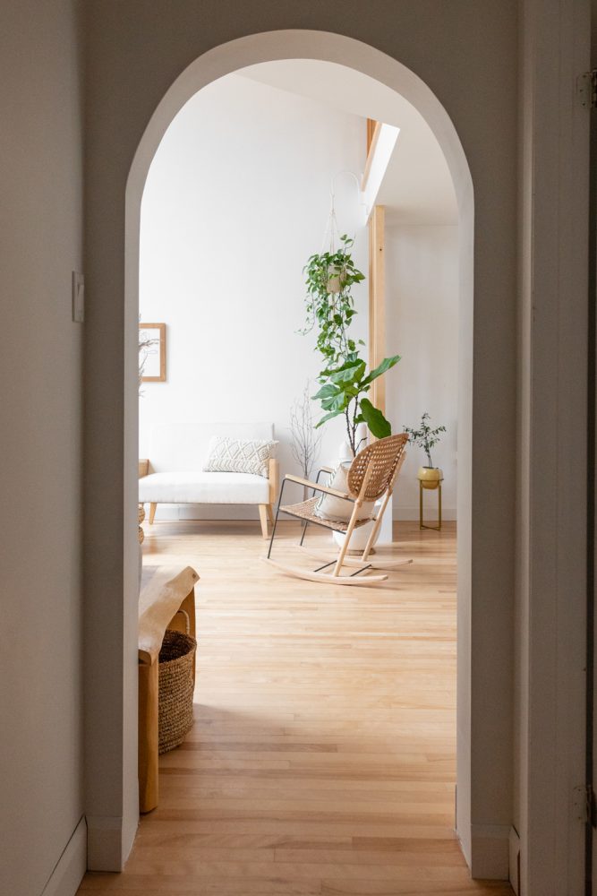
Recurring Curves
The spacious five-bedroom home is new to Lara’s family, but was originally built in 1986. Since moving in, they have worked to make the home more functional for their family. One recurring theme that they’ve added throughout is a touch of curve appeal, via an array of arches. “The arches are also part of this renovation and were a must for me,” Lara says. “I really wanted this space to reflect many elements of who we were. I’m Lebanese and my husband is Canadian, and I absolutely wanted this structural element to be present in our home – plus curves and arches add an architectural element to design but also add flow and softness.”
Related: A Look Back at Our Most Beautiful Home Tours of 2020
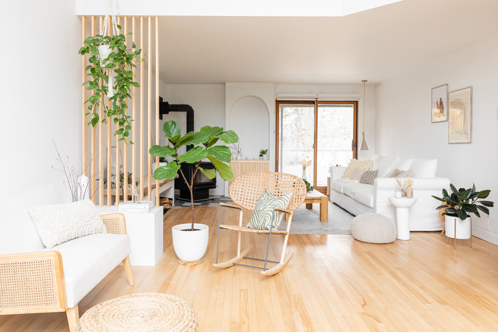
Minimal Aesthetic, Maximum Style
Throughout the home, Lara’s tastes have gravitated towards a less-is-more feel with a lot of flow, as the cozy, bright living room shows. “The overarching aesthetic I have is neutral and minimal,” Lara says. “I love clean lines, toned-down colour palettes and spaces that breathe.”
Related: From Kitchens to Living Rooms: Minimalist Design Style Ideas, Room By Room
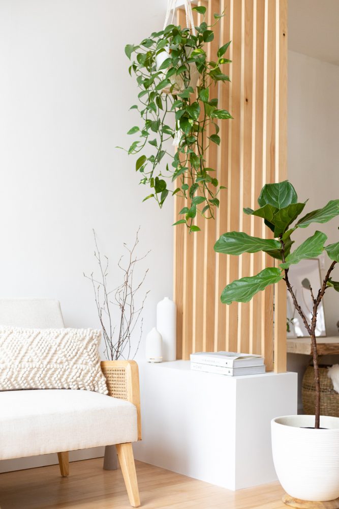
A Touch of Separation
While minimal, the living room is thoughtfully designed to be a functional, welcoming space for the whole family. The airy feel of the open-concept space gets a sense of differentiation, for example, from the addition of light-toned wood slats. “I wanted a separation that anchored the space, but did not divide in such a way as to make it heavy,” Lara explains.
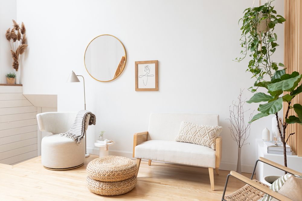
Chic Inspiration
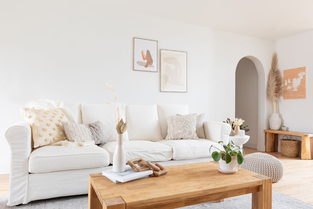
The fresh, bright feel of Lara’s home design pulls from a number of sources of inspiration, which come together to create a distinctive appeal. “My design influences come from a combination of Mediterranean, Scandinavian and mid-century aesthetics, to which I sometimes add subtle touches of vintage or boho depending on the space or room,” Lara says. Here, the love seat and wall art evoke mid-century modern vibes, while a woven pouf and hanging plant layer in boho accents.
Related: This Insta-Worthy Reno Blends Bright Style With Boho Details – and Plenty of Plants
Layers of Comfort
The living room furnishings are cozy, comfortable and light in hue (with two young children, Lara notes that light-coloured fabric means it’s extra important to use a spill-repelling protectant). On the couch, a mix of pillows showcases Lara’s love of playing with different textures, as well. “Texture is a very important element that adds coziness and warmth to a space,” Lara says. “I like using textures and layering them, especially since the overall tones of my home are neutral. I find that textures through pillows, throws, and rugs dress up a neutral room well.”
Related: 20 Tips for Arranging Furniture in Your Living Room
Integrating Warmth
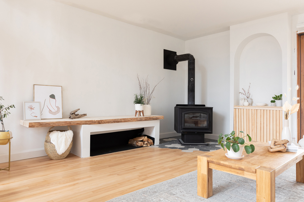
Atop a pattern of distinctive geometric grey floor tiles, a black fireplace brings warmth to the corner of the living space – a touch that was selected and designed with purpose. “I wanted the fireplace to integrate seamlessly and not be an element that stands out on its own, so we renovated this area entirely,” Lara explains, noting that the unique wood storage area was a renovation addition to the home as well. “I wanted a built-in space large enough to accommodate wood, but that could also be used as a space for decor.”
Related: Our Favourite Storage Solutions to Stash Your Stuff Around the House
Bright and Light
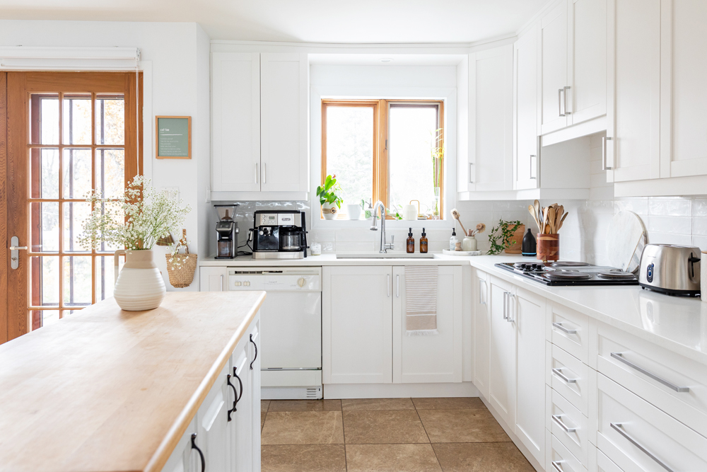
The home’s kitchen, which is sunny and airy with all-white cabinets, is still styled to the previous owner’s renovations. For more light-filled white kitchen inspiration, check out these ideas.
Related: Our 12 Most Popular Kitchen Design Ideas on Pinterest
Dining Details
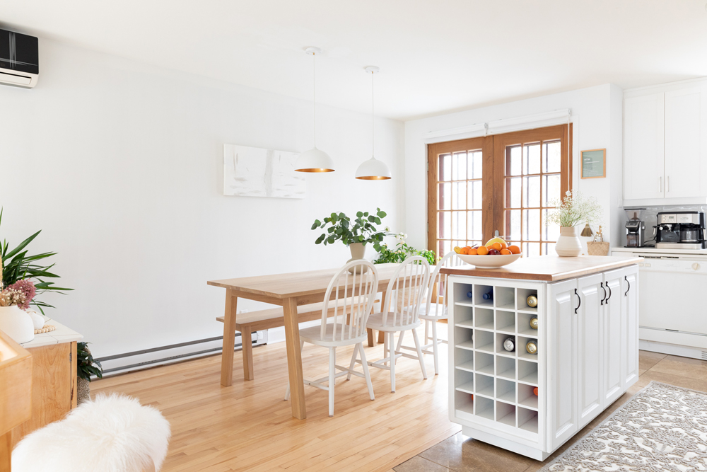
The kitchen flows into the dining room, offering a space that’s functional for everyday family meals and hosting guests. The wooden table and bench are handmade by a local small business, Woodstock & cie. “The quality is exceptional, and the fact that they plant 10 trees for every piece of furniture purchased is something that speaks volumes to me,” Lara says. The pendant lights deliver a touch of Scandinavian inspiration while giving a look of height to the lower-ceiling space. To customize the lights to the space, Lara used a little DIY ingenuity. “I found them on Amazon Home, only available in black – so I changed the colour myself to white.”
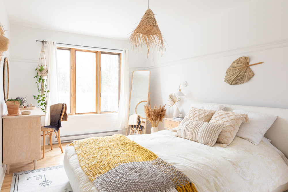
Natural and Neutral Inspiration
The primary bedroom is calm and serene by design, making use of Lara’s love for soft tones and nature-inspired accents. “Here again the colour palette is neutral,” Lara says, adding that “there are natural elements like plants and dried florals, but also wood, and my inspiration comes from a Scandinavian influence with touches of boho that I used to add texture.” Above the bed, a raffia light fixture that’s made in Morocco furthers the dreamy feel of the space. A fun colour note? The cozy throw blanket on the bed perfectly incorporates both of Pantone’s Colours of the Year for 2021.
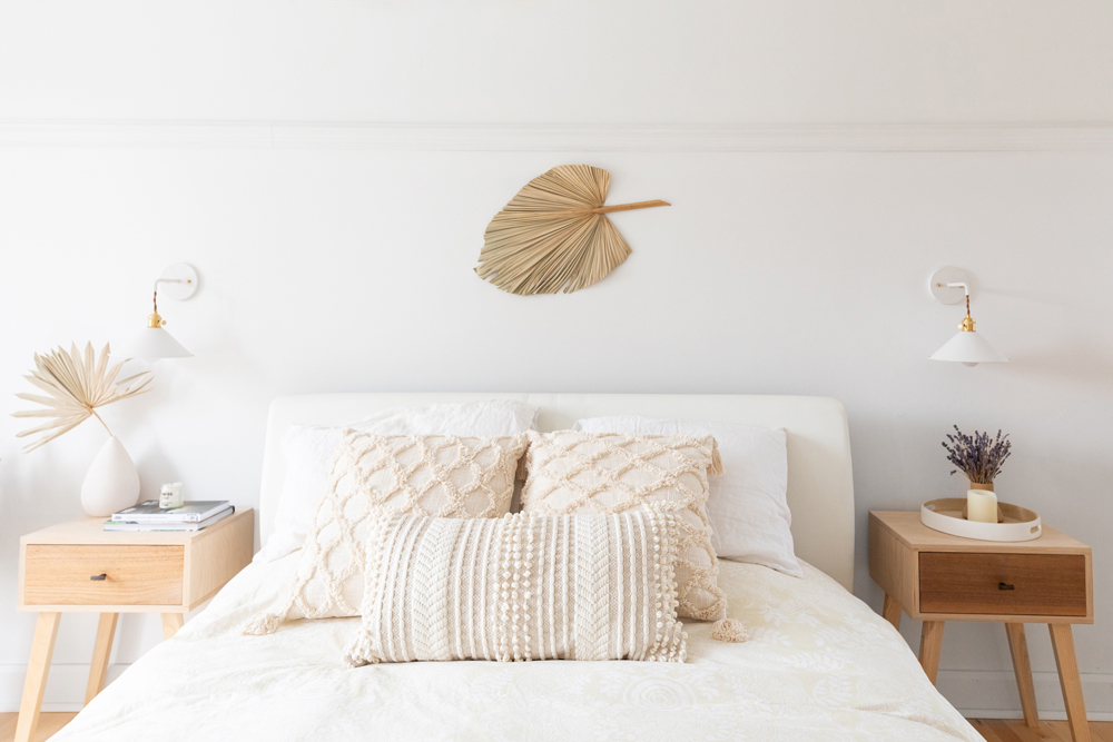
A Dreamy Retreat
When it’s time to rest, the bed is as cozy as it is stylish, thanks to neutral-hued Desigual bedding from Maison Simons. Boho-inspired details lend texture and dimension around the room, as well. “The frond is a dried palm leaf, adding an accent above the bed but keeping it soothing and natural,” Lara says. Inspired to update your own sleep sanctuary? Here are our tips for buying bedding.
Related: 15 Bedroom Decor Ideas to Make Your Space Cozy for Autumn and Winter
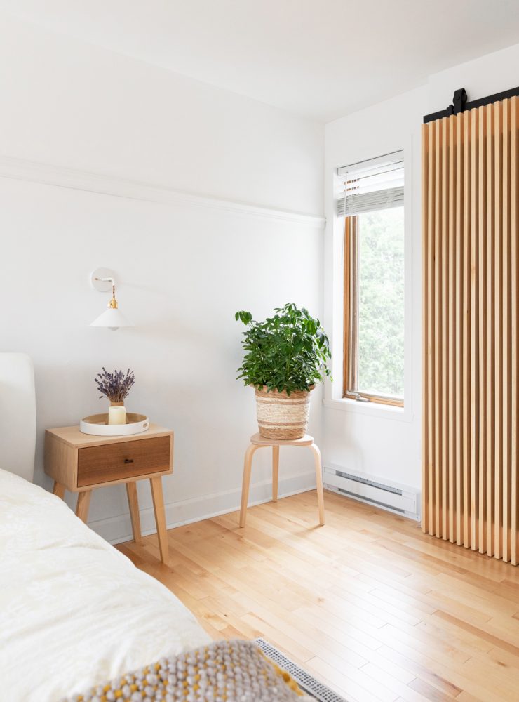
Sliding Doors
When they first found the home, one drawback to the primary bedroom was a lack of storage space, so they opened one of the walls to create a larger walk-in closet (taking some space from an adjacent bedroom). To separate the walk-on, Lara chose a DIY barn-style door to complement her design aesthetic. “I wanted the functionality and look of a barn door system while keeping the clean and minimal lines, so we opted for a DIY wood slat door,” Lara explains.
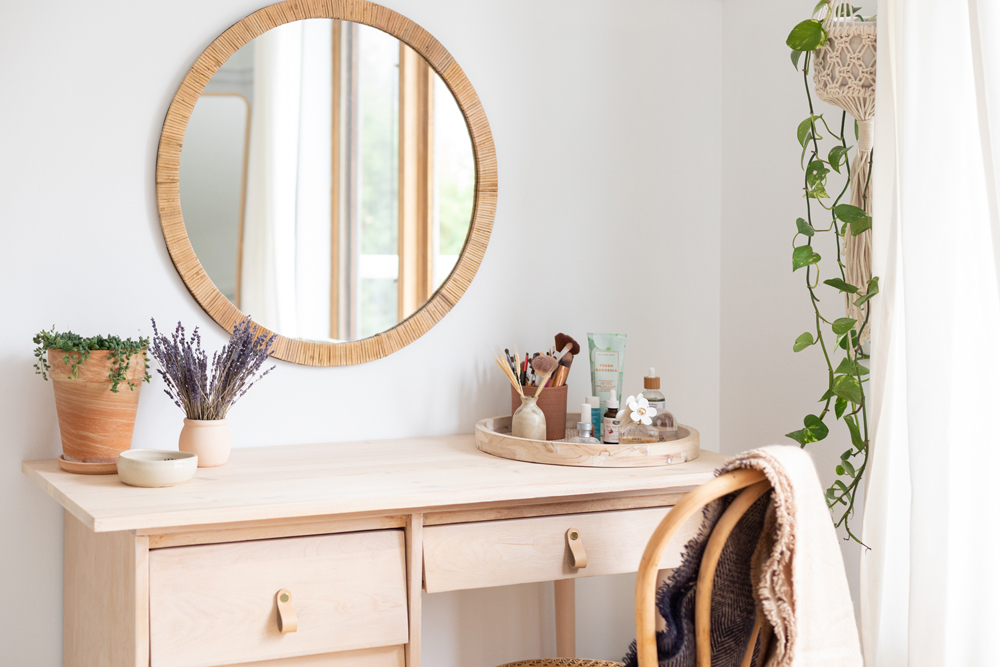
Old Meets New
Lara loves finding ways to mix vintage and new pieces in the home, as this corner of the primary bedroom beautifully demonstrates. Here, she found an old vanity on Facebook Marketplace and then customized it by sanding it to a lighter wood finish and adding new pulls. Above the DIY vanity, the rattan-framed round mirror, a Bouclair find, incorporates a nod to the materials in the rest of the room.
Related: 15 Canadian Vintage and Antique Shops to Find the Perfect Piece for You
Home Spa Experience
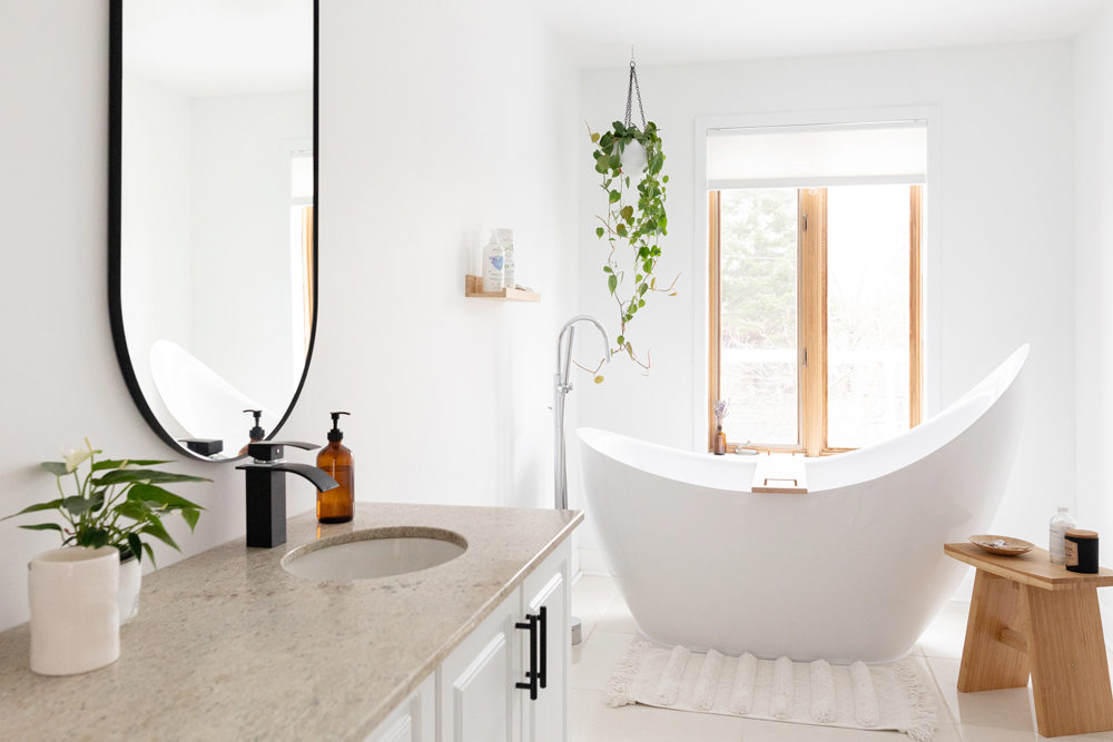
The stunning curved tub was already part of the home when the family moved in, so Lara made it the focal point of the spa-like bathroom. They swapped the old vanity for this light-coloured one, and added black-tone accents for character. Lara also loves plants, and incorporates them all throughout the home, including in the bathroom. “In this bathroom, I chose a pothos, because it is very easy maintenance, can take the humidity and is right next to the window for light,” Lara notes. “Plus, to add to the spa-like feel, I wanted a hanging plant close to the tub, and it was perfect there.”
Related: Who Needs the Spa? 15 Bathroom Ideas That’ll Leave You in a State of Total Bliss
Tranquil Touches
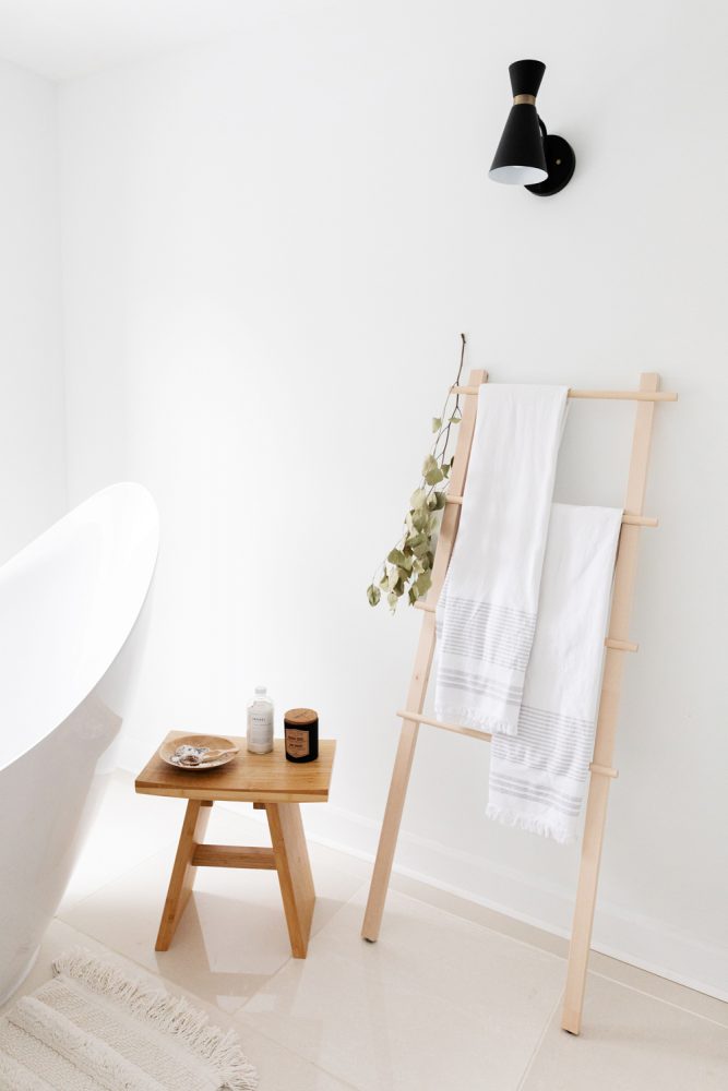
A few select wooden accessories, like this small stool and towel ladder, offer touches of nature while also keeping bathroom essentials well organized. Here are a few more ideas for organizing your bathroom like a designer.
Related: 12 Modern, Minimalist Bathroom Ideas to Inspire You
Work Space
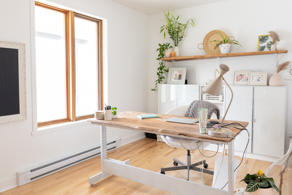
Lara converted one of the home’s bedrooms into a practical office space. IKEA cabinets are sleek, while also keeping supplies in order. “For the home office, again I needed style and function, so it was important for me to have enough storage so I don’t have to see papers lying down,” Lara says. The large desk is a DIY project. “The base is from IKEA, and the top is a DIY from old barn wood. I liked the rustic old feel to it, and the desk’s live edge, so we did it ourselves.”
Related: 15 Items Every Home Office Needs to Boost Productivity This Year
Stylish Shelving
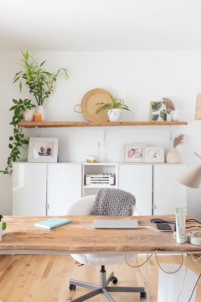
Behind the desk, a wood shelf is beautifully styled to match Lara’s aesthetic. Lara’s tips for curating a shelf or surface like this one? “I usually pick a colour scheme. Then I group items together in threes, twos or standalone. I start with the biggest item and work my way from that as a focal point. Also, I try to place items in such a way as to have balance and flow and mix textures and types of items (like a frame, vase, candle, etc.).”
Related: These Living Room Shelving Ideas Will Make Your Organizing Dreams Come True
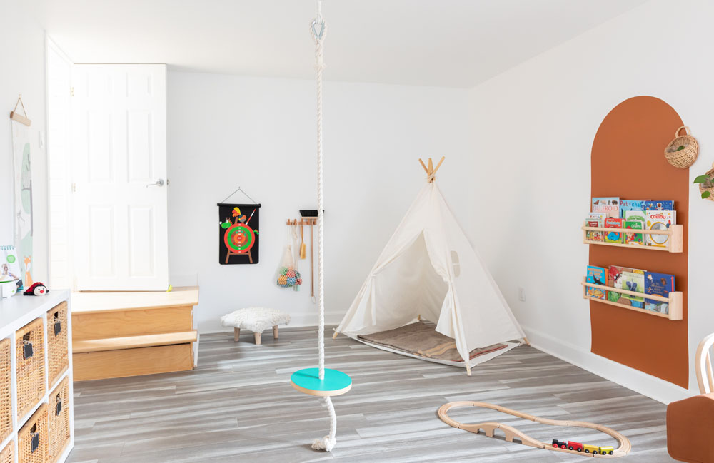
A Place for Play
The home’s playroom is a place for Lara’s children to play, read and be creative. Speaking of play, in the room’s centre, a rope swing (made by a local company) brings active time indoors. “I love as much as possible having eco-friendly toys for them, so materials like wood are common in their toys,” Lara says. “I liked how it looked, in terms of product design, and it allows them to have some active play even when they’re indoors.”
Related: 18 Stylish Playrooms That Blend Into Your Living Space
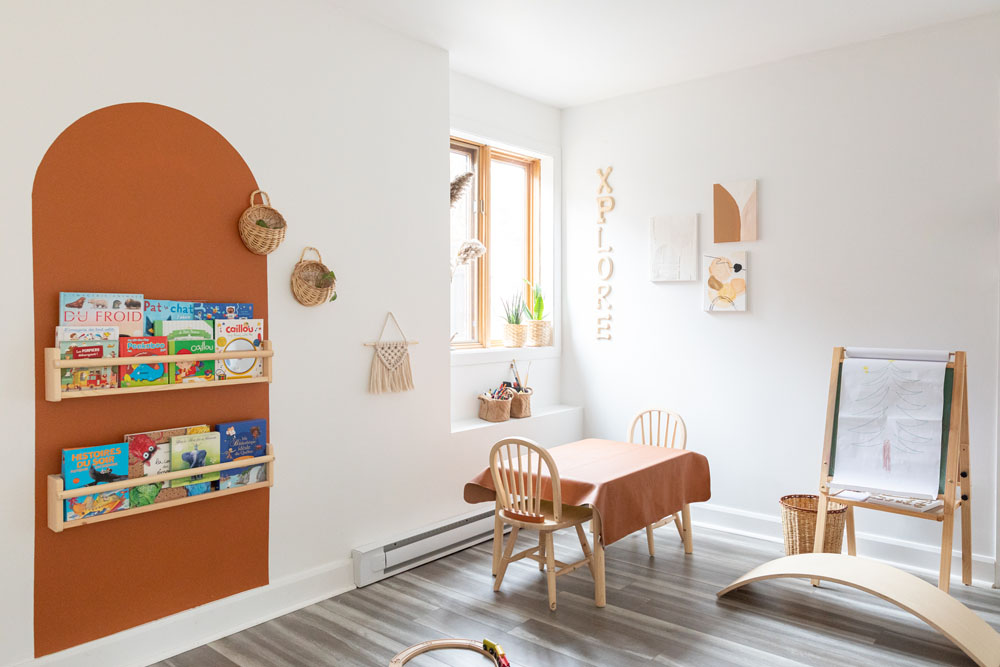
Colour Pop
A painted colourblocked arch in the playroom – another chic DIY by Lara – echos the arches in the living room, while adding a fun detail to frame a duo of book shelves. “I saw something similar on Pinterest at some point, and thought it would tie with the rest of the arches without being structural,” Lara, who can also be found on Pinterest as Liv & bloom, explains. “Also, it focuses the playroom on books and reading.”
Related: Pinterest Predicts 12 of the Most Popular Home Decor Trends for 2021
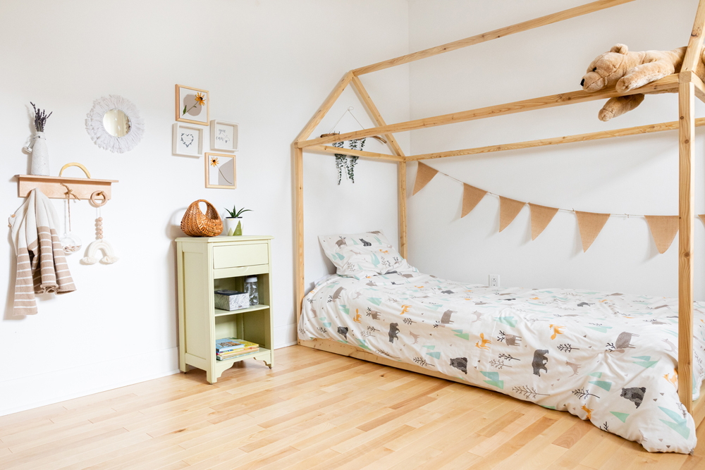
Sweet Dreams
Lara’s thoughtful approach to design extends to the children’s bedrooms, as well. “Because we’re fortunate to have a dedicated playroom, I wanted the kids’ room to be minimal and neutral to enhance sleep and rest, while also being characteristic of their individual personalities,” Lara explains. The minimal wooden bed frames, made by a local company adds a fun, earthy touch.
Related: 10 of the Most Adorable Kids’ Rooms We’ve Ever Seen
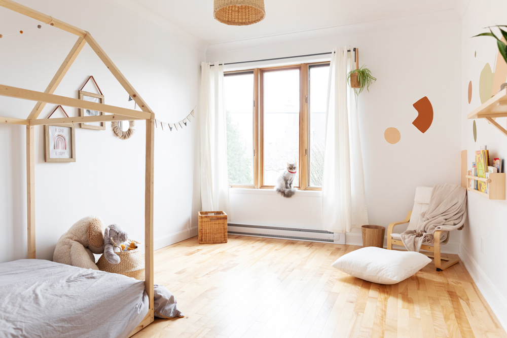
Reading Nook
“Additionally, reading is very important in their routine, so except for plush toys, there are no other toys – but a reading corner in each of their rooms,” Lara notes. “This is the nook we sit in to read stories to them before bedtime. Otherwise, their rooms can evolve well with time without major changes.”
Related: For Sleep and Play: 15 Kids’ Room Trends for 2021 That’ll Have Your Kids Asking to Get Grounded
HGTV your inbox.
By clicking "SIGN UP” you agree to receive emails from HGTV and accept Corus' Terms of Use and Corus' Privacy Policy.


