Just because a house was built in the 1920s doesn’t mean its style has to stay in the past. Thanks to the renovation vision of the Property Brothers, this gloomy heritage home is transformed into a light-filled modern oasis. Go ahead and see for yourself!
Blind Trust
Home hunters Denise and Massimo were reluctant to drop $1,650,000 on a 100-year-old house in need of a lot of TLC. Luckily, they took the plunge and put their trust in Jonathan and Drew.
Home Wrecker
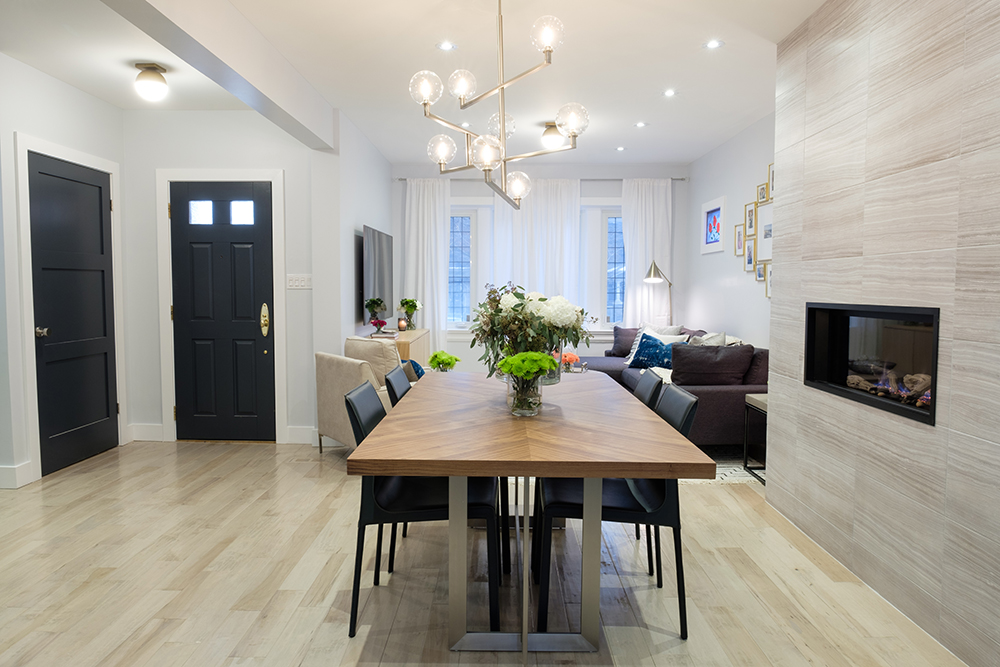
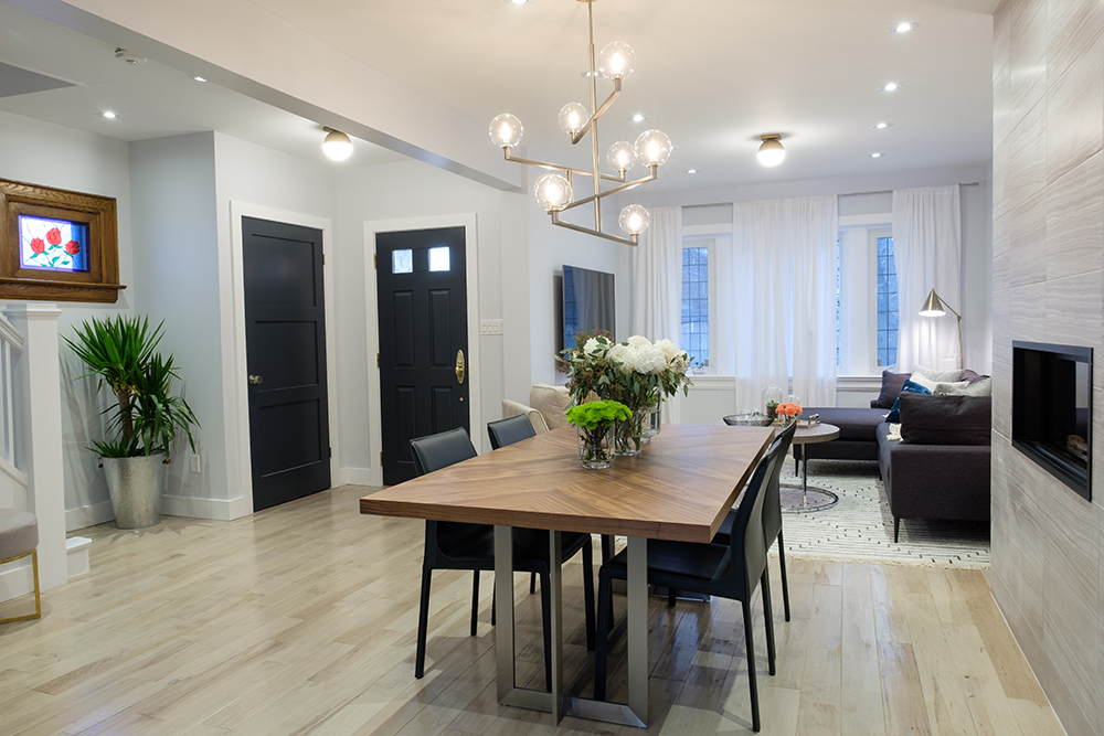
To get the open-concept flow the homeowners wanted, Jonathan removed all the interior walls on the first floor and installed extra structural support with a cleverly hidden support beam.
Go With the Flow
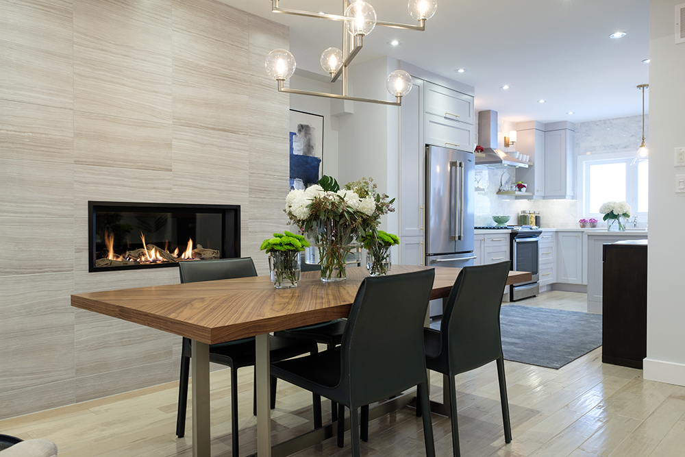
After an eight-week renovation, the main floor of this 1,752-square-foot Toronto home now flows from the living room to the dining area, and then right into the kitchen at the back of the house.
On Strike
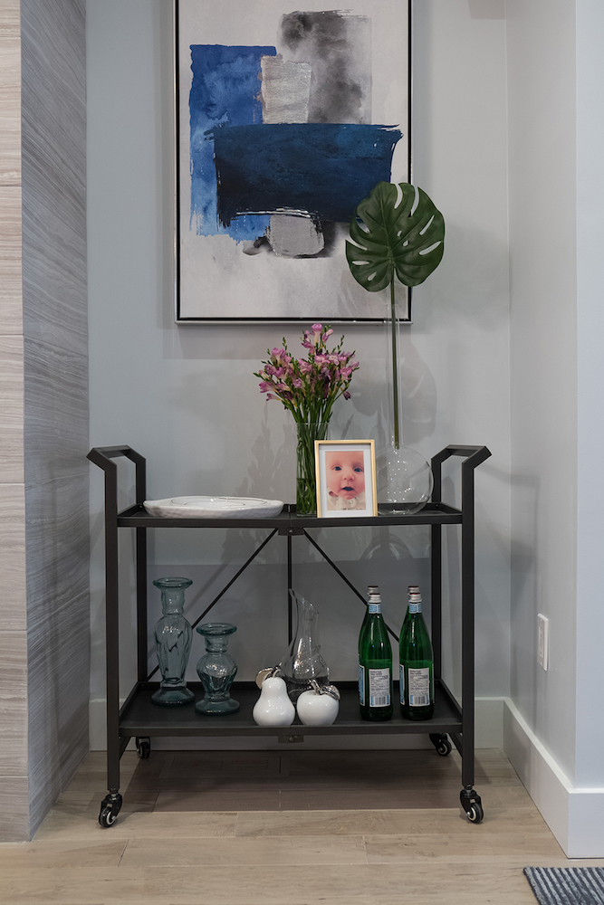
Since Denise likes modern decor and Massimo skews towards more traditional styles, Jonathan had to come up with an interior design that struck a balance between their two opposing tastes.
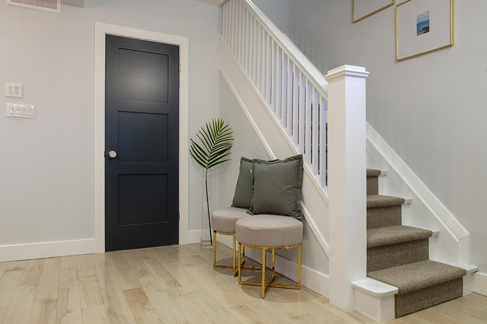
White Out
From the stair banister to the wainscoting, this heritage home was full of dark, outdated varnished oak. A simple and inexpensive way to switch up the look was to paint out all the wood in a bright, clean white.
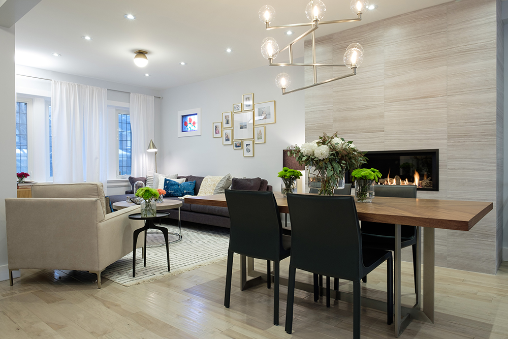
Fire’s Burning
A linear gas fireplace, surrounded by gorgeous sand-toned tiles from the floor to the ceiling, adds instant warmth and a textural focal point for the family friendly living-dining area.
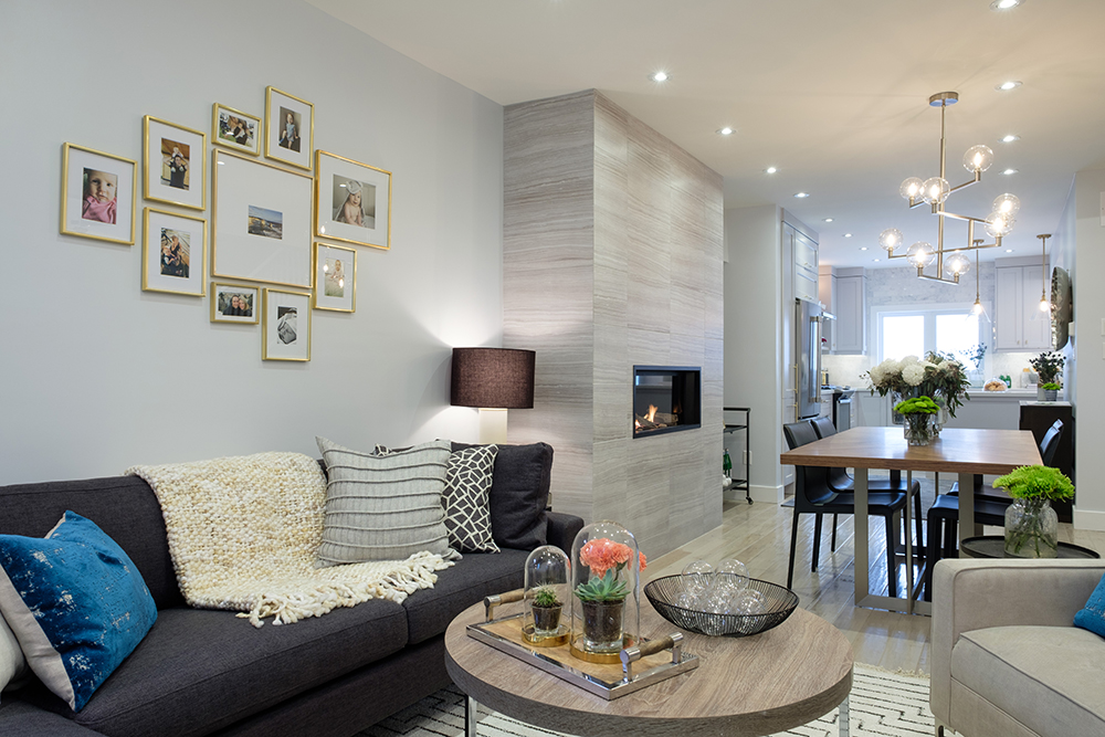
Family Time
A grouping of gold-framed family photos shows that this beautifully renovated house is more than a pretty face – it’s the place where Denise and Massimo have decided to raise their two precious daughters.
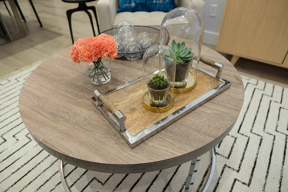
Wood Worker
Chic accents of wood, glass and gold keep the living room’s palette warm and welcoming, while the plush, geometric carpet and cream-coloured armchairs add instant softness.
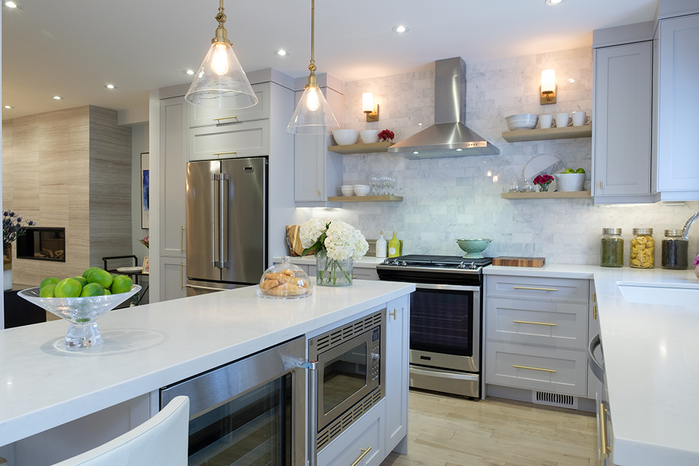
Pretty Prep
The stunning, fully renovated chef’s kitchen was the biggest change to the house. What used to be a dingy, galley-style kitchen with a wonky layout now features function and style.
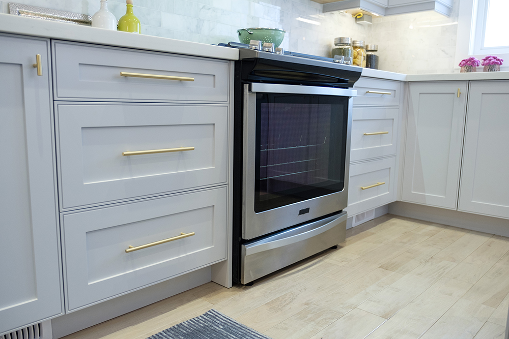
Appliance Science
As an avid cook, Massimo really wanted top-of-the-line appliances to make up for the basic ones he had been using in their condo for years.
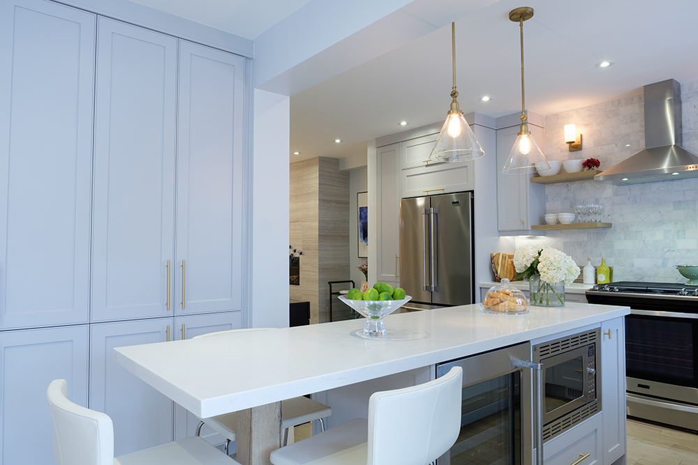
Walled Up
Since the added (structurally necessary) beam created an extra wall in the kitchen, Jonathan turned a potential design flaw into a smart storage solution by adding a wall of floor-to-ceiling cabinets.
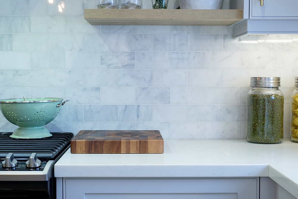
Stoned Roses
On-trend white and grey-veined stone subway tiles come together in a traditional brick pattern as the kitchen backsplash, presenting a pretty, modern take on a classic style.
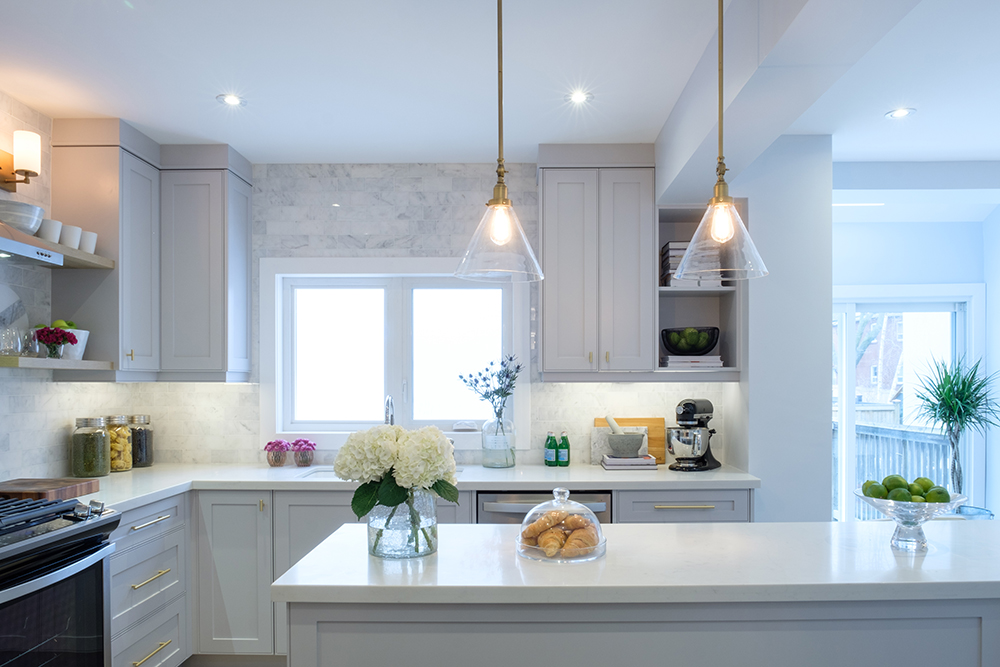
Mission Control
Jonathan’s goal for the kitchen was to create a bright, contemporary space with enough room to prep meals, cook and entertain… so, mission accomplished!
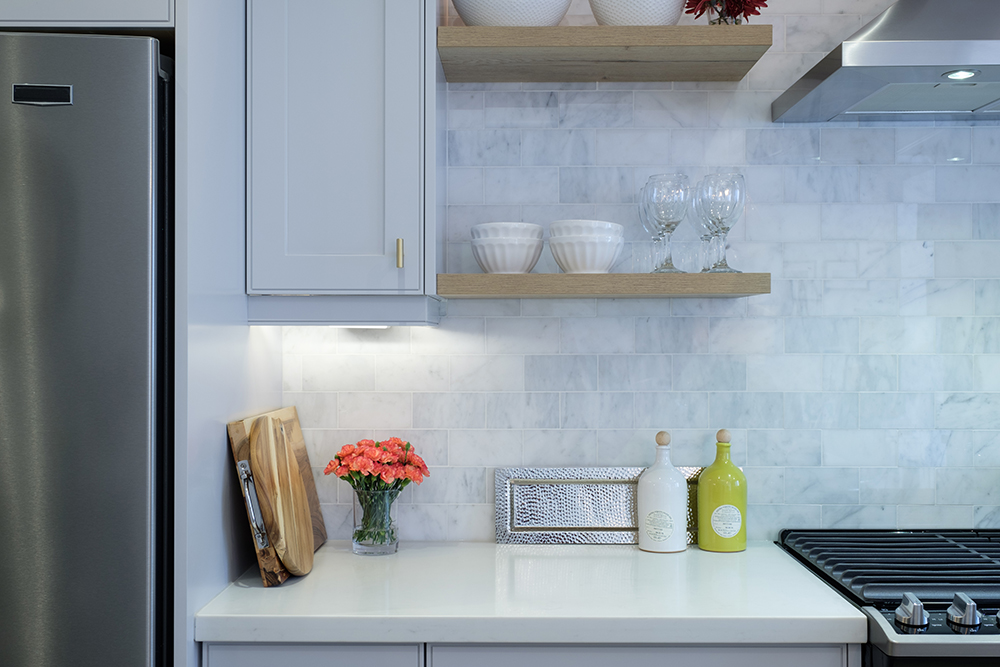
Totally Oaked
Not only do the floating oak shelves provide extra ledges to display glasses and dishes, but the warm grains in the wood contrasts nicely against the bright-white stone tiles and quartz countertops.
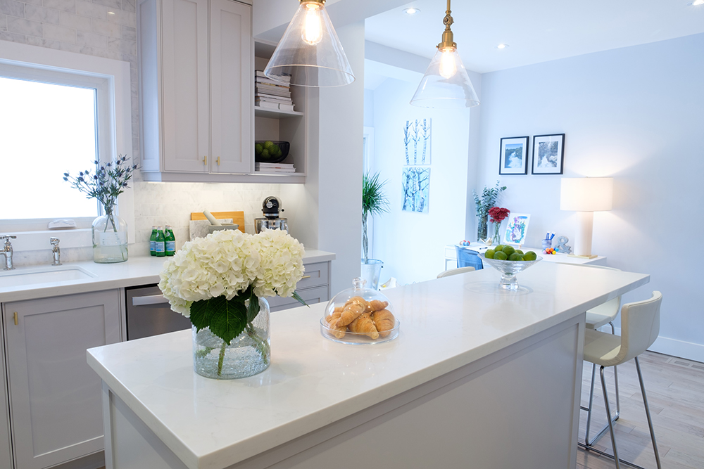
Room to Grow
A long, narrow quartz-topped island provides plenty of prep space as well as much-needed extra seating for Denise and Massimo’s growing family.
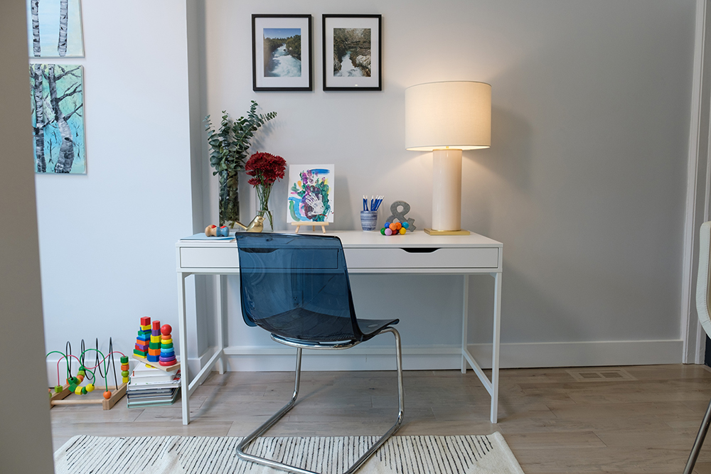
Playroom Partition
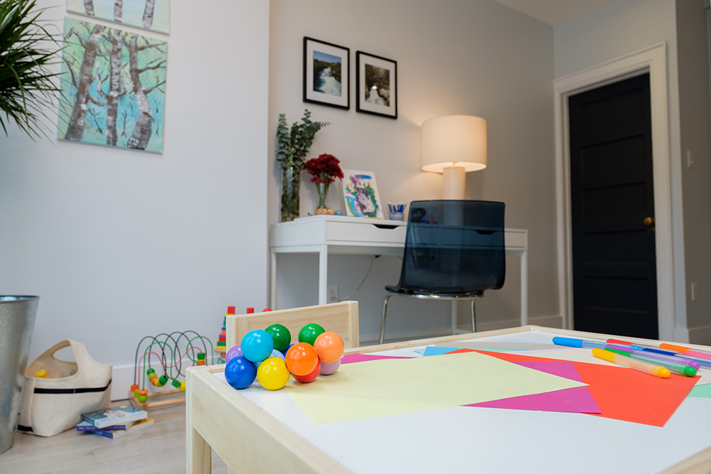
The bonus space to the side of the kitchen acts as a work station and kids play area, moving all the toys, crayons and books to the back of the house, freeing up the front areas for entertaining adult friends and family.
Kids’ Corner
A sweet crafts table for the kids – kitted out with paper and pens – give Denise and Massimo’s daughters a space to call their own, which is so important when designing a family home.
Paper Airplanes
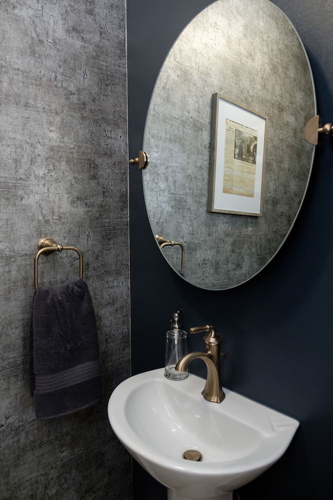
Massimo was not sold on the idea of using wallpaper in the main-floor powder room but once he saw what Jonathan picked out, with its chic aluminum effect, he soon changed his tune.
Tonight’s Feature
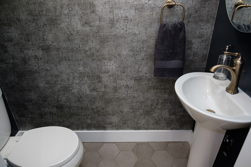
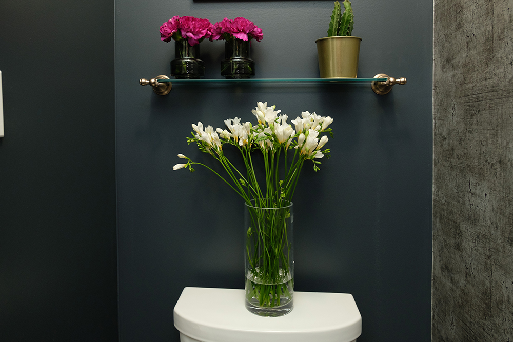
In the small but stylish powder room, brass fixtures and soft, sand-toned hexagon tiles warm up the darker greys and blacks found in the wallpapered feature wall.
Now Move-In Ready
Turning a century-old house into a modern dream home is no small feat, but with a renovation budget of $163,500 and Jonathan’s smart design choices, this family was able to move into their forever home.
HGTV your inbox.
By clicking "SIGN UP” you agree to receive emails from HGTV and accept Corus' Terms of Use and Corus' Privacy Policy.


