Updating a 100-year-home would be a challenge all on its own, but incorporating the eclectic tastes of its new owners adds a whole other level. In this renovation, the Property Brothers manage to feature the homeowners’ quirky personal style while also bringing in a cool, mid-century modern aesthetic.
That ’70s Show
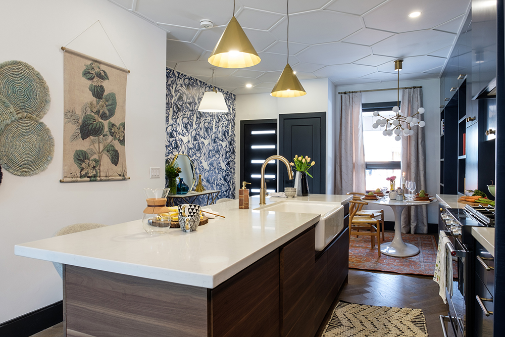
First-time homeowners Katie and Mark wanted their new home to feel like a Manhattan apartment in the 1970s – with lots of plants, personality and pizzazz – but in a 1,200 square foot house in Toronto.
Beauty and the Built-In
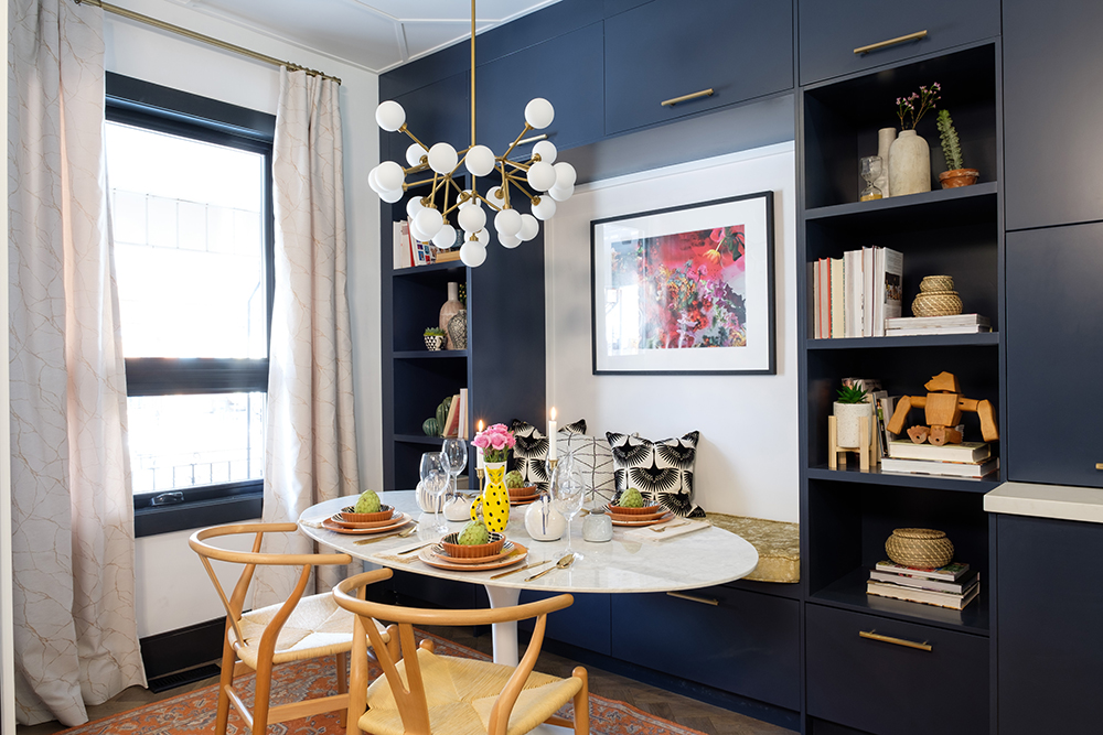
Whether it’s working on their laptops or hosting games night with friends, these homeowners have plenty of seating options thanks to this sleek built-in dining nook situated at the front of the house.
Balancing Act
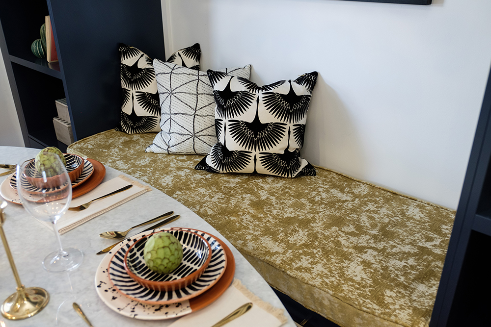
Pinpointing the couple’s exact design taste was a challenge for Jonathan, but he nailed it by striking a balance between funky and sophisticated, which is illustrated in this choice of textured yellow velvet for the bench seat and hand-painted geometric dinnerware for the round marble-topped table.
Gold and Globes
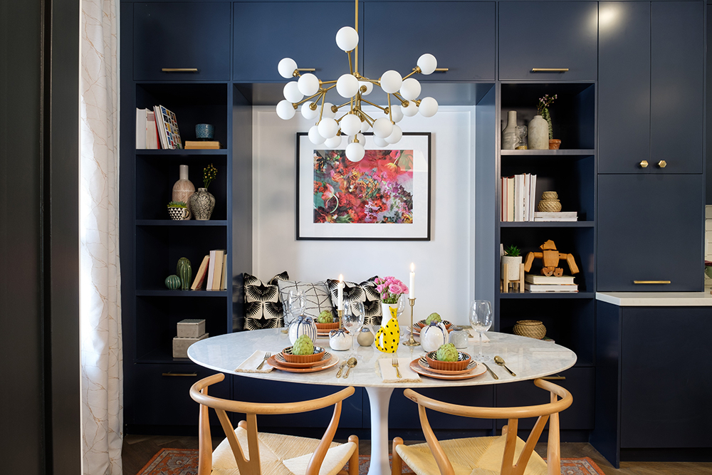
In the front-of-house dining nook, a gorgeous molecular chandelier draws focus upward with its glass globes and gold hardware, which stands out against the navy blue built-in cabinetry wall. See here for 25 more dreamy breakfast nook designs.
Bone to Pick
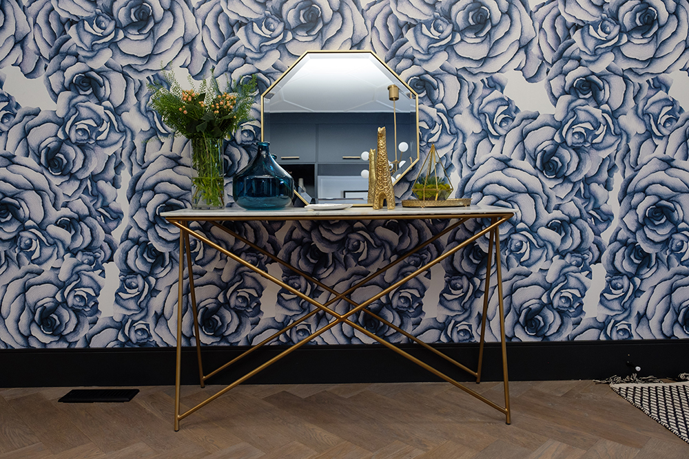
Tying into the blue cabinetry, a bold, blue-rose wallpaper covers the entire wall near the entryway, while the herringbone hardwood floors pay homage to the original (damaged beyond repair) mini-chevron-patterned floors found in this 100-year-old Toronto home.
Social Climber
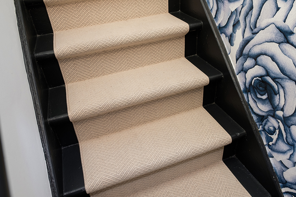
A new cream-coloured runner – also in a herringbone pattern – was added to the stairs to give comfort and grip while climbing the original narrow staircase up to the second floor of this heritage home.
Getting Crafty
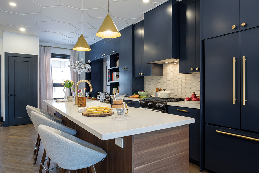
Having demolished all the interior walls, finding a functional layout and flow of the now open-concept space was paramount – for Katie and Mark, the kitchen had to be the heart of this home because it’s “where the beer is.”
Brace for Impact
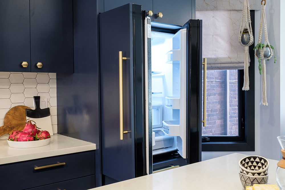
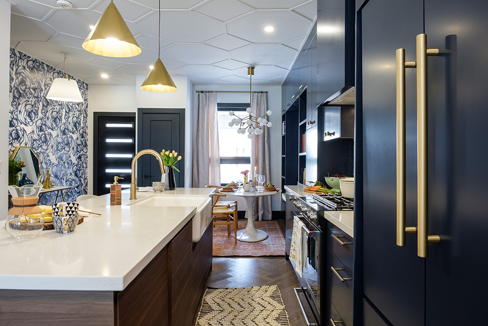
This quirky couple didn’t want traditional white cabinets in their dream home – they demanded colour. Opting for deep royal blue, with on-trend gold hardware, these floor-to-ceiling cabinets make a visual impact the moment you walk in. These 12 kitchens also make a case for colourful cabinets.
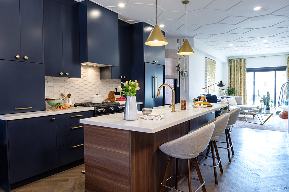
Counter Confidential
Like most young couples these days, Katie and Mark didn’t have the need for a formal dining room – they wanted to use the extra space to put in plenty of comfortable in-kitchen seating instead.
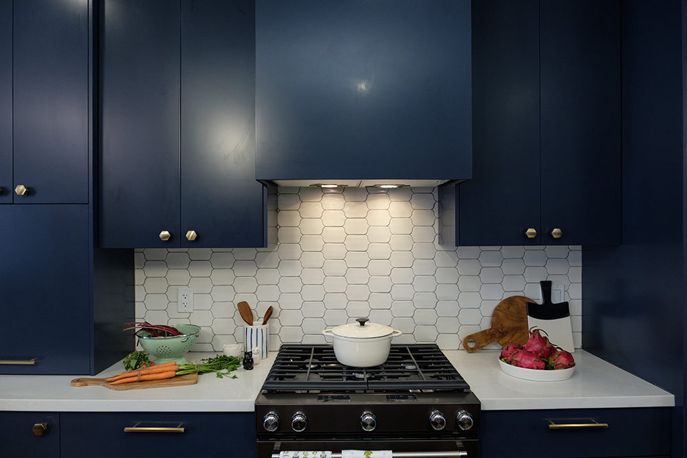
Honey, I’m Home
A white honeycomb-tile backsplash brings in just enough of that retro vibe without feeling dated. Modern under-cabinet lighting and a top-of-the-line gas range also help bring this funky kitchen into the 21st Century. Here are 40 brilliant kitchen backsplash ideas for your next reno.
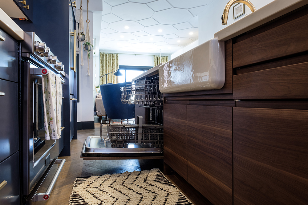
Design Flow
Thinking through how an appliance is used and where it should be installed is so important when it comes to kitchen workflow. Placing the dishwasher right next the deep, textured apron sink was a smart move.
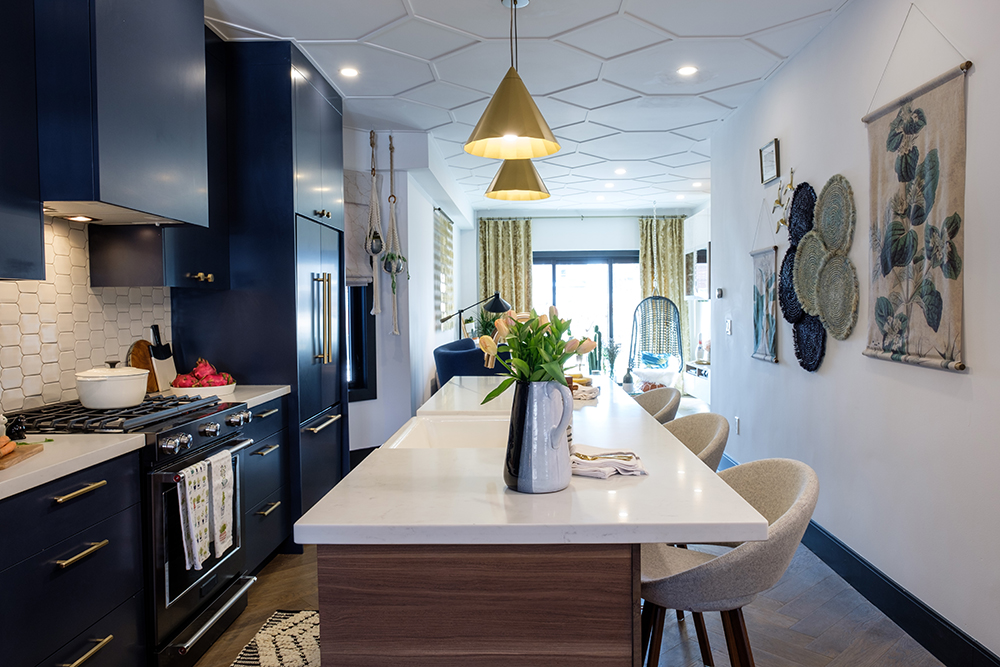
Going Deep
To give this fun-loving couple something truly unique in their new home, Jonathan designed them custom geometric ceiling moulds. This creative treatment gives depth and interest to the long and narrow shape of this vintage home. Reach new design heights with 9 more ultra-stylish ceiling ideas.
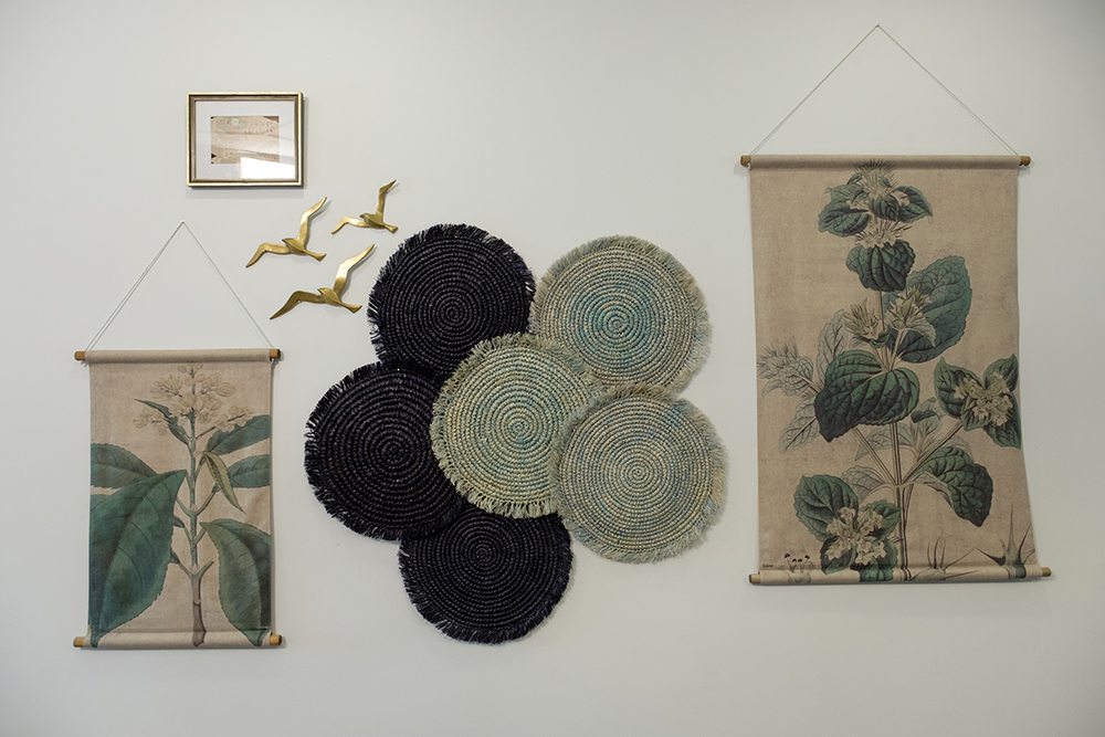
Floral Expression
During the demolition, Jonathan and his crew found an entire wall of 1970s floral wallpaper. To keep a little piece of the home’s history, he decided to frame and incorporate it into this textural feature wall.
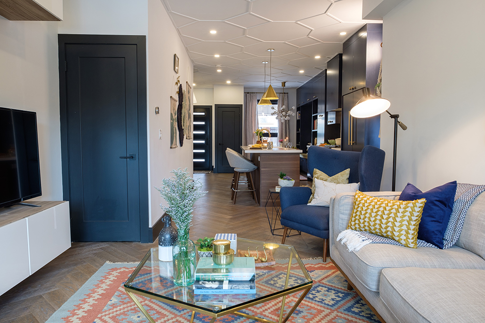
Story Time
Before Jonathan got to work on the home’s overall decor, the homeowners gave him a box of personal memorabilia and special objects to be included in the displays. They wanted every object to have a story, not just look good… and after the renovation, they now have both.
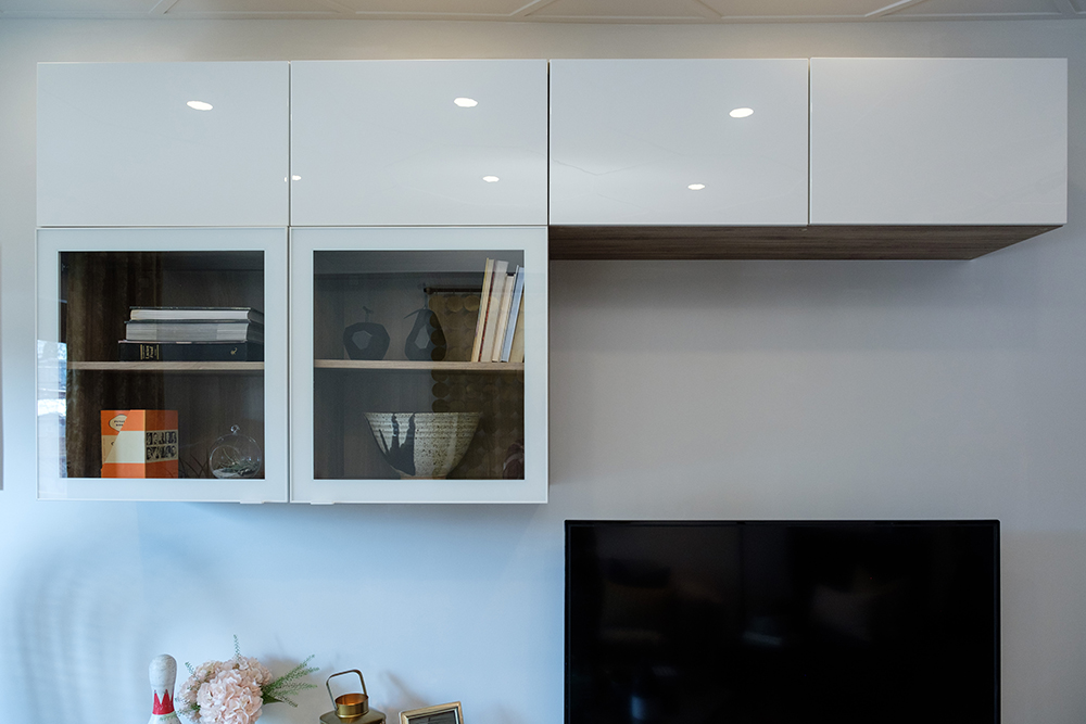
Not at all Board
A sleek new set of white high-gloss cabinets crown the flat-screen TV, providing the perfect spot to store all the board games Katie and Mark need for their famous games nights with friends.
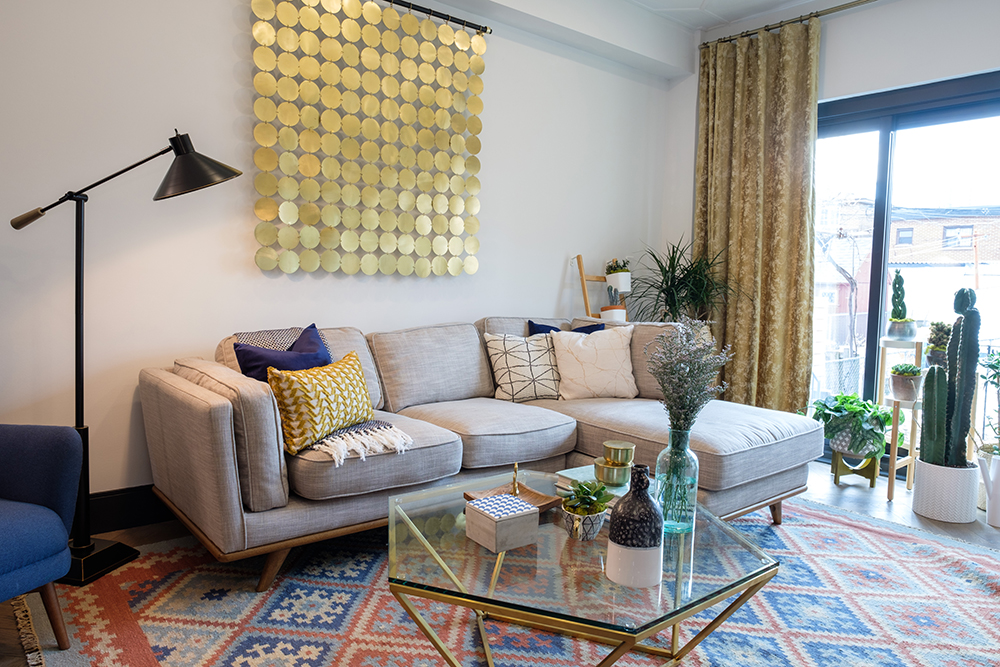
Green Thumb
Katie is a plant person, so having a collection of cool green oxygen makers was high on her must-have list. Jonathan scoured the city to find her a huge 40-year-old cactus, and she couldn’t have been happier with it.
Matchy Matchy
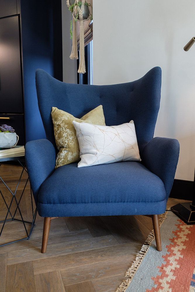
The deep blue of this mid-century modern armchair ties in perfectly with the cabinets in the dining nook and kitchen. To add to the matching theme, Jonathan even had a throw pillow made for it from the same yellow-velvet material as the dining-nook bench and living-room drapes.
Open Sesame
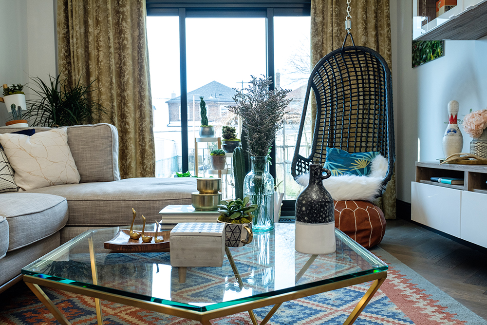
To let in as much light as possible (for the plants and the people), Jonathan installed a collapsible wall at the back of the house. It was an expensive addition but one that will be worth it when summer rolls around and the entire wall opens up to the yard.
Mind Reader
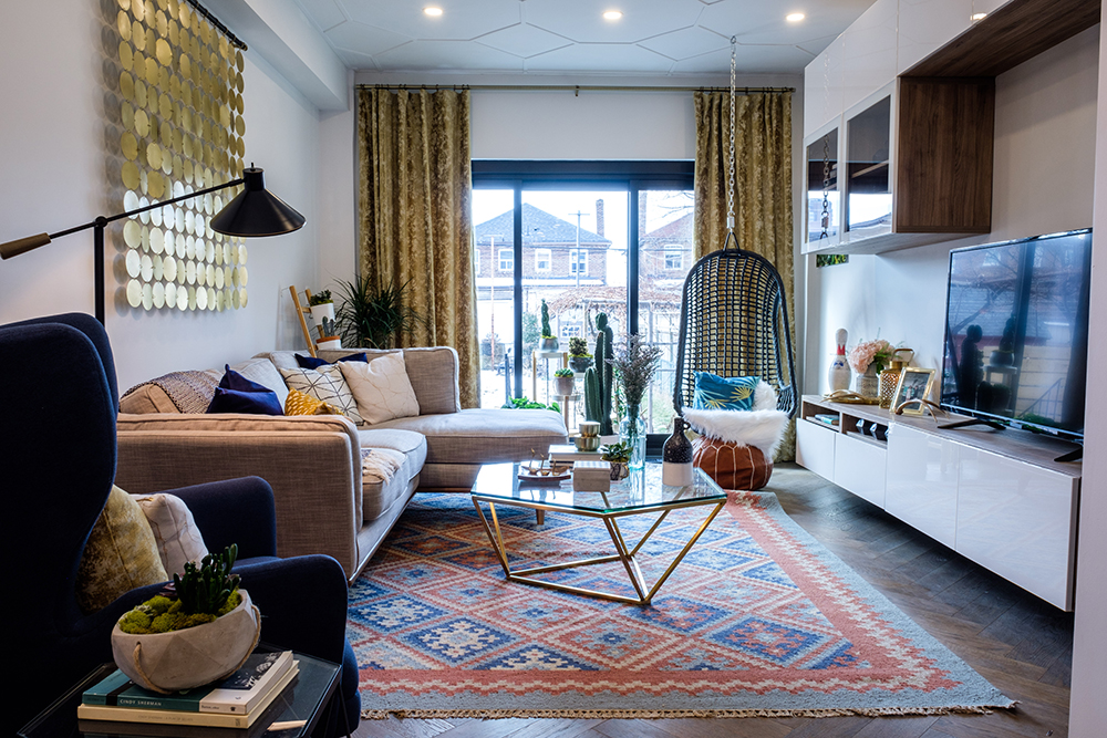
From the colourful kilim rug to the hanging rattan chair, Katie said it seemed as if Jonathan had seen the mood boards in her mind and found all the perfect items to make this space feel instantly like home.
Eclectic Glam
To get the personalized mid-century modern dream home that these homeowners wanted meant they had to shell out $106,000 for the renovation, on top of the original $650,000 purchase price for the property. But after a seven-week construction schedule, they were able to move into a space made just for them and their eclectic sense of style.
HGTV your inbox.
By clicking "SIGN UP” you agree to receive emails from HGTV and accept Corus' Terms of Use and Corus' Privacy Policy.


