When cost-conscious contractor Sebastian Clovis and designer Sabrina Smelko stepped into the chaos of this partly-renovated family home on Save My Reno, the ceiling was missing and the laundry was in the kitchen. After a $90,000 renovation and a complete rejig of the main floor layout, the space now features function and form.
Sound Escape
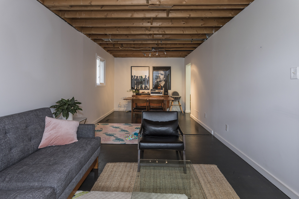
Turned off by the original white-stucco ceiling, homeowner Michael took it upon himself to remove it. The DIY demo exposed the second-storey floor jousts and unsightly electrical work, and let all the upstairs sounds be heard very clearly downstairs.
Wider and Softer
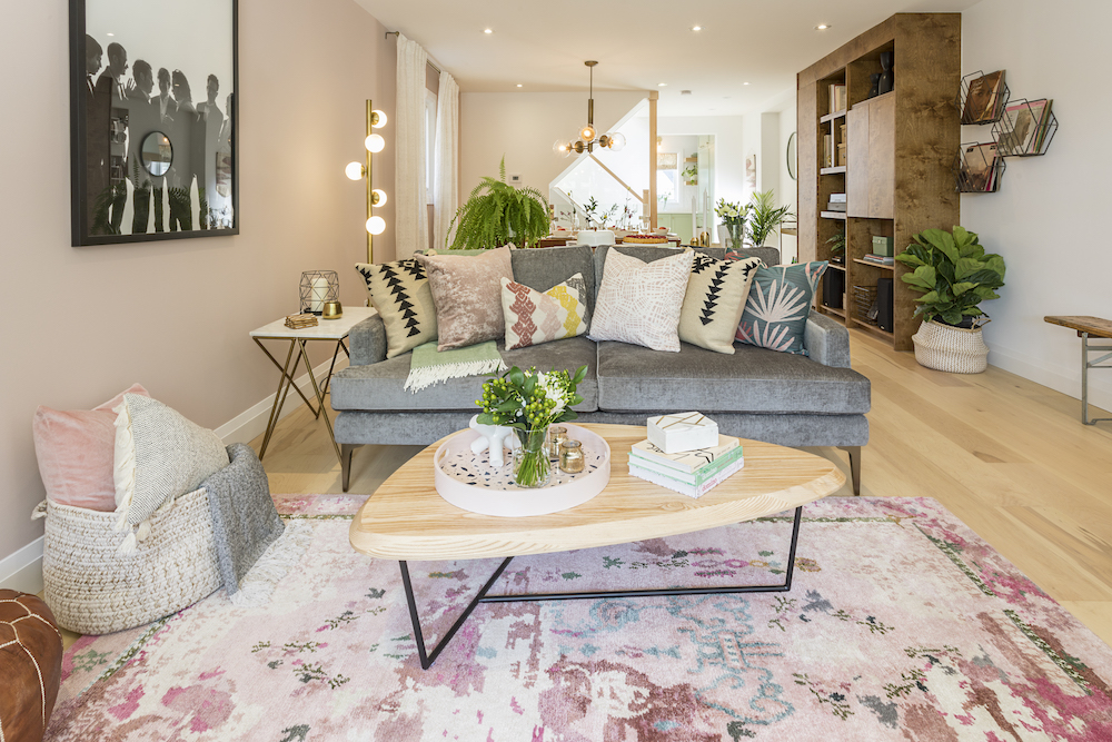
Sebastian and Sabrina installed a series of pot lights in the new ceiling to provide soft ambient lighting for a reconfigured and significantly wider living space, thanks to the demolition of an entire hallway wall.
Rail Roaded
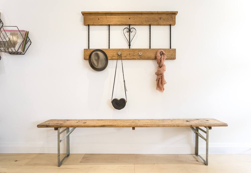
Saving money with little DIY projects wherever possible is the name of the game on Save My Reno. Case in point, the black spray-painted spindles that make up this charming antiqued coatrack used to be part of the original (outdated) stair railing.
Black Hole No Sun
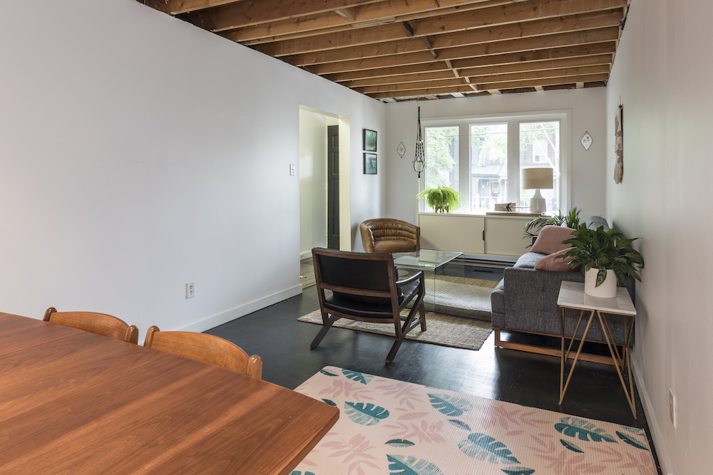
In an attempt to modernize an ancient parquet floor, Michael added a few coats of thick black paint. And while the paint did a good job of covering up the worn-out wood, the dark colour pulls the light right out of the room.
Light Streaming
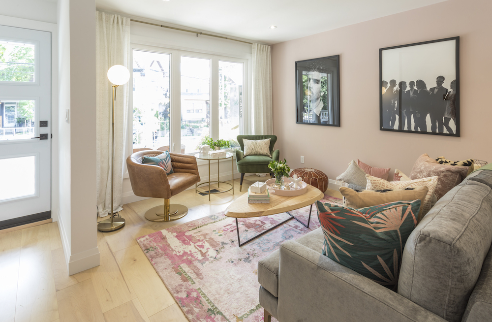
Wide-planked maple now runs throughout the house, limiting the number of seams and reflecting the natural light streaming in from a set of tall windows and a glass-panelled front door.
Velvet Crush
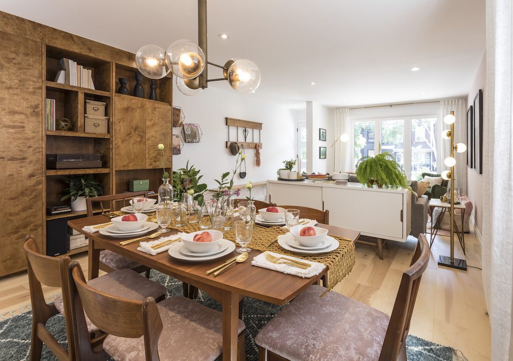
Since Michael and Elise already had a cool mid-century-modern dining set (as well as an impressive collection of other mid-century pieces), Sabrina opted to simply update the chairs with new, pink crushed-velvet upholstery.
Hide and Seek
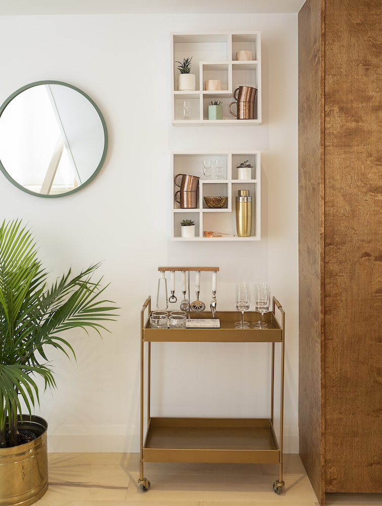
A sleek bar cart sits beside a gorgeous built-in media centre that Sebastian designed not only to hold Michael’s stereo equipment (he used to be a deejay) but also to hide a necessary bump out for HVAC ducts and electrical wires.
Basic Sitch
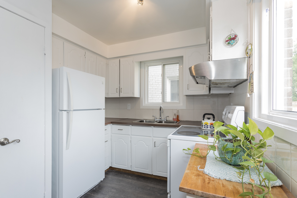
Michael and Elise’s kitchen was the perfect recipe for bland and extremely basic. The appliances were old, the laundry was in one corner, and the storage was severely limited – this space was in desperate need of some design love and expert attention.
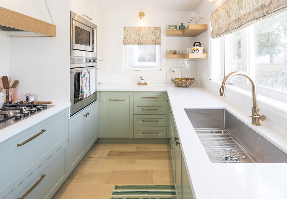
Sage Advice
After living with a white-on-white kitchen for so long, Elise was dying for some colour – and that’s exactly what Sabrina served up with these right-on-trend sage-green cabinets completed with attractive bronze hardware.
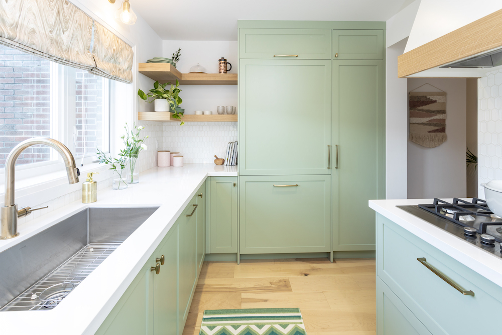
Skill Set
The floating wooden shelves, champagne-bronze kitchen faucet, and hidden fridge and freezer drawer all speak to Sebastian and Sabrina’s skill of turning functional elements into show-stopping design features.
HGTV your inbox.
By clicking "SIGN UP” you agree to receive emails from HGTV and accept Corus' Terms of Use and Corus' Privacy Policy.


