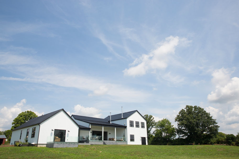
Tania and Dustin Kolesnik did what most of us only dream of – they packed up and moved to the country, the village of Bloomfield in Prince Edward County to be exact. Here they built a dream home for themselves and their two young children. Using their expertise as owners of County Collective (a creative space consisting of a retail shop and stunning boutique vacation rental) along with their penchant for Scandinavian design, they created a 2,400-square-foot modern farmhouse that puts a new spin on country life.
The Simple Life
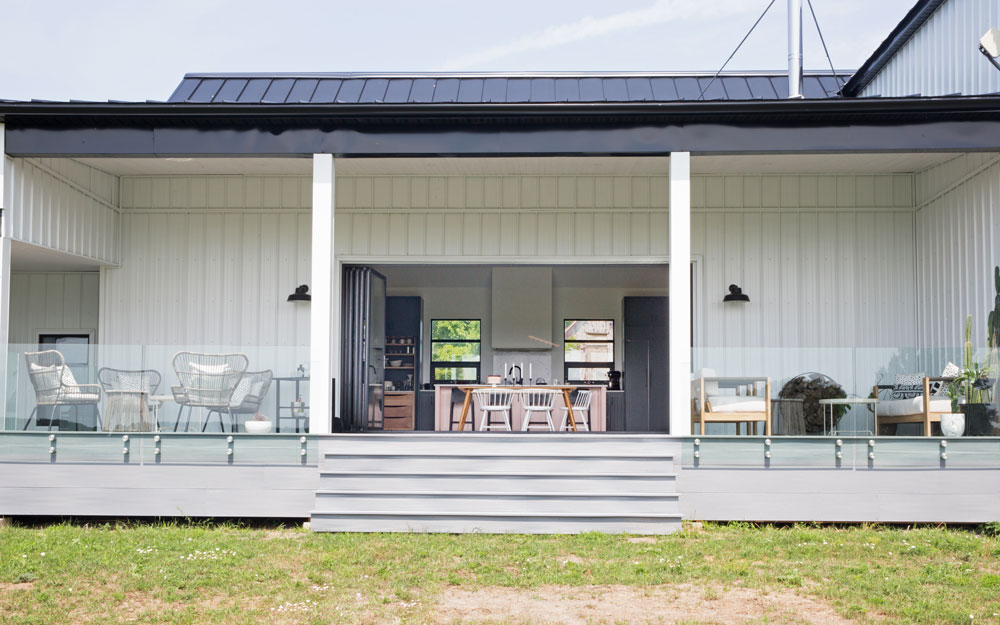
Balancing a restrained approach to design in a lush rural setting isn’t easy – go too modern and you can end up with something at odds with the landscape. Tania and Dustin knew exactly how to master the tricky equation. “We wanted an overall Scandinavian aesthetic but also to keep a touch of country as a nod to our amazing backdrop,” says Tania.

Compare and Contrast
Tania continued the minimal black-and-white palette indoors with a spiffy entryway that features smart seating and gallery-like graphic artwork. “The iron-and-wood bench was an awesome find from IKEA and the framed abstracts are by one of our favourite artists, Caroline Walls from Australia.”
The Heart of the Home
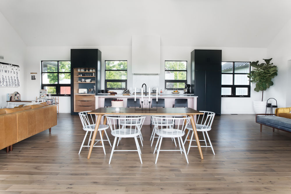
“Our main floor is an all-in-one living space,” says Tania. “We decided to place our dining table right in the middle and set our lounging areas on either side of the room. There’s something about gathering in the very centre of the space when we prep or sit down to enjoy a meal together that feels very grounding.” We love how the furniture isn’t pushed up against the walls and the way the flanking sectional and long bench demarcate the seating areas.
House With a View
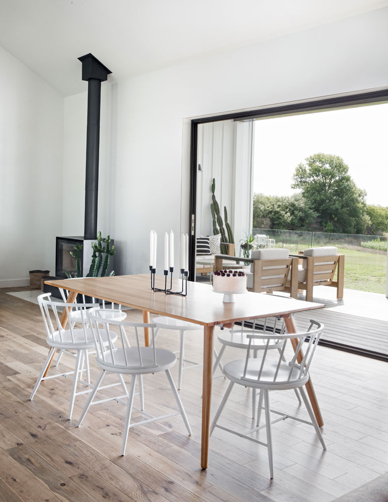
“A seamless indoor to outdoor transition was a high priority for us,” says Tania. “We invested in this beautiful wall that perfectly frames the gorgeous view from the back of our home.” It’s a splurge they don’t regret. “There’s nothing we enjoy more than opening up the big door and letting the fresh air fill our home!” Tania purchased the table (she loved its minimal lines) from Article and the white metal chairs from Wayfair.

Up Against the Wall
Such an expansive wall, as the one in this seating area, demands to be decorated, and Tania did so with Scandi minimalism in mind. “I chose this white shelving from CB2 because it looks like it’s melting into the wall. I love the height of them and how they can display so many interesting accents.” It’s an ingenious and budget-friendly way to stylishly fill in a large space with personality and items that have meaning.

Pass the Mustard
“These velvet chairs were a steal from Wayfair and we love the deep mustard velvet,” says Tania. “They’re kind of unexpected in the space but are so comfortable and eye-catching.” While the main floor is open-concept, Tania’s smart furniture placement creates cozy nooks. She says, “It’s nice to have more energetic parts of the room and more calming parts as well without having to be in totally separate areas.”
Fireside Tales
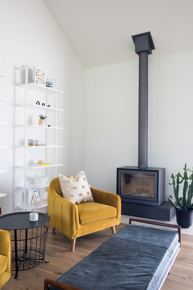
A wood-burning stove is essential in a country house, and this clean-lined one seems like it was custom-designed for the space. “It’s by Stuv and it does an amazing job of keeping us warm in the colder months,” says Tania. We love how she tempers this cozy space with something as unexpected as a cactus. The pom-pom cushions from are Tania’s County Collective pop-up shop.

Up Close and Personal
Though the shelves in the cozy seating area are perfectly styled, they are definitely not just for show. “I’ve filled them with books that we love, things from our travels and ceramics.” The bowl of fresh Ontario peaches has a painterly effect, and its fun and unexpected placement can be copied in any space.

Picture Perfect
Look closely, can you see the TV? The Samsung Frame television is set to a black-and-white photo of the family, which tricks the eye into thinking it’s artwork. Tania furthered the effect by augmenting it with black-and-white photos of the kids placed on a floating shelf hung in line with the TV. The tan leather Article sectional lends warmth and contrast.

At First Blush
In the world of design, “have fun with colour” is an oft-heard direction, but in real life, making it happen can be difficult, even for an expert like Tania. “Pairing beautiful dark matte green cabinetry with a fresh nude blush on the island was a choice I made last minute, as Dustin and I were nervous about how it would turn out. But, without a doubt, it’s been the best choice we’ve made!”

Home and the Range
Any cook worth her Larousse, knows this range is the holy grail of kitchen appliances. “It’s a matte black LaCornue and, though maybe a touch more traditional than other elements in the room, we’re really happy with how it’s become the focus of our kitchen and balances nicely in the space.” We love the signature brass hardware and how it pops here.

Raw Food
Tania isn’t afraid to mix materials, and this angle of three different finishes shows that she’s adept at cooking up contrast. “I just loved the idea of adding raw wood inserts with exposed shelves and drawers in our floor-to-ceiling storage. They’re a great complement to our hardwood floors, and they bring in another material to break up the deep green of our large-scale cabinetry as well.” All-one-colour-and-finish fans take note!

Open Kitchen
“The floor-to-ceiling storage has retractable doors that house open shelving and a coffee station, as well as some pull out drawers,” says Tania. “We love putting our favourite ceramics by local artist Cylinder Studios on display here and keeping the doors open for everybody to enjoy.” The dark-green wall has continuity with the cabinets and highlights the gorgeous pale ceramics and the classic Smeg toaster.

Stylish Hoodie
Range hoods are a kitchen necessity
, but not always easy on the eye – Tania had a remedy for that. “I decided to drywall our range hood and let it melt into the back wall, then painted it the same white shade. I love how it brings an architectural element to the kitchen.” Another stylish idea that works in any space.

Get Back
Continuity is key in great design and Tania ensured the kitchen was on board. “The backsplash is the same as the countertop, White Attica by CaesarStone. I didn’t want to get caught up in the intricacies of tile so I made a big impact by putting up a slab on that back wall.” Bonus: there’s no grout and it’s super easy to clean.

Hanging Out
Who says bedside lights have to be beside the bed? Tania hung hers from the ceiling for an original placement that’s practical and pretty cool. She was just as inventive with her art placement. “I was playing around with options and temporarily propped them up on our side tables,” she says. “There was something about how casual they looked leaning on our wall that appealed to us. We may hang them one day, but for now we really love the vibe it gives to the room.”

Old Meets New
Great rooms are never homogenized or all-new, and usually boast items that are a lively contrast to the overall decor. In this instance, it’s these wonderfully simple chests used as bedside tables. “They’re from Crate & Barrel and have been with us for a couple of moves now,” says Tania. “We love the brass hardware and the fact that they have so much storage. They bring some character into the space and have a rustic feel.”

White Room
This bath is both dreamy and super cool. “We decided to have an all-white bathroom but really wanted to add some texture by using varying scales of tiles,” says Tania. “The larger scale herringbone spanning the back wall gives the room height and huge impact.” She tempered the cool white and sharp lines with a showstopper natural element.

Penny Bazaar
“Dustin and I have always loved penny-round tiles so we decided to cover the entire floor all the way up the vanity ledge with them. We’re in love with how it all ties together, and our master suite is easily one of the favourite spaces in our home.” The fixtures are grey-toned brass, which Tania chose for their masculine look and industrial lines.
Family Ties
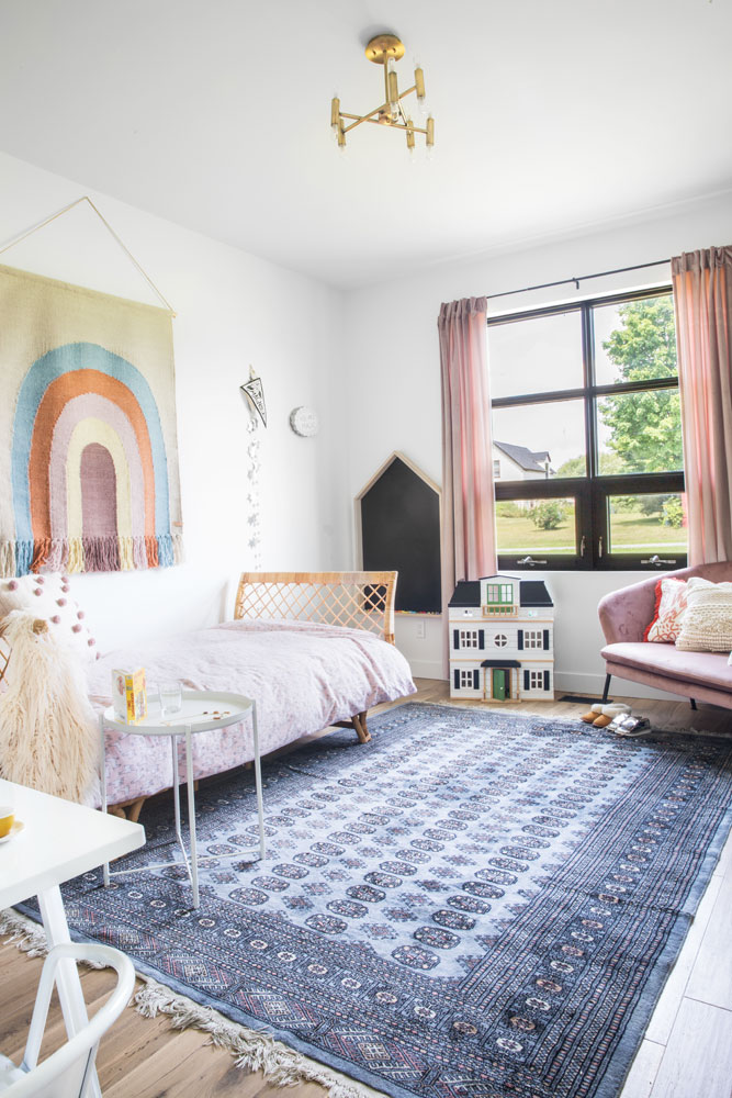
This bedroom is a shortlist of great design as it appeals to its 4-year-old resident Magnolia just as much as it does to any adult. The key is a mix that is kid-friendly without being kid-centric. “We found her chandelier from Wayfair and think its deco lines are kind of unexpected in a little girl’s room,” says Tania (more importantly, Magnolia loves it!). The vintage area rug was the first item chosen for her space. “I played off its muted blue tones, blushes and mauves.”

Under the Rainbow
“We found this rainbow wall hanging in Ottawa during our travels and Magnolia actually picked it out! The muted tones and the rainbow are a really bright and cheerful focal point in her room.” The rattan day bed from Serena and Lily lends a vintage feel to the space.
Play Day
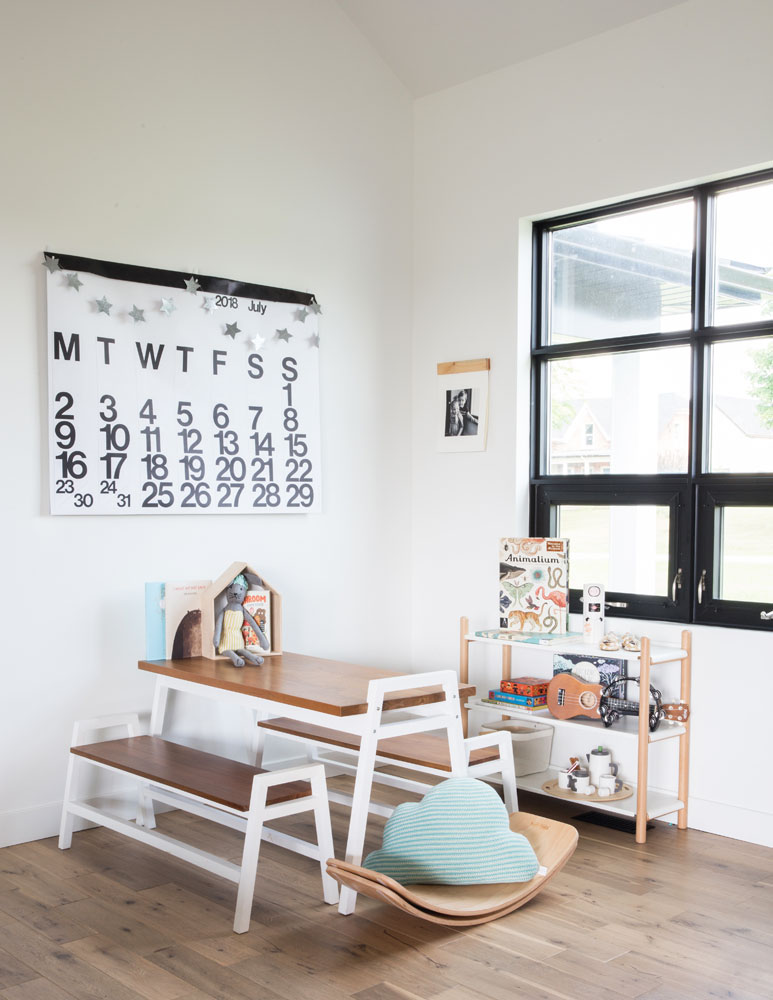
It’s hard to believe this children’s area is in plain sight on the main floor, and yet it doesn’t compete with the design or scream “play room.” Tania says, “The play nook is a nice way to incorporate our kids’ most beloved items into our everyday lives. I chose a deco teak table and benches where they do lots of colouring and arts and crafts.”
Ready to Relax
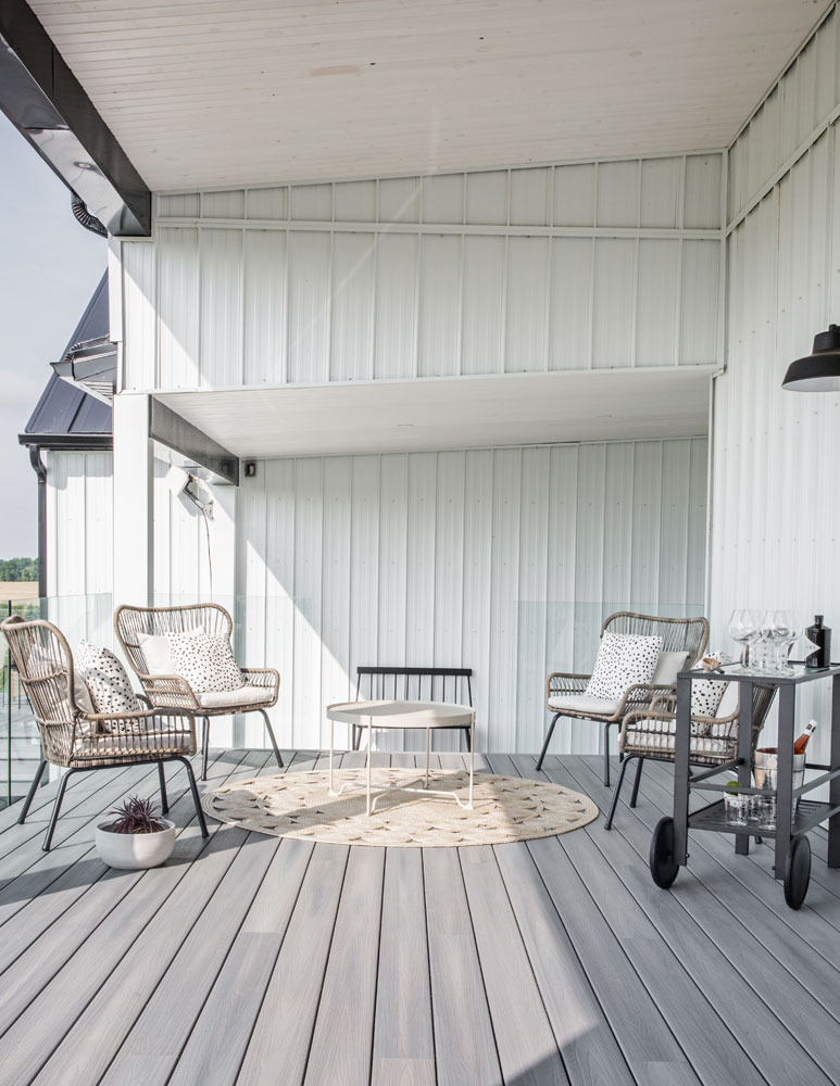
Outdoor furniture needn’t be pricey or formal to create a welcoming effect. “Ours is actually mostly from Target,” says Tania. “We didn’t want to get anything too precious as we really love to encourage the kids to play freely while they’re outside.” The sleek bar cart is a grown-up addition and makes alfresco entertaining that much easier. We love the round area rug as a contrast to all the straight lines.
County Setting
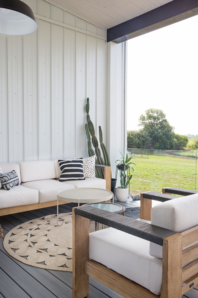
With a “backyard” like this, nothing should interfere with the view. “Dustin and I decided on glass panels off our back deck as opposed to a traditional railing as we really wanted to keep the incredible views as unobstructed as possible.” says Tania. And if it looks idyllic from a city point of view, that’s because it is. “We’re pretty secluded except for our one next door neighbour, Fred. Our land is a cutoff of his farming land, and he’s become a wonderful family friend!”
The Simple Life
The dream house that began as a drawing on a napkin is now a reality, and Tania and Dustin couldn’t be happier making it their family forever home shared with their Bernese mountain dog Leah, their four chickens and colony of honey bees. See, don’t you want to live in a country house now?
HGTV your inbox.
By clicking "SIGN UP” you agree to receive emails from HGTV and accept Corus' Terms of Use and Corus' Privacy Policy.


