Located just north of the city’s main core, Montreal’s Plateau Mont-Royal neighbourhood is known for its bustling community and creative vibes – which makes it something of a dream spot for Edmund Lam – Creative Director for tech-fashion start-up Sheertex – to call home. Since moving into the 850-square-foot home in May 2020, Edmund has used his creative experience to curate an artful mix of personal touches and purposeful design. The result is a sophisticated living space that dances with minimalism, without sacrificing an ounce of comfort or charm. Check out the video tour here.
The Right Space
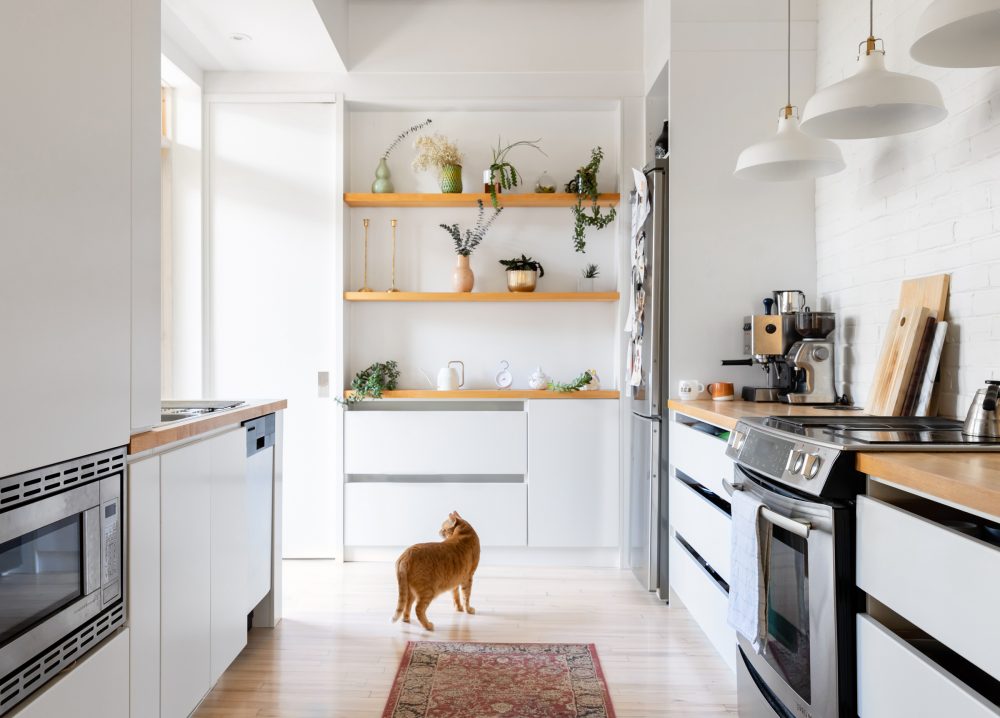
Built in around 1900, the home’s convenient central Plateau Mont-Royal location was a major pull for Edmund, his girlfriend, Kate, and his son, Arthur. “We just love that we’re able to have our dream home be so close to the action,” Edmund explains. While the location was ideal, however, the interior truly sealed the deal. “What drew us to the space is how open, uncluttered, and well-thought out the space is.”
Related: This Narrow Montreal Townhouse is a WFH Dream Brimming With Luxurious Materials
Light and Bright
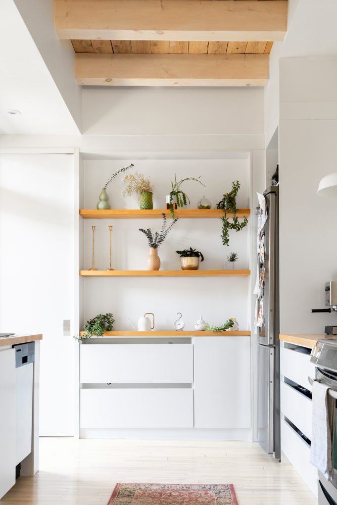
For Edmund, who describes his design aesthetic as Scandinavian modern and his furniture choices as moderately minimalist, the home came ready-made with the right bones. “The light woods, the high ceilings and the aesthetics were quite breathtaking for us,” he explains. “Also, for a relatively small space at 850 square feet, it feels remarkably roomy.”
Related: From Kitchens to Living Rooms: Minimalist Design Style Ideas, Room By Room
A Fresh View
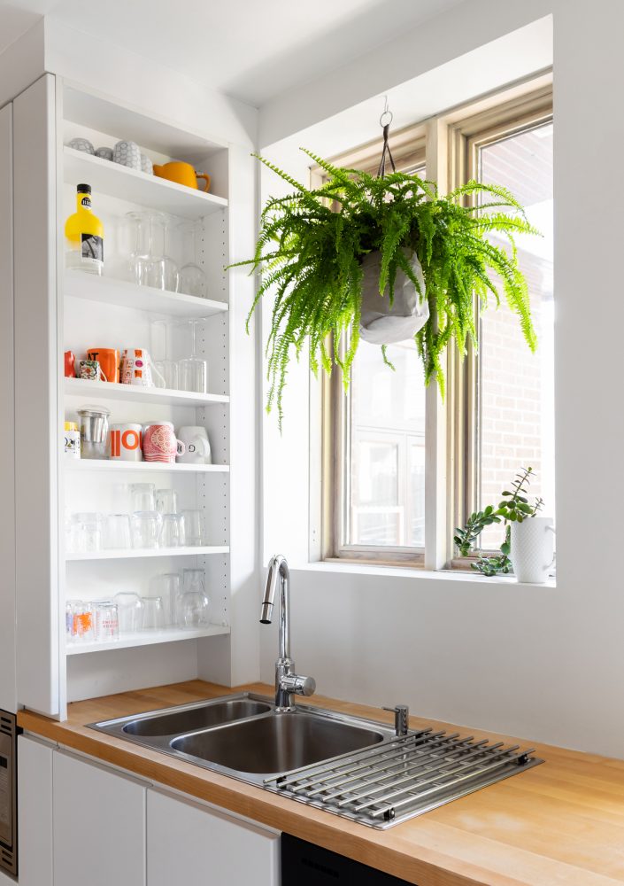
With soaring ceilings, sleek white cabinetry and light-wood countertops, the kitchen epitomizes this modern-Scandi feel. Here, green plants bring a pop of colour and nature to the space for warmth. Narrow shelves beside the sink keep cups organized, yet accessible.
Related: 10 Kitchen Organizing Tips That Practically Do the Cleaning for You
An Inviting Cooking Space
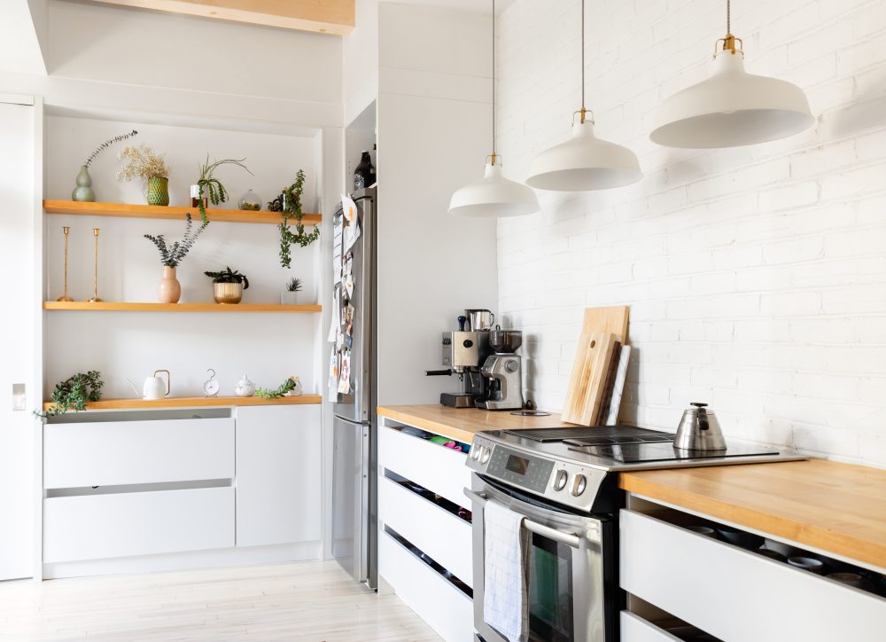
As Edmund explains, “While the space is somewhat minimalist, I’m a fan of keeping things warm and lived-in looking. I like pops of colour, textures and plants. It feels more inviting, where you’re not afraid to actually sit down and use things without worrying about disturbing anything.” Indeed, the clean white kitchen incorporates multiple textures (like the white brick above the stove) and shapes (like the trio of pendant lights with metallic hardware) for subtle dimension.
A Little Ribbit
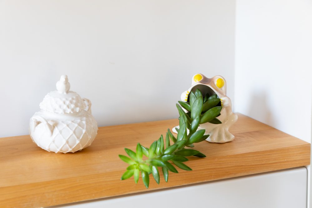
Minimal, of course, can be playful, too. The kitchen’s wall of open shelves display a variety of green plants in an array of unique vases and containers – like this fun frog.
Related: The Best Indoor Plants for Every Room in Your House
Room for Art
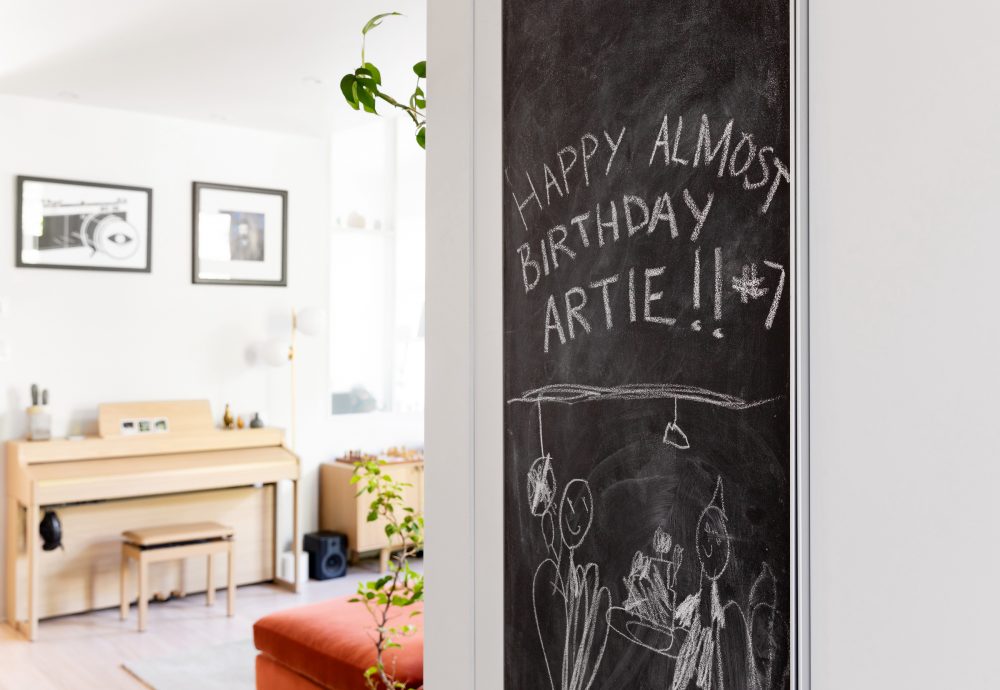
The home’s common spaces feel open and spacious, with the kitchen flowing into the living room with ease. Here, a chalkboard makes space for a creative welcome as you move into the living room.
Related: This Artist’s Montreal Work-Live Space is Full of Artwork, Plants and Plenty of Bright Ideas
Room for Living
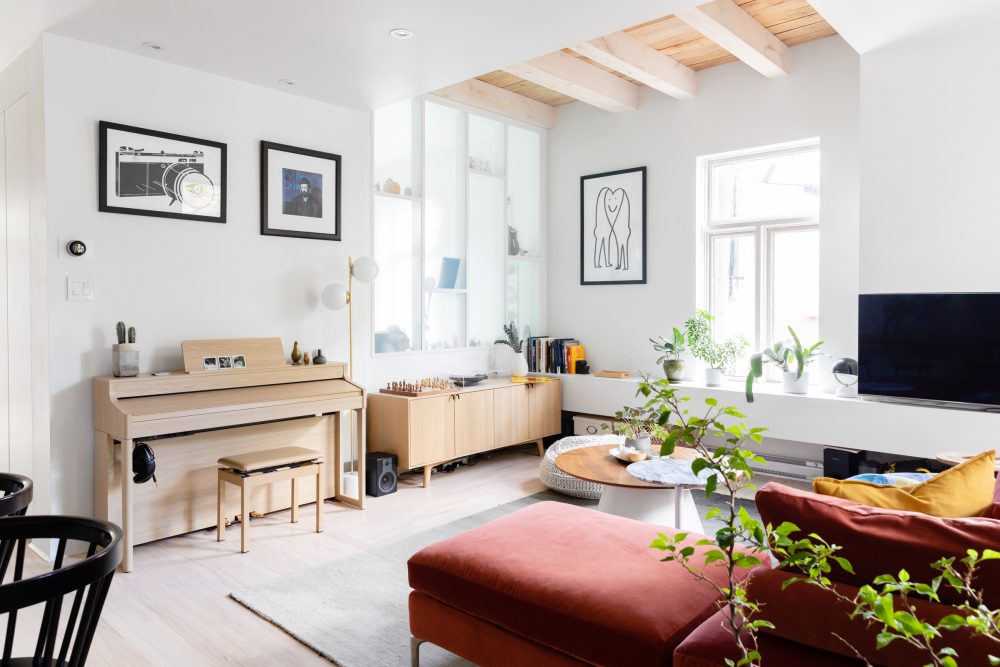
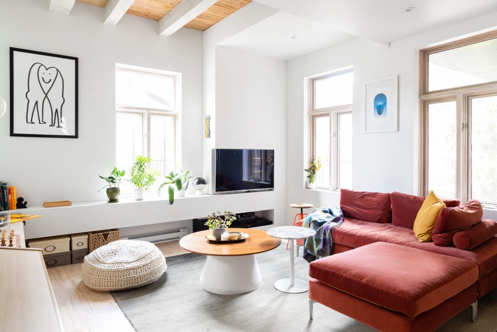
For Edmund, Kate and Arthur, the living room is the heart of the home. “This is for sure the place we spend the most time in,” Edmund says. “We wanted it to flow design-wise into the hall, the dining area and the kitchen – all while feeling like its own cozy space.” The walls display a mix of Edmund and Kate’s existing art, including a camera print by Montreal illustrator Raymond Biesinger, a framed heart smiley by artist Cath Laporte and a Picasso print from the blue period. “I like the contrast of something very illustrative and graphic with something painterly and more classic.”
Checkmate
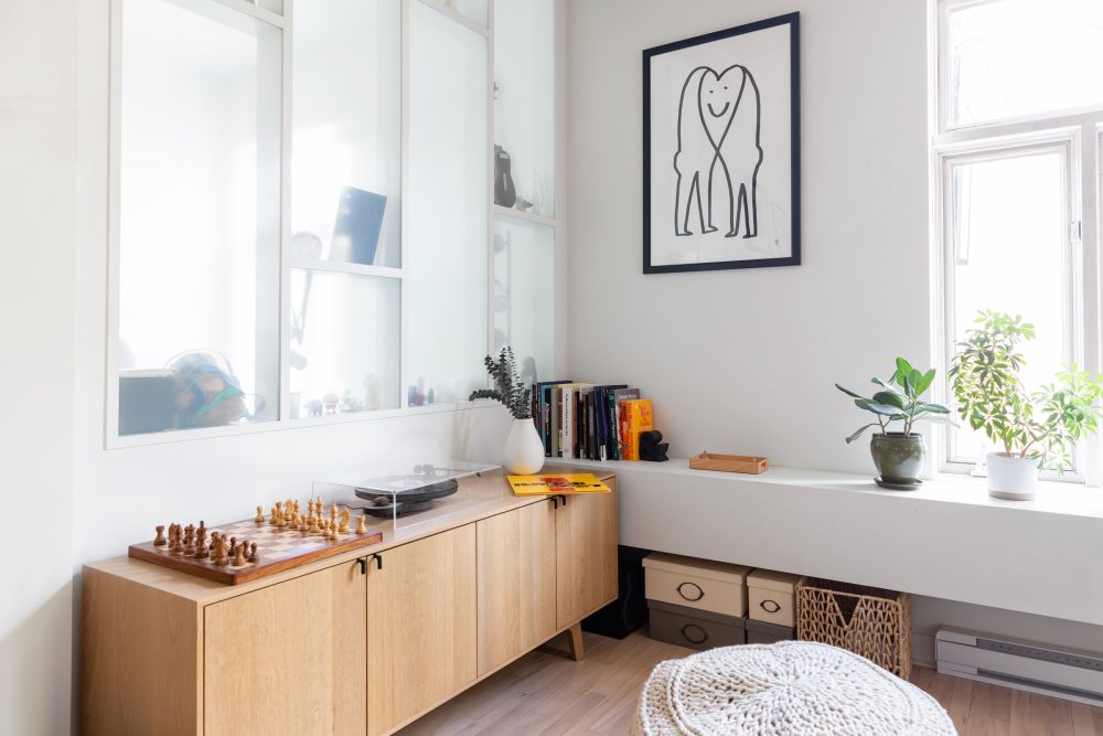
This corner plays to win when it comes to mixing fun and functionality. A perfectly sized Kastella cabinet adds storage and a home for a record player and chessboard. “The chessboard Kate bought me for my birthday after we watched The Queen’s Gambit, and after she learned I was in the chess club in elementary school,” Edmund says.
Proportion and Balance
There’s an art to selecting and arranging furniture for the living room. For their space, Edmund and Kate considered factors like colour, size and profile to create the perfect balance. The coffee table is from EQ3, and the knit ottoman is from a Montreal design boutique, Must.
Related: 14 Plant-Filled Living Rooms for Serious Decor Inspiration
Custom Seating
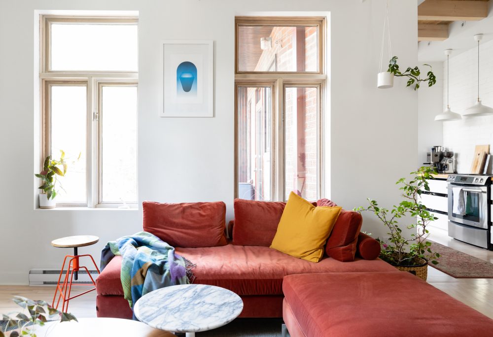
When it came to the sectional, Edmund and Kate struggled to find the right pick, so they came up with an innovative solution. “We love sectionals, but most were too big and disrupted flow. We basically hacked this chaise-longue from EQ3 by adding an ottoman to it – turning it into a compact low-profile sectional.” The terra cotta colour is bold, but a great contrast to the white and light-wood in the room. “It added the warmth the space needed, and, no joke, it complements the colour of the plants.”
Related: 12 Sectional Sofas That Will Transform Your Living Room
A Sweet Note
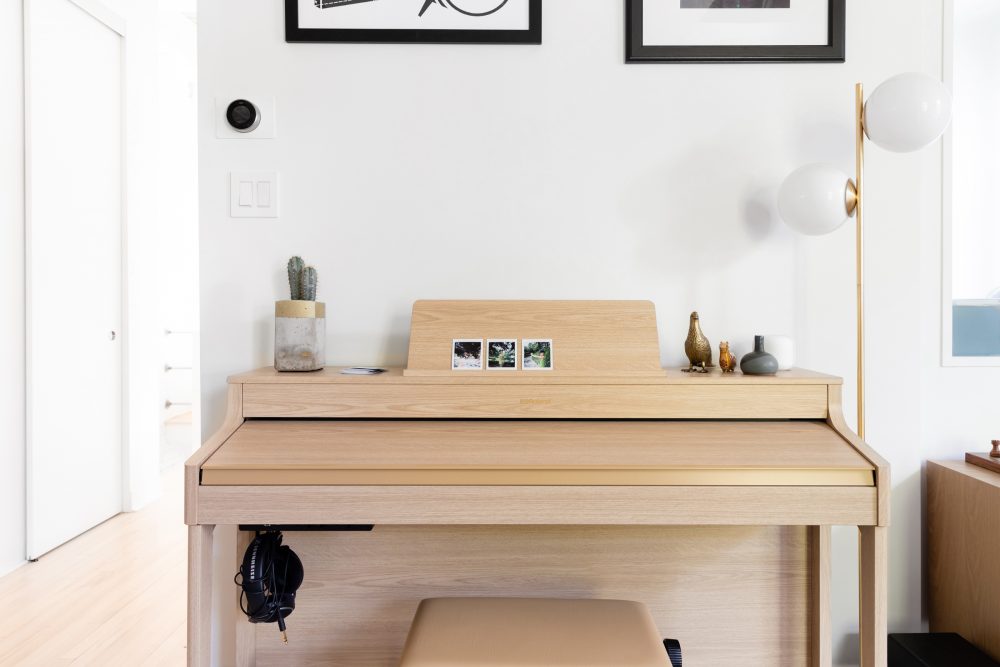
Music ebbs throughout the space, whether through the home’s six SONOS speakers or through instruments. “I once had a philosophy about having something musical in every room,” Edmund says. “That wasn’t deliberate with this place, but it basically happened anyway.” Here, a unique Roland white oak piano complements the room’s decor – and it’s an ode to Edmund and Kate, who both play. “We had two full-size pianos when we first moved in together, Edmund explains. “That felt unnecessary, so we sold those, and got one we both loved. Something that had a parlour piano analog feel (for me) and an electric one that Kate was used to.”
Little Treasures
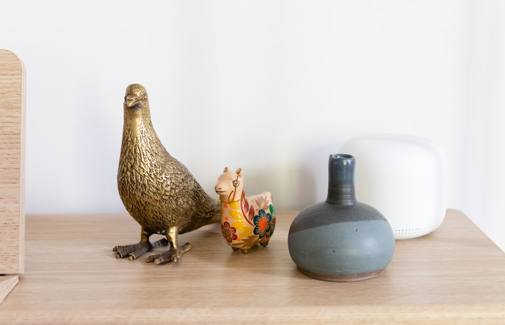
The piano also doubles as a stylish place to display Edmund and Kate’s decorative items. “The gold pigeon I got from a street market in Hong Kong, and the llama was a gift to Kate bought from Peru.”
Related: A Look Back at Our Most Beautiful Home Tours of 2021
Time to Dine
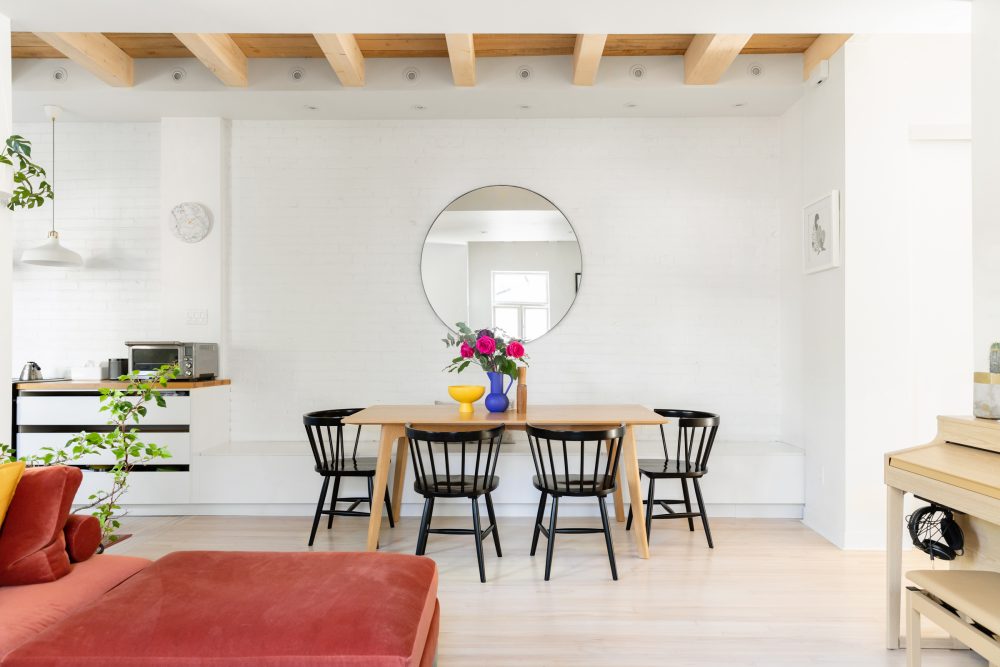
In the dining area, furniture and decorative items lend dimension to the otherwise neutral space. The star of the room is a long dining table from Kastella, designed in light wood that calls back to the light-wood ceiling beams and flooring. The table is surrounded on three sides with black chairs for a pop of contrast.
Related: 10 Unique Dining Tables That Are Perfect for Small Spaces
Colour Pop
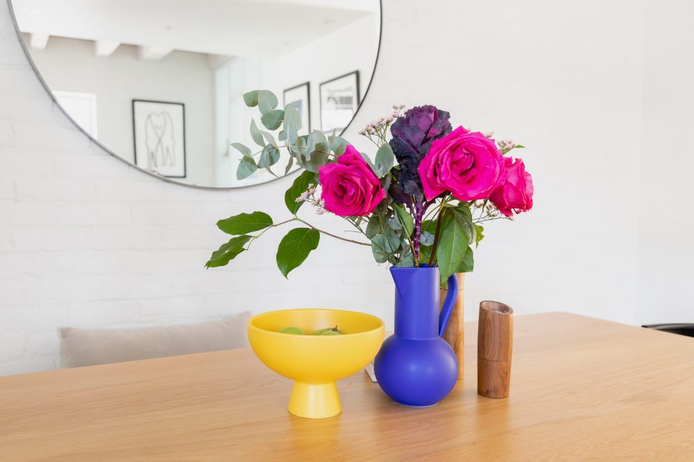
Atop the dining table, an array of different vases add vibrant colour to the tablescape. A large round mirror on the wall behind the table reflects light and further enhances the open feel of the space.
Related: This is How to Use Creative, Cool Decor to Create a Bespoke Home – No Renos Required
Purposeful Design
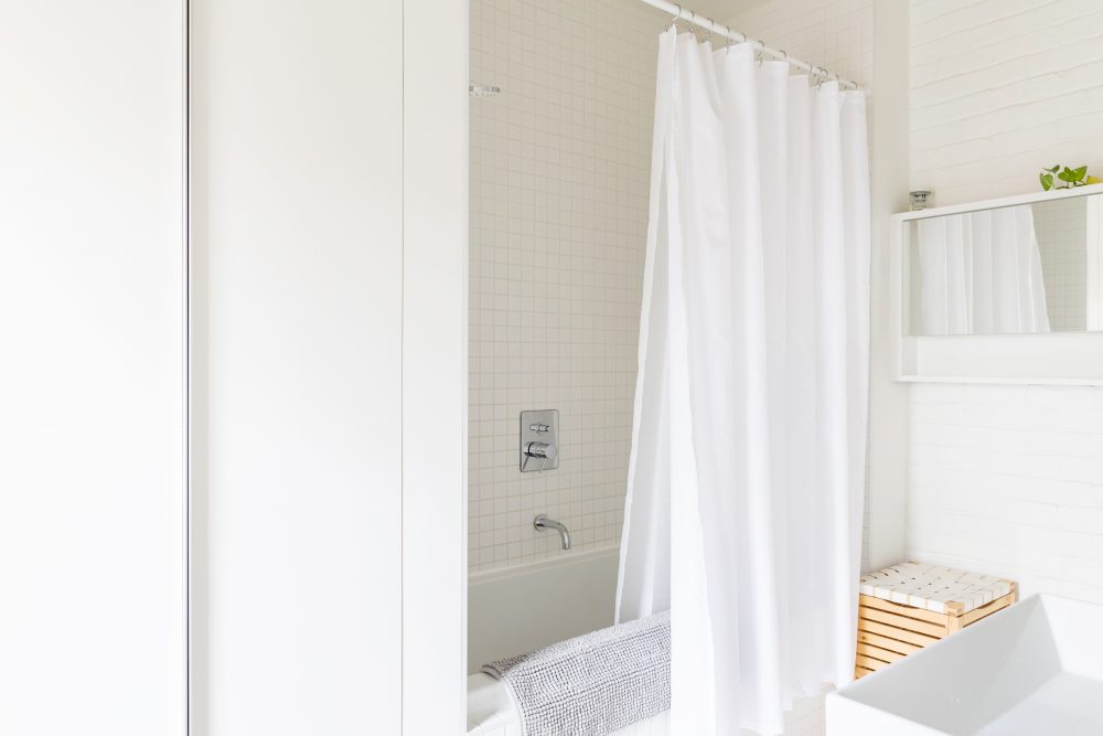
The bathroom is clean and refreshing – by design. As Edmund explains, the key to keeping the space comfortable and stylish is to think about experience by keeping things that are used everyday accessible, while storing less-used items out of sight. “Every additional thing that isn’t essential is there to make it feel more comfortable and warm – like the bath mat,” he says. “I always think about purpose – does this thing really need to be there?”
Related: Bathroom Design Idea Trends for 2022 That Will Stand the Test of Time
Hidden Gems
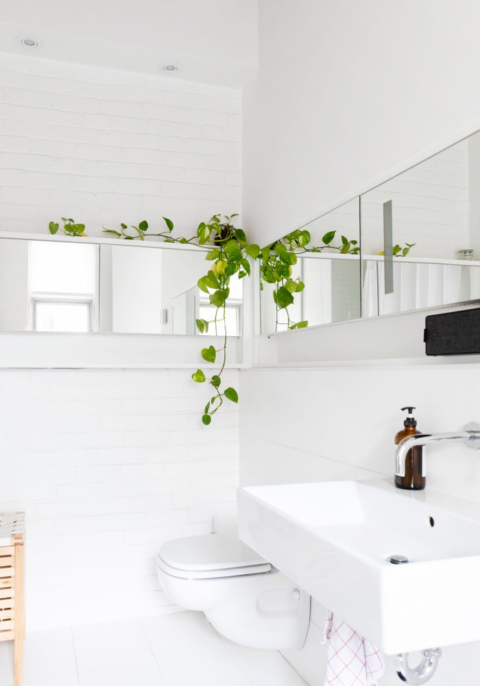
The wrap-around mirrors are an aesthetic fit for the bathroom, but – thanks to hidden storage – they also add necessary storage, while keeping essentials organized and out of sight. “All of our daily toiletries fit into them,” Edmund explains. “We have our own his-and-hers shelves, super practical and keeps things clutter-free.”
Related: How to Organize Your Bathroom Like a Designer – No Matter How Small it Is!
Smart Solutions
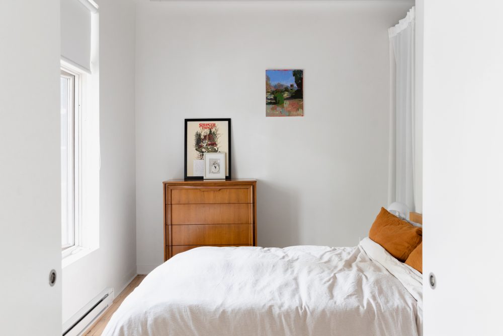
With no doors on the closets, the bedroom presented a unique challenge when it came to storage. “If there’s a space to hide your metaphorical skeletons, it’s the bedroom. But alas, we couldn’t,” Edmund says. The solution? They audited their belongings to declutter, and they put up curtains. Art also adds a personal feel to the space, with a colourful painting on the wall (created by a friend) and a Stranger Things print on the dresser (an ode to a show that Kate worked on as a VFX artist).
Related: 10 Small Bedroom Ideas That Will Make Your Room Way More Functional
Little Luxuries
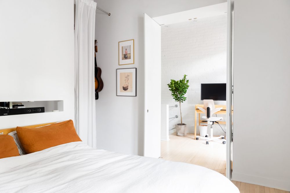
The bed is super cozy with a combination of linen pillowcases and an IKEA duvet cover. Behind the bed, a cutout detail serves as a nightstand for items like glasses and phones at bedtime, as well as providing a unique and fun feature. “We tucked a projector in there, and watch movies and play video games projected against the opposite wall,” Edmund says. “It’s the most luxurious, indulgent thing ever.” Outside the bedroom, Kate’s work-from-home space is bright and full of light.
Related: The 10 Softest and Most Luxurious Sheet Sets at Every Price Point
Work Space
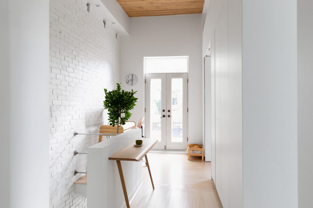
Kate’s work area fits in with the look of the home, but still has to be ultra-functional to accommodate her tasks. “She’s a VFX artist, so she needs a very big screen and a very powerful computer. All those things take up a lot of space that we didn’t have,” Edmund says. “So we mounted the monitor, and hacked her laptop with a very powerful graphics card to keep things small but powerful. Her desk closes up, so it keeps things looking very clean when she’s not working.”
Related: 15 Items Every Home Office Needs to Boost Productivity This Year
The Cat’s Meow
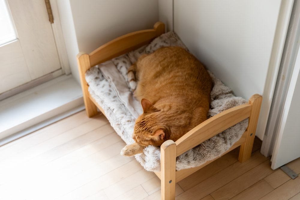
Tucked into the corner of Kate’s workspace, this cozy feline-friendly spot is a cozy retreat for the family’s two cats, Ernie and Oliver. “it’s a doll bed from IKEA,” Edmund says. “We saw it, and we instantly knew how to repurpose that. Oliver the cat just loves it.”
Related: 12 Stylish Pet Accessories Your Home Needs This Year (Ditch the Cat Tree)
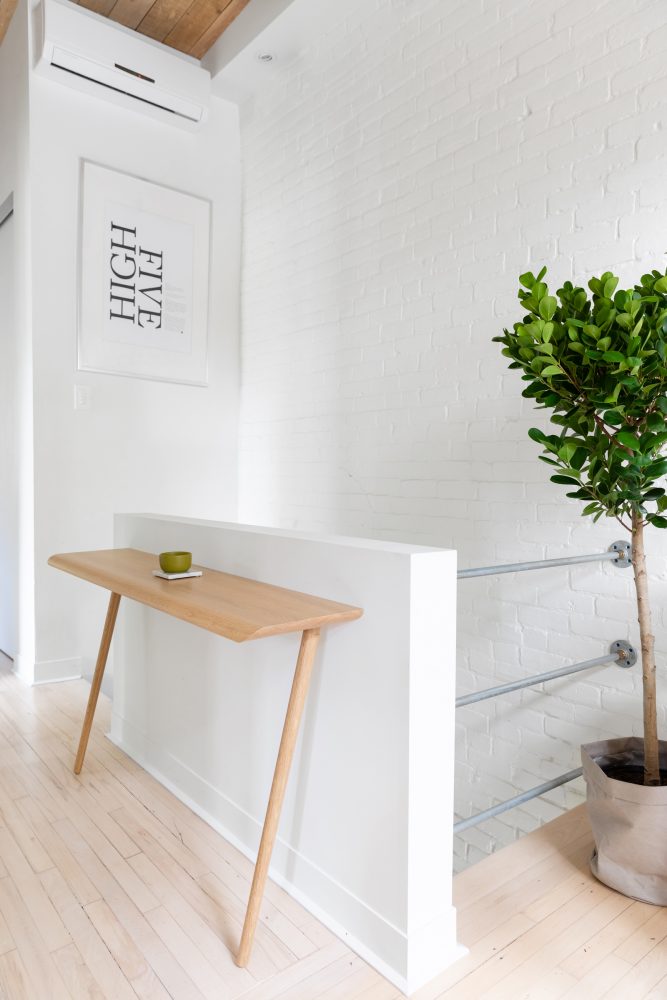
High Five
A two-legged table (also from Kastella) saves space while looking stunning. On the wall, a “High Five” poster is Edmund’s own design, which he created years ago for an agency he used to work for. “We were very goofy and enthusiastic. High Fives were kind of our thing.”
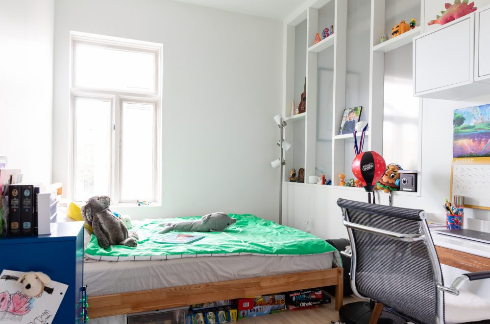
A Playful Space
It can be challenging to keep kids’ rooms fun, while keeping them organized. Here, Arthur’s room is a beautiful example of balance, with toys and photos adding pops of bright colour and charm to slim multi-level shelves opposite the bed.
Related: 10 of the Most Adorable Kids’ Rooms We’ve Ever Seen
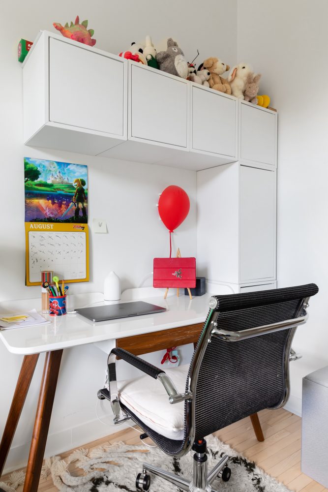
Inspiration Zone
Arthur’s desk and surrounding cabinets are sleek and clean, while soft toys and colourful accessories turn up the kid-friendly, creative feel. Underfoot, a cozy area rug adds plush comfort.
Related: Kids’ Craft Rooms Packed With Colourful Design Inspiration
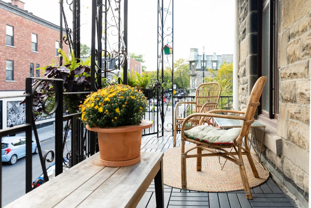
An Urban Escape
Just outside the bedroom, the patio – styled with a bench and table from a local boutique, VdeV, and a cozy L.L.Bean rug – offers a sunny spot to relax and unwind. “The design was really meant to be like an extension of our living space, but outside,” Edmund says. “We wanted this urban balcony to feel like a garden. We spend a lot of time out there in the summer – we people-watch, have a few glasses of wine and chat. We live just off a very busy and bustling corner in the neighbourhood, so there are lots of things to watch.”
Related: Want Some Fresh Air This Winter? These Patio Staples Are Perfect for Outdoor Gatherings
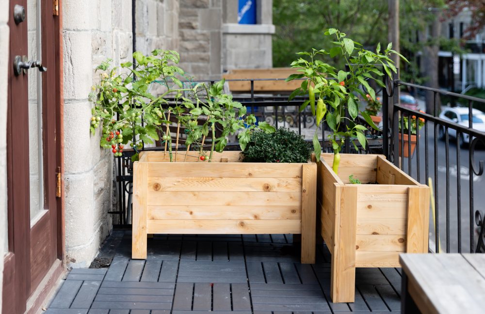
A Growing Garden
While the patio is compact in size, Kate – whose gardening prowess stemmed from her mom’s love for it – created a beautiful container garden in an underused corner. “It was a bit of a pandemic project to give this space a lot of life,” Edmund says. “It started with a few pots and it blossomed into a garden. We wanted vegetables too, as we had that corner that didn’t really serve any purpose. We found some planters from Facebook Marketplace that fit the space perfectly. I hacked off a few inches off the legs to get it to fit just right.”
HGTV your inbox.
By clicking "SIGN UP” you agree to receive emails from HGTV and accept Corus' Terms of Use and Corus' Privacy Policy.


