Having design expectations for a home that are at odds with one’s budget is a common enough conundrum. But while sacrifices are necessary, a little resourcefulness can also go a long way. Case in point? Couple Sophie and Tim, who envisioned moving into a brand new property with tons of modern features, despite their limited budget. So when the Property Brothers led the pair to a run-down duplex with a cramped layout, the couple wasn’t sure they had faith in the design vision. But in the end, Jonathan Scott gave the homeowners the modern, open-concept home of their dreams, complete with a brand new office and entertaining space. Here’s an inside look.
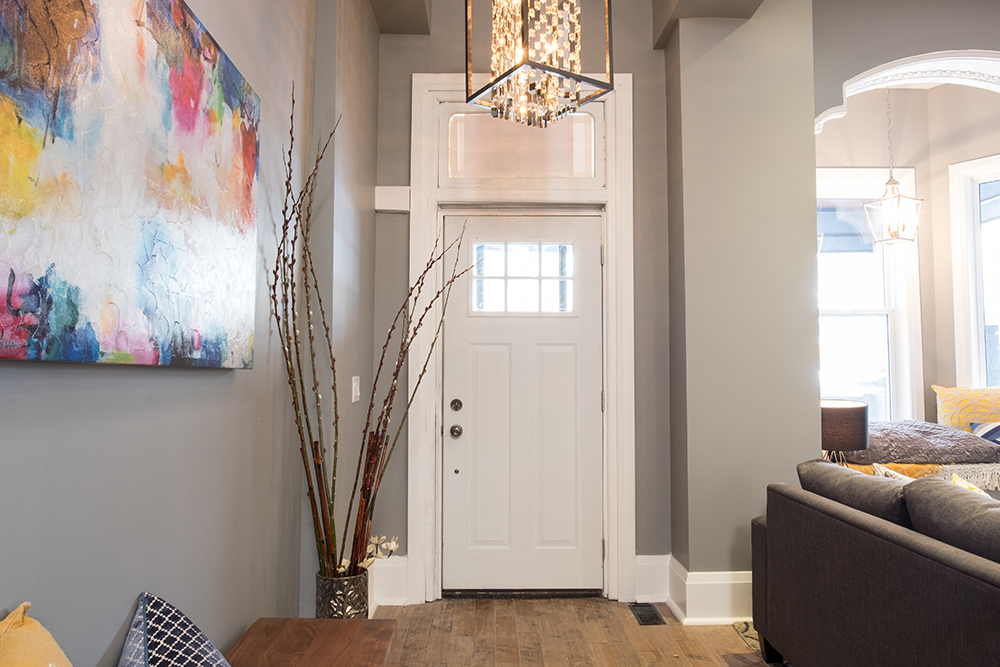
Bright Welcome
Set foot in the revamped front entrance and you’d never know this was the same house couple Tim and Sophie first laid eyes on. Extra-high ceilings and modern grey walls help open up the space, while rainbow-bright accents make for a cheerful welcome.
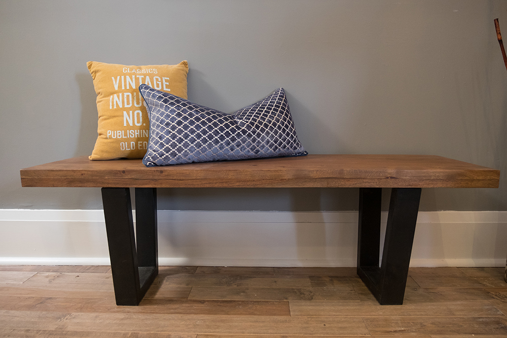
Crafty Bench
This sturdy bench is modern and understated thanks to its sleek black legs and simple wood seat. A few colourful throw pillows add coziness and character.
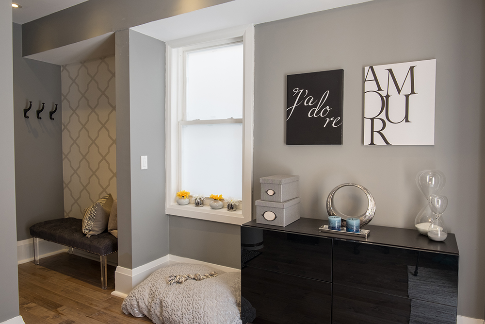
Modern Office
Jonathan transformed the old kitchen into a gorgeous office space for Sophie, who works from home. The space leads into the backyard where the couple’s dogs can roam about. Adding bench seating, wall hooks and a dog bed transform one corner into a makeshift mudroom.
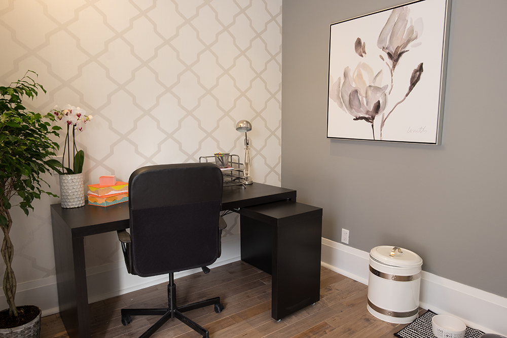
Modern Wallpaper
An elegant feature wall adds contemporary flair to the office thanks to its subtle hue and pretty pattern. Soft pops of colour introduced through plants and office essentials liven up the look.
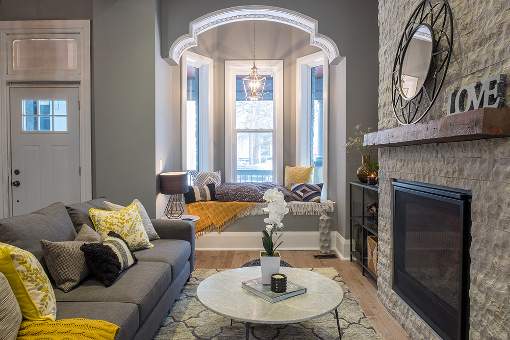
Beautiful Living Room
Jonathan kept some of the home’s original charm intact, such as this arched window nook, which he updated with bench seating and decorative moulding. While the space gets plenty of natural light, fixtures like the lantern-style chandelier and small table lamp create a relaxed ambiance when the sun goes down.
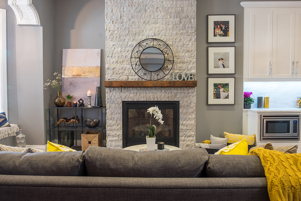
Updated Mantel
The homeowners had their hearts set on a wood-burning fireplace, but the bones of the house didn’t allow for it. So they opted for a natural looking gas version instead. The floor-to-ceiling stone surround and wooden mantel give the unit a more authentic, rustic feel.
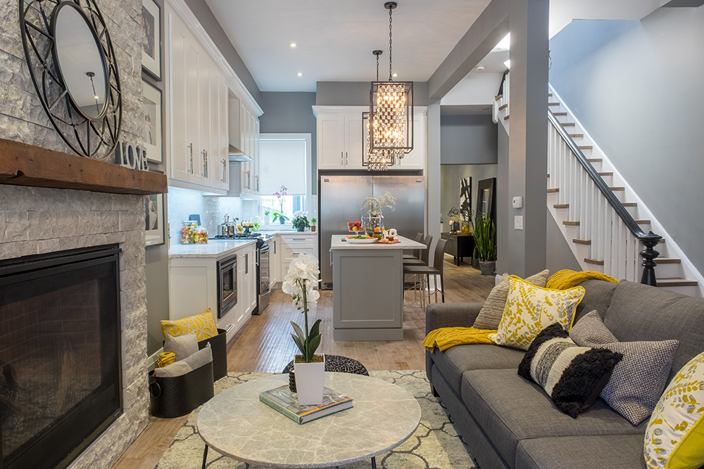
Open-Concept Layout
With the duplex walls removed and the structure reinforced, Jonathan created a gorgeous sightline from the living room through to the kitchen. He also updated the staircase with a fresh coat of paint, new spindles and refinished steps.
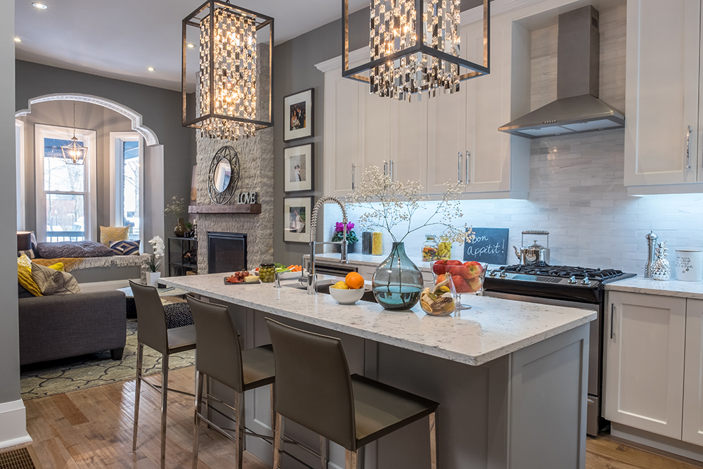
Island Life
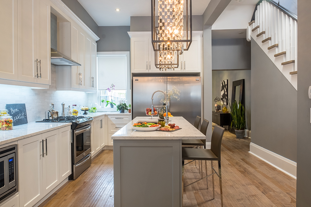
The open-concept kitchen’s large island is perfect for entertaining, and also acts as a casual eating area for the homeowners. Since square footage is limited, the cooking area’s galley layout maximizes space and function.
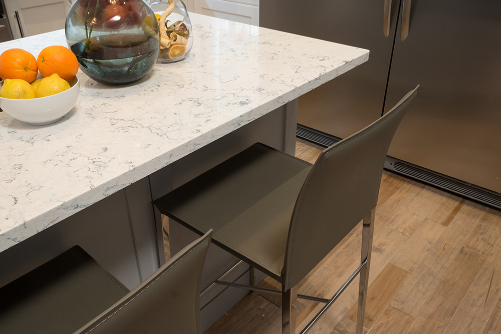
Better Finishes
The homeowners opted for a granite countertop, a choice that helped them save in terms of their overall budget while still providing that pretty marble effect. Modern grey bar stools with pretty steel legs polish off the look.
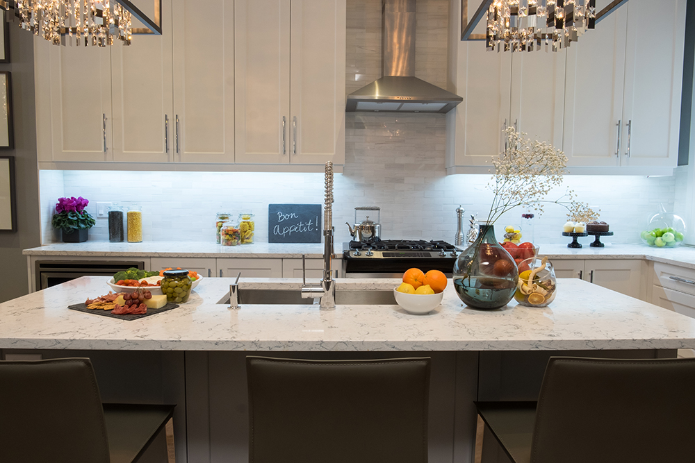
Elegant Backsplash
We love the white and grey brick-style ceramic tiles the homeowners chose for the kitchen backsplash. The glossy finish keeps the cooking zone polished and contemporary, while the soft hues help reflect the natural light to visually expand the space.
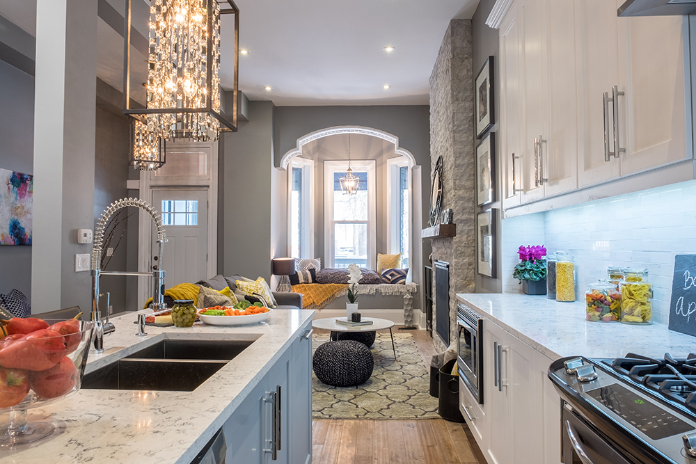
Extended Ceilings
It’s amazing how super-high ceilings can take a space from confined to capacious. The lofty window nook helps open up the living area and allows the homeowners to admire the outdoors, even while standing in the kitchen.
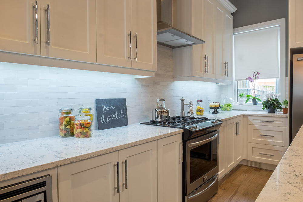
New Cabinets
There’s plenty of extra storage in the new kitchen, giving homeowner Sophie more space to stow away her collection of small appliances. New stainless-steel appliances and cabinetry hardware elevate the room’s modern aesthetic.
Entertainer’s Dream
The home’s open-concept flow is perfect for hosting friends and family, since everyone has a place to congregate and hang out without ever feeling separated. We love the modern blinged-out chandeliers hanging above the island, which lend drama and definition to the space.
Modern Dining Room
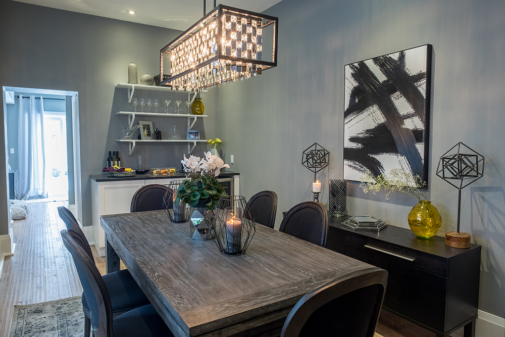
The dining area offers plenty of room to maneuver and entertain. Boasting a dark, moody palette and rich finishes, the space feels dramatic and sophisticated. The dining table also expands to ensure plenty of seating, while jet-black chairs tie in with the storage unit and abstract painting above.
Dry Bar
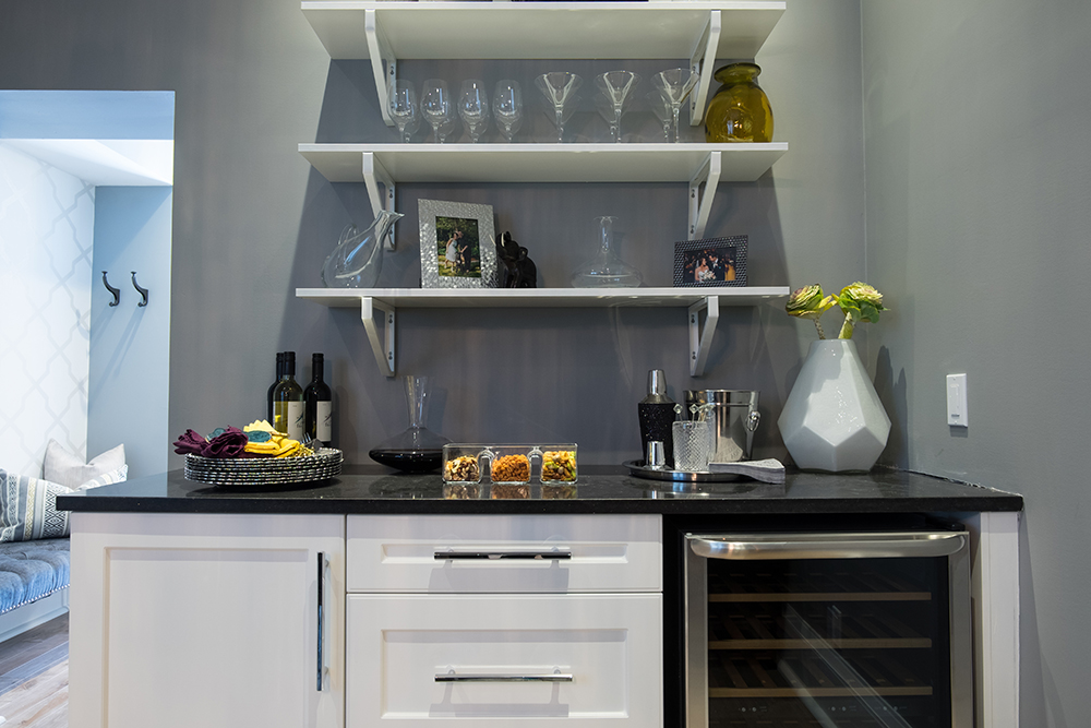
This is the perfect nook for a dry bar with pizazz. A built-in wine fridge makes entertaining a breeze, while pretty glassware and canisters add instant decor and appeal. Open shelving above and drawers below ensure there’s plenty of storage space, too.
Finishing Touches
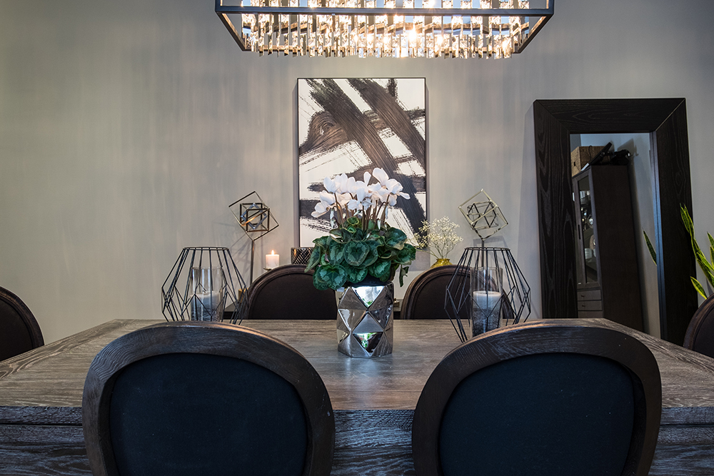
Sometimes it’s the smallest elements in a room that make the biggest design statement. Take the geometric candleholders and vase that adorn the dining table, bringing the furniture piece from boring to beautiful. Meanwhile, a large mirror leaning against the wall adds drama and creates the illusion of more space.
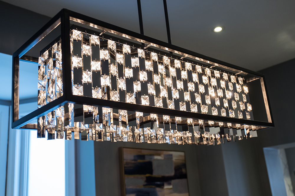
Light Show
The dining room chandelier corresponds to those in the kitchen, instantly connecting the two spaces. The light reflecting off the crystals adds enough glamour to make anyone feel like they’re dining in style.
Despite all of the structural problems Jonathan faced while renovating, he was able to give these homeowners a beautiful new home that met all of their needs, and then some.
HGTV your inbox.
By clicking "SIGN UP” you agree to receive emails from HGTV and accept Corus' Terms of Use and Corus' Privacy Policy.


