Laurence Marinacci might be said to take work home with him, in the most wonderful way. As co-owner of Montreal’s dynamic lifestyle boutique Buk & Nola, Laurence is a designer who excels at curating fabulous decor. So, when he and his husband Jeff built a new home for themselves and their three children (Matteo, 9, and 7-year-old twins Adele and Sofia), Laurence knew exactly what look he wanted. “An airy, bright and welcoming home made-to-measure for our active family,” he says.
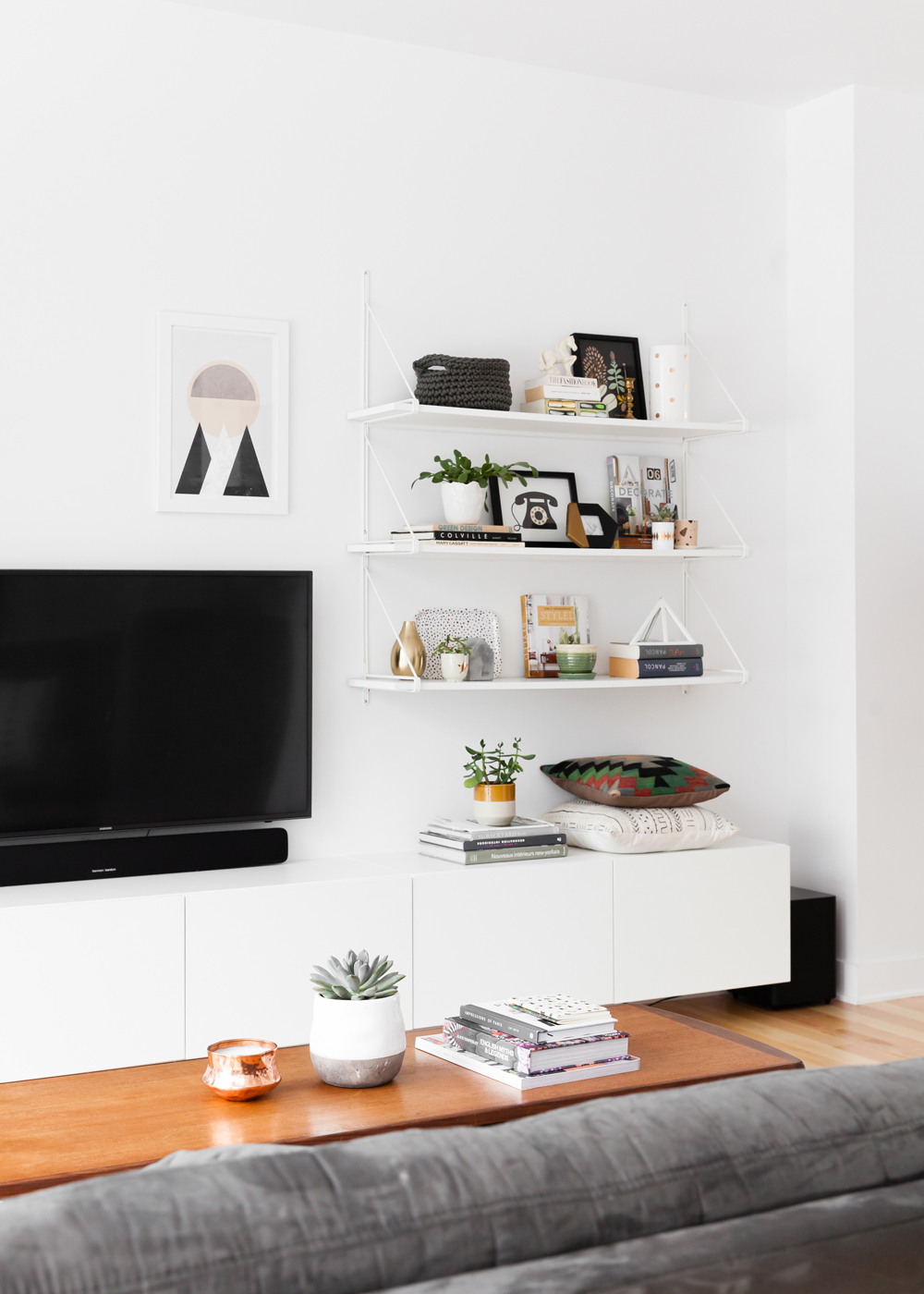
Screen Time
The TV sits in focal-point territory in front of the living area’s sofa, yet Laurence’s expert styling makes it feel more like a design feature. Artful black accessories and accents tighten the relationship between practical and pretty and we love the unexpected artwork just above the screen.
Related: Awesome Living Room Wall Art That Makes a Statement: Beyond Paintings and Photos
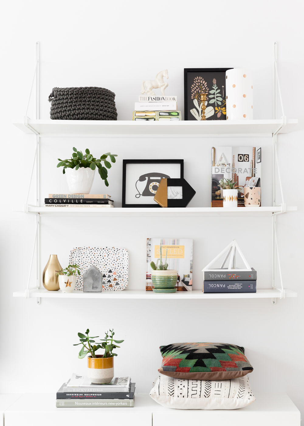
Levels of Interest
Ikea shelves liven up the living area and provide a stylish perch for books, a few antiques and accessories from Buk & Nola. Laurence’s panache for display is on display in this vignette that is chockful of ideas to copy – from styling each shelf in sections of three to adding nubby texture, flashes of metallics and pots of greenery.
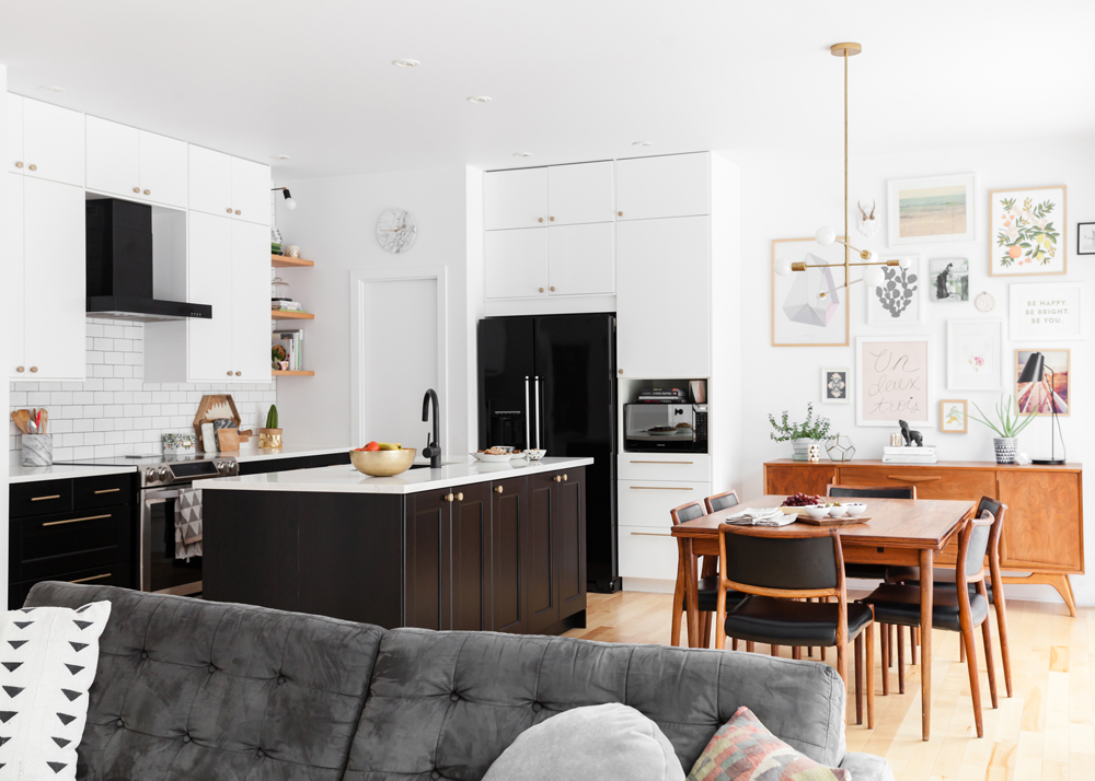
Modern Warm
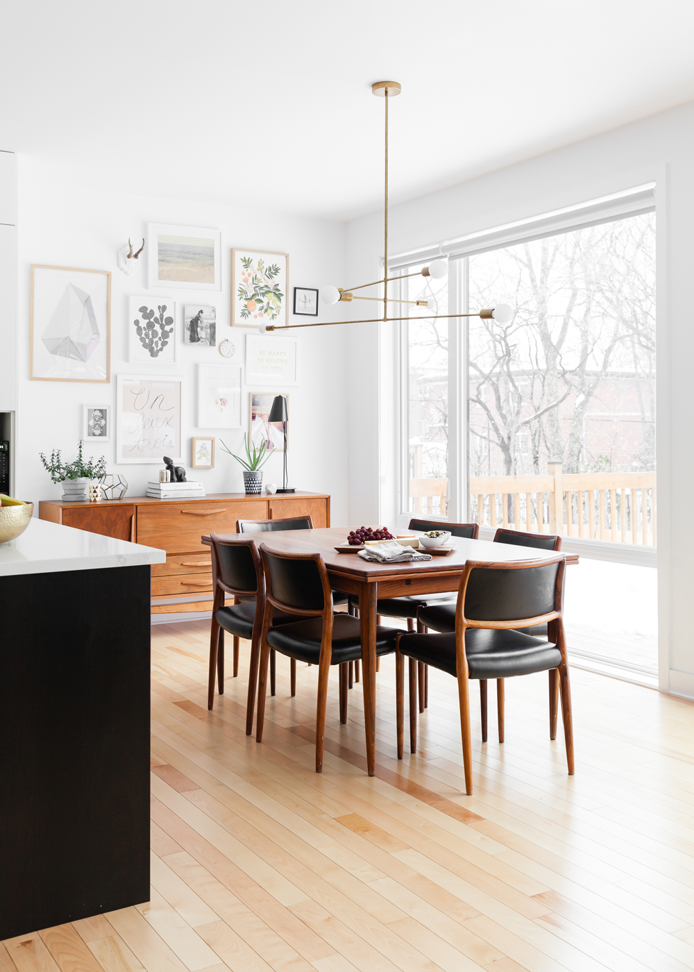
“Design wise, we were aiming for a Scandi mid-century-modern style,” says Laurence. The open-plan living and dining areas dish that up with a fresh mix of vintage furniture alongside a new kitchen that was thoughtfully designed, even down to the fridge. “We tried to stay away from stainless steel, so black was the best option and we love how it blends beautifully with the rest of the space.”
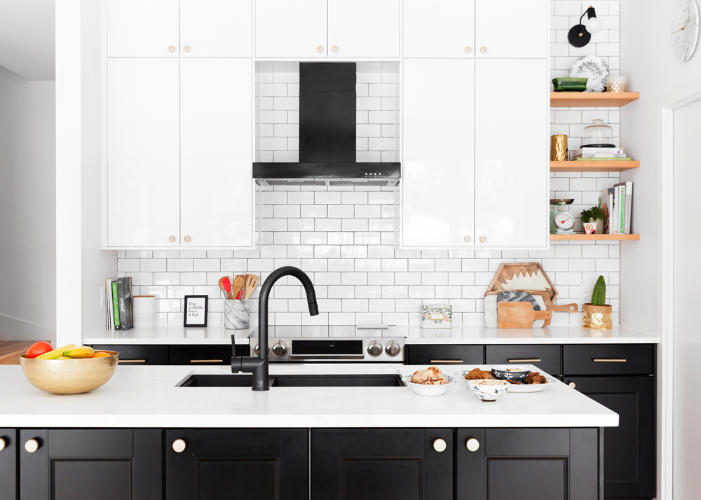
Save and Splurge
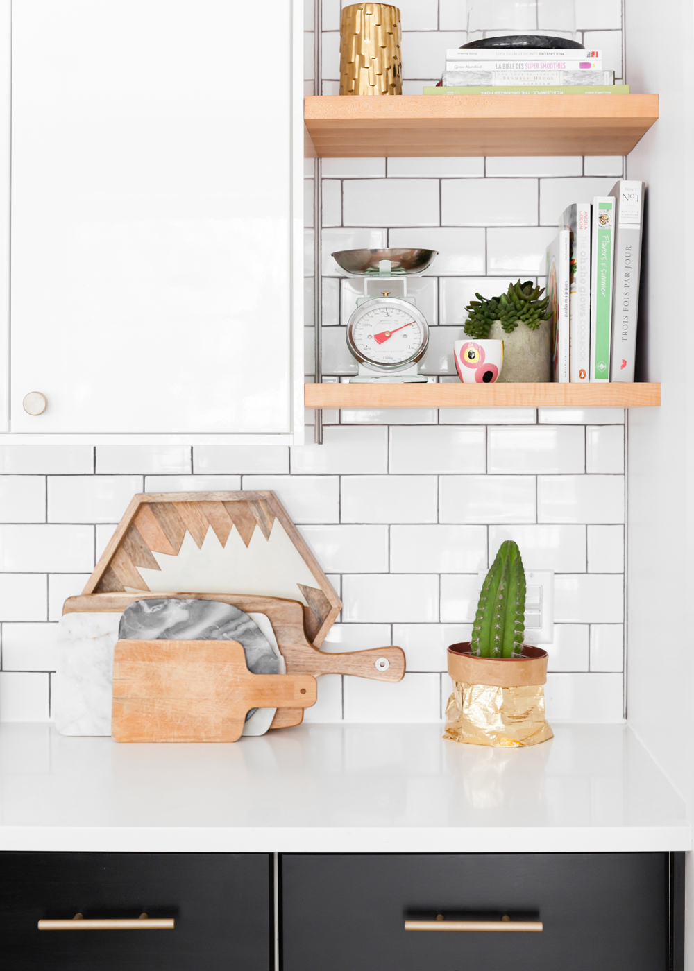
“For budgeting purposes, we decided to go with an IKEA kitchen,” says Laurence. “We then gave it a more custom look by mixing two types of cabinets and adding custom maple floating shelves, a mix of brass pulls and quartz countertops.” The couple also maximized storage space by adding cabinets to the island.
Related: 12 Ways You Can Organize Your Kitchen Like Marie Kondo
Recipe for Style
Laurence opted for a backsplash of subway tiles. “I wanted something timeless and simple,” he says. “We both like the contrasting effect of black and white and adding texture to it with the accessories like wood cutting boards, books and plants. The maple shelves are a great way to include even more kitchen accessories.”
Scandi Handy
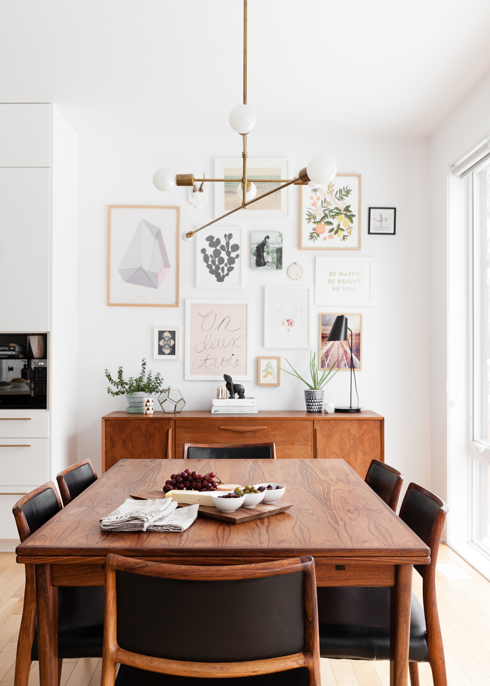
“I was lucky enough to inherit this dining set from my grandfather,” says Laurence. “It is an original rosewood piece that was made in Denmark. We found the teak sideboard on the streets! Just needed a bit of refurbishing and voilà.” A contemporary brass pendant light has a warm presence that doesn’t compete with the gallery wall or handsome table and chairs.
Related: 15 Dining Room Lighting Ideas That’ll Shine in 2020
Frame Game
To make a statement and take advantage of the ceiling height, Laurence devised a high-impact gallery wall in the dining area. “It’s a great way to incorporate colour and personality,” he says. “I used a lot of prints from my shop mixed in with personal photos and pictures.”
Related: Sarah Baeumler’s 7 Gallery Wall Tips That Will Make Yours Look Like You Hired a Pro
High Low
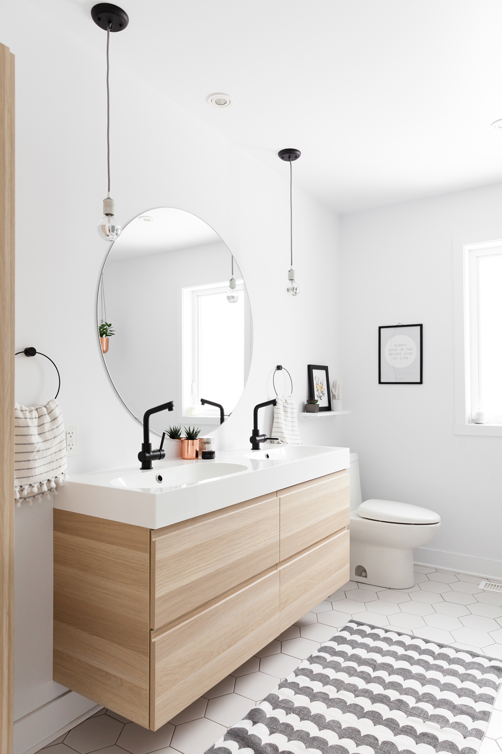
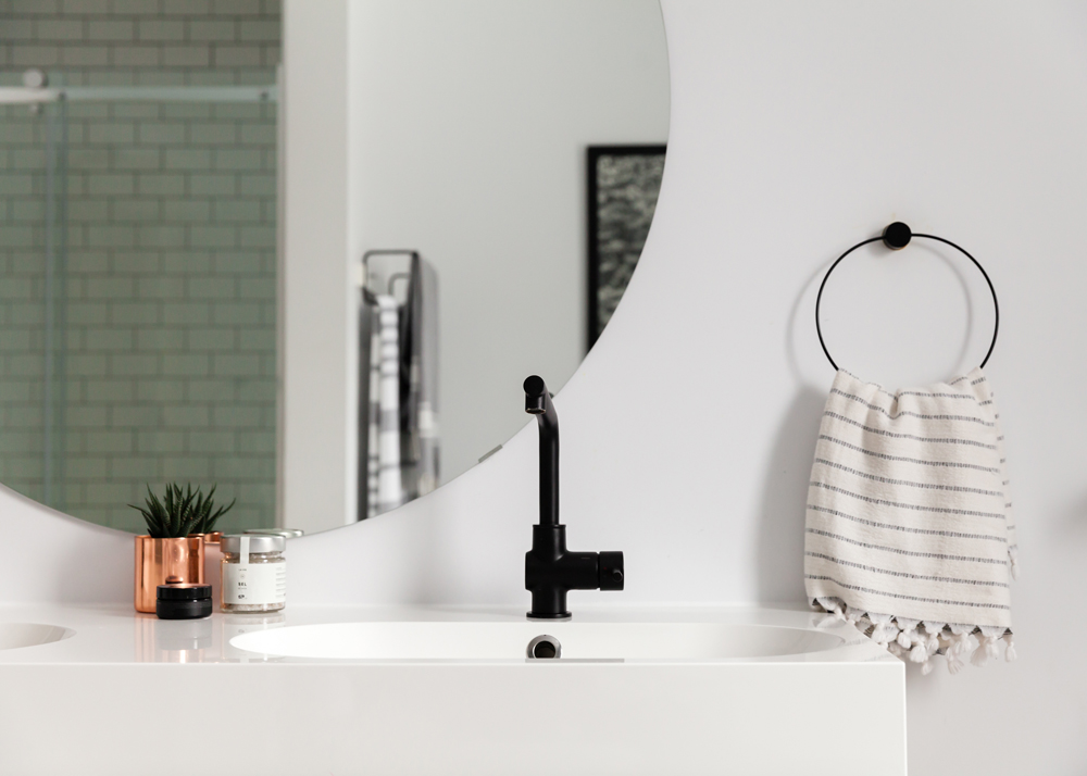
The bathroom pays savvy homage to budgeting with an ingenious mix of items, from the splurge-worthy custom-made mirror to the Ikea vanity and faucets. “We wanted a minimal and simple look here,” says Laurence. “I love that we chose dark grout for easy cleaning.” We love how the lights are suspended for an airy, minimal effect.
Related: 12 Modern, Minimalist Bathroom Ideas to Inspire You
Rinse and Repeat
The choice of the towel holder here is noteworthy. While a small bar or hook would suffice, the repetition of a circular silhouette ties in nicely with the statement mirror for cool cohesion.
Related: 13 Ways to Stylishly Store and Organize Your Toiletries
Sweet Dreams
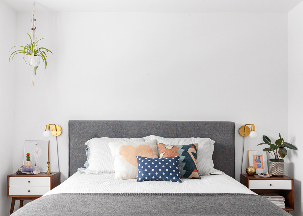
The master bedroom is invitingly furnished yet also shows careful restraint. We love how Laurence didn’t feel compelled to fill in the wall space above the bed. Symmetry and an unexpected element – a hanging spider plant – conjure all the dreamy styling required.
Related: The 20 Best Bedroom Plants to Help You Get a Better Sleep
Light Fantastic
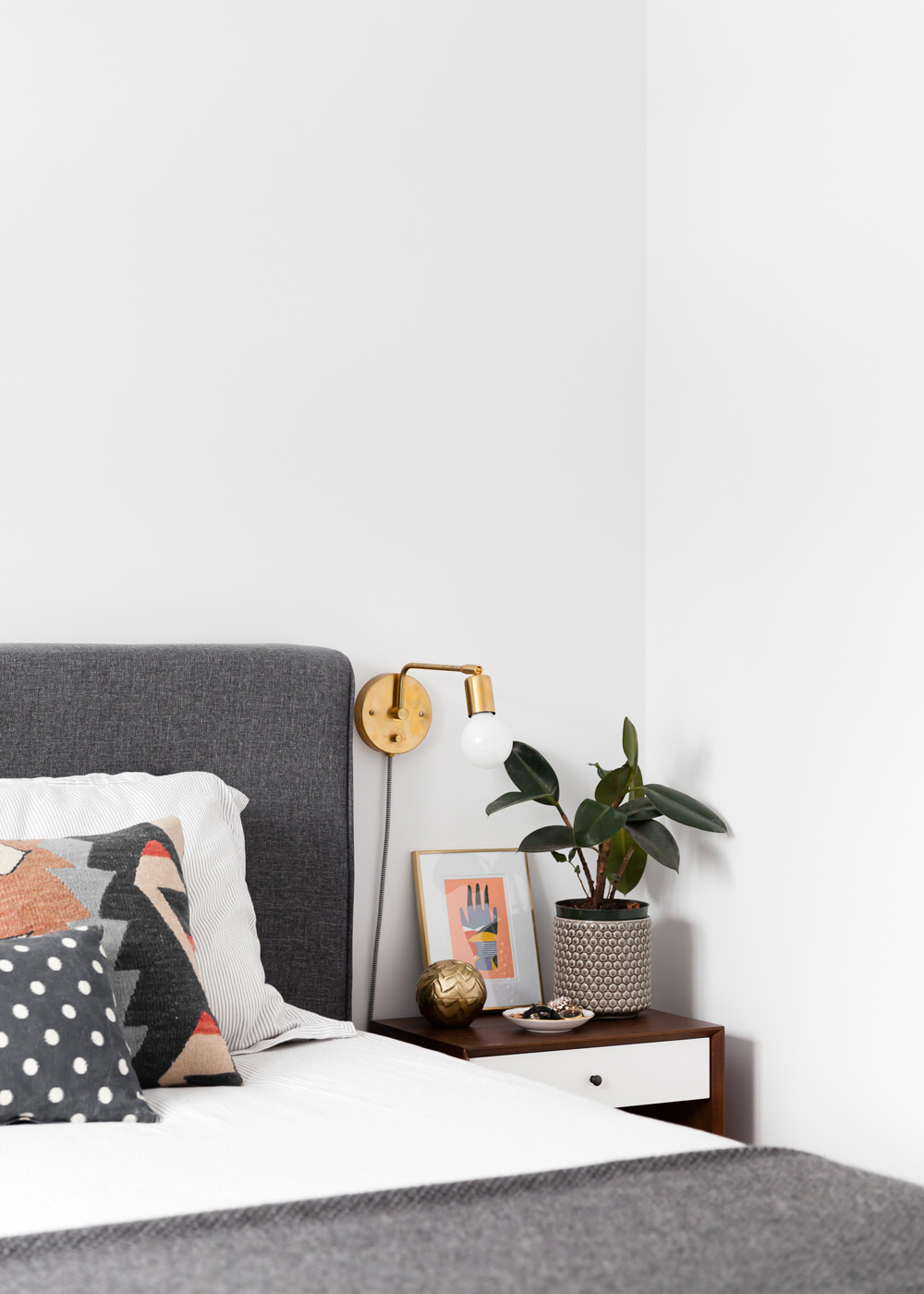
The flashes of metallic accents continue in the master bedroom with brass sconces that were crafted by Hamster Co., a local lighting company. They have a neat industrial feel that’s warmly tempered by potted greenery, a framed print and more metallics.
Related: The Joy of Less: 10 Minimalist Bedroom Decorating Ideas That Aren’t Boring
Soft Touch
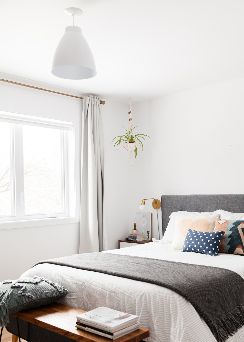
The bed, which has a custom feel thanks to soft grey upholstery, is from Wayfair. Laurence dressed it with bedding from H&M Home and patterned cushions from Buk & Nola. Drapery and a throw further the soft effect.
Pineapple Kids
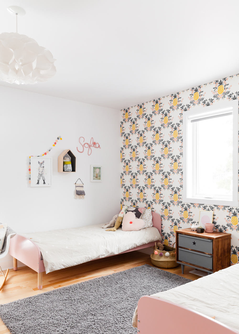
There is so much fun going on in Sofia and Adele’s room – and it starts with the showstopper pineapple-print Hygge & West wallpaper. The wallpaper creates a fabulous focal wall and while utterly playful, it doesn’t scream “kids room,” so it will grow with the girls. The grey rug from IKEA is warm underfoot and a cool contrast to the pinks and yellows.
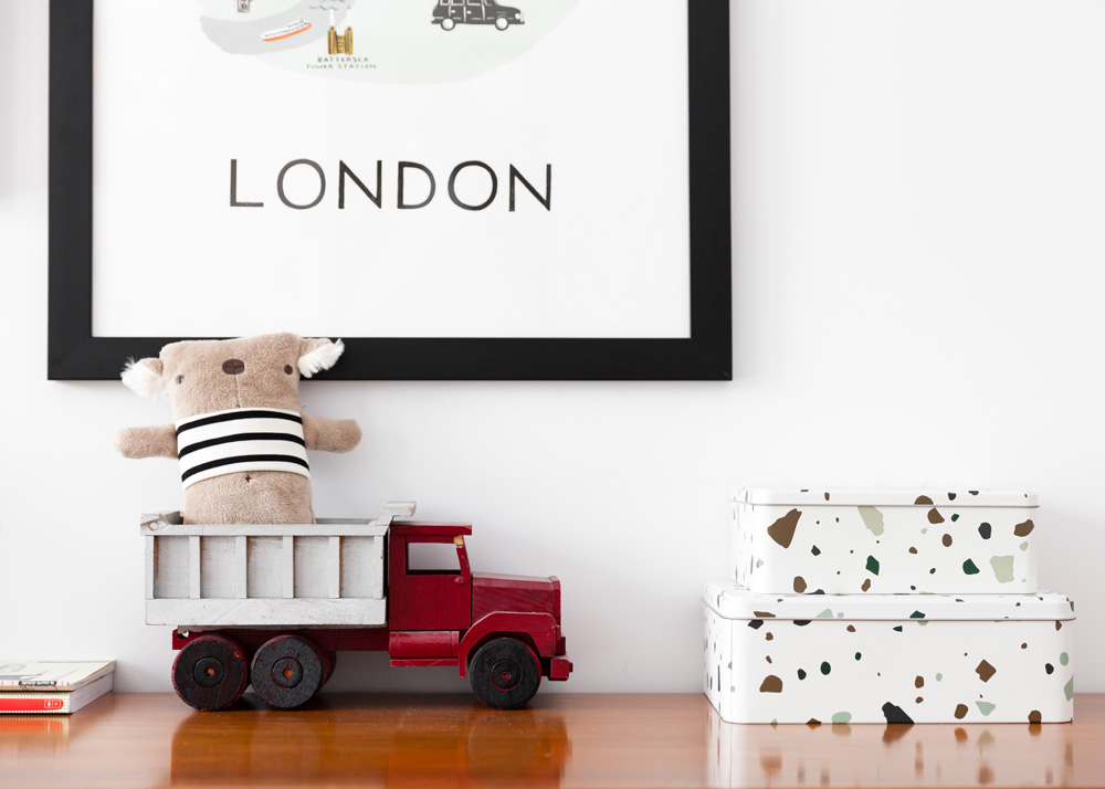
Tidy Up
can be styled like principal rooms. This playful grouping is proof that books, toys, pattern and art are in sync with child-friendly style.
Related: 12 Things Every Stylish (and Functional) Kids’ Room Needs
Cushiony Job
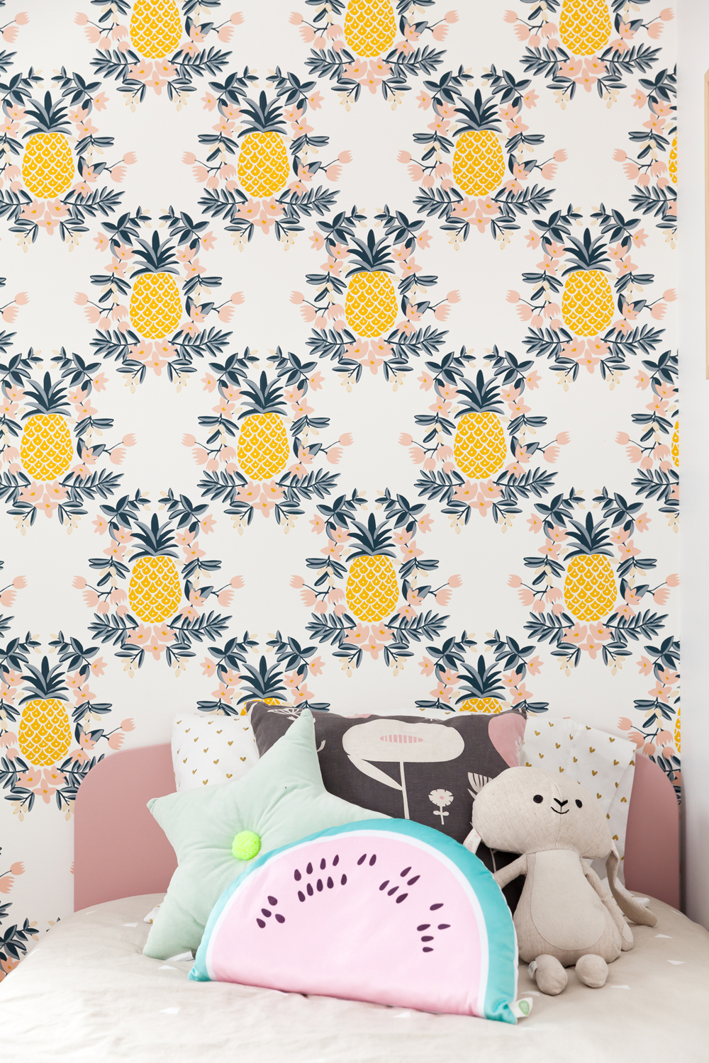
One of the easiest and most fun ways to liven up any little girl’s (or boy’s) room is with playful cushions. This mix of shapes and colours is delightful and also very much Adele’s. It’s a nice way to further differentiate twin beds in a shared room.
Related: Dreamy Ways to Update Your Kid’s Bedroom on a Budget
Custom Corner
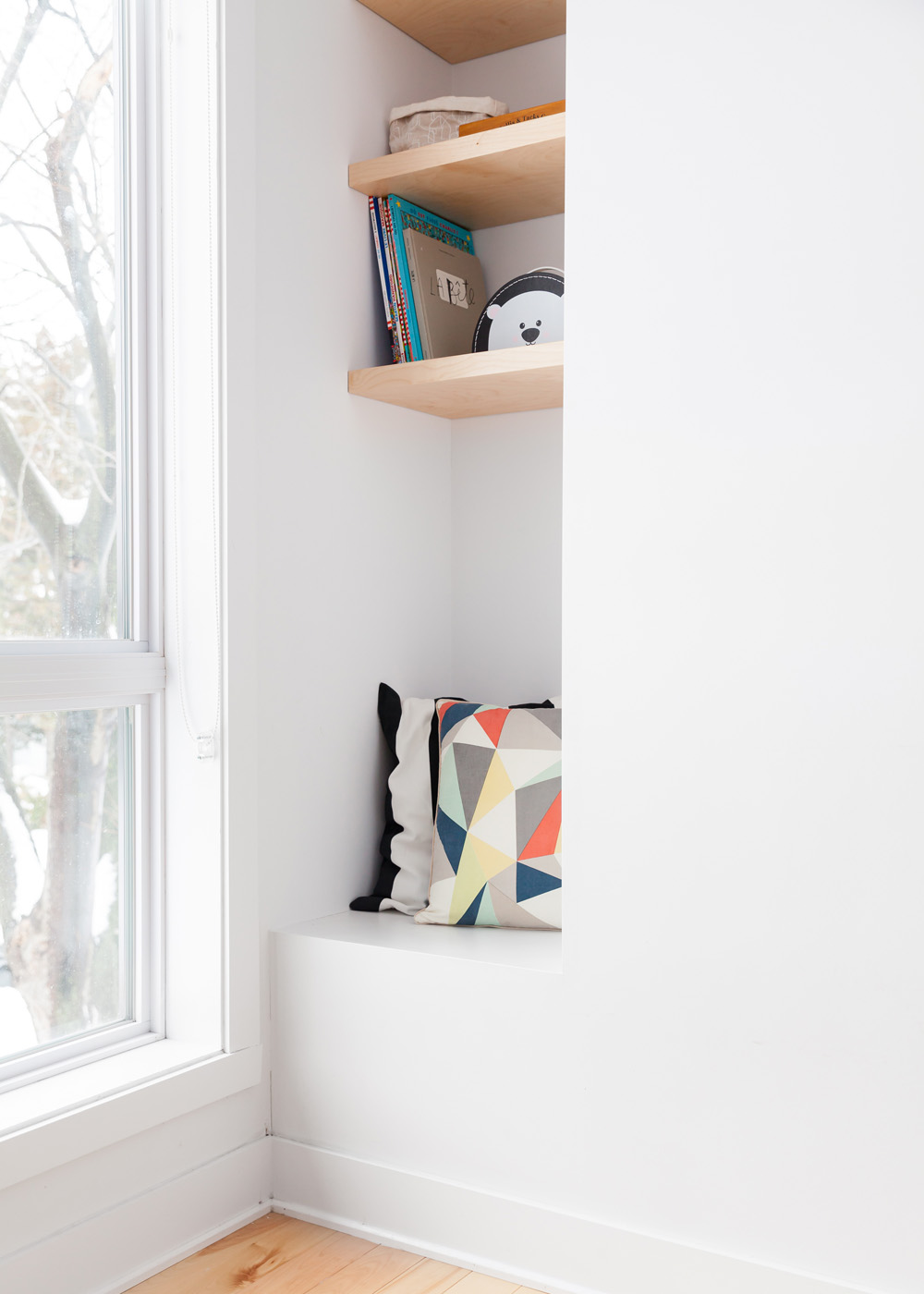
Laurence and Jeff planned every element in their new-build, including this kids’ room niche. It’s fitted with custom maple shelves and offers an imaginative spot for reading and storage.
Related: 11 Homes With Secret Rooms, Nooks and Crannies Hidden Inside
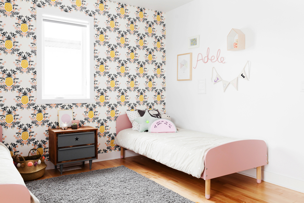
Name Game
Sofia and Adele love sharing a room and the wall art is just one of the reasons why. We love how each girl has her name above her bed – it’s whimsically pretty and also demarcates personal space in the shared room. The cool nightstand is from Un Lapin Dans Le Tiroir.
Related: Cheerful Kids’ Room Gallery Walls That’ll Rival Adult Spaces
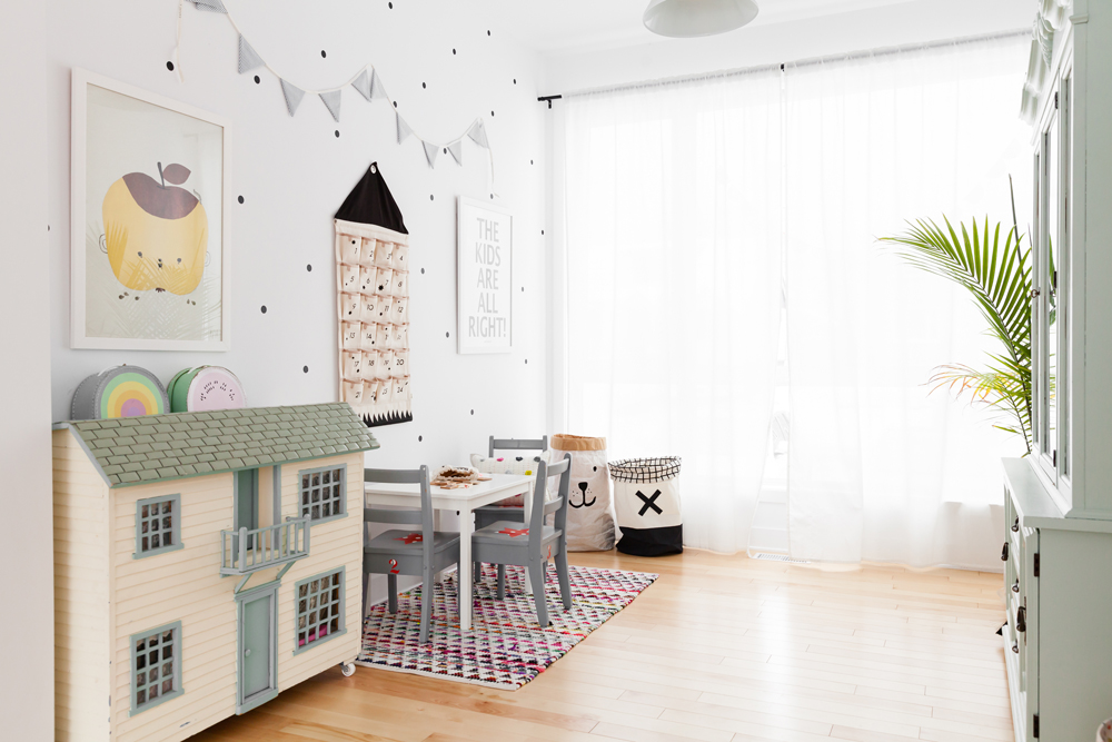
Old Meets New
The children’s playroom brims with fun and creativity, as well as provenance. The wonderful dollhouse was given to Laurence by his grandparents when he was five. This heirloom piece shares the space with an Ikea table, polka dots and fun artwork. Kid-level baskets make it easy to put toys away and drapery has a softening effect.
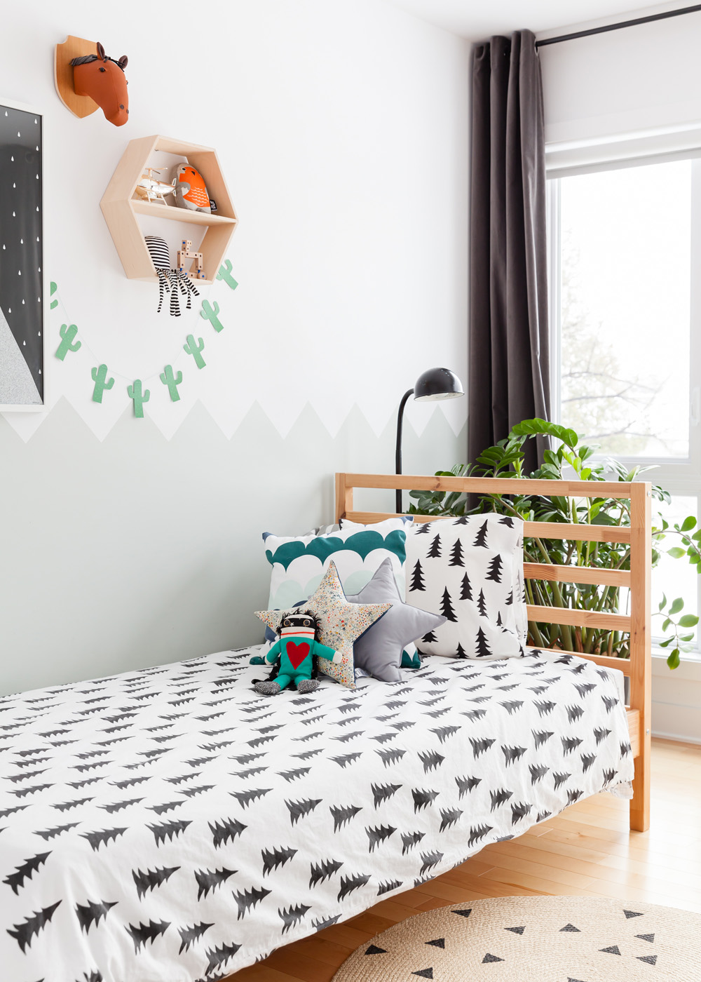
Pattern Play
Matteo’s bedroom has a playful vibrance thanks to whimsical bedding from Fine Little Day, a collection of cushions (like in the girls’ room) and wall hangings above the bed. The grey drapery has a boyish vibe.
Related: 20 Ultra-Stylish Kids’ Rooms Designed by HGTV Canada Stars
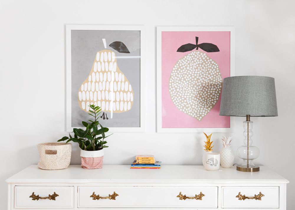
Fresh and Fun
The framed artwork from Darling Clementine layers Matteo’s room with more colour and pattern. The playful pics hang above a vintage dresser that Laurence had painted white. We like how the grey lampshade references the drapery colour.
All in the Details
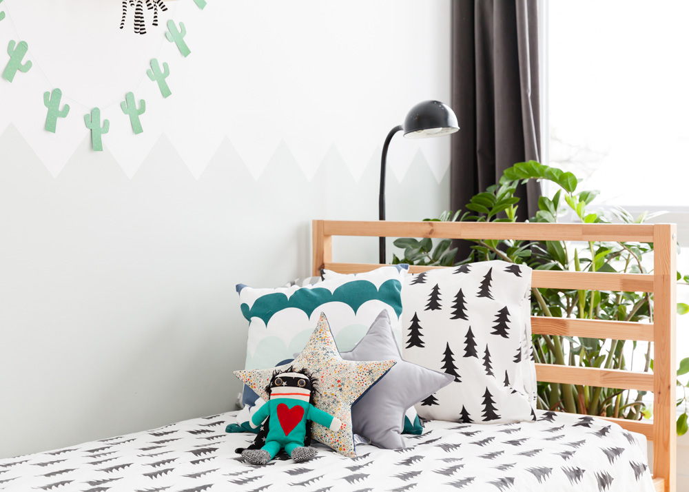
Matteo’s room shows that it doesn’t take a lot to make a very special place that children will love. A simple twin bed and floor lamp take on a whole new level of fun thanks to a splashy mix of pattern and colour. Bonus: the bedding is easy to switch out depending on the season and mood.
HGTV your inbox.
By clicking "SIGN UP” you agree to receive emails from HGTV and accept Corus' Terms of Use and Corus' Privacy Policy.


