Builder Christopher Brun and his brother bought a heritage home in the city’s Mile End neighbourhood with a vision to move in their families and create a space conducive to modern living. The to-do list varied from monumental tasks (excavating 200 tons of bedrock, overhauling plumbing) to the fun stuff (adding tons of natural light and little luxuries like heated floors). But the most compelling part? Seamlessly melding the century-old abode’s original charm with contemporary verve.
Bonus: check out the video of this modernized triplex.
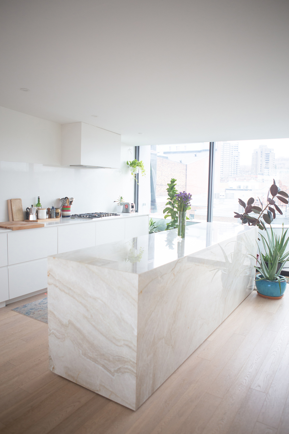
Love Island
The kitchen in Christopher’s brother’s unit features a showstopper island crafted from a carefully considered material. “I opted for quartzite as it is very practical and resistant to wear-and-tear, yet, at the same time, stunning,” says Christopher. Its veining imparts visual interest in the pale colour scheme.
Related: Kitchen Counter Upgrades That Will Increase the Value of Your Home
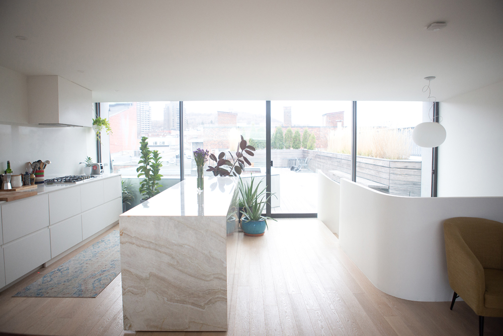
Material World
The kitchen’s cabinets are crafted from Fenix, an innovative, anti-fingerprint material that is highly resistant to scratches. “This is a very practical finish and especially suits my brother’s very curious toddler,” says Christopher. The integrated range hood seamlessly blends into the space, while the smattering of plants feels lively, a perk during Montreal’s long winter months. The engineered white oak flooring boasts radiant heating, another warm touch.
Related: 20 Plants That Are Safe for Children, Cats and Dogs
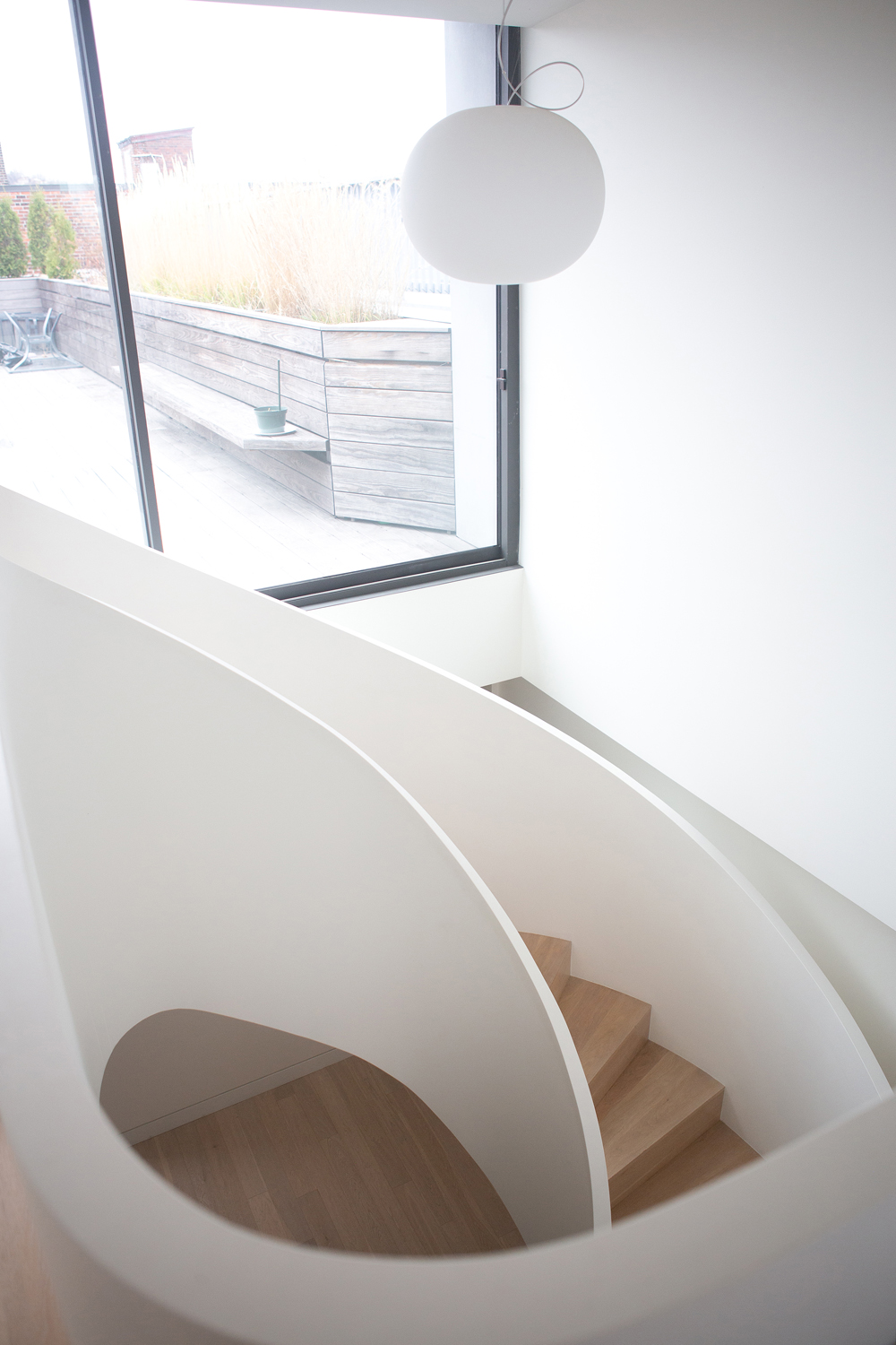
Best of Both
The triplex’s stunning staircase is another design feature that Christopher carefully planned and realized. “This connects the old rooms of the third floor to the new addition,” he says. “I wanted a form that would at once be classic, while also feeling timeless. The staircase ties two time periods together, while not appearing out of place in either space.” The Glo-ball pendant light from Flos furthers its sinuous curves.
Related: Staircase Ideas That Will Make a Statement in Your Home
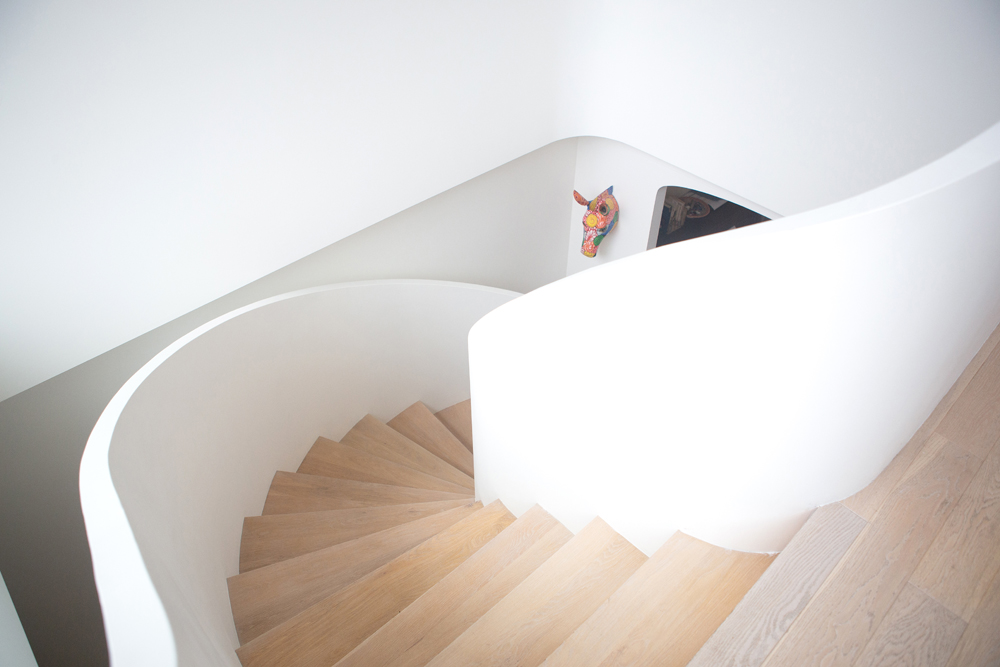
Personal Effect
A colourful horsehead sculpture, a travel memento, adds just the right amount of splashy colour and quirky interest. We love how its hand-crafted playfulness contrasts the architectural importance of the staircase.
Related: Awesome Wall Art That Makes a Statement (Beyond Paintings and Photos!)
Wood Works
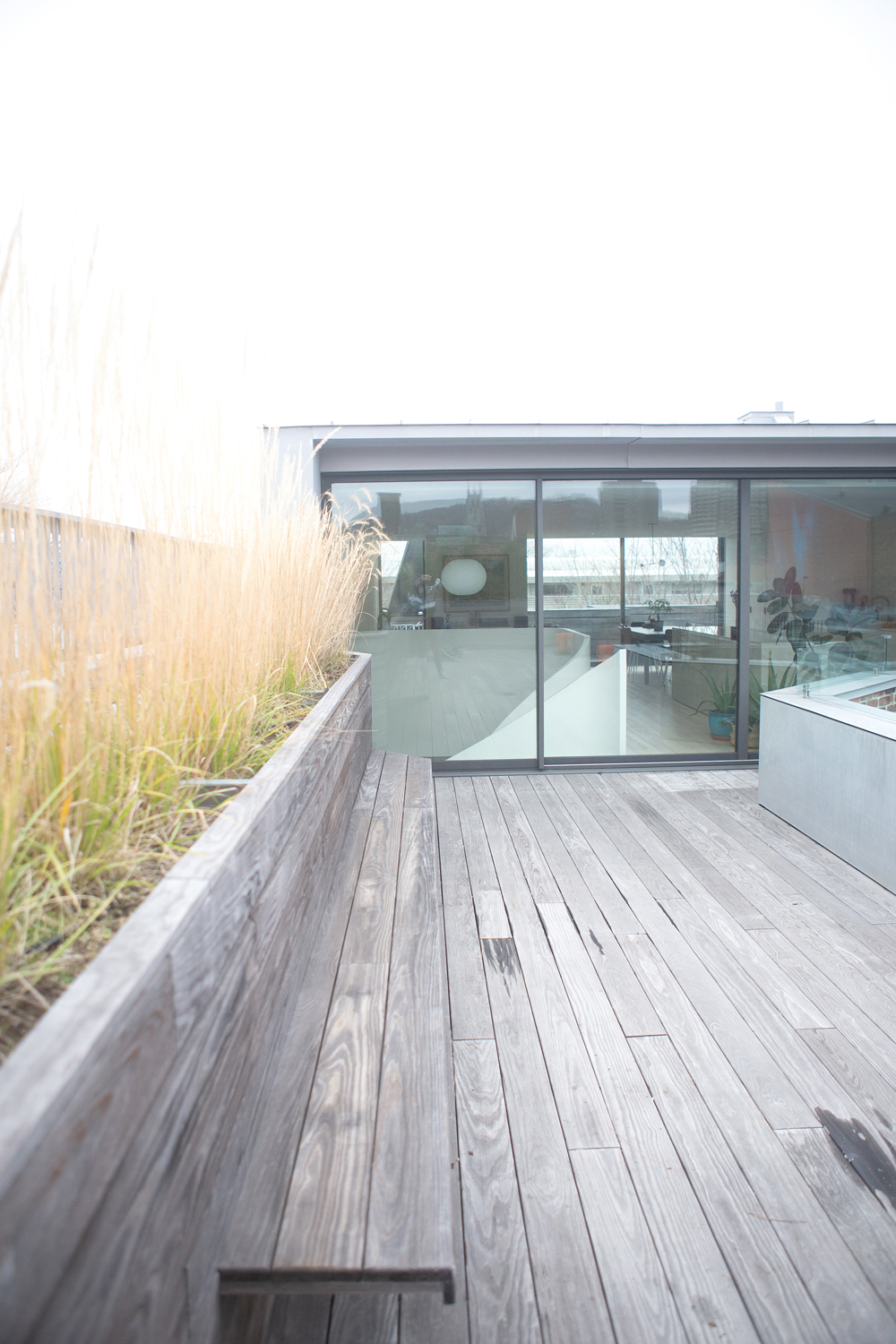
The home’s use of innovative materials extends to the top deck which is clad in Kebony, an eco-friendly, durable wood. “It’s safe for the baby to crawl on and does not leach chemicals into the waterways,” say Christopher. “It also has a tiny carbon footprint, compared to the tropical rainforest alternatives.” Bonus: it requires very little maintenance. “The grasses are all endemic species that are tough enough to handle the exposure of a rooftop with minimal maintenance.”
Related: This Eco-Conscious Montreal Home Definitely Isn’t Afraid of Colour
Old Meets New
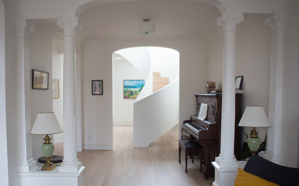
The upright piano strikes just the right note here. We love the mix of original details, especially the fantastic columns that support an original, classic archway, and how that shape is echoed in a new archway. “It’s a simple architectural gesture with impact,” says Christopher.
Seating Plan
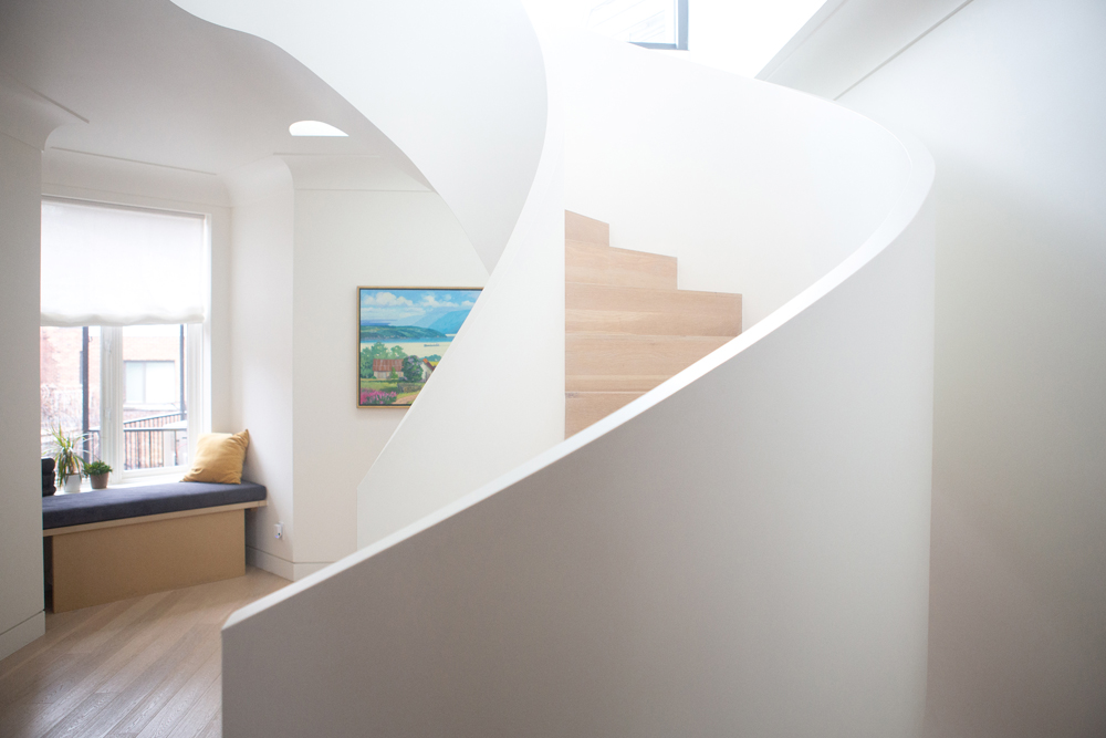
“This window bench was a little surprise I designed for my brother and sister-in-law,” says Christopher. “I wanted a space for them to hide their cat’s effects. The bench top actually lifts up. On one side the cat’s litter box is hidden, and on the other side there is storage for food and litter.”
Keep it Simple
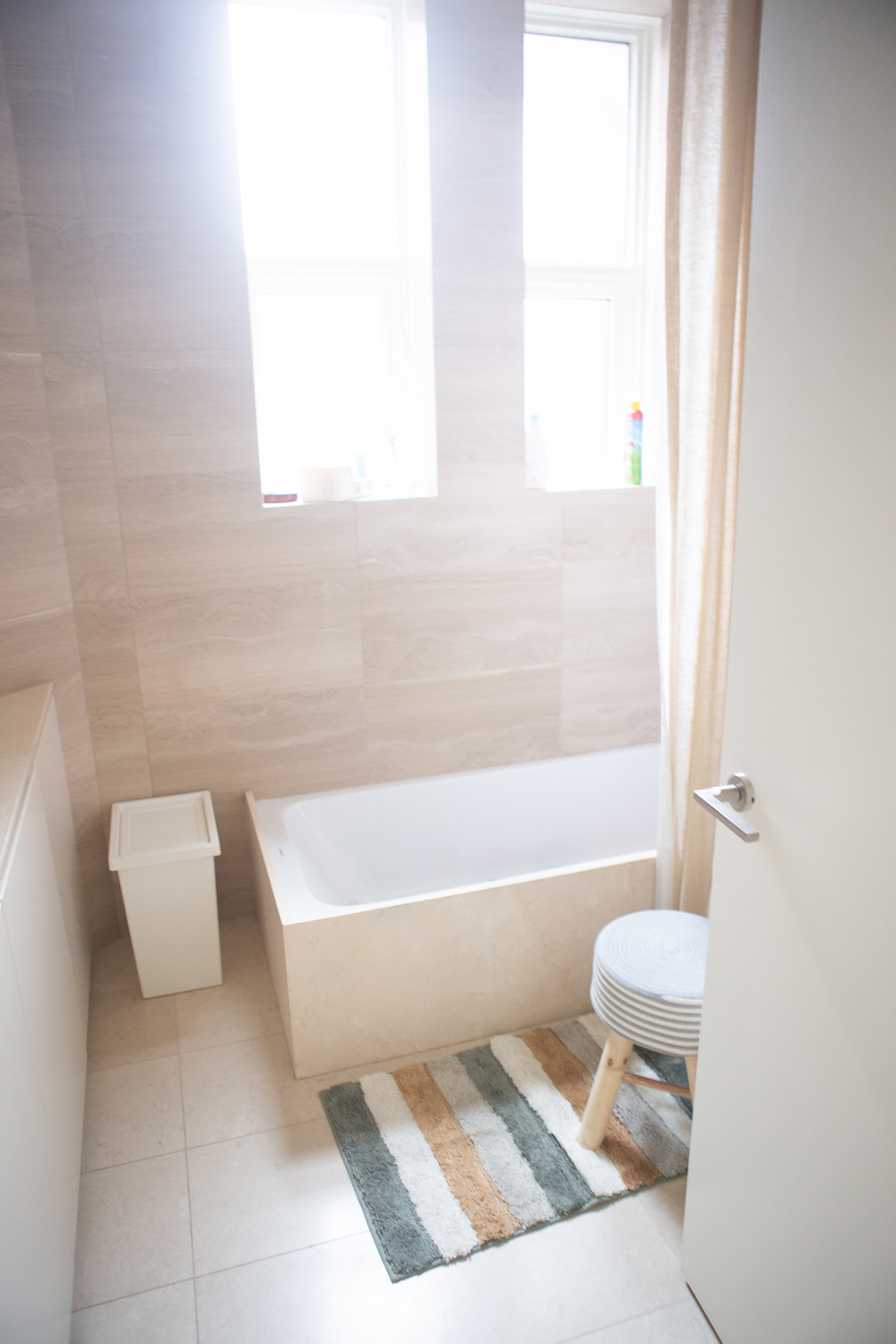
Floor-to-ceiling tiles (no dry wall here!) craft a practical bathroom and we love the way the windows’ ledges act as built-in storage. Cladding the tub with slabs of tile gives it an elevated look while a striped rug layers in pattern and texture.
Faux Finish
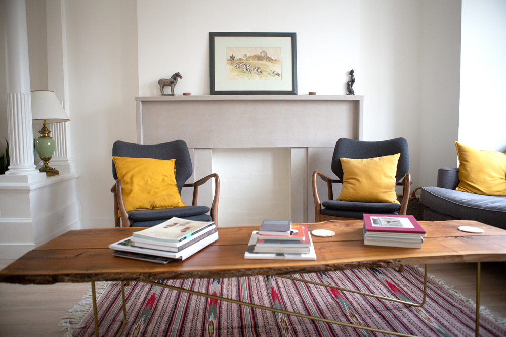
“The house had always had a faux fireplace and it came with some gaudy glowing lights,” says Christopher, who nixed the gaudy and kept the good. “I opted to keep the form in the space, but turned it into an element that is simple and serves to anchor the room.” He designed the cool coffee table using live-edge walnut slabs.
Related: Gorgeous Home Decor Ideas for Styling an Empty Living Room Fireplace
Mix it Up
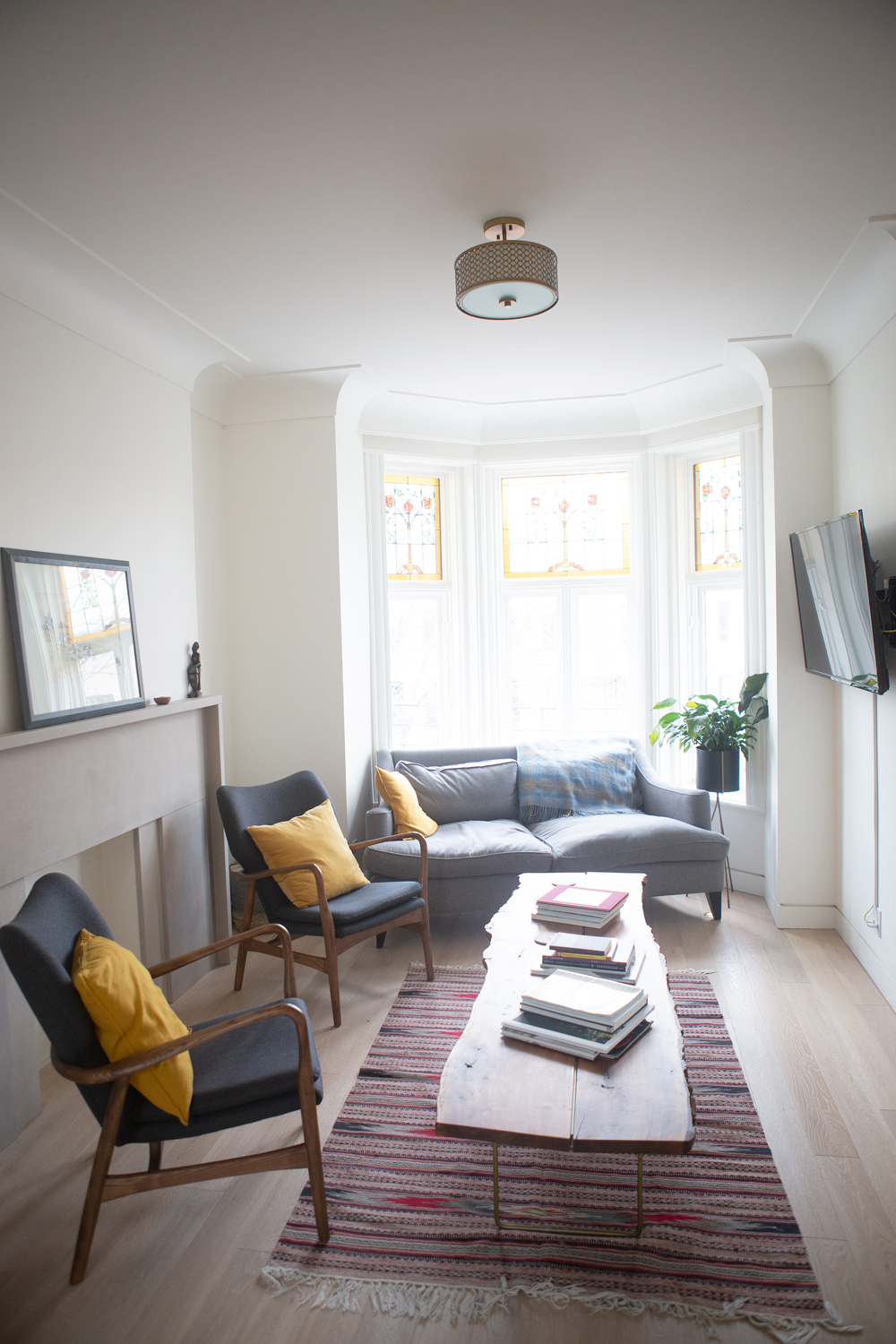
The mix of furniture styles in the living room of Christopher’s brother’s unit feels welcoming. A comfy sofa with plush cushions shares the narrow space with vintage chairs that have a more structured silhouette. We love how the TV is hung opposite the fireplace – not above it – making it less of a focal point but still easy to see.
Glass Act
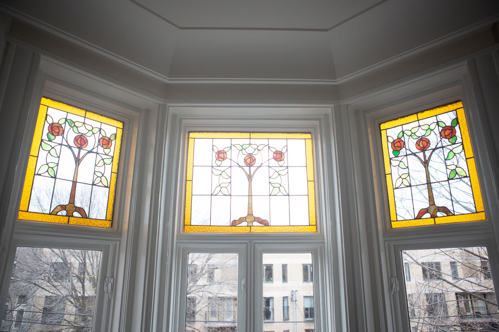
The charming stained-glass windows are original and over 100 years old. They’re not only pretty, but super practical. “The previous owner had them sent away to be restored and converted into thermal windows to help with our extremely cold winters,” says Christopher.
Clearly Beautiful
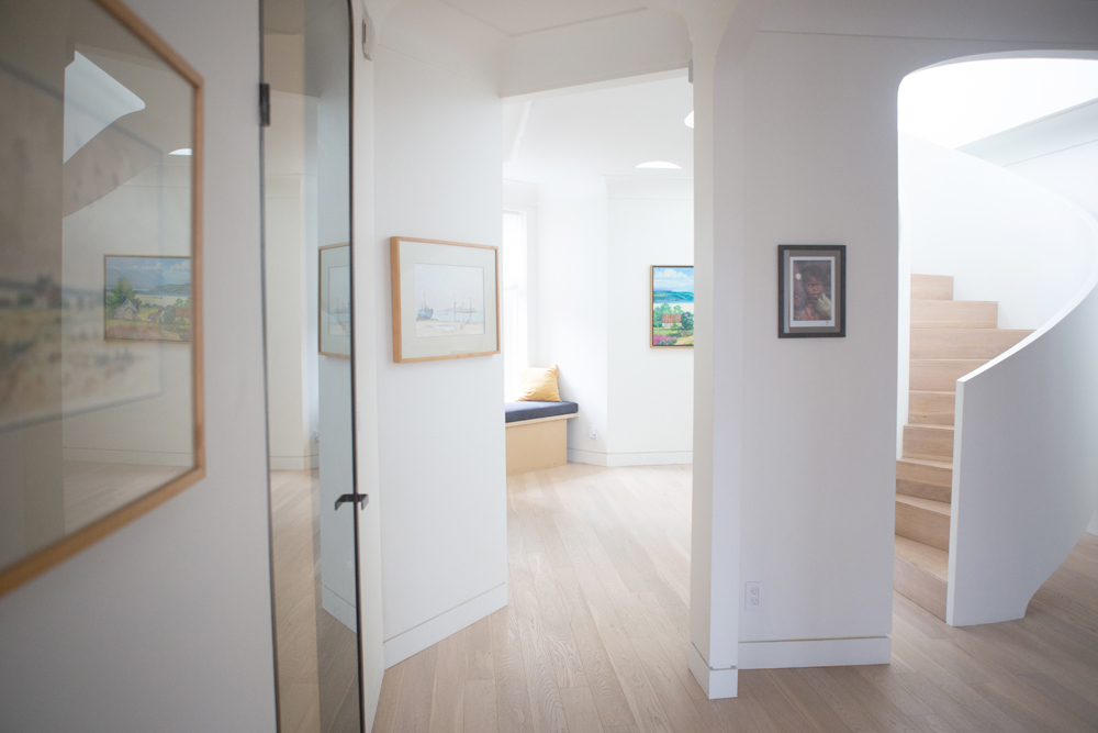
Christopher designed this sleek glass door and had a local craftsman make it. Its slightly curved top echoes the space’s archways and keeps the view open and airy. We love the detail on the baseboards and the mix of art, which is all hung at the same level for continuity and impact.
Related: A Foolproof Guide to Hanging Your Pictures Perfectly, Every Time
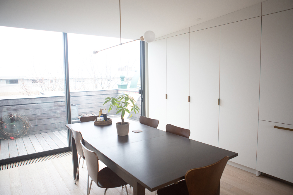
Space Saver
In one of the dining areas, an otherwise unused wall is transformed using integrated custom cabinetry that provides ample storage. A contemporary pendant light illuminates the modern dining table and chairs. The look is sparse, yet inviting.
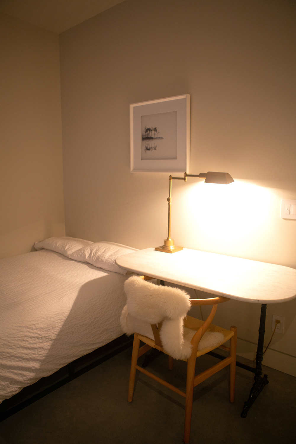
A True Melange
The old saying “use what you’ve got” is definitely at play in this bedroom. “The furnishings are from all over,” says Christopher. “The desk was inherited by my girlfriend from her father. The desk lamp is from Restauration Hardware. The chair is from Structube and the faux throw was a gift.”
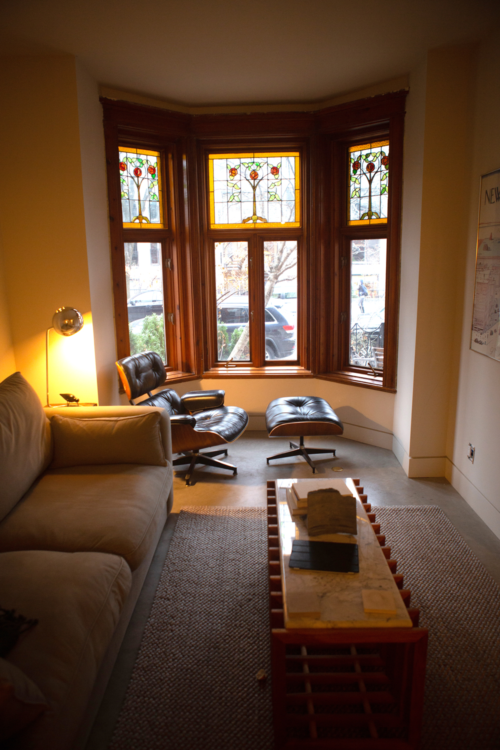
Window Seat
A classic Eames chair and stool cultivate a contemporary vibe that feels fresh against a heritage backdrop. We love how their wooden frames echo the windows’ natural wood trim. A neutral-toned rug nicely softens the stone floors and subtly demarcates the main seating area.
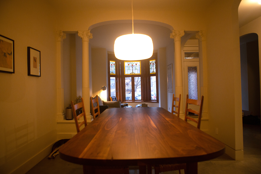
Simply Warm
This dining area brims with warm heritage style and, thanks to beautiful original columns, needs very little embellishing. We love the pared-back styling – an empty tabletop, a sleek pendant light – and how it keeps the original backdrop a focal point.
Related: Incredible Celebrity Dining Rooms You’ll Want to Have a Feast In
Going Grey
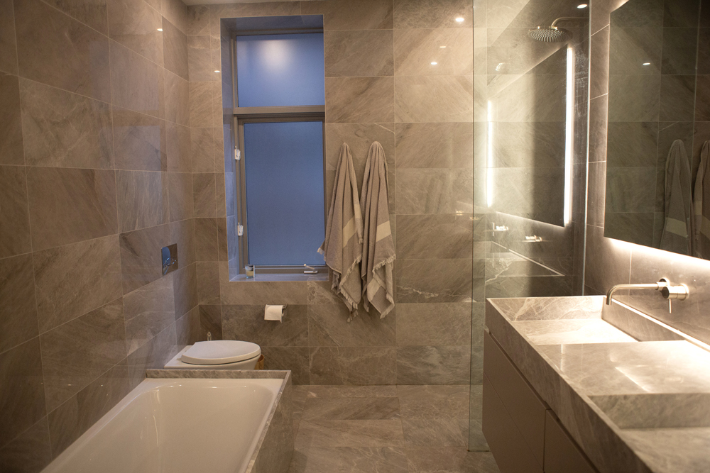
This contemporary bathroom is filled with inspirational details. We love the neat mix of space and discreet toilet placement, the way the simple tub is framed in and the generous use of tile (even in the window frame). Though cool grey, there is something undeniably warm and welcoming about this space.
Related: These Modern Bathroom Design Ideas Have Major Staying Power
For Two
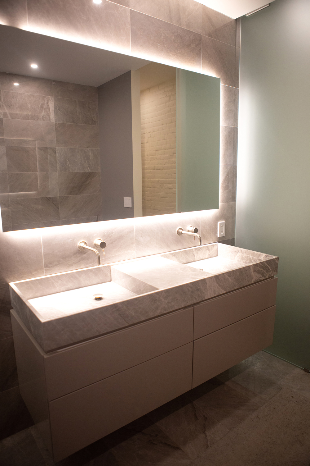
“This floating vanity was designed to be generous in terms of space,” says Christopher. “My girlfriend and I wanted to be able to both get ready without stepping on each other’s toes.” Wall-mounted faucets further the sleek design and the backlit mirror suffuses the room with flattering, warm light.
Local Resources
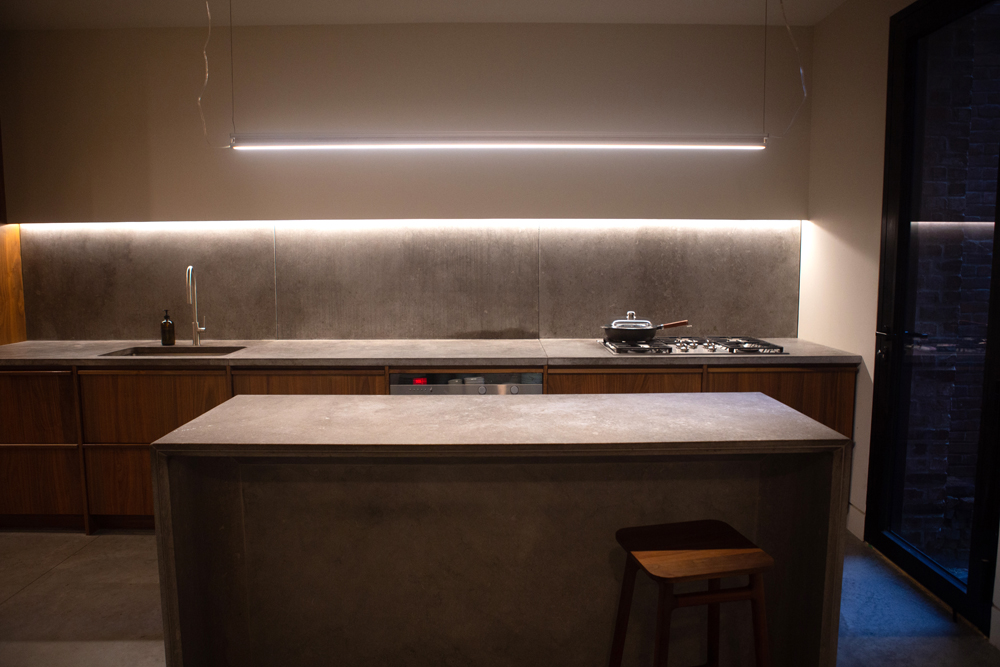
“The slabs that make up this kitchen’s counter and backsplash are St. Marc stone,” says Christopher. “It’s a stone that has been quarried in the areas around Montreal for centuries. Traditionally, its been used for the base of buildings throughout the city. I thought it would be interesting to take it inside.” And how interesting is that pendant light over the island?
Lighting is Everything
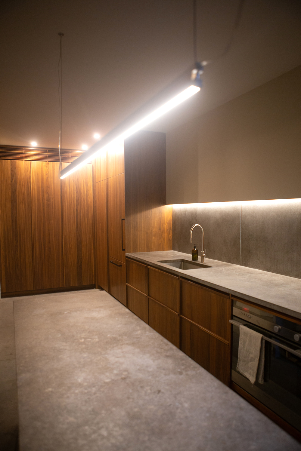
The minimalist look of this kitchen was very intentional. “The light cove over the counter helps light up the workspace, as well as wash the stone in warm light. I also decided to hide the plugs in this cove, which keeps the backsplash looking clean,” says Christopher. The walnut cabinetry effectively plays off the cool stone, and plays up the warmth of the lighting.
Related: Backsplash, Tile, Cabinetry: The 15 Top Kitchen Trends for 2021
HGTV your inbox.
By clicking "SIGN UP” you agree to receive emails from HGTV and accept Corus' Terms of Use and Corus' Privacy Policy.


