For Anna Niemczewski and her husband Paul, a home’s design does not have to be static. Instead, as the couple illustrates via their 2,200-square-foot Calgary space, a home can be more of a malleable canvas – a place that can (and, perhaps, should) change over time as a reflection of ever-evolving tastes and needs of the people that live within its walls. “We sought a blank canvas that we could live in immediately, but also one that would grow organically with us as time and space demanded,” Anna explains. Bonus: check out the video of this incredibly unique yet multi-functional home.
A Forward-Thinking Vision
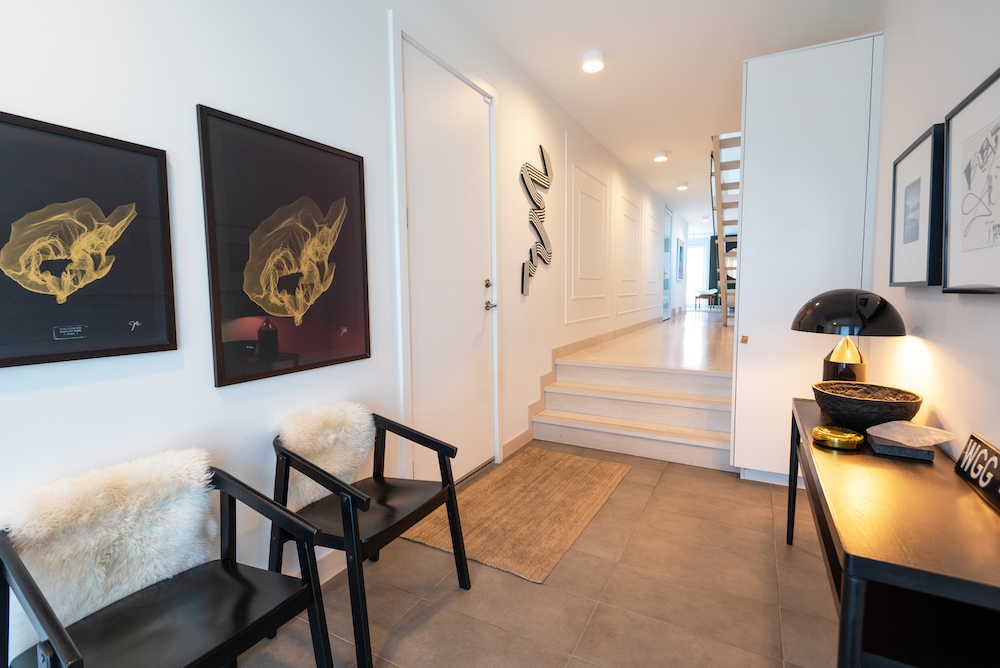
Built in 2015, this prefab house in Calgary’s inner city stands on a 25-by-140-foot lot, which creates the home’s long and narrow silhouette. Anna and her husband worked with HouseBrand of Calgary to design and build the house. The couple had a clear vision of the type of flexible space they wanted for themselves and their daughter. “We pursued the idea of a house that is essentially a shell. As new parents to a young child, we didn’t know what our future looked like or how our family might grow, so we asked for maximum flexibility and adaptability of spaces. That was the guiding principle behind all of our choices.” The result? A home that’s full of character, art and endless style.
Related: This Calgary Loft Delights With Whimsical Goodies, Original Art and Fortifying Pattern
Artful Accents
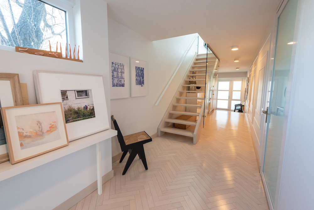
The home’s main floor welcomes the family with an art-filled entryway that leads into the bright hallway pictured here, which Anna has styled to maximize natural light and a spacious feel. “It’s a long, narrow space that we’ve filled with art that gets rotated, as well as simple, narrow furniture to allow for as much space as possible,” she says. The art adds colour and a personal touch that Anna can change over time. “I love layering art and figuring out what works together.”
Flex Appeal
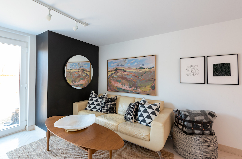
A flex room adds versatile living space to the home – the family uses this area for everything from watching movies to working out. To style this multi-functional area, Anna opted for a mix of art (such as the painting of an Alberta landscape by artist Ken Christopher, which she inherited from her grandfather’s collection), contrast (like the black accent wall, which they painted to bring visual depth to the space) and reflection (via the round mirror). The Natuzzi Italia couch adds a personal touch for Anna, as well. “The couch was the very first couch I ever purchased, and has been in a few homes and apartments before it found itself here.”
Related: 20 Bright Sofas That’ll Bring Personality to Your Living Room
Sunny Seating
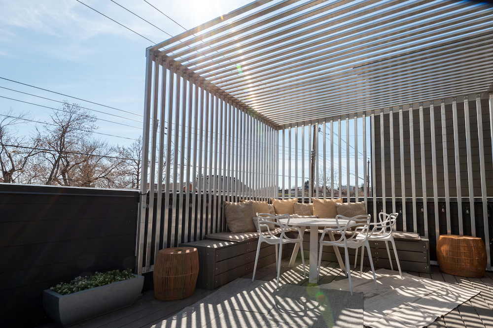
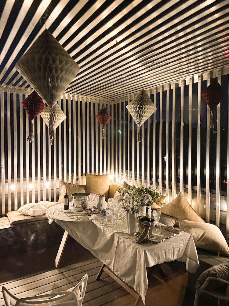
Anna’s patio maximizes its limited space via bench seating (which was made from extra patio flooring for a cohesive look) and stackable white chairs from Structube. Overhead, a custom slat-based pergola adds shade from the heat and a distinctively contemporary look that’s adaptable. “A friend cut and assembled the metal for it based on my design,” Anna explains. “It’s simply bolted together, nothing is welded, so we can easily take it down if we ever need to.”
Evening Glow
Adding to its versatility, the cube-style pergola doubles as a solid structure to hang decorations and lights to enhance the outdoor space for evening entertaining. To illuminate the outdoor space when the sun goes down, solar-powered hanging patio lights evoke a warm glow. “It’s lovely to be out there during the day and at night,” says Anna.
Related: The Days Are Getting Shorter: 15 Outdoor Lighting Ideas to Brighten up Your Backyard or Balcony
Indoor-Outdoor Flow
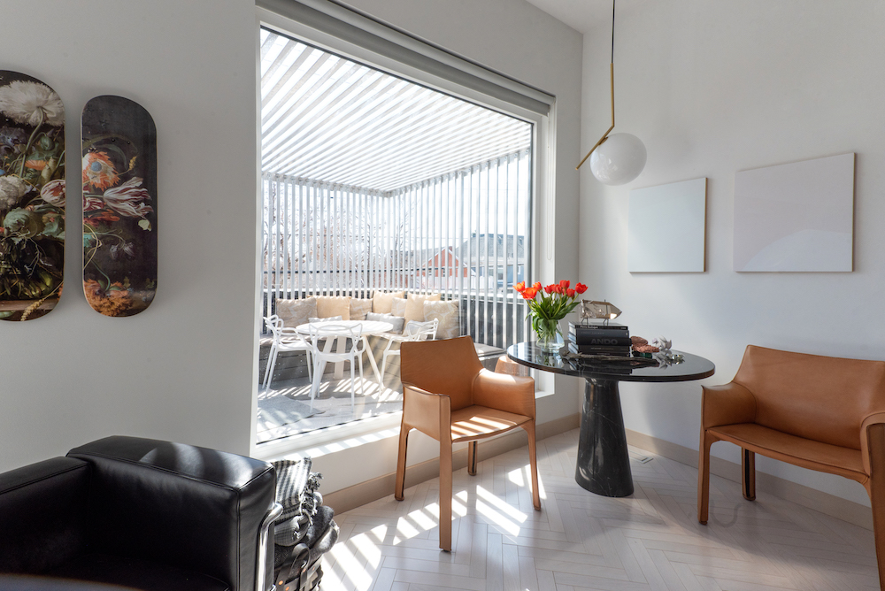
While the patio is a stylish space all on its own, it’s visually linked to the living room. “From the view inside, the structure has extended our sense of space so the house feels even longer, and I love the shadow play cast from the slats into our living room during the day,” Anna explains. “At night, it lights up beautifully, flooding the patio and living room with glowing light while also lit from the street view outside. It’s been the best addition to the house and completely transformed our use of the space.” Complementing the outdoor area from inside, Anna created a cozy, art-filled corner using dreamy paintings by Canadian artist Larissa Tigglers from Norberg Hall Gallery.
Room to Live
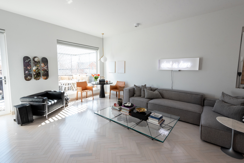
In the living room, furniture helps keep the family space adaptable. “The dimensions of the space posed a bit of a challenge with a traditional couch, but this grey sectional is perfect,” Anna explains. “It allows the space to be as flexible as necessary, and we can move the sections as needed.” For the coffee table, Anna waited years to get her hands on this beauty. “I have always loved the Paolo Piva ‘Alanda’ table, and lucked out as B&B Italia started producing it again around the time I was seriously looking for a table. It’s perfect for us as it’s visually interesting with its geometric base, but not visually imposing.”
Skater Style
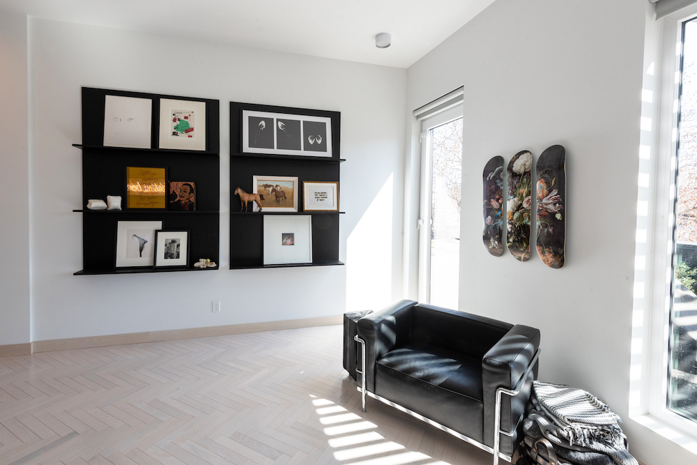
Adaptability and space to honour inspiration are key tenets that ebb through the home’s design. Here, creative wall art expresses personality in multiple dimensions. On one wall, a trio of skateboards acquired from Booooooom Art are a playful take on classic art. “The skateboard triptych is a bit of a play on the new/old world, as it has a Dutch masters still life painting featured across the three boards,” Anna says. On the other wall, black shelving units (designed by Anna and made by a friend) showcase the family’s rotating art collection. “The shelves are visually striking, but don’t demand much space in the room itself, which is ideal for us,” she says.
Related: 10 Modern and Stylish Bookcases We Can’t Get Enough Of
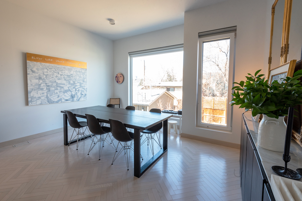
Fine Dining
Anna’s dining room was designed to be a versatile multi-functional space. “We use this space all the time for art, crafts, homework, work, music, daily meals and entertaining,” she says. “We created it to be flexible and adaptable to our needs, and it certainly has proven to work well.” The furnishings – durable Herman Miller chairs and an IKEA table that has been stained black – combine style and comfort, while art (including the “Blow Like Smoke Through” painting by Canadian artist Erik Olson and a circle painting by Chris Cran) adds a punch of personality to the room.
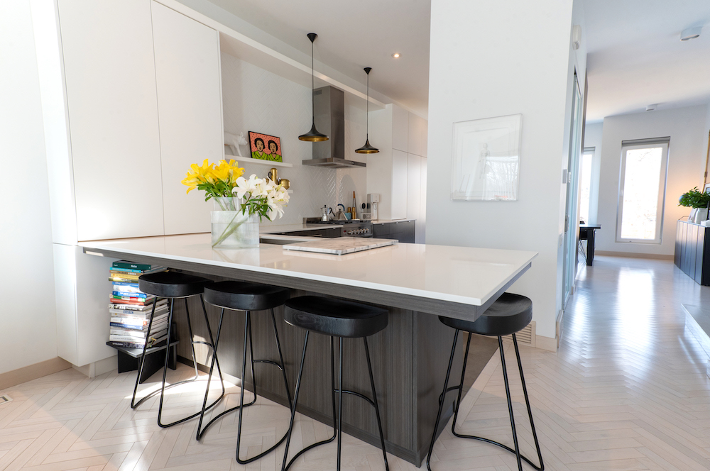
A Clear View
The home’s narrow footprint helped determine the style of Anna’s sleek, storage-filled kitchen. “The kitchen was designed partially based on space constraints,” she says. “It’s an oversized galley-style kitchen that’s exceptionally functional.” It allows for visual access from one end of the house to the other. For the colour palette, a neutral base enhances the bright feel of the space. “We went with a white kitchen knowing that we had art to accent the space and to allow for it to be as light and bright as possible given that there are no windows with direct light entering the space.”
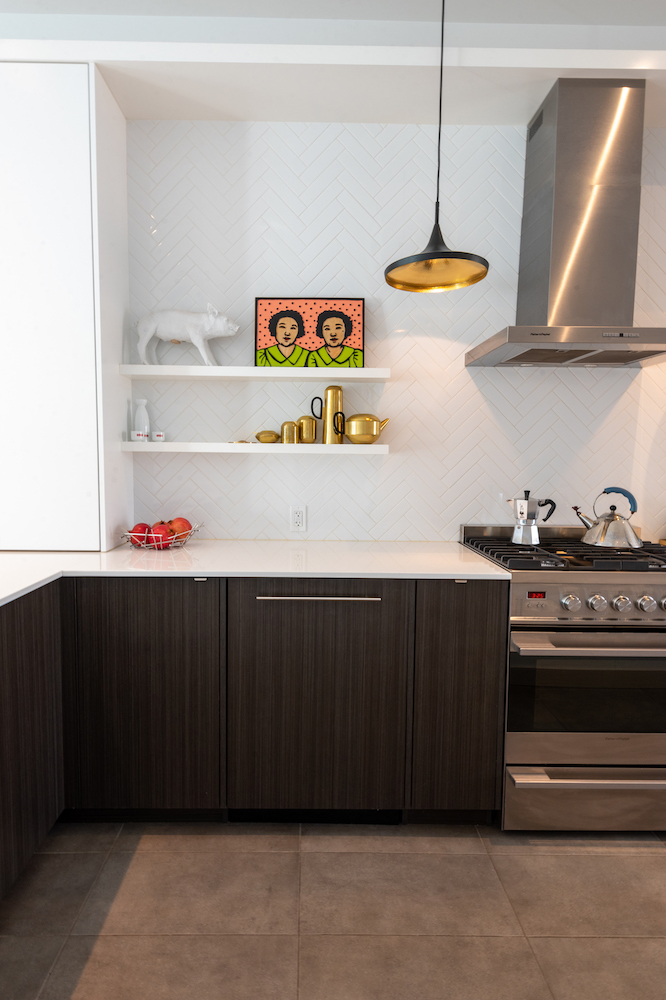
The Art of Cooking
While the kitchen is bright and light, it still reflects the home’s character and sense of style through details like the open shelves – which display art alongside functional, often-used items like the brass Tom Dixon tea set – and the herringbone kitchen backsplash. “The tile reflects the herringbone pattern of the flooring in the rest of the house, connecting the kitchen to it,” says Anna. “It’s also amazingly easy to clean, too.”
Related: Backsplash, Tile, Cabinetry: The 15 Top Kitchen Trends for 2021
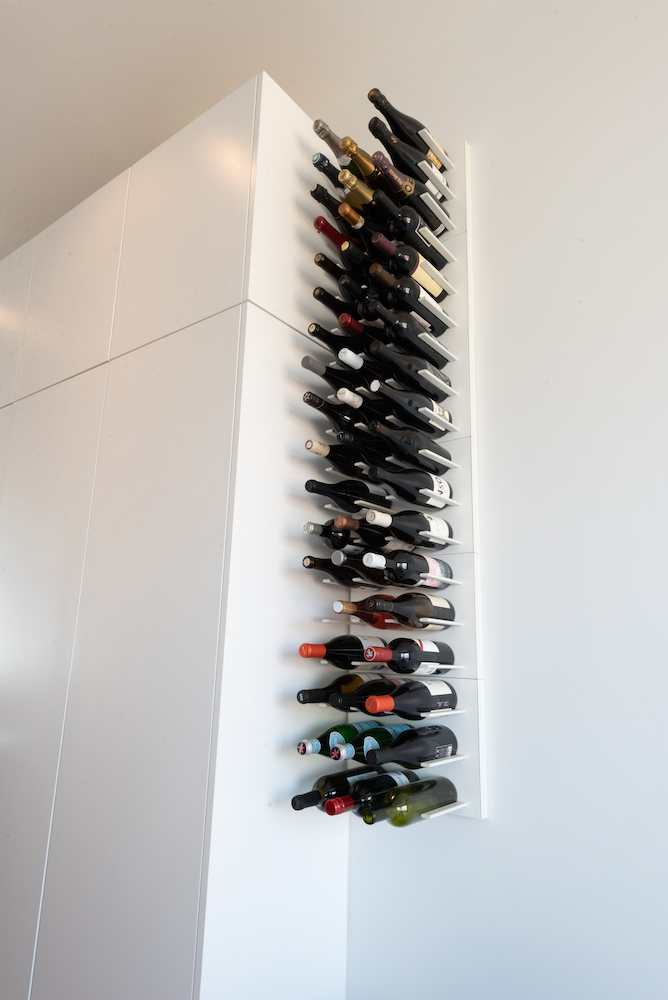
Like Fine Wine
Practical details don’t have to be merely functional – you can turn anything into an artful moment. Take the home’s wine rack, a modular system by Stact, which beautifully displays the couple’s collection. “We added it after we moved in and are thrilled with the results,” Anna says.
Related: 10 Kitchen Organizing Tips That Practically Do the Cleaning for You
Petite Perfection
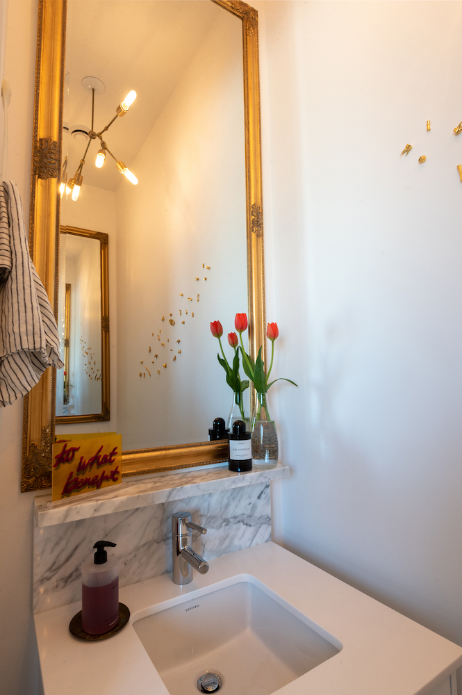
The guest bathroom presented more opportunities for creative design. To make the narrow-but-tall (the ceiling height is 10 feet) bathroom feel more spacious, Anna used mirrors, light and art. “I placed mirrors on the front and back walls to expand the sense of space through reflection. Their gold frames help create a luxe feel,” she says. “Adding the marble backsplash and shelf allowed that theme to continue, and the gold sculptural artwork on the adjacent wall is by Marigold Santos. We kept the walls white to allow for as much light and sense of space as possible.”
Related: How to Organize Your Bathroom Like a Designer – No Matter How Small it Is!
Herringbone Details
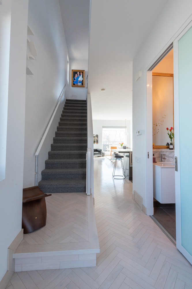
The herringbone-patterned flooring that runs through the home is full of character and timeless – and chosen with purpose. “No matter how flexible the rest of the house could be, the flooring was the least likely to change, so we made sure to get it right,” Anna says. “My husband and I have lived in many amazing spaces in Europe filled with character, patina and age, and our inspiration was always to create a home that could age along with us – but also never be too precious. I love floors that show wear and tear and character, so we opted for something that would do the same in our home. For us, they were an investment that was well worth the expense.”
A Bright Family Vision
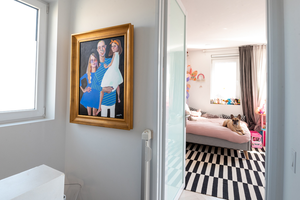
At the top of the stairs, a family portrait by Maya Gohill (and framed by Norberg Hall Fine Frames) is a welcoming and bright touch. “I like that it is placed in the entryway to the third floors, where you enter more personal spaces,” Anna says.
Related: Decorating With Kids: 15 Ways to Make it a Family Affair
Room to Grow
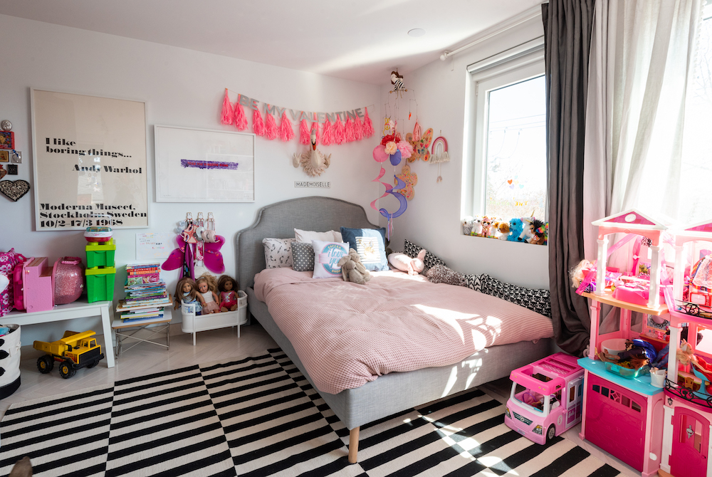
When it came to their daughter’s room, Anna and her husband wanted to establish a neutral base that could adapt and change along with her interests. “Our daughter’s room was approached in the same way the rest of the house was, which is to say we created a space that was a canvas for her to grow and evolve,” Anna says. “Nothing is built in, aside from the closets, so everything can be moved and changed as needed. The white walls are a canvas for her to express herself. It’s a generous space with lots of storage, which is so necessary with children!”
Related: For Sleep and Play: 15 Kids’ Room Trends for 2021 That’ll Have Your Kids Asking to Get Grounded
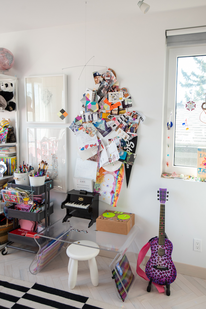
Clearly Fun
In this creative corner, a Lucite desk by Karim Rashid for Umbra is kid-friendly and playful. “It’s a perfect height for her, and the legs offer extra storage,” Anna says. To keep art supplies organized, a tiered trolley from IKEA is a practical addition that can move around as needed.
Related: 8 Easy Ways to Organize Your Kids’ Rooms – That We’ve Actually Tried
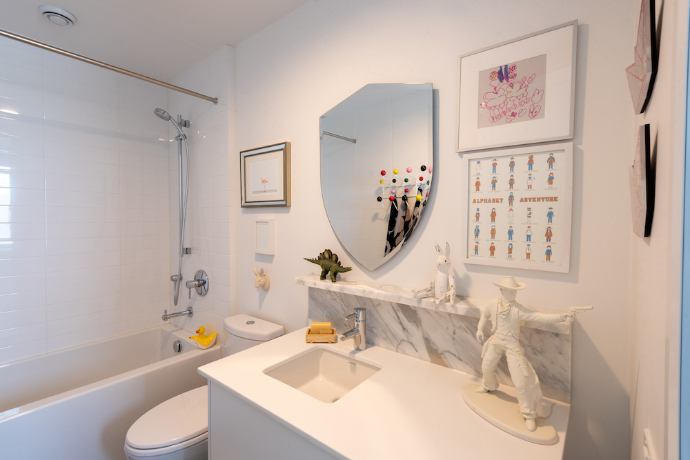
A Playful Washroom
For their daughter’s bathroom, Anna and her husband followed the same approach that they did with her bedroom – with a neutral base that could be updated with fun details as her tastes change. “We made it as clean as possible to allow for pops of colour to appear through art, fixtures, etc.,” Anna says. “It’s a fun space that we hope can evolve as her needs, interests and desires grow.”
Related: 12 Kids’ Bathroom Design Ideas That Make a Big Splash
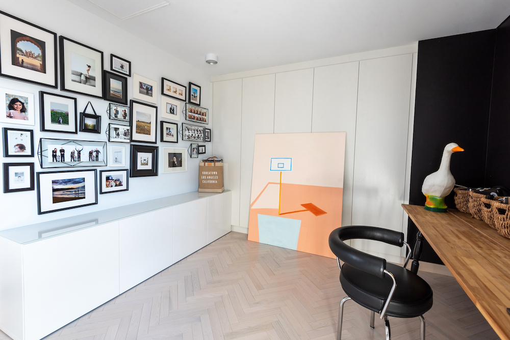
Office Space
Having a home that could suit the family’s needs today – and their needs in the future – was key. The third bedroom, for example, currently functions as a home office, but it could be used as another bedroom in the future. For its time as an office, the room offers a mix of storage and space to work. A black accent wall creates contrast, while a gallery of photos captures a personal feel. “I used black and white frames that I had, as well as those I acquired, and put them together to create a fun, dimensional and ever-changing wall of photo memories for us,” Anna says. “It makes the space personal and engaging. It’s a non-load bearing wall, so hanging pictures is a great use of the space.”
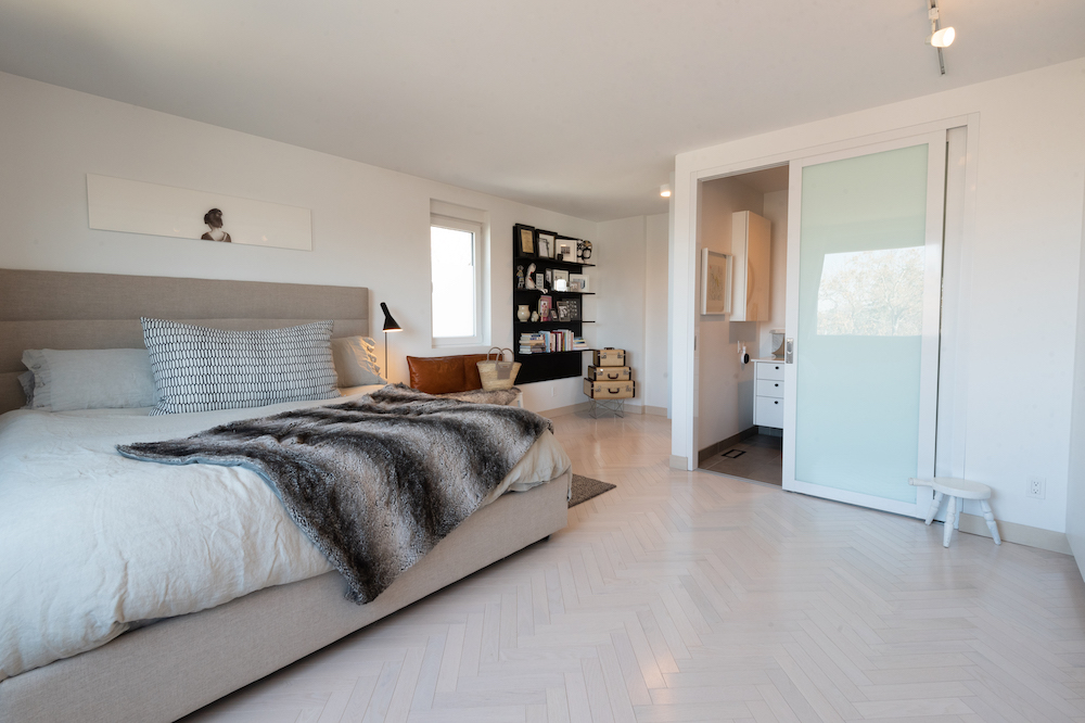
A Primary Paradise
The primary bedroom is a culmination of the clean, character-rich aesthetic that runs through the rest of the home. “The room developed over time and continues to provide a space for us to evolve that is a reflection of who we are while offering peace and comfort,” says Anna. In addition to the black shelving that mirrors those in the living room, Anna turned to unique storage options – like vintage leather steam luggage. “I bought them from a woman who had them custom-made in the 1950s. They’ve been well-used by us as beautiful storage pieces.”
HGTV your inbox.
By clicking "SIGN UP” you agree to receive emails from HGTV and accept Corus' Terms of Use and Corus' Privacy Policy.


