The owners of this small new-build in Vancouver’s eclectic Fraser neighbourhood wanted a lot: a beautifully designed family home, personalized enough so they could enjoy it now, yet neutral enough for easy resale down the road. They hired Lindsay Steele, owner of Motto Interior Design, who relied on smart storage, functional furniture and just the right amount of colour to get the balance right.
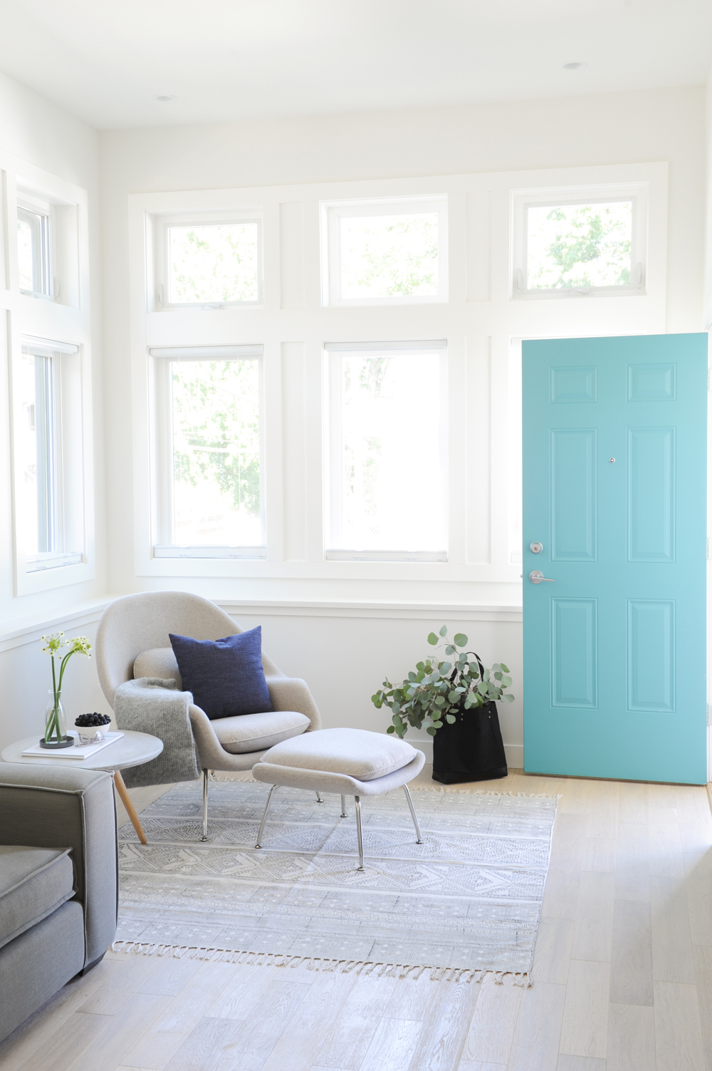
Blue Notes
The owners’ desire for a few splashes of colour is fulfilled in the welcoming, yet high-energy front hall. “I absolutely love a colourful front door,” says designer Lindsay Steele, who chose this lively shade that has a very cheery impact. She complements it with a darker cushion which pops in this cozy vignette.
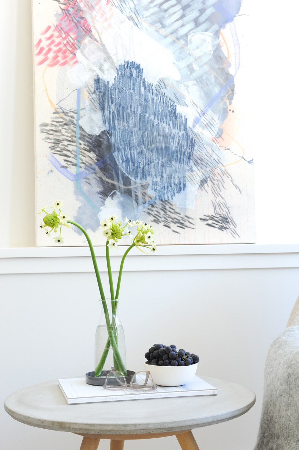
Local Talent
Who wouldn’t like to open the front door and be greeted with artwork? This abstract, by local artist Sarah Delaney, is a compelling composition that elevates the style of the entryway and connects nicely with the pops-of-blue palette.
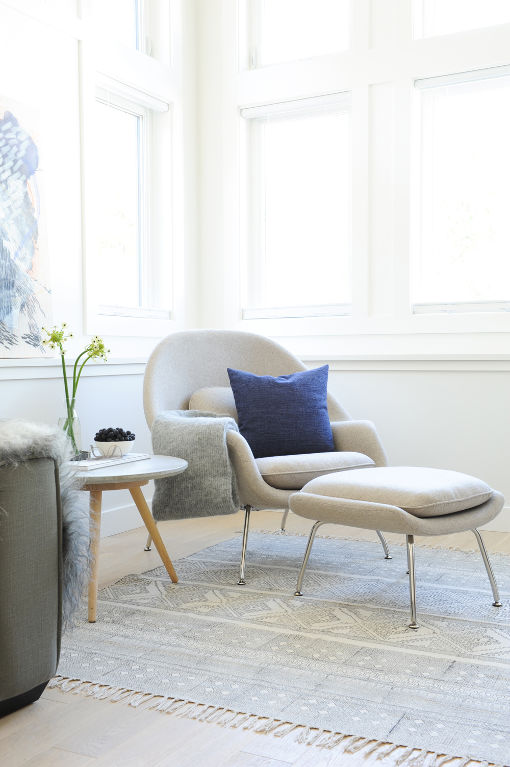
Have a Seat
The home’s entrance is more than a place to kick off shoes, it is thoughtfully furnished and boasts locally made accents from the artwork to the side table from Barter. “I chose this womb chair precisely because it is super cozy and inviting,” says Lindsay. Soft throws and a woven rug continue the theme.
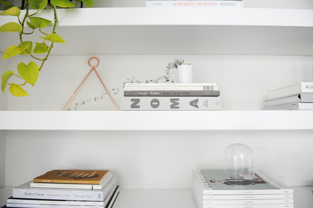
Styling Notes
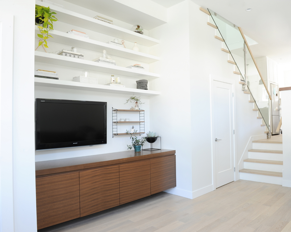
When in doubt about styling floating shelves, copy a designer. “Some stacked books and objects keeps the look subtle, while a plant warms everything up and introduces another texture,” says Lindsay.
Space Craft
To give the homeowners the open shelving they wanted, Lindsay layered in white floating beauties that meld into the wall. A custom walnut credenza provides much-needed closed storage and a nice framework for the TV placement. We love how Lindsay balanced the TV’s position by hanging tiny walnut shelves beside it.
Clear Vision
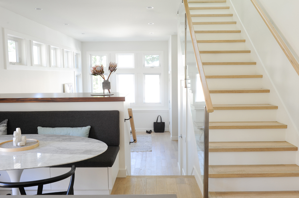
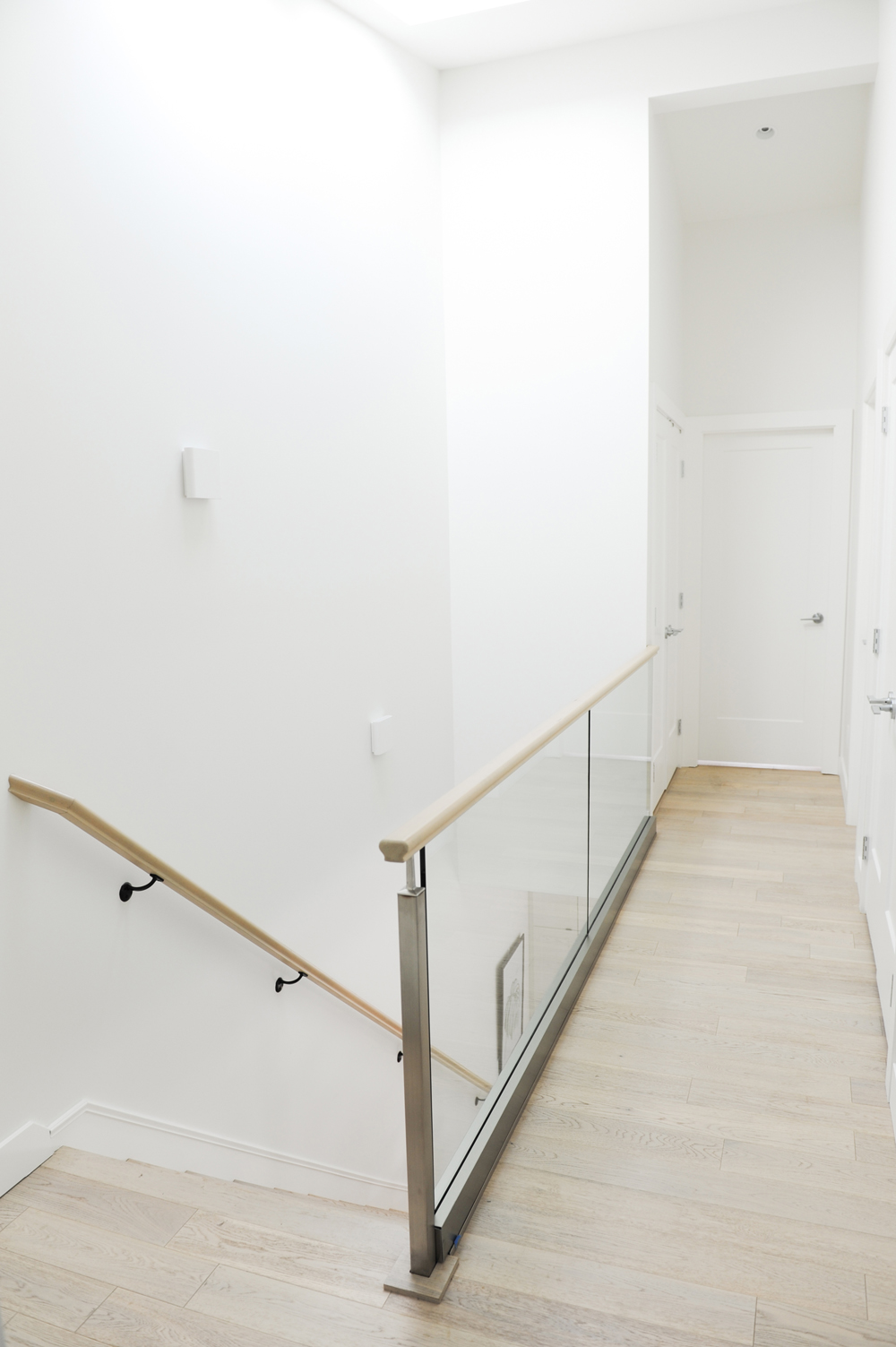
Clear railing panels work well in just about any space, but they were almost a necessity for this narrow staircase, which leads to an upper hallway that is even more narrow. They let the kitchen design remain a focal point, to keep the look expansive and reflect all the natural light.
Related: This Adorable Cozy Cottage Near Ottawa is Peak Canadiana
Bench Mark
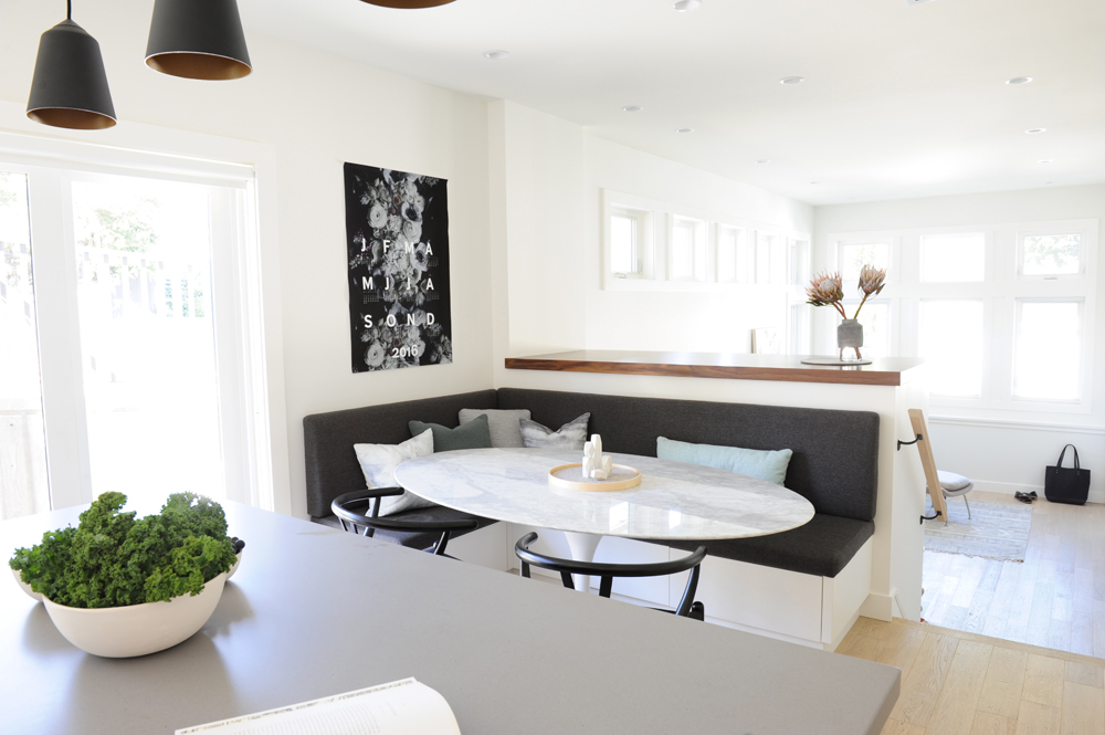
Built-in seating is a lifesaver in a small kitchen. “There was barely any room for seating here, so the banquette really increases the functionality of the space,” says Lindsay. She smartly covered it in a dark fabric, a practical choice for a family home – and it offers ample comfy seating complemented by additional chairs.
Good Shape
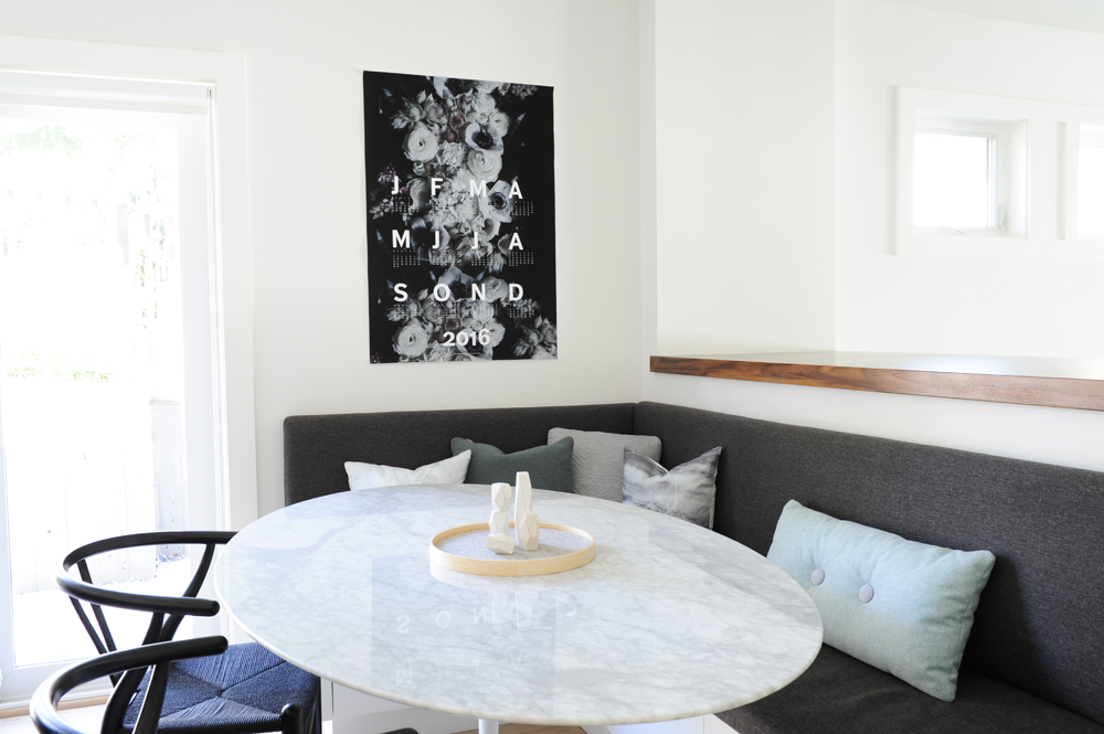
Lindsay countered the angles of the banquette seating with a classic tulip table from Rove Concepts. Its oval top doesn’t overpower the small area, yet is still big enough for the whole family. Finishing touches, from cushions to the owners’ artwork, add personality to the practical area. One takeaway: hang art in your kitchen!
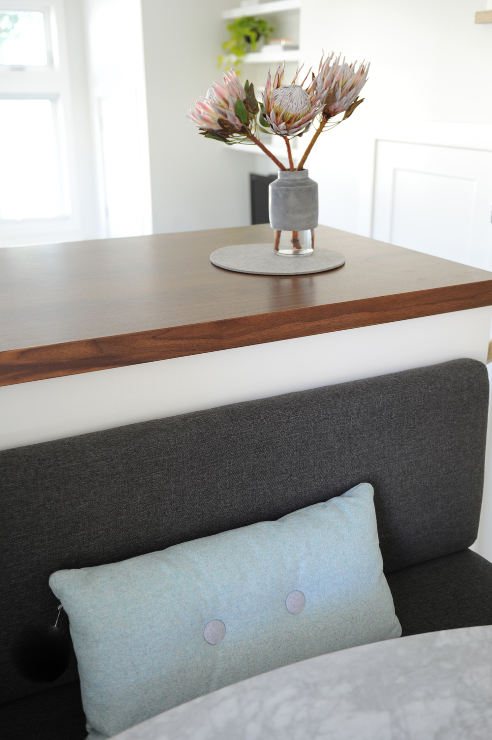
Soft Touch
Materials, from beautifully grained walnut to soft upholstery, keep this minimal and mostly white space warm, while imparting an almost organic element. We like how the simplicity of three Protea stems play up on that.
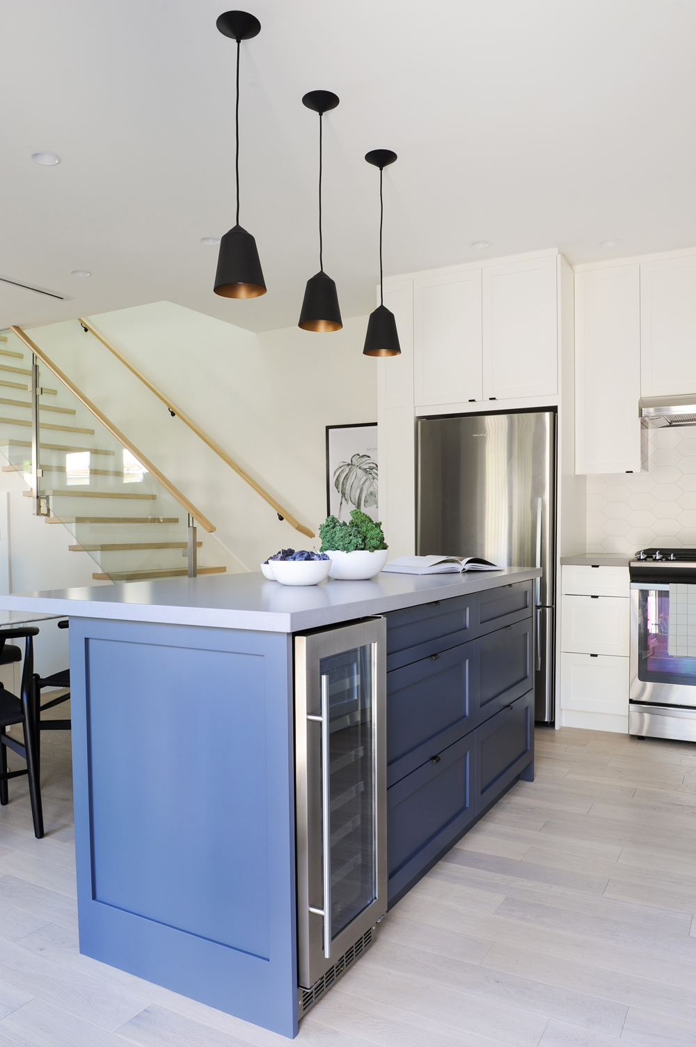
Nice Colouring
Another design tip: contrast is your friend. This fabulous blue-charcoal base of the island adds interest and heft to the kitchen’s pale finishes. It ties in specifically with this home’s blues, but encourages colour contemplation (what shade would you choose for your island?). The owners were thrilled that Lindsay was able to sneak in a small wine fridge.
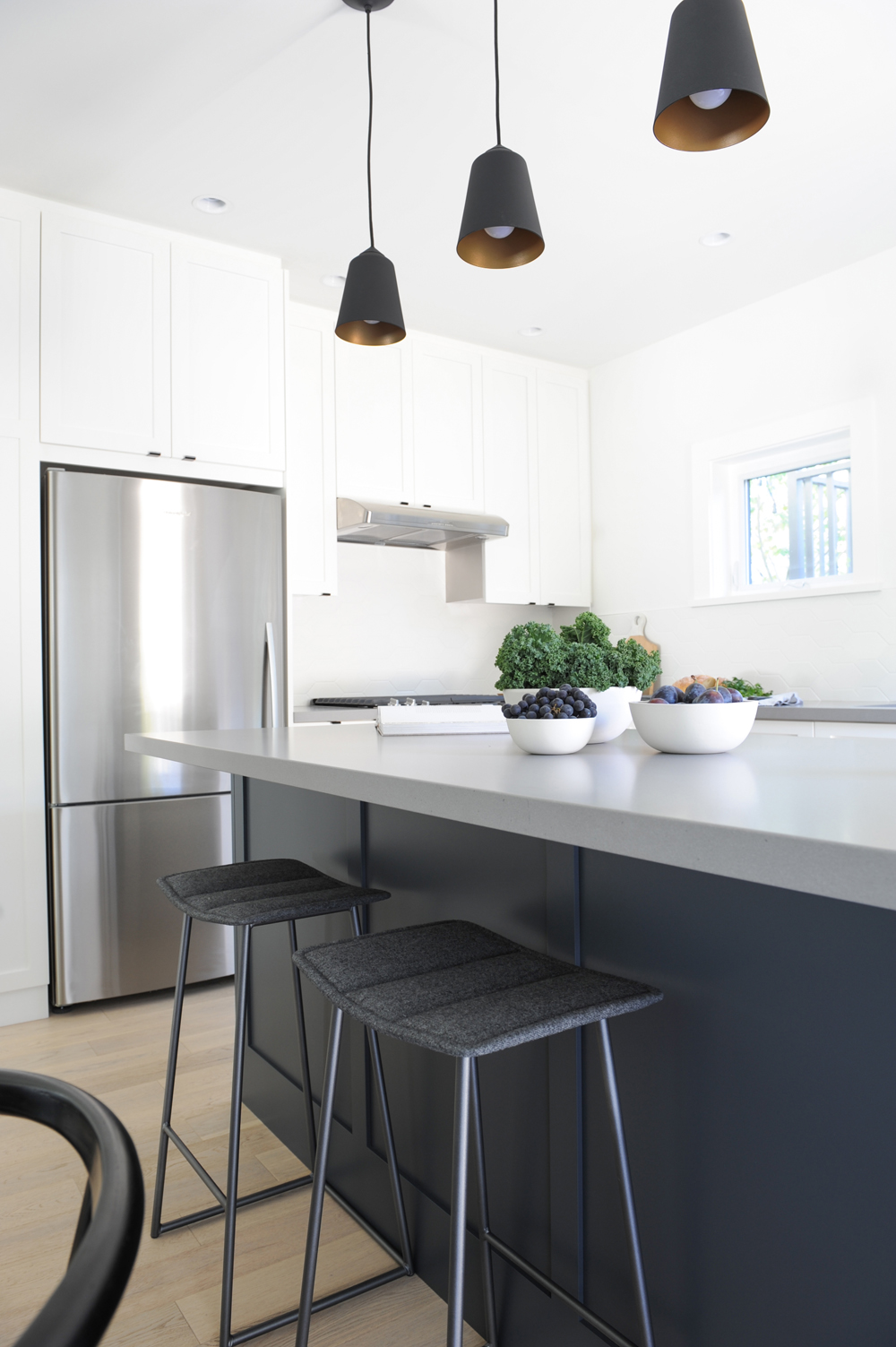
Grey Matters
This storage-free side of the island (there are six drawers on the other side) highlights the charcoal tones of the paint. Lindsay capitalized on that with grey-flannel topped stools that are a slight variation in tone to the nearby banquette seating.
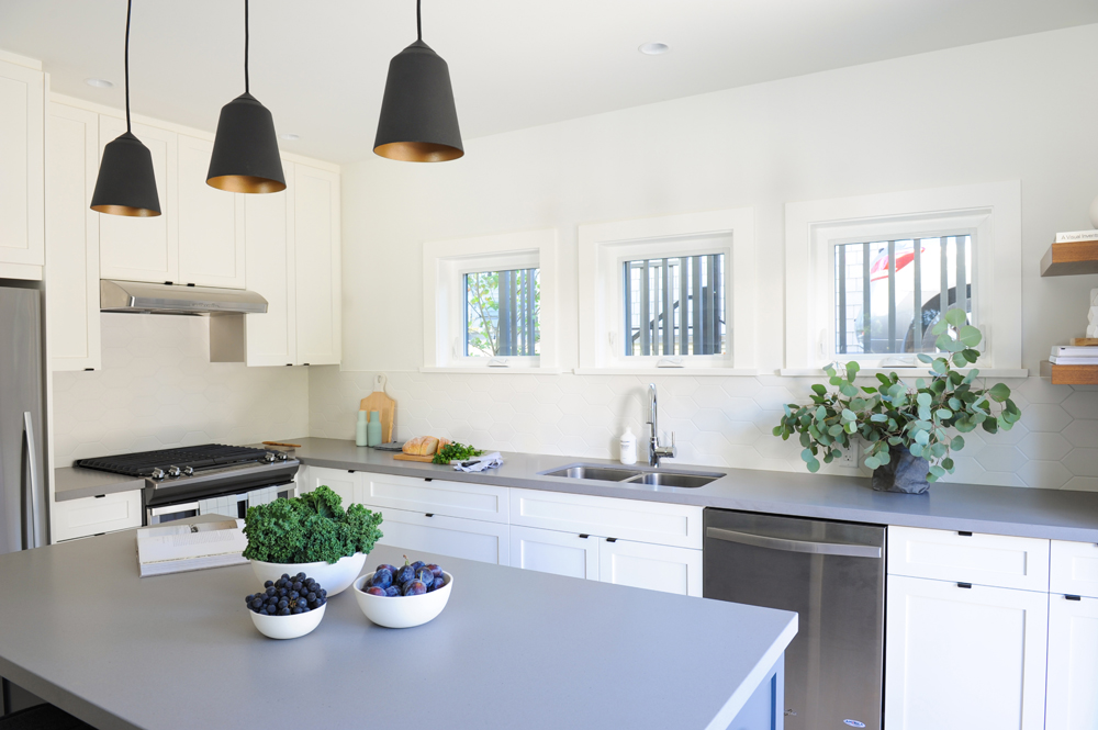
Fine Finish
The simple and clean kitchen boasts many subtle details, but one of our favourites has to be the backsplash. Look closely at the tiles: the white makes them blend in, but the interesting six-sided shape takes a bold stance away from the more expected mosaic or subway silhouettes.
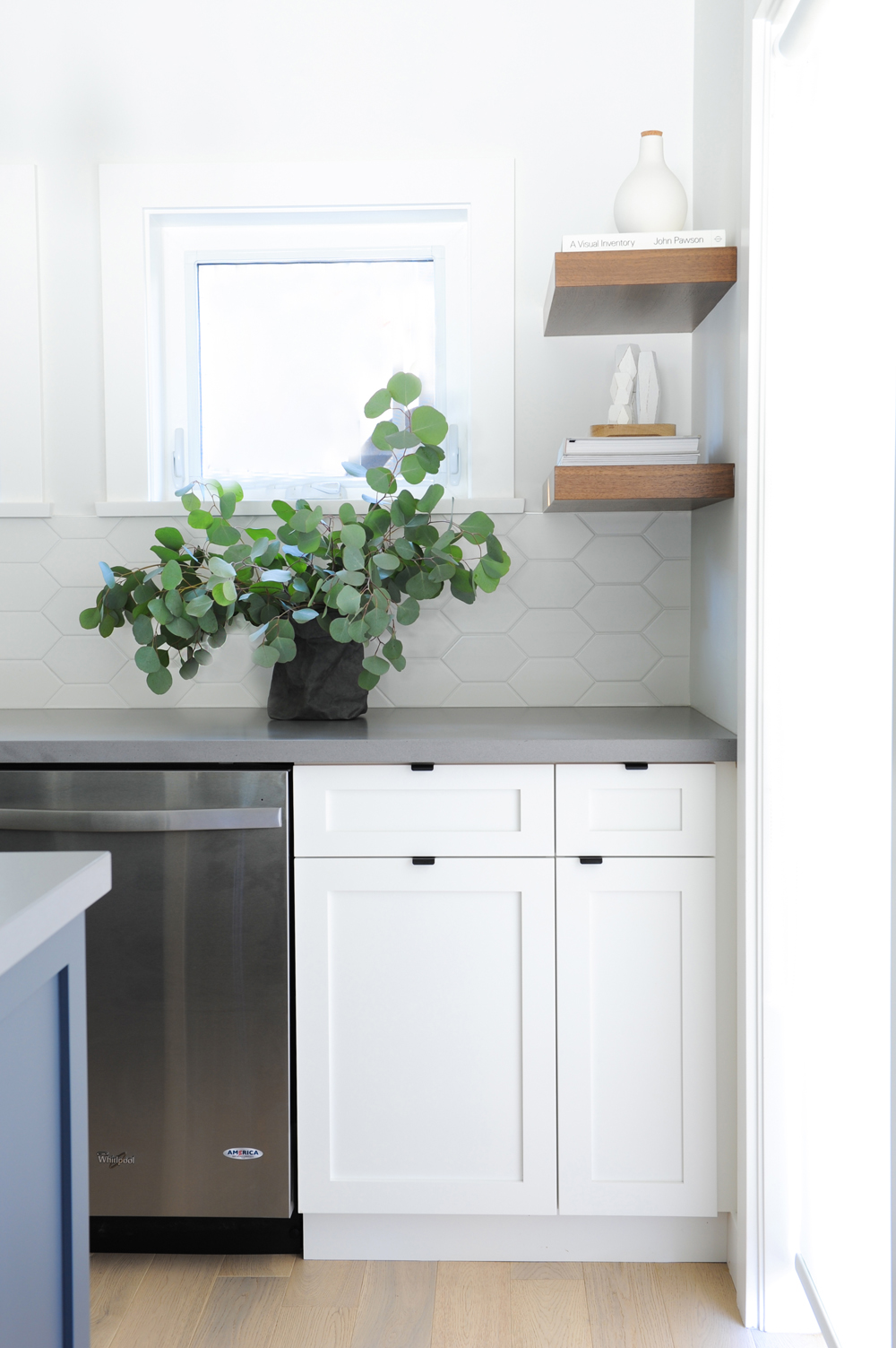
All Natural
Stylish elements like leafy greens and walnut shelves keep the white kitchen from feeling sterile. We love how the shelves are styled with items that would work just as well in the living room, proving that you can go beyond cookbooks and cookie jars in the kitchen.
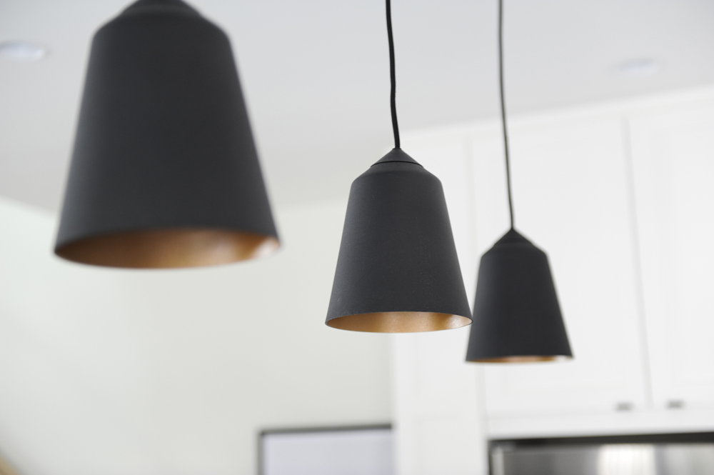
Good Lighting
“I used a lot of black in the home’s lighting, as well as the hardware,” says Lindsay. These three stunners are from Mateo Lighting. Here are the coolest lighting trends that’ll transform any room.
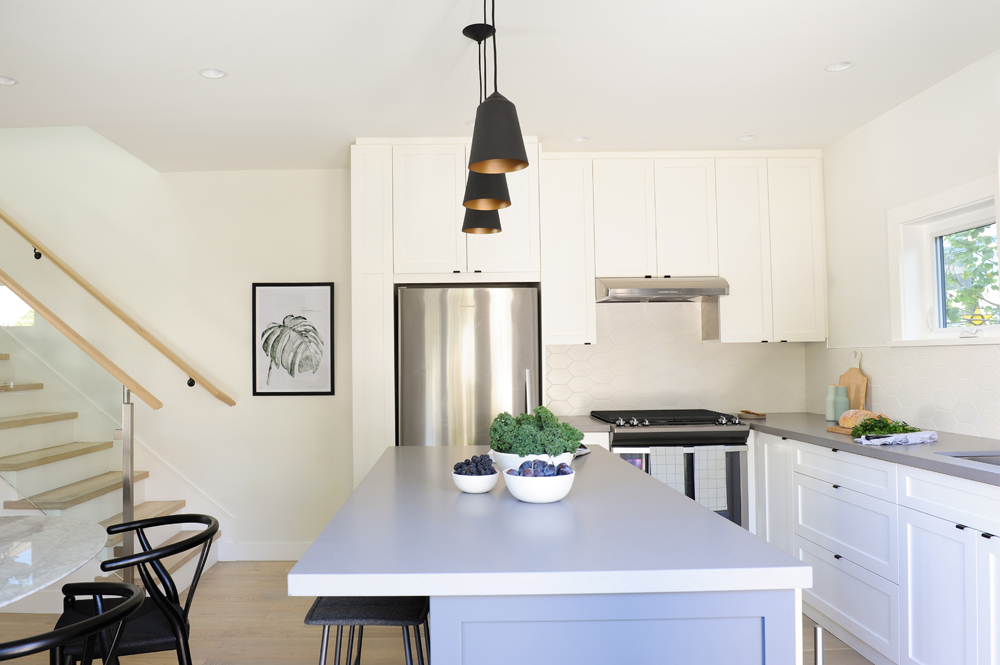
Space Management
Thanks to Lindsay’s expert planning, the small kitchen now boasts oodles of storage space, seating options and a layout that’s conducive to family life. It’s proof that even when kitchen square-footage is at a premium, you can still enjoy have an island and eat-in dining area. Small style note: we love how the range hood matches the stainless-steel appliances.
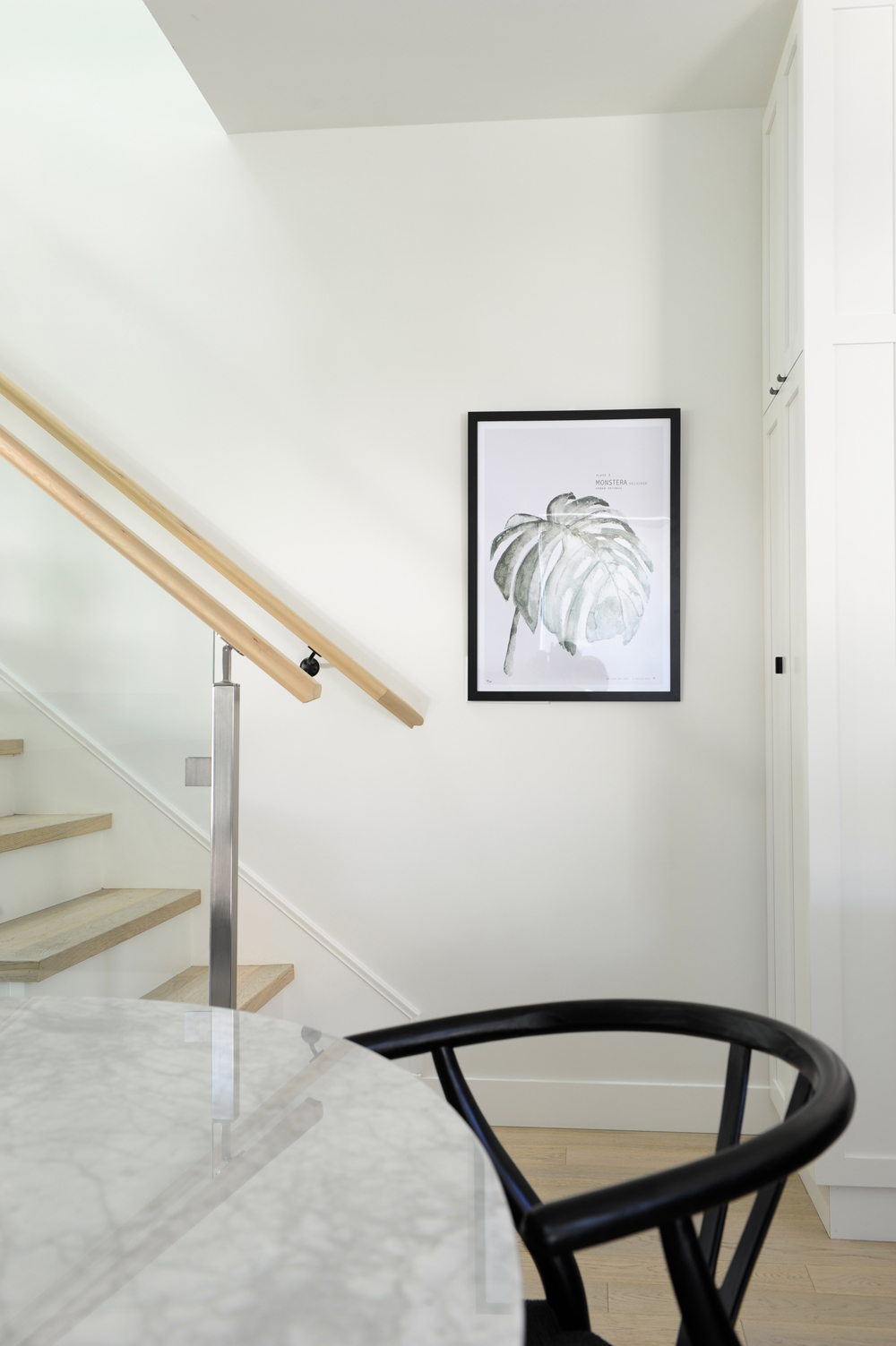
Artistic Flair
We love the restraint of the artwork here: no small pictures lining the wall up the stairs; rather, one black-framed graphic print – not too high up – that makes a statement.
Related: 13 Beautiful Pieces of Artwork for Your Home for Under $100
Watch Your Tone
The restraint continues in the minimal white art that almost disappears into the wall. These pieces are also from local artist Sarah Delaney and though they are the epitome of subtlety, they really are a bold and confident choice here.
Product Placement
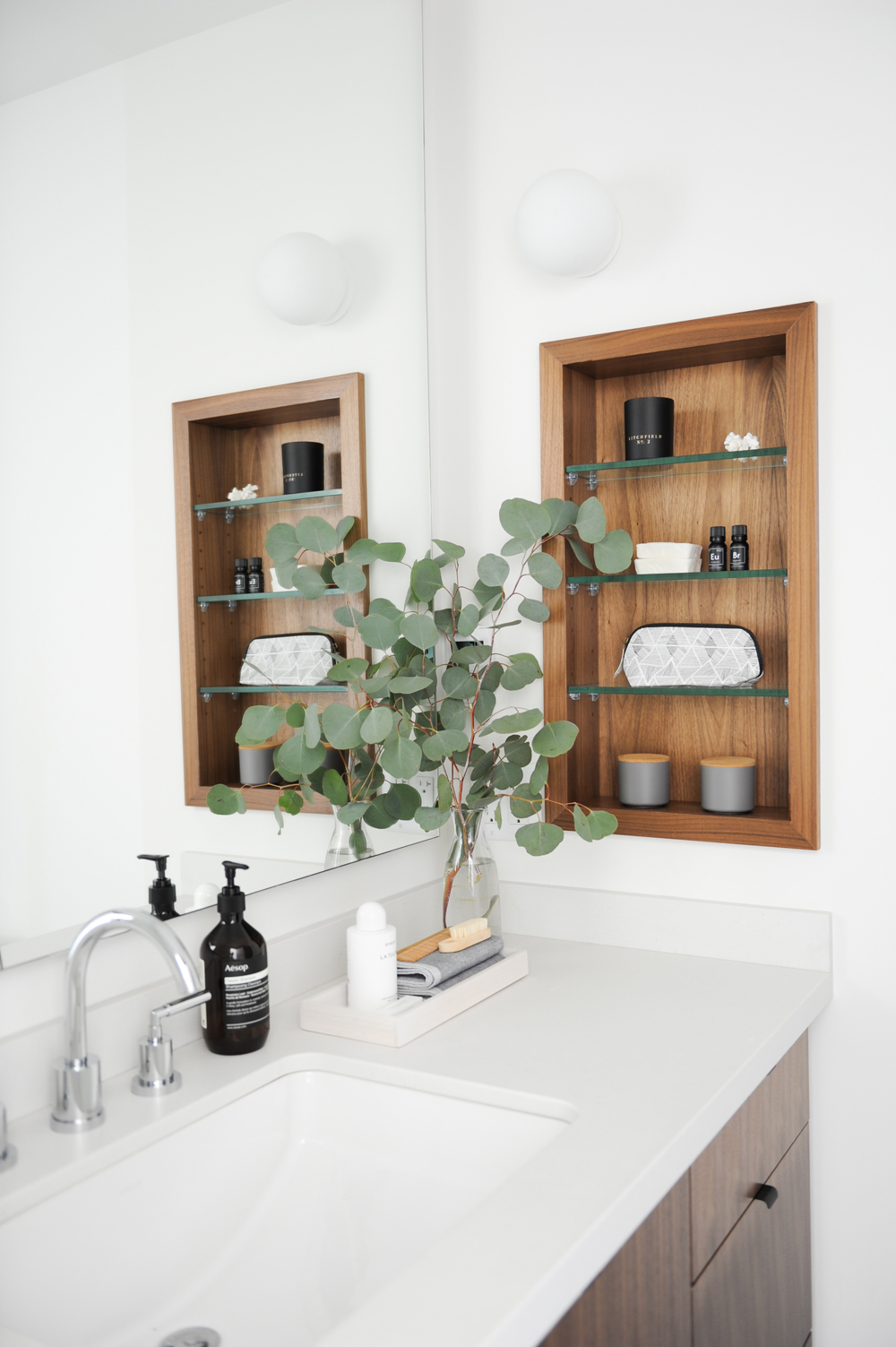
How to sneak in more bathroom storage? Inset shelving. “The owners wanted more storage for toiletries in the master bath and this was my way of bringing it in tastefully,” says Lindsay.
Fine Form
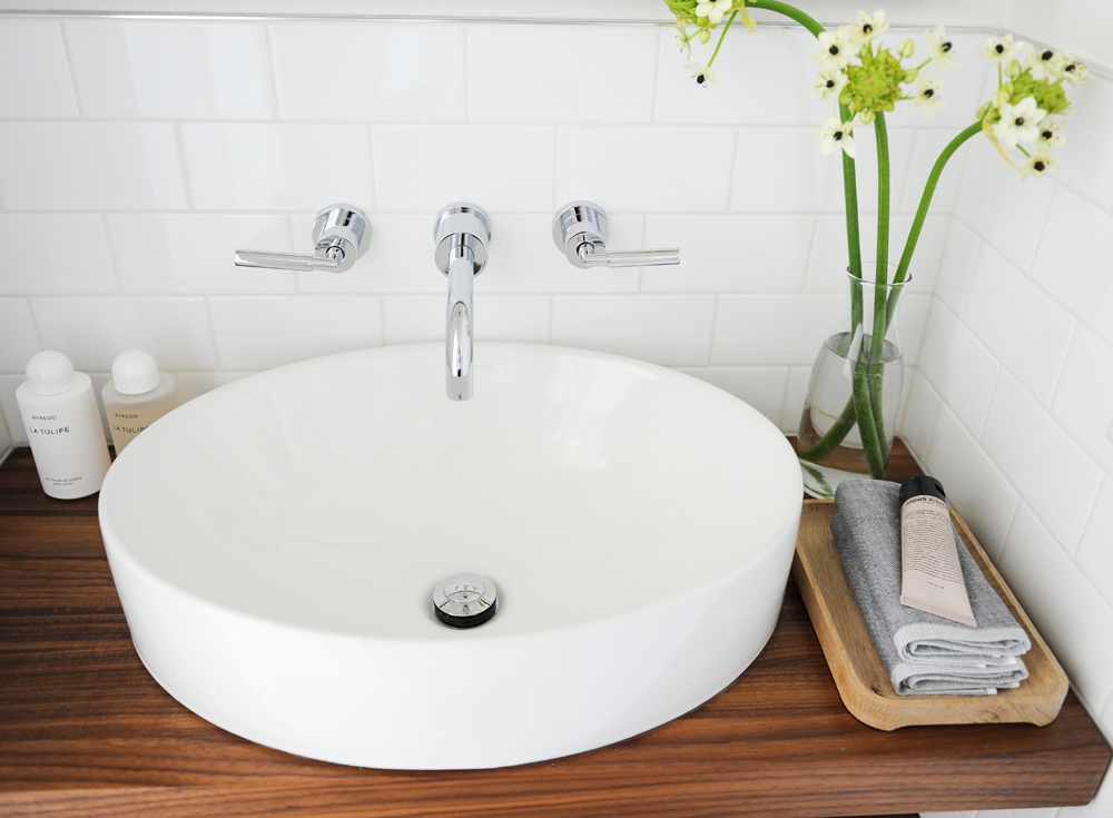
In the powder room, a vessel sink has a sculptural presence and this one’s oval silhouette is a nice break from all the straight lines surrounding it. We love how, instead of the usual bar or hook, a natural wooden tray is the chic home of the hand towels.
Nice and Simple
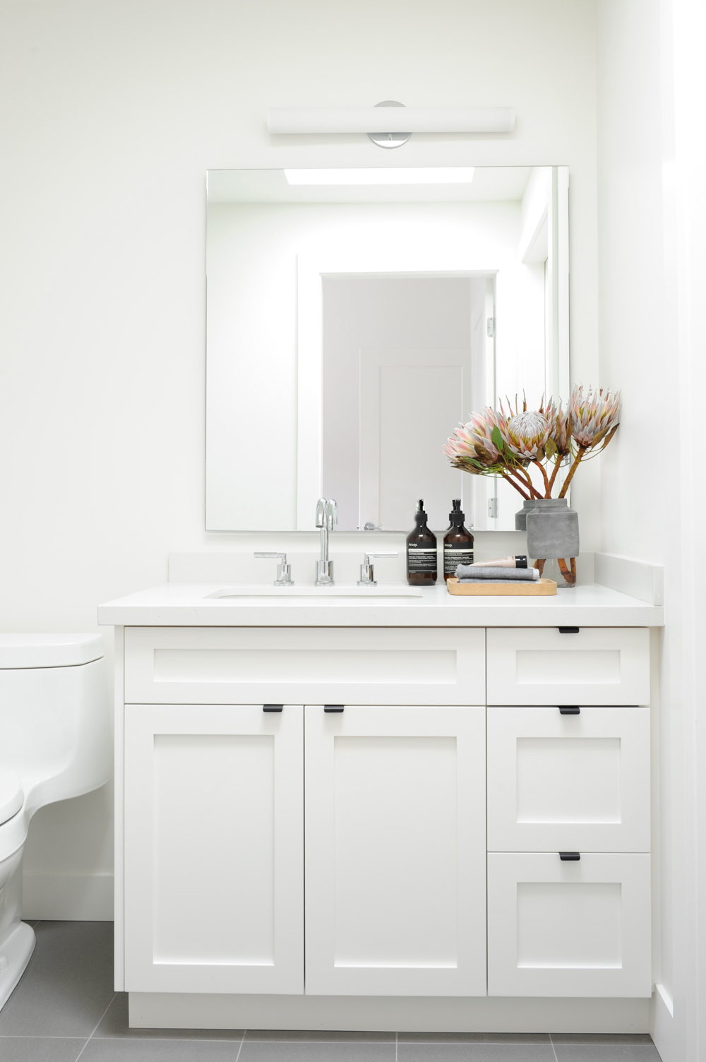
Lindsay wanted to keep the children’s bathroom simple. Its hardworking design and ample storage make it kid-friendly, but also open to some flair. Like the rest of the home, it has a neutral, well-designed backdrop that has endless styling possibilities.
Related: This Vancouver Home Proves That Contemporary Can Have Texture and Warmth
HGTV your inbox.
By clicking "SIGN UP” you agree to receive emails from HGTV and accept Corus' Terms of Use and Corus' Privacy Policy.


