Designer Jodie Owen of Bradford, ON’s Jodie Owen Design has taken the blank canvas of a new-build and made it into a cheerful and welcoming family home for herself, husband Paul Franks and their two young daughters. It dials up warmth and simplified sophistication with a mostly neutral colour scheme, natural materials and an airy, yet layered approach to everyday decor.
Just Lounging
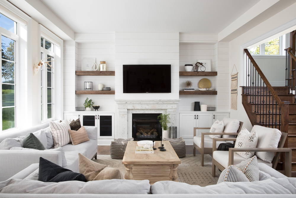
Designer Jodie Owen’s living room is warm and welcoming for many reasons, but especially because of the ample seating. “I selected two upholstered 90-inch sofas from Urban Barn that are great for lounging and family movie nights,” she says. “The metal frames on the armchairs add a different texture to the space, while keeping with the neutral theme.” We love how – no matter which seat you choose – the sight lines are compelling.
Built-In Beauty
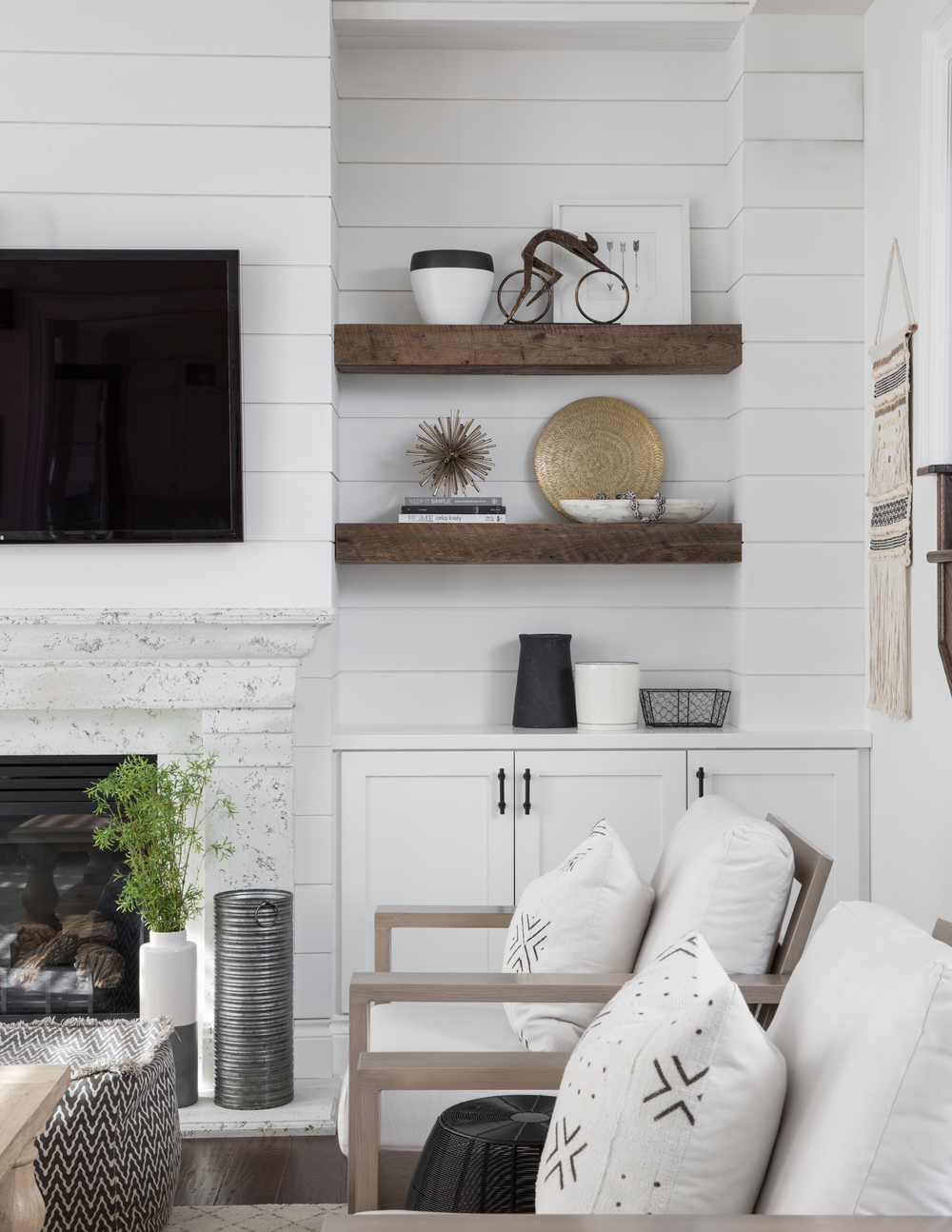
Custom-made four-inch barnwood shelves flank the fireplace and create a nicely layered effect. Jodie stained the shelves to match the hardwood floors for thoughtful continuity.
In Plain Sight
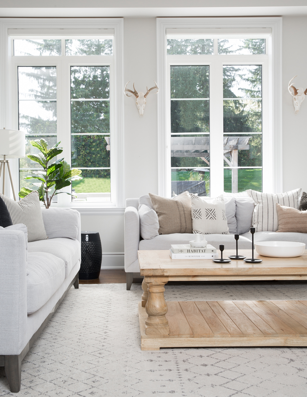
Look closely: the gorgeous living room windows really do have very smart coverings. “I chose silhouette blinds from Hunter Douglas in a linen colour to blend in,” says Jodie. “They rarely come down though, because we love our view and all the natural light that comes through with the wall of windows!” The natural-pine baluster coffee table is from Restoration Hardware.
Material World
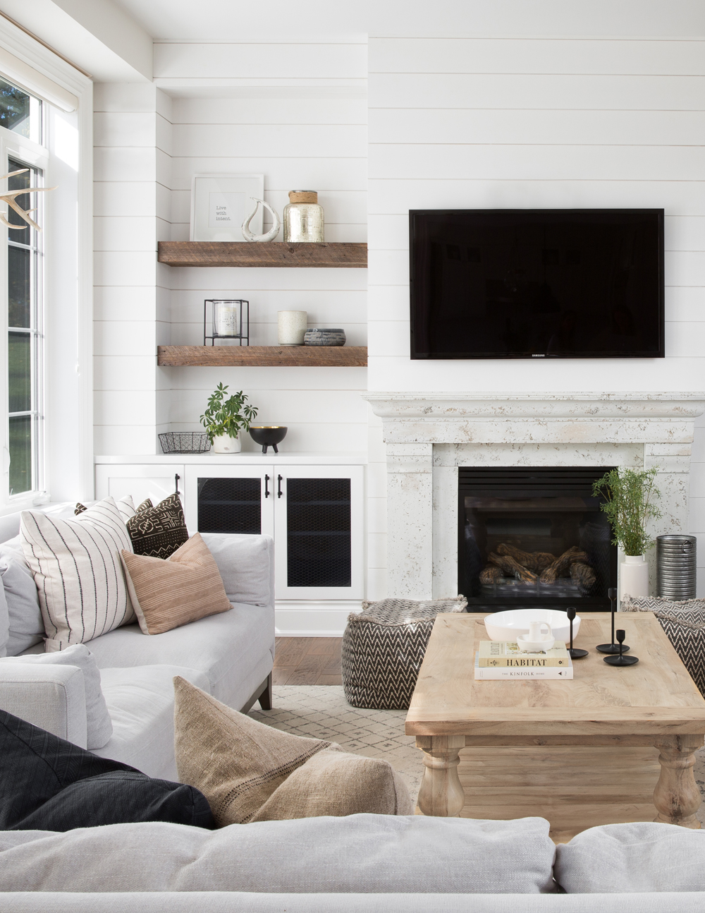
Texture is a wonderful way to add visual interest to a room. Jodie excels at this skill both in the soft furnishings and by adding shiplap to the focal wall. She pulled out all the stops for the fireplace mantel, which is crafted in stone veneer (from Eldorado Stone) that mimics the rich, aged look of natural limestone. “I chose the ‘travertine’ finish for a more textured surface, painted it and gave it a quick sanding for an old-world feel.” It’s an interesting backdrop that doesn’t allow the TV to be the focal point.
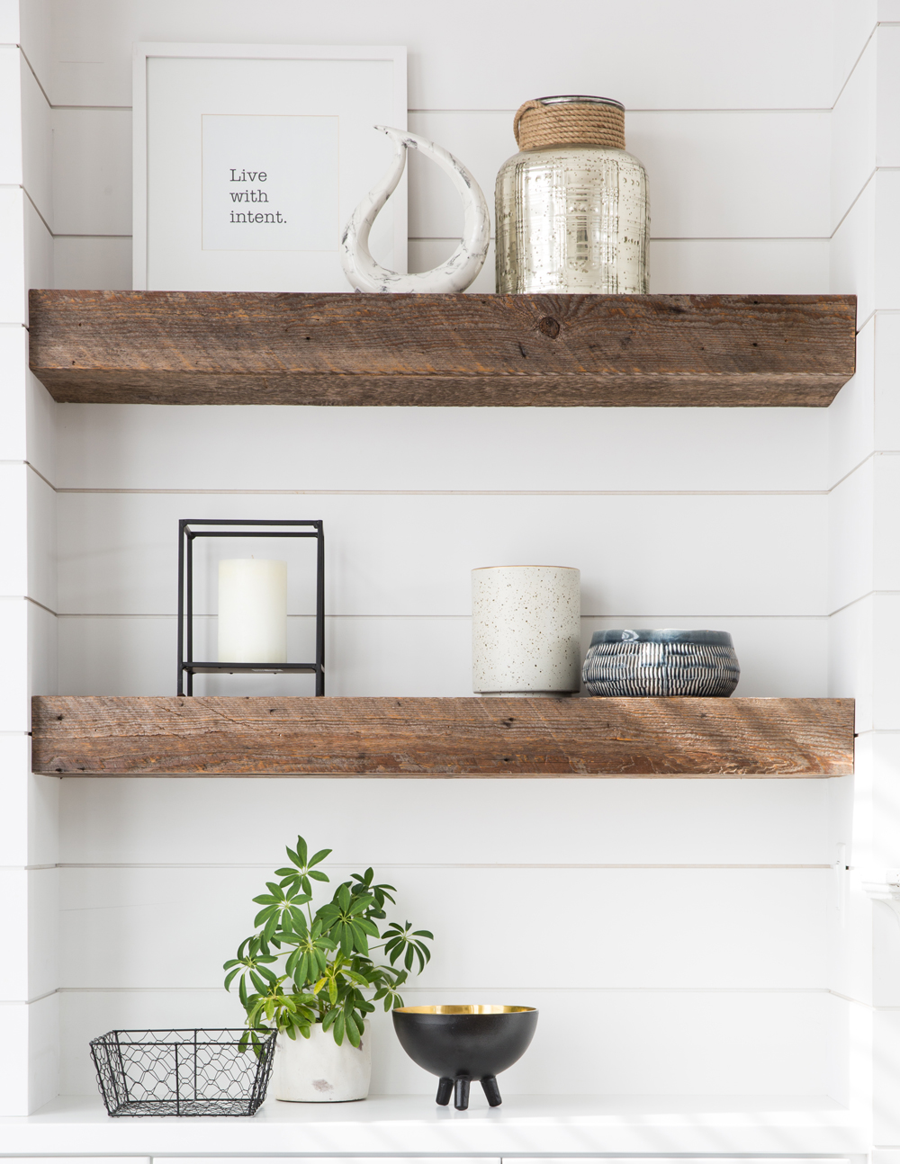
Shelfie
The living room’s airy colour palette is enlivened by the mix of beautifully arranged accessories on the shelves. A bit of metallic gold feels fun and the real greenery breathes life into the vignette. All the items are a mix of HomeSense and CB2 finds.
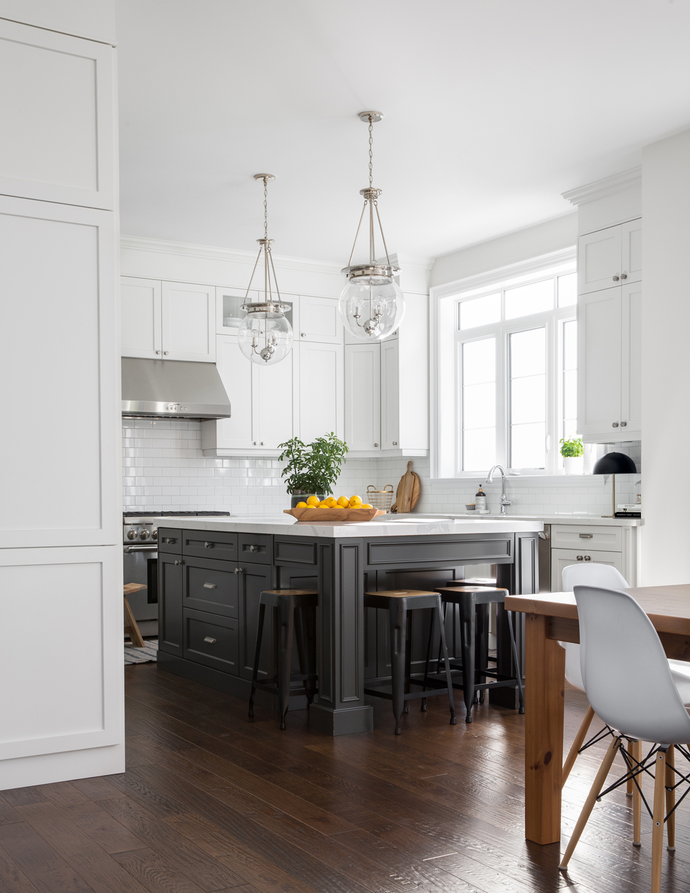
Great Ingredients
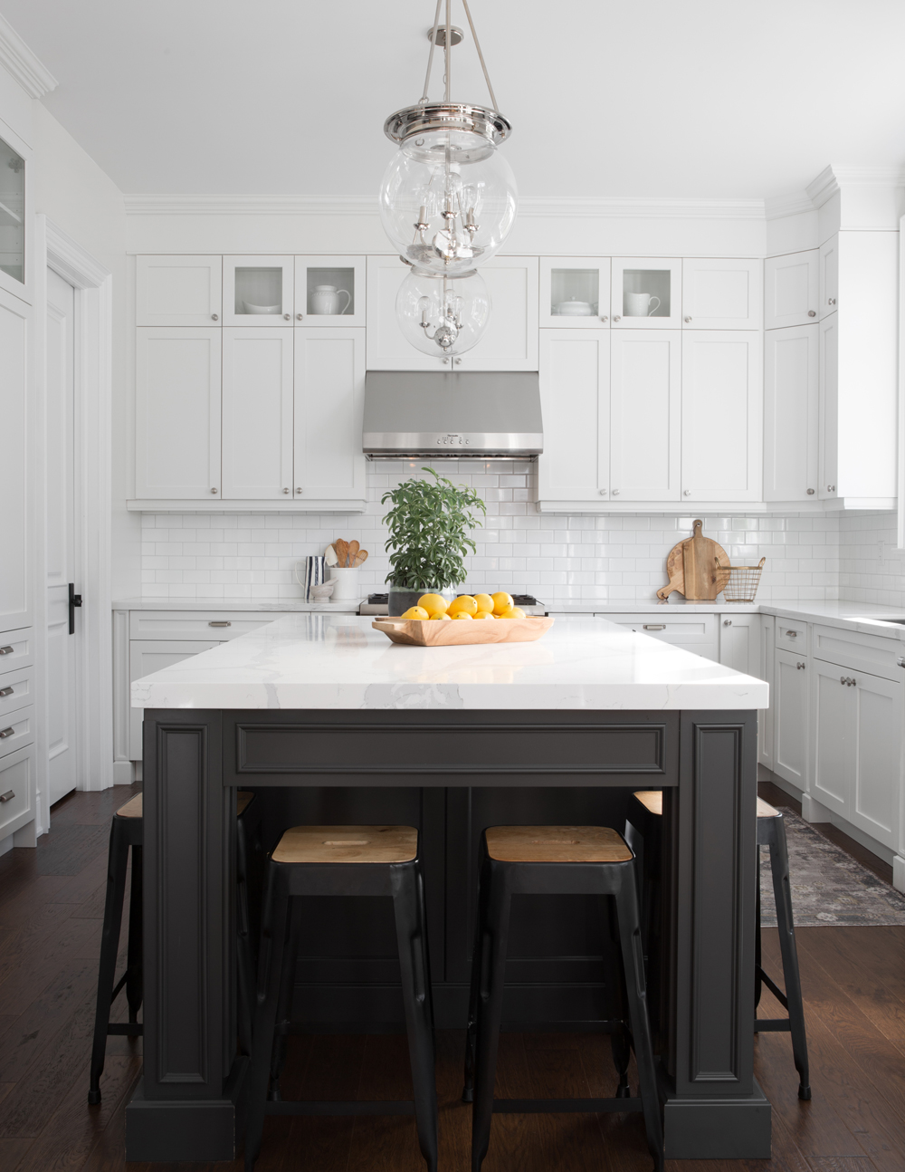
The showstopper kitchen radiates classic luxury and casual warmth. The island‘s details are worth noting: a charcoal-slate hue, bevelled detailing, dramatic gables and extra trim. The countertop is quartz with grey veining and a hint of gold for that soft warmth. Above, the clear pendant lights are a foil to the dramatic island. Jodie says: “I opted for two oversized glass globes here to keep the space airy and provide ample overhead lighting.”
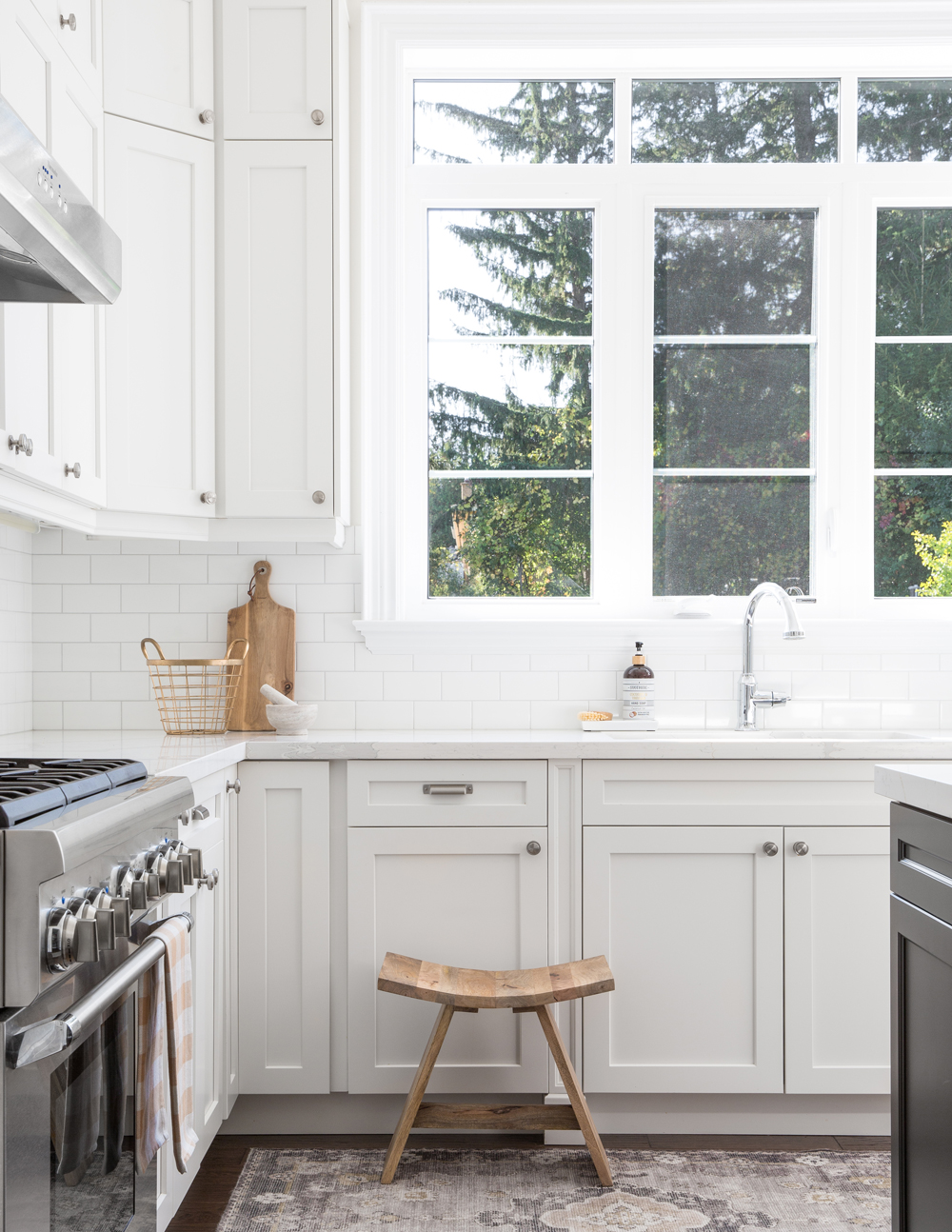
Shaker Baker
The kitchen’s perimeter cabinetry is classic shaker style in a warm off white. Jodie extended them to reach the 10-foot ceiling, maximizing storage and nicely filling in the space. For the backsplash, Jodie says: “I went with a standard six-inch white subway tiles in a glossy finish, because I didn’t want anything too busy and I knew their classic look would stand the test of time.” We like how the raw-wood accessories and patterned runner warm up all the white.
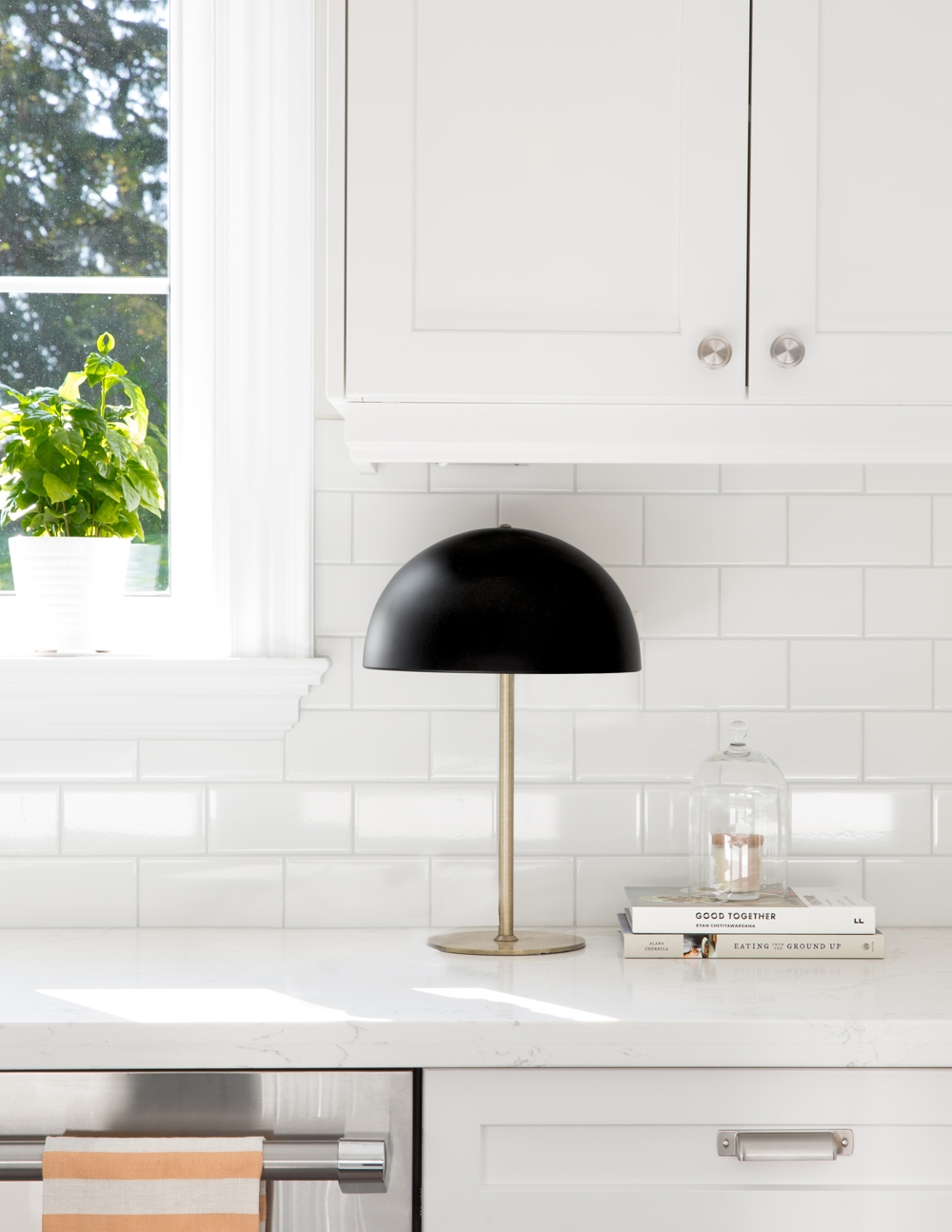
Good Lighting
Mixing old with new is one of Jodie’s design signatures, as this vintage lamp demonstrates. The black shade pops against the subway tiles and adds some antique interest to a brand-new kitchen.
In Black and White
Jodie puts a graphic spin on the all-white kitchen with her “mostly white” one, which gets an energetic design shift thanks to the rich darkness of the island’s base and the warm wood floors. Glass inserts in the upper cabinets break up the expanse of cupboards and tie in with the pendant lights for a savvy overall mix of sturdy and light.
Natural Beauty
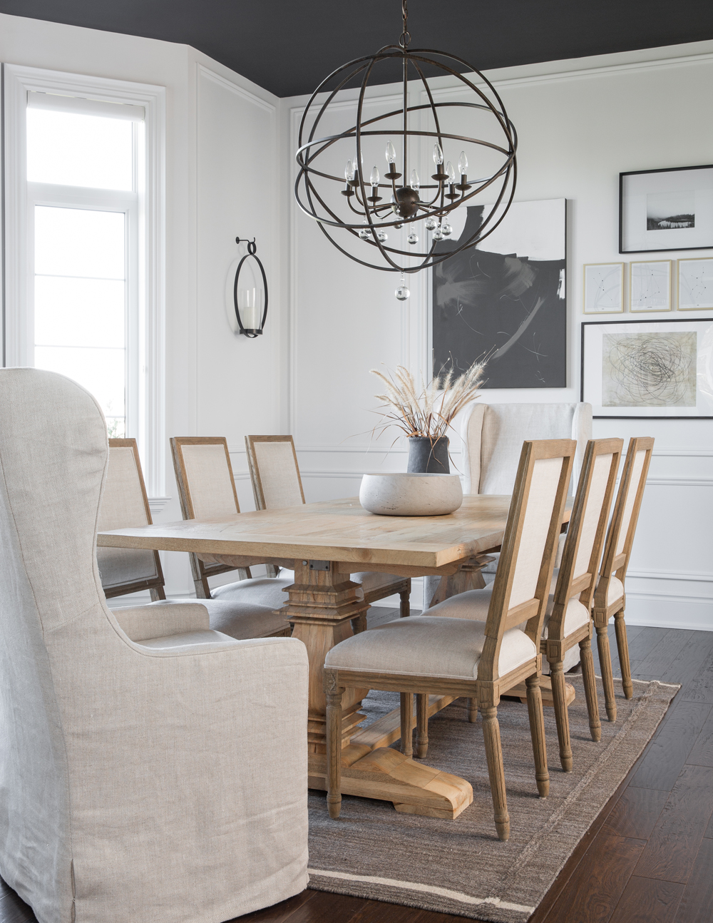
The natural finish of the dining area’s mango-wood table is a riveting contrast to the darker floors. Jodie loved the moulded detailing on the vintage-inspired French square-back chairs, which she mixed with slip-covered chairs (all from Restoration Hardware). “The wingbacks add height, break up all the wood details and are on castors for extra comfort and ease.” The artwork is a selection of downloadable prints from Etsy, except the black-and-white abstract, which Jodie painted. We love the contrast of the painted ceiling and how it demarcates this as the dining area in the open floor plan.
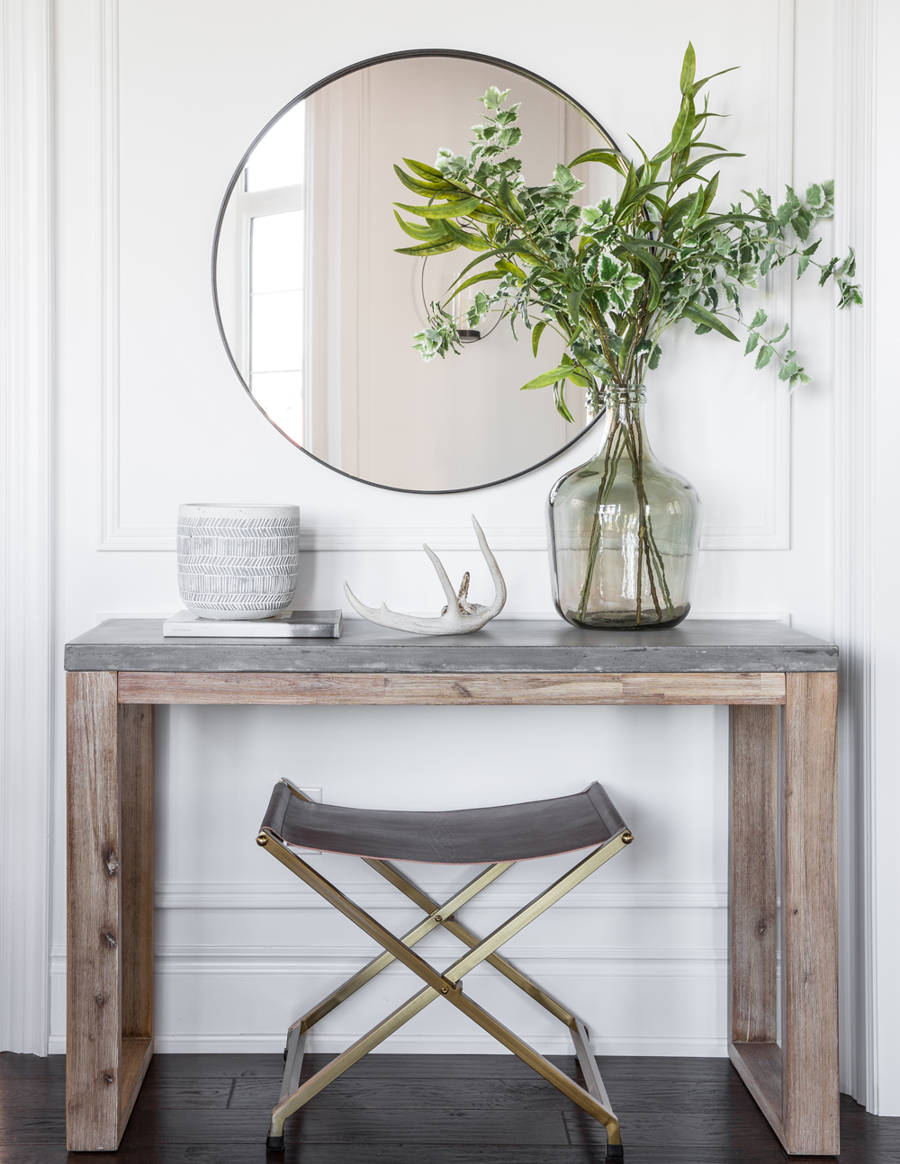
Bright Entry
is also part of the open plan’s dining area, so it needed to fit into the overall design brief. The mirror injects a bit of black contrast and reflects the entry’s natural light into the room. The concrete-top table layers in a different texture, while its base references the wood in the dining area.
Nice Landing
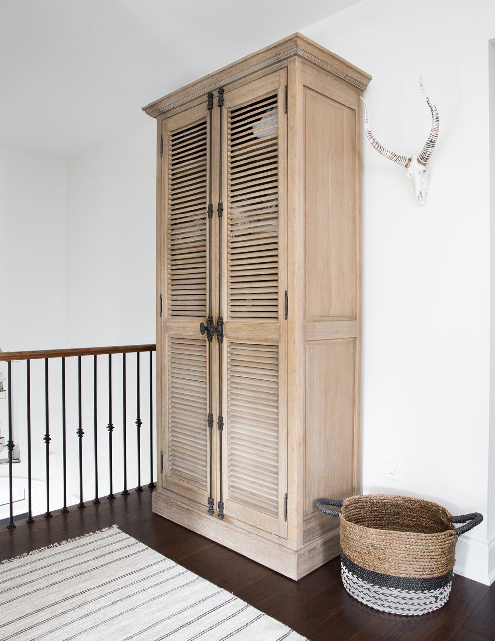
Jodie removed the upper floor’s built-in linen closet to enlarge the master bathroom and replaced the lost storage space with this shutter-doored cabinet. She says, “It’s eight-and-a-half-feet tall, which not only provides a ton of storage, but makes for a perfect vignette on the landing.”
Nice Work
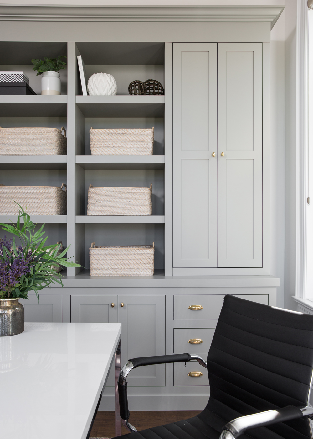
Jodie’s home office features nine feet of custom cabinetry that offers a ton of storage and includes a sliding panel that conceals the printer. The open shelves break up the heaviness and the pretty baskets are from West Elm.
Sleep Well
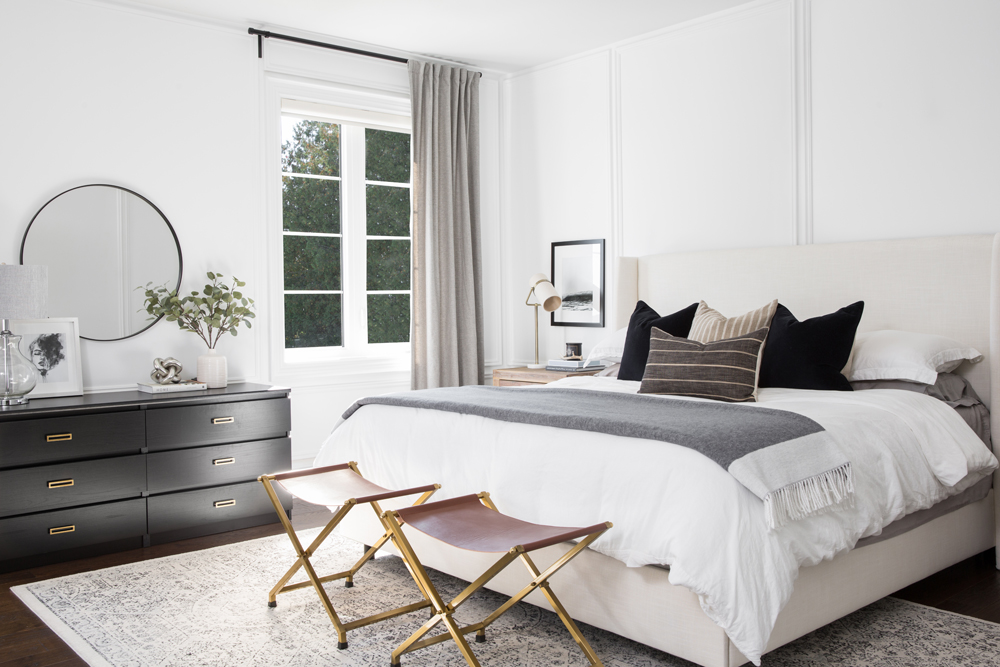
“I opted for a more masculine vibe in our master bedroom,” says Jodie. “Think pinstripe-suit-meets-calm-neutrals.” Her original vision for the room included custom drapery panels, until she saw this Belgian flax linen panel in the perfect shade of grey at Pottery Barn. The folding stools introduce more texture and warmth and Jodie loves the play of the rich caramel tones against the bed’s deep navy cushions.
Side Order
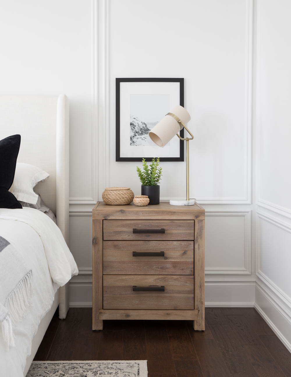
The white-washed oak bedside tables from Urban Barn have herringbone detailing on the top and provide a natural soft effect against the white walls. The pretty vignette includes one of Jodie’s favourite design elements: a touch of green.
Gold Metal
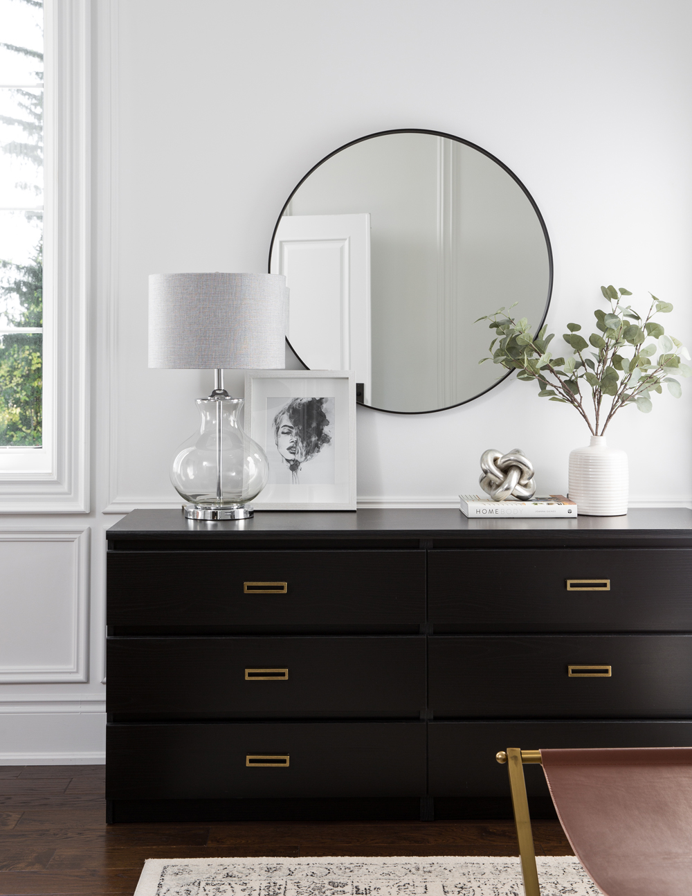
A black flat-fronted dresser has a contemporary presence that adds a bit of modern flair to the master bedroom. Jodie replaced its existing pulls with antique-gold pulls from Lee Valley for a dynamic look that also references the gold in the folding stools.
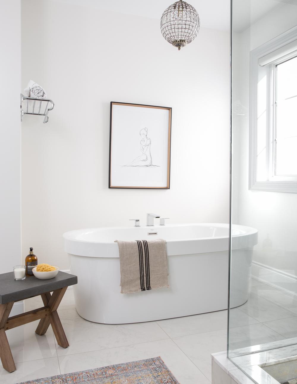
Bathing Beauty
A bathroom should be more than just a practical space. Jodie implemented many great decorative ideas to steal, from the framed artwork and Persian-style rug to the mix-material stool (a perch for pretty necessities) and the intricate pendant light.
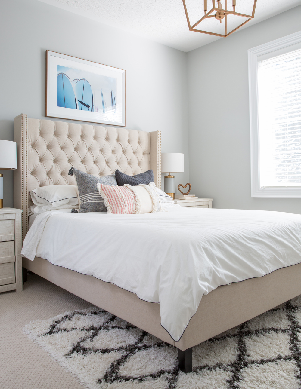
Room to Grow
Jodie thought long-term for her 12-year-old daughter’s bedroom. “I love this girly headboard in tufted linen from Structube. It was the perfect way to give her a bed she can grow with, but it was still affordable.” The thoughtful artwork has a beach vibe and is relevant to this 12-year-old who loves to swim.
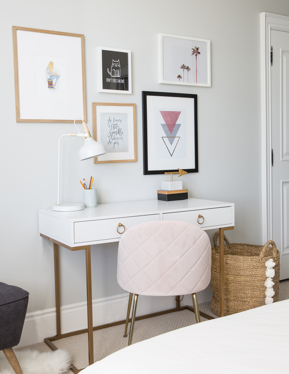
Desk Job
The desk, situated opposite the pink tufted headboard, makes doing homework a joy. The gold legs strike a glam note and the soft-pink chair has feminine and cozy appeal. The gallery wall is a mix of prints, once again, from Etsy.
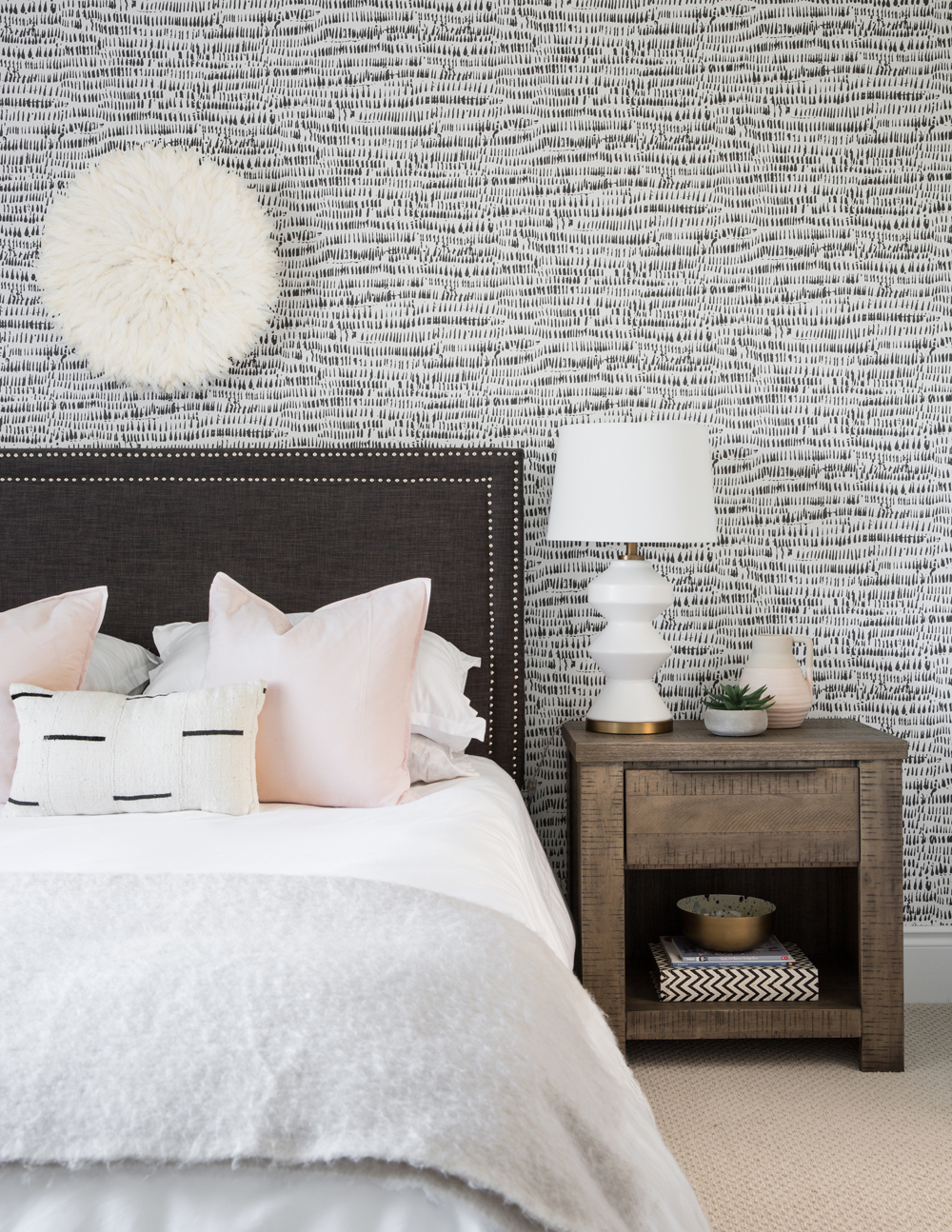
Pattern Play
Jodie’s youngest daughter has a bedroom that’s both girly and grown up. “I chose a black-and-white teardrop wallpaper for her accent wall,” says Jodie. “It’s actually a peel-and-stick from NuWallpaper that hung beautifully! It’s a great way to add pattern without ‘committing’ to wallpaper.” An African Bumbles Juju hat from Etsy keeps the pattern playful and soft. Like the rest of this charming family home, this room is layered, fresh and quietly sophisticated.
HGTV your inbox.
By clicking "SIGN UP” you agree to receive emails from HGTV and accept Corus' Terms of Use and Corus' Privacy Policy.


