If Josh LaCombe’s house had a design theme when he bought it with his husband, Sean Collins, in 2013, it would’ve been honey oak. The house, built in 1925 in St. Clair West, had been given a lipstick renovation in the 1990s, which meant plenty of popcorn ceilings, yellow-hued wood and shabby grey carpeting with a peculiar funk. But Josh, a natural design aficionado, saw serious potential in the space. Inspired by the home’s barn-style exterior, he set out to modernize the house while preserving its farmhouse character.
Oh, Hello
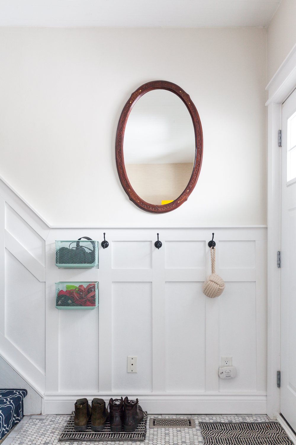
In the entranceway, Josh installed this oval mirror. It originally belonged to his mother, who got it as a gift from a friend in India. Josh liked the idea that the piece had history and a personal story. Rather than cramp the small hallway with a console table, they installed little baskets for their odds and ends, like headphones, dog boots and mail.
Bold Entrance
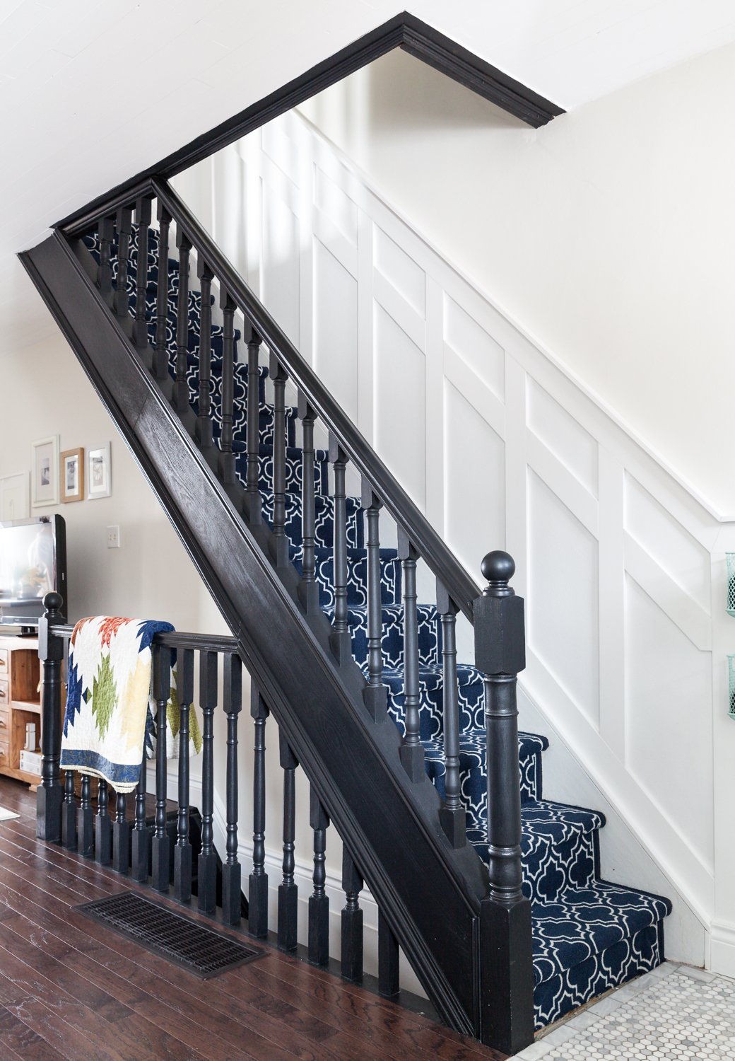
One of the home’s most dashing design features was also one of the easiest. The staircase, originally honey oak, was painted black, and Josh spent less than a day adding the patterned carpeting. The decision was more about practicality than design: their dog, Max, struggles to get up the slippery (and steep) wooden staircase. The quilt hanging over the bannister was a wedding gift.
Bright and Airy
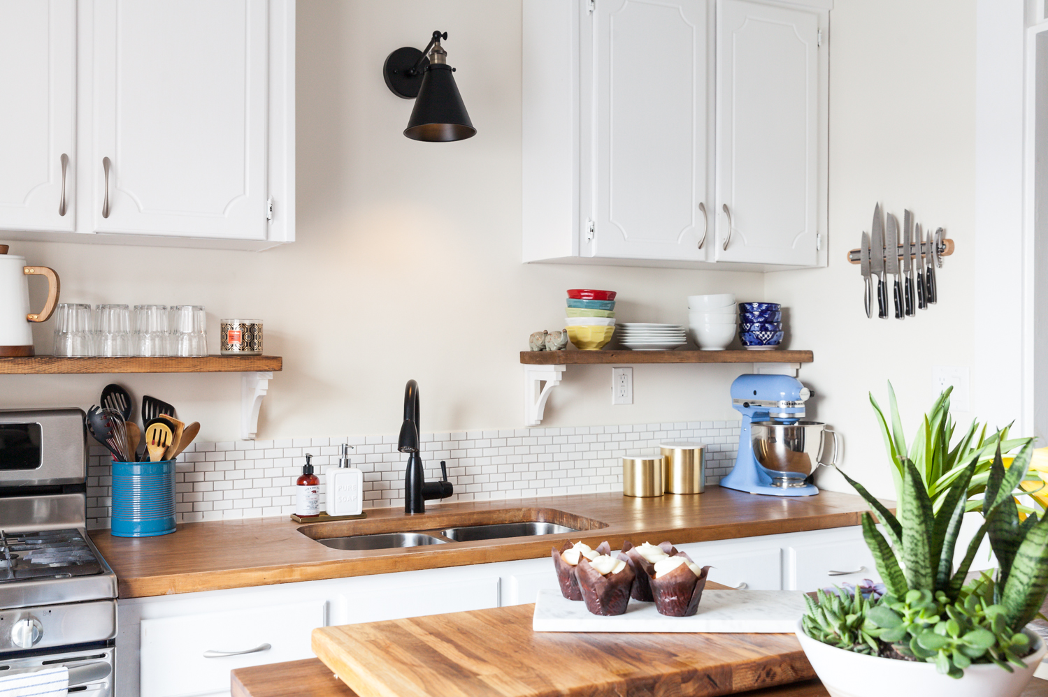
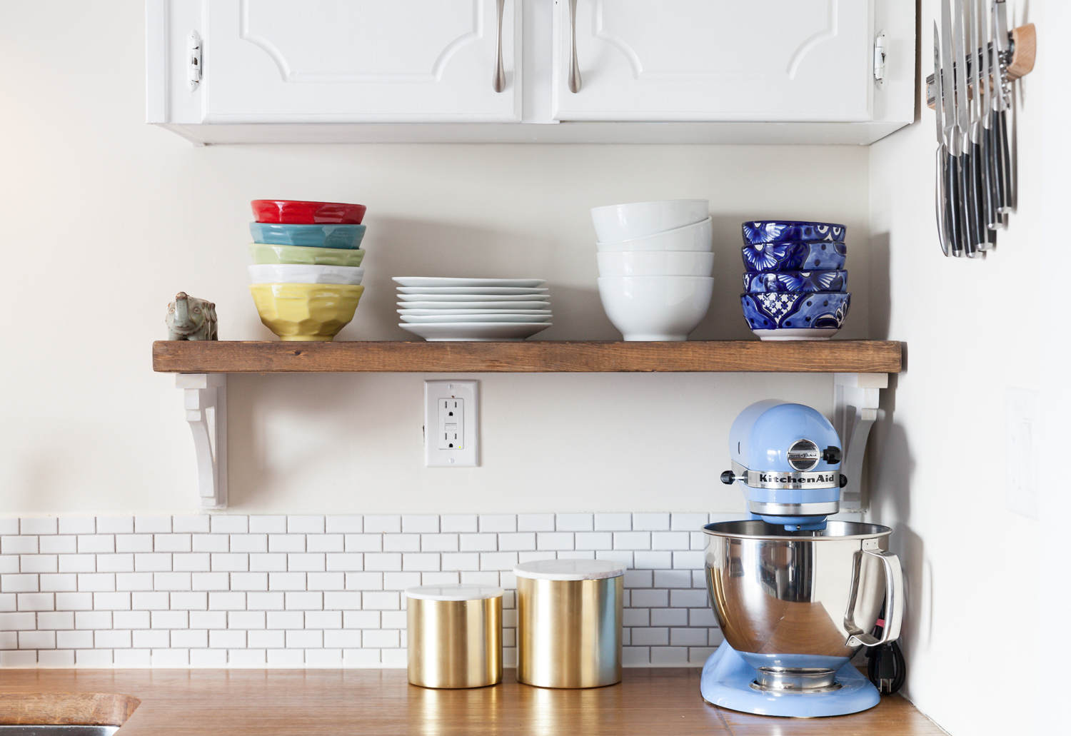
The kitchen cabinets were a total Frankenstein job. Using the original cabinetry, Josh and Sean took them off the wall, chopped them up and moved them higher, opening up space for a shelf to profile their glassware. The blue bowls on the right are from their honeymoon in Mexico. The butcher block countertop adds a warm touch to the white-on-white space.
Private Island
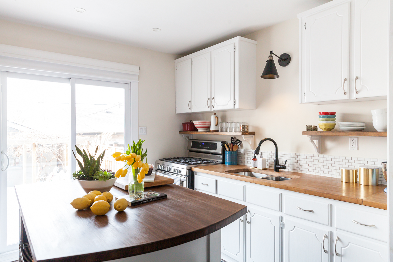
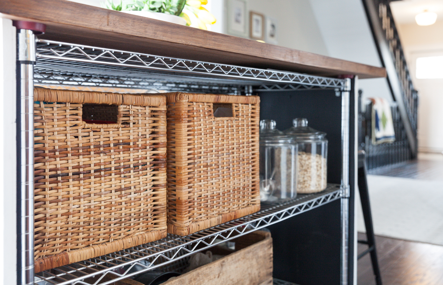
The island, which grounds the kitchen, was a homemade piece that Josh and Sean pieced together from two baker’s racks. The matte-black kitchen faucet and light fixture above the sink are a common colour theme from room to room.
Storage Wins
Anyone who’s ever packed a salad for lunch knows the agony of searching for matching Tupperware. Here, Josh and Sean dedicated space for two bins: one for lids, one for containers. They’ve added some glass containers for dry goods for a prettier touch.
True Blue
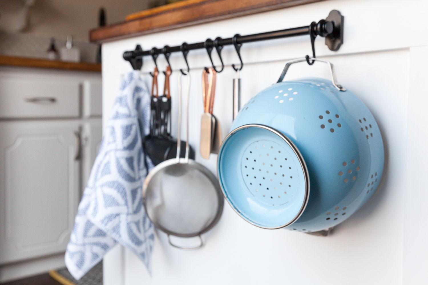
Rather than hide all their cooking tools, Josh and Sean opted to profile the pieces they like the most. Josh has owned this robin’s-egg blue colander since he first moved out on his own.
Show it Off
The light-blue motif appears again on the counter, home to the couple’s Kitchen Aid mixer, which they often use for everything from baking to making burgers. The gold storage canisters with marble tops are from Crate and Barrel. The miniature subway tile backsplash was repurposed from their last condo.
Open Bar
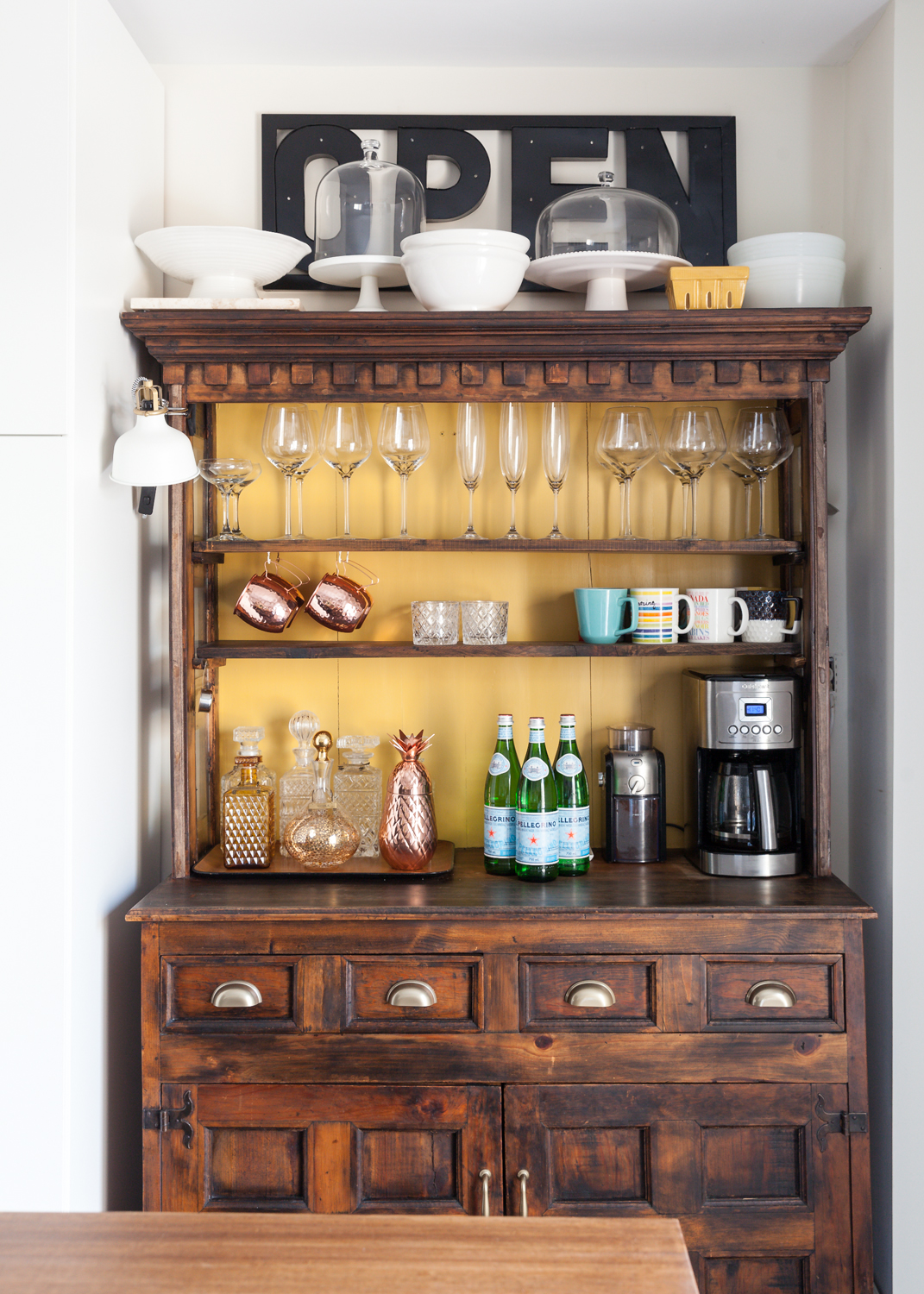
This handsome hutch was found on Kijiji for a cool $200. Sean and Josh ripped off the doors to maximize counter space and updated it with new hardware. To tie in the house’s overall design, the back of the hutch is painted the same shade of yellow as the front door.

Cuckoo Discovery
This space was originally intended as a dining room, but Josh and Sean wanted to use the ample space as a living room. Contractors installed the panelled windows with custom-cut glass, which separates the living room from the kitchen while still keeping the space open. The cuckoo clock in the corner was poached from Josh’s grandparents, and it perfectly suits the modern farmhouse vibe.
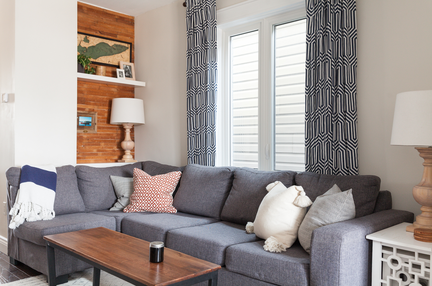
Cozy Corner
The brick nook is where the chimney runs up through the house. Josh and Sean added shelves, which offer a perfect place to set your drink and profile their art. The wooden map, seen on the top shelf, shows Lake Erie, which is where Josh proposed to Sean. The sectional sofa was custom-made to fit the space, and the coffee table was a HomeSense find.
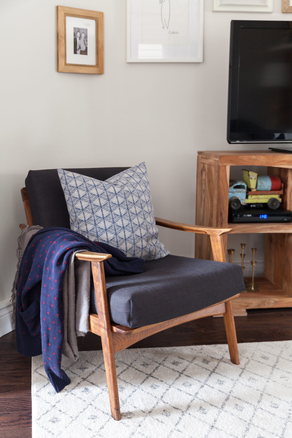
Teak Treasure
Josh updated this teak chair with black covers and added a patterned cushion from H&M Home. He admits that pillow covers are one of his obsessions, and that they’re a necessity thanks to their dog, who has a habit of sitting on each of the pillows while the couple are at work.
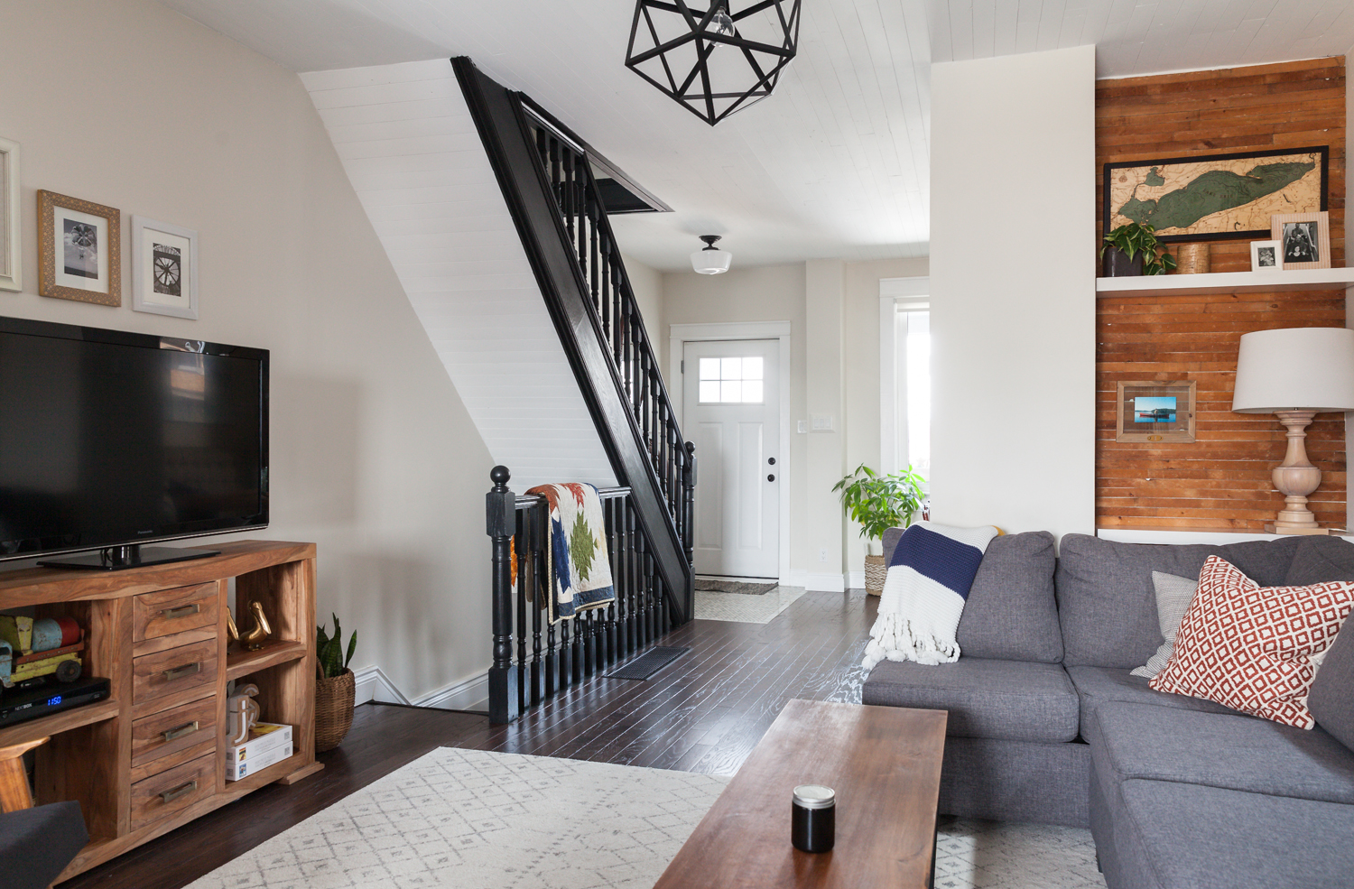
Wide Open Spaces
Josh and Sean searched for a while to find the right carpet. They settled on this square white rug from Wayfair, which helps amp up light. The ceiling was once popcorn textured, so Josh and Sean scraped it away and eventually painted it white. The geometric light fixture, purchased at HomeSense for $100, was painted matte black.
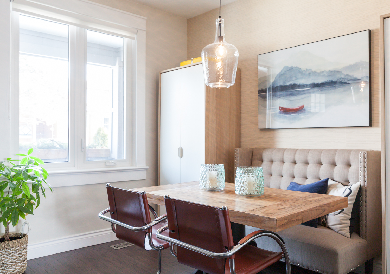
Silent Lake
Thanks to the cozy banquette, the dining room doubles as a lounge space, and is the ideal place to curl up and read a magazine in the morning. Sean works twice a week from home, and turns the table into his office. The art on the wall is a print that pays homage to Sean’s childhood summers spent with his family at Algonquin Park. The pendant light fixture is from Lowe’s.
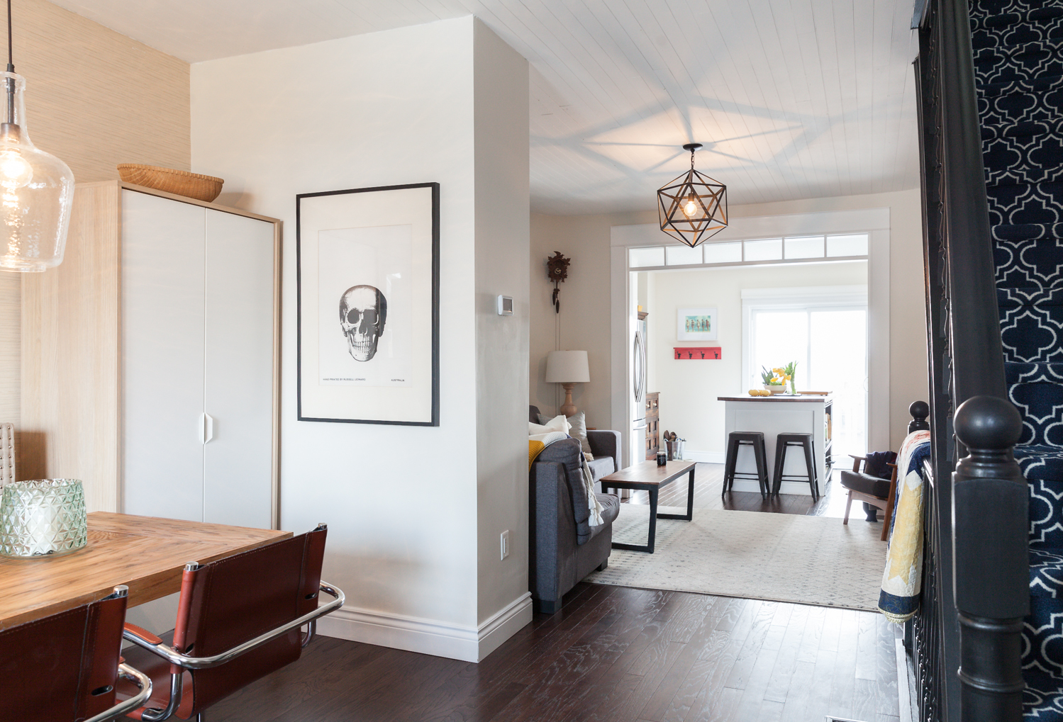
Head Space
The home is filled with little conversation pieces, but one of the most striking is this skull-printed tea towel that Sean bought in Australia.
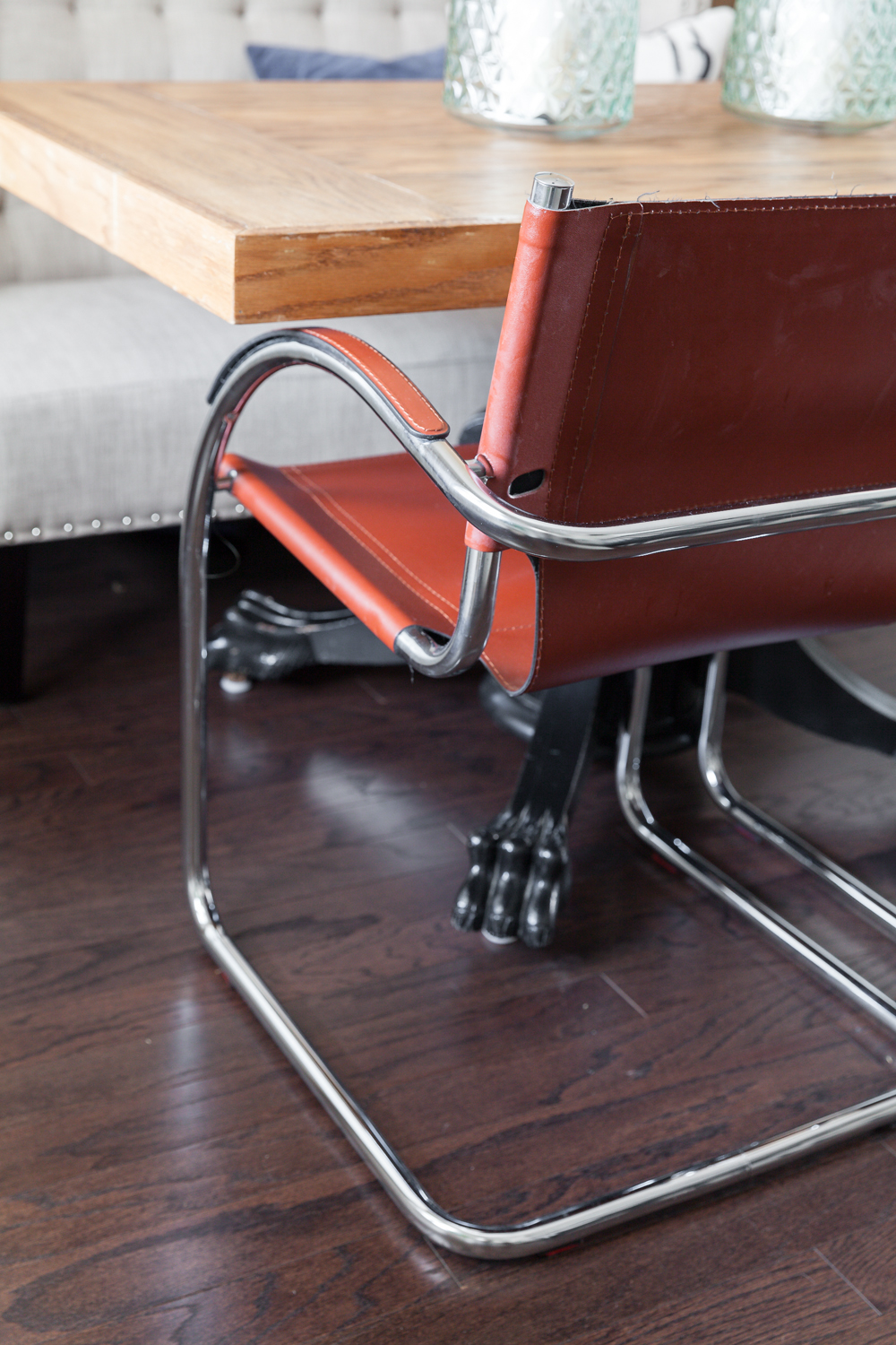
Do it Yourself
Josh and Sean built their dining room table themselves. The claw-foot base was originally in a friend’s cottage, and they painted it black and re-topped it with a thick slab of wood.
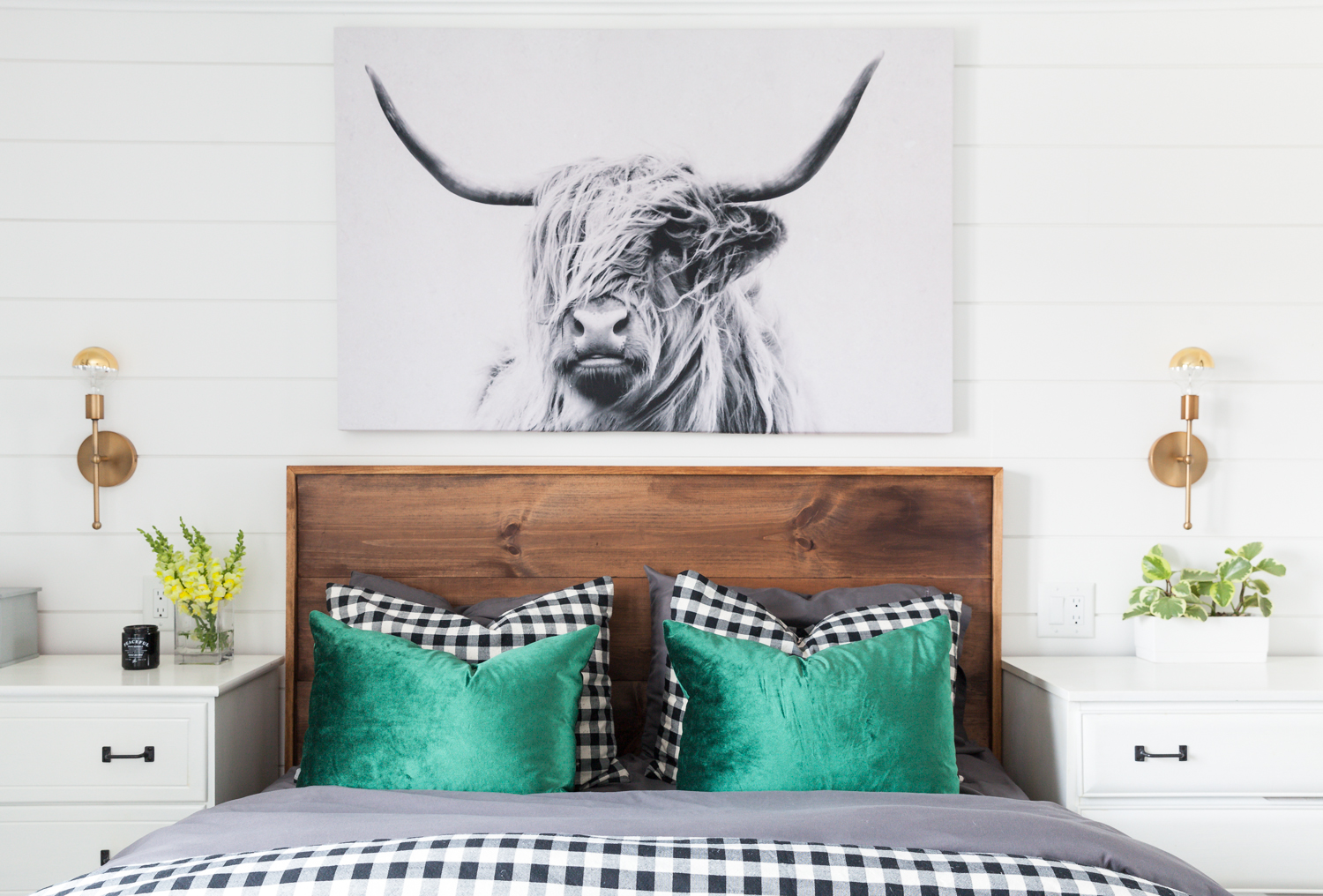
Sow Cute
The main bedroom isn’t huge, so Josh and Sean have designed it strategically to suit their needs. Rather than side lamps, they’ve installed chic gold wall sconces and hired Josh’s dad, an electrician, to sort out the wiring. Keeping with the farmhouse vibes, the walls are white shiplap. The room’s boldest design choice is undoubtedly the highland cow hanging above the bed. When they first hung it up, the dog freaked out. The green velvet pillows add a colourful punch atop the gingham bedspread, and Josh built the headboard himself.
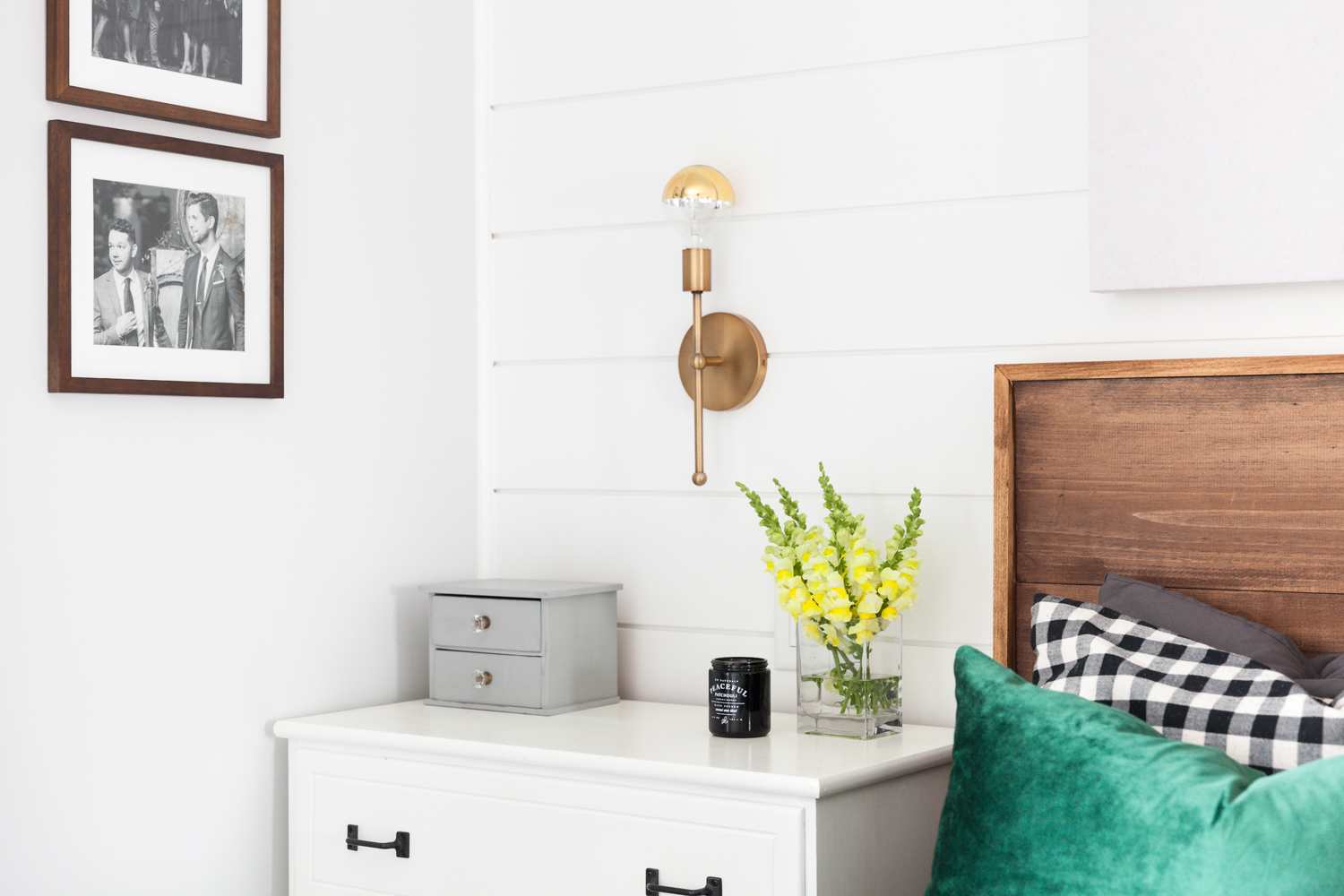
Personal Touch
Josh and Sean knew they wanted to profile their wedding photos in the house, and settled on hanging them in the bedroom, which felt like a more personal space. The grey knick-knack box helps keep the side tables free of clutter.
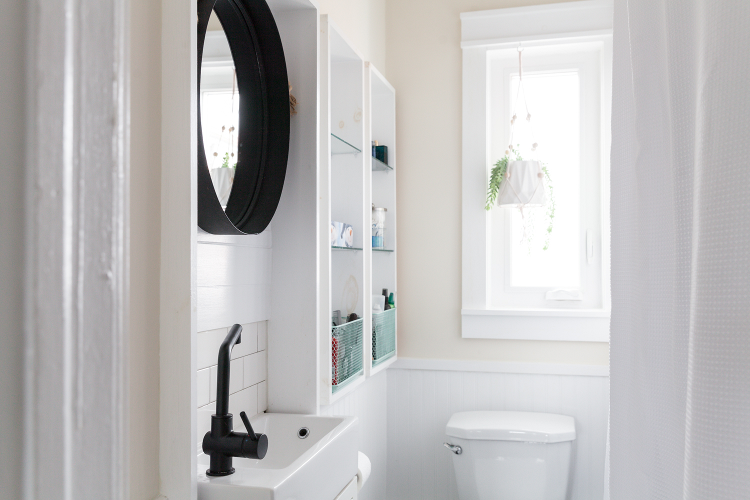
Small Solutions
The bathroom is tiny, but Josh and Sean found a way to maximize light and space. They installed a super narrow sink and dug into the wall to create more cabinet space. The black faucet and mirror add a punch of contrast.
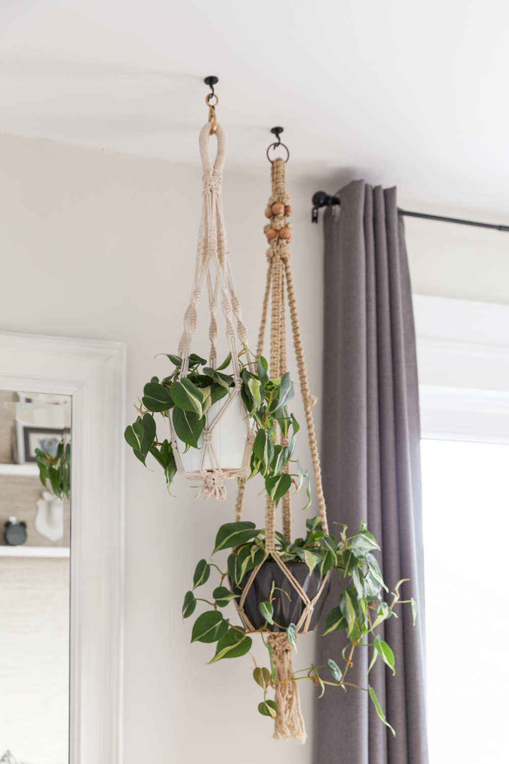
Vintage Finds
In the guest bedroom, Josh installed these crocheted plant hangers he found in a grocery bag in Sean’s mom’s house. In the summer, they’re rotated outside into the yard.
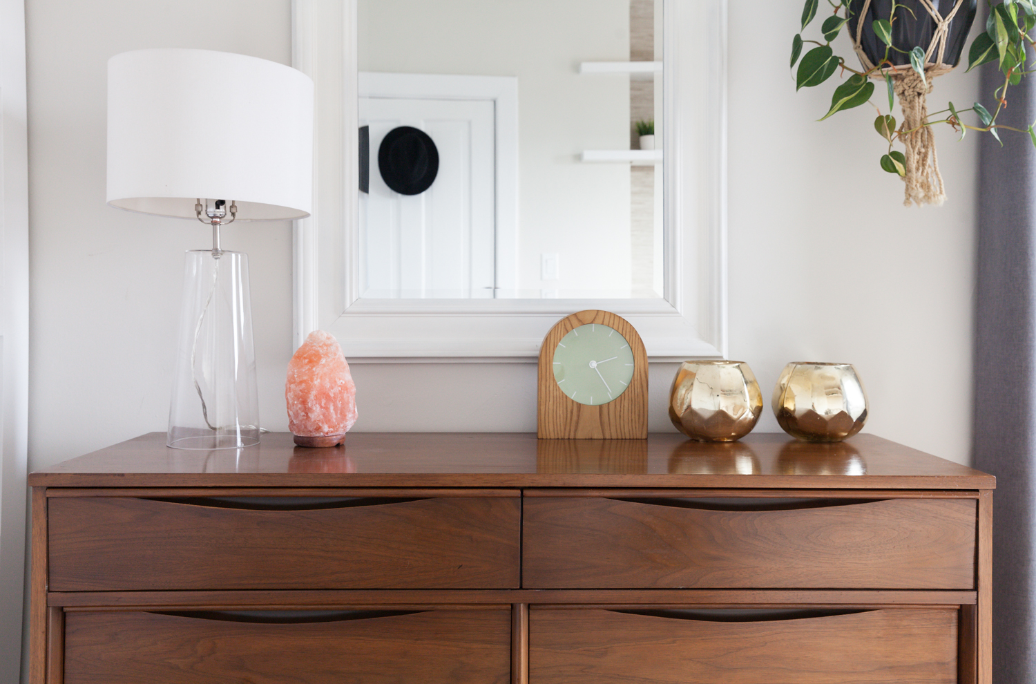
Baby Space
Josh and Sean are planning to adopt, and so they wanted to make the bedroom as baby-friendly as possible. This vintage dresser, which they updated with a coat of Danish teak oil, has plenty of dividers for baby-friendly odds and ends. When the baby arrives, they’ll simply add a change pad on top and voila – a change table. In the meantime, the couple often practices yoga in the space, so they’ve added a pink salt lamp.
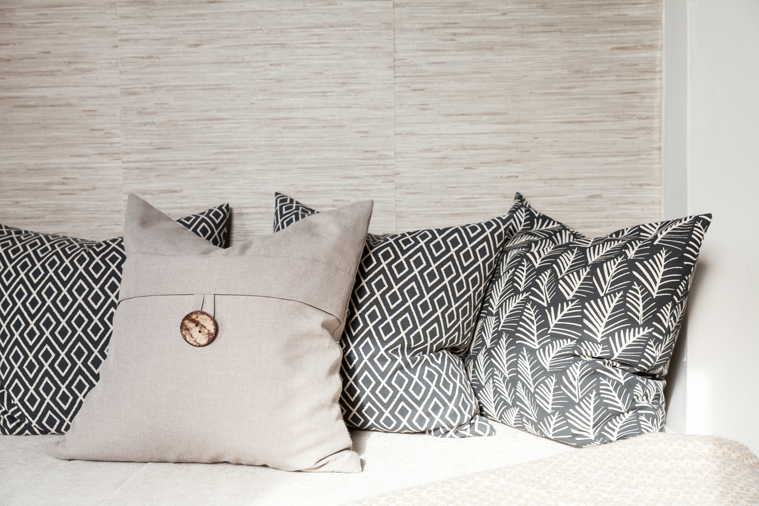
Pillows Galore
Josh’s pillow obsession is on full display in the day bed, tucked in the guest bedroom.
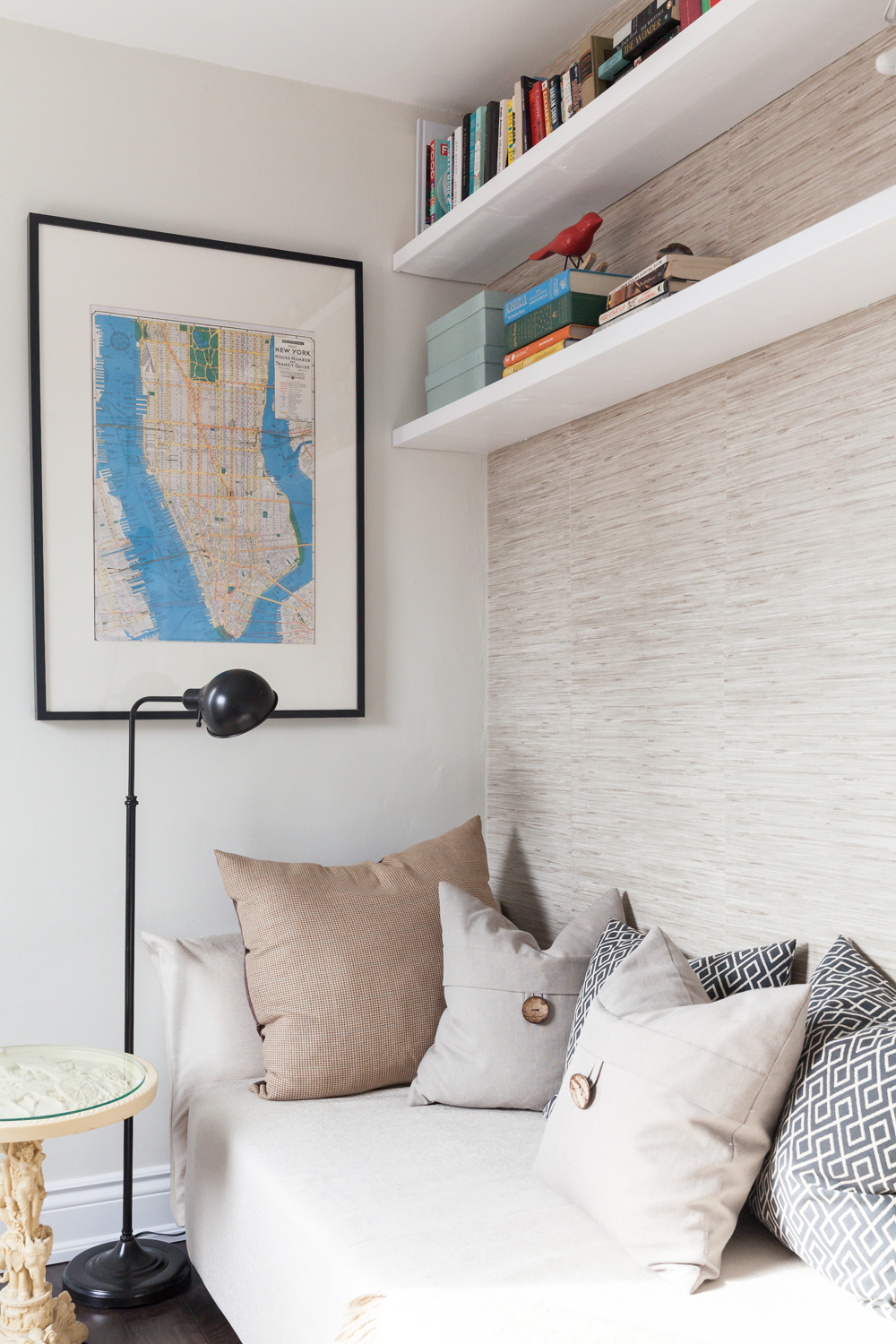
New York State of Mind
Here’s another look at the day bed, which is tucked beside a beautiful vintage table that Josh picked up from his grandparents. The New York City map is a piece that Sean brought with him to the house.
HGTV your inbox.
By clicking "SIGN UP” you agree to receive emails from HGTV and accept Corus' Terms of Use and Corus' Privacy Policy.


