Home tour fans will know Designer Keri MacLellan, of Hamilton’s Four Walls Interiors, from her fabulous take on The June Motel Lobby in Prince Edward County. Now she’s turned her talents closer to home, in Freelton, Ontario, to be exact, where she’s created the dreamiest rental cabin nestled amongst the apple orchards of the West Avenue Cider company. Her choice of natural colours and textures pay homage to the rural setting, while contemporary touches radiate cool. Trust us, you’ll want to check into this three-bedroom beauty asap.
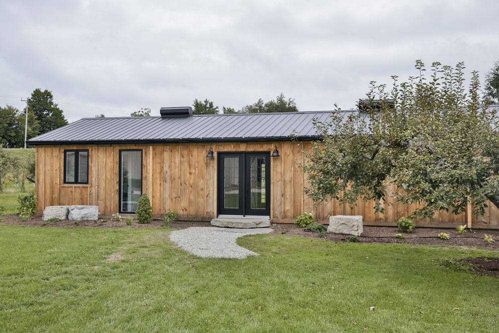
Cider House Rules
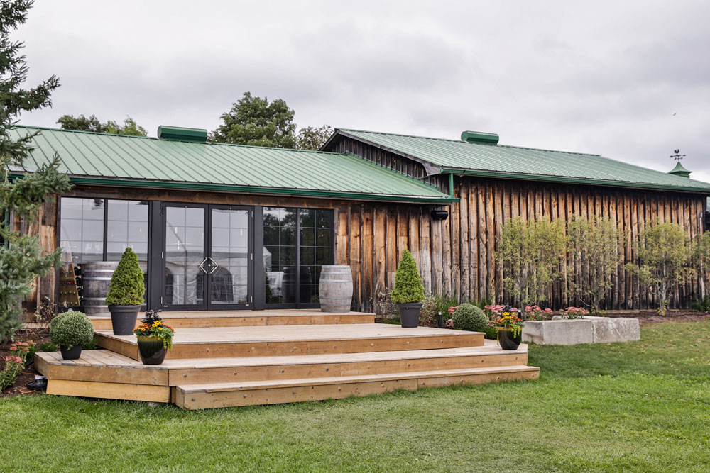
Christened “Somerset Cottage” after the county in South West England, this charming dwelling was originally an outbuilding where seasonal workers stayed during harvest season. Designer Keri MacLellan chose board-and-batten for the cladding and complemented it with classic, yet graphic black accents. “The aged look of the wood siding mimics the original Cider House for a rustic feel,” she says. “The black trim gives the property a modern edge that ups the curb appeal.” It’s bold and dramatic and hints at the less-than-traditional farmhouse aesthetic. Wait until you see inside…
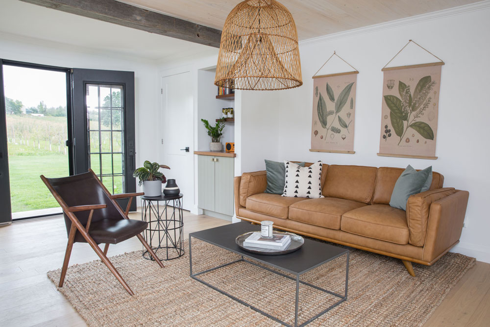
All Mod Cons
The living area, with its natural textures and modern furniture, packs a super-cool aesthetic that’s both wonderfully unexpected and incredibly welcoming. “Every inch was designed with the modern weekend traveller in mind,” says Keri. Colour also plays a key role, with a muted interior that reflects the natural palette of the surrounding orchards. The handwoven jute rug is a great example of layered-in texture. “It’s durable, making it a great choice for a rental property, and it also creates an intimate area that gives you permission to relax.” Something that all city dwellers will appreciate.
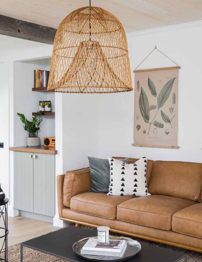
Nice Tan
Keri’s expert choice of colours is on display in the furniture selection. “The tan leather sofa warms the space, while the black in the accents reflects the exterior’s doors and windows,” she says. The fabulous pendant light is from CB2. “Its airy design allows it to be the focal point of the room, while the natural cane reflects the cabin’s earthy location.”
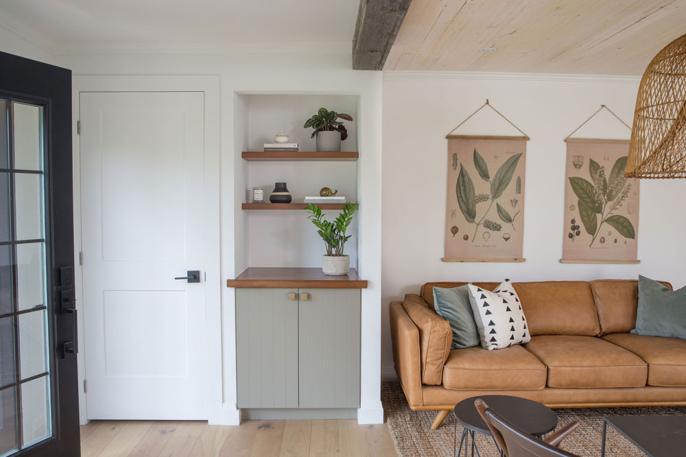
Shop Local
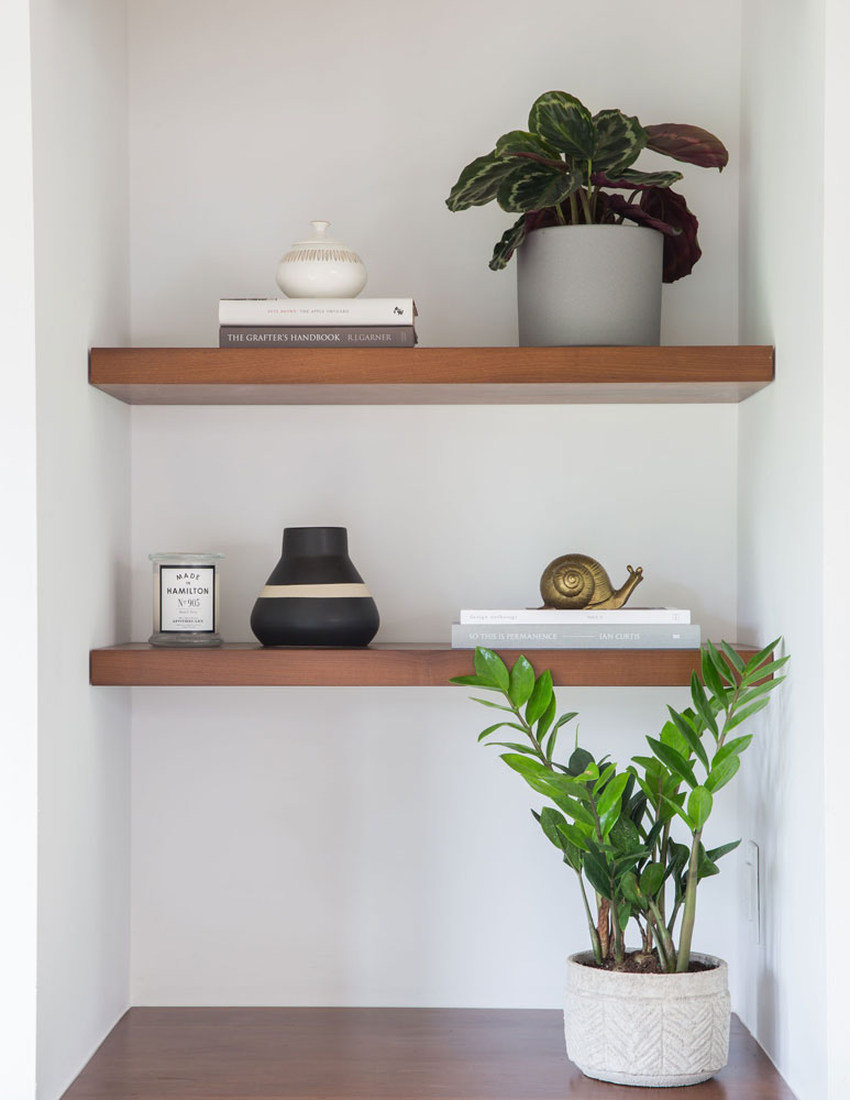
Location is referenced not just through colour and fabric choices, but also through provenance. “One of my goals was to source decor from local businesses,” says Keri. “These botanical wall hangings are from Pretty Grit in Hamilton, and they truly bring the colour palette and my intent of creating nature-based design together.” She calls the adjacent built-in shelving space the “cider nook” as it is often used to display bottles of West Avenue Cider.
Hamilton Hits
The nook’s walnut shelves sit above a tiny toasted maple countertop that’s handy for entertaining. All of the accessories are sourced from local suppliers including the potted plants from Oliver + Rust and the Hamilton 905 candle from Pure Home Couture. The books are a selection of cider-inspired stories.
Up Above
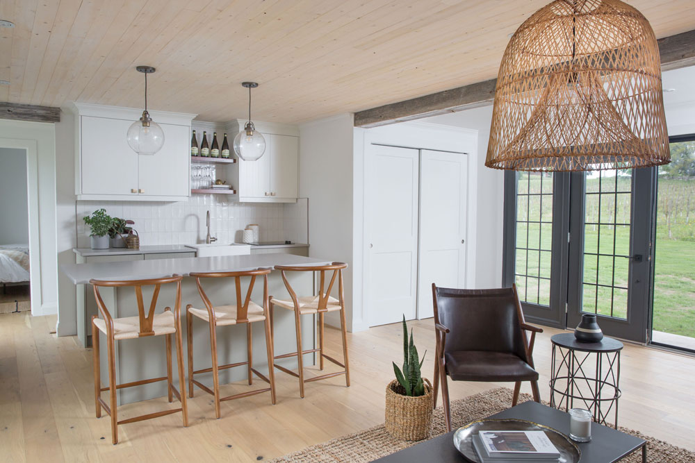
The open-plan living area is brimming with design ideas, including the ceiling treatment. “The white oak ceiling was slightly white-washed to warm the space, and the finish speaks to the modern nature of the design,” says Keri. We love how it effectively complements the wood-toned accessories, as well as the painted white kitchen cabinetry.
Glass Act
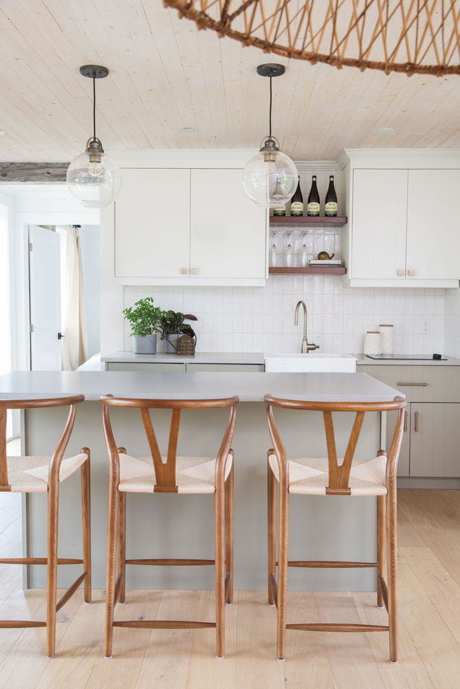
The kitchen’s clear pendants (sourced from Wayfair) create a focal point and provide a warm glow. “The clear glass ensures they don’t compete with the large woven-cane hanging light in the open-plan’s living area,” says Keri. She expertly references that adjacent space with her choice of seating. The wishbone chairs in a walnut finish complement the living area’s open shelving and tan leather sofa, while their woven seats add to the natural textures in the space.
Go West
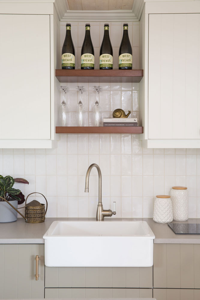
An apron sink is a clever nod to the rural setting, while the backsplash subway tiles, when applied vertically, inject a contemporary vibe. The styling of the shelves is, once again, inspired by locality. “They speak directly to the location of West Avenue Cider Orchard,” says Keri. “When you stay at the Cider Cottage, cider is in plenty.”
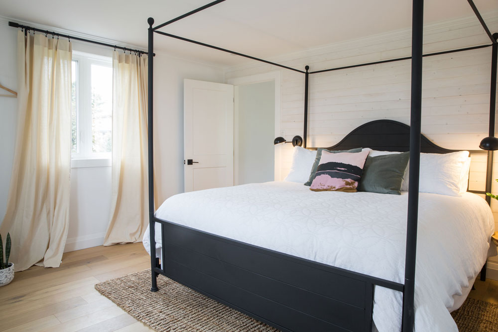
Graphic Content
This bedroom, the first of three, reflects Keri’s love of black accents and shows how just a few well-chosen ones have graphic impact. She chose a black four-poster from Wayfair and we like how she echoed its finish in the sconces, door knob and curtain rod. Like all of the bedrooms’ curtains, these are linen and look both natural and elegant. The jute rug is the same style as the one in the living area to nicely layer in continuity.
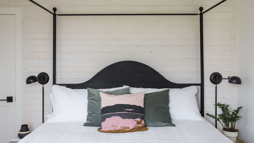
Wood You?
Keri retained this bedroom’s wood wall and white-washed it. “The wood planks give authentic texture to the room,” she says. “They create the warm and relaxing environment I envisioned, while the white finish feels fresh.” She punctuated the white bedding with cheap and cheerful cushions from Ikea.
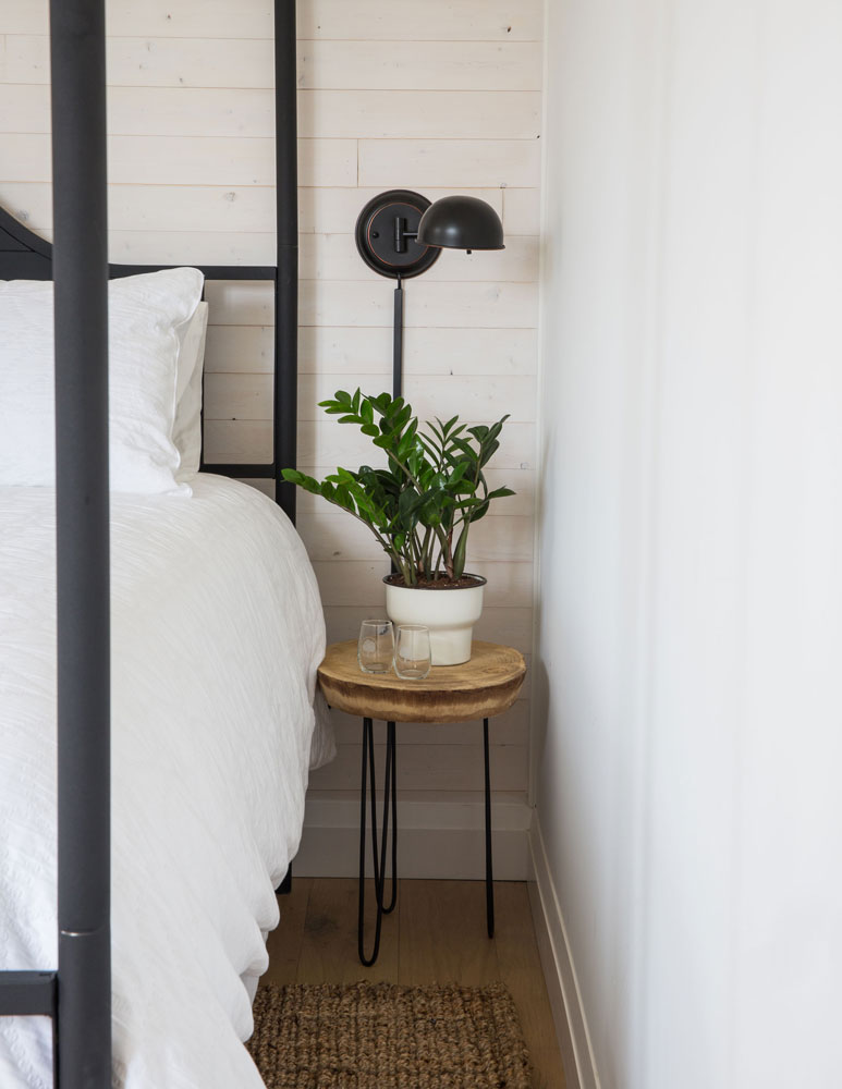
Perfect Finish
The combination of raw wood and black metal make this bedside table appear as if it were custom-made for Keri. “This little gem is also from Pretty Grit in Hamilton,” she says. The sconce and rug are from Wayfair.
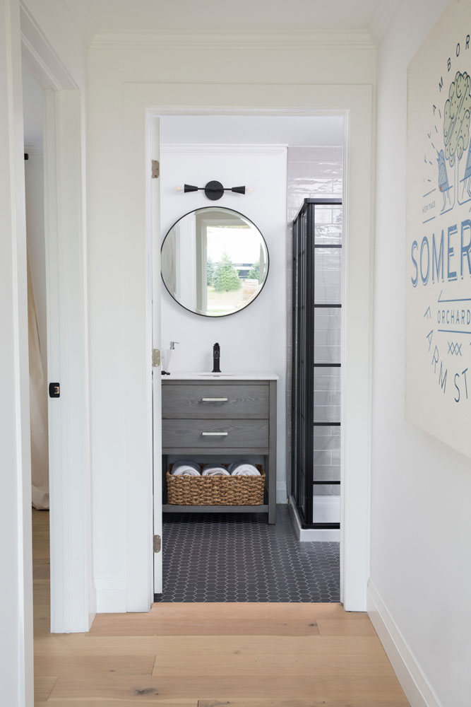
A Little Bit Country
In this guest bathroom, Keri weaves in a bit of country charm with the simple addition of a nubby basket that holds extra towels. The round mirror is a snazzy foil to all the straight lines and keeps the space from feeling too industrial. Grey mosaic floor tiles from Olympia Tile strike a bold note and are super practical to clean and maintain. The designer found the sconce, mirror and vanity on Wayfair, and we love her choice of this dramatic black faucet from Kohler.
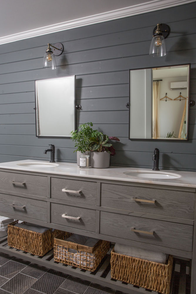
Style Part Two
“This double-sink vanity is perfect for a master suite,” says the designer. “While there are all kinds of guests at Somerset Cottage, I designed this suite with the newlywed couple in mind.” She painted the wood-panelled wall Off Black from Farrow and Ball and added sleek mirrors. “With their stark black frames and angled positions, the mirrors provide a contemporary quality and, when matched with the dark walls, make for a moody master ensuite.”
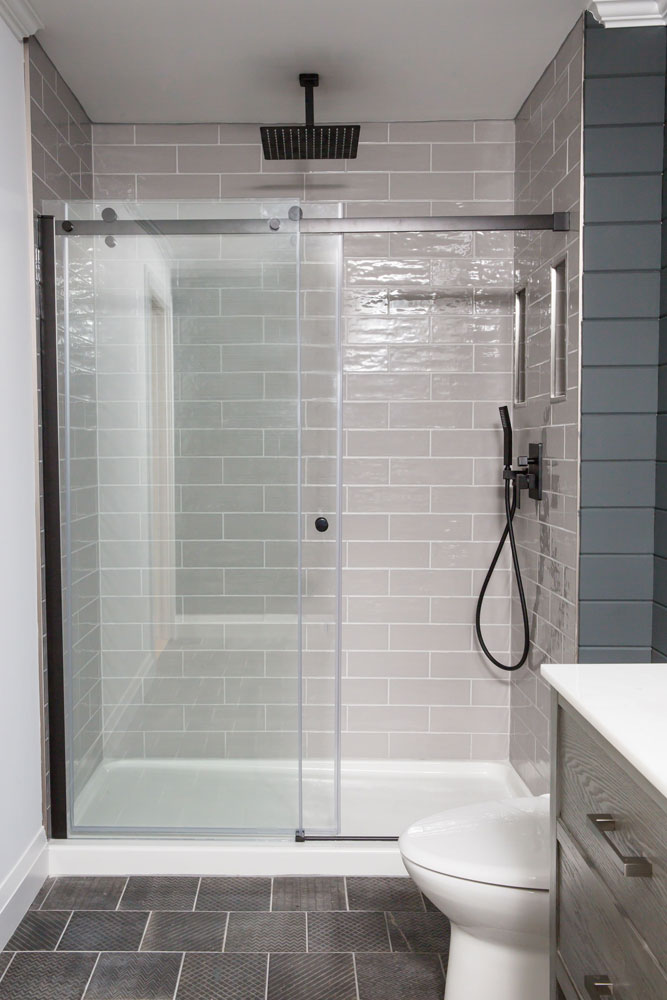
Four Shades of Grey
The shower’s subway tiles really stand out here thanks to their lovely finish. “They’re hand-glazed which creates a great texture that adds to the natural material palette I intended for the space,” says Keri. They are a sleek backdrop to the black hardware from Richelieu and nicely complemented by the 6 x 6 floor tiles from Olympia Tile.
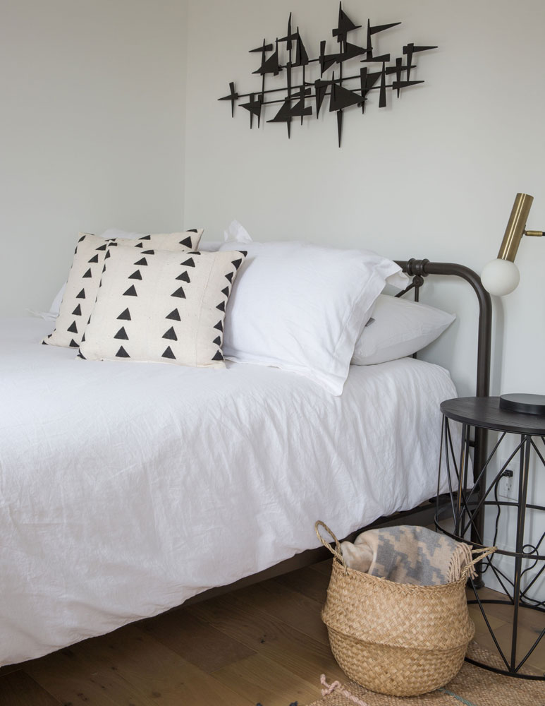
Heavy Metals
In the second bedroom, Keri continued her black and white palette with a twist. “I wanted this room to feel unique from the others, so mixed metal-on-metal black in the wall sculpture, bed frame and side table as a stark contrast to the light white throughout the room.” She also added an unexpected metal. “The brass sconce was a natural way to tie in the brass hardware in the nearby kitchen.”
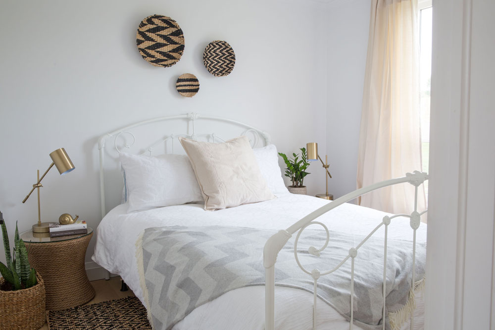
Sleep Well
The serene third bedroom features a white-glazed antique bed frame whose airiness is augmented by earthy details like woven sidetables from Wayfair and wall plates from Pretty Grit. The brass side lamps feel fresh and elegant. A look to copy, everything here is quite simple, but when mixed together radiates stylish charm.
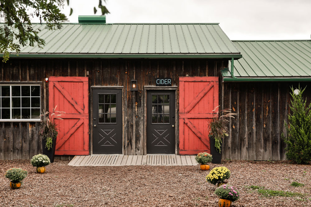
Red Alert
Keri’s design prowess is evident on the Cider House’s exterior yet she is anything but boastful of her choice of palette here. “This red is iconic to the West Avenue Cider House brand and its packaging, so it really was a no brainer.”
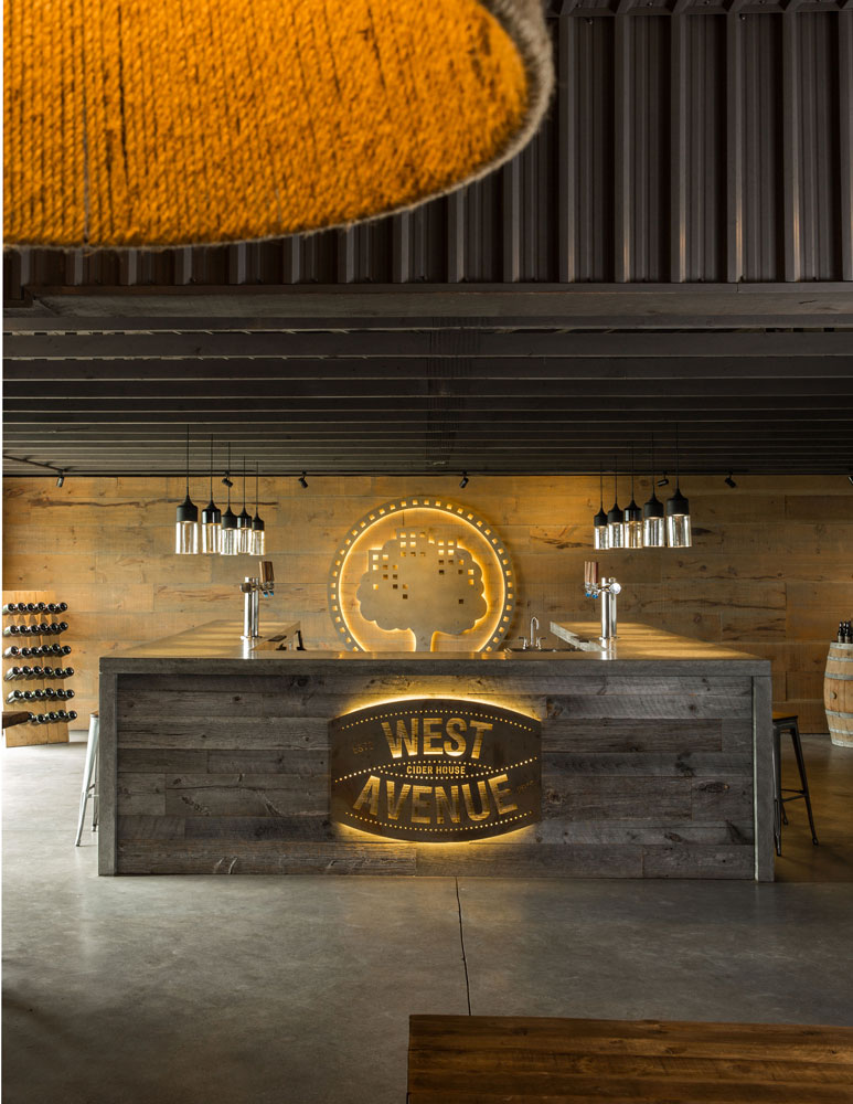
In House Design
Since it was founded just over five years ago by husband-and-wife team Chris Haworth and Amy Robson, West Avenue Cider House has garnered acclaim and awards both at home and abroad. Chris, a British-born chef, met Amy in London, England, which is where Keri began her career, working in restaurant and hospitality design before moving back to Canada. The couple was on the lookout for an emerging local designer to oversee the cidery and its rental cabin transformation, and Keri was an instant match.
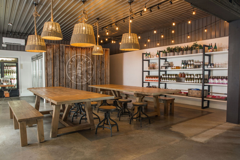
Basket Case
Our eyes were immediately drawn to the Cider House’s gorgeous pendant lights. “The shades are actually baskets – hidden gems I found at the One of Kind Show – that are placed over pendant lights,” says Keri. The reclaimed oak harvest tables are from Restoration Hardware and the stools were a Wayfair find.
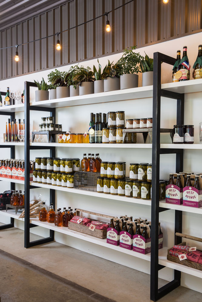
Shelf Life
Keri custom-designed these handsome display shelves and they are perfect mix of rustic and contemporary. We like how she didn’t default to simple wood and chose this graphic alternative instead. Plus, the white makes items pop while the black sharply frames them.
Busy Bees
The back of the Cider House looks out to the property’s 75 acres that are home to over 100 varieties of apple trees. The company’s specialty ciders include barrel-aged and cask-conditioned options and all capture the distinctive elements of the orchard terroir. Think this place can’t get any sweeter? The couple have started cultivating honey bees and plan to add this sweet nectar to upcoming cider varieties. Stay tuned…
HGTV your inbox.
By clicking "SIGN UP” you agree to receive emails from HGTV and accept Corus' Terms of Use and Corus' Privacy Policy.


