Not many biology college professors are decor bloggers, but Nancy Marcus Gueret, of Marcus Design Inc, has design in her DNA. After a quick study of the 2,600-square-foot home she shares with her husband and their two-year-old son, Nancy formulated a design thesis: delete the time capsule pink carpets and honey-tone woods and implement lots of white, millwork and layered patterns to create a home that makes the grade.
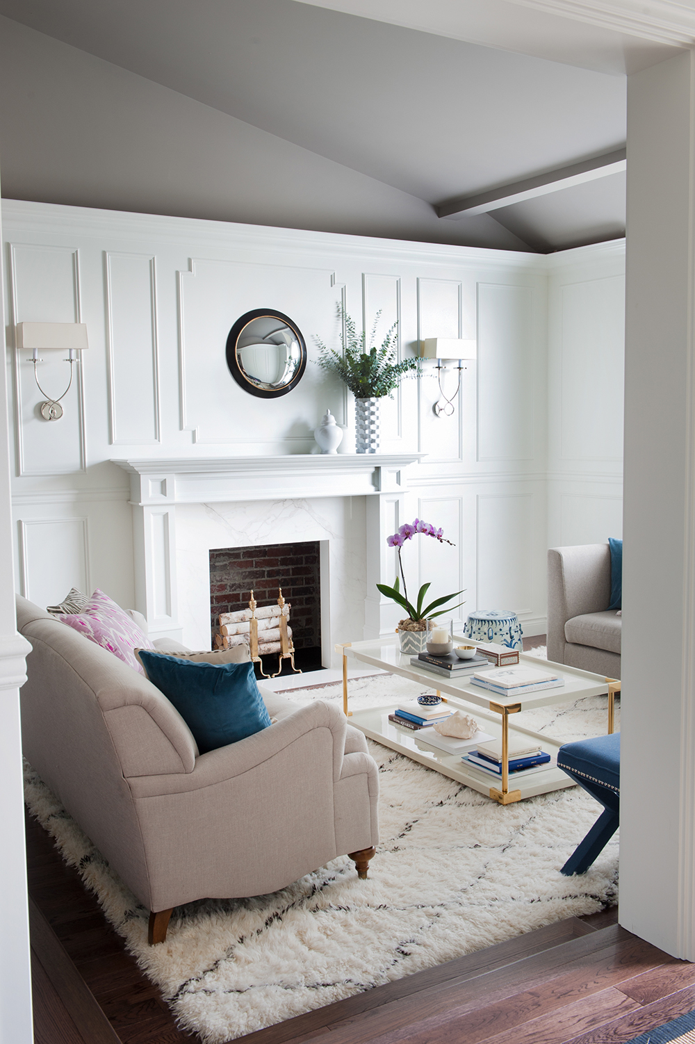
Above it All
A daring dark ceiling seems de rigueur in the living room. “I chose a shade called Escarpment by Benjamin Moore,” says Nancy. It’s unexpected and a dynamic contrast to the wall panelling Nancy added beneath it. “It also adds a moody glow that’s perfect when paired with candlelight.”
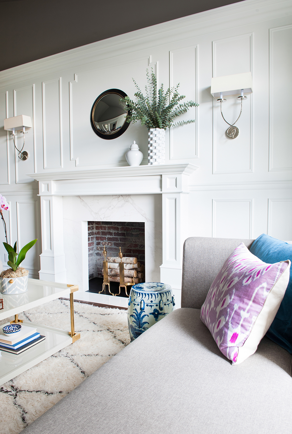
Fire Away
The original fireplace was leaking gas, so the practical and cost-effective solution was to seal it up. “I’m so happy with our choice,” says Nancy. “I left the brick exposed and filled it with antique brass log-holders and wood. I love the result.”
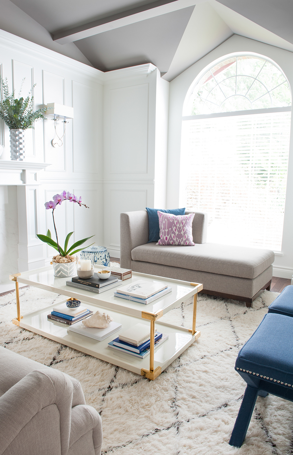
Expert Panel
“I honestly think that adding the panelling and trim transformed this dated ’80s home,” says Nancy. “I chose Metrie millwork, which offers all of its collections with coordinating trim. I wanted a traditional vibe here, so opted for their French Curves Collection.” The wool area rug, from Rugs USA, is easy to wipe clean and cozy underfoot.
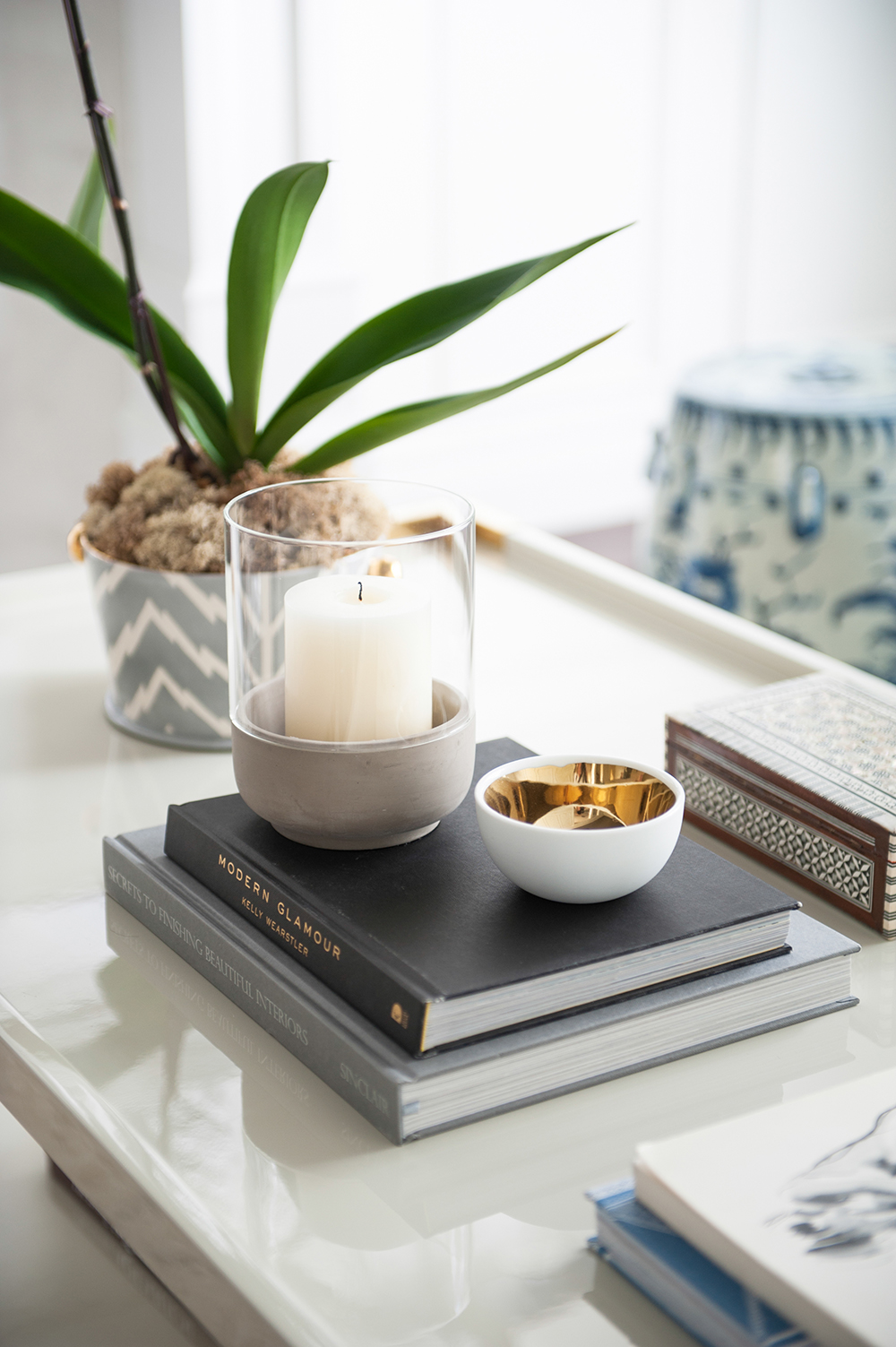
Table Manner
“The Bernhardt tray-style coffee table with brass corners was a definite splurge, and I’m in love with it,” says Nancy, who purchased it from Kathy Kuo Home. It displays one of her coffee table must-haves. “Stacks of books are essential! Guests love to flip through them.” The orchid cache pot was handmade and custom-coloured by artisan Jill Rosenwald. “Special items like this add a personal touch to a home.”
Chaise View
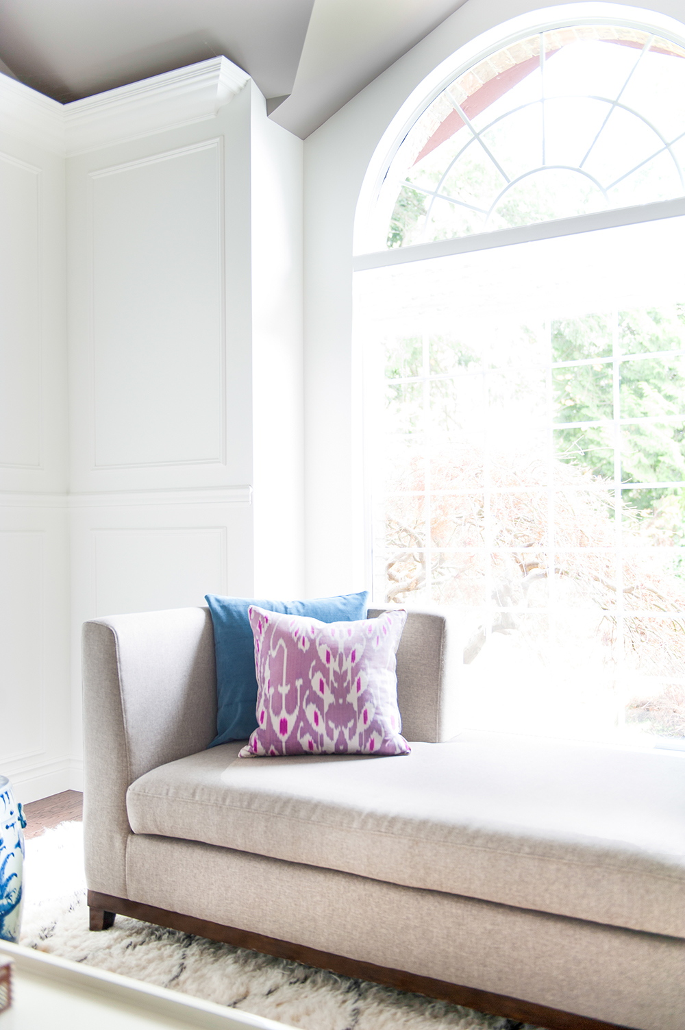
“The living room chaise was another great Craigslist find. It’s a perfect spot to read, and it isn’t so big that it blocks the outdoor view.” With that in mind, Nancy kept the upper arched portion of the window unadorned. “It’s high up so it doesn’t compromise privacy, and it lets in lots of light. We look out onto old-growth trees, which is a lovely backdrop.”
Gather Round
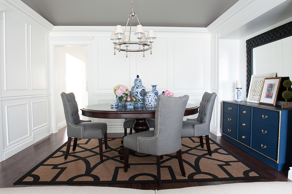
“I think a round dining room table helps induce great conversations,” says Nancy. “It means that no one is really at the head of the table and everyone is equivalent. Plus, they are much easier to move around.” The handsome neutral-tone chairs are from HomeSense and feature nailhead detailing.
Jarring Effect
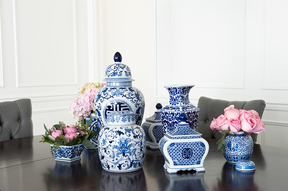
“I definitely have the beginnings of a collection here,” says Nancy of her vases and ginger jars. “There is something so timeless about blue and white, and now I find I’m always looking out for special or unique pieces.” The addition of pink blooms feels fresh and elegant.
Into the Blue
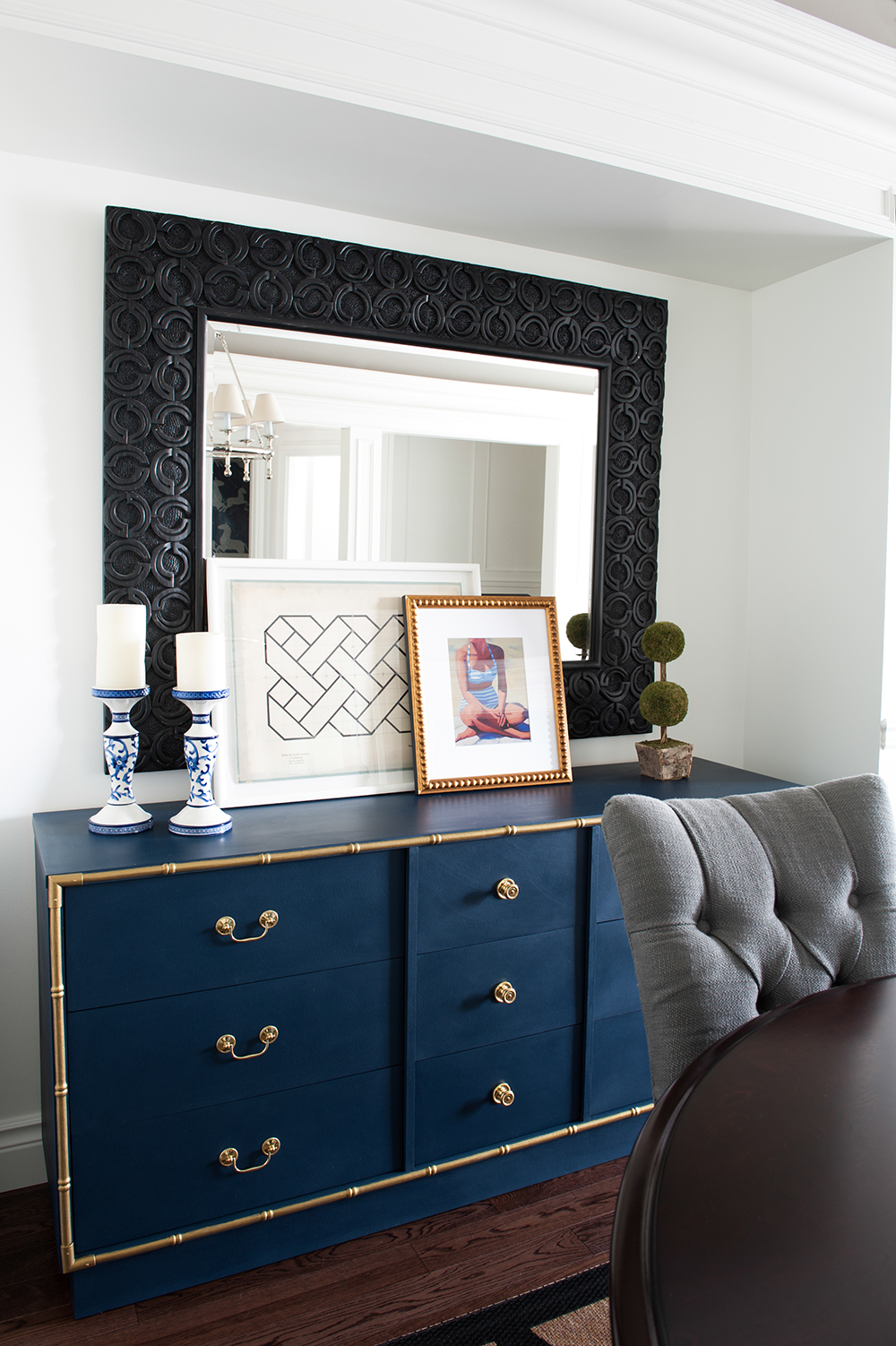
Nancy found this showstopper buffet online for a mere $80. “I used blue paint to transform its dated wooden veneer and painted all the bamboo trim gold so it would stand out. Always keep your eyes open for pieces with great shape and detailing. It’s amazing what a little paint can do.”
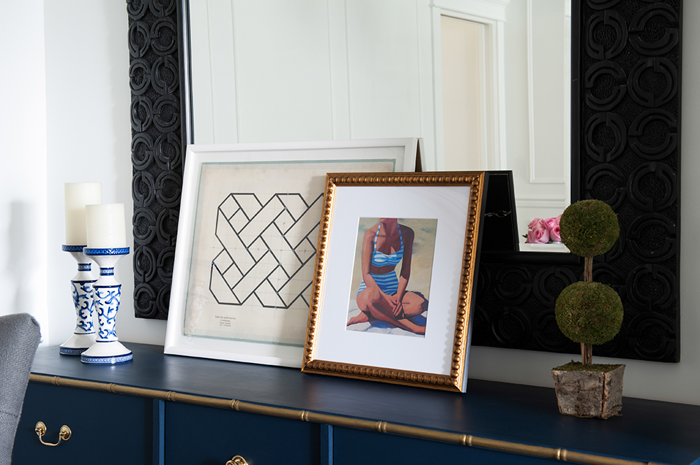
Triple Layer
Artwork casually propped up against the dining room mirror embodies one of Nancy’s favourite looks. “I love layered artwork. The Jean Baptiste geometric print is from Natural Curiosities and the lovely beach print is from Artfully Walls.” It, and the candlesticks, carry on the blue theme.
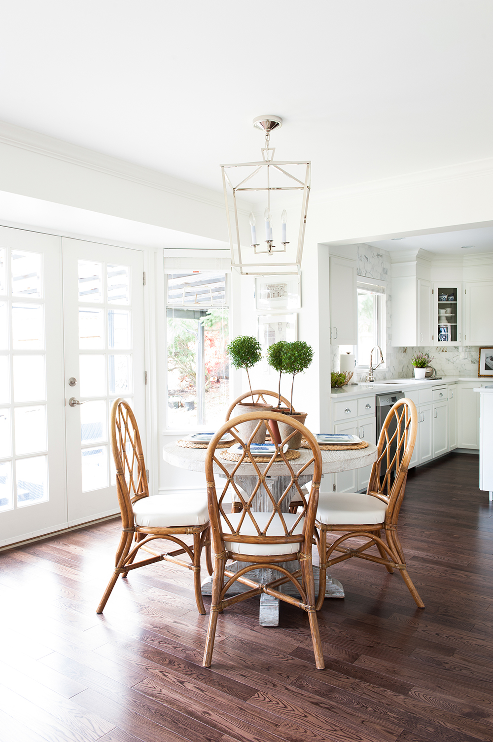
Seating Plan
The kitchen eating area is used by the family every day, so it had to be casual and welcoming. Nancy purchased the rattan chairs online. “They’re inexpensive and add patina to the space, giving it a lived-in feel. I recovered the seats with vanilla faux-leather, which makes wiping up extremely easy. You can tell I had a baby in mind!”
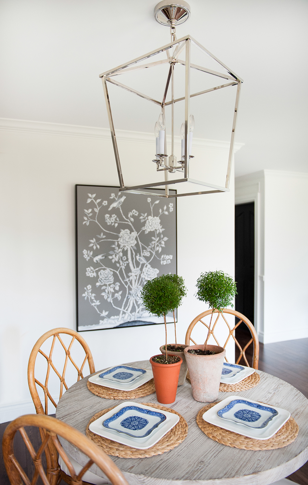
Open Concept
The striking chandelier above the kitchen table also ticks the practical box. “It has no glass, which means very little dusting,” says Nancy, who fell for its polished nickel sparkle and oversized shape. Topiaries of myrtle lend a slightly formal effect echoed in the chinoiserie artwork that Nancy painted.
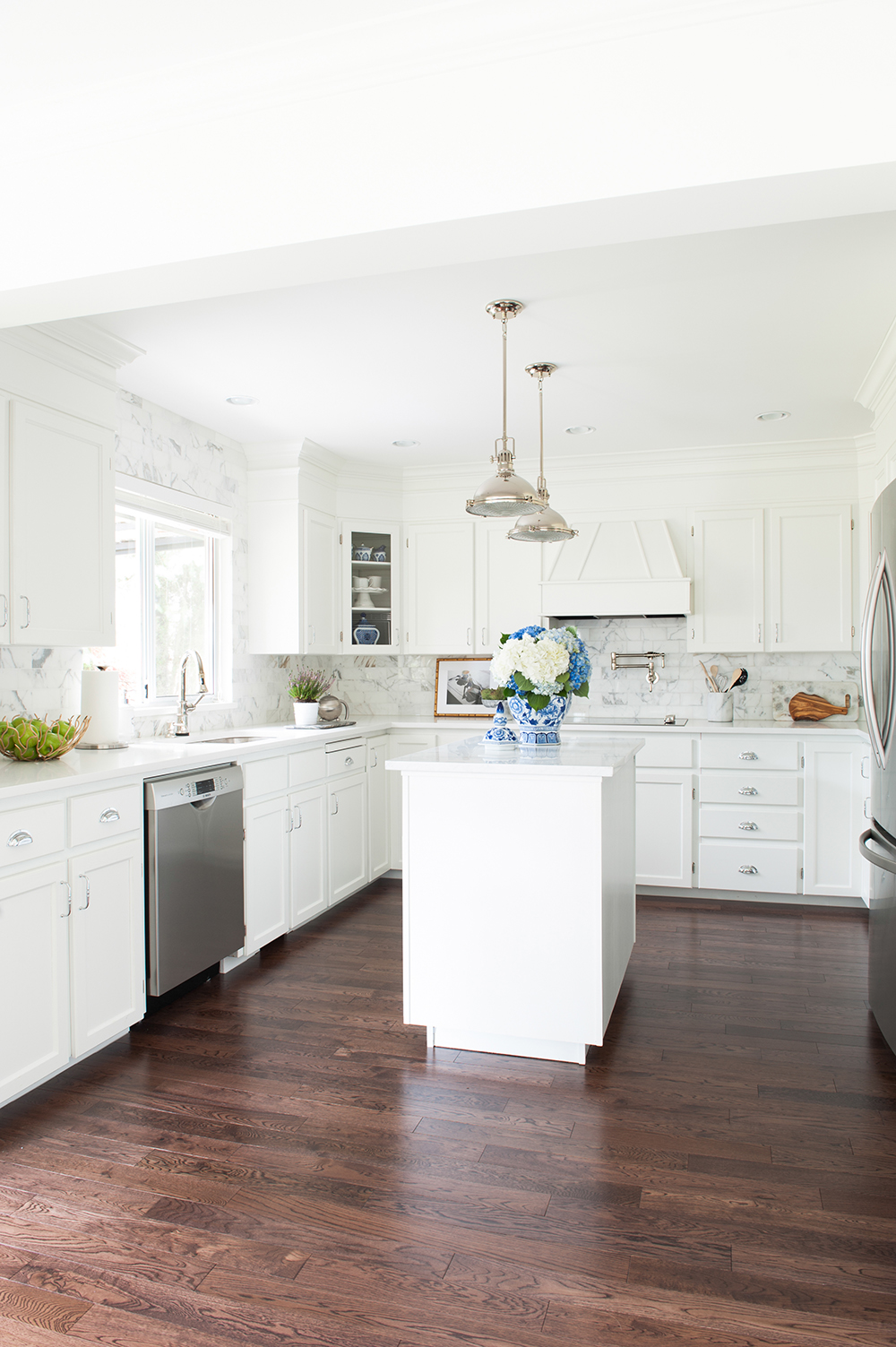
It’s All a Front
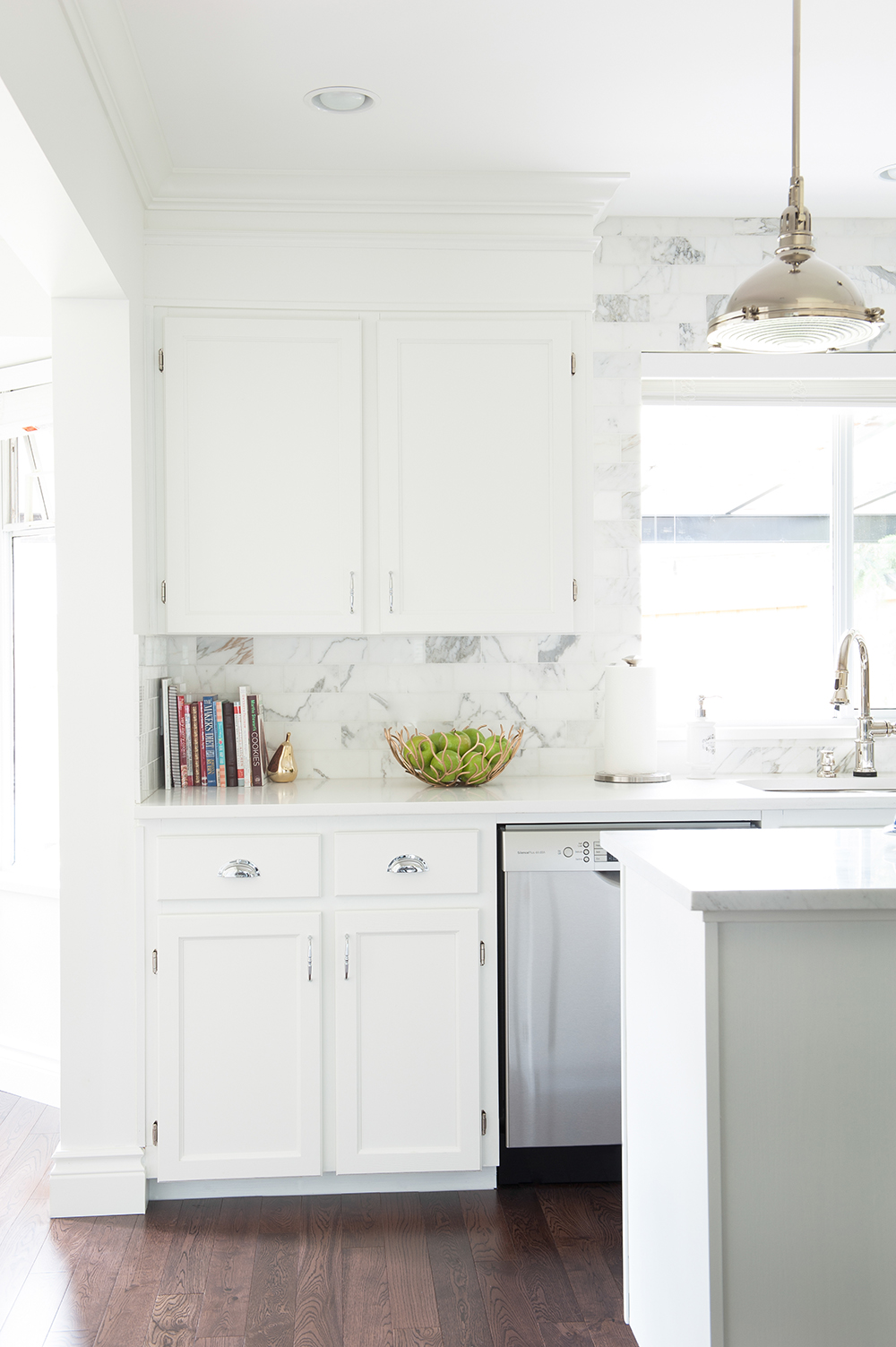
“Believe it or not, this is the original 1989 cabinetry,” says Nancy. “I had new door fronts made in a Shaker style and sprayed all of the honey-coloured oak with Chantilly Lace by Benjamin Moore.”
Splash Out
While Nancy is adept at scoring cheap-and-cheerful online finds, there was one area where she was more than happy to splurge. “The kitchen backsplash! It’s the real deal Calacatta gold marble, and it is worth every penny.”
Pretty Traditional
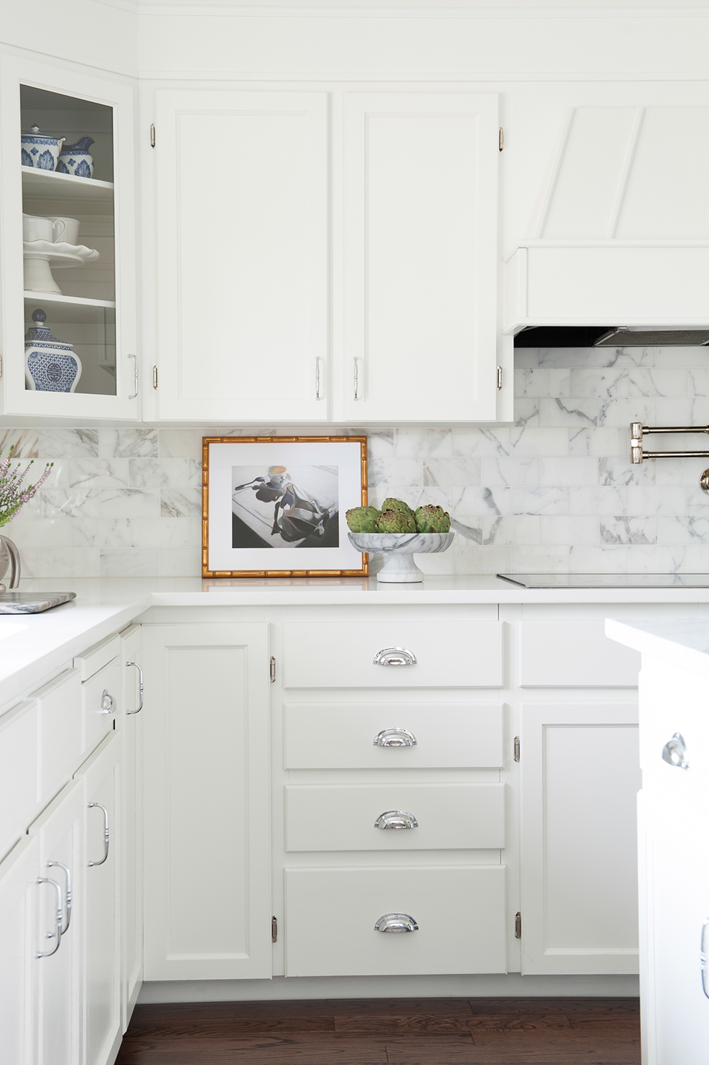
New doors and white paint weren’t the only additions Nancy made to the kitchen cabinetry. “I wanted it to look like it extended to the ceiling, so I disguised the empty space with trim from Metrie. Your eye now goes all the way up to the ceiling without a visual interruption. This creates a more traditional look.” A glass-fronted corner cabinet displays decorative items that reference the blue-and-white accents in the dining room.
On the Surface
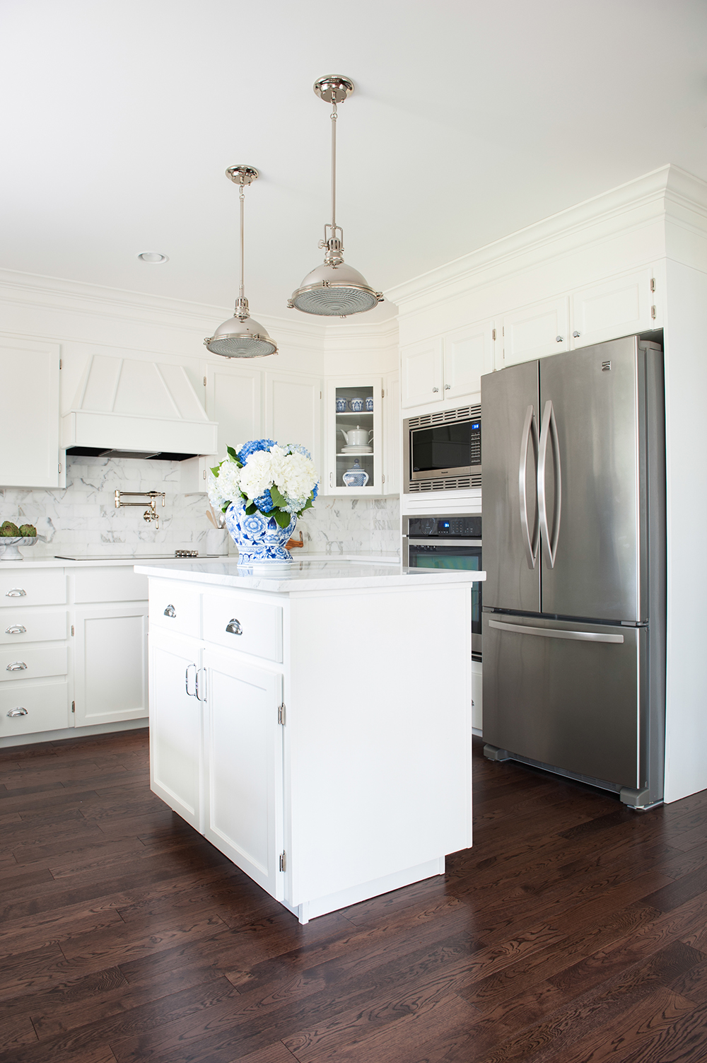
Given that the kitchen island is small, Nancy nixed the idea of adding a sink in favour of using its surface as a second prep area. “I chose a marble top, which has held up to wear-and-tear wonderfully, despite its bad maintenance reputation. It’s the perfect surface for all the chopping and baking we do.”
Paint it Black
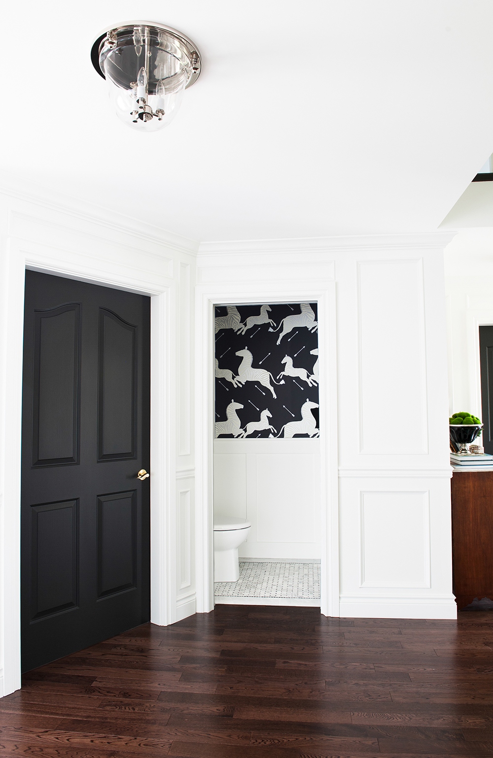
“I painted all of the interior doors black and love the result,” says Nancy. She chose Black Magic by Sherwin Williams, and it definitely casts a dramatic spell. This door beside the powder room leads to the home’s office/den, which has yet to be decorated but is next on Nancy’s list.
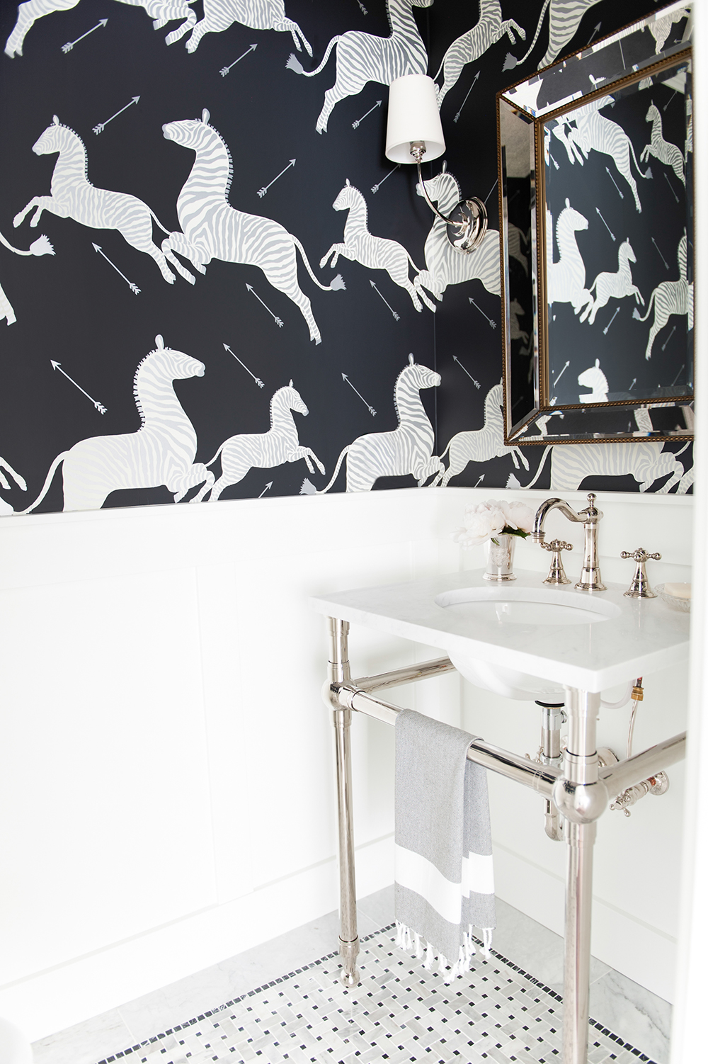
Restaurant Takeaway
The powder room’s knockout wallpaper has unexpected provenance. “It was custom created for Gino’s restaurant in Manhattan in the ’40s. It’s bold but classic and is a paper I long dreamed of using.” The pattern is Scalamandre Zebras, which Nancy sourced through Decorator’s Best. The Restoration Hardware sink has an open polished-nickel base that keeps the small space feeling airy.
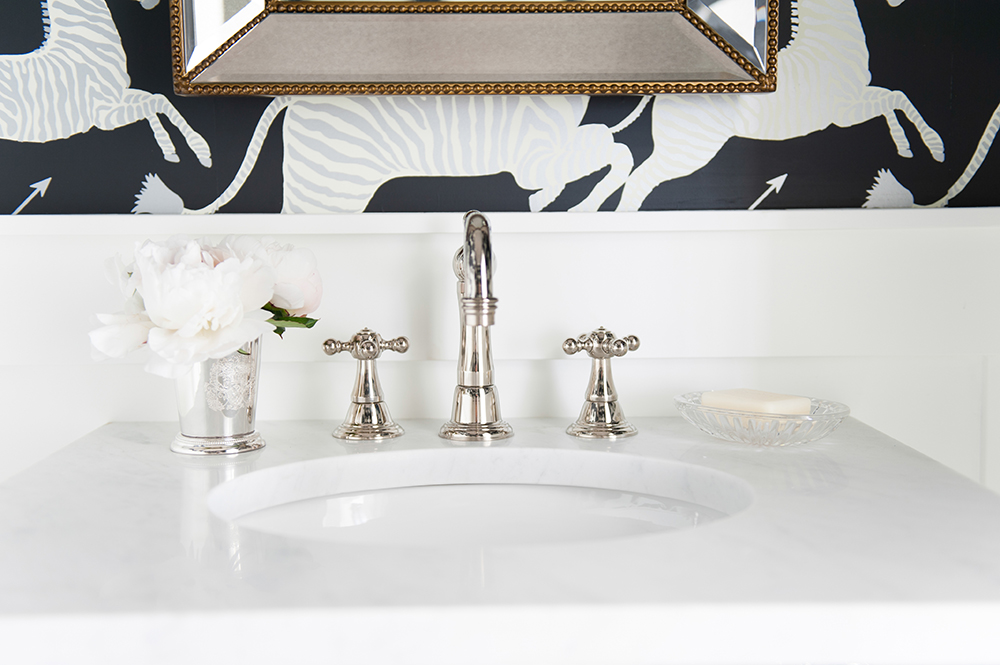
Shiny New Nickel
Nancy says the sparkle of the bathroom’s fixtures have a dazzling effect and are like jewellery. The bevelled mirror is from Restoration Hardware, and its subtle brass trim has a casual warmth.
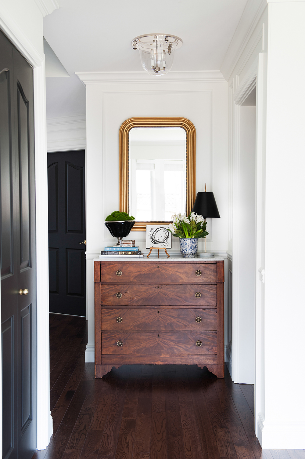
Door Prize
An antique burled walnut dresser topped with marble (another online purchase) sits inside the front entryway. “It’s a great spot to drop keys and mail, it holds lots of papers and, if anything piles up, it can be easily tucked in a drawer when there’s an impromptu arrival of guests.” The classic Louis-style mirror from Ballard Designs wasn’t the perfect gold, so Nancy painted it her preferred shade.
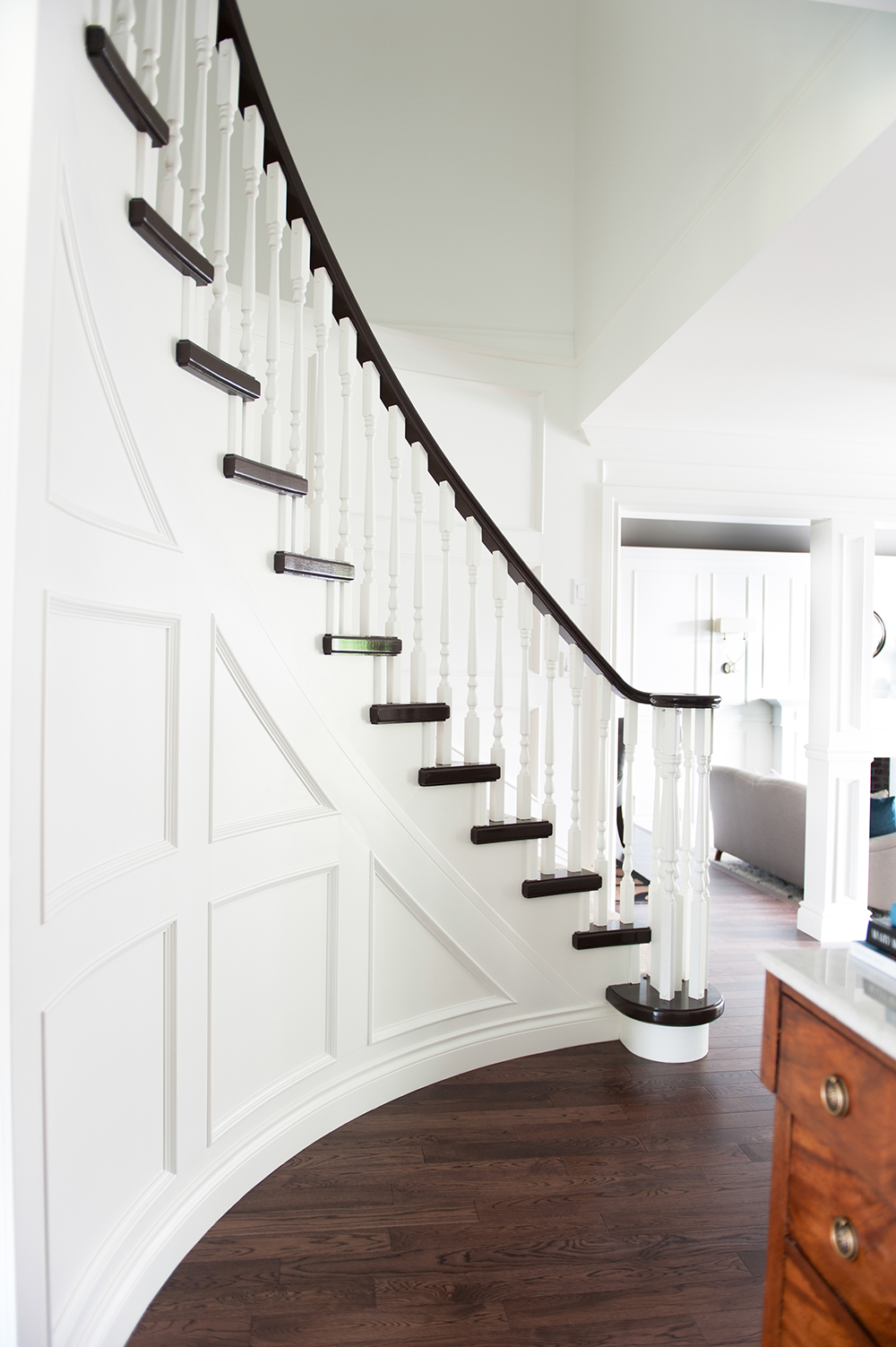
Formal Affair
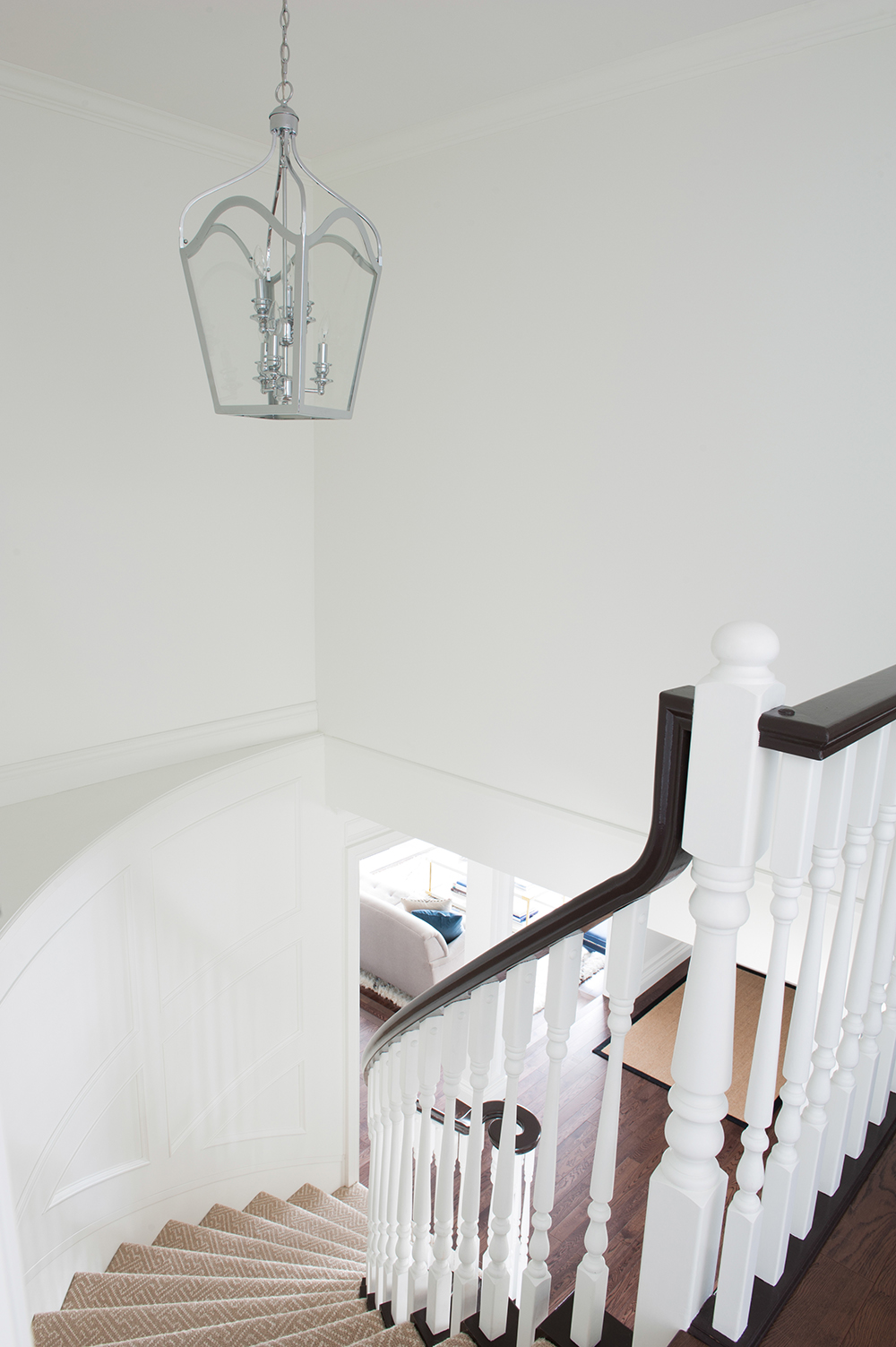
Nancy reinvigorated the original yellow honey-oak staircase with a black-and-white colour scheme to make the space feel bright but formal. “I wanted to create an impression when you first walk in and, for that reason, I also used the same Metrie panelling here as in the living room.” The railing and treads are painted Black Bean Soup by Benjamin Moore.
Shine On
Nancy’s penchant for mixing warm and cool elements is evident in the staircase’s gold-tone runner from Karastan and the polished nickel light fixture. “The fixtures just below in the entry and living/dining areas are all polished nickel, so there’s nice continuity as you move upstairs.”
Dresser Code
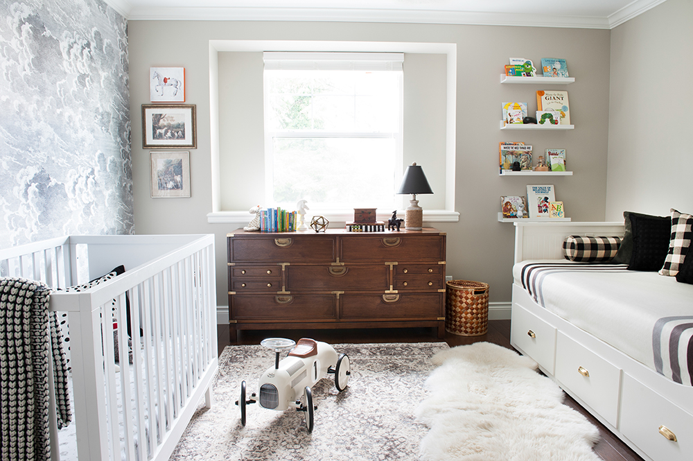
Nancy’s son Marcus’s nursery is masculine without being prescriptive baby blue. Its dresser is an engaging focal point. “It’s another Craigslist find,” laughs Nancy. “It’s gorgeous and felt brand new so I didn’t change a thing. I love its campaign-style brass details, and it will definitely grow up with baby.”
Extra Bedding
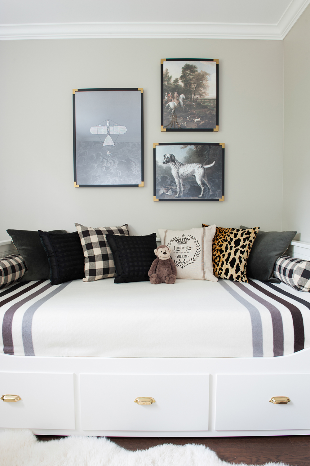
The stylish day bed from a big-box store is dressed up with a classic Hudson’s Bay point blanket and stylish cushions. “It pulls out to a queen-size bed and has drawers for extra storage, so I’m hoping it will grow with baby too.” The artwork is from Anewall; Nancy added black frames and painted the corners to look like brass.
Puff ‘n’ Stuff
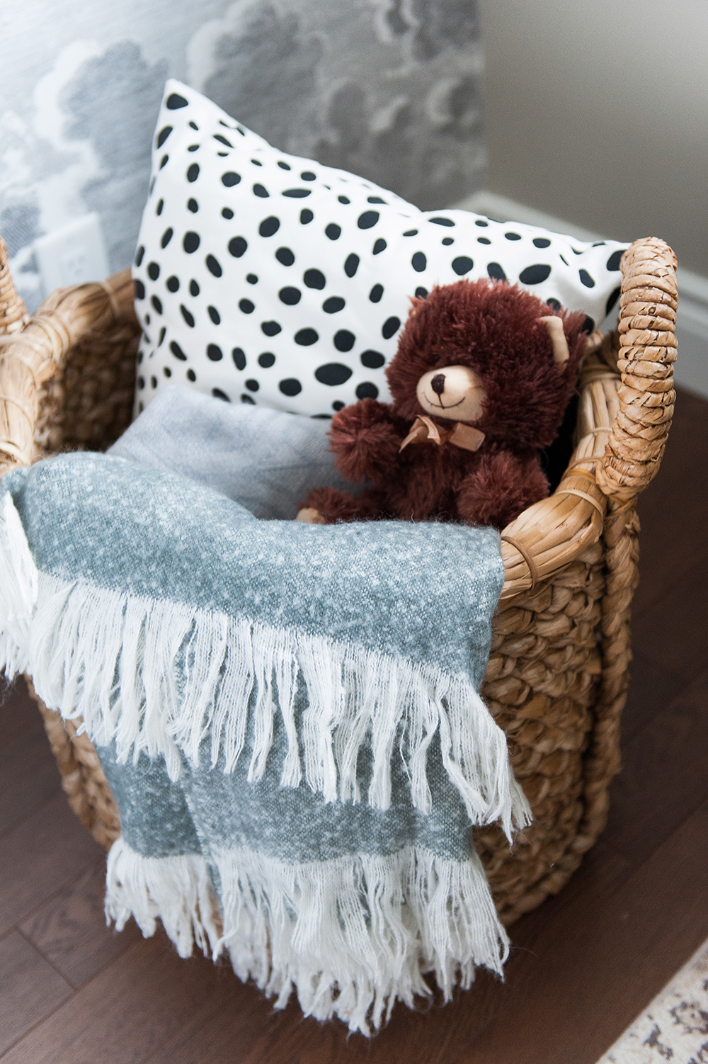
“Baskets are a perfect way to store a lot of stuff,” says Nancy. “This oversized one is from HomeSense.” It keeps cuddly favourites out of the way yet within easy reach.
European Accent
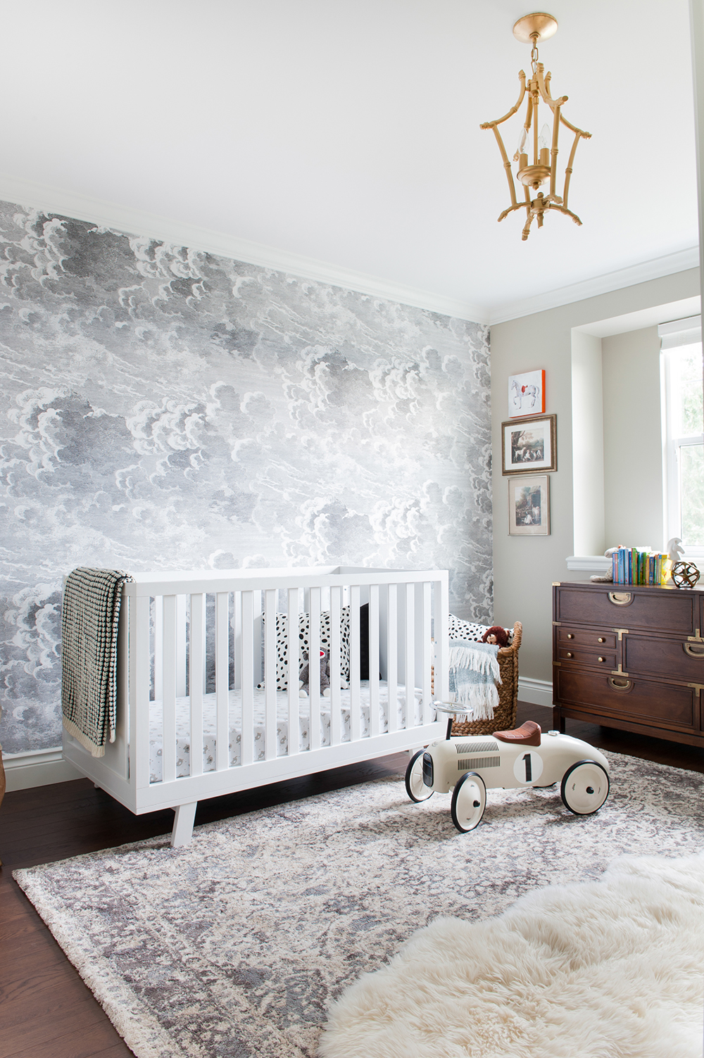
One wall boldly dressed with European paper feels energetic in the mostly neutral room. “This is Fornasetti Nuvolette wallpaper, and I love how it’s both whimsical and dramatic.” The microfiber rug echoes its colour palette and is incredibly soft for Marcus to crawl and play on. The faux sheepskin rug on top layers in more softness and texture.
French Class
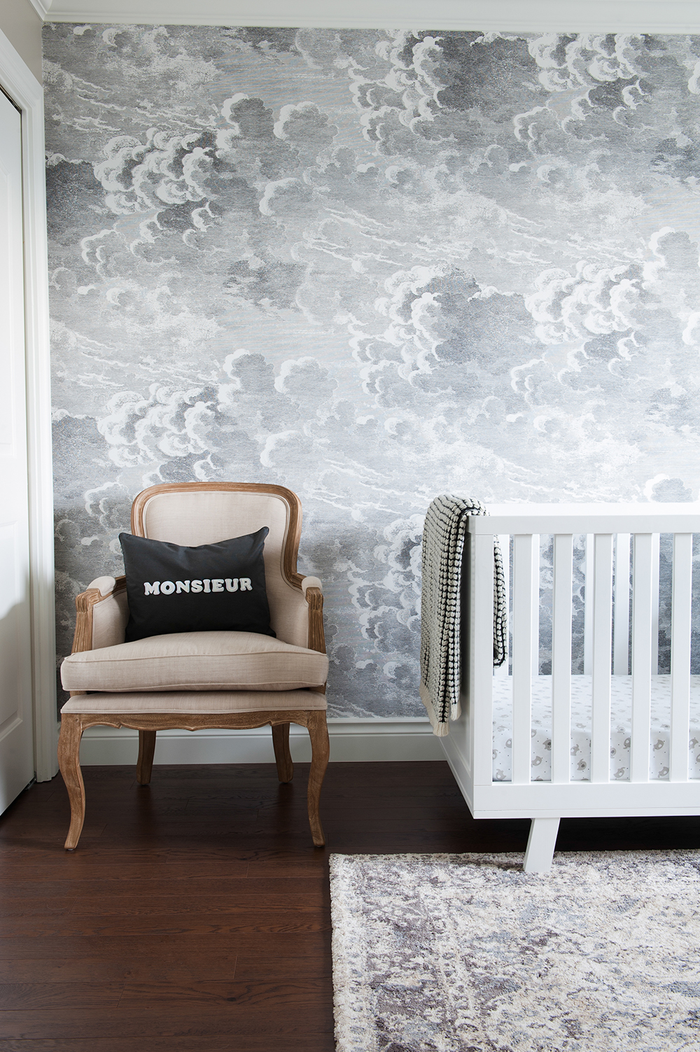
“This chair is the perfect place to perch on during those late nights with baby,” says Nancy. “The cushion is a simple DIY project with iron-on letters. My hubby has a French background so I wanted to bring that in.”
Advanced Class
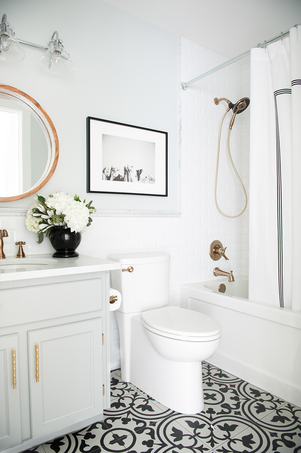
You’d be forgiven for thinking this stylish bathroom was the grown ups’ ensuite. “It’s actually our son’s,” says Nancy. Designed to grow with Marcus, it features a graphic cement-tile floor that adds interest to the small white room.
Warm Front
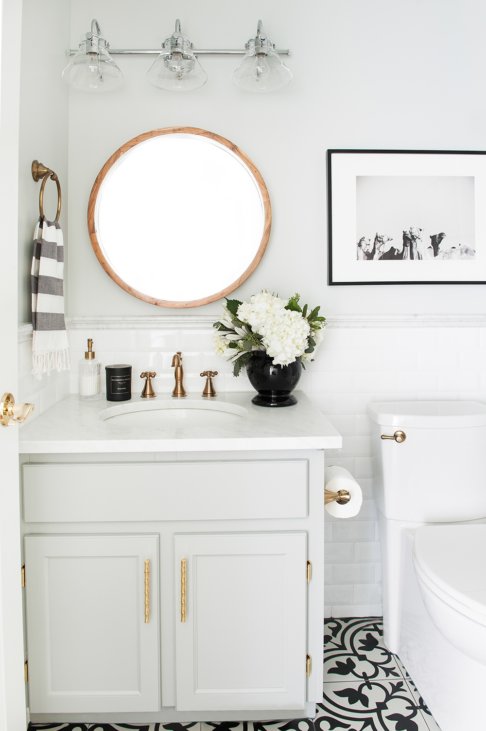
Nancy chose brass Delta Faucet hardware for the monochromatic bathroom. “The champagne bronze finish is amazing looking and totally hides dirt and fingerprints, which is great for a kids’ space.” The round wooden mirror and brass hardware have a sunny effect that keeps the space warm. The framed camel artwork by Heather Marie reflects Nancy’s Egyptian background.
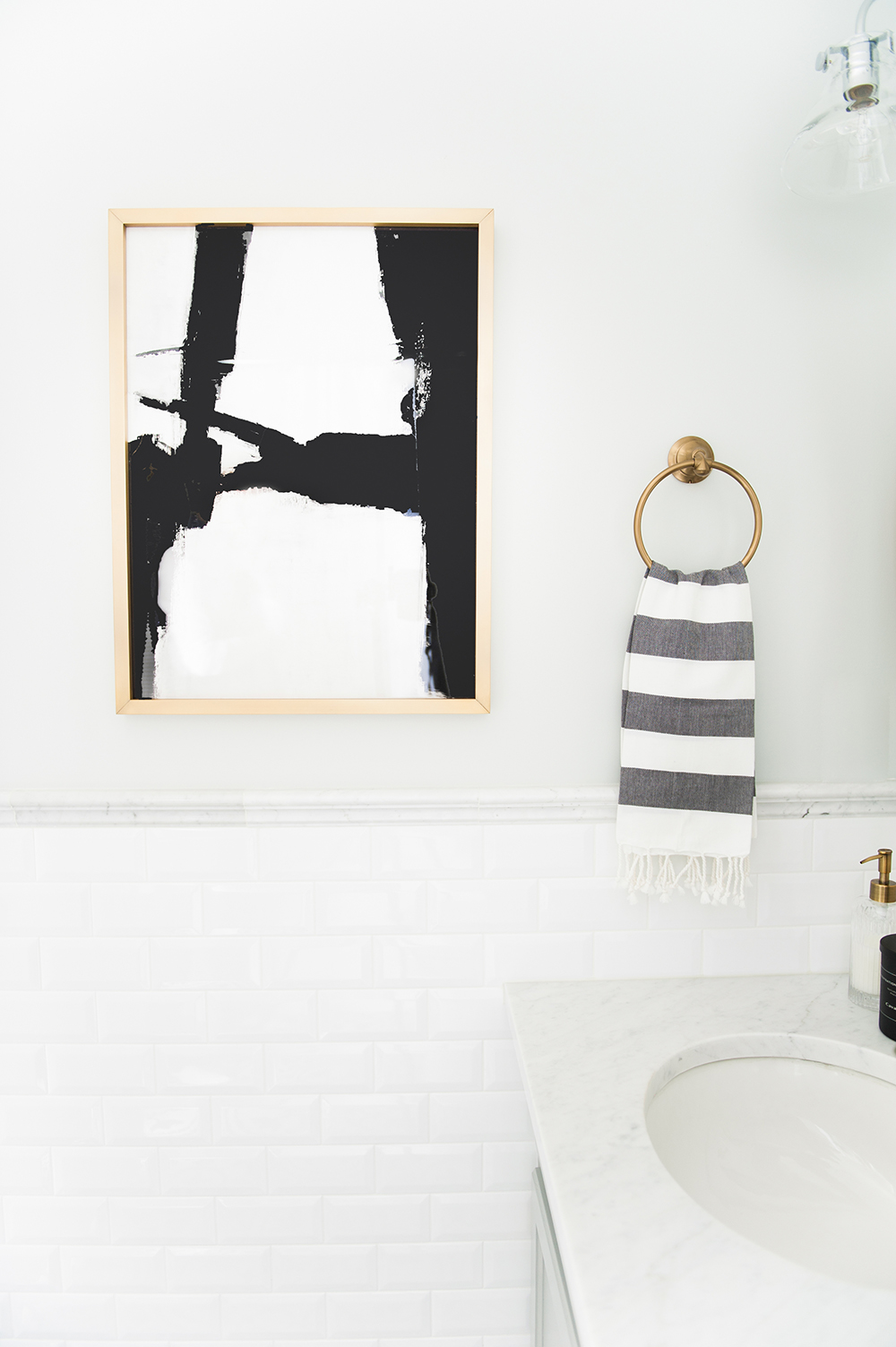
Between the Lines
The home’s black-and-white dynamic pops up in Marcus’s bathroom with well-chosen accessories like the stripy towel and the abstract artwork by Ilana Greenberg. On their own, they add interest to the small space, and overall, they reflect an engaging continuity that is found throughout this bright and happy home.
HGTV your inbox.
By clicking "SIGN UP” you agree to receive emails from HGTV and accept Corus' Terms of Use and Corus' Privacy Policy.


