If you happen to drive through Sault Ste. Marie, Ontario, you’ll quickly notice a certain style of house. Many were built in the 1950s and 1960s with picture-frame windows, modest gardens and relatively nondescript profiles of siding and brick. So it’s little surprise that Dan and Sophie Nogalo’s house, with its rosé-pink front door and black-and-white colour palette, regularly draws slack-jawed onlookers. It wasn’t always that way. They bought the place in 2016, back when it was just another cookie-cutter bungalow. But with the guidance of local designer Brie Gallagher, a mini-forest of house plants and a $70,000 budget, Sophie and Dan transformed their home into a stylish oasis that rightfully snaps heads.
Slate Beginnings
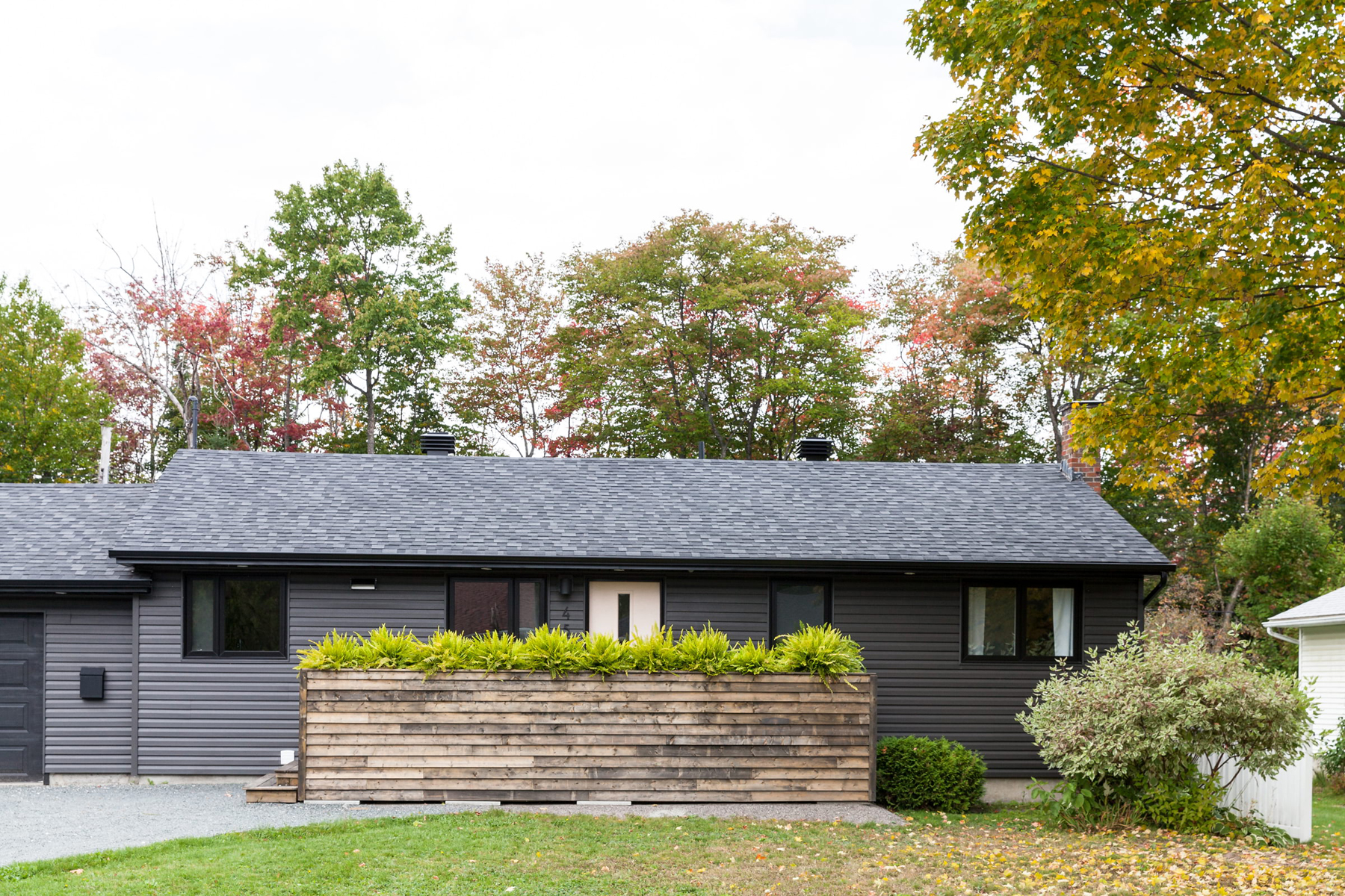
The entire house was gutted, including the exterior. The bungalow originally had two-toned siding, giving it a striped effect. For a more striking introduction, Sophie and Dan went with a handsome grey, changed the trim to crisp black and punched in a new window to brighten up the space. Oh, and there’s a peek of the blushing door.
Room for Two
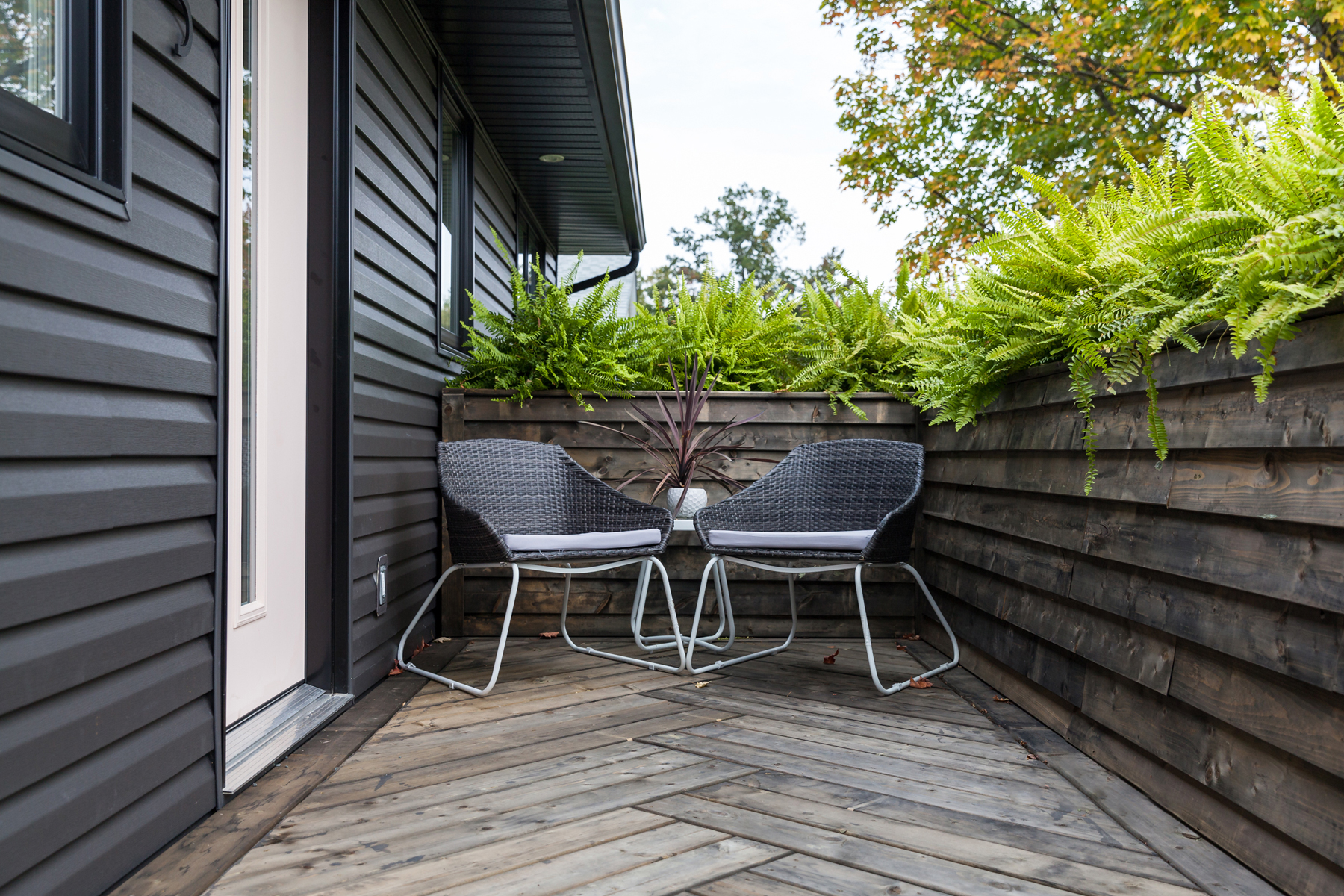
Designer Brie wanted to keep a front patio but still give Sophie and Dan some privacy. The porch, cordoned off with a wall of lush ferns, is the perfect spot for a morning coffee.
Oh, Hello
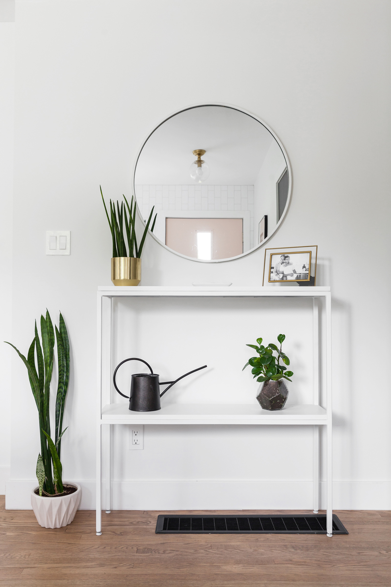
This is the first thing you see upon entering the home. Brie brought together some of the design’s key motifs – monochrome, gold, plants, and circles – and placed them here as a visual amuse-bouche. For a sentimental touch, Dan and Sophie added an engagement photo.
Simple Geometry
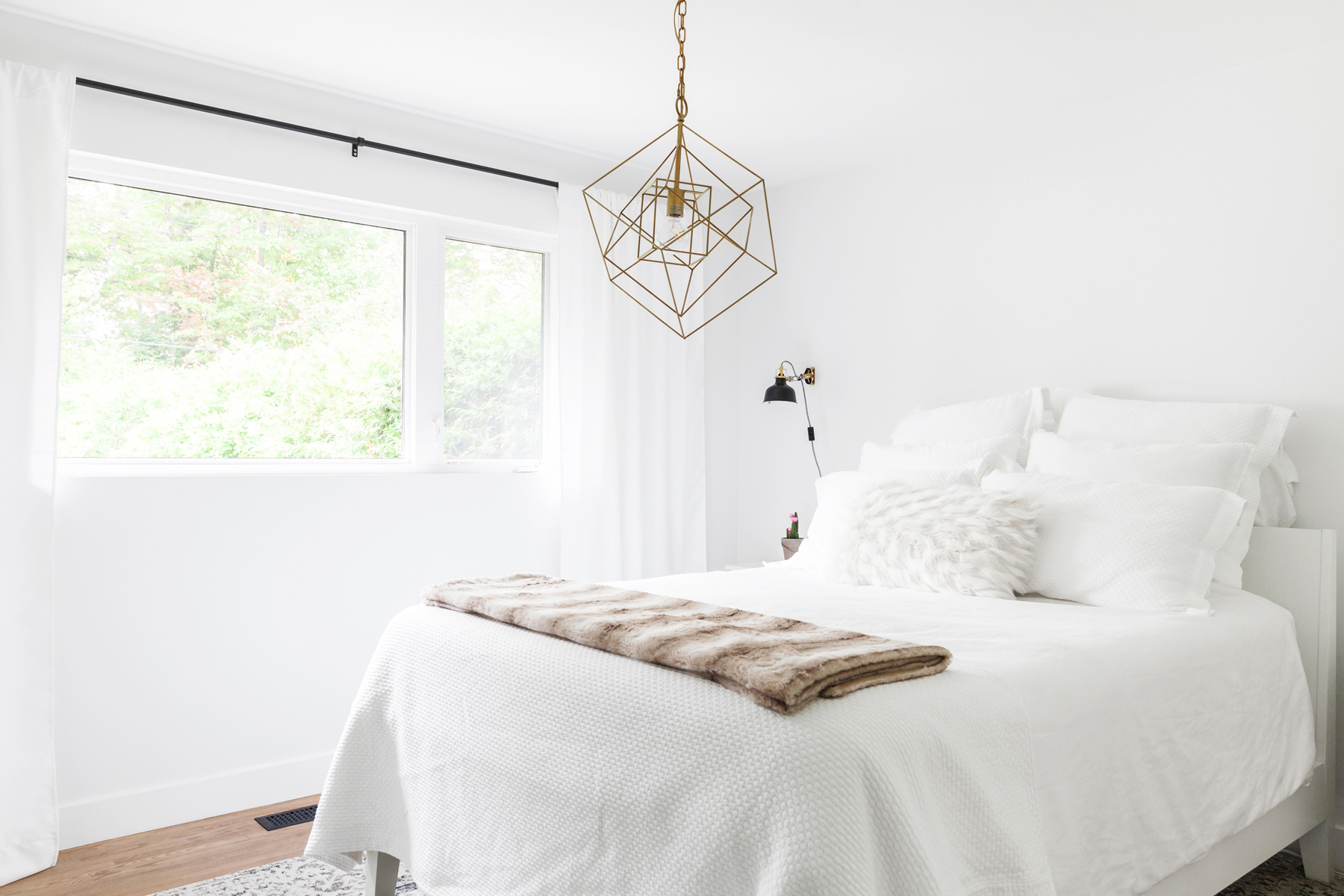
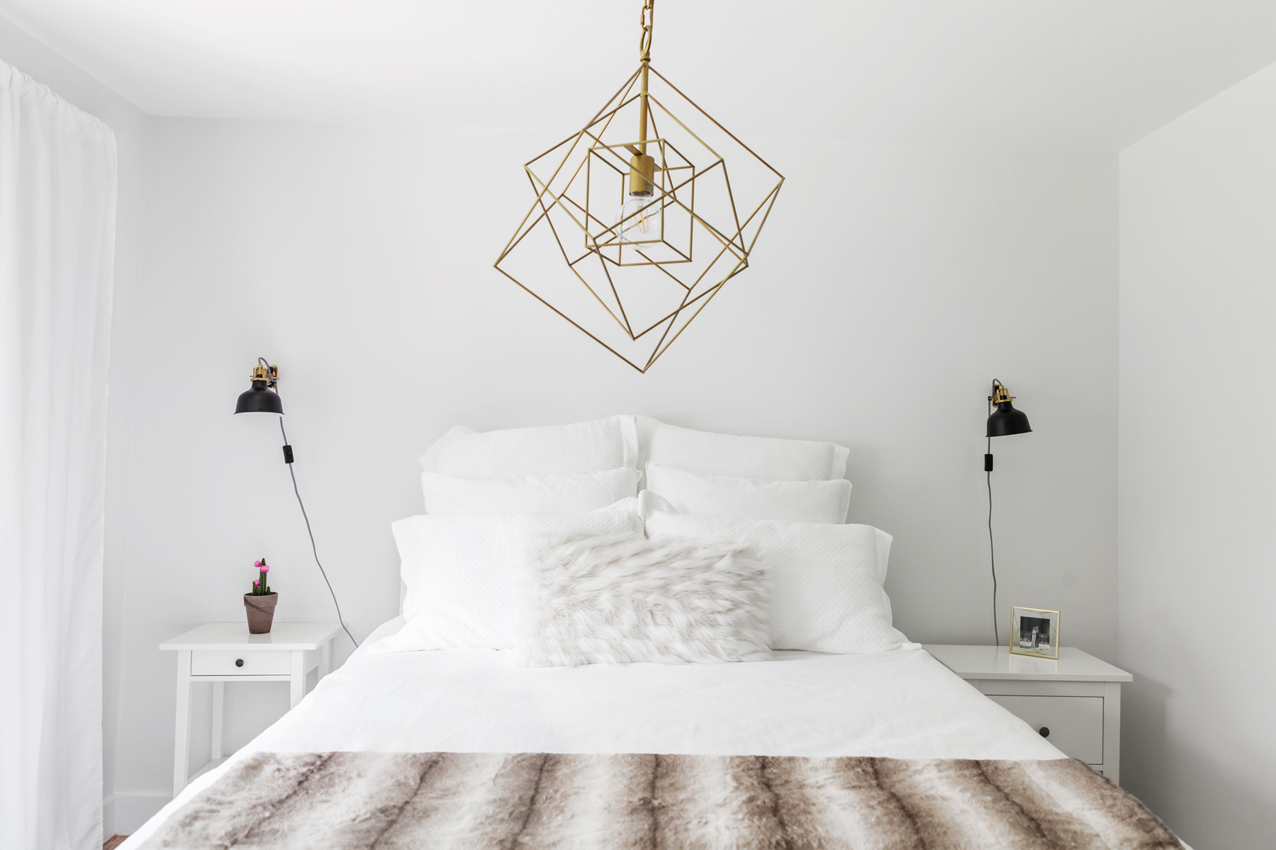
Like every other room in the house, the master bedroom is white – but its hardly blank. Brie brought in a gold chandelier from DIMOND LIGHTING to add a visual anchor to the room. The curtain rods, like others in the home, were custom-made to be oversized, so as to not obstruct precious natural light.
On a Cloud
The master bedroom is small, so Sophie and Dan went slim on furniture. A fur throw adds a warm touch to the otherwise monochromatic bedspread. A flowering cactus sits on the bedside table.
Casting a Hex
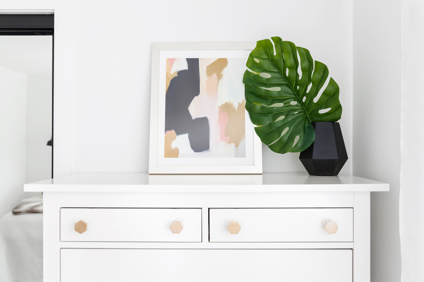
Little pops of colour create an elegant bedroom vignette. The dresser is from IKEA, and Sophie personalized it with cute hexagonal knobs from CB2, which are a subtle wink to another design touch in the bathroom. Similarly, peachy tones in the artwork and knobs are seen throughout the house.
Tropic Thunder
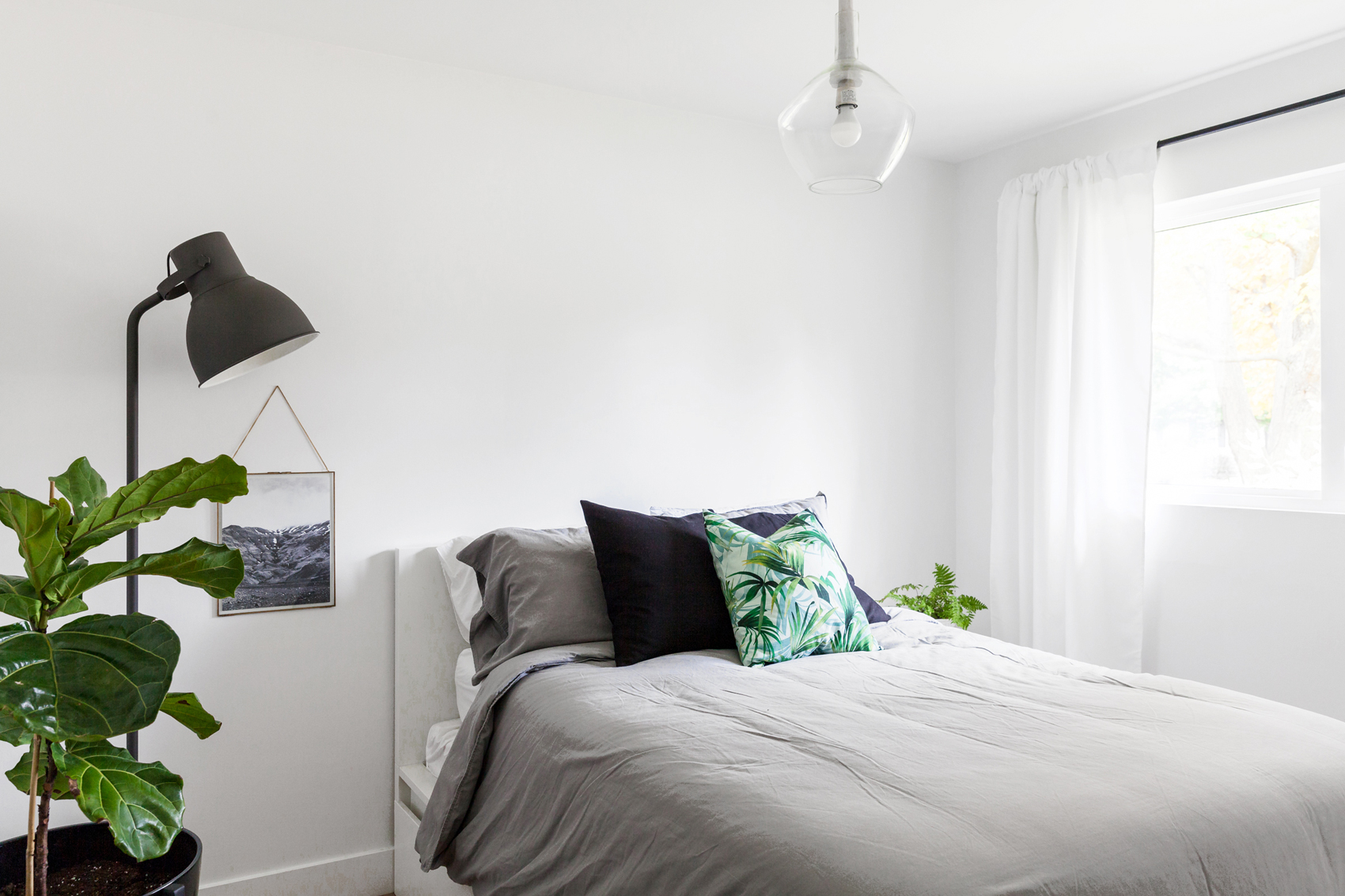
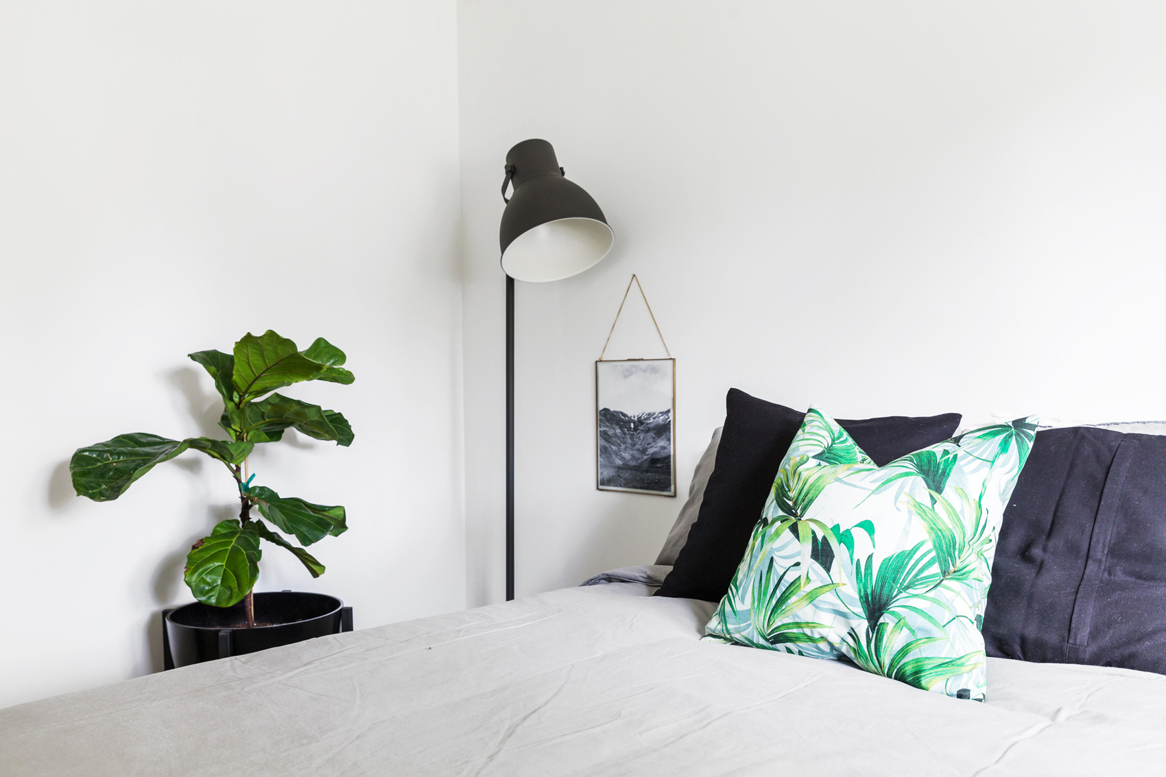
The guest bedroom features more plants than the master bedroom, which are reflected in the tropical palm throw pillow. In an ironic twist, a photograph from a trip to Iceland hangs in a gold frame beside the bed. Brie found the glass bulb light fixture at a shop in Sault Ste. Marie and hand-painted the stem to match the space.
Fiddle Dee Dee
For curious plant lovers, the greenery seen here is a fiddle-leaf fig, and they’re super low maintenance.
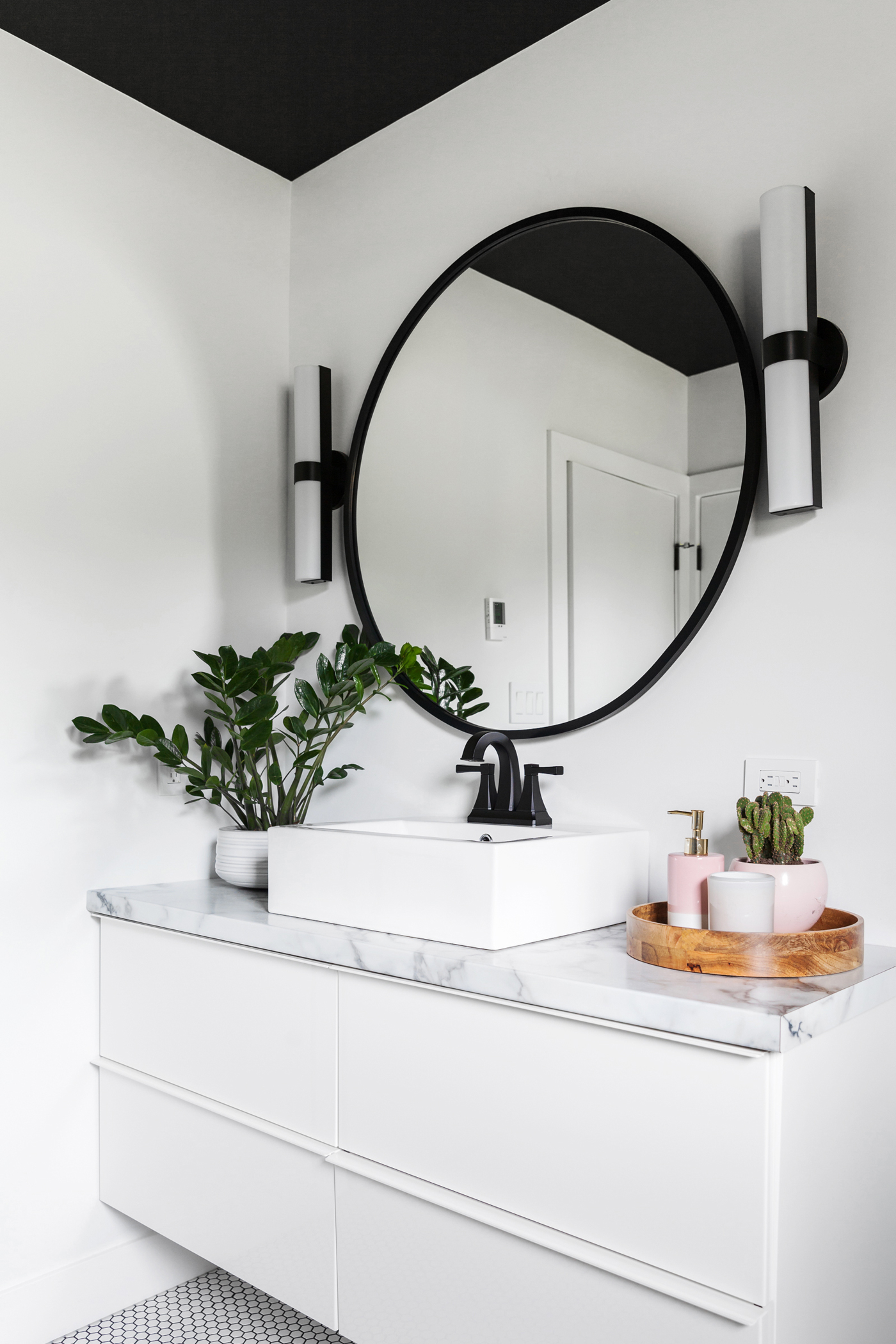
Full Circle
The bathroom was designed around the dramatic 36-inch hub mirror from Umbra. The marble countertop is actually a very convincing laminate, which helped keep costs down during renovations. (And frankly, it’s almost impossible to tell the difference.) Brie is a bit of a horticulture whiz, and she knew that a ZZ plant and cactus would be the right choice for the low-light space.
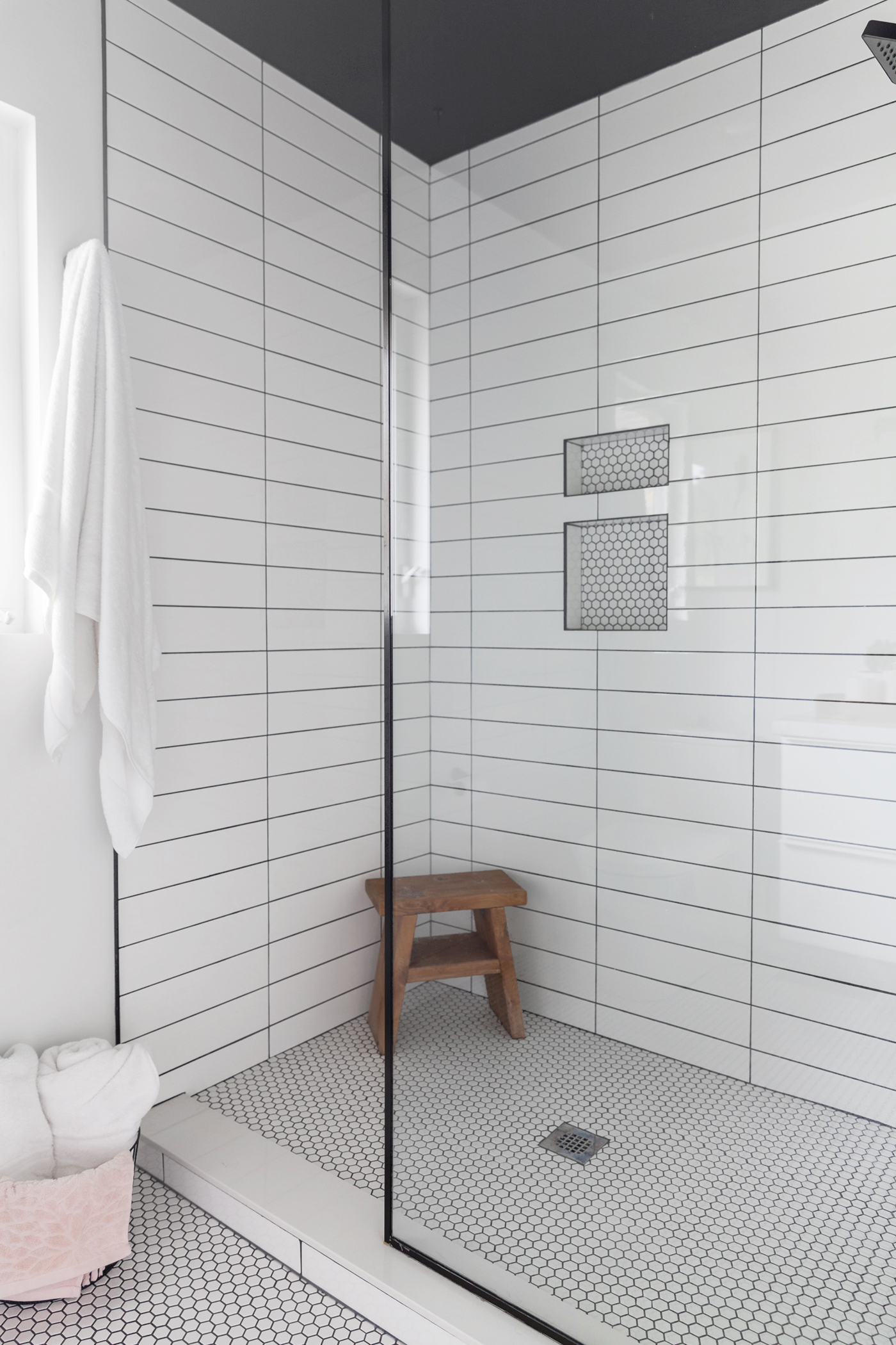
Power Clashing
Two different shapes of tile immediately add visual contrast to the shower space. The hexagonal floor tile is a throwback to the 1950s, when it’s believed the home was built. The oversized, stand-up shower maximizes light with a glass wall, and Brie convinced Sophie and Dan to opt for a black ceiling to tie the space together.
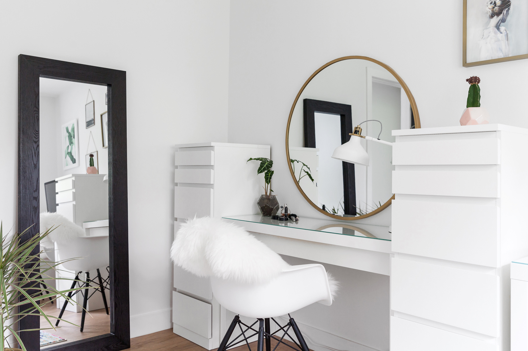
Soft Touches
This room serves as a boudoir-slash-dressing room-slash office, and it’s easily the most colourful room in the bungalow. Bursts of pink, gold and green add vibrancy to the calmer tones, and a fuzzy sheepskin throw is draped over the chair to make morning routines a bit more bearable. The round mirror and dressers are all IKEA.
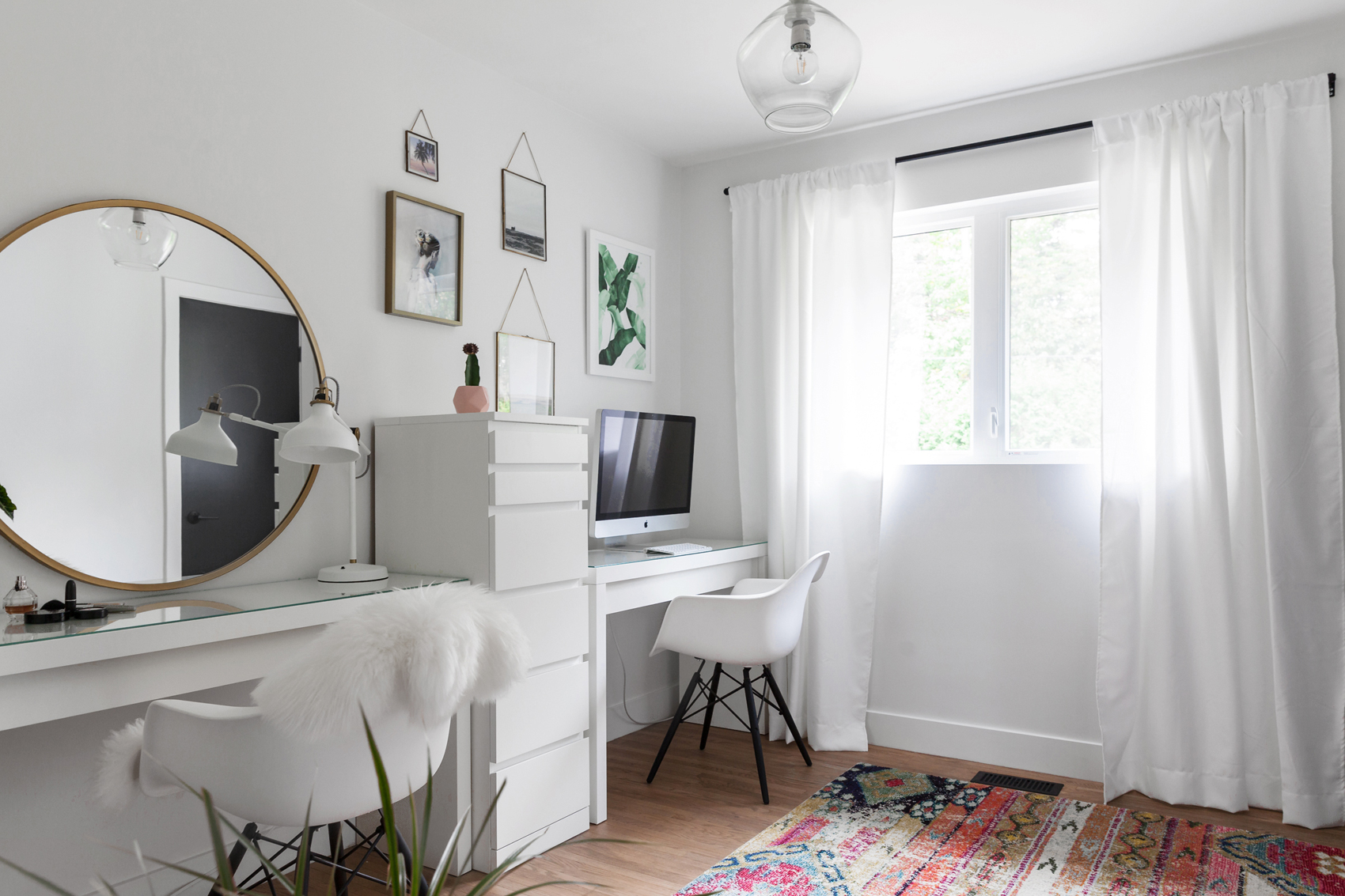
World Travels
Sophie and Dan have done a lot of travelling, and to personalize the space, they turned over some of their favourite photographs to Brie, who selected the most suitable ones for a mini-gallery wall. The playful rug was purchased online.
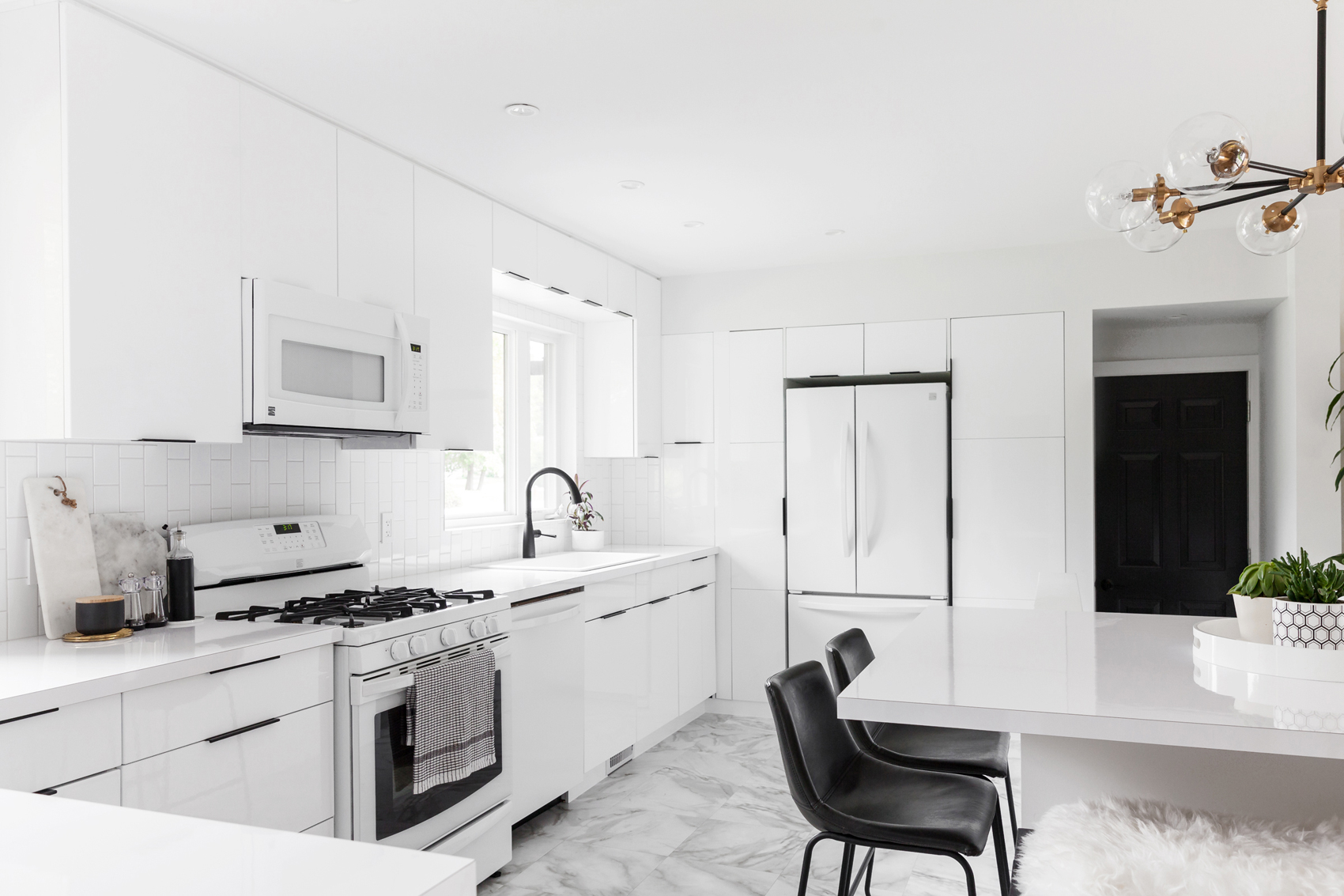
Crisp and Clean
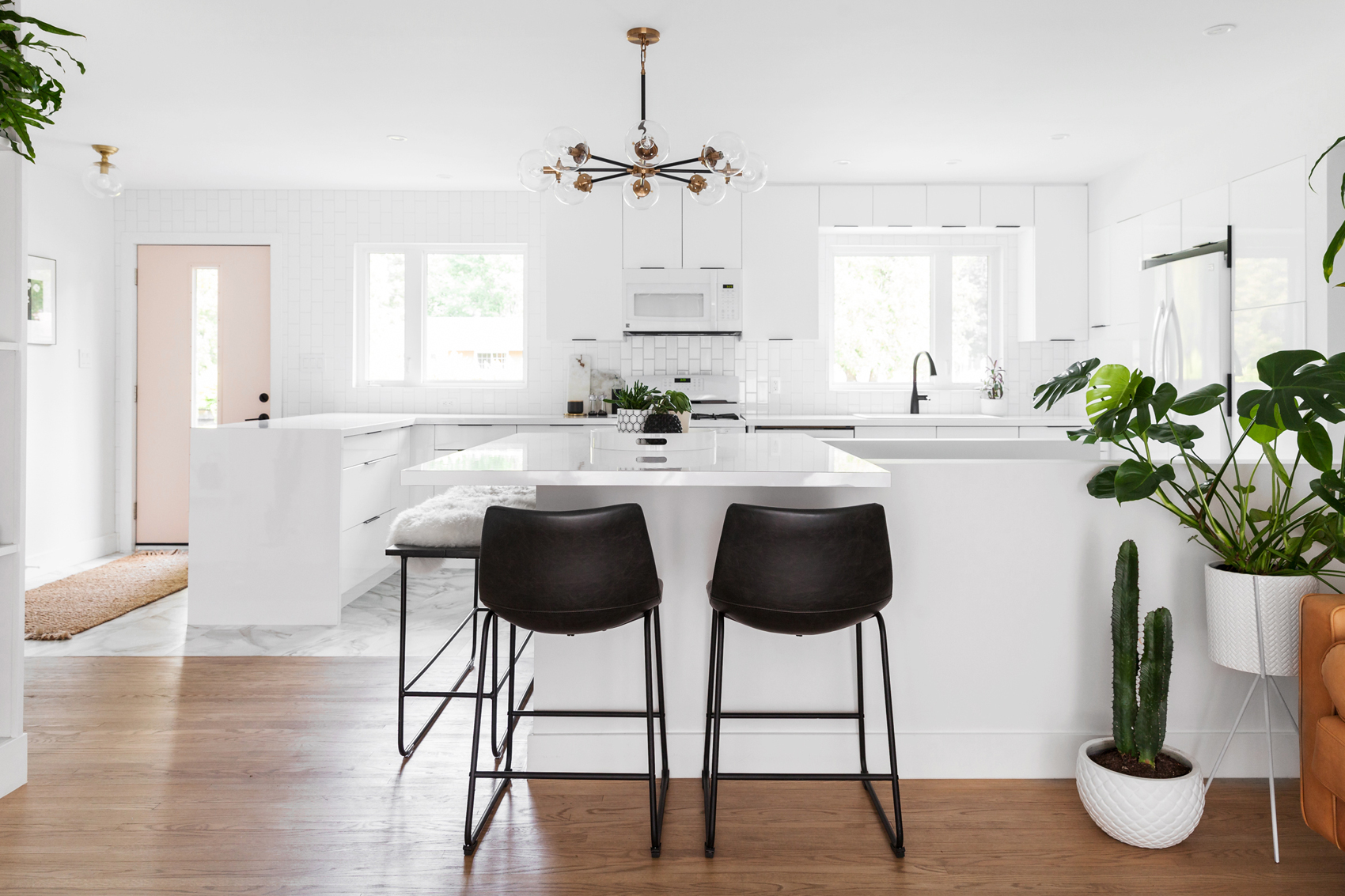
From the start, one of Dan and Sophie’s main goals was to turn the cramped galley kitchen into a luminous white space. Brie pulled it off by knocking out walls, creating a new window over the sink and adding an elegant marble-patterned vinyl hybrid tile to the floor. Winters in the Sault are notoriously frigid, and the sensible (and affordable) choice was to opt for something that stays warm and is waterproof.
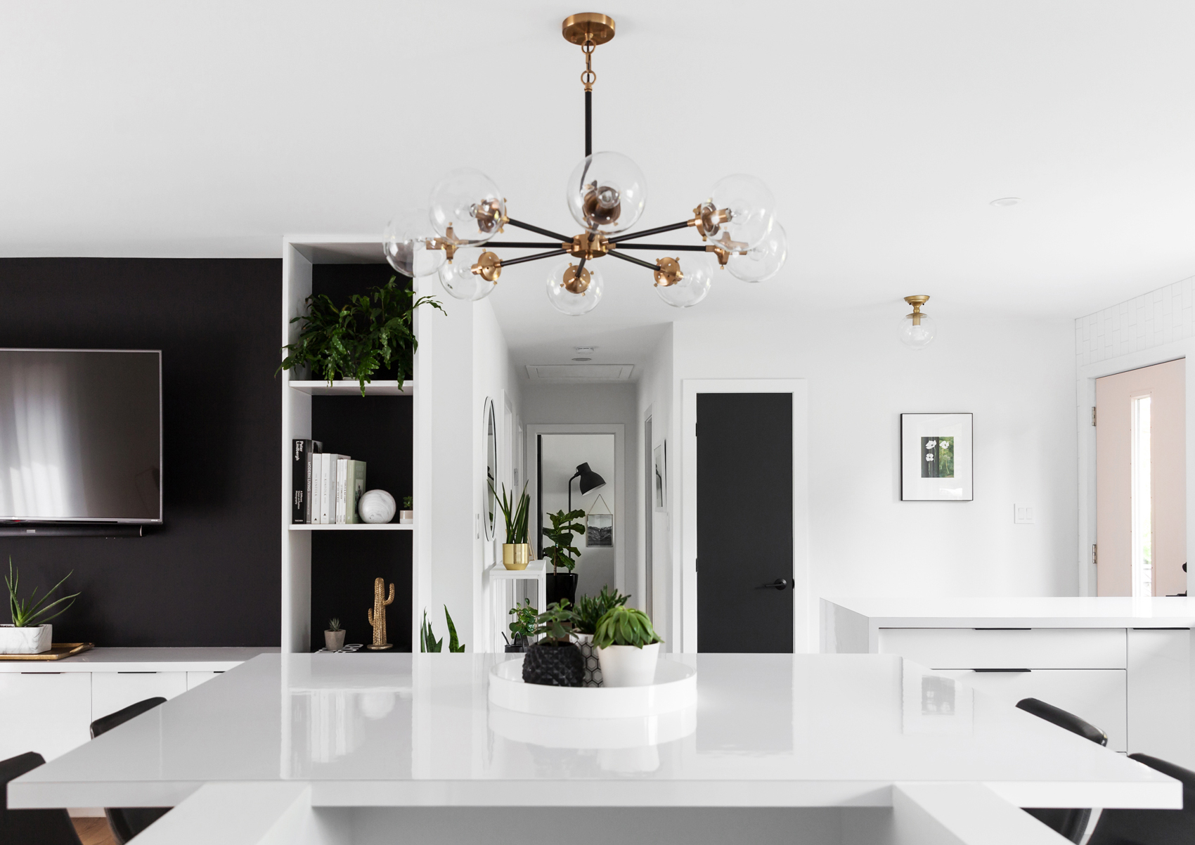
Floating Island
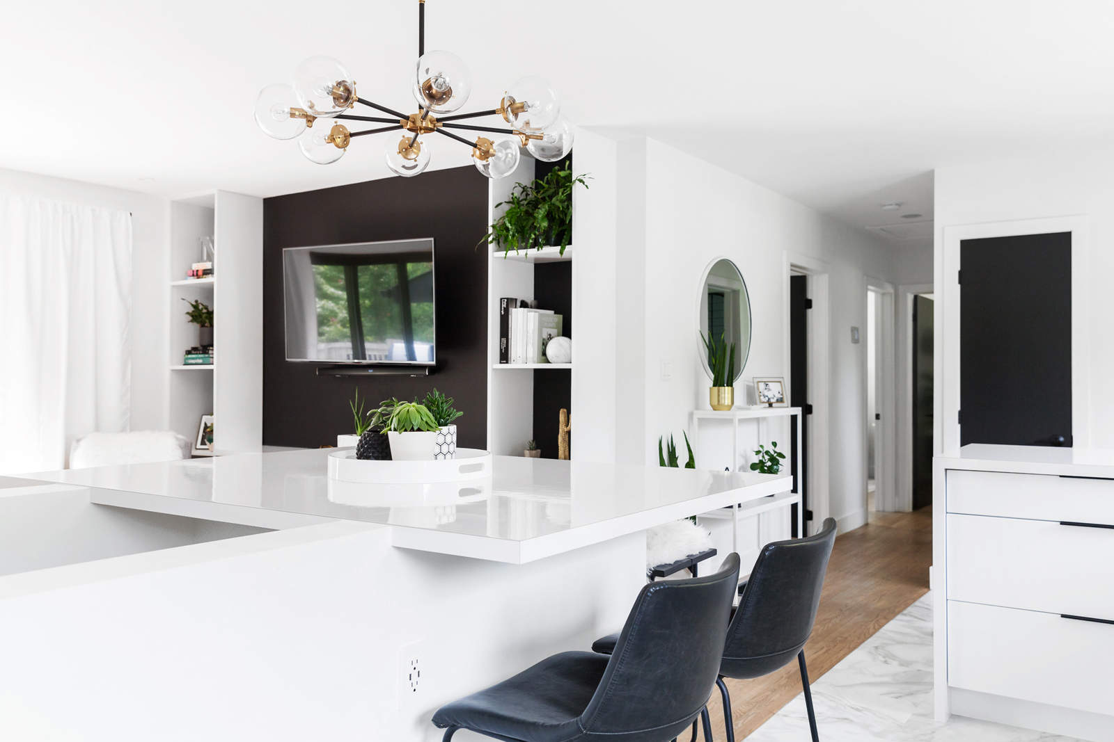
The bungalow isn’t big enough for a separate dining room, so they built a floating island atop the basement stairs to make the most out of the square footage. It was a savvy design choice that keeps the living room open. The multi-bulb light fixture, from Elk Lighting, adds a beautiful golden glow.
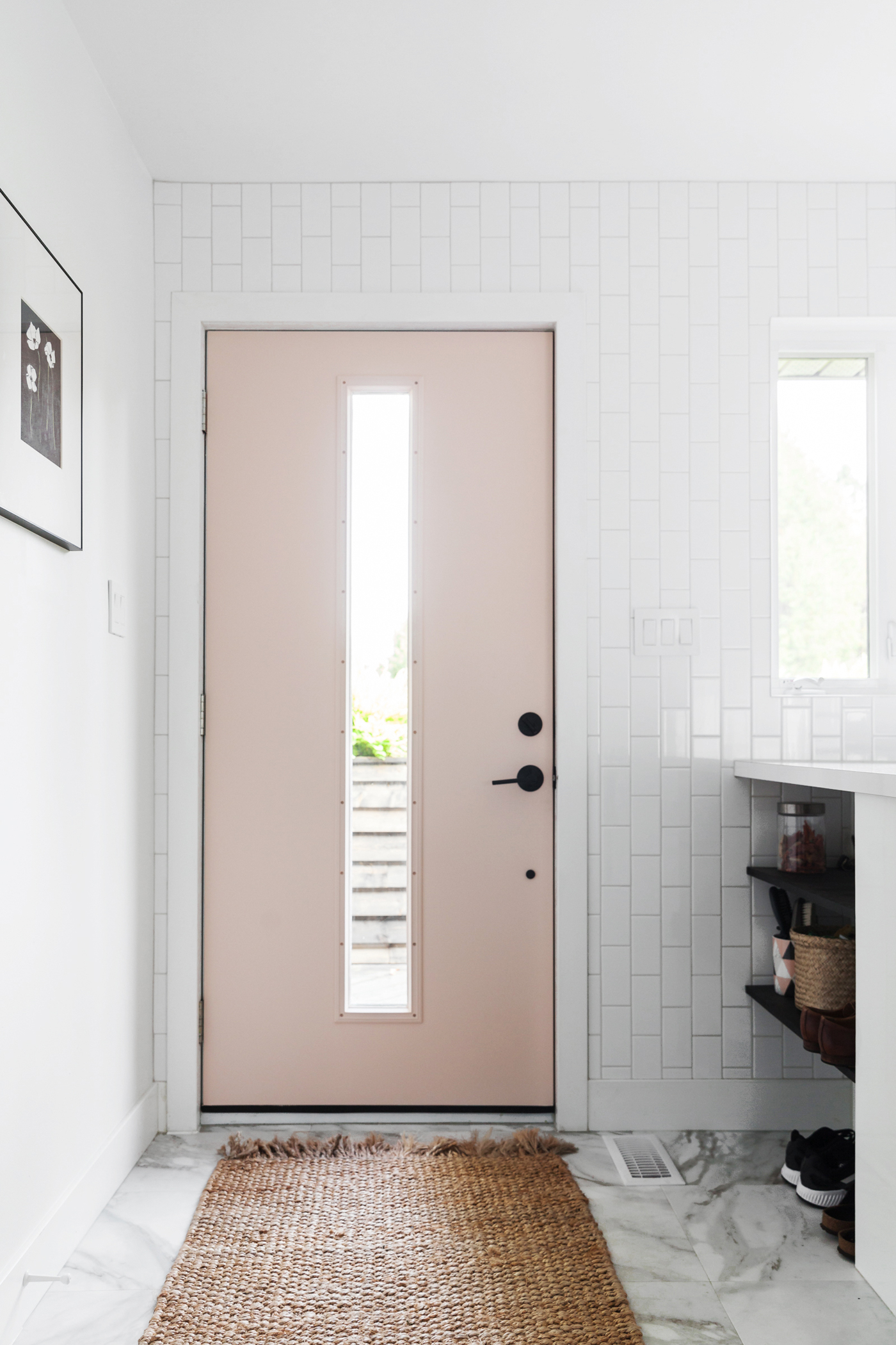
Rosé All Day
Here’s that famous door in all its glory. A column of light shines through, adding a bright welcome. The subway tile wall is an extension of the kitchen, and Brie flipped the tiles vertically for a unique design touch. The print of poppies on the wall is by local artist Renée Anne Bouffard-McManus.
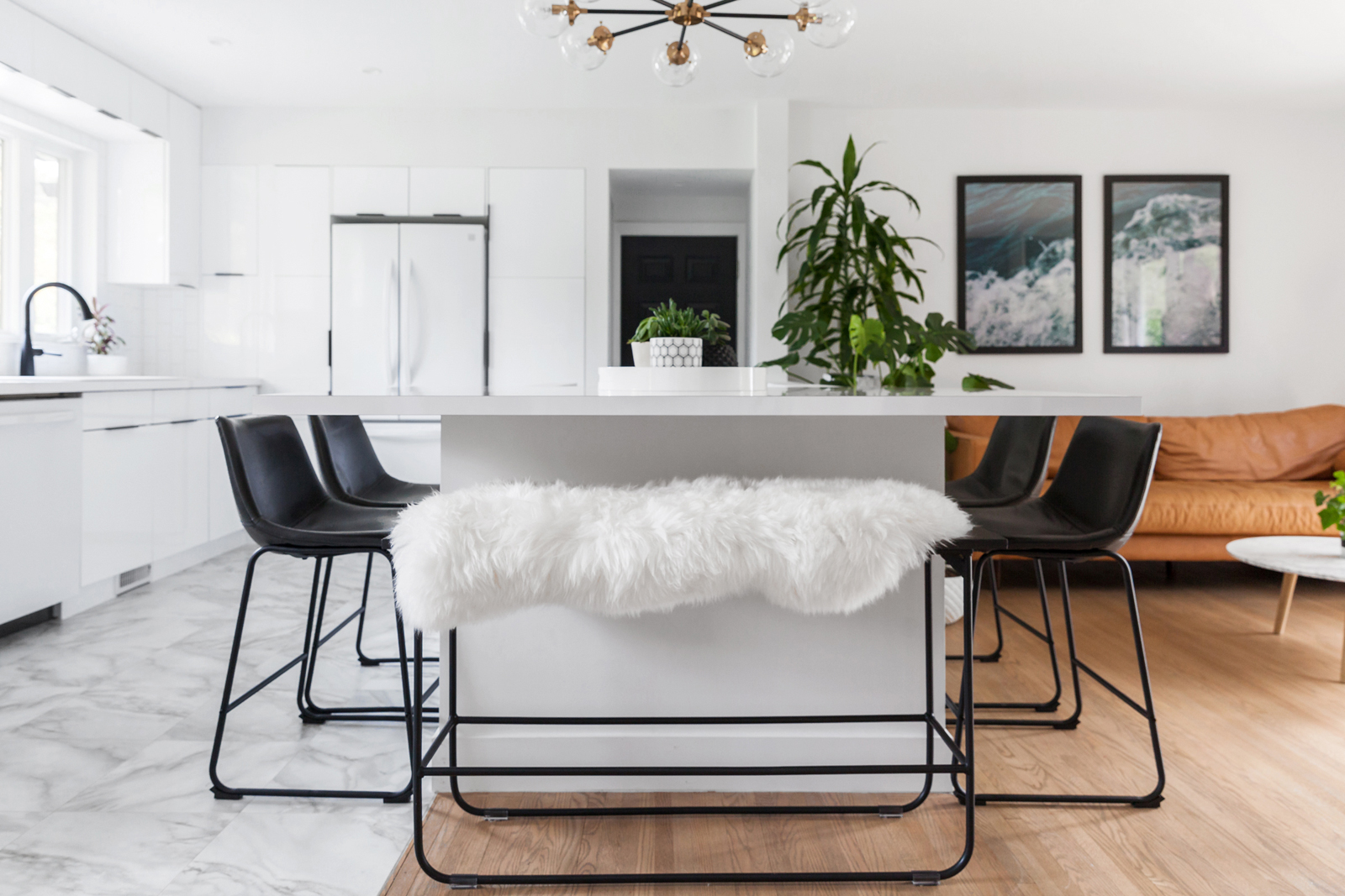
Flock Home
Credit for the cozy bench goes to MAXCO, a custom furniture maker in Sault Ste. Marie, who perfectly matched the existing island chairs from Wayfair. The sheepskin throw makes the bench the most coveted spot at the dinner table come winter.
Open Up
The airy space was once sectioned off by walls. One of the very first tasks in renovations: knock ’em down.
Cottage Country
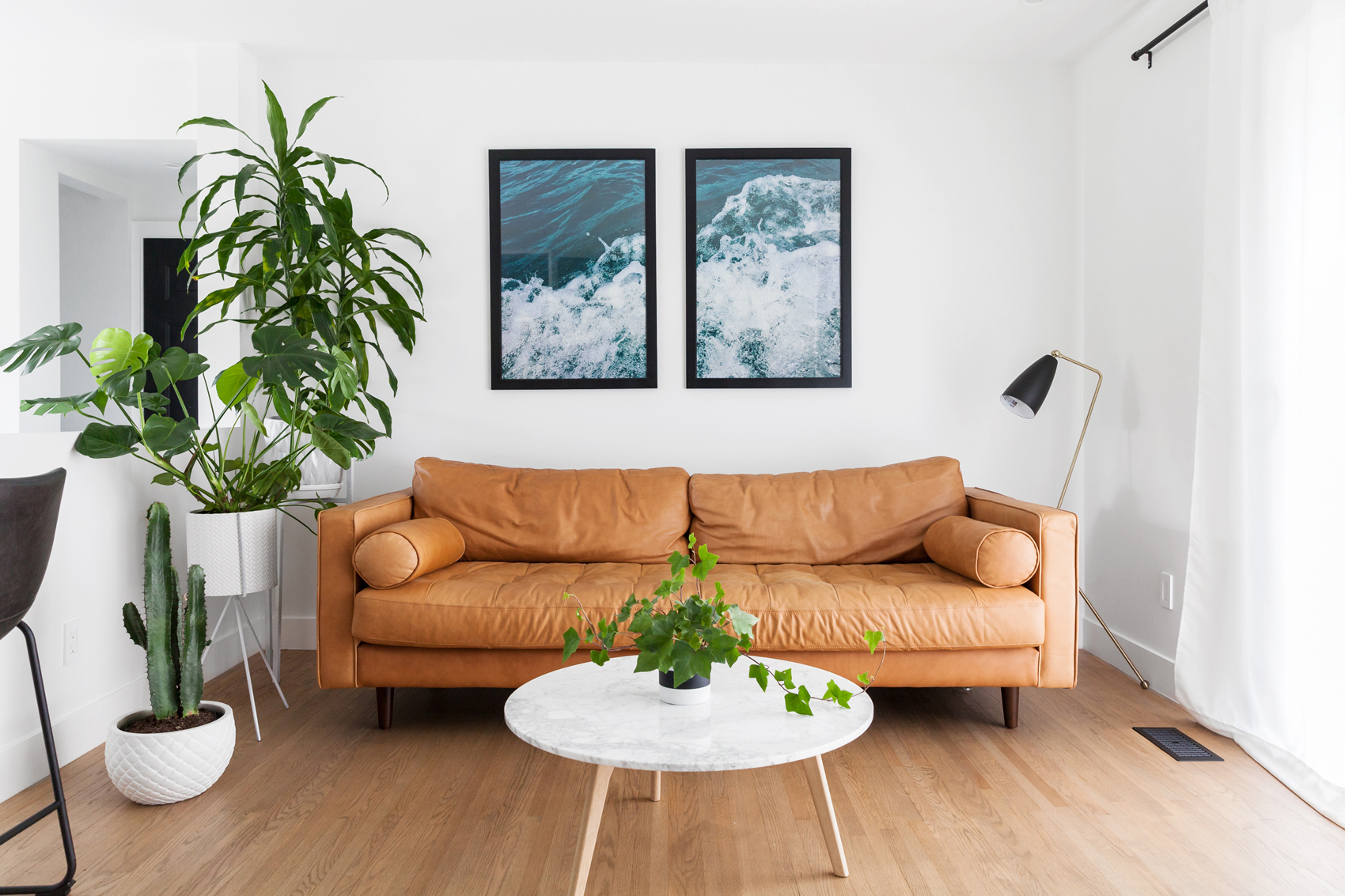
Amidst all the black and white, this tan couch from Article is a bold injection of colour. The choppy waters on the wall is a photograph shot by Brie off her boat in Lake Superior. Dan and Sophie have a cottage on the lake, and so displaying the artwork prominently was an easy choice. A custom-built plant stand by MAXCO creates a tiered display for more bold, leafy greens. The gold reading lamp isn’t necessary since the room is so bright, but it adds a pleasing visual symmetry.
Original Features
There are few original features in the home, but Sophie and Dan decided to keep the hardwood floors. They mixed their own signature stain to match the bright design.
Into the Woods
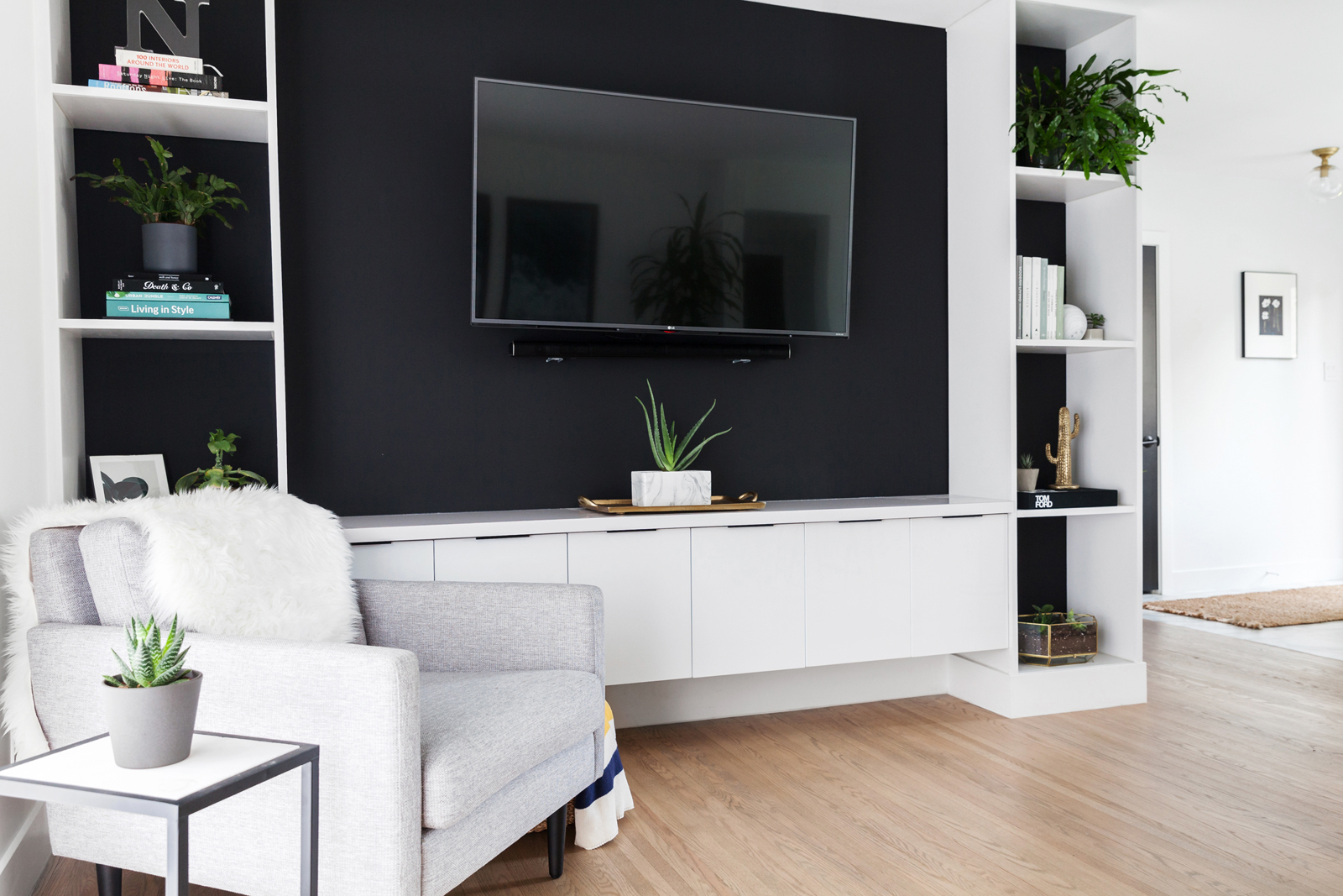
For those keeping count, there are a total of 29 plants in this house. Succulents, cacti and leafy ferns create a natural calm in the built-in entertainment area, which is the handiwork of Sophie’s father. The dark wall forms a dramatic backdrop for the television, books and (lest we overstate it) house plants. The grey armchair is from Article, and it’s been fleece-ified.
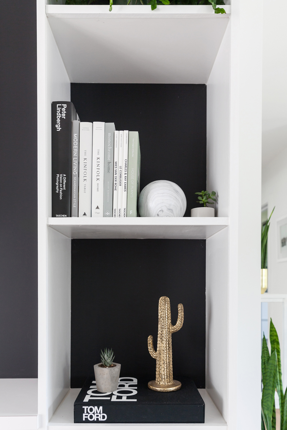
Book Club
You shouldn’t judge a book by its cover, but the spines of these fashionable titles all draw on the home’s neutral tones.
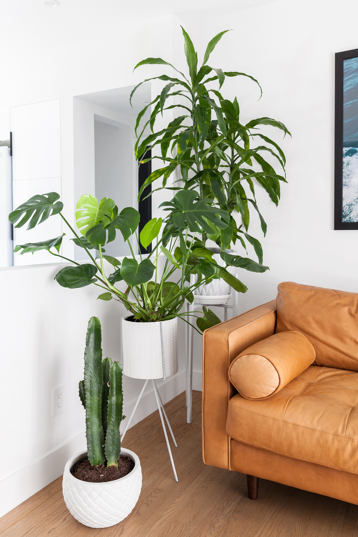
Going Green
We leave you with a closer look at that glorious, custom-made greenery tier.
HGTV your inbox.
By clicking "SIGN UP” you agree to receive emails from HGTV and accept Corus' Terms of Use and Corus' Privacy Policy.


