As more and more condo towers rise across Canada, making your unit stand out in the market is more important than ever. Taking the time to understand how to best show off limited square footage can pay off. With these seven staging tricks, you’ll know how to showcase your condo’s best assets – and get the best price possible.
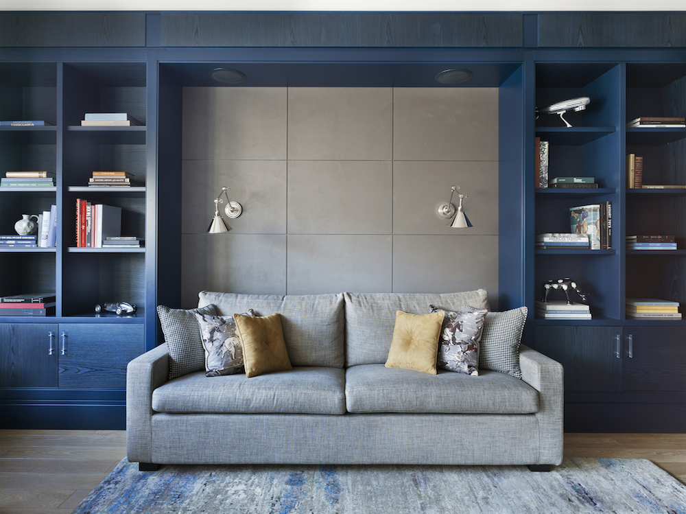
Scale it Way Down
Sure, that overstuffed brown-leather recliner was comfy for your weekly Netflix marathons, but it takes up too much valuable square footage. It’s time to replace any bulky furnishings with smaller, more streamlined versions. Look for condo-sized pieces with narrow, shorter seats and lower backs (they make ceilings look higher). This staging trick pays off down the road when prospective buyers comment on how open and uncluttered the space feels.
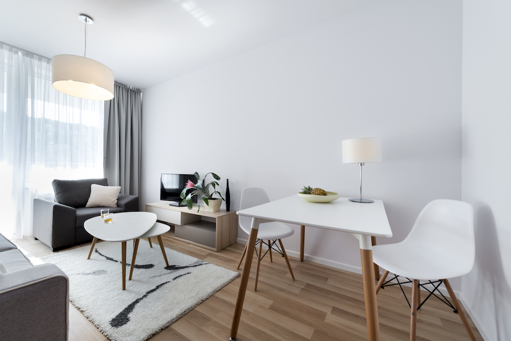
Let There Be (Lots of) Light
Good lighting is what makes everything else shine, so having a cohesive lighting system is key to showcasing your pocket-sized pad. First, for this staging trick, let in as much natural light as possible by removing heavy drapes, blinds and window coverings. (If privacy is an issue, install sheer curtain panels where needed.) Second, make sure every room has layers of light coming from multiple sources such as overhead pendants lights, table lamps and floor lamps.
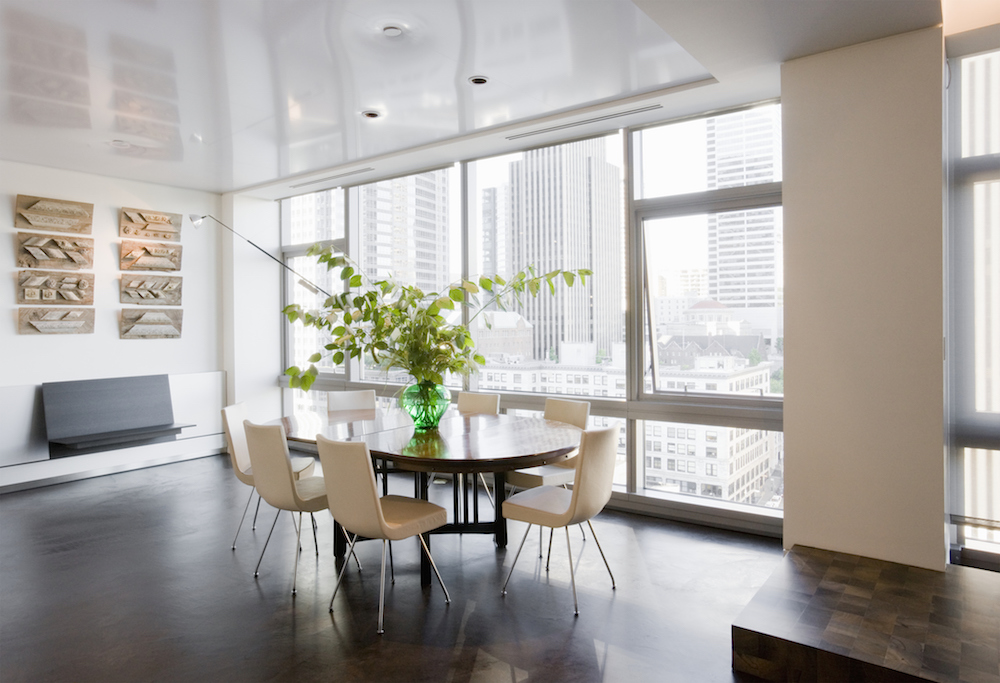
Clutter Mutter
We all know the staging trick of removing clutter, but it’s especially important when it comes to condos. With limited square footage, every inch makes a difference when you’re trying to make a positive impression on homebuyers. Clear off counters, pack up personal photos and knickknacks, and edit your room accessories down to a few selections. You want people to imagine themselves living in this space, not living in the space with you and all your stuff.
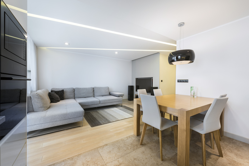
Traffic Jams
Walk through your condo and be very conscious about how easy it is to move around. Are you bumping into anything? Having a clear, flowing path between chairs, tables and couches – especially in open-concept condos – shows off the space’s livability. Rearranging the furniture to create more space or using rugs to designate “zones” are just two staging tricks that will enhance usability.
Colour Coordinated
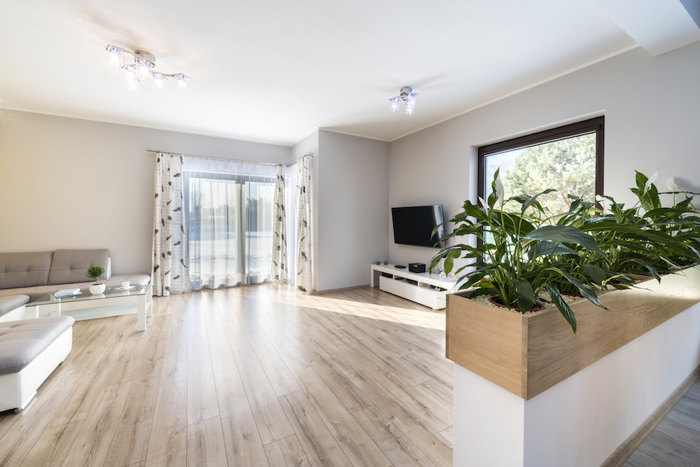
While you may love your fuchsia feature wall, that bold colour statement may put off tamer home hunters. If you have the time, consider painting all the walls of your condo a similar, soft neutral colour such as greige. Not only does the lighter wall colour reflect more light and make the space feel bigger, but it presents a fresh canvas.
Condo Clear-voyant
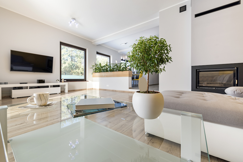
When it comes to implementing furniture staging tricks for your condo’s sale, think clear. A glass-topped dining table or an acrylic desk both provide the same function of their wooden counterparts but disappear into the background. Clear pieces are perfect for a condo because they trick the eye into believing that there’s more space than there actually is.
Step Outside
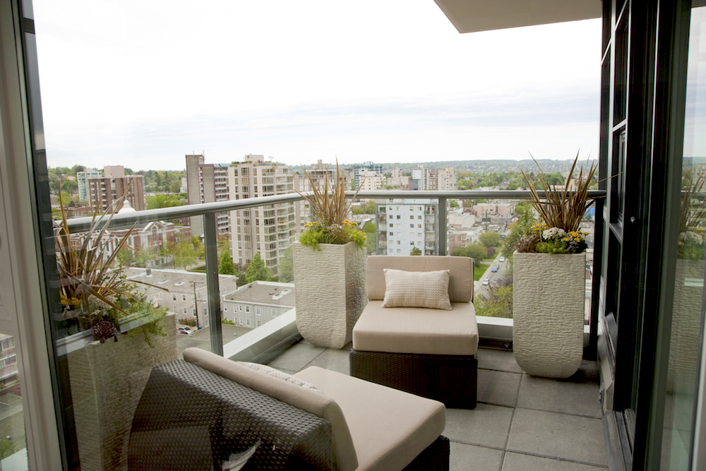
Setting up your balcony with a dining area – no matter how small it is – is a must if you want to get top dollar. You need to show that outdoor living is possible even in a condo tower by extending the indoor space outwards. Start with a small outdoor rug and add a table and chair set, plus a few bright potted plants (faux is fine). Remember that the balcony is part of the condo’s square footage, so show off this space like you would the living room.
With these staging tricks, you can show your condo in the best light (literally) and move it ahead in the real-estate market. Staging your condo can take some time, money, and effort but it’ll be worth it when the offers start rolling in.
HGTV your inbox.
By clicking "SIGN UP” you agree to receive emails from HGTV and accept Corus' Terms of Use and Corus' Privacy Policy.


