Wendy Sider, principal of Vancouver’s Wendy Sider Design, had a vision that required careful treading. Namely, reimagining a couple’s West Coast heritage home as a brighter, more modern space in keeping with their love of sailing and the Mediterranean. She had to be the life preserver of original elements and still make a contemporary splash. She did so swimmingly.
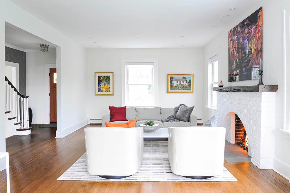
Warm Contrast
Wendy’s choice of crisp white wall paint is tempered by the flooring’s darker stain. “I had the original red oak hardwood with dark inlay refinished and stained a medium-brown in satin sheen.” That glossy sheen is a nice foil to the matte finish of the walls, which were painted with Paper Doll by Benjamin Moore. The overall effect is both contemporary and convivial.
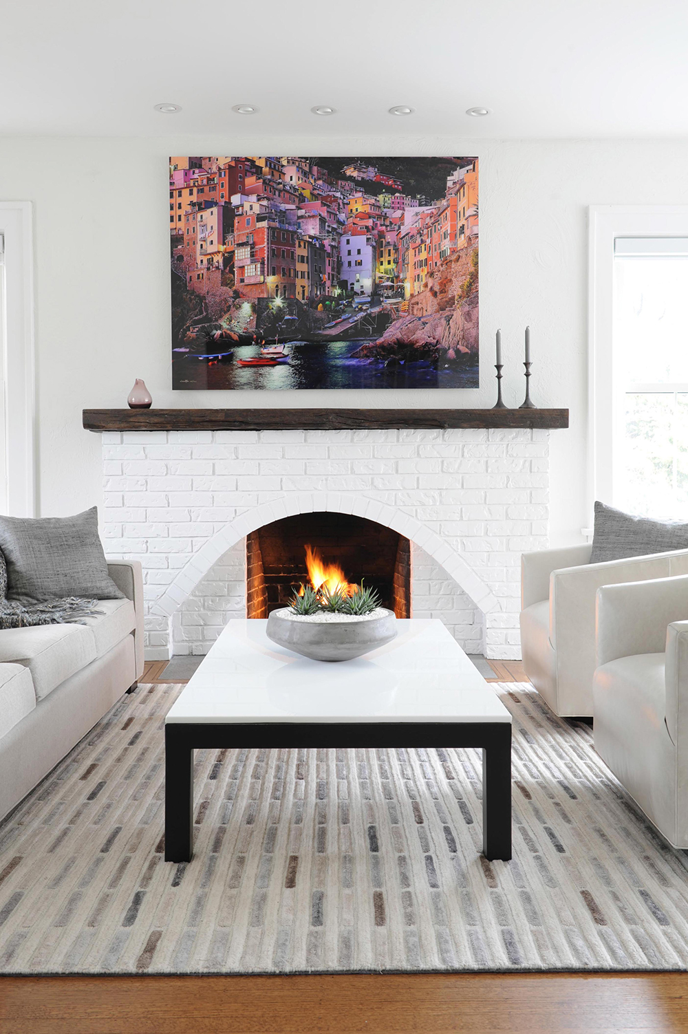
Club Med
“This large photographic art shows Italy’s Cinque Terre region, where the owners vacationed years ago,” says Wendy. “It’s a wonderful memory for them and adds spectacular colour and interest.” She continued the work’s Mediterranean feel underfoot. “This rug has a great beachy vibe with its sandy high-pile colour blocks.”
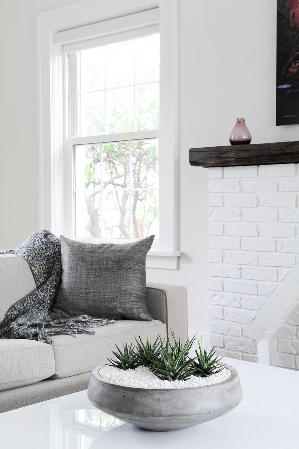
White Caps
This plush sofa by Mitchell Gold + Bob Williams
is upholstered in taupe fabric. “I love its sturdiness and how it anchors the room and holds up to the visual weight of the fireplace,” says Wendy. Potted succulents rest on a white quartz-topped coffee table. “Its white top draws the eye to the fireplace and the art above it.”
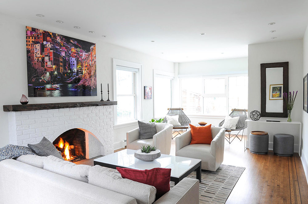
A Fine Arrangement
Wendy paired the sofa with leather swivel chairs from MG + BW. “The boxy sofa mimics the visual outline of the fireplace, so I wanted to add some playfulness and break up the symmetry. The leather also offers a little quiet sophistication.” The mantel is reclaimed beach wood found locally. “It was custom cut and stained by Reclaimed Wood Custom Furniture. I love its rough live edge.”
Into a Corner
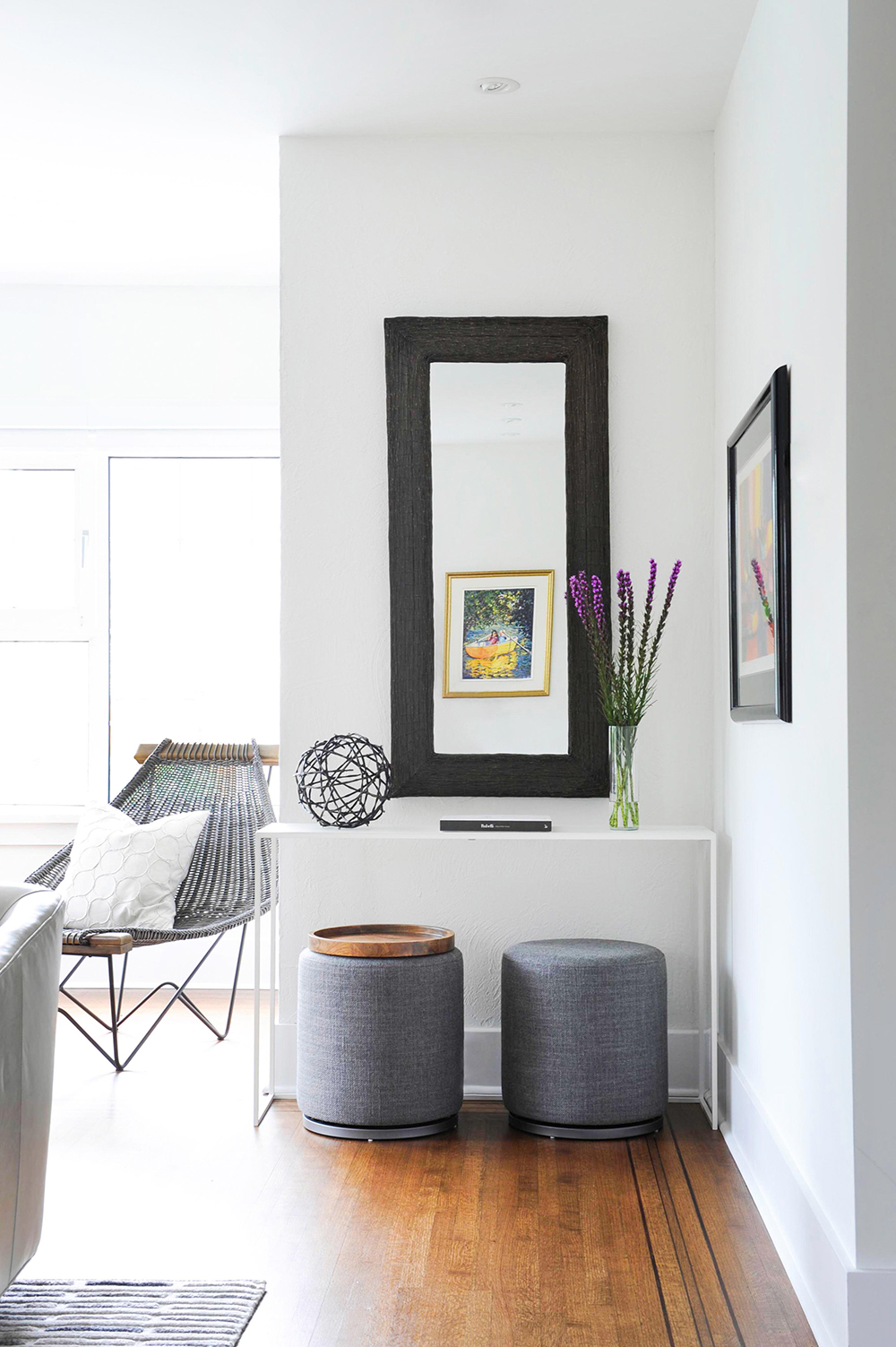
Wendy admits this corner of the living room was a challenging space. “But then I happened upon this mirror on sale at Crate and Barrel,” she says. “I chose it for its substantial scale (it’s a large room) and dark bronze finish.” The white console table beneath it allows the mirror and decorative items to animate the vignette, while the ottomans can be repurposed as movable side tables.
Ahead of the Curve
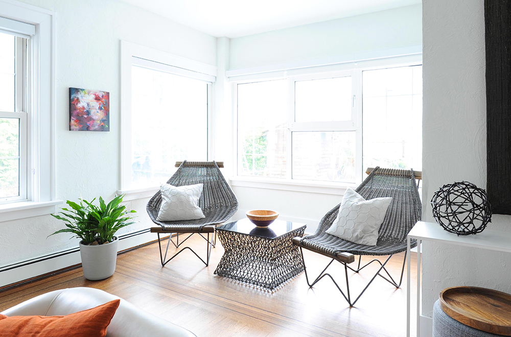
“This end of the living room needed to feel intentional, so a secondary seating area made sense to me,” says Wendy. These faux-rattan chairs spoke to her, but not the owners. “I had to convince them these would be a highlight. Their curvaceous shape breaks up the geometric lines of the room, adding some fun.” And, happily, the owners agree.
Budget Beauty
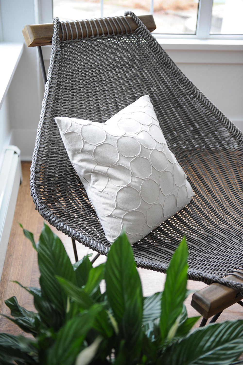
Wendy eschewed custom cushions here, opting for more wallet-friendly finds. “These pillow covers with down inserts are from Crate and Barrel. Again, when there’s a strong rectilinear form to a space, it’s important to add curves.”
Something Blue
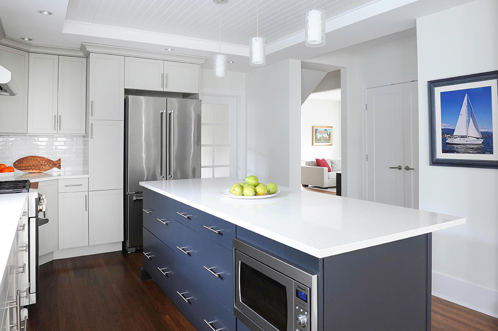
The homeowners wanted some blue worked into the kitchen and loved Wendy’s suggestion of adding a gunmetal blue island by Burnaby-based KitchenCraft. More than just a pretty hue, the super-efficient island also features an under-counter microwave and ample, easy-to-access storage drawers large enough to hold everyday pots and pans.
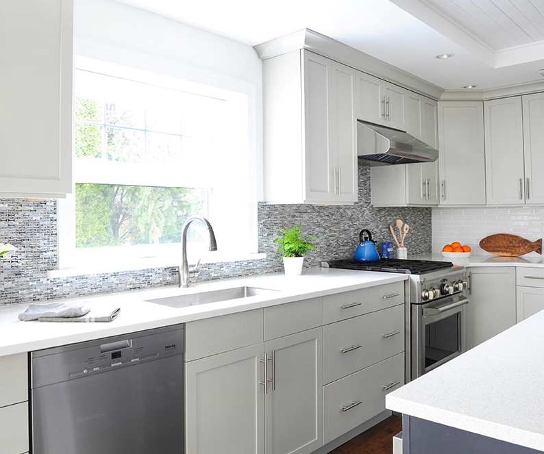
Mod Heritage
Wendy’s choice of kitchen cabinetry deftly channels the home’s history with a contemporary spin. “The Shaker-style doors with flush slab fronts reference the original heritage vibe, while the crisp glazed finishes add a modern feel.”
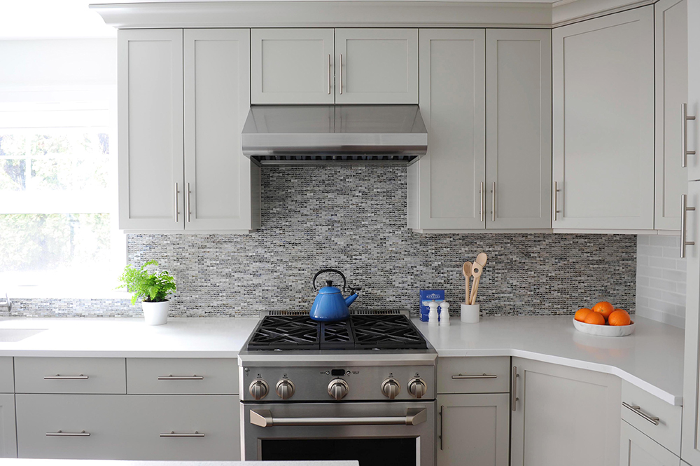
Splash Out
The glossy mosaic backsplash tiles were meant to be applied vertically, but Wendy decided to upend that notion. “When placed horizontally, they subtly reminded me of a fish and that beachy vibe we were after.” Introducing contrasting glass subway tiles on the return wall feels fresh and creates a dynamic contrast.
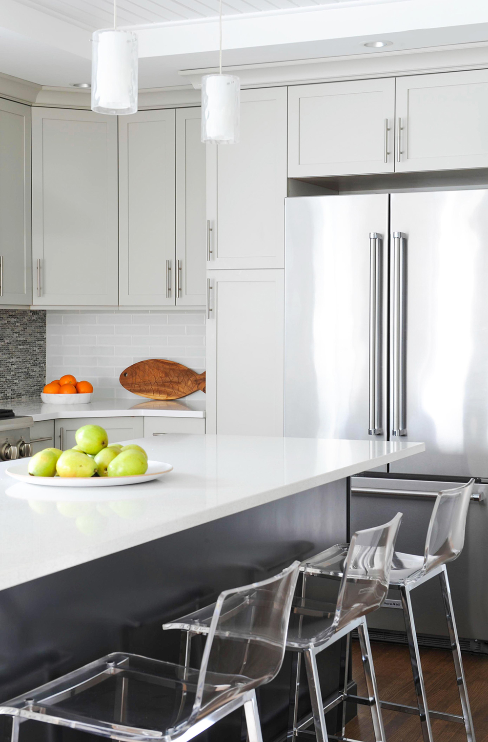
Surface Area
“Since it’s a narrow kitchen, it was key not to make the island busy with a sink or appliances,” says Wendy. Its surface is crafted from Caesarstone. “It has great sparkle and subtle colour that work well with the intricate backsplash.” The fish cutting board echoes that backsplash’s scale pattern in a whimsical way. “It’s important to have fun during the design process!”
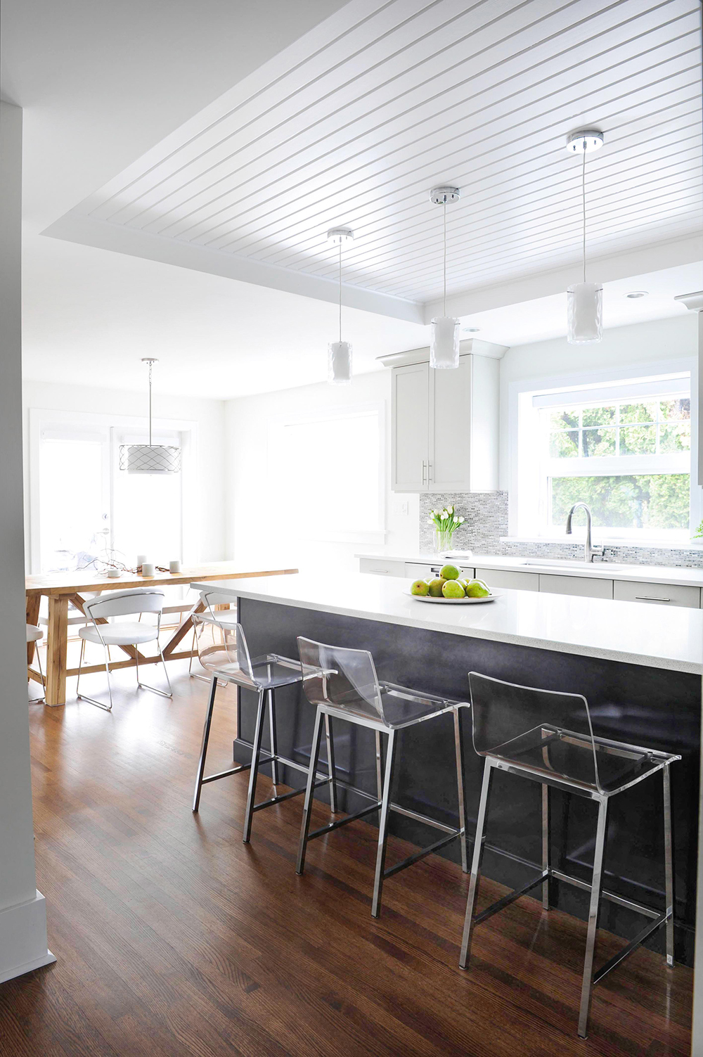
Clearly Perfect
Acrylic stools let the island’s grey-blue base pop. The pendant lights continue the Med theme with white opal inner-glass cylinders and transparent textured exteriors that have a serene watery effect. The tongue-and-groove recess above the island provides continuity by referencing the den, which is not visible here but sits at the other end of the adjacent dining area.
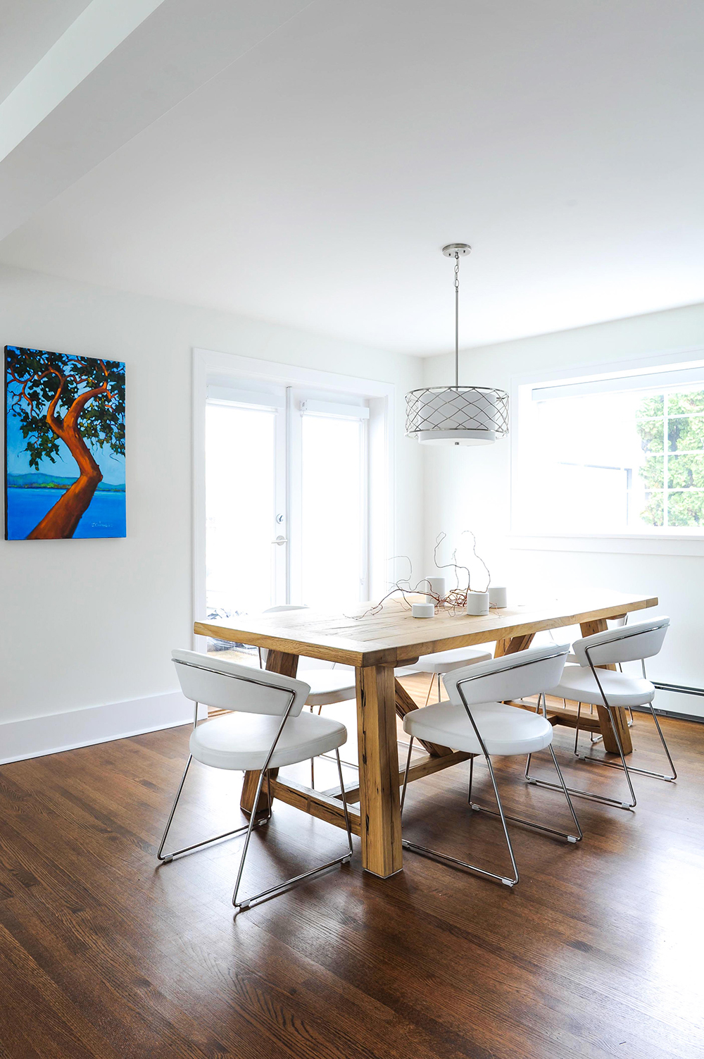
Casual Fare
Wendy’s commitment to contrasting materials is on fine display in the casual eating area off the kitchen. “This warm oak trestle table from Restoration Hardware has a rustic raw finish that’s an energetic contrast to the crisp look of the kitchen and modern white leather chairs.”
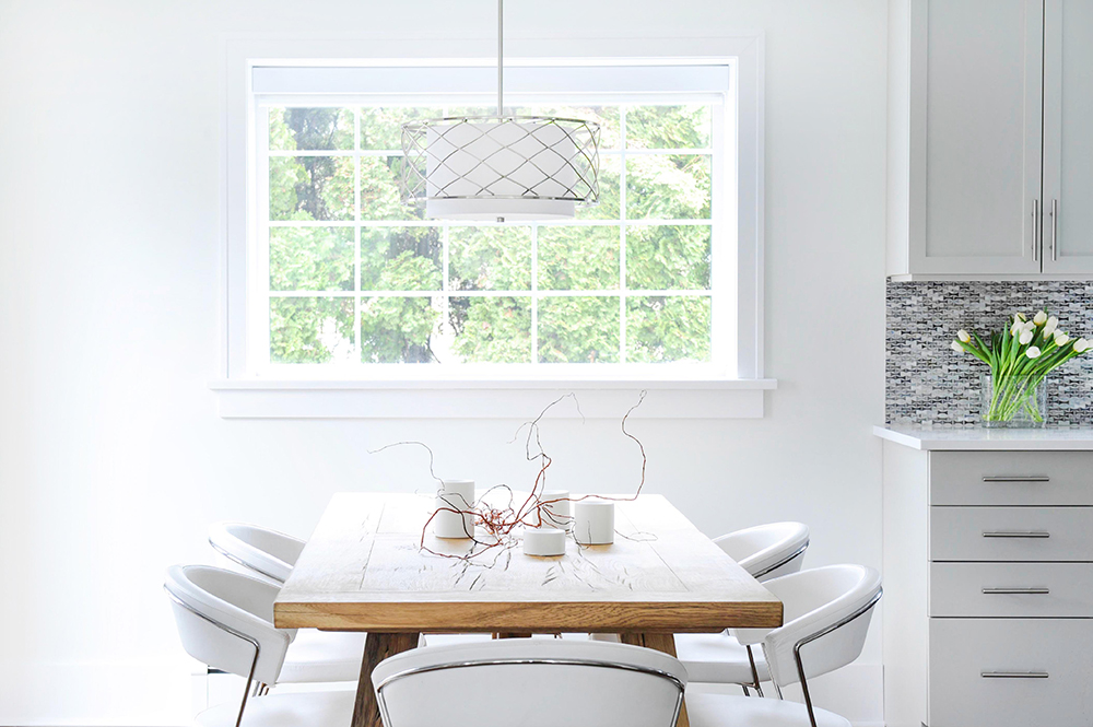
Net Effect
Wendy chose this sleek pendant light because its brushed outer nickel frame reminded her of fish nets. Tangled ornamental willow branches feel organic and are flanked with tealight holders.
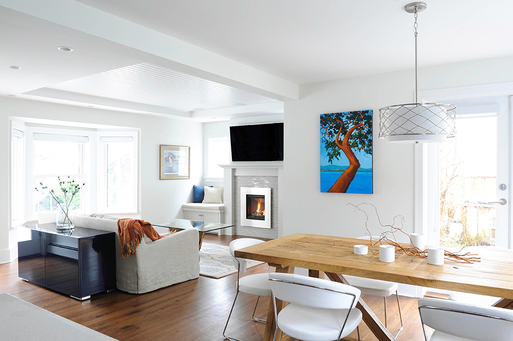
Art Matters
Bold acrylic artwork nicely demarcates the eating area from the adjacent den. It was painted by Jim Charles Walsh, a friend of the owners, and depicts a view to Gulf Island, which the couple often see when they’re out sailing. It has personal meaning and its vibrant design really enlivens the space.
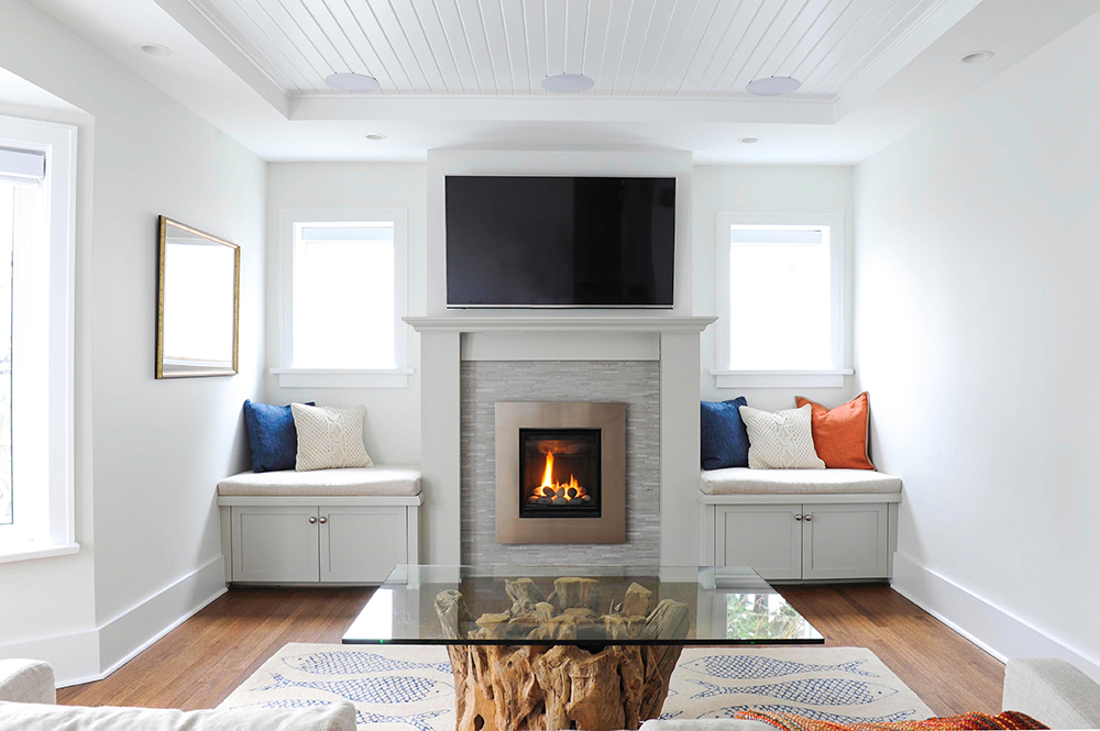
Hearth and Home
“I had to ensure the den’s fireplace feature wall was appropriate to this small space,” says Wendy. The gas fireplace replaced an original free-standing stove, and Wendy raised it up the wall to avoid the need for a hearth.
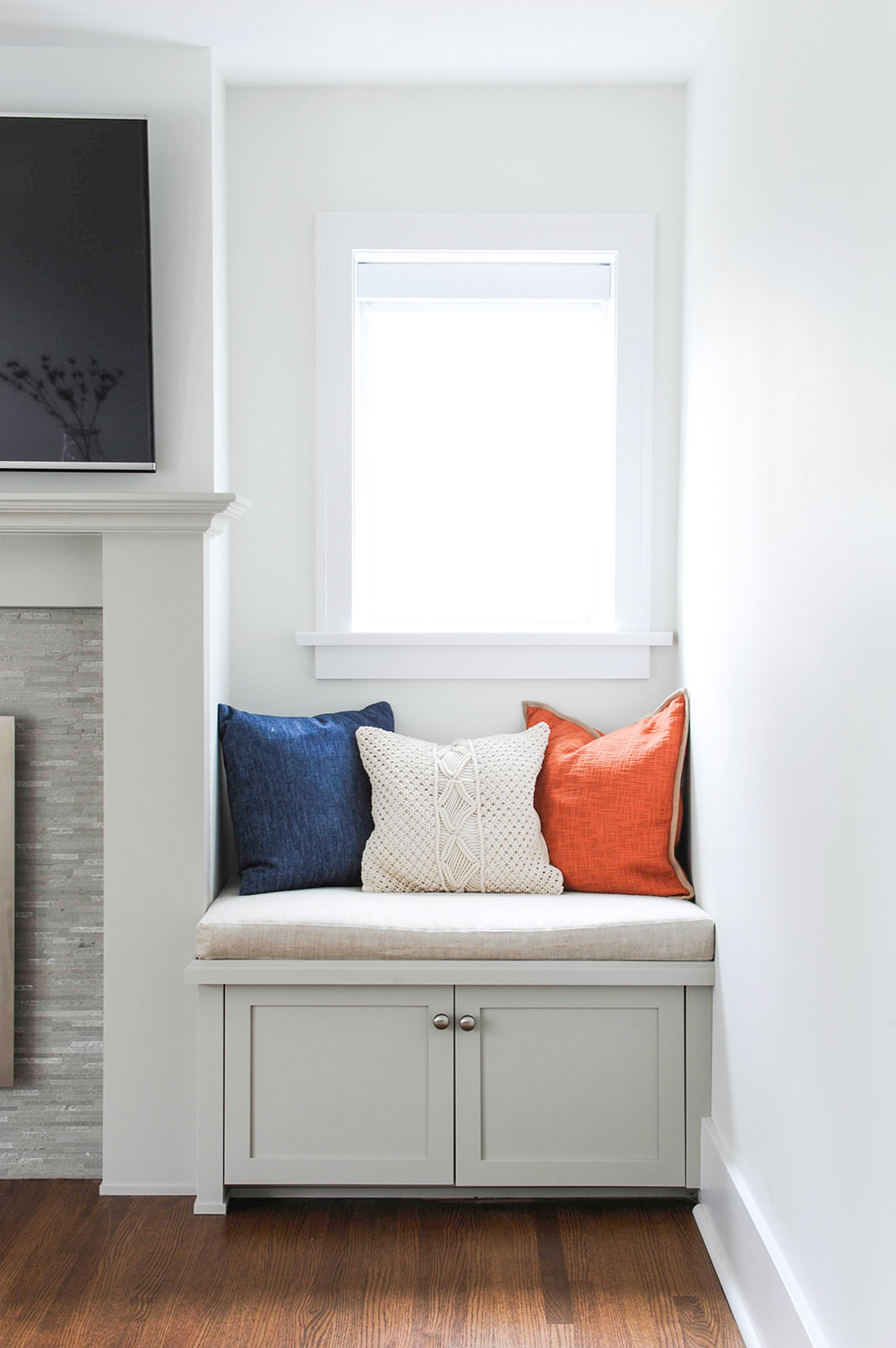
Bench Mark
Wendy designed built-in benches to flank the fireplace, and topped them with custom-made cushions upholstered in linen. They’re comfy and the cupboards below hide AV equipment for the wall-mounted TV.
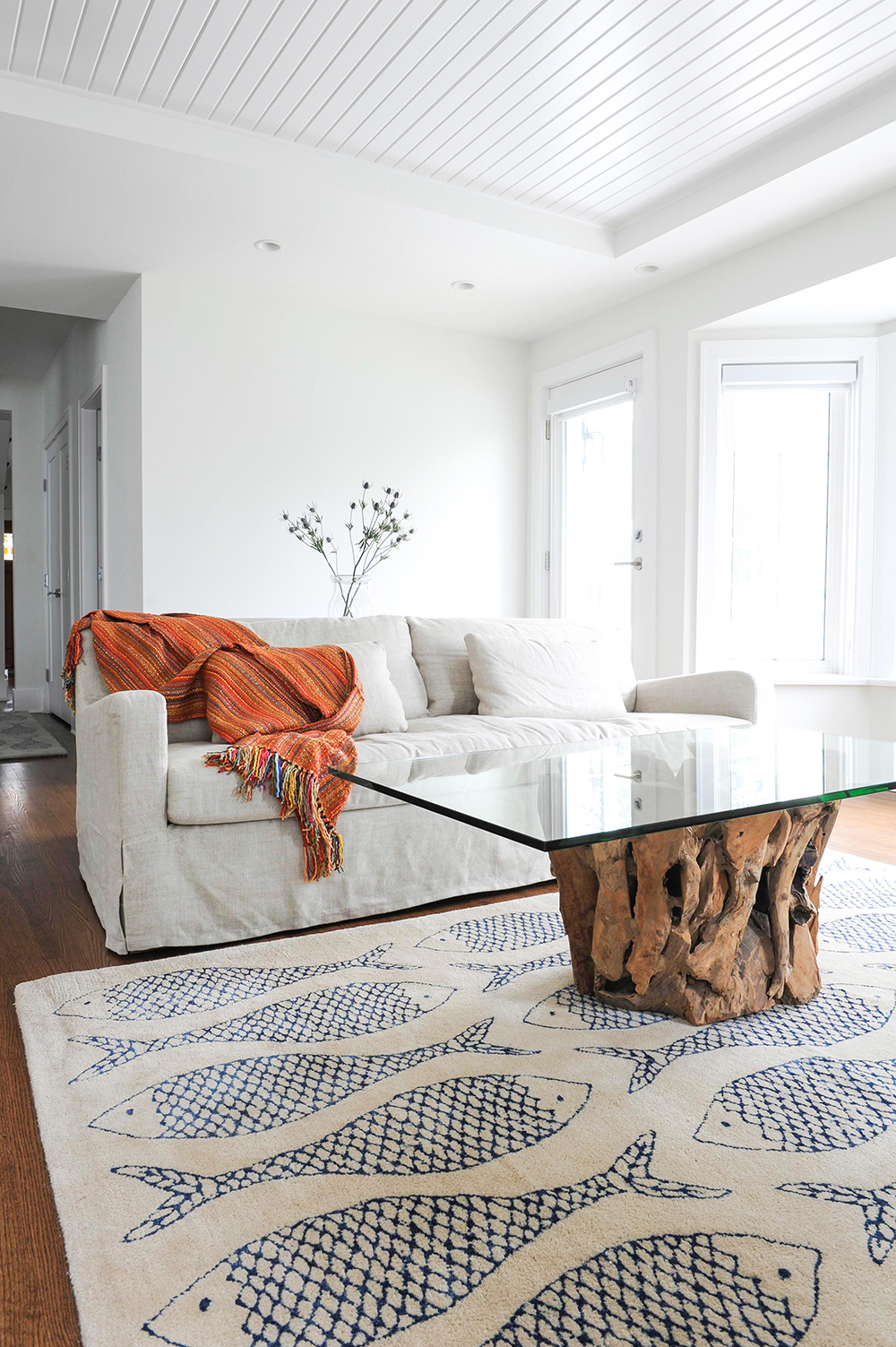
Coastal Cool
This stunning driftwood coffee table with a floating glass top allows the rug’s fish-print to come through.
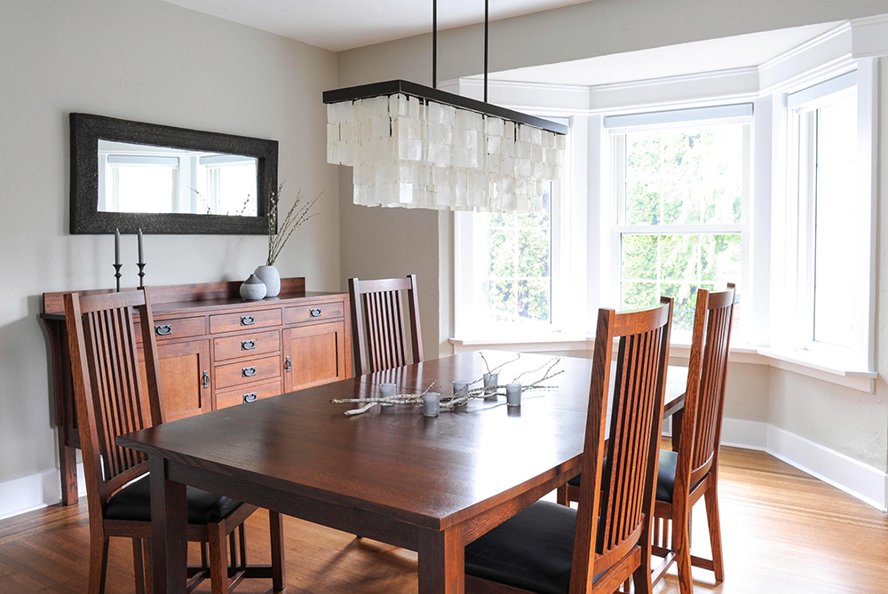
Natural Elements
Wendy complemented the owners’ dining room table and chairs, which were manufactured locally by Once A Tree Furniture, with a breezy light fixture. Its white capiz shells are a fresh counterpoint to the wood tones.
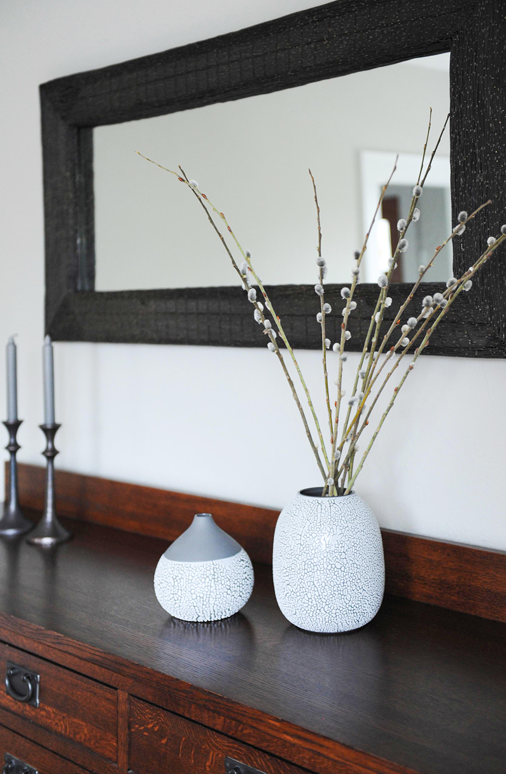
Seeing Double
The mirror above this buffet is the same as the one in the living corner, but here Wendy positioned it horizontally.
Attention to Detail
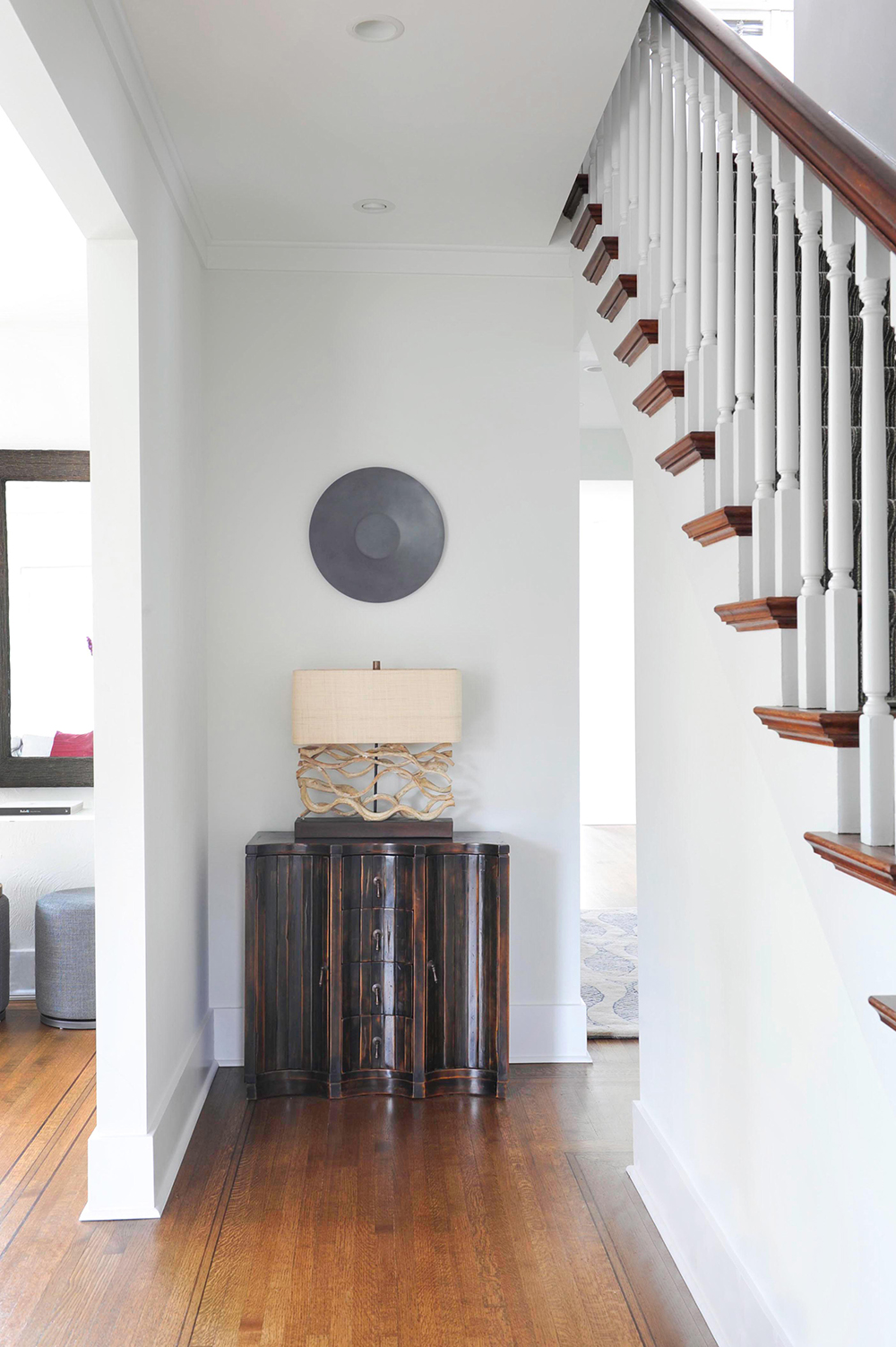
This front hall vignette is a masterful combination of the bronze and nickel tones Wendy used throughout the house. The driftwood base of the lamp is in keeping with the home’s modern beach house aesthetic.
Shimmer and Shine
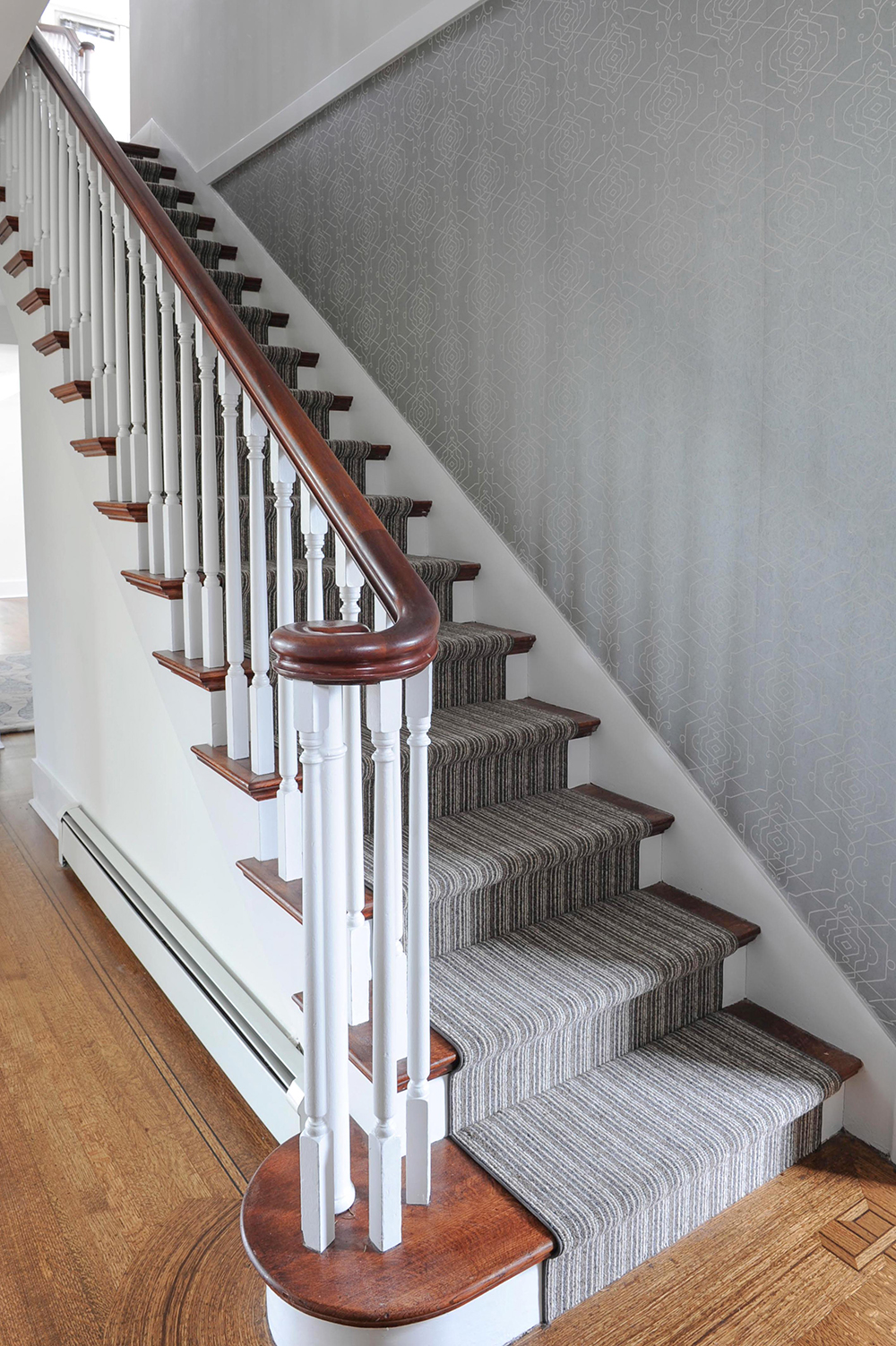
The hallway’s wall covering by Candice Olson shimmers as you move past it, changing from a cooler silver to a warm pewter. The striped wool runner from Colin Campbell adds depth and warmth to the staircase and nicely plays up the original inlay details in the floor.
Two-Tone Texture
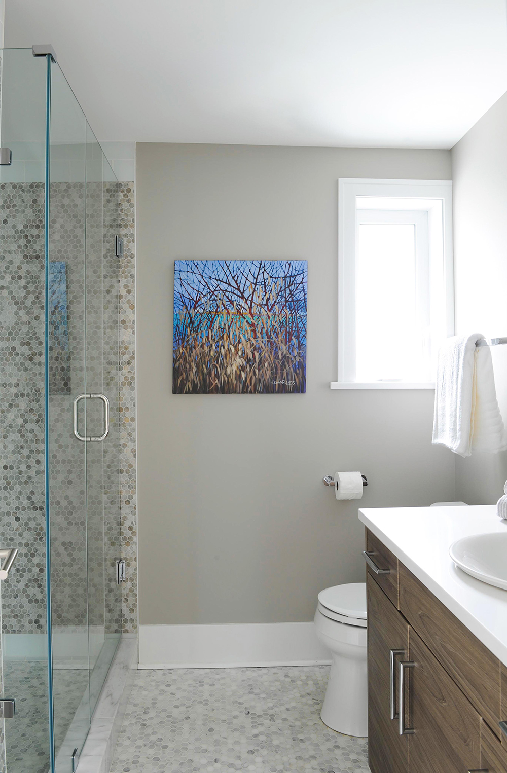
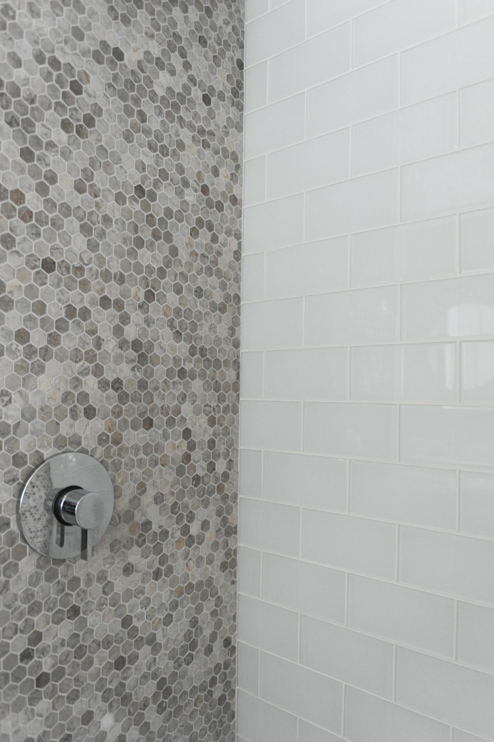
The main floor bathroom features a shower for easy rinse off after time in the pool. “This space is close to the kitchen, so I wanted to keep the finishes quite neutral and play up texture to reference the beach,” says Wendy. She chose the same marble hexagonal tiles for the floor and shower wall but switched up the colour. The painting is extra bold in the neutral space.
Shell Game
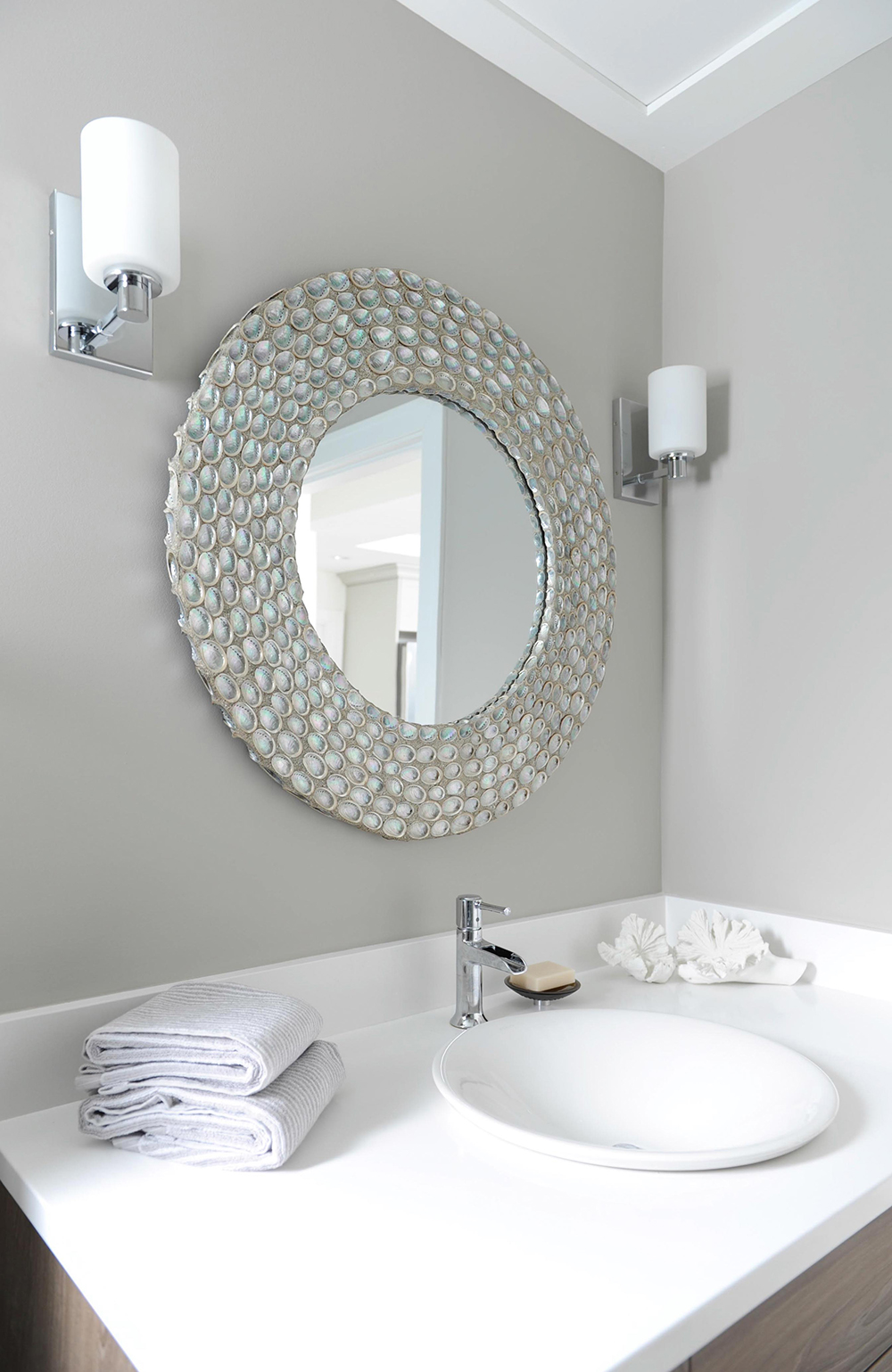
The seashell mirror ticks all the beachy boxes and is framed with simple and sparkly chrome sconces. The cool open spout faucet looks like it was custom made for this modern Kohler sink.
Go With the Flow
The third shower wall is clad in the same glossy subway tiles as the kitchen’s return wall. “This was intentional,” says Wendy. “I think that a subtle repeat of finishes throughout a space creates better transition and flow.”
Inspired to explore a far-flung locale? Here are the world’s best zika-free beach destinations.
HGTV your inbox.
By clicking "SIGN UP” you agree to receive emails from HGTV and accept Corus' Terms of Use and Corus' Privacy Policy.


