Open-concept living, minimalist design and the kitchen at the heart of the home. This was the brief for interior designer Stephanie Durston of Durston Design. Her clients Raul and Cynthia have two kids (Emilia and Enzo) and wanted to transform the dark, unwelcoming first floor and tiny kitchen of their Lynn Valley, North Vancouver abode into a light and bright family home. Inspired by Scandinavian interiors, clean lines and warm accents, the designer made it happen. Here’s how.
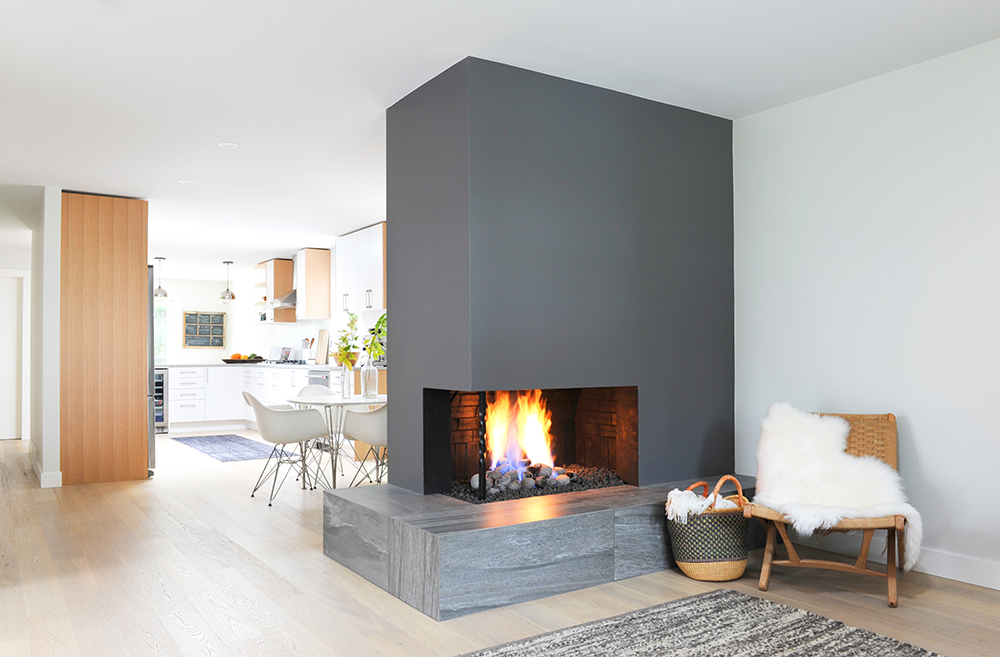
Playing with Fire
Stephanie recast the home’s original cumbersome-looking fireplace as a seriously sleek and contemporary showstopper. “It was covered in red brick from floor to ceiling and had a huge presence in the space,” she says. “Instead of removing all the brick, I covered it with cement board and drywall and painted it Overcoat by Benjamin Moore.”
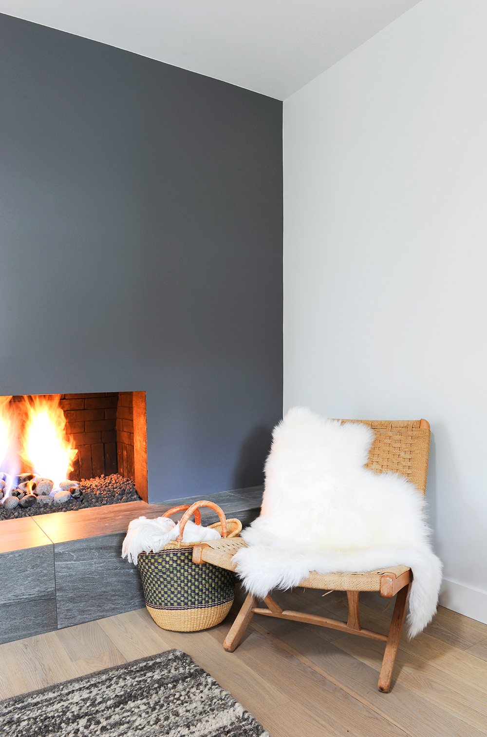
Base Hit
The fireplace’s new contemporary facade continues to the hearth, which Stephanie refaced with grey tiles from C&S Tile. “Both the dark paint and tiles make the fireplace a feature without overwhelming the space,” she says. “They’re also a nice contrast to the rest of the home’s light finishes.”
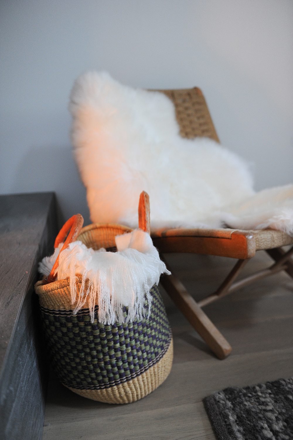
Global Market
We love the way the designer channelled some Scandi hygge into the minimalist design by adding cozy accessories with meaning. “The homeowners travel often and have collected some great pieces, like this basket they picked up while they were in Africa.” It imparts an inviting natural texture that’s echoed in the throws, woven chair and rug.
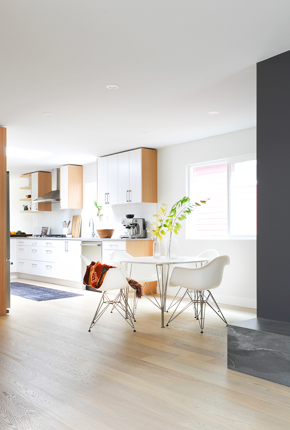
Oaky Finish
Varying wood tones animate the mostly white kitchen. “The engineered white-oak floors are in a shade called Coastal Classic by Envision,” says Stephanie. “The millwork around the cupboards was, again, inspired by Scandinavian design. I think it adds warmth and interest here.”
New Balance
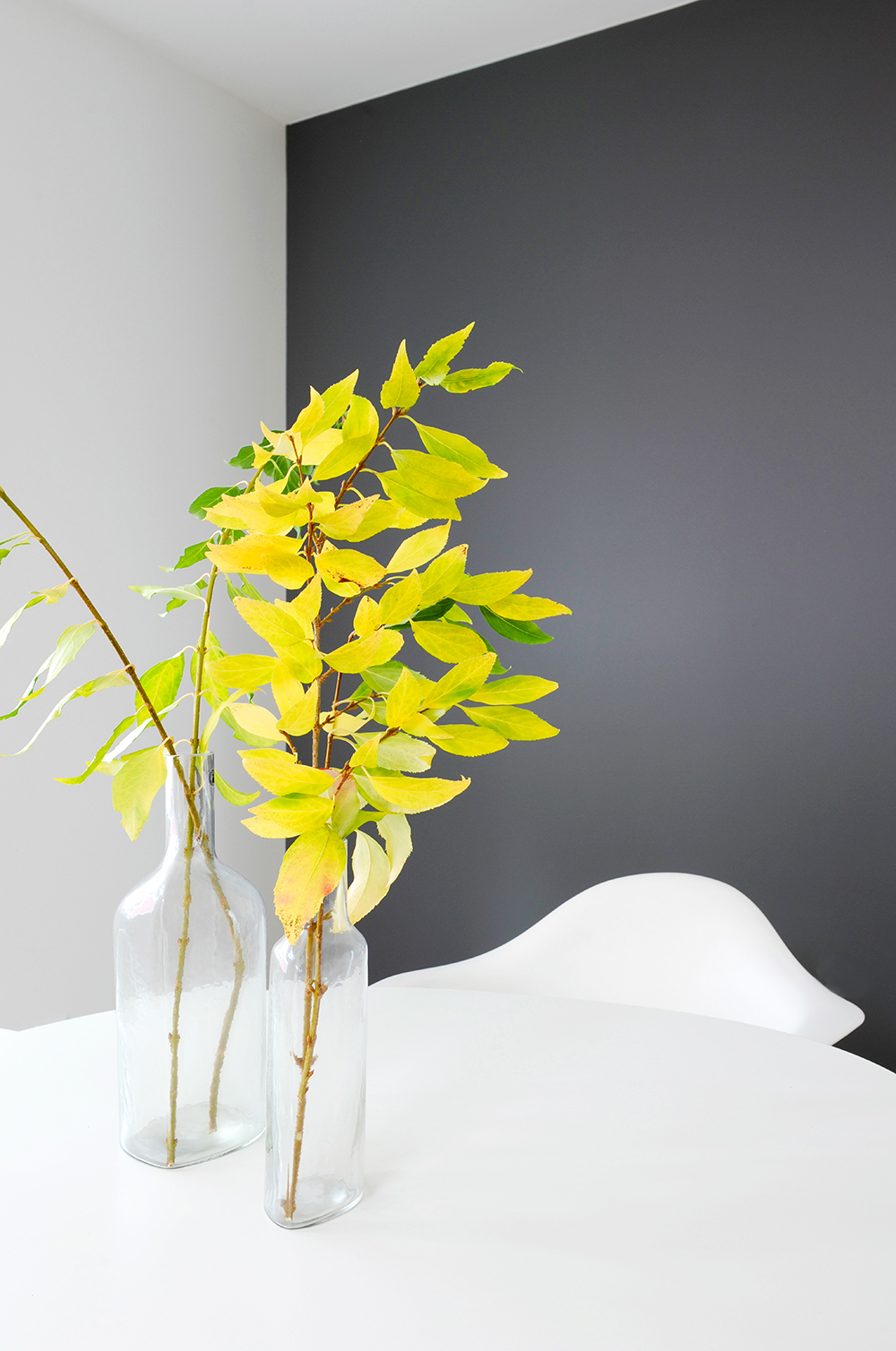
Simple arrangements of leafy branches sit on the Fritz Hansen kitchen table that’s surrounded by classic Eames chairs. Stephanie says, “This furniture speaks to the overall design of the space, which is about mixing clean lines with warmth and texture.”
Grey Area
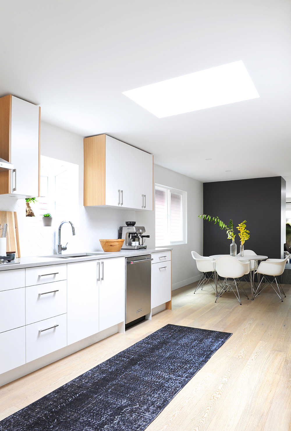
The kitchen’s contemporary cabinetry is contrasted with a vintage-look rug from IKEA. “I chose this black one to complement the grey of the fireplace wall,” says the designer. “It’s been bleached out and dyed in a single tone, allowing the original pattern to still show through. I also love how the black contrasts the white-oak flooring.”
Storage Space
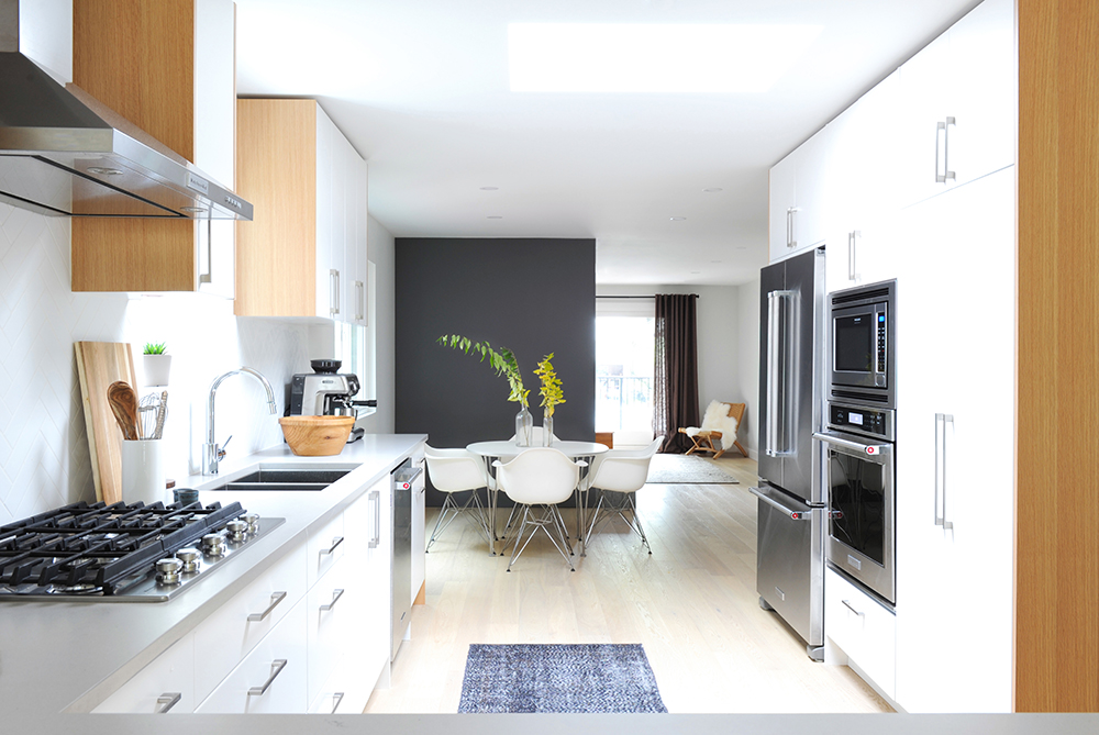
The light and airy kitchen also flexes some utilitarian muscle thanks to the bank of cabinetry that surrounds the fridge and ovens. “I decided on floor-to-ceiling millwork here to give the owners the most storage possible,” says Stephanie. “The cabinets house pull-out pantry drawers, shelving for pantry items and storage for small appliances.”
Pattern Play
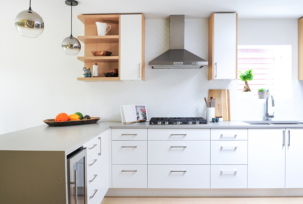
The kitchen’s raw cement countertops demanded an equally sleek backdrop. “I didn’t want standard subway tiles or anything too busy here like mosaics,” says the designer. “These 2″ x 8″ white tiles applied in a herringbone pattern were the perfect solution.” We love how it (versus trim) frames the window as well.
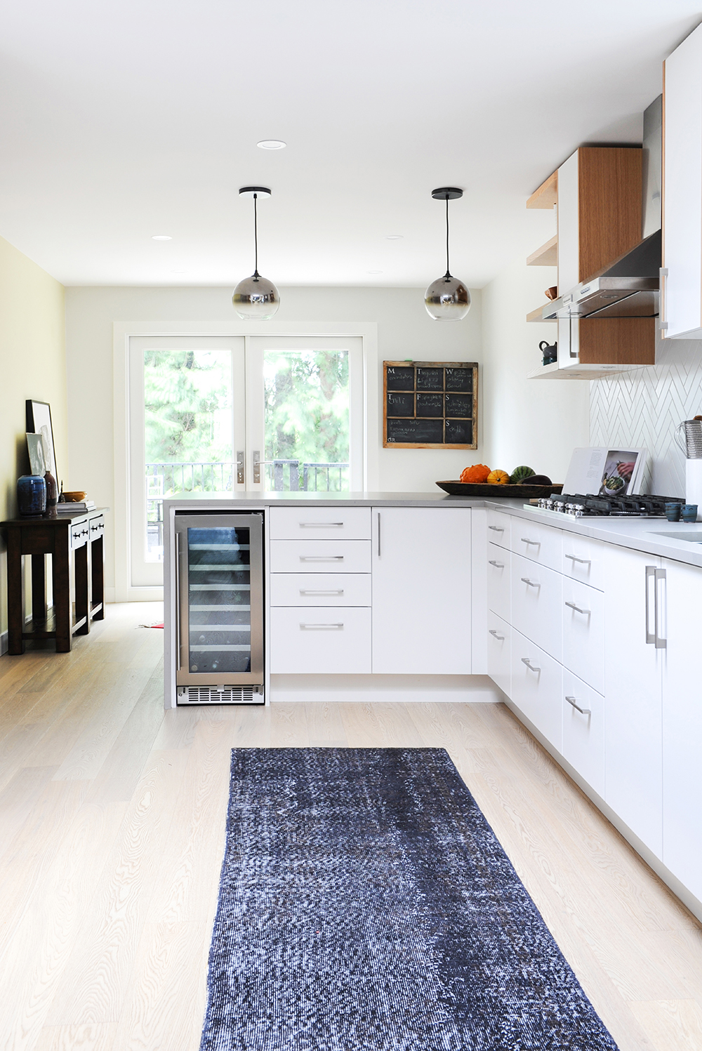
Kiddie Corner
With the owners two young children in mind, Stephanie designed the lower cabinets in an L-shape. “I wanted an area where Emilia and Enzo could eat at the counter, which is something little ones love to do.” Stools on the other side (not shown) let them do just that and watch while their parents cook.
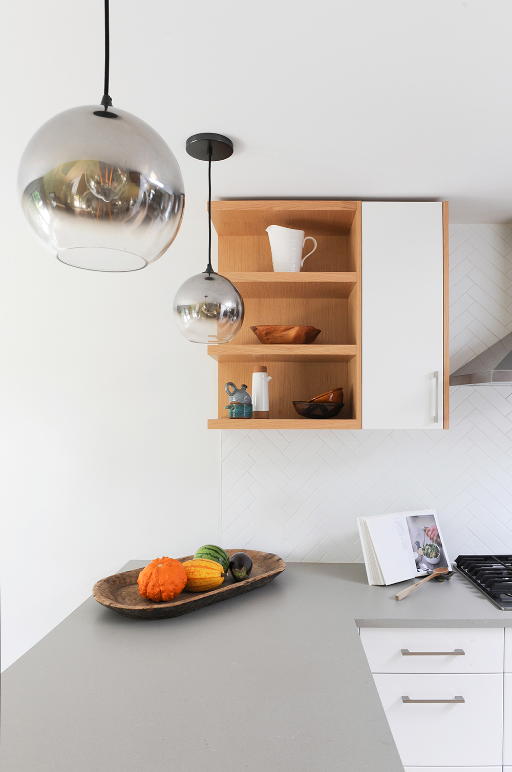
Open Ended
Stephanie wanted to incorporate storage wherever possible, but reaching over the L-shaped counter to open a cabinet door would be awkward. Her ingenious solution was to augment a narrow cupboard with open shelving. It allows for storage and a place to display stylish, lesser-used items. The nearby mirrored glass pendant lights from West Elm make a style statement.
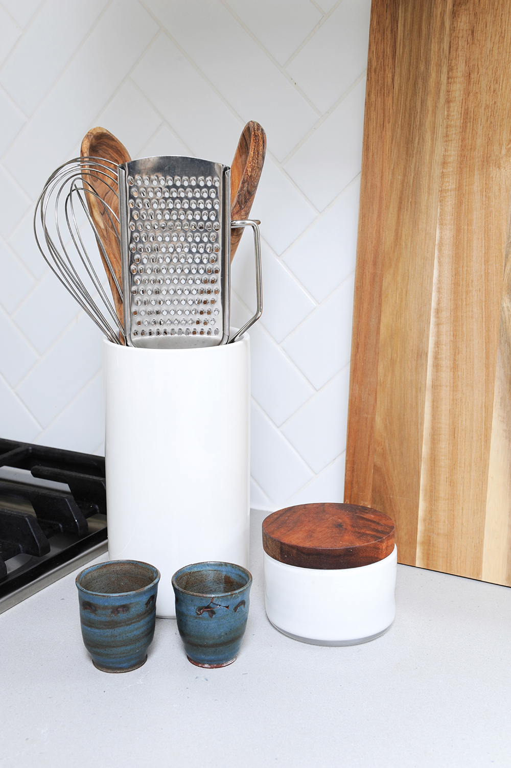
Setting the Scene
When great design and sleek materials are the backdrop, even everyday utensils take on an artful form. Here, the wooden items add warmth and the little blue cups, from the owners’ personal collection, impart a pop of colour.
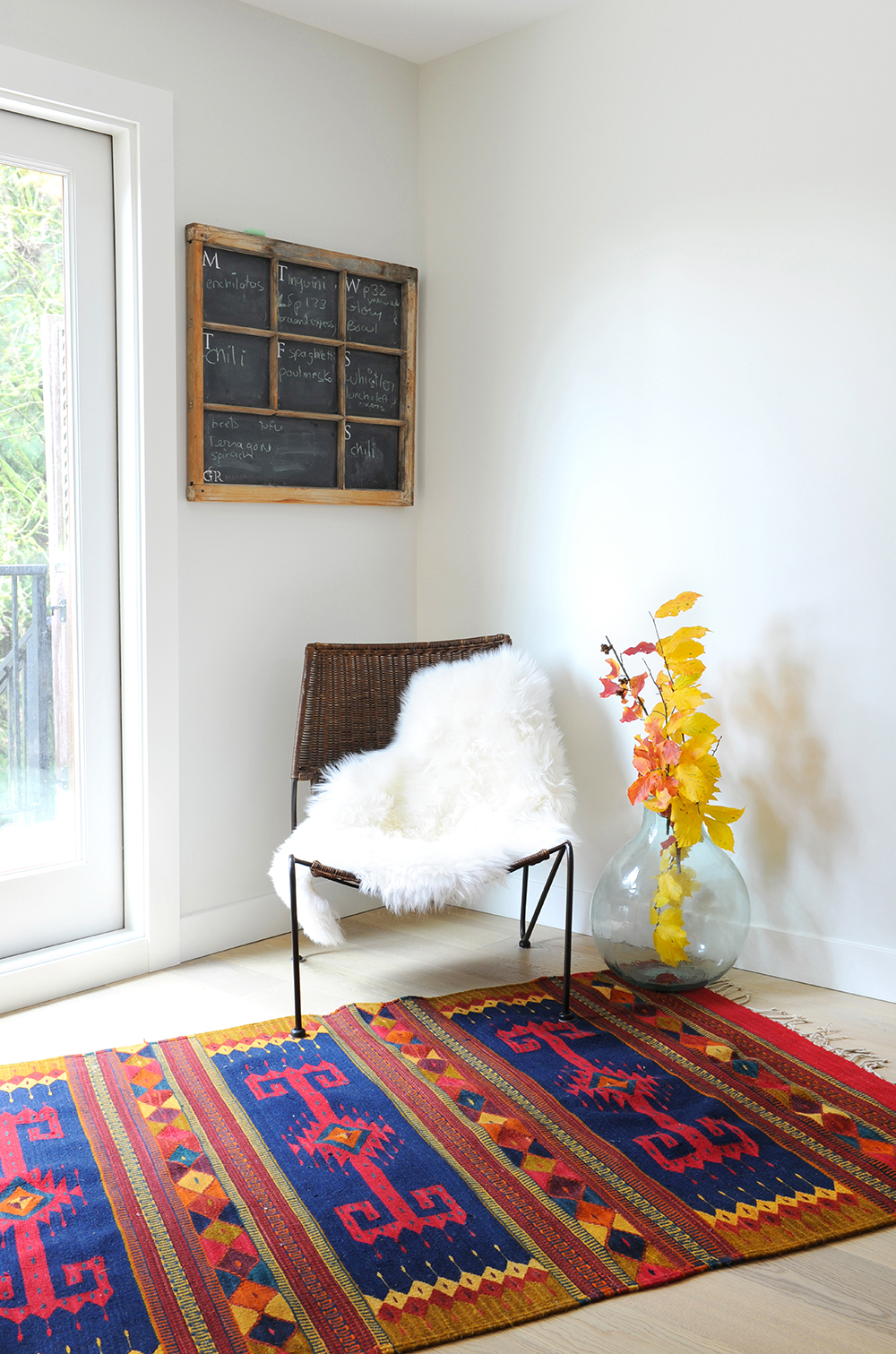
Flex Appeal
We love how Stephanie and the homeowners refer to this area beyond the kitchen as “flex” space. “Most likely, it will eventually house a small desk and laptop and act as a home office,” she says. It shows that not everything has to be determined at once. The blackboard has notes written on it for each day of the week, and the beautifully coloured rug is from Mexico.
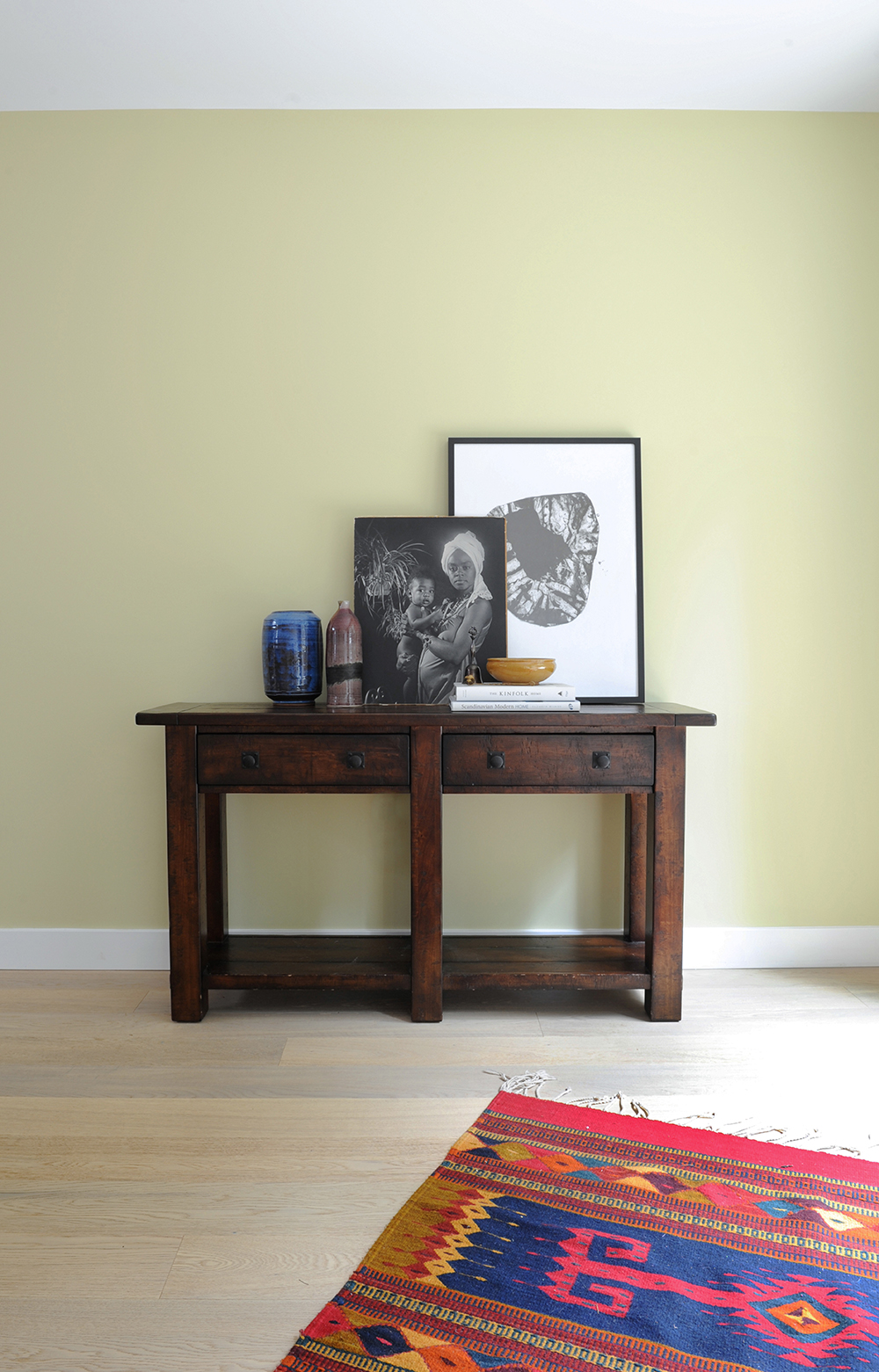
Gallery Grouping
A console is one of Stephanie’s favourite styling tools. “It’s a great way to display special mementos you’ve collected, and it can be changed and added to as new pieces are collected.” She painted the wall behind it Sesame by Benjamin Moore to add colour and interest to this small area.
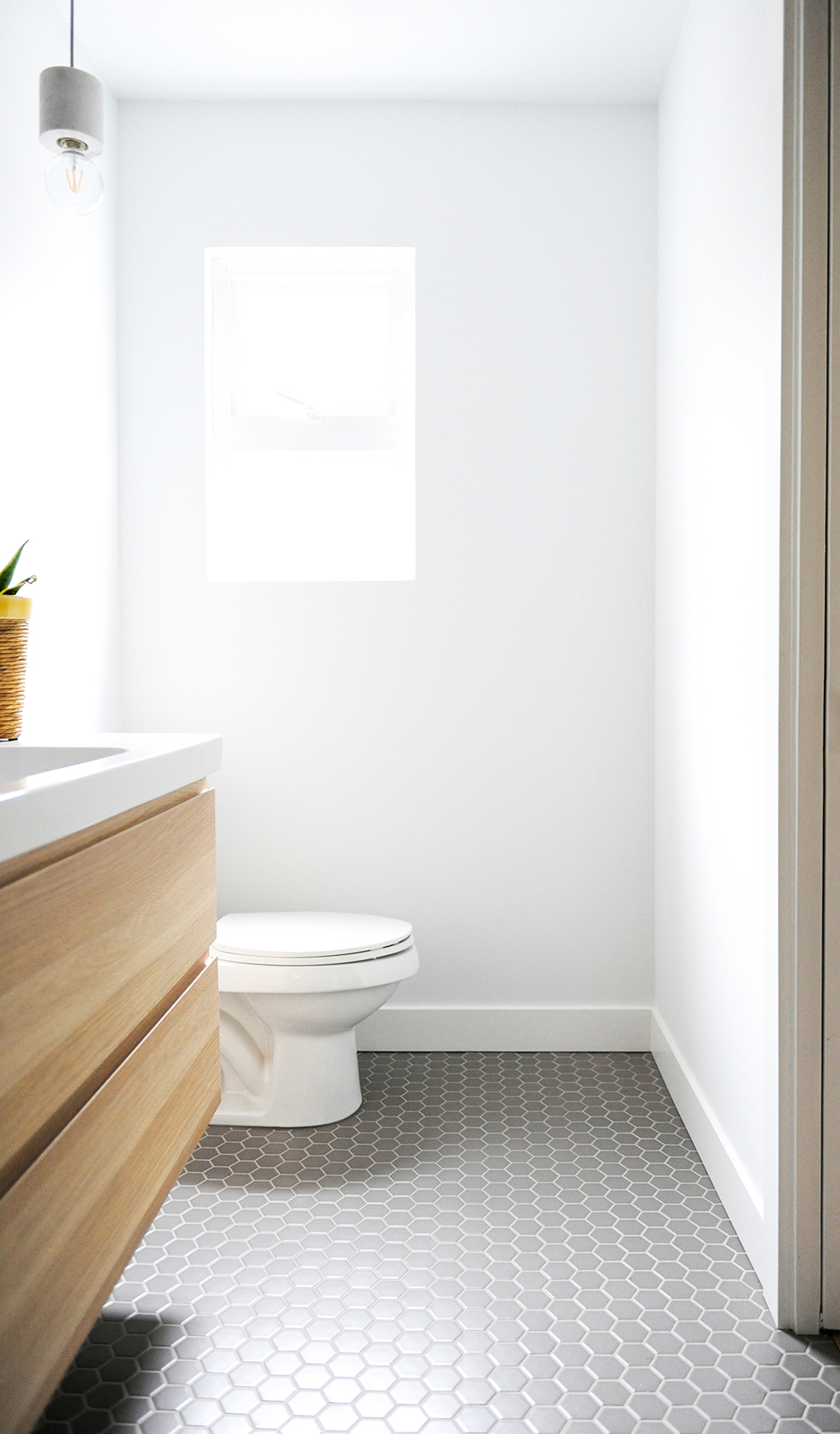
Big Time
Stephanie wanted to give the tiny master ensuite an expansive feel. “I chose a floating vanity, which is visually lighter than one that sits on the floor.” Bonus: It was also affordable. “Since we allocated a large portion of the budget to the kitchen, we went low here with a pre-built vanity from IKEA.”
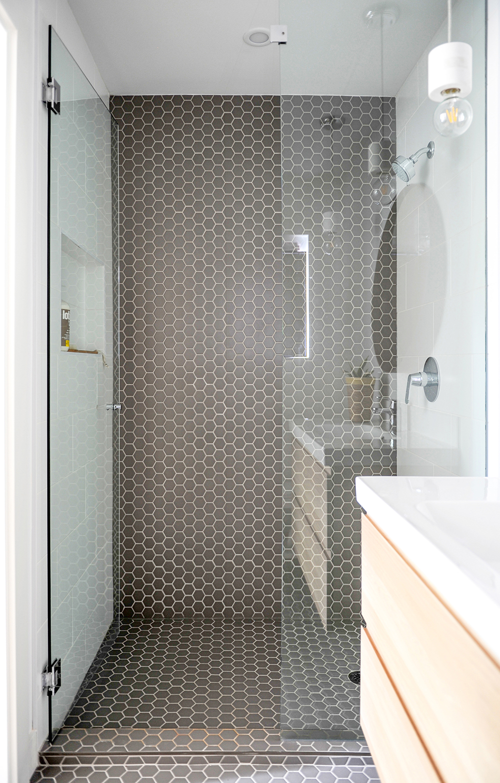
Climbing the Wall
Creating that expansive feel continued with the tile treatment. Stephanie says, “I extended the hexagonal floor tiles to the shower’s base and ran it up one of the shower walls. It tricks the eye by making the space appear wider than it actually is. I’m really happy with the result.”
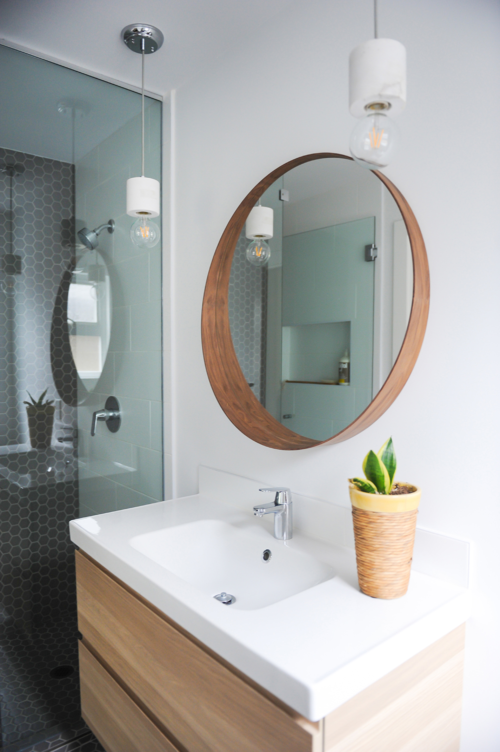
Fine Finishes
Another example of budget-savvy design, the ensuite features an IKEA mirror (which looks custom-made in this setting) and solid marble pendant lights from Rove Concepts.
Crisp and Clean
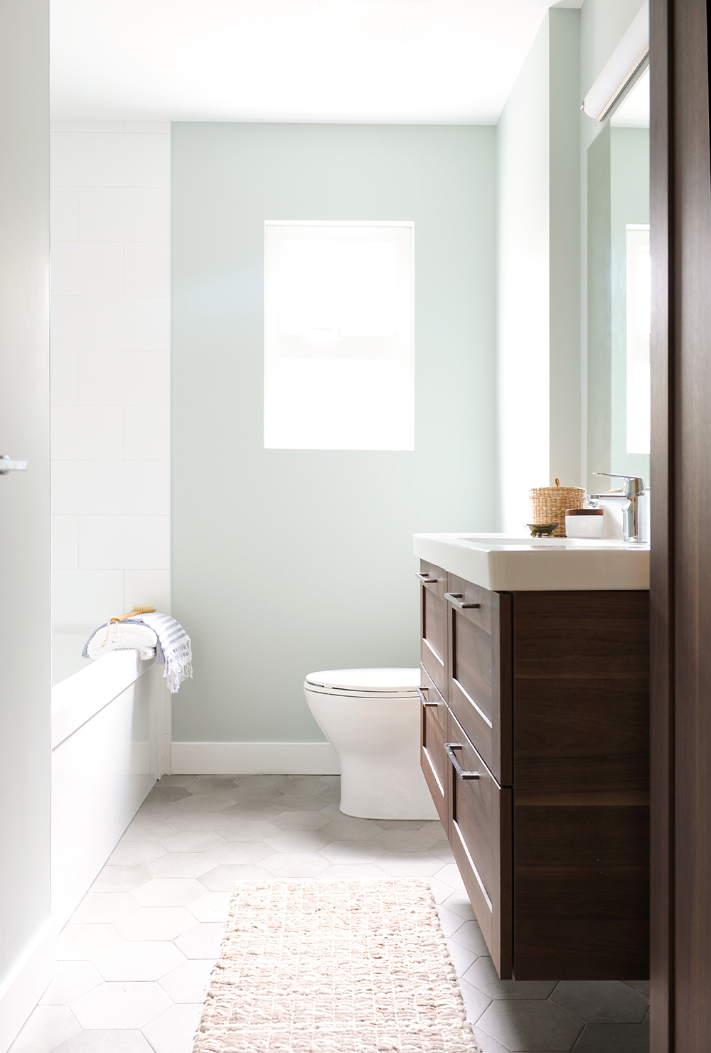
In the home’s main bathroom, a mix of materials, textures and subtle colour create a fresh effect that’s also practical for the children: the hexagonal floor tiles have a matte finish so they’re not slippery when wet. The earthy tones of the floor and cabinetry are elevated by the zing of the wall that’s painted Smoky Green by Benjamin Moore.
In a Nutshell
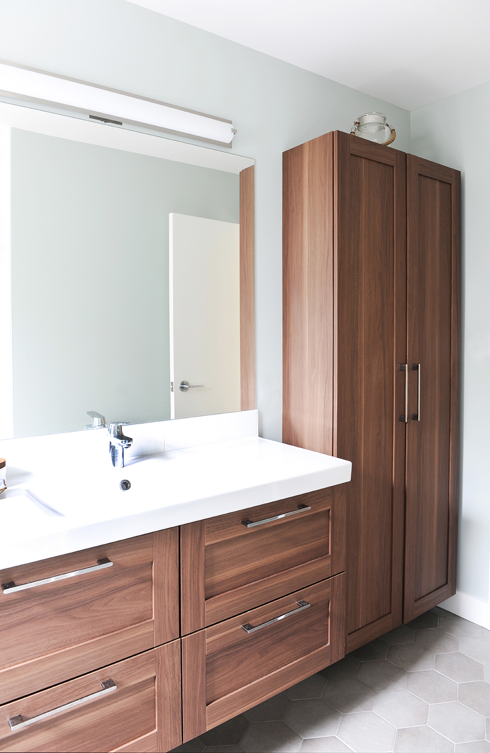
The cabinetry’s walnut finish feels rich and luxurious in this light space. It was also a budget-friendly big-box store find. Stephanie chose the light above the mirror for its clean lines that are in keeping with the silhouette of the vanity and cupboard.
Rail Way
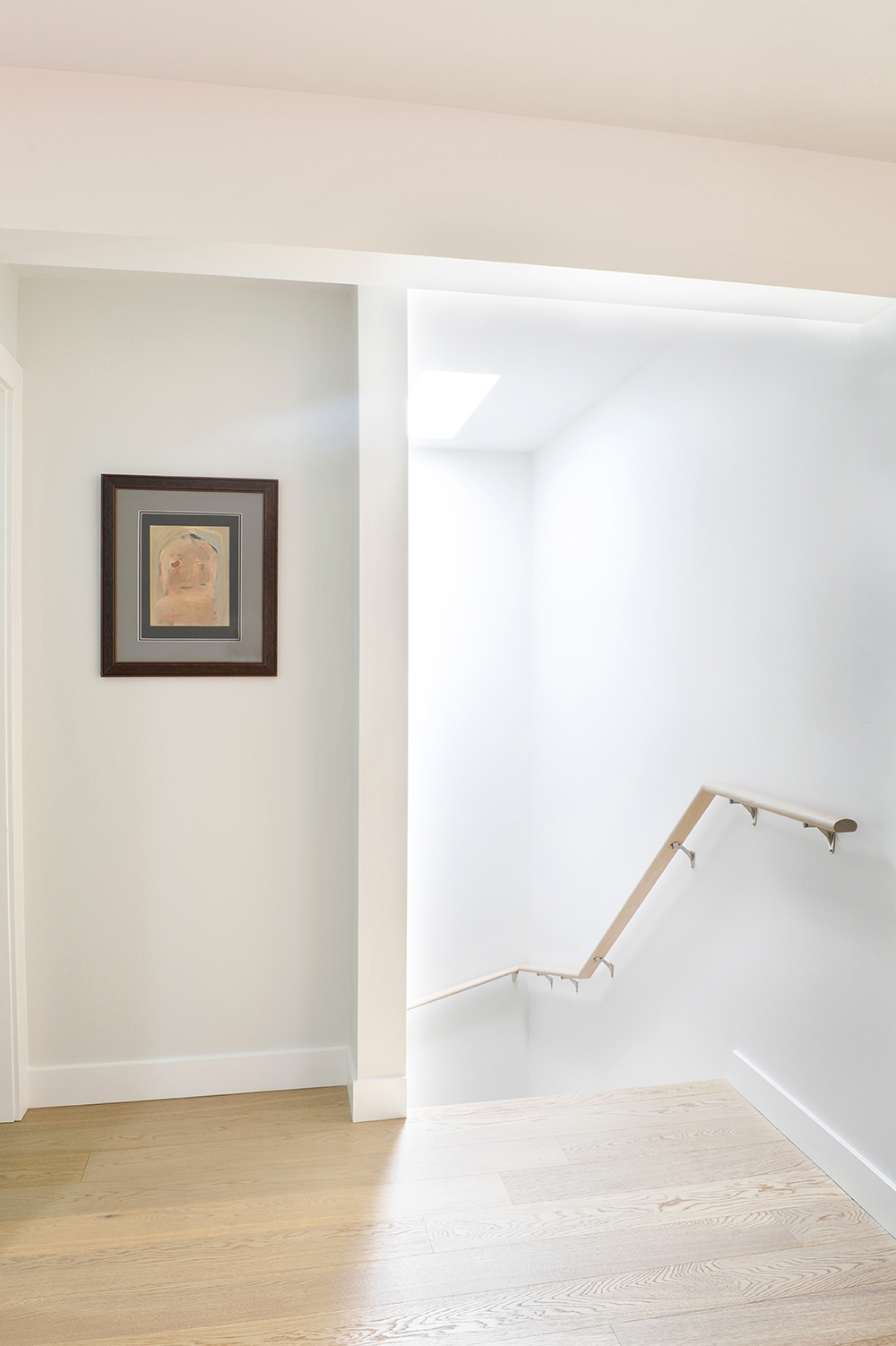
“The railing that leads down to the basement is white oak to match the flooring,” says Stephanie. Undeniably practical, it is also aesthetically pleasing, almost like a floating modern sculpture. It was constructed by the contractor for this project, Irvine Construction.
West Coast Ready
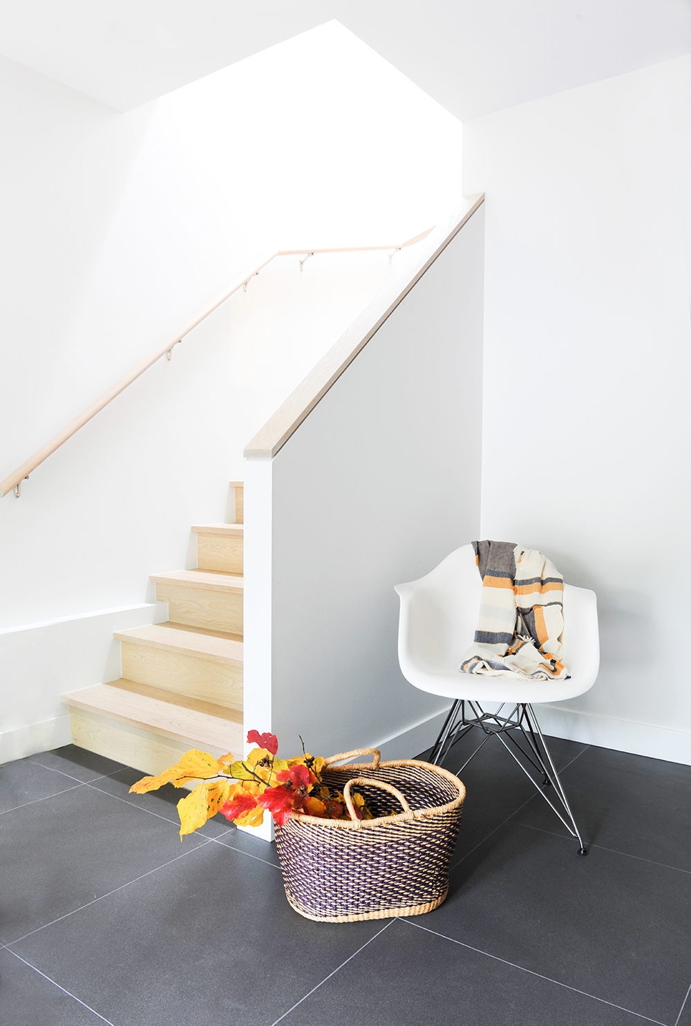
“North Vancouver gets a lot of rain,” says Stephanie. “The basement features heated tile flooring to stand up to wet shoes and warm up cold feet.” By using 24″ x 24″ tiles, the designer was able to minimize grout lines. “The dark matte finish also offers great contrast to the white-oak hardwood on the stairs,” she says.
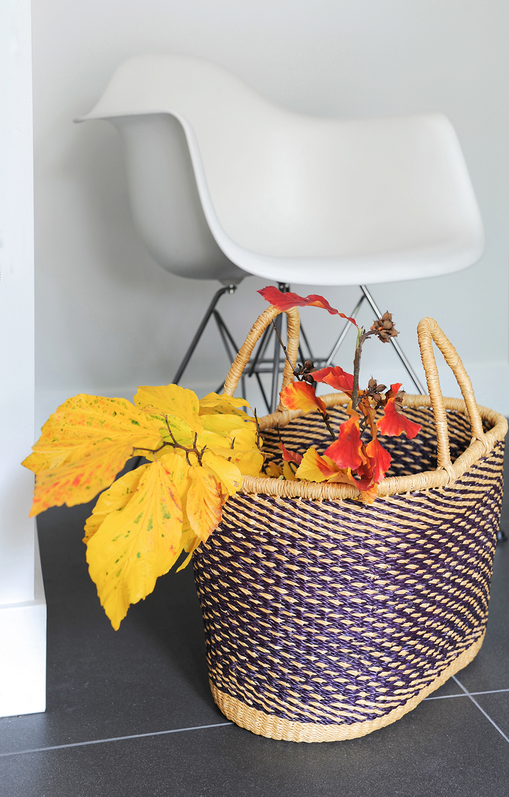
All Natural
This basket is from the owners’ personal collection and, like the one by the fireplace upstairs, introduces an organic element to the contemporary space. The autumnal branch, from their tree outside, signals natural warmth that’s in keeping with this home’s deft balance of clean lines and Scandi coziness.
HGTV your inbox.
By clicking "SIGN UP” you agree to receive emails from HGTV and accept Corus' Terms of Use and Corus' Privacy Policy.


