An old house with dark walls, dated furnishings and a dreary layout – so far, it’s a familiar story. But not for long. The young couple who purchased the home, set in Toronto’s vibrant Leslieville neighbourhood, called in designer Orsi Panos to banish these three ds. “I wanted a light-filled space that was modernized, yet with an eye to maintaining its character.” Exposing a brick wall, salvaging brass vent grills and restoring millwork were just some of the ways she mixed old with new. Here’s a look inside.
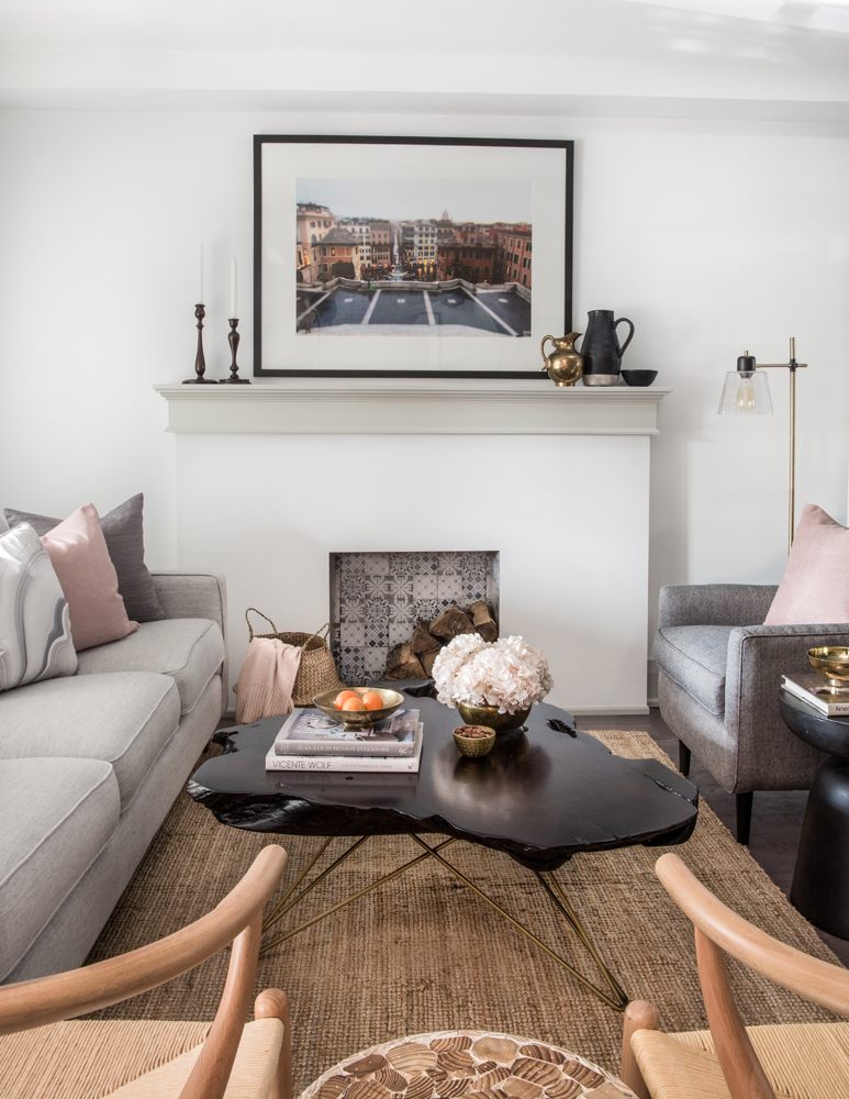
No Place Like Rome
The inviting living room commands attention for many reasons, but we’re instantly drawn to the gorgeous graphic artwork, which is – wait for it – only as expensive as its framing. “The owners love to travel,” says Orsi. “They took this photo of the Spanish Steps in Rome and had it blown up and framed.” Though wallet-friendly, it looks like it’s from a gallery and is a nifty idea to copy for any space.
Want more decor inspiration? Here are Decorating Ideas Inspired by the World’s Most Stylish Countries.
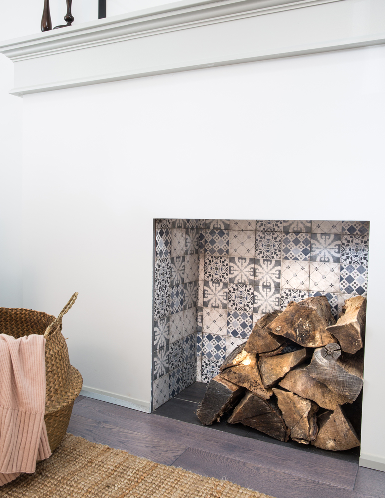
Global Warming
The living room’s fireplace takes us from Rome’s Spanish Steps to some lively Spanish tiles. “It’s a non-functioning fireplace so I felt we could do something unorthodox here,” says Orsi. “Spanish tiles from Mettro Source add an unexpected layer and, like the artwork above, bring a global feel to the space.” The casual wood pile adds warmth and finishes the look.
Speaking of fireplaces: The Gorgeous Fireplace in This Tiny Heritage Bungalow Will Have You Saying, “Wait, What?”
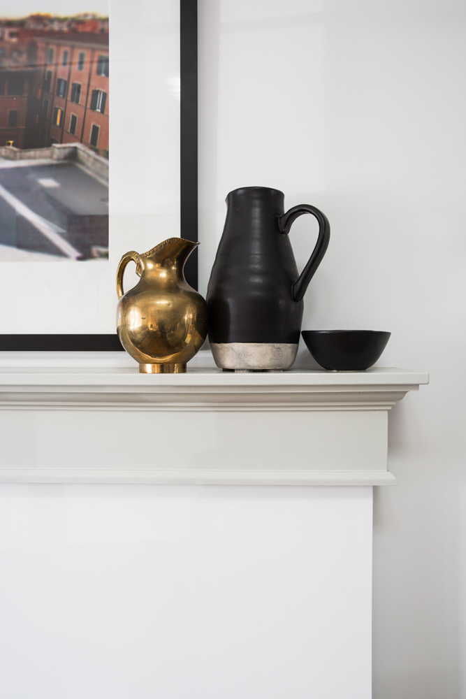
Creative Content
Jugs and bowls may be relegated to the kitchen, but a creative eye knows no boundaries. Placed on the living room mantel, these items – pieces collected by the homeowners – have a fresh presence: the black ties in nicely with the picture frame and the brass adds a bit of reflective shine.
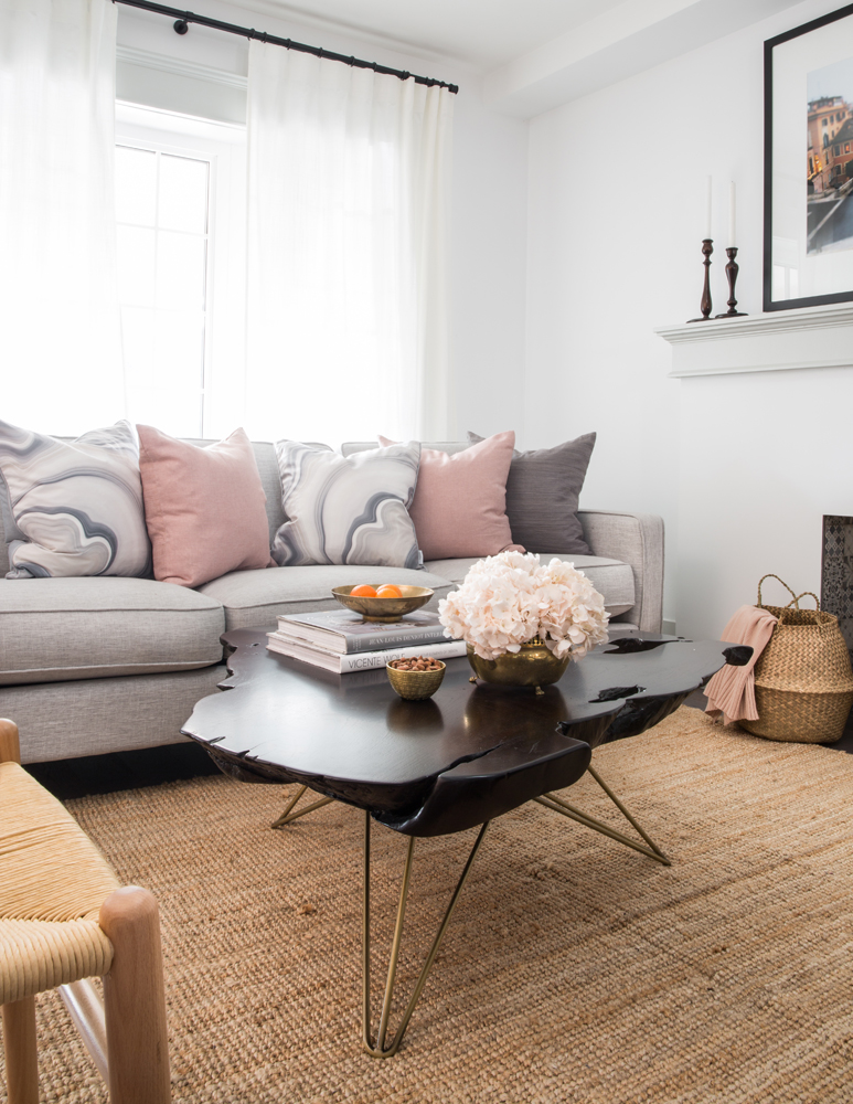
Light Fantastic
“Because there’s a limited amount of natural light in this home, I kept the walls light and bright,” says Orsi, who blanketed the space in Benjamin Moore Chantilly Lace. Full-height drapery in a similar palette gently frames the window and layers in softness. “I chose a sisal rug because I love mixing rustic and modern pieces together. The coffee table’s free-form shape allows for easy traffic flow in this small space and the dark finish is a nice complement to the sisal.”
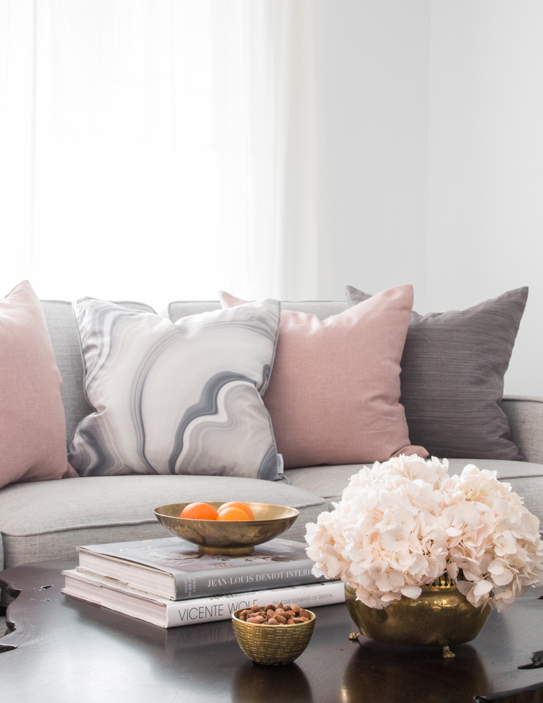
Pillow Talk
The tailored pale-grey sofa effectively showcases the palette of the cushions. “The varying tones keep the mix interesting,” says Orsi, “but the real intention behind the choice of pink was to echo the pinky hues of the exposed brick wall in the dining room.” It is a showstopper – wait until you see it.
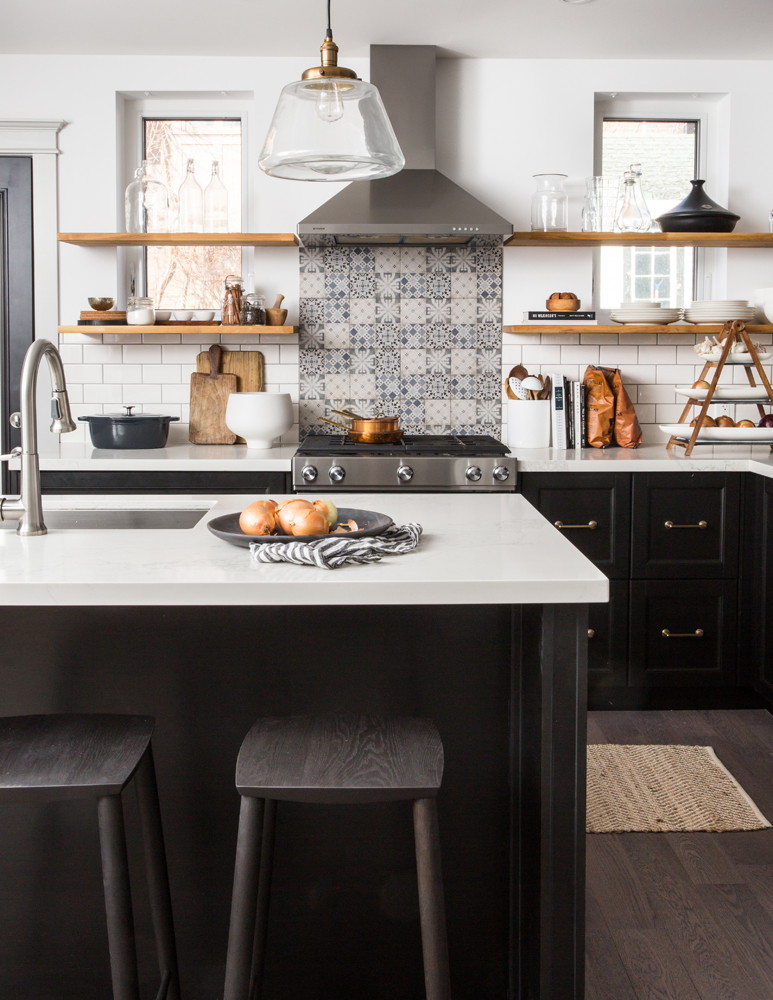
Spanish Lessons
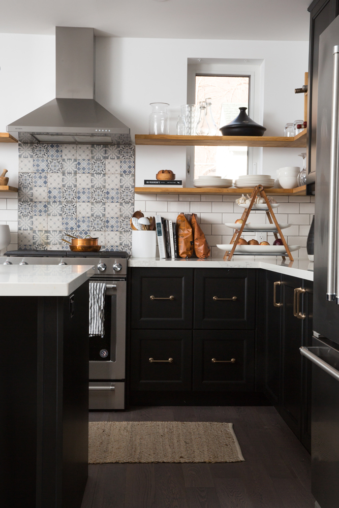
There’s nothing like a thread of continuity to make a home really come to life. In the kitchen, Orsi repeated the Spanish tiles she used in the living room fireplace. “White subway tiles on the entire backsplash would have been nice, but too predictable,” she says. “Patterned tiles, placed just above the stove, break up the white and create a focal point.” A hand-blown glass pendant light lets the room’s graphic black and white elements speak for themselves. Note the designer attention to detail: the lamp’s brass base is echoed in the cabinetry hardware for further continuity.
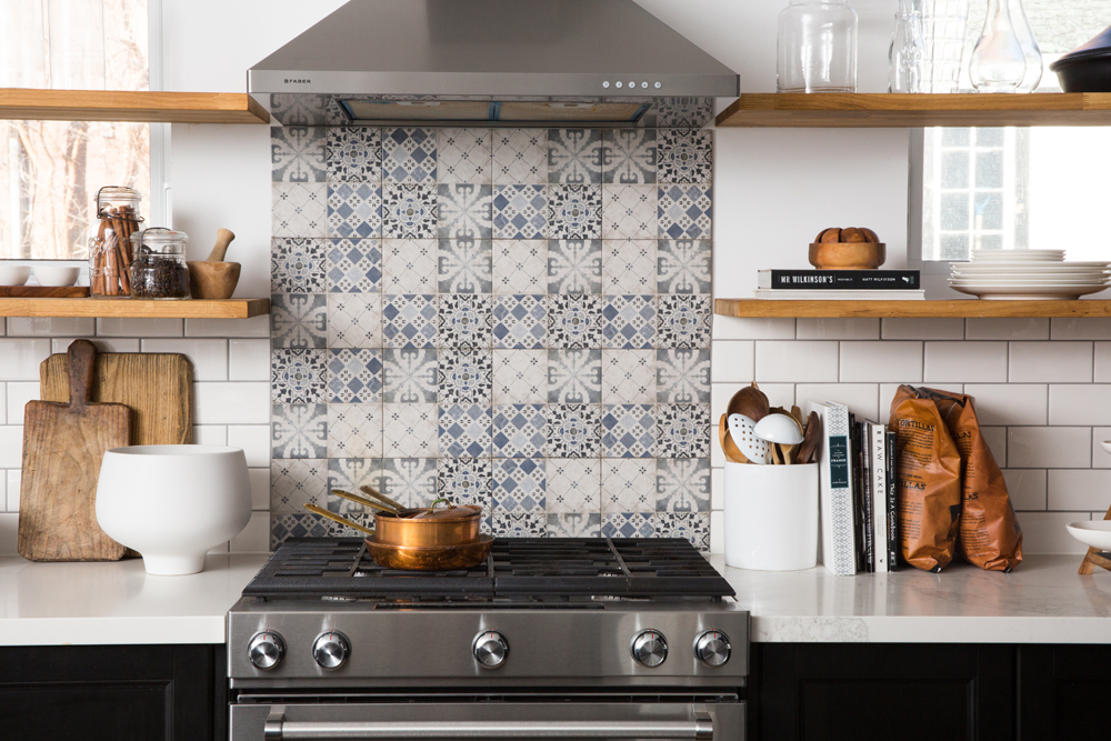
Shelf Help
Not only would traditional upper cabinets have competed with the riveting tiled backsplash, they simply weren’t an option here given the placement of the windows. Orsi came up with a bold solution: “I decided to run floating shelves in front of the windows. They maximize storage and display space, and by keeping low stacks of plates and clear glassware on them, the natural light is still able to flood in.”
Here are 40 Brilliant Kitchen Backsplash Ideas for Your Next Reno.
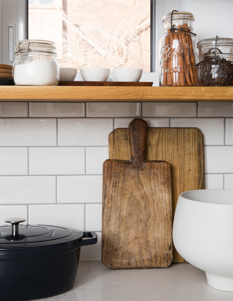
Home Cooking
This stunning space is still very much a cook’s kitchen, as the well-worn cutting boards, dishes and pantry items attest. “The homeowners love to cook and entertain. The premise was that once the reno was done they could take over hosting family functions. And that’s exactly what has happened.”
Just Around the Corner
Look closely and you’ll notice that the floating shelves extend beyond the window wall. “I designed them to run into and around the corner to maximize storage space,” says Orsi. “They had to be custom fit around a plumbing stack that’s hidden in the corner.” The shelves nicely frame the space and radiate an almost country-like charm (or that signature rusticity) against the black cabinetry.
See here for 20 Gorgeous Kitchens That Will Inspire You to Embrace Open Shelving.
Black Magic
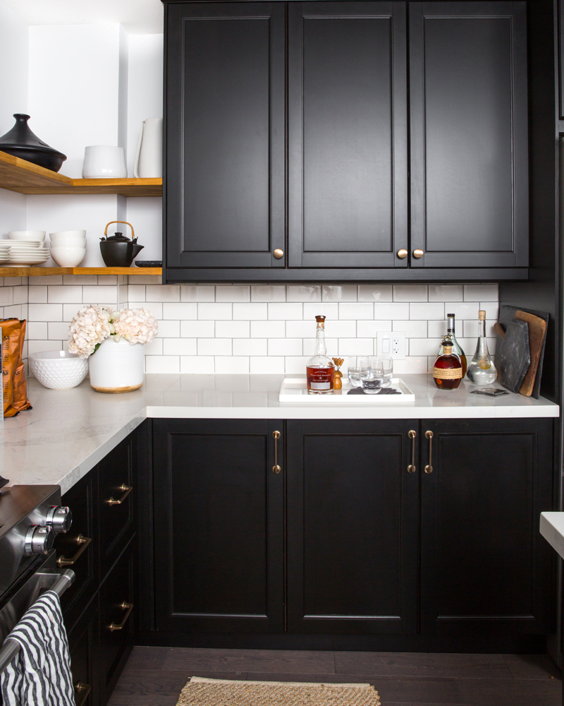
“I can’t imagine this kitchen any other way,” says Orsi, referring to the cabinetry’s intense colour. “Black is classic, easy to care for and doesn’t feel dark because the backdrop is a mix of white walls and white subway tiles.” That tricky corner hiding the plumbing stack can be seen here, along with the ingenious way Orsi’s custom shelves minimize it.
Modern Art
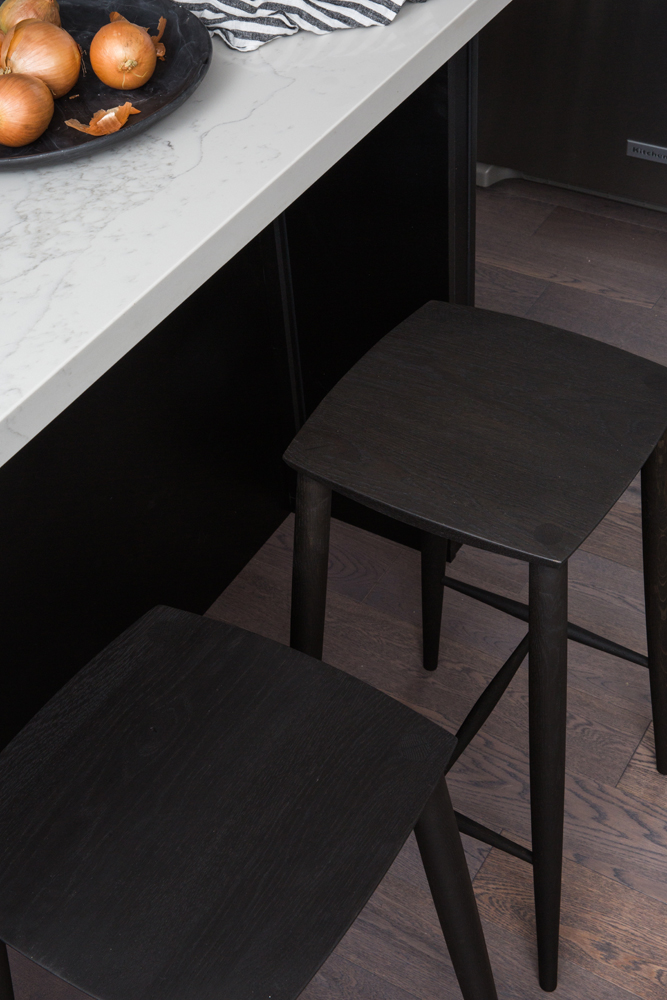
The quartz-topped island is paired with handmade oak stools from Toronto’s Coolican & Company. Orsi loves their silhouette and says, “they add a modern edge to the kitchen.”
Points of Difference
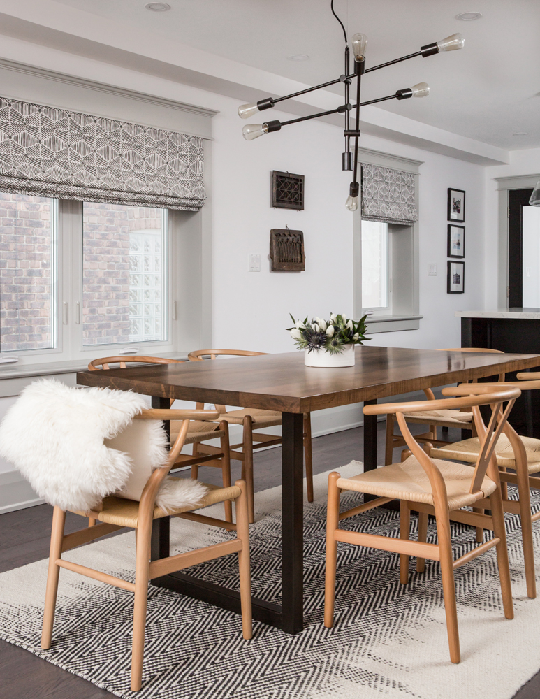
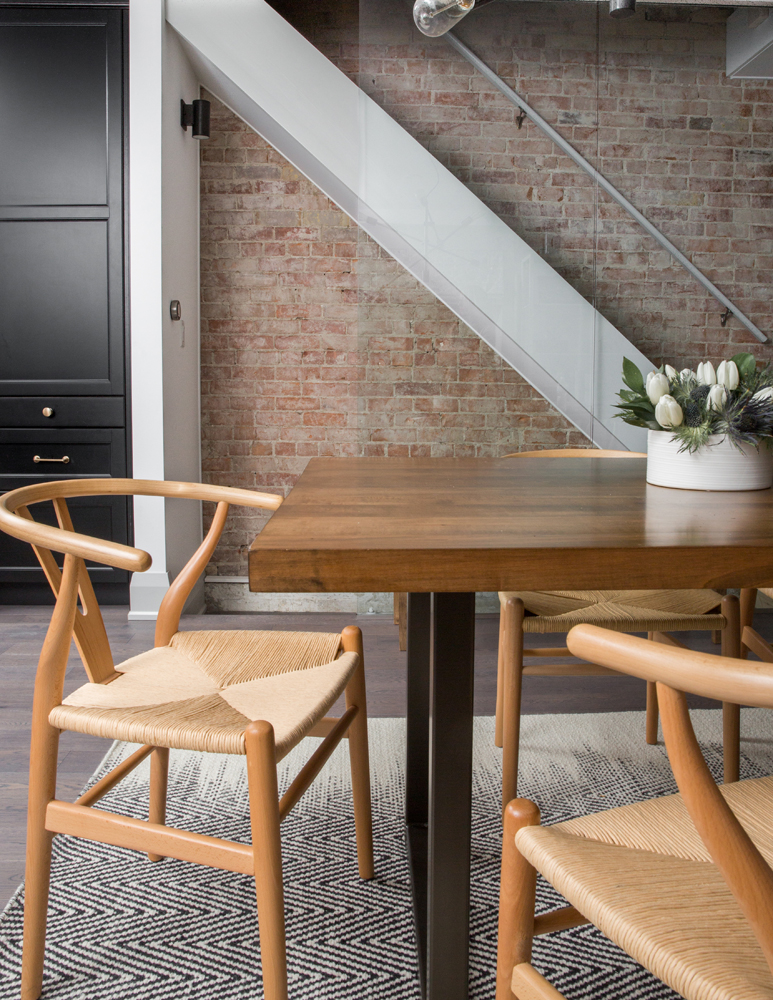
“The dining room table was custom made by Design Republic, and I chose these classic wishbone chairs for their sculptural shape,” says Orsi. “I love pairing a rustic-looking maple table with iconic modern chairs.” A graphic wool rug introduces pattern that’s picked up in the custom Roman blinds from Tonic Living. The Mobile Chandelier is from West Elm. “The light had to be modern. I wanted something simple and airy so that it wouldn’t create a visual barrier.”
Brick Works
This is the stunning pinky-toned brick wall that influenced the living room cushions. “It was originally covered in plaster. We removed it, left some of the residue on the brick to retain the patina and finished it with a matte sealer. It’s my favourite part of the whole reno! When we discovered the brick was in fantastic shape and we were able to keep it exposed, we all danced a happy dance.” The original staircase was walled in, but a new glass barrier keeps the exposed brick visible from every corner of the main floor.
Home Truths
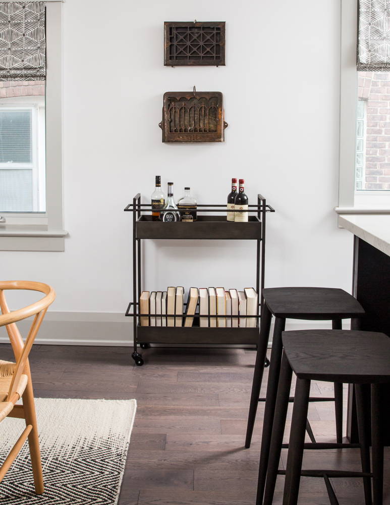
“I was able to salvage the original vent covers,” says Orsi. “The homeowners and I wanted to display them as a way to pay homage to the home’s history.” They hang like works of art above a rustic-style bar cart. Did you notice the backwards books? “They’re cookbooks with ugly covers that created visual clutter. We turned them around to keep the cart tidy looking.”
Behind the Scenes
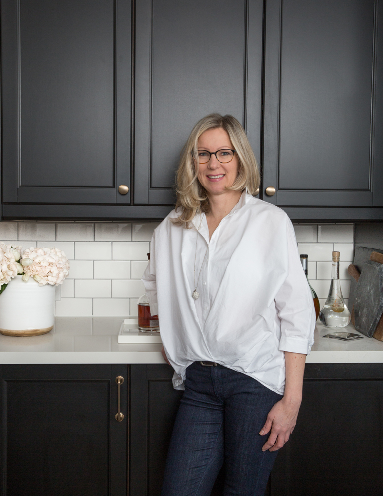
Designer Orsi Panos in the home’s finished kitchen. She is thrilled with the transformation and cites the deft combination of rustic with modern as the secret to this renovation’s success. “It was the guiding balancing act throughout the project,” she says.
HGTV your inbox.
By clicking "SIGN UP” you agree to receive emails from HGTV and accept Corus' Terms of Use and Corus' Privacy Policy.


