Jess, Sabrina and Sue were raised by Uruguayan parents who were always there for them-not to mention their children. So when their parents retired, the sisters wanted to help them produce a little extra income through the family cottage in Collingwood, Ontario.
The plum location had tons of potential, but it definitely needed work. With an awkward layout, an unfinished carport, and bedrooms that weren’t exactly well-defined within the space, this trio knew they could use some serious help. So they called upon Scott McGillivray, designer Debra Salmoni, and the Vacation House Rules team. Here’s how they transformed this vacation rental into a calm and colourful Latin American inspired retreat.
Scott’s Vacation House Rules airs Sundays at 9 p.m. ET/PT on HGTV Canada. It is also available on the new Global TV App, and on STACKTV with Amazon Prime Video Channels. HGTV Canada is available through all major TV service providers.
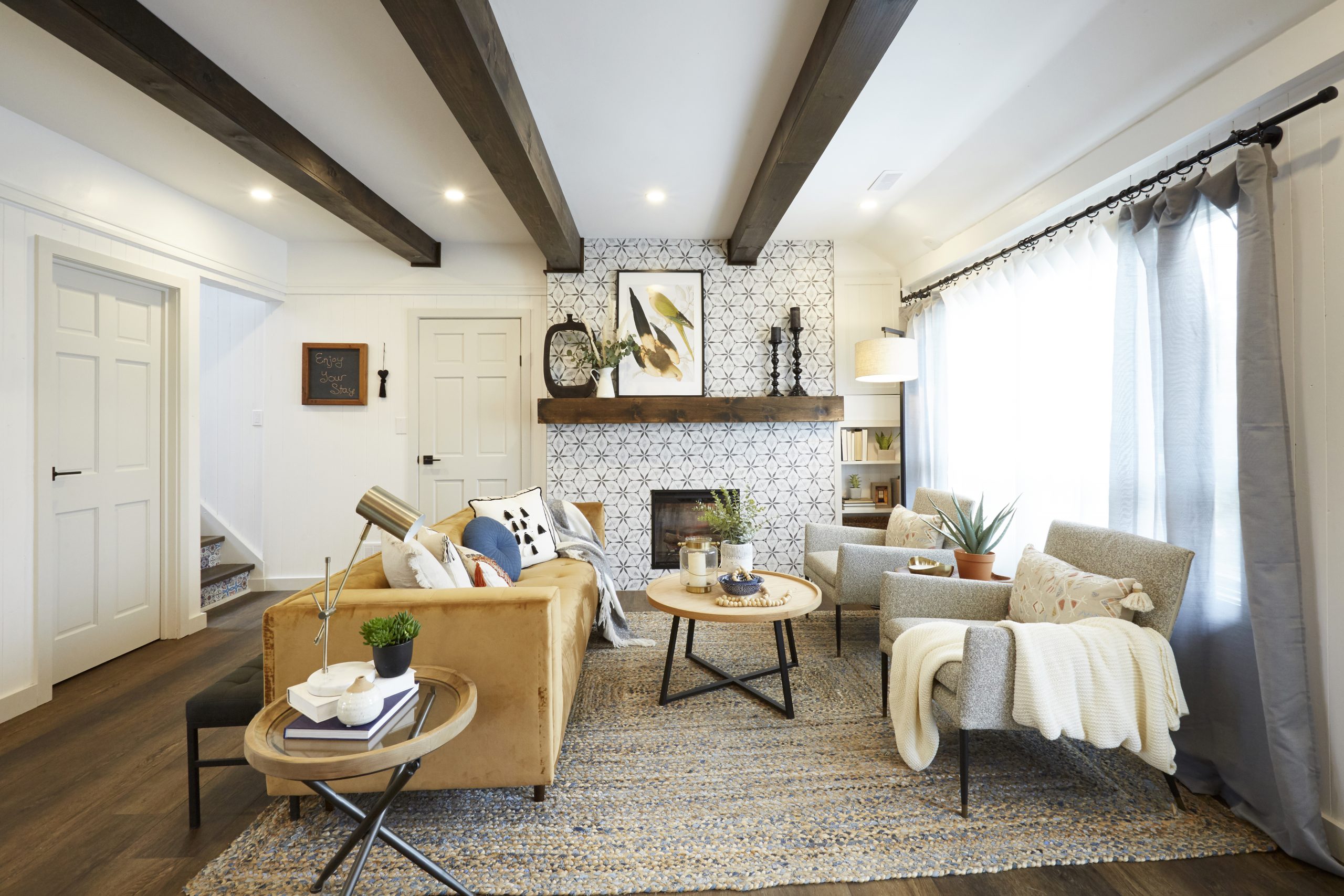
Creating A Vibe
To establish the theme of this rental, the team used neutral colours paired with standout accents and intricate patterns. The tiling on the fireplace, for example, is something you could instantly picture at a Latin American retreat but also totally belongs in Collingwood thanks to the statement beams and matching mantel. Neutral walls and a dark finish on the floor tie it all together.
Related: How a Toronto Couple Created a Cozy Farmhouse Escape Just Outside of Collingwood
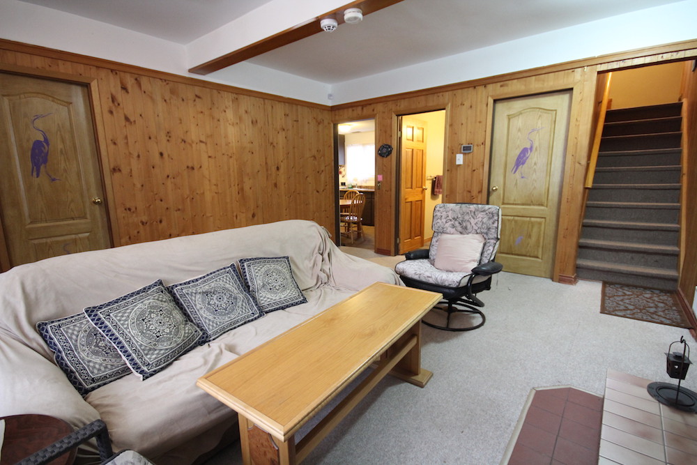
Re-Evaluate Your Layout
To establish this rental as a coveted spot for clients, Scott pulled it all back and started fresh with an open concept. Before, the wood panels, drab floors, and awkward rooms made this space feel cramped and dated-not exactly selling points when you’re trying to get people to pay money to stay in your space.
Related: Scott McGillivray Renovates a Rentable Muskoka Paddler’s Paradise
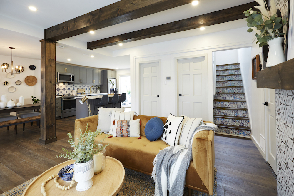
Give Renters a Communal Space
Opening up the walls and creating a seamless layout makes a huge difference, not only in photos but in attracting renters with families who want to go away for some quality time. The living-dining-kitchen combo ensures plenty of space for everyone to keep in contact, no matter what they’re up to around the cottage. Meanwhile, that Latin American theme is ever-present thanks to the kitchen backsplash and tiling on the stair risers.
Related: 10 Smart and Stylish Ways to Divide Your Open-Concept Living Space
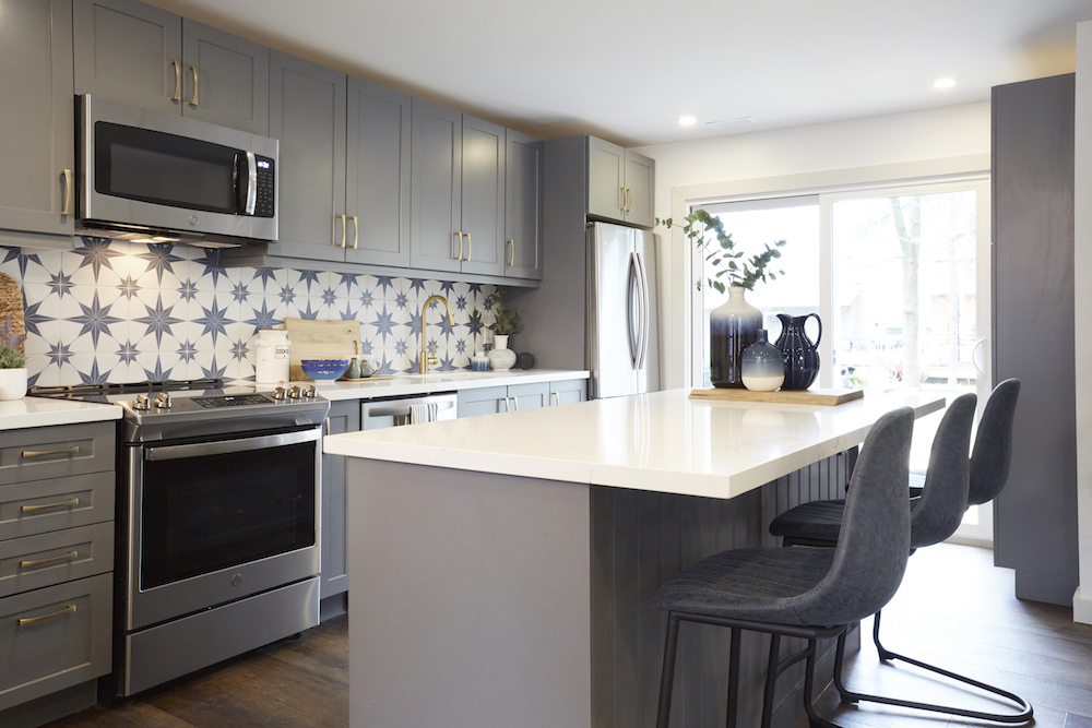
Crafting the Perfect Kitchen
Scott wouldn’t typically include quite so many upper cabinets in a rental (it’s usually best if renters can immediately see and access things), but because the family will still be using this space half of the year, they wanted a lot of storage options. The big focal point in this new kitchen, however, is the walkout to the yard. Now, not only can renters easily access the outdoor space, but the sisters will no longer have to pass plates from the window that used to live there instead.
Related: 10 Things That Will Make Your Kitchen Feel Way More Luxurious
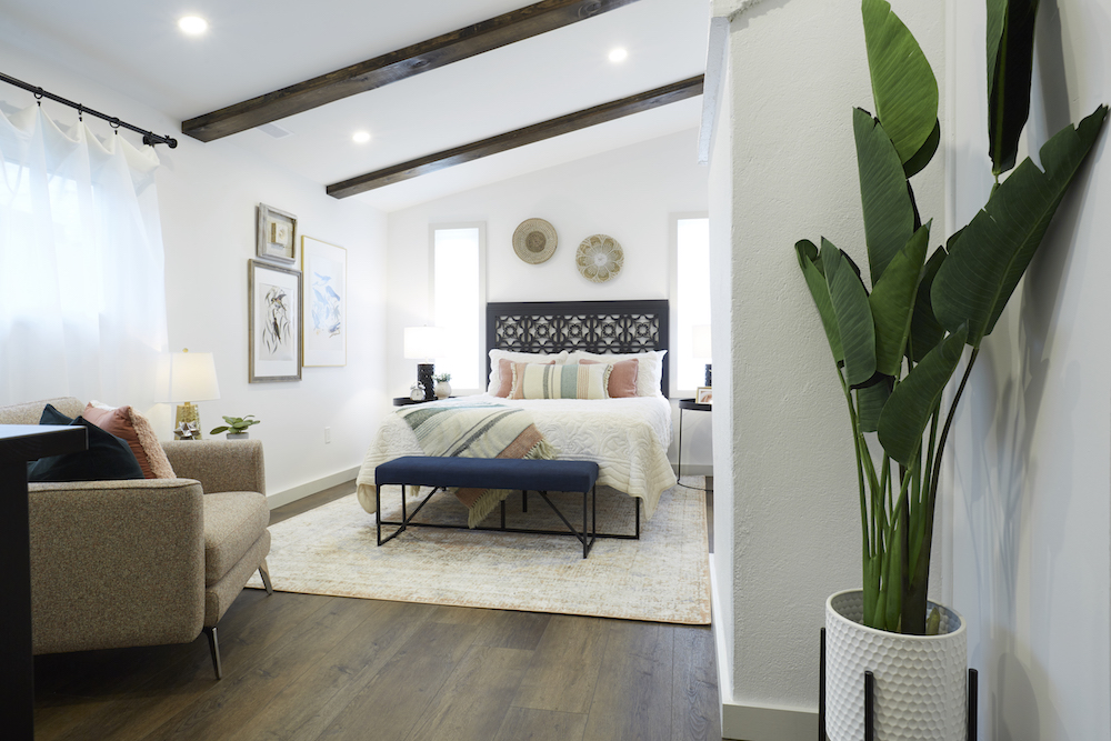
Transforming a Primary Retreat
Where a half-finished carport used to be, Scott and co. transformed this space into an apartment-like ensuite just off the kitchen that their parents can use (That’s why the sisters helped make the headboard with Scott and a CNC machine). The unit is also great for renters, thanks to the separate washroom. It can either serve as the main escape for those footing the rental bill or as a unit for newer parents with small children that are still waking up for snuggles throughout the night.
Related: 17 Basement Bedroom Decorating Ideas That’ll Make You Forget You’re Underground
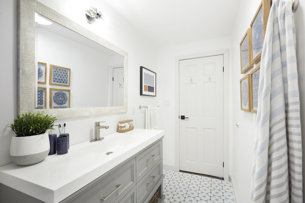
A Pretty and Polished Bathroom
The Latin American vibes continue in a serene, spa-like way with the main bathroom, which has been given a facelift with a new, storage-filled vanity and a large shower. The floors add tons of personality without overwhelming the space, which is what you want when you’re crafting a space for those who just want to enjoy their vacation in peace.
Related: 10 Decorating Mistakes That Are Making Your Home Look Cluttered
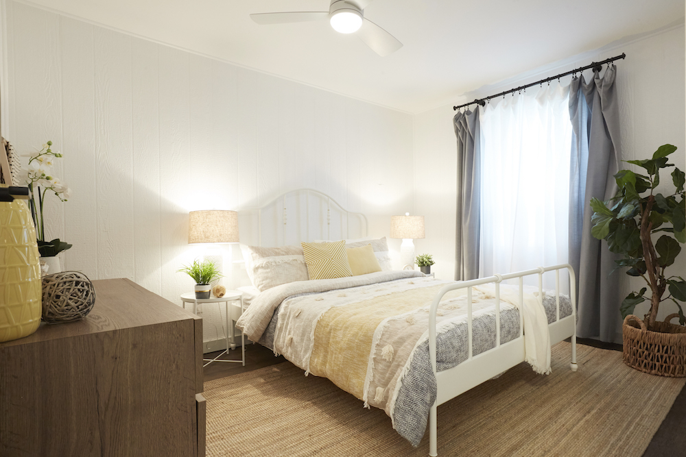
Bedrooms Meant for Good Dreams
There are four bedrooms in this rental, all of which have been finished with the same flooring and neutral walls. Queen beds ensure plenty of extra sleeping space, and the dressers allow renters to unpack and feel at home. Luxe finishes like plants, lamps, and even the ceiling fan ensure this is a comfortable and chill zone for anyone.
Related: 10 Design Tricks to Make a Small Bedroom Look Bigger

A Space for the Kids
Before, this area couldn’t technically be classified as a bedroom because it featured a curtain rather than an actual door. Scott fixed that by adding a sliding door and bringing in bunk beds, which max out the small area’s sleeping space and create an instant, fun room that kids will look forward to calling their own for a few nights.
Related: For Sleep and Play: 15 Kids’ Room Trends for 2021 That’ll Have Your Kids Asking to Get Grounded
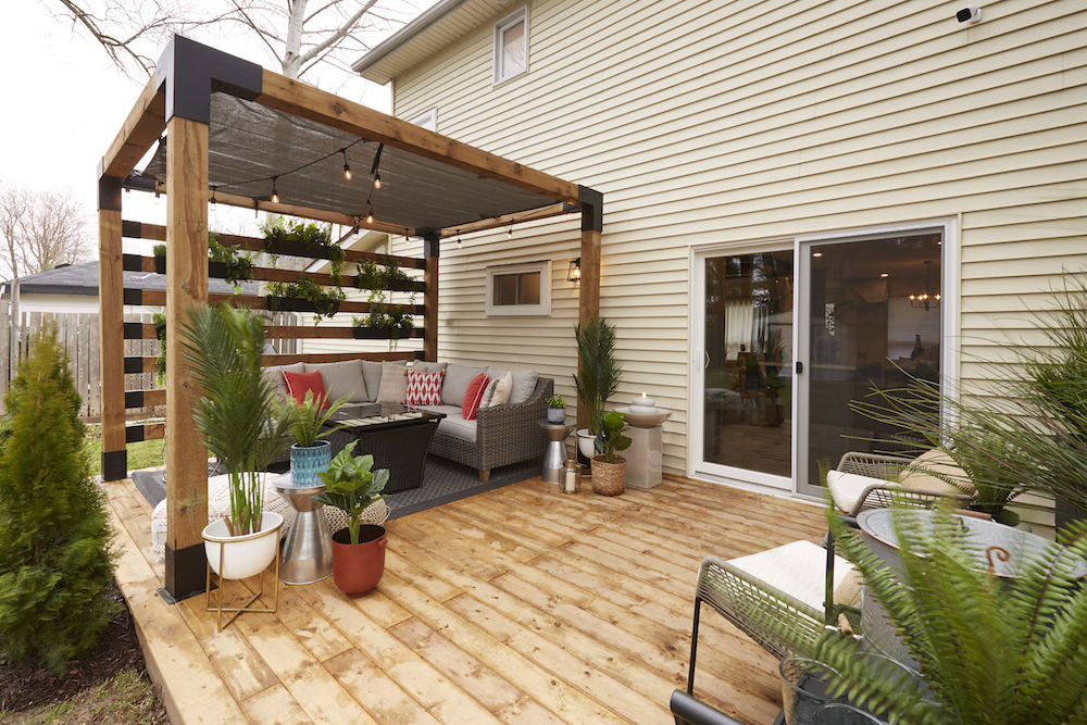
Creating an Outdoor Oasis
Your rental doesn’t need to be on the water to feel like a retreat. Some shade, a space to congregate, and even a fire bowl add tons of vacay vibes to any outdoor space. Here, Scott and Debra crafted an outdoor oasis complete with a pergola, string lights, plants, and plenty of other lush elements to really get you into that vacation spirit.
Related: 55 Beautiful Backyard Ideas

Setting the Tone
When it comes to vacation home rentals, never neglect the front of the property, which is the first thing renters will see upon their arrival. Scott added plenty of pretty structural and decorative finishes to this casa, completing the transformation from the inside out. The sisters and their parents can now secure $450 a night to rent out their space. This should bring in lots of extra cash for the family as they continue to enjoy their retirement years.
Watch: RENO REVEAL! Scott and the team transform this bland rental cottage into the ultimate canoe club.
HGTV your inbox.
By clicking "SIGN UP” you agree to receive emails from HGTV and accept Corus' Terms of Use and Corus' Privacy Policy.


