When Nadia and her husband moved to Canada, they fell in love with the cottage life dream. So they went ahead and bought themselves a lakefront Muskoka property with gorgeous views of the water. The inside of the property, however, wasn’t so memorable.
When the couple decided they wanted to rent out the property for 12 weeks of the year to recoup some of their costs (not to mention save for their kids’ futures), they called in Scott McGillivray for help. Together with designer Debra Salmoni and the Vacation House Rules team, they took this below-average rental property and transformed it into a canoe-themed paddler’s paradise.
Scott’s Vacation House Rules airs Sundays at 9 p.m. ET/PT on HGTV Canada. It is also available on the new Global TV App, and on STACKTV with Amazon Prime Video Channels. HGTV Canada is available through all major TV service providers.

Crafting a Theme
When you enter the competitive vacation rental marketplace, especially in an area like Muskoka, you want to stand out. Creating a theme is one of the easiest ways to do that, which is why Scott went with a canoe theme for this particular property. Renters get that from the moment they arrive with the new front door, which the team painted a bold red. Then, they created an inexpensive canoe portico above, really setting the vacation vibes from the get-go.

Before the Renovation
To give you an idea of what the property looked like before Scott arrived, here’s a snapshot of the great room. The views offer a ton of potential, but the tired wood, first-generation laminate floor, and undefined space doesn’t exactly scream vacationer’s paradise, does it?
Watch: REVEAL! Scott McGillivray Creates a Trent Lakes Winter Wonderland

A Great Room
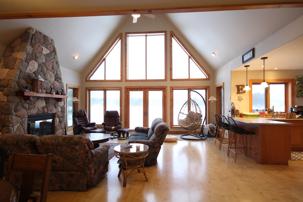
Now when you walk into this great room, it really does take your breath away. The new floating floor is more modern and can withstand lots of wear-and-tear, which is essential when you’re renting out your space. The dark trim around the windows adds instant drama, and the new living room layout offers a chill vibe where you know you’re supposed to hang out and get your vacation on after a fun day at the lake.

Creating Focal Points
Open concept is in style, but you still want to have separate areas within your space to make it feel purposeful. Scott and co. did that with the furniture placement and with the finishes themselves. The new kitchen island is bold and polished, with pendant lights that draw the eye. In the living room, the original fireplace remains a central focal point with its beautiful stonework. And above, the wood-panelled ceiling brings it all together to create that cozy vacation feel.
Watch: Artist and Photographer Re-Imagine Condo as a Lively Abode

Working With the Existing Layout
The kitchen itself had a good layout, and the cabinets were in great shape, so Scott and Debra left things as-is to save on costs but then used paint to modernize the look. Below they opted for a darker colour that holds up well to wear-and-tear, and above the white finish adds even more brightness. A new backsplash, countertop and sink help pull it all together, while the dark trim on the windows continues the overall cottage flow.
Related: 10 Things That Will Make Your Kitchen Feel Way More Luxurious

Creating a Dining Space
Before, there was no formal area to eat, which is fine for some families but not in a rental. And since there was no kitchen table, the team created this space complete with a coffee and bar nook to match the main kitchen area. The new table can accommodate large gatherings, and above, the custom canoe light fixture that Scott built keeps things totally on theme.
Related: 15 Things You Need to Know Before You Buy Your First Rental Property

A Functional Mud Room and Bathroom
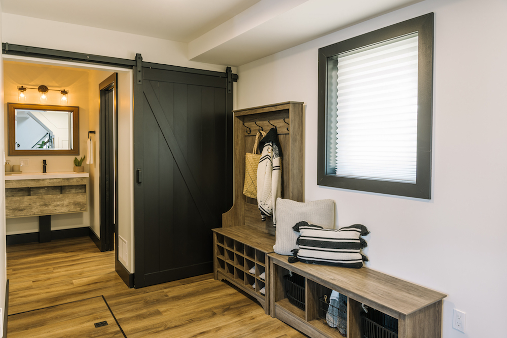
At the front of the rental, Scott made good use of the entire space. The team added a shoe tree and bench to create an instant mudroom effect, giving renters a space to place their items upon entry. Then they added a sliding barn door to the washroom and laundry room area, which is separated into three spaces so that even when a renter is showering, someone else can use the washroom.

Designating One Bedroom into the Primary Space
There are four bedrooms in this rental, but before Scott arrived, none of them had really been designated as the primary bedroom. Renters who are footing the bill want to feel as though they have a special space designated for them, so it’s important to allocate one bedroom as the main retreat. The team did that here with a beautiful feature wall and four-post bed, but this new primary room also features a new ensuite where unused closet space used to live.

A Kid-Friendly Space
Since families will probably be looking into renting this space, it was important to create at least one kid-friendly room. On the second main-floor bedroom, the team did that with bunk beds, an armchair (for story time, of course) and a chest of drawers. That latter item helps to keep renters organized without having to use space for a closet, which is very low on the list of rental priorities.
Related: Scott Transforms This Kawartha Property into an Executive Retreat

Cashing in On the View
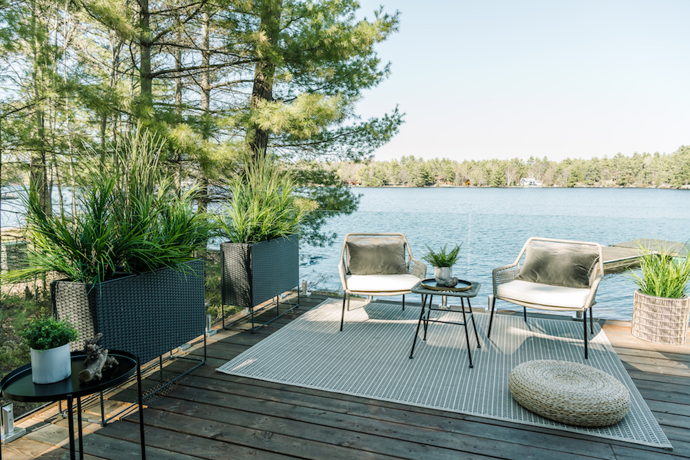
Because this rental is right on the water, the deck should be a great space to congregate without obstructing those gorgeous views. Safe but transparent glass panels achieve those goals, while a few extra touches of decor and some seating completes the look. With all of these upgrades, this four-bedroom rental can now list at $715 a night, a fine price for those owners who have now fully realized their Ontario cottage dreams.
Watch: REVEAL! Scott Transforms this Million-Dollar Cottage into an Executive Lodge
HGTV your inbox.
By clicking "SIGN UP” you agree to receive emails from HGTV and accept Corus' Terms of Use and Corus' Privacy Policy.


