Chris and David knew there was major potential in their million-dollar Kawartha Lakes vacation property. But the space had too much of an open concept to feel cozy and only counted on one bedroom. Add in a dated sunken sofa and wood finishes that sucked up all of the light, and they knew they needed help from the pros. Enter Scott McGillivray and the Vacation House Rules team. See how they transformed the property into a luxury, show-stopping retreat that will catapult this property to the top of rental listings everywhere.
Watch Scott’s Vacation House Rules on the Global TV App and on STACKTV with Amazon Prime Video Channels. HGTV Canada is available through all major TV service providers.
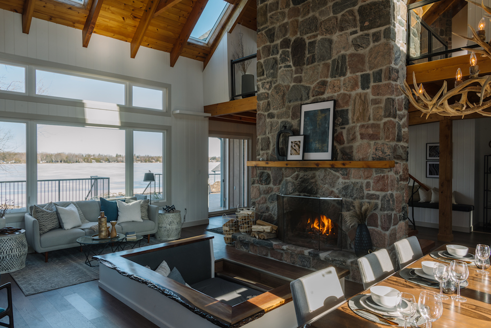
A Luxe Focal Point
The trick to this reno was keeping the cottage’s original charm intact while updating it to feel fresh and modern. To achieve that, Scott painted some of the original wood walls white, instantly brightening up the space. Then, he left the fireplace as a central focal point, which adds a nice contrast and a touch of cozy charm.
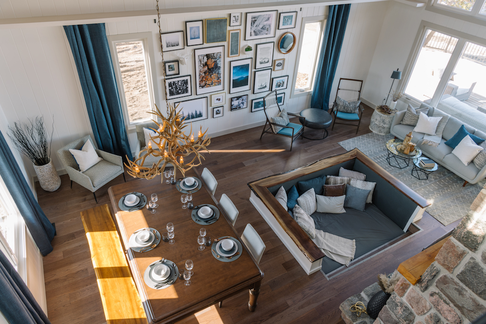
Retro Charm
Rather than take away the original structure’s sunken sofa, Scott updated it into a cozy feature that’s perfectly situated for cuddling in front of the fireplace. A queen-sized mattress means it’s a sturdy sofa area that can double as extra sleeping space when needed, setting this home apart on the rental market.
Related: 12 Sectional Sofas That Will Transform Your Living Room
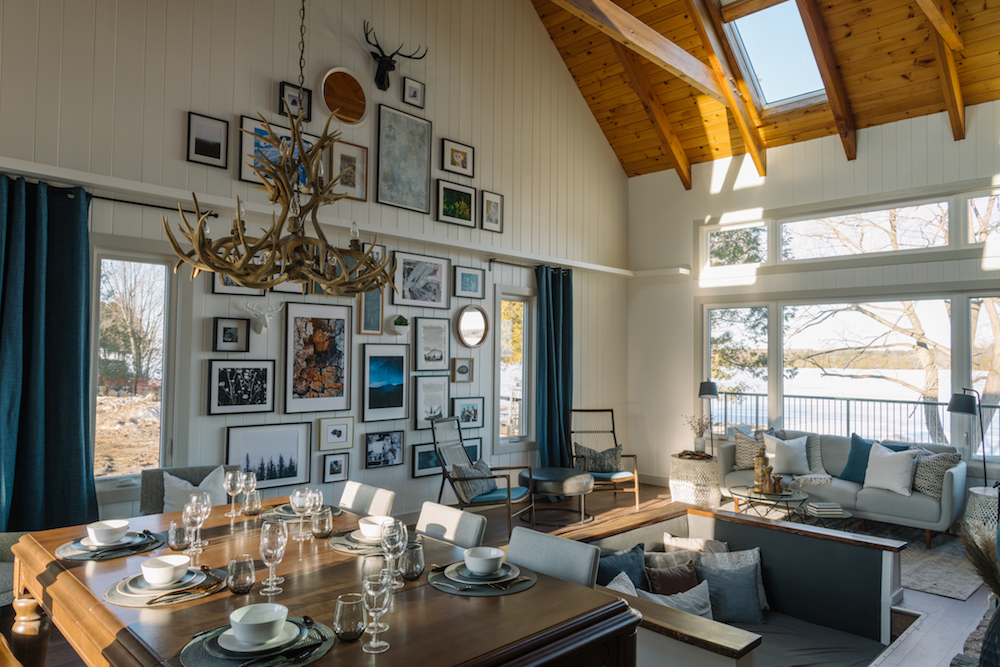
Extra Personality
The chandelier served as inspiration for this renovation, adding plenty of executive lodge vibes. On the back wall, Scott broke one of his own rules-never personalize a rental space. This time, he opted for a decorative photo wall that included a framed photo of himself, Chris and David ice fishing. After all, part of marketing a property is letting people see all of the great things they can do there, and a space like this is far too beautiful to only be rented during the summer months.
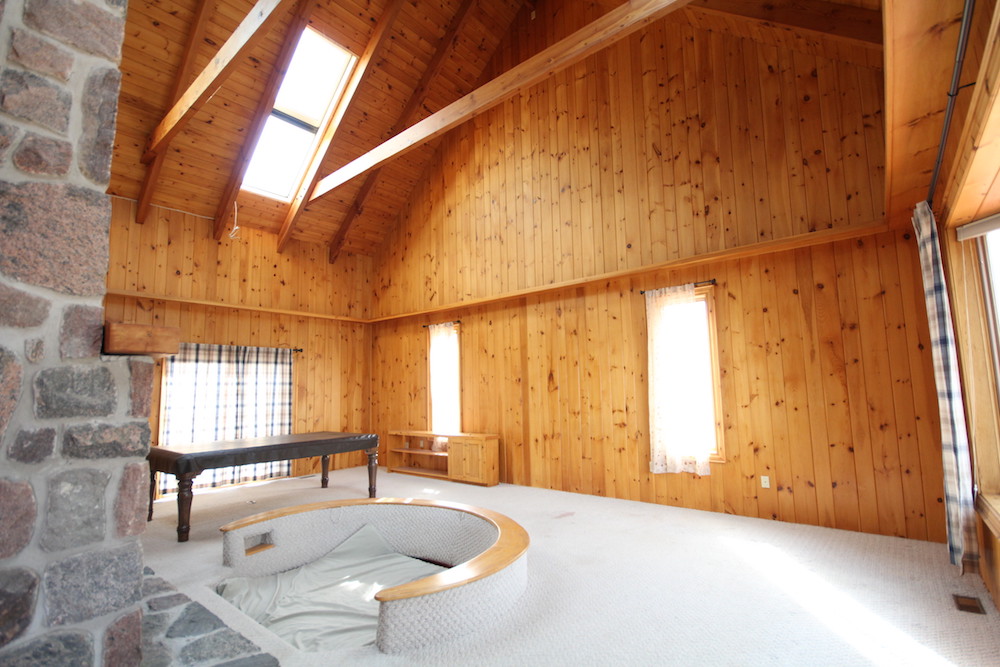
A Peek At the Old Space
Before, the space felt cavernous and lacked personality. Carpet (white carpet!) covered the area, which wasn’t exactly renter-friendly. Plus, with no furniture to delineate the space, renters probably wouldn’t look twice, mainly because all there was to look at was wood, wood and more wood.
Related: How to Naturally Clean the 10 Most Stubborn Household Stains
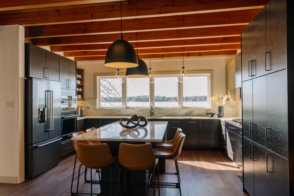
A Posh Kitchen Space
Because this kitchen is speaking to the executive set (rather than the family set), Scott and Debra designed it with bar-frequenters in mind. The island table is designed so that every seat is that coveted corner seat with extra elbow room. As for the cabinets, the finishes are dark and sleek, which add personality and old-world charm.
Related: Simple DIY Home Upgrades That Will Add Serious Value to Your Home
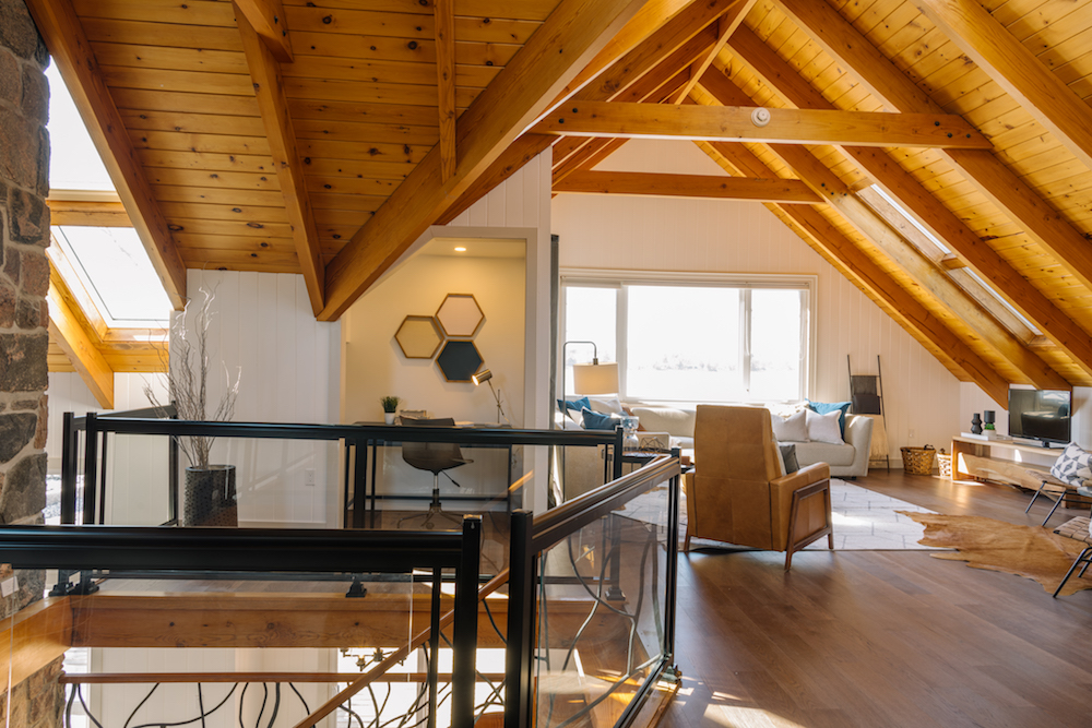
Utilizing the Open Space
Upstairs, the massive landing space also underwent a transformation. Scott separated the area into two seating areas, a home gym and an office. Dividing the upstairs landing space makes it more functional, therefore speaking to even more potential renters. Now, this is a spot where you can hang out, entertain, exercise, or get some work done. Talk about multifunctional.
Related: 21 Simple Ways to Fall in Love With Your Home Again in 2021
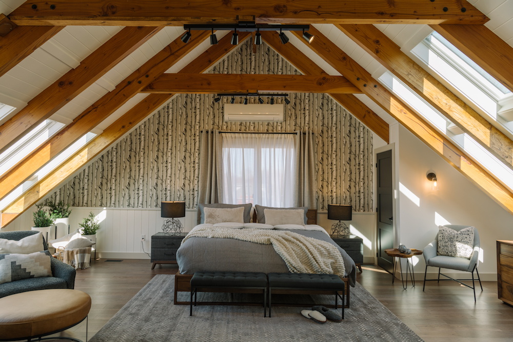
A Brand New Primary Bedroom
When you’re dropping serious coin on a rental property, you want a majestic place to sleep. This new primary bedroom certainly fits the bill. Under the main point of the A-frame is a massive king-sized bed, made even cozier with different textiles. The nature-inspired wallpaper makes for a beautiful and on-theme feature wall, while the extra seating area adds instant luxury. Not to mention the large skylights, ensuring the space is always bright and well-lit.
Related: 10 Design Tricks to Make a Small Bedroom Look Bigger
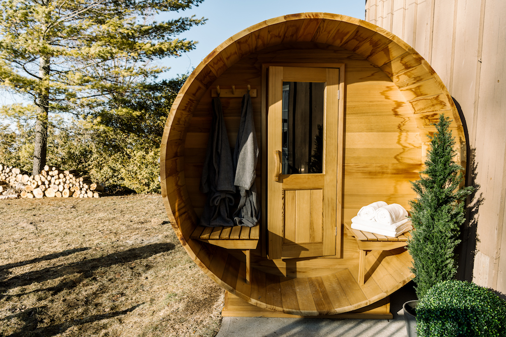
Extra Special Items
To truly up the rental game of this property, Scott also installed an outdoor cedar barrel sauna, which adds even more luxury to the overall rental. Now clients can spend their days brokering deals and then unwinding by the lake and sweating out all of those work toxins.
Related: Make Your Home Stand Out From its Neighbours With These Genius DIY Ideas
Adding Even More Potential
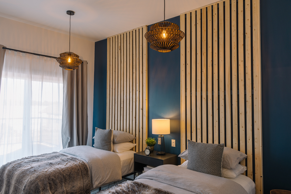
While it’s nice to think that a couple could enjoy this large space by themselves, it’s not a practical rental decision. So Scott transformed one of the two garages into a whole separate wing with two bedrooms. In the third room, he decided to add two double beds. While a queen- or king-sized mattress always feels more luxurious, not everyone wants to share. And sure, sharing is caring, but when you’re renting out a space, you always want to offer up the most potential to clients.
Related: Scott McGillivray’s Essential Tips to Create a Successful Vacation Rental Property
An Extra Bath
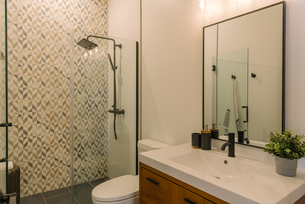
Speaking of extra potential, Scott also added a second bathroom to the rental so that executives coming here don’t have to share one shower. It’s one of several smaller but smart upgrades that add a ton of value for renters. Now Scott thinks Chris and David can rent this cottage out for $750 a night minimum year-round, a nice little sum that will surely help the guys pay off their million-dollar investment in no time.
Related: How to Build a Modern Bathroom Cabinet (for Less Than $100)
HGTV your inbox.
By clicking "SIGN UP” you agree to receive emails from HGTV and accept Corus' Terms of Use and Corus' Privacy Policy.


