When Christine and Sam purchased their Prince Edward County retreat, they were looking for a place to work remotely where the kids could also run around and get some fresh air. They were also hoping to recoup some of their costs in rental income, but with a hazardous entrance, a questionable layout, and a lack of rentable space, they needed help. Luckily Scott McGillivray, designer Debra Salmoni, and the Scott’s Vacation House Rules team were there to complete a rental redesign: one where remote-working professionals can come to hit the daily grind and to unwind. By updating the layout, adding more space, and creating an outdoor oasis, Scott transformed this rental into a retro-themed, high-tech property.
Scott’s Vacation House Rules airs Sundays at 9 p.m. ET/PT on HGTV Canada. It is also available on the new Global TV App, and on STACKTV with Amazon Prime Video Channels. HGTV Canada is available through all major TV service providers.
A Groovy Tech Rental
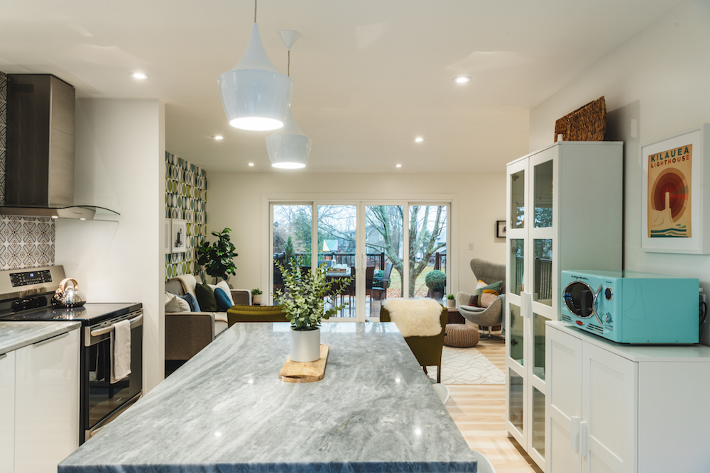
Scott really wanted to appeal to those working from home with this redesign, which is why he and Debra mixed plenty of modern elements with retro design. The new kitchen is bright and opens up to the living room space, immediately revealing what you get with this rental. There’s plenty of light, space for everyone to eat at the giant island, and a spot to unwind and relax by the new sliding glass patio doors.
Related: 10 Mid-Century Modern Living Room Designs You’ll Want to Copy
Opening Up the Space
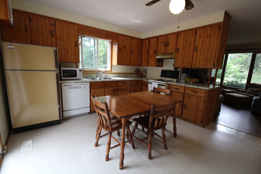
Before, this two-bedroom main floor was cramped and dark without a clear sightline to the main rental event, a.k.a. the waterfront. Afterwards, thanks to some reconfiguring, potential renters can immediately see the back of the property as soon as they walk in, transforming this space into the warm and welcoming vacation rental it was destined to be.
Getting Groovy With Design
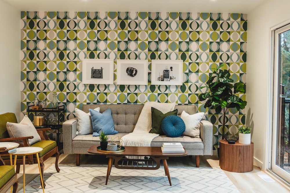
In order to play up the old meets new design in this cottage, Scott and Debra had the homeowners shop the garage to find old knickknacks and pieces of furniture they could incorporate into the final design. Then, they added a bit of whimsy with this easy wallpaper feature wall, which gives the space instant personality. Add in lots of seating for rainy days or hangouts with the crew, and this is a functional but modern space.
Related: 20 Bold Print Wallpaper Ideas That Will Transform Your Space
A New Primary Retreat
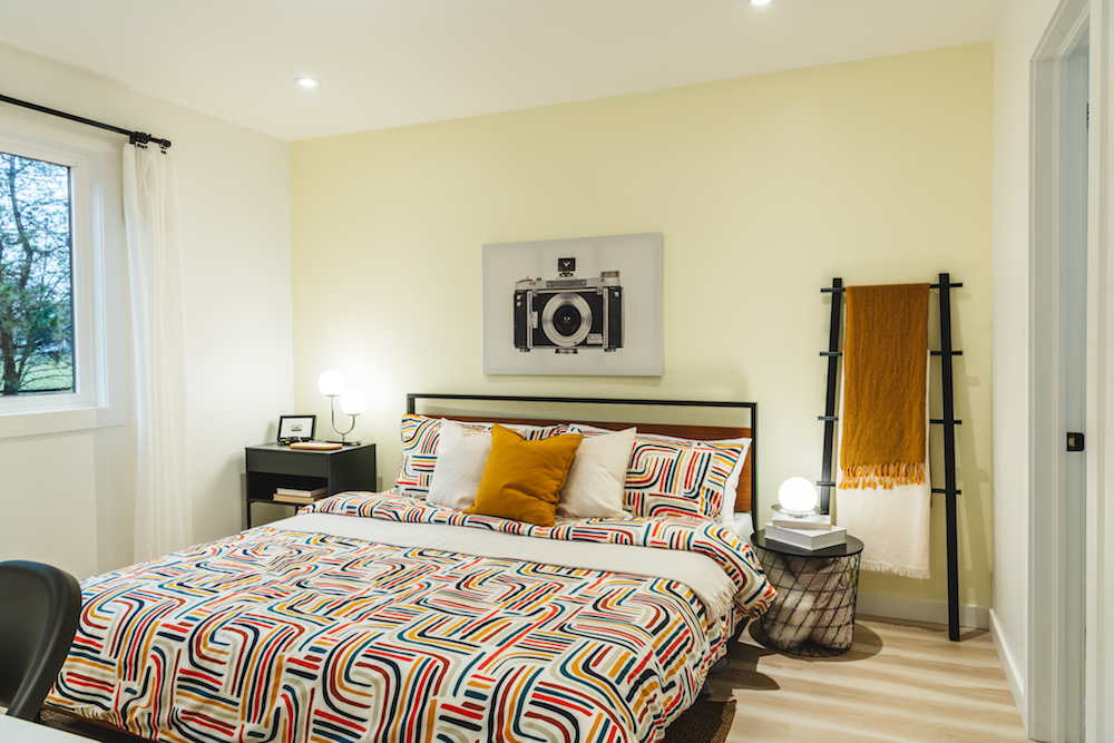
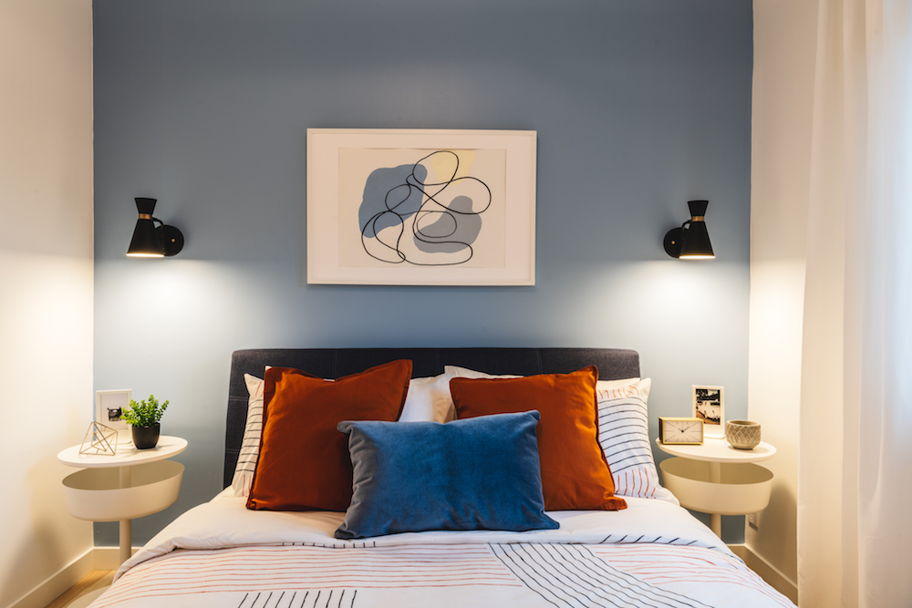
In the main bedroom, the team went with softer colours to encourage a restful night’s sleep, but they kept the flow with the matching photography print and simple finishes-like the blanket ladder and a compact night table. Meanwhile, the real retro vibes in this space come from the comforter, which adds lots of personality but can also be easily swapped out down the line if the homeowners are in need of a change.
A Nifty Workspace
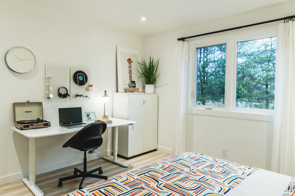
To align with the property’s work-from-the-cottage marketing strategy, there needed to be at least one office space setup in the final design. So Scott made use of the extra space in the primary bedroom by incorporating a simple workspace with a desk, chair, and extra organization. Everything is high-tech (from the wireless charger lamp to the wireless headphones), but there are also retro elements like the turntable to keep the rental on-theme.
Related: The Best Home Office Furniture Picks (and Accessories) Under $300
Extra Sleeping Space
Three-bedroom rentals can always pull in more money than two-bedroom rentals, so Scott transformed the old dining room into this large, new bedroom instead. The queen-sized bed allows at least two more people to join in on the work-while-away action, but thanks to the fun finishes it’s also a nice space where older kids can go to unwind.
A Kid-Friendly Space
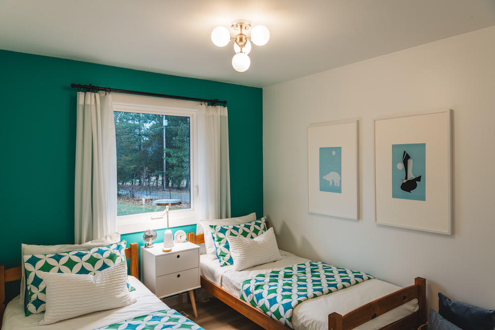
While Scott wasn’t exactly targeting families with this rental, he wasn’t discounting them either. That’s why this last bedroom features two single beds side-by-side, rather than your typical bunk bed situation. It’s a fun and colourful space for children who are coming on vacation with their parents, but the room also appeals to those adults who may not want to climb a ladder before crashing for the night.
Related: For Sleep and Play: 15 Kids’ Room Trends for 2021 That’ll Have Your Kids Asking to Get Grounded
Modern Bathroom Appeal
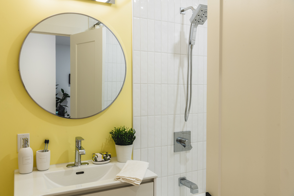
Scott always likes to pay extra attention to the bathroom situation in a rental, because that’s where renters typically want a retreat-like vibe when they’re paying to stay. In order to achieve that feel in this main bathroom, he gutted the pre-existing yellow tub and paid homage to the original design with a fun lemon wall colour. Then, a floating vanity gives the illusion of more space, while subway tiles stacked sideways in the shower feel fresh and fun.
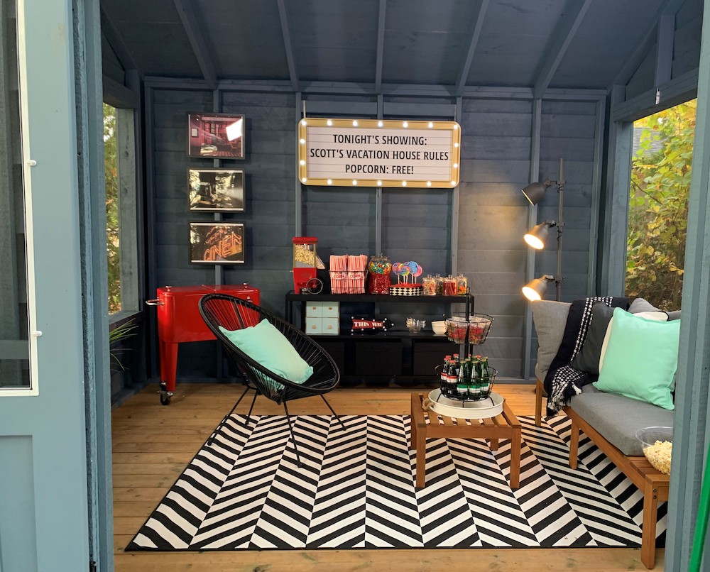
An Outdoor Workspace
When you’re escaping to a rental property to work, you want to actually get outside to work once in a while, too. So Scott had this hideaway installed, complete with wi-fi and power so that working professionals can escape lakeside the next time they have to hop on Zoom. The space also doubles as a lakeside retreat, where renters can spend evenings down by the lake too, having a movie night or just chilling out and chatting as the sun goes down.
Related: Granny Pods to Yoga Studios: 15 Ways to Makeover Your Garage or Shed
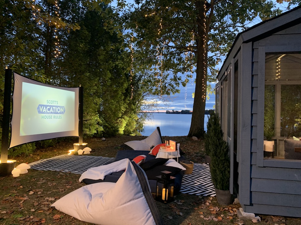
That Extra Marketing Flair
In order for this tech retreat to truly stand out with renters, Scott added one final touch: a movie screen right down by the lake. It’s a brilliant way to market the property for extra income, and it’s also the kind of touch that makes this rental stand out from the rest. Now Christine and Sam can charge renters $450 per night during the peak season, transforming this space into a real “retro” money-making opportunity.
HGTV your inbox.
By clicking "SIGN UP” you agree to receive emails from HGTV and accept Corus' Terms of Use and Corus' Privacy Policy.


