Scott McGillivray knows his way around a kitchen reno, whether starting from scratch in his dream home or restoring a rundown room. His skill with mixed materials, smart storage and small space solutions creates timeless rooms you’ll love for years. Take a trip down memory lane with 20 of his best kitchen designs.
Don’t Be Afraid to Mix It Up
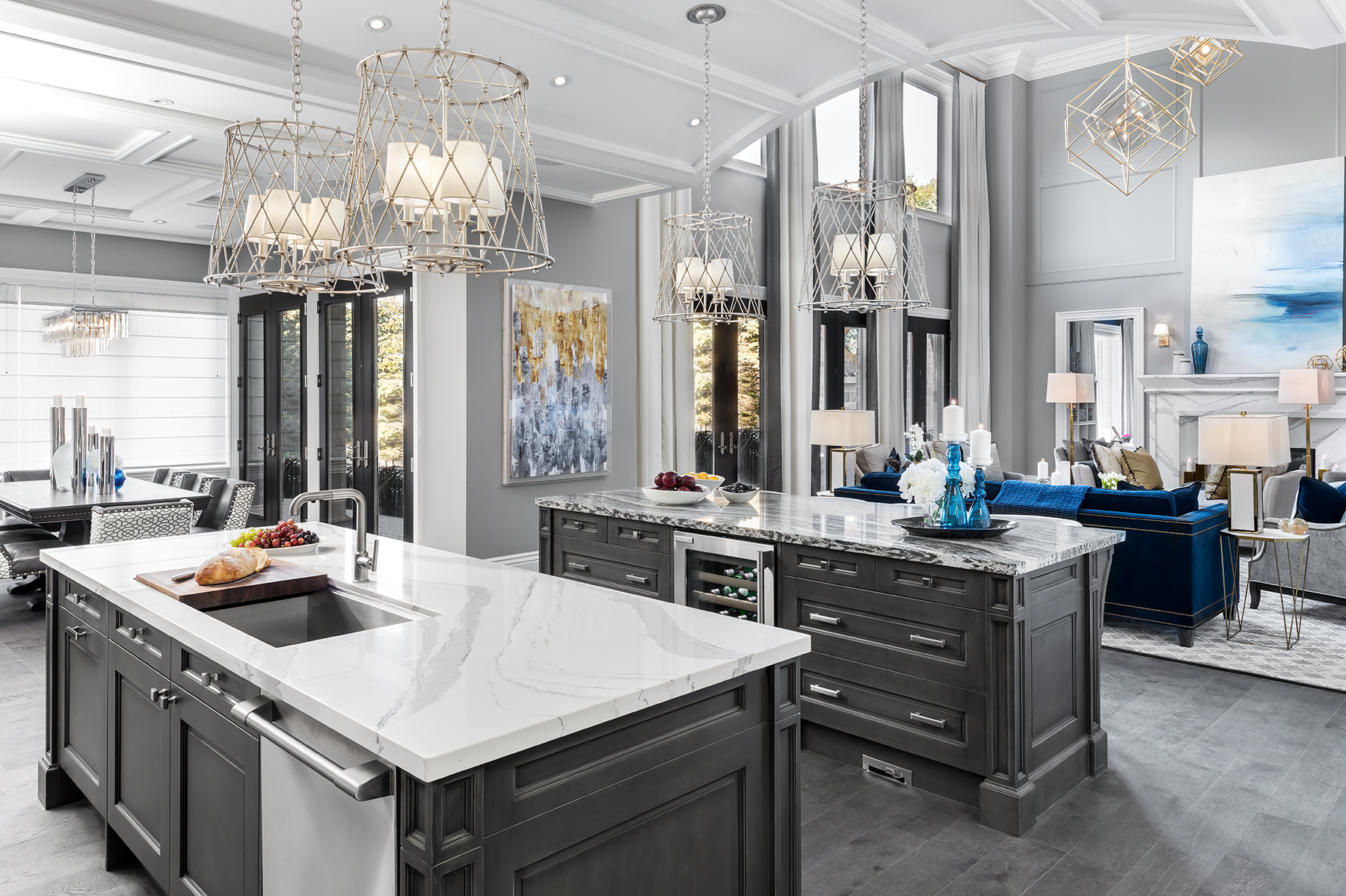
Scott and his wife Sabrina chose contrasting stone countertops and custom millwork in shades of elegant grey for two large islands in their dream kitchen.
Details Add Personality to All White
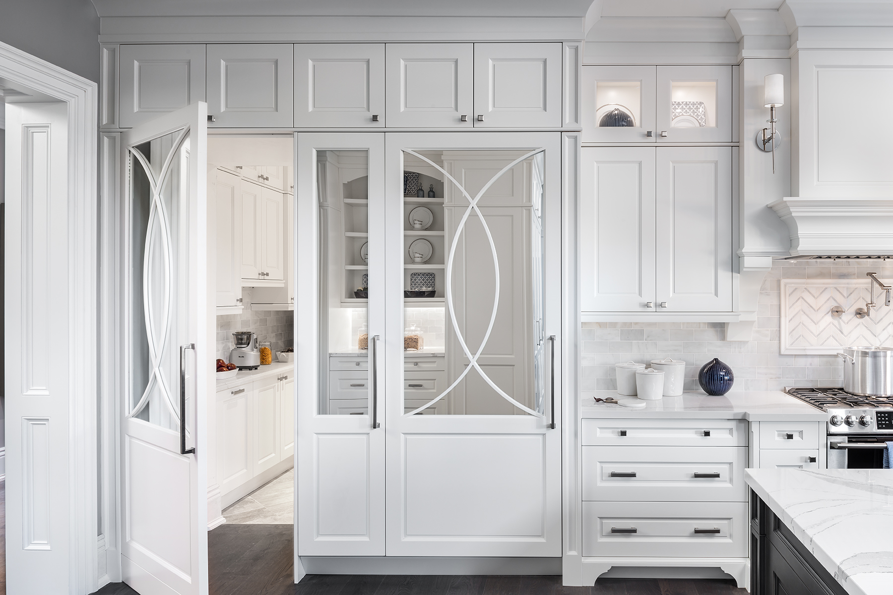
The true secret to never tiring of a classic all white kitchen is in the details. Here, mirrored doors with a curved overlay design add a glam touch and the contrasting tile framing the pot filler adds texture to the backsplash.
Updated Farmhouse Feels
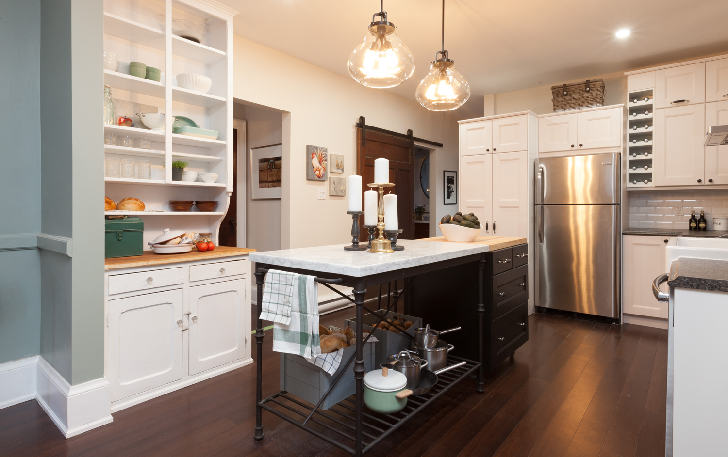
If you’re all about that quaint country style, look no further than this dreamy space. We can’t decide what we love more — the charming hutch or the marble-topped iron table.
Mix Up Materials
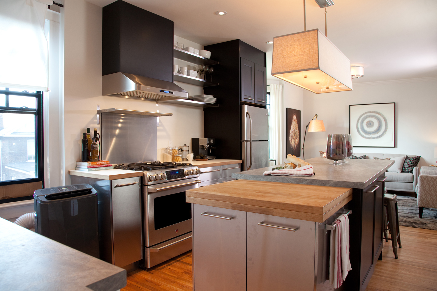
Stainless steel cabinets and backsplash, a stone counter and three shades of wood (counters, cabinets and flooring) somehow work together in this cool kitchen mashup.
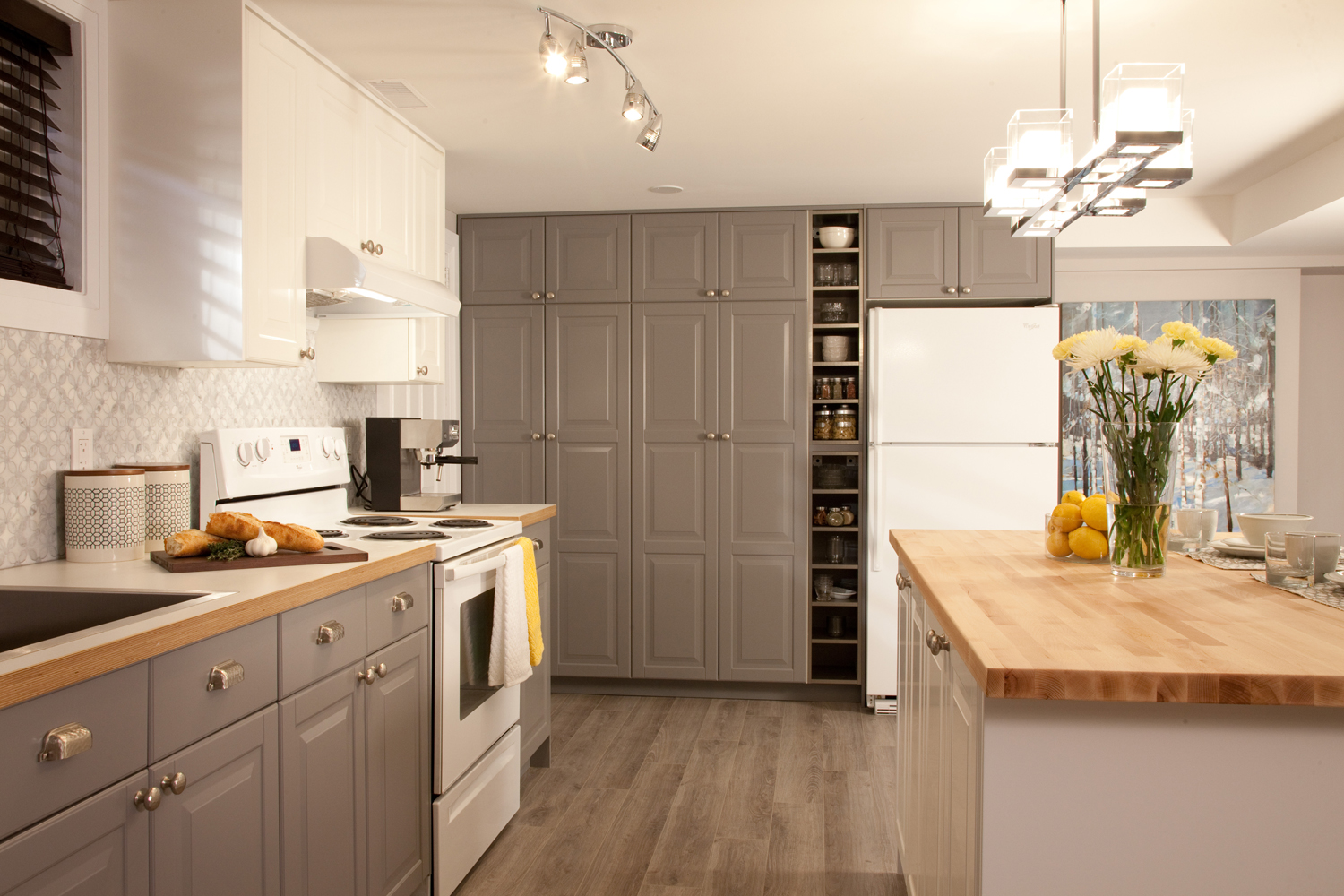
Floor to Ceiling Storage
Grey with warm undertones pairs well with wood and white in this storage-packed space. An open niche in the pantry wall makes grabbing every day ingredients a breeze.
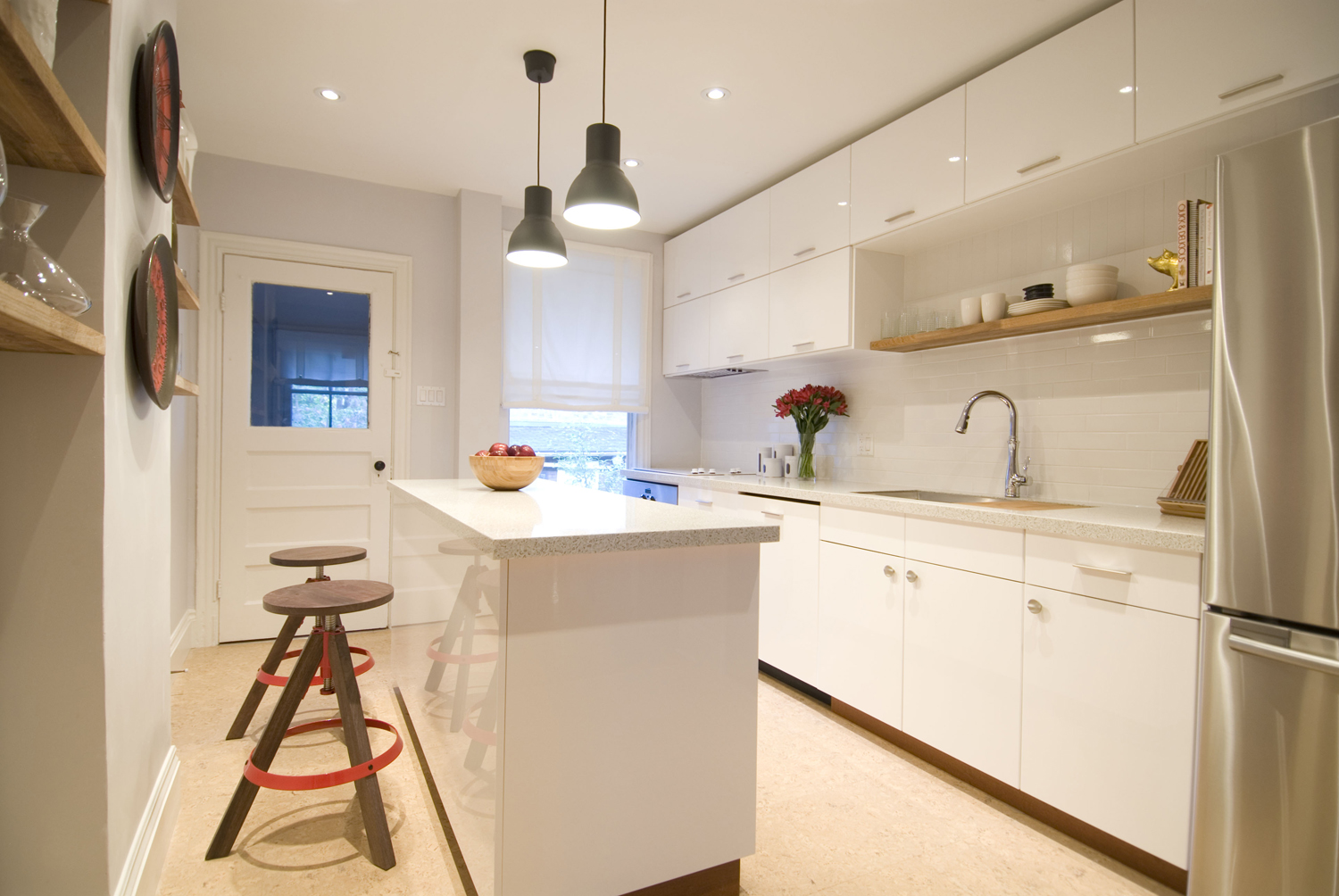
Sleek and Simple
Plain doesn’t have to mean boring. Modern high-gloss cabinets paired with warm wood creates a Scandi vibe, while black pendants ground the space.
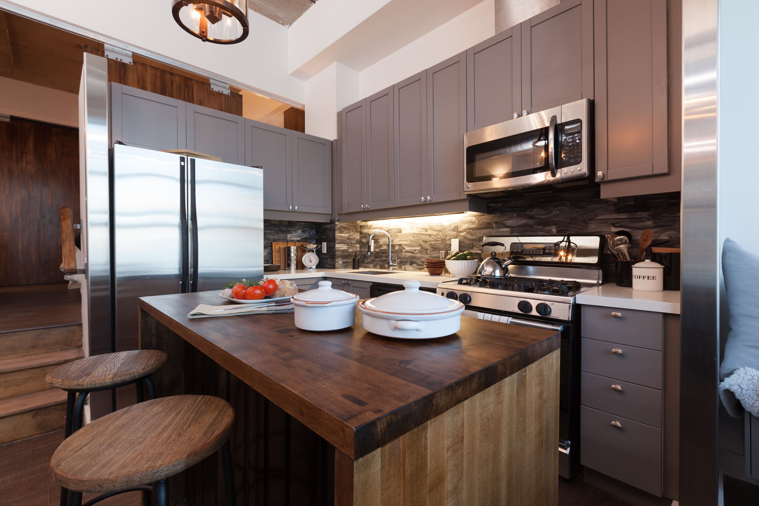
Big City Style
Luxe-looking details like that gorgeous mid-tone island, marble backsplash and end walls encased in stainless steel make this small space feel sophisticated.
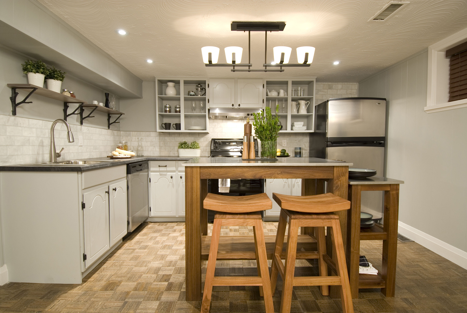
Open It Up
Open shelving and door-free cabinets make a small kitchen feel more spacious. Don’t miss those iron branch brackets, a tiny detail that lends a touch of personality.
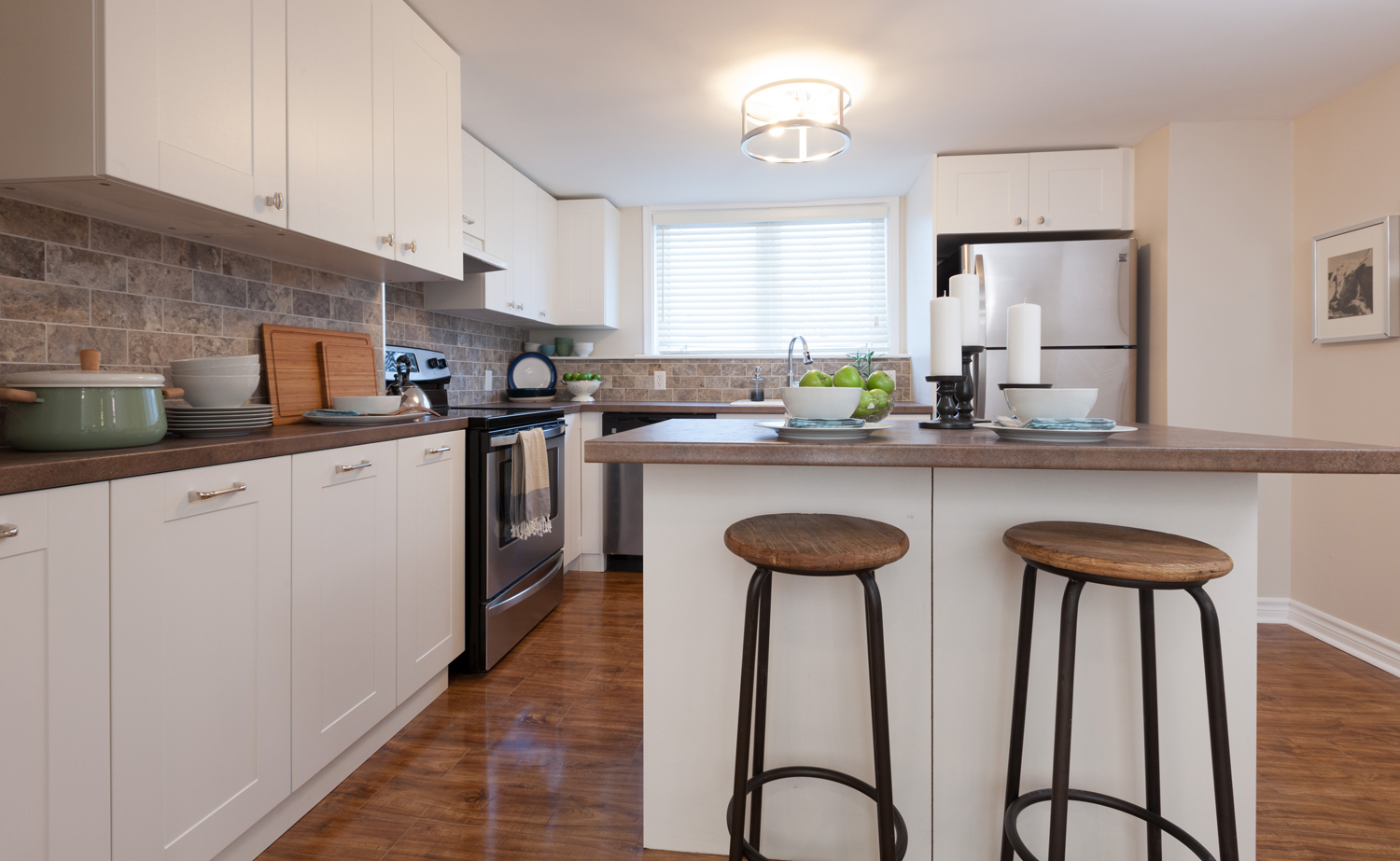
Brown Isn’t Boring
There are more to countertops colour choices than white, black and grey, as proven here with brown. It warms up the classic white kitchen, especially when paired with a stone backsplash that shares the same earthy tones.
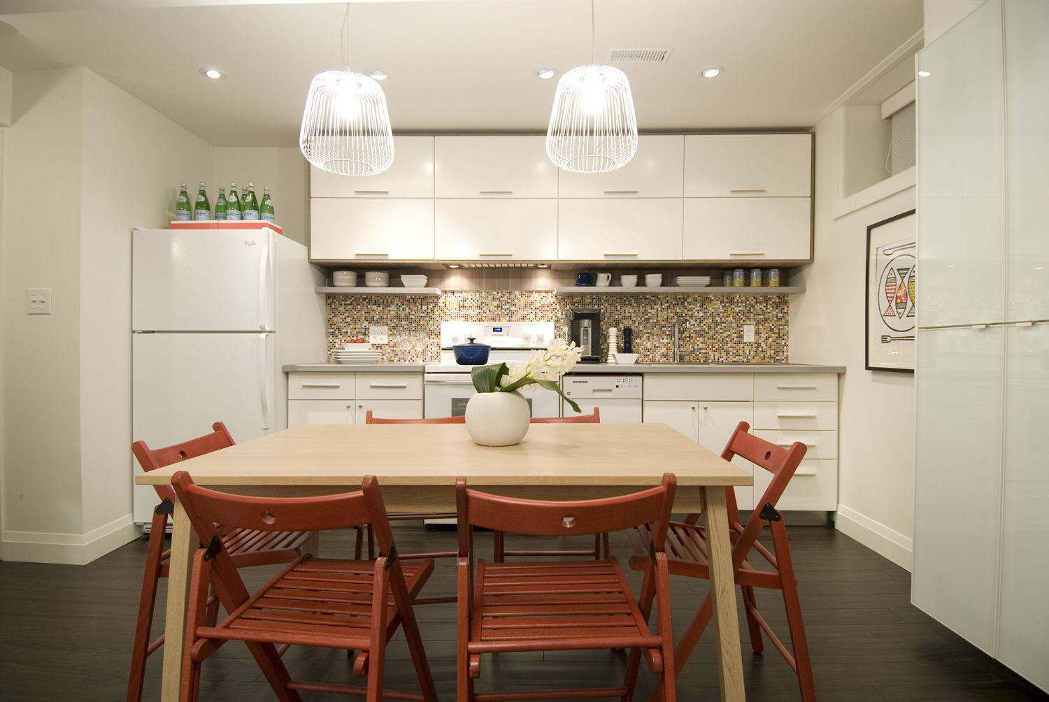
Add an Out of the Way Storage Shelf
An open shelf tucked just under the bottom of the cabinets creates a place to store everyday items — and frees up more room above.
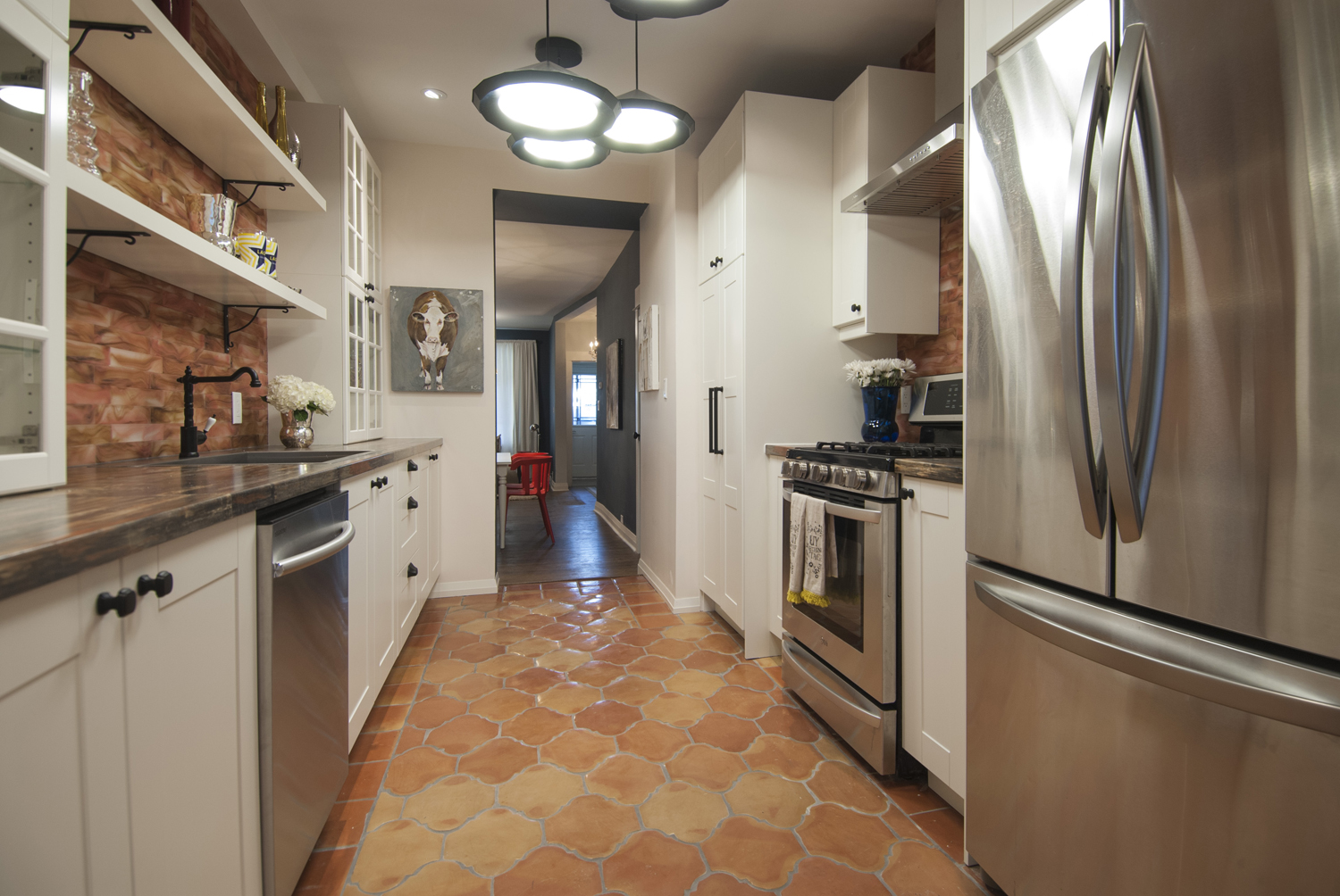
Old World Meets New
Clay tile floors add a bit of Spanish-inspired flair to an updated galley kitchen.
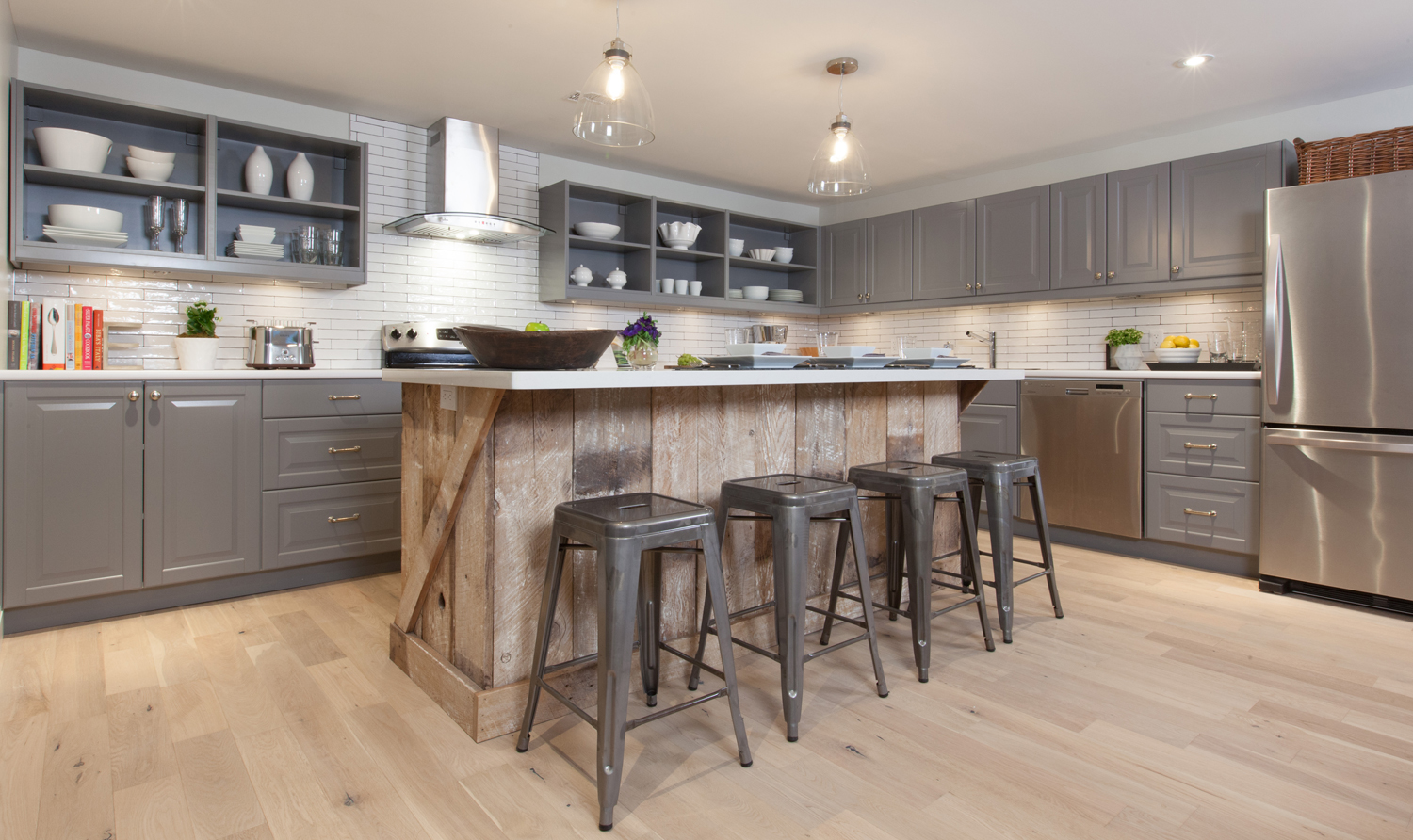
Make Your Island the Star
A wood-clad island lends a rustic vibe to an otherwise traditional kitchen.
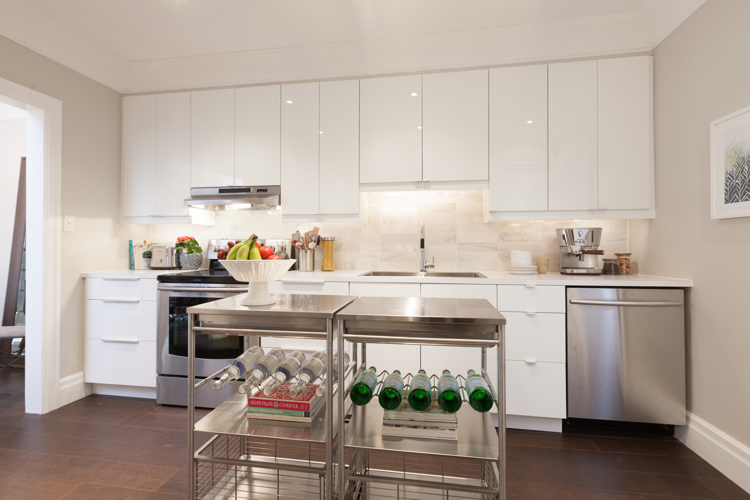
Two Becomes One
When you need an island, but don’t have the space or budget for something custom, try pairing two smaller shelving units together. This stainless steel island has a restaurant kitchen vibe and looks just right with modern cabinets.
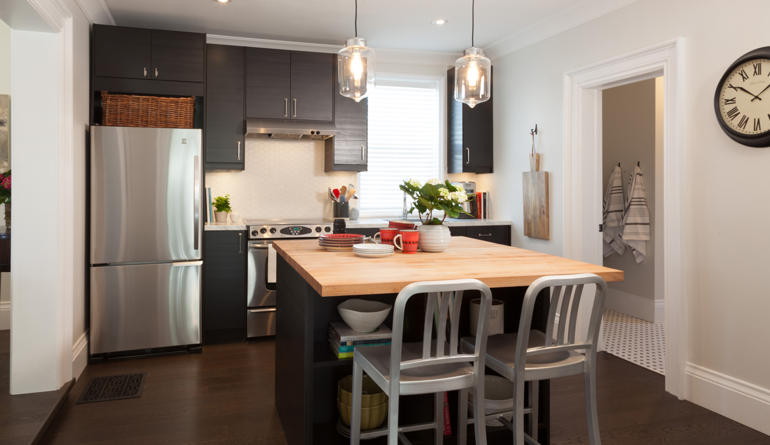
Sneak In More Storage
Turn an island into extra seating without sacrificing storage space with open shelving.
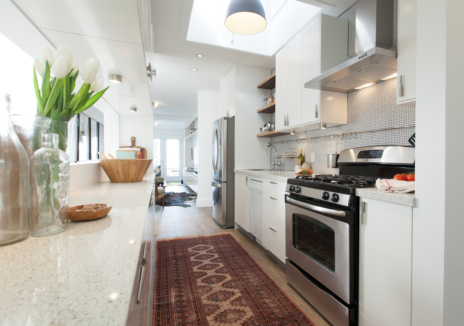
A Vintage Rug Always Works
There’s lots to love in this galley kitchen (the pendant suspended from the skylight alone is Pin-worthy), but that vintage runner is the star, adding personality and comfort. Plus, since it’s been around a while, you know it can stand up to high foot traffic.
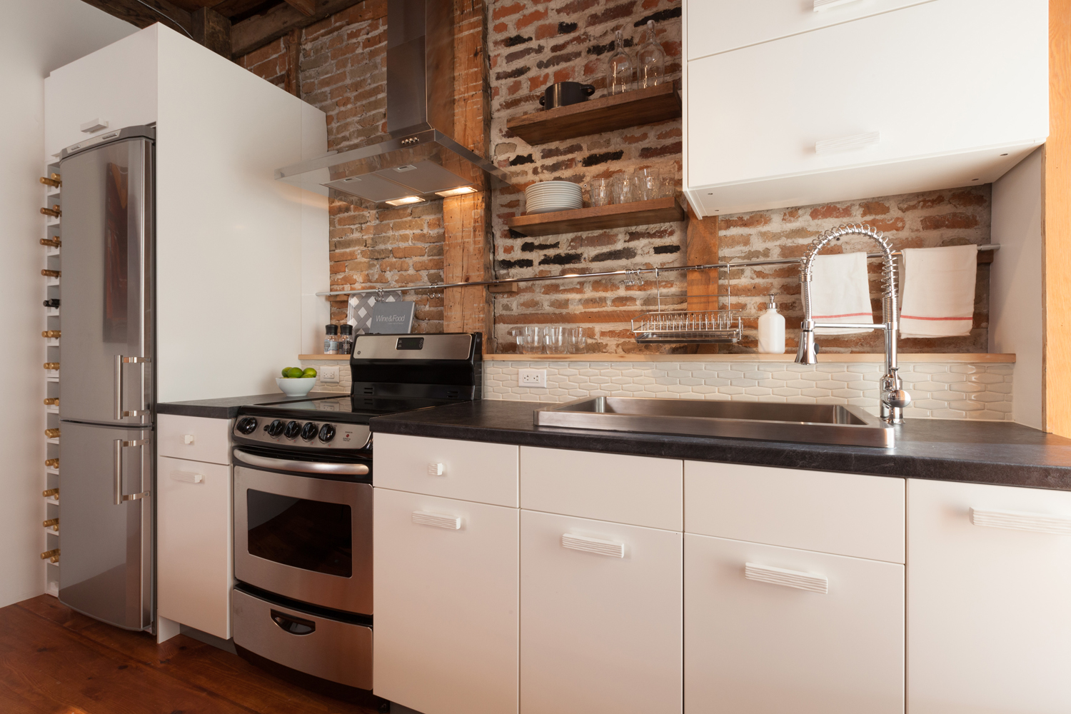
Make the Most of a Small Space
Steal this secret for a small kitchen: opt for a narrower fridge to add extra storage, whether as a wine rack seen here, or a pull out cupboard. Counter space lacking? No problem. Hang your dishrack and mugs from hooks on a mounted rod.
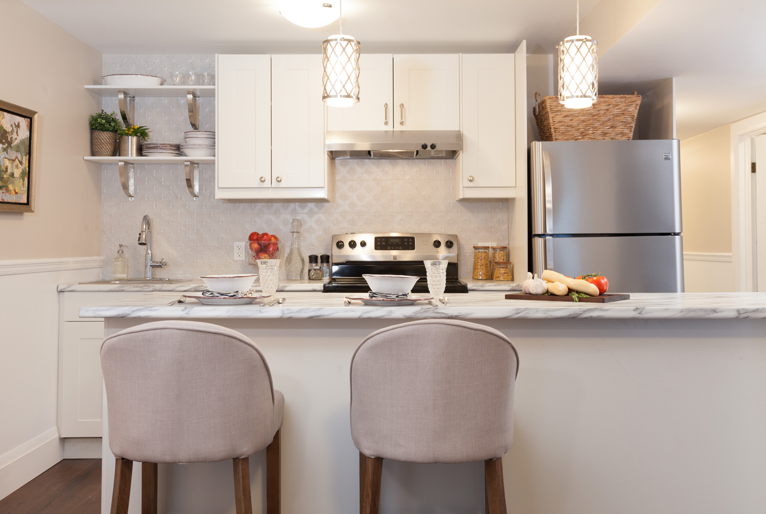
A Little Luxe Goes a Long Way
A small kitchen is the place to splurge on special countertops. Whether you chose the real deal or a marble look-a-like, there’s something about creamy stone swirled with ribbons of grey that just says luxury.
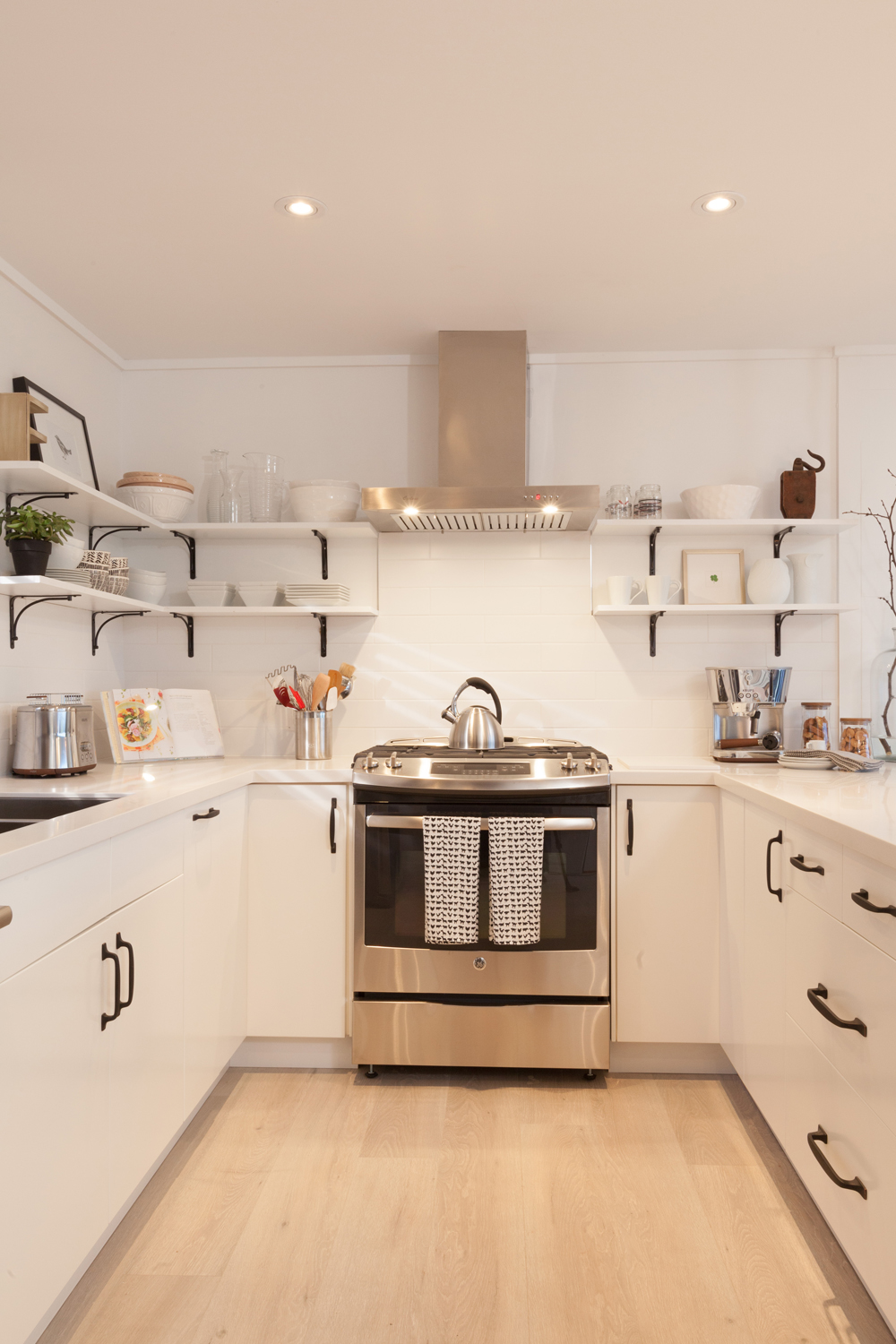
Open It All Up
If you are the organized type with dishware you’re dying to show off, don’t be afraid to do away with upper cabinets all together. Black hardware creates contrast to keep things interesting.
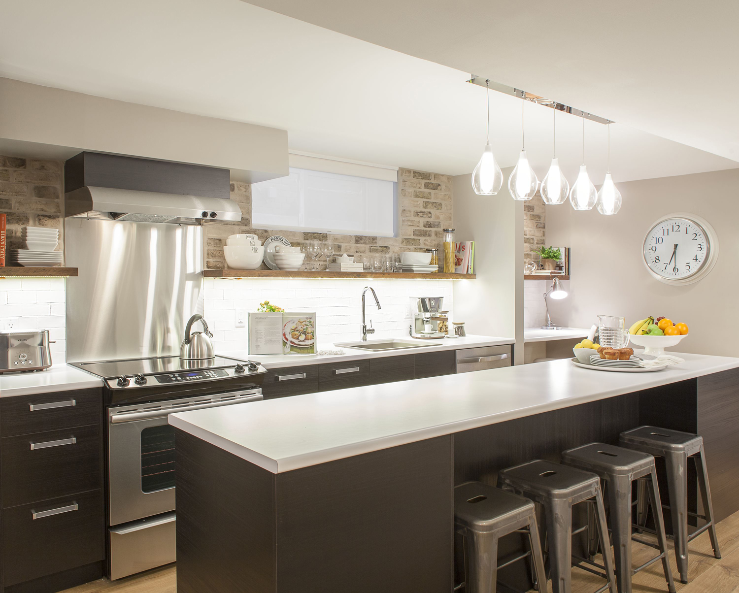
Long Island Love
Although you can’t see the other side of this island, it adds back the storage lost by not having upper cabinets, plus it doubles as a dining room table. Another design secret? Undermount cabinet lighting reflects off white counters to really bring the brightness.
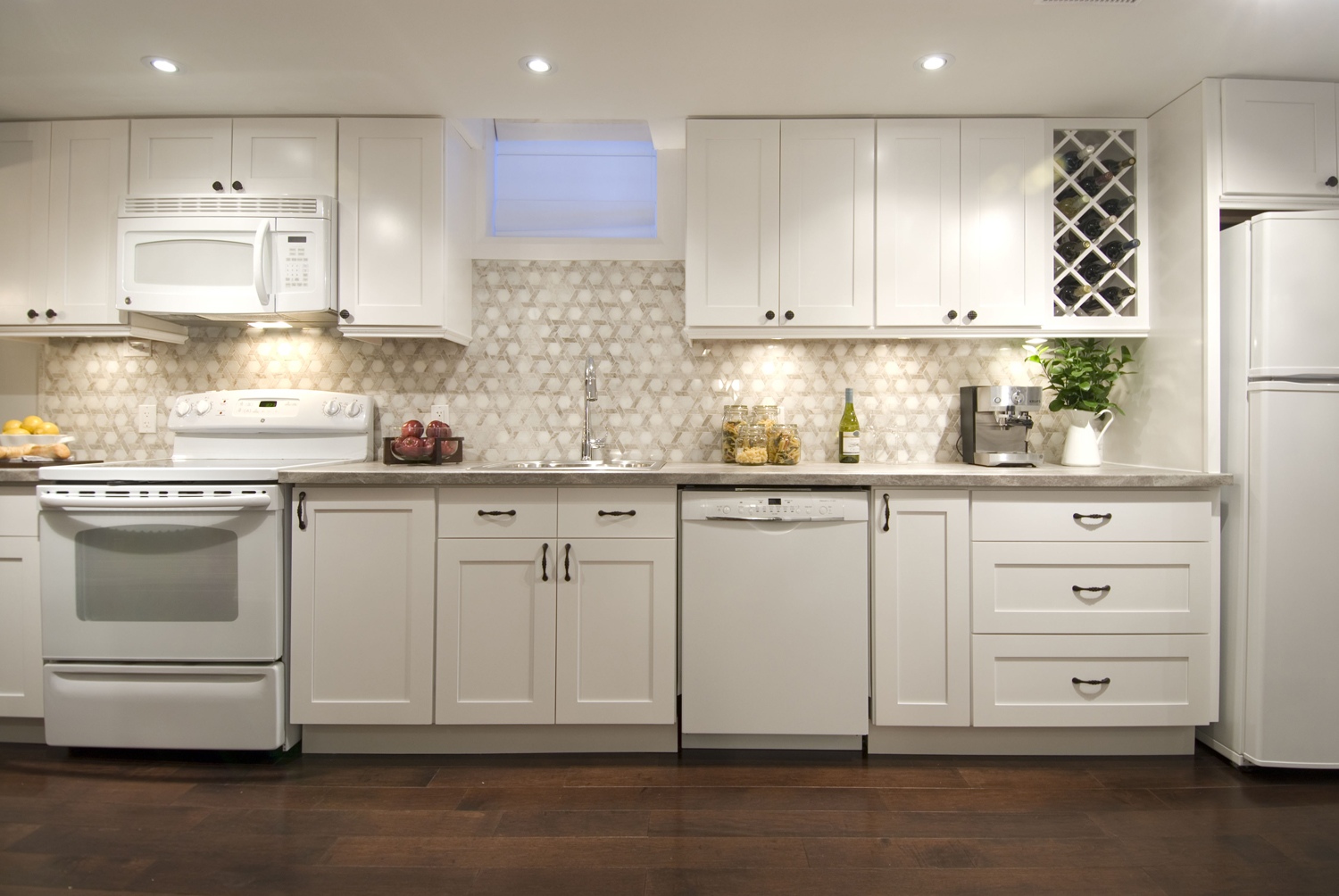
Line It Up
This layout is ideal for a long wall (perfect for a basement income suite) and you can always add an island for more working space. A subtle backsplash brings in pattern, but still keeps things light.
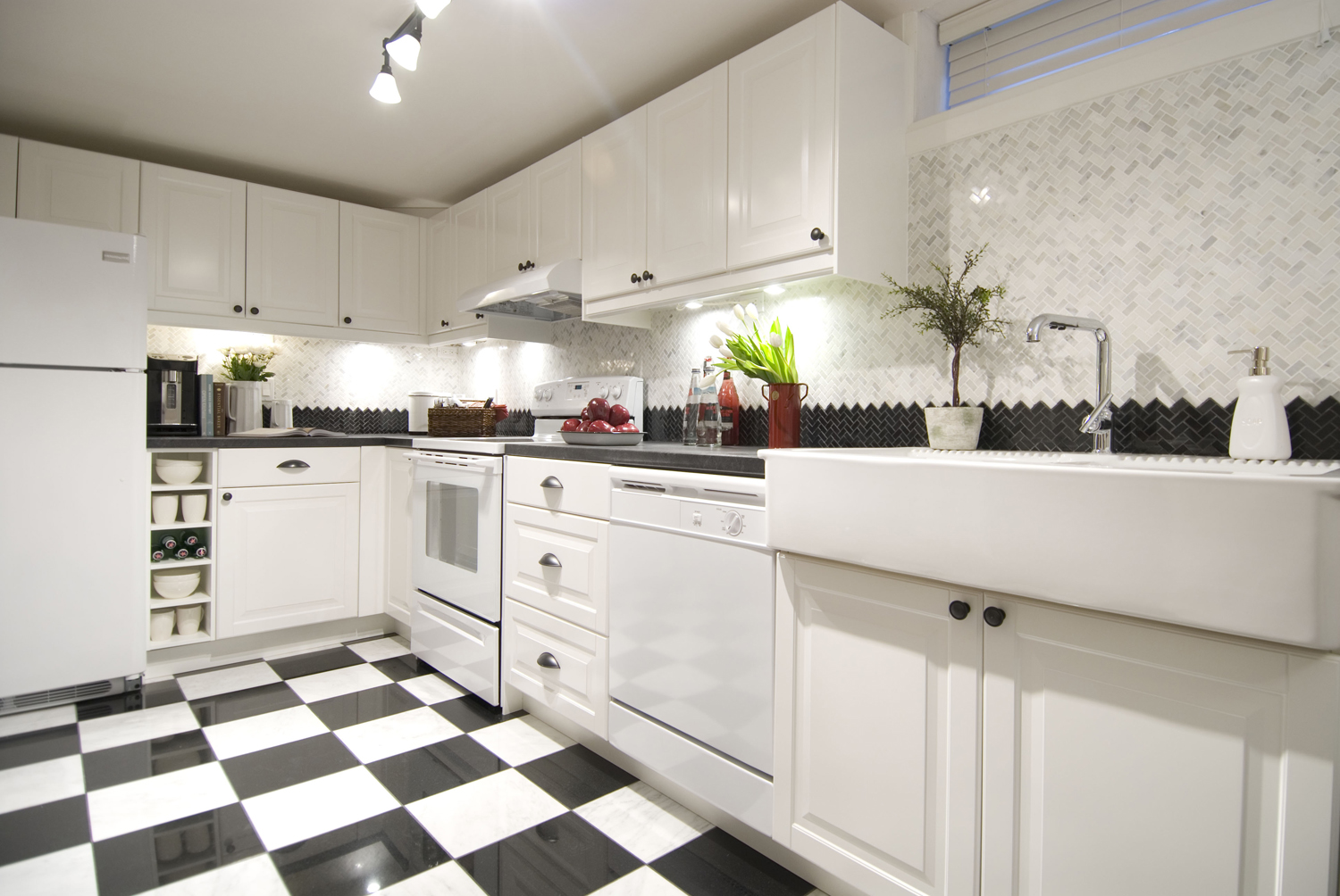
Get Creative With Your Backsplash
The more you look at this backsplash, the more “Why didn’t I think of that?” rings through your head. The contrasting tile could work in any colour, but the stark black and white really makes it stand out.
HGTV your inbox.
By clicking "SIGN UP” you agree to receive emails from HGTV and accept Corus' Terms of Use and Corus' Privacy Policy.


