When Aleisha and Justin bought their Trent Lakes, Ontario property, they envisioned vacation days with their kids and a place to spend quality family time. But when they realized they’d only used their property 10 days of the entire year, they knew it was time to turn their vacation home into a useful rental property. The only problem was that dark walls, an awkward layout, and no clear property lines made their home less than desirable to renters. Enter Scott McGillivray, designer Debra Salmoni, and the Vacation House Rules team. Here’s how they used donuts as inspiration for a fun, new family retreat.
Scott’s Vacation House Rules airs Sundays at 9 p.m. ET/PT on HGTV Canada. It is also available on the new Global TV App, and on STACKTV with Amazon Prime Video Channels. HGTV Canada is available through all major TV service providers.
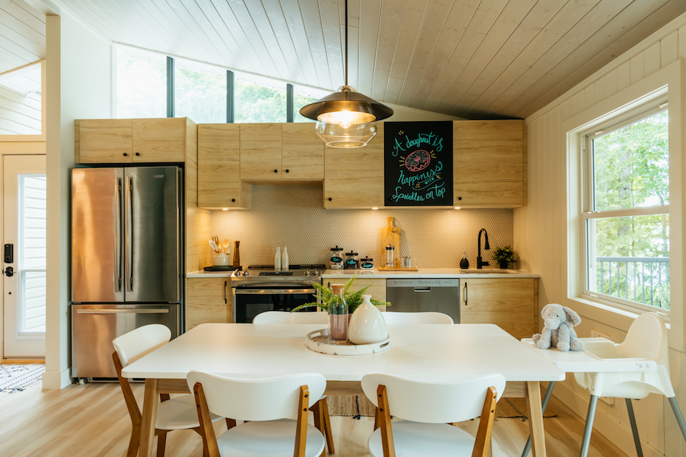
A Functional Family Space
Even in a cottage the home is where the heart is, so Scott needed to take the main room and transform it into a bright and welcoming space. A small kitchen along the back wall is useful and reflects light with natural wood finishes. Meanwhile, there are plenty of design elements to catch the eye – from the penny tile backsplash to the quartzite countertops. Add in a large table for the whole family and even a high chair for guests with young kids, and suddenly this is a desired family space.
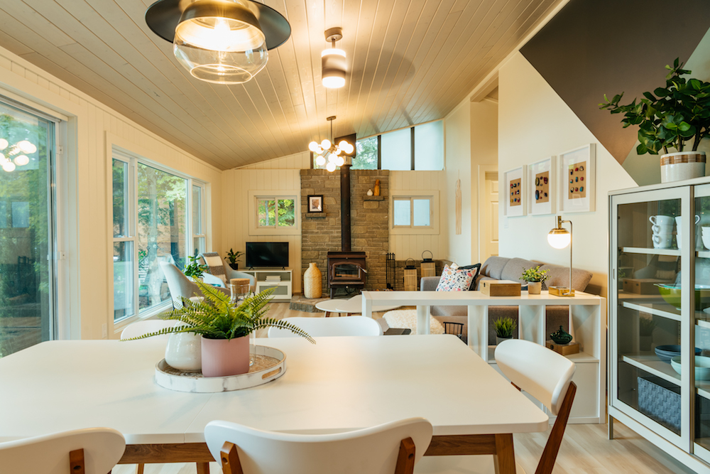
Room For the Whole Family
The kitchen opens up to the living room, creating a great main area with views to the water and property below. Scott kept the natural fireplace for charm and function, while creating proper insulation for the ceiling with Ready Pine, a pre-finished tongue and groove panels ceiling. An exposed hutch removes any guesswork for busy families about where items are located, and simple pops of pastel, donut-inspired colours on throw pillows and vases pull it all together.
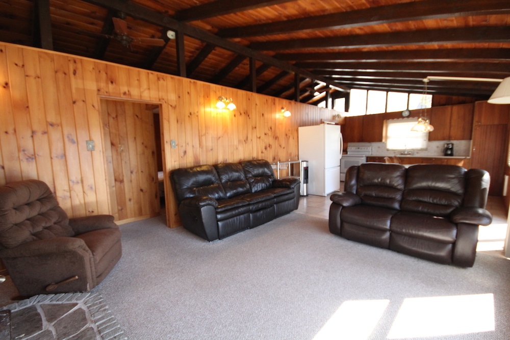
Before: A Whole Lot of Dark
It’s hard to imagine this was the same space before Scott and Debra arrived. Carpets are never a good idea in a rental, thanks to the way they attract and trap dirt and dust. Plus the pine walls – although rustic – sucked up all of the room’s light. Add in a ceiling with zero insulation, and this isn’t exactly a comfy spot for renters to hang out in every year.
Related: Scott McGillivray on Cottage Renovations: The Best and Worst for Resale Value
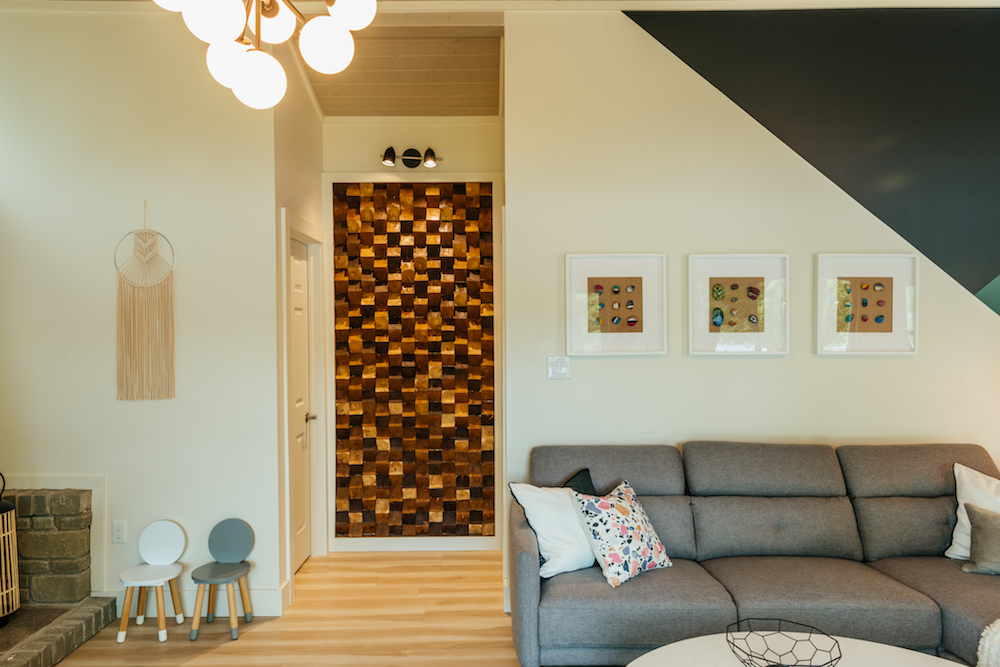
Creating Your Own Art
Decorating a cottage and giving it those home-like finishes doesn’t have to be expensive, at least not when you invoke a little creativity. On the main wall, Debra worked with the family to create budget-friendly rock art in shadowboxes, and then on the smaller wall leading to the bedrooms, she and Scott created this fun, 3D wall from pieces of stained wood cut at 30 degree angles.
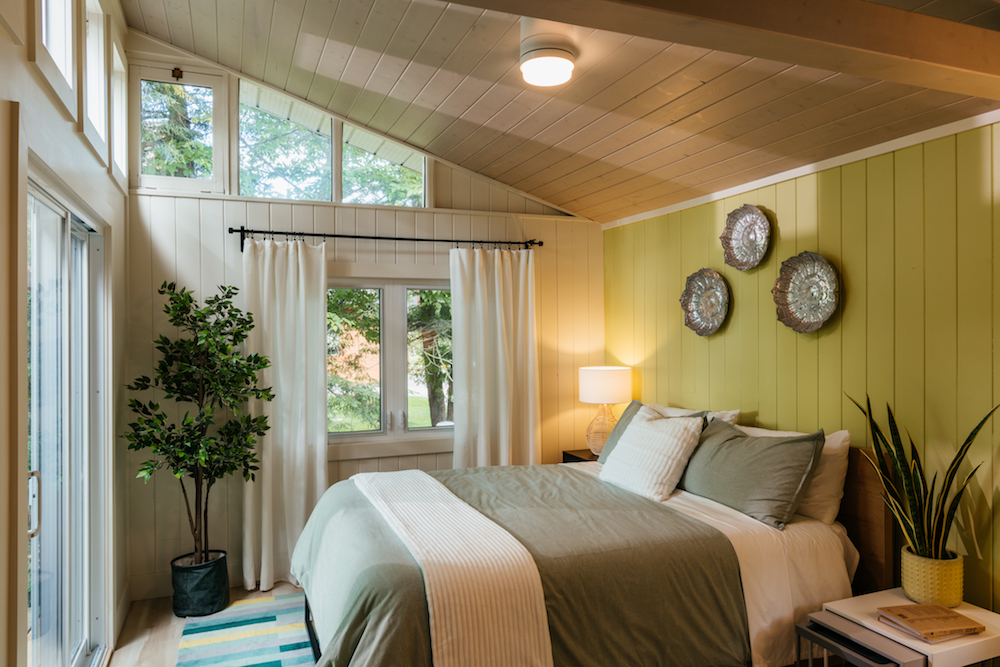
A Primary Retreat
Whoever calls the primary bedroom is probably the person footing the bill for the rental, so Scott likes to make the space feel like a retreat. In order to do that in this bedroom, they added that fun, donut-frosting-inspired green feature wall with inexpensive paint, and then added natural elements like the plants to make the room feel cozy and light.
Related: The 20 Best Bedroom Plants to Help You Get a Better Sleep
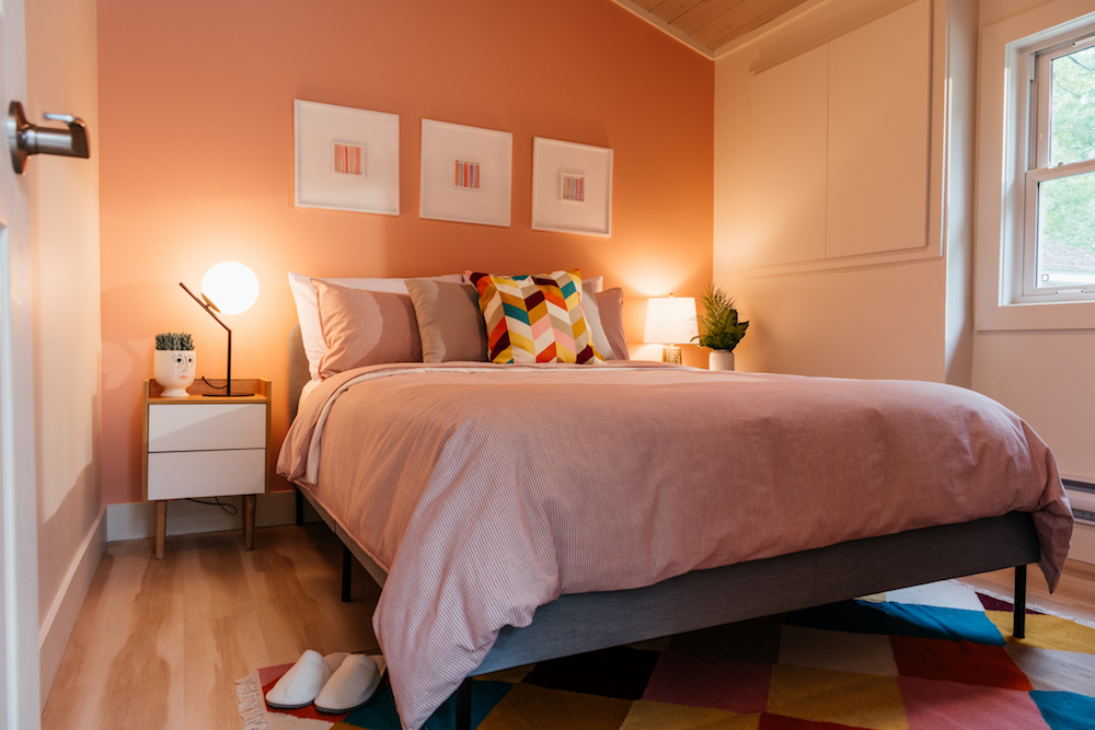
Some Pastel Inspiration
In the second bedroom, the team opted for a more whimsical colour scheme (every room in a cottage rental should have its own personality), opting for a simple bed and framed prints above, rather than a bulky headboard. Compact night tables and some additional lamps help keep the space bright, making it a great sleeping option for another couple or older children.
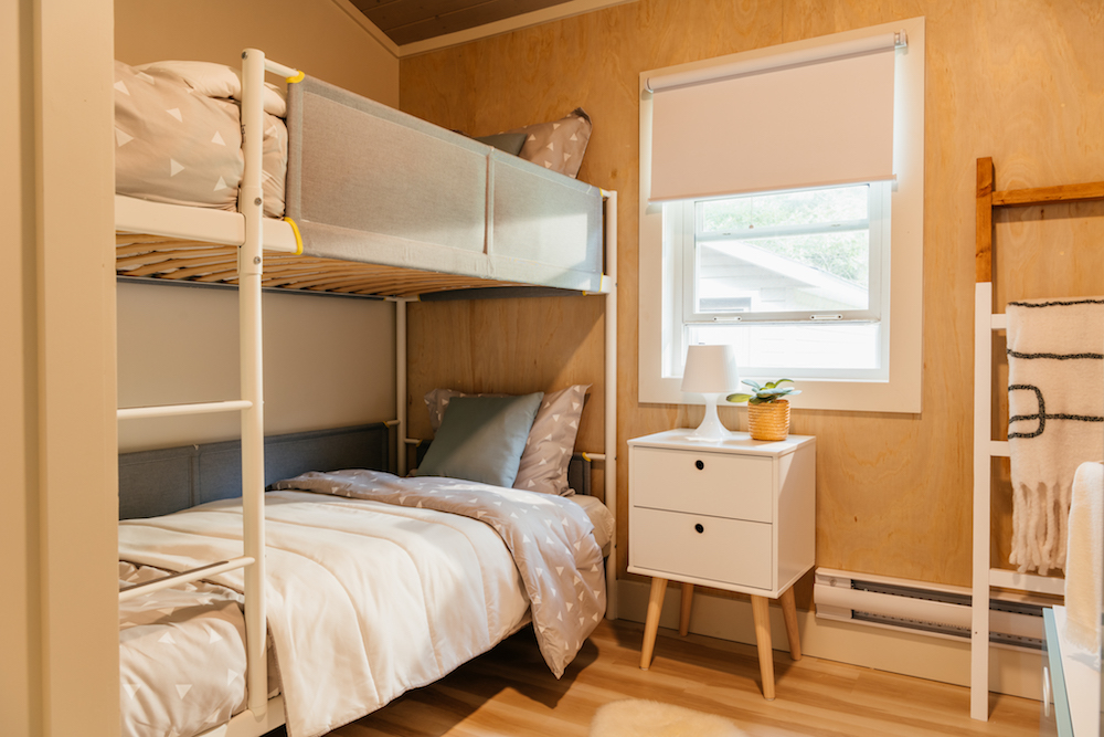
Heads In Beds
Scott took space from the larger bedroom to extend this third, smaller bedroom, and then used paint and light floors to make it feel like less of a box. Then, to increase rental potential he added a sleek bunkbed unit, making it a fun but safe place for younger kids to sleep when on vacation.
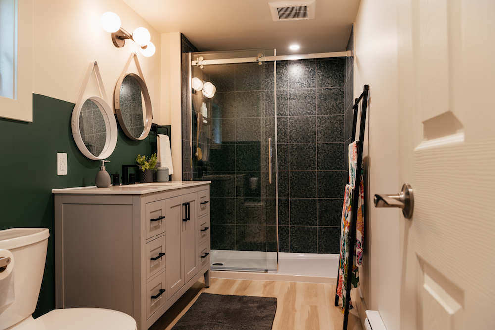
A Complete Bathroom Refresh
Before Scott got his hands on this property, the bathroom was the worst room in the house. With dark accents, a small shower insert, and a hot water tank snuggled right next to the shower, it was dark, dysfunctional, and not something that renters would be remotely interested in. By moving around the room, adding a real shower, and completing the space with a storage-friendly vanity, this is finally a bathroom that appeals to renters with families.
Revealing the View
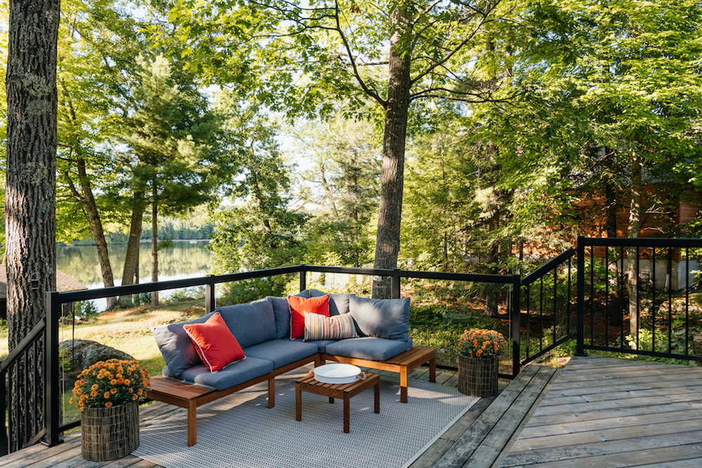
Although the deck itself was in good shape when Scott arrived, the existing safety railings obstructed the gorgeous view. So the contractor and his team built up these new glass panel safety railings instead, which keep families secure while also allowing renters to lounge deck-side and enjoy the beautiful views of the water.
Related: 10 Things to Consider Before Building Your Own Deck
Adding the Extras
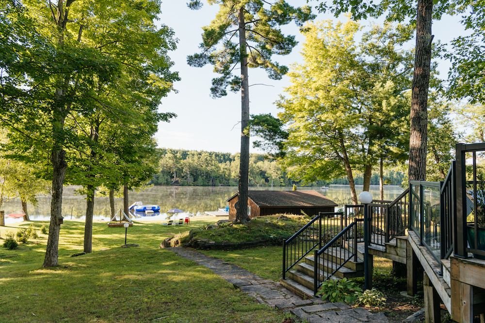
To complete this overhaul, Scott added shrubs to easily define the property line, a homemade sandbox for the kids, and a water trampoline to really up that fun factor and keep families wanting to return to the property year after year. Before, a three-bedroom property like this in the area would have gone for $300 a night during the busy season. Now, with all of that delicious donut-inspired TLC, Scott is confident this family can pull in $400 per night. With that kind of money on the line, this family no longer has to feel bad about only using their property 10 days of the year.
HGTV your inbox.
By clicking "SIGN UP” you agree to receive emails from HGTV and accept Corus' Terms of Use and Corus' Privacy Policy.


