Sisters Erin and Meghan knew there was a ton of potential in this 1875 farmhouse when they invested in the charming Prince Edward County property. In their minds, the guest house addition would make for the perfect short-term vacation rental property. But with an inconsistent layout, awkward spaces, and rusty finishes they needed help. That’s where Scott McGillivray, designer Debra Salmoni, and the Vacation House Rules team stepped in to save the day. See how the team kept the property’s charm while injecting modern updates, transforming this rental into the ultimate harvest retreat.
Scott’s Vacation House Rules airs Sundays at 9 p.m. ET/PT on HGTV Canada. It is also available on the new Global TV App, and on STACKTV with Amazon Prime Video Channels. HGTV Canada is available through all major TV service providers.
Creating a Focal Point
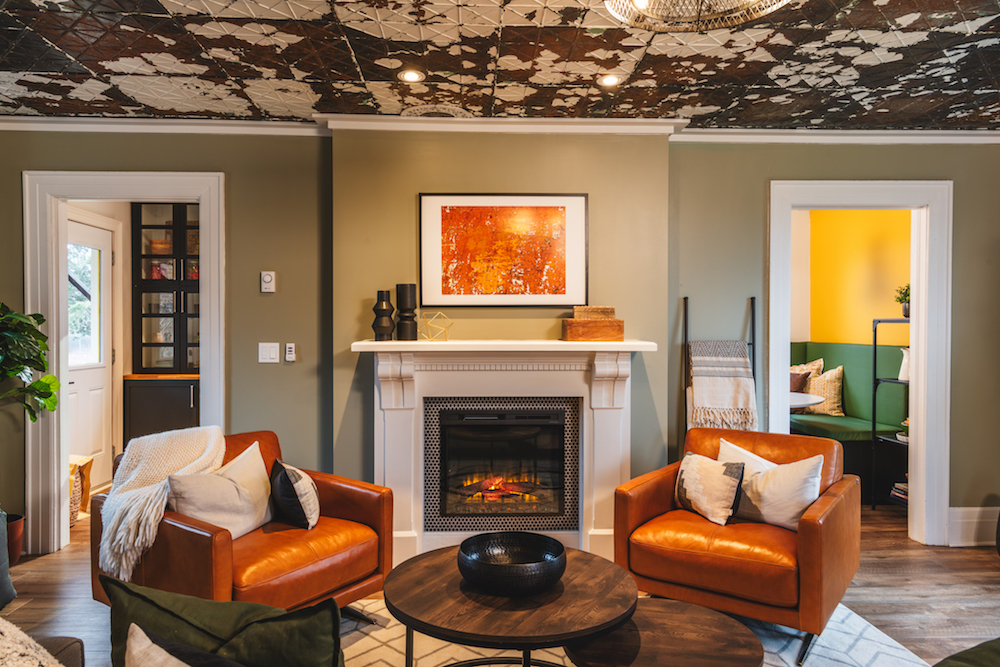
As soon as you walk into this charming farmhouse-inspired rental, you’re brought into the main living room area. In order to make it feel warm and inviting, the team needed to create an anchor on the wall by way of this fireplace. The mantle is an old piece salvaged by Scott at an antiques store, but thanks to the electric insert it gives off those warm and welcoming vacation vibes.
Related: 12 Gorgeous Home Decor Ideas for Styling an Empty Living Room Fireplace
Exposing the Bones
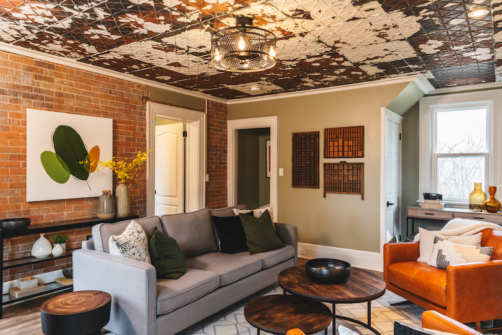
Even more notable than the fireplace in this main living space is the gorgeous tin ceiling. It’s a unique feature that brings instant character to the room, especially after Scott cleaned off the chipped paint and sealed the surface. Now, it looks like an original feature that has been properly maintained and cared for, and next to the exposed brick it definitely feels appropriate in this retro farmhouse design.
Dark and Unwelcoming Finishes
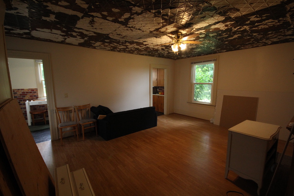
Here’s a glimpse of what the room looked liked before Scott and the team got their hands on it. Not only was this ceiling in dire need of some TLC, but the entire living room felt uninviting and cold. It’s amazing how much this space has transformed with a little lighting, a fireplace, and the addition of warm, fall-inspired colours.
Related: These Stylish Ceiling Ideas Will Inspire You to Reach New Design Heights
A Modern but Classic Kitchen
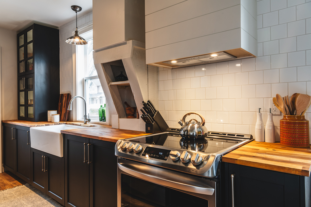
Rather than opening up the main living space like in so many other renovations, Scott kept the kitchen separate in order to play up the old-farmhouse layout and charm. Kitchens back then weren’t huge, but they sure were functional. In this design, dark cupboards and butcher block countertops combine for a look that perfectly balances the old and new.
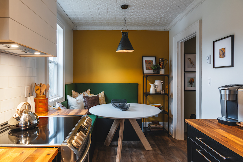
Custom Banquette
To get the most out of the space and to create an eat-in area for renters, Scott and Debra constructed this customized corner banquette. The unit is functional but it doesn’t impede the room’s overall flow, much like the circular table, which tucks away while offering lots of seating when needed. Add in that same tin ceiling, which is painted white to help brighten up the space, and it’s the ultimate place for a breakfast of farm-fresh eggs and smoked bacon.
Related: 20 Gorgeous Kitchens That Will Inspire You to Embrace Open Shelving
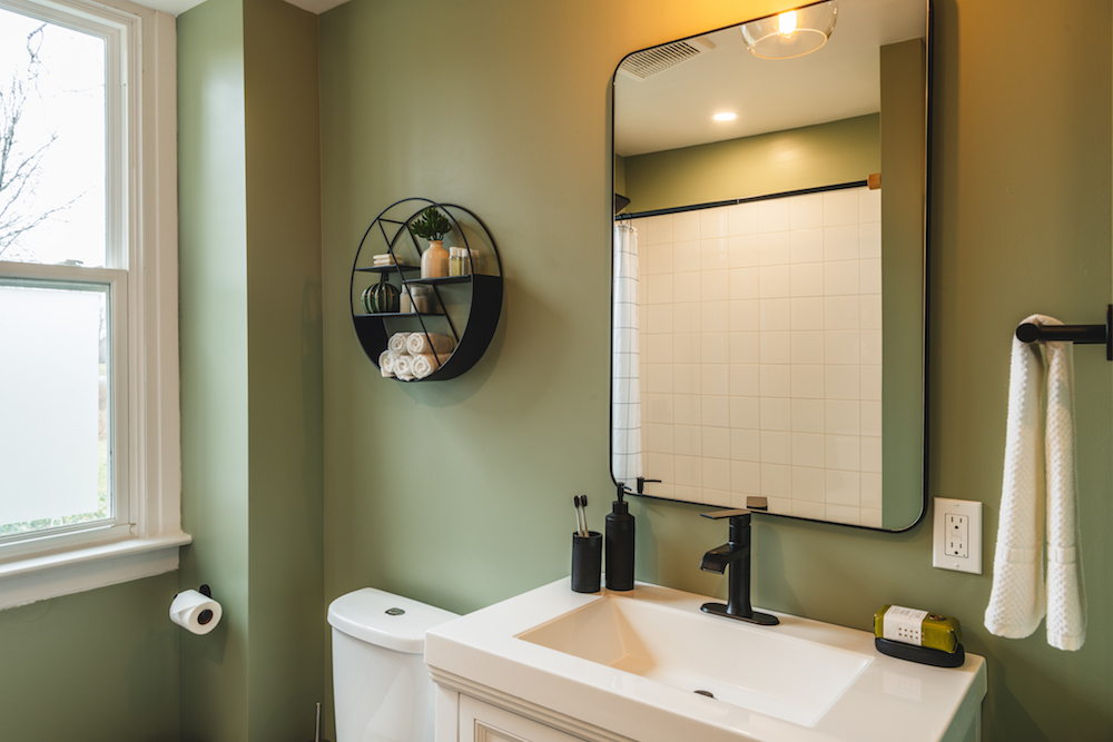
Bringing the Bathroom Into This Century
When you stay at a vintage vacation home, you expect lots of throwback finishes. Except in the bathroom, which is the best place to go a little more modern. That’s why Scott completely overhauled the old bathroom and redid it with new classic fixtures and finishes. He also added in a laundry unit, which is great for guests and for turning around the property quickly between rentals.
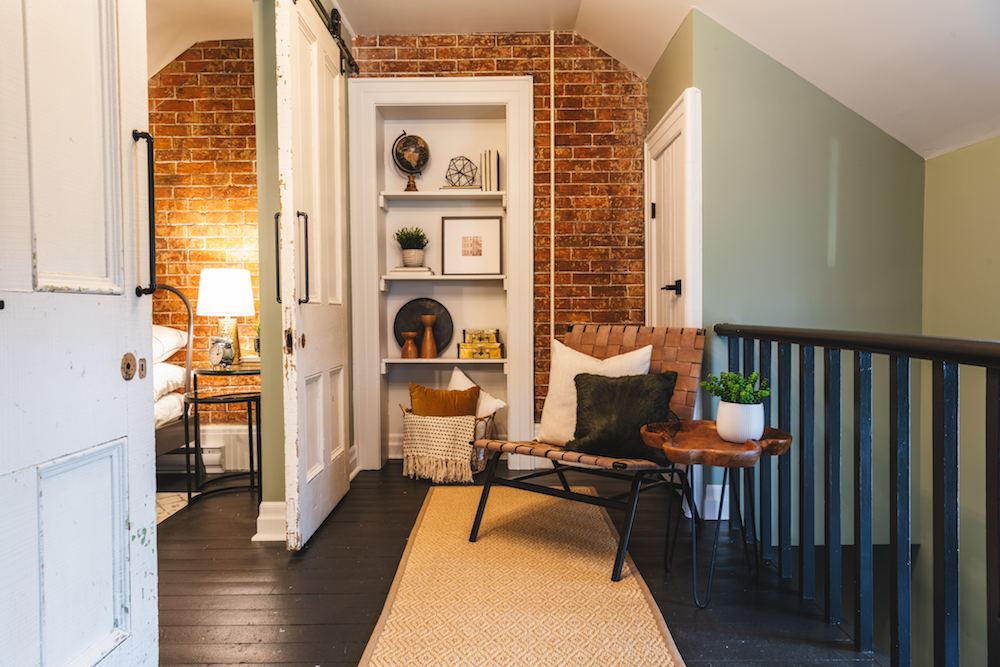
Defining the Upstairs Space
Before the renovation, this unit featured one bedroom and an awkward open space that had a ton of potential. So, Scott upped the rental potential by creating a charming landing and a second bedroom, separating the space with vintage sliding doors that he procured at an antique shop.
Related: Top Reno Ideas to Increase the Value of Your Rental Property
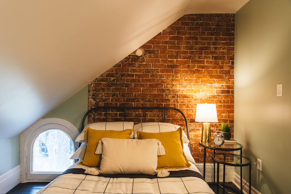
A Sweet Little Sleeping Space
On the other side of the sliding doors is this cozy bedroom that can sleep up to two extra people, which is always a plus when you’re trying to maximize your listing price. The exposed brick wall only adds to the charm, simple finishes keep the area streamlined, and what could have been an awkward window, adds just the right amount of light.
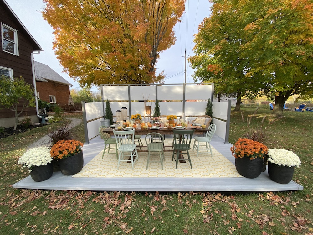
Getting Ready for the Harvest
Because this property has septic tanks and all kinds of other things going on beneath the generous backyard surface, it was impossible to dig down and install an actual deck. So Scott came up with this floating deck, which adds an outdoor dining area that can easily transport if Erin and Meghan want a change. Meanwhile the screen offers potential renters extra privacy, and the vintage chairs and the harvest table continue that rustic farmhouse theme outdoors.
Related: How to Give Your Deck a Makeover in a Single Weekend
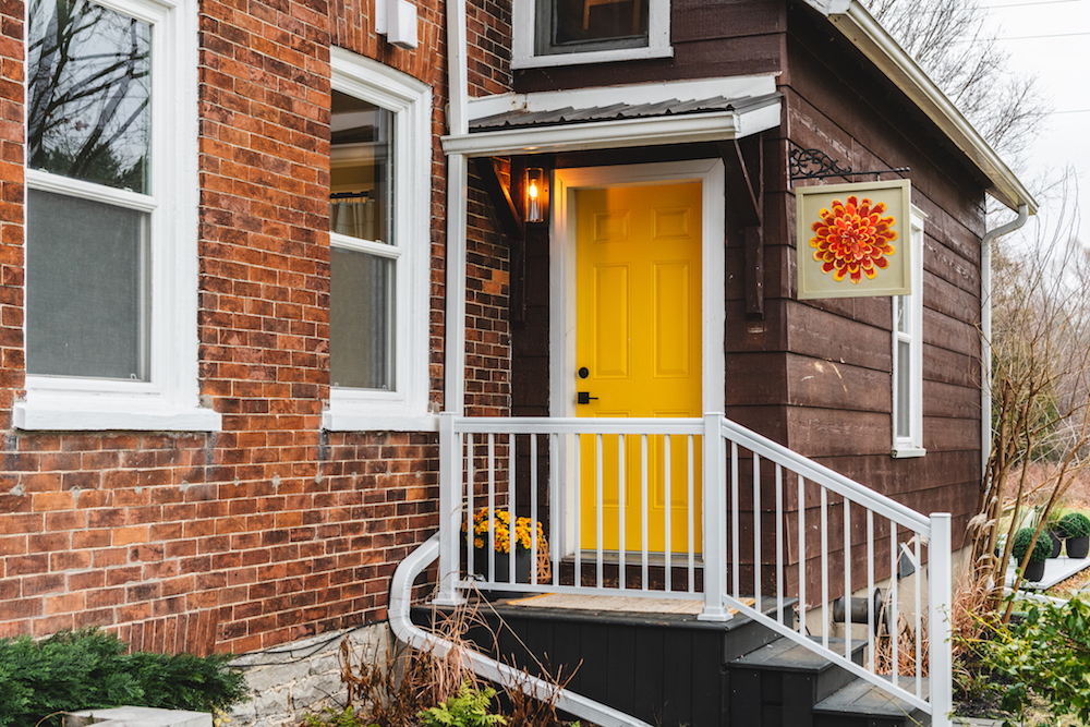
A Stay at the Marigold
In order to really make this rental stand out, Scott painted the front door a bright and welcoming yellow, and installed this homemade sign from the sisters’ father. Small, finishing touches like these, coupled with the functional but charming renovation choices inside, result in a space that Scott feels the sisters could rent out for $350 a night. Now that’s a vacation income property worth celebrating with a bountiful harvest.
HGTV your inbox.
By clicking "SIGN UP” you agree to receive emails from HGTV and accept Corus' Terms of Use and Corus' Privacy Policy.


