Designer Jessica Touhey didn’t hesitate to paint over the natural surfaces of this Yellowpoint neighbourhood home. In fact, she happily applied many coats of crisp white paint to bricks and wood, reinvigorating their dour look with some fresh inspiration. It was just what the homeowner wanted and provided a breezy backdrop to the nautical accents placed throughout this seaside abode.
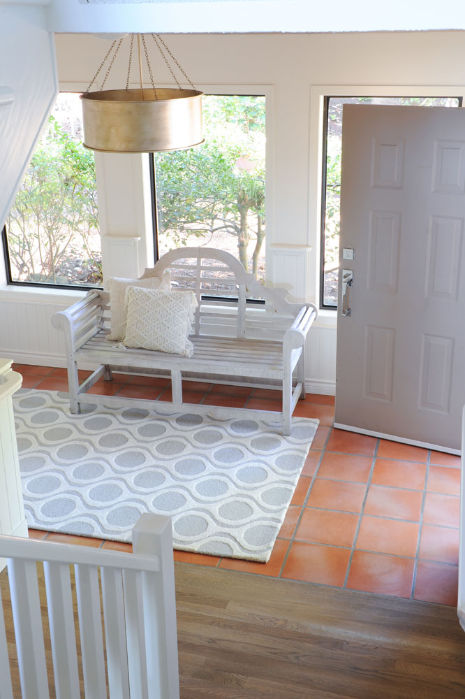
Terra Firma
“I love terracotta tiles!” says designer Jessica Touhey. Even so, she had to admit that these ones in the home’s entryway looked a little dated when she first spied them next to the original dark walls and trim. “I remedied that by lightening up the whole space with white paint and light-coloured furnishings. Now the terracotta takes the main stage and creates a very warm and welcoming space.”
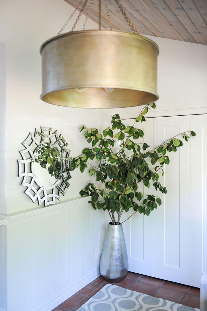
Metal Winner
“I try to incorporate metallics into all my spaces,” says Jessica. “They add such great textures and create a luxurious feel. Plus, the gleam captures the eye.” We love how she mixed this bold brass drum pendant with accents in unexpected silvery tones. “I don’t get too fussed about matching metals, as long as the overall look is pleasing.”
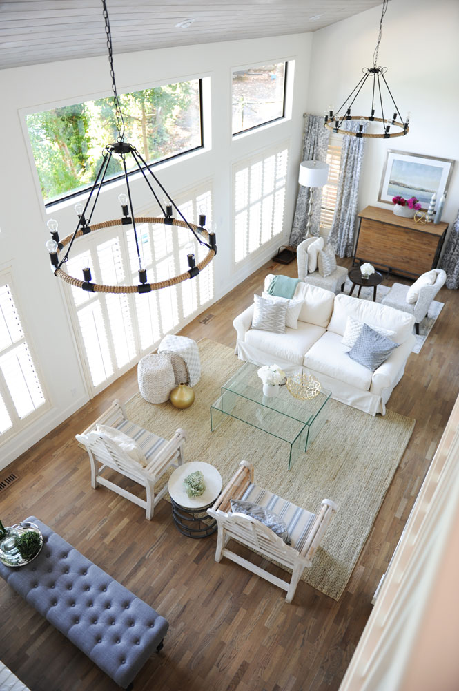
New Heights
Ceilings this high can be a challenge, even for an experienced designer like Jessica. “They are the best feature of the living room but, yes, also the most challenging aspect in terms of design,” she says. “I wanted to celebrate the height, yet refrain from making it overwhelming and still provide a sense of coziness.” Her choice of chandeliers handily solves the dilemma. Hung low, they reference the scale of the room, while downplaying how high the peak is. The spiffy rope fabrication channels the desired nautical vibe.
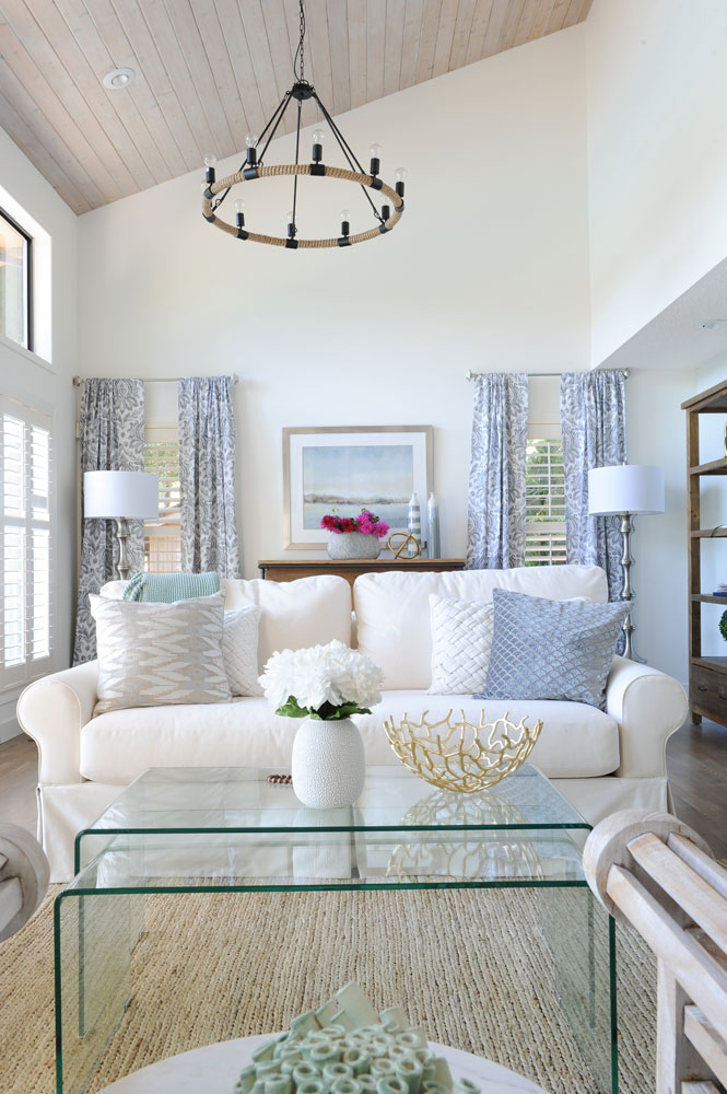
Get Comfy
If you want to sink into this sofa like we do, then Jessica knows she’s done her job right. “Light and airy was the name of the game here,” she says. “This slip-covering looks like fresh bed linens and is so inviting you just want settle in here.” Her expertise with the soaring ceiling height is also noticeable in the drapes, which she hung as though they were in a single-storey room. “Again, this was a method to bring the visual space down and create a more comfortable feeling.”
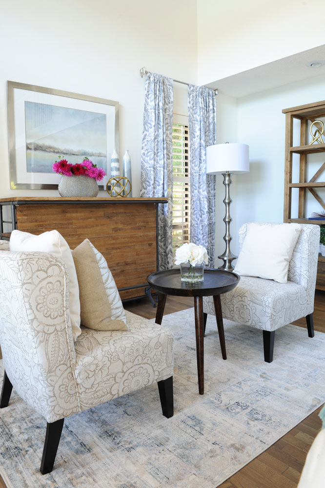
Planning Zones
This vignette is beautiful proof that furniture doesn’t need to be pushed up against the walls, especially when there’s room to spare. “With a space this large there was opportunity for multiple seating zones. These chairs are light enough to be pulled into the centre of the space when the owner is entertaining a crowd, yet they still work here tucked behind the sofa as a cocktail area or a spot to read.”
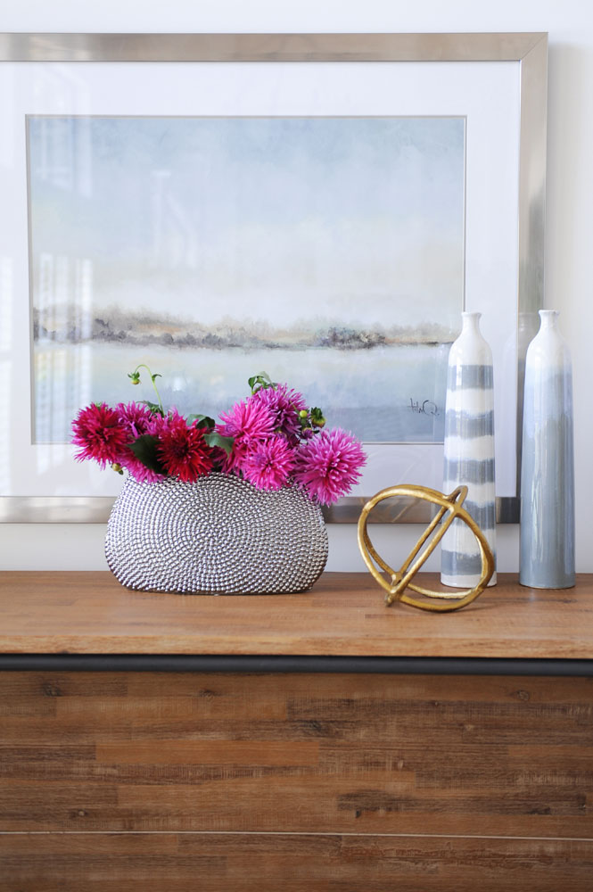
Raising The Bar
Watery-blue accessories and artwork that reference the home’s beachside setting rest on a handsome chest with an entertaining secret. “When pulled out, it acts as a bar with service shelves on the other side,” says Jessica. “It’s perfect for displaying signature cocktails that guests can grab and take down to the deck.”
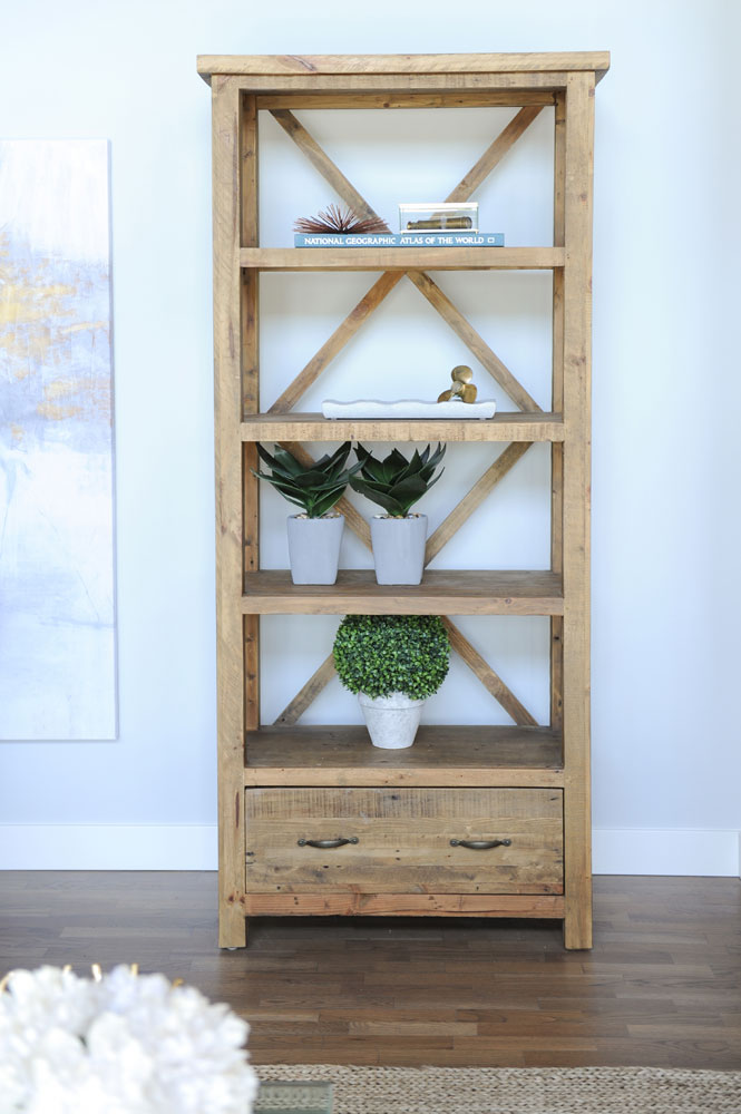
Show Off
This bold piece of furniture is more than just show. Jessica says, “While it displays collections of found items and pieces from local artists, its bleached wood nicely plays into the colour scheme, and the large criss-cross scale balances the loft-like ceilings.”
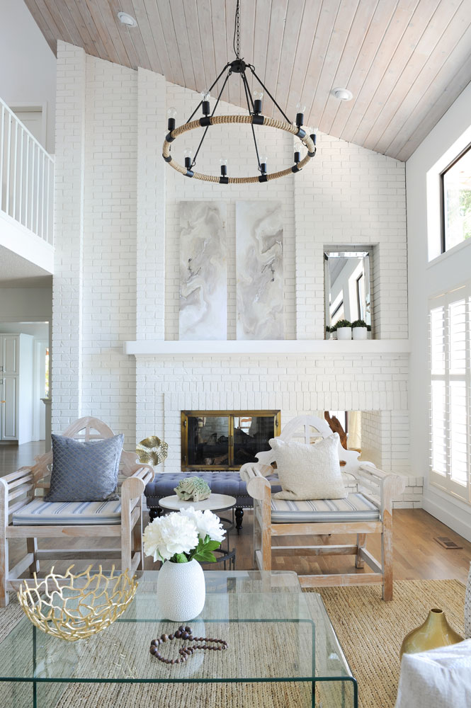
White Out
Even those with a phobia of painting brick will be won over by this makeover. “White paint here made one of the most significant transformations in the home,” says Jessica. “The brick fireplace is absolutely massive, and its original dark front made it seem even more so. Plus, it can be seen from almost all areas in the home. By painting it white, we retained its beautiful texture and still were able to create a light, airy space.”
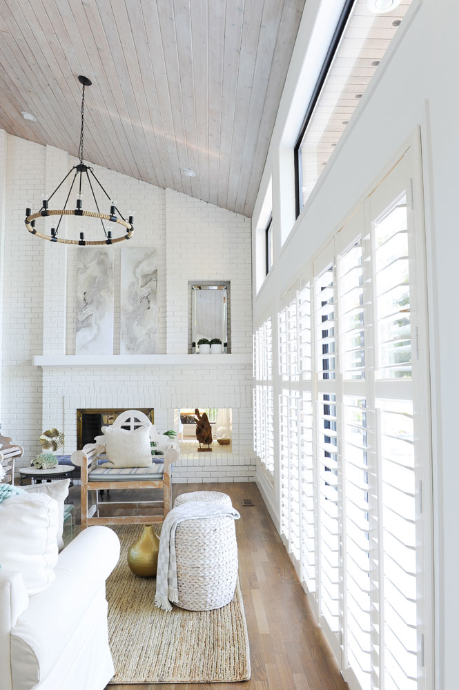
Shutter Island
Jessica chose white shutters both for their practicality in this sun-drenched room and their cool beach-house vibe. She sourced artwork in colours that complement the room’s palette, while their elongated shapes draw the eye to the fireplace and upward. The beach also inspired the choice of rug. “The seagrass brings more texture to this very white space, adds a bit of a natural warmth and reminds me of an element you’d find washed up on the shore.”
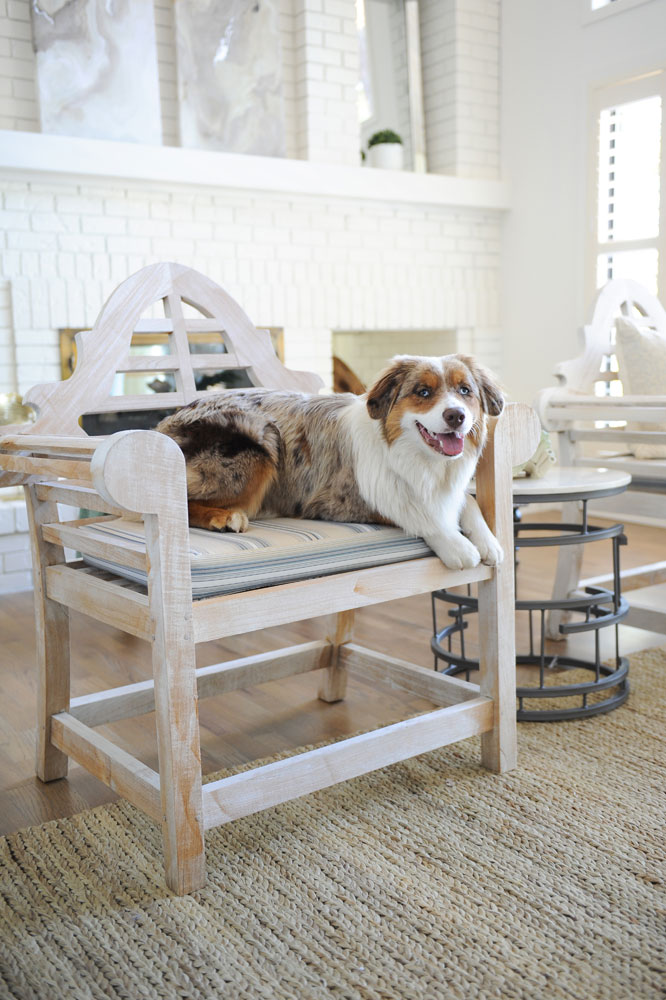
Decked Out
When Jessica sees something she likes, she grabs it – no matter what (or where). “I actually pulled these wooden chairs in from off the deck!” she says. “I love their strong shape and the colour of the naturally bleached teak.” It seems like Autumn, the owner’s dog, loves them too. The outdoors-in repurposing is an inspirational idea to copy, especially on the West Coast.
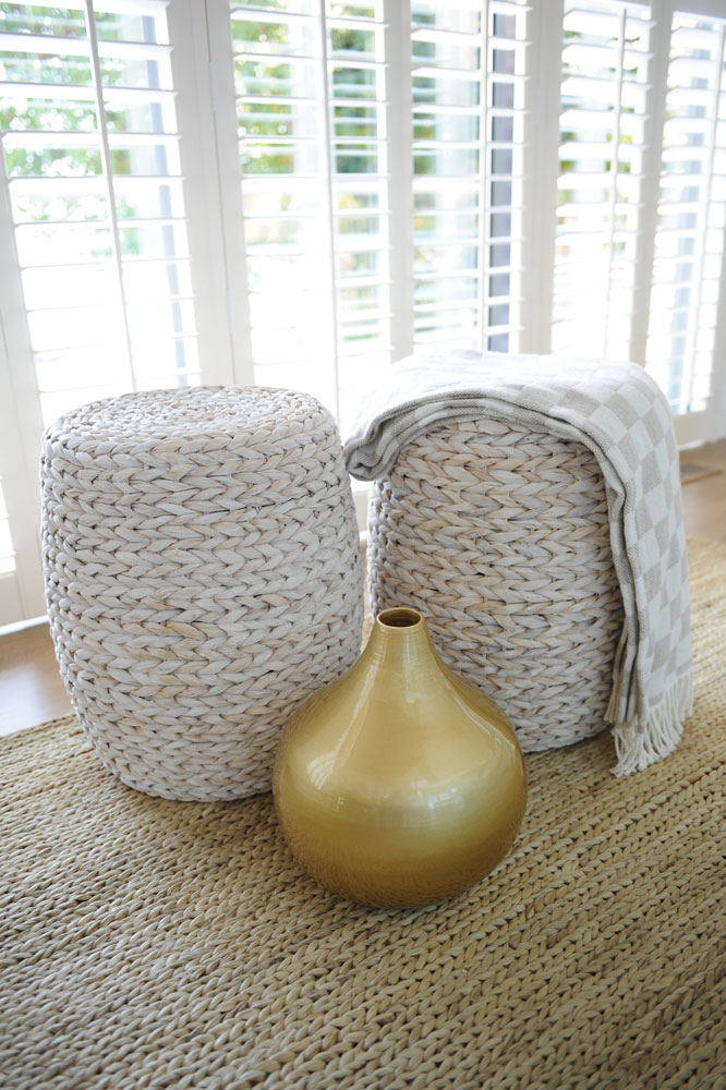
Get Roped In
Jessica found these gorgeous woven garden stools at a local shop, Flying Fish, in Nanaimo. They complement the seagrass rug and are nicely juxtaposed with one of the designer’s favourite elements: something metallic.
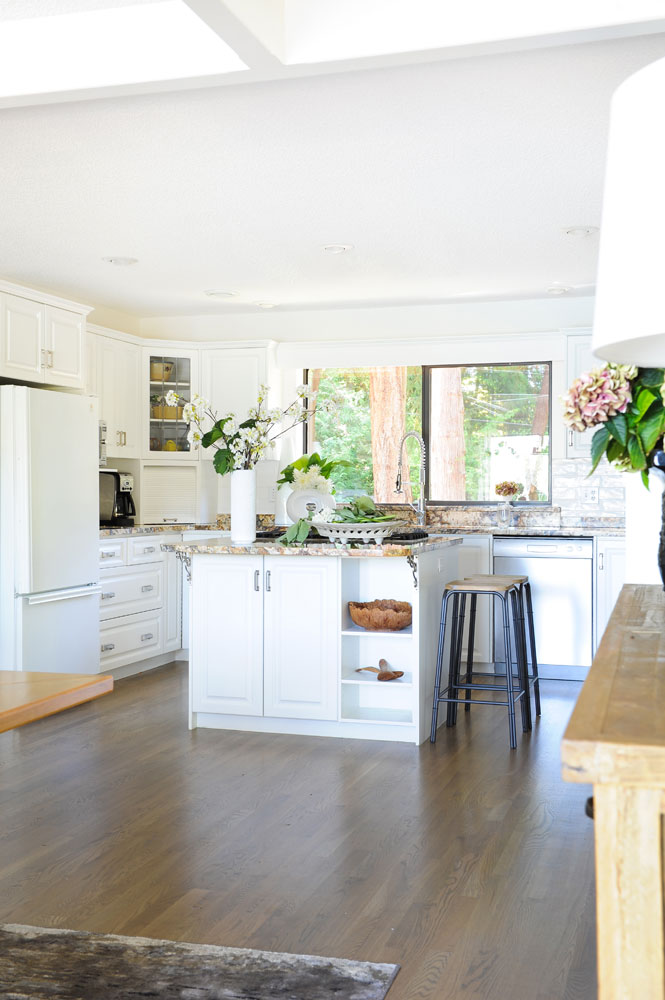
Blend Well
Because the kitchen isn’t that large, Jessica painted the original dark cabinetry white so it would blend in with the rest of the open-plan first floor. “We didn’t have the budget to add a new fridge with custom panels, and a stainless option would have appeared too industrial, so we kept the white and let it ‘disappear’.” The granite countertops in earthy hues, an original feature, lend a warm element.
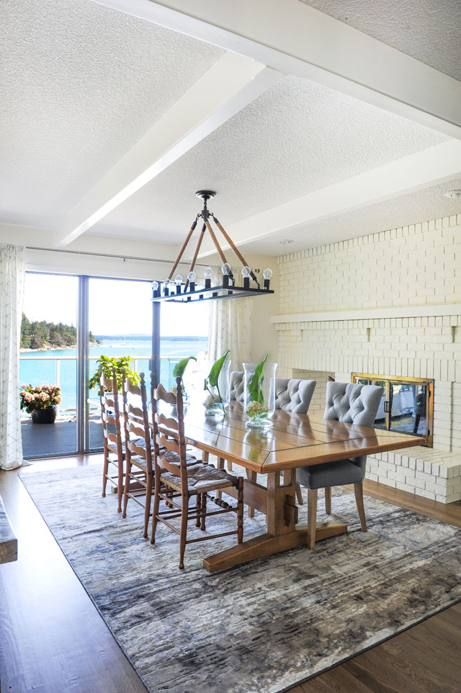
Tuft Love
The dining room features ladder-back chairs (made by the homeowner’s late husband) mixed with an unexpected style. “I added in some upholstered chairs for warmth and visual comfort,” says Jessica. Together these two looks have a dynamic energy and are almost as compelling as the jaw-dropping view to the water.
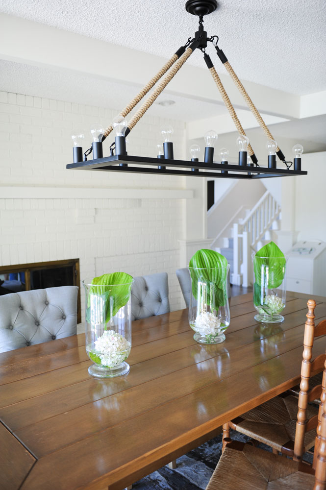
Very Nauti
The dining room enjoyed the same nautical approach that Jessica applied to the living area. “This chandelier and its ropey arms bring a beachy vibe to a formal space.” Its rectangular shape nicely echoes the table beneath it, and we love the easy-to-replicate floral arrangements of a single bloom and leaf in a hurricane vase.
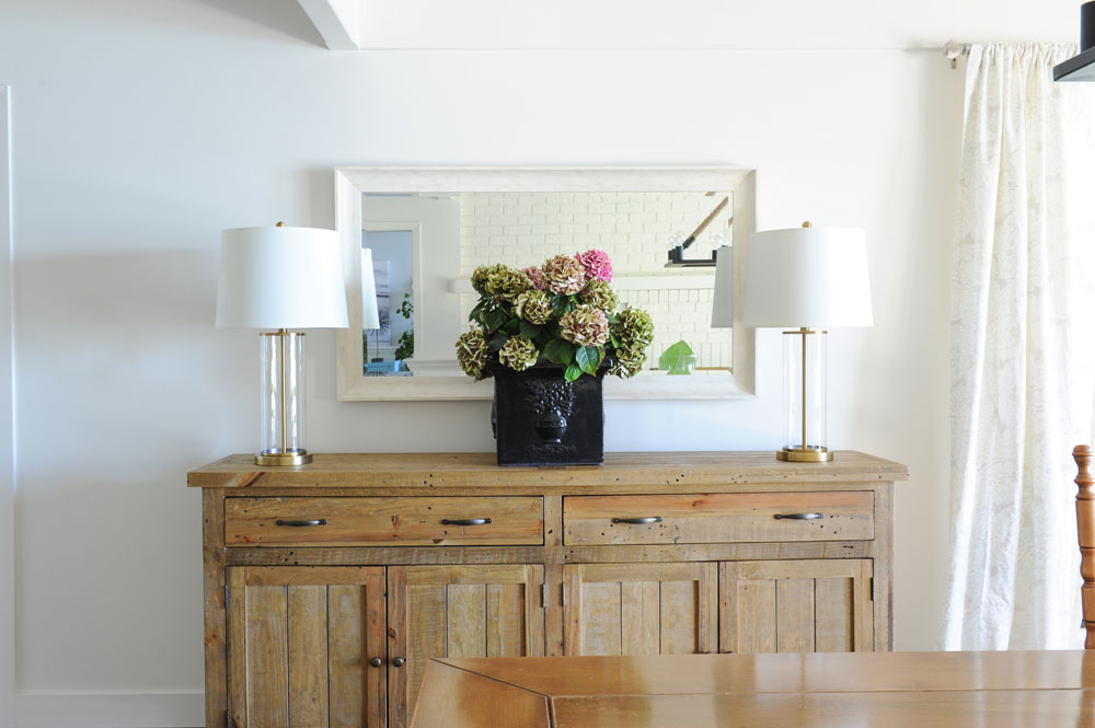
Buffet Zone
Jessica styled this handsome buffet (from LH Imports through Flying Fish) with fresh hydrangea, lamps from Ralph Lauren Home and a lovely framed mirror. “I always like a large mirror in the dining room,” she says. “It makes the space feel elegant and reflects the light from the chandelier.”
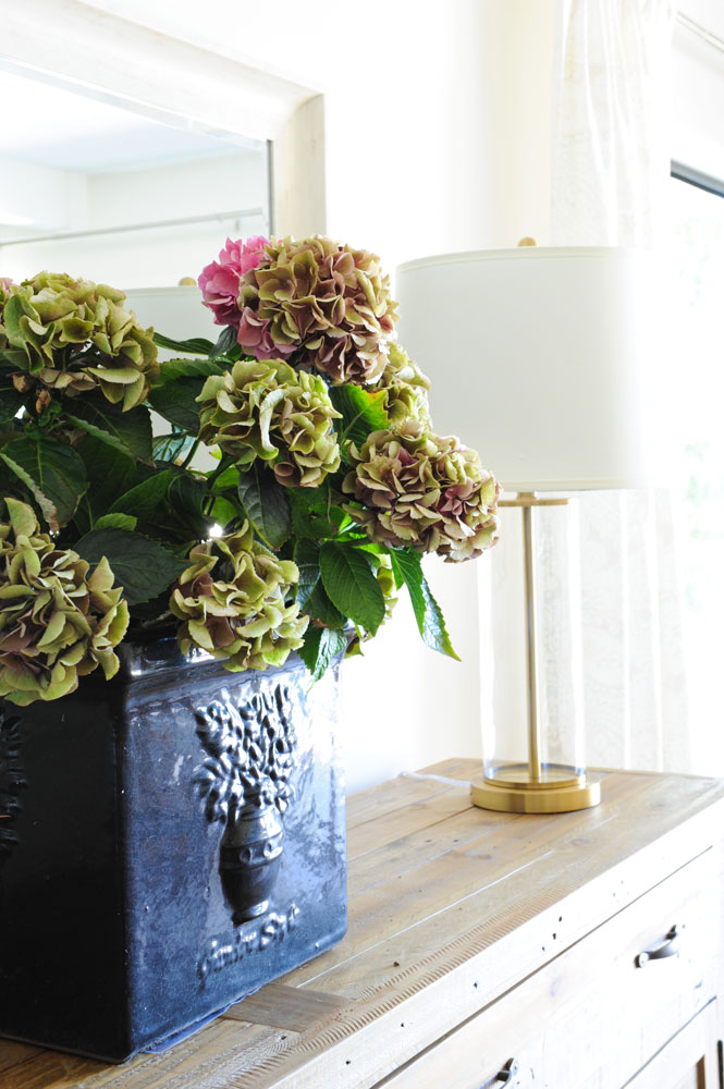
Get Fresh
Fresh flowers, especially hydrangea like these, are possibly the easiest way to enliven any space. Multiples of one type of flower make arranging a cinch and unexpected containers add a bit of flair.
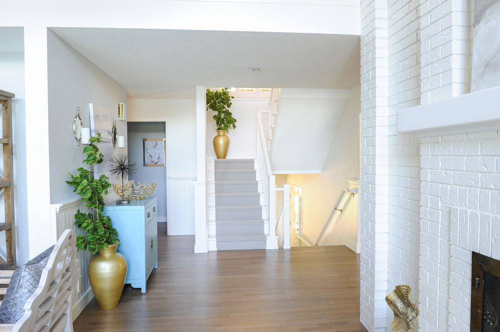
Smooth Landing
Landings are often overlooked as through-spaces, so we love how Jessica decorated this one with colourful elements and fresh greens, not to mention how she extended the look to the next landing. It creates continuity along with a smart, finished feel.
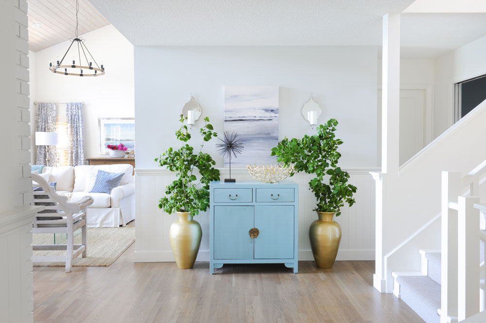
Dresser Up
“The blue dresser was a piece that the homeowner fell in love with,” says Jessica. “It is such a pretty colour I decided to let it take center stage on the landing area. It was important to play with scale here, which is why I introduced the tall greenery beside it. The gold of the planters simply sets off the aqua blue.”
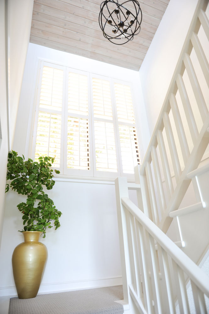
Black Magic
Look up! The pale cedar ceilings and white walls are punctuated with this smart black chandelier. Its colour makes a bold statement while its curves are a nice departure from all the lines of the railings and stairs.
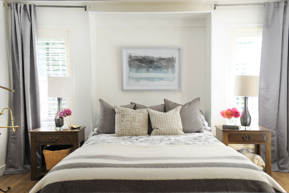
Calm Down
While the first floor is awash in beachy whites and blues, the master bedroom is a cocoon of earthy tones. “I wanted to create a cozier and calmer space here. This room is also at the back of the home and receives less natural light, so it seemed right to embrace that darker aspect.”
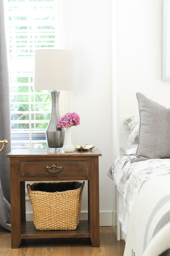
Novel Light
Bedside lamps from Ralph Lauren Home create elegant symmetry and provide good reading light. The wooden side table and woven basket are warm and elemental against the silvery drapes and bedding.
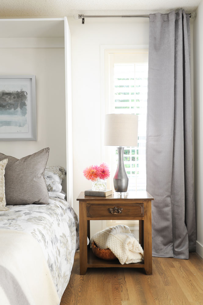
Basket Case
This side of the bed also features a basket tucked in the side table. “I love baskets in the bedroom where they’re a great place to store extra blankets.” Again, multiples of one bloom add cheery elegance and are echoed in the feminine floral-print bedding. We like how that’s mixed with the stripes of an iconic Hudson’s Bay point blanket.
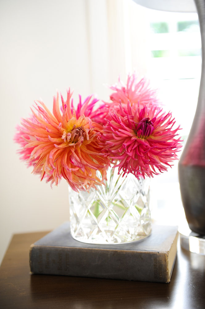
Pretty In Pink
Something as simple as three blooms in a vase can add colour, vibrancy and a little luxury to any bedroom.
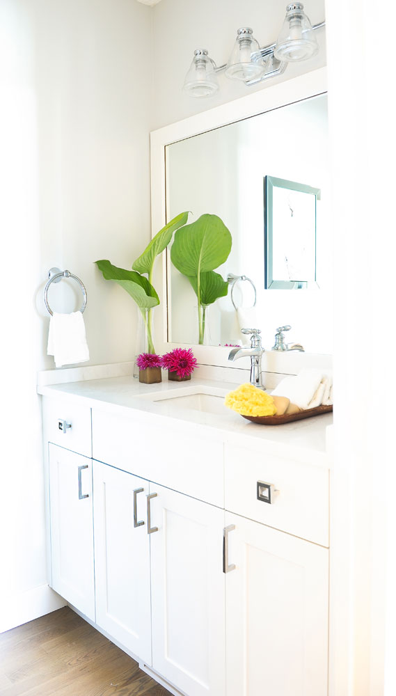
Go With The Flow
“I kept the bathroom very simple and clean,” says the designer. “I did use a few unique pieces like the wall-to-wall framed mirror and the waterspout faucet, but basically wanted this room to flow into the rest of the space.” The crisp white palette and thoughtful touches of flowers and green ensure that it does just that.
HGTV your inbox.
By clicking "SIGN UP” you agree to receive emails from HGTV and accept Corus' Terms of Use and Corus' Privacy Policy.


