It’s no secret that we consider home decor a form of art, so when you find the right canvas, use it to bring your vision to life – as blogger Natalie Ho did when she moved into her home in Toronto’s Hunt Club/Birch Cliff neighbourhood. Since creating her popular DIY and lifestyle blog, My Little Secrets, nearly a decade ago, Natalie has embraced her love for home decor – particularly cozy mid-century modern and Scandinavian motifs. So, when Natalie and her husband, Kyle, found a recently renovated home with the finishes she gravitates toward – “lots of wood and white with matte black accents” – they knew it was home. With a bright, fresh canvas to work with, Natalie was ready to style the space with her personal touches and inviting decor aesthetic.
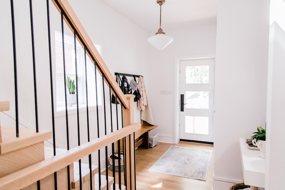
A Warm Welcome
The now 2,500-square-foot home was originally a bungalow, but the previous homeowners renovated the space – adding a second floor and more depth. The updated house was ideal for Natalie, Kyle and their young son, Everett. With the major renovations already taken care of by the previous owners, the family moved into the home in December of 2020.
Related: 25 Eye-Catching Entryways That Make the Ultimate First Impression
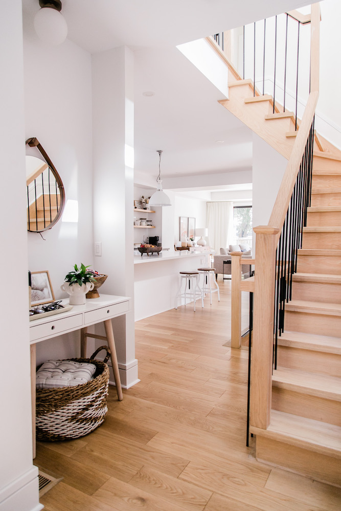
Stylish Balance
Throughout the home, Natalie’s talent for balancing practicality (with a small child, for example, storage is essential) with pops of personality is palpable. As she says, it’s “all about finding storage opportunities to hide away the clutter – so that I can still bring in some furniture and decor pieces that contribute to the overall design.” In the entryway, a mix of coordinating baskets, bins and hooks work beautifully. Beside the stairs, Natalie created a functional nook with storage and a distinctive mirror that she made herself at an event. “I love incorporating DIYs in my home!”
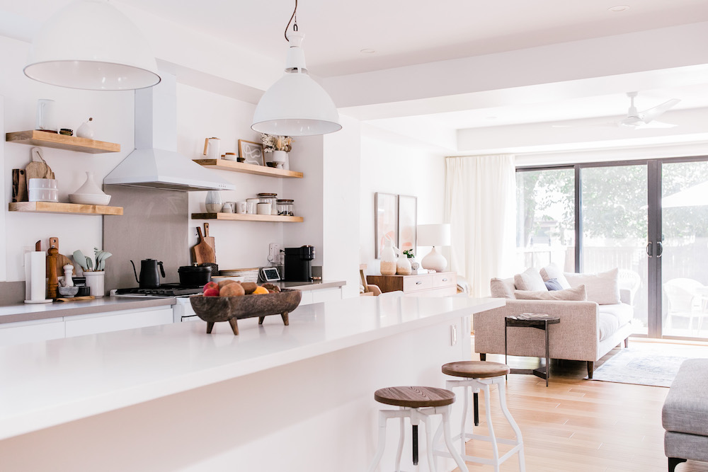
Natural Design
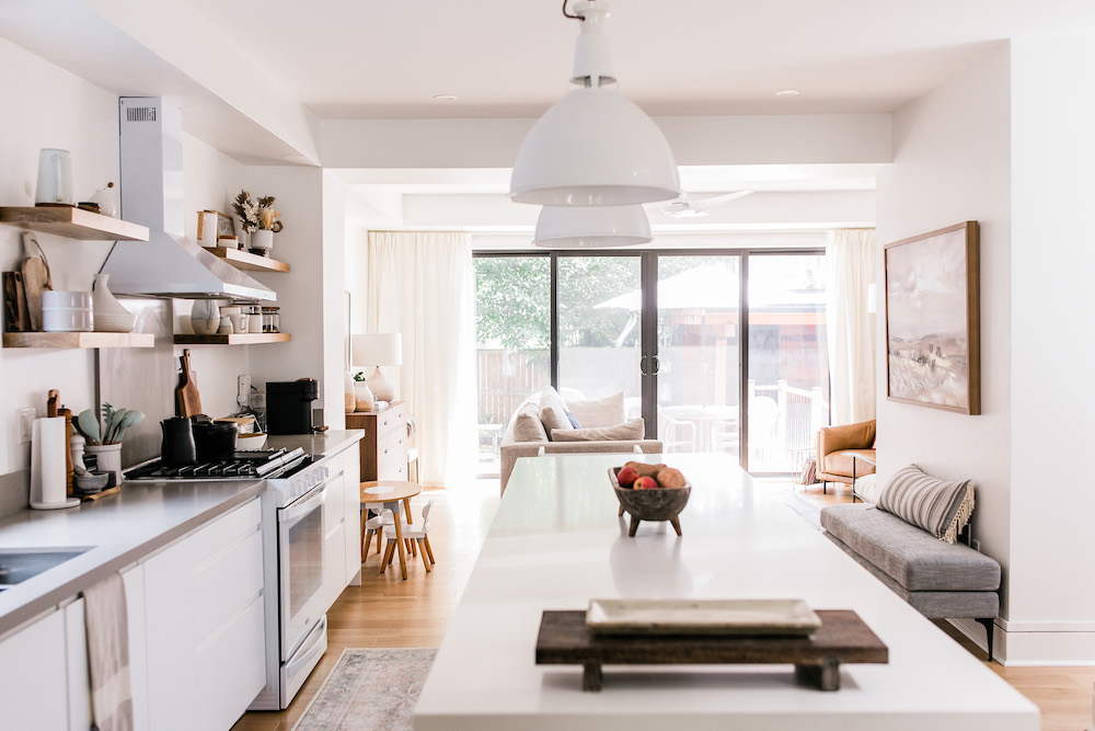
The home’s renovated kitchen is the epitome of bright and airy with a large island and clean-lined white details. To add depth and warmth to the space, Natalie brought in touches of wood in the island stools (Structube finds from their previous home) and via a wood fruit bowl from a local online decor shop, Maison Pear. As she explains, “I love a white kitchen, but sometimes it can feel really blended in or washed out. By adding dark wood or accent colours, it can create nice contrast.”
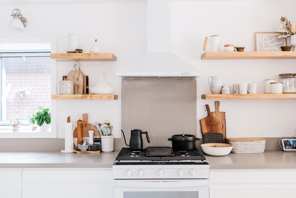
A Curated Display
The kitchen’s open shelves offer more opportunity to curate character in the space. “I love the open shelving, and really leverage that to bring some uniqueness and personality to the kitchen,” Natalie says. “I think it’s important to showcase pieces that are just for decorative purposes – like. frames, vases, plants and florals – but to equally display everyday functional items such as mugs, kettles, plates and bowls to give the overall space a lived-in, homey feeling.”
Go With the Flow
“People also seem to think you lose a lot of storage space with open shelves, but not if you actually use it to store practical items you use often,” Natalie says. Indeed, the mix of functional and stylish items on display creates a cozy feel in the open-concept area – allowing the kitchen to visually flow into the living room with ease.
Related: 10 Smart and Stylish Ways to Divide Your Open-Concept Living Space
The Art of Living
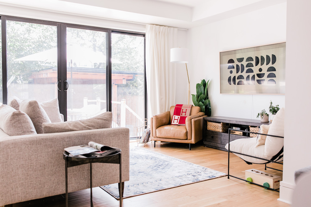
Here, Natalie used furniture (“all of the furniture pieces in the living room were sourced from Urban Barn”) to design a comfortable space with nods to her overall decor aesthetic. “I always anchor the space around the largest piece of furniture,” she says. “In our case, it’s our deep-seated couch. I like the mid-century modern style, so the legs on the couch were definitely influenced by that era.”
Related: 10 Mid-Century Modern Living Room Designs You’ll Want to Copy
Mix and Match
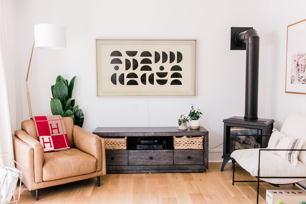
To keep the feel fresh, Natalie chose chairs that complemented each other, without being identical. “The chairs were selected after. I wanted a mix of something warm and traditional – the buttery cognac-coloured leather – and something a bit more cool and modern – the white corduroy black-framed chair.”
Related: 20 Tips for Arranging Furniture in Your Living Room
Cottage Comforts
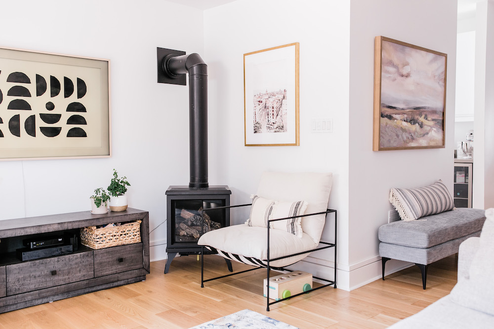
One major, not-so-secret inspiration for the room’s design? The distinctive black fireplace in the corner, which looks like a traditional design, but offers the convenience of being gas operated. “The decor selected for the living room was definitely centred around the wood stove-style gas fireplace and the ceiling fan,” Natalie says. “Both features remind me so much of being in a cottage – a running fan on a warm summer night and a cozy fire on a cold winter day.”
Related: Hot Topics: 15 Gas, Electric and Wood Fireplaces for a Cozy Fall and Winter
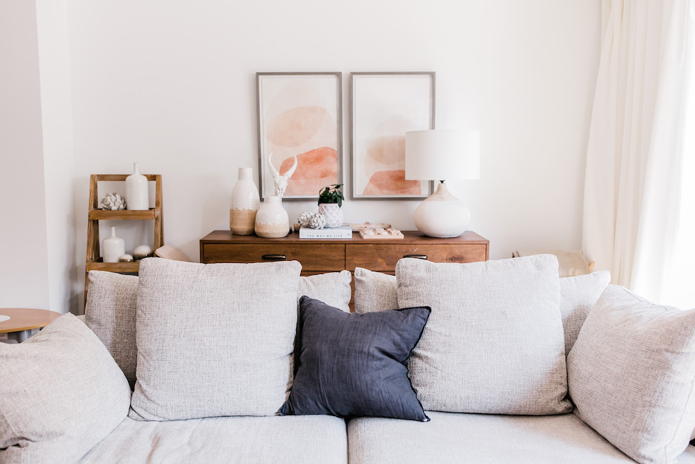
Chic Storage Ideas
Behind the couch, Natalie got creative with furnishings to create an area that – again – beautifully balances decor and functionality. Starting with a wooden six-drawer dresser selected from the bedroom collection at Urban Barn, she then layered decorative vases and wall art to create a chic vignette that doubles as kid-friendly storage. “The key to tucking away all the toys that a toddler can accumulate is storage,” she explains. “So I knew from the moment I started to plan out this space that a dresser or buffet was needed to put away all of my son’s toys.”
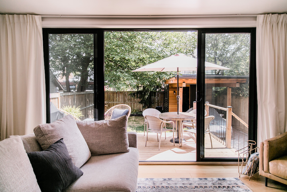
A New View
Off of the living room, a beautiful backyard and deck allow for effortless indoor-outdoor flow. Natalie notes that the space was created by the previous homeowners, and this outdoor oasis was a major draw when she first saw the home. As she explains, “this really was a big reason why we purchased this home. I’ve always loved large back-framed windows and doors, and this is a beautiful feature.”
Related: Backyard Ideas to Turn Your Outdoor Space Into a Staycation Paradise
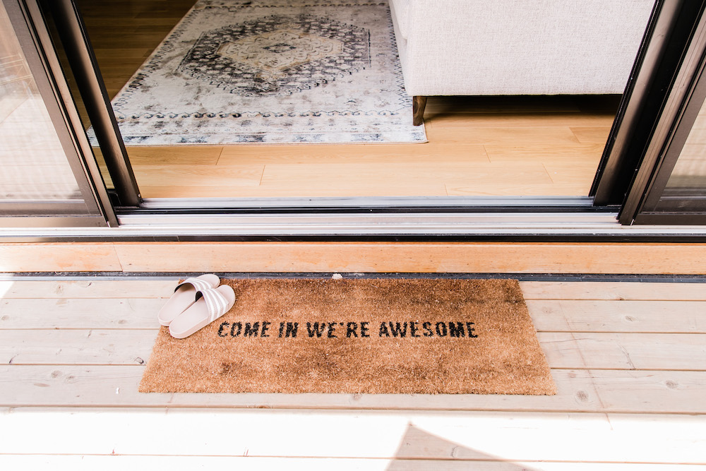
Awesome Accents
Small touches – like this playful doormat from BC’s The Cross Decor & Design – are a great way to add unexpected charm to practical places like the back entryway. Want to make your own chic doormat? Give this easy DIY project a try.
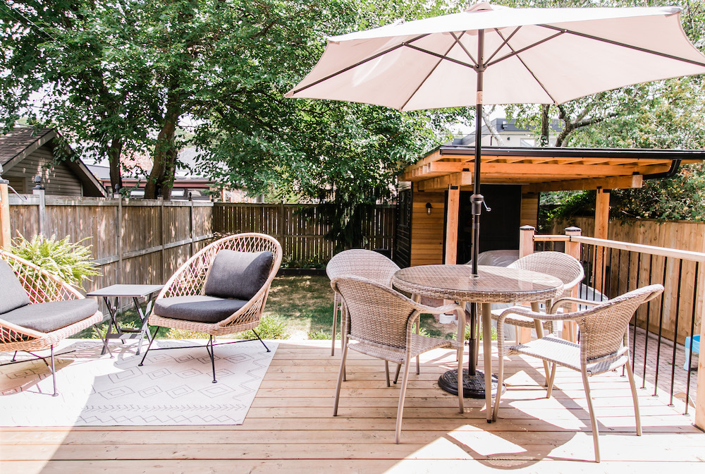
Multi-Functional Space
Tucked into the corner of the backyard, a sleek shed adds cohesive style and multiple functions to the property. “The covered space is so versatile,” Natalie says. “On most days, we park our second vehicle under it, but when we have parties or entertain, we also convert it to a buffet area or dining space.”
Related: Granny Pods to Yoga Studios: 15 Ways to Makeover Your Garage or Shed
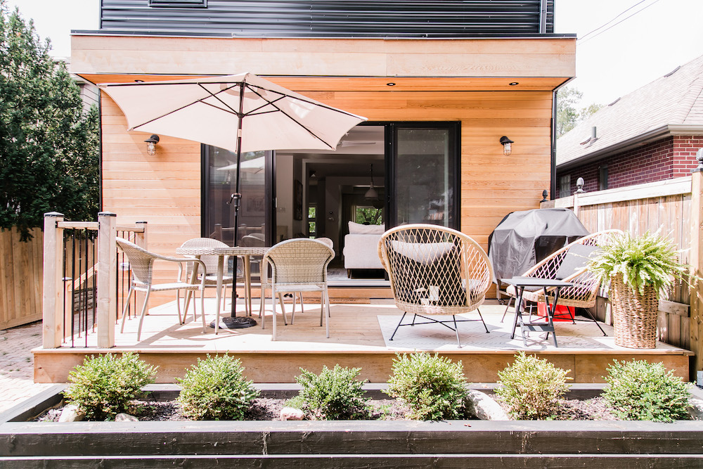
Deck Days
The wooden deck is home to a mix of outdoor dining and lounge furniture in a mix of textures that play up the overall style of the home. A few plants add a pop of low-maintenance green appeal to the space.
Related: 15 Timeless Backyard Ideas and Trends to Make You Fall Back in Love With Your Yard
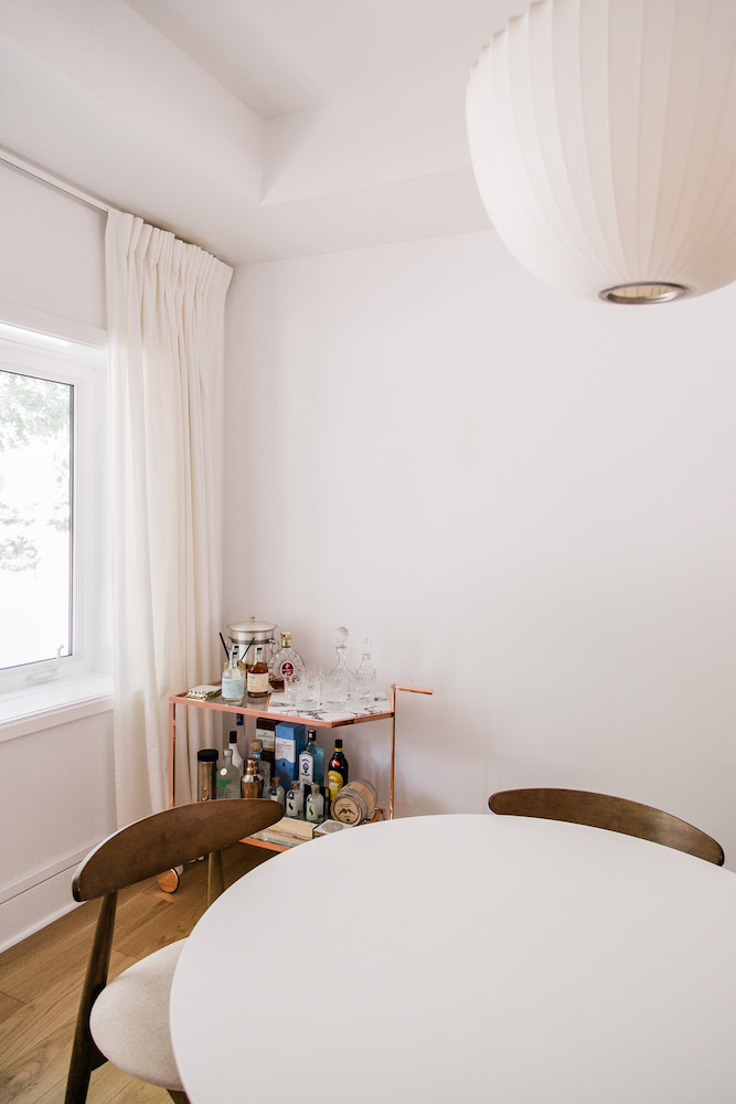
Mix Mastery
While the overall look of the dining room is still in progress, a round table and chairs from Wayfair keep the aesthetic clean and a touch mid-century modern. The star of the space, however, is the gorgeous bar cart – stunning piece with special memories for Natalie. “I actually won the rose-gold and marble bar cart at a mixology event where a number of us were asked to recreate a few fun cocktails demonstrated at this event,” she explains. “The winner, me, took home this limited-edition 10-year anniversary bar cart.”
Related: You’ll Be the Ultimate Party Host With These Beautiful (and Affordable) Bar Carts
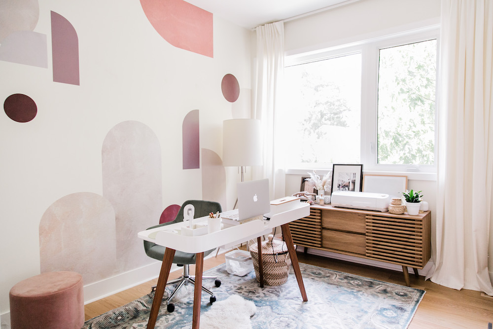
Crafting a Creative Work Space
Natalie’s home office needs to be inspirational and creative – yet also practical and full of storage – to allow her to flow seamlessly between her different roles. “I work full time as Head of Marketing during the day, and as a content creator in my free time,” she explains. Wall decals from Urban Walls bring stunning colour to the room, while a mid-century-style console from Structube offers plenty of storage. One lesson-learned secret to home office design? “I originally had my desk facing the wall, but I found that it was killing my creative juices and I was constantly distracted. I ended up turning it around and having it face outward, and wow, it made a huge difference.”
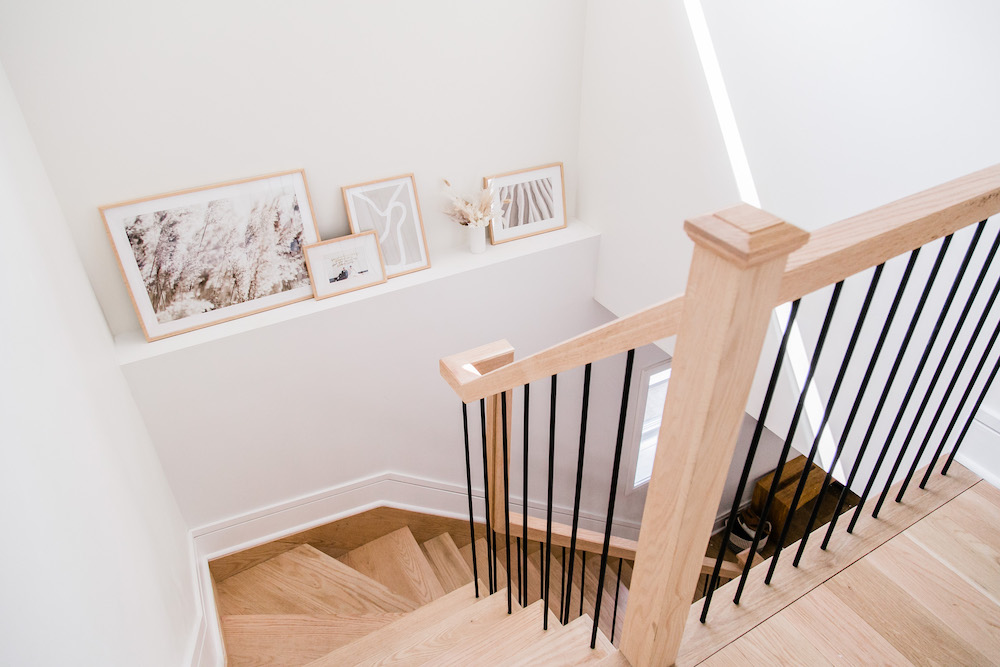
Step Up
At the top of the stairs, Natalie tool an otherwise minimal space and added a touch of style with a petite gallery of frames. “I love that at the top of the staircase there is a wide window, letting all the light in,” she says. “By placing a set of frames on the ledge, it kind of gave this small area its own focal point – so it’s not just a space for the stairs.”
Related: 10 Staircase Ideas That Will Make a Statement in Your Home
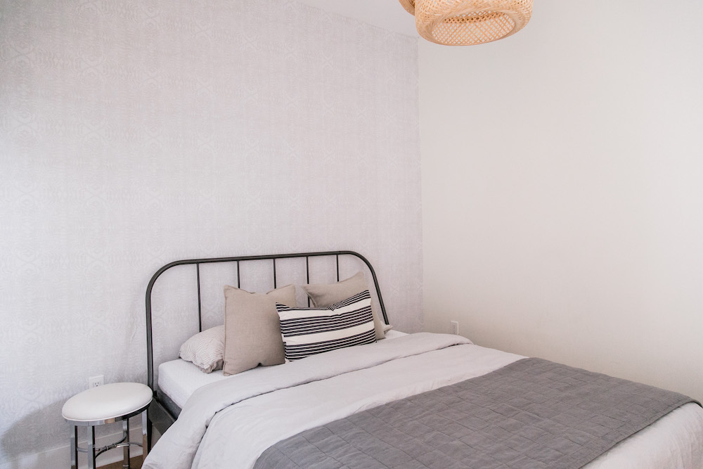
Guest Space
Guest spaces can be just as inviting as primary rooms. This guest room is clean and inviting, with a black-framed bed from IKEA the current star of the room. Natalie plans to further style the space with night stands, artwork and table lamps.
Related: 15 Bedroom Decor Ideas to Make Your Space Cozy for Autumn and Winter
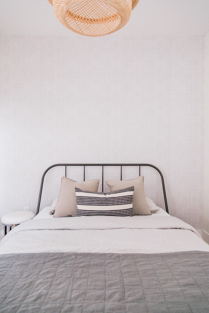
Wall Wonders
A chic accent, anyone? Behind the bed, removable vinyl wallpaper in a palm-leaf-inspired pattern from Urban Walls adds gentle texture to the bedroom.
Related: 20 Bold Print Wallpaper Ideas That Will Transform Your Space
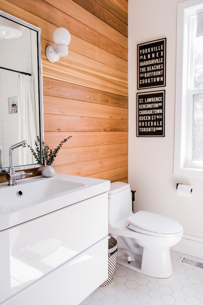
Neighbourhood Appreciation
The wood bathroom, which was renovated by the previous homeowners, is an ode to the home’s exterior. “It reminds me of a cozy, modern Scandinavian sauna, and I love it,” Natalie explains. To make the space more personal to her family, Natalie styled the wall with a duo of Toronto neighbourhood-themed wall art pieces sourced from a maker on Etsy.
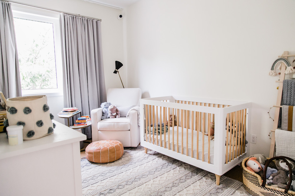
Cute and Calming
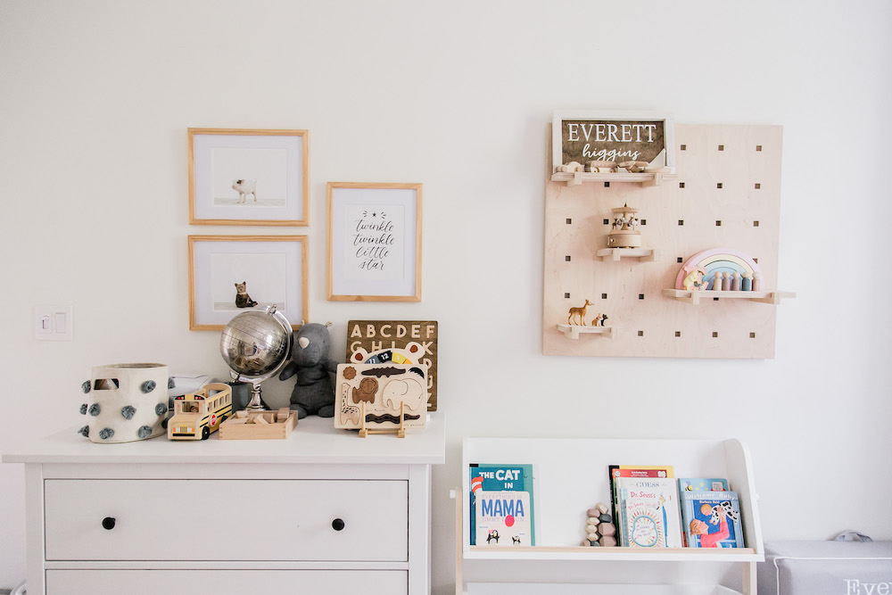
For Everett’s room, Natalie and Kyle strove to create a comfy and calming feel. “When designing a room for a newborn or young toddler, I think less is more, and the room really is meant for sleep and nursing,” Natalie says. “So removing distractions is key! Not too many toys, too much clutter or messes – I’ve read that children thrive on tidy spaces.”
Related: 10 Practical Tips to Decorating Your Baby’s Nursery
Sweet Tones
The neutral tones of many of the pieces in Everett’s room (such as the wood-and-white Babyletto bookcase and crib from buybuy BABY Canada) enhance the calming feel, while the wall pegboard from Gautier Studio, which features removable pegs and shelves, can be adapted and changed up as he grows.
Related: The Homemade Pegboard Entryway Organizer That’s Surprisingly Simple to Create (You Can Do It!)
A Dreamy Bedroom
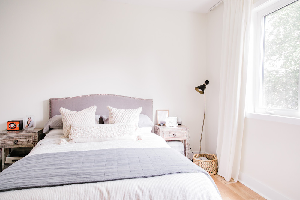
While Natalie has plans to customize the primary bedroom with a board-and-batten feature wall soon, she has already achieved a cozy feel for the space by restyling pieces that the couple already had in their previous home. “We just moved everything from the old house for now,” she says, “but I’d say the idea is to create a dreamy, comfortable cottage-feel space.”
Related: 18 Rejuvenating Zen Bedrooms That’ll Help You De-Stress
Soft Details
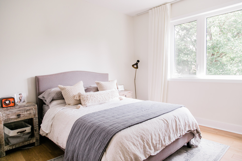
Grounding the bedroom’s decor, Natalie choose a Wayfair area rug that echos many of the other rugs used throughout the home. “I definitely like the traditional-style rugs, but in a muted colour scheme,” she says. On the bed, an array of H&M pillow covers bring texture and dimension to the room.
A Spa-Worthy Bathroom
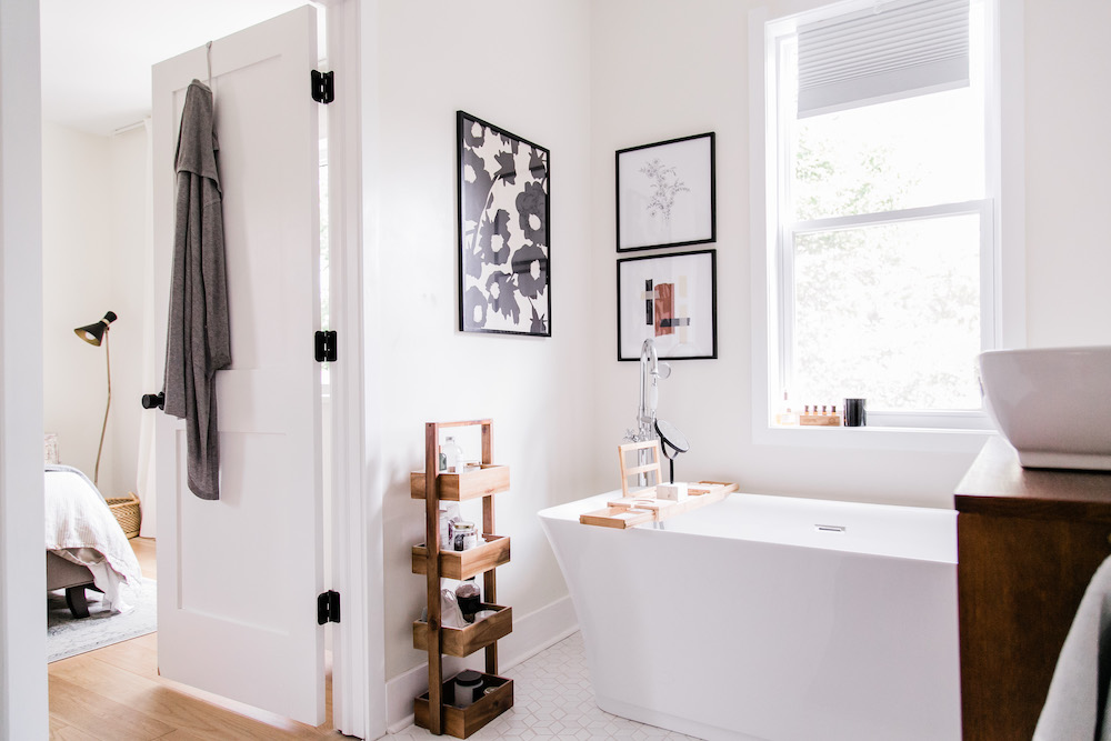
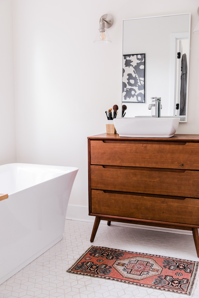
The primary bathroom is a spa-like stunner, with a sleek white tub and lots of natural light. To bring warmth, Natalie added natural touches via bathroom accessories like an Amazon bath tray and a tiered storage piece from Zara Home. “I love adding hints of wood – not too much – just to make the space more inviting.”
Related: We Ranked the 10 Most Extraordinary Bathtubs in the World
Pops of Contrast
The bathroom’s current vanity, which was retrofitted by the home’s previous owners, is actually a wooden dresser. Below, a patterned rug lends a pop of sophisticated colour to the space.
Related: 19 Bathroom Vanity Designs That’ll Make You Want to Reno Immediately
HGTV your inbox.
By clicking "SIGN UP” you agree to receive emails from HGTV and accept Corus' Terms of Use and Corus' Privacy Policy.


