It’s tough to know how far to go when decorating a rental, but designer Sarah Birnie cracked the code when it came to kitting out the historic Cabbagetown house she shares with her husband and young daughter. Inspired by Parisian apartments and Brooklyn brownstones, Sarah pulled out all the stops to create a cozy yet eclectic home that’s feels fully furnished, not temporary. The best part? She kept to a lean and mean budget and filled the space with creative visuals you’ll want to copy.
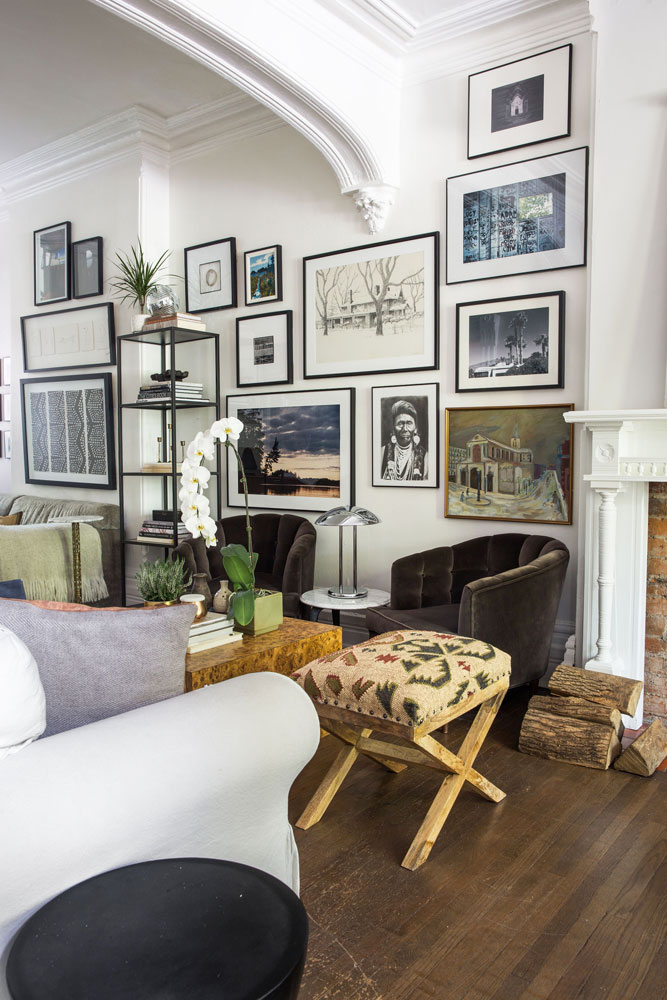
Artful Lodger
If you want your rental to feel like an inherited estate, become besties with art. Sarah’s gallery wall is not only packed with eye-candy but fab ideas to copy and many, happily, are respectful of a lean budget. Look closely and you’ll see this curated collection features travel photos and mementos elevated to artwork status thanks to smart framing. The gorgeous armchairs – admittedly old pieces that had been kicking around for years – were given a new lease on life with handsome green velvet that’s both plush and durable (upholstery being another wallet-friendly way to upgrade old furniture).
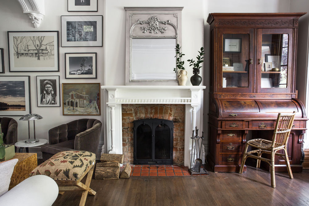
Breathing Space
When it came to the living room fireplace, Sarah adopted elegant restraint. The mantel is minimally dressed with a mirror and some greenery so it provides a bit of a visual break from the dynamic gallery wall. The mirror’s ornate frame, however, ensures there’s still lots of drama in this vignette. The secretary desk, a prized heirloom, belonged to Sarah’s great-great-grandmother and furthers that inherited estate vibe. Its burnished magnificence is nicely tempered with a laid-back rattan chair that feels fresh and casual.
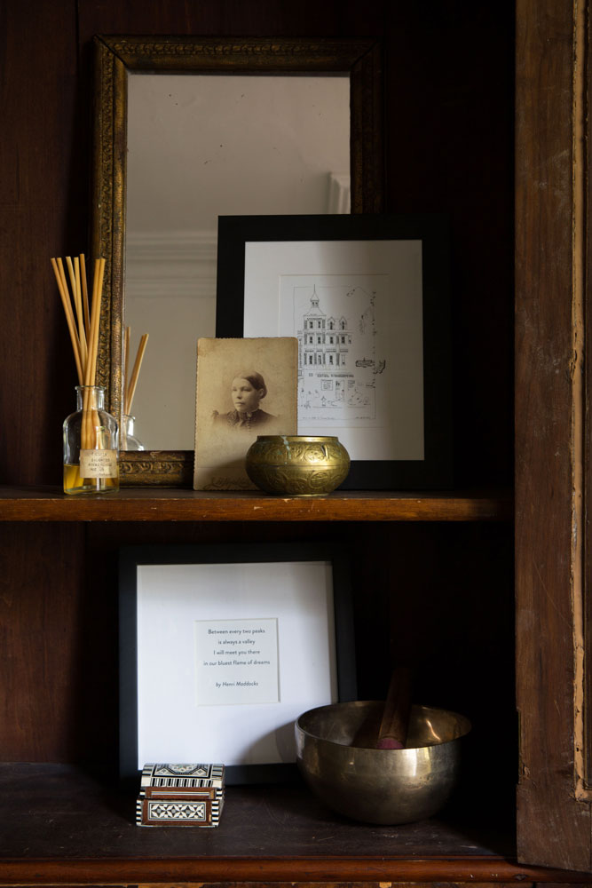
Personal Stylist
The secretary’s clear-glass door fronts mean its shelves are highly visible, whether the doors are open or closed, so Sarah styled them accordingly. We like how she included framed artwork in this enclosed space and layered items in front of each other. Notice how, rather than spreading accessories out across the shelves, she corralled them into small groupings that create interest and transform this storage space into a compelling display area.
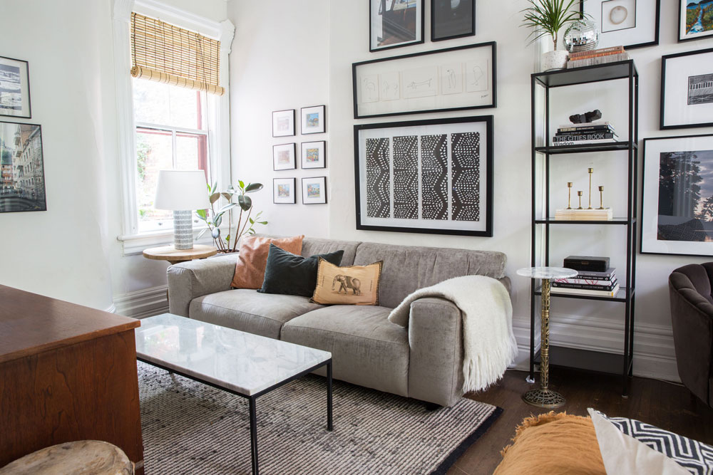
Designate Space
Whether you rent or own, you’d be smart to copy Sarah’s treatment of an open floor plan which avoids decorating it as one big space (a result that always looks poky) and, instead, boldly separates it into different sections. At this end of the main room, she uses savvy furniture placement to create a cozy nook away from the fireplace yet still very much a part of the space thanks also in part to the continuation of the gallery wall.
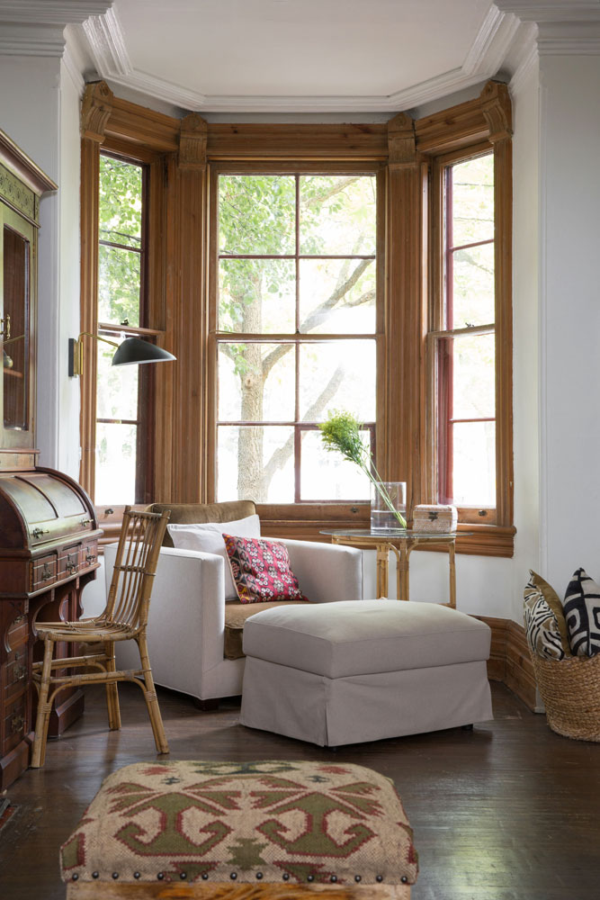
Fully Exposed
Sarah didn’t hesitate to paint the once orange living room white, but she put the roller down when it came to the frame of this charming bay window. “I adore its raw, natural wood,” she says. “Somehow over the years of renters, it survived the wild paint jobs in this room. I made sure it stayed this way: perfect imperfection, which is kind of what this whole place is about, come to think of it.” We love how she nixed window coverings and dressed this spot with an armchair (with seat and back cushions that reinforce the natural tones) and ottoman – large pieces that make a statement and also provide a comfy place for reading and relaxing. The black and brass sconce is a genius contrast of contemporary cool.
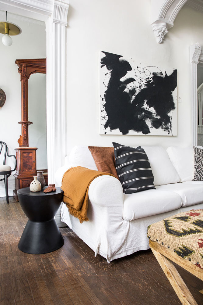
Abstract Expressionism
We think this next design secret will have you heading to your local craft store, pronto. “I painted this black and white abstract about 10 years ago,” says Sarah. “At that time, we were living in a condo that had big empty walls. I lugged this big canvas home on the subway and used black paint I had lying around to create this abstract.” It makes the simple slip-covered Ikea sofa come alive and the black side table and cushions further its monochromatic strength. Dashes of browns – in soft accessories and furniture – maintain an overall warmth.
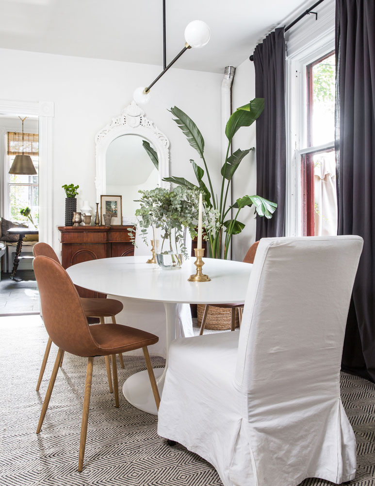
Chair Lifts
Sarah admits she hasn’t invested much money in dining room chairs, preferring to mix vintage finds with big-box store steals. Pairing covered slipper chairs with more contemporary styles feels bold and avoids a static matchy look. She replaced the original white drapes with dark-grey ones to help define the dining area and says she may eventually replace these with green velvet ones – proof that decor is never done and should always evolve. A mash-up of looks, from the mod table and chandelier to the antique buffet, creates energy and keeps the eye moving. The area rug injects pattern and further demarcates this as the dining area – a smart tip to copy in any open space.
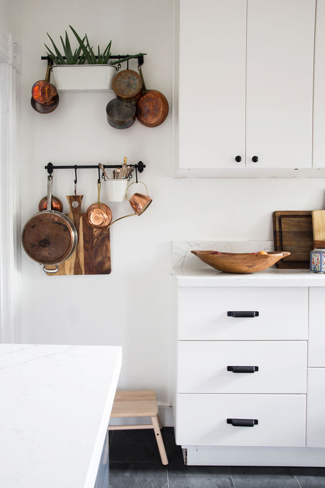
Recipe for Success
Rental kitchens can be tough – icky old cabinets and lots of laminate often being the norm – and this one was no exception. That’s why Sarah came up with a cheap and cheerful plan that was landlord approved: Ikea cabinets, slate floors and well-priced appliances. Her designer prowess is evident in the mix of hardware (much better than matching) and the tempering of a mostly white space with shiny copper cookware and earthy wooden implements. The aloe vera plant among the pots is pure fun. Should your landlord not be as compliant as Sarah’s, inexpensive cabinetry paint and new hardware are a nice makeover compromise.
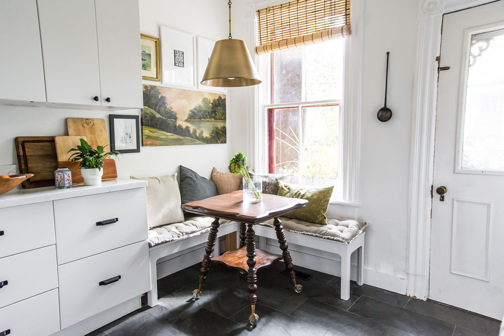
Nook Club
Sarah used two inexpensive benches to fake the look of built-in corner seating and conjure the cutest little breakfast nook. Topped with seat and toss cushions, they look like they’ve always been there. A stellar pendant light adds a bit of glam and can be taken away on moving day, just like the table, an unexpected silhouette that imparts antiquey allure to the new white kitchen (the table legs are divine!). Another idea to steal: artfully propped up cutting boards – they add visual interest and are at hand, while keeping counter space free.
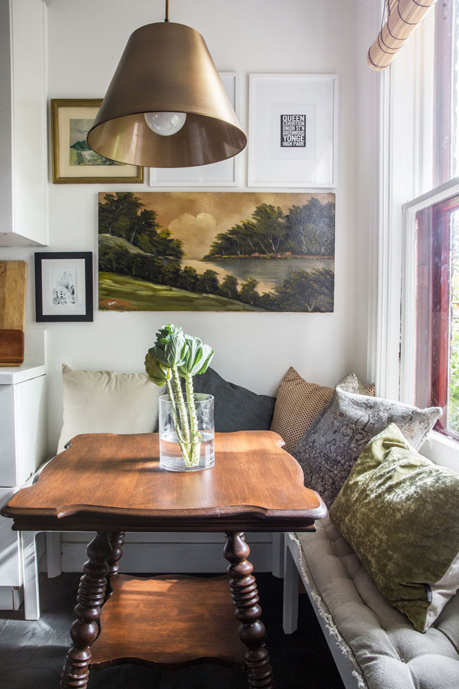
Picture This
Continuity in design makes any space feel pulled-together and like home. Sarah continued the living area’s gallery wall look in the kitchen to achieve that aesthetic flow. A grouping of artwork is an unexpected addition in a kitchen and that makes it all the more characterful and interesting. The angle reinforces the table’s curves and turned legs as another elegant foil in the practical space.
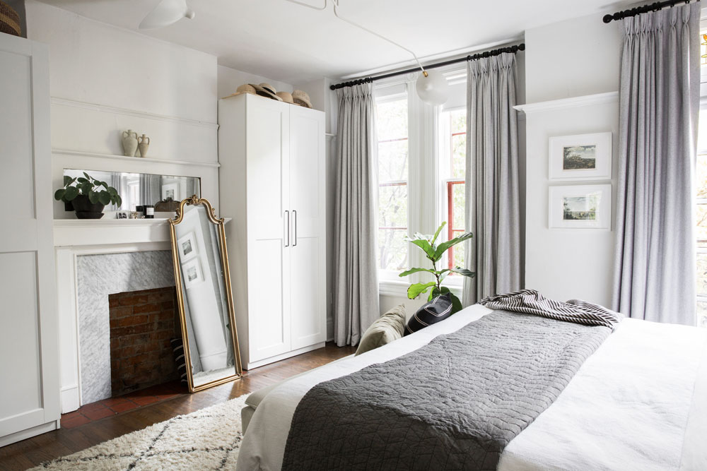
Master Sweet
How do you turn a generously proportioned, albeit generic, rental bedroom into your own Parisian boutique-hotel bolthole? Sarah relied on lashings of white paint for a super fresh backdrop and beautiful drapery from J&J Made. Its sophisticated grey tones reflect the fireplace facade and are also echoed in the quilt. Empty spaces flanking the fireplace were dressed with Pax storage cupboards from Ikea to add instant, and seamless, storage. Sarah describes the room’s overall effect as eclectic but minimal. And, other than the paint, pretty much everything can be packed up when they move so, once again, there’s no excuse to settle for lacklustre surrounds when renting.
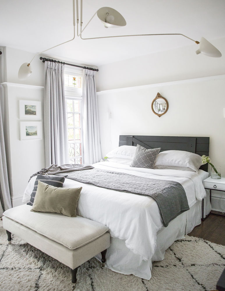
Something Old, Something New
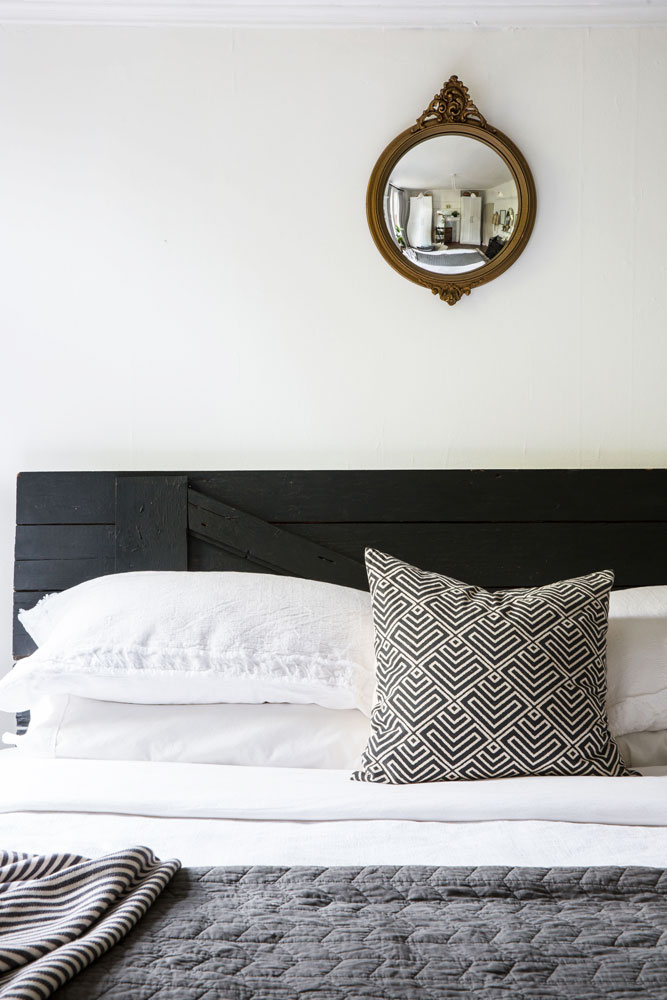
The master bedroom encapsulates Sarah’s overall plan for the home. “I envisioned modern light fixtures contrasted with traditional features. I love mixing antique and modern in all of my projects and I knew that would work beautifully here.” Indeed it does, from the contemporary chandelier to the rustic door re-purposed as a headboard. The rug placement is noteworthy – horizontal and half under the bed versus flipped around and fully beneath the bed. It anchors the bed and makes the space feel wider.
Hit the Scale
While some might be tempted to fill the wall space behind the bed with something large, Sarah knew again that restraint in scale would win. A small convex mirror holds its own here thanks to its roundness – a nice foil to the room’s straight lines – and its reflective surface which becomes a point of interest. Bright white sheets and pillows are punctuated with black and white accessories for a chic look that channels that Gallic boutique-hotel style.
In Plain Sight
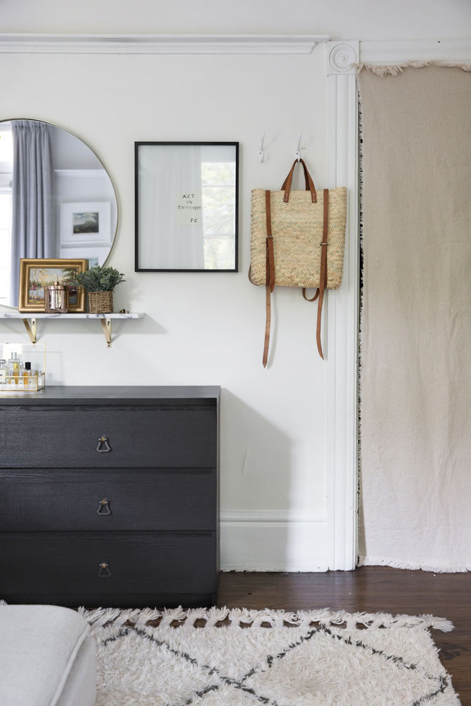
Don’t you love the confidence of this decor? A simple piece of frayed-edge fabric hides a storage space yet looks anything but makeshift. A woven backpack/handbag is proudly on display and acts like a piece of art just like the framed work beside it. A plain mirror gains interest thanks to the faux marble shelf placed beneath it that is styled to perfection – much like the bottles of scent corralled in a pretty glass box. The takeaway – not everything has to be perfect, especially in a rental, and embracing that is a great starting point for inspiration.
Green Room
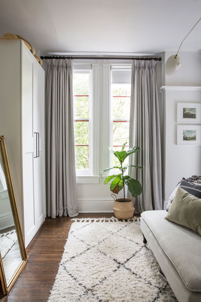
Hotel-chic heft aside, this is a proper home and nothing says you’re here to stay, even if you’re renting, like a plant. Do as Sarah did and choose one that’s big enough to make a statement then add a planter that accents the room, like this woven one which plays up on the space’s many textures and wood-tones.
Twin Perks
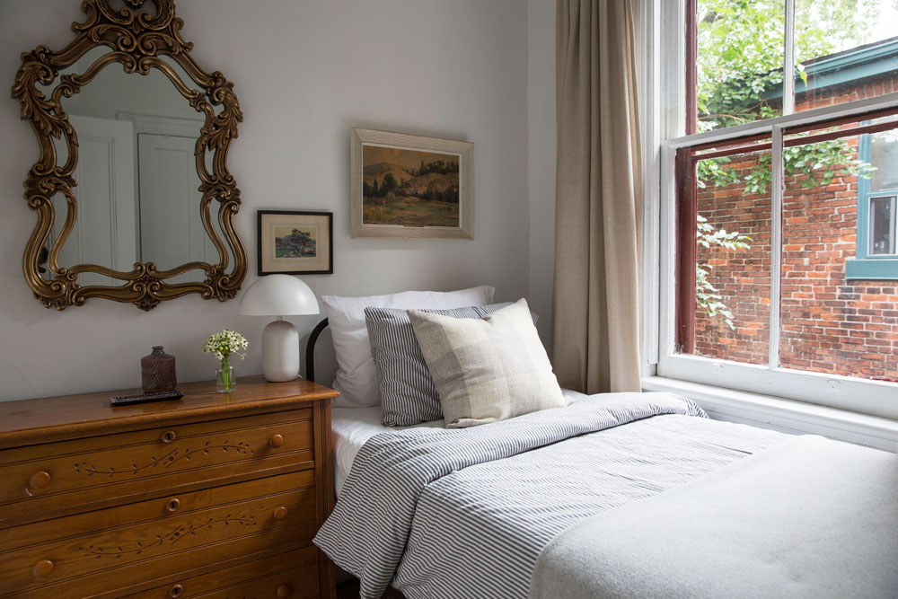
Sarah purchased the guest room’s twin iron bed, an antique, years ago but didn’t have the right spot for it until it came to furnishing the home’s tiny guest digs. Big on appeal, it influenced the dresser and mirror, both of which are also vintage. Together they create a wonderful layered permanence that feels like anything but a rental. We especially like how the dresser multi-functions as a side table in the tight space and the addition of the cheeky mod lamp.
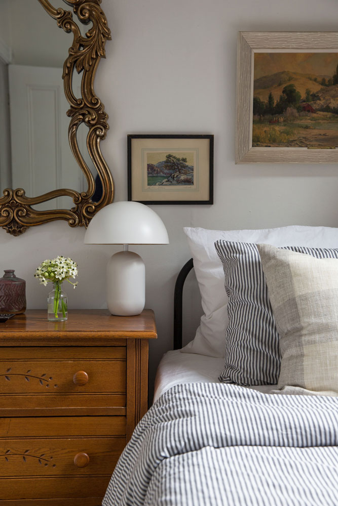
Be My Guest
Sarah’s guest bedroom proves that overnighters need more than just a spot to sleep. Rather than a place to crash, it is a highly stylish retreat replete with framed artwork, cheery ticking bedding and thoughtful posy of blooms – little elements that have maximum hospitable impact.
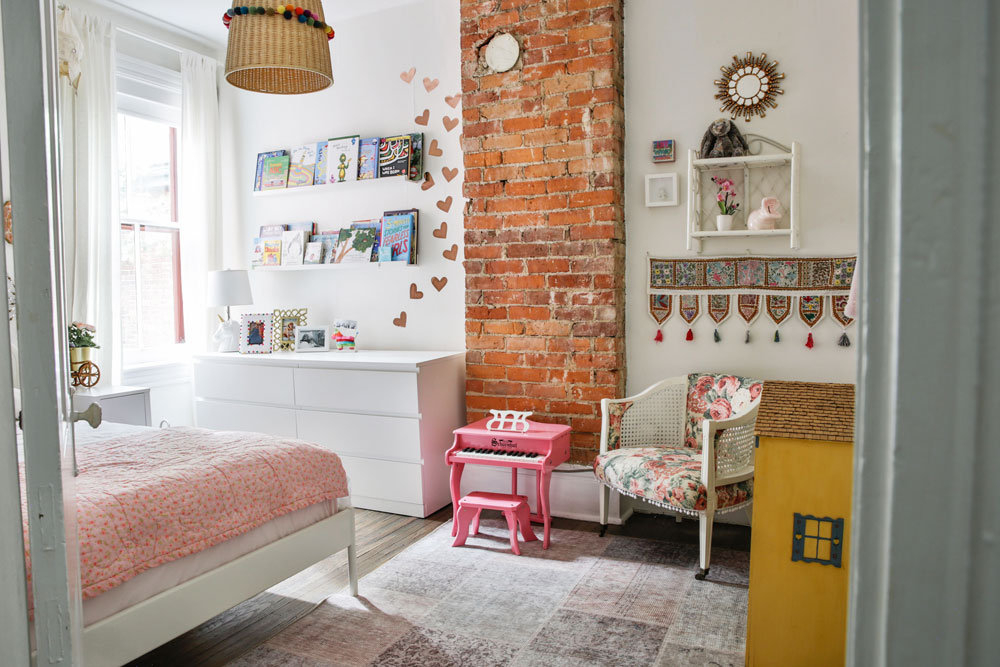
Girls Just Wanna Have Fun
For her daughter’s bedroom, Sarah created a fantasy space that any little girl would fall in love with. Pretty pinks, high-spirited patterns and plain old fun were the inspiration. “I like the idea of her bedroom being a place that fosters imagination,” she says. The exposed brick chimney – not a traditional marker of a little one’s room – becomes less of a focal point when flanked with books, wall hangings and whimsical decals. The rug layers in softness and pattern and keeps the room from becoming too nursery in feel.
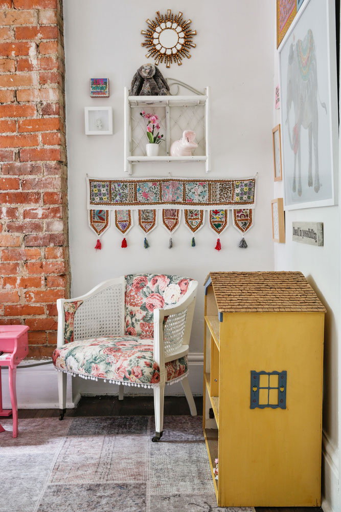
A Doll of a House
Sarah’s approach to design handily proves that rentals can feel permanent, loved and a part of a family’s history. In fact, this sweet doll’s house in her daughter’s room was actually made for Sarah, when she was young, by a friend of the family some 35 years ago. It’s at home among the splashes of pattern, candy pinks and varied artwork – ideal furnishings that make this little girl’s room feel like home.
HGTV your inbox.
By clicking "SIGN UP” you agree to receive emails from HGTV and accept Corus' Terms of Use and Corus' Privacy Policy.


