To some, working with an interior colour palette limited to only a few shades may seem like the ultimate test in design self-control. But looking at this Worst to First makeover – and the bright colours chosen by the decorating experts – restraint doesn’t mean reserved.
Colour Wheels
Pull out your colour wheel and you’ll immediately see that red and green (or coral and turquoise) are complementary colours. When put side by side, each colour appears richer and brighter.
Throwing Shade
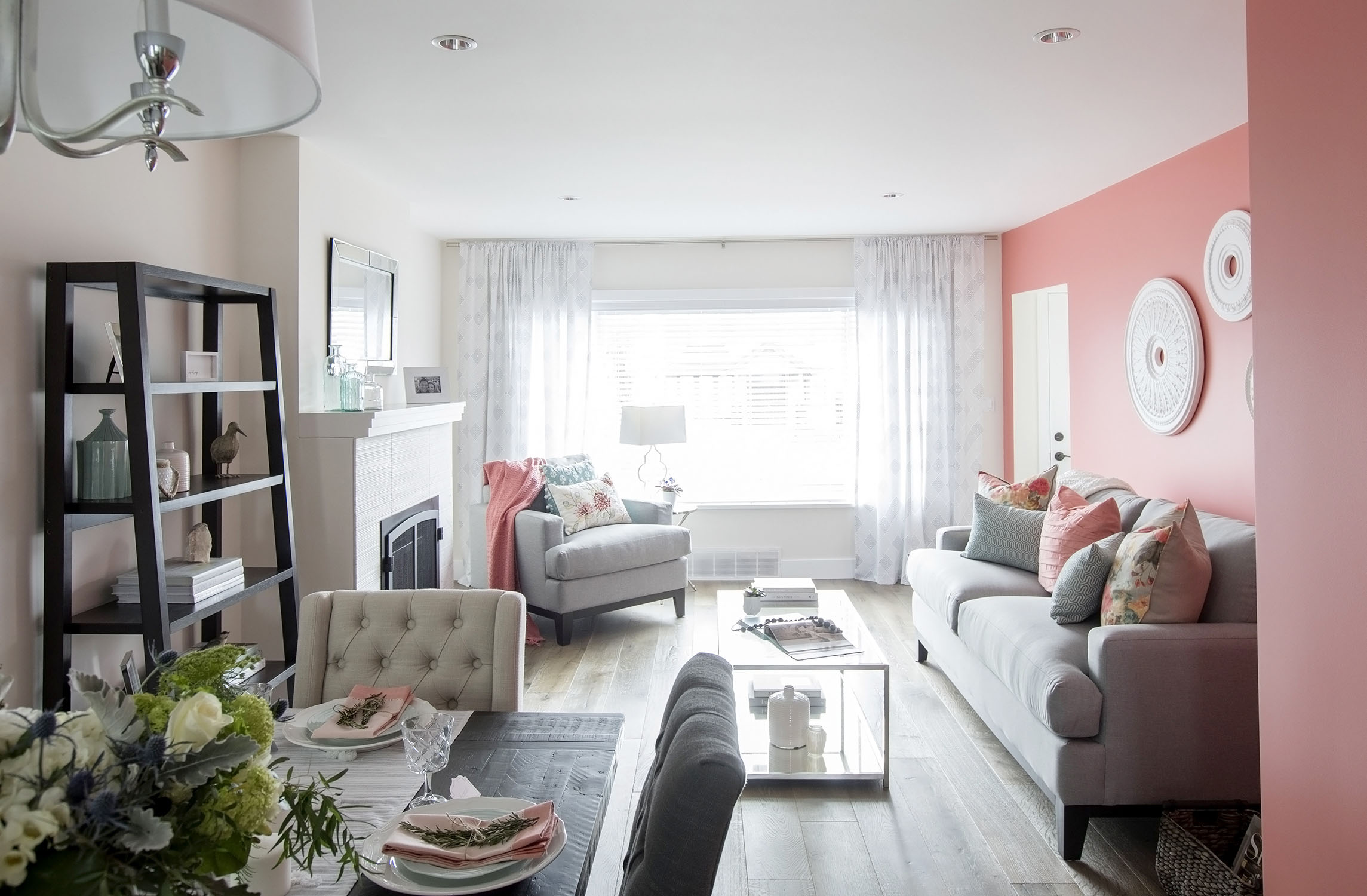
A boldly coloured feature wall isn’t for the faint of heart, but placing soft furnishings in the same shade throughout the house softens its effect – it turns into a palatable neutral.
Power Pairing
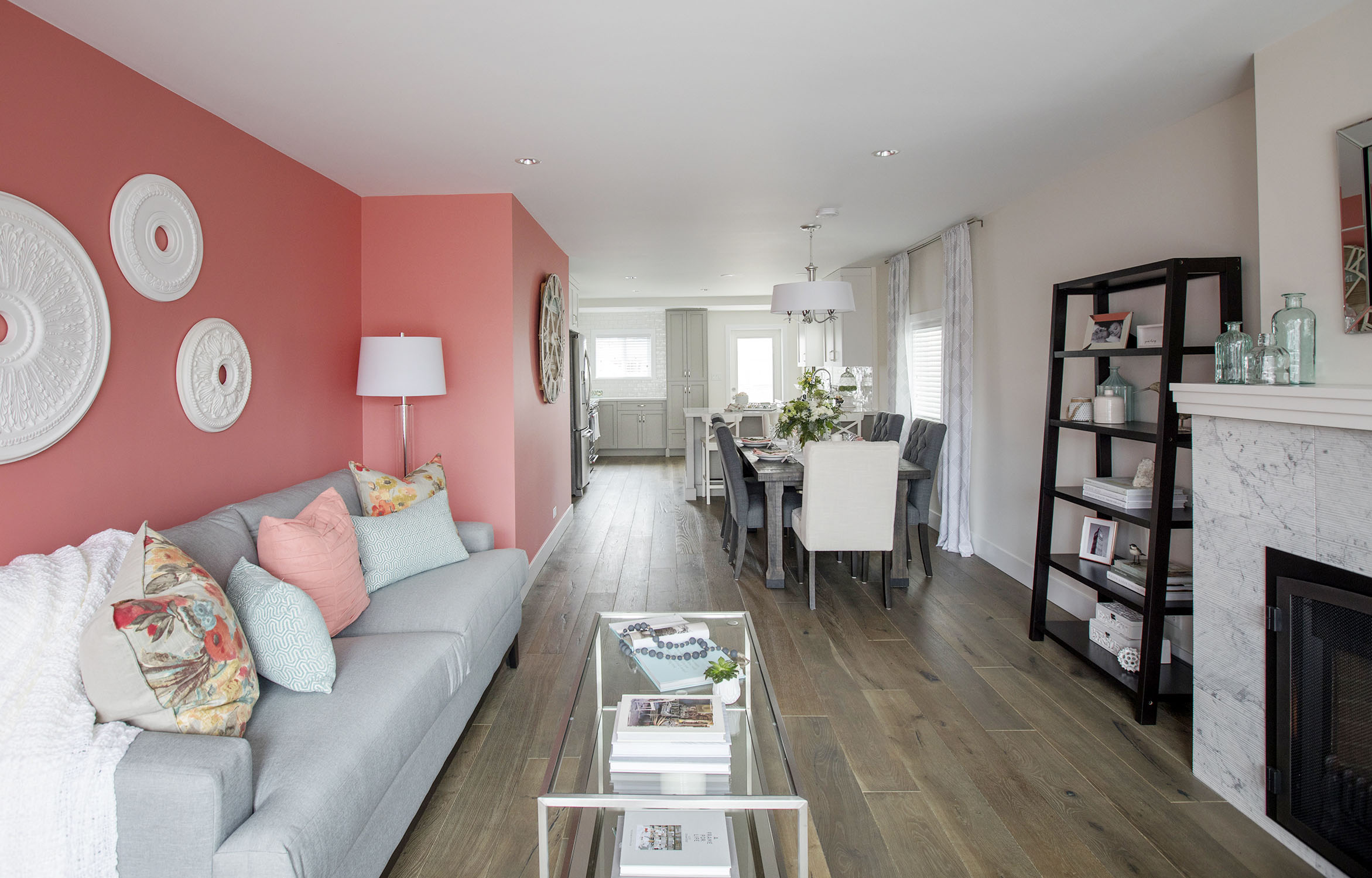
Opting for two bold complementary colours such as coral and turquoise – and exclusively choosing room accents, soft furnishes and mantel groupings in the same hues – gives this space a cohesive feel.
Mirror Image
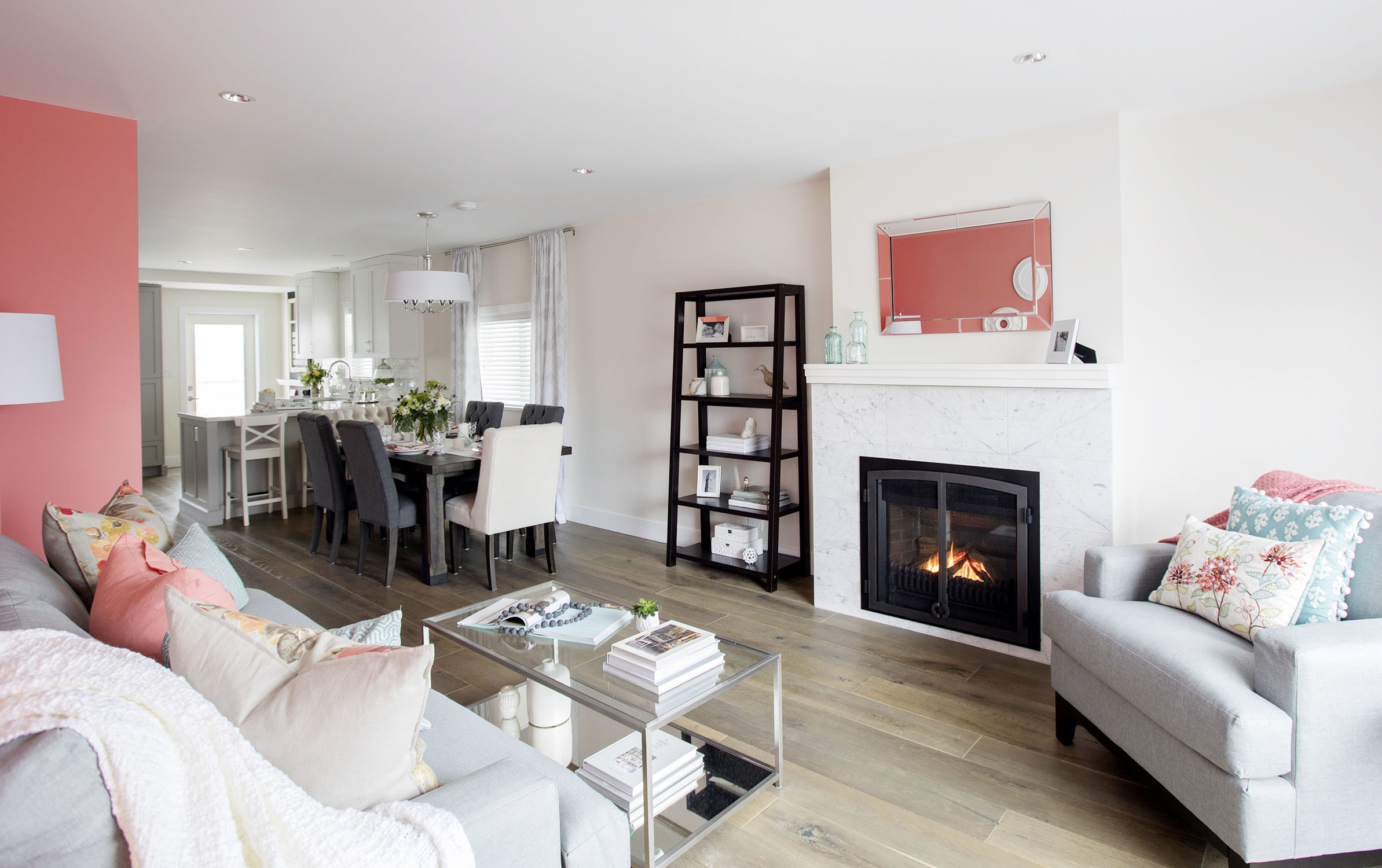
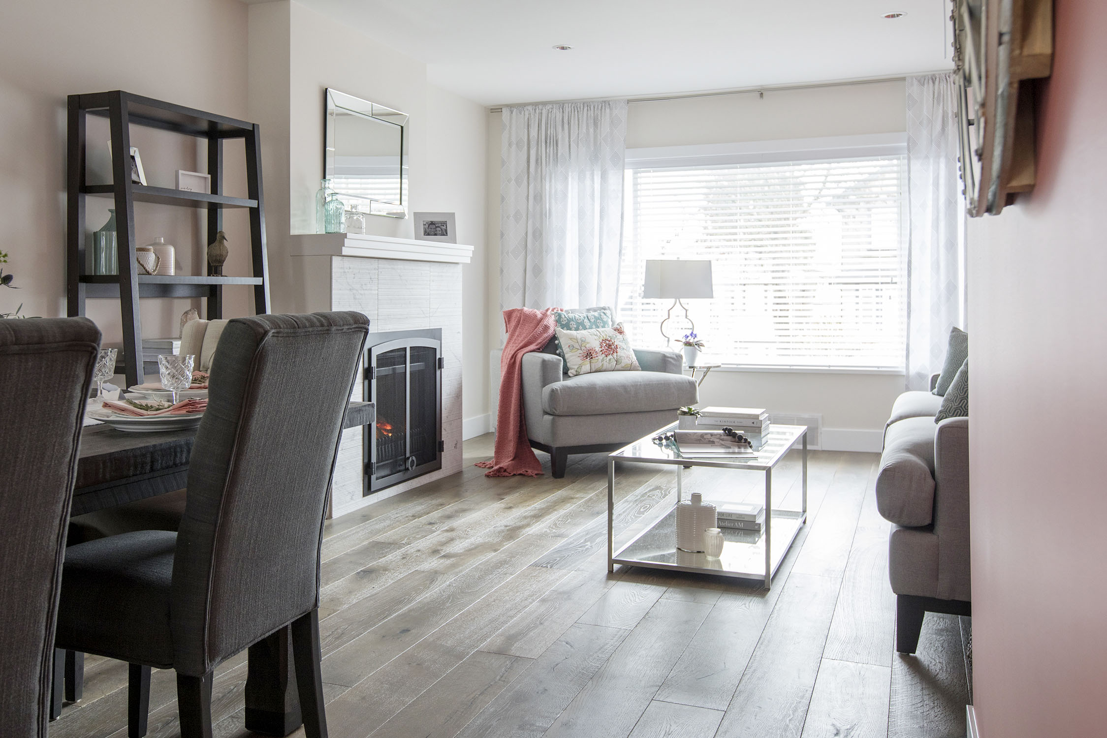
A strategically placed mirror reflects the bright coral feature wall, breaking up a long block of white (thanks to the soft-white paint and marble-faced fireplace) with a burst of colour.
Grey Days
To balance the boldness of the two feature colours, the designers opted for a mix of whites, greys and silver in the furniture, fixtures, remaining walls and floor stain.
Rule Breaker
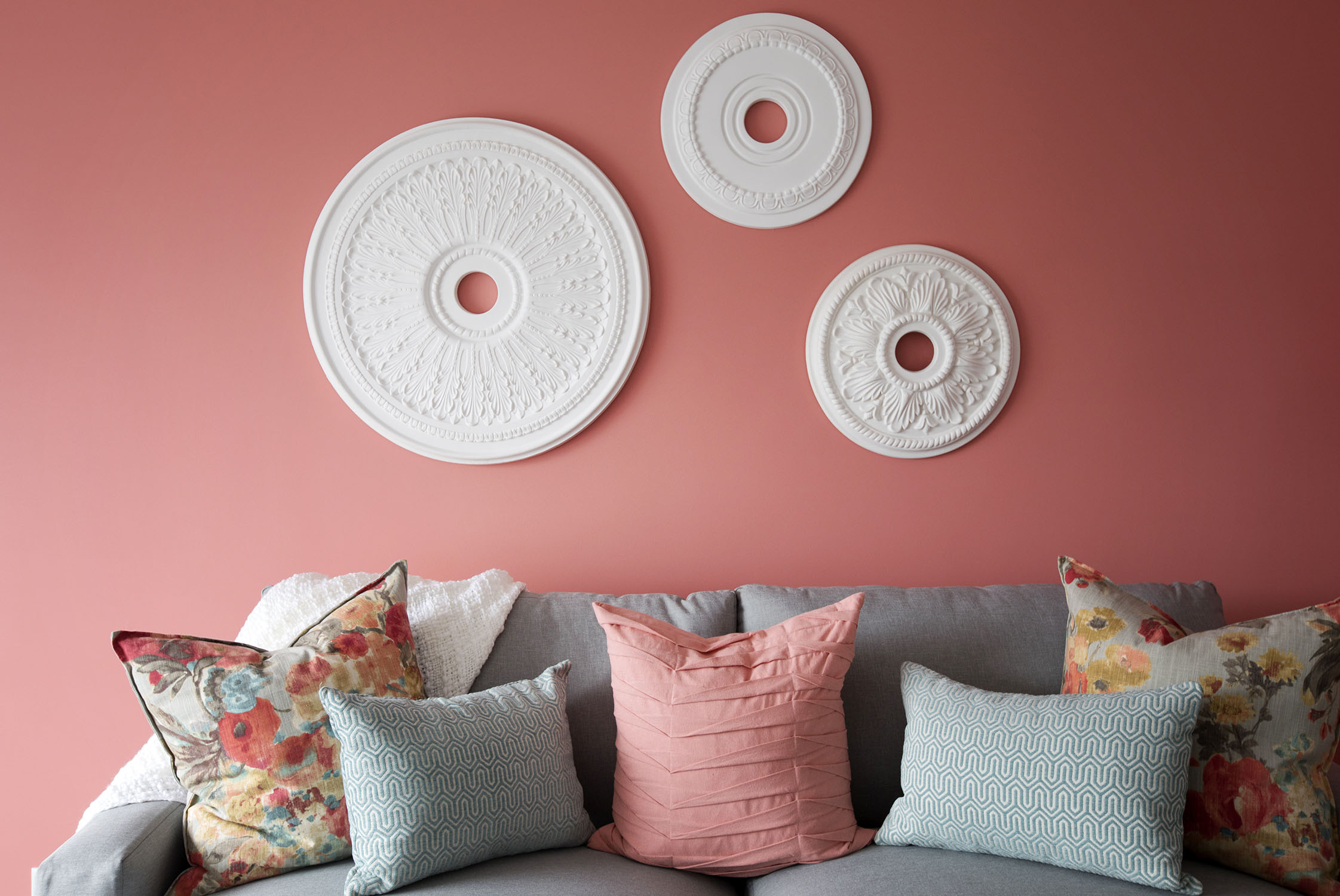
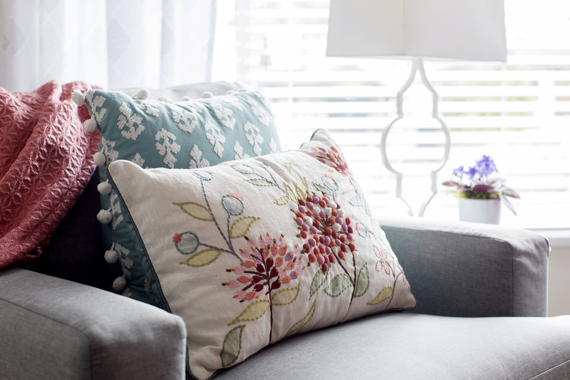
Just because the main colour palette is limited doesn’t mean other shades can’t find their way in, such as the green leaves on this throw pillow’s floral motif. They can add depth to a room’s colour balance, as long as they don’t take up more space than the feature colours.
Optical Illusion
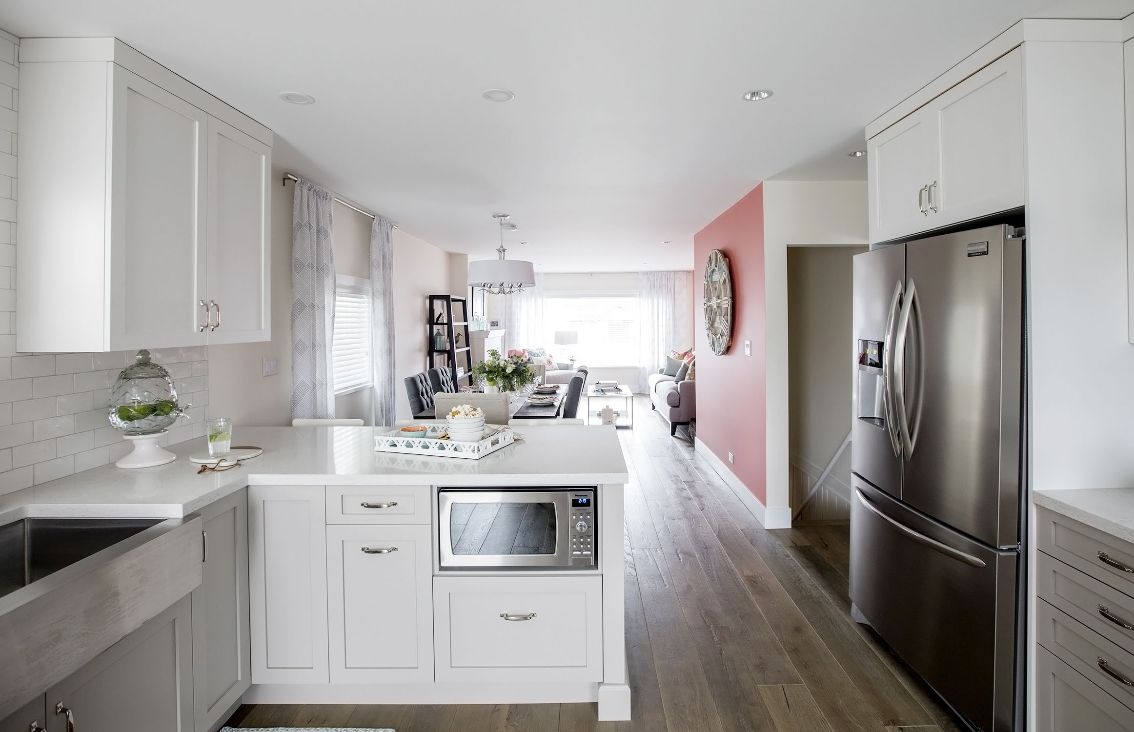
Two decorating tricks are being used here: Hanging similar circular art pieces on one varied-planed wall creates unity, while switching out the dining-room end chairs for cream-coloured ones visually widens a narrow room.
Staging 101
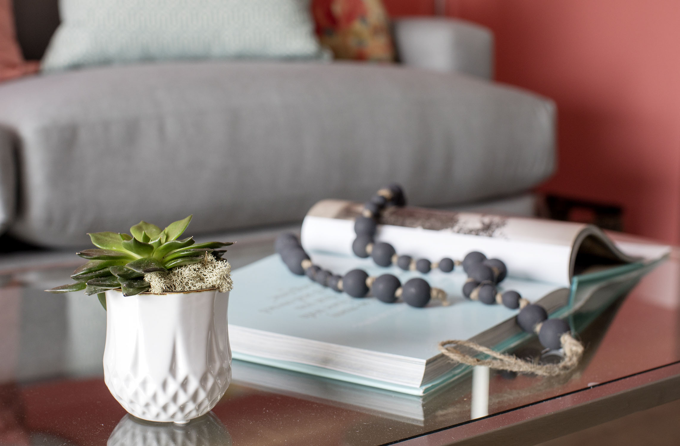
Even when we zoom in, we see all the colour details that make this makeover a decorating success. The palette may be limited, but coral, turquoise, grey and white blend together beautifully to create unique decor vignettes.
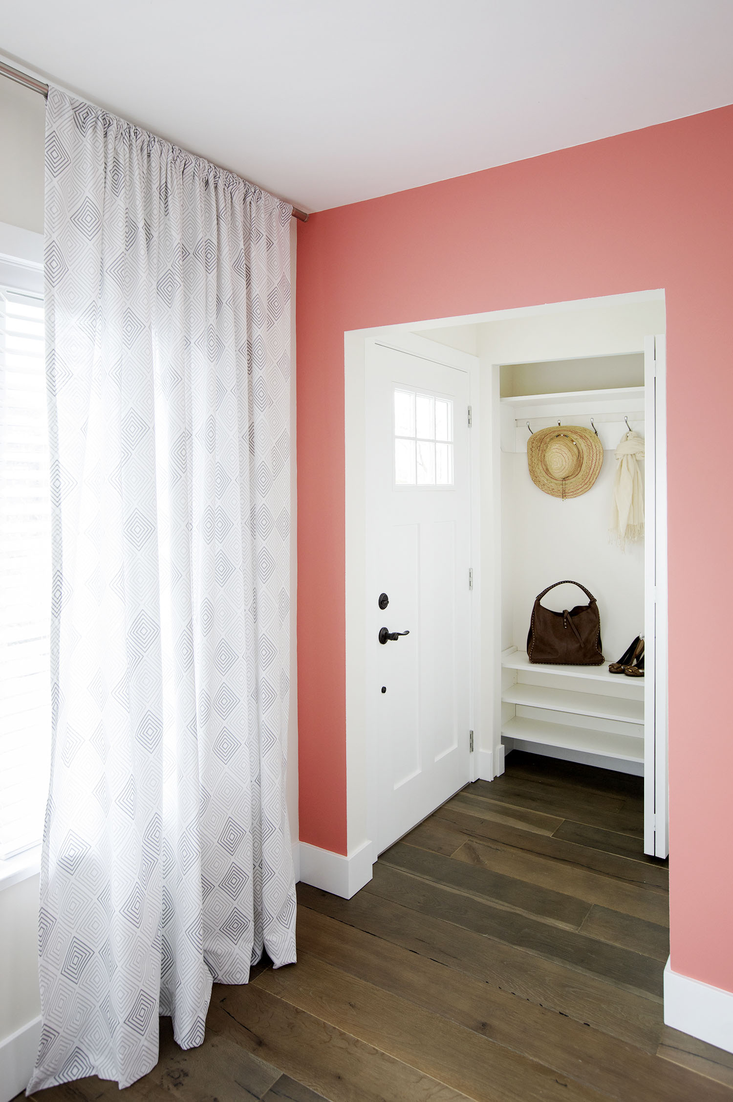
Closet Confidential
While the front hall wasn’t large enough to create a full-sized mudroom, the designers customized a narrow coat closet, turning it into a functioning front-hall organizer.
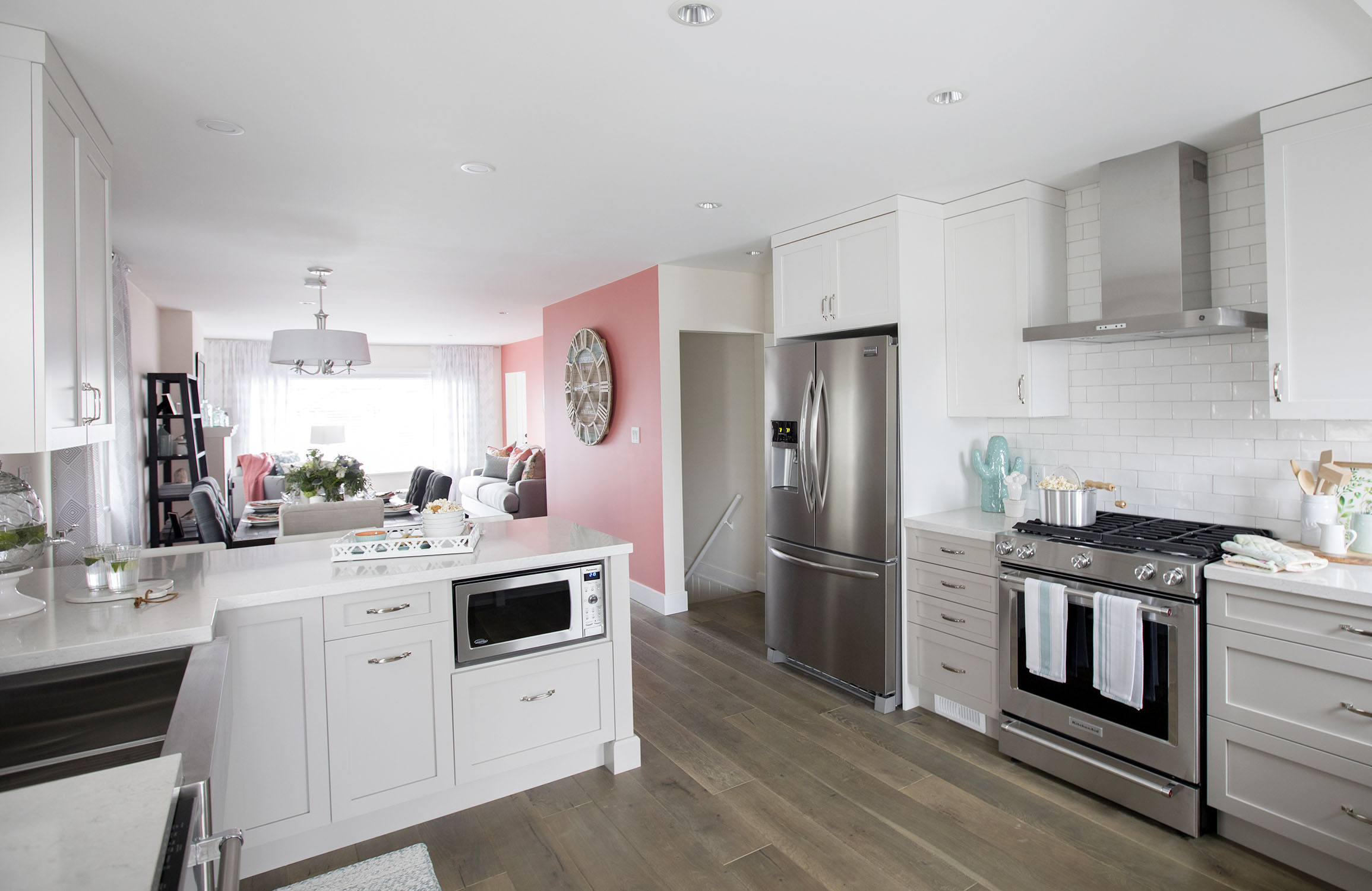
Kitchen Confessionals
Moving into the kitchen, the limited colour palette still reigns supreme. Grey lower cabinets ground the white uppers, while touches of turquoise are scattered throughout.
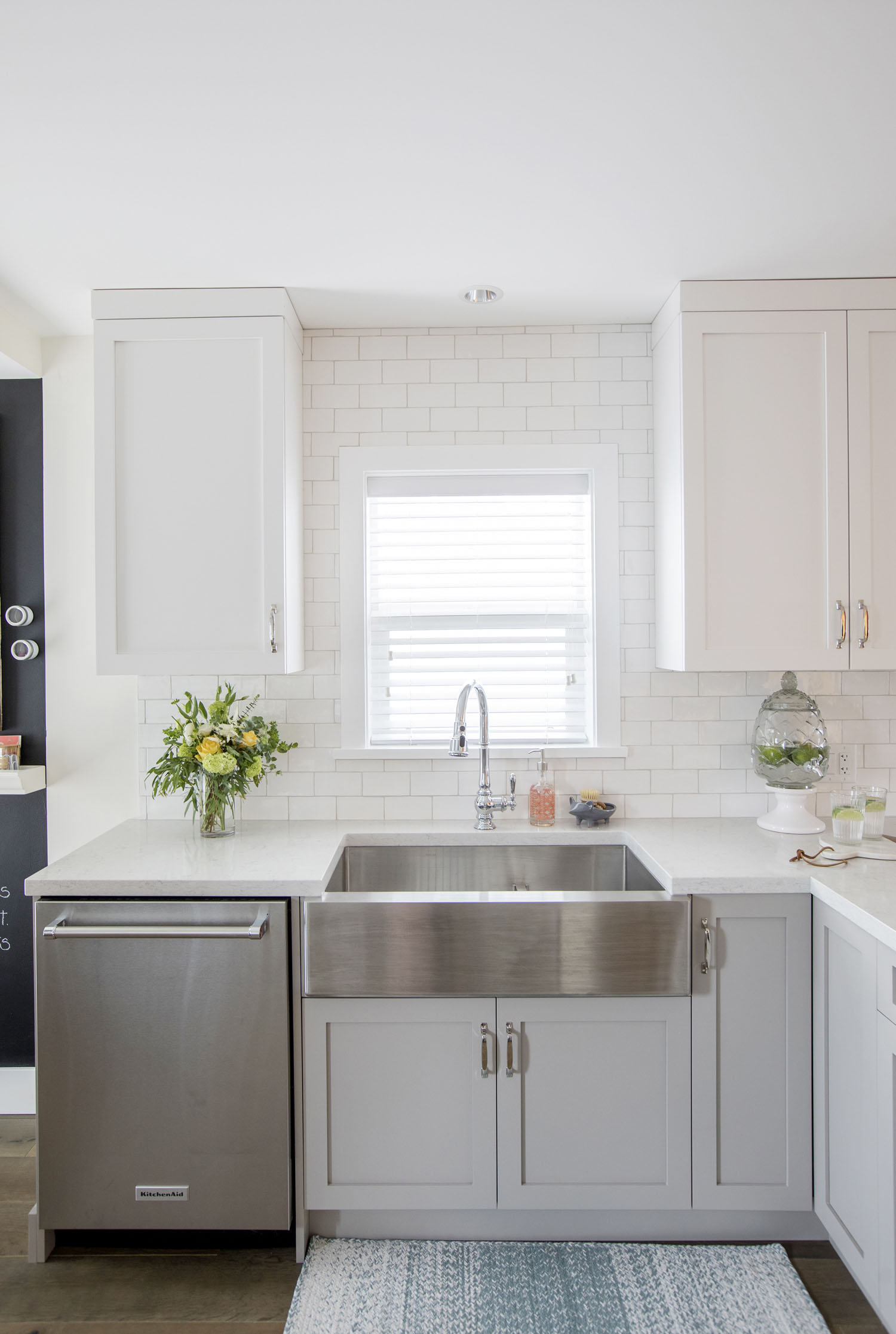
Sink In
A brushed-steel apron sink is the hero of this kitchen makeover, but coral still makes an appearance in the shape of a soap dispenser and turquoise weaves in and out of the floor mat.
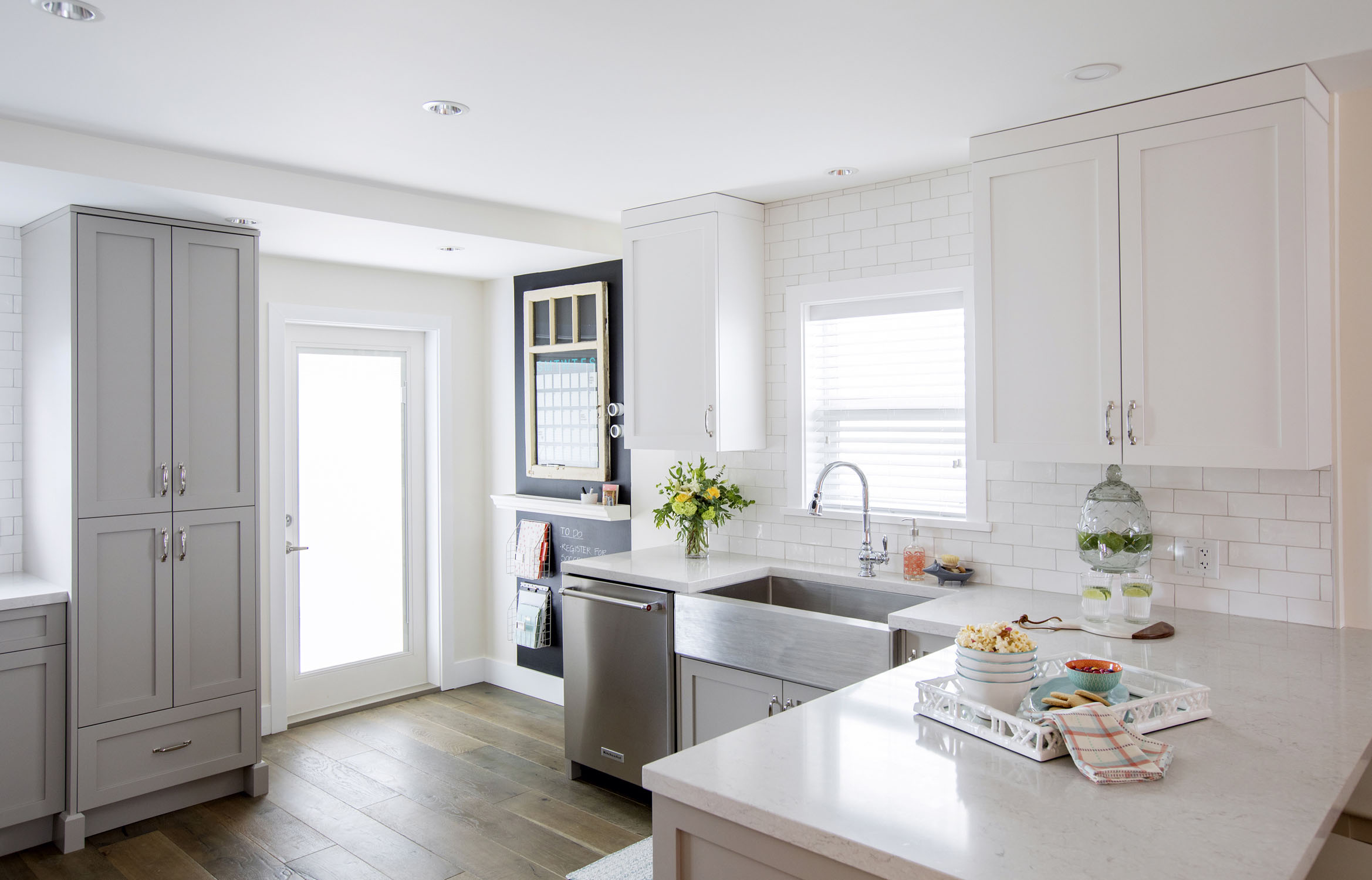
Powered By Quartz
Quartz countertops, such as these veined white ones, offer the look of marble but without all the fussy maintenance. Plus, there are a lot more options when it comes to colour and pattern.
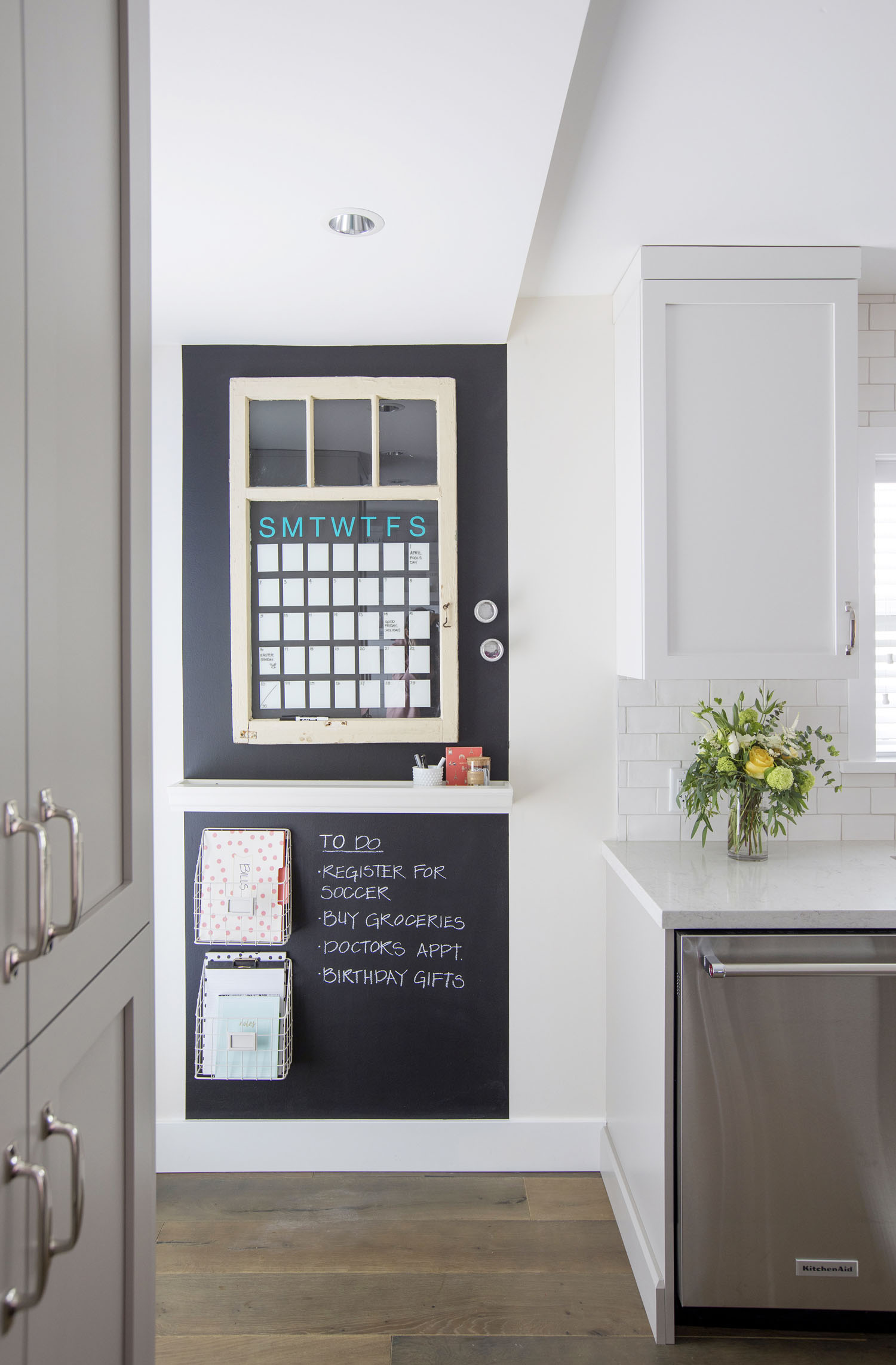
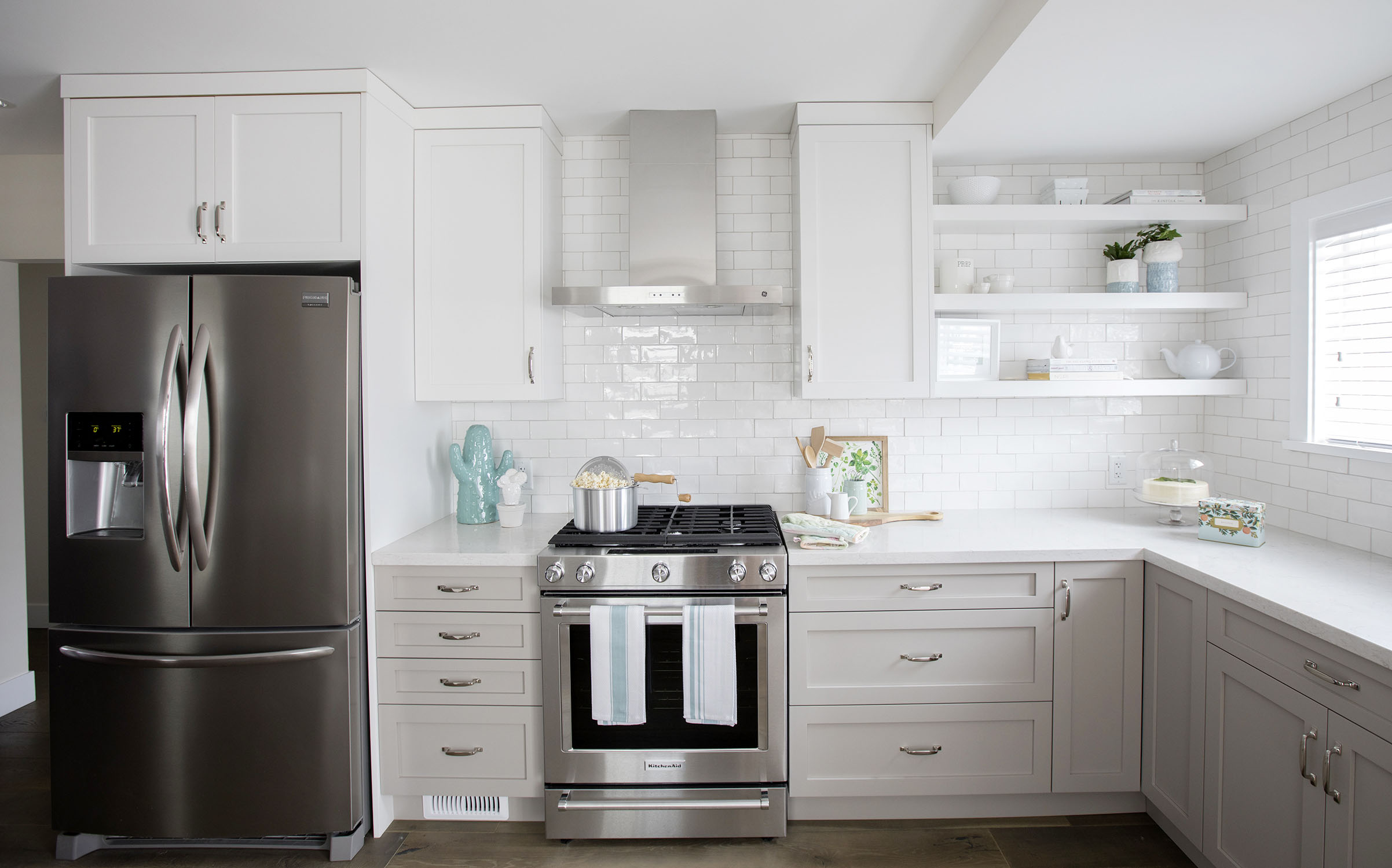
Subway Stop
White, high-gloss-glazed subway tiles line the kitchen back wall from countertop to ceiling. The all-white top half of this kitchen reflects tons of light for an open, airy feeling. (Also, that turquoise cactus is adorable.)
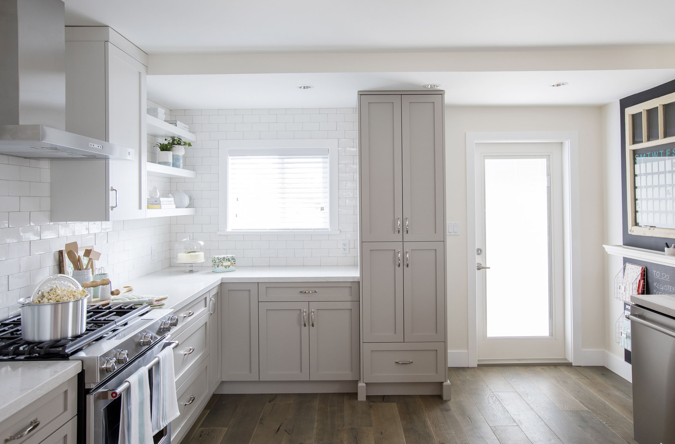
High Jump
Sometimes in a kitchen renovation, storage wins out over counter space. In this case, a floor-to-ceiling cupboard provides an in-kitchen pantry just where this busy family needs it.
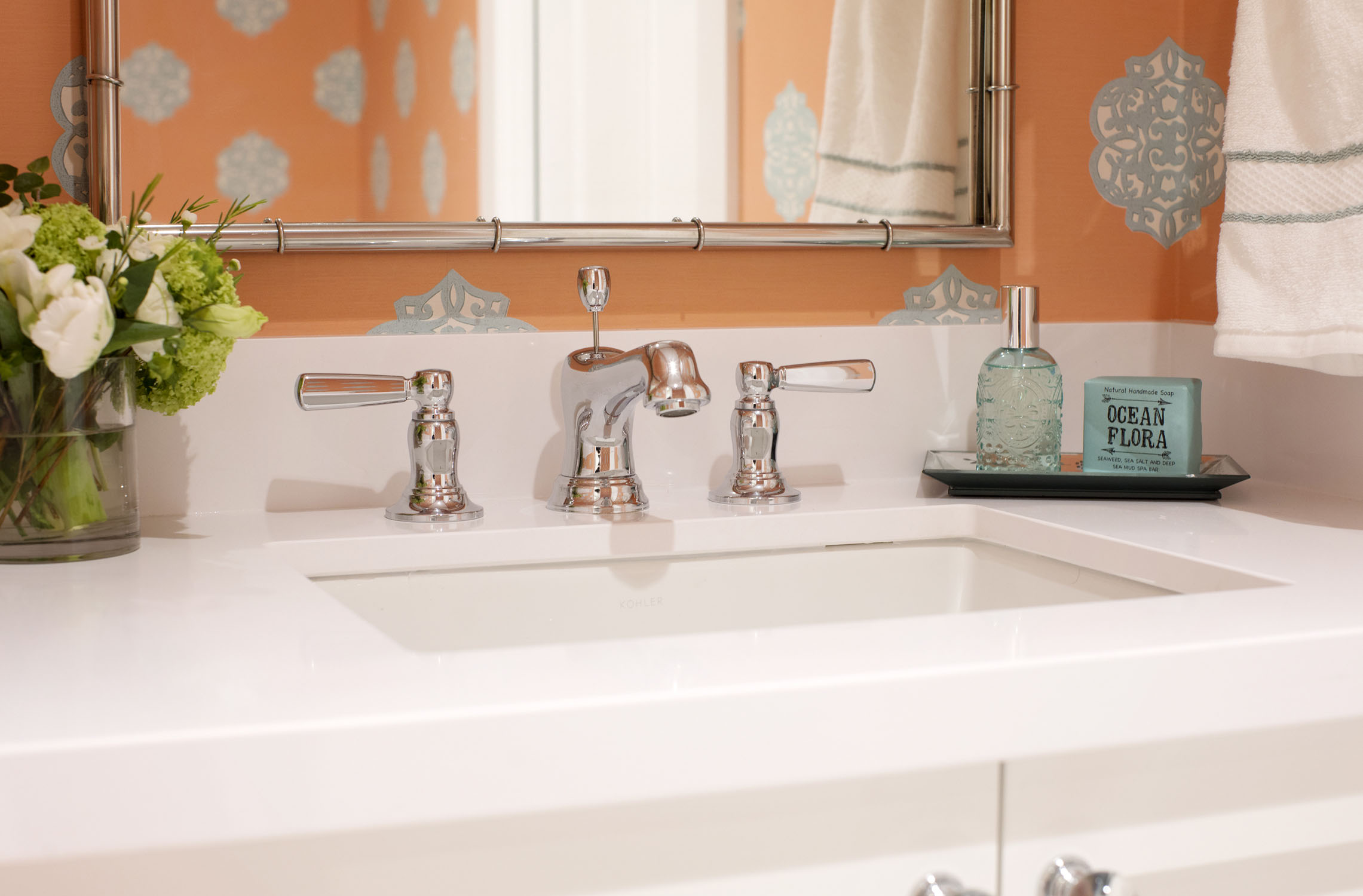
Wallflower Wallpaper
The Worst to First designers are so good at what they do that they found a spectacular wallpaper pattern that fits right in with their coral-and-turquoise colour theme.
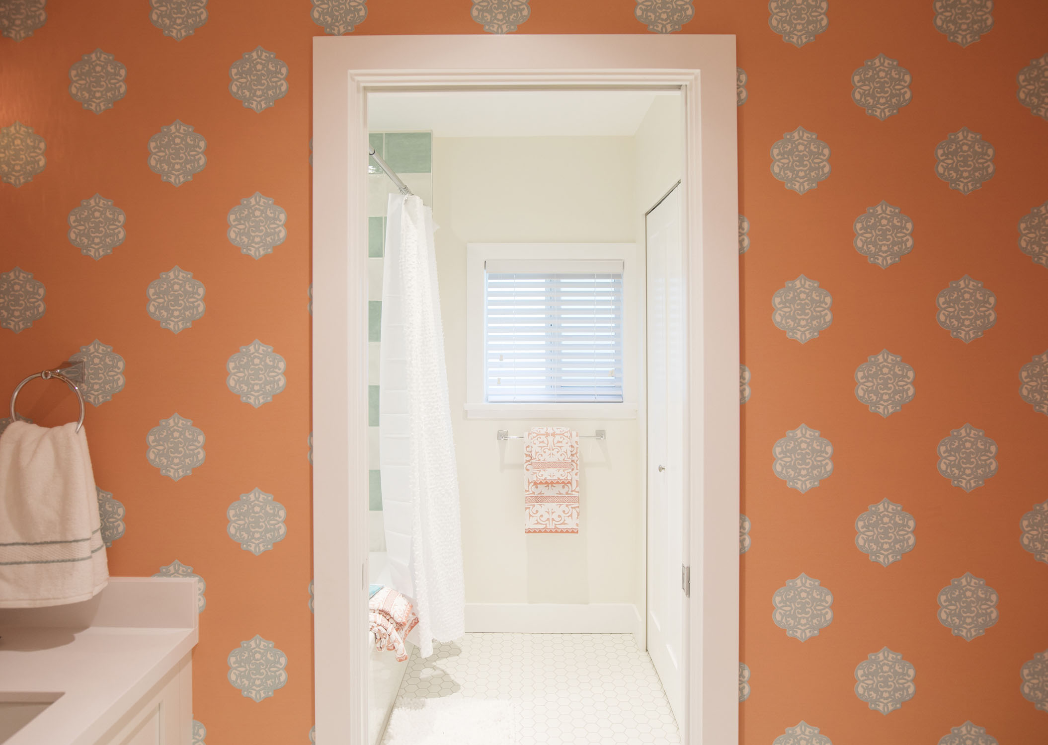
Pantone Dreams
It’s also worth noting that these two shades of coral and turquoise are featured in the Pantone Color of the Year trend predictions for Spring 2018.
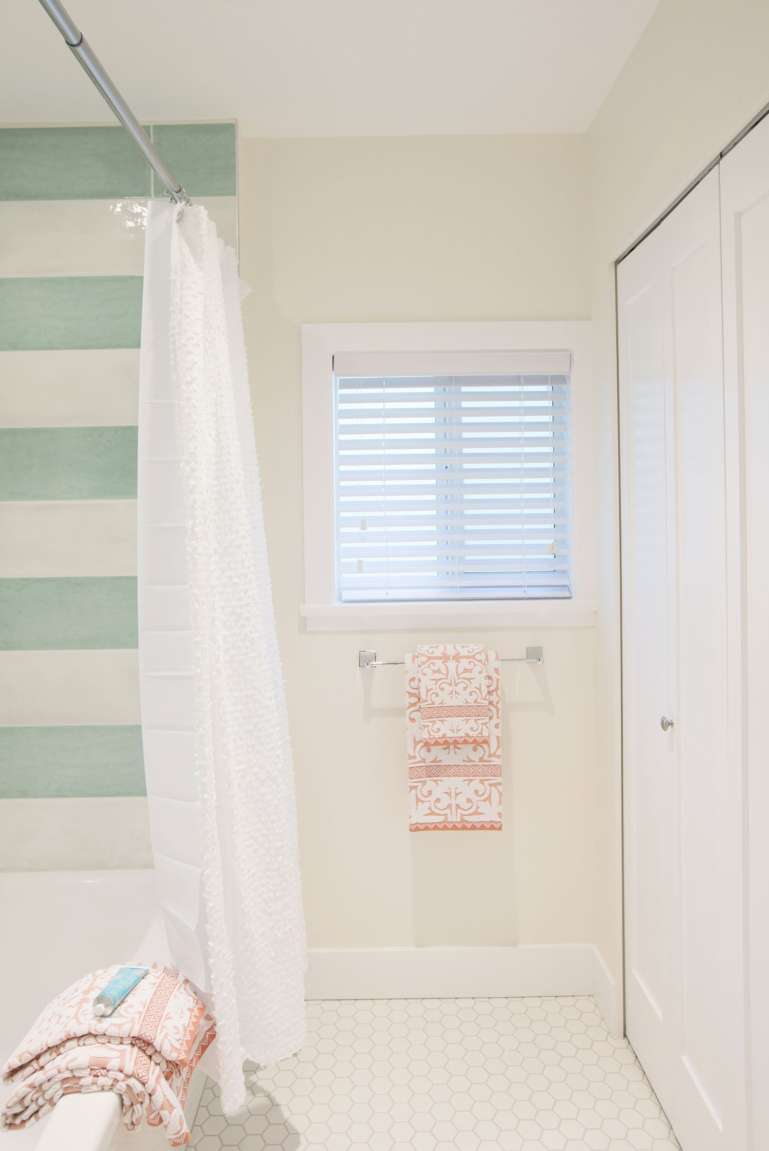
Showered With Love
From a bold wallpaper to horizontal stripes, this bathroom is far from basic, but the commitment to the colour palette keeps the space feeling calm and serene.
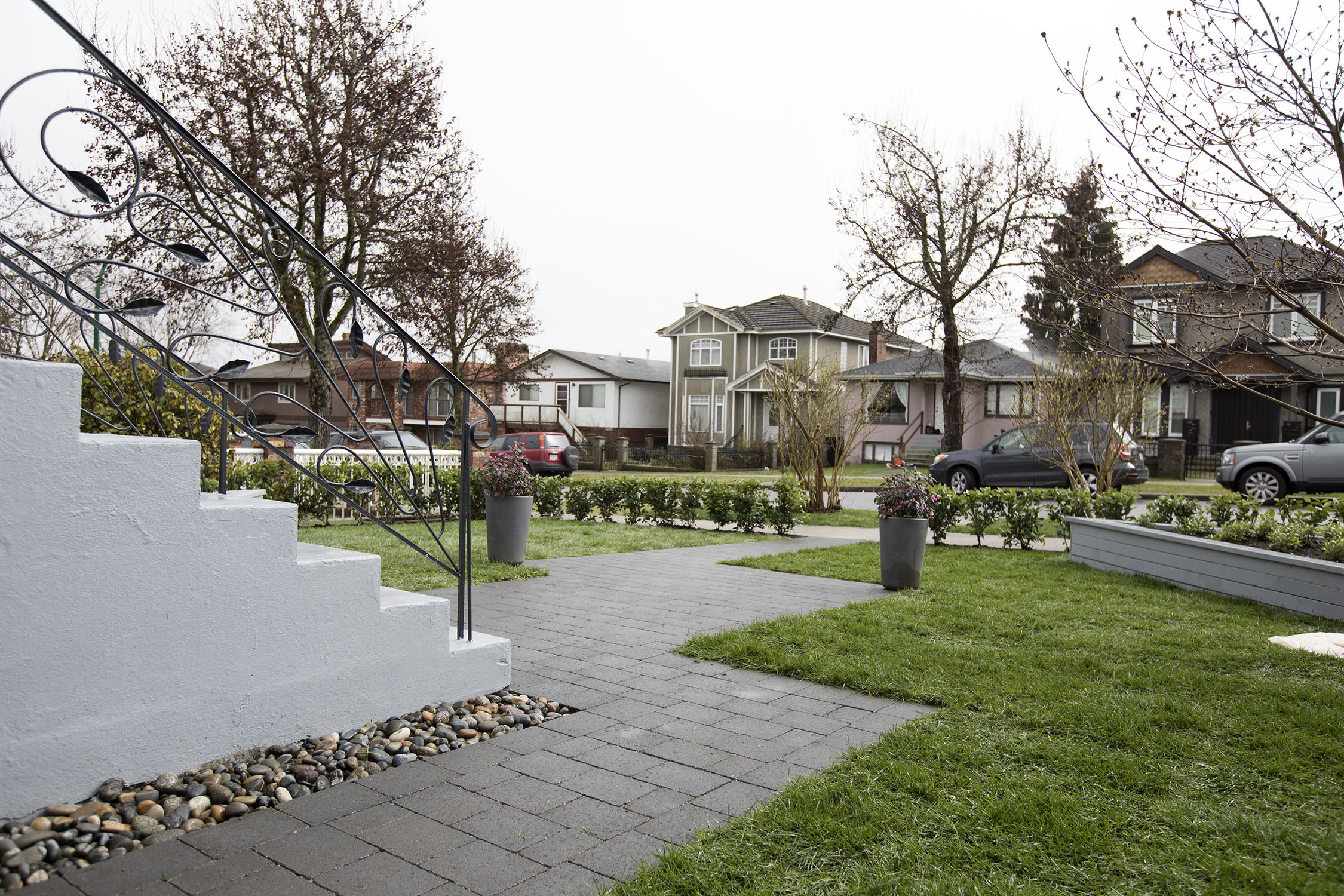
Fresh Air Repair
The outdoor spaces in this Vancouver renovation weren’t ignored either. New grey paving stones were cut into the ground to create a wider front path, as well as two triangular corner flower beds that were added out front.
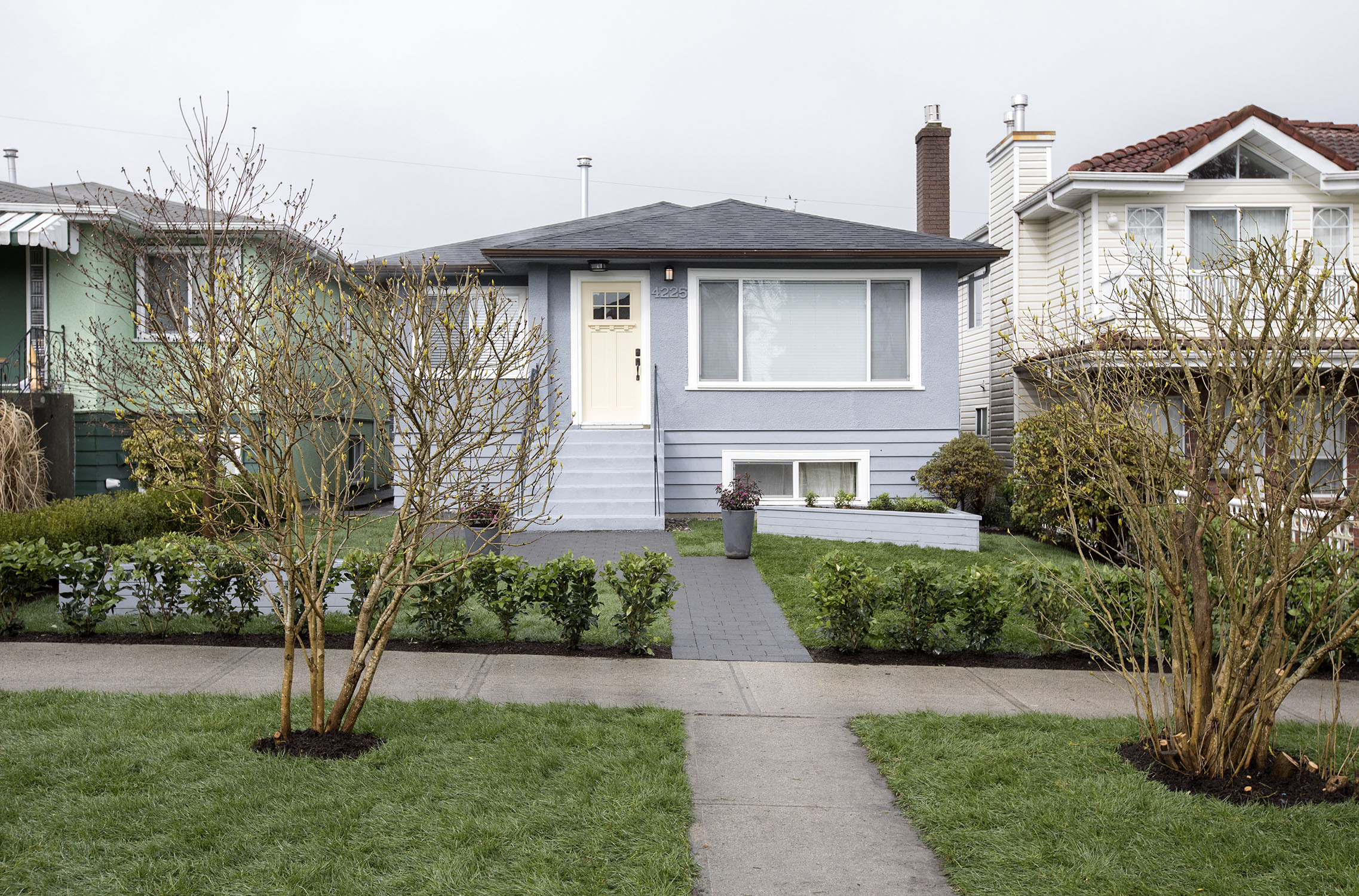
Home Stretch
Painting the outside of this Worst to First makeover home an un-intrusive shade of blue-grey makes the coral and turquoise that awaits these homeowners on the inside that much more special – and surprising.
HGTV your inbox.
By clicking "SIGN UP” you agree to receive emails from HGTV and accept Corus' Terms of Use and Corus' Privacy Policy.


