What this 2,025-square-foot semi in Toronto’s Beaches neighbourhood looked like before the renovation was pretty typical of 1990s design: dark with builder finishes and tiny rooms. Designer Orsi Panos changed all that by opening up the first floor, layering in colour and channelling a bit of mid-century cool. Something the owners, artist Janet Taylor and her wife Hazel, couldn’t be happier with.
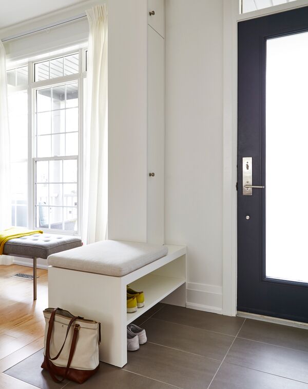
Making an Entrance
You need to screenshot this. Designer Orsi Panos’ front hall vignette is a shortlist of ideas to steal. There are easy-to-clean tiles that stand up to the vagaries of Canadian weather, a custom bench that offers a comfy perch for putting on (or taking off) shoes, plus closed storage and shelves. We love how the bench delineates the entryway from the adjacent dining room in this open-concept space.
Related: This Airy Home in a Former Textile Factory is the Quintessential Toronto Loft
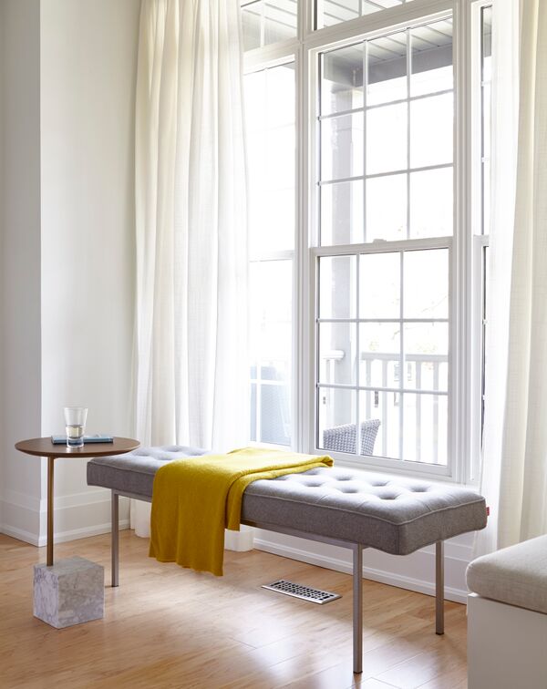
Window Seat
With the dining room positioned at the front of the house, this chic tufted bench does double duty. It imparts a decorated look that goes beyond the practicality of the dining room’s table and chairs and it can be used as additional seating when Janet and Hazel entertain. The mustard throw layers in a bit of zing. Like a lot of great design, the bench offers even more than the intended effect. “Truthfully, it mostly gets used by the cats (Bowmore and Henry) who window watch and nap on it all day long,” says Orsi.
Related: The Victorian Era is Still Alive in This 106-Year-Old Carriage House in Montreal
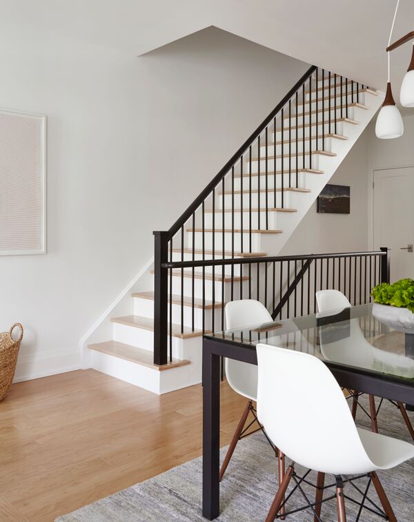
A Step Up
Orsi gave the home’s original staircase a dramatic makeover, replacing the colonial-style balusters and railing with a revamped modern style in keeping with the owners’ desire for a more contemporary vibe. We like how she echoes the railing’s dramatic black finish in the dining room table for sharp continuity.
Related: How a Toronto Couple Created a Cozy Farmhouse Escape Just Outside of Collingwood
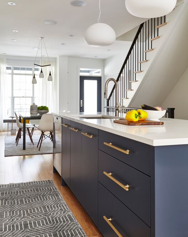
In the Open
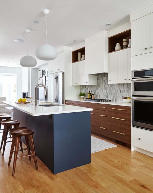
kitchens can pose a decorating challenge, especially when they’re in the middle of the house. How do you keep the kitchen functional, while maintaining aesthetic flow and form? “I wanted to make sure the kitchen didn’t feel utilitarian,” says Orsi. “I chose blue for the island for this reason. It adds warmth, interest and brings a great furniture-like feel to the kitchen.” Continuity alert: the island is the same colour as the front door frame.
Warm Front
Orsi created dynamic energy in the kitchen by contrasting the cool blue of the island’s base with the warmth of walnut drawers and stools. It’s a gamechanger – imagine if the lower drawers were white. They’d look fine, but would lack the energetic impact now in place. That attention to detail and finishes is extended to the uppers which feature walnut-lined display areas that effectively break up the expanse of white cabinetry and provide pretty focal points.
Related: This Historic Langley Farmhouse Will Make You Want to Move to the Country
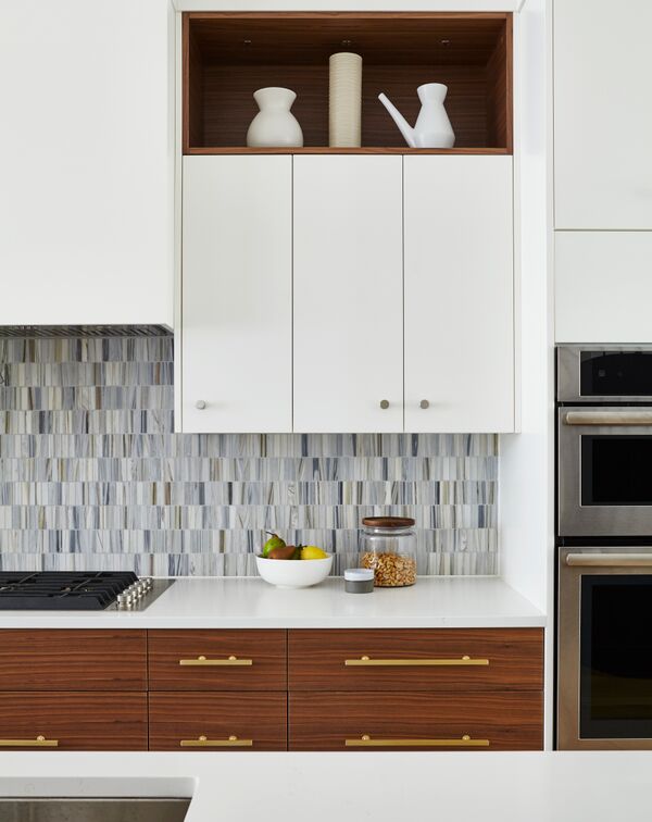
Mix Well
There is so much to keep the eye moving here – an element of great design – and one of the more subtle, yet effective details is the mix of hardware (a great idea to steal for a mini makeover). We love how the walnut drawers are complemented with brass pulls, while the white cupboards feature brushed chrome ones. It’s an ingenious touch and connects to the stainless-steel appliances for a pulled-together look.
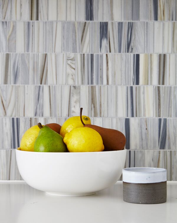
Straight Up
The kitchen’s showstopper backsplash features natural marble mosaics that reference all the blue, white and natural tones found throughout the space. Orsi had them installed vertically to amp up the mid-century modern vibe.
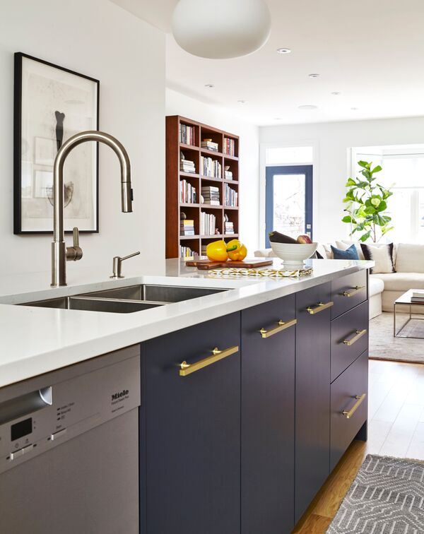
The View From Here
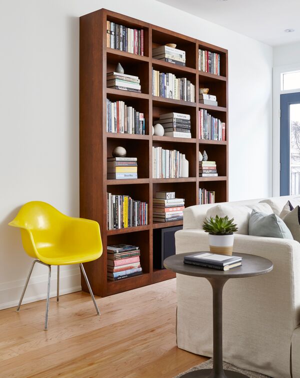
The living room is at the back of the house and clearly visible from the kitchen. Orsi maintains a cohesive flow here by repeating elements: the walnut of the kitchen drawers is reflected in the freestanding bookshelf and the back door (like the front) is painted the same shade as the island. The bookshelf is a good reminder to “shop your home” as it used to sit in the dining room. Moving it to the back of the house gives it and the living area a fresh look.
Lemony Fresh
“I’m drawn to yellow as a pop of colour,” says Orsi. “It really does a good job of waking up any palette. This yellow Eames chair came as the last decorative layer and was an excellent authentic find at GUFF.” If you’re looking for a quick refresh of your space, copy Orsi’s book styling. We love the mix of vertical and horizontal placement and the addition of round vases and vessels.
Related: 15 Bold Print Wallpaper Ideas That Will Transform Your Space
Plant-Based Design
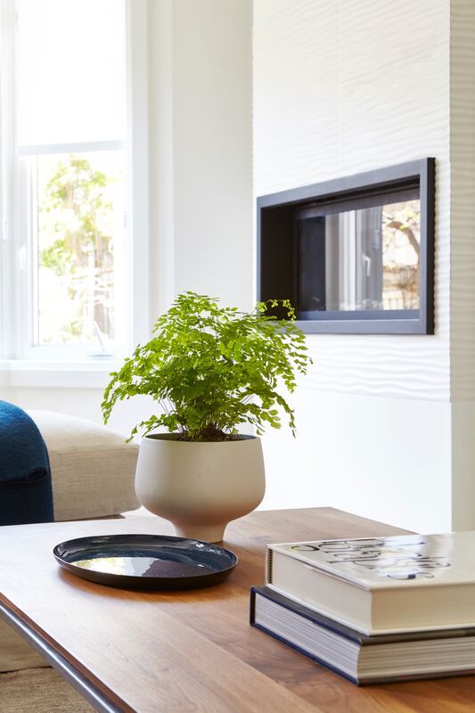
This greenery works so well because the vase is the same tone as the walls and sectional. Imagine it in a traditional terracotta pot and it would look flat, too outdoorsy. The vase also references the shape of those on the bookshelf reinforcing that no detail is too small and everything should be connected.
Related: How to Make Your Own Living Wall
Picture This
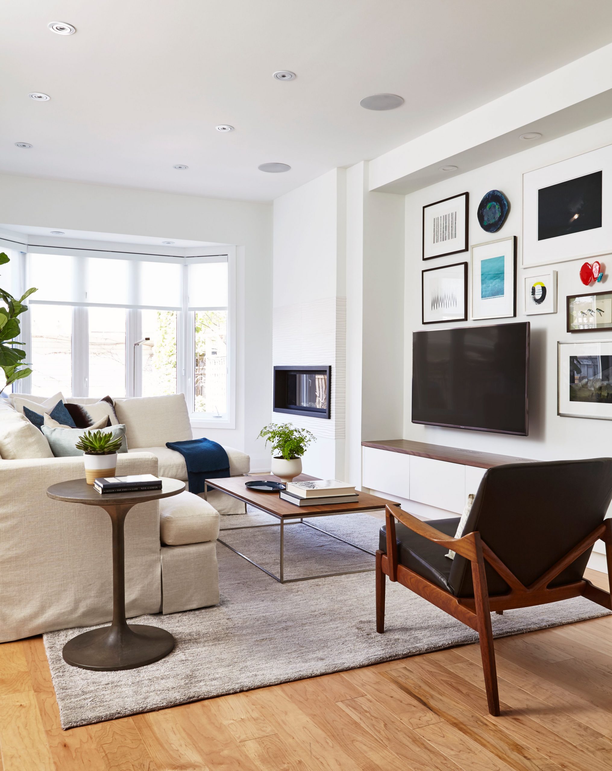
A gallery wall is a brilliant way to “hide” a TV in plain sight. This one features Janet’s own work, as well as favourite collected pieces. Orsi fit the base of the wall with custom built-ins for added storage and to keep clutter to a minimum. She chose a walnut top for consistency with the adjacent kitchen. The sectional was custom-designed to fit the space and is slip-covered for easy cleaning. The concrete side table has a mid-century mod feel, the vintage chairs is an original Johannes Anderson and the coffee table was an existing piece. As Orsi says: “why change something when it’s perfect?”
Nice Touch
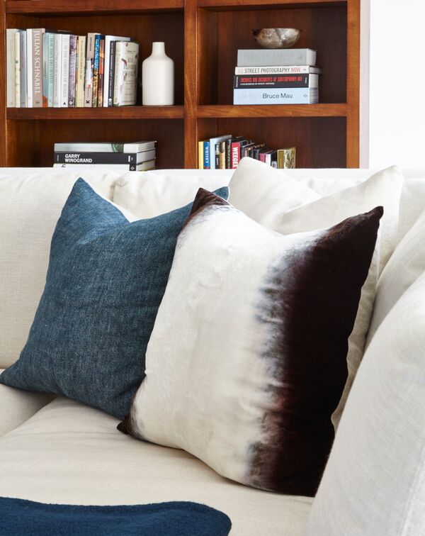
The living room’s toss cushions are handmade and were sourced from Lief Huis. They are one-of-a-kind and the homeowners love supporting artisans wherever possible.
Big Ideas
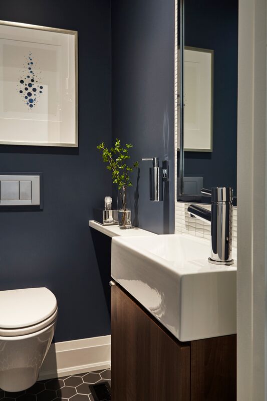
The teensy-tiny powder room has lots of ideas to copy. We love that Orsi went dark and painted it the same blue as in the kitchen and door frames. The sink is just enough for washing hands (note the ingenious and reusable wall-mounted soap dispenser). The small bathroom is lavished with a floating toilet, framed artwork and greenery.
Blackout Beauty
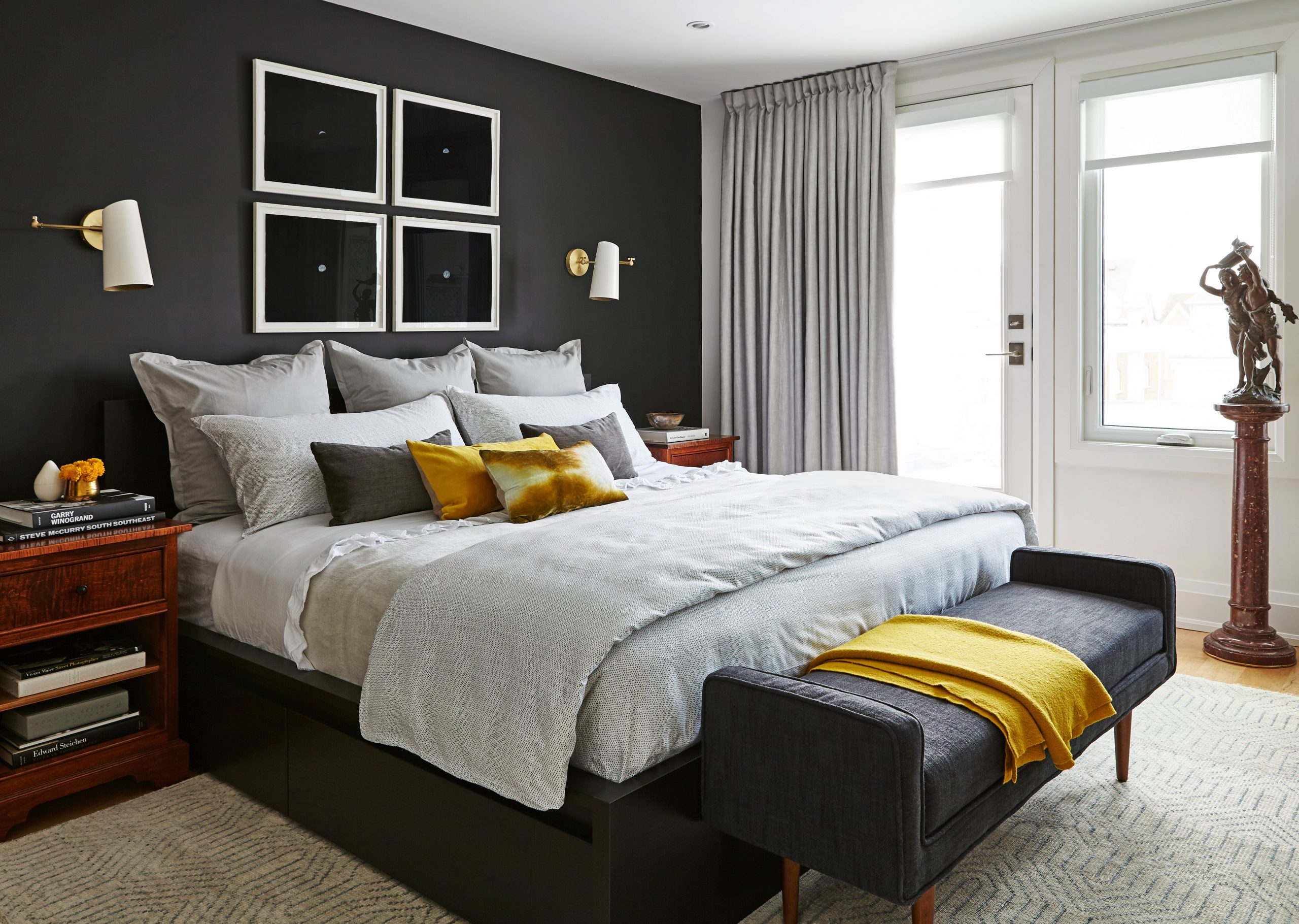
In addition to custom-made blackout drapery, the bedroom boasts a dramatic black focal wall. “The clients already had the black bed,” says Orsi. “Since its headboard was not going to become a feature because it has such a low profile, I decided to paint the whole wall black. It allows for the burled wood night tables to pop.” The statue on the marble pillar is another example of shopping your home – it was previously stashed away in a corner and it was moved to become a feature piece.
Four Square
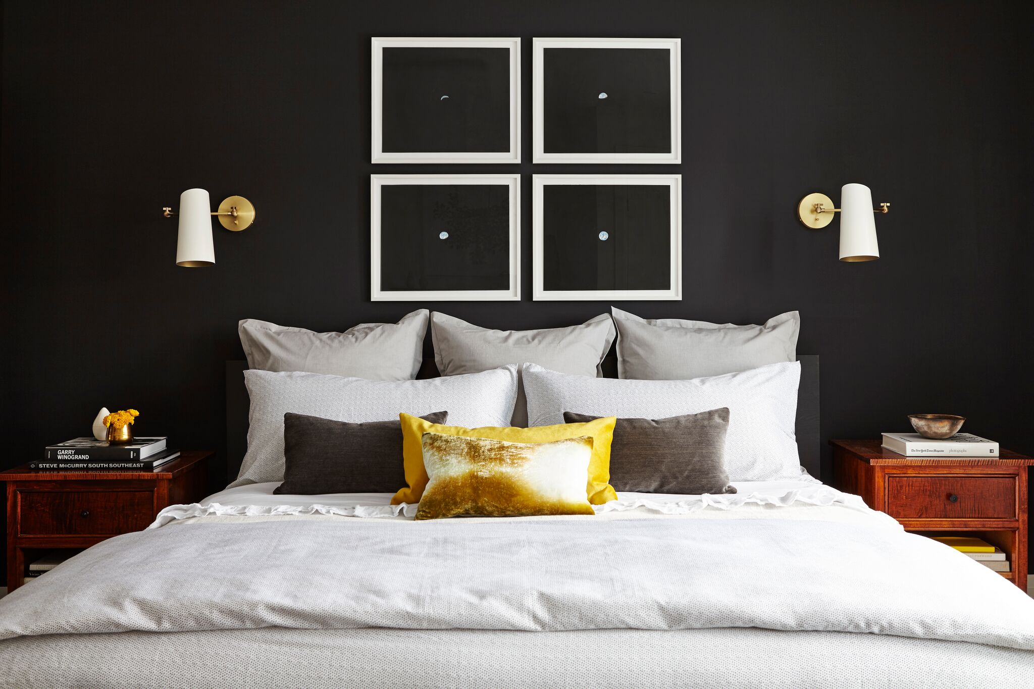
The bedroom’s black focal wall is further punctuated with black artwork that pops thanks to white framing. Another inspired idea to emulate – four smaller pieces of art rather than one large one is easy to copy and budget-friendly. We love the mustard cushions here – a continuation of the throw in the dining room window.
Against The Grain
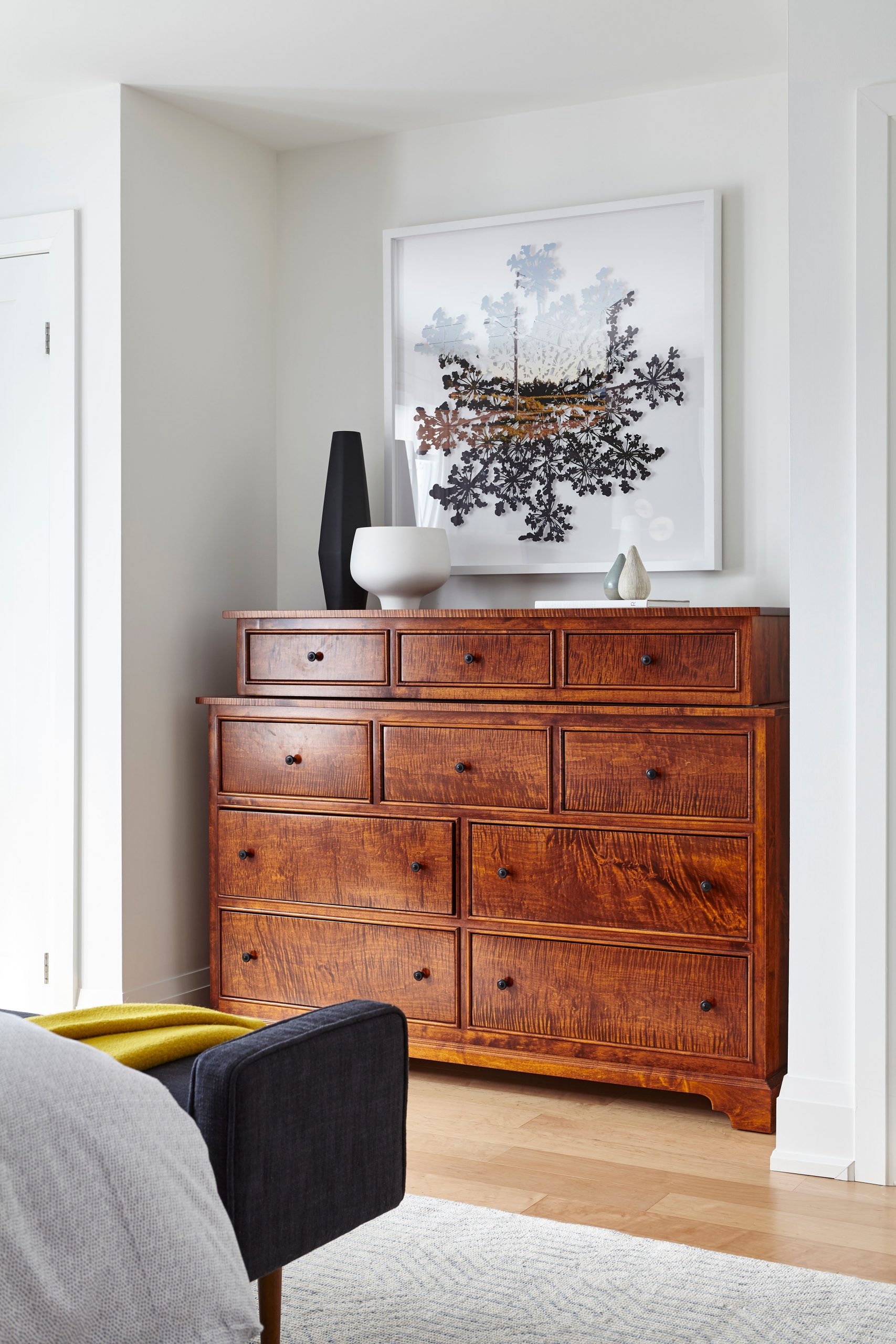
The homeowners’ burled wood dresser is a magnificent piece with old-world charm. We love how Orsi contrasts that with monochromatic accessories and contemporary art for a rich, layered look.
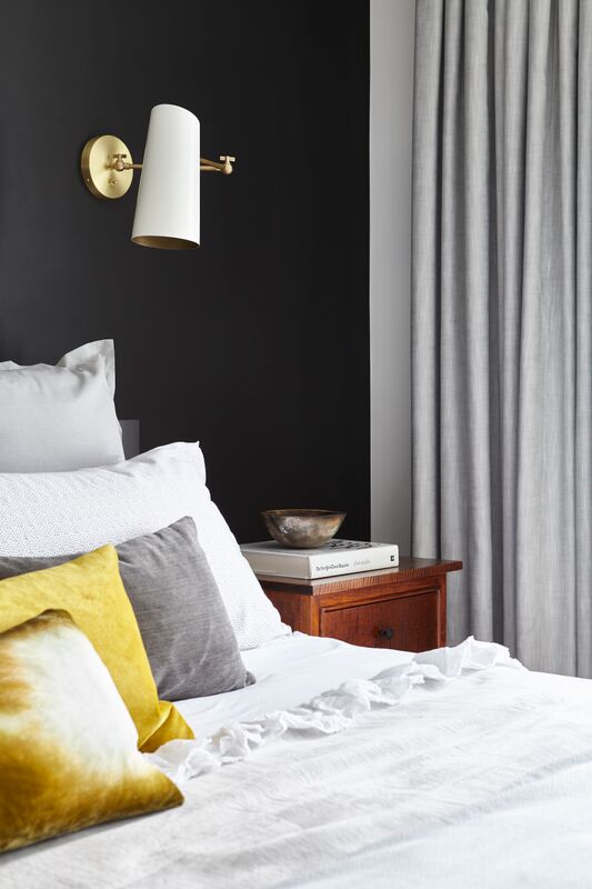
Spot On
Orsi opted for hard-wired sconces with articulate arms for directional light while reading in bed. Their practicality is tempered with their pure eye-candy wow. She says: “with the white and brass, they are like pieces of jewellery here.”
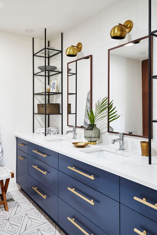
Vanity Fair
The ensuite’s custom-made vanity is an example of smart design: two sinks, loads of drawer space and – look to the end – laundry pullouts. The window-less room is now a light-filled space thanks to the addition of sun tunnels which illuminate the mix of elements found throughout the home: blue paint, brass pulls and walnut trim (here in the mirrors’ frames).
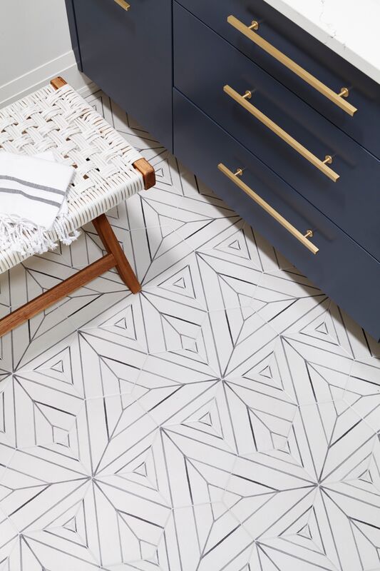
Floor Show
The quirky, geometric bathroom floor tiles set the fun tone for the space. They’re handmade and from Red Rock Tileworks.
Related: 10 Unusual Tile and Grout Combos We Love in Kitchens and Bathrooms
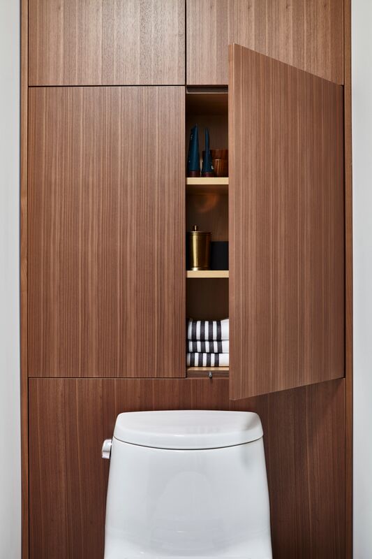
Behind Closed Doors
To add even more storage, the toilet was repositioned, slightly away from the wall and sleek, integrated walnut cabinetry was installed behind it.
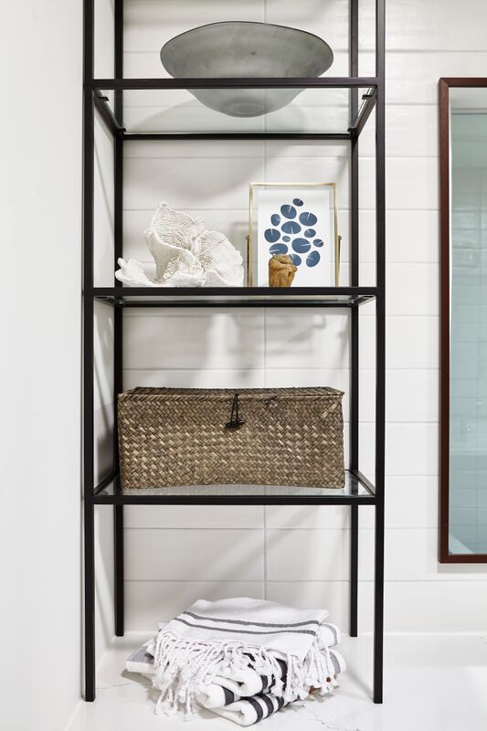
Shelf Life
Custom etagere-style metal and glass shelves sit at either end of the the vanity and are a practical and pretty way to add display space and more storage.
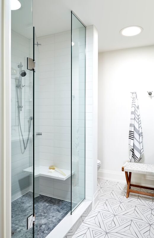
Take A Seat
A shower bench is a great investment and great for resale. We love the mix of materials here and the practical choice of grey pennyrounds for the shower floor. The ensuite, like the rest of the house, avoids the prescriptive all-white look often deferred to in a contemporary makeover and relies on a bold mix of materials and colours to achieve a very layered effect that’s both compelling and welcoming.
HGTV your inbox.
By clicking "SIGN UP” you agree to receive emails from HGTV and accept Corus' Terms of Use and Corus' Privacy Policy.


