Bryan and Sarah Baeumler designed this refreshed family home with modern features and hits of brilliant blue for first-time homeowners, who are also expecting! See how the stars of Bryan Inc. incorporated the year’s biggest trends in a way the homeowners can enjoy for years to come!
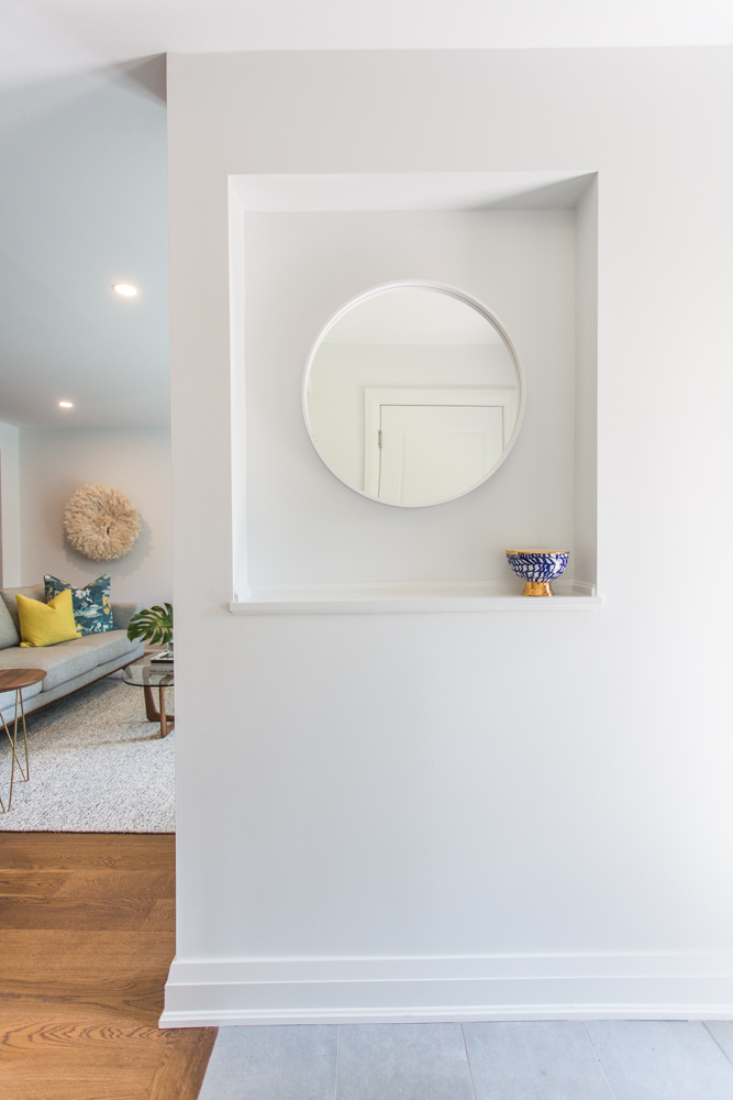
Storage Salutations
When first-time homebuyers James and Lisa walked into their newly renovated home, they were greeted by a purpose-built key nook – thanks to Sarah’s careful planning.
Dreaming of a home that’s all your own? Read on for Bryan Baeumler’s tips on designing a home from scratch.
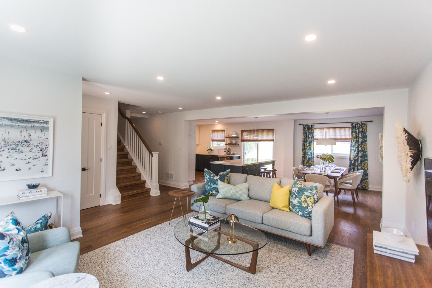
Redo Renegades
What started out as a small renovation project soon expanded into a whole house makeover – at the request of the Baeumlers’ clients James and Lisa, of course.
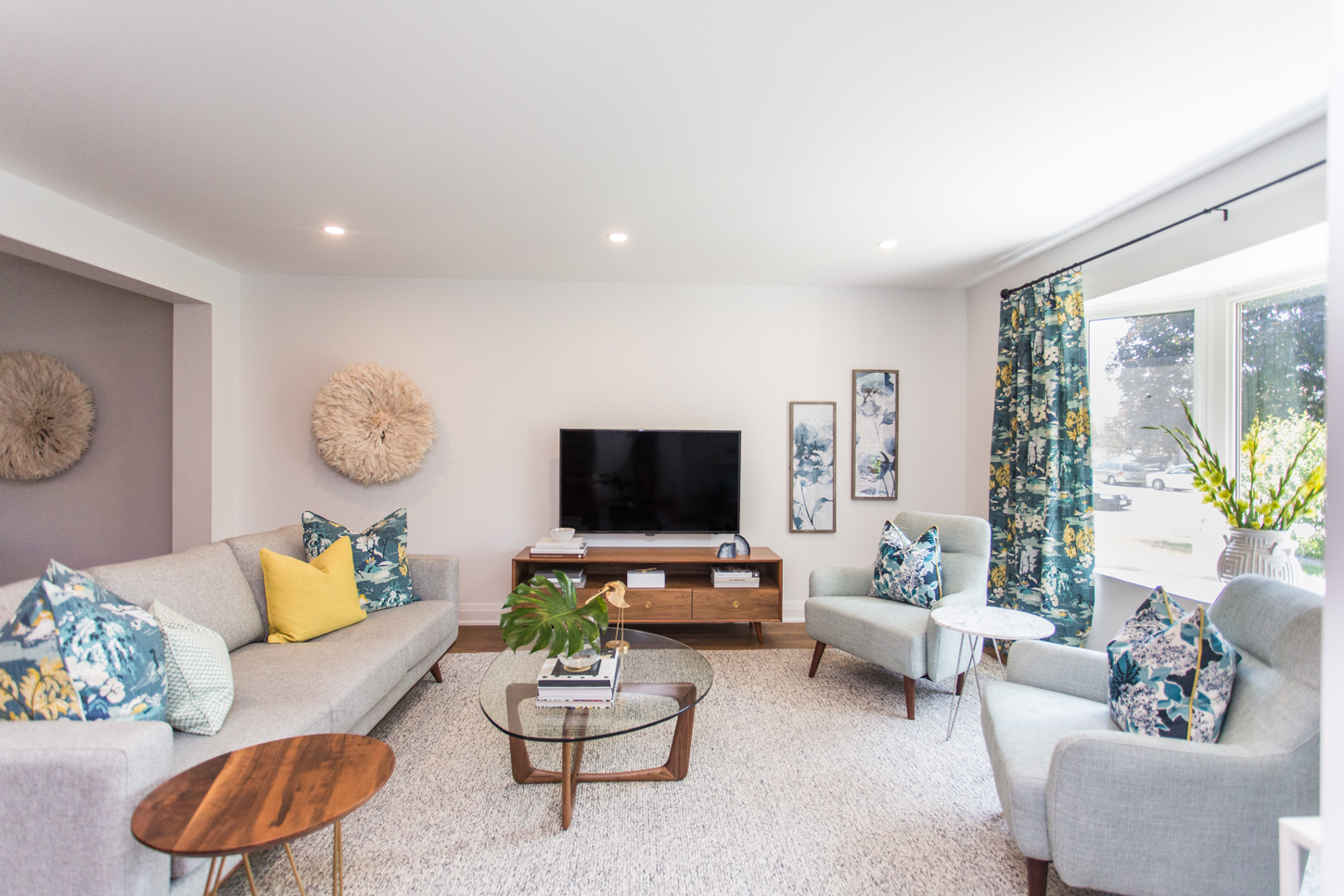
Wood You
There were discussions around wrapping the drop-down beam with wood siding, but James and Lisa decided to save the cash to use it elsewhere in the budget.
Bryan Baeumler weighs in on the 12 most polarizing design debates.
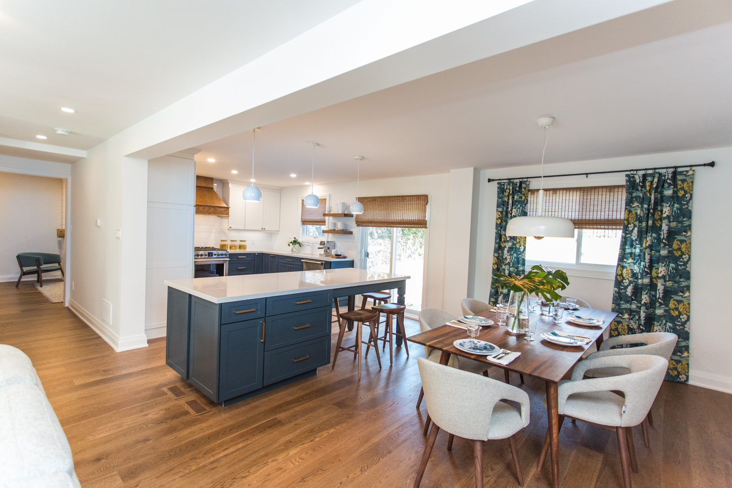
Growing Waistline
After gaining square footage by removing and relocating a small powder room, the fully renovated kitchen grew in width by nearly one and a half metres.
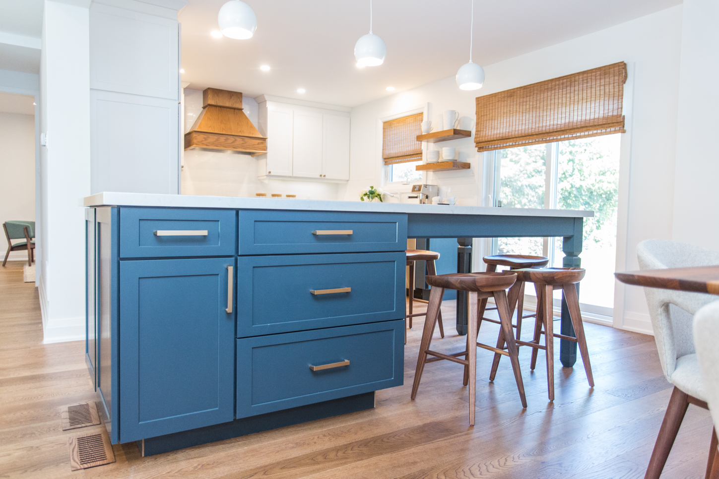
Dine In Dine Out
The spacious new island provides an alternative eating area to the more formal dining space. Its glam brass hardware and bright blue hue also adds modern appeal.
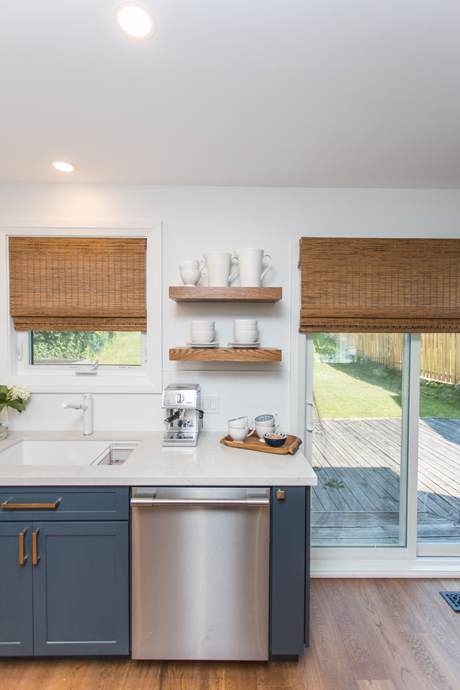
Shelve It
Beautiful floating wood shelves on the edge of the kitchen provide the perfect spot to place coffee-making accoutrements at this in-house caffeine station.
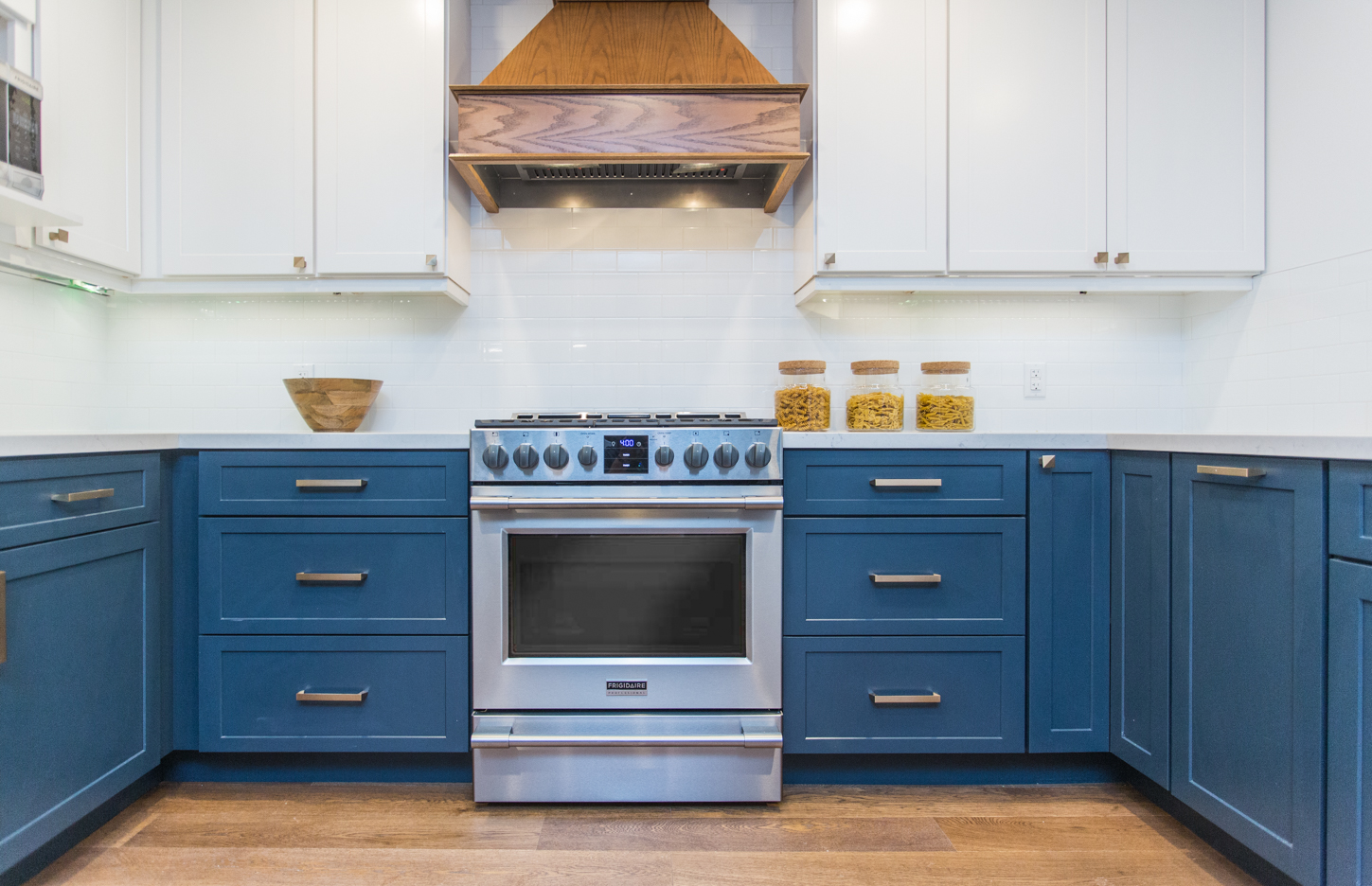
Blue Moon
The rich blue of the lower cabinets grounds this custom cook’s kitchen, while the matching wooden hood vent and hardwood flooring create a cohesive design aesthetic.
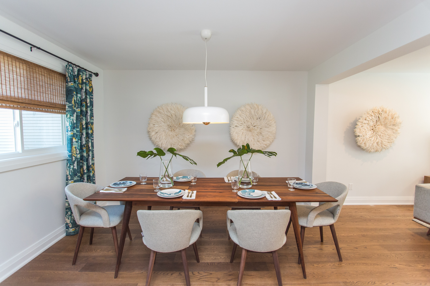
Desired Dining
While Sarah tends to gravitate towards more sparkly lighting options, she kept her clients’ wishes in mind when choosing this simple, single overhead lamp.
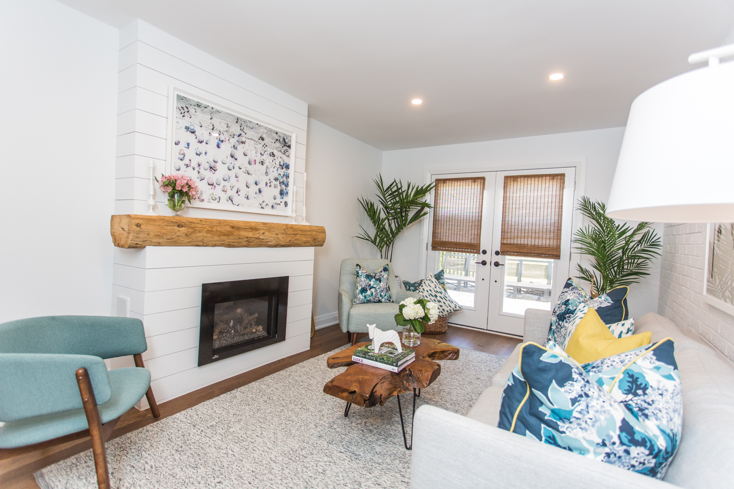
Receiving a Bonus
Part of the $154K renovation budget went into transforming the stuck-in-the-1980s family room into a comfortable, modern “bonus” room.
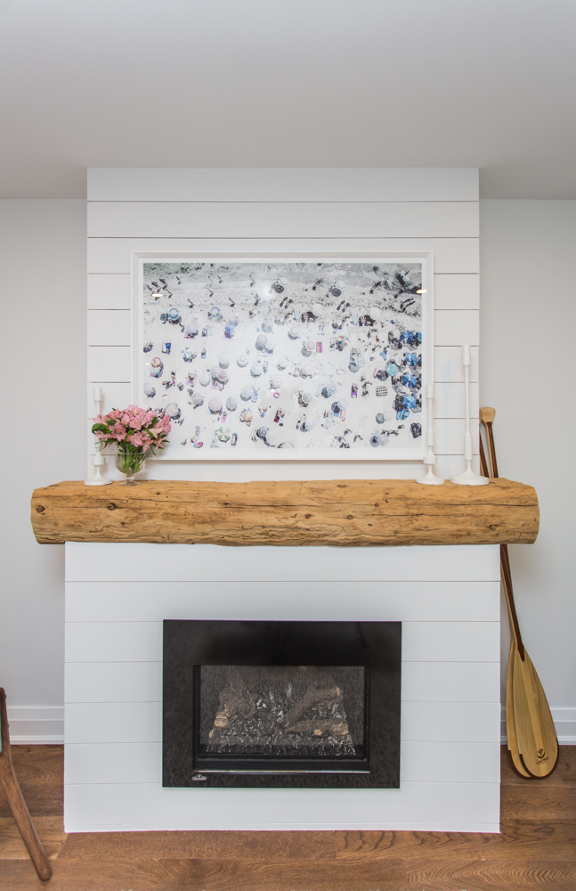
Family Ties
Going the extra mile to make this house feel like home, Bryan refinished a reclaimed barn beam from the clients’ family farm and fashioned it into a rustic mantel.
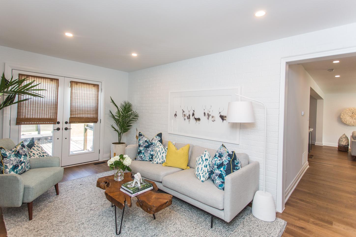
Brick-a-Brac
Whitewashing the existing brick wall saved the clients cash while adding texture and dimension to the space.
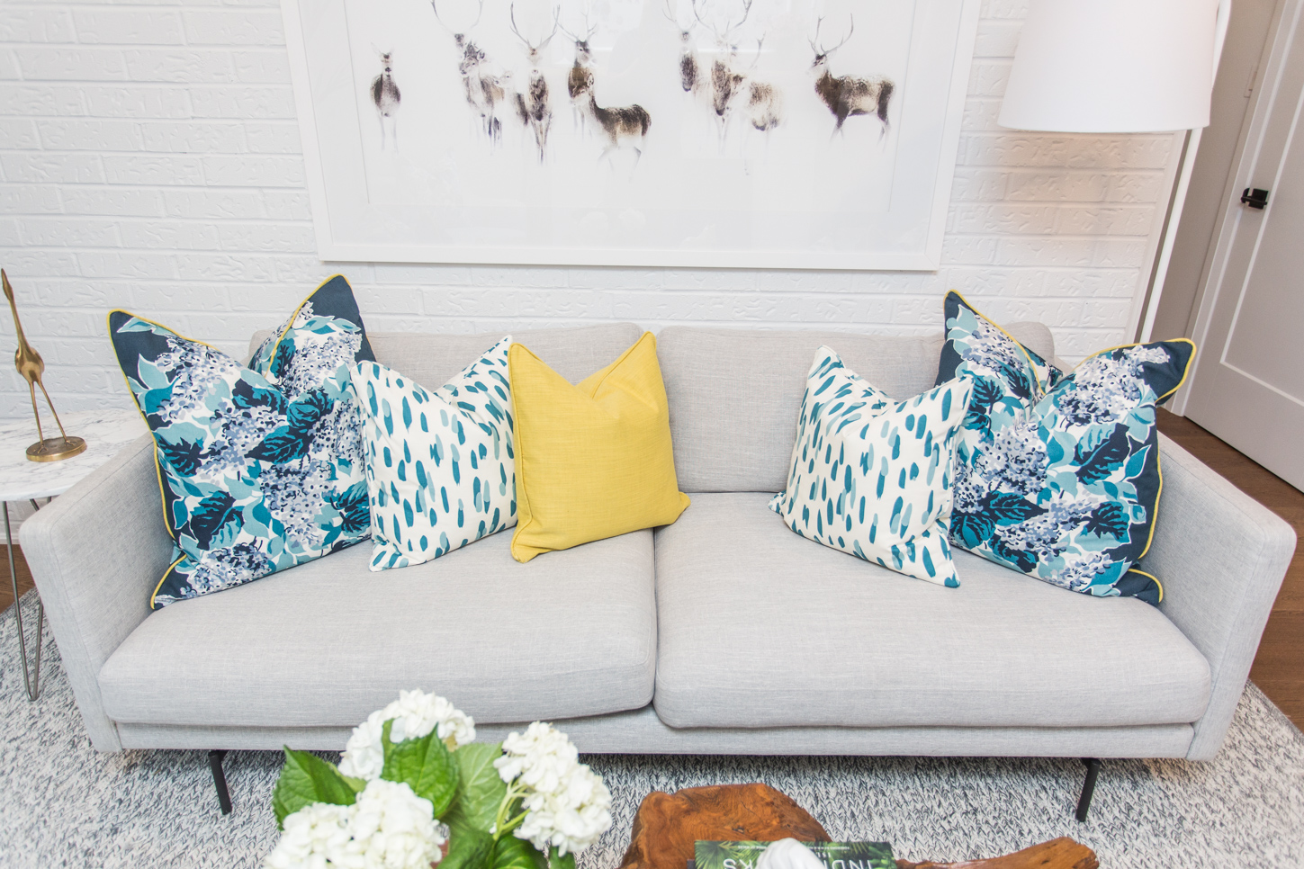
Beating the Blues
With Bryan’s renovation know-how and Sarah’s eye for design, this dynamic duo delivered a chic, comfortable living space decorated with cheerful hues of blue, yellow and green.
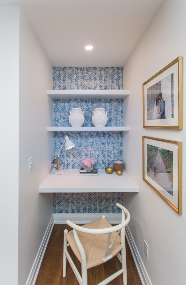
Playing Favourites
The built-in workstation is just one of the design touches that made Sarah declare this bonus room as her favourite space in the whole house.
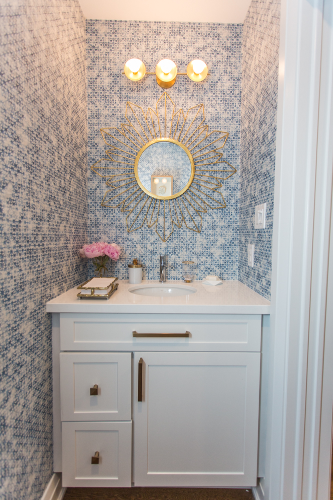
Powder Days
Moving the main-floor powder room from the kitchen to the bonus room not only opened up the dining area but also added a convenient walk-through to the back of the house.
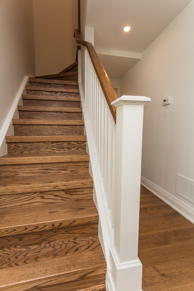
Non-Magic Carpet
When James and Lisa bought their home, the staircase was covered in old, grey carpeting – and it had to go. Instead, the homeowners opted for hardwood steps with a classic white banister.
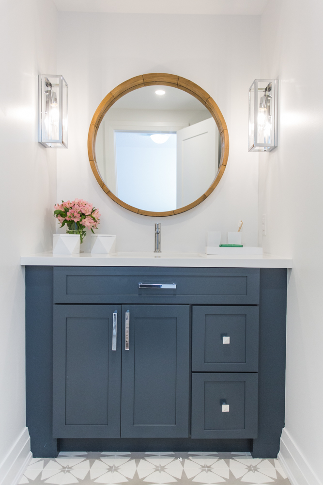
Strategic Spacing
By rearranging the square footage of a large main bathroom, Sarah and Bryan were able to create a guest bathroom and master ensuite all within the same area.
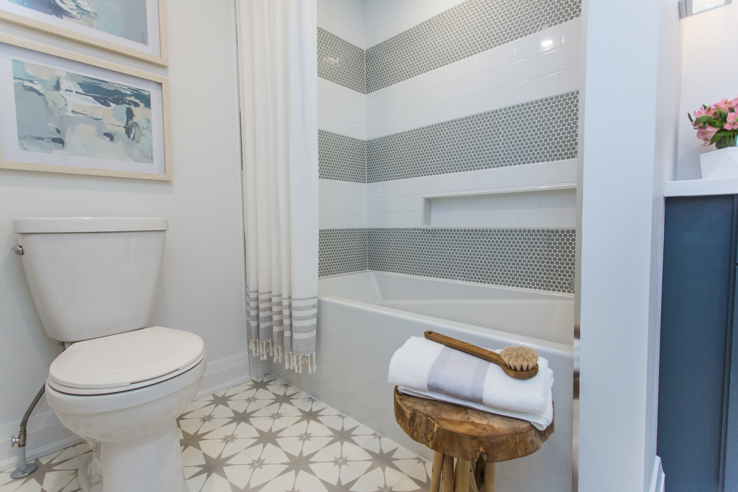
Starry Night
While James was originally unconvinced by the star-patterned floor tile that wife Lisa and designer Sarah picked out for the main bathroom, once he saw it in place, he conceded.
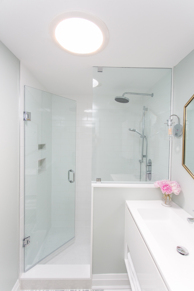
Let There Be Light
Next door, the master ensuite has a large, glass-enclosed shower and a sun tunnel to let in natural light, since having a window wasn’t an option.
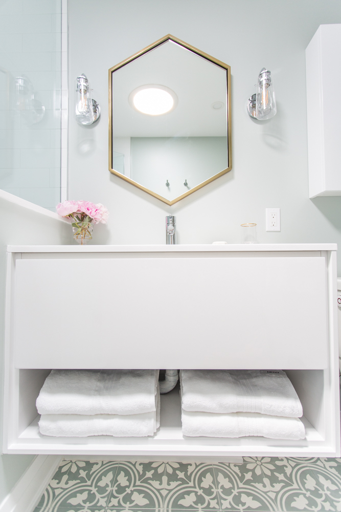
Everything in its Place
Even in such a snug space, there’s still lots of storage and vanity surface area – something James and Lisa really appreciated.
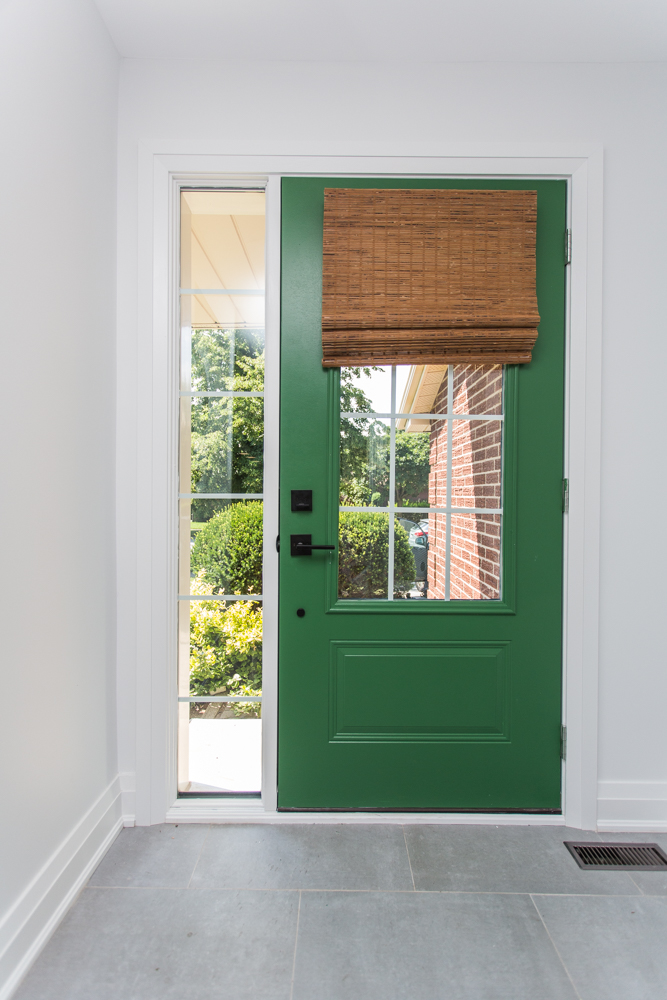
Seeing Both Sides
As this was the first time Sarah worked with paying clients, she learned to voice her vision while listening to James and Lisa’s wishes – and the comfy, contemporary end results made everyone happy (including Bryan).
HGTV your inbox.
By clicking "SIGN UP” you agree to receive emails from HGTV and accept Corus' Terms of Use and Corus' Privacy Policy.


