For years Yonette and Jude have shared their home as a safe haven for many-including their own family of seven and more than 30 foster children over the past three years. Wear and tear will get the best of any household though, and this family’s four-bedroom home, with its clunky layout and not enough space for all those being welcomed, was fast reaching its breaking point. Enter the Family Home Overhaul team, headed up this episode by designer Sarah Keenleyside and contractor Scott McGillivray. See how the duo transported this home into an actual safe haven that does the entire family (and community!) proud.
Watch Family Home Overhaul online at HGTV.ca this fall and stream Live and On Demand on the new Global TV App, and on STACKTV with Amazon Prime Video Channels. HGTV Canada is also available through all major TV service providers.
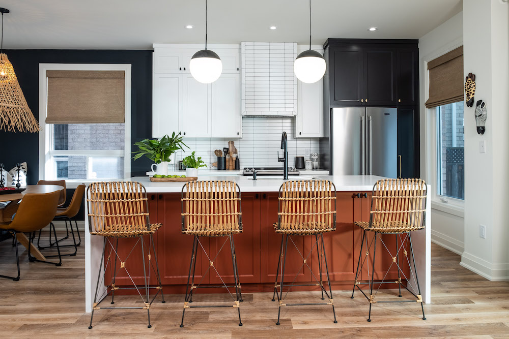
Kitchen Gathering Space
Everyone knows the real heart of the home is the kitchen. Unfortunately though, the former layout in this house wasn’t exactly allowing the entire family to assemble there. Enter this spacious and functional design, which incorporates lots of extra seating at the island, plenty of storage above and below, and an open feel that allows lots of extra family members to congregate and connect over a meal or cup of tea. Add in some durable new floors and pops of colour for personality, and this is a heart of the home with lots of extra heart.
Related: Scott McGillivray Ranks the Worst Home Design Trends of the Last 10 Years
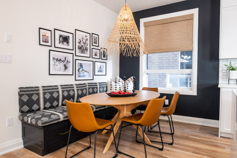
Creative Seating Solutions
Creating an open-concept layout in the kitchen and eliminating the rarely used dining room from the floorplan may have opened up the area, but Sarah Keenleyside and Scott McGillivray were still working with the same amount of overall space. So they got creative in constructing enough room for the whole family with solutions like this dining nook off the side of the kitchen. The circular design of the table eats up less space while allowing more people to sit in the chairs, but the true highlight is the custom banquet. The piece triples as extra seating, a storage unit and a design piece thanks to that pretty fabric. A collage of family photos and a statement chandelier tie everything together.
Like this look? You can source many of the items used in creating this and all the rooms on Family Home Overhaul using our Shopping Guides.
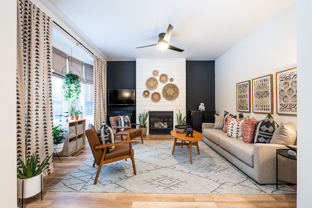
When Design Meets Function
As Sarah pointed out in the episode, most people are afraid to go all-in on design when they’ve got kids. But having kids in the house doesn’t mean you can’t implement functional design. This newly-imagined living room is the perfect example. A giant area rug adds personality and safety to the room, the sturdy chairs and rounded edges on the coffee table are picked with kids in mind, and the shiplap fireplace wall is free of rough edges but completely catches the eye. In other words? It’s the perfect space for kids and adults alike.
Related: 10 Home Theatre Designs That Will Make Movie Nights a Hit
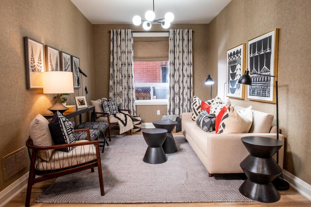
An Adult-Like Retreat
Yonette and Jude give up so much of their time to help others, so Sarah and Scott wanted to give them a small space where they could go and relax. While the room itself is similar in size to the previous den, updated textiles and furniture that fits the space transforms it into a tranquil environment. As Yonette said herself upon the reveal, it’s a room that makes you feel as though you’re on vacation.
A Bright New Master
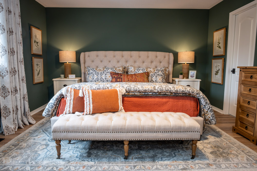
Sarah and Scott also wanted to make sure that at the end of the day Yonette and Jude were able to escape to an adult-only space that was 100 per cent just for them. Enter this new master bedroom with serene colours and plenty of throw pillows and blankets for extra layers of comfortable design. The headboard ties in with the ottoman below, while pops of orange contrasted against the forest green walls offer loads of personality.
A Redesigned Bedroom
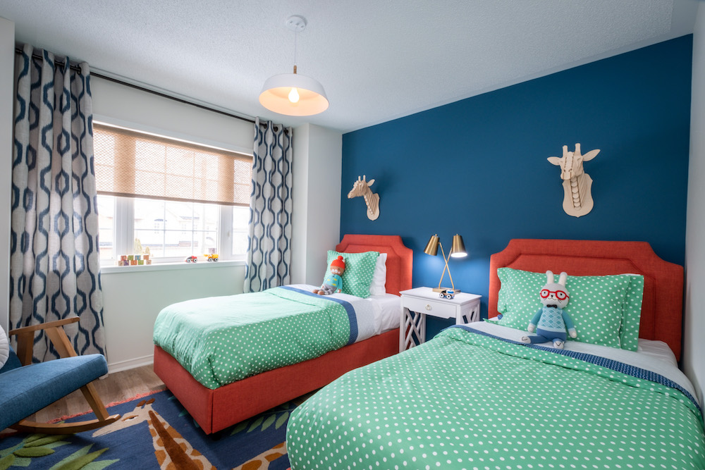
Sarah and Scott wanted to make sure they weren’t forgetting the foster children in this redesign, and so they transformed the foster room into a bright and colourful space complete with two beds, lamps, and a funky blue-and red design. The area rug below is totally on-theme with the giraffes above, and the result is a bright and airy space that any kid would love to spend time in.
A Second Foster Space
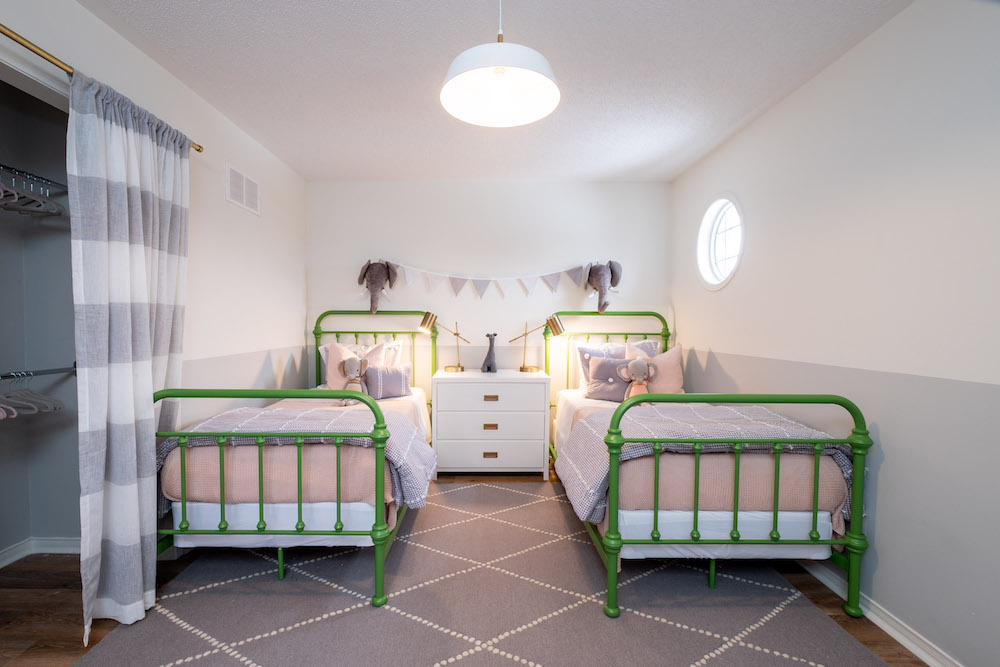
In the past, whenever Yonette and Jude received two or more foster kids they found themselves clamouring for more space. So Sarah and Scott designed this second bedroom complete with two more beds to permanently eliminate that problem. The room has an airy vibe thanks to the curtain replacing a traditional closet door, while the green bedframes add instant personality and pop against the textiles and grey rug below. Last but not least? A simple bunting and a few cute elephants bring everything purposefully together.
Related: 12 Things Every Stylish (and Functional) Kids’ Room Needs
A Reimagined Laundry Room
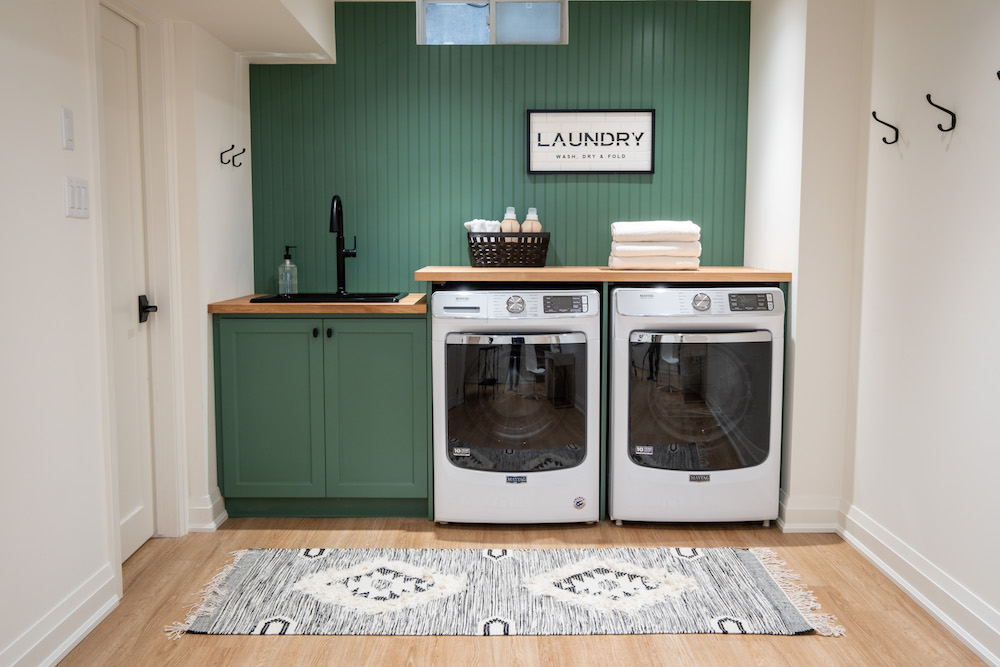
An unspoken rule for families with kids is that there will always be laundry – lots and lots of laundry. So Sarah and Scott made sure to at least incorporate a bit of serenity between loads with this pretty basement laundry room redesign. The space features painted walls and cabinets for a dramatic effect, new appliances with a folding table on top, and a built-in sink area with black finishes to tie the overall nook together.
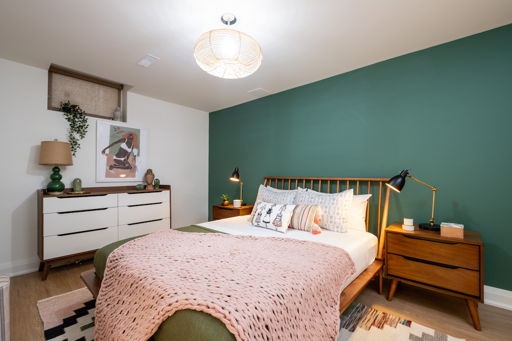
Another Adult Space
To give the couple’s adult daughter and her partner their own space, Sarah and Scott made sure to incorporate a second primary bedroom into the previously unfinished basement. The green theme featured throughout the rest of the home is present here, while some mid-century pieces add minimalist function. Now the couple can feel like they too have a place to escape from the rest of the chaos whenever they need to chill.
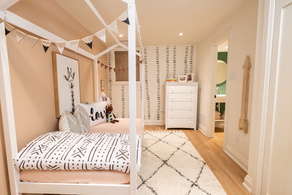
A Bonus Bedroom
There’s a full bathroom that separates the basement master from this pretty bonus bedroom, which feels light and bright thanks to the selected wall colours and papered feature wall. A daybed with posts is a fun touch that doesn’t eat up light or space, and a plush rug adds a little bit of warmth-especially in the winter when basements tend to cool down. With thoughtful touches like these, a newly redesigned floorplan, and furniture that makes the most of every single space, Sarah and Scott truly were able to transform this house into the perfect family home and safe haven for children in need.
Read: What is Housing Inequality? And What Canadians Can Do About It
HGTV your inbox.
By clicking "SIGN UP” you agree to receive emails from HGTV and accept Corus' Terms of Use and Corus' Privacy Policy.


