Niki and Jordan were perfectly content with the main floor living space in their century-old Victorian farmhouse. But now they were ready to make the attic the adult escape of their dreams, while also finishing off their daughter’s in-progress nursery. Enter Billy and Carolyn with their Farmhouse Facelift expertise. Transforming the upstairs levels into a home with modern farmhouse appeal was one of the sibling’s biggest challenges yet, but read on to see how they completely transformed the space on a $180,000 budget.
Watch Farmhouse Facelift on the Global TV App and on STACKTV with Amazon Prime Video Channels. HGTV Canada is available through all major TV service providers.
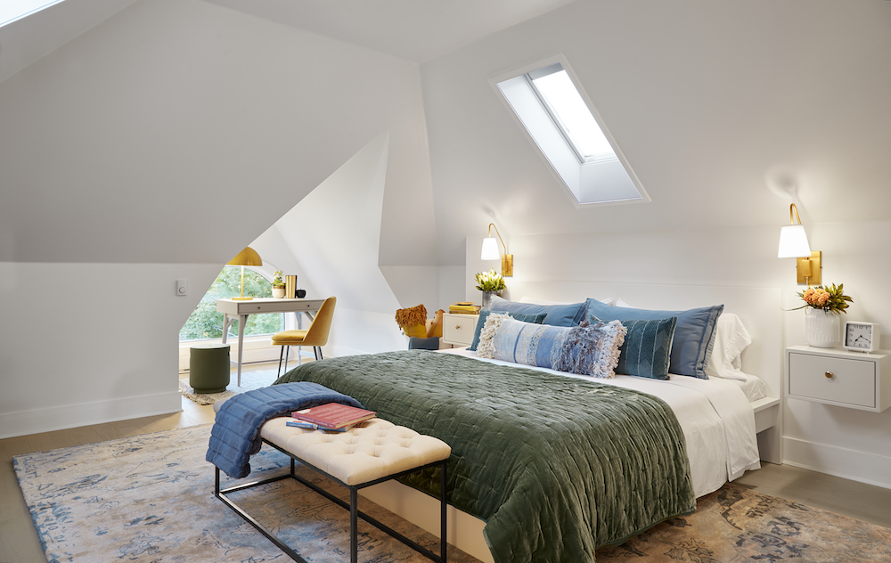
An Attic Oasis
For months new parents Niki and Jordan have spent night after night with their new baby girl in bed with them as they worked on renovating her bedroom on weekends. But now they were ready for a dreamy new space of their own, and the attic was where they wanted it. We’d say Billy and Carolyn definitely delivered with this gorgeous new primary bedroom area that’s full of light and makes use of every possible nook and cranny. The king bed is large and comfortable with a variety of textiles; a small office space by the corner window is functional and polished; and the light-filled sensor skylight above shuts with the mere push of a button.
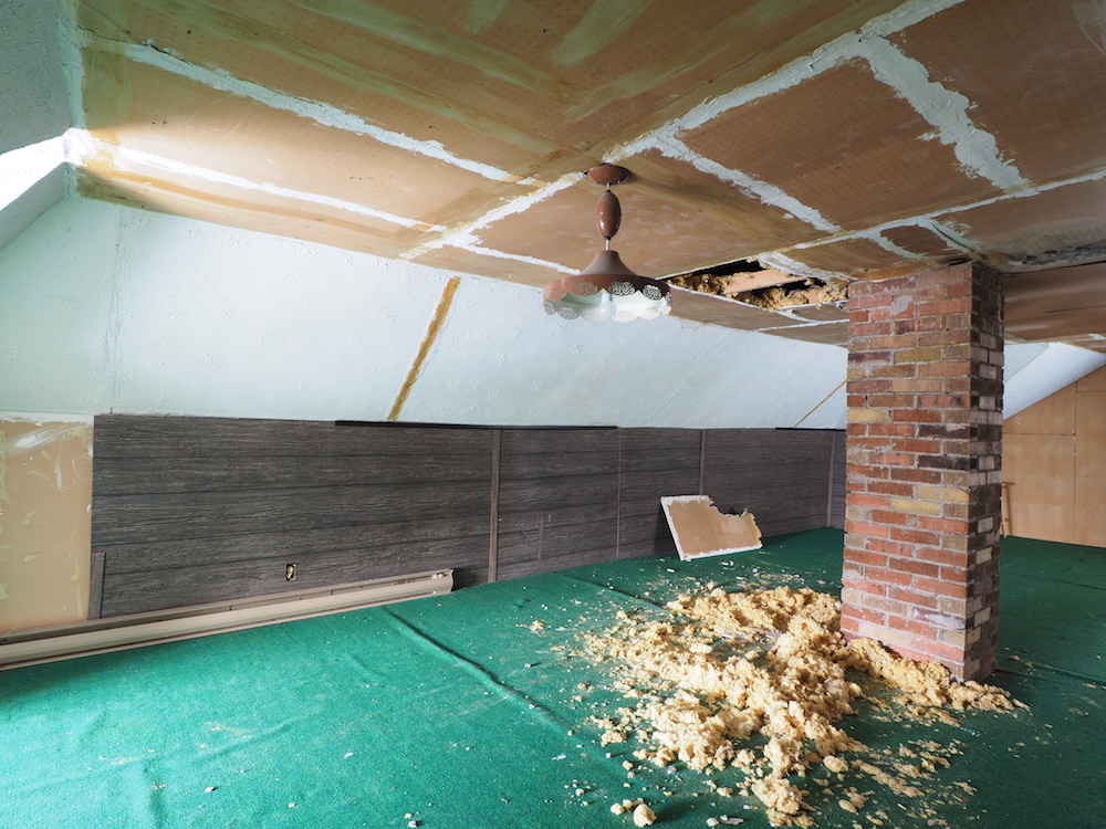
Starting From Scratch
Here’s what Billy and Carolyn were working with when they entered the home – an actual bat cave (as in there were bats living in the ceiling!). The good news was that the open space was a blank canvas of sorts. The siblings realized they could raise the ceiling to maximize space, while retaining some of the structure’s original charm. That definitely included keeping the window shapes and the personality-filled chimney stack that runs through the house.
Related: Want to Get out of the City? Farmhouse Facelift Hosts Share Real Estate Tips
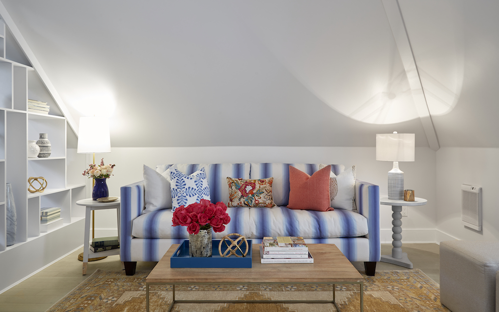
An Intimate Living Space
Billy and Carolyn didn’t just transform this attic into a bedroom escape, they gave the owners their very own grownup suite. That meant adding this small living space, which divides the sleeping area with a custom-built, open-shelving unit that doubles as storage. Now Niki and Jordan have an intimate area that’s just for them, giving them an opportunity for plenty of well-earned adult time.
Related: 18 Rejuvenating Zen Bedrooms That’ll Help You De-Stress
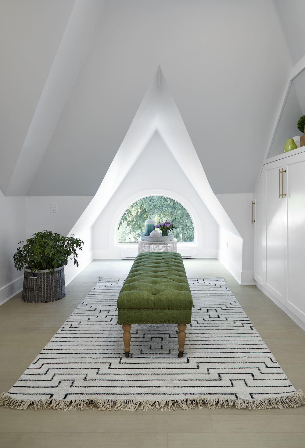
Making the Most of a Closet Space
When Niki and Jordan decided on the attic for their grownup retreat, they knew they wouldn’t be able to incorporate a traditional closet. But that didn’t mean they couldn’t have a gorgeous and functional space to organize all their things. Billy and Carolyn worked with the original floorplan and window structure to create this bright walk-in closet that’s full of storage and design. The elongated bench, open shelving above, and new insulated window make this area feel more like a dressing room than an actual closet.
Creating Something New With History
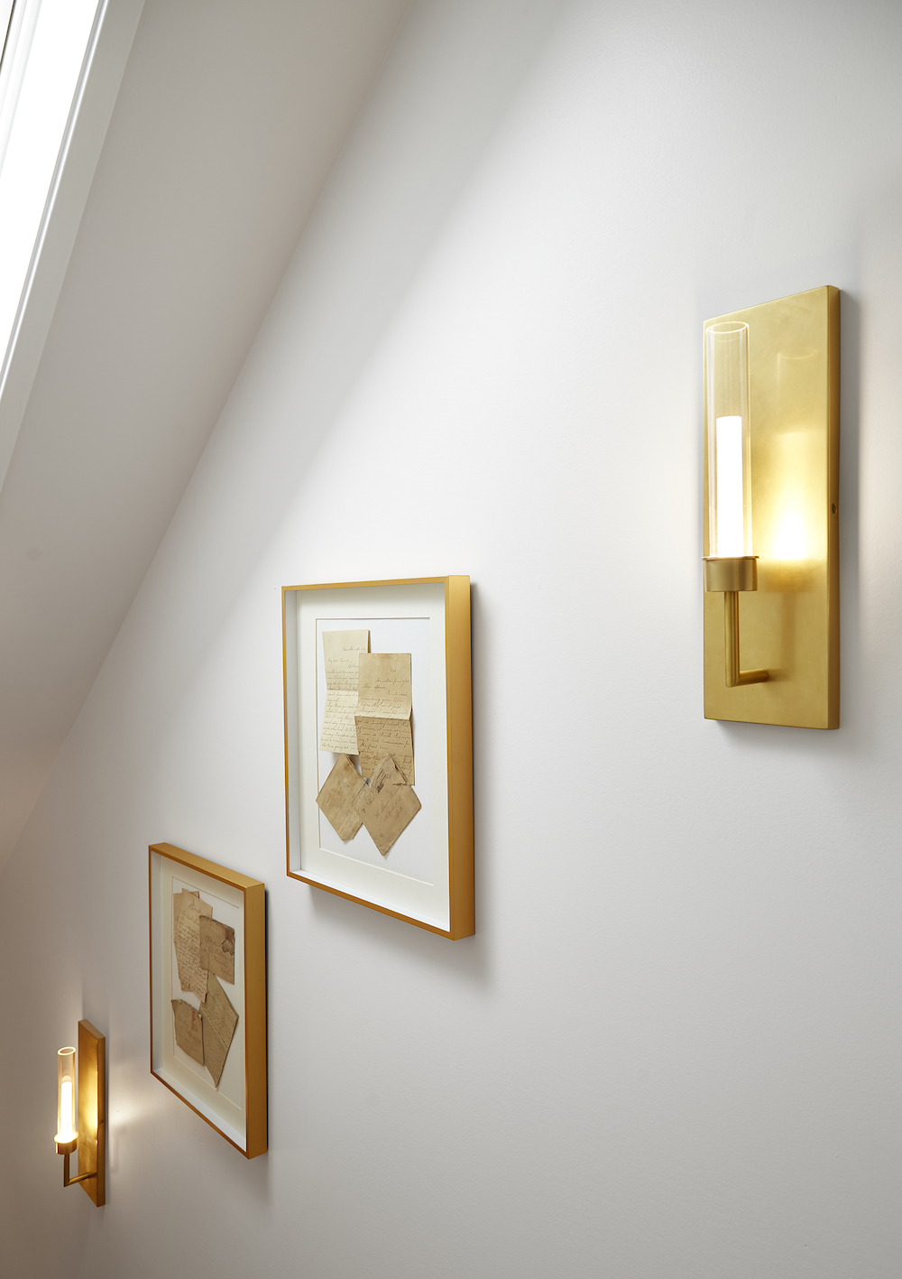
Part of the redesign in this epic space was reconfiguring the original stairs into a safer, family-friendly design. Before, the steep stairs were a death trip, but by eliminating a small “junk room” to the side and opening up the space, Billy and Carolyn were able to create a safer alternative with a landing. When they opened up the walls, however, they found these love letters from 1894-1899. By framing the letters and hanging them in the exact same area where they found them, Billy and Carolyn were able to incorporate an actual piece of history into the brand new design.
Related: Awesome Living Room Wall Art That Makes a Statement: Beyond Paintings and Photos
An Upper Level Laundry
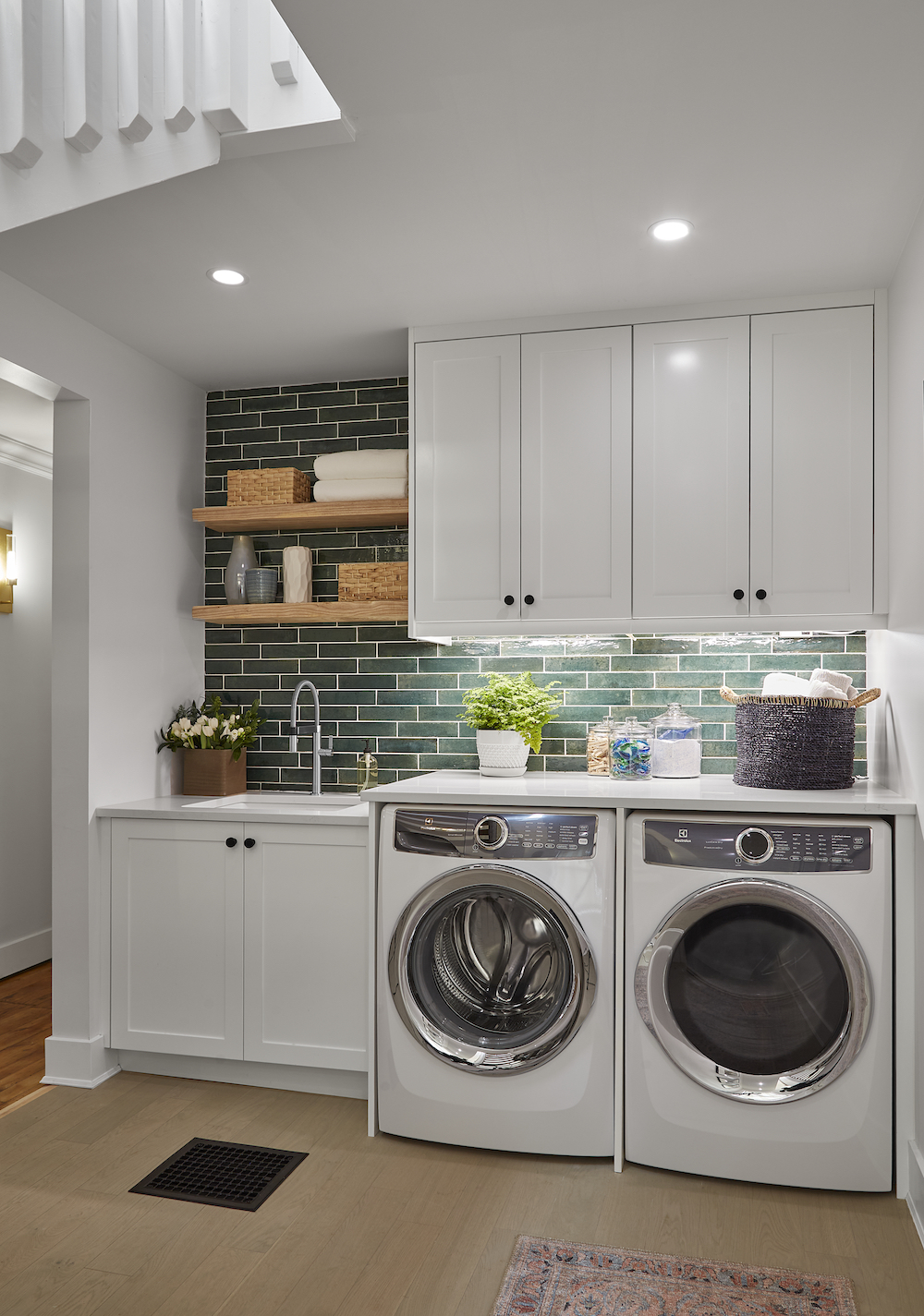
On the landing floor between the new flights of stairs Billy and Carolyn made sure there was no wasted space by incorporating this new laundry room area. Gorgeous green tiling adds an instant pop of colour and personality, while floating shelves and cabinets ensure there’s plenty of storage. Because Carolyn and Billy also added an en suite bathroom to the design, they were able to tap into that same plumbing line to ensure an easy hookup.
A Pretty New En Suite
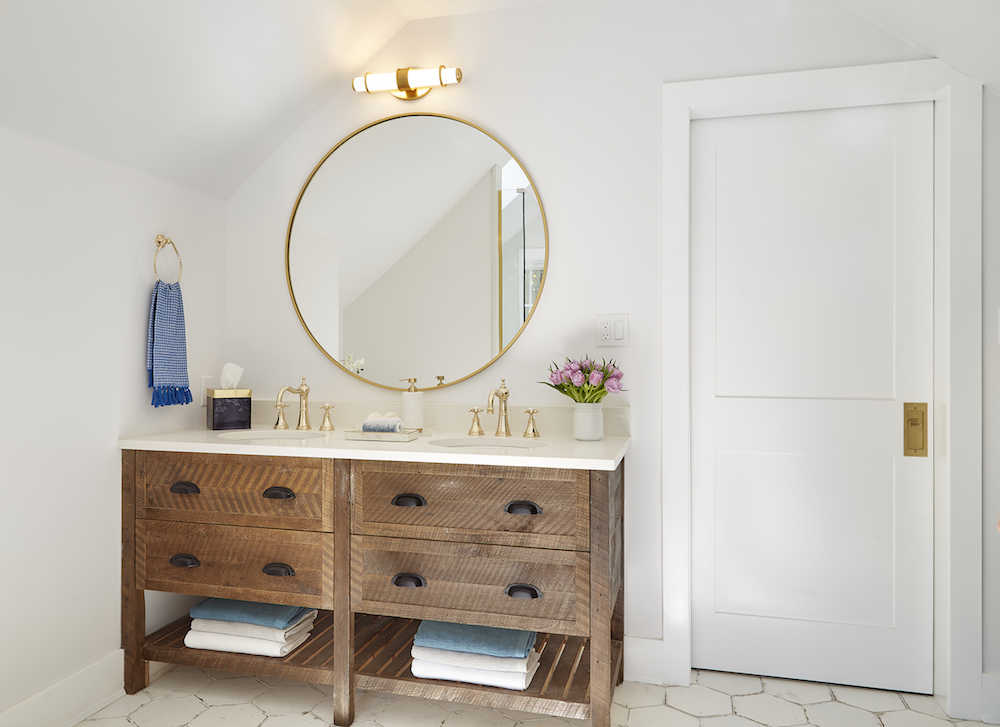
Speaking of the en suite, Billy and Carolyn made use of every nook and cranny in that space too. This vanity was made from the attic’s original subfloor, giving the space an instant story. Then, the siblings added this distressed hex floor tiling to make the bathroom feel as though it has always been there. English gold finishes and a simple mirror and light make this an elegant space with lots of farmhouse-style finishes.
Related: Who Needs the Spa? 15 Bathroom Ideas That’ll Leave You in a State of Total Bliss
The En Suite Before
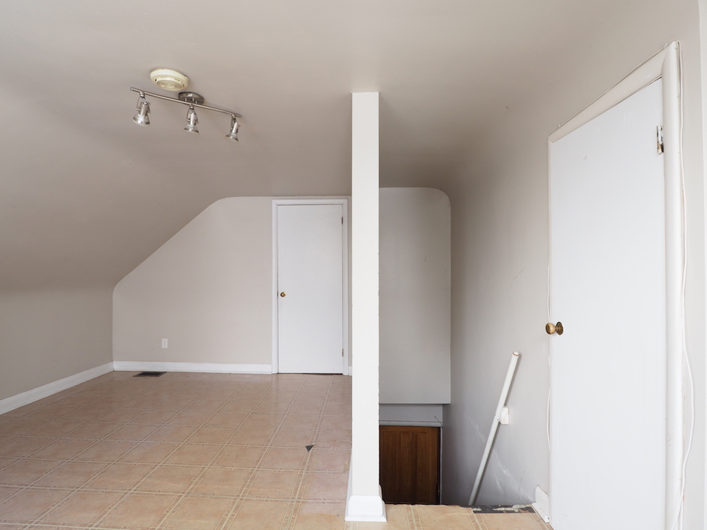
For context, here’s what the en suite looked like before Billy and Carolyn started the design. It’s hard to imagine what this landing area room would have been good for, other than eating up space.
A Tub Fit for a Queen
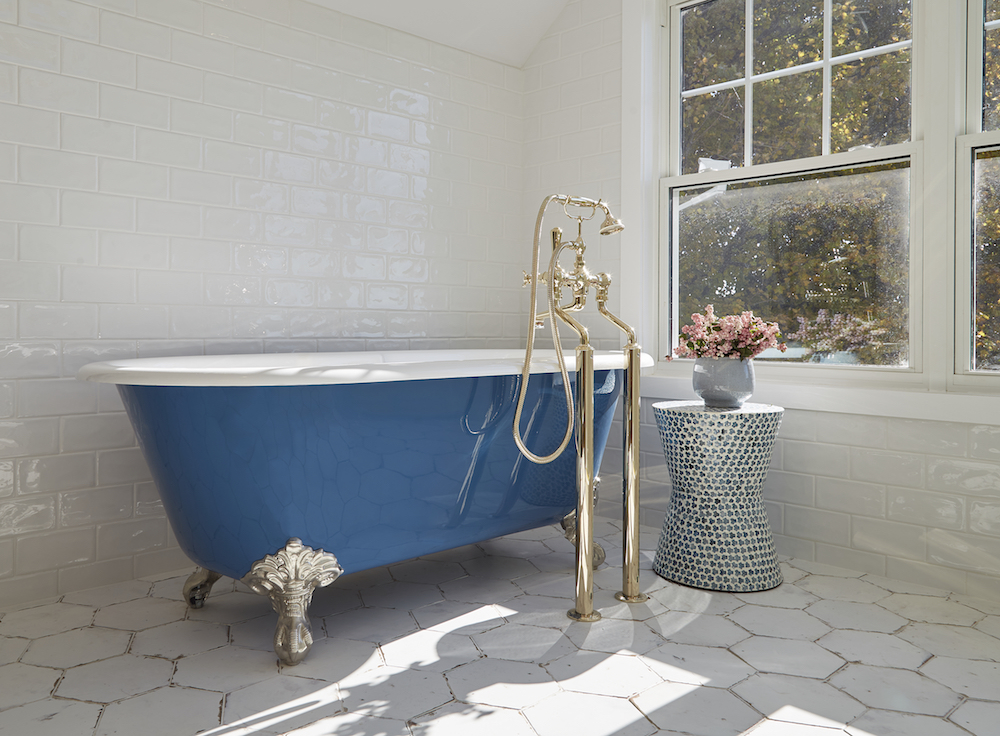
Billy and Carolyn had to lift this beast through the window, but the end result was well worth it. The clawfoot but anchors the space and feels fresh but historic all at once. The antique taps feature English gold, the brilliant blue pops perfectly against all of the white, and a modern brick tile on the wall ties everything old and new together.
A Nostalgic Nursery
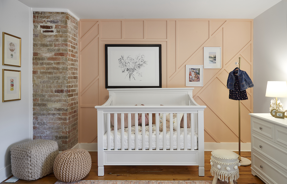
Last but not least, Billy and Carolyn also wanted to give Niki and Jordan’s eight-month old baby a space of her own – a space that she can grow into. That meant a crib that will eventually convert into a bed. The space is also filled with fun finishes. The siblings revived the original hardwood floors below, and they also finished exposing and filling in the original chimney stack. Then they added wainscoting to the coral feature wall in order to incorporate Niki’s custom art for her daughter. Now everyone in this home has their own unique space, encapsulating the true potential of what a modern farmhouse renovation can be.
HGTV your inbox.
By clicking "SIGN UP” you agree to receive emails from HGTV and accept Corus' Terms of Use and Corus' Privacy Policy.


