Since laying eyes on a run-down resort on the island of South Andros in the Bahamas, Sarah and Bryan Bauemler have been smitten. They dreamed of creating a unique travel destination for sun seekers out of the wreckage of a decrepit resort. Last season on the Island of Bryan, the Baeumlers ran out of time. The rooms in their resort remained empty and the bills kept piling up. This season, it’s do-or-die. The rooms are booked, the staff is hired but the resort isn’t close to being ready. It’s a race against time to open the doors of the Caerula Mar Club. Will they be ready? Follow along as we check in on the Baeumlers’ progress in what promises to be a gorgeous boutique resort.
Island of Bryan is available online, on HGTV Canada and now available through STACKTV with Amazon Prime Video Channels, or with the new Global TV app when you sign-in with your TV service provider details.
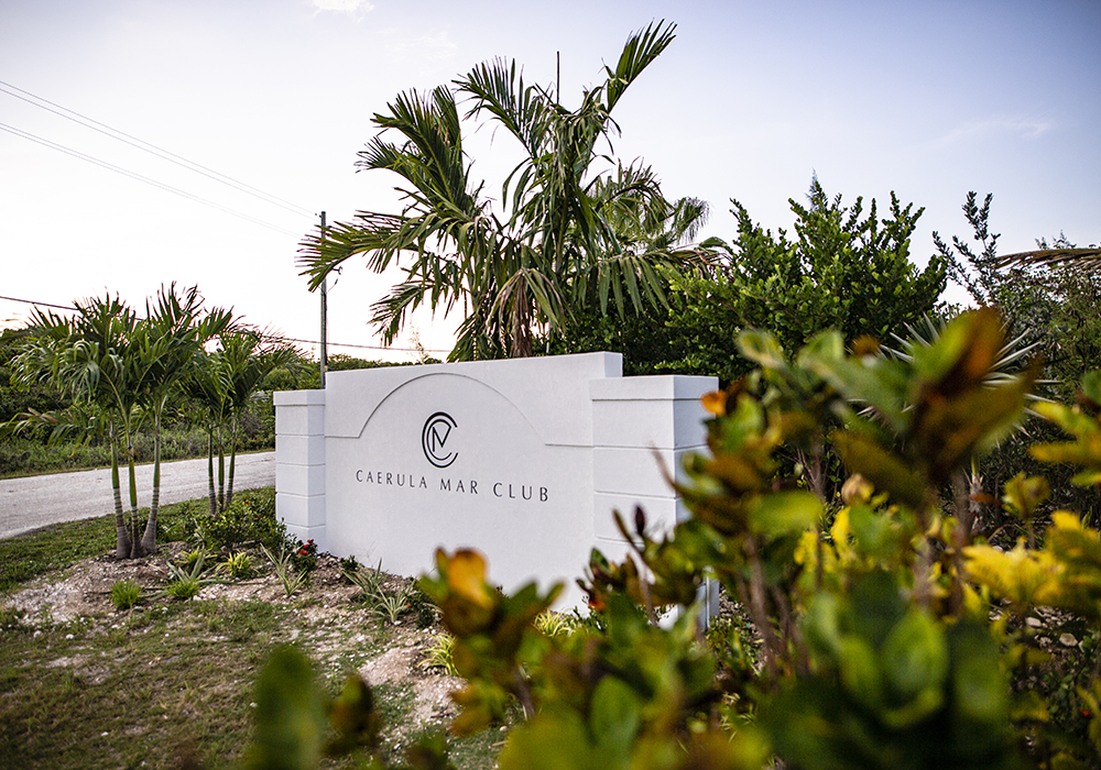
Caerula Mar Club
A sign in front of the Caerula Mar Club is a momentous occasion when you consider all the struggles and challenges the Baeumlers have faced in rebuilding this old run-down resort. While sometimes demolishing has been the only way forward, repair and upcycling has sometimes been the best option. Even though this sign is a bit of a compromise for Sarah, who had something grander in mind, we love how it turned out. It’s a clean design with a bit of an art-deco vibe. Most importantly, the name of the resort is spelled right.
Still not seen our gallery from season one of Island of Bryan? Check it out here.
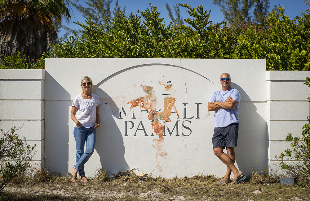
A Couple of Dreamers
Here’s a quick look at Sarah and Bryan Baeumler before they erased another trace of the old resort and put their own mark on it. You can see there are a few layers that have been added over the years as resorts came and went. The newest incarnation is definitely an improvement.
Watch Jojo give Bryan an adorable lesson on hermit crabs.
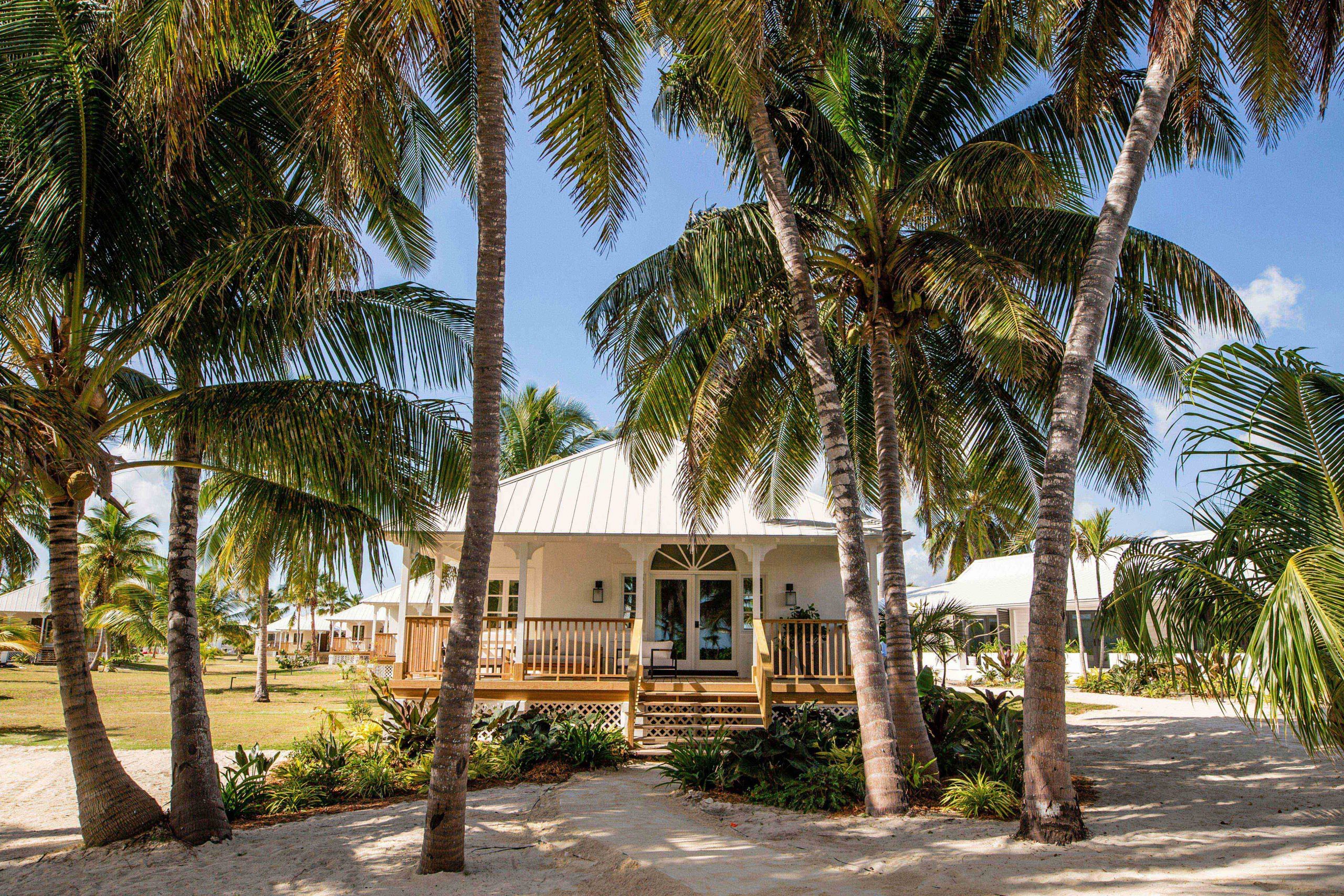
Final Villa
With a wedding party scheduled to arrive, the Baeumlers had extra pressure to finish the final of four Signature Suites. From the outside, we can consider this “mission accomplished”. Although the four Signature Suites are done, there are a total of 22 villas to finish so there is no time to drop the hammer quite yet.
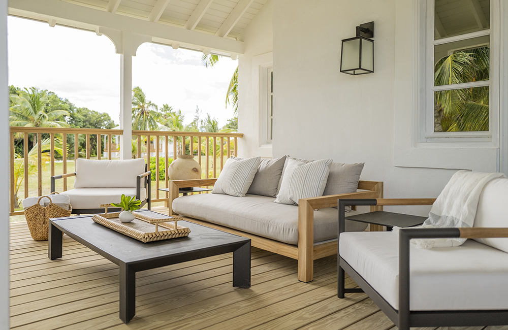
Villa Veranda
A closer look on the villa shows off this welcoming veranda space. It’s the perfect spot to unwind after a day exploring the Island of South Andros and play some backgammon. Who knows, maybe someone lounging on the veranda sipping a Long Island Iced Tea will come up with a name for the villa. The latest name is “Villa #4” although Bryan suggested “Sand” villa.
Things don’t always go as planned on the Island of Bryan. Watch these hilarious bloopers and outtakes.
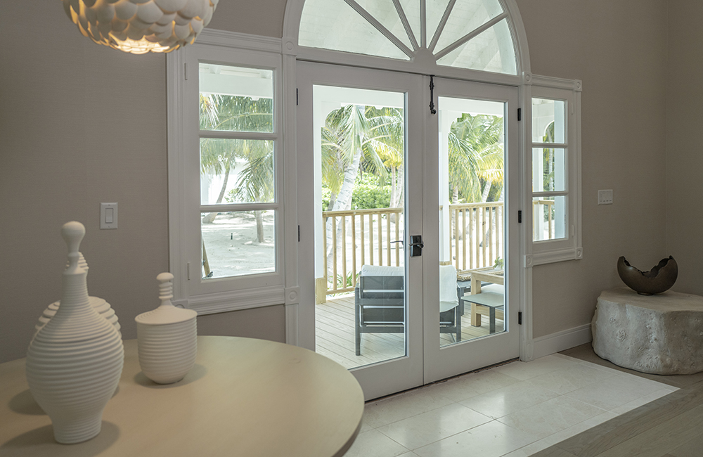
Mahogany Doors
These doors flood the villa with sunshine. Due to the threat of hurricane, they are sturdy enough to withstand almost anything nature can throw at them. They are made of mahogany, the perfect wood for the Caribbean climate.
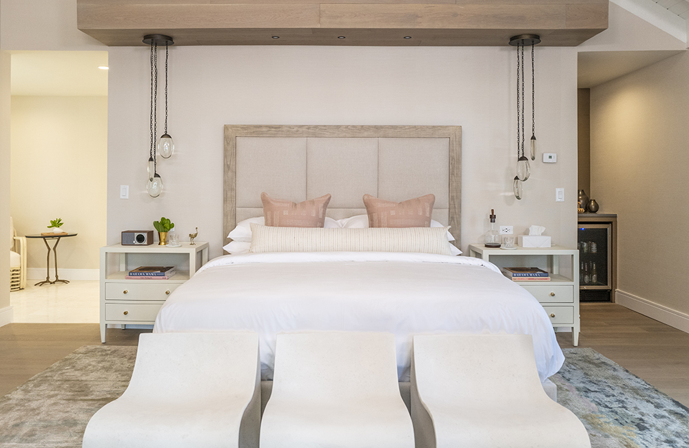
The Money Shot
Now, here is what you would call a designer’s money shot! The muted beige colours obviously reflect the sand that is just beyond the villa’s front door. Sarah has used a beige colour scheme in the other signature villas to give the resort a unified aesthetic. The peach accent pillows pick up some of the coral colour from the nearby reef while the hints of turquoise in the rug give a nod to the Caribbean Ocean which is within ear shot. The wave inspired end-of-bed benches lull your eyes up towards the king-size bed.
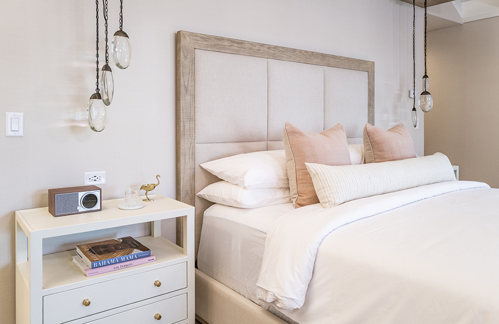
Pendant Lighting
The lighting on either side of king-size bed were picked up by Sarah while on a trip to New York. Unsure where she would ever use them, the perfect time arrived with this villa. The lighting gives the room a bit of a boho vibe that doesn’t intrude on the overall calm and contemporary look of the space.
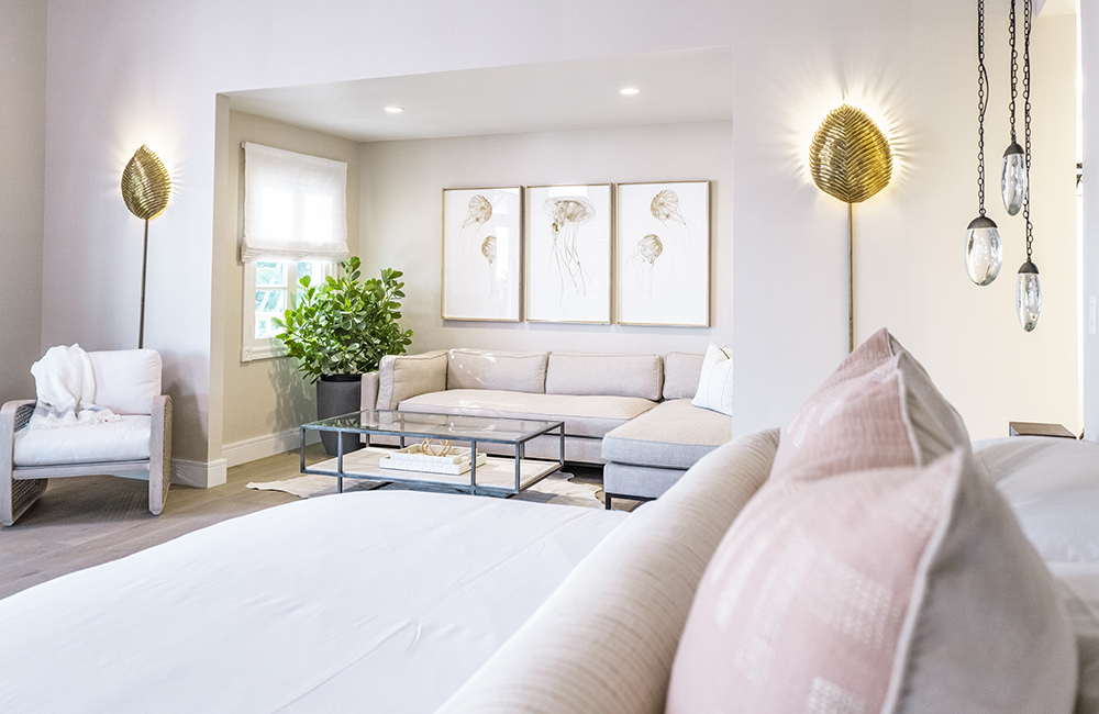
Myrtle Sconces
Just to the side of the bedroom is a sitting room. Its entrance is marked by these regal looking myrtle sconces. The exotic leaf-inspired lighting separates the sitting room while providing a design element to fascinate guests as they make themselves at home. The artwork depicting jelly fish effortlessly draw attention back to the ocean just outside.
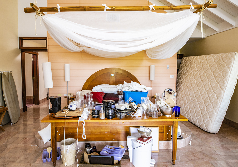
What Was
Before we go to much further, let’s take a quick look back at what this and the other villas looked like before Sarah and Bryan Baeumler got their hands on it. Like other villas, Villa #4 had more of an ’80s look. Not to mention there were termites and other critters living in many of the resort spaces. Let’s put that out of our minds now and move on.
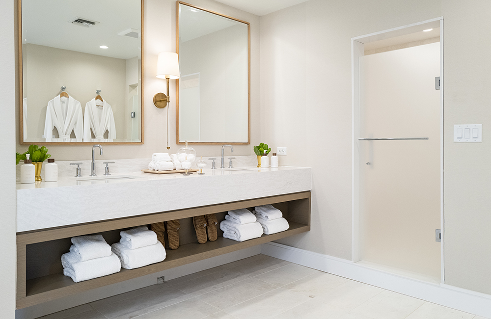
Room for Two
No clamouring to get the sink before your bed partner gets up (a complaint the Baeumlers have when they stay at less accommodating hotel suites). The double sink layout gives you room to brush your teeth while your traveling companion curls their hair or shaves their beard. All the amenities have been hand-picked or made by Sarah. The importance of recycling containers and cutting waste is something that is stressed at the Caerula Mar Resort.
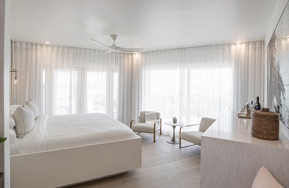
Signature Suite
The Signature Suite looks like it could float up and be at home in the clouds. As the template for the rest of the hotel suites, Sarah had to get the look just right. The windows have been updated and enlarged, letting in buckets of sunshine. The suite continues the sand tones and coral accents evident in the Villas. And the location is perfect. The suite is a mere 10 meters from the ocean, is steps from the bar and has an amazing sunrise view. It’s a hard combination to beat.
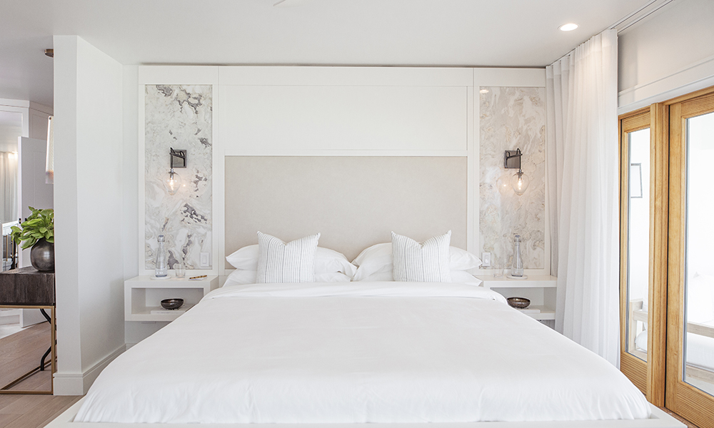
Perfect Framing
Here is a shot of the Signature Suite looking directly towards the soft, comfy king-sized bed that is framed by pendant lighting and gorgeous marbled inlays. When picking the marble Sarah wanted something that resembled the ocean floor. “The colouring reminded me of what I see when we are scuba diving – different colours and variations in the sand and coral,” Sarah told HGTV Canada.
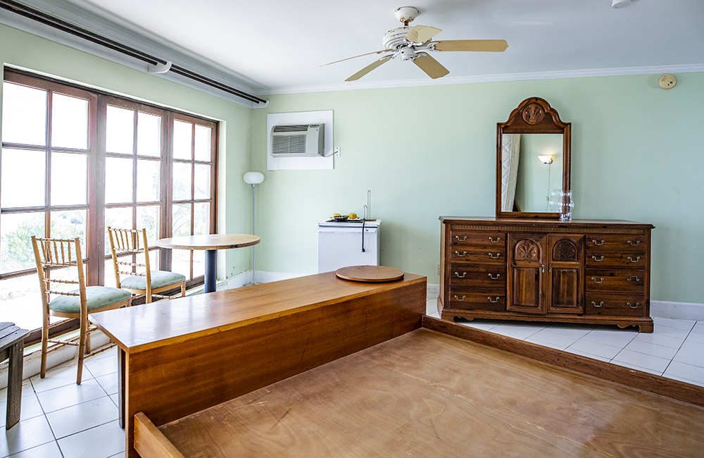
Before Picture of the Signature Suite
Here’s a quick look at what the Signature Suite looked like before the Baeumlers came to town. The walls were a mint green and the furniture was chunky stained wood. (The first thing that comes to mind when I hear mint green is ice cream but a look at these walls quickly ends my craving.) There was a time when this suite was a real beauty. Sadly, that time had passed. The memories are likely numerous and happy.
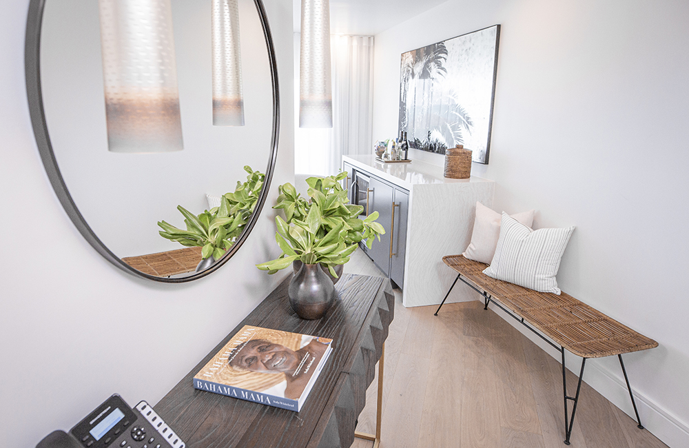
Hallway
The passage between the bedroom and the bathroom continues the design flow while housing some important items like the telephone. There are also drawers in the hallway desk to keep information on local attractions to help guests fill their days.
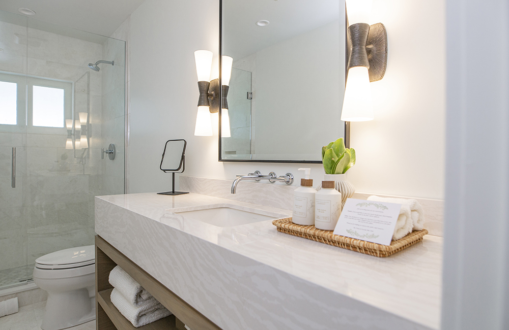
Signature Bathroom
While the bathrooms in the Signature Suite aren’t as roomy as the Villas, some really smart design and fixtures by Sarah and Bryan have added a greater sense of space. A great example are the wall-mount faucets which leave greater counter space. Also, look under the vanity. A shelf has been installed so you can tuck away supplies. While there is a window in the shower, this is something unique to the Signature Suite.
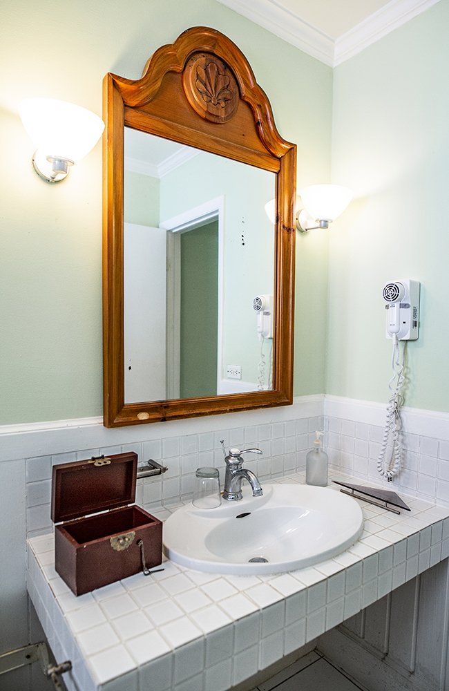
The Signature Suite Old-School Bathroom
The mint green in the main suite is carried over to the bathroom as is the use of chunky wood furniture (the framing of the mirror). Even though the square footage and layout of the old bathroom is quite similar, the Baeumlers made this space feel open and spacious.
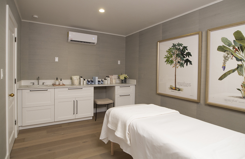
Relief in Sight!
As Sarah and Bryan Baeumler get closer to opening day at Caerula Mar Resort, there is relief in sight! This is a look at the newly finished spa (there is also an accompanying water closet and shower room). Although a bit small, Bryan and Sarah may look to enlarge this building if guests are drawn to the offerings of massages, pedicures and facials. With 18 hotel rooms and 22 villas, we think another renovation of this building might not be far off.
Watch the full episode of Island of Bryan in which the spa is revealed.
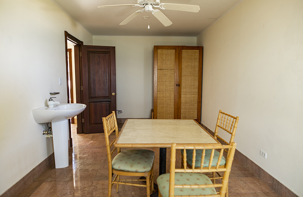
Spa-less
This is what the spa room looked like before the Baeumlers came to town. The pink marble tiles seen throughout the resort have now been replaced with Sarah’s more calming sand colours with a nod to nature (evident in the two pictures over the massage table in the previous slide).
Watch the first short video from Island of Bryan when the Baeumlers discovered the resort!
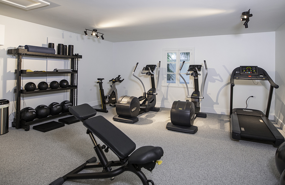
Gym
Similar to the spa, the Baeumlers decided to keep the gym a bit smaller than what you would expect at a bigger resort. If the need arises, they will upsize and add more equipment. But with bike riding, swimming in the ocean and other activities available, guests may be getting more exercise than they would doing their usual workout.
Watch as the Baeumlers take some much needed time to take a date on the ocean.
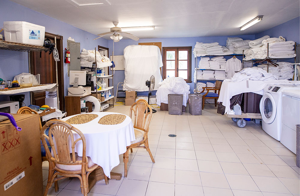
Laundry, Sweat and Tears
This is what the gym used to be – a laundry room. Although there would have been a lot of sweating and exercise doing the laundry, it’s not the kind of activity guests would be clamouring to be involved in.
Go back to where it all started. See our reveal gallery from Season 1 of Island of Bryan.
Looking Forward
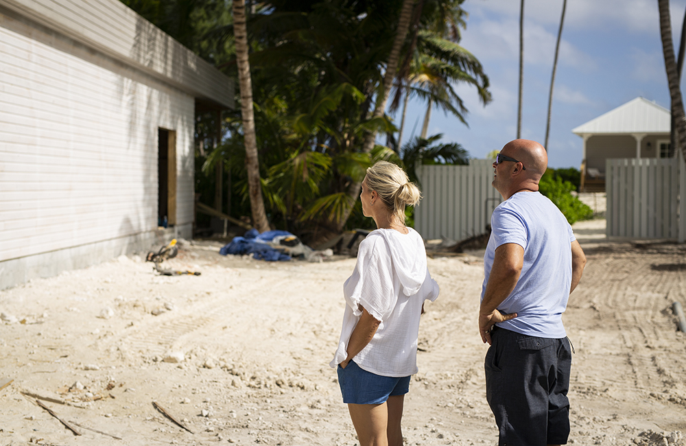
The new laundry facilities for Caerula Mar Resort will be housed in the building Bryan and Sarah are looking at. A completed laundry building is proving to be a bridge too far. The building is almost done but still needs some finishing. The finishes will be complete after the first guests have settled in. Luckily it is not visible to guests.
Grand Finale
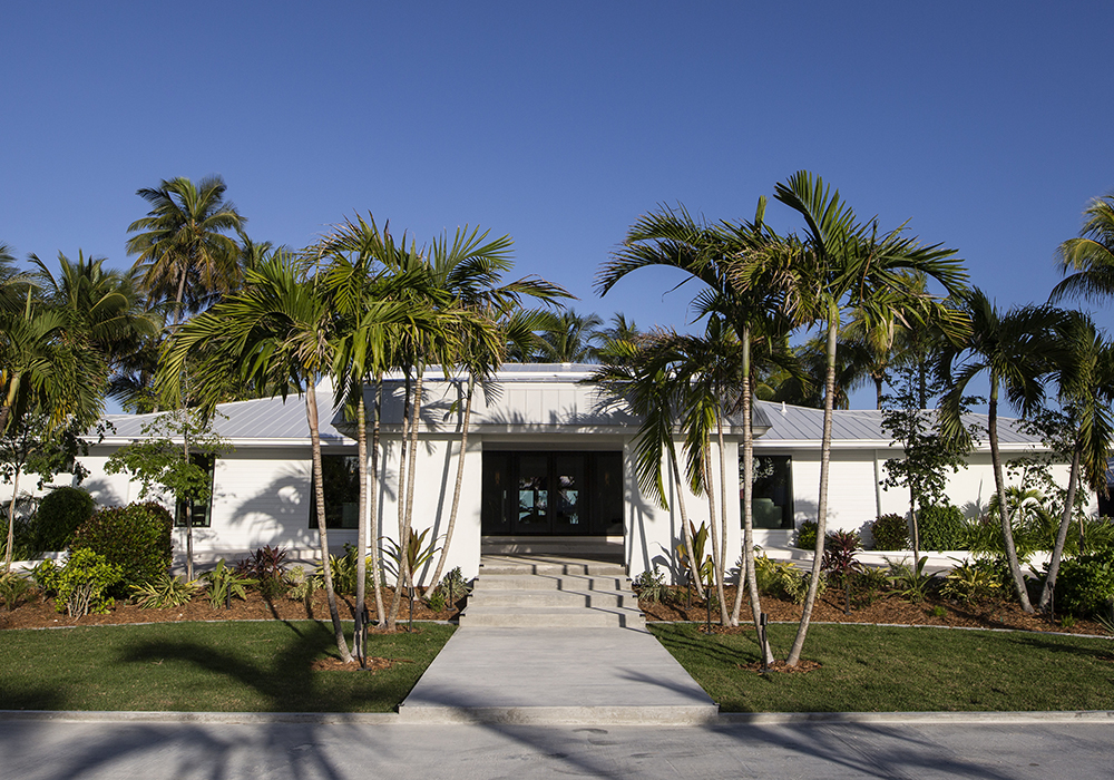
The importance of landscaping can’t be overstated when looking at the transformation of the Caerula Mar Club. The newly created walkway to the hotel lobby is bordered by palms trees that sway in the wind. The entrance has a presence that is almost regal, which lets guests know that they will be pampered and catered to – a great way to start any holiday!
Entrance Before Landscaping
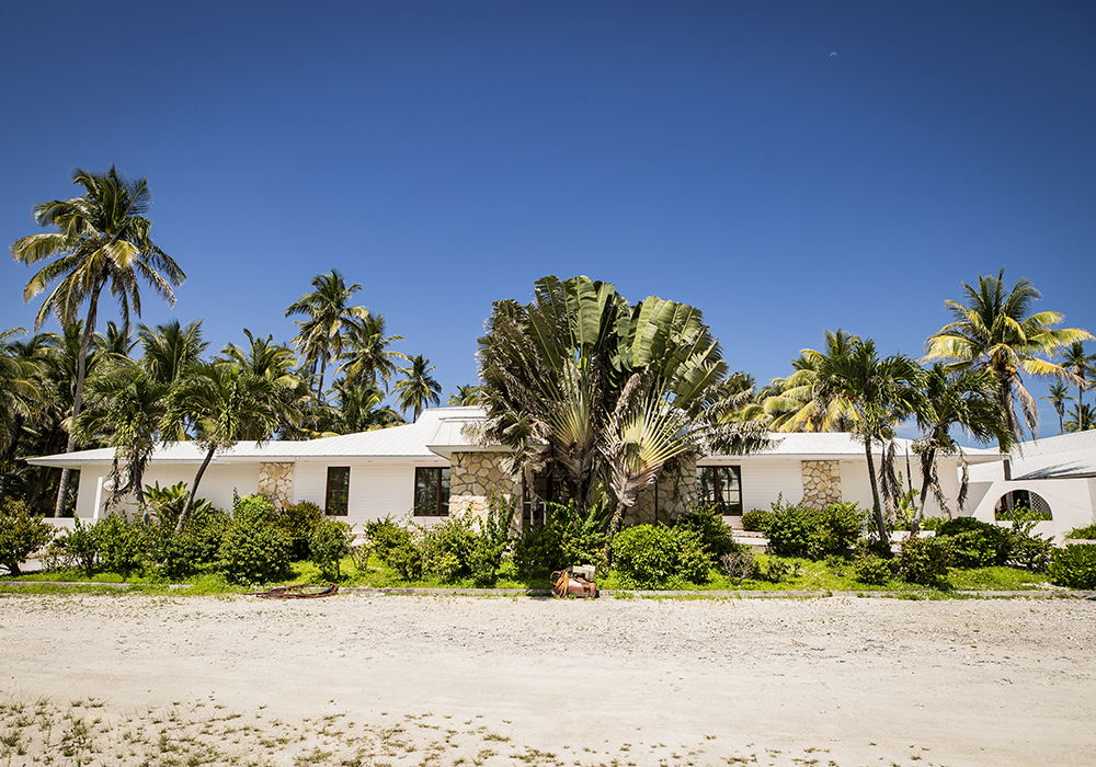
Before, the entrance to the resort was obscured by overgrown shrubs. It’s hard to tell where the front entry even begins. But the Baeumlers gave more than a haircut to this entrance. They created a walkway and transplanted palm trees from other parts of the resort, giving the trees a new lease on life and a starring role in the new resort.
Island of Bryan Resort Lobby
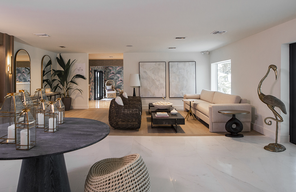
Once inside, the lobby makes you feel like you’ve entered your true home away from home; not a place of business. Sarah’s colour scheme of sand and coral tones greets guests with the calmness and freshness of an ocean breeze. While not evident in this image, the Bauemler’s took down a wall between the lobby and the dining room that had been hiding a gorgeous ocean view. When entering the lobby, one of the first things guests see is the Caribbean Ocean.
Video: See Sarah Baeumler explain the design for the Island of Bryan resort’s lobby.
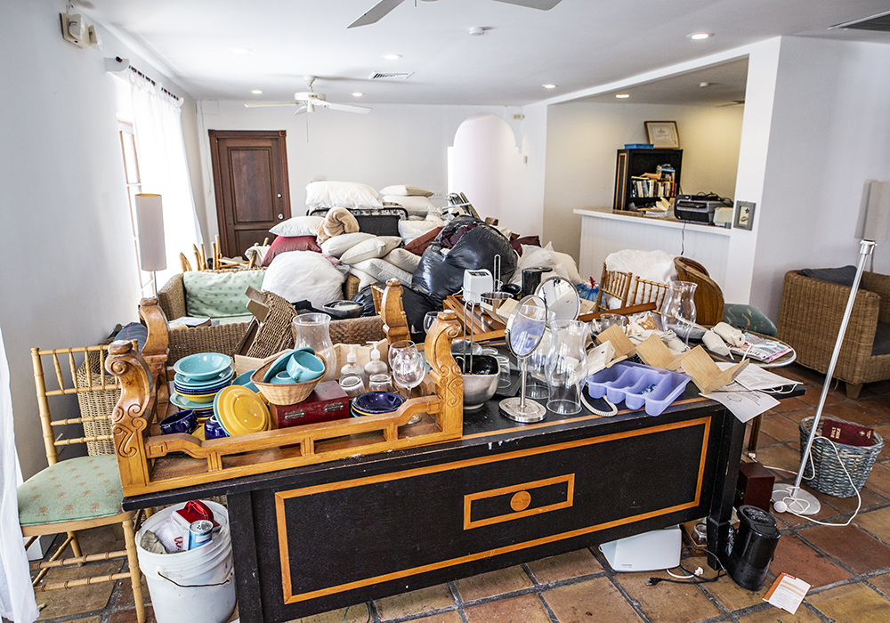
Island of Bryan Resort Lobby Before Transformation
What was the lobby like before? One look at this will wish you hadn’t asked. Stuffed with all kinds of bric-a-brac, it looks like the setting of a show celebrating hoarding rather than the reception area for a Caribbean resort.
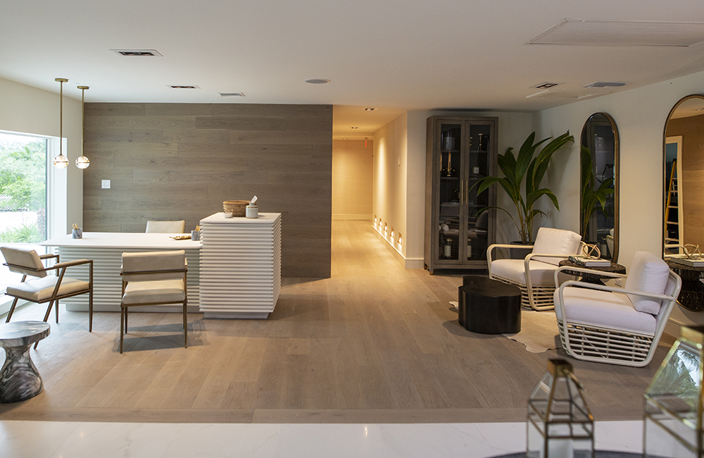
A Concierge at Your Service
Here is another view of the new-and-improved lobby. The most officious looking item in the lobby is the concierge desk where guests can get helpful tips on excursions and activities. Down the hallway from the lobby are four new private washrooms, which replaced the ladies’ and men’s room. This added privacy but also freed up space in the lobby for people to mix and mingle.
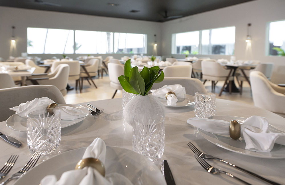
Main Dining Room
Beyond the lobby is the resort’s dining room, Lusca. It’s flexible enough to hold a wedding party and for everyday use it provides an intimate space for guests to dine and get to know each other. The windows looking out were once doors that were shrouded in sheers. By installing windows, the Baeumlers have lifted sight lines out and beyond to the ocean.
See Sarah explain the design process behind the Island of Bryan Resort’s main dining room.
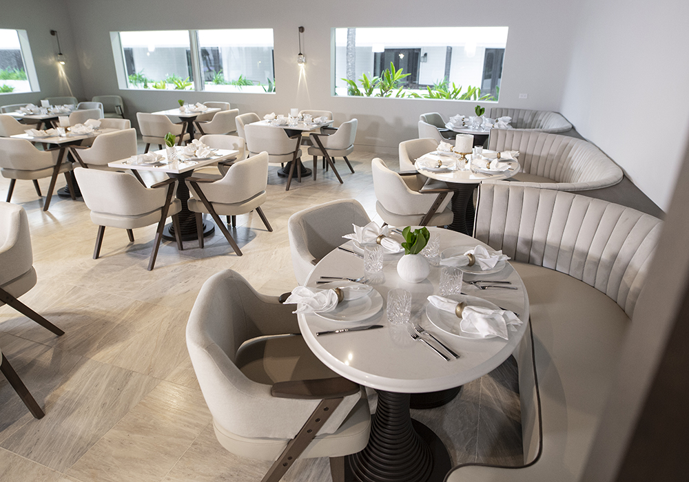
Lusca’s Seating Options
The Lusca dining room offers a variety of seating arrangements, including banquette seating which adds to the room’s calm and cozy vibe.
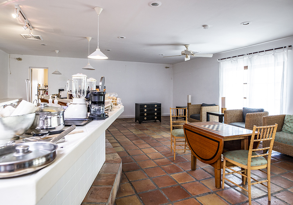
Dining Room Before the Baeumlers’ Transformation
Here’s a quick snapshot of the dining room before the Baeumlers began their two-year odyssey of transforming this resort. Dated tiles and a cramped feeling were this room’s M.O.
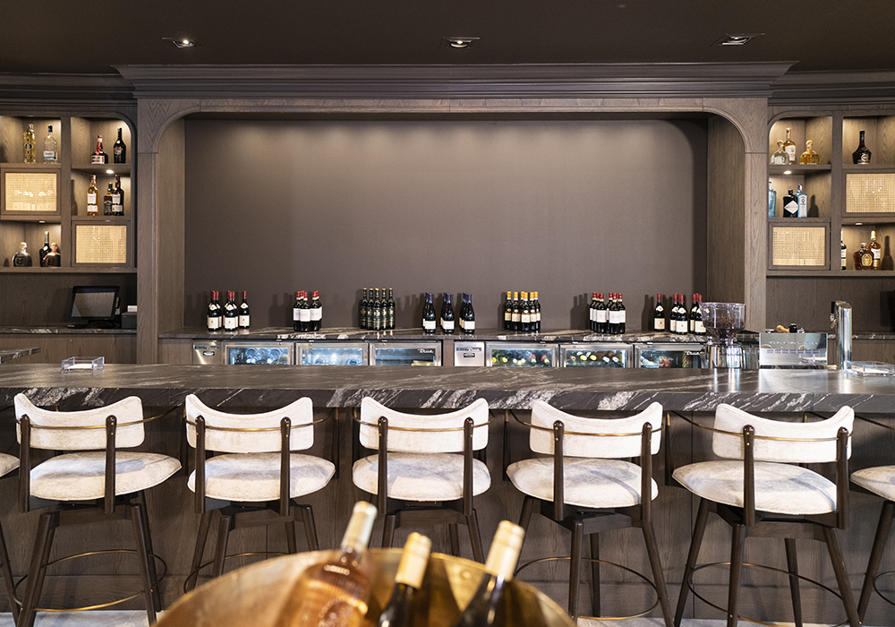
Dining Room Bar Area
The last section of the dining area we tour is the bar. A great gathering place, the oversized and well-stocked bar provides space for 10-12 patrons to meet up before dinner for an aperitif or to relax after dinner with a shot of brandy or liqueur. It’s almost a sure thing that more than one friendship will be christened here.
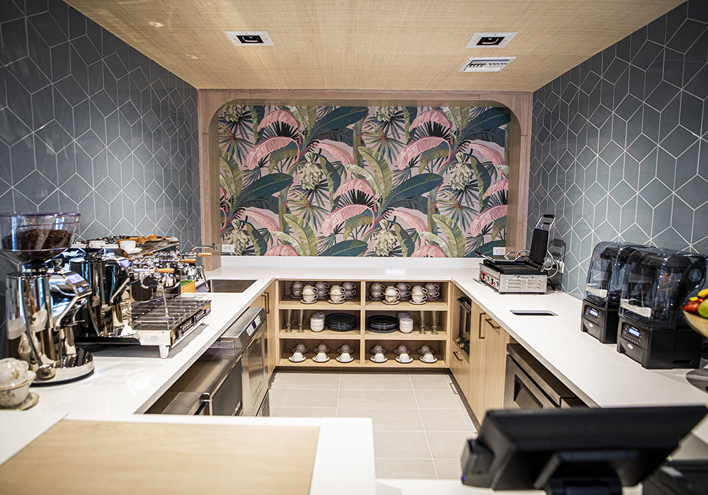
Switcha
Sarah’s favourite space in the resort is Switcha. It was a forgotten nook that now will be where guests can grab a cappuccino, smoothie or dessert. Sarah worked with Chef Sebastian so that the necessary appliances fit perfectly into the millwork. It’s a fully functional space. But that is only half the story.
See Sarah explain the design process behind the Switcha space.
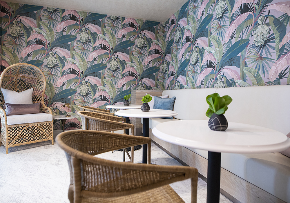
More Switcha
The other side of Switcha is a lounge space. The banana leaf-print wallpaper was the jumping-off point for Sarah. It’s a cool and casual area complete with wicker chairs where guests can escape from the heat of the Caribbean sun.
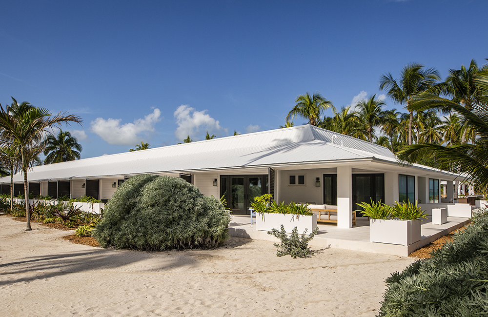
Hotel Block Completed!
Now finished, the hotel block is what gave Bryan the toughest fight. All the plumbing had to be dug up and replaced, the electrical had to be rewired, and all the furnishings replaced. The exterior of the hotel block belies a struggle that Bryan fought for nearly two years. Sometimes the fish that gives the biggest fight is the one that wins you the trophy.
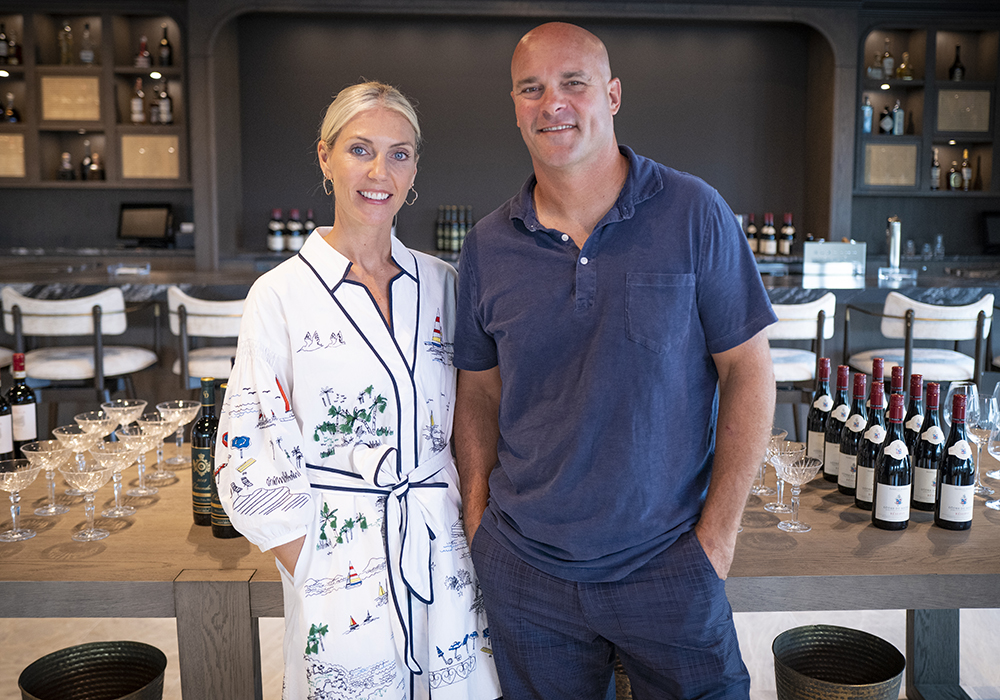
Champagne Finish
While the Baeumlers had thoughts of running the resort, the years of trials and tribulations have left them yearning for home. For now, it’s time to pop the champagne and absorb the feeling that comes with a job well done. What’s next for Sarah and Bryan? Stay tuned.
HGTV your inbox.
By clicking "SIGN UP” you agree to receive emails from HGTV and accept Corus' Terms of Use and Corus' Privacy Policy.


