It’s only a matter of time until a home with awkward angles and an odd floor plan wears on its owners. For Katie, Mark and their three young children, their living space’s main floor was in need of dire updates – either that, or the couple wanted a change of address. So they called in experts Jillian Harris and Todd Talbot of Love it Or List it Vancouver. Read on to discover how Jillian converted the cramped main floor into a contemporary and open-concept space fit for a family of five.
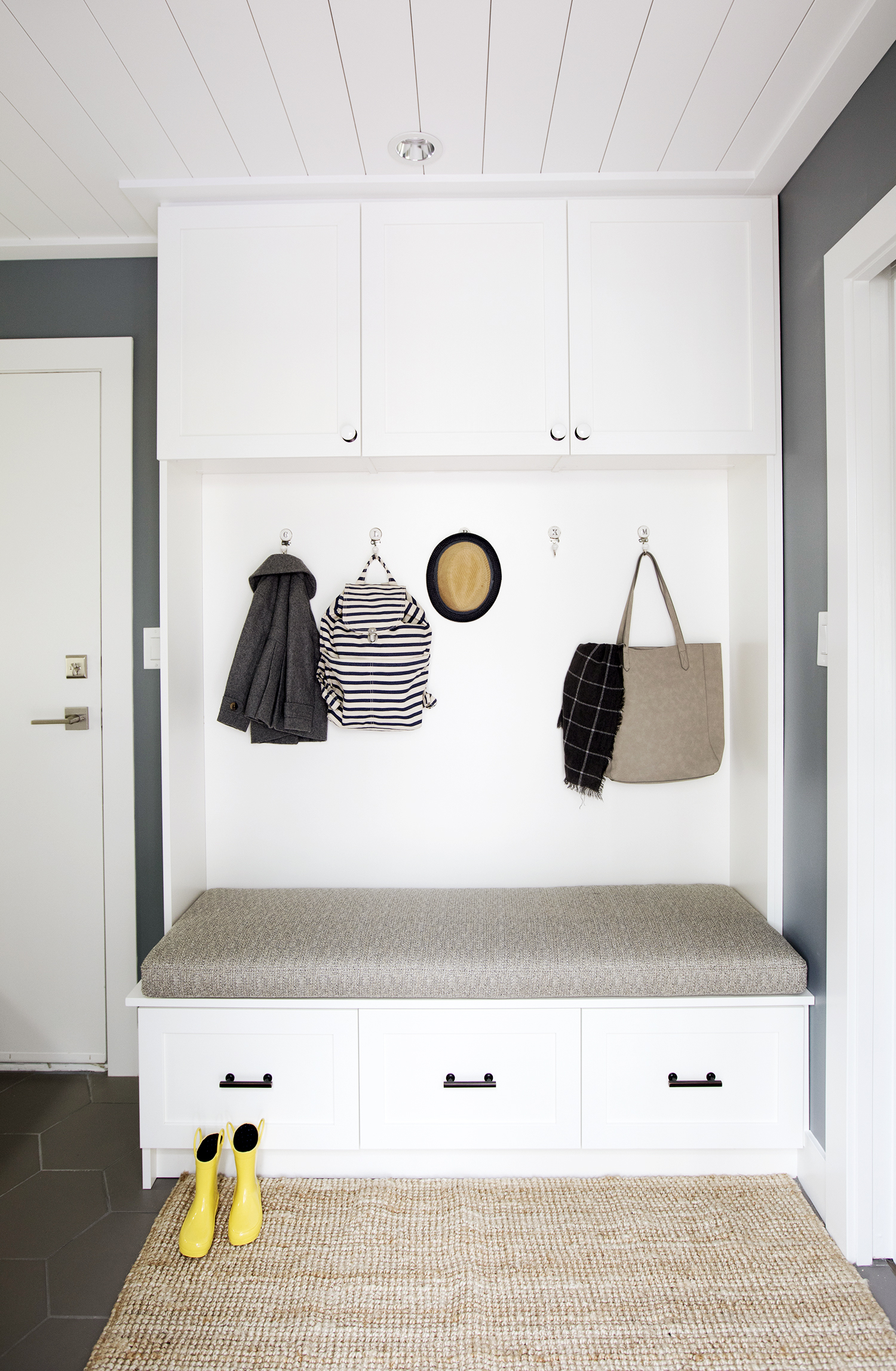
Mud Room
No family space is complete without a mud room to collect outdoor shoes, jackets and miscellaneous items children tend to bring home. Designer Jillian Harris made sure this one was bright and functional, adding a large built-in storage unit with hangers and deep cupboards.
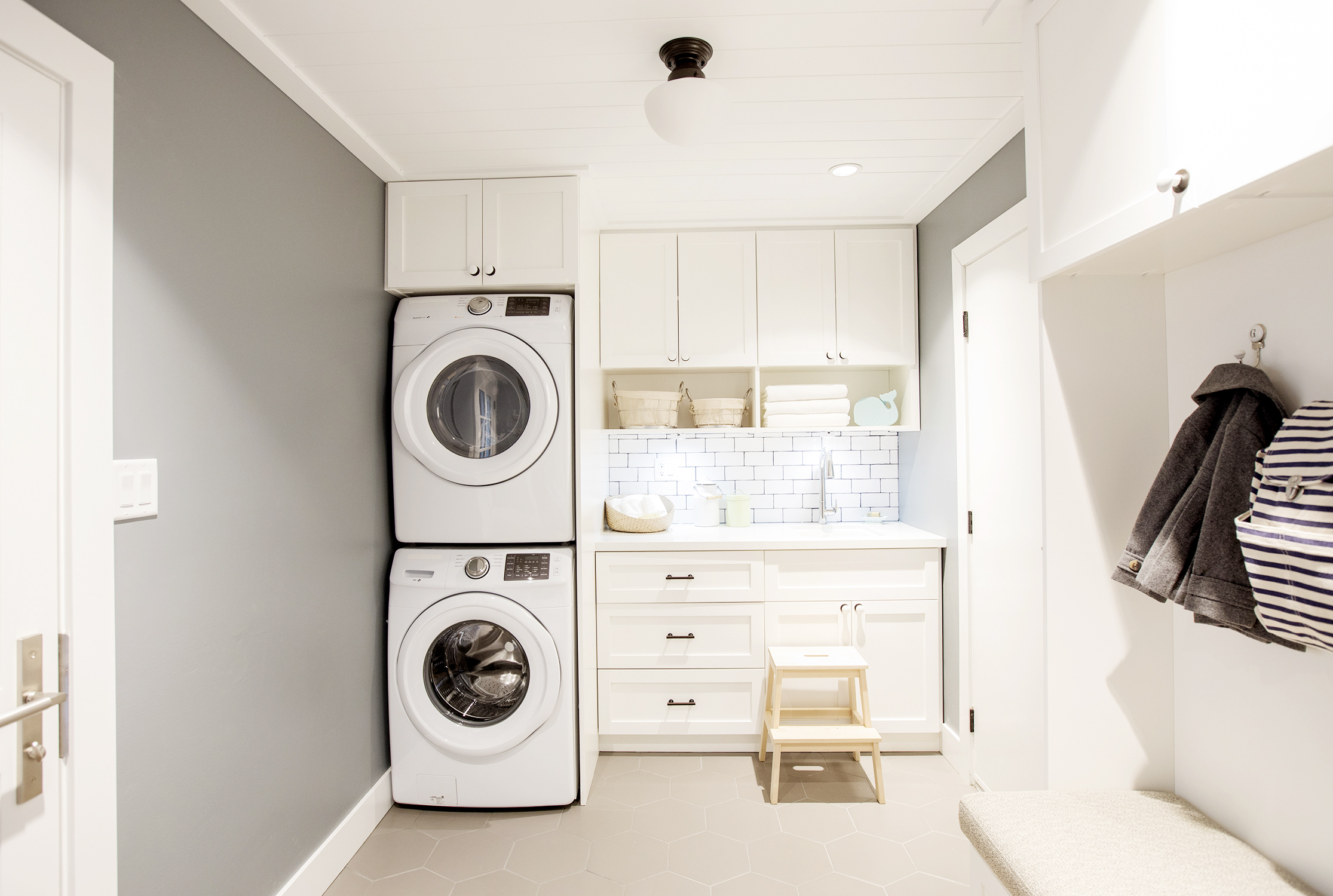
Squeaky Clean
Also in the mudroom? A fully functional laundry area. The stacked washer and dryer and built-in cabinets maximize space, while the countertop acts as a perfect place to sort and fold clothing.
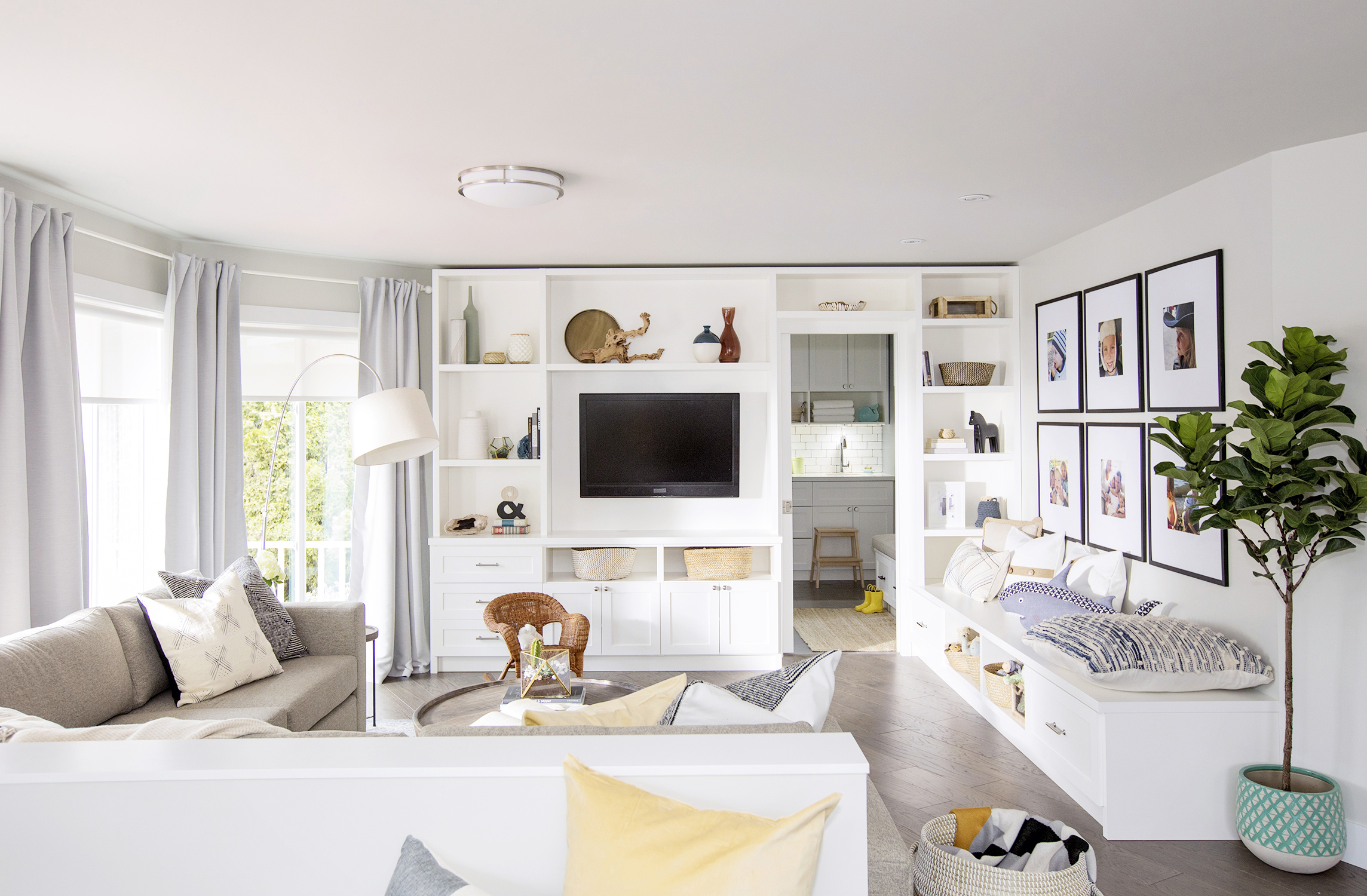
Breathtaking View
This redesigned living room is spacious, bright and provides ample seating for the family of five. A built-in bench along one wall even incorporates storage underneath, while the custom TV unit acts as an art piece, showcasing some the homeowners’ favourite finds.
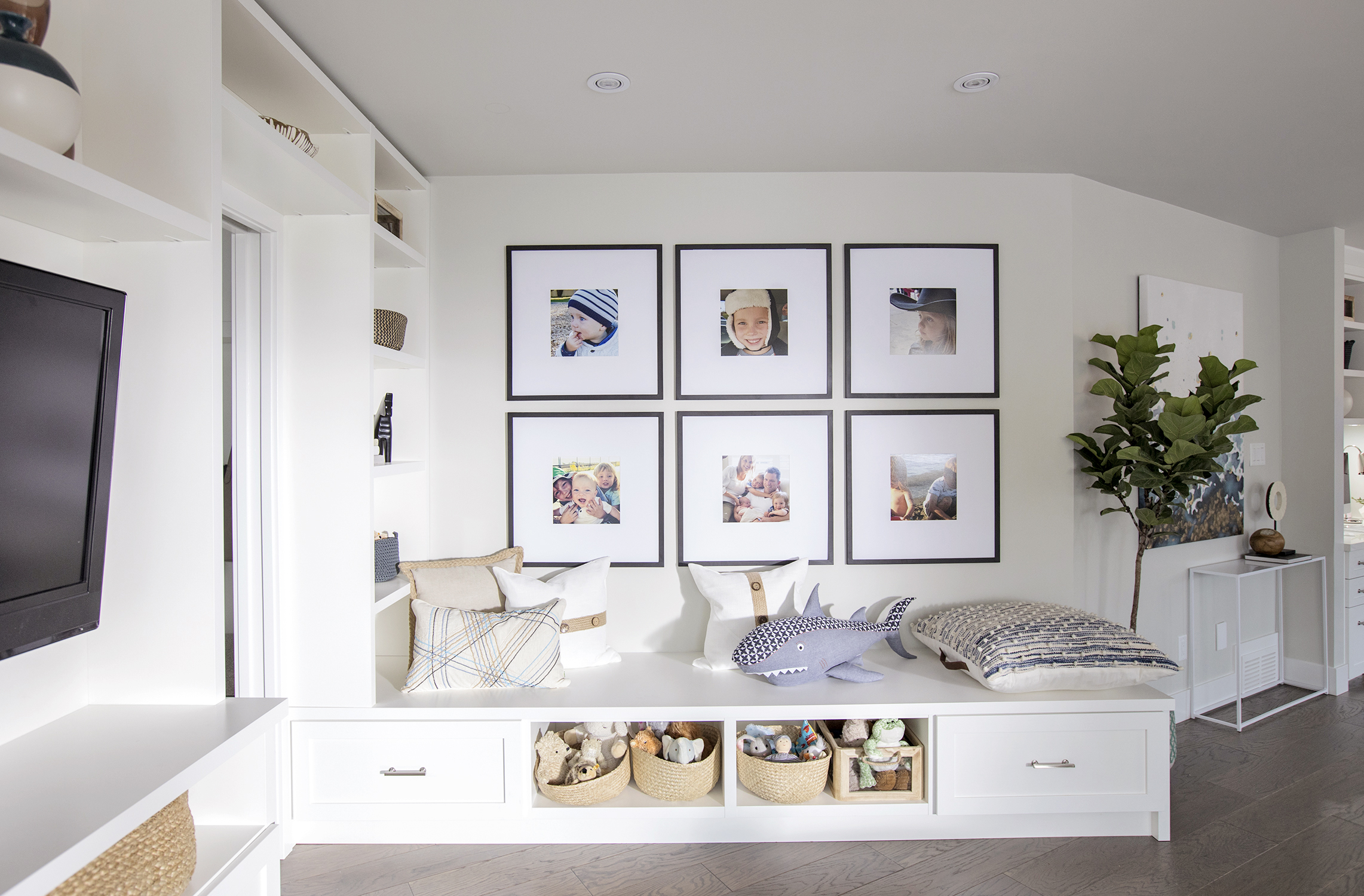
Feature Wall
Not all feature walls require bold patterns or tiling to make a statement; Jillian managed to make this corner feel stylish and homey thanks to a symmetrical family photo wall. Extra storage below for the kids’ toys is a bonus.
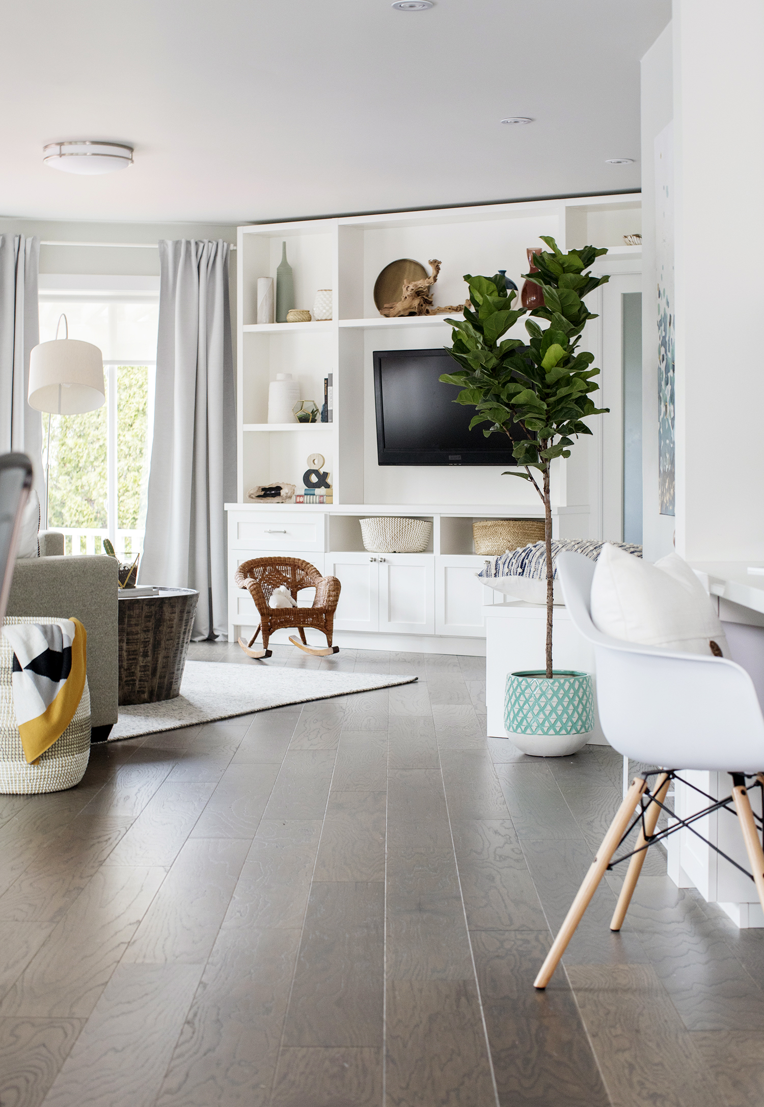
Uniform Flow
The main floor’s new chocolate brown hardwood is rich and elegant. The dark hue grounds all the bright whites Jillian selected and makes the space feel all the more warm and welcoming.
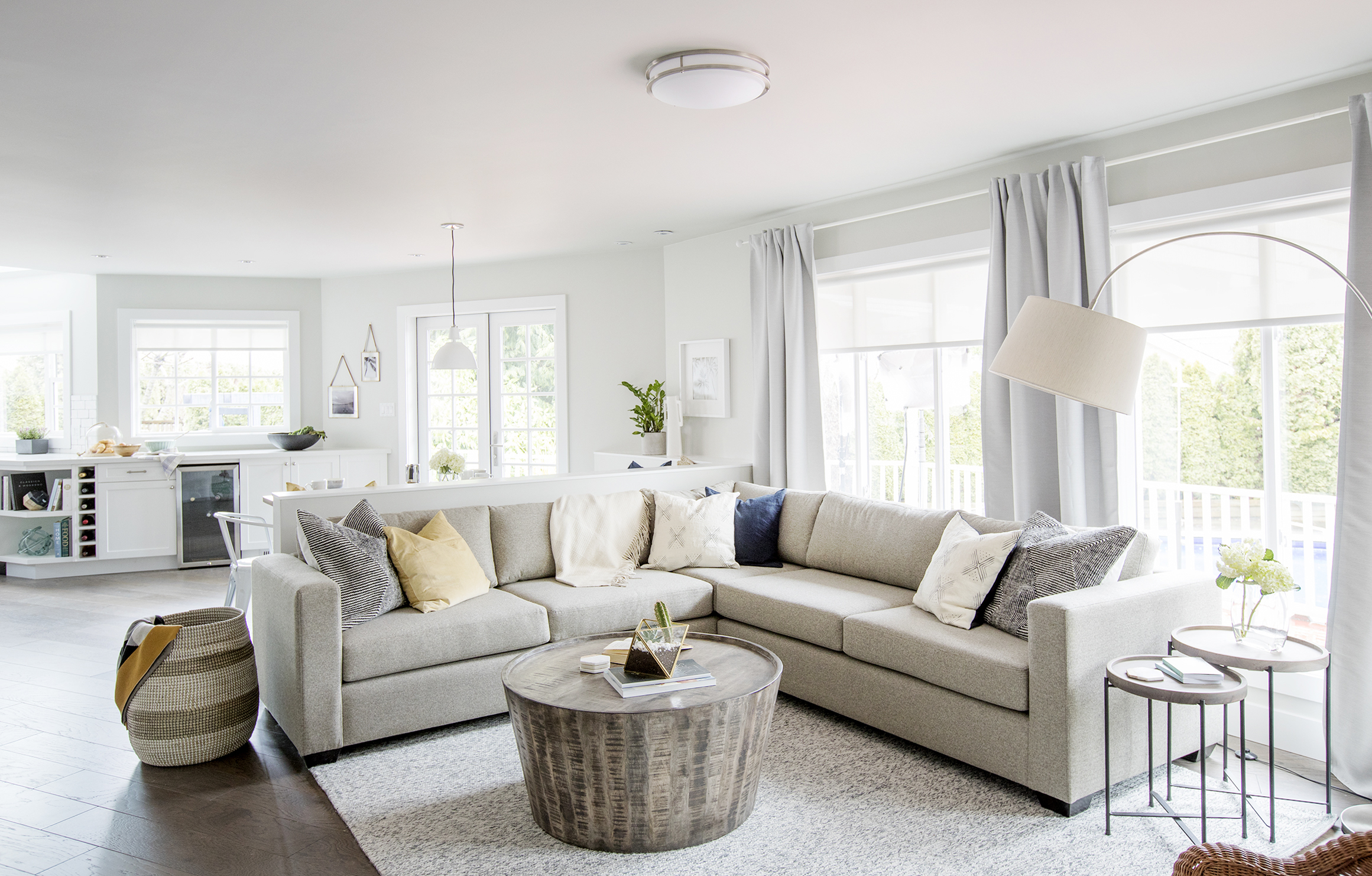
Perfect Sectional
This low-slung sectional is a great fit for the space as it doesn’t feel bulky or add clutter. Its soft grey hue matches the speckled area rug below, while the circular coffee table introduces subtle texture and rustic flair. Meanwhile, plenty of windows let in tons of light, adding to the space’s open and airy feel.
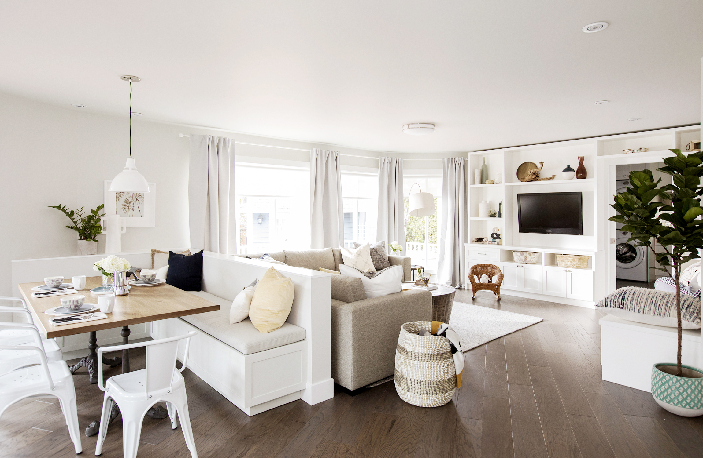
Smooth Sailing
From this angle, you’d never know how closed-off the rooms were before Jillian got her hands on them. Now, each space flows effortlessly into the next in a way that really takes your breath away.
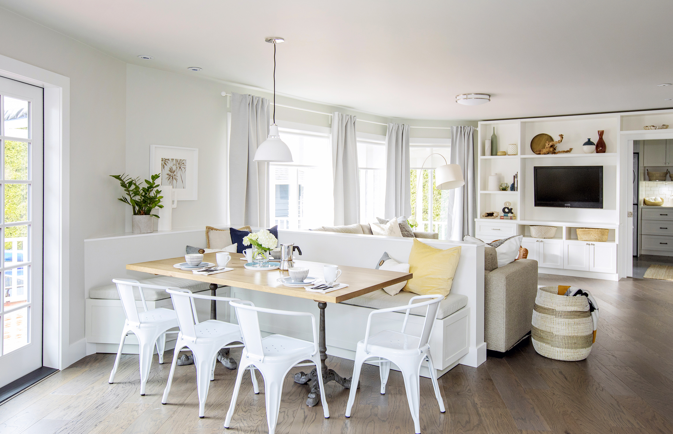
Custom Dining
In order to separate the kitchen from the living room, Jillian installed a custom banquette that doubles as a room divider. It’s a great way to incorporate a small dining nook with plenty of seating without taking up too much space.
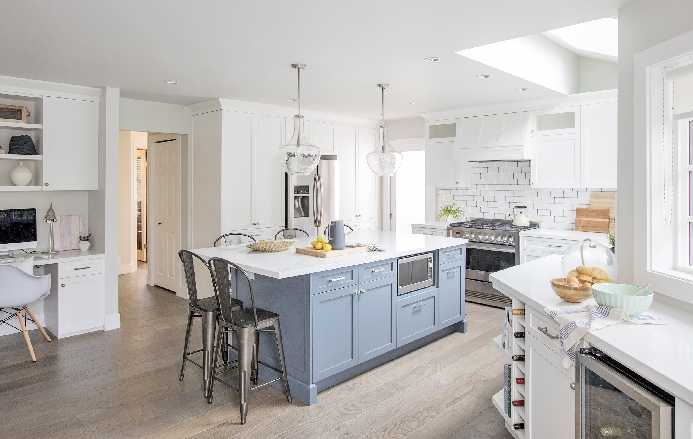
Island Experience
To give the kitchen a burst of colour, Jillian opted for a contemporary blue hue for the island. The addition also provides the homeowners with even more seating and counter space. The skylight is the finishing touch that shines the spotlight on this state-of-the-art space.
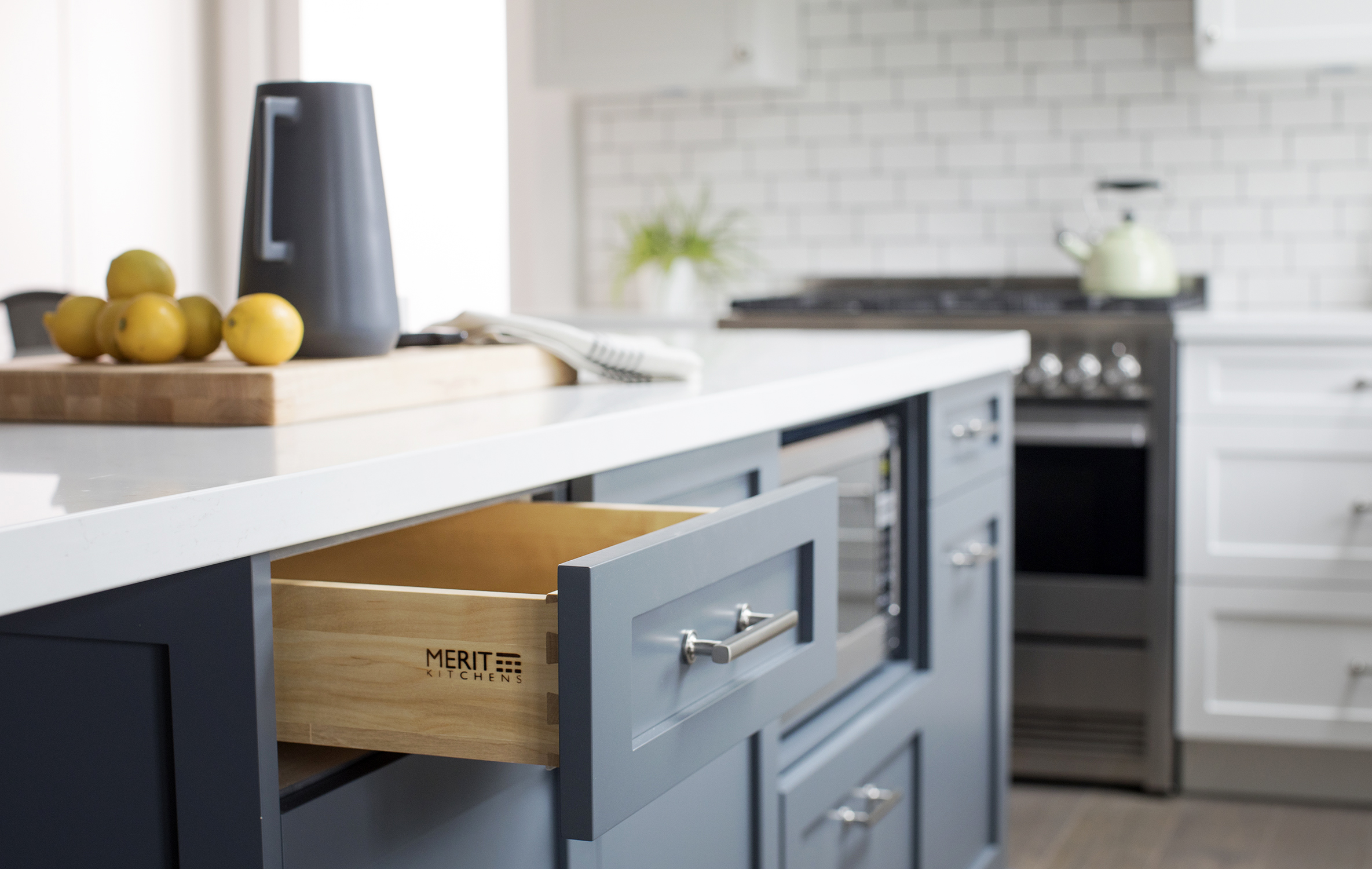
Bonus Storage
We love kitchen islands that are multifunctional, and this model is no exception. While the addition’s pretty blue finish offers a fresh pop of colour, its drawers and cabinets add coveted storage space.
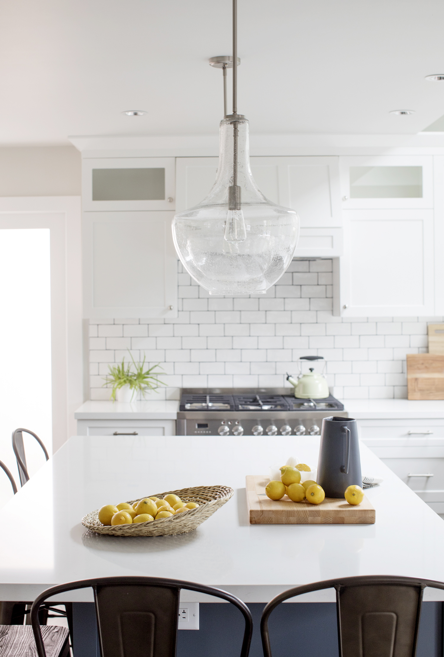
Lighter Details
Even the pendant lights hanging above the island help with the open-concept flow; the see-through glass fixtures add pretty luxury and keep sightlines open.
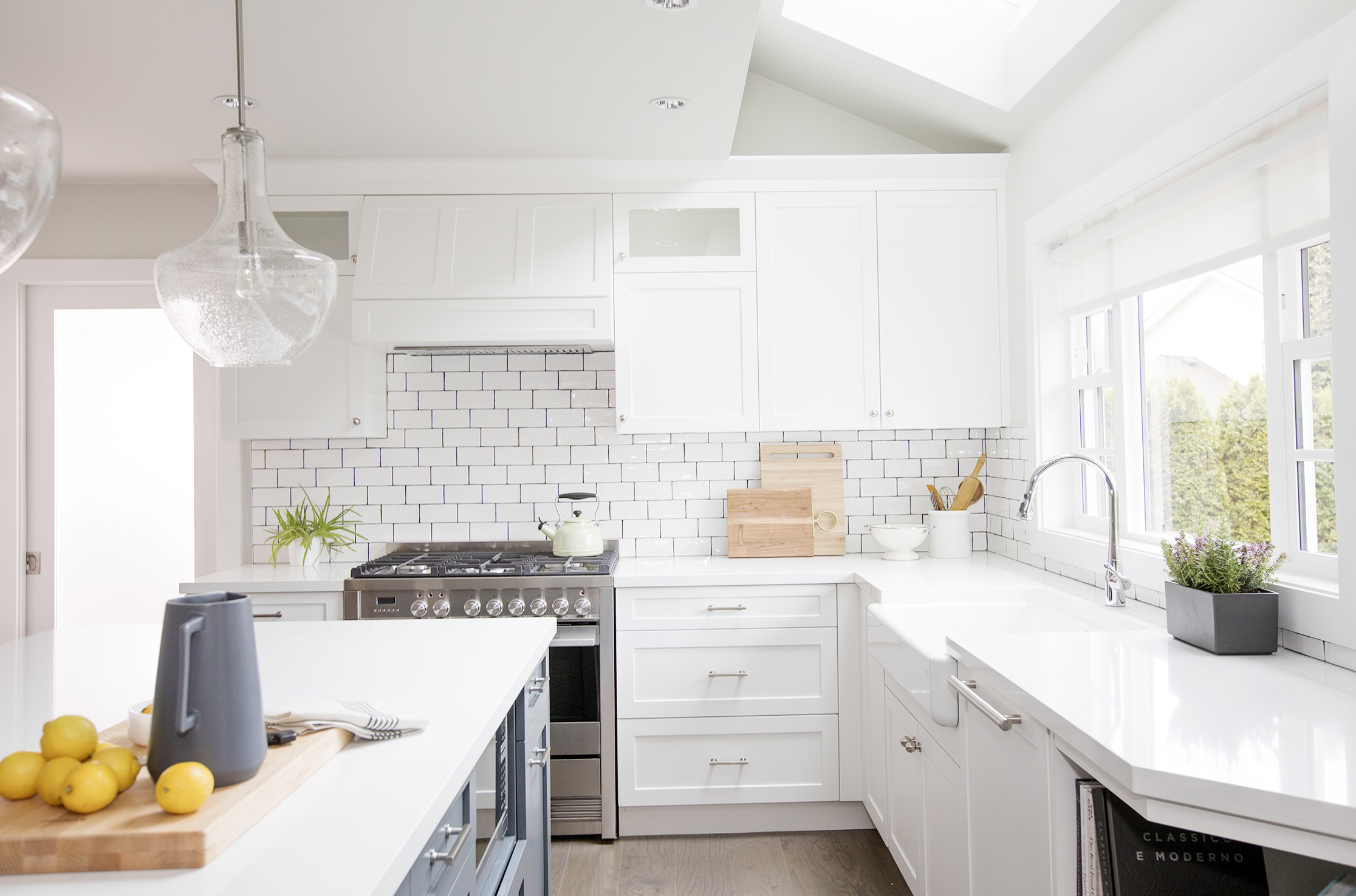
Bright Finishes
What’s the best way to achieve a modern and bright kitchen? By going white, of course. Crisp white cabinetry with coordinating countertops ensures a gleaming and timeless aesthetic.
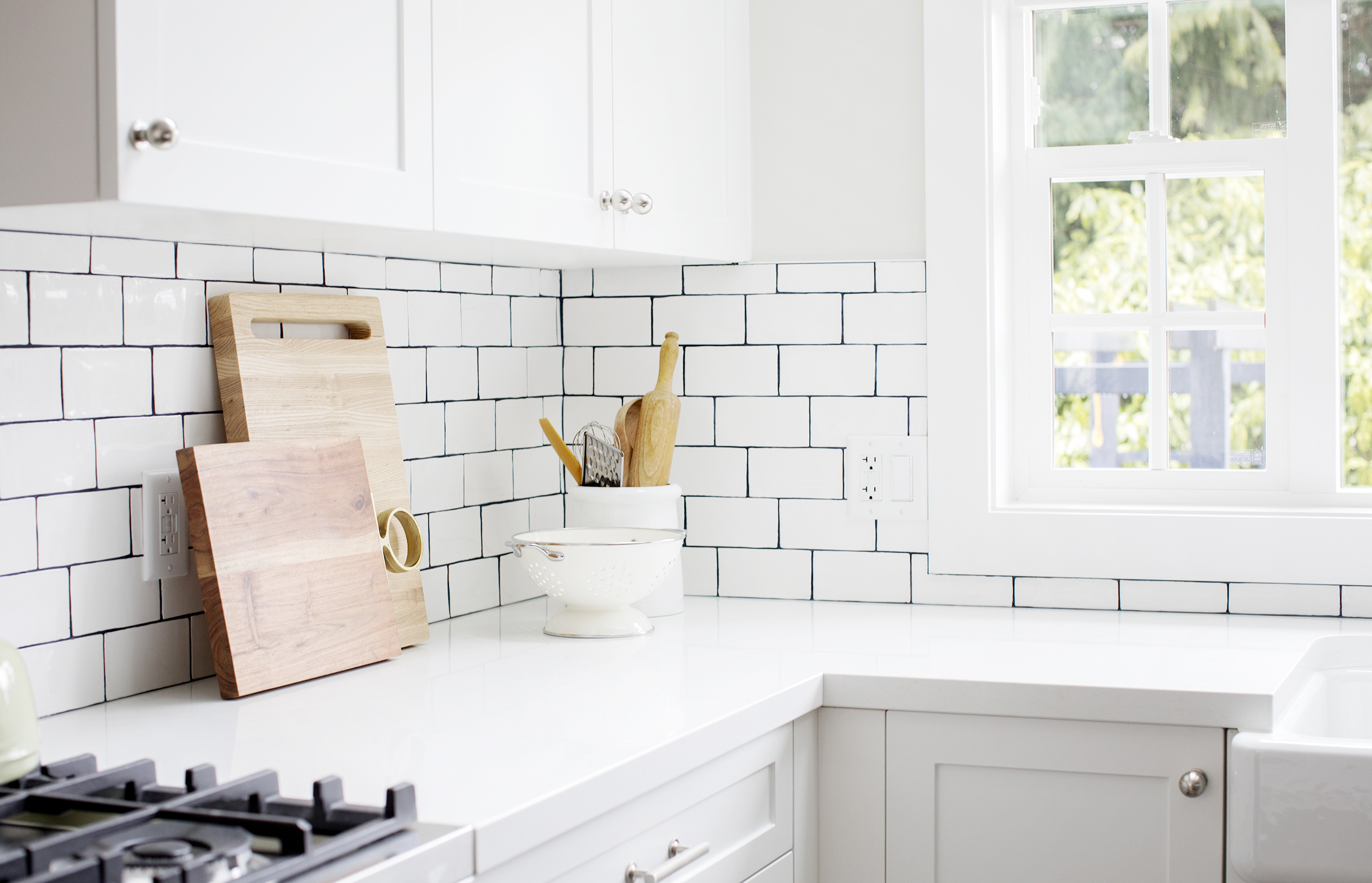
Bright White Backsplash
To break up the white-on-white, Jillian opted for a subway tile backsplash with contrasting black grout. The result is a look that adds texture and bistro-style charm, giving this kitchen tons of personality.
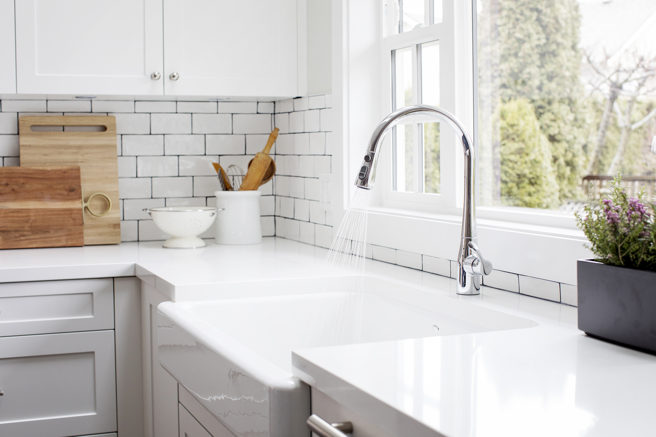
Oversized Sink
When you have a family of five, it’s super important to have a kitchen sink that can keep up. Jillian installed this pretty model that definitely goes the extra mile thanks to its large size.
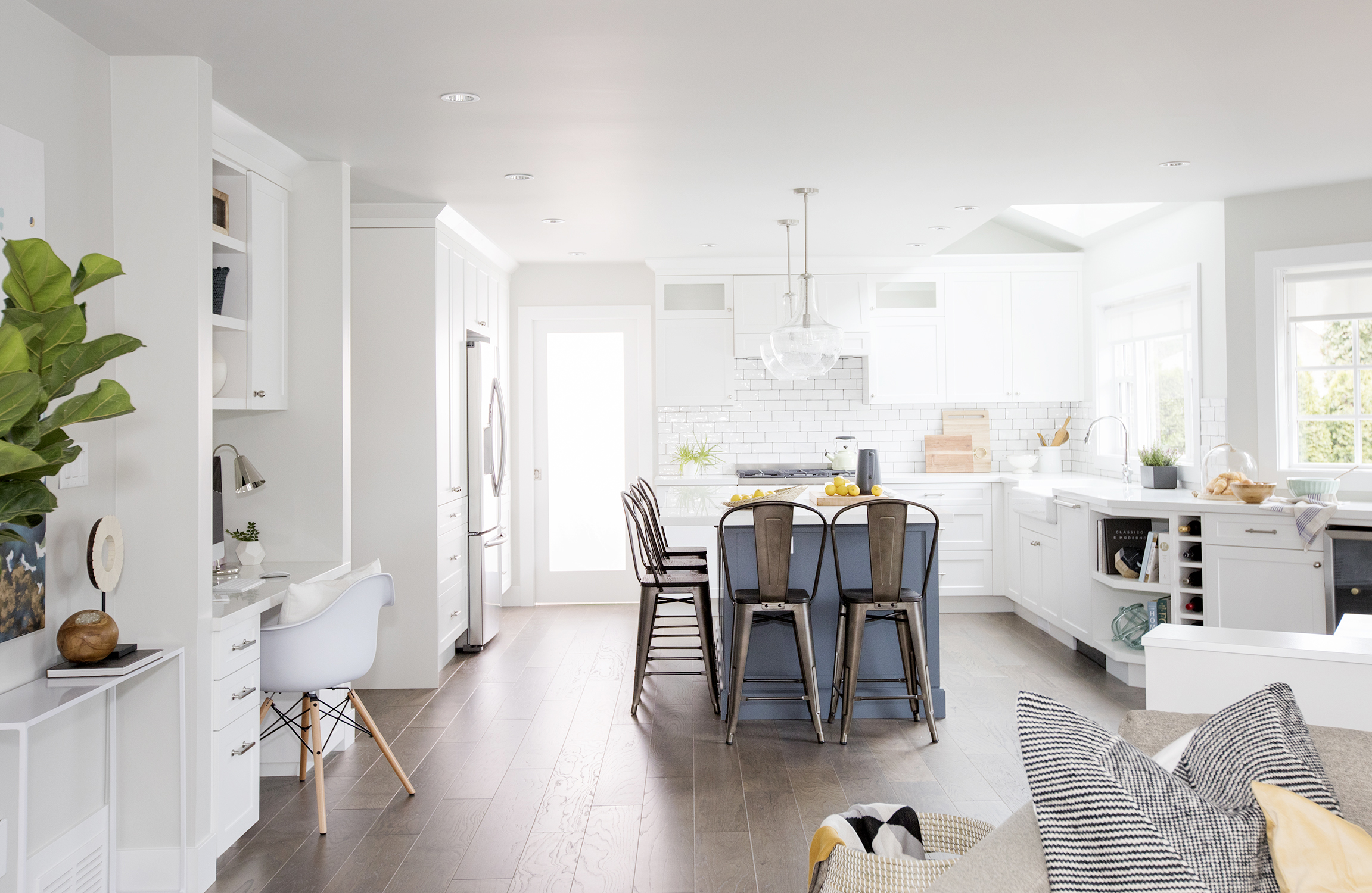
Office Nook
The open-concept kitchen boasts a compact office nook ideal for the homeowners to catch up on paperwork, or for the kids to finish homework after school.
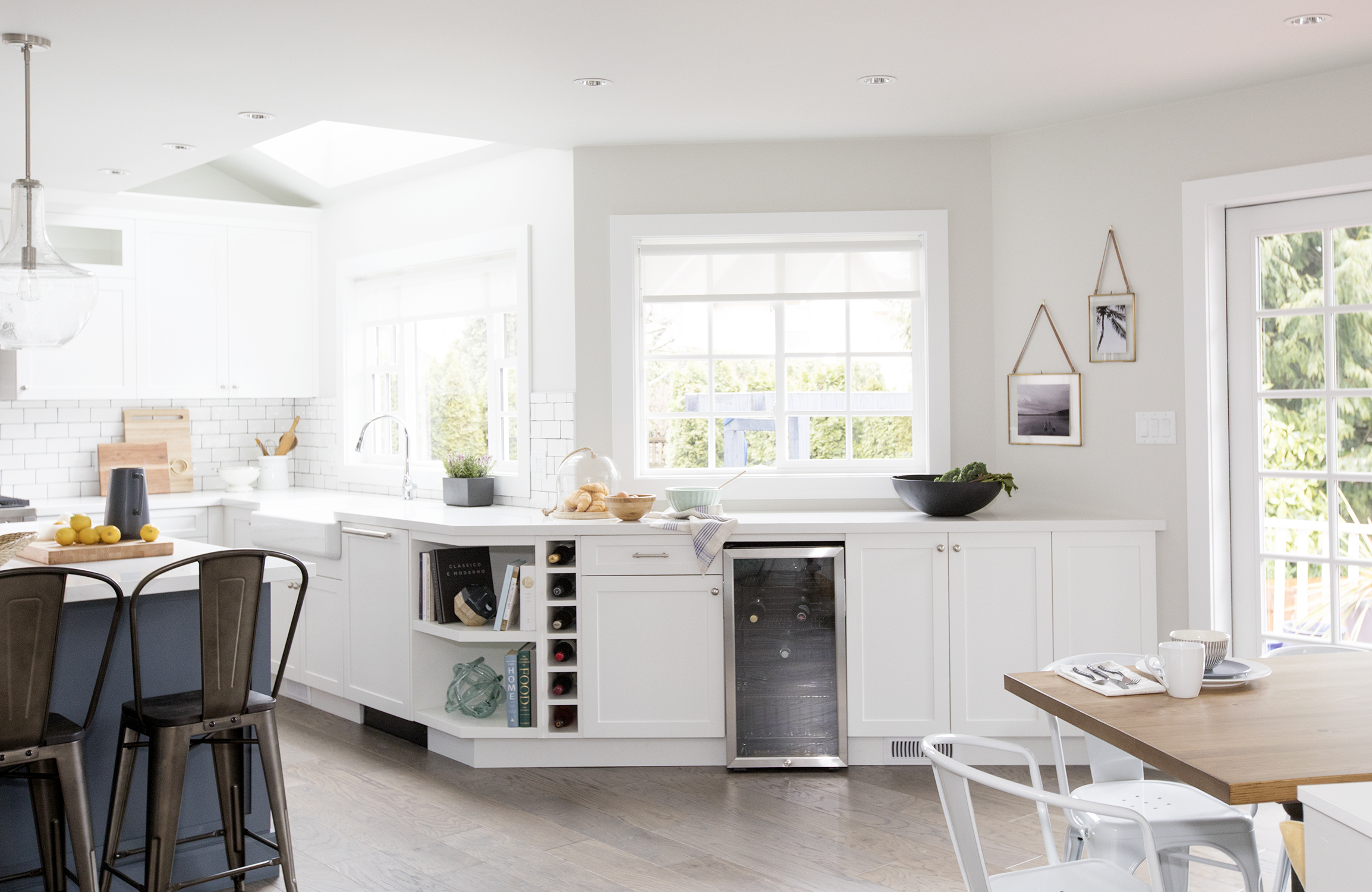
Entertaining Zone
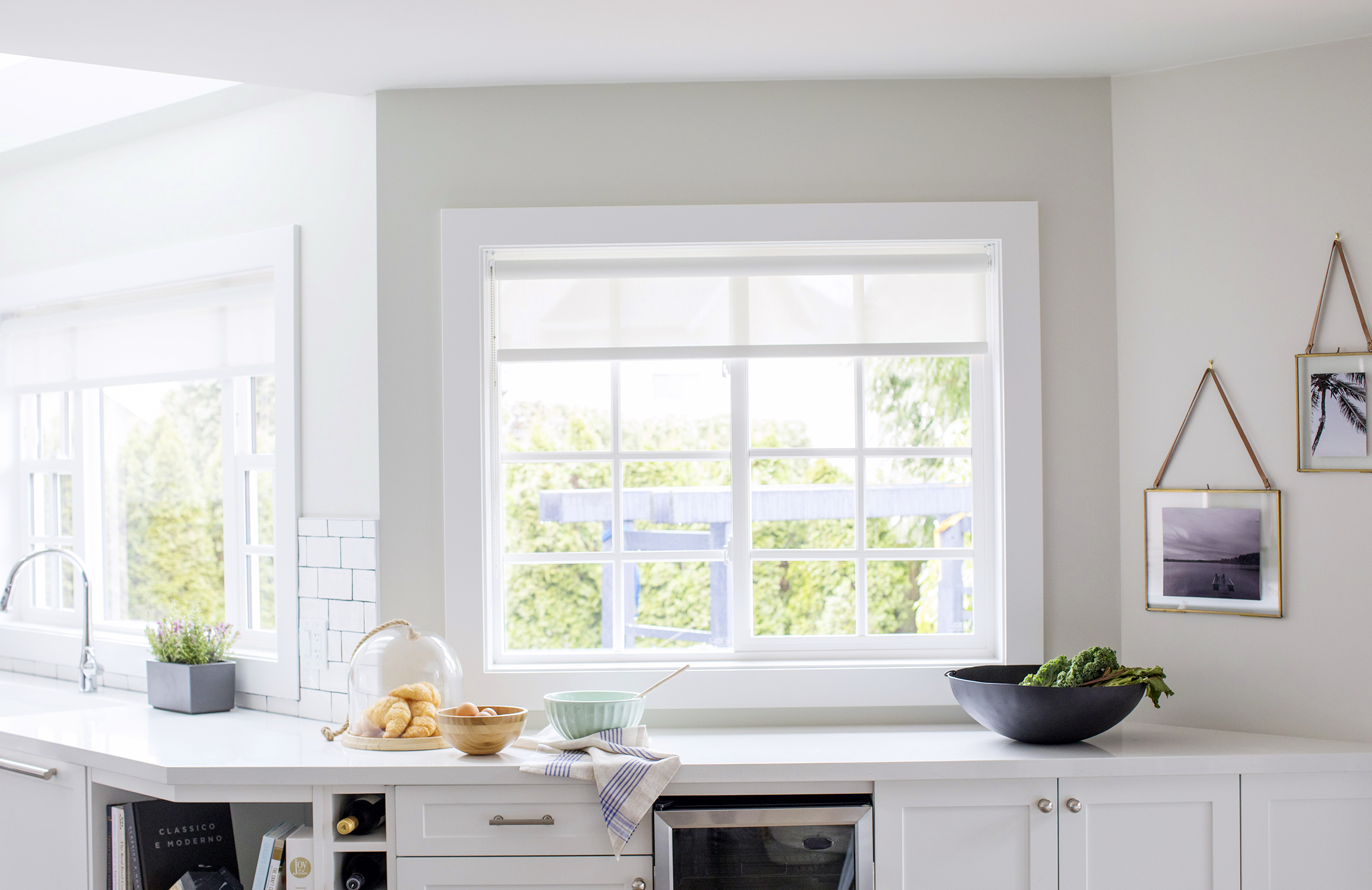
To help facilitate the transition between the kitchen and dining room, the designer extended the counters along this wall to create an entertaining area of sorts. Now there’s extra space for a wine rack and bar fridge, which makes hosting thirsty company a breeze.
Shine Bright
With so many windows, it’s hard not to be drawn to this kitchen, which feels like a spacious sunroom of sorts.
In the end, this grand living space with a hardworking kitchen and tons of storage may not have been enough to convince the couple to stay, but we have no doubt another family will fall head over heels for it in the very near future.
HGTV your inbox.
By clicking "SIGN UP” you agree to receive emails from HGTV and accept Corus' Terms of Use and Corus' Privacy Policy.


