With an initial $750,000 budget, Becky and Michael set out to find a new home, but after investing $225,000 into a renovation, suddenly their old family home looked all shiny and new. Would they decide to love their home or list it? Read on to find out!
Watch Love It or List It Mondays at 10pm on HGTV Canada. Stream HGTV Canada anytime with the Global TV app and on STACKTV . HGTV Canada is available through all major TV service providers.
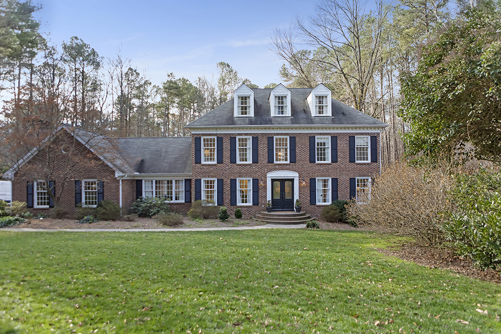
A Picture-Perfect House (On the Outside)
Becky had dreamed of owning this very home before she and her husband bought it, but six years on, she’d tired of the 1970s interiors that she and husband Michael had never gotten around to updating. While the house was large, the layout wasn’t ideal, and rooms on the main floor were blocked off. They gave Hilary a budget of $200,000 to renovate, and set out to house hunt with a $750,000 budget with David by their side. Would they find their next forever home? Or realize they’d been living the dream all along? Read on to find out!
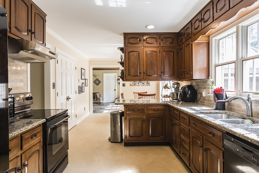
Welcome to Brown Town
One of Becky’s biggest complaints with her family’s current home was the terrible kitchen. The layout of appliances was awkward, there was little counter space, and Becky felt it was blocked off from the rest of the home. She wanted a kitchen that was beautiful, and enjoyable to use. But this space would prove to be the most challenging. To rejig some load-bearing walls, Hilary had to ask the couple to increase their budget by an extra $25,000, an ask that they begrudgingly agreed to.
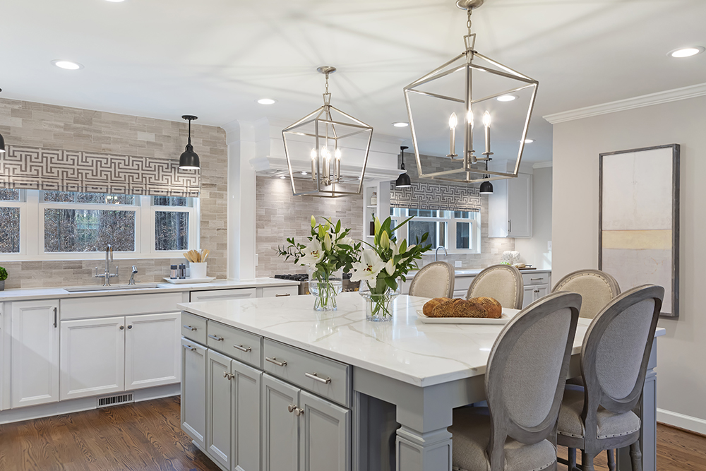
A Crush-Worthy Contemporary Kitchen
Hilary’s completed kitchen was beyond anything Becky and Michael saw during their house hunting. Their new kitchen had more storage and counter space than they could have dreamed of, and it was perfect for entertaining – something Becky and Michael stressed was very important to them. (Even David agreed that Hilary’s design was a 10 out of 10!)
Related: 10 Surprising Things You Didn’t Know About Hilary Farr
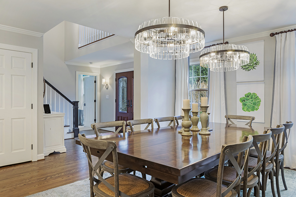
A Dining Room With Room to Spare
By tearing down a wall in the entryway, Hilary was able to not only update the boring, brown foyer, she was also able to create a large, open space that was big enough to accommodate a dining table to seat 14.
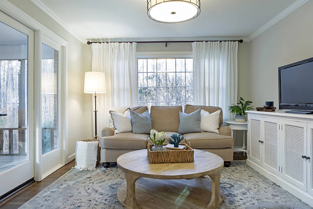
A Cozy and Comfortable Family Room
Initially Hilary had envisioned this space as an office, but after Becky expressed concerns over noise from the kitchen, it became a cozy TV room, with access to the family’s much-loved backyard.
Related: How to Decorate Your Living Room Based on Your Zodiac Sign
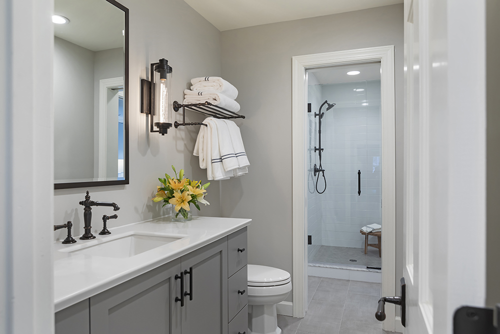
The Power of Pocket Doors
This is where Hilary’s genius really shines! She needed to find a way to offer a main floor powder room that could also double as a bathroom for the guest bedroom. Hilary created a space for a sink and toilet off the main hallway with a pocket door leading to a space for a shower, with a second door connecting it to the guest bedroom. Guests can have their privacy, but the bathroom can still be used as a main floor powder room. Genius, right?
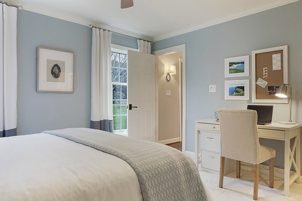
A Sweet Escape
After setting up the guest bedroom, Hilary realized the space could also double as Becky’s much-needed home office. Upon walking through the guest room, and seeing the home office set up, Becky was brought to tears! But if she thought that was impressive, she was about to be blown away by the master bedroom and bathroom.
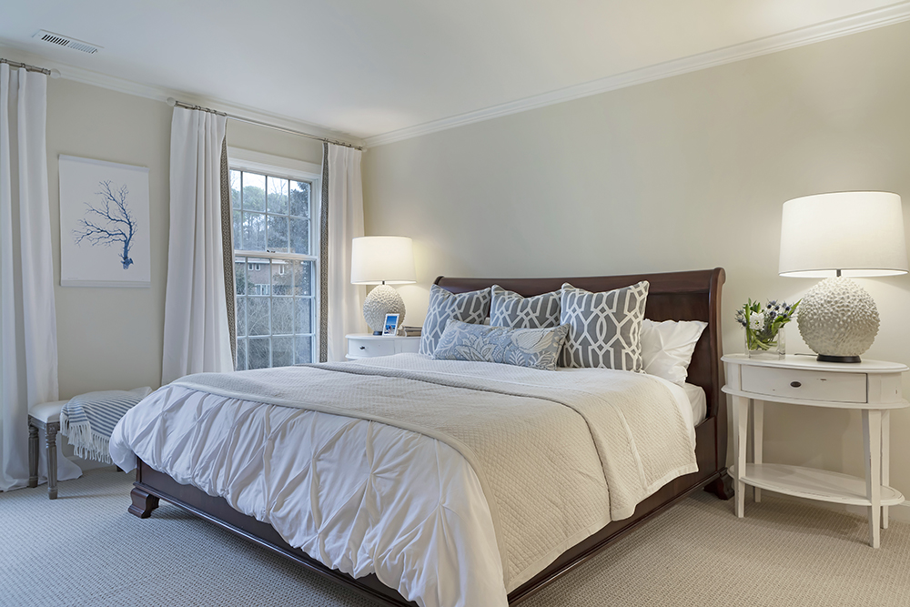
The Master of All Bedrooms
A few minor cosmetic tweaks made a world of difference in updating this master bathroom. Sometimes a few key accessories, like pillows, lamps and artwork can make all the difference. Here, a serene palette of white and soft grey help to soften the couple’s wood bed frame.
Want more inspiration? Check out Sarah Richardson’s best bedrooms.
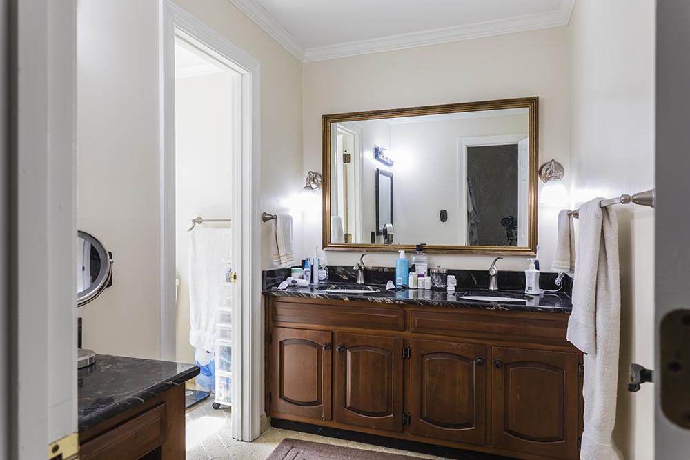
A Dated Master Bathroom
The original master bathroom wasn’t super inspiring. Previous owners had made some small attempts to update the 1970s design, but it was left feeling mismatched, and Becky wanted something really elegant and calming. Thankfully, Hilary was up for the challenge!
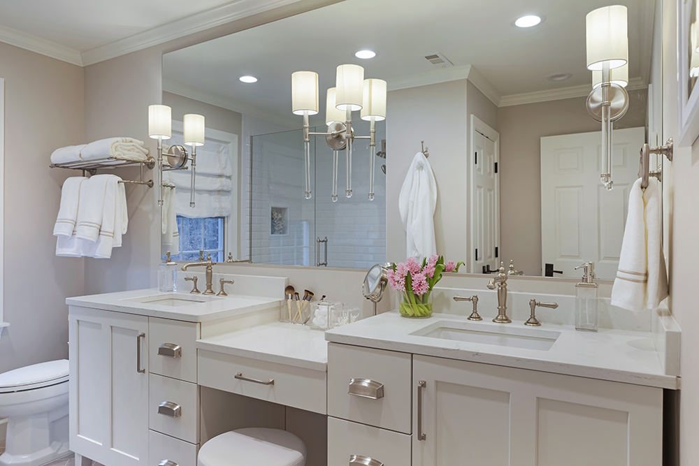
A Bathroom Fit for Happy Home Owners
Can you believe this is even the same bathroom? Brand new everything (floors, vanity, shower, lighting and hardware) transformed the outdated master bathroom into something out of a boutique hotel. The double vanity with a makeup station offered loads more storage, and created a space where Becky could relax and unwind at the end of each day.
Stay in the loop on all bathroom trends and tips.
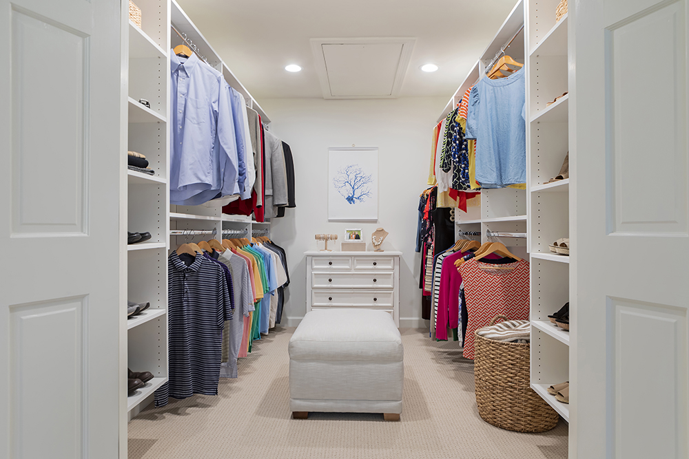
Did They Love It Or Did They List It?
If the master bathroom wasn’t enough to convince Becky and Michael to stay, the expanded walk-in closet certainly was! After touring several houses, and increasing their budget to $800,000, it wasn’t enough to pry the couple away from their newly redesigned home. They loved the new kitchen, the bright, open entryway, and felt the home finally offered everything they needed to call it their “forever” home. Becky and Michael decided to love it! (Better luck next time, David!)
HGTV your inbox.
By clicking "SIGN UP” you agree to receive emails from HGTV and accept Corus' Terms of Use and Corus' Privacy Policy.


