Constructing a home off the grid is no small task, especially when you’re constructing, designing and project managing a home the size of Sarah Richardson’s in Sarah Off The Grid. See the gorgeous results of Sarah’s new home, beaming with charm, character and rustic touches!
The second season of Sarah Off The Grid premieres Sunday April 21st at 9 PM ET/PT.
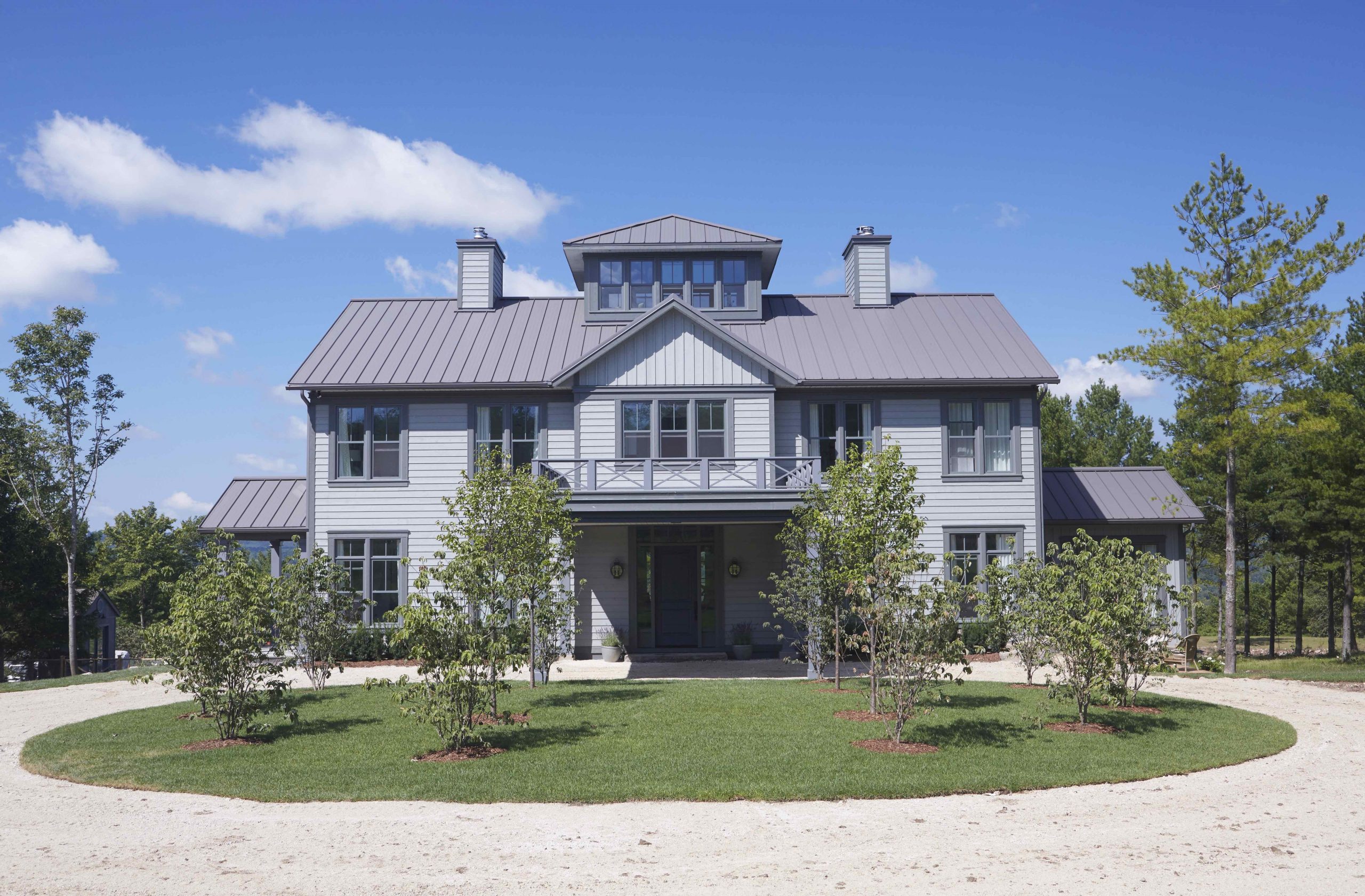
Infinite Curb Appeal
This house may be off the grid but you can tell from the outside that it boasts tons of modern conveniences. The striking stonework, double chimneys and beautiful Belvedere immediately catch the eye, while the circular driveway ensures guests always have plenty of room to park and visit.
Think you’re a Sarah super fan? Read on for 14 things you may not know about Sarah Richardson.
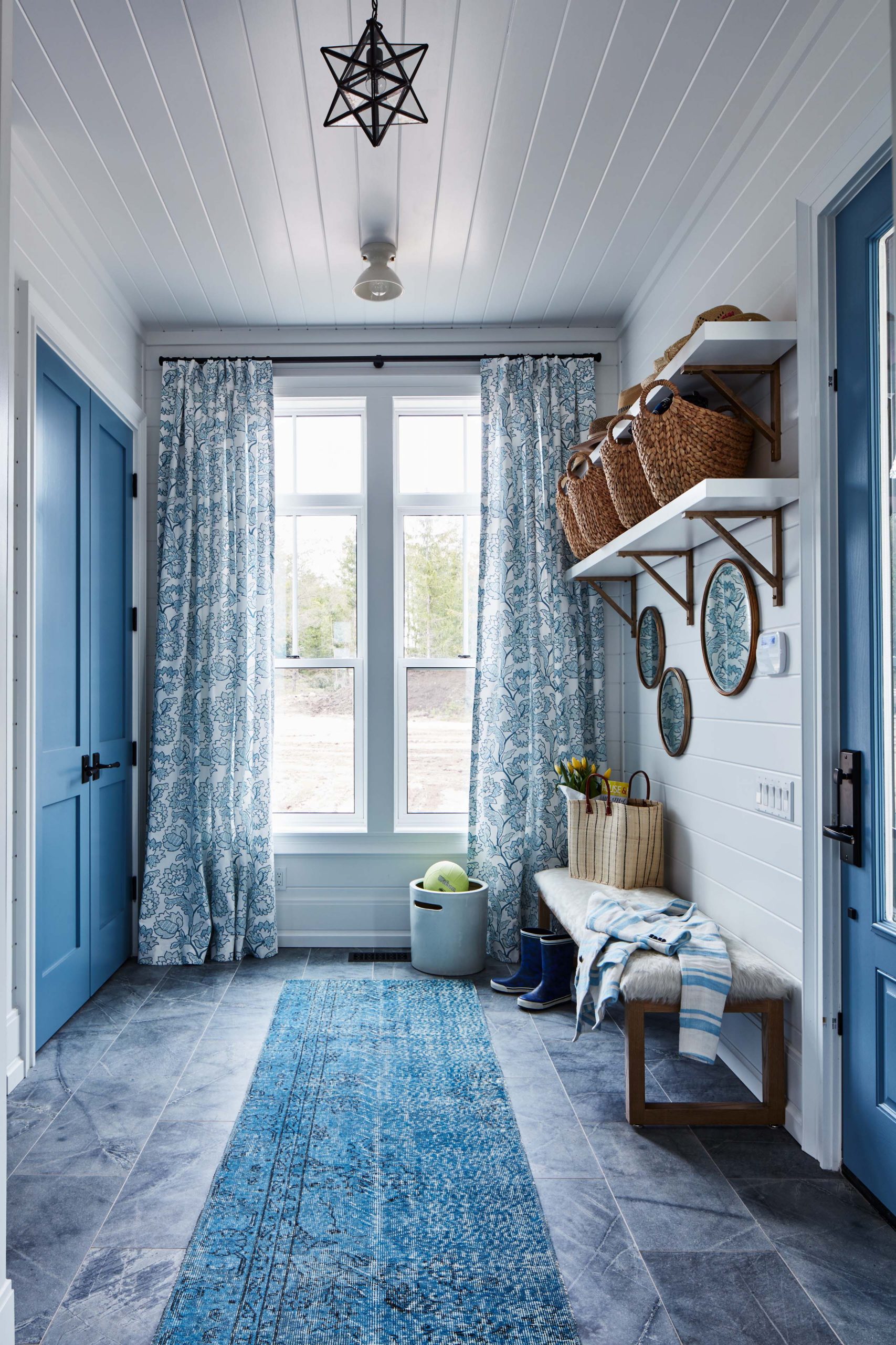
A Private Entrance
Soft blues distinguish this mud room, which is perfectly set up for the whole family with its elongated bench and easily washed tiles.
Love Sarah’s easy, elegant style? Click to read Sarah Richardson’s secret recipe for design success.
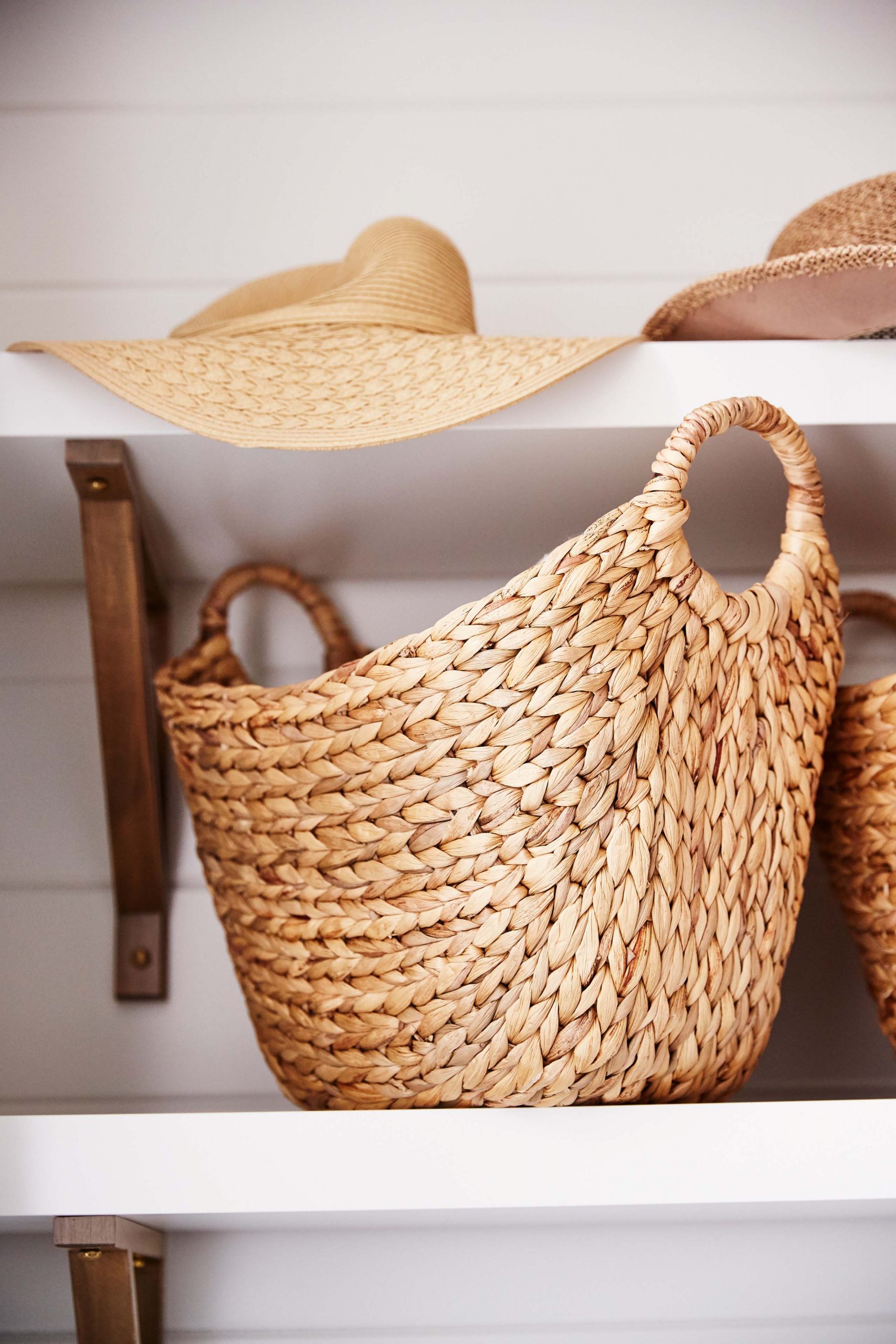
Simple Storage
Baskets are a surefire way to keep any mudroom looking neat and organized; just assign each family member their own basket and you’ll keep the clutter from accumulating elsewhere in the house.
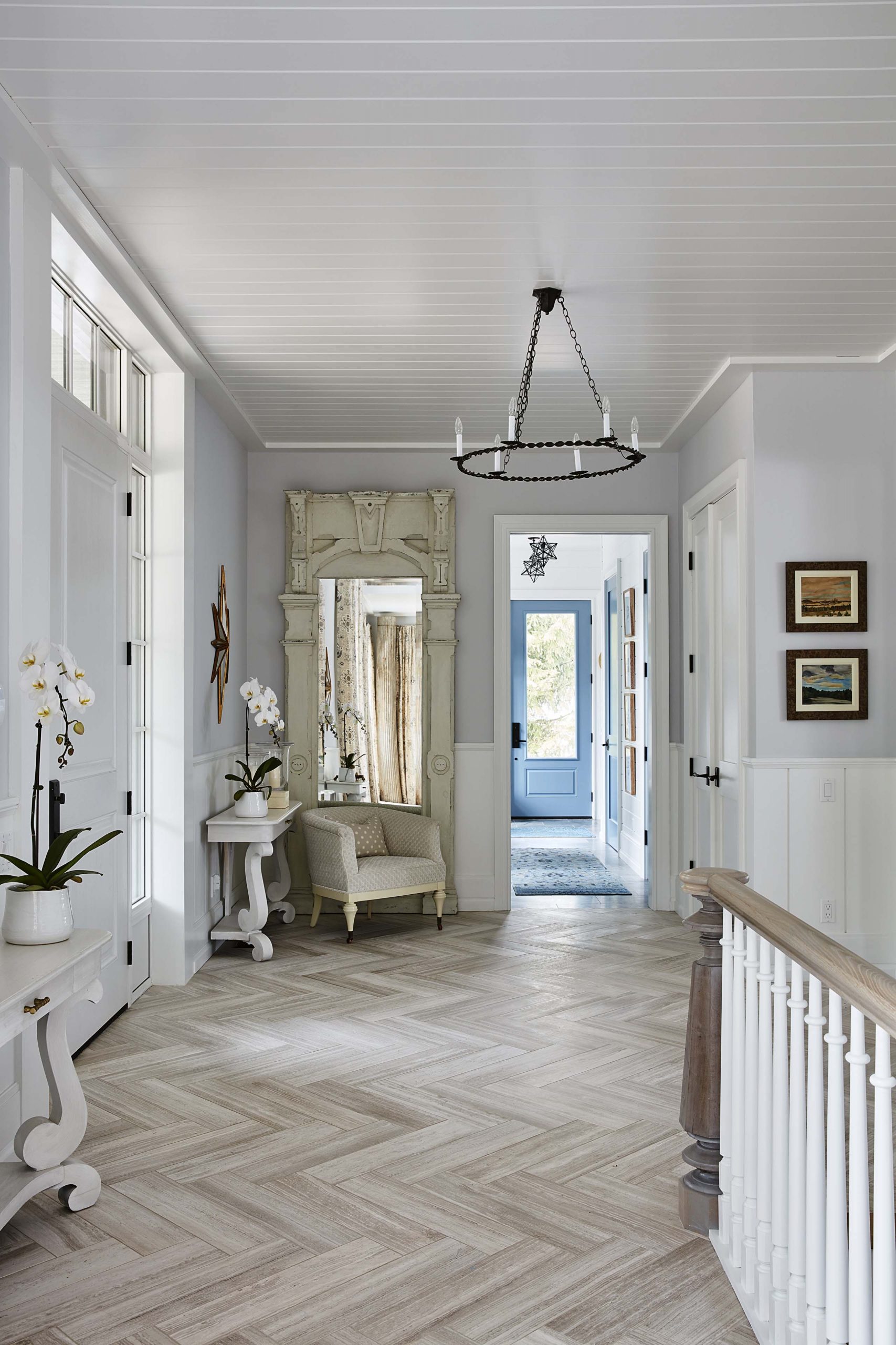
Patterns and Textures
What’s not to love about the chevron tiling and shiplap walls in this main floor foyer? Add in a gorgeous entryway mirror and an oversized armchair, and this is a small space that packs a big punch.
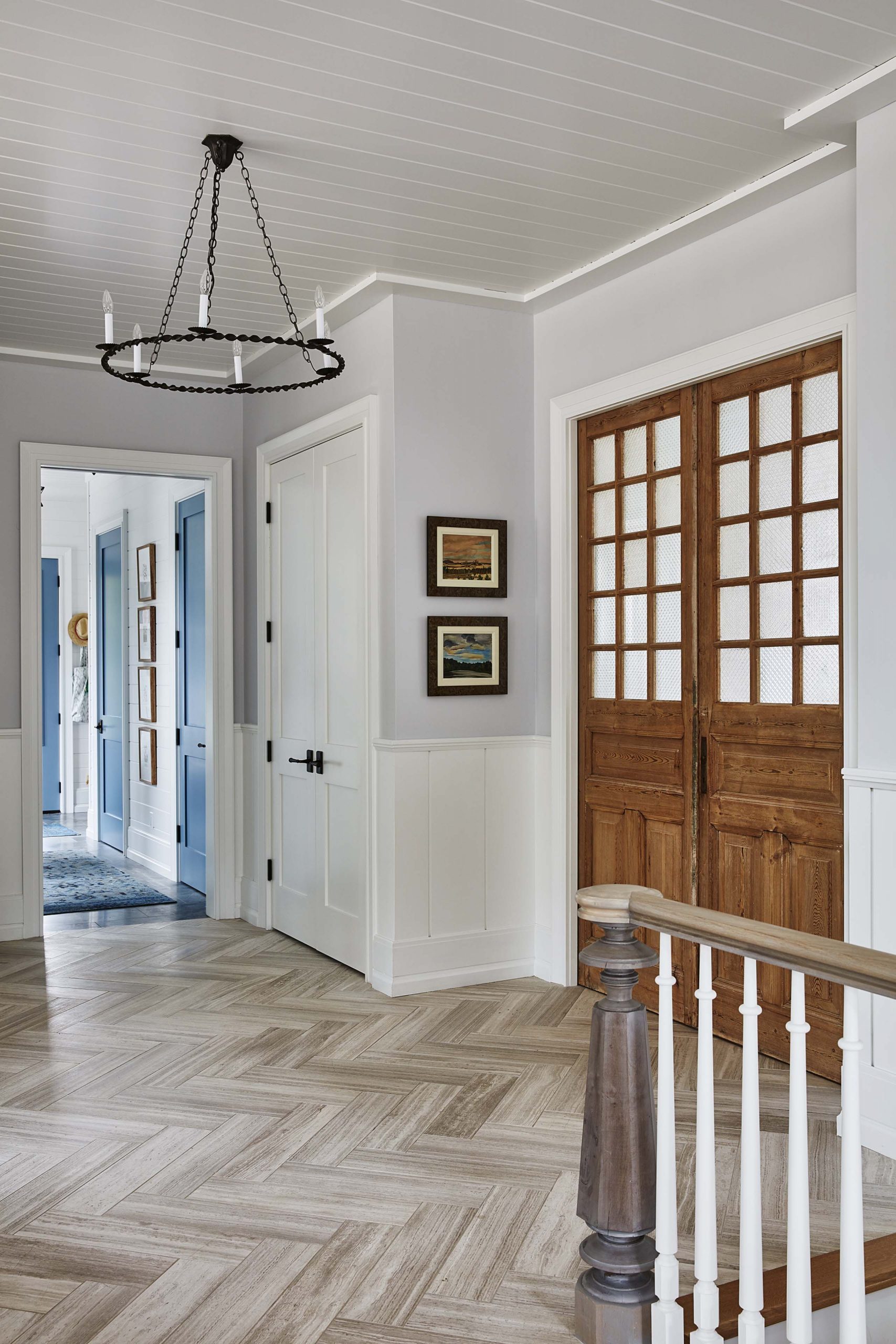
Statement Doors
Add country chic back into the design by opting for a warm wood finish on doors rather than a more modern paint colour. Frosted French windows above take the whole look to the next level.
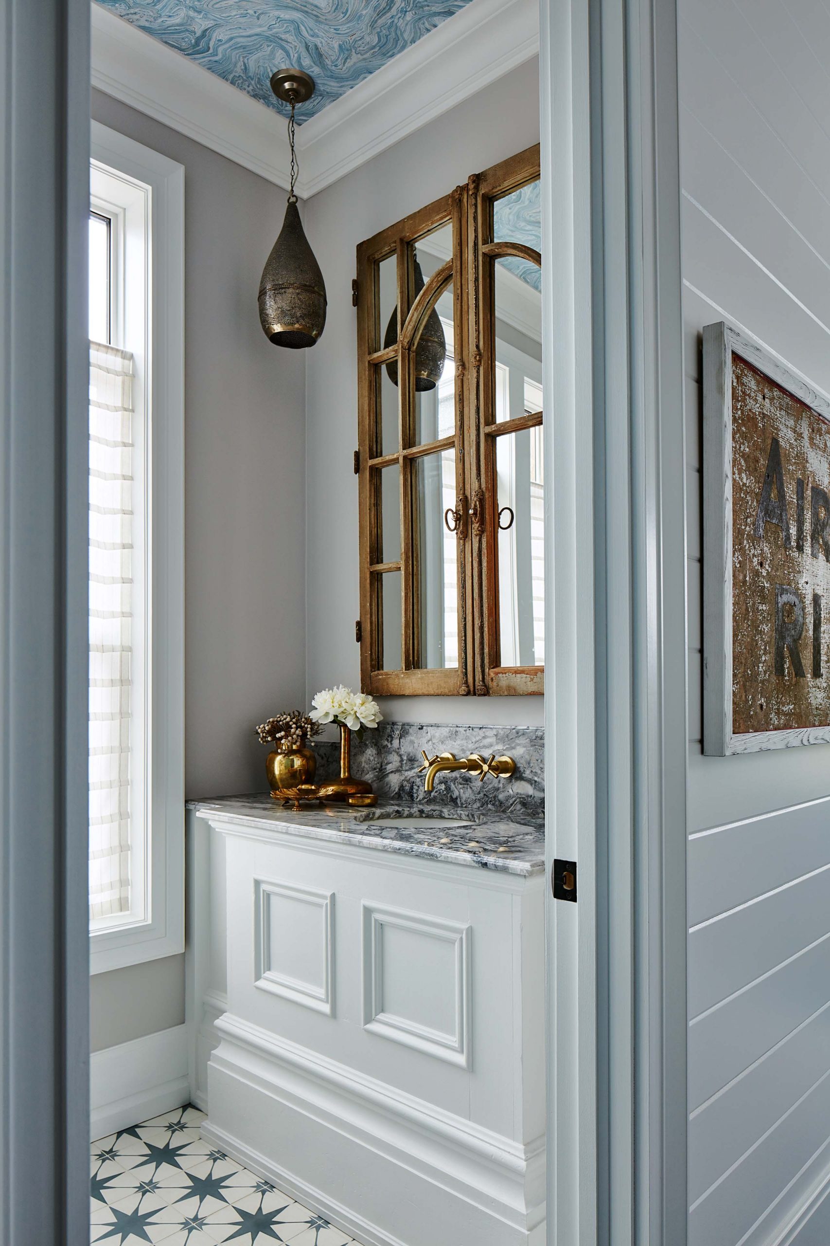
Powder Your Nose
A small powder room feels like a jewel box thanks to pretty star-inspired tiling, rustic wood finishes and a built-in vanity that feels lavish and purposeful.
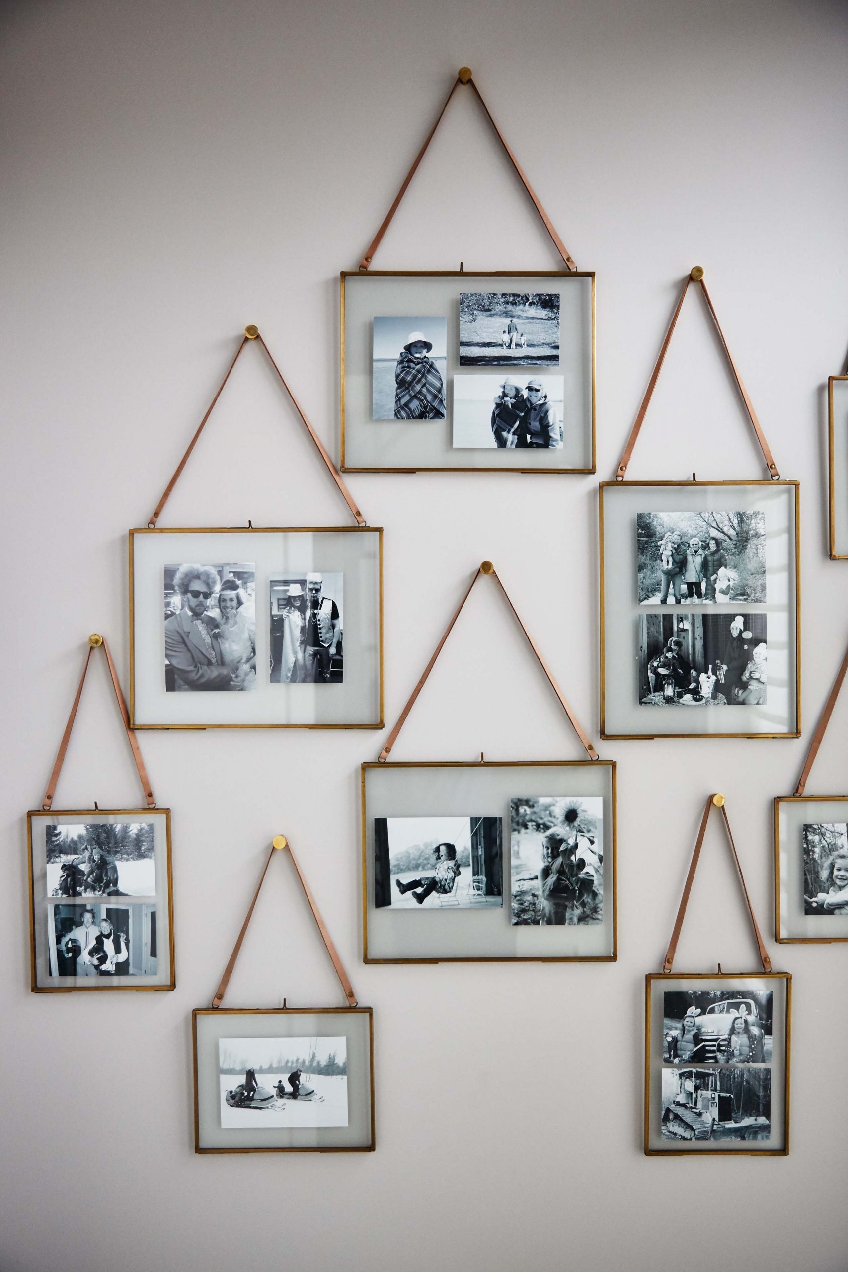
Picture Perfect
Gallery walls and photo displays should be constantly evolving in family homes, so Sarah recommends stocking up on your favourite frames, so you’ll have them on hand in the future each time you print new pictures.
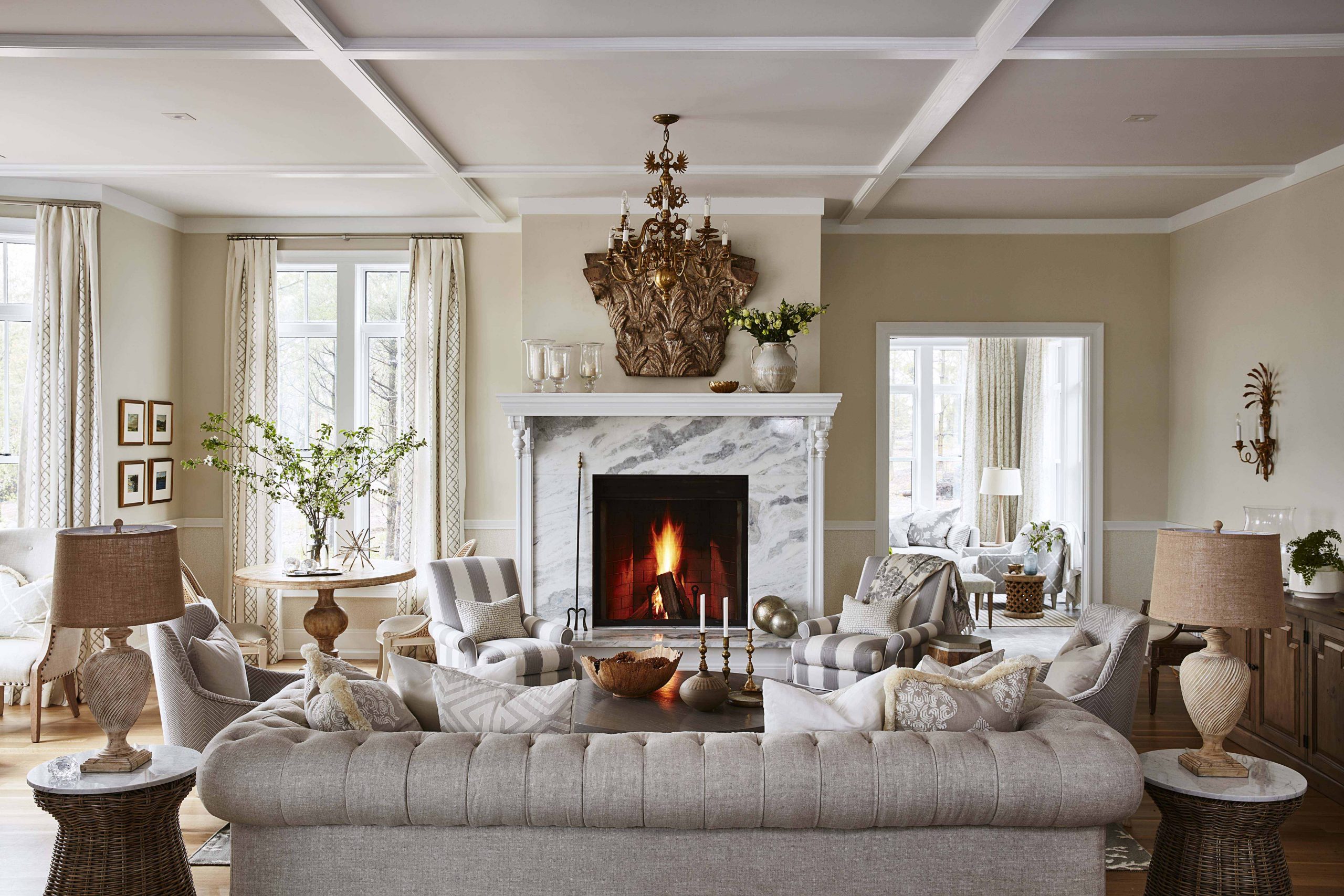
A Marble Standout
Living rooms are where you spend a great deal of your down time, so why not make them grand and opulent? A show-stopping marble fireplace, neutral furniture and lots of textured fabrics create the luxurious look of this living room.
See why the designer’s style is so timeless with 16 of our all-time favourite Sarah Richardson living rooms.
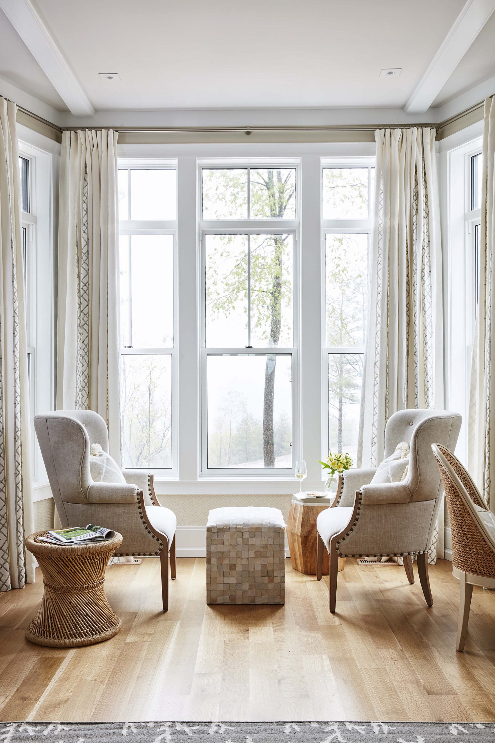
A Room with a View
Large bay windows allow lots of natural light to shine a spotlight on the gorgeous natural hardwood floors and hand-selected pieces of furniture.
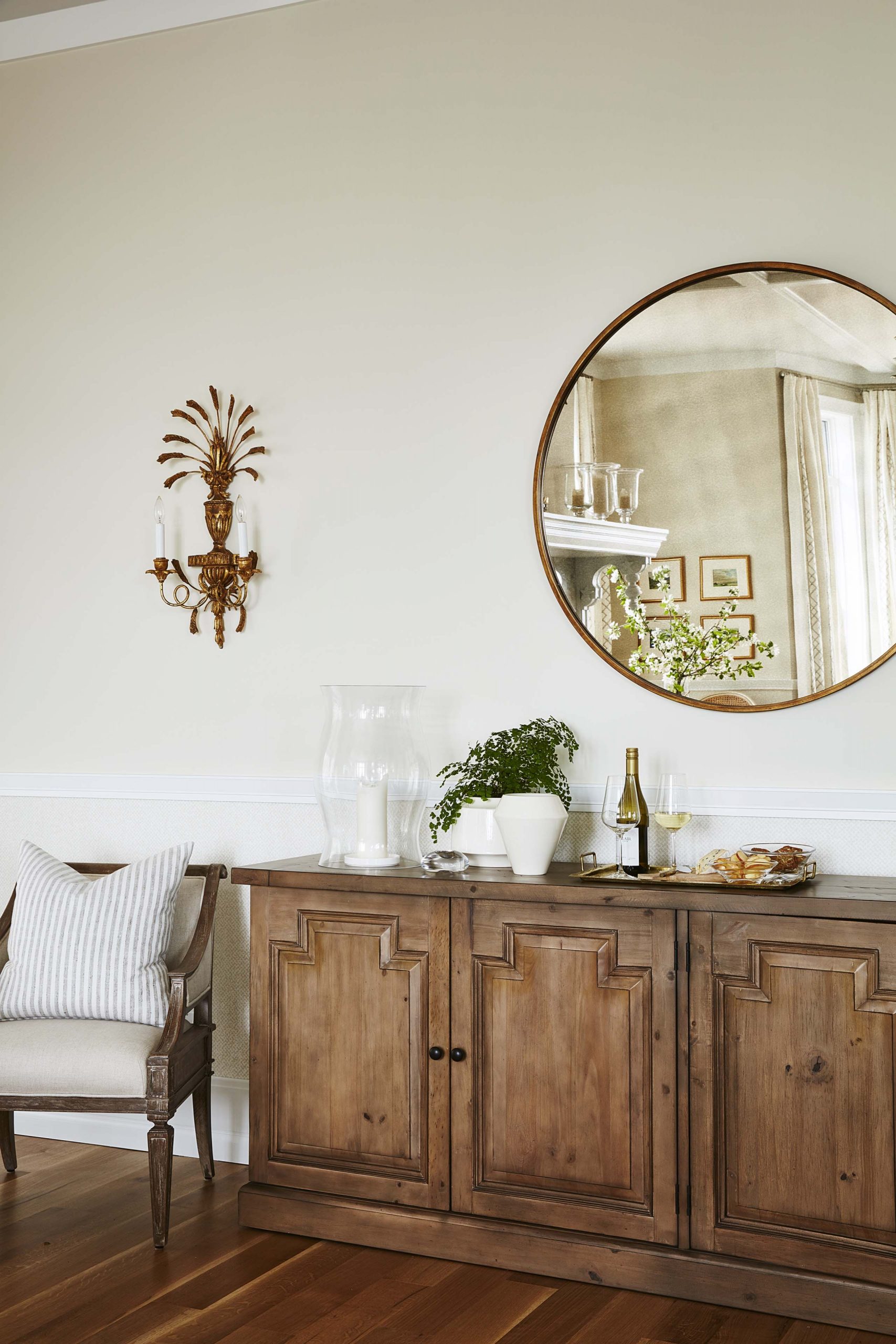
Finishing Touches
Storage solutions can be beautiful too; this wood-finished piece is a beautiful focal point, and hides a multitude of clutter. A large, circular mirror and a pretty wall sconce bring the entire look together, crafting an elegant corner.
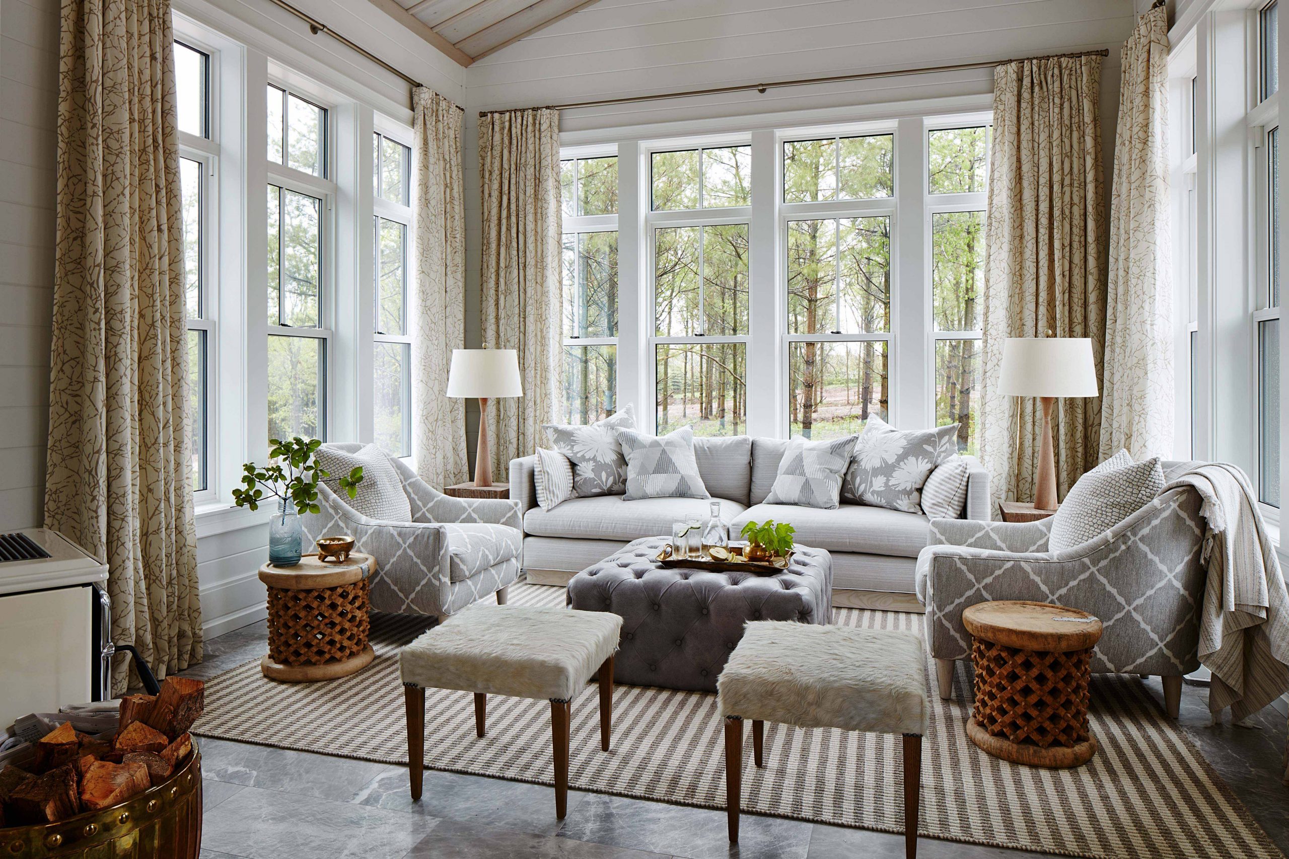
Soak Up the Sun
Take in the views and the gorgeous decorative details in a sunroom meant to impress. Between the custom, champagne drapes, the shiplap walls and the gorgeous seating area that’s large enough for a small gathering, this is one space that will never go out of style.
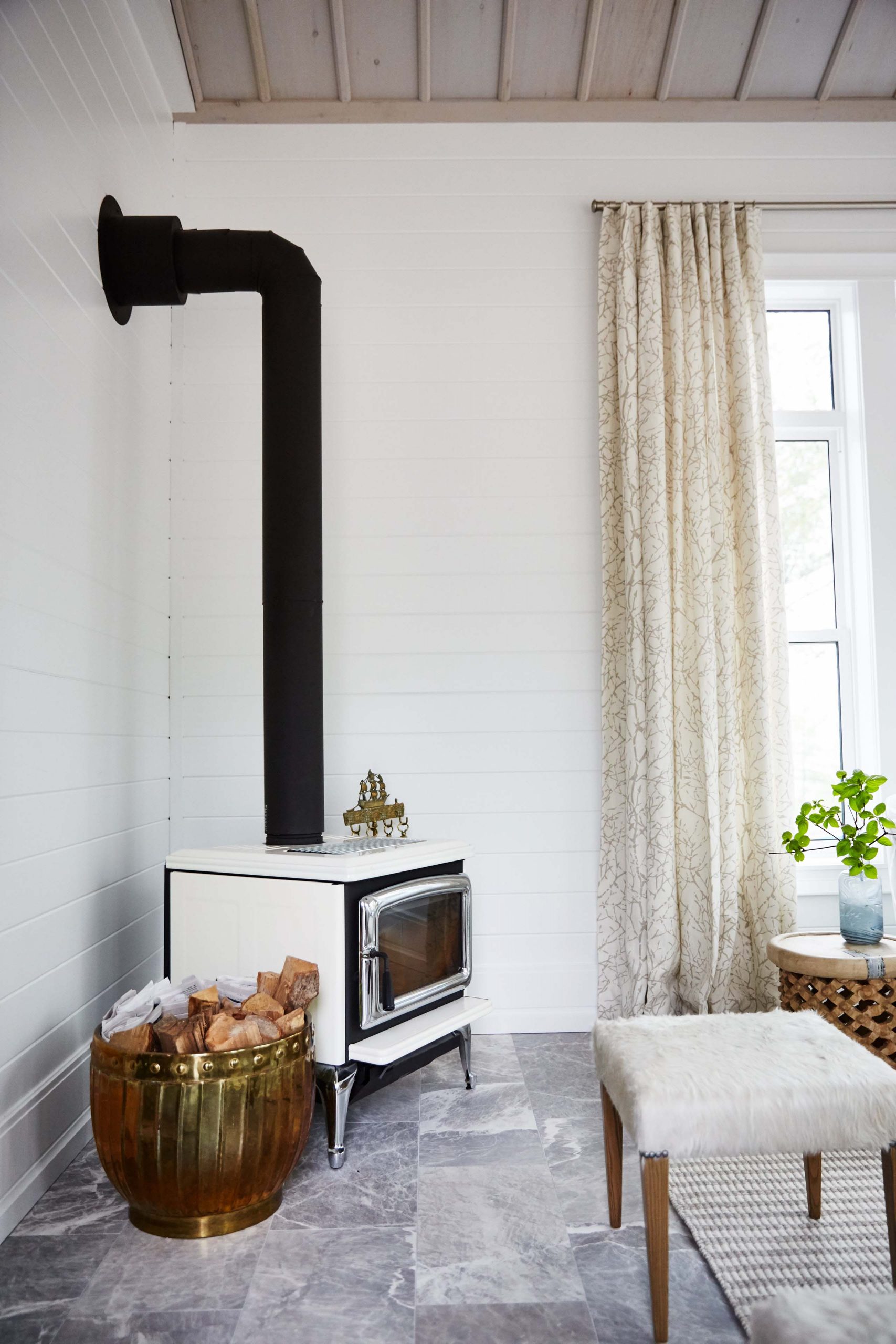
Bonus Details
Just because a sunroom brings in the sun doesn’t mean it’s always a warm space. A vintage fireplace stove adds instant charm and character, not to mention a bit of extra heat during cold winter months.
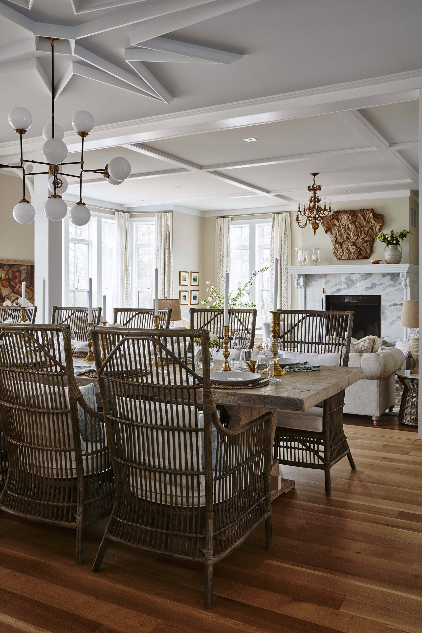
Open Concept
The dining room flows into the living room, creating the perfect entertaining space for large functions and intimate soirees. This is the type of space you want to spend hours in with good friends as a crackling fire roars in the background.
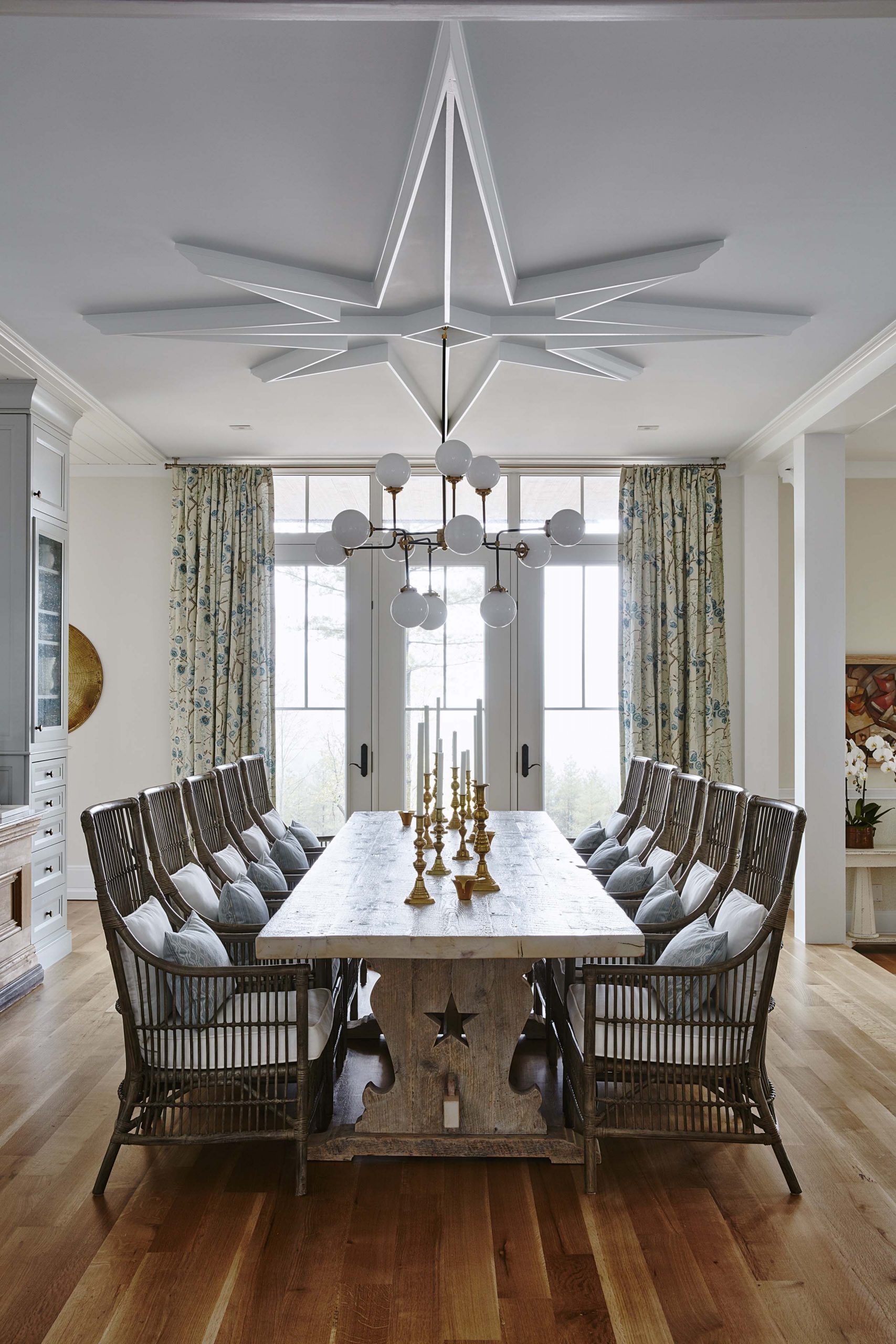
A Bold Statement
The dining room is the first thing you see when you walk into this home, so Sarah wanted it to be grand. Extended seating, a sturdy table and gorgeous framework on the ceiling certainly achieve that feeling of grandeur.
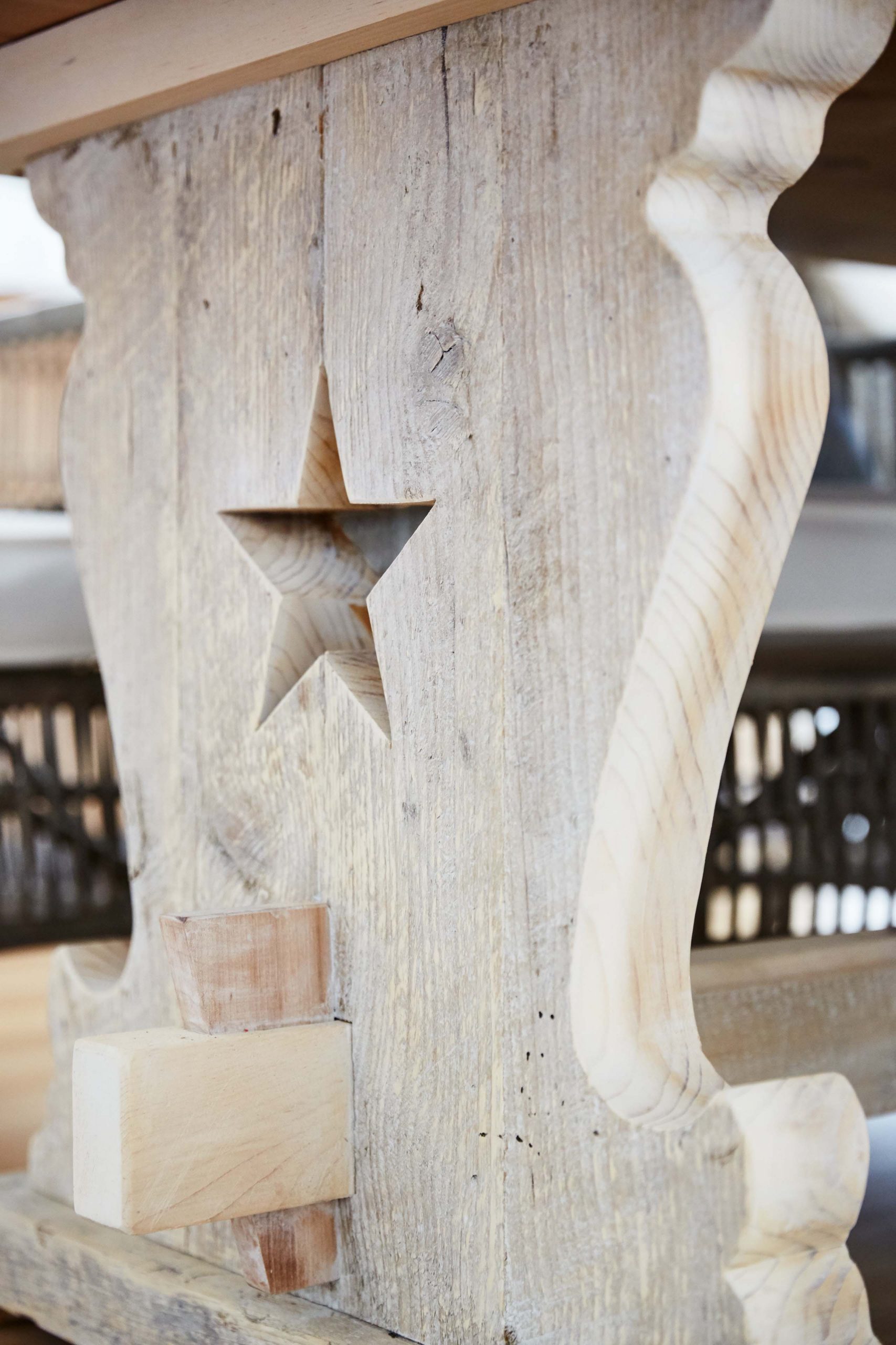
Intricate Details
Everything from the light fixtures to the table posts were hand-selected by Sarah, making this space a true reflection of her signature style.
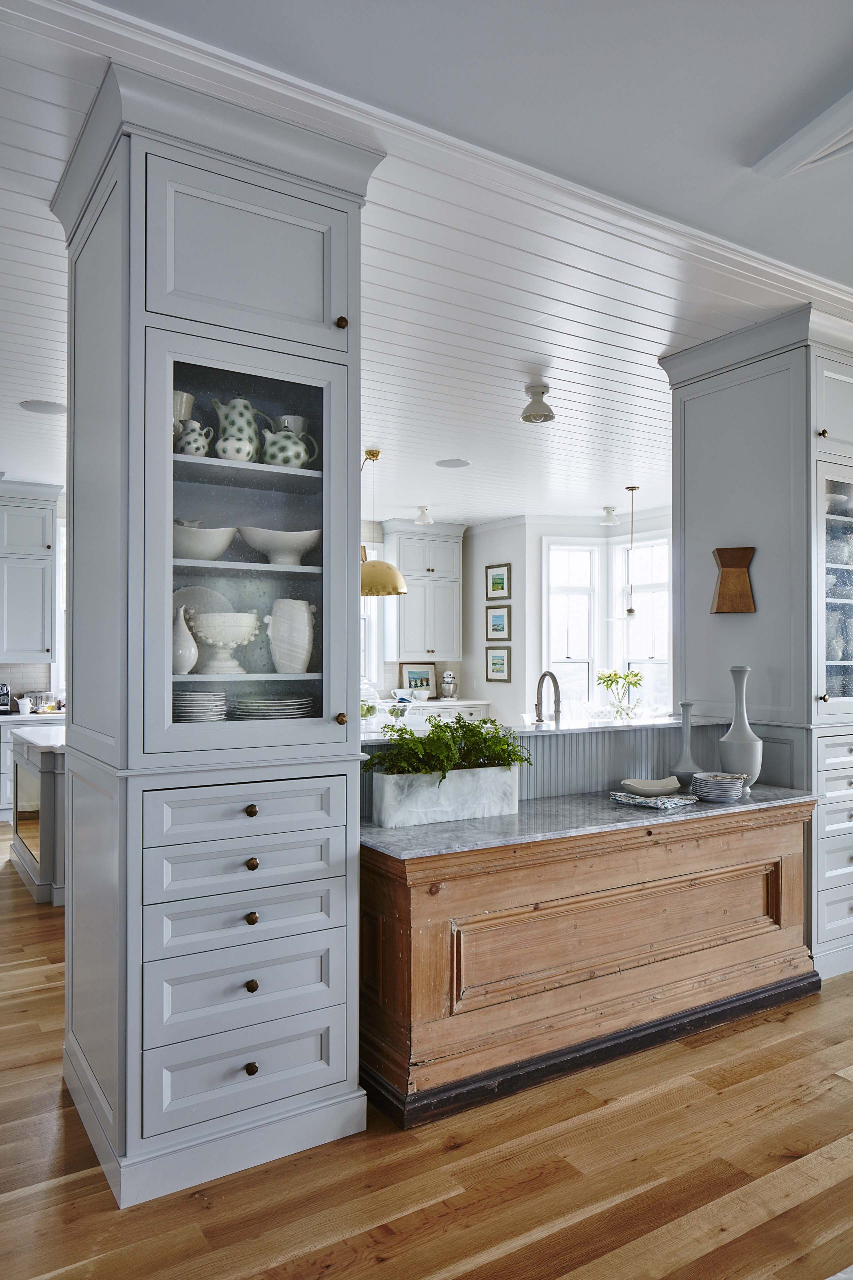
A Better Buffet
To maximize the potential of the dining room, Sarah had this hutch built-in, with sturdy cabinetry, a custom marble countertop and tons of storage space.
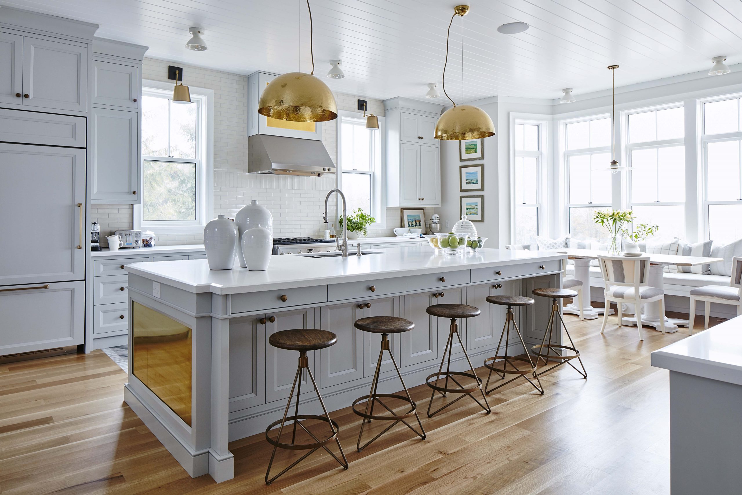
A Dream Kitchen
Every dream kitchen needs an island and this one does not disappoint. With ample seating, storage and counter space, this is the perfect spot for everyone in the family to congregate before dinner, on weekend mornings and all those moments in between.
Browse through the best of Sarah Richardson’s kitchen designs.
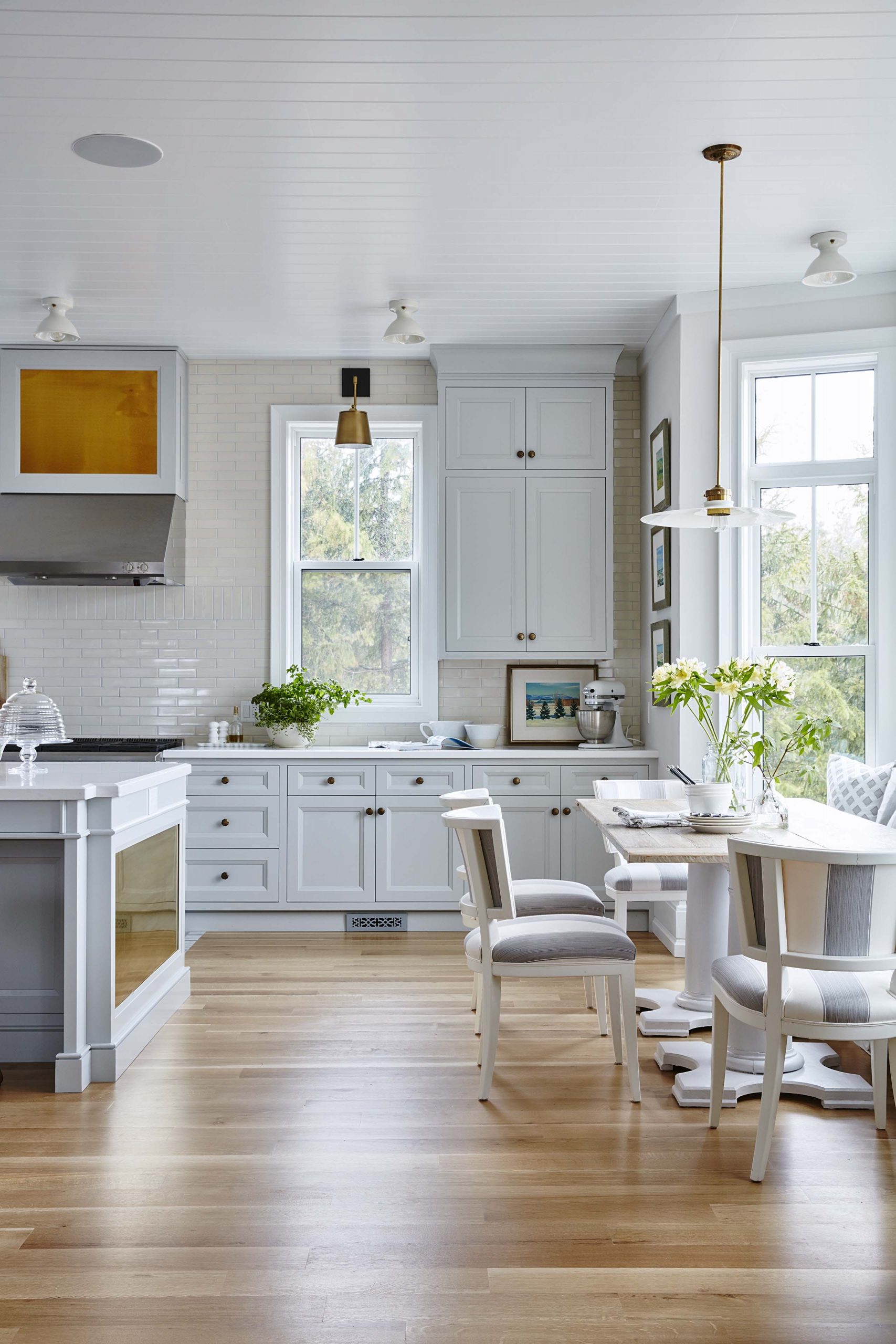
A Bay Window Banquette
The kitchen is bathed in light thanks to the large bay window at the centre of it, with a large banquette and table for extra seating and more intimate meals.
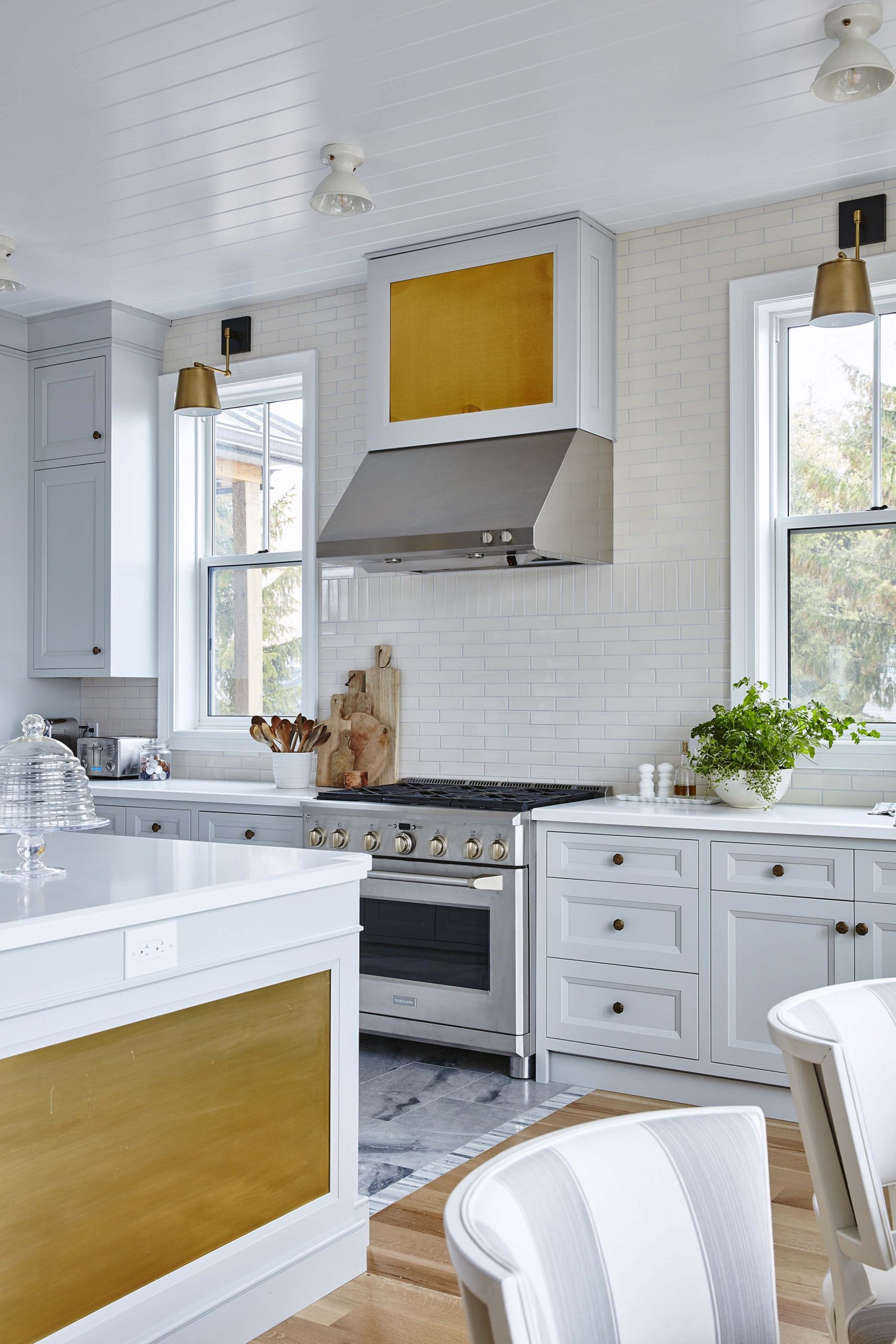
Modern Conveniences
Off the grid doesn’t mean going old school, it only means simplifying the bells and whistles. The appliances in this kitchen are modern and updated, but without the fancy timers or electronic additions that soak up power.
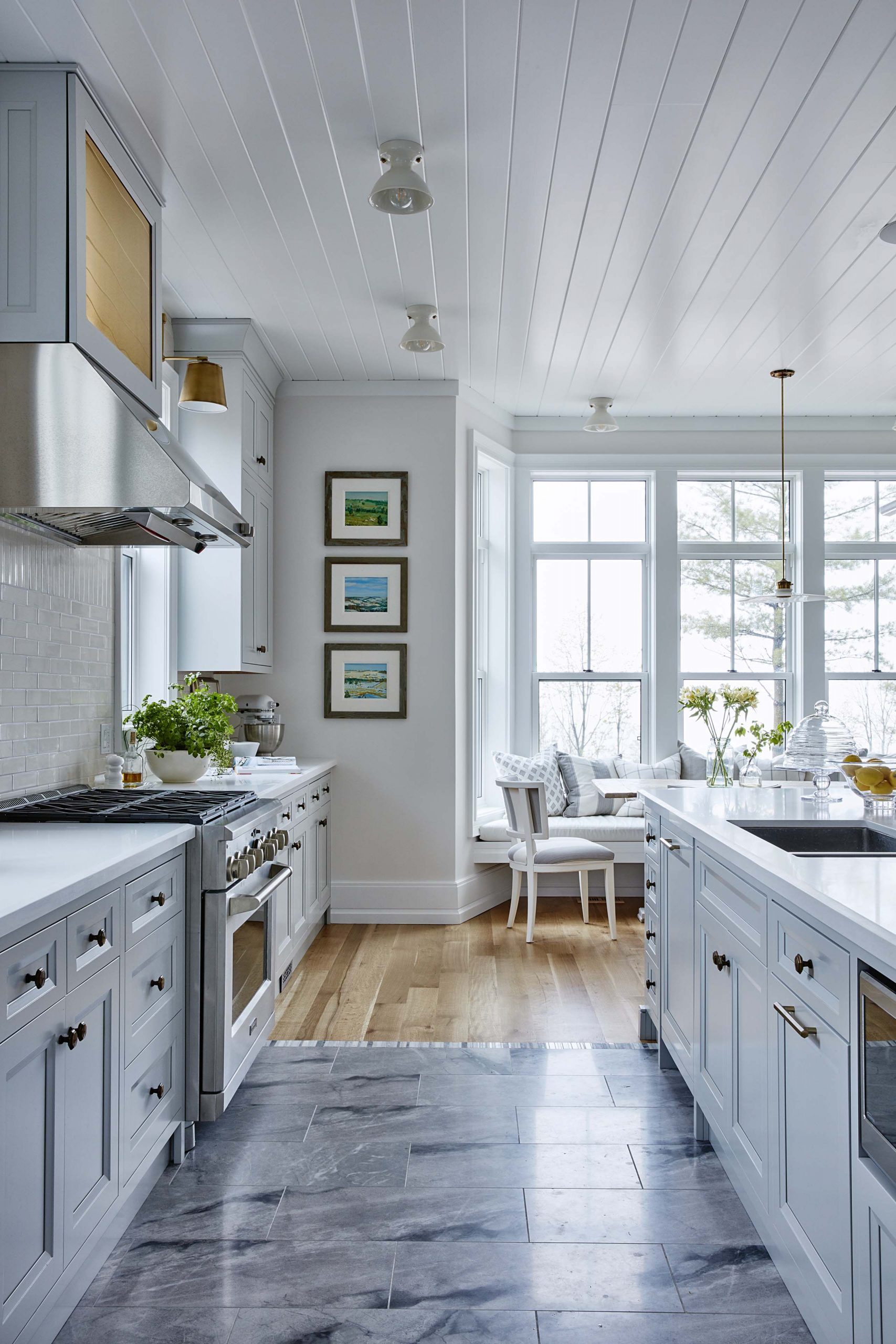
Dual Floors
Stone floors are gorgeous, but they also suck up heat and leave you feeling cold. So Sarah compromised with a pretty combination of wood and stone, surrounding the prep area with her favourite flooring instead.
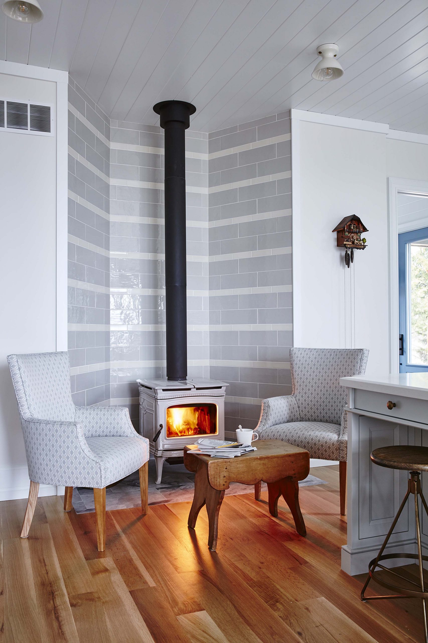
A Touch of Warmth
In the other corner of the kitchen sits this gorgeous stove fireplace for added warmth and comfort. Updated tiling and high-backed armchairs leave the look modern and fresh.
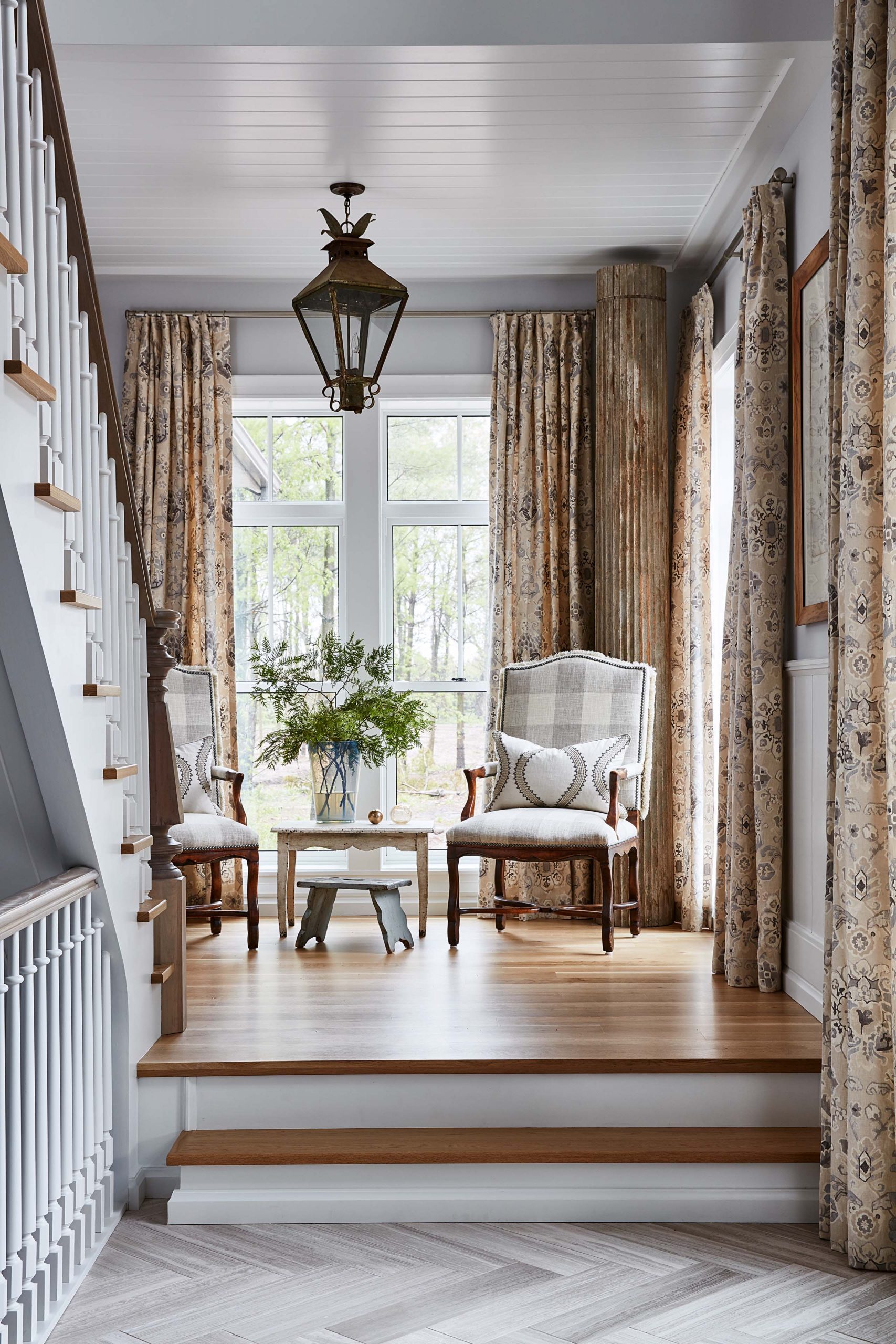
Separate Spaces
A couple of small steps help to define the entrance from the rest of the house, creating immediate texture and automatically drawing the eye.
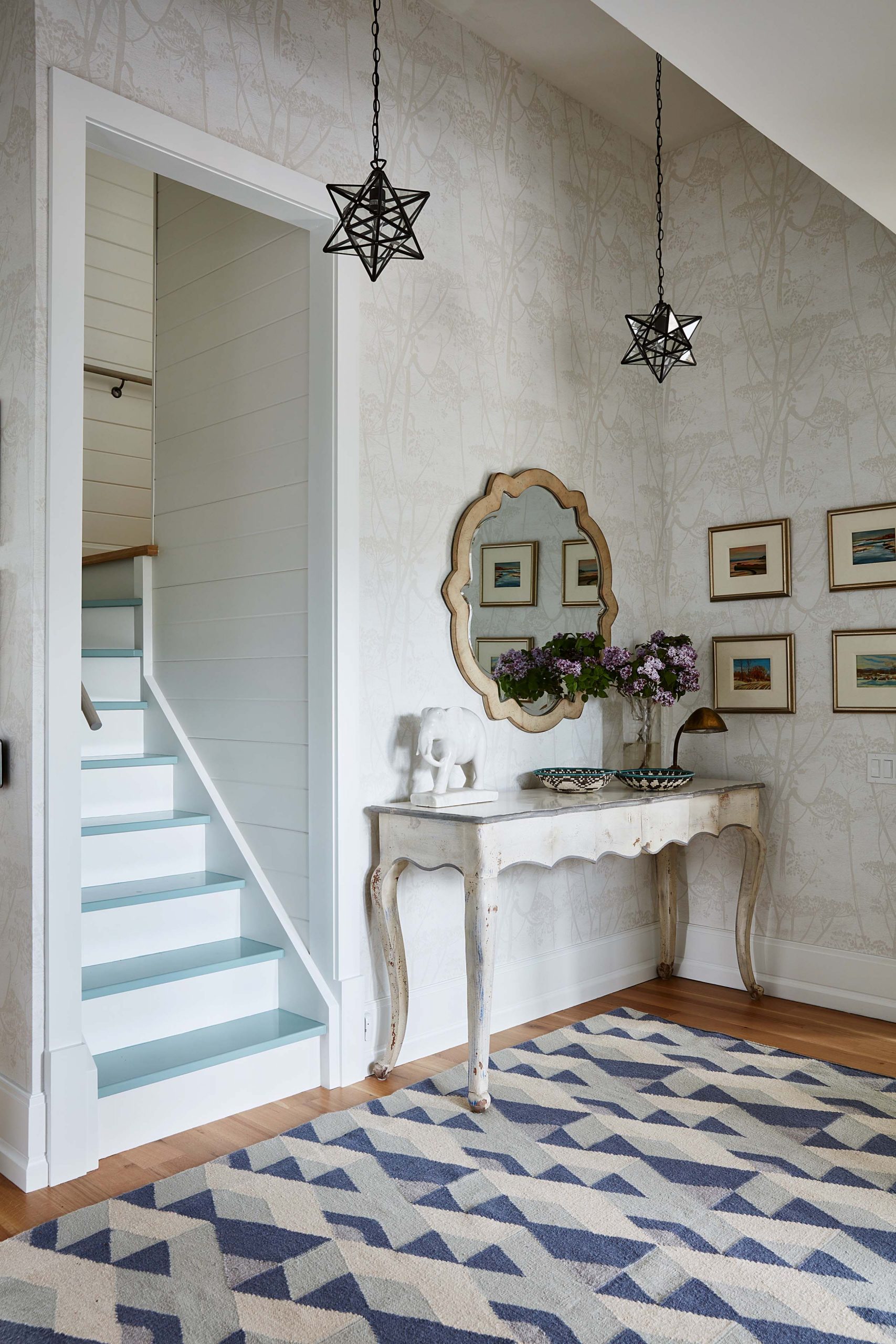
A Bright New Hallway
Hallways deserve some love too. A bright, neutral wallpaper, a colourful area rug and an antique style wall table (in white, of course) help give the second-floor landing space instant charm.
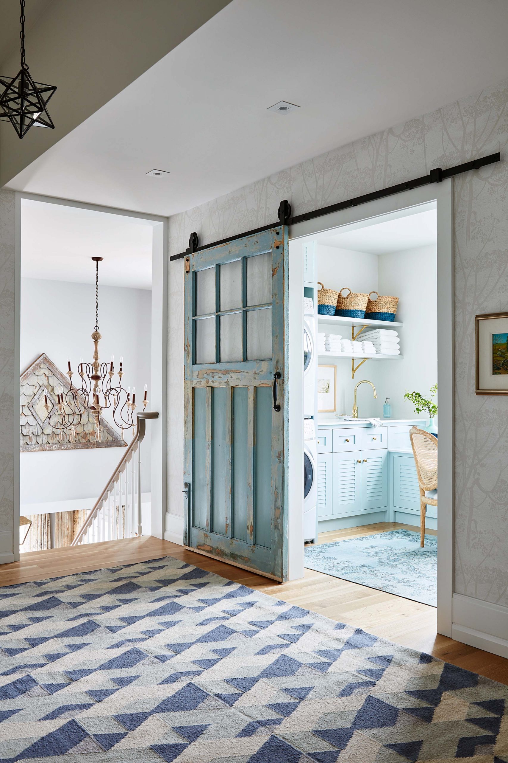
Reduce, Reuse, Recycle
Vintage doors don’t just come at a great price-they also add instant personality to a space. Here Sarah used her find as a sliding barn door leading into the laundry/craft room.
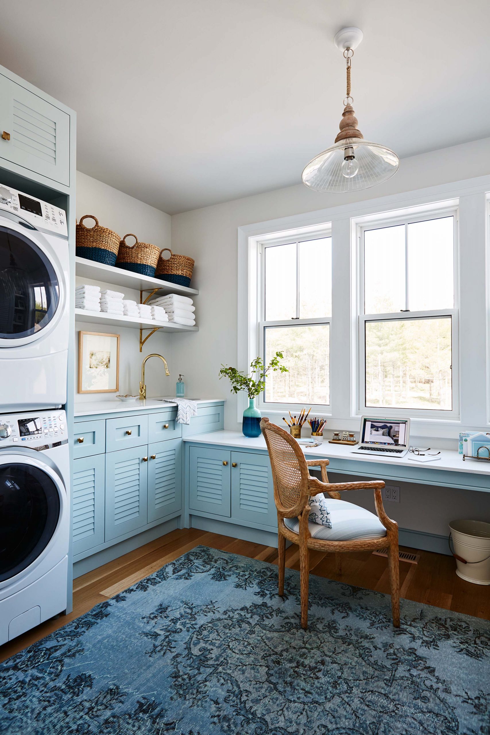
Dual Purposes
Sarah’s motto is that laundry is boring, so why not make the room itself fun? Pops of blue reminded her of water, while the stacked unit allowed for plenty of extra room for a crafts area for her and the girls.
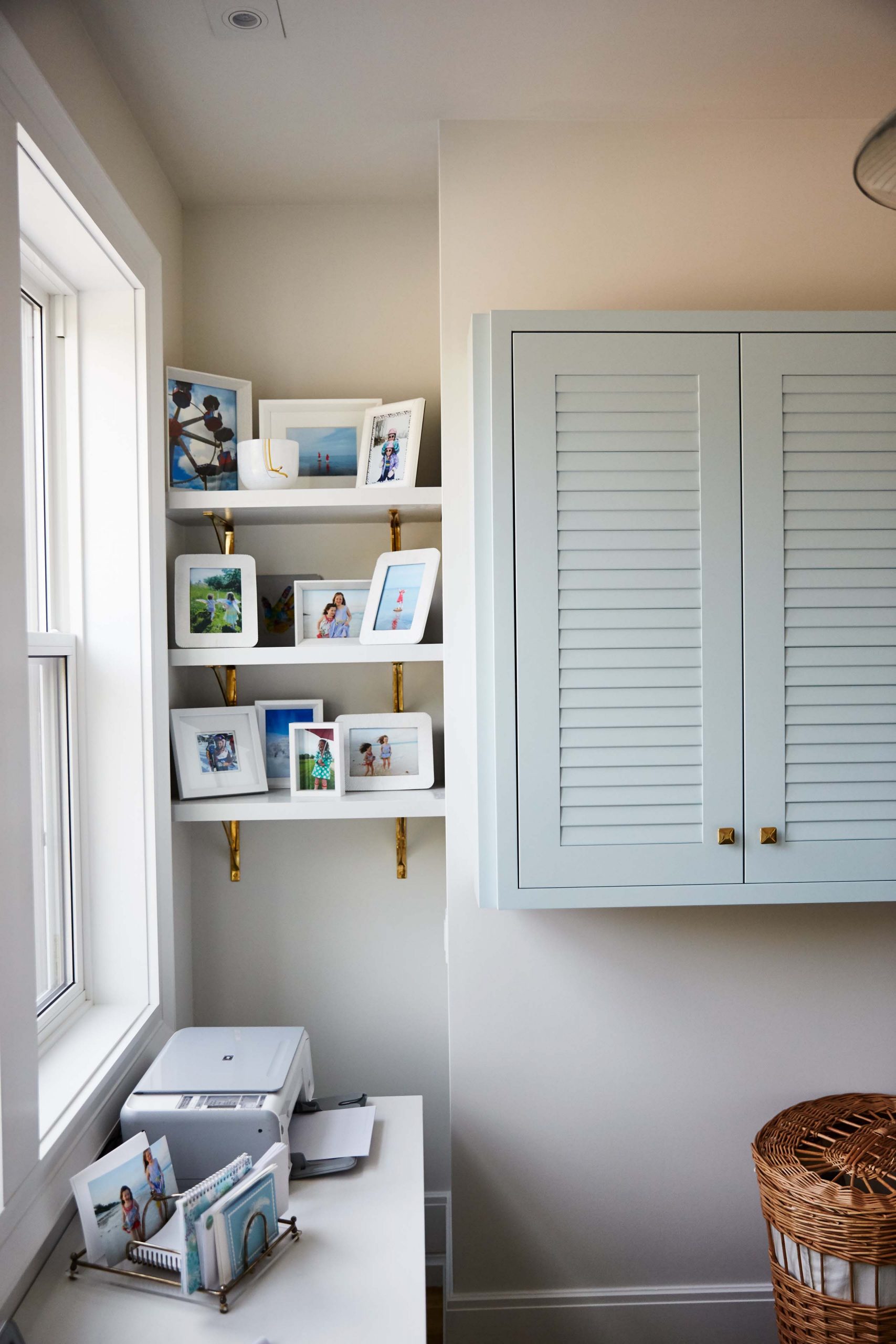
Tiny Nooks
Framed photos on the shelves make the most of a tiny area while completely personalizing the space.
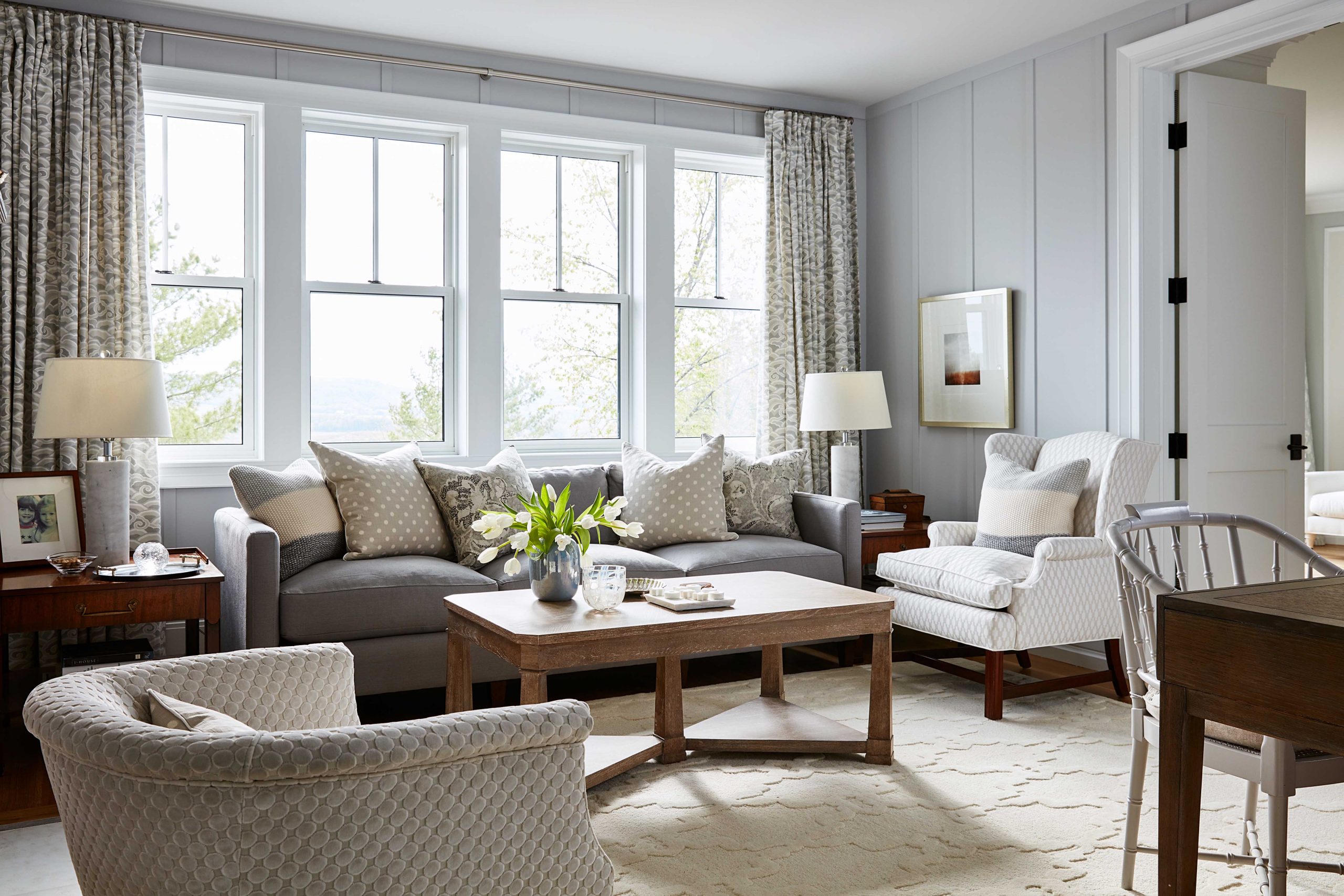
Mismatched Pieces
Who says all furniture needs to match? A variety of pieces work to complement each other in this den, thanks to the new upholstery and matching toss cushions.
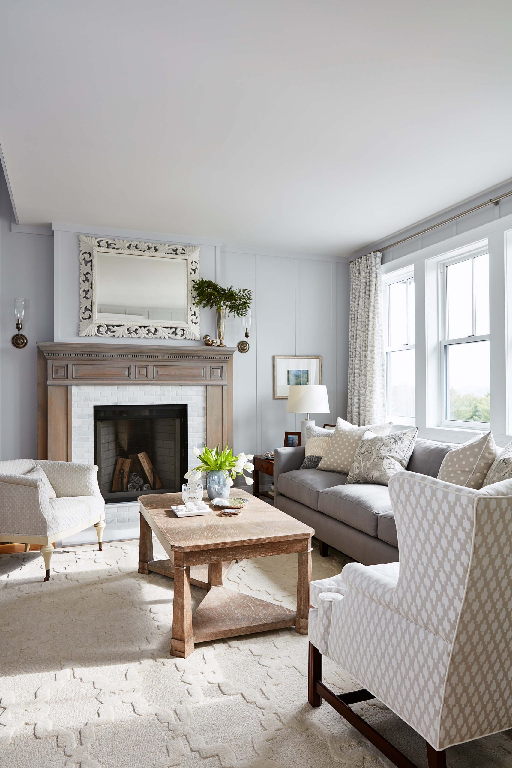
Charming Finishes
Wood and marble combine for the ultimate luxe finish on this fireplace; it’s the perfect spot to unwind when you’ve had a long day but aren’t quite ready for bed yet.
Defined Walls
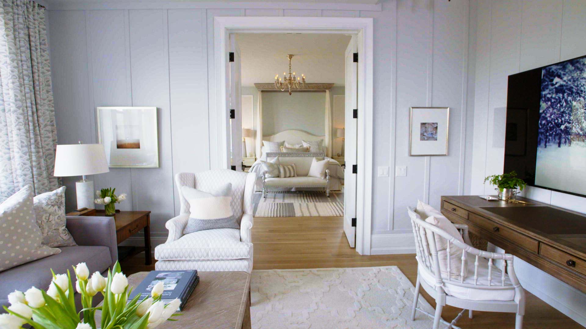
Simple wainscoting adds a pretty and decorative country touch to any room while giving the walls automatic texture and depth. Next to oversized trim and baseboards the entire room simply pops.
White and Bright
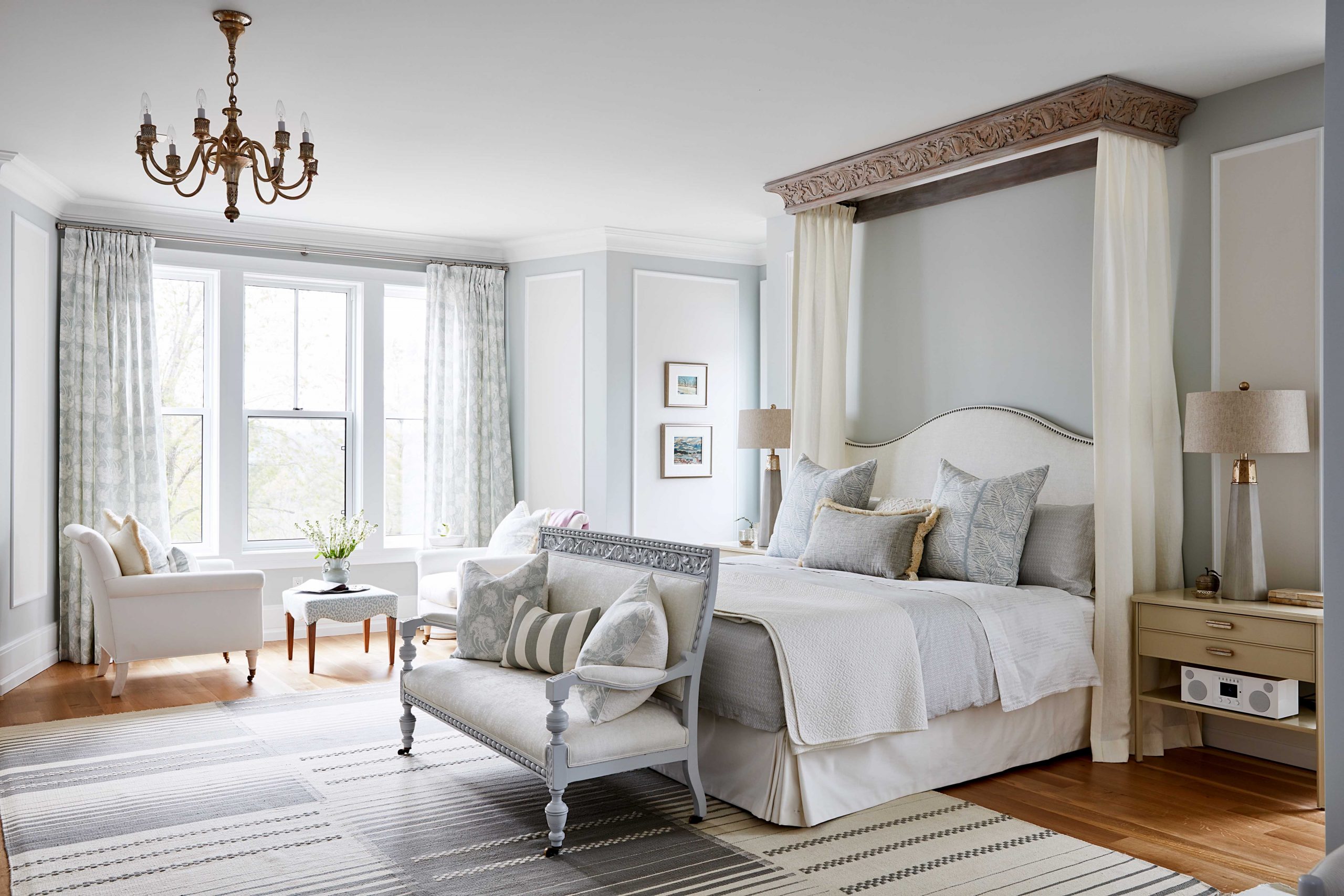
Whites and greys are complementary and add a world of classic country vibe to a master bedroom setup like this, especially when the furniture itself is so intricate and detailed.
Look back on 20 of Sarah Richardson’s most beautiful bedroom designs.
Bench Seating
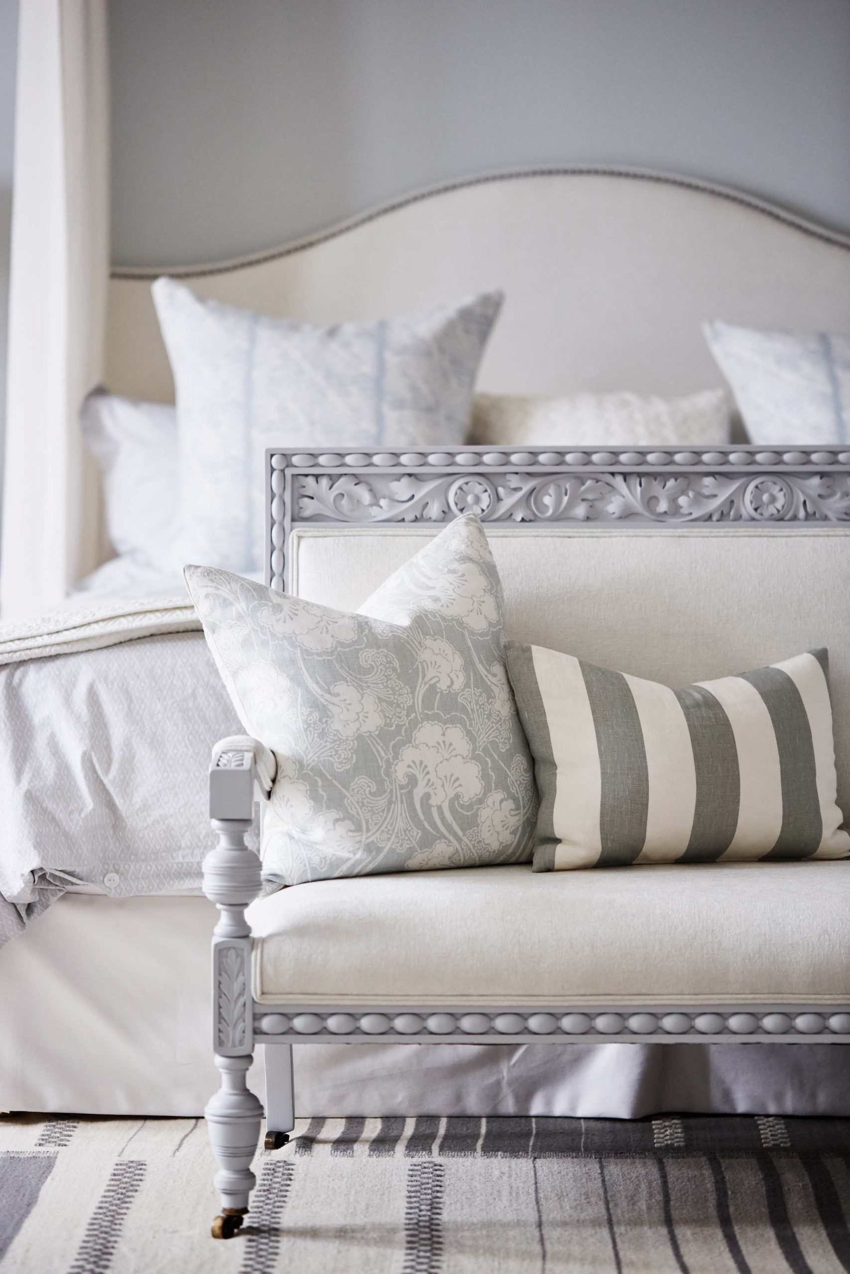
Carved details add luxury to a room, especially when they’re used in an unexpected way like on this bench that sits at the end of the bed. Now that’s a space to slip on your slippers in style.
A Custom Sitting Area
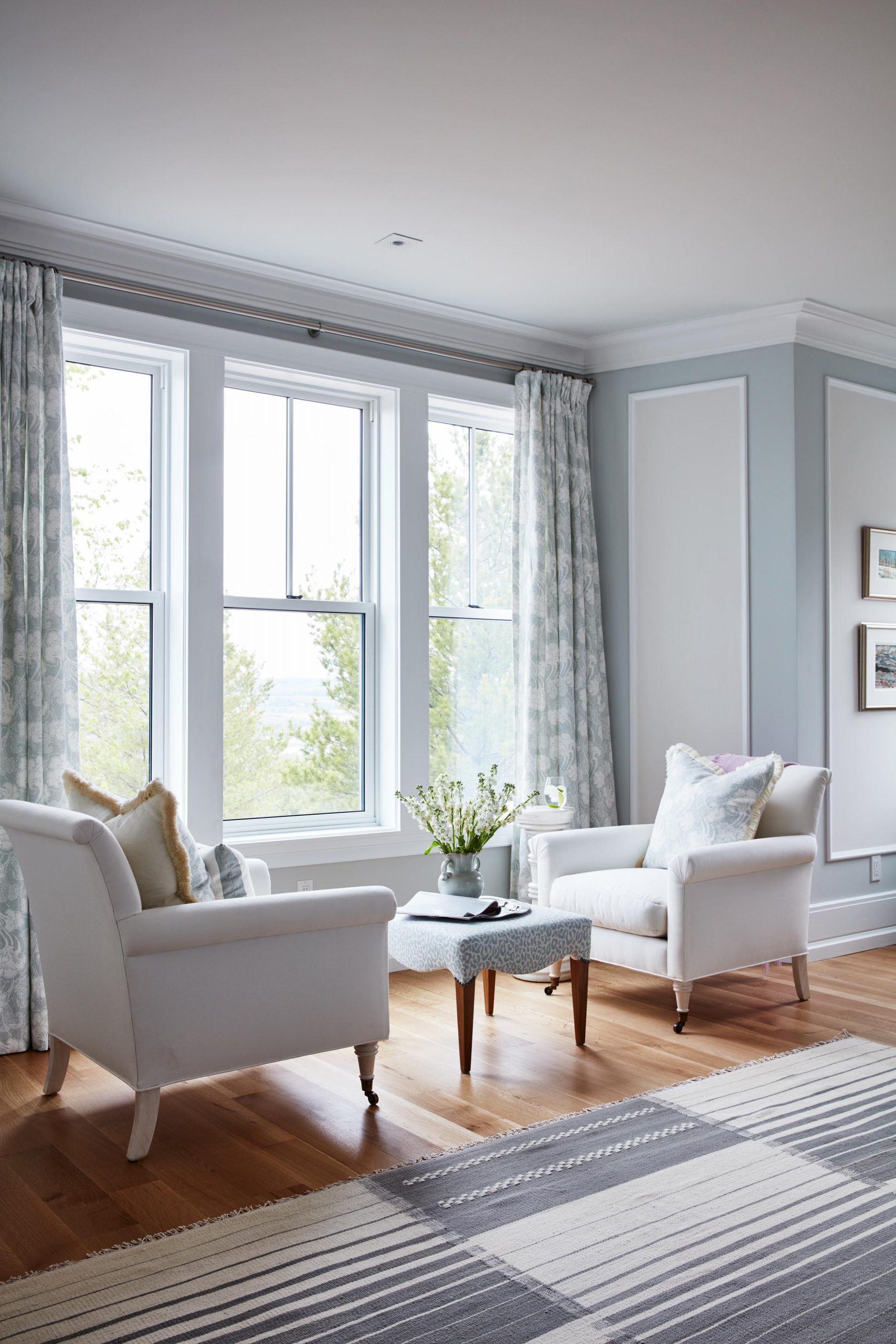
In order to take advantage of all the natural light in this nook, all you need are a couple of oversized armchairs and a stylish coffee table. Who wouldn’t want a morning coffee in a cozy sitting area like this?
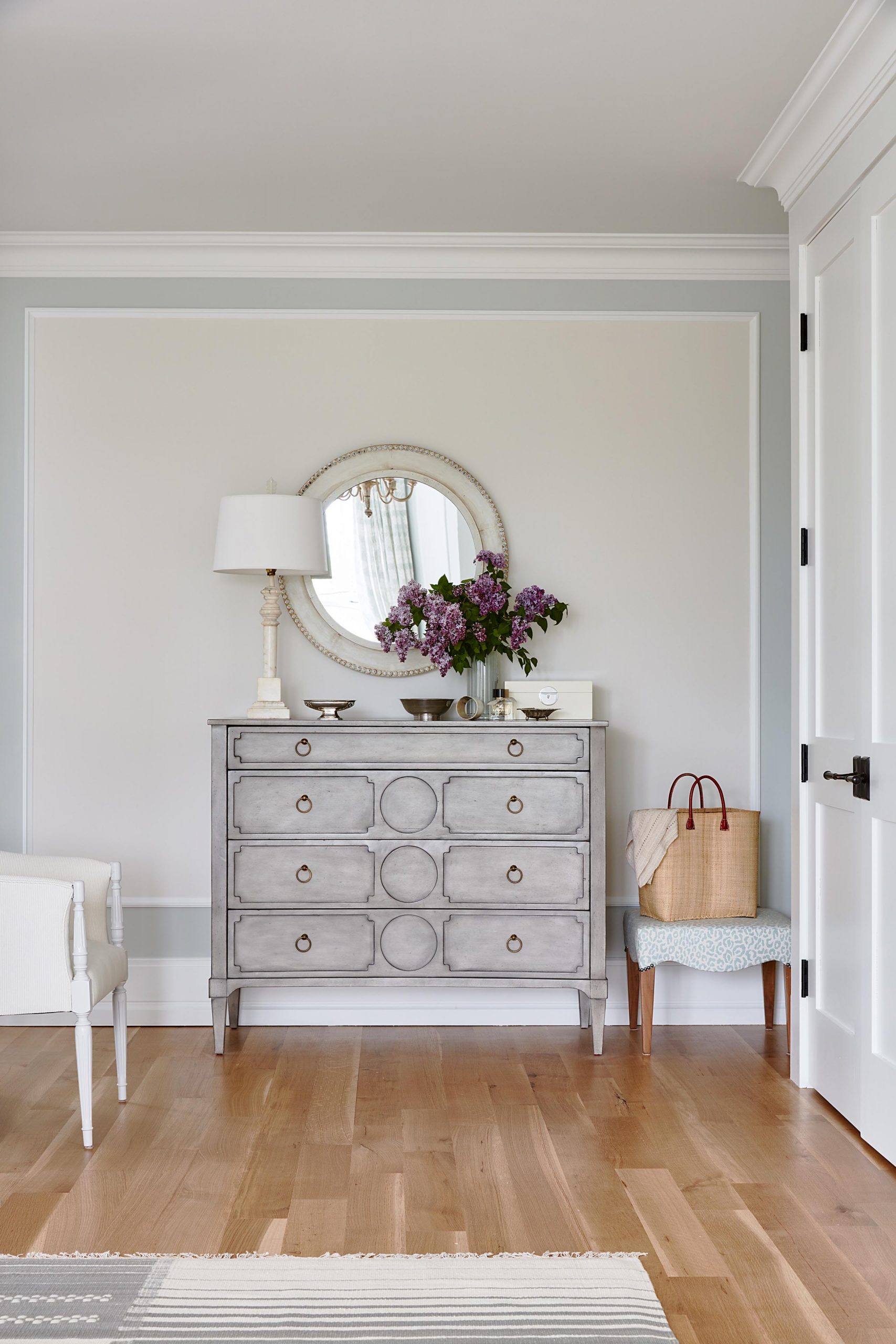
Upscale Pieces
Simple etchings go a long way in an antique piece like this, which is given new life thanks to some updated paint and hardware.
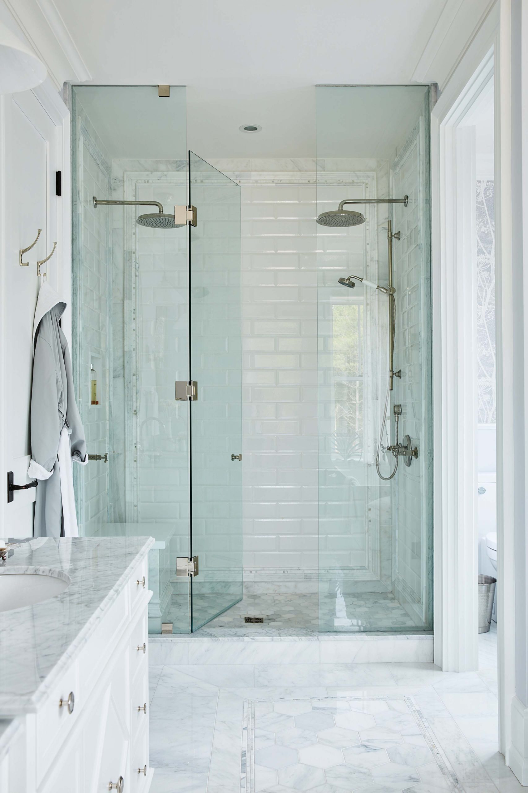
Simple Tiling
Sometimes simple is best, especially when it comes to tiling and the white bricks help add definition to the dual rainfall showerheads in this gorgeous standup shower.
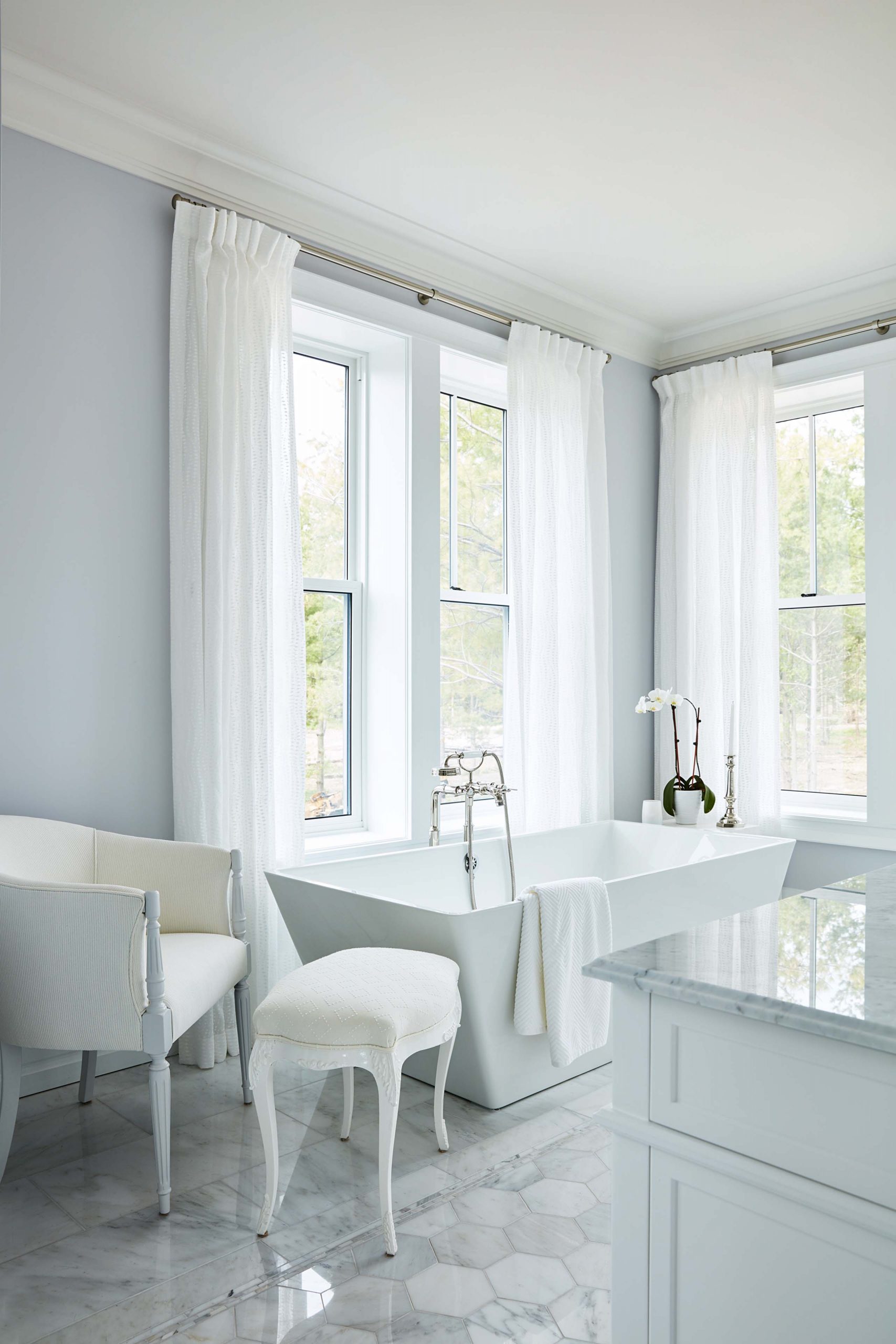
Relaxation for Two
This soaker tub is modern thanks to its updated shape, but also luxurious and large enough for two. Against the pretty white-and-grey tiled floor it makes a total splash.
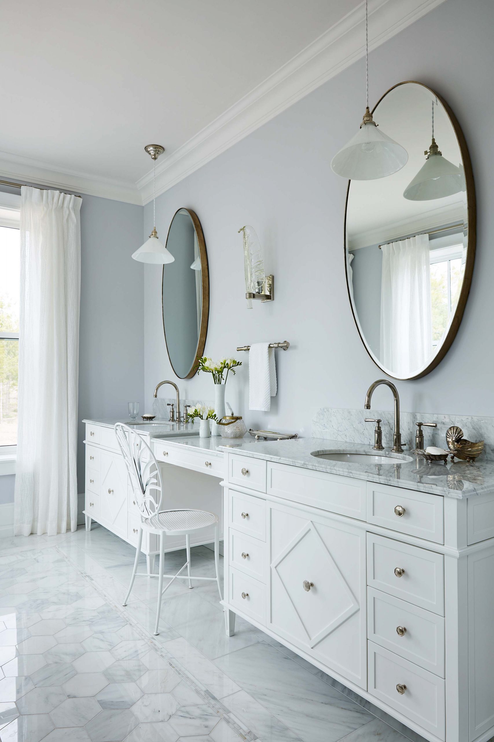
A Luxe Ensuite
This large vanity feels anything but bulky thanks to its slim depth and sleek hardware. A white finish and a simple white chair at the makeup station complete the look.
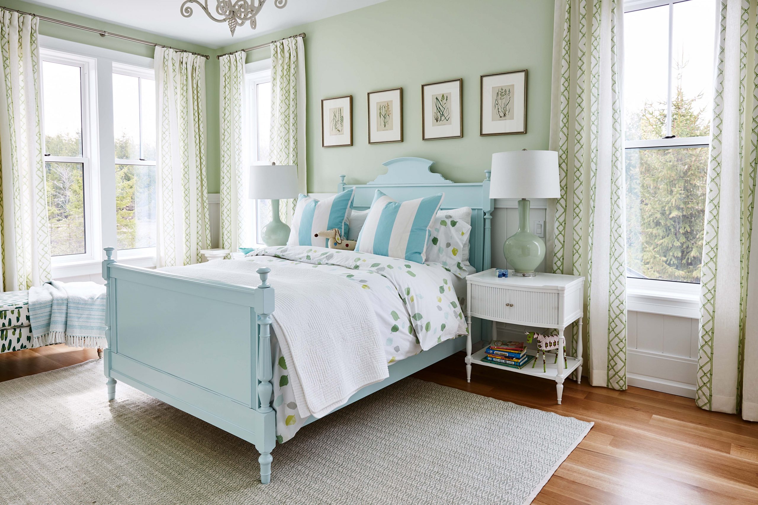
What’s Old Is New Again
Fiona wanted a green bedroom so Sarah selected soft tones and patterns that felt feminine and country. Meanwhile the restored antique bed adds lots of personality thanks to a fresh coat of paint.
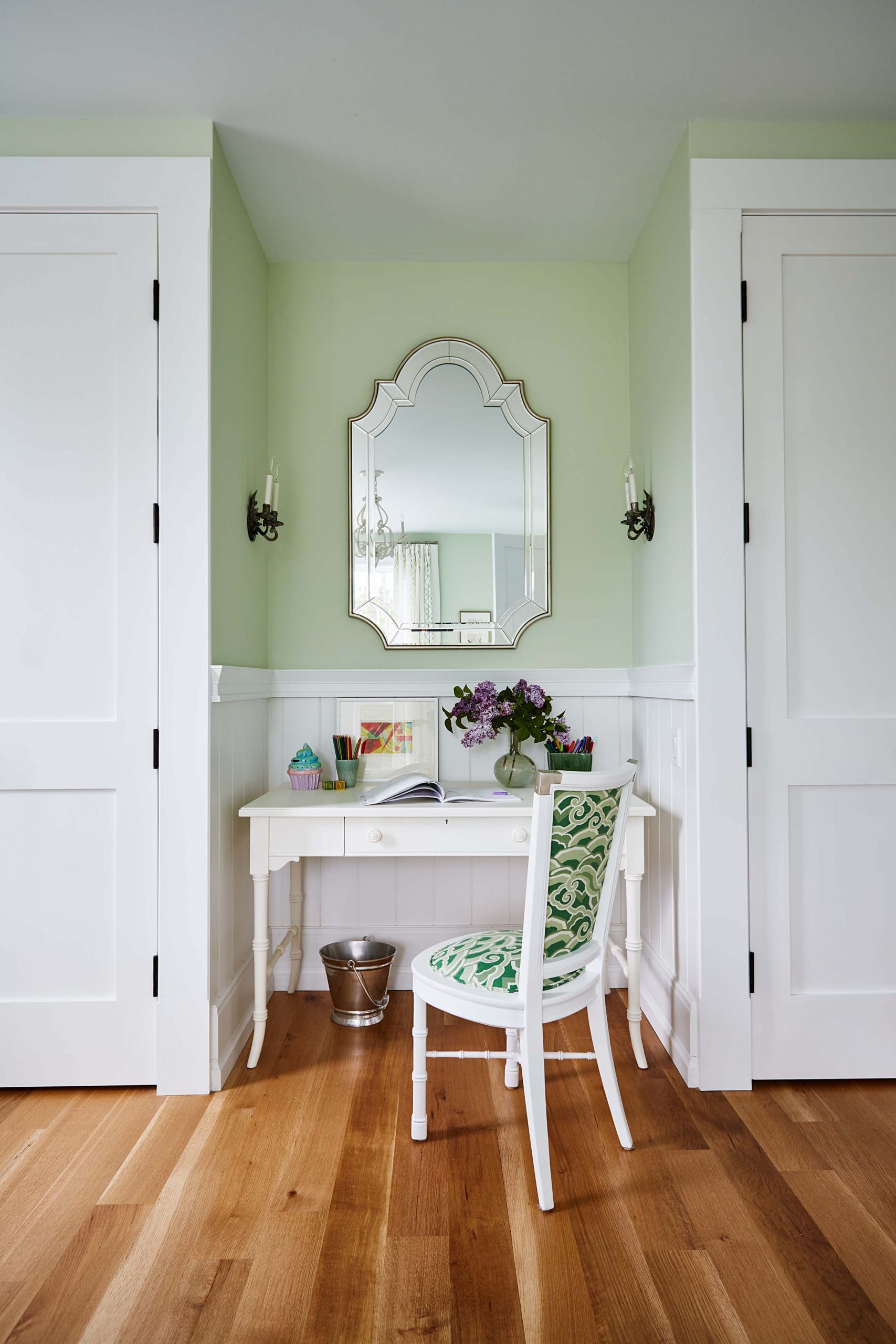
Personalized Spaces
A little nook for studying is further defined by wall sconces and a pretty mirror. Another gorgeous Sarah touch? This chair with its matching green upholstery.
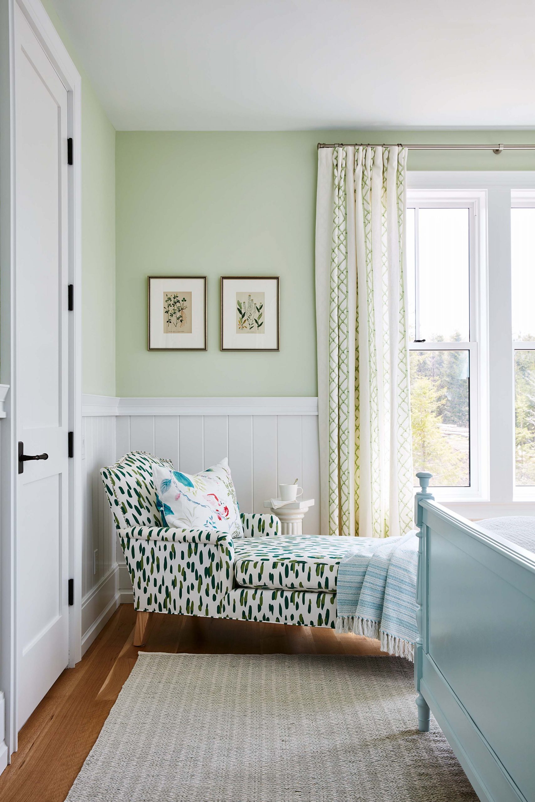
Lounging Out
Fiona wanted a chaise lounge, so Sarah delivered with this whimsical piece in a fabric to match the rest of the room.
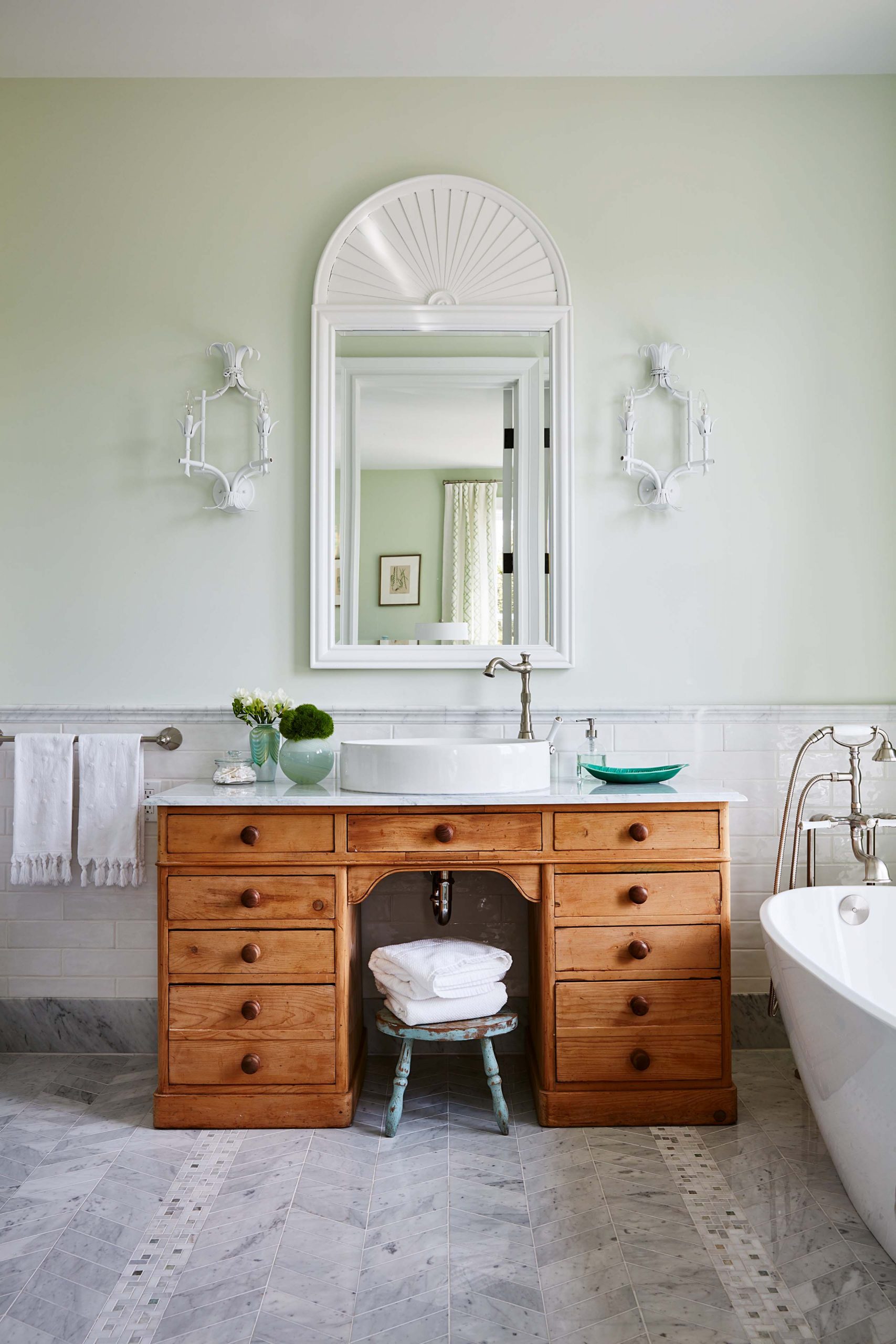
Imaginative Pieces
An antique dresser is transformed into a beautiful bathroom vanity thanks to a new countertop and sink in Fiona’s bathroom.
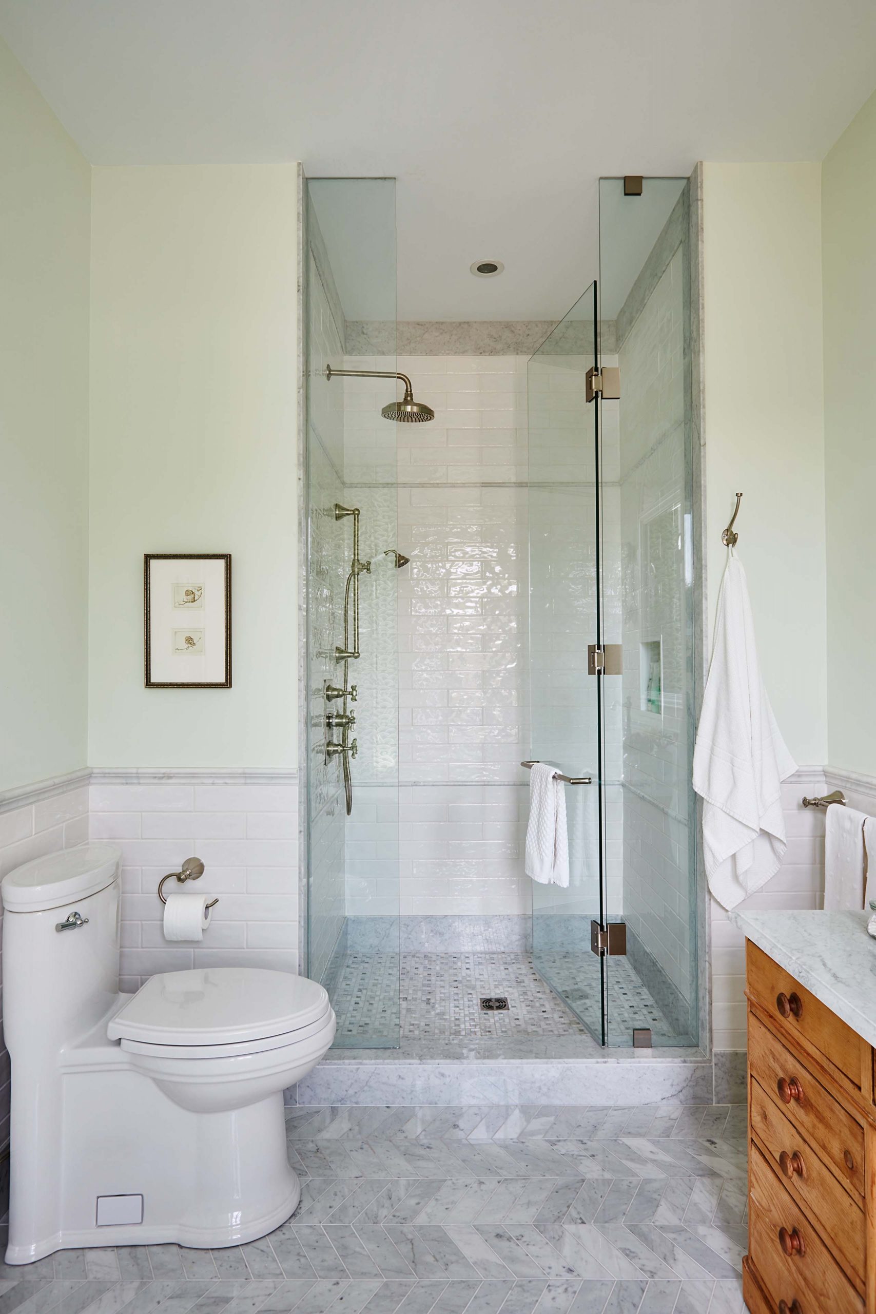
Adult Touches
Soft greens and bright tiling make this a beautiful shower for a kid, but one that Fiona can grow into over the years. This is the family’s forever home, after all.
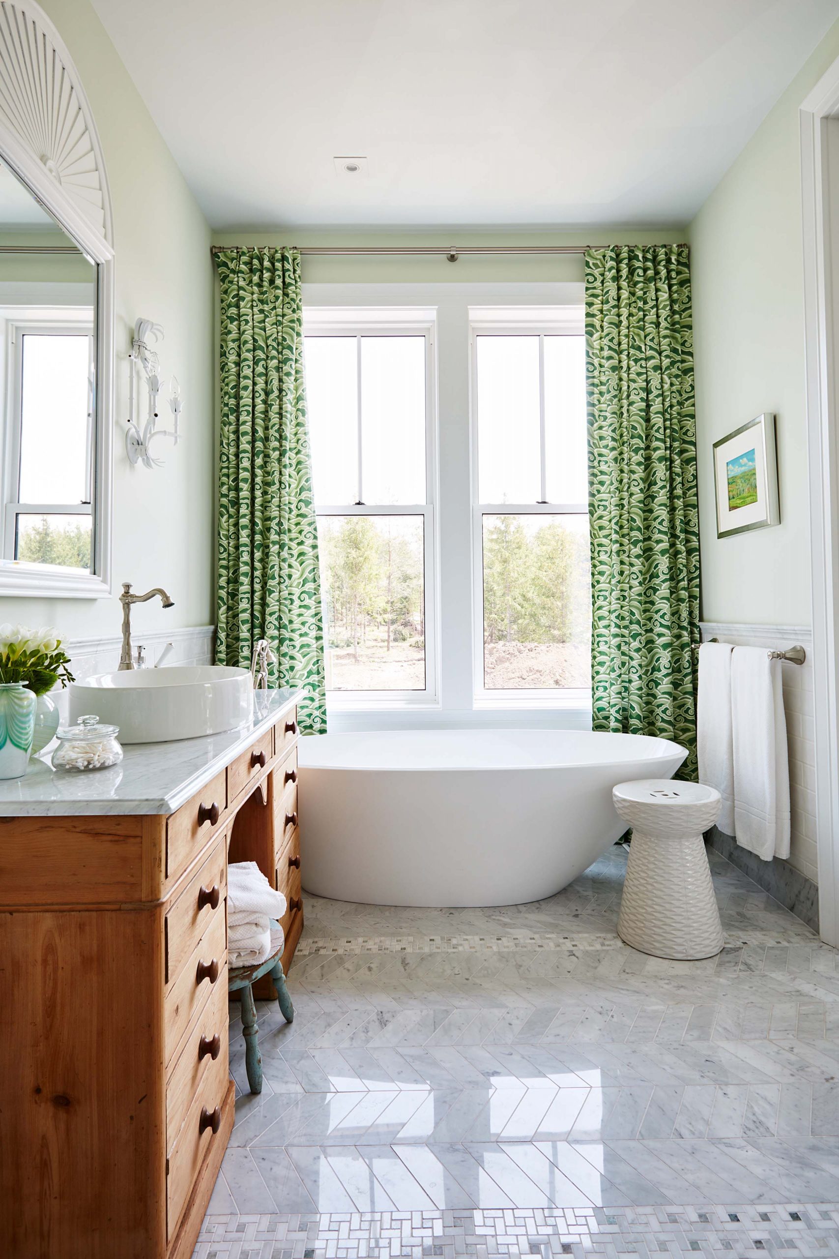
Matching Textiles
All kids prefer baths, and who wouldn’t want to soak up the fun here? This bath comes with a view, and with pretty green curtains for a little privacy come the evenings.
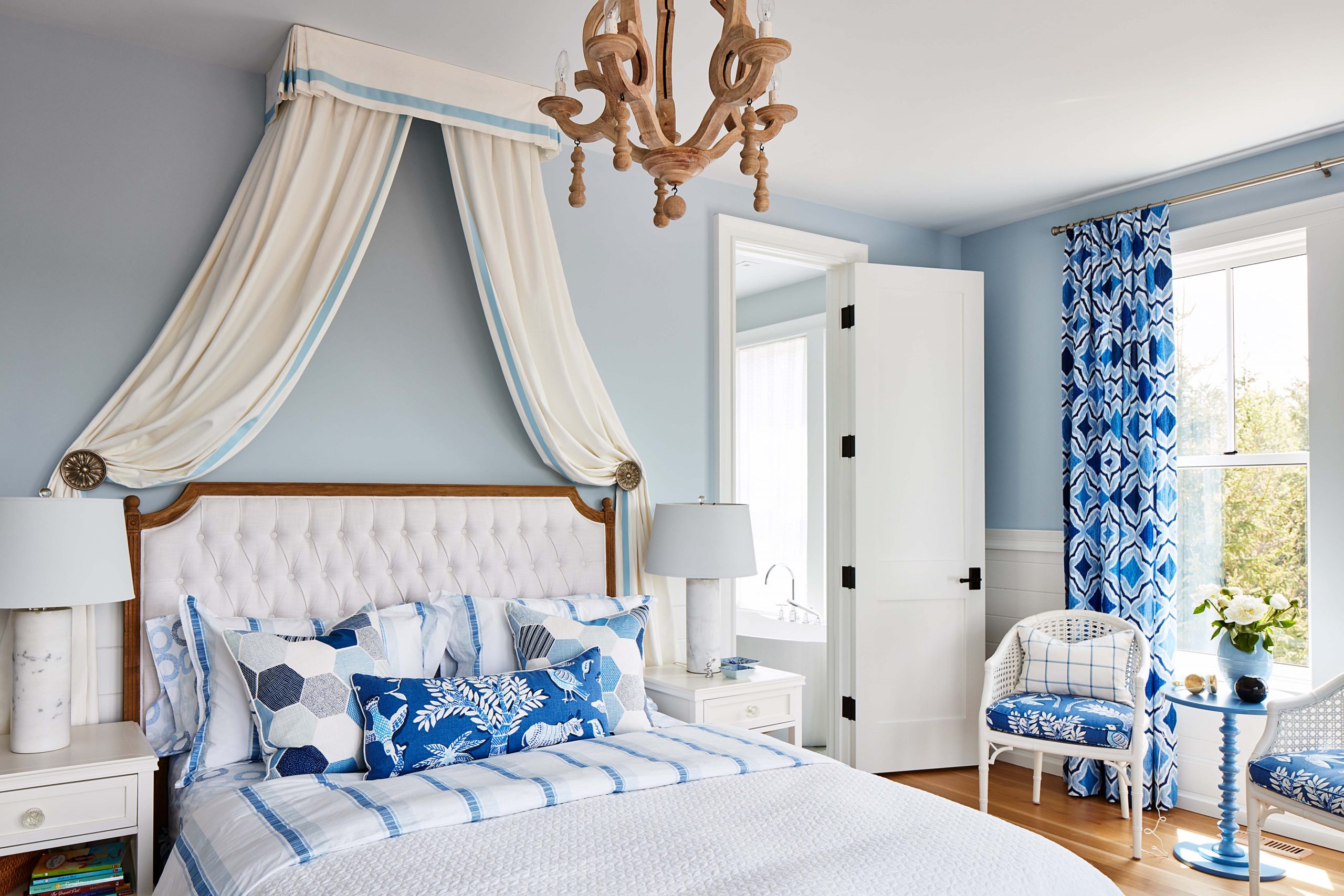
A Little DIY
Sarah crafted this canopy out of inexpensive material and recycled wood. A tufted headboard and a chandelier make this bedroom feel fit for a princess.
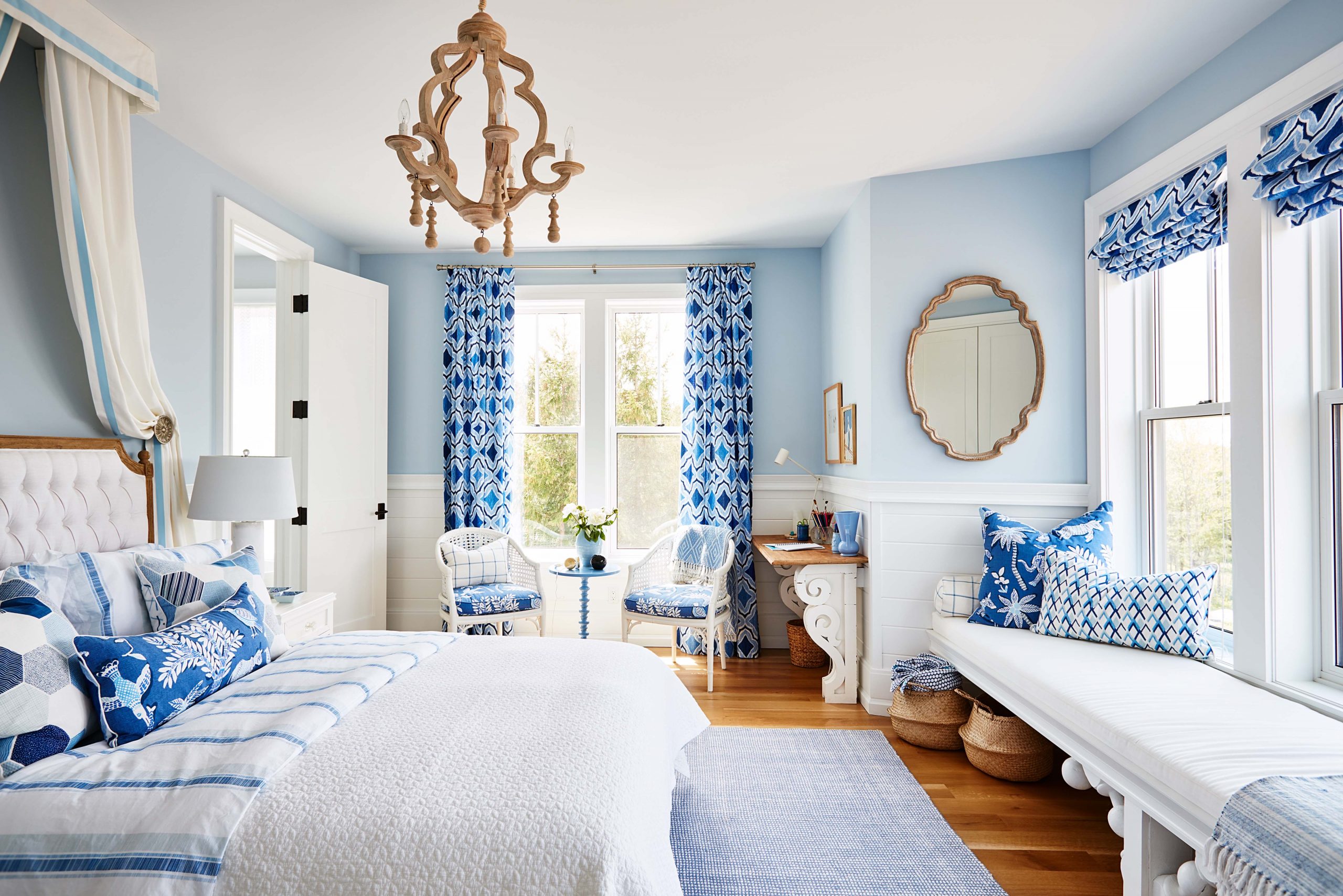
A Brilliant Fabric
Matching blue material on the drapes, pillows and chair covers give the room a cohesive and bright finish, especially against the softer blues of the walls.
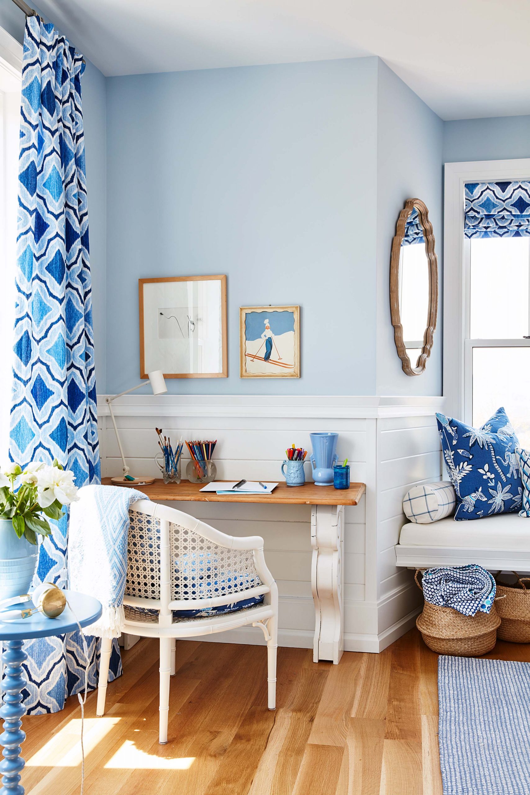
A Study Space
Sarah went for a softer look for Robin’s study area, helping her desk pop with a wicker-backed chair and a couple of framed prints.
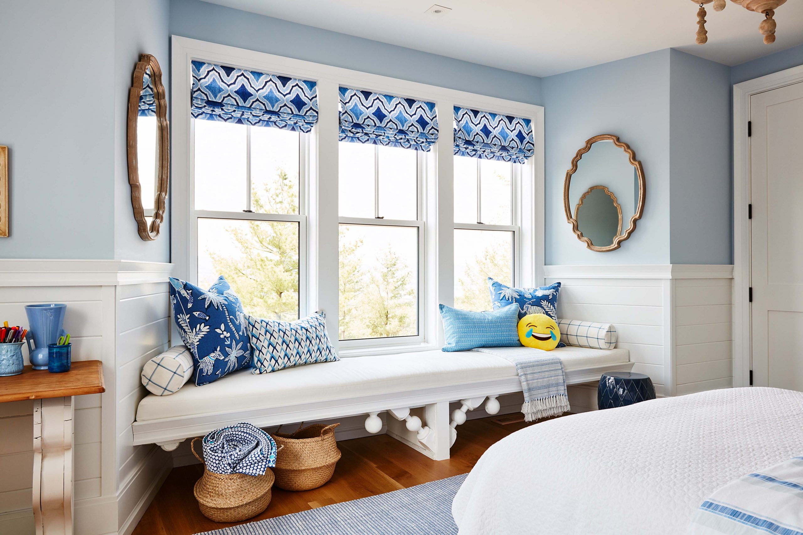
Window Seating
An open bench allows plenty of storage underneath while still taking advantage of the beautiful view above. Meanwhile, a couple of emoji toss cushions mixed in with the rest remind us this is a kid’s space that she can grow into over the years.
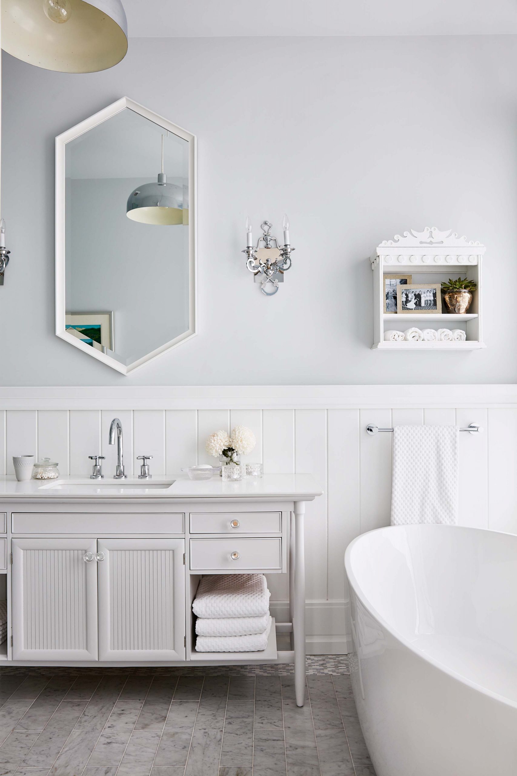
Going Country
Soft blues and brilliant whites are the theme for Robin’s bathroom, which feels country chic thanks to antique finishes like the vanity and wall décor.
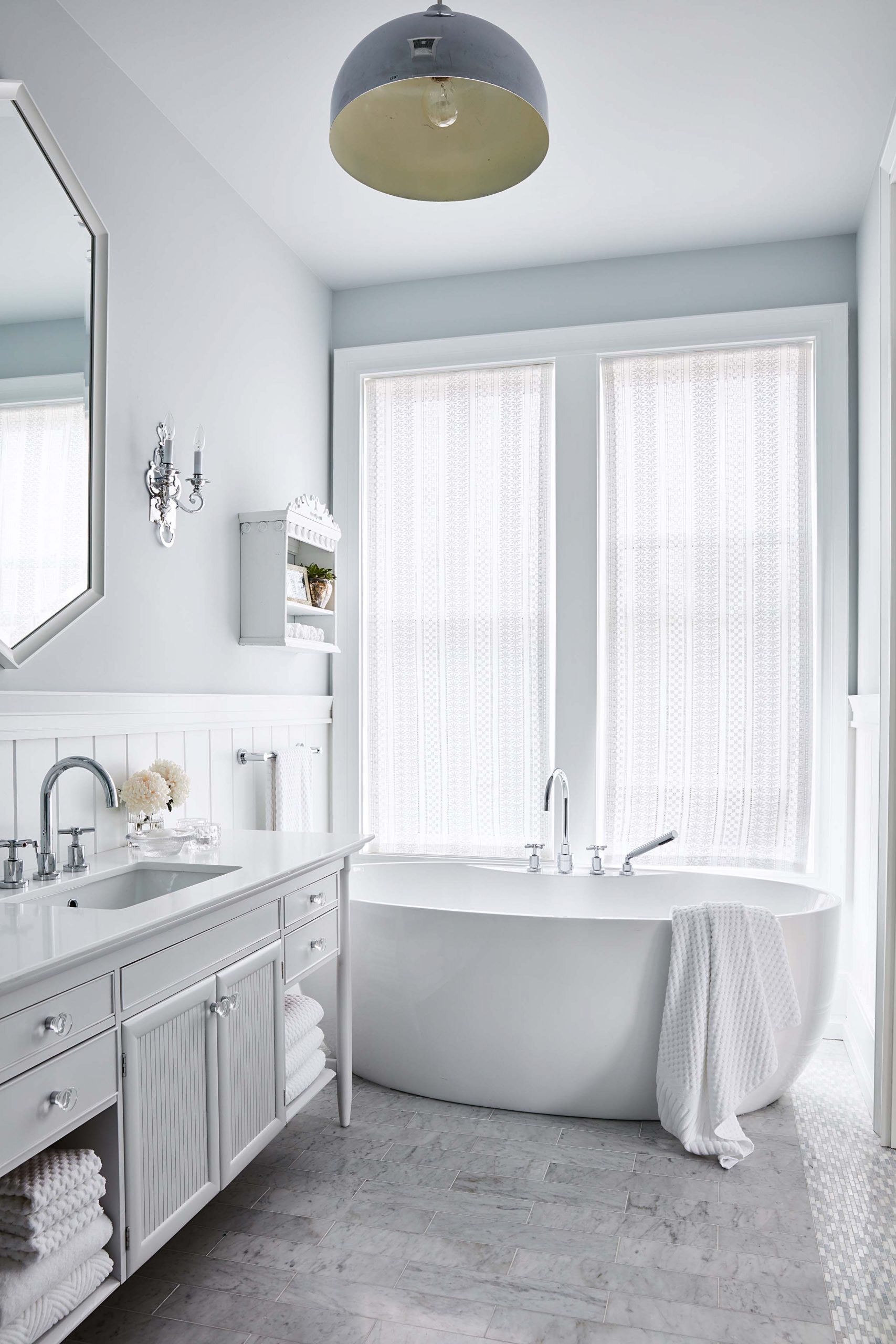
An Unexpected Look
Sarah had fun with the lighting in this space, alternating between pretty sconces and a more defined overhead shade that you wouldn’t normally find in a bathroom.
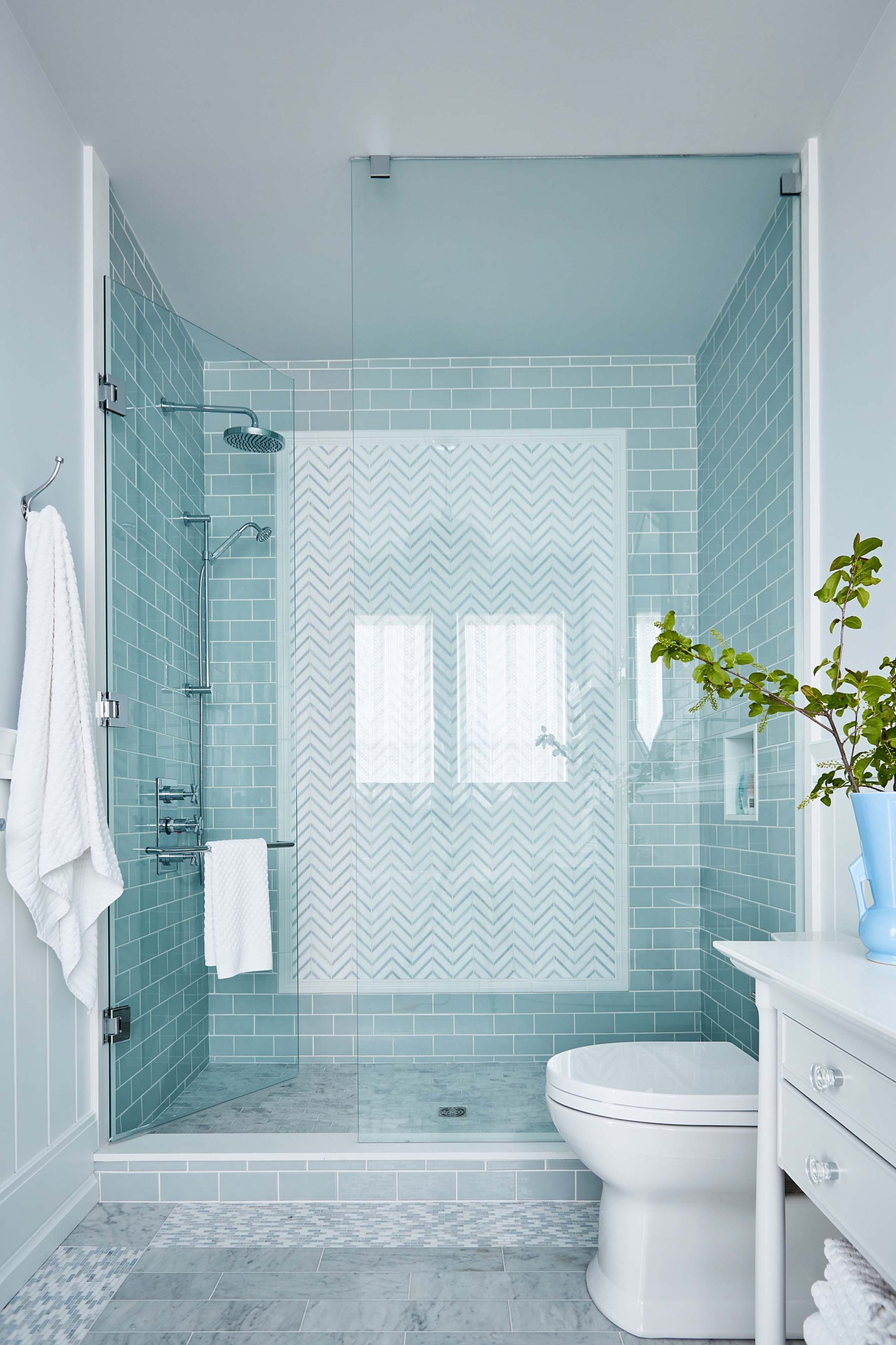
A Spa Area
Aqua tiling gives the bathroom a spa-like quality, while glass doors allow the light to reflect off those tiles and really liven up the room.
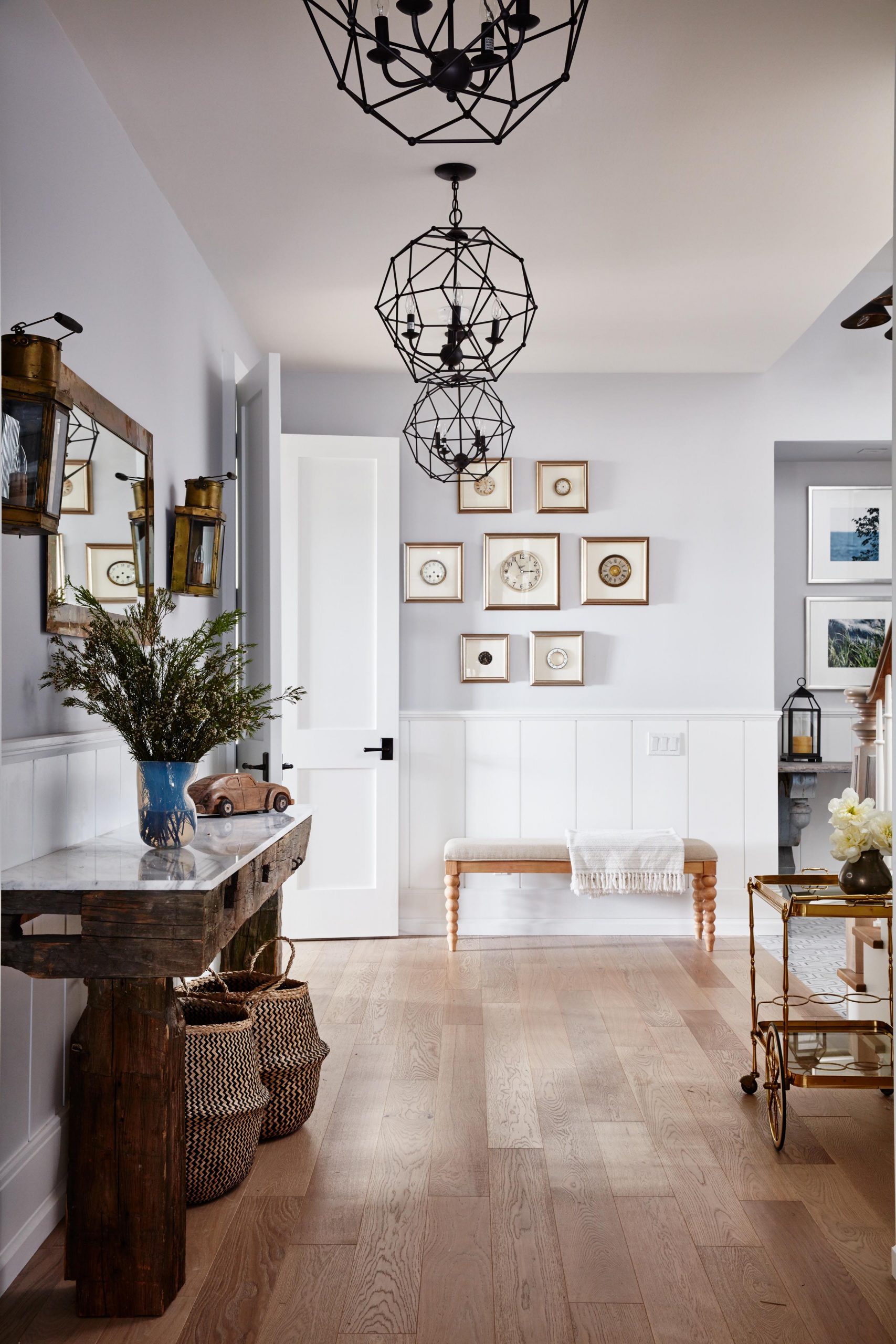
A Bright Entrance
The basement foyer of Sarah’s home is anything but dark. Thanks to enlarged windows and an open floor plan, the space feels airy and bright. Hardwood floors below are soft in order to maximize the sunlight, while classic finishes and furniture like the sturdy wall table and portable bar cart add a luxurious feel. Meanwhile pretty wainscoting on the walls adds a two-tone look that softens up the space and gives it a bit of a contemporary touch.
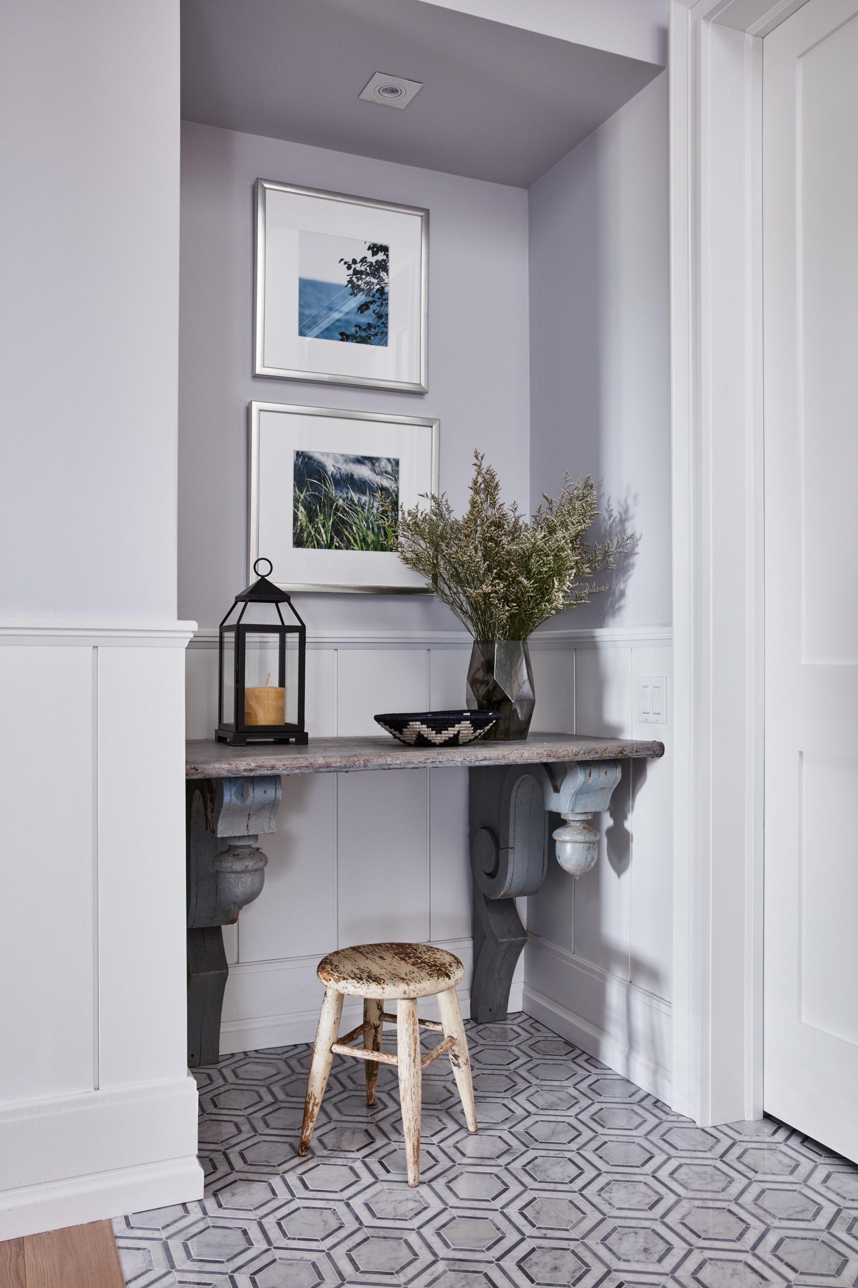
A Built-In Nook
This small nook is the perfect area for a built-in desk and stool, making it a great space to write a last-minute letter or to place wayward items on before running between floors. A pretty floral arrangement, some framed photos and a candle within a lantern-frame complete the look.
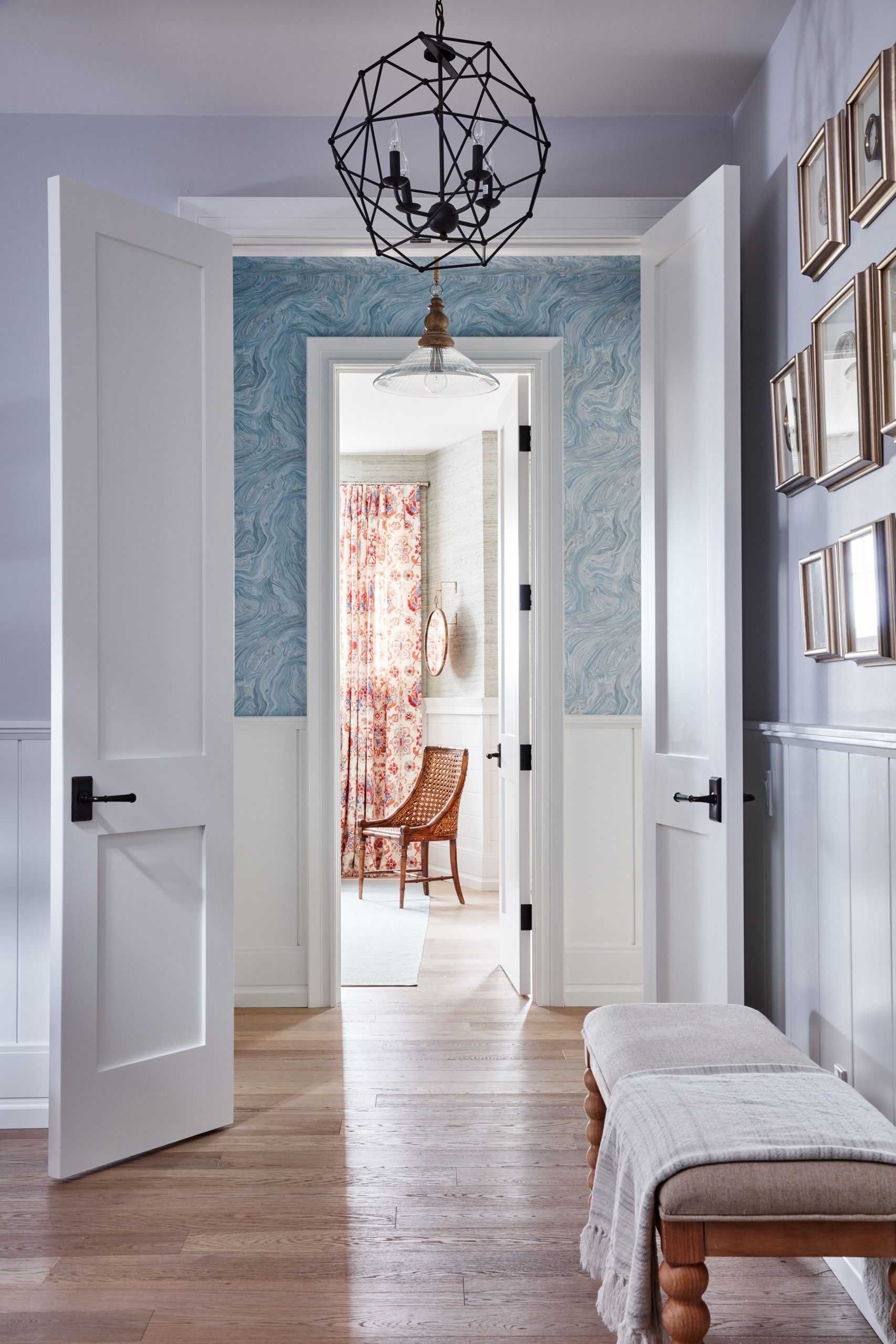
A Bright Basement
The pretty marble blue wallpaper really pops against the the white doors and trim, creating a bright open space in the basement.
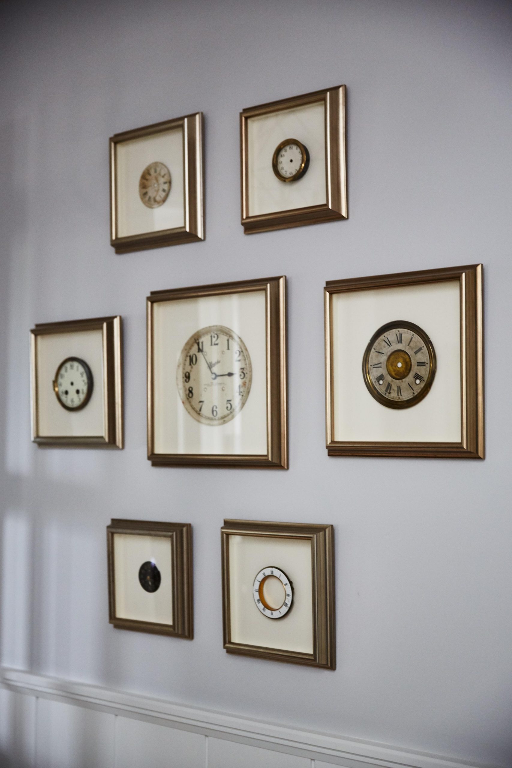
A Worldly Touch
We love the rustic gold frames surrounding these clocks on the landing wall, which really pop against the soft blue paint and instantly draw the eye. The clocks themselves feel worldly and regal, adding another instant, luxurious touch to the space.
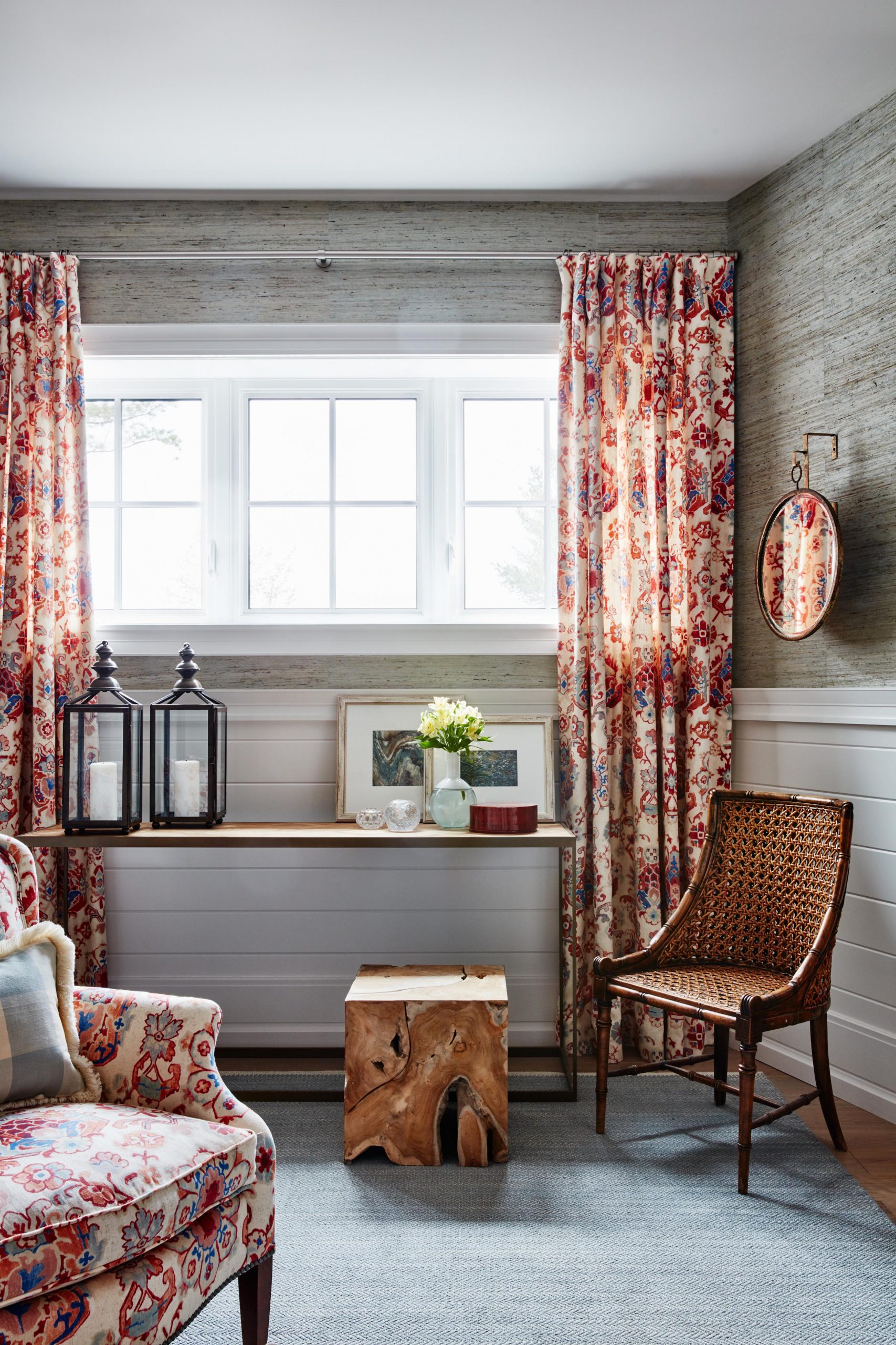
Rustic Finishes
The two-toned walls continue throughout the room, with a more masculine feel thanks to the rich wallpaper capping off the upper half. Pops of wood and outdoor elements like these lanterns on the wall table create rustic finishes that balance the floral pattern and make this a truly universal guest space.
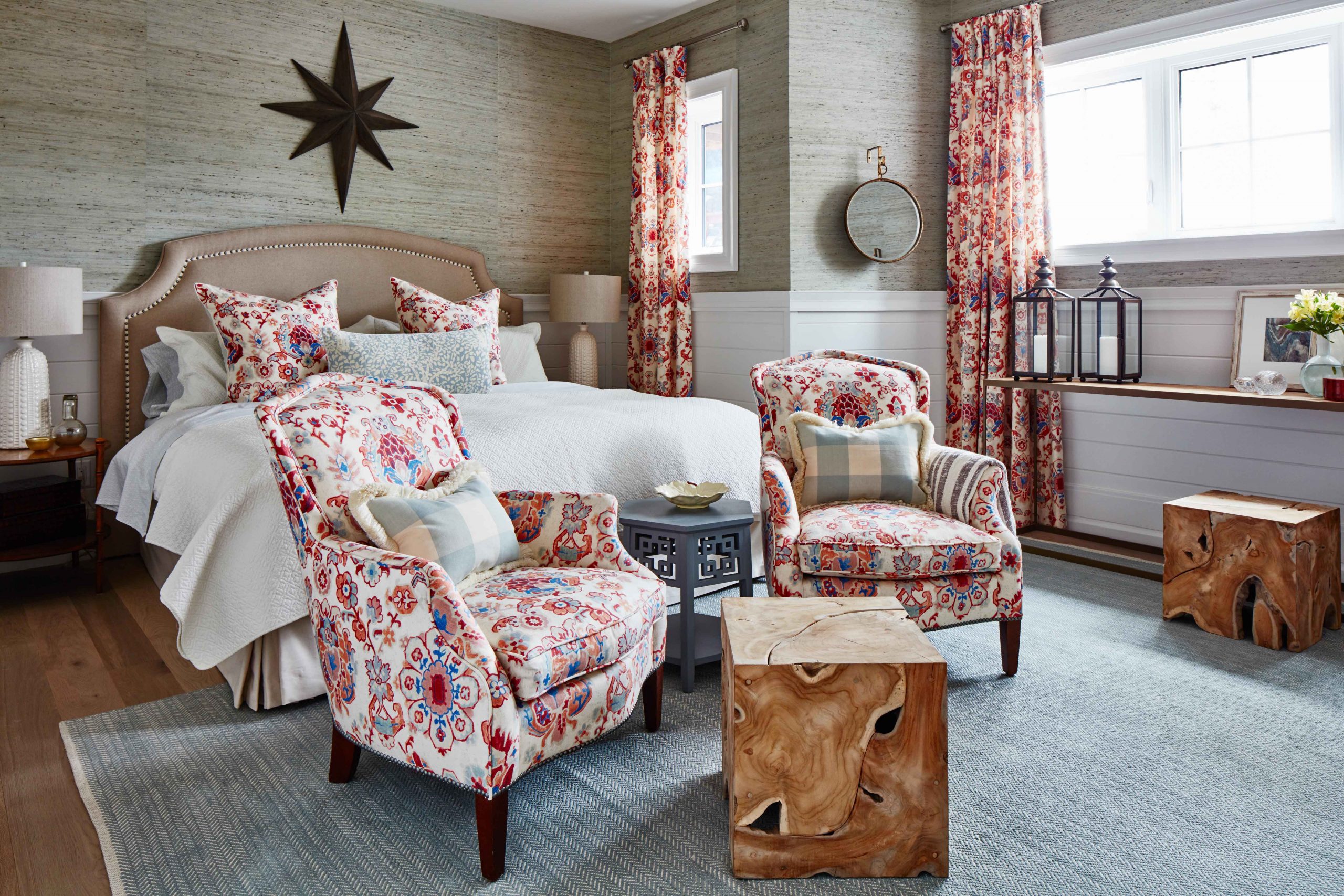
Matching Fabrics
Sarah was excited to pick one fabric and really play with it throughout the space, which again doesn’t feel like a basement room thanks to the enlarged windows and sunlight streaming in. The fabric doesn’t just pop on the curtains and arm chairs; it’s present on the bed’s toss cushions as well to create a fun, floral effect throughout.
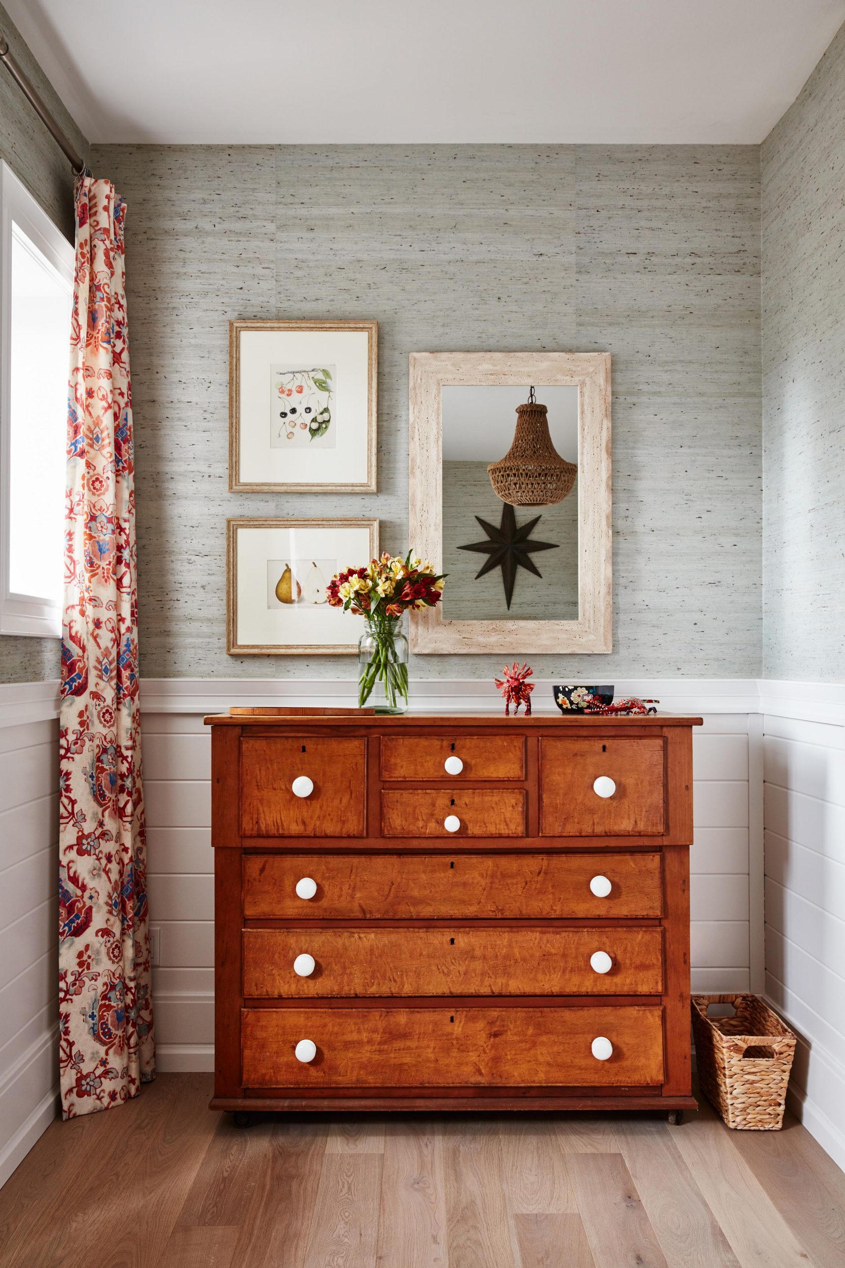
Attention to Detail
This refurbished dresser adds lots of functionality, but the cherry wood finish adds another one of those rustic elements while drawing in some of the colours from the curtains. New, white hardware make the unit feel fresh and purposeful, while simple adornments like the framed prints and a wide-framed mirror on the wall above tie it all together and create a polished look.
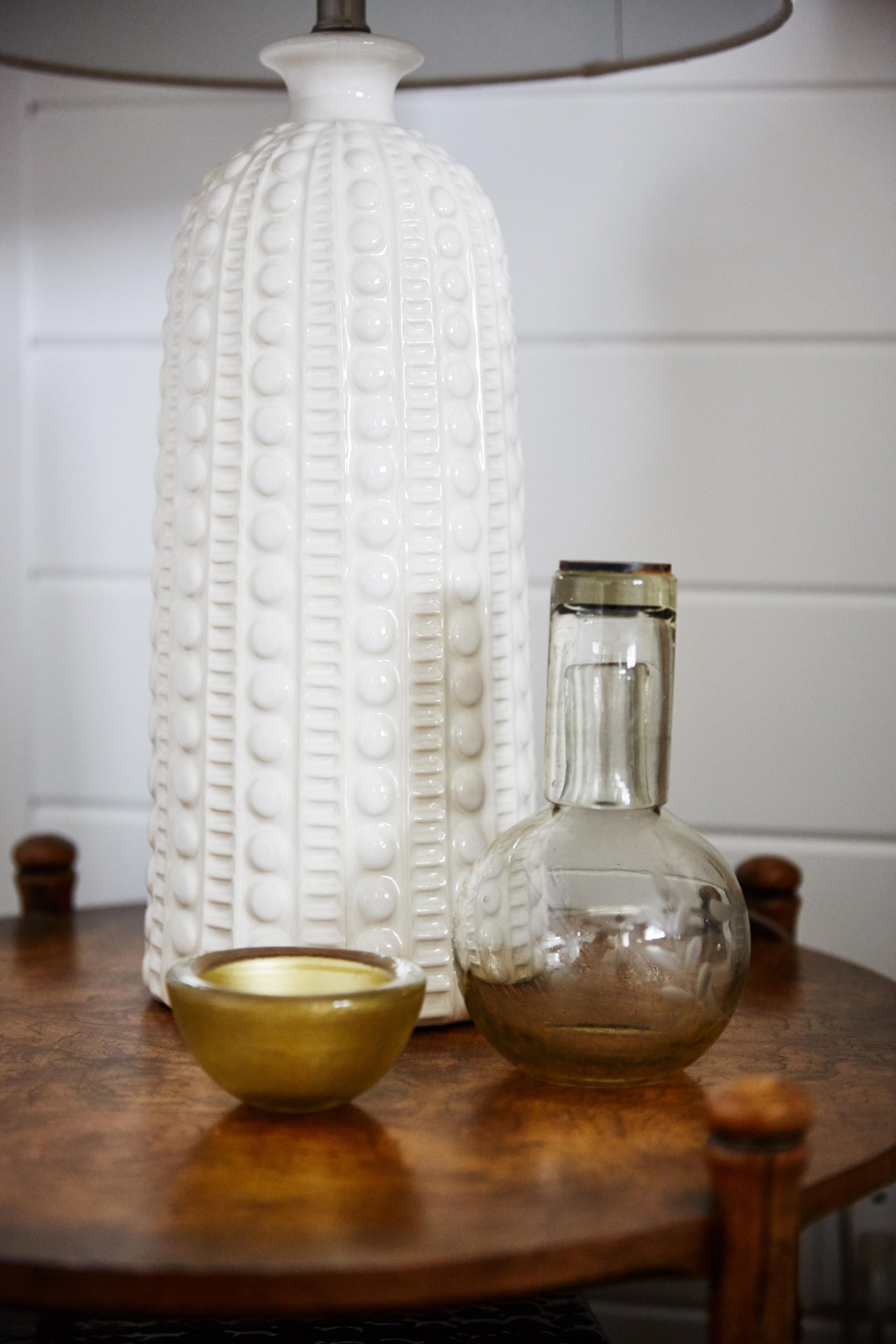
Attention to Detail
We love the ceramic finish on this table lamp, which adds instant contrast and character. Against the darker finish of the table and surrounded by small design elements like the candle and jar, it stands out and really compliments the room.

Lighting to Talk About
Above, this light fixture feels classic yet bold thanks to its woven design and bell shape. The warm colour is the perfect compliment to the warm blushes and greys below, allowing the piece to stand out as another brilliant feature in the overall design.
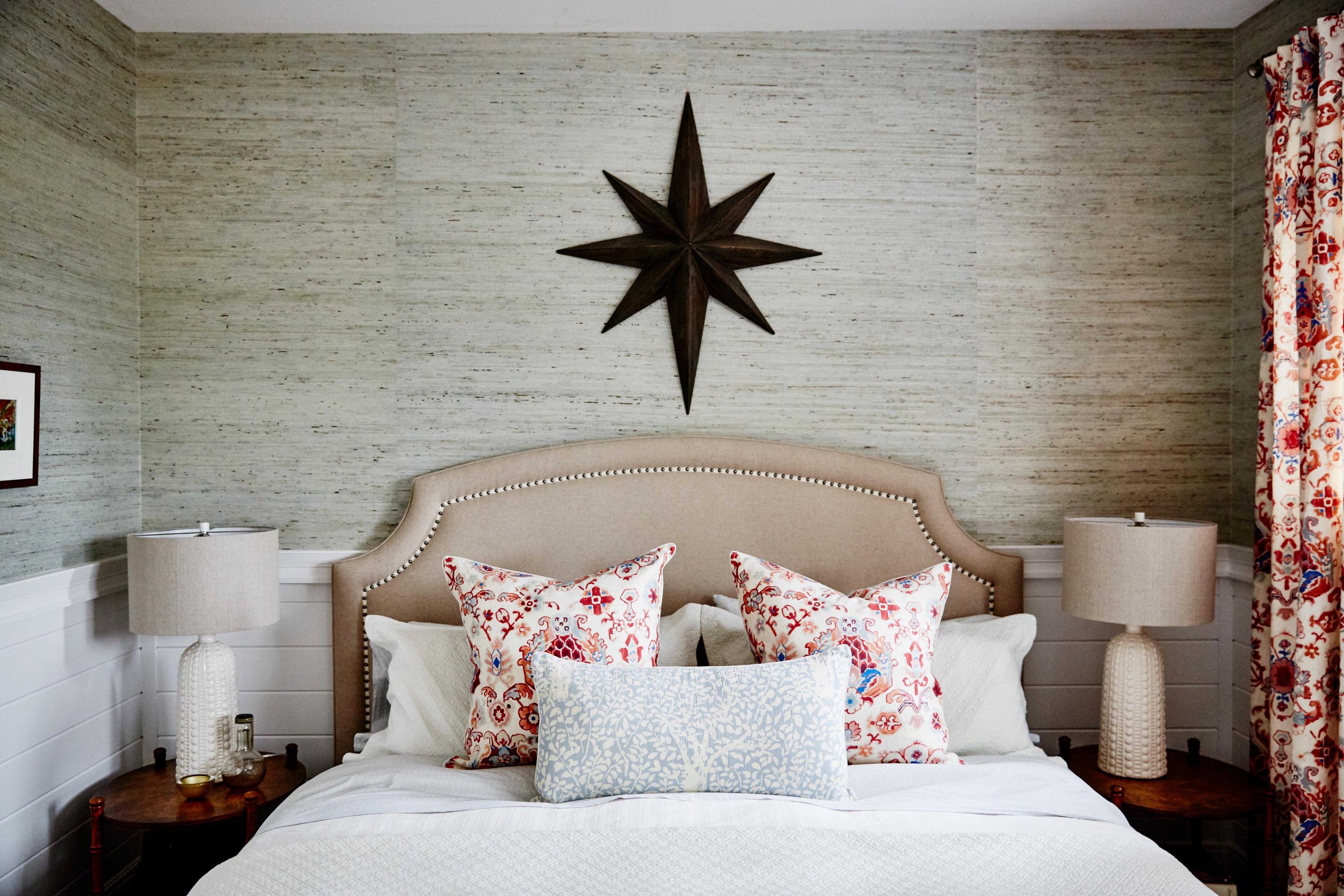
A Feature Wall
Feature walls don’t have to be lavish in order to stand out, as Sarah proves with this pretty, neutral headboard along the bed. A star cutout on the wall instantly draws the eye, while complimentary night tables with simple lamps brings it all together.
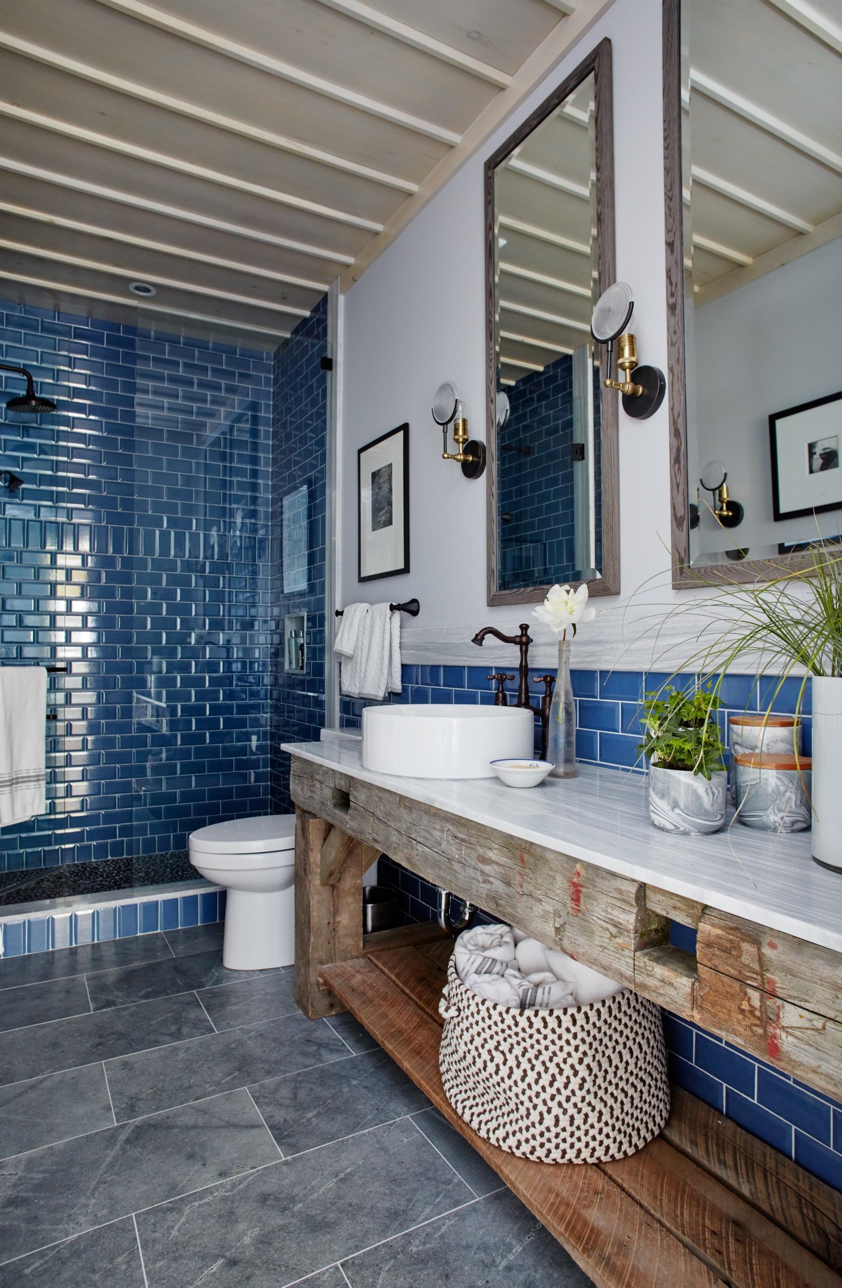
A Spa-Inspired Space
There are no windows in the guest bathroom, which meant that Sarah wanted to go dark and dramatic to really pack a designer punch. So she opted for opulent blues and beach-side finishes to really give this space definition, with a sloped ceiling and a gorgeous custom vanity creating a lasting effect.
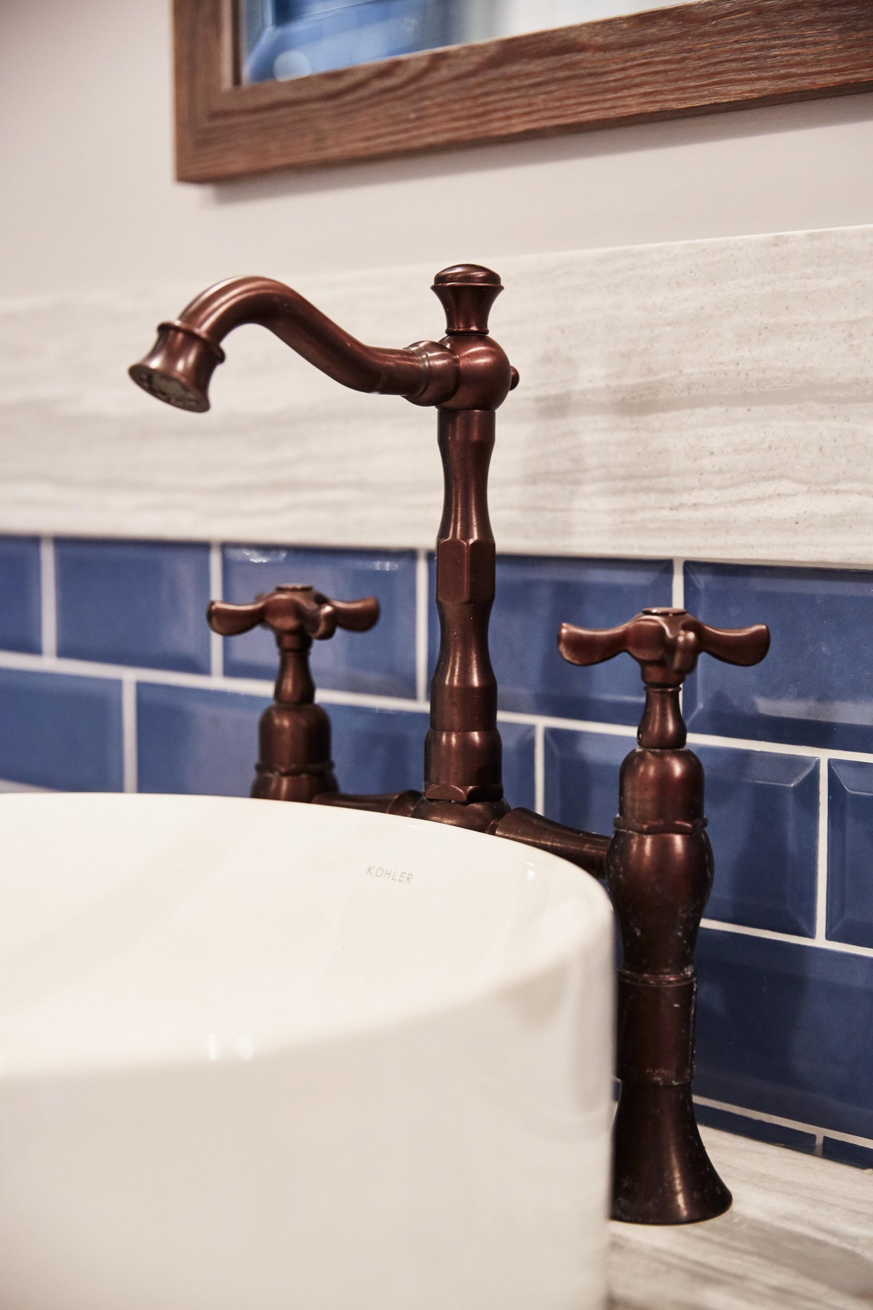
Special Touches
The basin sink adds instant design appeal, especially when contrasted with the antique copper faucet. Behind, the rich blue tiling adds even more depth to the look, adding a water-inspired finish to the space.
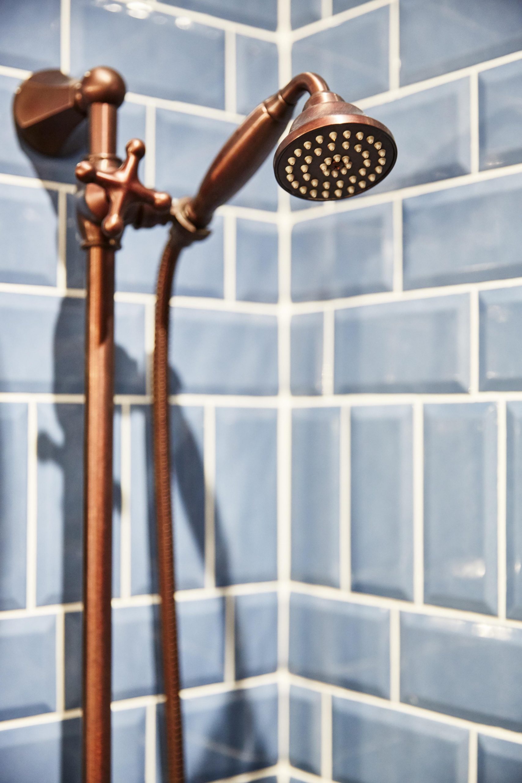
Dramatic Touches
The copper finish on this antique shower head is unique and dramatic, and really pops against the brilliant blue hue of the shower’s back splash. It’s hard not to feel like you’re at a spa with finishing touches like these.
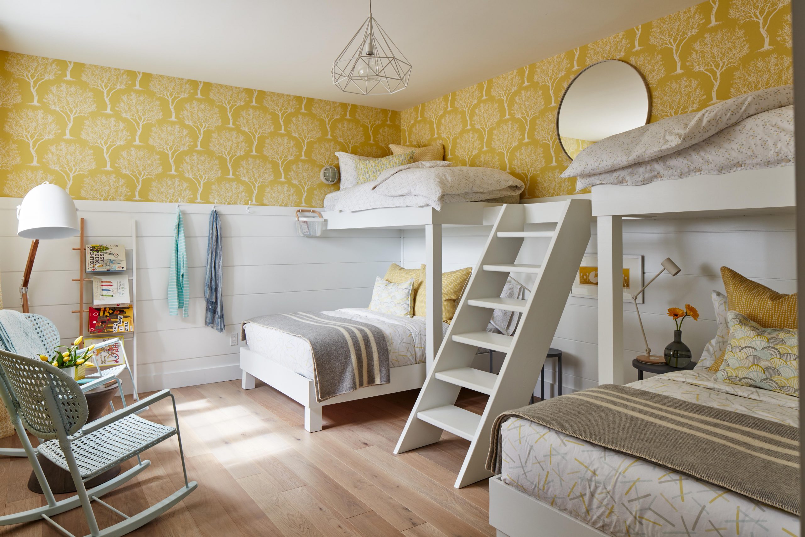
A Kid-Friendly Space
Guests – especially of the younger variety – can’t help but love this fun room that Sarah designed with her own childhood in mind. Bright yellows are neutral and fun, adding instant personality to the space, while custom-built bunk beds make this an essential sleepover space. Painted barn-board trim on the lower half of the walls and the same hardwood floors below keep this space in tune with the rest of the basement, with plenty of designer touches further elevating the room.
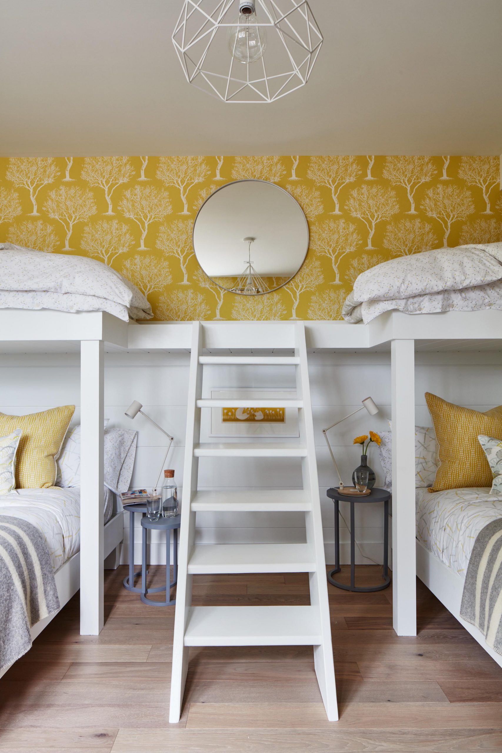
Fun With Height
This custom ladder in the middle of the bunk-bed design helps to keep the area open and spacious while still drawing the eye by making the ladder itself a focal point in the room. The white finish is bright and clean, and really pops against the yellow wallpaper above. A central, circular mirror adds another fun design element, capped off by the geometric light fixture.
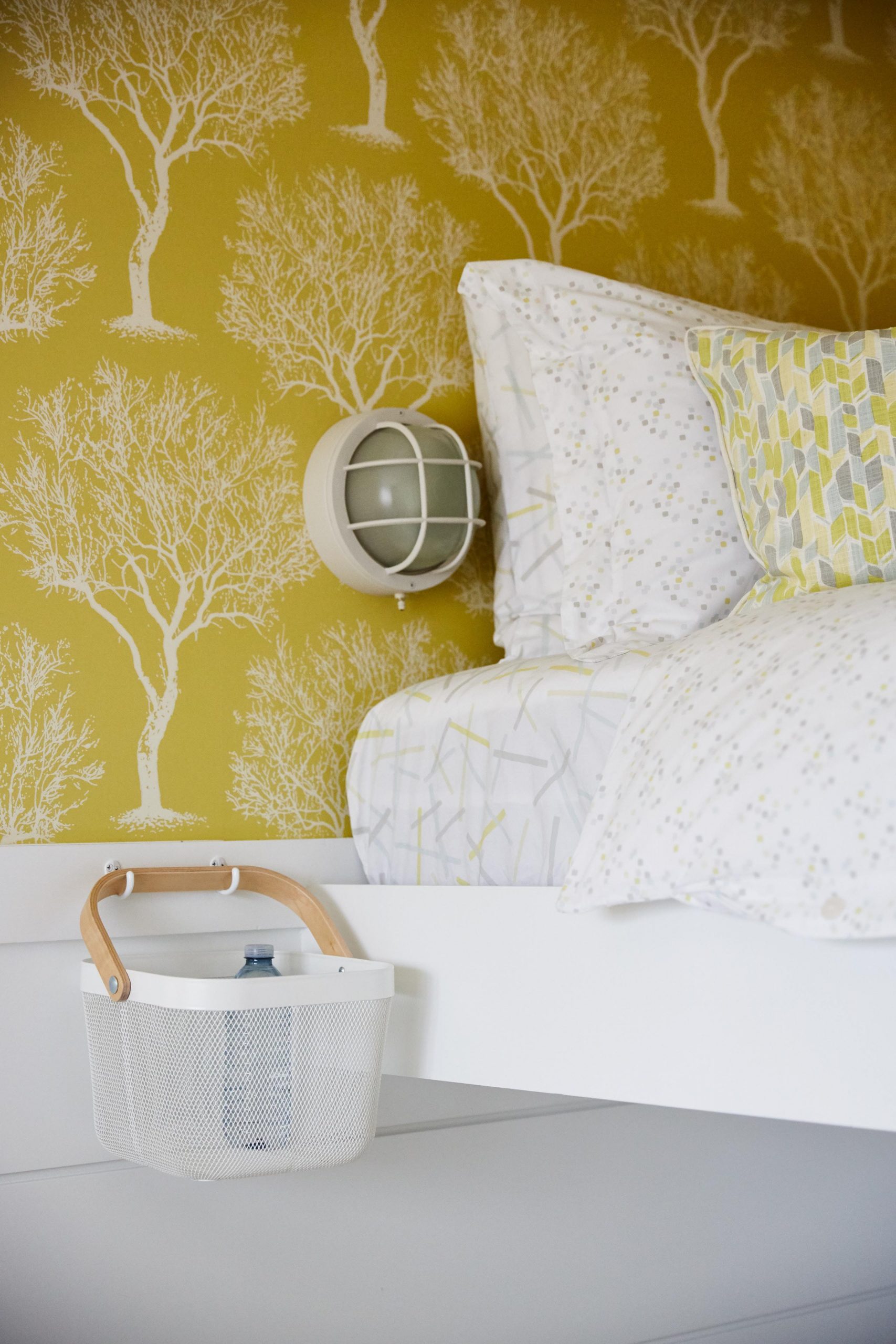
Finishing Touches
Pretty grey-and-yellow textiles on the beds help to compliment the space, pulling all of the different elements of the room together. Small sconces on the wall allow for individual lighting, as well as a few well-placed baskets giving guests their own little storage options for the night.
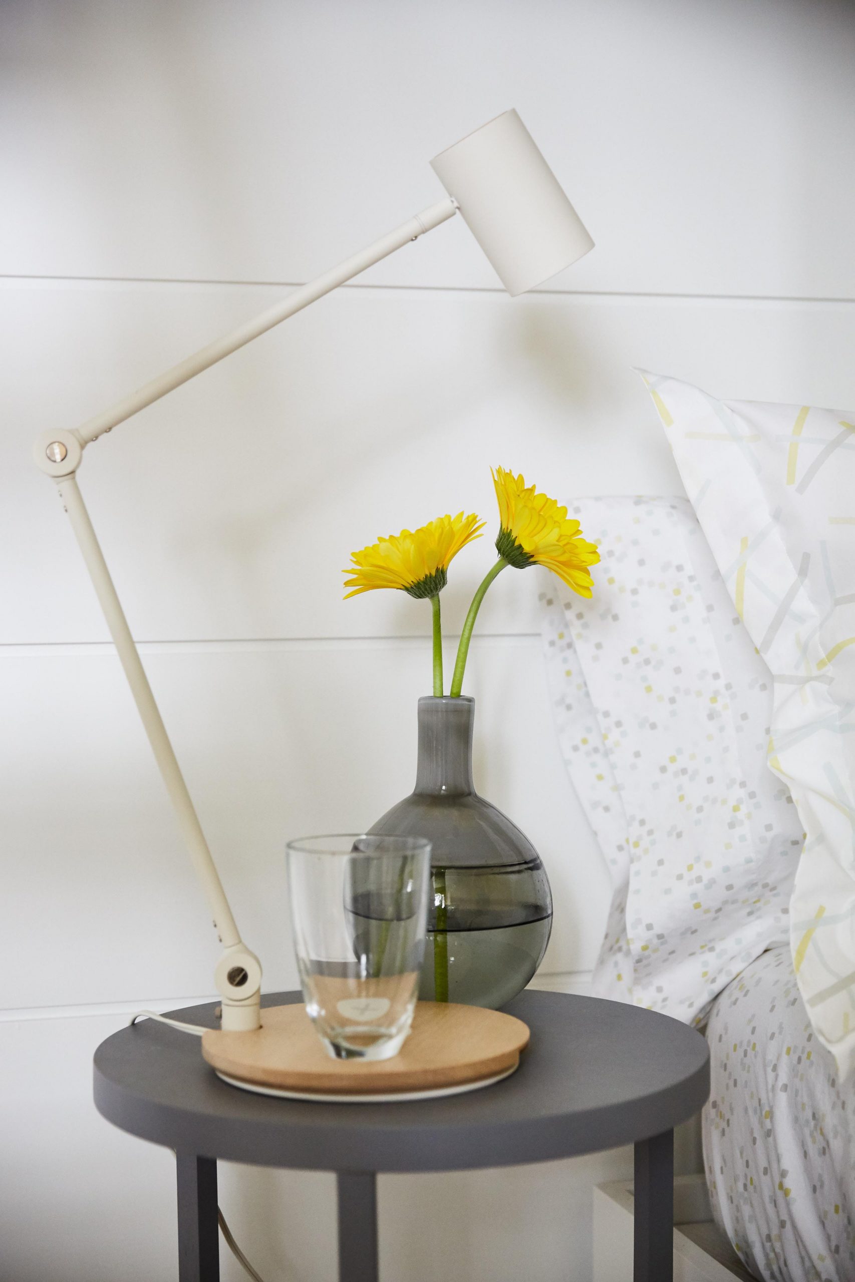
Decorative Details
Below, the bottom bunks also feature personalized lighting thanks to the adjustable table lamps and nesting tables. A painted pot with some brilliant flowers adds more design detail, while a serving tray is the perfect spot for that always-needed glass of water in the middle of the night.
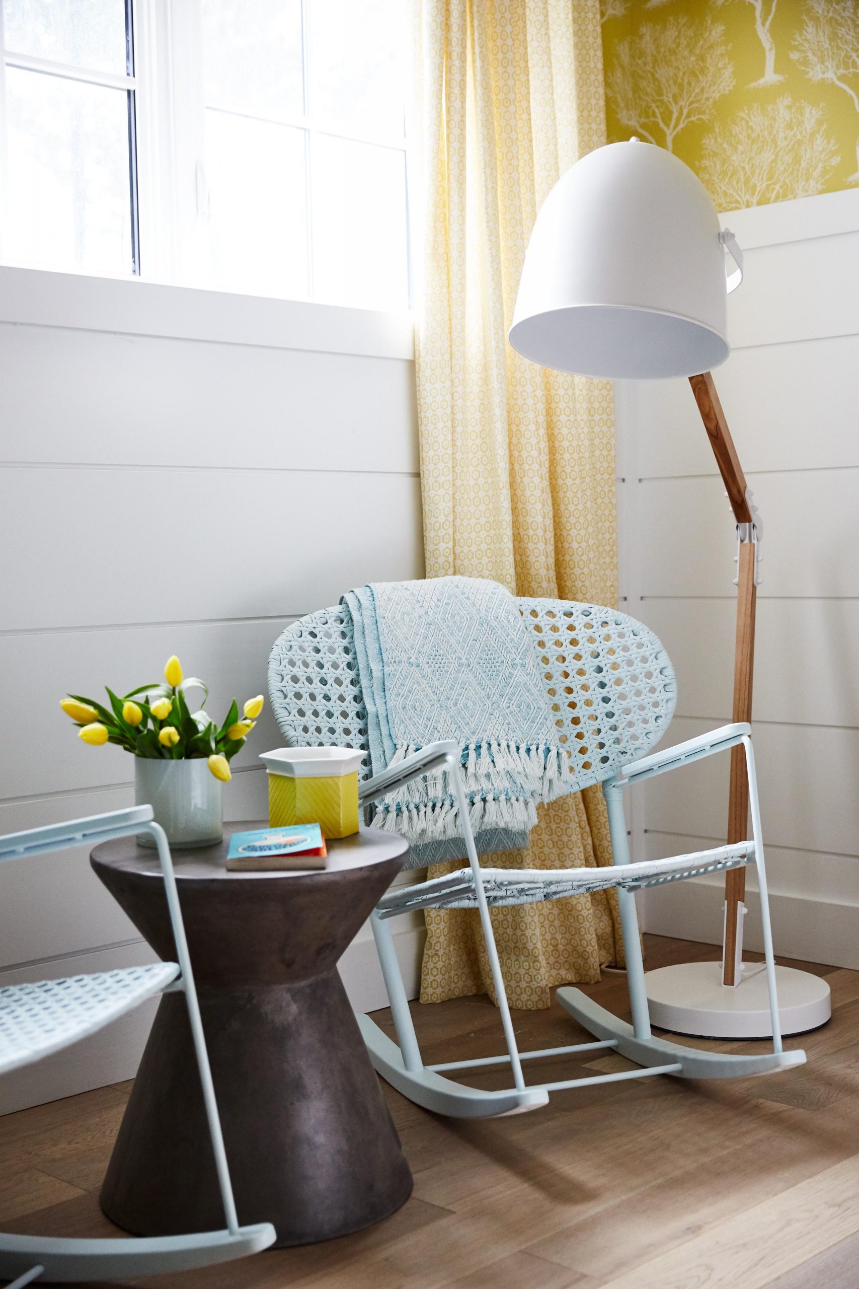
A Space to Chill
Matching rocking chairs are light and add more seating potential to this guest space without making it feel cluttered, while an end table in a modern design pulls the corner together. More flowers and a modern floor lamp complete the look.
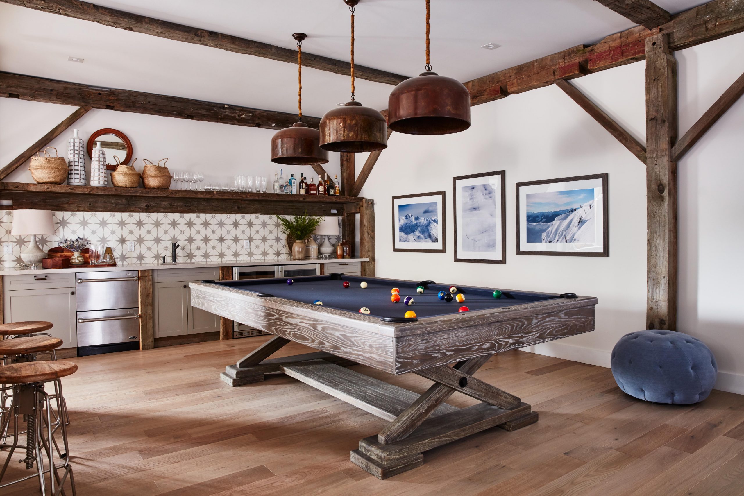
The Perfect Den
Sarah surprised her husband with this pool table addition in the media room, given how much he missed their old one. The rustic finish on the table itself plays into all of the exposed beams in the space, creating an updated pub vibe that’s actually bright and airy. Meanwhile a wet bar with a pretty back splash and lots of storage makes this the perfect entertaining space, while dramatic drop lighting above the table itself instantly draws the eye.
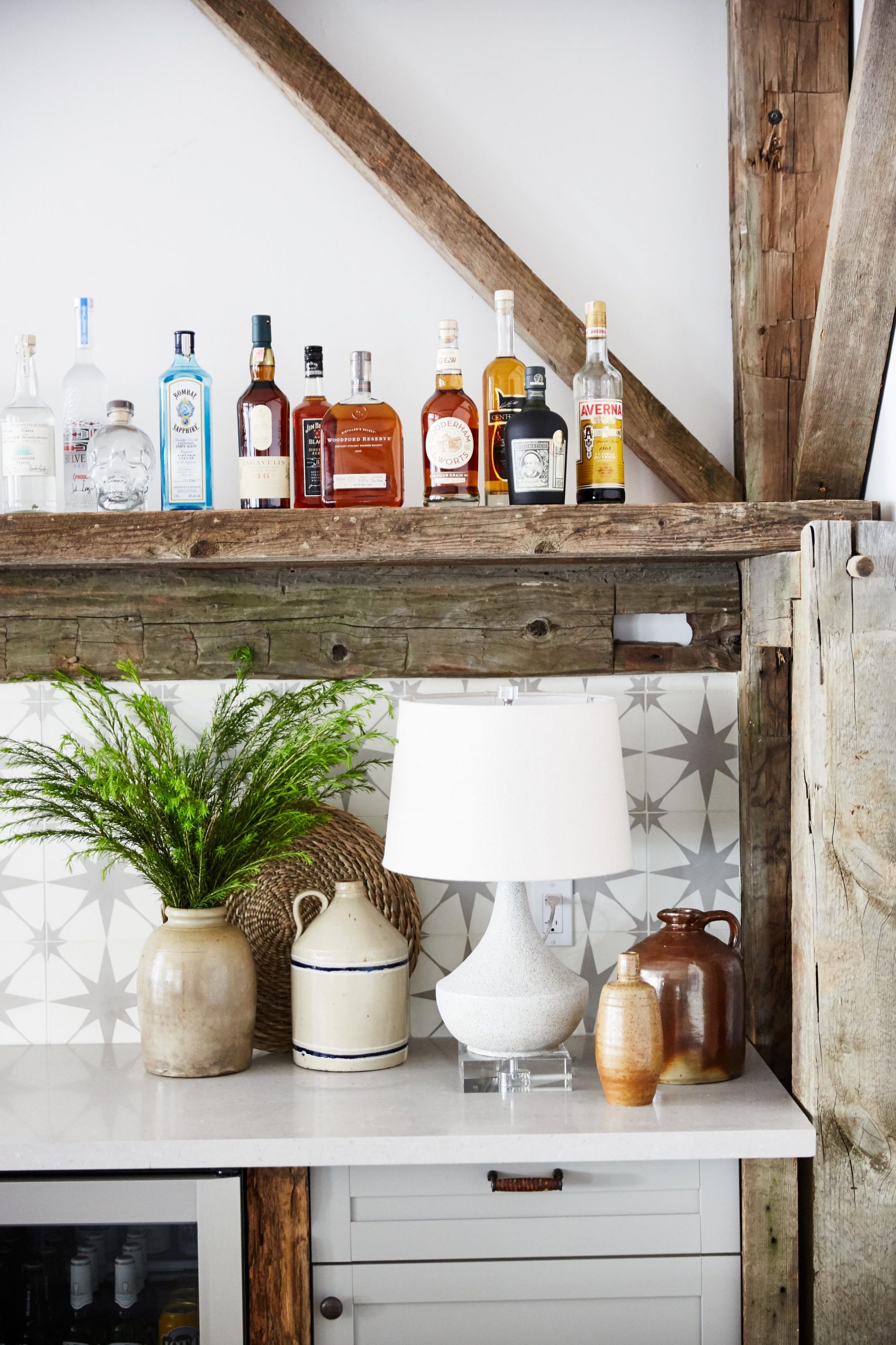
A Better Bar
Along the back wall of the media room, Sarah crafted this bar area with shelves that match the exposed wood features throughout, adding yet another luxurious finish to the area. Above, there is plenty of space for a well-stocked bar, while pieces below like this modern lamp and jugs add instant design appeal.
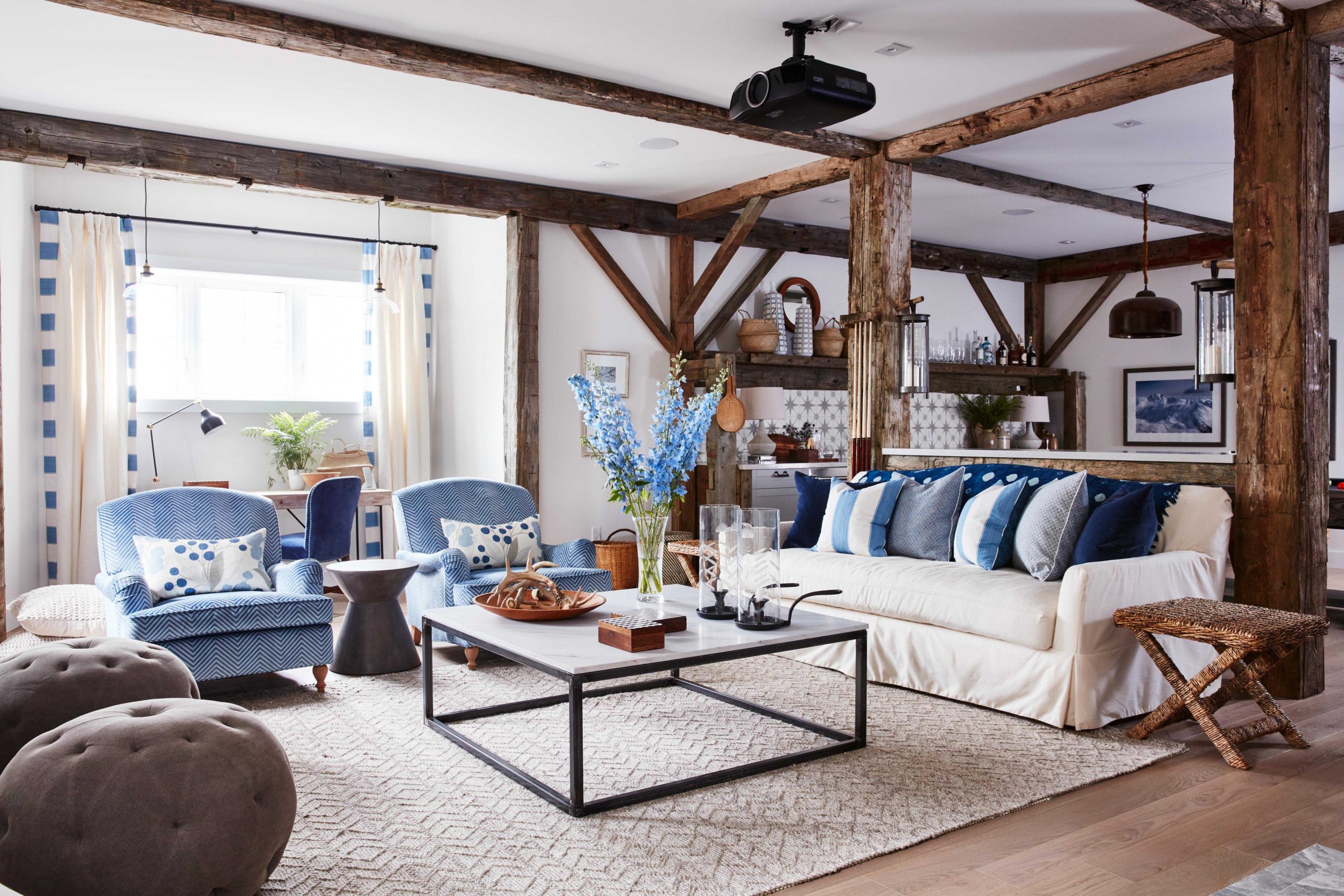
Family Seating
In the actual media area, Sarah created a space with lots of seating potential so that the whole family can curl up together during movie nights, or so that guests will have plenty of space to sprawl out. An oversized sofa with plenty of toss cushions in varying shades of cream and blue complements the armchairs, while tufted ottomans add bonus seating and depth to the overall look.
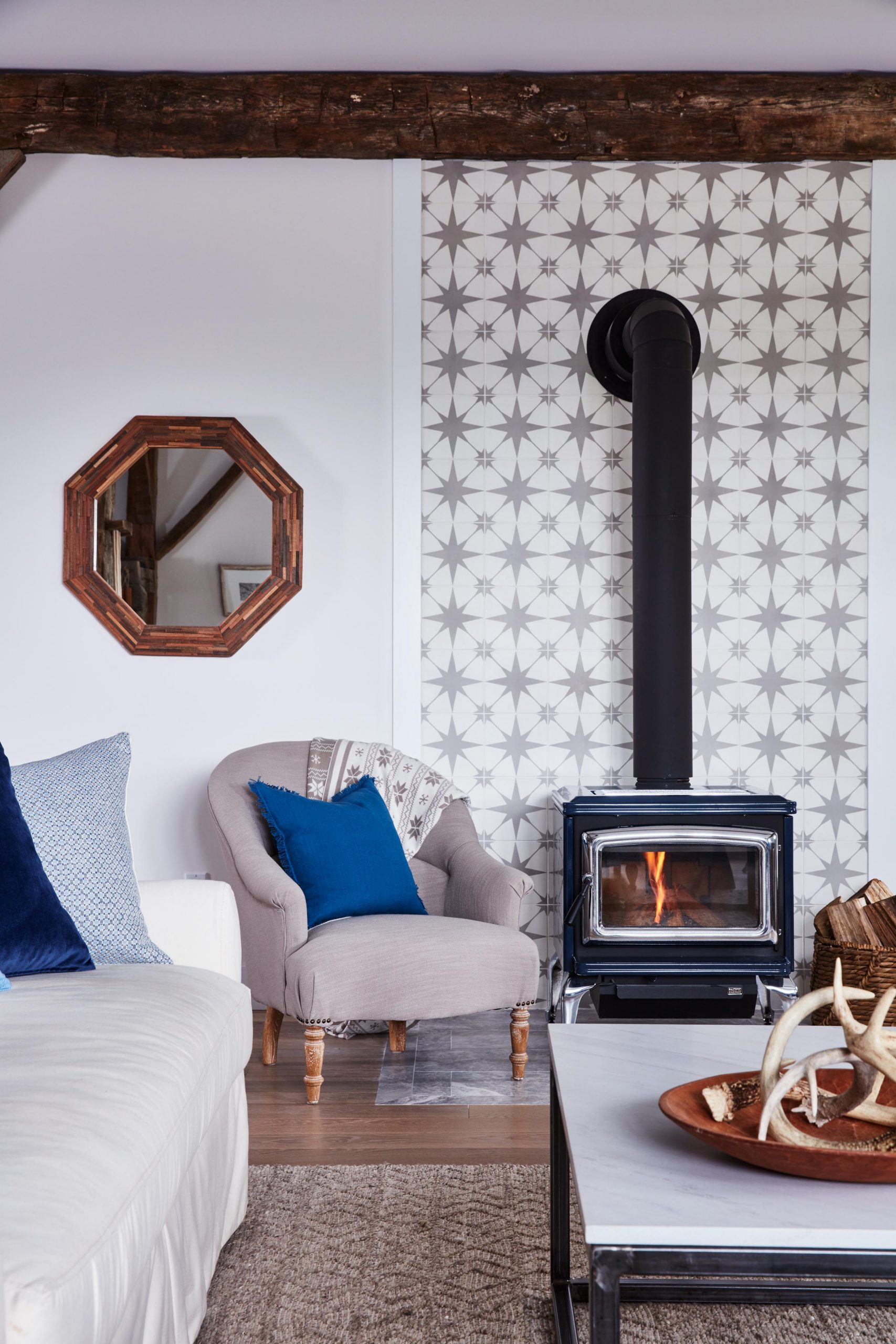
Added Warmth
The wood-burning stove fireplace with an updated insert adds instant rustic appeal in the space with all of the modern conveniences you’d want in an off-the-grid home. The unit really pops against the star-patterned deco wall, while more neutral elements like the oversized armchair and wood-trimmed, octagon mirror tie it all together.
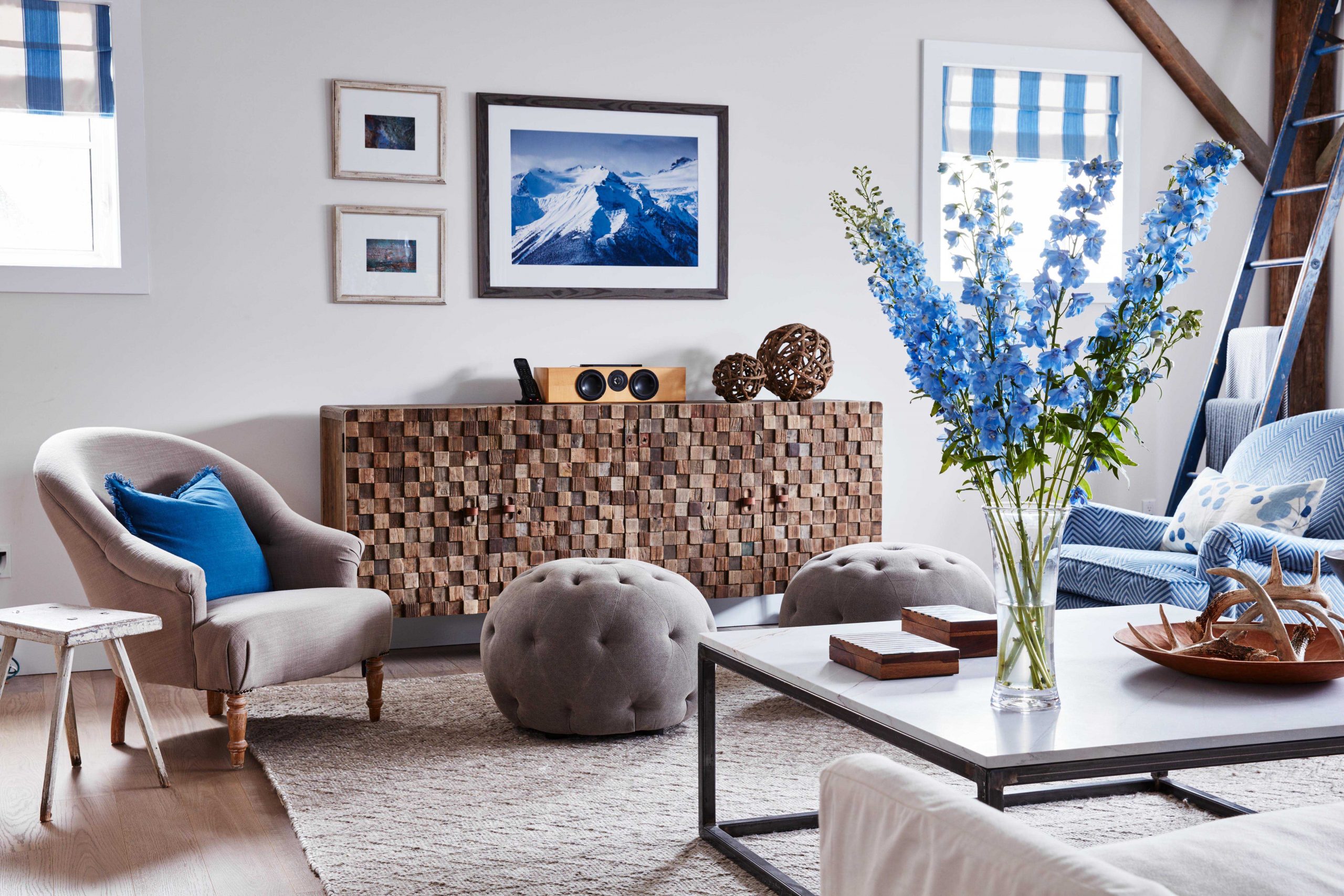
Timeless Décor
This house is meant to be a forever home for Sarah and her clan, which means the design details needed to be classic and timeless. That’s why she opted for neutral furniture and interesting pieces like this hutch with its carved finish, and then complemented the space with interchangeable blues via the flowers, toss cushions and shades.
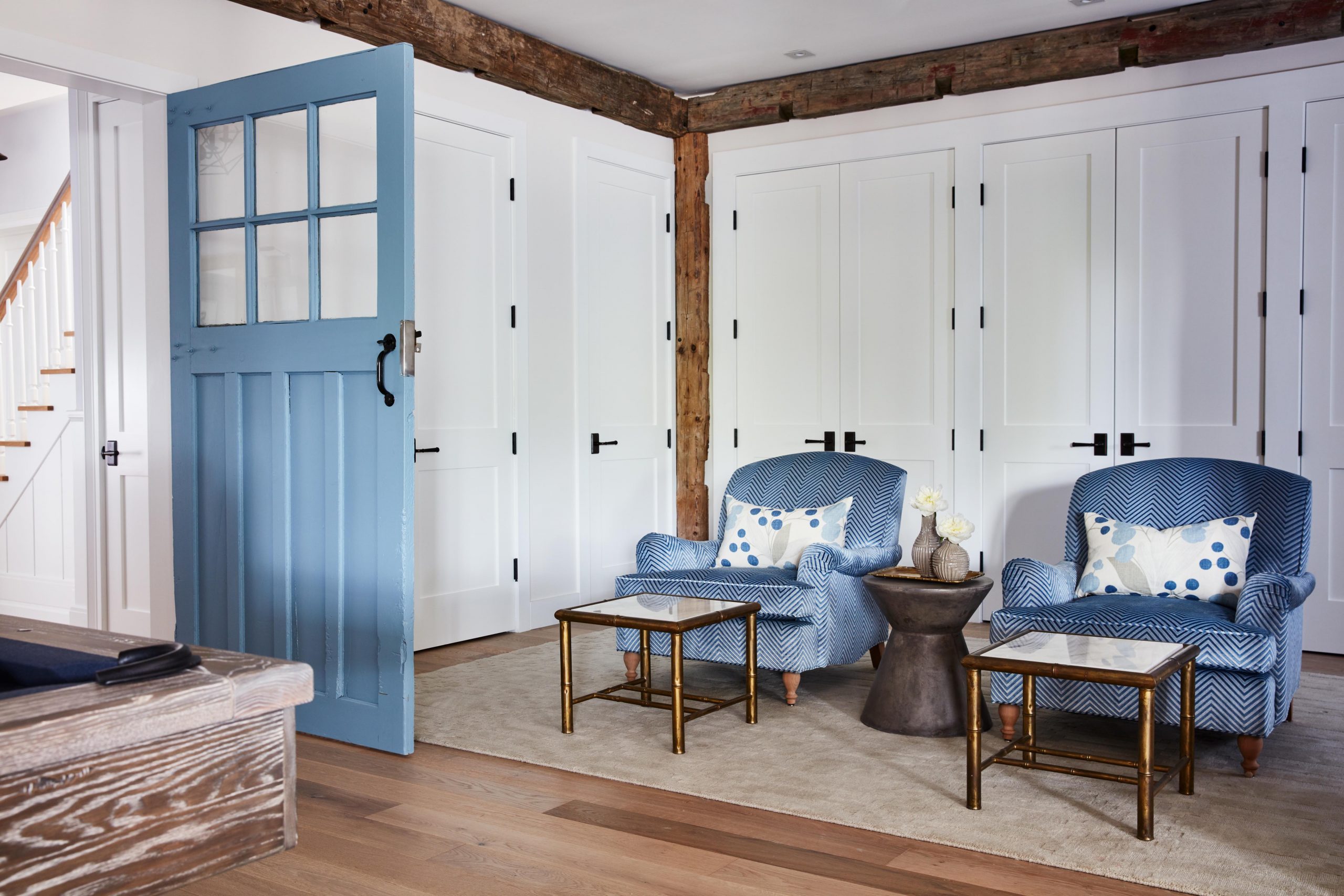
Storage Central
Behind some of the pretty blue details Sarah was sure to max out the storage space for her family of four, especially considering how much they like their outdoor activities together. That’s why the room also features plenty of custom, built-in storage along the back walls, where things can be easily tucked away and kept out of sight.
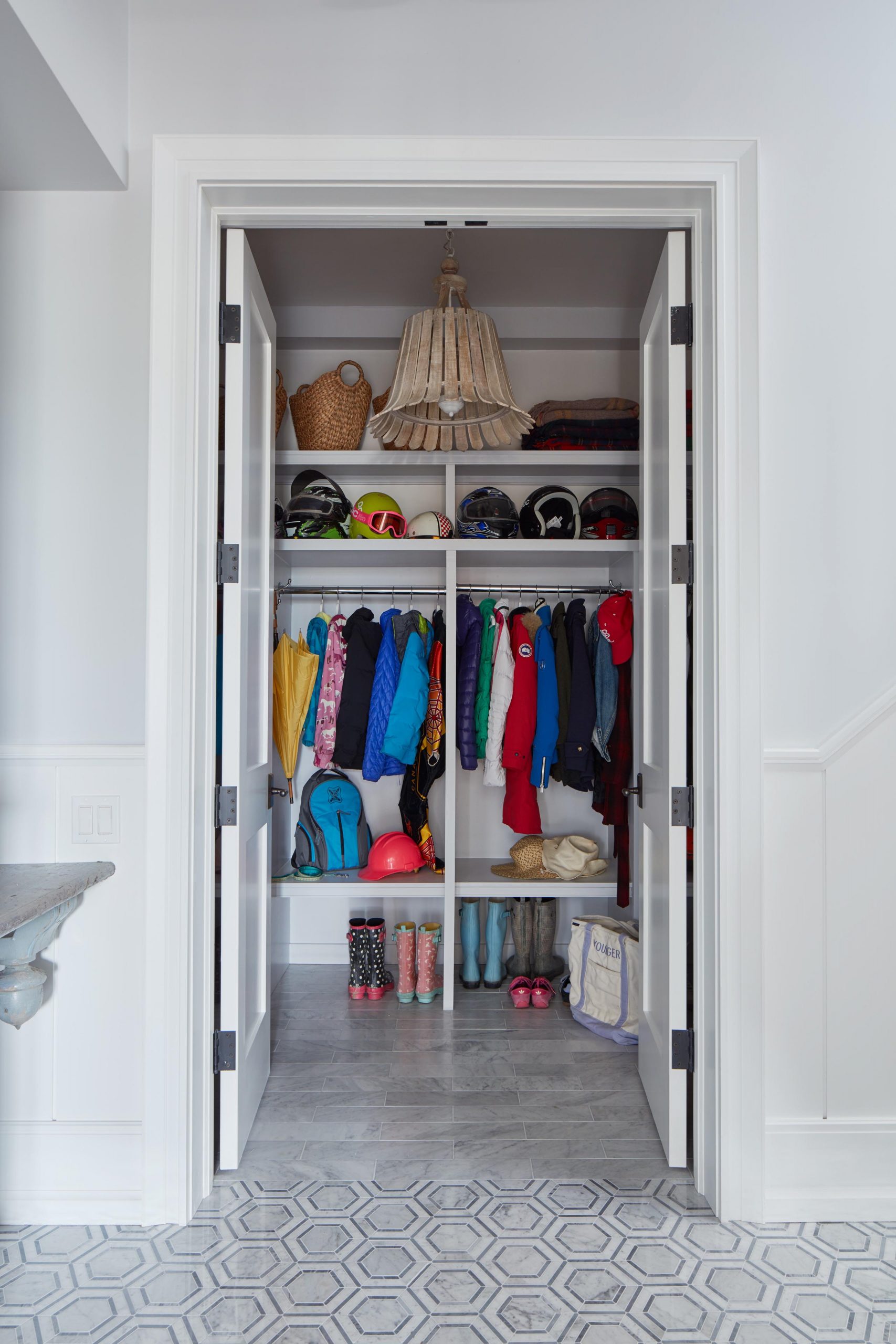
Organized Chaos
Inside those closets are well-managed storage solutions, which in this case means that all of the family’s ski gear can be kept easily tucked away and organized. That’s an impressive feat, when you’ve got a family of four.
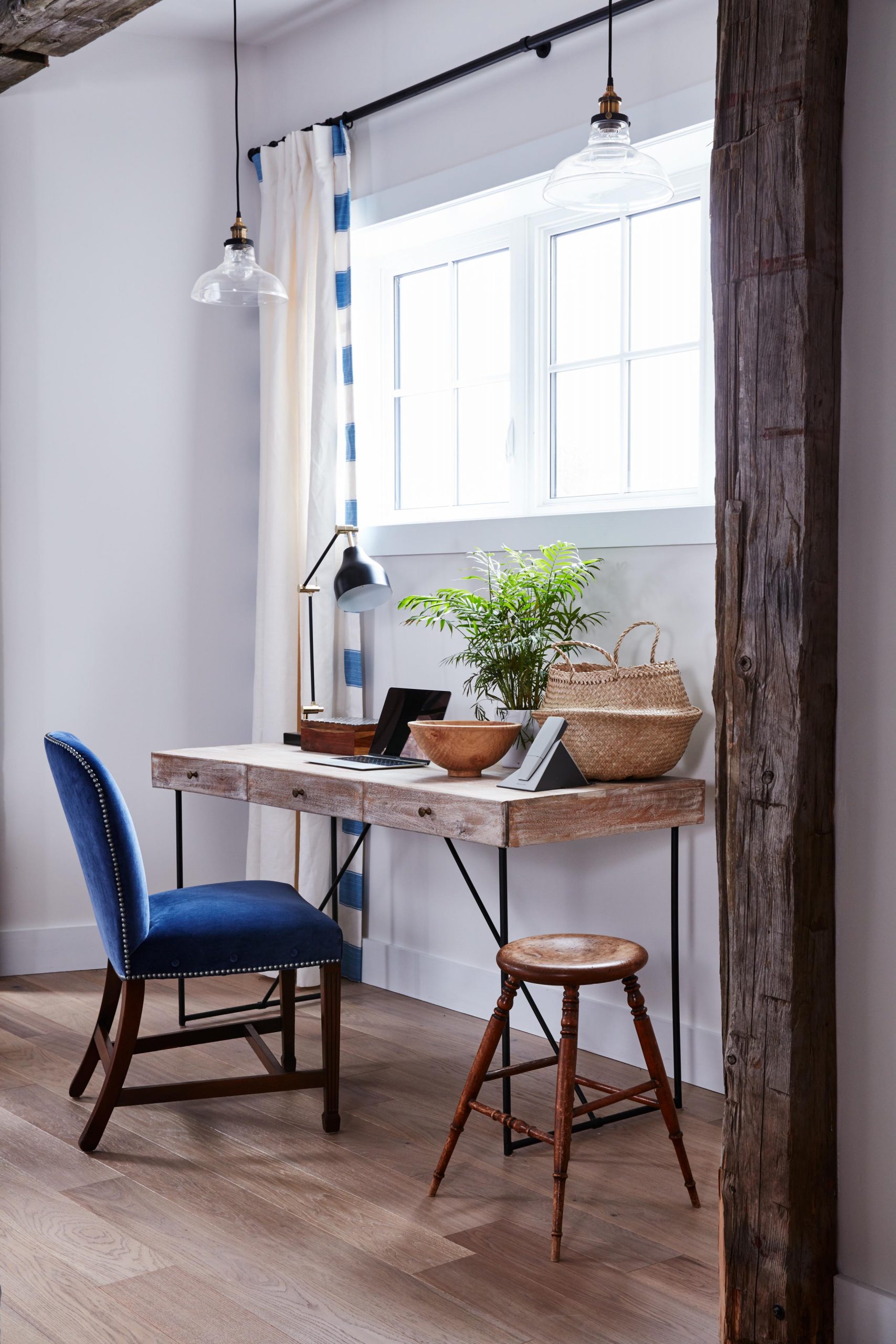
An Office Area
Whether the kids want to hang out with the adults while getting some homework done or a guest wants to sit down and do a little work, this pretty office nook with its brilliant blue chair and wood-finished table is the perfect addition to the rest of the space. Pendant lighting above and a table lamp below ensures this is a well-lit area day or night, while a bonus stool means this is also a place where collaboration can easily happen.
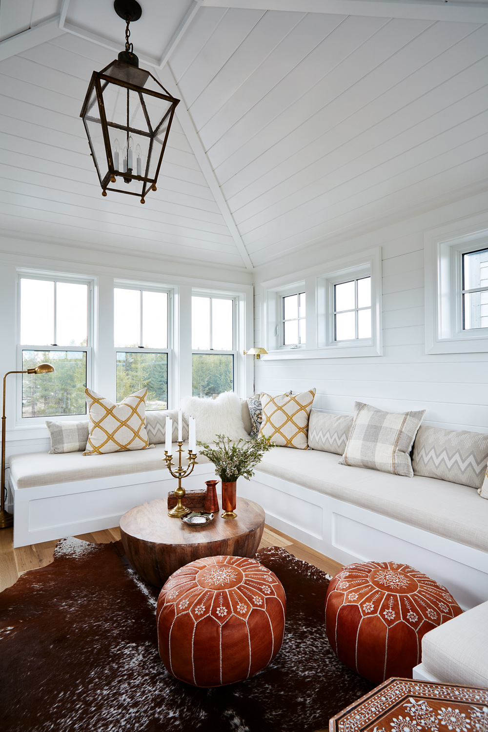
A Real-Life Escape
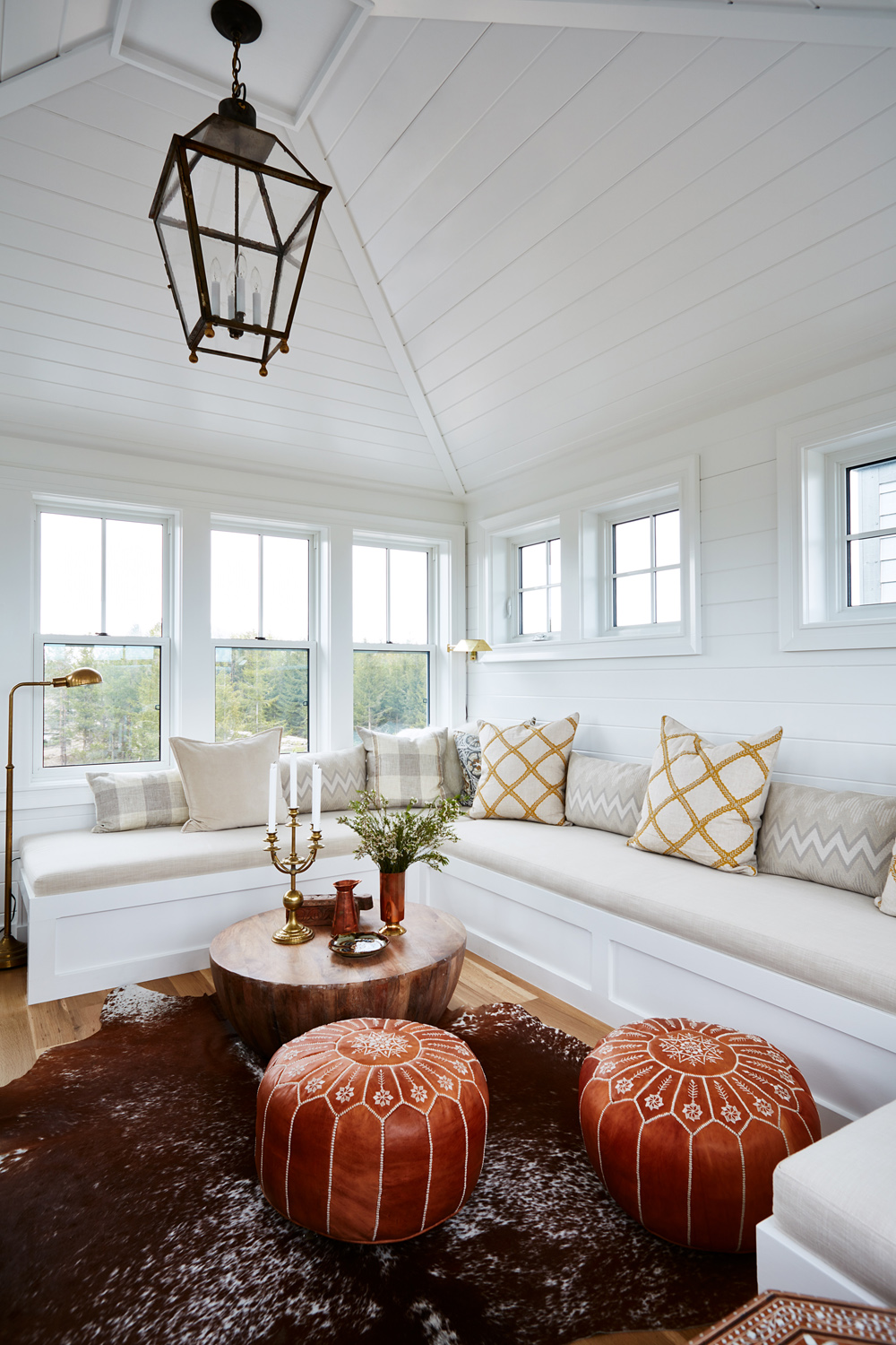
Cathedral ceilings with painted shiplap walls and plenty of windows frame out this space, which is bright, airy and open despite its relatively small size. Because the winding stairs wouldn’t allow for much in the way of furniture to enter, Sarah had this custom bench designed to allow plenty of seating.
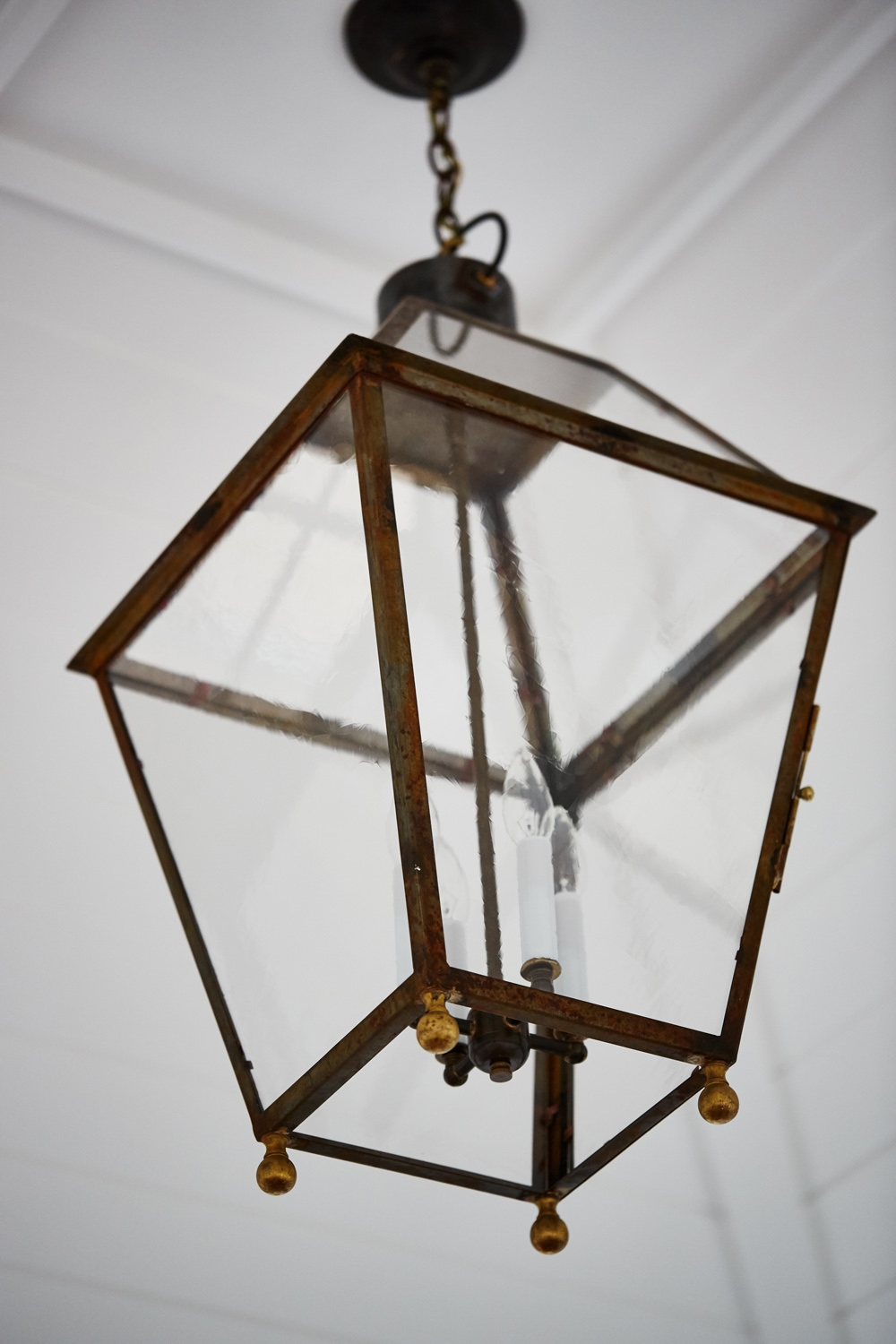
Rustic Lighting
This lantern-inspired pendant light serves as a real statement piece against the high ceilings thanks to its iron finishes and candle bulb interior. It’s just one of several simple, yet rustic touches to the space that makes the room feel like a natural extension of the beautiful outdoors that surround it.
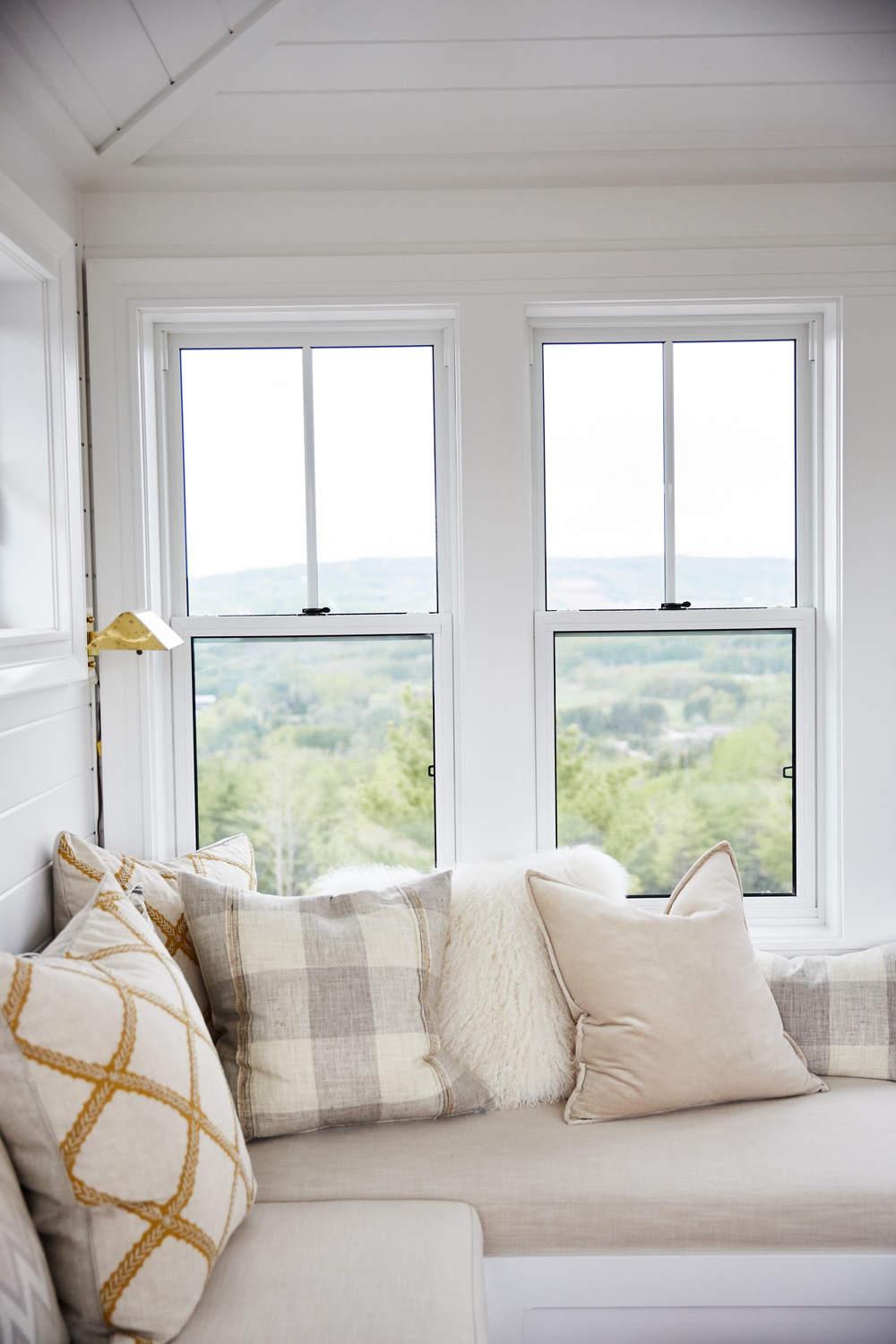
Custom Seating
Because these bench frames are custom-made, the cushions on top of them have been custom-cut as well. The simple, creamy finish ensures that the room stays bright and airy, while plenty of throw pillows in various shades of cream, grey and gold help to elevate the look and create a plush, adult space.
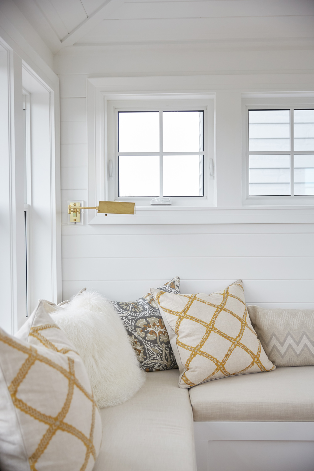
Pops of Metallic
Helping to further draw the eye and create a designer’s touch are small metallic pops of gold and champagne throughout the space. The intricate gold details of the throw pillows are matched by the pretty, antique wall sconce above, which adds a slightly worn-in, well loved aura to the overall design.
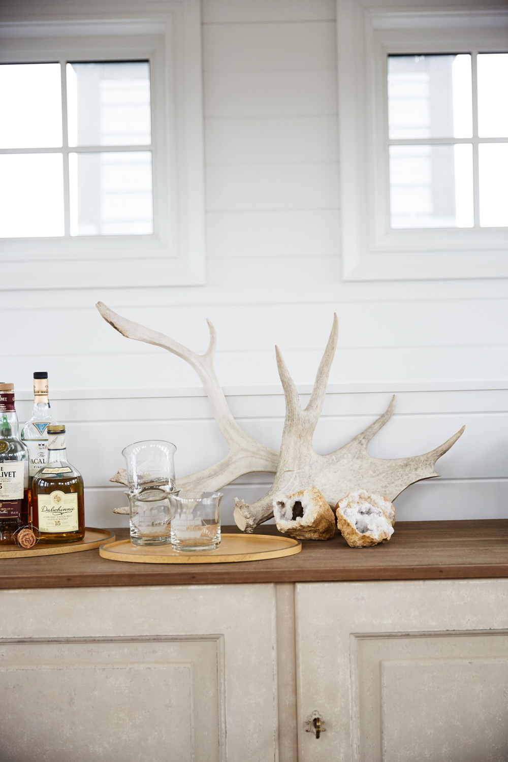
Small Furniture
Although not much in the way of furniture fit up the stairs to get to the belvedere room, a small hutch originally meant for the hallway turned out to be a perfect fit. Its worn wood finish was an easy match for the outdoorsy vibe Sarah was going for in the room, while the piece itself adds just a touch of extra storage and functionality.
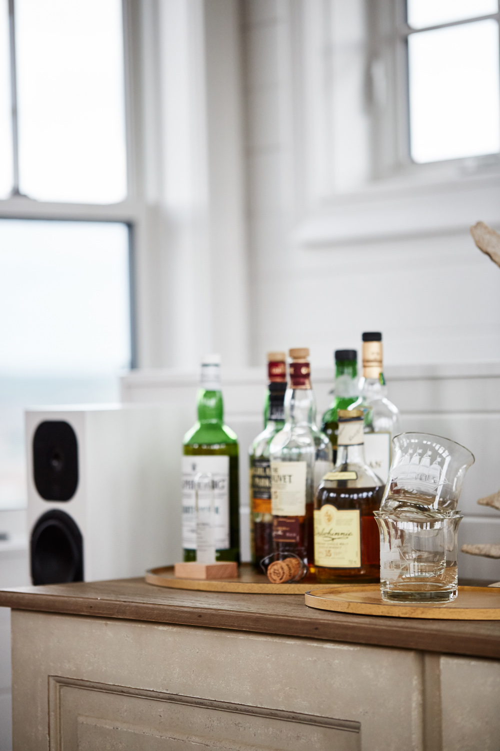
Adult Spaces
The surface of the hutch makes for the perfect minibar, transforming the look into an adult-friendly space where a couple can retreat together and relax after a long day. A couple of serving trays help to keep everything neat and organized, while a small speaker allows for romantic music to play in the background as Sarah and Alex sip away and enjoy each other’s company.
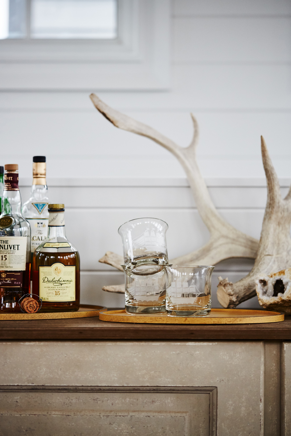
Attention to Detail
Sarah paid the utmost attention to every small detail in this space, and that included the type of glassware she wanted to feature in her belvedere. The etched ships on these particular glasses lend a worldly feel to the space, easily transporting visitors to another place in time.
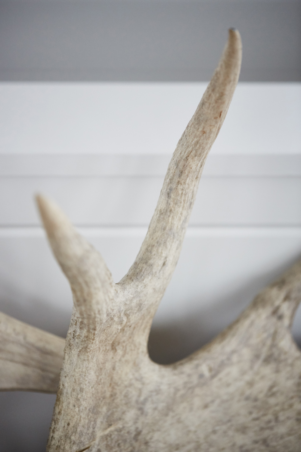
Bringing the Outdoors In
Speaking of attention to detail, Sarah made sure that every single decor item had purpose and feeling. That included this antler on the bar, which packs a real design punch as it brings more of those outdoor elements into the space.
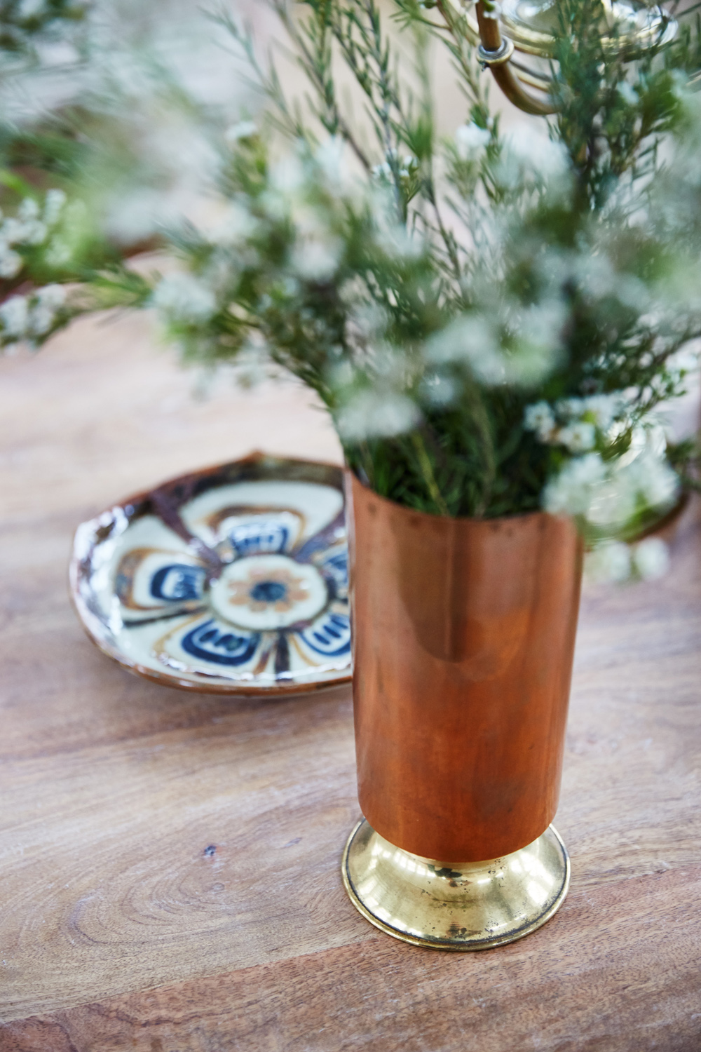
Copper Finishes
More of those metallic finishes can be seen on this pretty vase, which combines worn copper and gold for yet another worldly touch. Fresh sprigs of flowers tone down the look and make it purposeful, while a small dish with matching details adds just a small pop of colour.
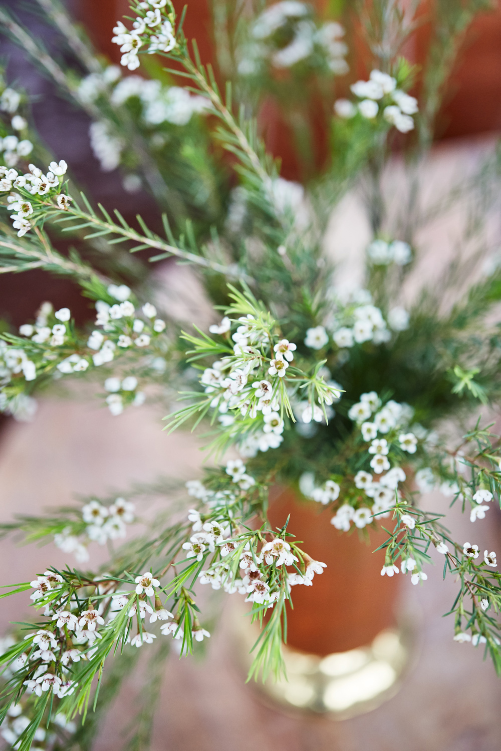
In Full Bloom
These small sprigs are simple and elegant, but they add quite the statement to the room. The best part is that they’re versatile depending on Sarah and Alex’s mood, and can be used to showcase the different seasons as the couple settles into their new home.

Plugging In
Just because Sarah and Alex are going off the grid doesn’t mean that they’re completely unplugging; this vintage speaker adds even more functional charm to the space while helping to set the room’s overall tone.
Matching Accessories
Adding a bit more depth and dimension to the room are these colourful champagne ottomans and a matching coffee table in a warm stain. Atop of the textured area rug it’s a bold but simple look that draws the eye and transforms the belvedere into a cozier, more romantic space.
A Touch of Luxury
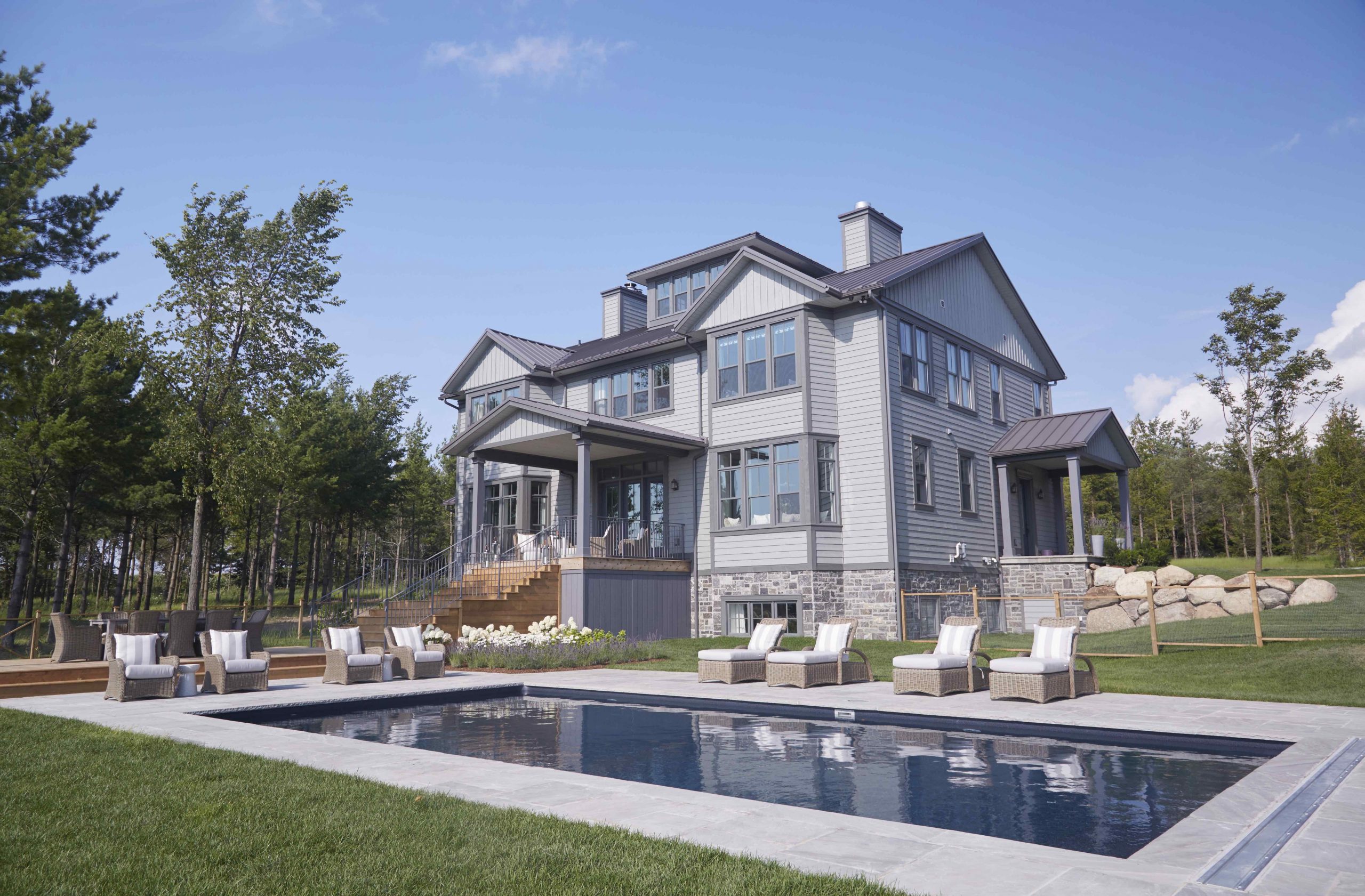
Serene, grand and surrounded by all of the nature Creemore, Ontario has to offer, the view from the back of the house is just as beautiful as the front.
Take a Dip
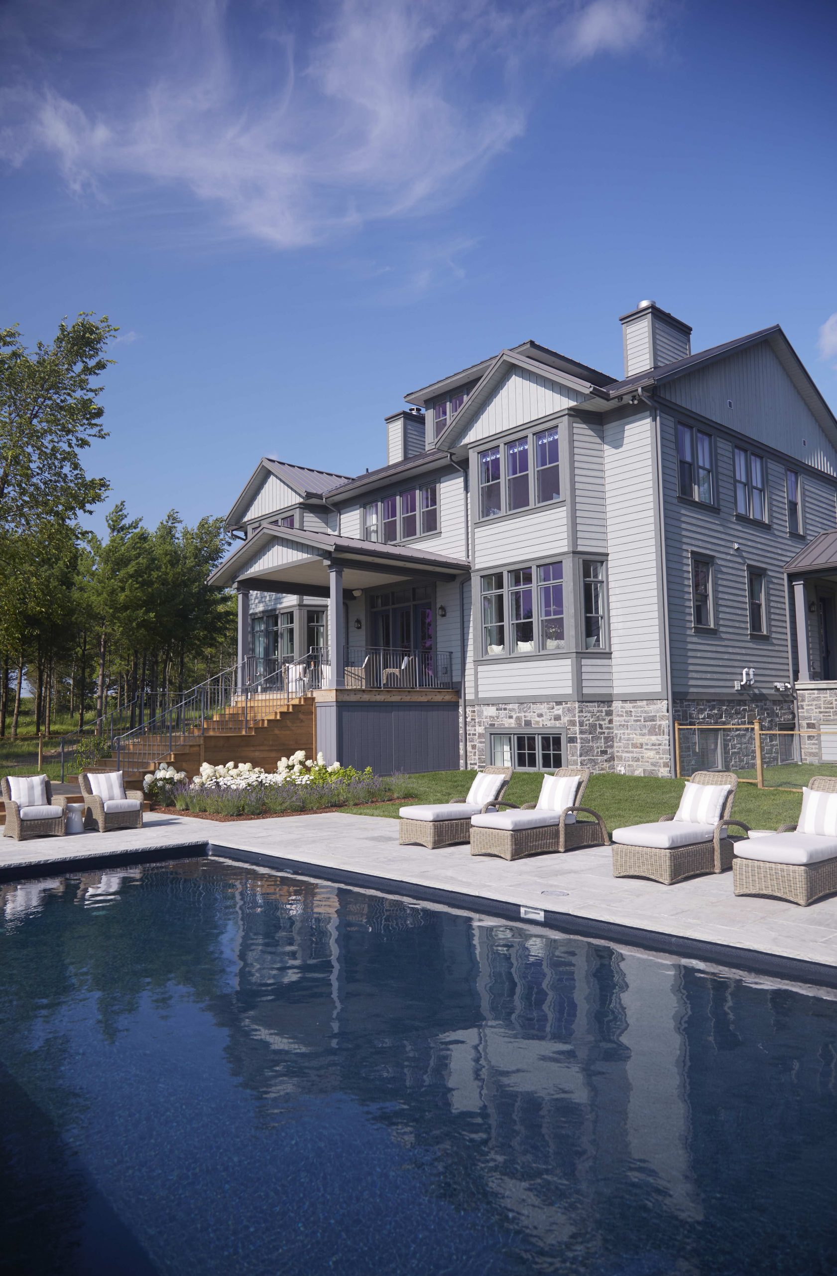
Swim laps, host pool parties or simply lounge out in this beautiful backyard that boasts ample deck space and a large pool that’s perfect for swimming or soaking.
Rustic Vibes
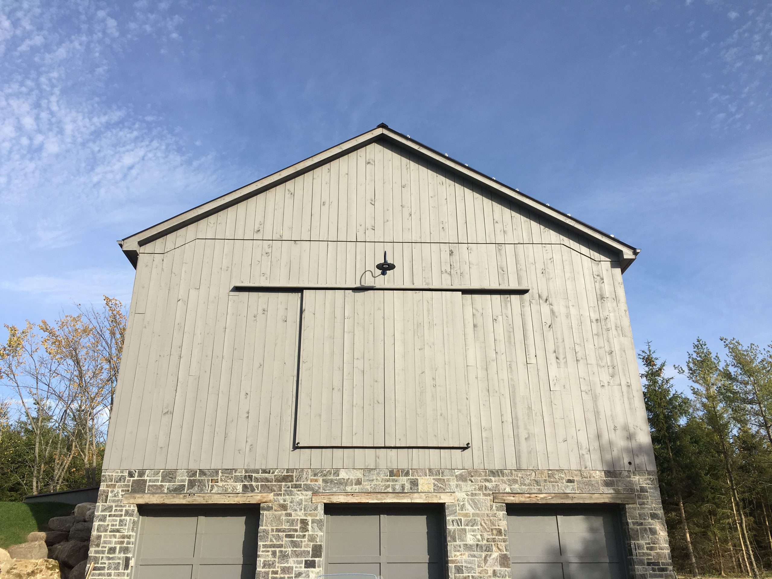
Sarah spent time picking out the perfect stones for their new barn, which match perfectly with the grey exterior walls.

A Country Barn
Sarah and her husband Alex, also built a barn and wanted it to have an original farm-feel, which is why she included the stones a quarter of the way up.
HGTV your inbox.
By clicking "SIGN UP” you agree to receive emails from HGTV and accept Corus' Terms of Use and Corus' Privacy Policy.


