After nearly a decade with no improvements or updates to their main floor living space, Raj and Riva were ready for a new look. But when the quotes for their tired kitchen and living room combo began coming in at upwards of $80,000, this couple knew they needed help. Enter designer Sabrina Smelko and contractor Sebastian Clovis of Save My Reno. Thanks to a little creative reconfiguring and smart upcycling, here’s how they were able to save this family more than $20,000 on a gorgeous new kitchen and living room with tons of storage space.
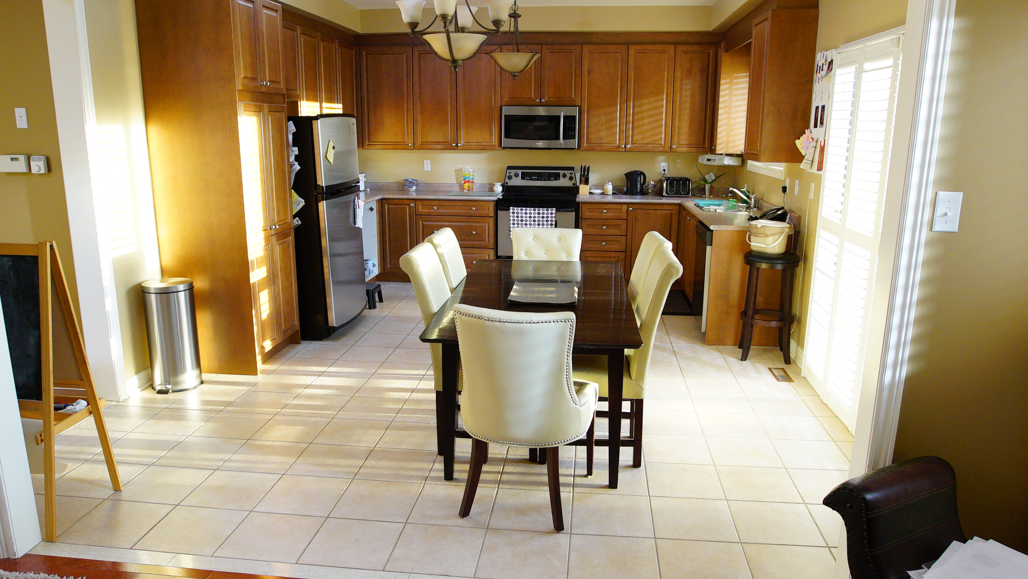
Before: Dated and Dark
A decade ago this kitchen would have been state-of-the-art. But now with tired tiling, drab cupboards and an awkward layout that didn’t exactly allow for easy entertaining, the heart of this home needed a little resuscitation.
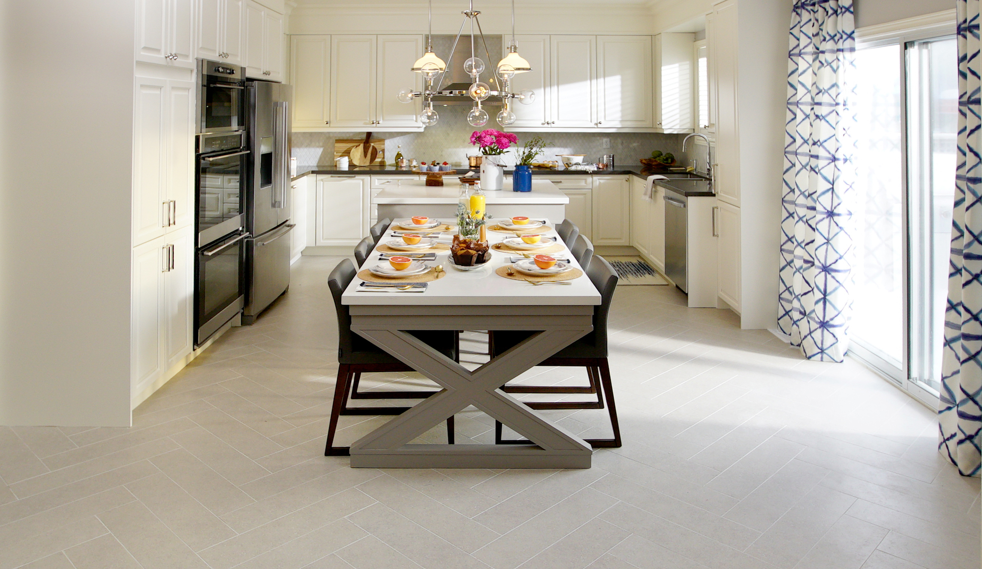
After: A Bright Oasis
Thanks to some paint these cupboards — which were in excellent condition — feel brand new and modern. A new herringbone tile below helps the space feel bright and airy, larger appliances are way more functional, and an island with an extended table ensures there is plenty of space for the whole family to hang out in.
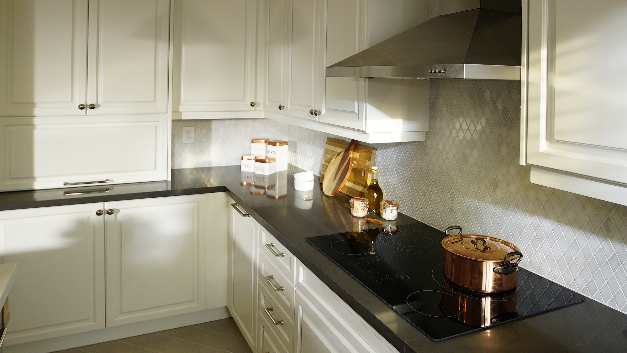
After: Storage Central
Because they saved so much money by upcycling the old cabinets, Sabrina and Sebastian were able to install high-end storage solutions in the cupboards, giving Raj and Riva tons of organization. Meanwhile dark new quartz countertops were the perfect colour choice to add some dramatic depth, playing off the new, diamond backsplash.
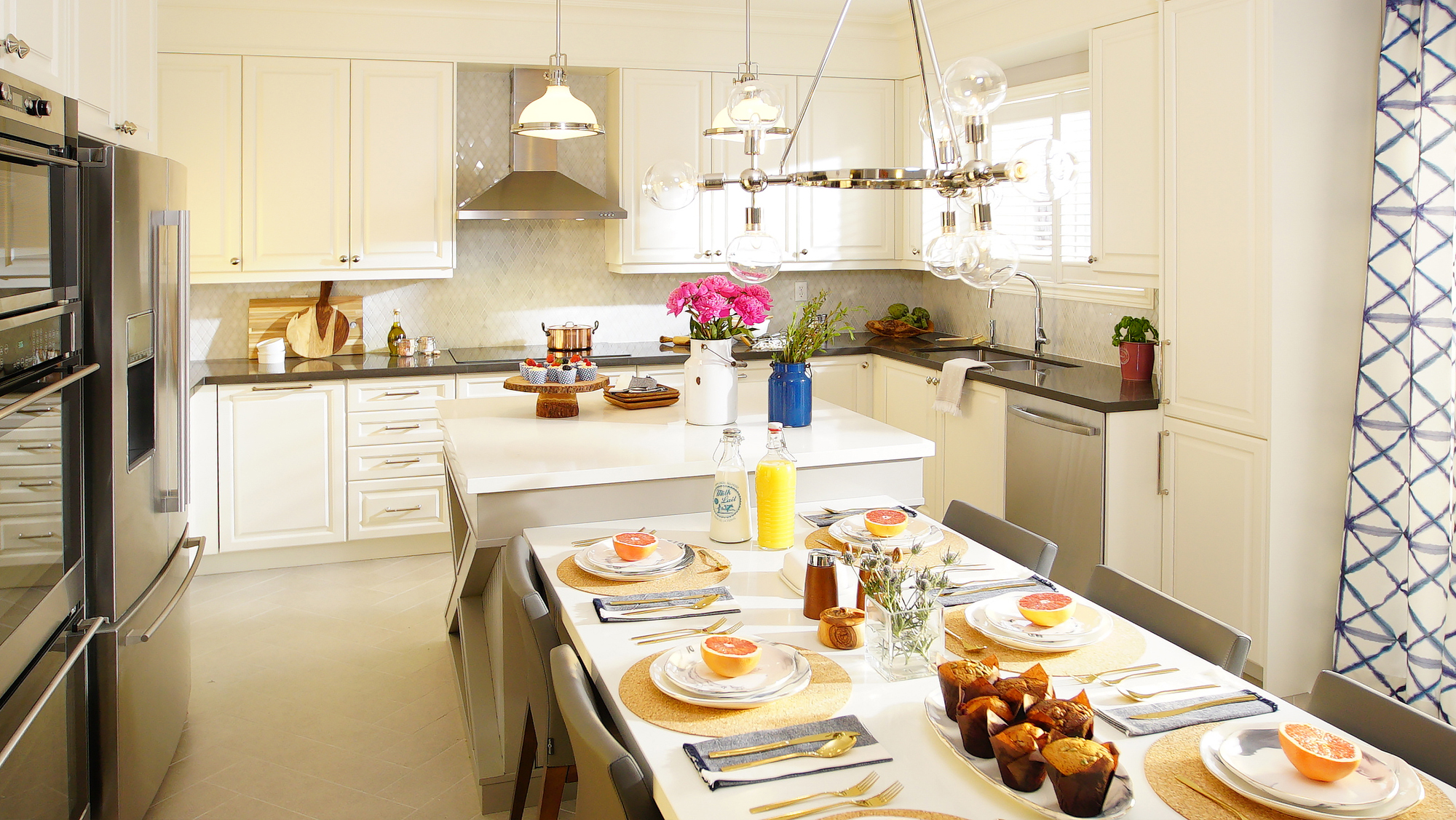
After: Extended Dining
By installing a small centre island Sabrina and Sebastian gave the homeowners a spot to prep food without turning their backs on guests. The piece also adds bonus storage potential thanks to cabinets below. Meanwhile the extended table feels like a natural part of the kitchen, creating an easy flow.
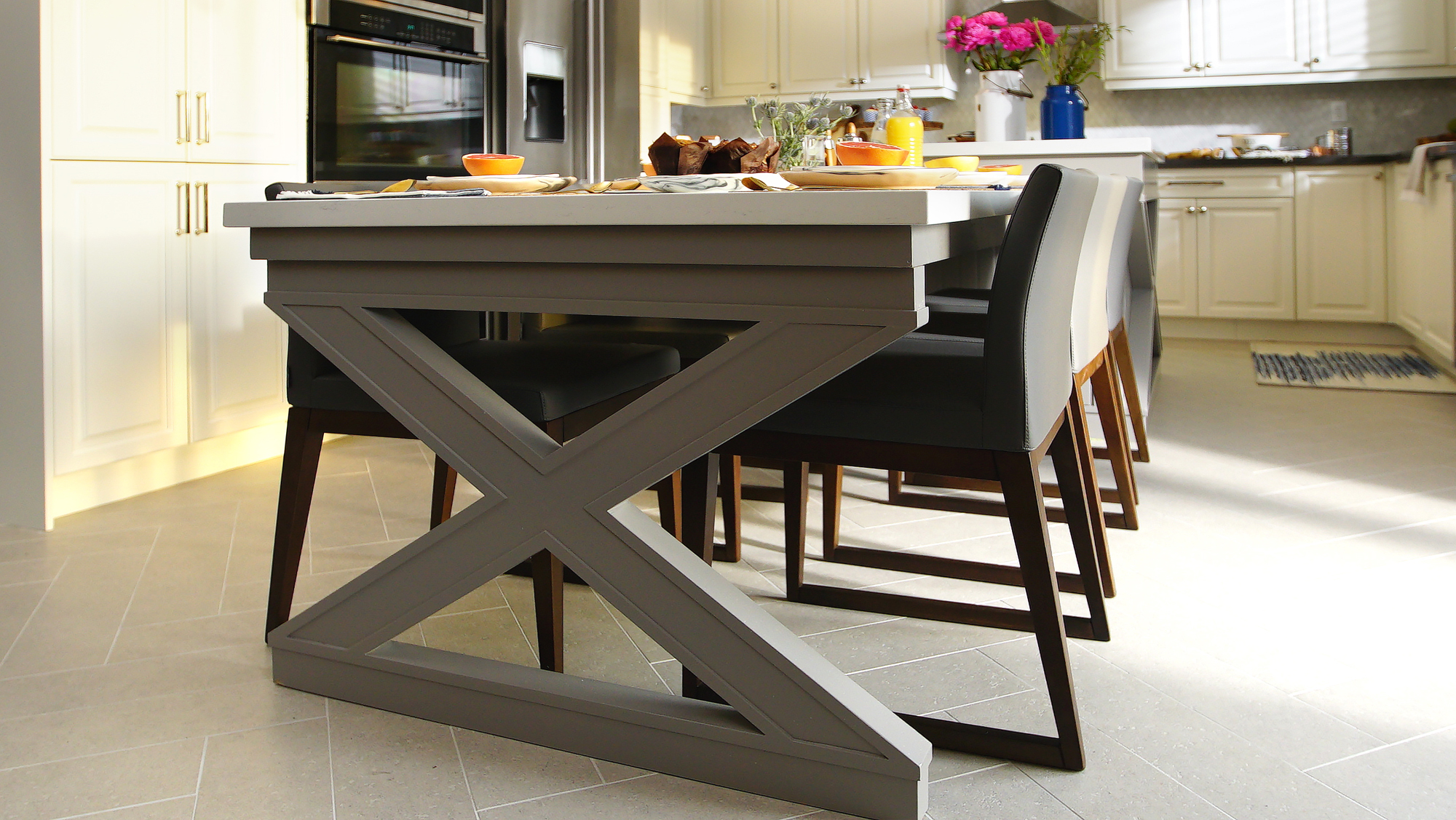
After: Beautiful Finishes
The custom woodwork on the end of table feels contemporary and fun, and ties into both the woodwork on the other side of the island and the diamond-shaped backsplash. It’s small finishing touches such as these that help create a flow between the different elements of the room and lend personality to the space.
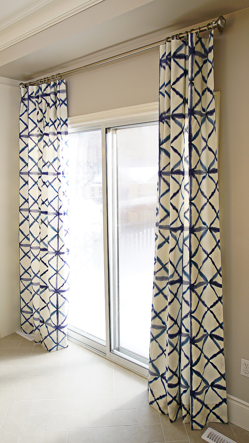
After: Pops of Colour
In a smaller space that you may want to update in the future, it’s important to stick to neutral finishes that add brightness and quality. Then you can personalize the look with pops of colour through the textiles and design elements the way Sabrina did with these curtains. The blue ribboning adds just enough colour to make this space feel fresh, giving it that extra little design boost.
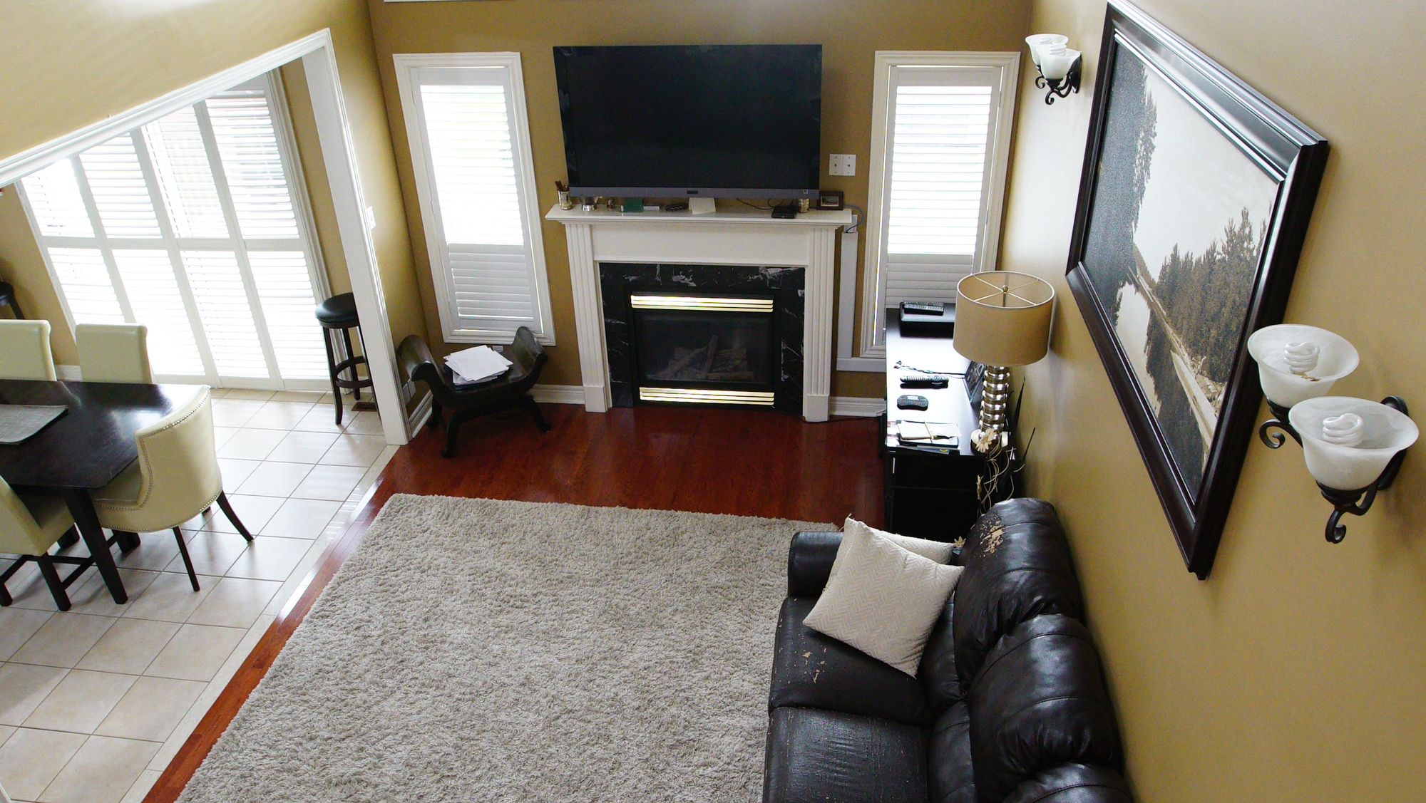
Before: A Disjointed Room
Meanwhile the old living room was just as tired as the kitchen thanks to an outdated fireplace with dark marble and gold trim. The mustard paint job didn’t help the situation either.
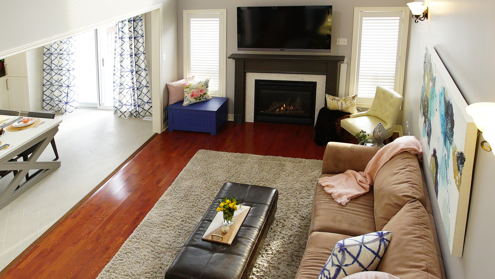
After: A Little Facelift
Here’s another classic example of upcycling that saved the homeowners thousands: by removing the fireplace frame, installing new tiles and giving it a fresh coat of paint, the mantle feels modern and new.
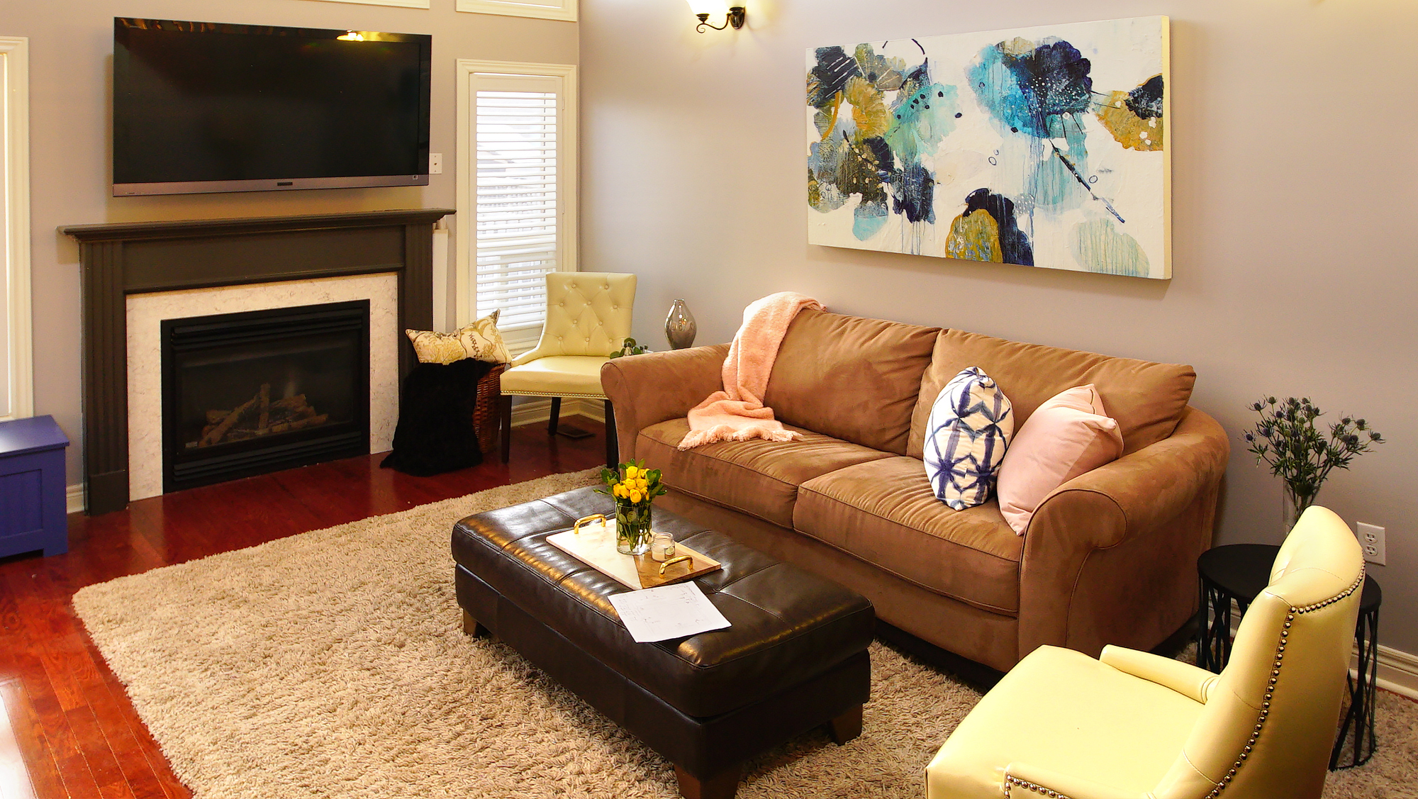
After: Simple Staging
Sebastian and Sabrina kept the hardwood floors in this space, but they helped create a better flow with an oversized area rug and lighter furniture that plays up some of the contemporary elements in the kitchen. Meanwhile the softer paint colour opens up the room and makes it feel fresh. Now this is a great space to entertain guests or hang out with the fam-jam.
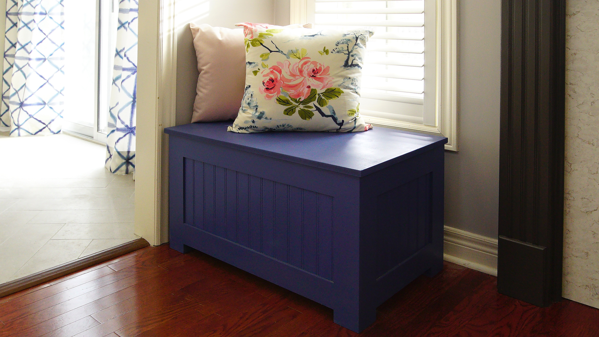
After: A DIY Bench
This beautiful DIY storage bench cost about $60 in materials but it packs a huge design punch. The beautiful blue hue plays nicely off the blues from the kitchen, helping to tie the two spaces together. Inside there’s plenty of storage room too, making this a beautiful and functional piece.
HGTV your inbox.
By clicking "SIGN UP” you agree to receive emails from HGTV and accept Corus' Terms of Use and Corus' Privacy Policy.


