Samantha Pynn and Sebastian Clovis are back for another exciting season of Save My Reno. The dynamic duo make reno dreams a reality without breaking the bank. By getting the homeowners involved, their renos become a family affair. Add in smart spends, upcycles and creative designs and you have one of HGTV Canada’s favourite series.
Save My Reno airs on HGTV Canada Tuesdays at 9 and 9:30PM and is streamed live on STACKTV which is available through Amazon Prime.
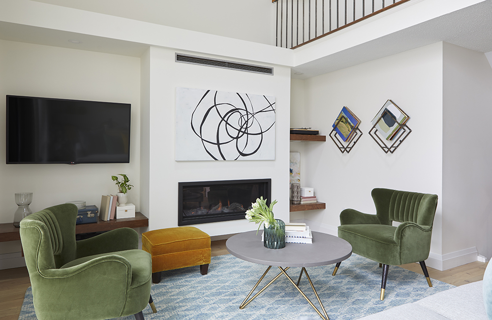
Cool and Comfy
The Save My Reno team was called in to update Sue’s dated kitchen and dining space. What she got was a lot more than she bargained for. This living space, adjacent to the dining room, has been updated with furniture that replaces an oversized 70s couch and chairs. Tasteful artwork and a funky DIY record holder that Sebastian created using left over railings adds a real cool-factor. A light oak flooring used in this space, the kitchen and dining room lightens up the rooms and adds a sense of cohesiveness to all the rooms.
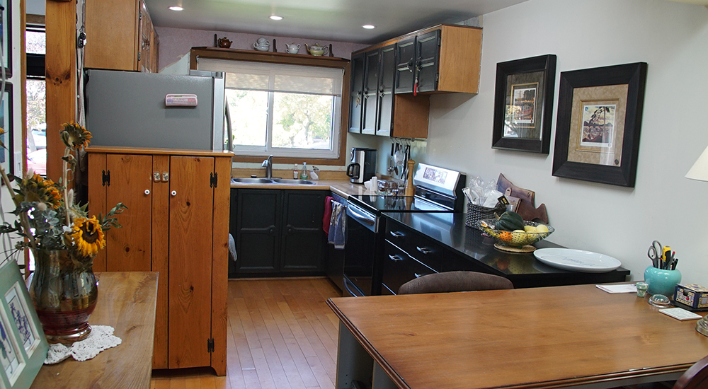
Before
Most people loved the 70s but that era is gone. However, this kitchen didn’t get the memo and got left behind! The layout was awkward and there was no flow. Sue used an inheritance from her mother to fund this reno so the pressure was pretty high. A click through to the next slide, will let you know if they succeeded.
Related: Some of the Worst Things Scott McGillivray Has Come Across Homes in Canada.
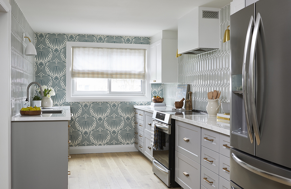
Light and Bright Kitchen
Sue’s reaction to this renovation was emotional (aka tears!), and with good reason. The kitchen is now light and bright. The wallpaper and backsplash tag-team to lift this kitchen to a new level of luxe. A larger fridge and an induction range make cooking and food storage a dream. Off-the-rack cupboards were customized by Seb to give them a bespoke look. Good-bye 70s!
Related: Watch a guided reveal tour of the space with Sam Pynn!
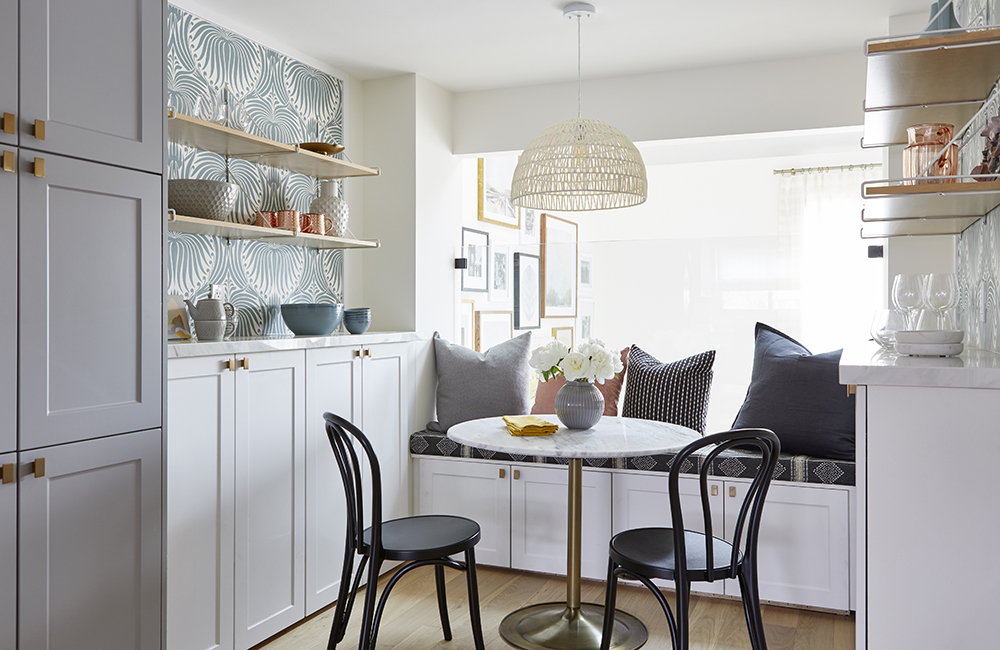
Balcony View!
Previously, Sue and her daughters crowded around a mid-sized kitchen table to eat their meals. It was a tight fit. To help alleviate this issue, Seb and Sam decided to create a dining room from an under-used space just a few steps below the kitchen. Seb and Sue’s daughters, Lee and Andy, built the banquette bench to add storage and seating space for this smaller table where they can continue to have more informal meals. A glass half-wall that replaces dated railings and allows better sightlines into the dining room and living room. This home has its flow back!
Related: Watch Sebastian make budget-conscious bespoke cabinets.
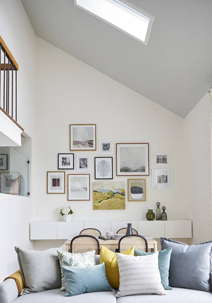
Dining Room Under the Stars
And here is the dining room! Just off the living room, this dining room gives a great space for entertaining. The high ceilings are accentuated by artwork that draw the eye up. On the ceiling are skylights that allow light to enter and heat to escape (they also close automatically when it rains). Another triumph for the Save My Reno team.
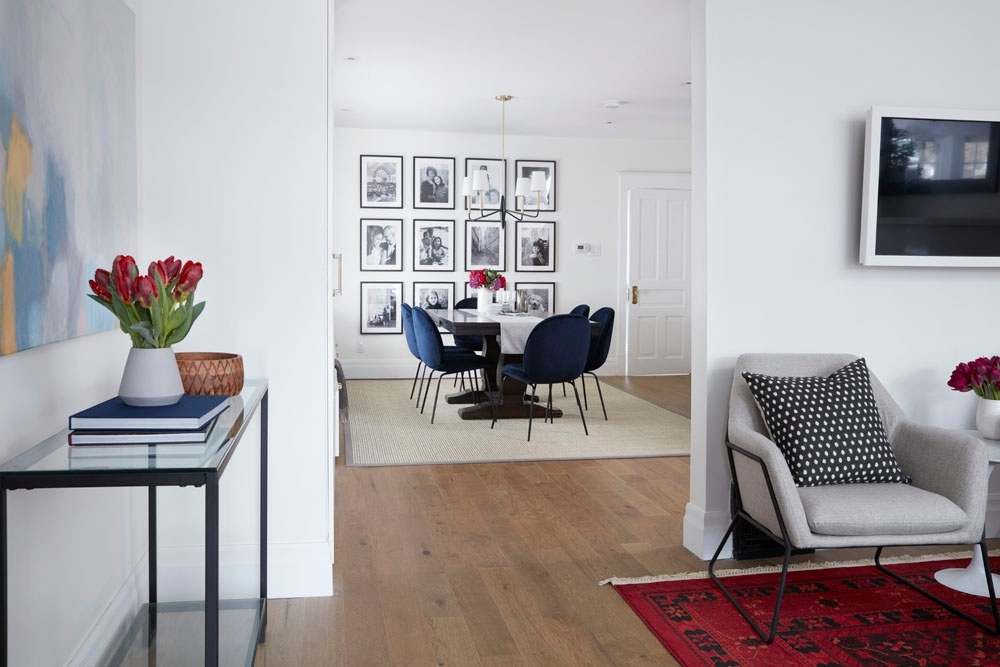
Decluttered Design
Michelle and Fred were excited to tackle home renovations, but after an unexpected health scare, the couple’s plans came to a halt. Now that Michelle is back on her feet, the couple knew they needed some extra help redesigning and renovating their main space while sticking on budget. Eliminating clutter and having a comfortable place to relax and unwind together with their two growing kids was essential to make their house feel like a home.
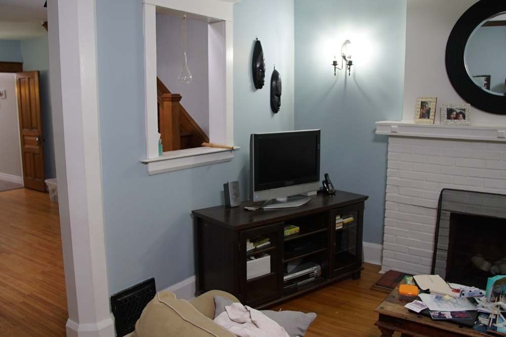
Out With the Old
Michelle and Fred’s old living room had an awkward opening in its wall that felt distracting and didn’t serve a purpose. By closing up the wall, Sebastian was able to mount the TV on the wall and maximize the space of their living room.
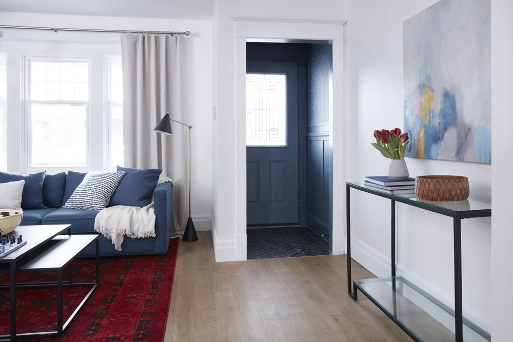
Stylish First Impressions
A welcoming entryway was just the first step into creating a more organized main floor for Fred and Michelle. New trim work and coordinating herringbone wallpaper make for an inviting foyer that feels connected and flows with the rest of the space. Note the battered old flooring has been replaced by this lighter and durable flooring.
Personalizing Your Place
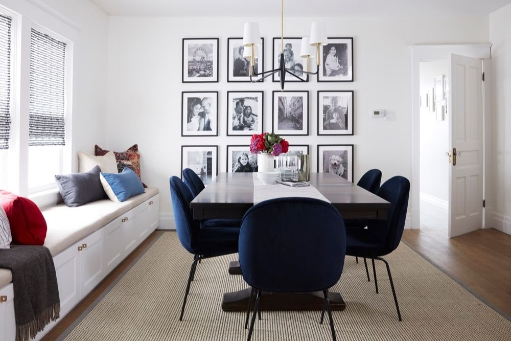
Making a house into a home is all about the details. The Save My Reno team added a gallery wall featuring a dozen black and white family photos for a personalized touch. Sebastian’s custom-built storage bench also doubled as extra seating, which is perfect for entertaining. Paired with new modern navy chairs, Michelle and Fred’s existing dining room table now looks bright and classy.
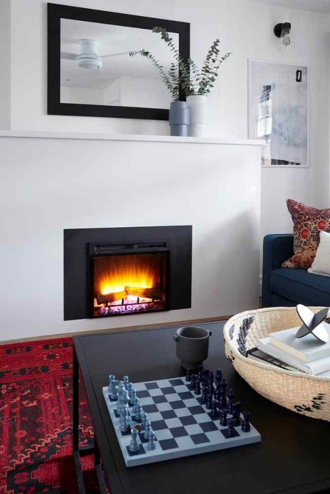
Table Top Fun
Using the main floor’s new colour palette as inspiration, Samantha and Michelle created a stylish DIY chess set that doubled as decoration in the family’s new living room.
Study Nook Solutions
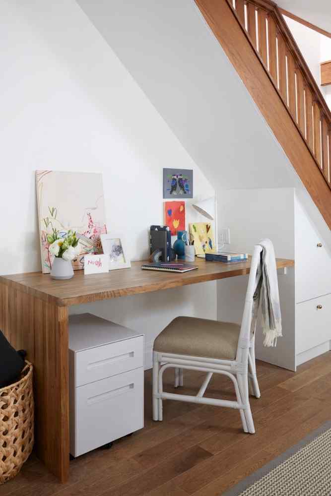
The Save My Reno team created the kids’ own study nook by the staircase, complete with beautiful custom built-ins for all their school supplies. New sky tunnels added much more natural light into their space without having to invest in new windows.
Watch a guided video tour with highlights from this Save My Reno reveal.
Picture Perfect
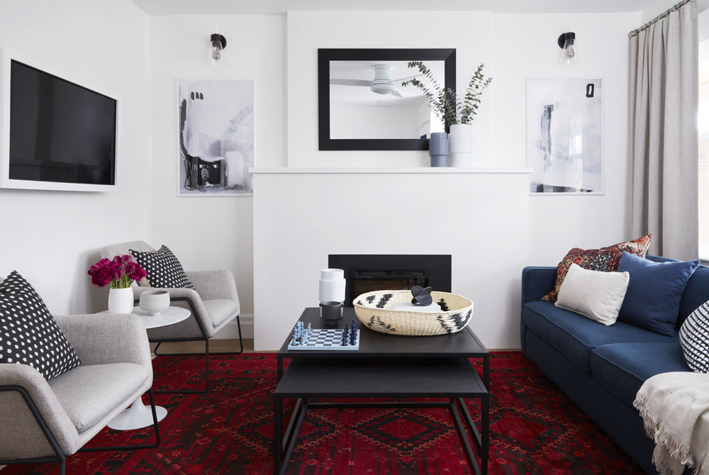
Picture frame TVs are all the rage, but they’re not the most budget-friendly choice. Sebastian created a custom frame for Fred & Michelle’s newly mounted TV, which gave their living room a luxury look for less. Another reno completed on budget and on-trend!
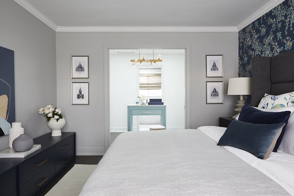
Magnificent Primary Suite
Sebastian Clovis and Samantha Pynn did an incredible job with this second-floor overhaul. Kristen and Alex’s second-floor was a collection of disjointed rooms that didn’t work with their lifestyle. Seb and Sam took the space and created a place tranquility where the homeowners can recharge. This lux update to their second floor now matches the renos done in the rest of their home. And this reno didn’t cost a fortune due to some smart suggestions from the Save My Reno team.
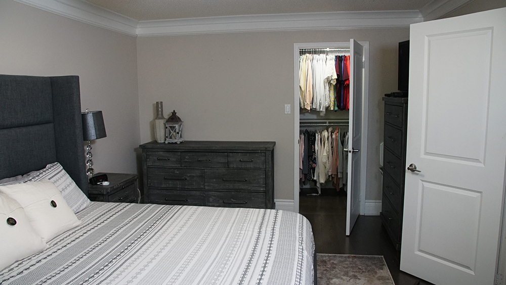
Before the Reno
At first glance, Kristen and Alex’s bedroom was beautiful. But upon closer inspection, it definitely needed Seb and Sam’s expertise. The bed was too big for the space, while the en suite was the opposite and was too small. Then there was the couple’s extended walk-in closet – which led to Kristen’s office. It was a dysfunctional, tight maze that simply didn’t work.
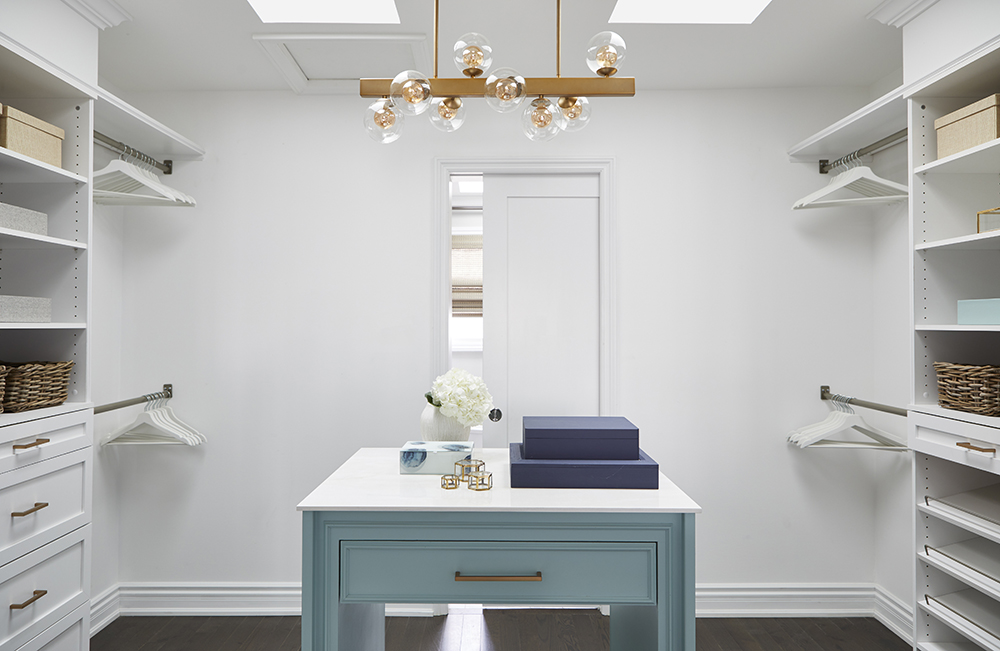
Luxurious Closet
This is the closet every clothes horse dreams of, complete with loads of hanging and storage space. The island in the middle serves as both a place to sit and a pullout drawer that could hang pants. It was topped off by two spectacular skylights that brightened up the majestic space.
Watch: Sebastian demonstrates how to make this DIY closet island!
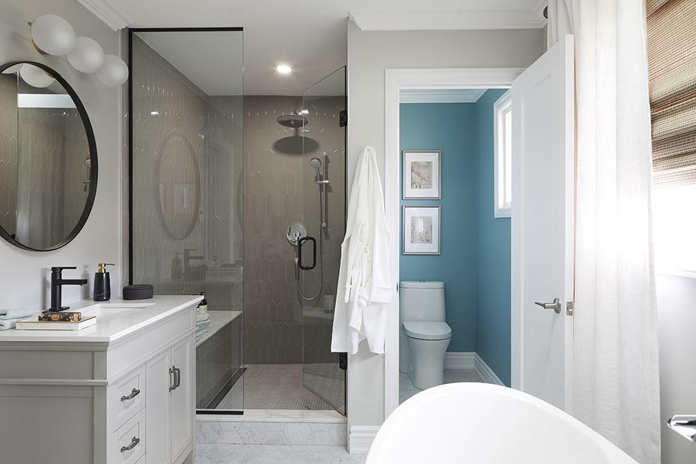
Triple the Bathroom
Kristen and Alex went from an en suite the size of a postage stamp to a bathroom takeover. Seb kept the reno costs down by keeping the plumbing where it was and now their two separate vanities, soaker tub, shower space and water closet spanned the space where their bedroom once was.
Like what you see? Shop the look using our Resource Guides for this and all Save My Reno episodes.
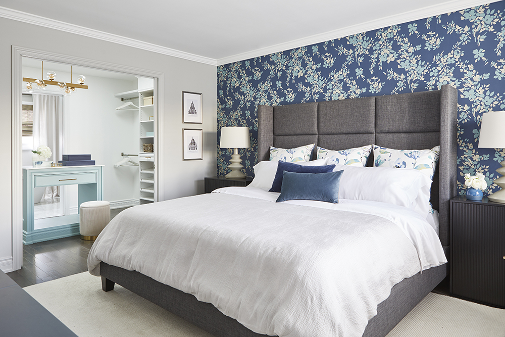
Luxury Bedroom
Repurposing the massive bed saved the homeowners some money but how do you make such a big structure not dwarf a room? With a dark, floral accent wall, of course. That wallpaper did wonders to somehow make the bed seem less imposing and truly suit the space – that Kristen used to call her office. To sum up, the bathroom took over where the bedroom was, the bedroom moved to where the office was, and the maze of a closet was opened up to a more usable, amazing space.
Related: Want more? Watch the full length episode on HGTV.ca.
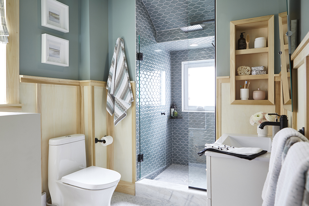
Shower Power
Melissa and Ben’s old home had a lot of character, but the upstairs bathroom was a bit of a disaster and was lacking a shower. Melissa had been using the downstairs shower for 12 years and she’s tired of it. Enter the Save My Reno team. Sebastian and Samantha gave this family of four the bathroom of their dreams, by not only getting rid of their old tub but also making it function better. Adding in the bright shower and giving the illusion of height made the whole space look and feel bigger. More good news: The reno didn’t break the bank.
Have you entered our Save My Reno giveaway contest? Get all the details here.
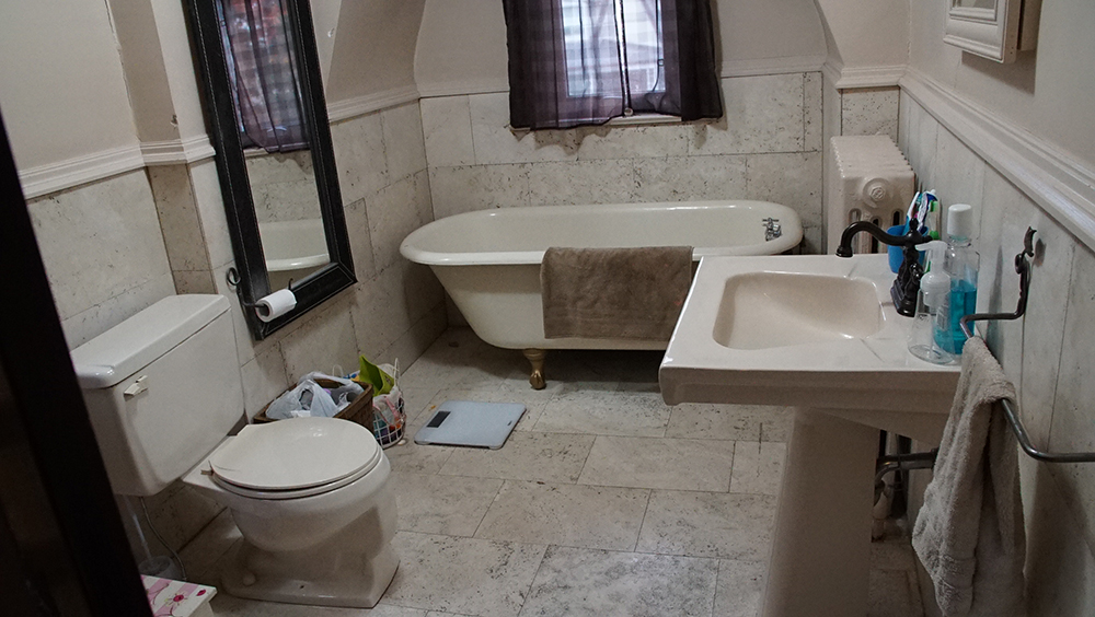
Before the Reno
Because of their budget, homeowners Melissa and Ben had to choose between two renovations and their bathroom won. The only thing worse than a small bathroom is four people sharing it. In fact, all the family members would go all the way down to the basement to fight for shower time. Sam and Seb knew that had to stop.
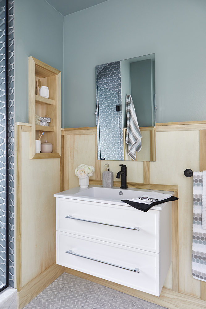
It’s (W)all in The Details
Because the Save My Reno team couldn’t make all of Melissa and Ben’s reno dreams come true, they were able to focus more on the bathroom and provide even more storage than the homeowners had dreamed of. This new vanity added counter space and drawers under the sink, as well as bonus inset shelving on the wall next to the sink. Seb echoed the wainscoting that was already in the architecture into the bathroom, but set it a little higher to add even more depth.
Storage Solutions
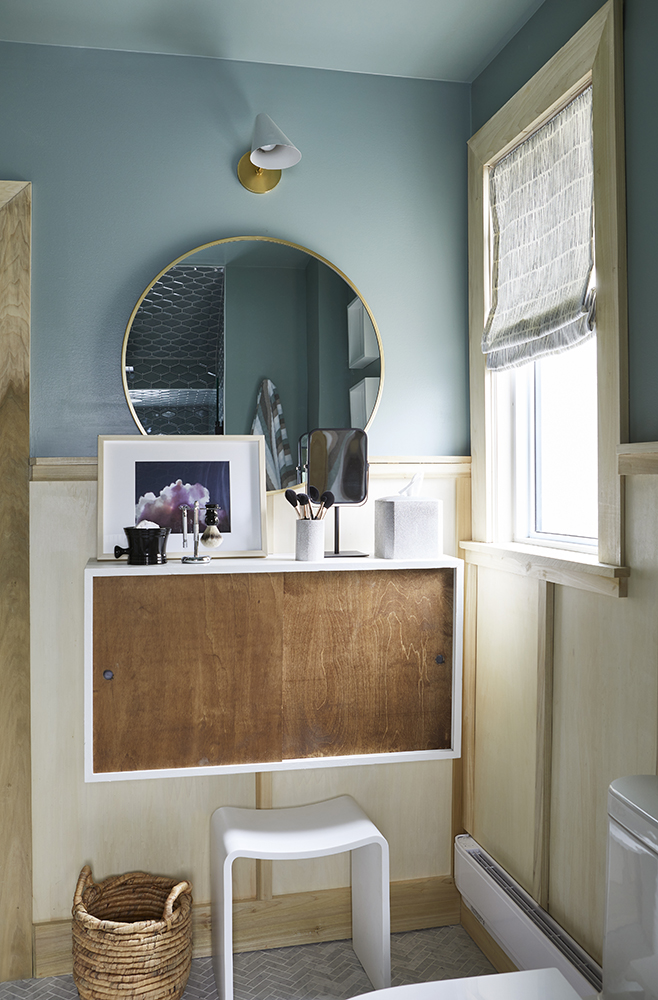
Seb and Sam created more storage by creating this gorgeous floating unit with sliding doors. It also doubled as a vanity and make up counter. Let’s just stop and admire the gorgeous blue paint Sam chose for the walls.
Related: Watch Sebastian show you how to build this DIY unit!
Tall Stall
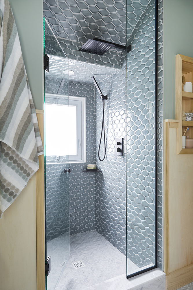
Seb and Sam really maximized the height of the bathroom ceiling by continuing the colour of the walls to the tiles, to visually elongate the shower. By tiling all the way up and allowing for light to be brought in from the existing window (but now frosted for discretion!), it added a brightness to the entire space that was previously lacking. Insulation was added to cut down on their heating bills while also helping with soundproofing. All in all, they transformed the small space into something beautiful, functional and classic.
Colour-Filled Space
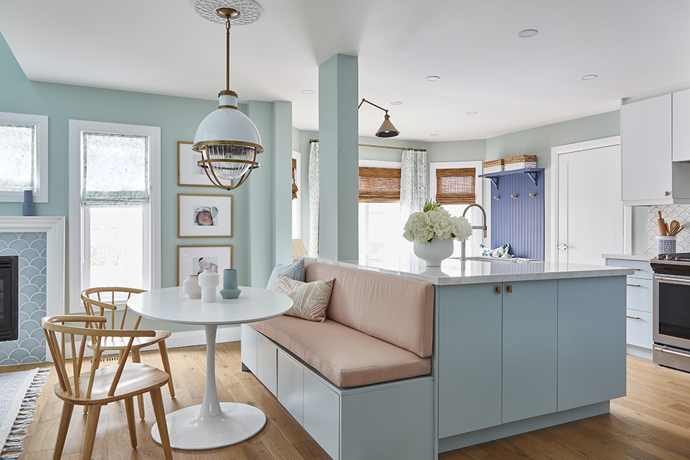
With an entire main floor to tackle, leave it to Samantha Pynn and Sebastian Clovis to handle it all with ease. The basic beige throughout needed to go and, instead, match homeowners’ Maricris and Francis’ love of colour. The calm yet bright ocean colours were a perfect choice.
Related: Sam Pynn shows you how the Save My Reno team created lots of storage space for this growing family.
The Stuff of Kitchen Nightmares
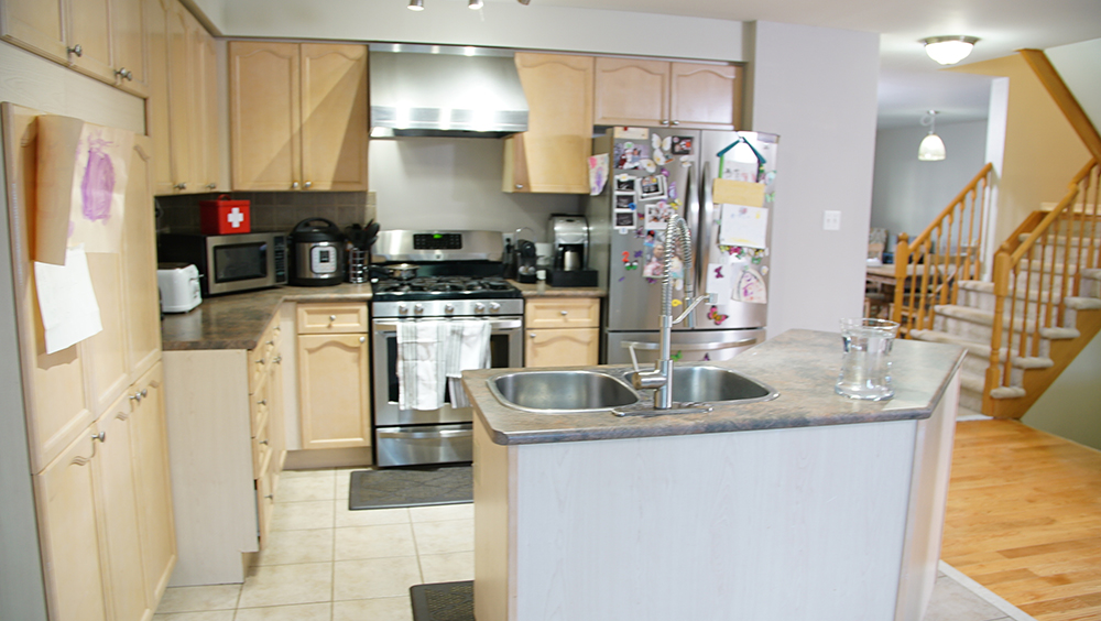
The oddly shaped island. The badly placed pillar. The lack of cabinets and counter space. And even more beige. Blah, blah, blah and more blah. With two young daughters and another child on the way, Maricis and Francis needed all the reno and design help they could get. And who better than Sam and Seb to come to their rescue?
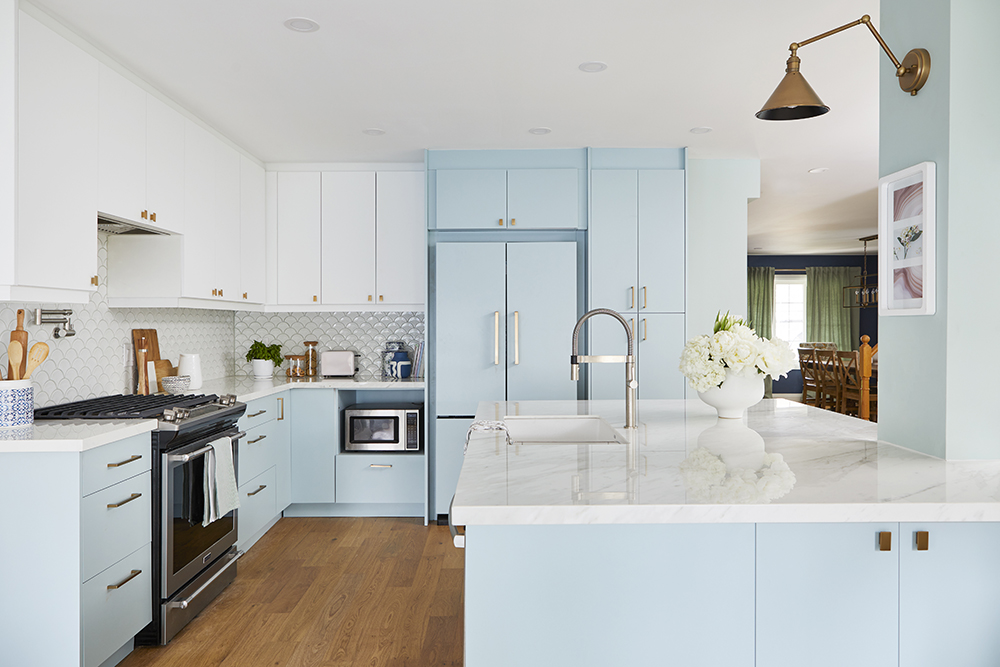
A Kitchen With Mermaids in Mind!
You could almost hear the waves in the family’s new kitchen, thanks to the nautical hues and the “mermaid” backsplash, as Maricris referred to it. Their new island not only provided plenty of counterspace and storage space underneath but it also incorporated the pillar, and was no longer an obstacle. And keeping the pillar where it was saved thousands of dollars.
Realted: Creaky stairs causing you stress? Check out Sebastian’s videos to help you fix this issue without replacing the staircase.
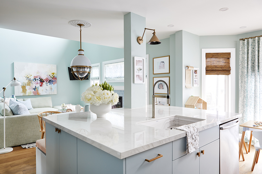
Family Room
The pastels in the kitchen and family room managed to be vivid yet serene. The tiles Sam chose for the front entrance linked wonderfully with the bright dining room. The colours in all three rooms were so different, yet worked well together. Sebastian added a skylight and updated the fireplace into the formerly dark family room. Maricris and Francis wanted to get rid of the fireplace but Seb shut that down – and saved on the home owners’ spend! Opening up the kitchen and family room gave the first floor so much more flow – something the family of five desperately needed.
Like this reno? You can shop the look for this episode and all the Save My Reno episodes.
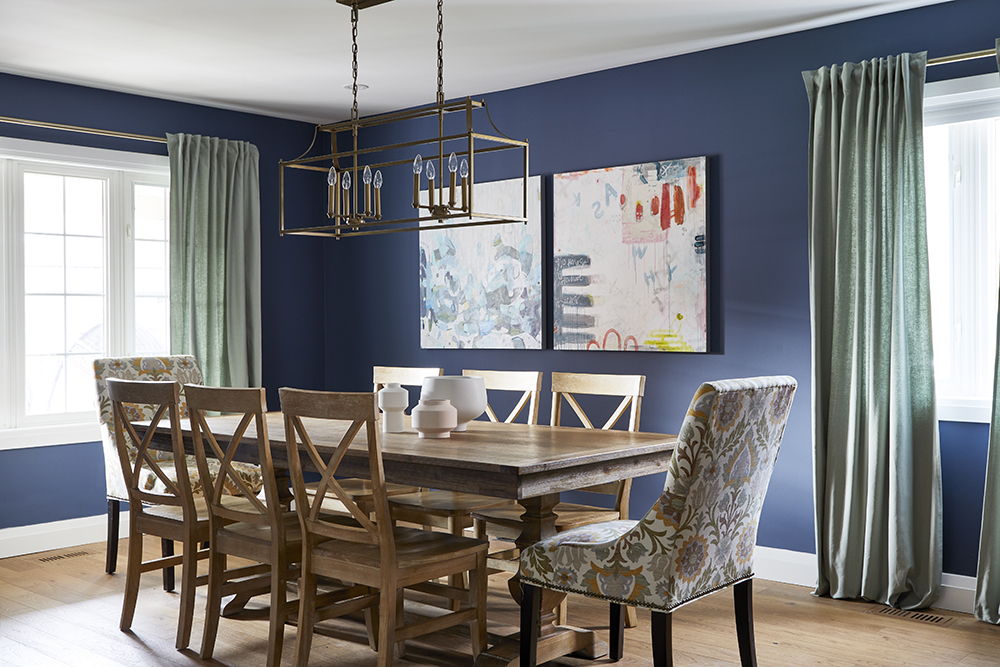
Front and Centre
The front room only needed a minor refresh and repainting the walls – from that boring builder beige to this brilliant blue – did wonders. Their dining room table went untouched and matched perfectly with the new hardwood floors throughout the entire main floor, elevating the previously unused space from outdated to outstanding.
Related: Looking for dining room inspiration? Check out our Dining Room page.
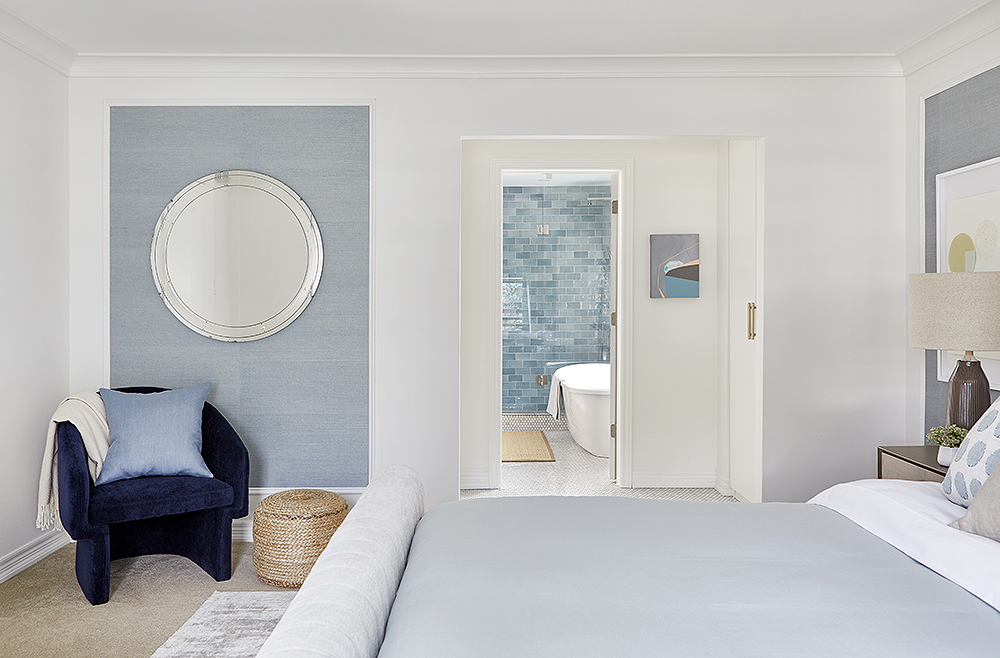
Serenity Now
After renovating their entire home, Lori and David had one room left on their checklist and they needed the Save My Reno team to get them across the finish line and on a limited budget. A vaulted ceiling (which was on the homeowners wish list) would have put the homeowners over budget but the added crown molding gave the illusion of height. The couple wanted more texture and they got it with the grass cloth walls. The lighter hues also gave the space more depth in a classic, beautiful way and brought together both rooms.
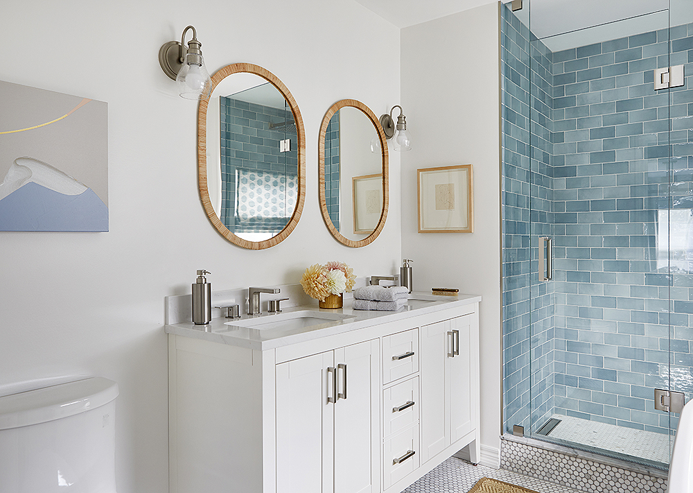
Double the Bathroom
By cutting into the closet space, the Save My Reno team was able to expand the bathroom so it could fit the double vanity David so desperately wanted along with the roomy shower separate from the tub.
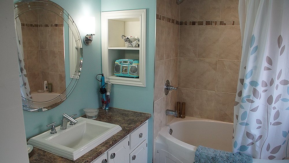
Before the Reno
Lori and David’s bedroom was actually in pretty decent condition as they and their son, Alex, had been renovating their home over the years – but it was the bathroom that needed work. It was small and cramped; in fact, their walk-through closet was bigger than the bathroom. And while Lori and David love all the room for their clothes, a soaker tub after a long day was much more needed.
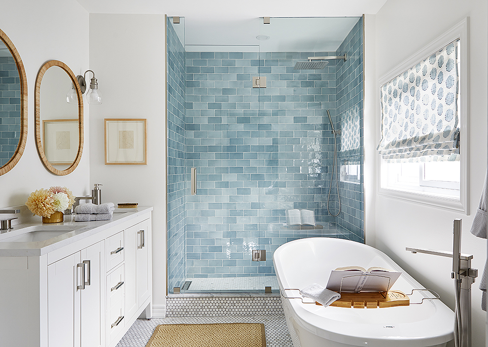
SMR-4051-bathroom-soaker-tub
By cutting into the closet space, the SMR team was able to expand the bathroom so it could fit the double vanity David so desperately wanted along with the roomy shower and a soaker tub to unwind in after a hard day. Doesn’t everyone dream of a soaker tub like this?
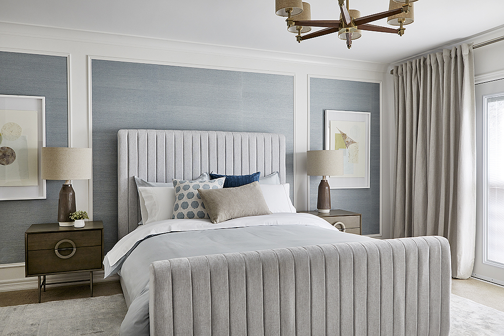
Bright and Beautiful Bedroom Suite
Sebastian Clovis and Samantha Pynn transformed this bedroom and en suite and somehow created more space with an easy remodeling fix. The bedroom went from dark and a tad dated to a light, airy, classic room where Lori and David can truly relax. An inexpensive bit of wainscoting on the feature wall takes this room to a whole new level. Mission accomplished.
Related: Watch Sebastian’s tips on mitre cuts so you can make your own DIY wainscoting.
Depth and Detail
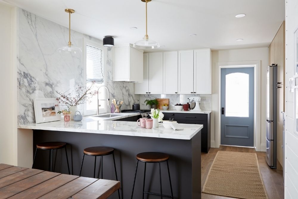
Elektra and Paul loved their charming heritage home. Built in 1924, it packed plenty of character and charm. But the coffee shop owners wanted nothing more than a new main floor and were willing to hand over $50,000 to get the job done. Although Sebastian and Samantha were a little worried about the budget, they got the job done. The renovated kitchen above features plenty of depth and detail to keep eyes moving thanks to the porcelain counters, proper storage and prefab cabinets.
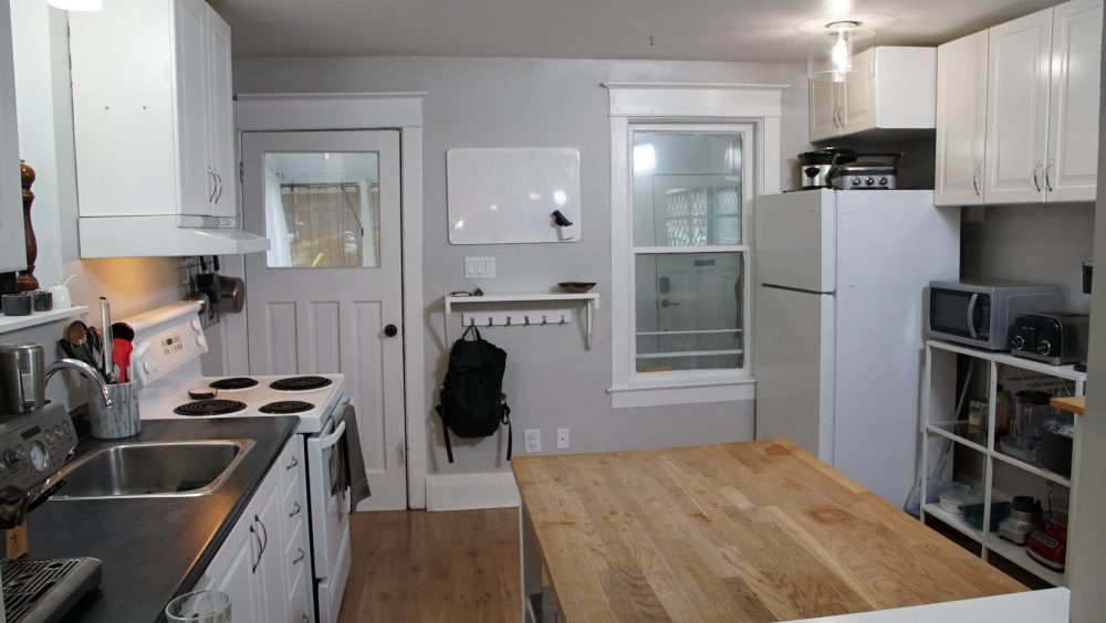
Before: Cramped and No Storage
Prior to the renovation, Elektra and Paul’s kitchen was crammed into the back of the house with minimal counter or storage space. In the same boat? These small kitchen ideas will inspire you to reno your cooking space.
Shiplap Update
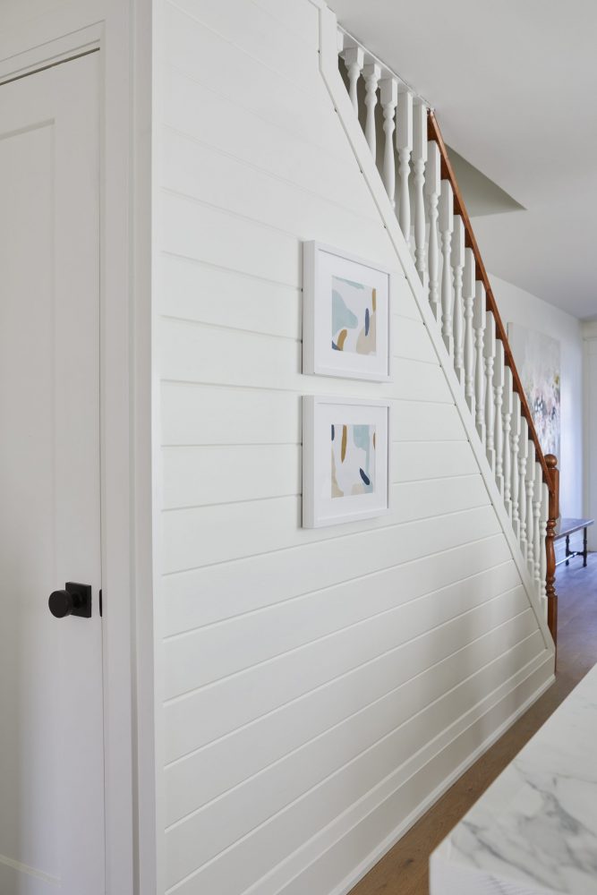
The staircase went from drab to fab thanks to the addition of freshly painted shiplap. Sebastian also went through the entire main floor to uproot all the old carpeting for a fresh hardwood look that tied the whole space together. Find more staircase ideas that will make a statement in your home.
Walled In
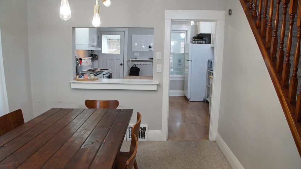
As you can see, the main floor was a tight squeeze prior to the renovation. Sebastian tore down the wall that divided the dining room from the kitchen to open things up. Despite a slight hiccup (asbestos in the wall, eek!), it all came together beautifully.
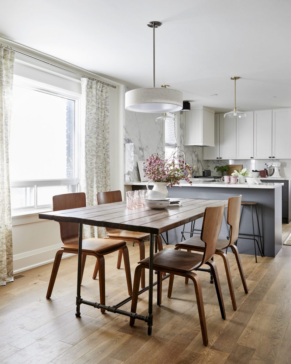
Freedom
With the wall partition gone, Elektra and Paul are free to roam comfortably around their modern main floor renovation. Thankfully, the couple were happy to keep all of their furniture, allowing Sebastian and Samantha to stay on budget. Tearing down walls is costly and a step not taken lightly by the Save My Reno crew but in this case, it make perfect sense. The space has been freed up and the homeowners have the home of their dreams.
Related: Tackling a Home Reno? These Are the Features You Need in 2021 (and Beyond)
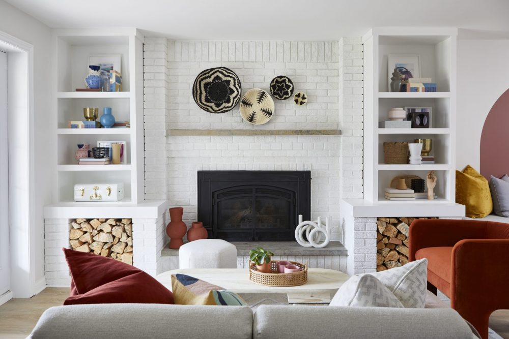
Basement Beauty
Amidst the chaos of the pandemic, Courtlyn decided to move back in with her mom, Kim, to save money and get out of the city. However, the outdated basement she called home wasn’t exactly giving off cozy vibes. With a modest $30,000 budget, Sebastian and Samantha teamed up to elevate the space, starting with transforming the fireplace from clunky eyesore to the gorgeous centrepiece seen above. For more inspiration, these basement bedroom decorating ideas will make you forget you’re underground.
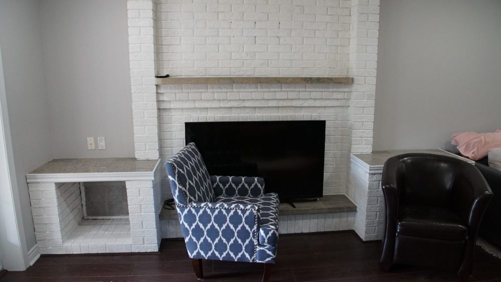
Dungeon
Although Courtlyn loved the idea of having a fireplace in her seating area, she wasn’t thrilled with the hulking storage spaces on the sides. Originally, she hoped Seb could remove them, but for the sake of staying on budget, he suggested simply upgrading the current model. The results, as we saw in the previous picture, were gorgeous. While this space looks and feels like a basement, the renovated version can hold its own against any above ground space!
Related: 10 Tips for Creating the Ideal Basement Apartment, According to Scott McGillivray
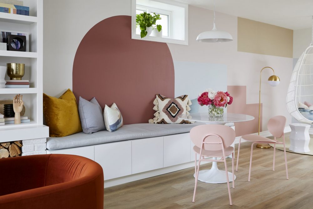
Comfy Nook
By removing an unused storage closet, Sebastian opened up the entire floorplan, allowing for this chic and functional breakfast nook/reading area where Courtlyn can spend her downtime. The opened space also gave Sam the canvas she needed to created this wall treatment. A bit of paint and a lot of creativity has given this space a definite “wow” factor!
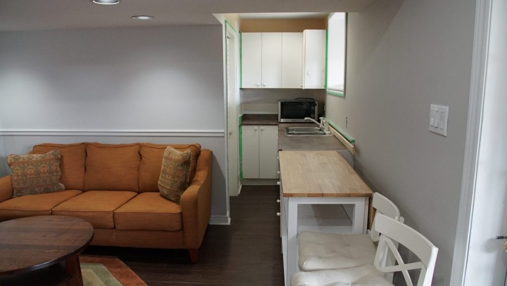
Ouch!
Initially, the basement layout felt like one long, dreary tunnel, especially in the area around the kitchenette. Just looking at the space makes you feel pinned in. Although Seb couldn’t relocate it to a better spot (due to old wiring and a tight budget), he did promise to update so that it would be both stylish and functional.
Related: 10 Ways to Prevent Basement Floods Before They Start
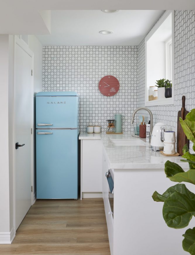
Clean and Open Kitchenette
While still narrow, the kitchenette feels as though its doubled in size thanks to soothing white paint, smaller appliances and chic wallpaper. The space has more breathing space and a definite retro-chic appeal.
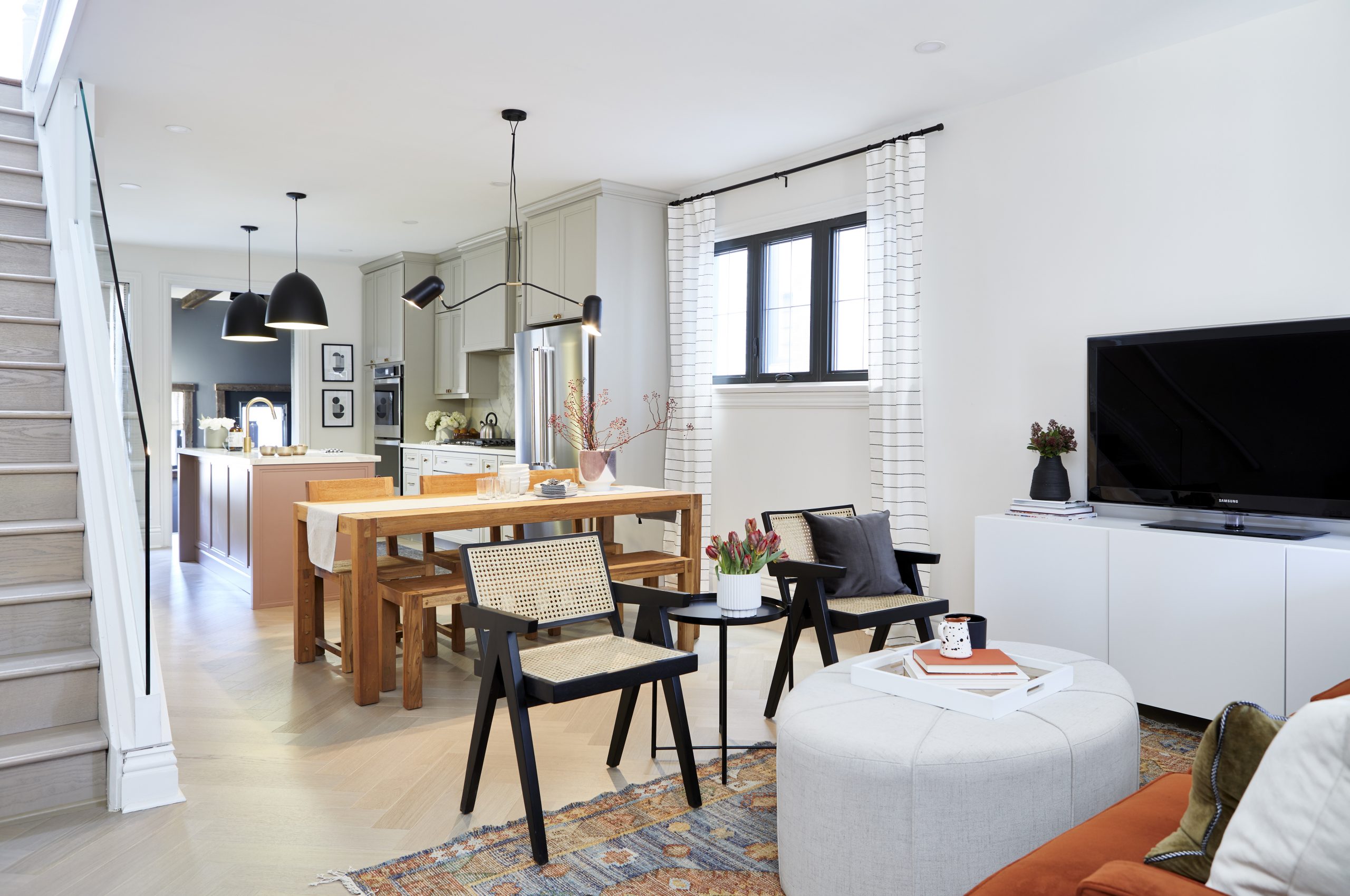
Party Central
Randy and Justin love to entertain in their 100-year-old Toronto home, but their previously cramped quarters made it next to impossible to do. With an $80,000 budget to work with, Sebastian and Samantha opened up the entire main floor, added new floors and created a bigger kitchen.
Related: Designer Sam Pynn’s Money-Saving Tips for Home Renos
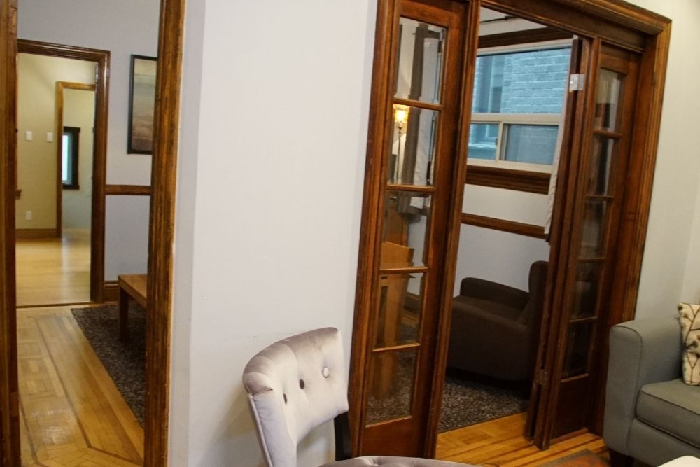
Cramped Quarters
Talk about a tight squeeze! Sebastian tore down all the walls that originally separated the main floor. The original splintered floorboards and clunky walls had passed their expiration date.
Related: 10 Design & Renovation Features Every Home Needs in 2021
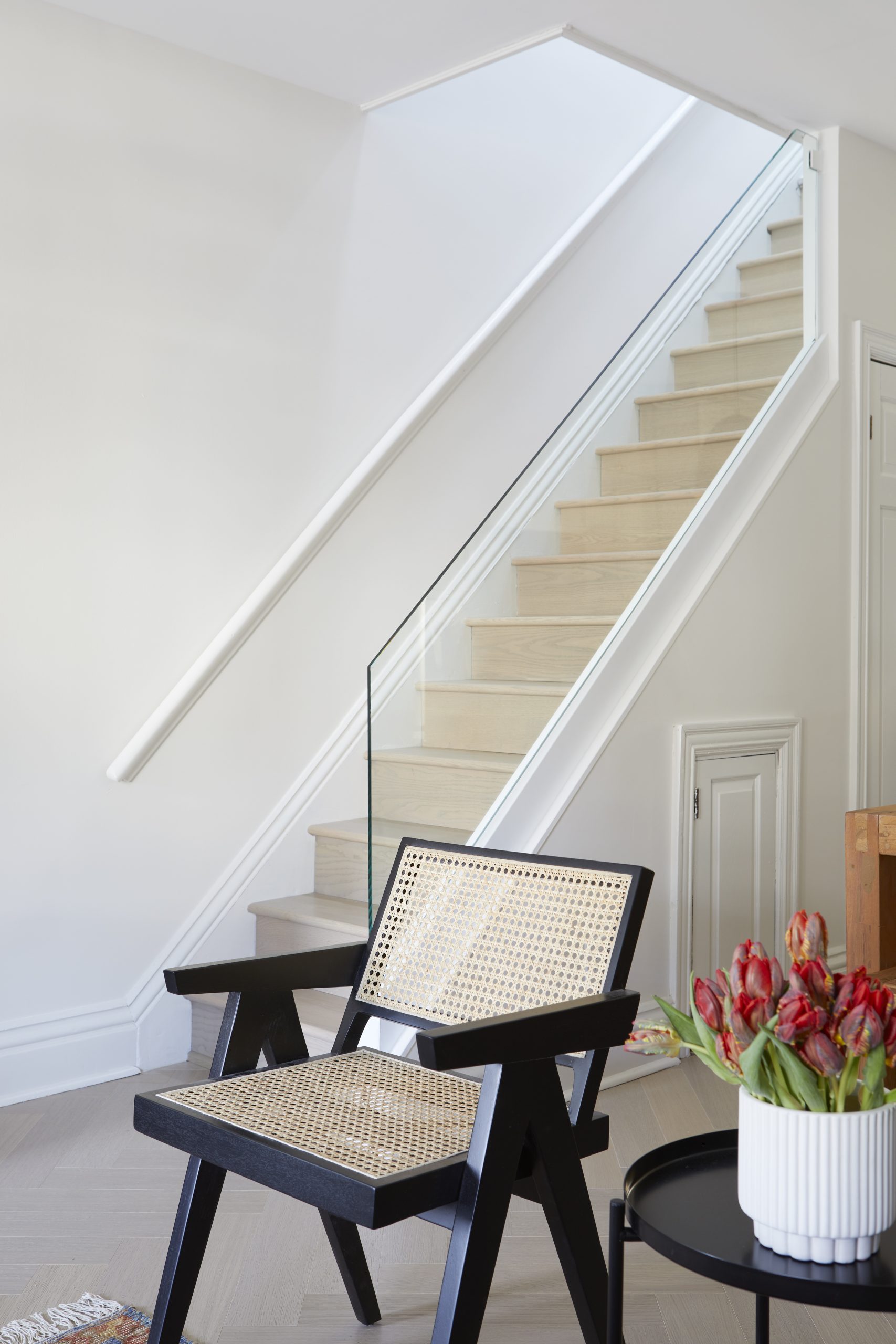
Let There Be Light
The original staircase was little more than a dark and gloomy tunnel. To open up the space and add more natural light, Sebastian made two sun tunnels that fed light onto the main floor and added a glass handrail for a more cohesive (and less restrictive) staircase.
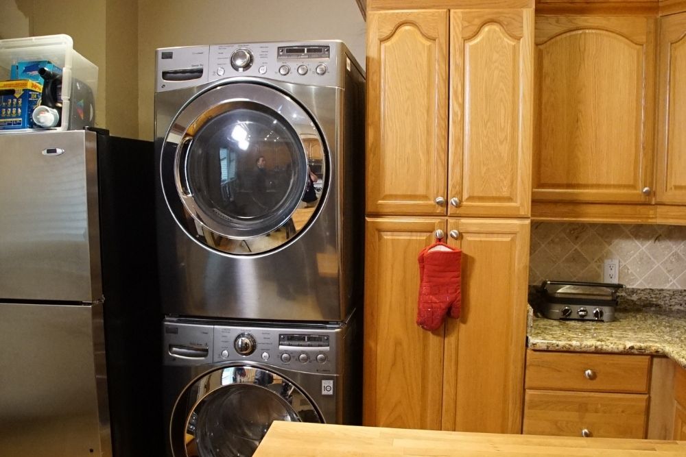
Kitchen Nightmare
No, your eyes are not deceiving you: that is, in fact, a stacked washer/dryer right in the middle on an already cramped, outdated kitchen that is located all the way at the back of the house and hidden by walls, walls and more walls.
Related: Small Kitchen Ideas: 15 Apartment Kitchen Layouts That’ll Inspire You to Makeover Your Cooking Space
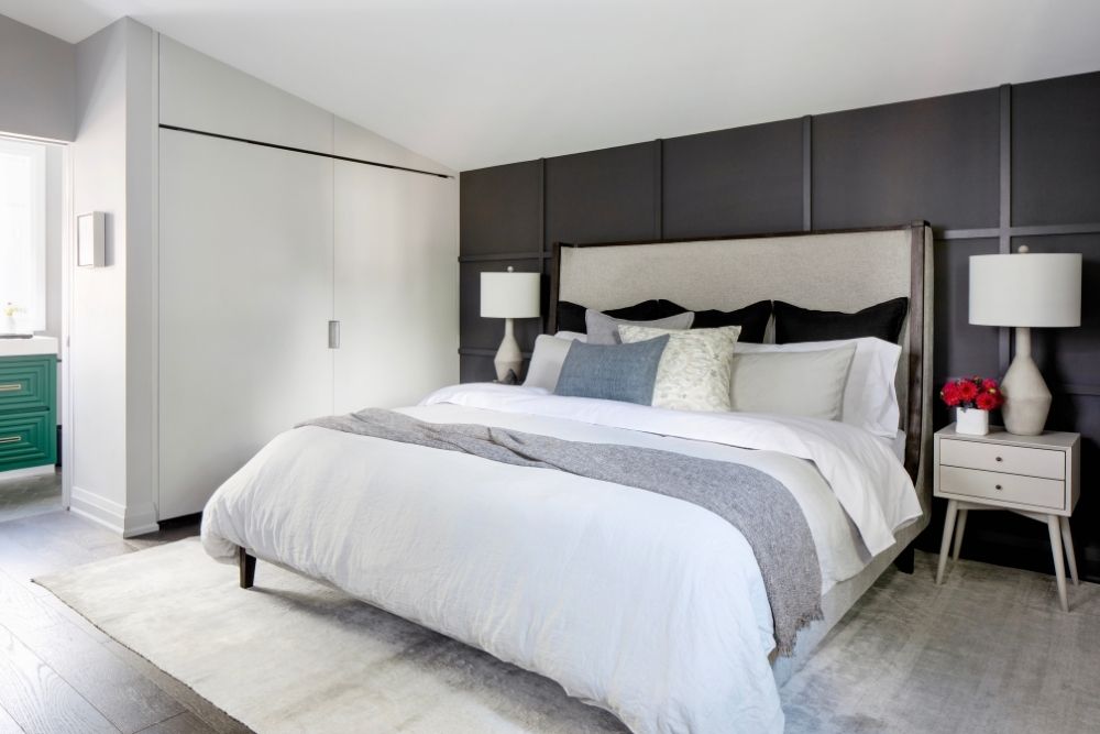
Linda and Christian’s New Bedroom + Ensuite
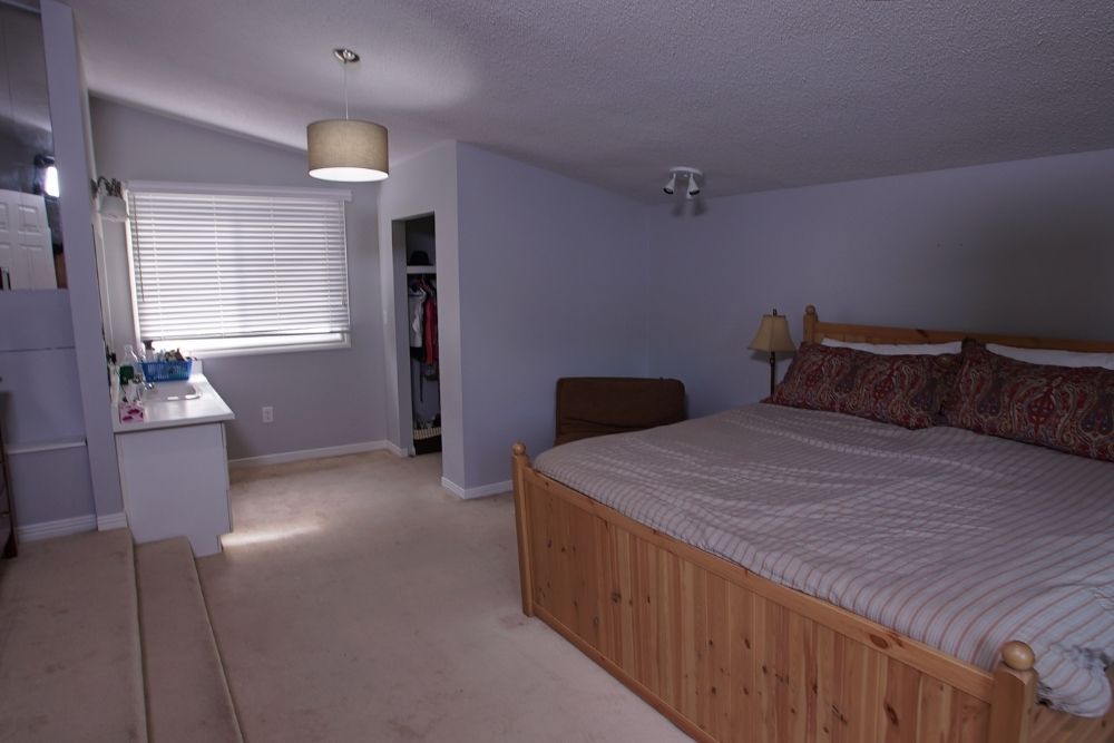
With a budget of $50,000, Linda and Christian were looking to recreate the primary bedroom and ensuite bathroom they had in the former dream house they’d reluctantly left. (The couple decided to move to a bigger home so their kids could each have their own rooms.) The upstairs of their new abode required a few fixes, from the removal of the popcorn ceiling to unified flooring throughout.
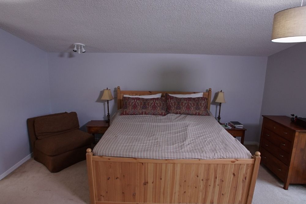
A Dated Bedroom
This was Linda and Christian’s bedroom, pre-renovation. Between the old carpet, outdated popcorn ceiling and muted colours, it didn’t have much going for it.
Related: 10 Super Easy Ways to Add Character (and Value) to Your Bedroom
A Vanity, Nothing More
Initially, the bathroom “ensuite” was nothing more than a worn-down vanity with a stained sink. Sebastian and Samantha worked together to help Linda and Christian realize their dream of recreating their previous ensuite, complete with a steam shower and bidet. (And we all know Sebastian loves to extoll the many virtues of the bidet.)
Related: 10 Reasons Why a Bidet is the Life-Changing Bathroom Accessory You Need
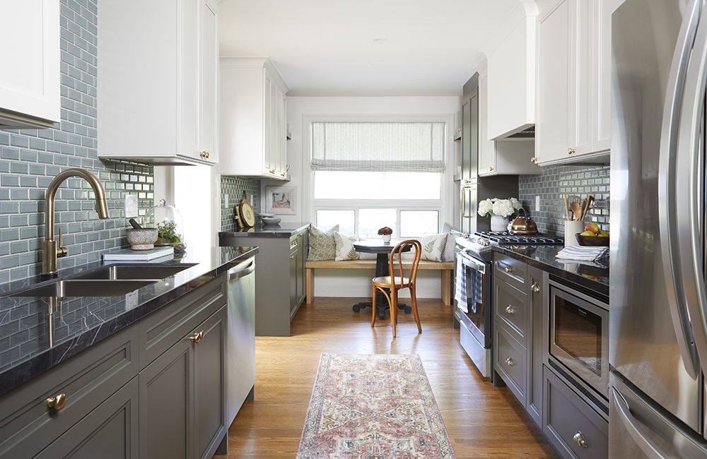
Catherine and Dan’s New Kitchen
Catherine and Dan had a $60,000 budget to get their kitchen and front-hall area updated to match other renovations they had done in the house. Through a lot of creativity, sweat equity and renovation know-how, Save My Reno‘s Seb and Sam made it happen. This modern looking kitchen has added cabinet space, a breakfast nook, and flooring that now matches the rest of the home.
Related: Watch the full episode online now!
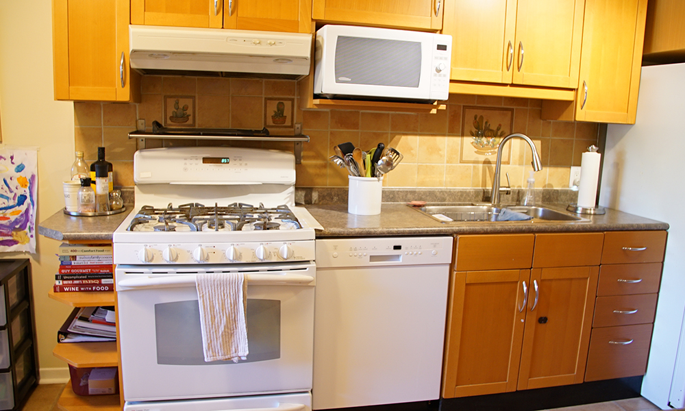
A Dated Kitchen in Need of a Reno
This was Dan and Catherine’s kitchen before the Save My Reno crew got their hands on it. It was stuck somewhere in the 90s, and was out of step with the updated look they had elsewhere in the house.
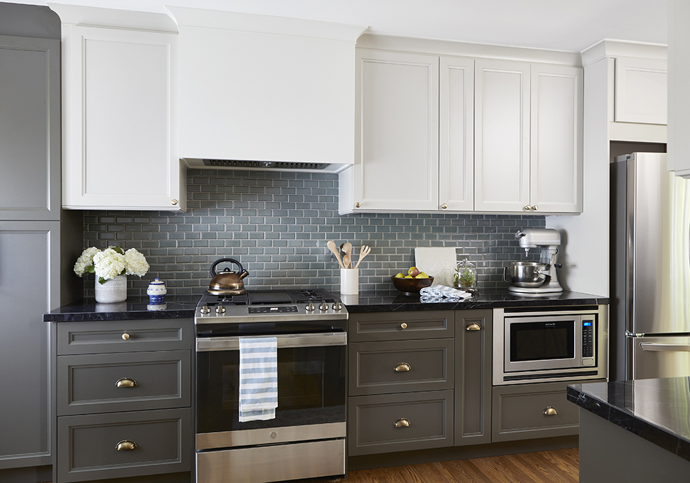
Sleek and Sophisticated
There is so much to say about this kitchen. Let’s start at the top where Seb and Dan were able to shrink and camouflage a pre-existing bulk head. Below are light and bright upper cabinets with accompanying darker cabinets down below. Inexpensive tiles add a pop of colour (and replace the much-maligned cactus themed tiles that were there). Modern stainless steel appliances complete the look. An entrance way to the right of this picture had been opened up to let in more natural light. Overall, the space is lighter, brighter, and more cohesive with the rest of the house.
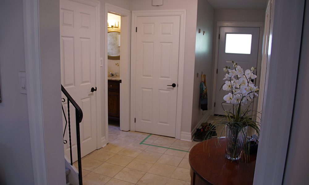
Mismatched Hallway
The owners originally had plans for taking out a wall in this space but Sam and Seb were able to find a more inexpensive and stylish option. The big issues in this space including dated tile flooring that didn’t match the rest of the house and a banister (on the far left of the picture) that was lacking character. If you are wondering what the green tape on the floor is… it is the line at which all outdoor boots are to never cross. Let’s see on the next slide what Sam and Seb cooked up.
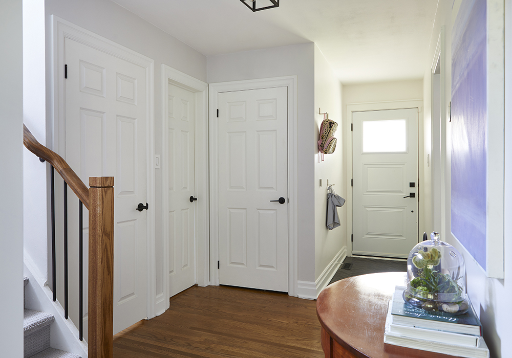
Freshened up Entrance
A fresh coat of paint goes a long way in brightening this space. The dated tile has been replaced with hardwood flooring and charcoal herringbone tiles that now delineate the line over which winter boots must not pass (replacing the previously mentioned green tape). And check out the updated bannister. It’s a small but impactful update to the space that helps bring together design elements in the hallway and adjoining kitchen. A definite theme we are seeing this season on Save My Reno is holding back on taking down walls. It’s a costly venture that is often not necessary.
Related: Sam Pynn’s Money-Saving Tips When Undertaking a Reno.
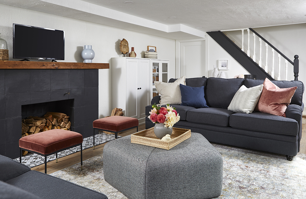
Rustic, Roomy and Cozy
For $50,000 Davina and Phil got a basement reno that left them speechless. Instead of taking out the fireplace as the homeowners initially wanted, Seb and Sam used it as a centrepiece to create a warm and rustic feel. The stained wood mantle was added, the tiles cleaned and treated, and the hearth got a Portuguese-inspired update. Storage cabinets (which Adina and Phil’s son helped with) flank the fireplace on either side. Lots of storage and lots of room to invite neighbourhood friends over.
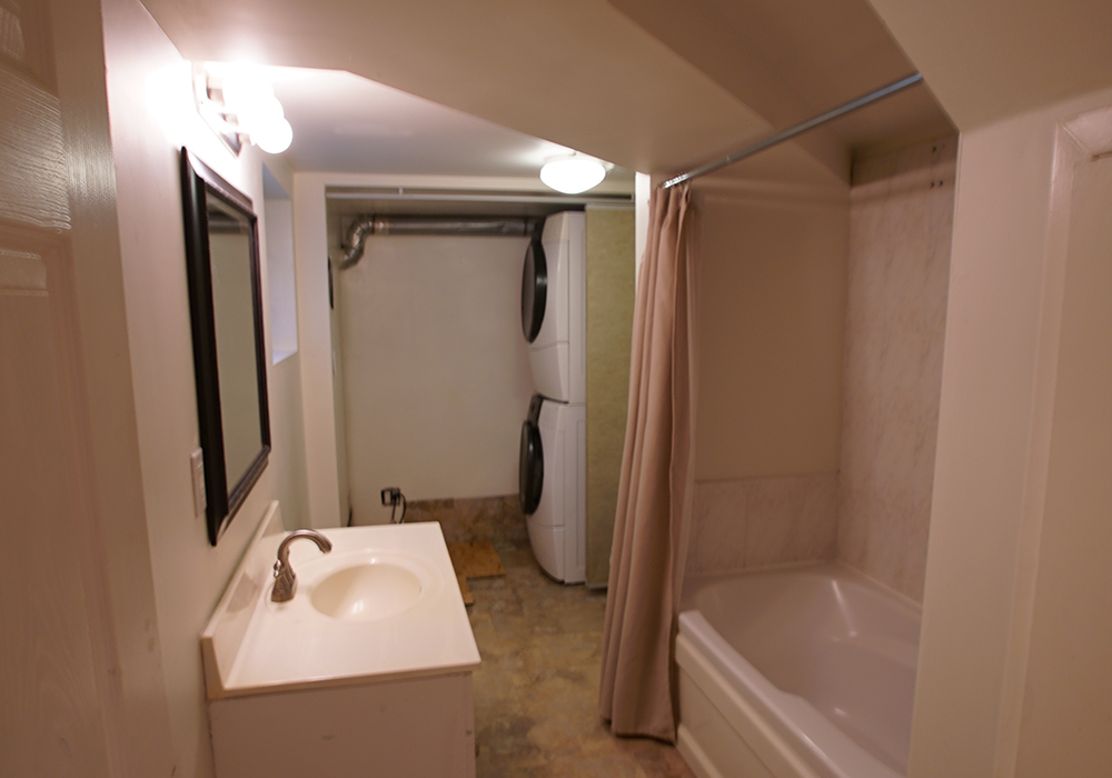
A Laundry-Bathroom Demonic Duo
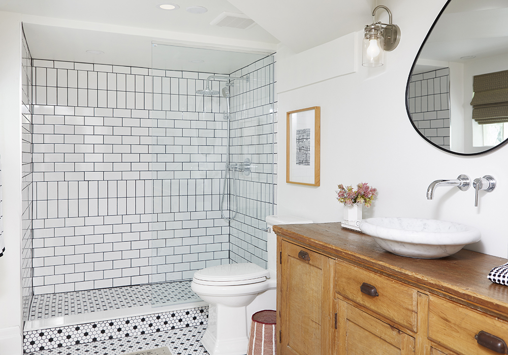
Adina and Phil were less-than-happy about this basement laundry/bathroom they had before going into this reno. Adina even refused to do laundry it was so creepy looking. What Seb and Sam found was an opportunity to make a gorgeous and spacious bathroom.
Sharp Looking Bathroom
Now this is a bathroom! What used to be a spooky space is now a deluxe looking basement bathroom. The tiles in the shower are inexpensive subway tiles but the dark grout gives them a more luxe look. The upcycled dresser continues the overall rustic feel that Sam and Seb have created. The marble sink on top of the vanity was sheer genius. Well done Seb!
Luxe Laundry Room
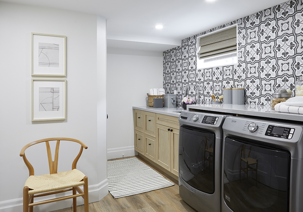
Adina won’t be afraid of coming into the room to do laundry! With the vinyl flooring that runs throughout the basement and the decorative tiles on the walls, there might even be a fight over who gets to fold the clothes. There is lots of room for storage and Sam hid the furnace behind a newly created wall. The fresh paint on the ceiling in this and other rooms in the basement make all the spaces feel higher.
Games Time
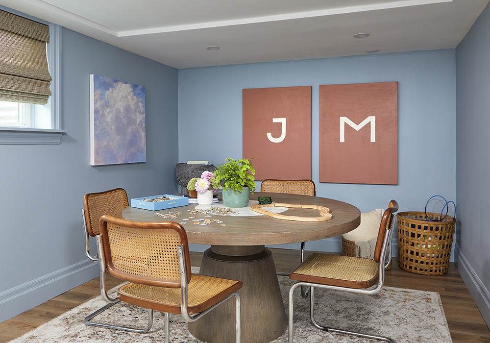
This room had been rarely used before but we think it will be a hit with the kids now. Jake and Maddie will have no problems laying claim to this room as their initials are prominent on the wall. While the room is for the kids now, in the future it could be easily converted into an extra bedroom in the future.
Bean-Bag
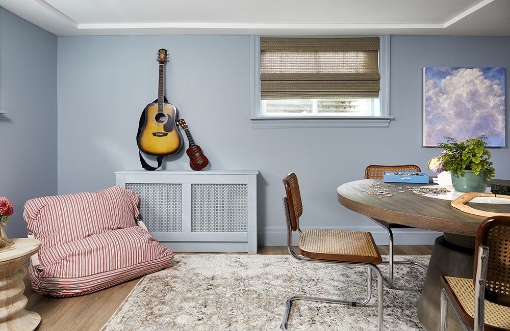
To add to the comfort of this space, Sam and Adina made these custom bean bag chairs. Davina’s work in making custom design items with Sam and Phil’s sweat equity in helping out Seb saved this family a bundle. Let the celebrations begin.
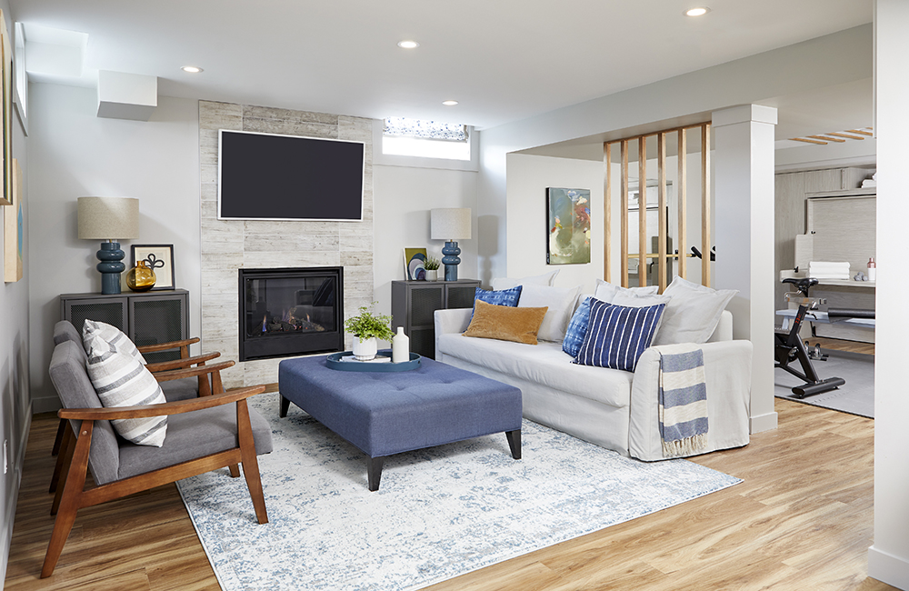
Big and Bright Basement
and Samantha Pynn knocked it out of the park with this basement reno. It went from a nothing space to this big, bright and beautiful room with multiple functions. There is a hangout area for homeowners Marie and Rob and their son Josh to spend time, a workout space; and a hidden wall bed to accommodate overnight guests.
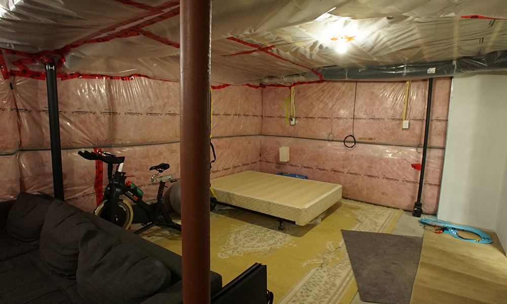
Before the Reno
Before Sebastian and Samantha got their hands on the basement, it was a cavernous mess. The space had been used as an apartment in the past but had recently gone unused. Some earlier renos that Rob did (which led him to the local emergency department!) made life a little easier for the Save My Reno team. The space was wired for electricity and there was even a gas connection for a future gas fireplace.
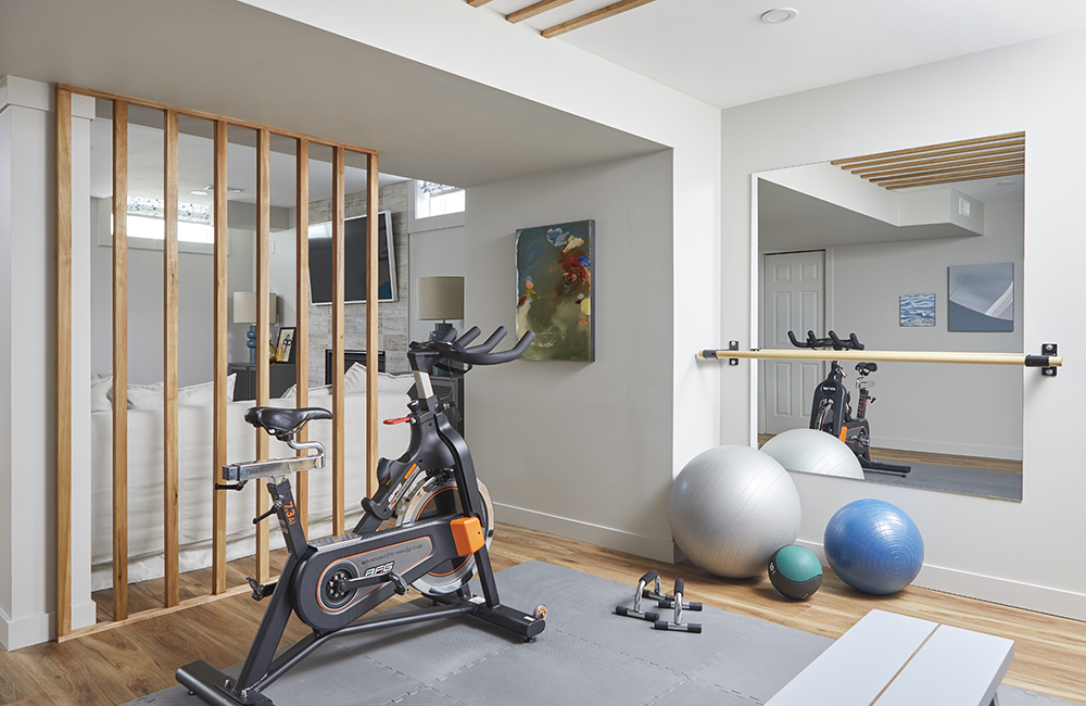
Basement Gym
Rob and Marie wanted a place to work out and Seb and Sam stepped up to the challenge. The gym is separated by a wood feature wall that not only gives the space a modern look but also helps camouflage a support beam that couldn’t be removed for structural reasons. The open concept also helps let light flow between the spaces. You might even be able to angle the stationary bike to watch TV while you exercise.
Watch: Sebastian walks you through how to make this DIY feature wall.
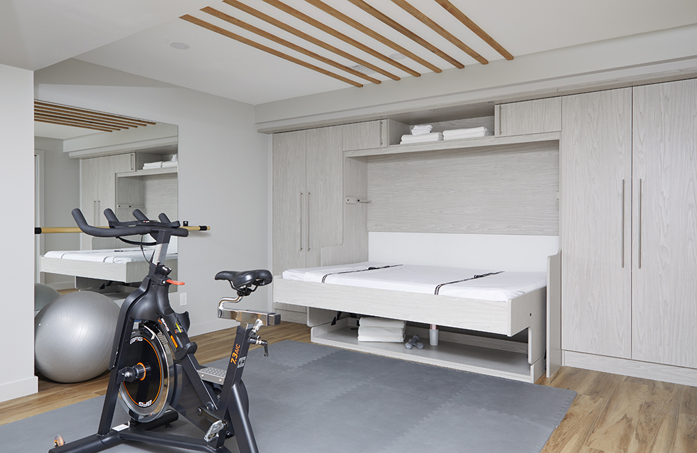
Hidden Bed
Seb and Sam were able to squeeze in the added functionality of a space for overnight guests. A hidden Murphy bed in the gym area blends perfectly with the rest of the basement while the custom cabinets on either side add much-needed storage space.
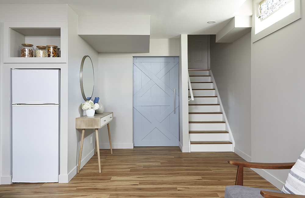
Stairs to a New Living Space
By taking out an awkward wall at the bottom of the basement stairs, Seb and Sam were able to open this space up even more. The vinyl flooring was a perfect option for the basement space that also accommodated the family-friendly, farmhouse-chic vibe elsewhere in the basement and throughout the house.
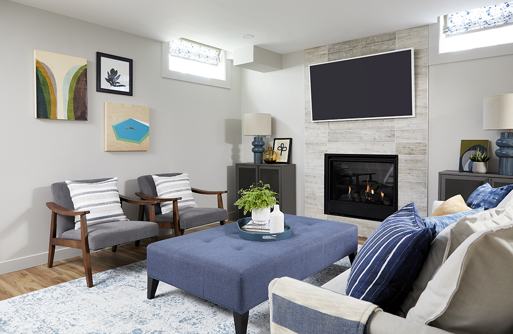
A Final Look
A final look at Marie and Rob’s newly renovated basement shows off the design choices that Sam incorporated into the space. The fireplace is surrounded by rustic, ceramic tiles that are laid horizontally to give a flash of modernism. The mid-century chairs add a nice flair. (Most of the furniture in the basement was ‘shopped’ from elsewhere in the house!) On the far end of the couch you can see the shibori-dyed pillows that Sam and Marie made. It’s the kind of DIY element that adds character and charm to any room while giving you DIY-bragging rights when the neighbours stop by.
Related: Watch the full episode of Marie and Rob’s fabulous renovation.
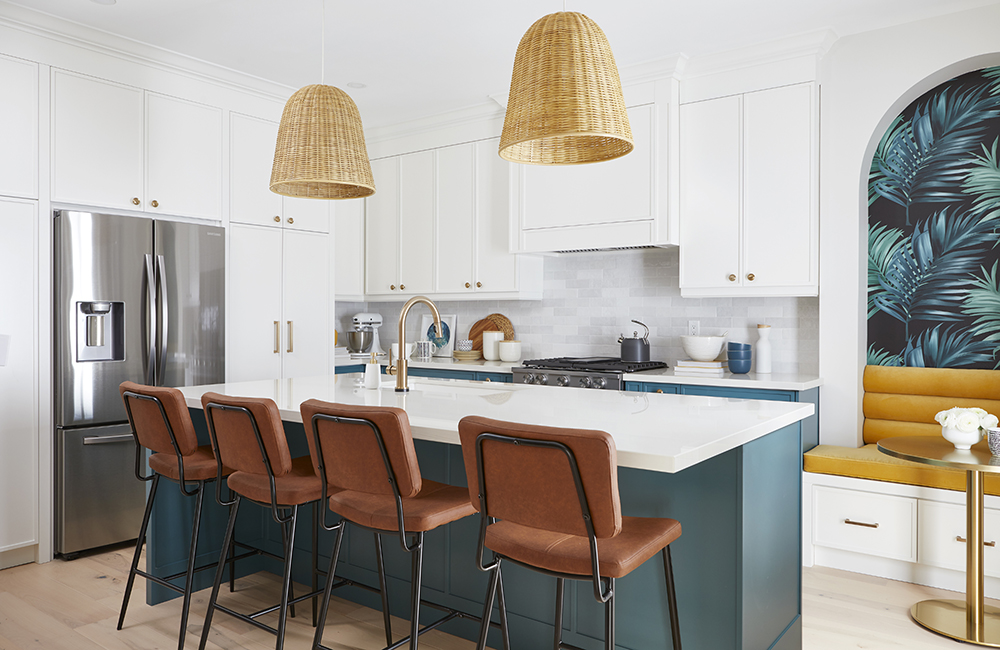
Kitchen of Their Dreams
This is the kitchen of Mike and Rose’s dreams. The couple and their family have a busy lifestyle and they love to entertain extended family and friends. The kitchen (and food!) is often the heart of these gatherings. A banquet-sized island with a marble countertop provides lots of room for food prep and seating. Before the reno their kitchen was full of awkward corners and spaces. Now, everything flows.
Related: Watch Samantha and Rose create a DIY can message board.
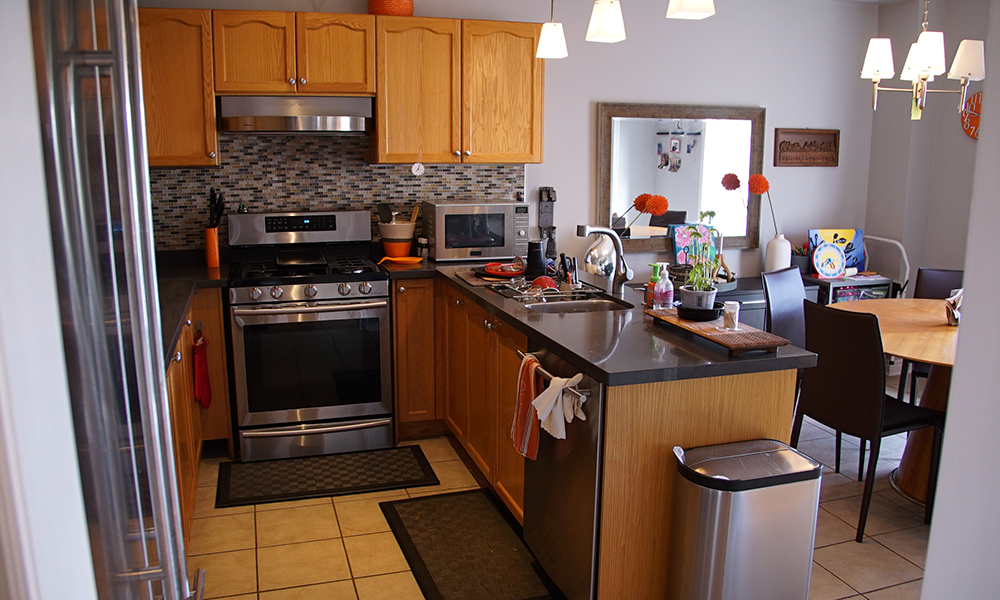
Before Kitchen
As you can see in this ‘before’ picture of the kitchen, entertaining was a challenge with no real focal point or flow. After an assessment of this space and how the family uses it, Sam and Seb were ready to make a transformation that would bring tears to the homeowners’ eyes.
Storage and Island Vibes
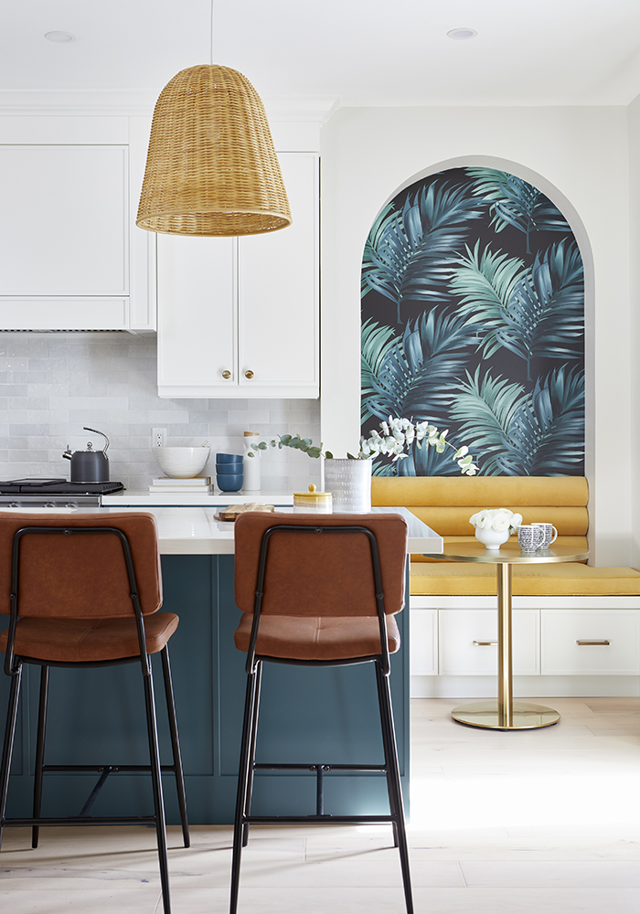
This view of Rose and Mike’s kitchen shows off a clever storage unit that Seb built into a nook that stores some of the clutter all families seem to collect. The space also provides extra seating. The colours and design of the kitchen reflect the families’ desire for an island vibe. The bottom cabinetry is a deep teal while the upper cabinets are a fresh and clean white. The wall covering above the storage nook almost makes you feel and island breezes. The backspalsh tiles are all handmade and painted.
Related: Watch how Sebastian built this clever seating and storage nook. You can do it too!
Open Flow
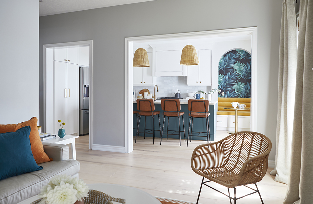
While Mike and Rose had wanted to lose the entire wall between the kitchen and living room, some of it had to stay as it was providing support for the house. Replacing the wall with a beam might add about $10,000 to their budget. The chair in the foreground of this picture is made of cane which is reminiscent of the rattan found in the Philippines where Rose is from. This element is also evident in the pendants above the kitchen island. The easy flow from kitchen to living room is ideal for entertaining.
Local Artwork
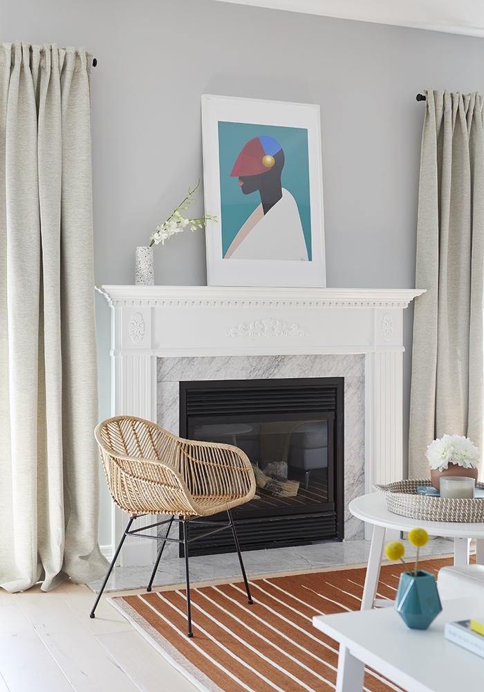
Rose wanted to support local artists when choosing art for her home. The vibrant piece above the fireplace, entitled Aurore, is the work of Toronto-based artist Nick Bahizi. Much of his artwork reflects and is inspired by African culture and the Black Lives Matter movement. Rose immediately connected to his work and spoke to the importance of her children seeing inspiring Black artists that connect to their heritage and culture.
Living Room
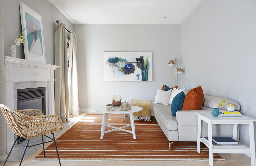
Here is a final look at Rose and Mike’s living room. The colours are fresh and alive. The couple had been given quotes in the $80,000 range, but the Save My Reno‘s money-saving tips, along with some sweat equity by the homeowners, brought the price of this reno down to $60,000. Now that’s cause for celebration! Luckily, Mike and Rose have the perfect home for a party.
Related: Watch the full episode and transformation of Mike and Rose’s gorgeous but budget-conscious reno.
HGTV your inbox.
By clicking "SIGN UP” you agree to receive emails from HGTV and accept Corus' Terms of Use and Corus' Privacy Policy.


