If you live in an apartment, condo or small space, you’re going to want to read this. Designer Lindsay Steele, of Vancouver Island’s Motto Interior Design, transformed a young professional’s 1,200-square-foot Kitsilano condo from cramped to positively spacious. Walls came down, a dream kitchen was cooked up and furnishings transformed. In short, there are plenty of liveable design tips to inspire and copy.
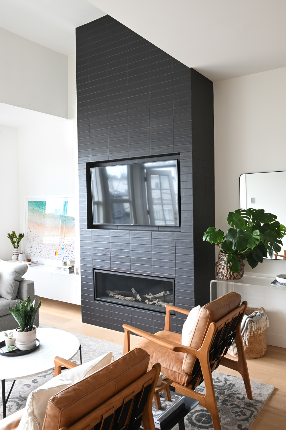
Black Magic
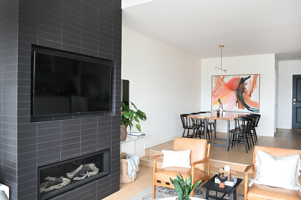
The living room fireplace presented a couple of design challenges: the different lines and angles where it meets the ceiling and the fact that it really is the only practical spot for the TV. To address these issues, Lindsay made a bold decision. “I removed the traditional mantel to create a flat front that we covered with black tiles,” she says. It makes the fireplace a cool focal point, lets the TV blend in nicely and draws the eye away from the busy ceiling.
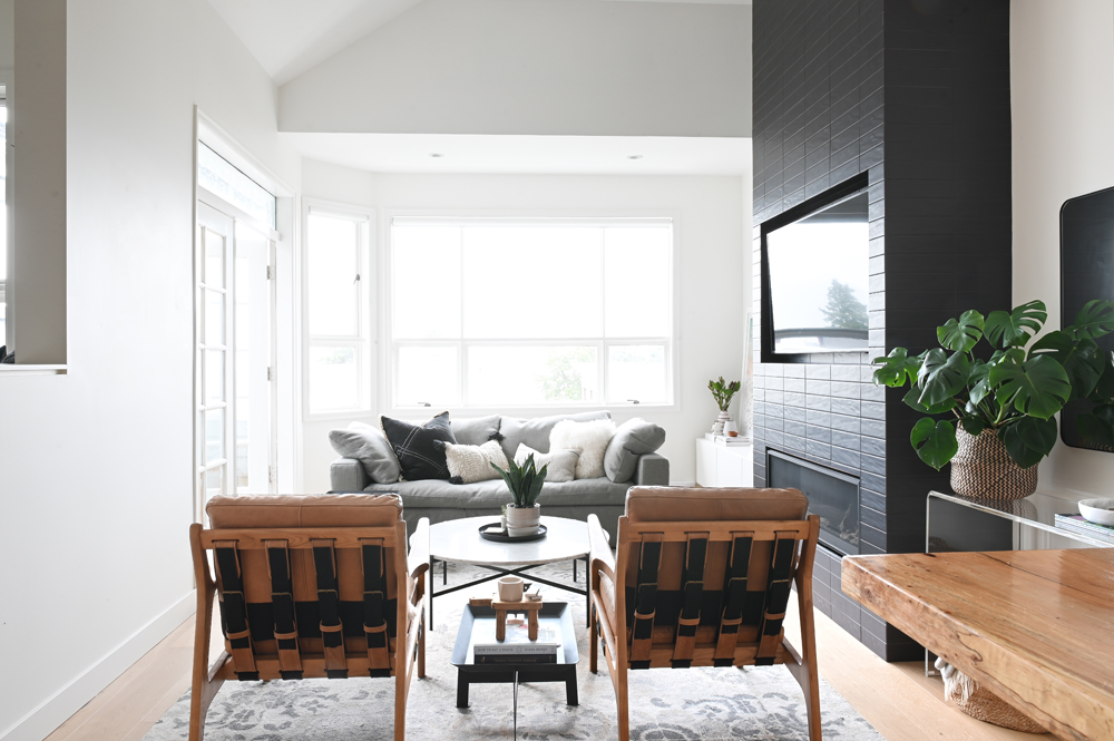
Seating Plan
When furnishing the small open-concept living area, Lindsay complemented the sofa beneath the window with two arm chairs. They have light and open silhouettes that lend an airiness and don’t close off this compact space from the dining room the way a second sofa would.
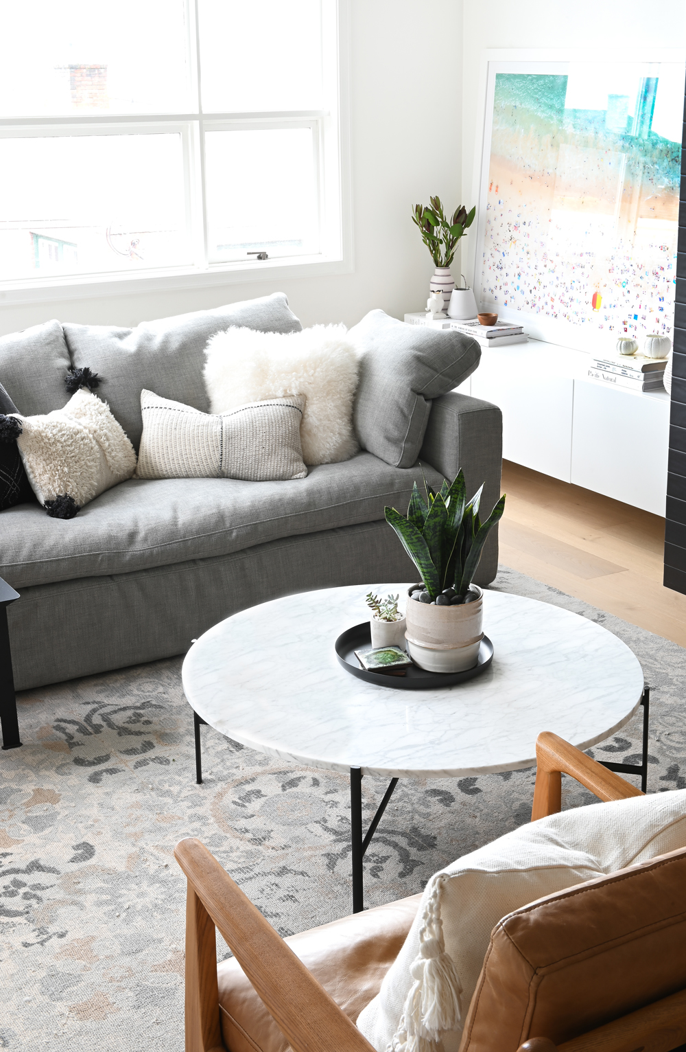
Well Rounded
A round coffee table is a curvy foil to the living room’s many square and rectangular shapes. Its pale top keeps the look light, while the grounding black legs reference the focal-point fireplace. The black tray corrals fresh greens and furthers the circular shape.
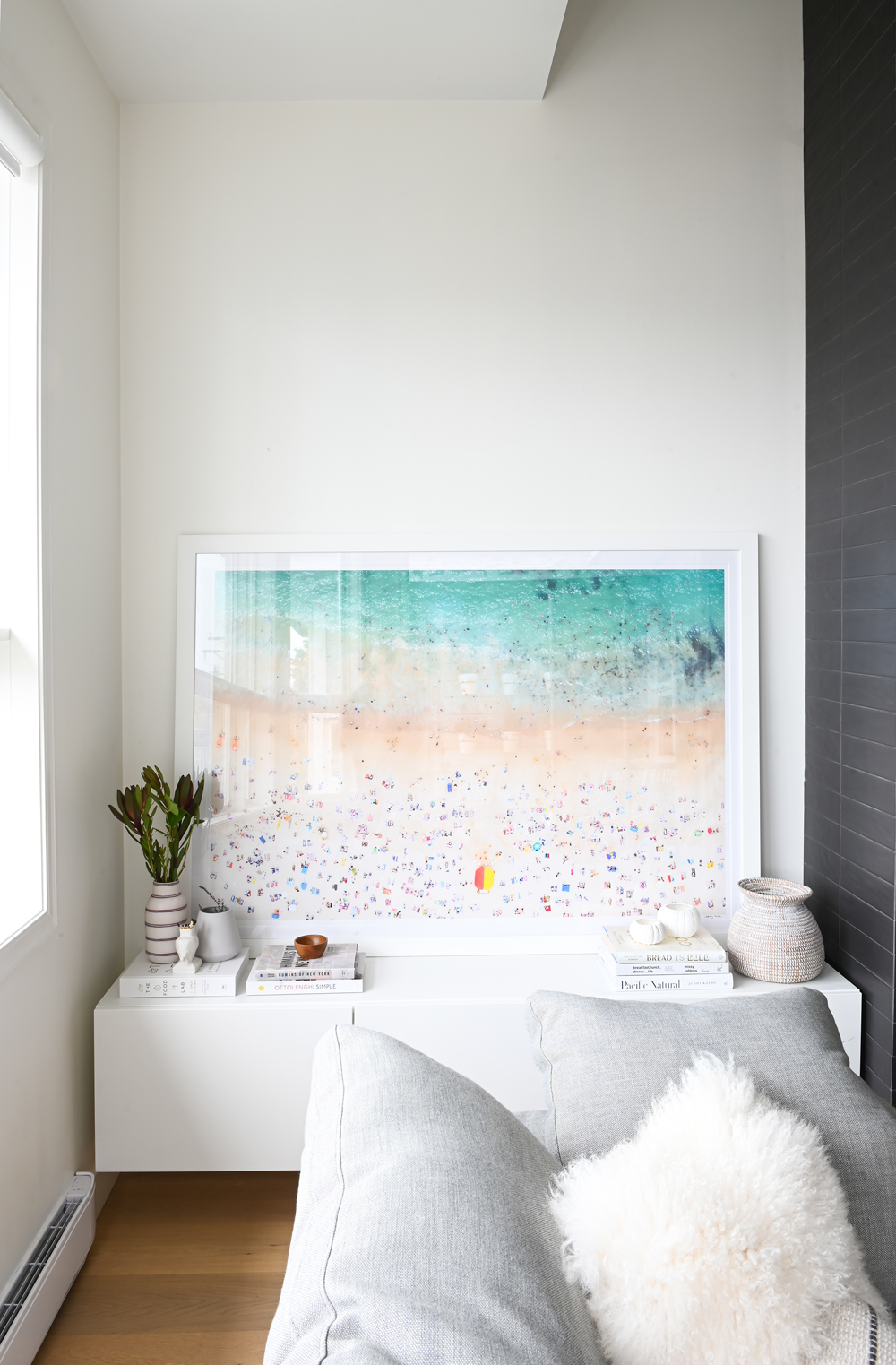
Beachy Keen
A photograph by Gray Malin enlivens the mostly neutral space with splashes of fun colour and is a nod to the apartment’s location: steps from Vancouver’s famous Kitsilano Beach. It sits upon a Besta cabinet from IKEA. “I use the Besta line a lot,” says Lindsay. “I like that it’s modular and can be combined to fill spaces – sometimes perfectly – for a very good price.”
Fit to Scale
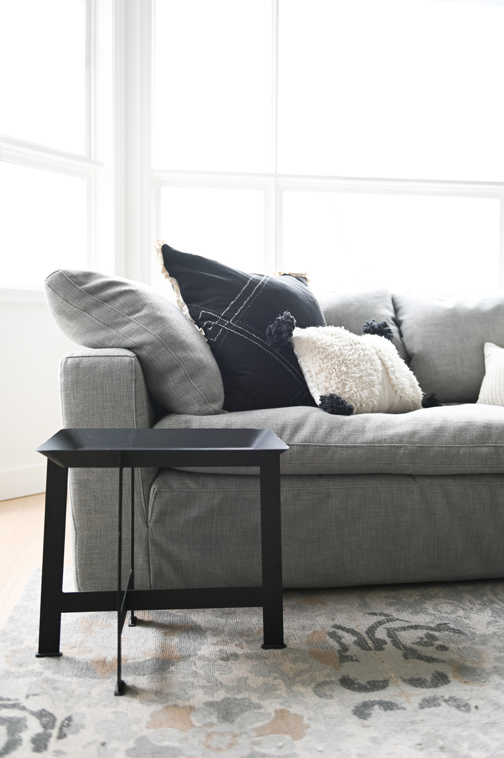
dwellers take note: bigger is better when it comes to sofas. Lindsay chose this Cloud sofa from Restoration Hardware for its deep seating and large, loose cushions, which are the antithesis of tiny and tailored. It avoids the apartment-size furniture trap and provides very comfortable seating. The smaller-scale table is a practical contrast that’s easy to move around.
Related: How Do You Strike a Balance Between Modern Design and Warmth? Ask This Vancouver Home
Step Up
The second level of the condo features the dining area which now opens on to the kitchen. By knocking down the kitchen’s original dividing wall and extending the stairs into the living space, Lindsay transformed the once cramped area into the much desired open-concept footprint. The takeaway: don’t be afraid to re-jig existing floor plans when designing any space.
The Art of Dining
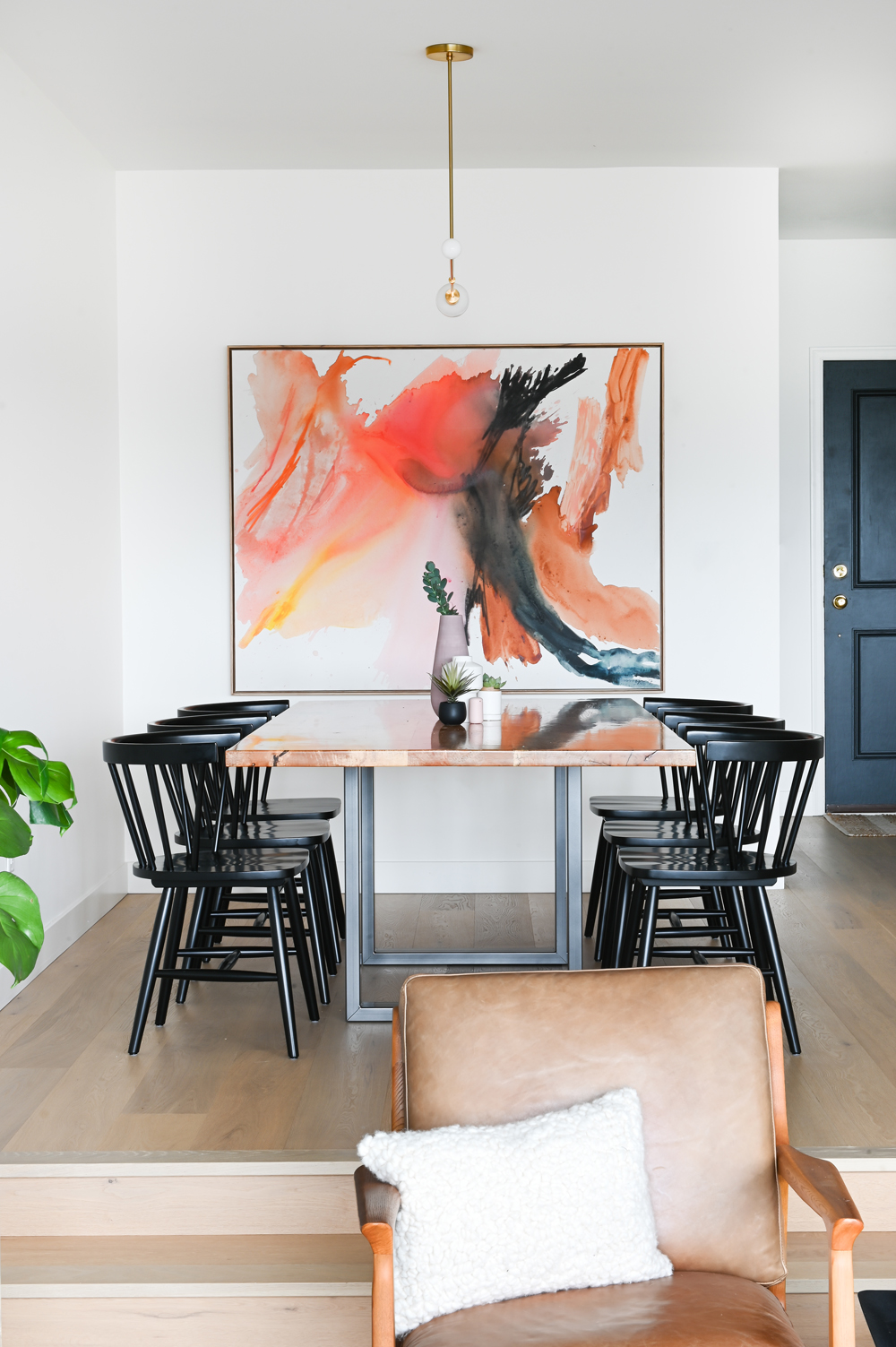
The dining area is energized with colourful artwork that includes a splash of black for great continuity with the chairs and base of the table. A simple pendant light from Lambert & Fils doesn’t compete with the canvas. We like the way the living room’s natural leather chair complements the dining room’s table top.
Related: This Adorable Cozy Cottage Near Ottawa is Peak Canadiana
Open Minded
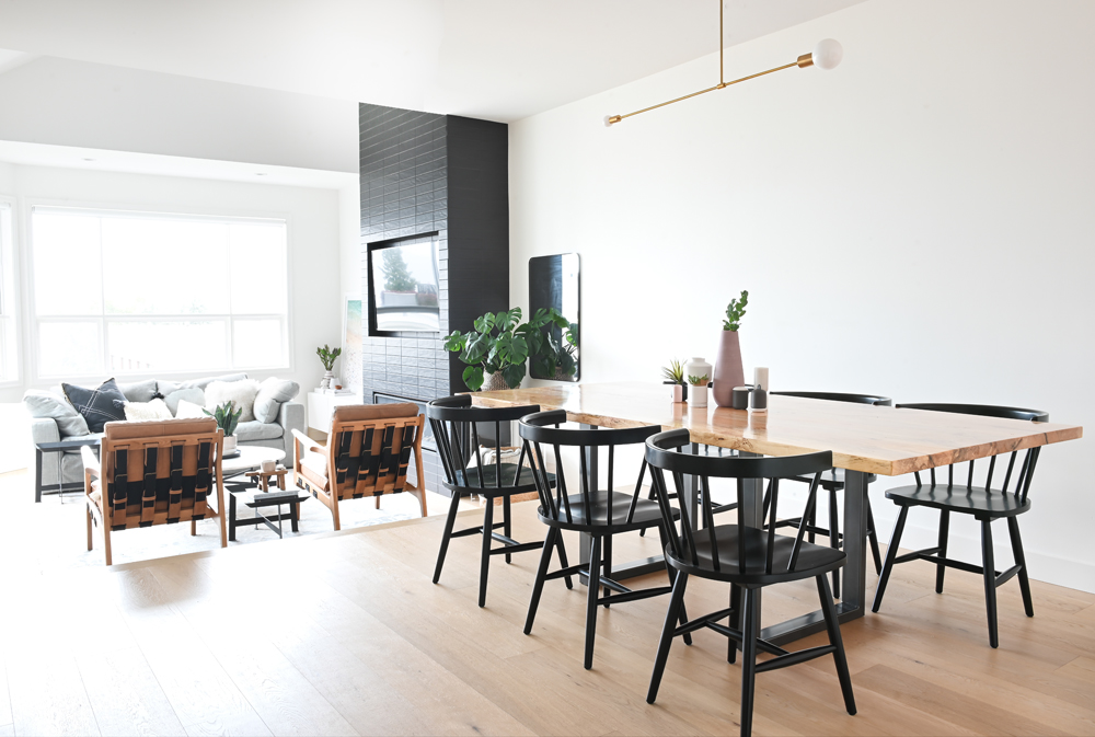
This angle showcases the tiny condo’s expansive new look. The handsome dining table was built by the owner’s uncle as a housewarming gift. Lindsay contrasted its warm wooden top with sharp black chairs from EQ3. Note how even the backs of the living room chairs are in sync with the colour palette here.
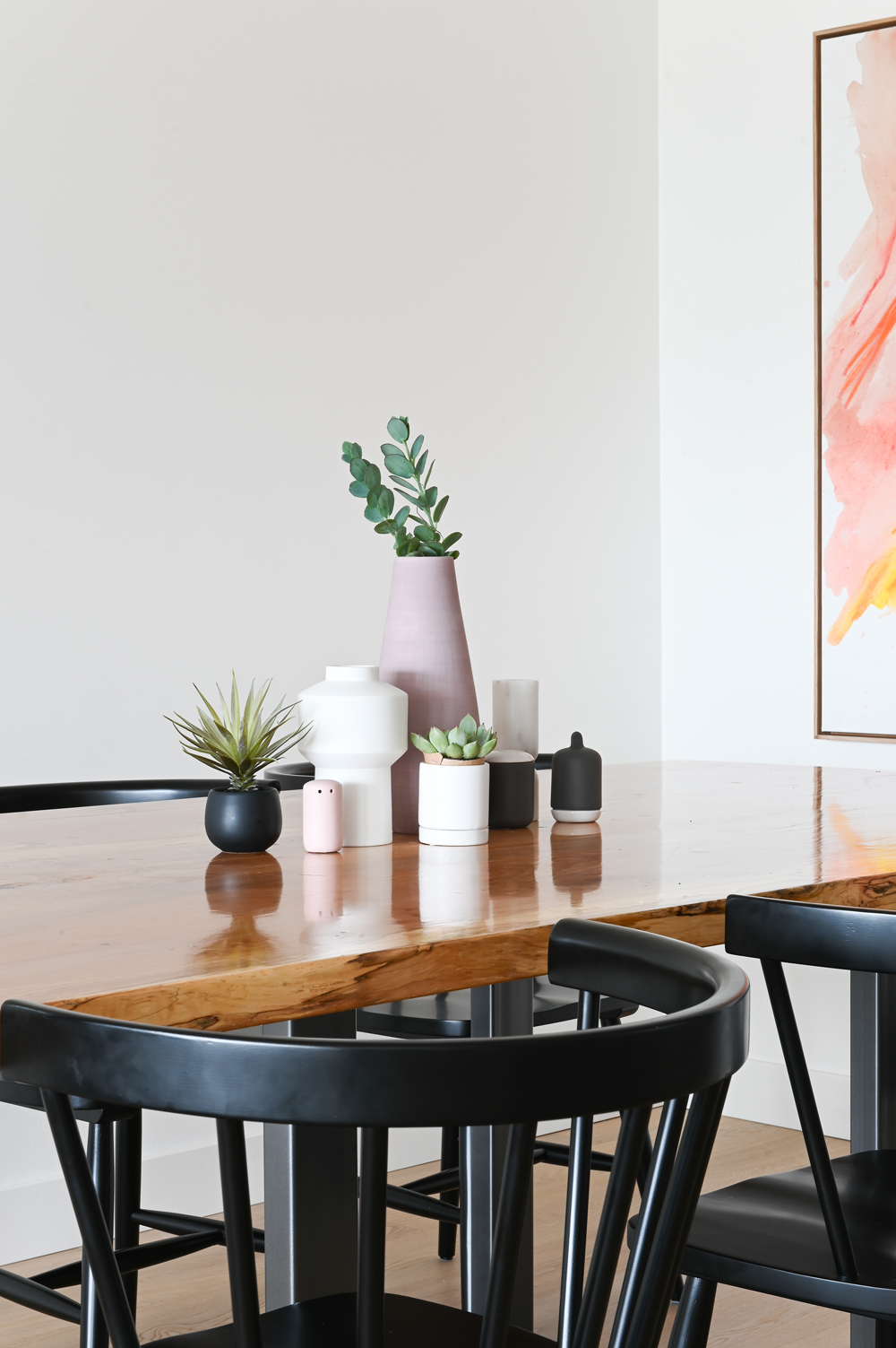
All Shapes and Sizes
A centrepiece of vessels with interesting silhouettes enlivens the dining room table. They’re a mix, from CB2 and EQ3, that works well thanks to shared round lines and soft, matte finishes.
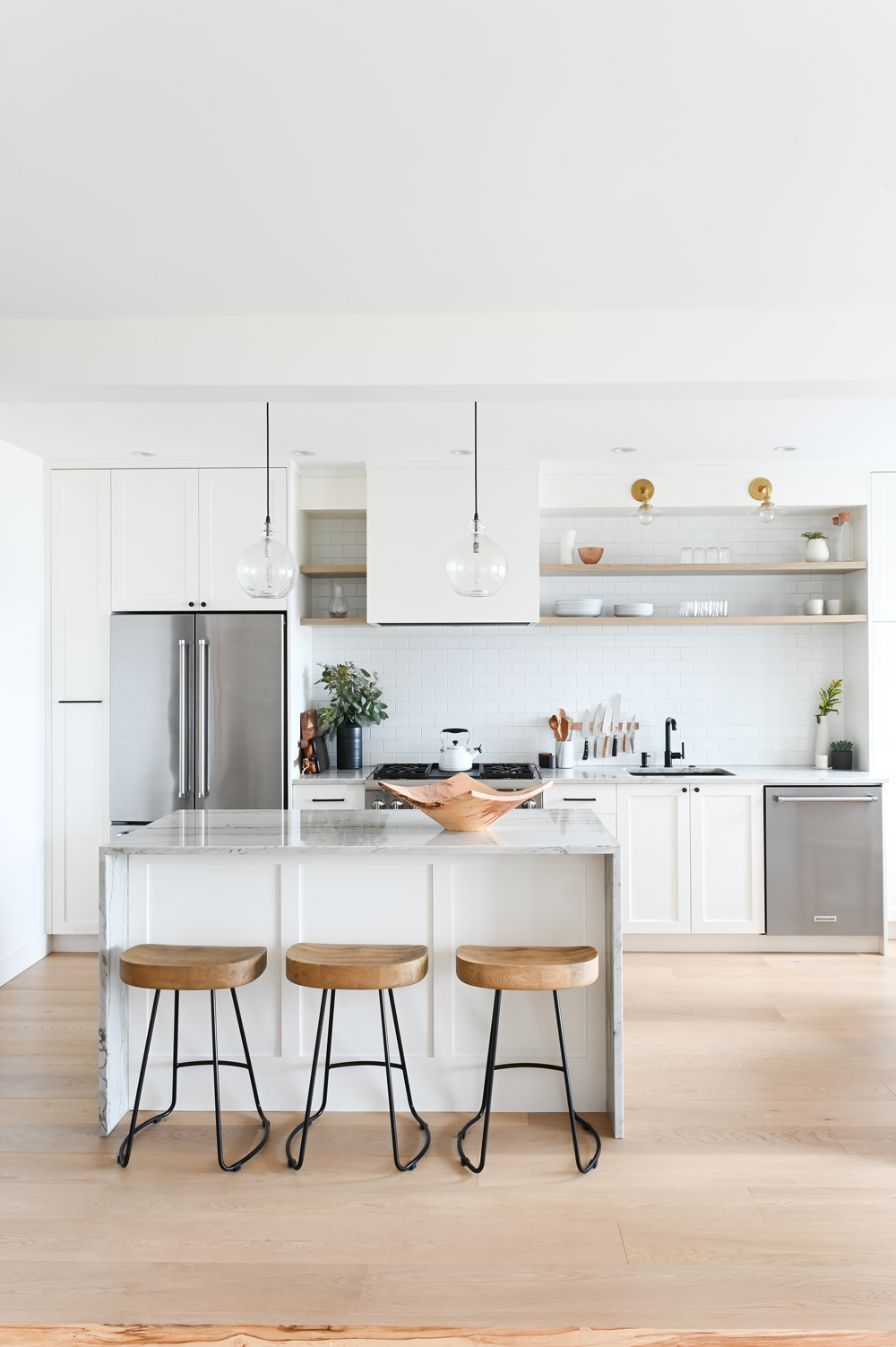
A Cook’s Kitchen
As in many makeovers, the kitchen upgrade was the main priority in this renovation. Knocking down the wall that enclosed it, opening it up to the rest of the space, building an island and adding a new gas line for the stove (the old one was electric) were just some to the wish-list boxes Lindsay ticked before layering in the fun part: the decor.
Related: This Entire Toronto Apartment Was Furnished and Decorated for Less Than $2,500
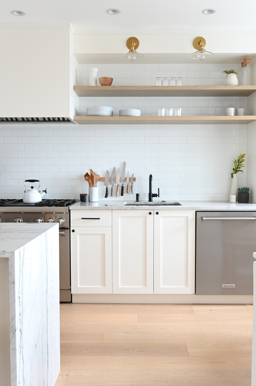
In the Hood
The attention to detail in the kitchen’s finishes is evident in the sleek range hood. “I love the look of an integrated hood fan,” says Lindsay. “It’s beautifully clean and simple.” It also provides a great frame for the floating shelves and creates an overall custom vibe that elevates the space (read: you don’t have to settle for a hood out of a box).
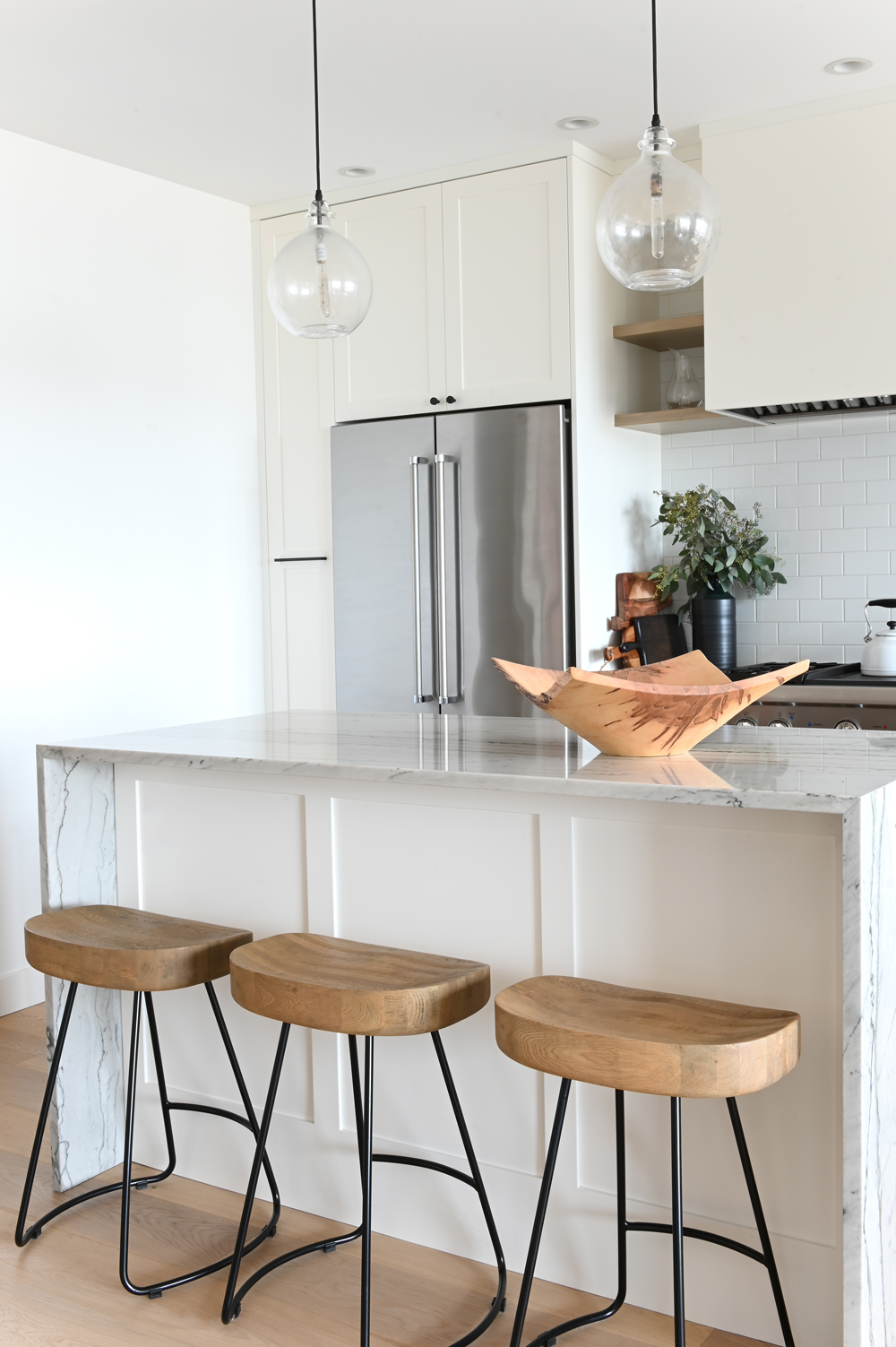
Shaker It Up
The dynamic mix of materials in the kitchen was very much intentional. Lindsay says, “While the owner loves modern lines, I wanted to make sure this space felt warm and cozy as well. I find that Shaker-style cabinetry lends itself to this, being clean but not too contemporary.” We love how she even incorporated it beneath the island. Clear pendant lights keep the millwork the focus.
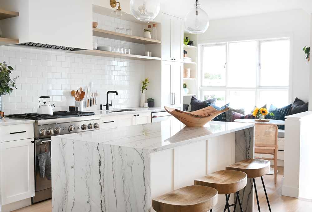
Waterfall Effect
The island’s waterfall finish adds a splash of luxury and the heavy veining feels natural, almost organic. The wood-topped stools further the natural tone and layer a bit of warmth into the mostly white space. They’re also a nice tie-in to the dining area’s wood-topped table, which is visible from the kitchen.
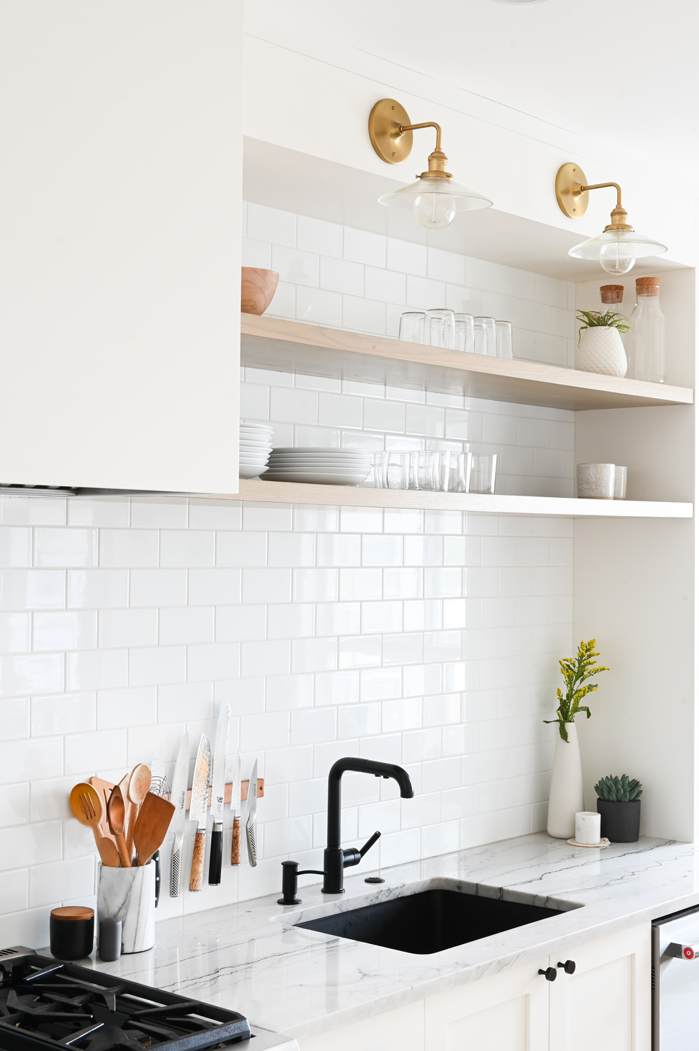
Classic Warmth
Simple classic subway tiles are easy to clean and keep the shelves a focal point. Lindsay added the floating shelves here to break up the millwork and also for the owner who is an avid home cook. They’re extremely functional and channel the look of a restaurant kitchen. The brass sconces feel like a special touch and offer some warmth among the crisp monochromatic tones (more on that stunning black sink next!).
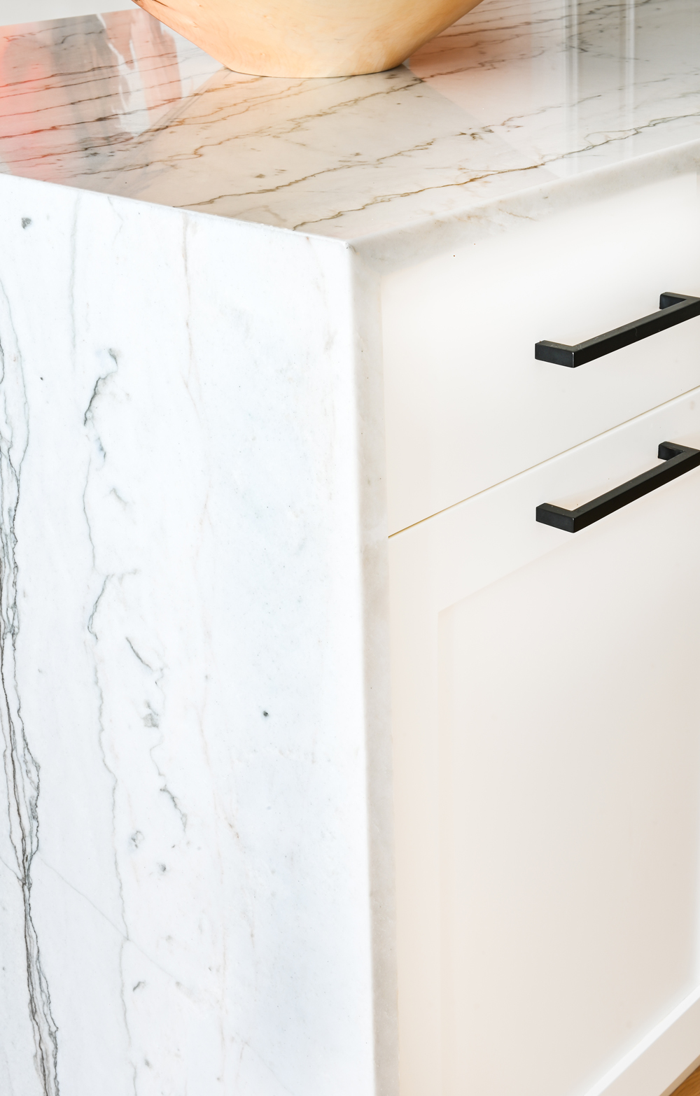
A Dash of Pepper
Black hardware is a genius way to add contrast to white cabinetry and in this case, continuity with design elements found in the living and dining areas. The look is clean, yet dramatic and Lindsay was bold enough to carry it through to the sink and faucet seen in the previous slide.

Cutting Edge
You don’t have to be a home chef to store your knives like one. A metallic knife holder keeps utensils within easy reach, frees up the counter space and it also looks cool, displaying different shapes, sizes and handle treatments.
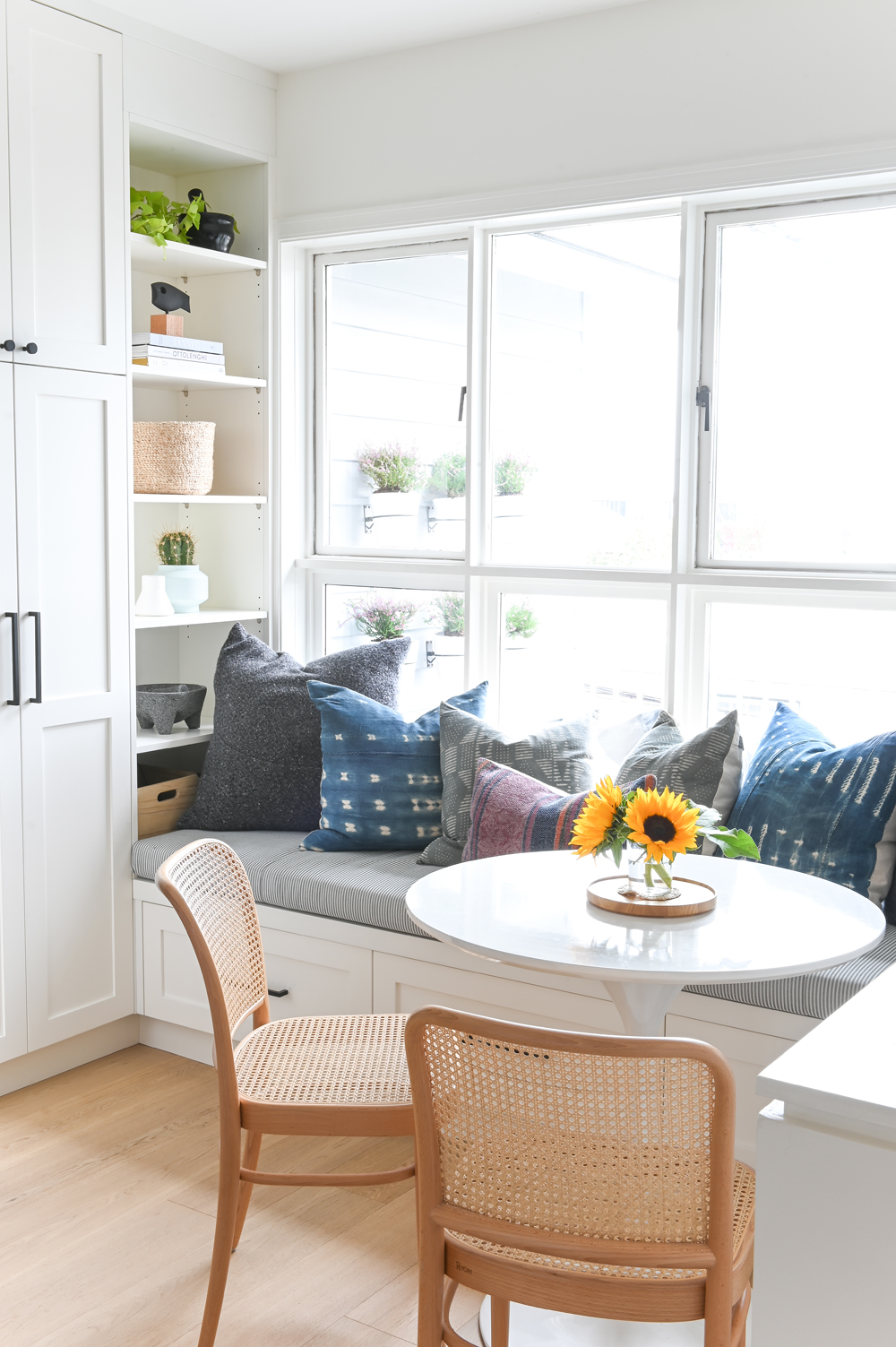
By the Nook
How inviting is this breakfast nook? Lindsay maximized the space around the window by adding a built-in bench and open shelving. The pony wall to the right was originally full-height; opening it up to the living area makes this sunny spot even more appealing. Again, a reminder that little tweaks to existing floor plans can net big results.
Nook Shelves
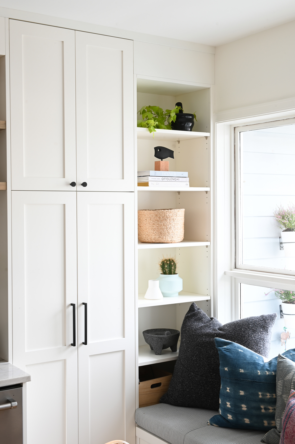
“Storage is always an issue in condos,” says Lindsay. “I extended the kitchen millwork all the way to the window and beneath the bench to increase this precious commodity.” The owner now has so much additional space to stash essentials that the shelves can also display pretty things like cookbooks and mortar and pestles.
Natural Elements
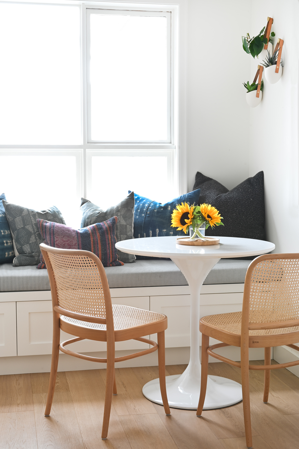
Cane back seats, a wooden tray and leather straps on wall-mounted planters have one thing in common: natural materials (and bonus: in the same natural tones). By incorporating these items into the breakfast nook, Lindsay achieved that coastal vibe she was after and again, added warming elements to a mostly white space. The mod silhouette of the table is a nice contrast to the classic chairs and casual cushions.

Hanging Around
Wall-mounted planters are an easy way to add greenery to any space and we love how white planters against a white wall allow the plants to pop and act almost like pieces of art.
Pretty in Pink
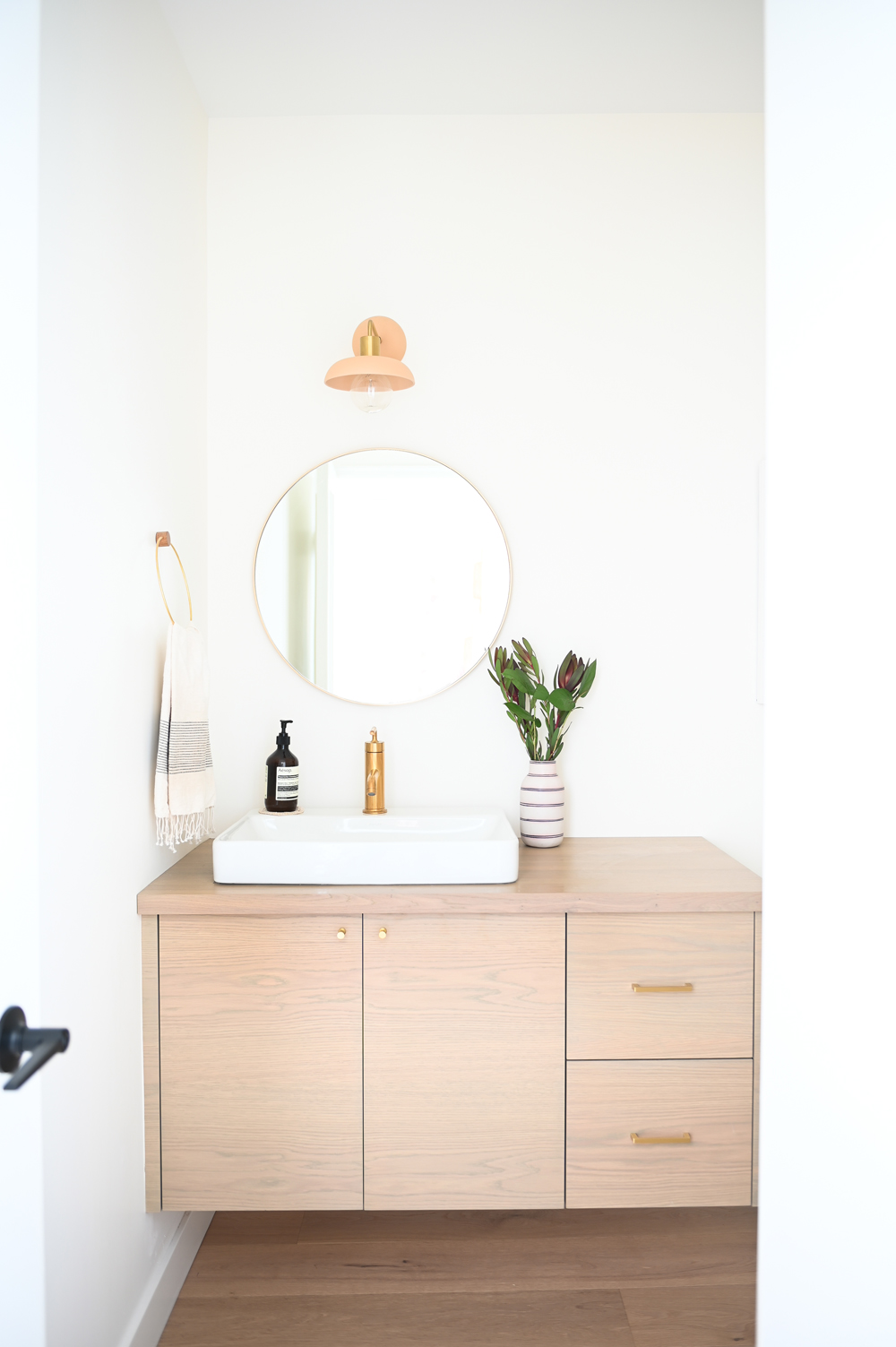
Lindsay’s mandate for the bathroom: warm, soft and pretty. The custom-designed oak-veneered vanity was stained a rosy hue and finished with brass hardware – it’s a nice departure from the kitchen’s white millwork and black accents. The floating mirror is airy and makes the small room feel a bit bigger.
Round Up
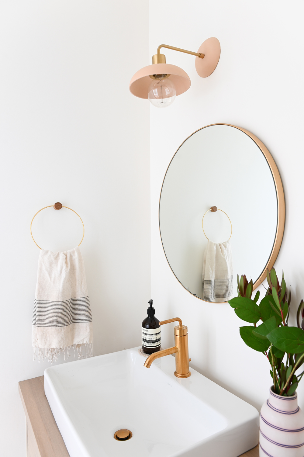
The symmetry of rounded shapes here is a pretty foil to the vanity’s angles. The rose-gold mirror from Wayfair, single faucet, simple towel holder and even the sweet little coaster beneath the soap all speak to Lindsay’s love of design details and continuity. And that delectable pink and brass sconce is like the cherry on top.
HGTV your inbox.
By clicking "SIGN UP” you agree to receive emails from HGTV and accept Corus' Terms of Use and Corus' Privacy Policy.


