When Kortney and Dave Wilson take on a house-flipping project on Masters of Flip, they never go half way. They saw the potential of a ho-hum split-level house, and were able to transform it into something pretty special.
All in One
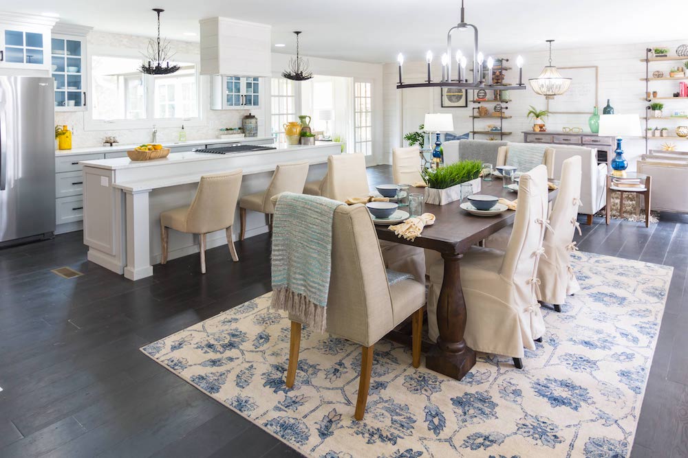
When a home’s layout isn’t working for the Wilsons, they just take down a wall or two. And that’s exactly what they did here to get this easy-breezy dining-plus-living area.
Video: Want to see the full renovation? Watch this full episode of Masters of Flip here.
Dine to Shine
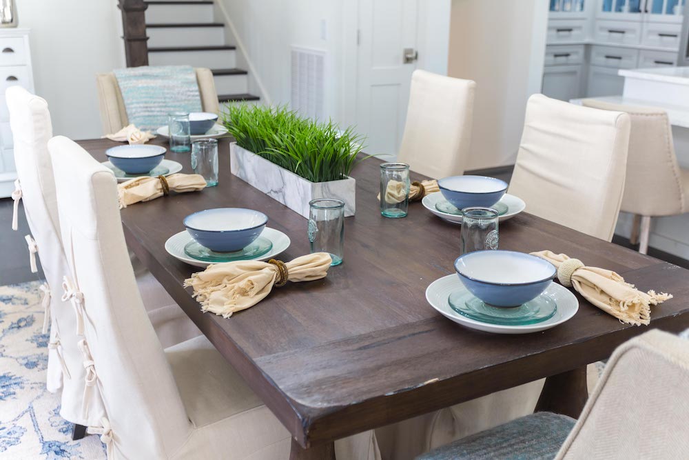
Trying to keep it light and welcoming, Kortney chose soft blues, aqua greens and sand tones for this home’s staging colour scheme, which is reflected in the casual place settings on the substantial dining-room table.
The Great Divide
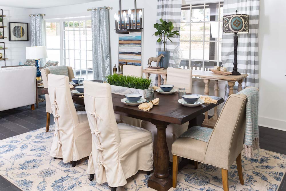
Choosing different sets of drapes for the dining room and living room help to differentiate the distinct spaces in this large, open-concept home – they take the place of a room-diving wall.
On Your Mark
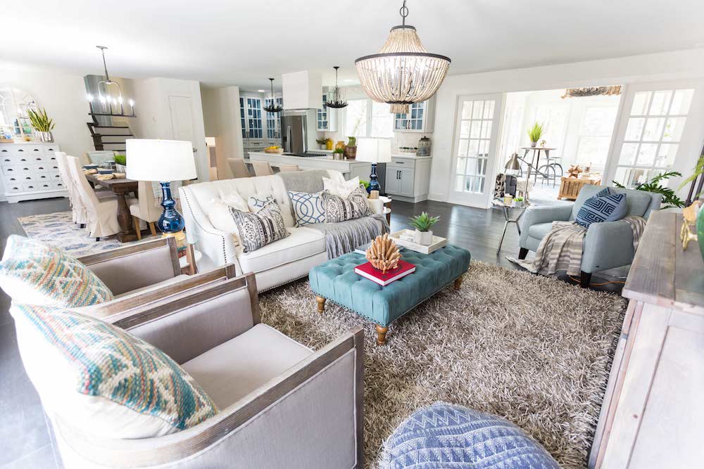
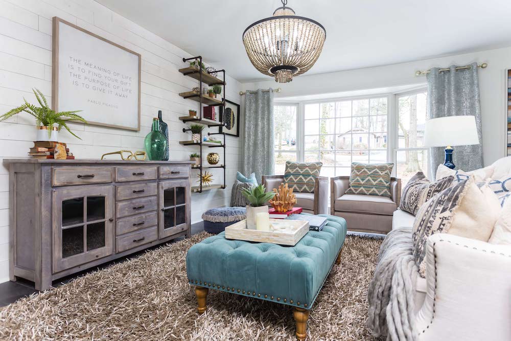
A grand vintage-inspired glass chandelier hangs over the formal seating area helping to demarcate where the dining room ends and living room begins.
Text Her
In a space where the walls and ceiling are flat white, Kortney uses texture found in the deep, grey shag carpet, blue velvet ottoman and embroidered multi-coloured throw cushions to add depth and visual interest.
Designated Survivor
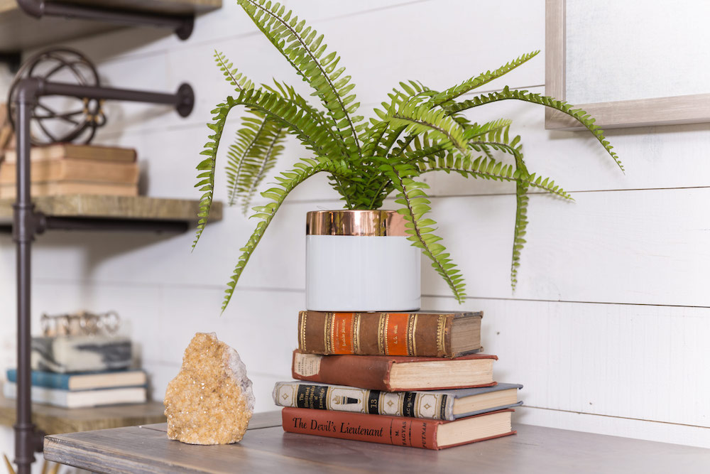
To add even more interest to the living room and help designate the sitting area from the rest of the open, airy space, Dave and Kortney installed white wooden peel-and-stick paneling to the back wall.
Always Accessorize
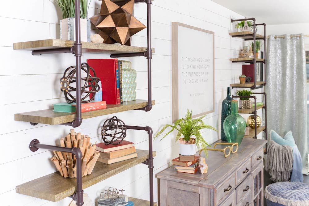
Since Kortney kept the walls and furnishings quite neutral, she used other accessories, such as red-bound vintage books, blue and green glass vases and metallic objets du art, to bring colour into the fully renovated space.
Birds of a Feather
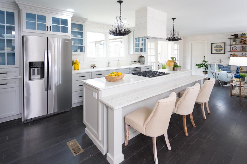
The design and layout of the new large, open kitchen is quite traditional but there are unexpected twists such as the sky-blue interior of the cabinets and the funky bird’s-nest chandelier light fixtures.
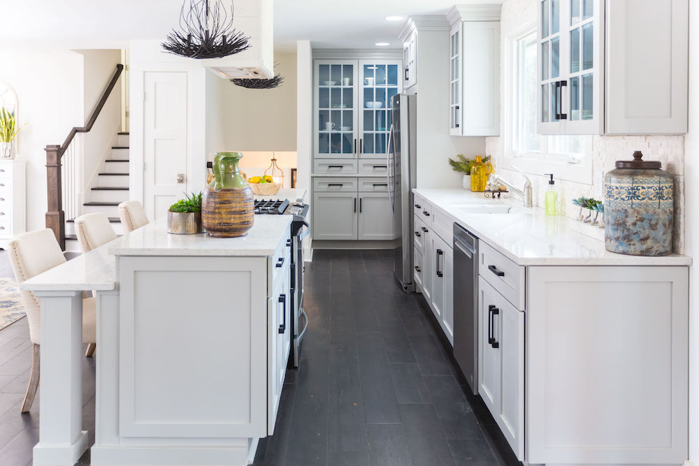
Back in Black
“I think the black floors really pull everything together because everything’s so white, airy and dreamy,” says Kortney of her unconventional yet modern flooring choice. “The floors sort of ground the space.”
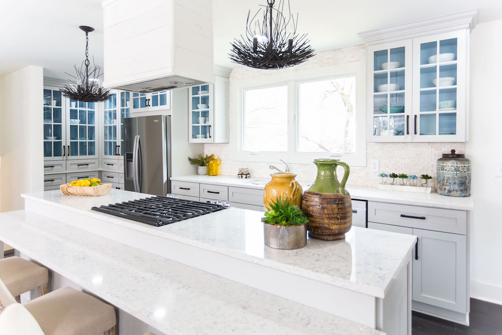
Same Vein
One of the reasons Kortney went with these particular quartz countertops is that the blue-grey veining in them mirrors the pretty sky-blue paint inside the white kitchen cabinets.
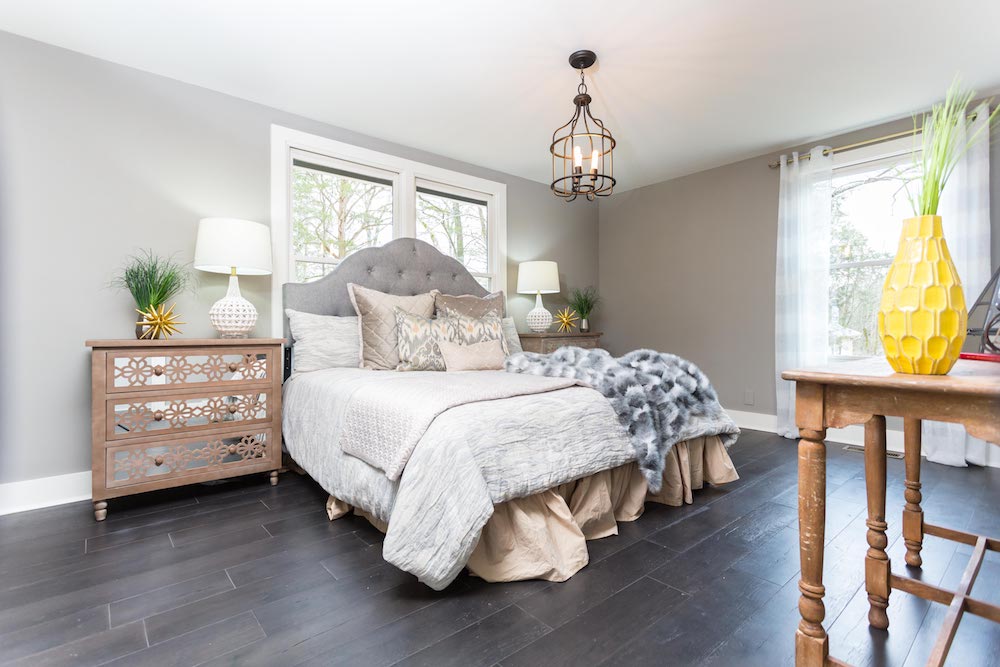
Be Our Guest
Dave’s plan was to add another bedroom to this 2323-sq.-ft., three-bedroom house, which he managed by rearranging the rooms and transforming the original master bedroom into this palatial guest suite – complete with a unique birdcage chandelier and mirrored bedside dressers.
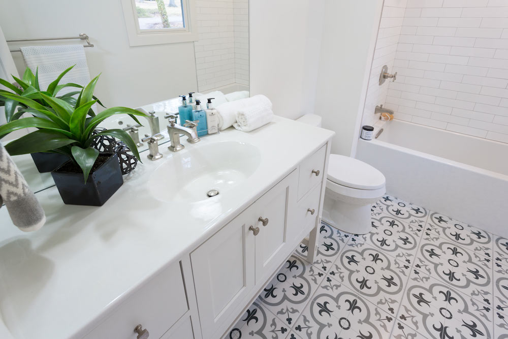
Mais Oui, Fleur-de-lis
Widening the original master bedroom ensuite turned a once cramped bathroom into a lovely, spa-like space featuring on-trend, grey and white fleur-de-lis floor tiles.
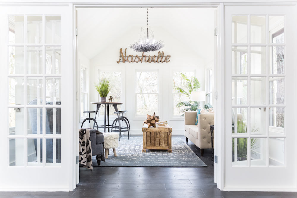
Sunny Days
As the only addition to the existing house, Kortney and Dave wanted to make sure this “bump out” sunroom really shines. French doors and windows galore made sure of that, as well as charming antique-inspired furnishings.
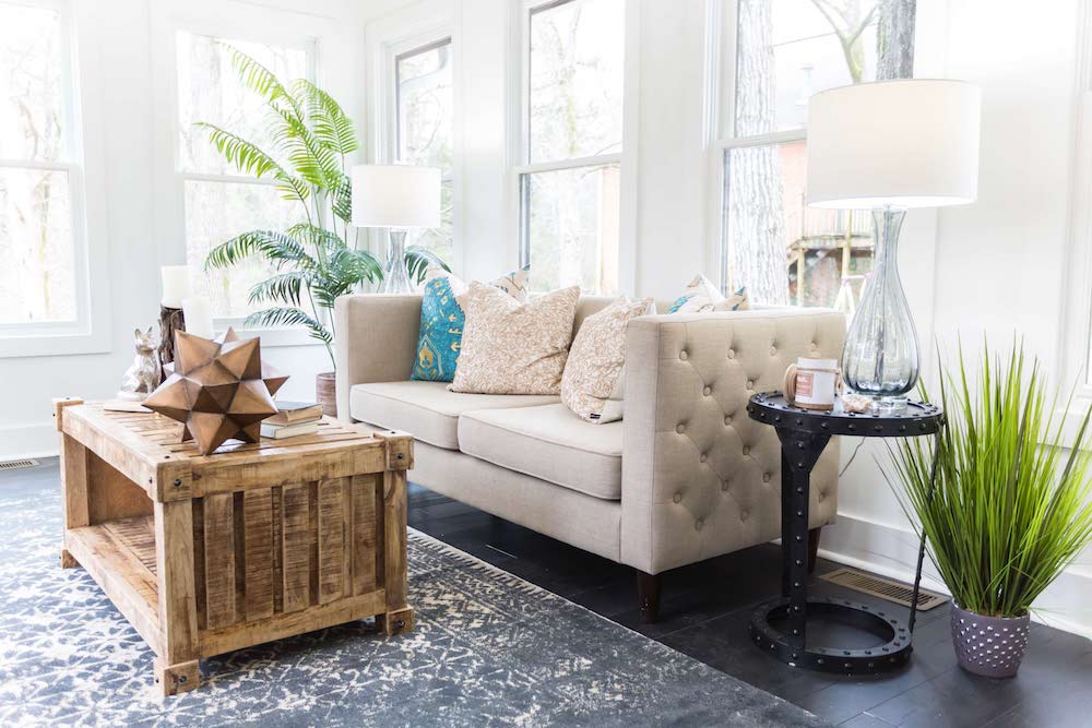
Mix and (Not) Match
Positioning the tufted couch so prospective buyers could see the view of the forest and creek in the backyard was all part of Kortney’s plan – so was choosing a contrasting mix of industrial-and-country-inspired furnishings.
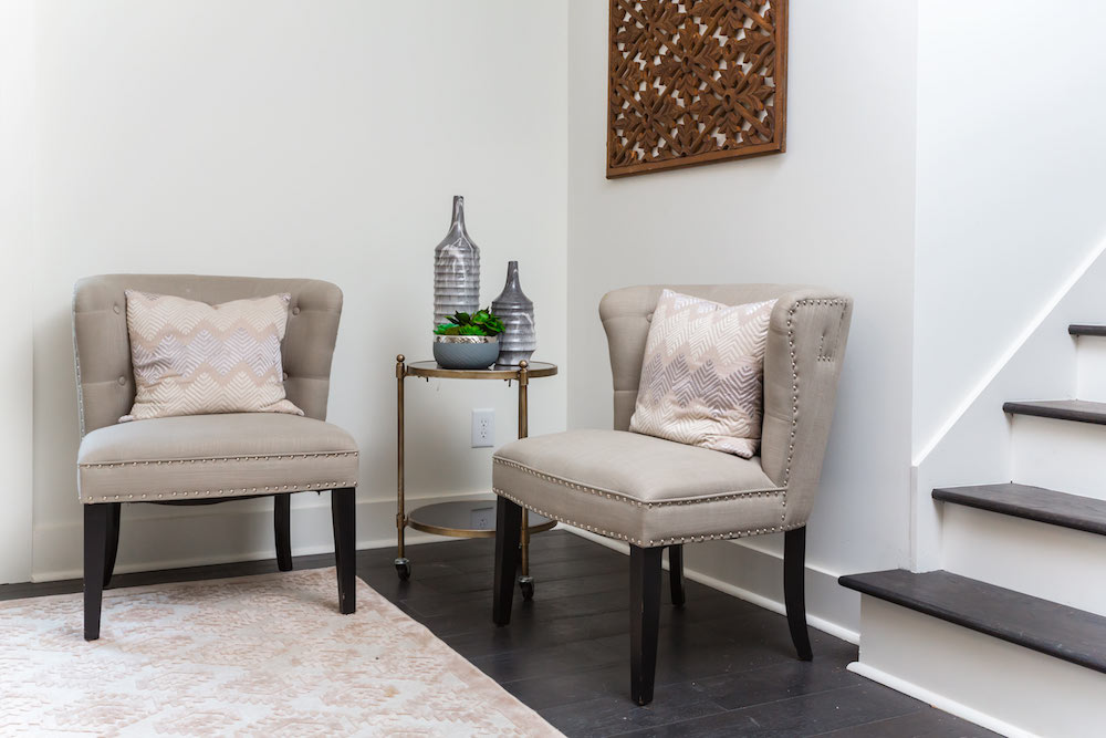
Separation Anxiety
Having a split-level layout to work with gave the Wilsons some creative ideas when it came to choosing the function of each room. The master suite was relocated to the lower level creating a sense of separation from the rest of the house.
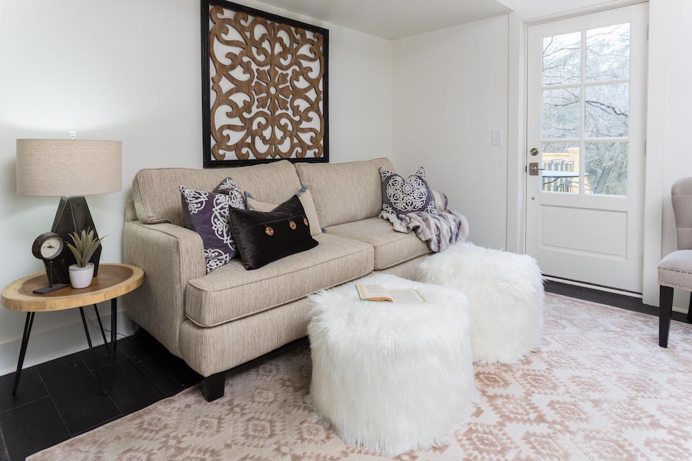
Walled Off
Adding a wall to the completed lower level enabled them to create a private sitting room as part of the master suite, which could also work as an extra guest room or office. The room is tired together using texture and repeating patterns found in the rug, pillows and wall art.
Beige Before Anyone
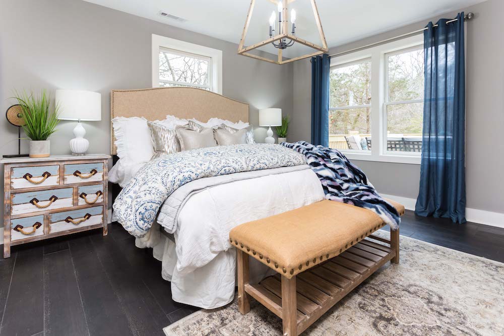
The enormous master bedroom pulls in a number of different colours, from the navy drapes to the silver throw pillows, but it’s the beige headboard, bench and wooden light fixture that work to balance out the room beautifully.
Mining for Gold
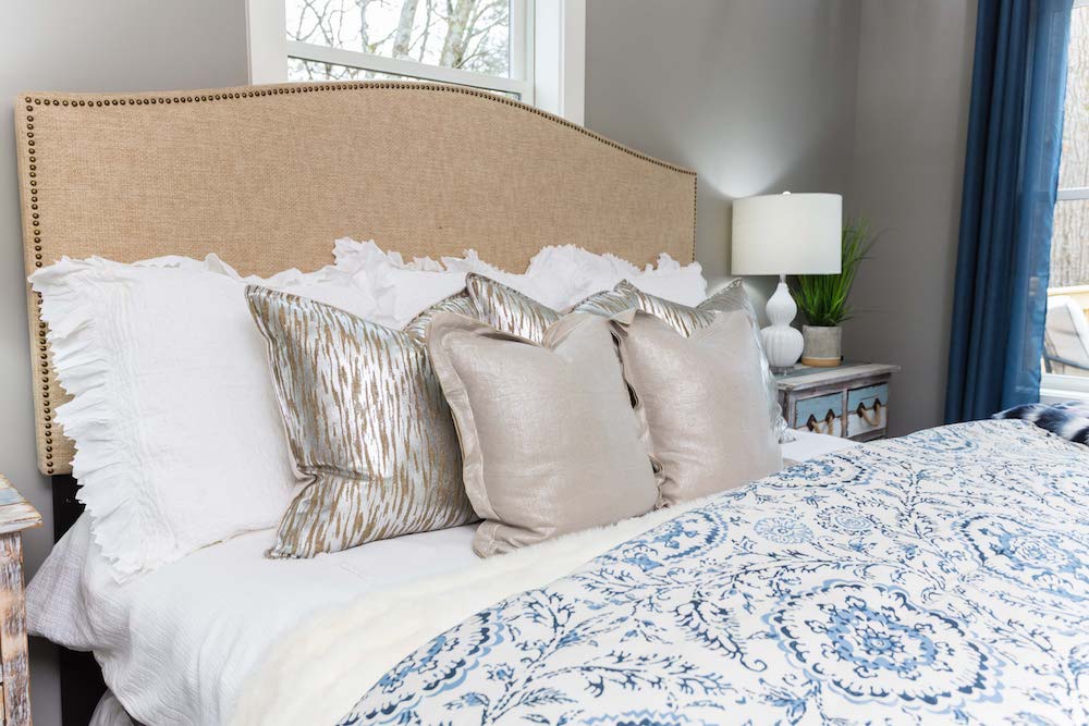
Mixing metallics is no longer a decorating faux pas, it’s a full-on décor trend – these gorgeous silver and gold throw pillows are proof of that.
So Tiled
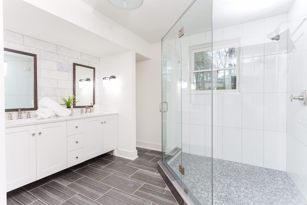
The expansive master ensuite uses four different tiles – on the floor, above the vanity, in the shower walls and on the shower floor – but rather than having it be too much, it feels just right thanks to the unifying grey-and-white colour palette.
Walk-In Closet Clinic
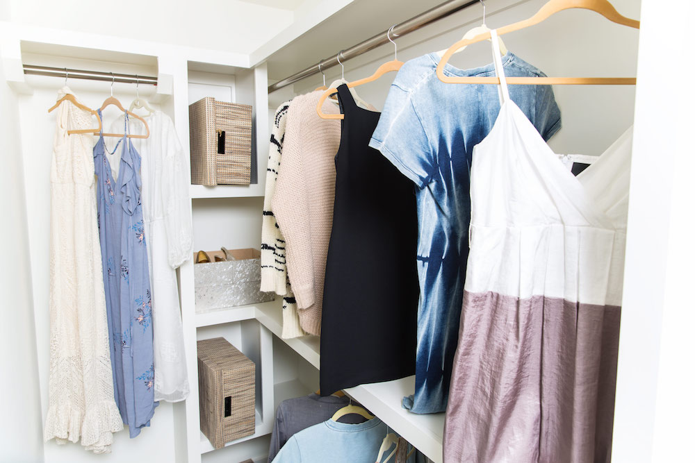
No Masters of Flip master suite would be complete without a walk-in closet, and this flip is no different. Two large clothes railings offer plenty of hanging space, while solid white shelves handle everything else from sling-backs to sweaters.
She Sells Seashells
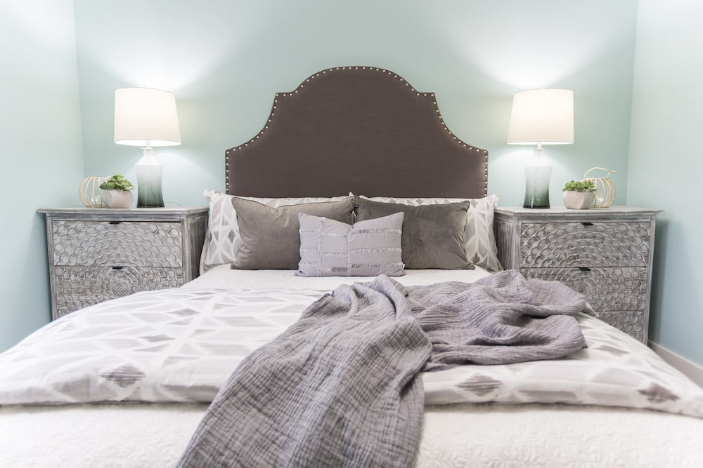
Kortney decided to go coastal with the bedroom décor, pulling colours found by the seashore – soft greys for the headboard and bedside tables, whites for the linens and a blue-green for the walls.
Coastal Connections
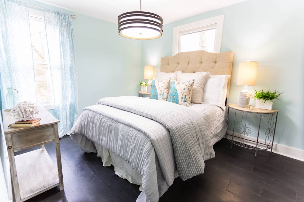
In order to create a sense of cohesiveness upstairs, the fourth bedroom keeps the sea theme going but adds a punch of aquamarine with the throw pillows and shear panel drapes.
Profit Margins
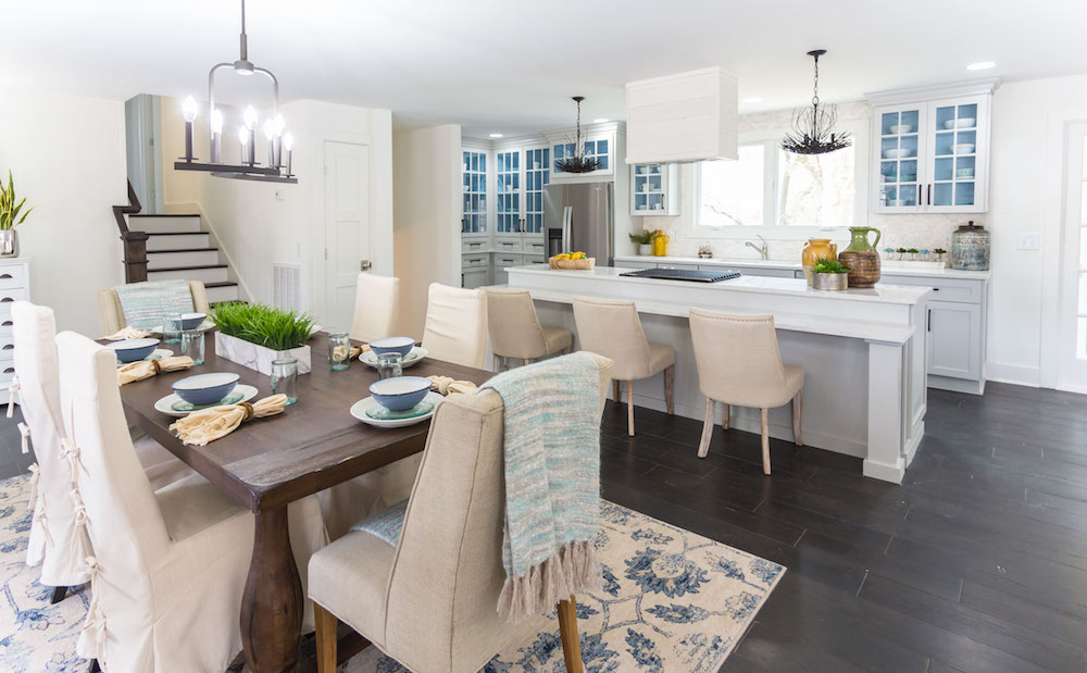
After deciding to buy a split-level Nashville house for US$275K, the Wilsons put $172K into transforming the interior and exterior into a chic, coastal retreat. Putting it on the market for $560K, it sold quickly at list price, giving them a $79K profit.
HGTV your inbox.
By clicking "SIGN UP” you agree to receive emails from HGTV and accept Corus' Terms of Use and Corus' Privacy Policy.


