To get this 3,100-square-foot West Vancouver home in sync with the needs of Alex and Tanya Suelzle and their three kids (Elle, 9, Cohen 6, and Lilly, 4), designer Joanna Vagelatos from JV Design Group was willing to break down walls – literally. “The original layout featured dark compartmentalized rooms,” says Joanna. “It was far from the open and bright family space we envisioned.” So, main floor walls came down, light colours came in and modern, family-style living began in earnest.
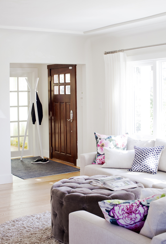
Wood Works
Designer Joanna Vagelatos chose a wood-tone door for the front entrance with both the inside and outside in mind. “The exterior is charcoal stucco, which lends itself to warmer woods rather than white. The same goes for inside – the wood adds warmth and makes the entryway pop.”
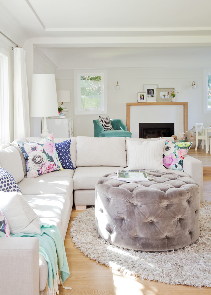
Party of Five
“The living room sectional was chosen based on the family’s lifestyle,” says Joanna. “They wanted this space to feel cozy while still providing ample seating for five.” The ottoman is both stylish and kid-friendly. “It has beautiful texture, acts as a coffee table and, with no sharp edges, is safe for little ones.”
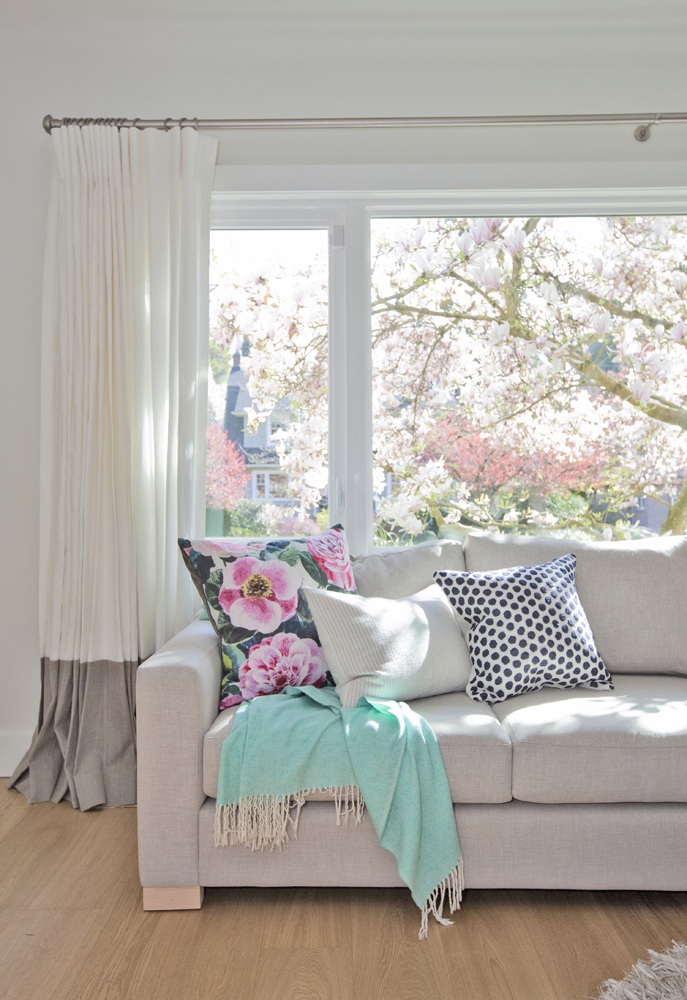
Changing Colours
“Toss cushions and throws are a super way to add colour and pattern,” says Joanna. “They’re low-commitment pieces and easily change the look of the room.” Two-tone drapes establish a contemporary aesthetic yet are in tune with the young family who lives here. “The darker linen at the bottom looks less dirty than white over time and stands up to sticky fingers.”
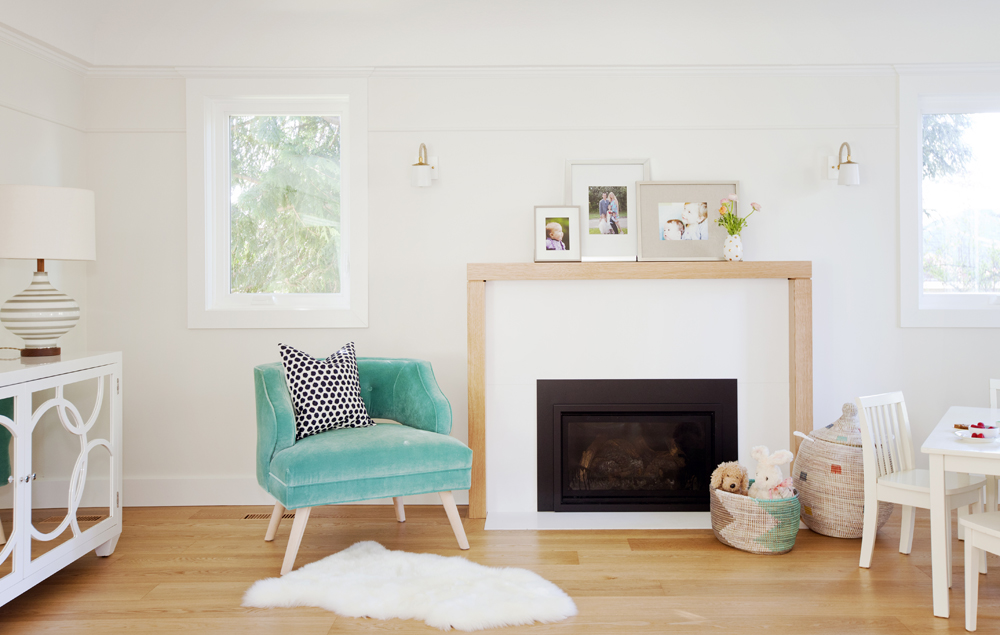
Framework
The back part of the living room – it’s a step up from the sectional seating area – has a fireplace with organic appeal. “It’s simple and modern but framing it with unpainted wood keeps it warm. It also ties in nicely with the kitchen’s oak island, which is visible from this space.” The custom-made chair, covered in turquoise velvet, provides an eye-catching splash of colour.
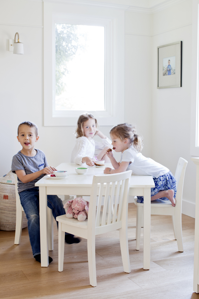
Action Plan
This back corner of the living room is the command centre for Elle, Cohen and Lilly. Joanna says, “It’s a designated space that allows them to be part of the action rather than having to play in the basement or their bedrooms.”

In Bloom
On the mantel, a posy of ranunculus sits in front of a group of family photos. “Layering multiple frames this way, as opposed to hanging a single piece, creates a more casual and eclectic feel,” says Joanna. “The family can change the photos as the kids grow.”
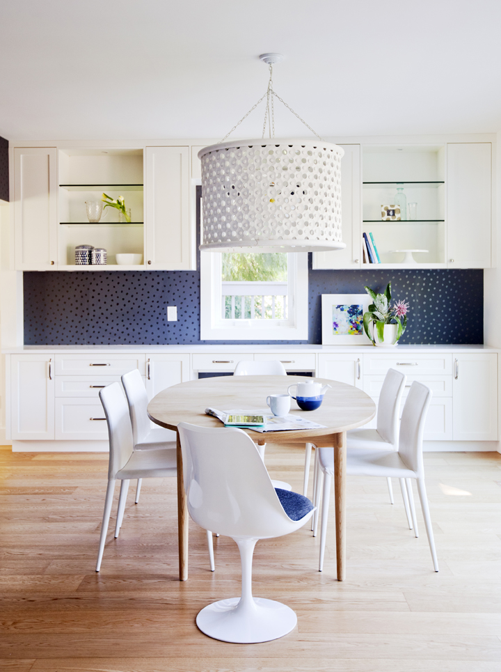
Get Back
A bold backdrop gives the kitchen’s dining area an exhilarating lift. “It’s actually wallpaper from Juju Papers of Portland,” says Joanna. It’s a snazzy riff on the blue chair cushions at either end of the table and a rich contrast to the engineered oak flooring. Open glass shelves between the upper cabinets maintain a light effect and are a pretty perch for decorative objects.
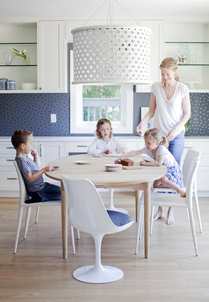
Light Away
The kitchen’s stunning light fixture was “stolen” from the dining room and now lives here permanently. “The shade is actually made of carved wood, so it adds warmth by way of texture, yet still feels light because it’s white,” says the designer. “Its oversized scale is impactful here.” Indeed, but not so much as to distract the kids from mom’s banana bread.
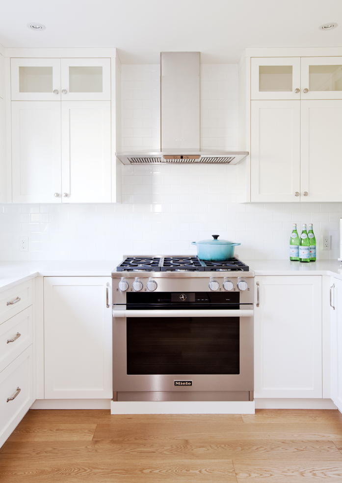
In Tile
The backsplash encapsulates the home’s makeover mandate. “We wanted to create a modern feel in the house but still stay true to its traditional style,” says Joanna. “Subway tiles are super classic and bridge that gap.” They’re applied all the way to the ceiling for a finished effect that doesn’t stop stingily half way up the wall.
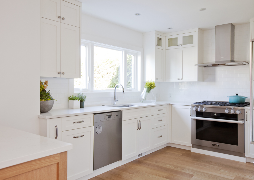
Glass Act
A private setting allows for unadorned kitchen windows. A portion of the upper cupboards features glass-front doors that break up the cabinetry and fend off a heavy look.
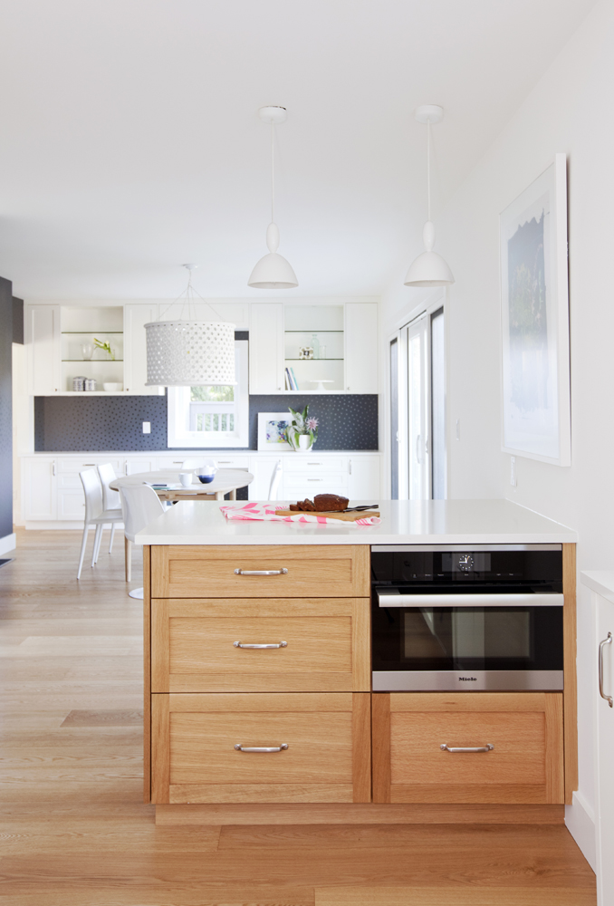
Go for Oak
This peninsula subtly separates the kitchen from the eating area and is crafted from oak to warmly contrast all of the white cabinetry. It’s also a discreet hub for storage and the microwave.
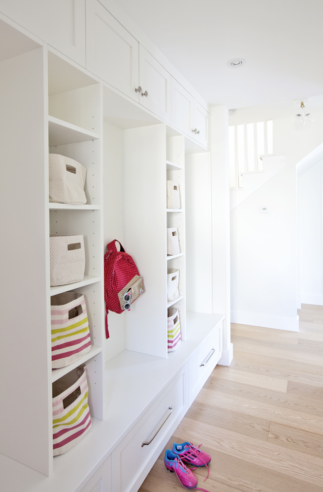
A Place for Everything
Joanna’s ingenious storage feature, opposite the front door, ensures that everything is always in its place. “This area acts as a mudroom and the built-in cubbies and drawers mean each child has their own storage space so the family can stay organized.”
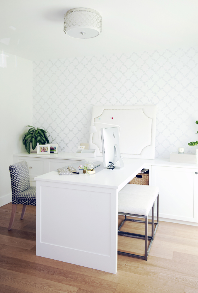
Office Grace
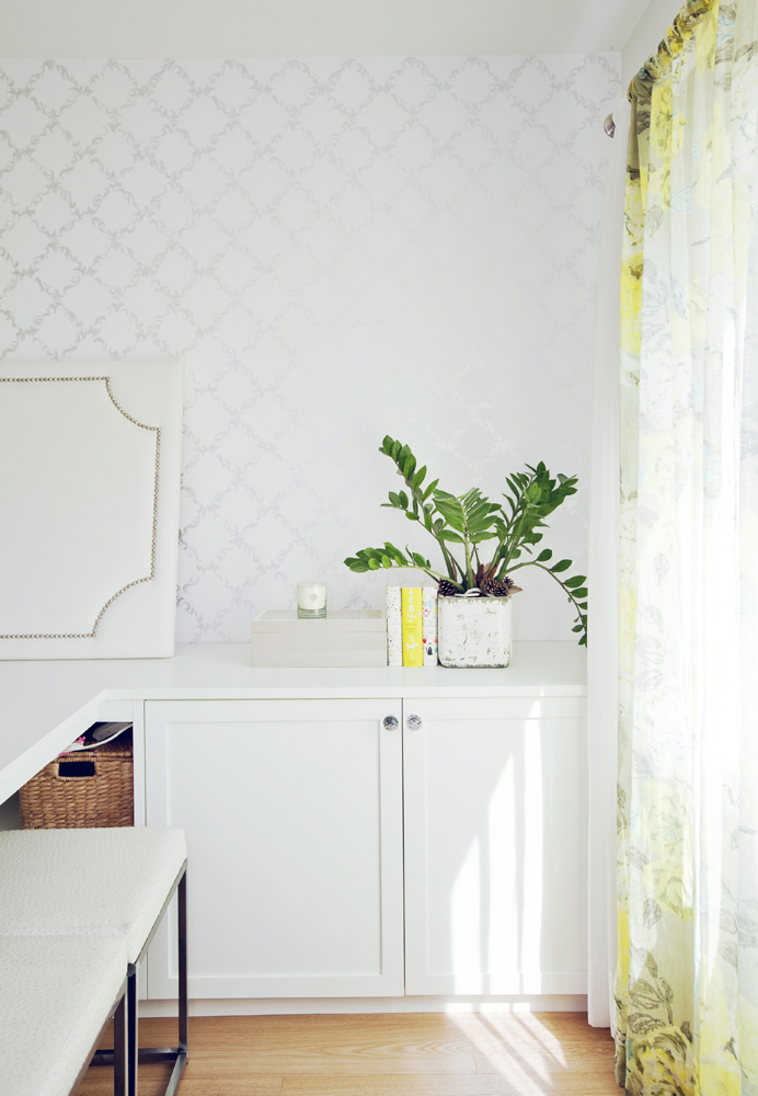
The home office is the only enclosed room on the main floor’s open plan and it is exquisitely pretty. “Tanya works from home so this space had to fit in with the rest of the house, but I also wanted it to be a little escape for her,” says Joanna. “I used soft tones and subtle pattern to add femininity.”
Room With a View
The home office’s desk was custom-designed and positioned to take in the view. “I wanted Tanya to see the window when she’s working. I didn’t want her facing a wall.” Sheer floral drapes in a sunny shade layer in fresh colour and pattern.
Book Club
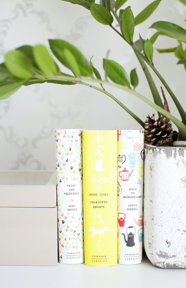
Classics, covered in prettily graphic dust jackets, strike a feminine note and play off the colour of the drapes.
Paper Back
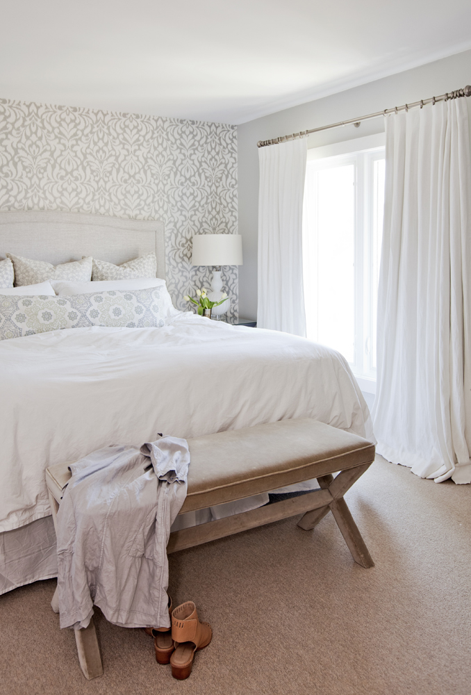
“Wallpaper is a great way to add texture, pattern and colour to any bedroom,” says Joanna. “Behind the bed is a nice spot for it as you usually want to keep the bed the focal point, and this really draws your eye there.”
Soft Touch
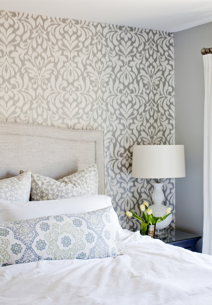
The master bedroom’s neutral palette is elevated with an enchanting mix of prints and textures. Patterned cushions softly echo the dramatic wallpaper and weave the room together in a way plain fabrics couldn’t.
Custom Order
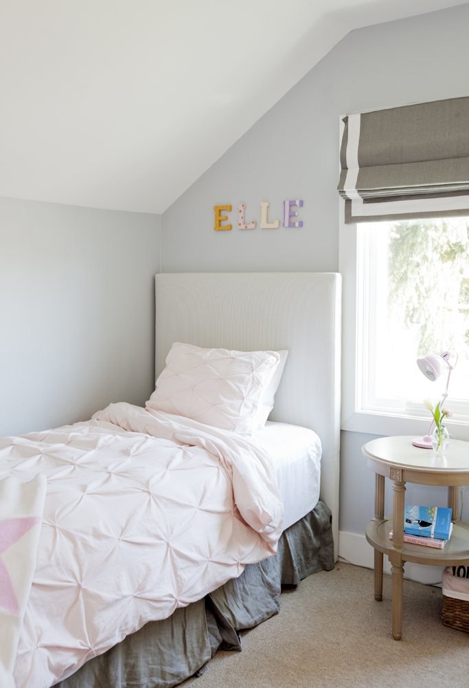
Elle’s bedroom features a custom-made grey pinstriped headboard and a custom-made Roman blind. “These are investment pieces, so we chose tones that aren’t kid-centric as children’s colour preferences change frequently.” The colourful block letters that spell out her name are a whimsical reminder that for now, this is still a 9-year-old girl’s room.
Remain Neutral
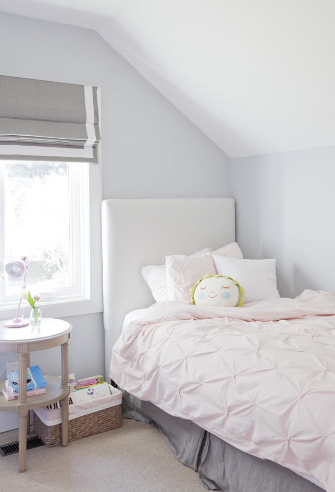
A neutral palette might seem sombre for a little girl’s space, but Elle’s room proves it is anything but. In fact, it allows the whimsical elements – like the girly pink accessories and the pretty side table – to shine.
Think Pink
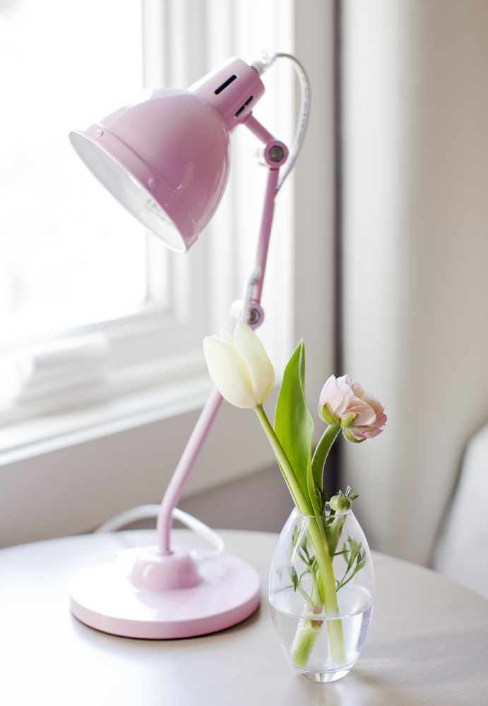
This desk lamp adds the traditional girly hue to Elle’s room without being overpowering.
Stair Master
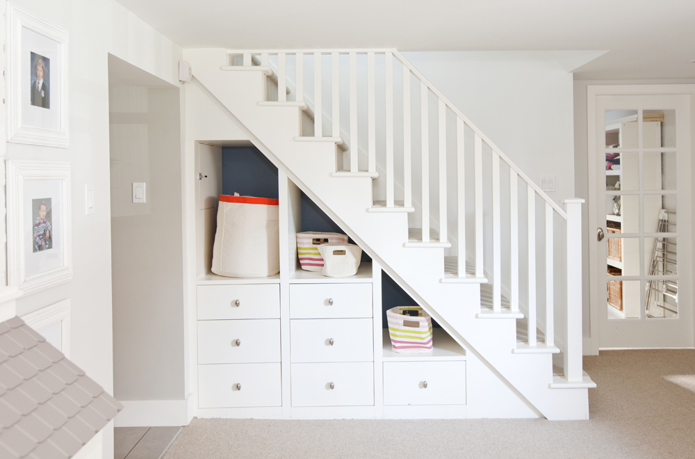
Joanna knows that any household with three little ones demands organized storage, and she was determined to achieve it wherever she could – including in one of her favourite go-to spots. “I love under-stair storage. It takes a closed, inaccessible space and makes it usable.” This storage lives in the basement and is a great place to stash toys.
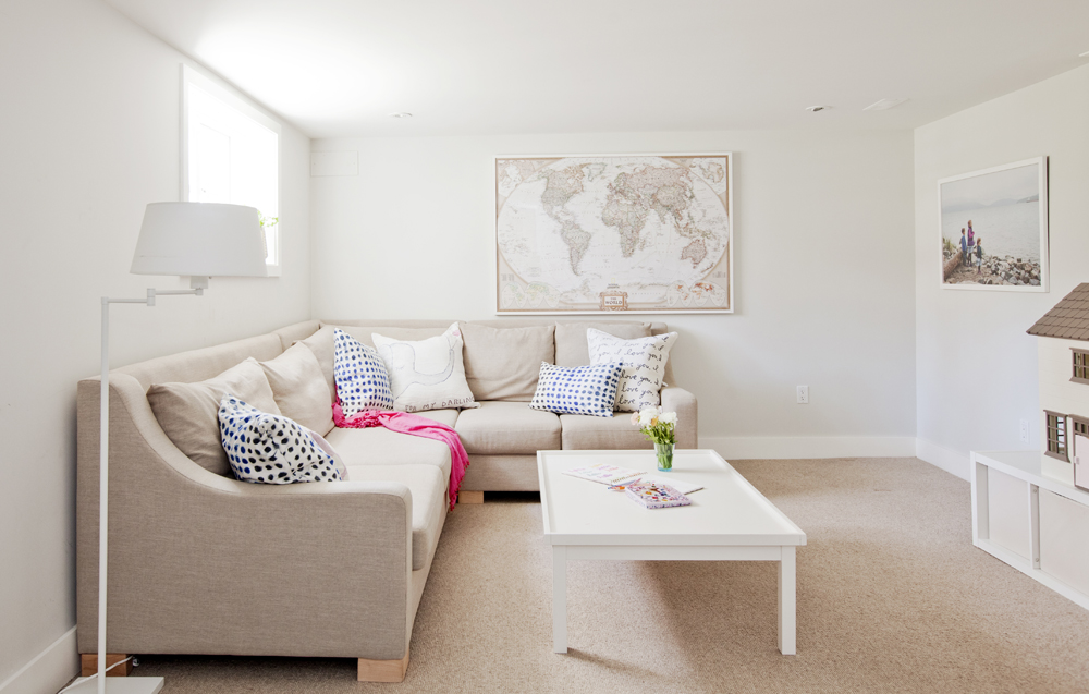
All Ages
Thanks to smart furnishings, the basement playroom is sturdy enough for Elle, Cohen and Lilly and sophisticated enough for mom and dad. “The carpeting looks elegant but it is also great for kids – it’s pure wool so it’s soft, non-toxic and cleanable.”
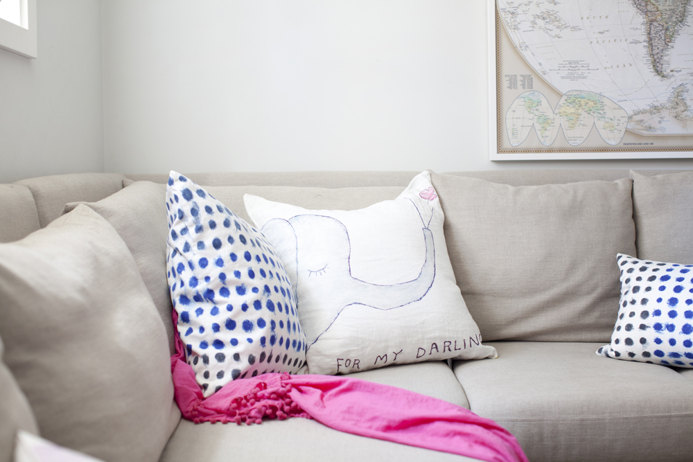
Sweet Sentiment
The ‘For My Darling’ pillow in the playroom is from The Cross Design & Decor. “The toss cushion’s colours work with the adult aspects of the house, but the image is whimsical and fun for a kids’ hangout.”
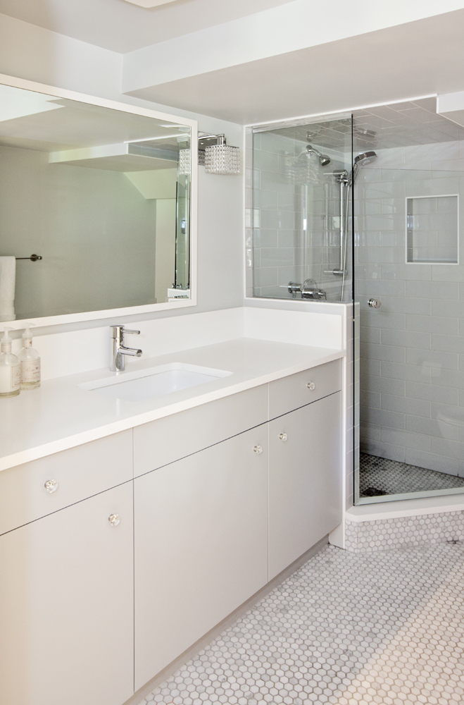
Pretty Penny
In the basement bathroom, a marble penny-tile floor adds texture and interest to a practical space. Joanna says, “Combined with the sleek slab-front cabinets, it’s a nice mix.” And, like the rest of the house, a perfect melding of modern and traditional befitting a young family of five.
HGTV your inbox.
By clicking "SIGN UP” you agree to receive emails from HGTV and accept Corus' Terms of Use and Corus' Privacy Policy.


