Taking work home took on a whole new meaning for Chris Meyer. As a builder with BC firm Homestar, crafters of luxury timber-framed abodes, Chris knew he wanted to build a dream space for his family (he and his wife Shayna have a baby son Axl). So he did – 8,000 square feet of dream space to be exact. When it came time to furnish it, he called in Vancouver designers Ben Leavitt and Kelly O’Quinn of PlaidFox Studio. “The homeowners wanted a rustic yet airy home,” says Ben. “Our vision was to make the grand space feel cozy, curated and interesting.”
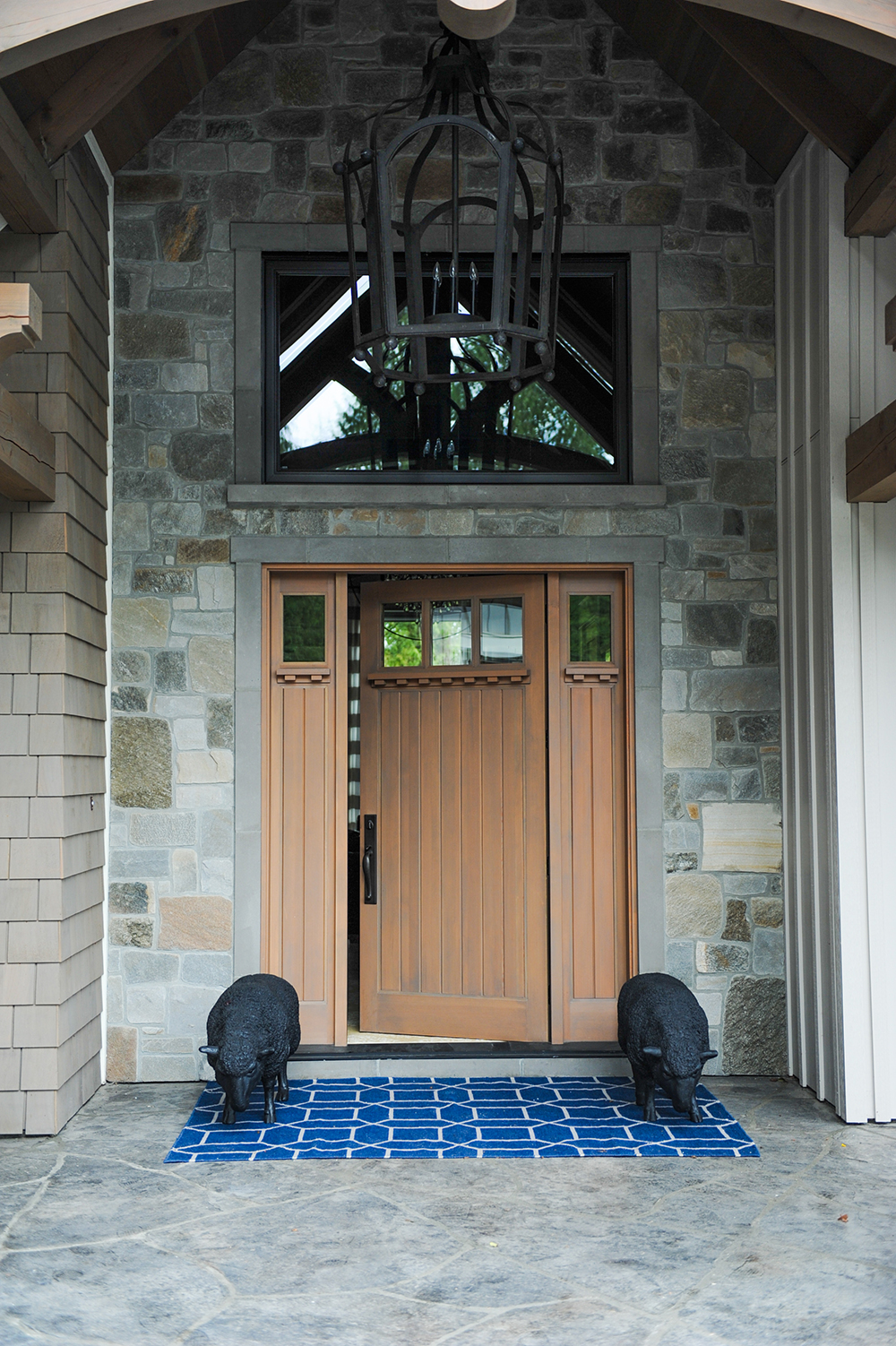
Grand Entrance
Homeowner Chris Meyer chose the grey-stained solid wood front door, which served as an inspiring backdrop to designers Ben Leavitt and Kelly O’Quinn. “Unexpected sculptural touches like the welcoming black sheep add character and interest to the wide doorway,” says Ben. “They’re also more unusual than plants, which would have required more maintenance.” The navy welcome mat is an intimation of accent colour to come.
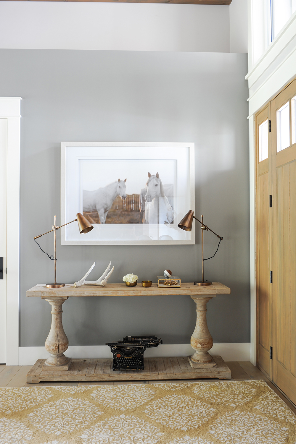
Hall Pass
The front hall encapsulates the designers’ vision for a curated look. “The burnished brass lamps partnered with the rustic console and equestrian art give an unexpected country feel,” says Ben. He scored the vintage typewriter and deer antler from a local picker. “They have a sense of history and add a certain level of sophistication.”
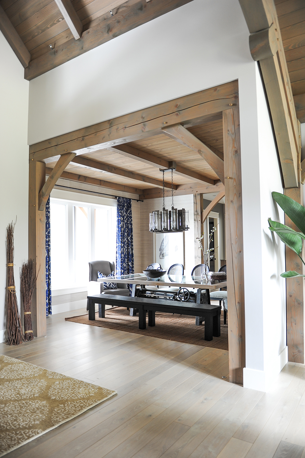
Fine Dining
Throughout the space, white oak flooring and fir beams keep the open-plan design cohesive. The dining area’s position beside the front entrance dictated the choice of seating. “We didn’t want to see the back of a row of chairs here,” says Ben. Instead, a long bench opens the room, has a welcoming feel and an airy effect.
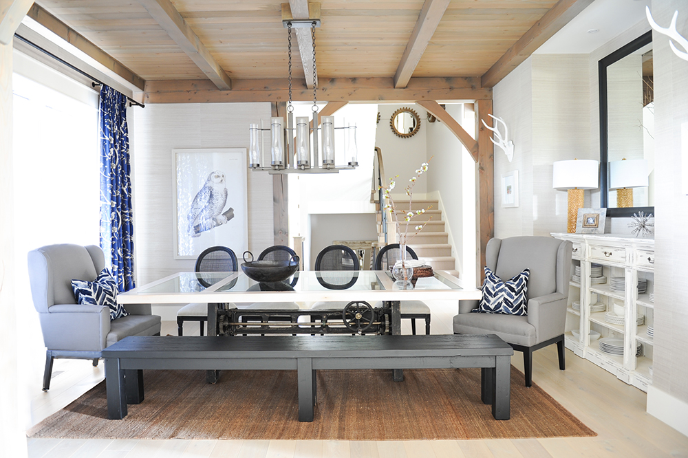
Have a Seat
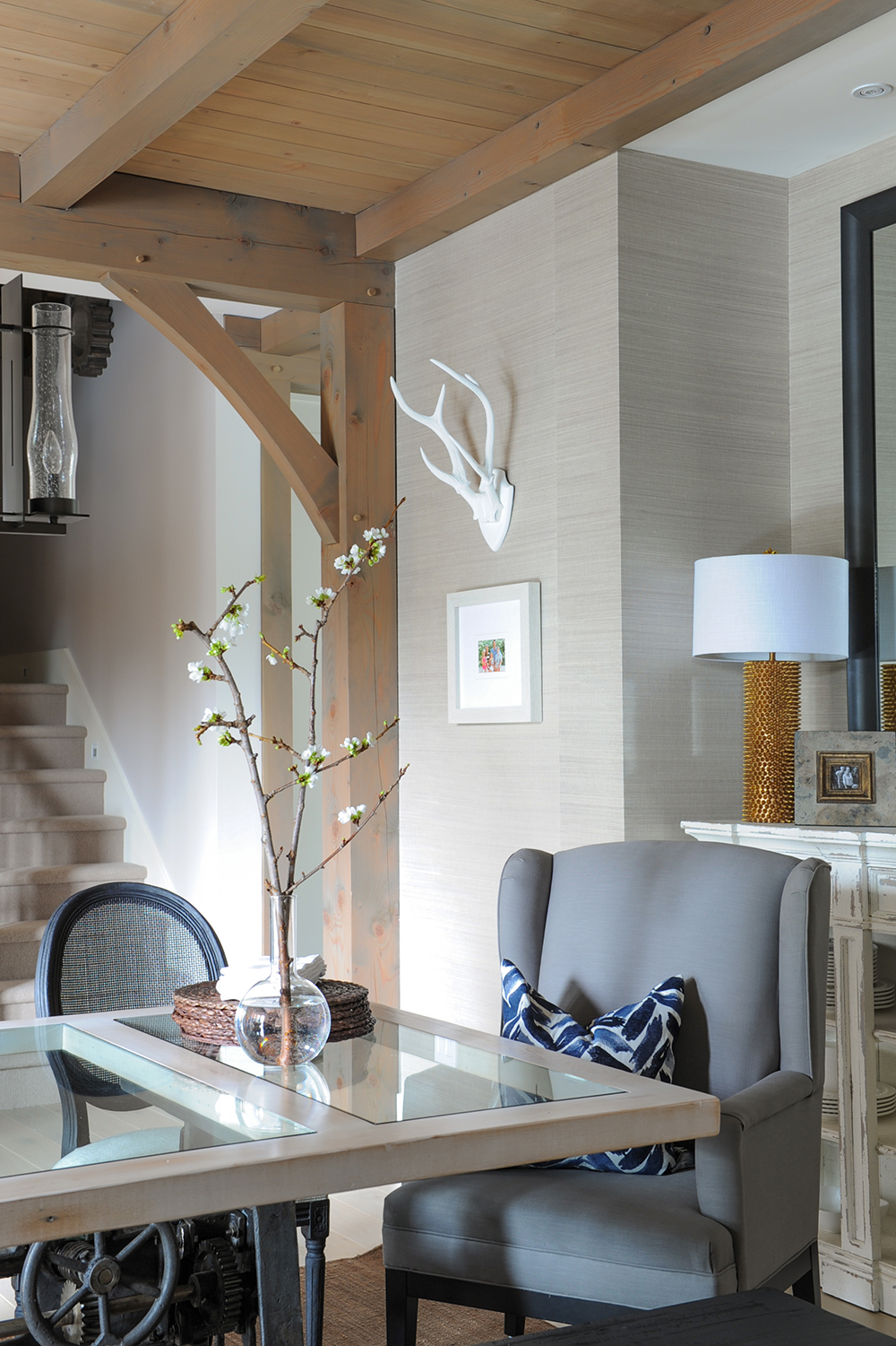
“Dynamic seating in an eating area creates an eclectic, casual feel,” says Ben. “Even in a formal dining room, a mix of styles and materials adds interest.” Here, grey and black seating options are lifted with zings of crisp navy and white. “The drapery and cushions add depth. Navy is also both classic and sophisticated while still being young and fresh.”
Fully Furnished
The custom dining table features a glass-inlayed white oak top that sits above a refurbished industrial mechanism. This unlikely mix is echoed in the furnishings, from the glam gold lamp that rests on the distressed dishes cabinet to the refined seagrass wallpaper.
Join the Club
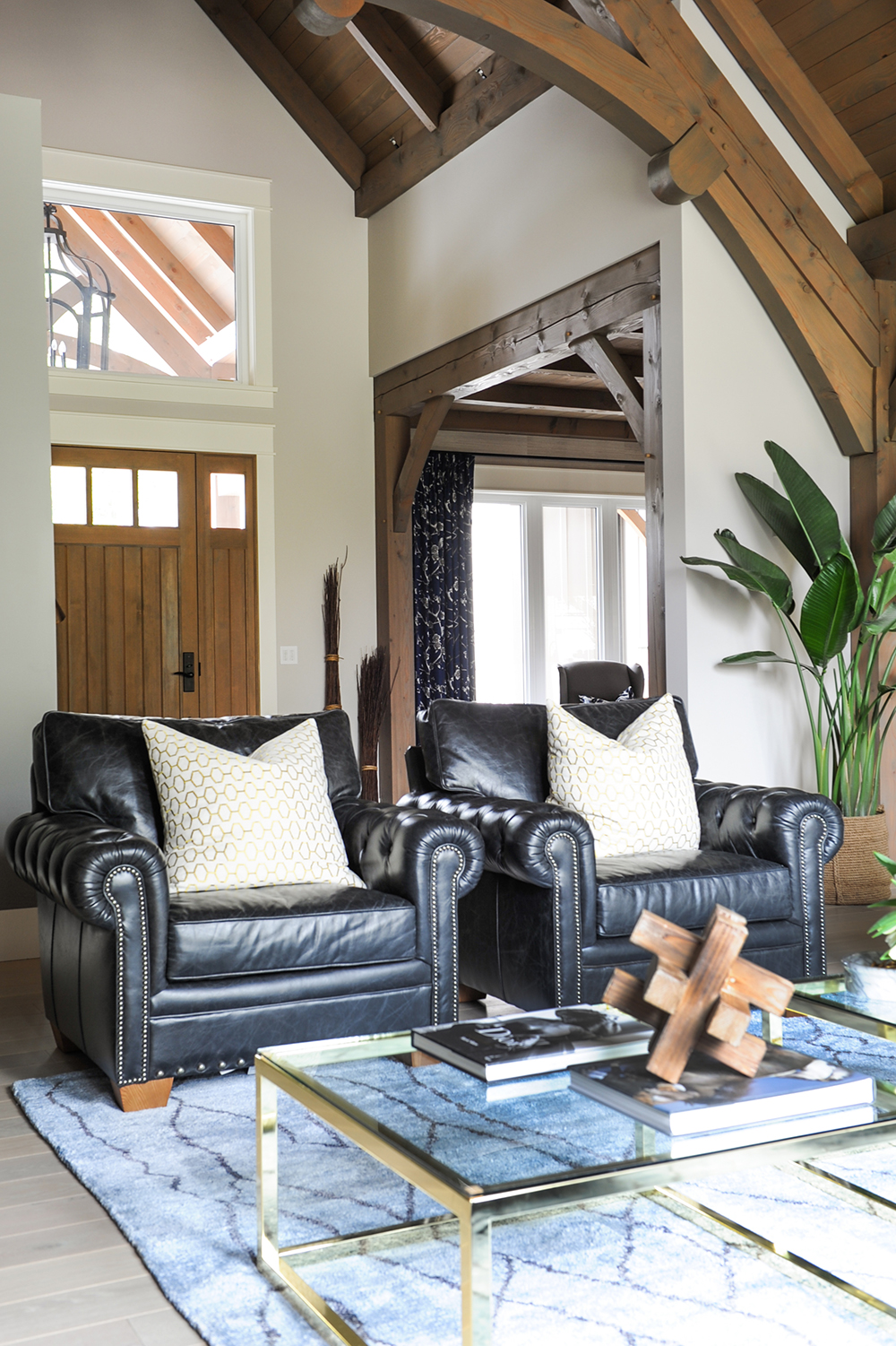
“These tufted black leather club chairs were rescued from Chris’s work office,” says Ben. “An alternative to a typical loveseat, they add a bit of contrast and interest to the living room.”
Caged Beauty
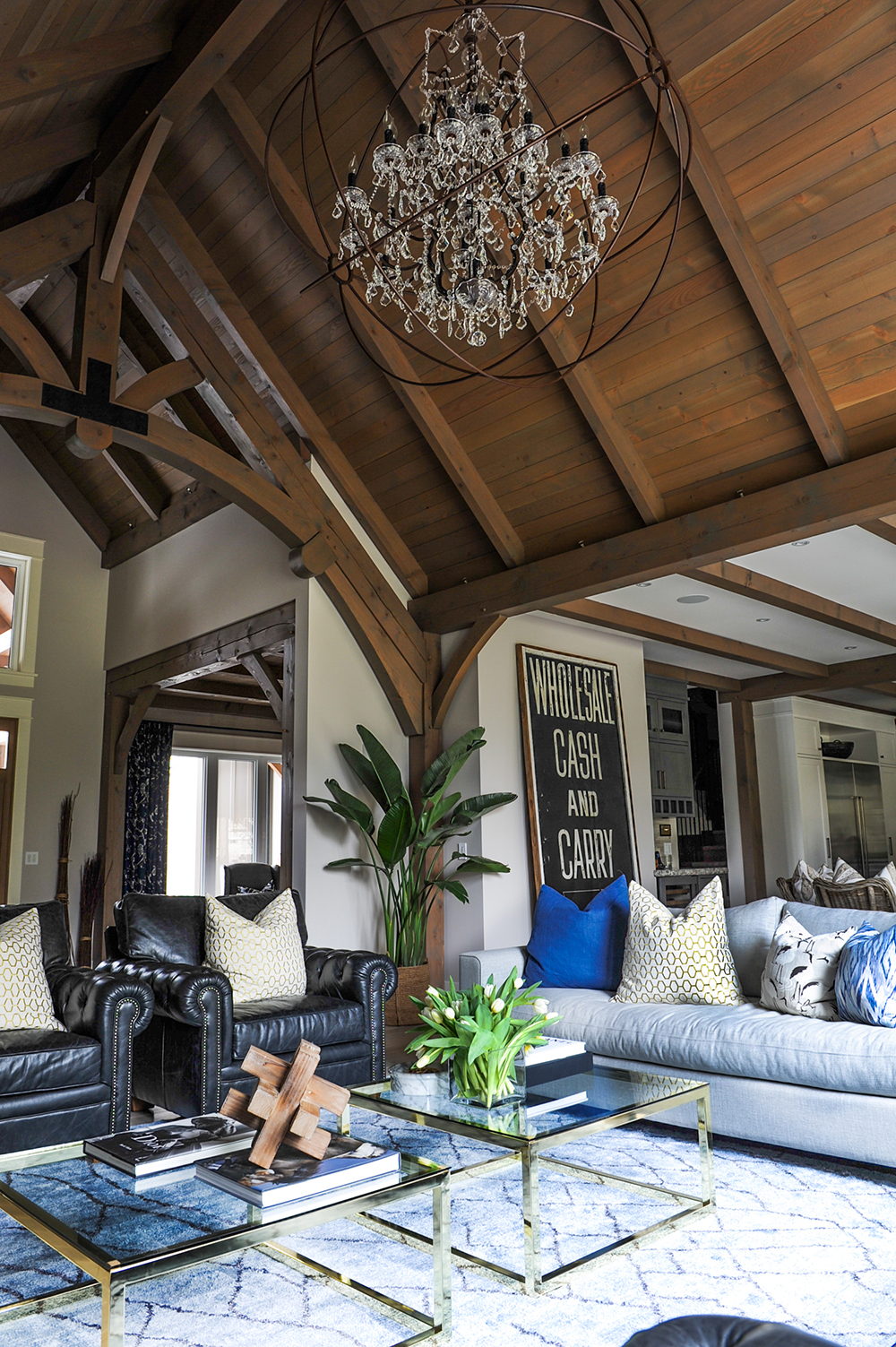
The living room’s stunning chandelier riffs on the designers’ skill at juxtaposing disparate elements. “It’s a great take on industrial with a bit of unexpected glamour,” says Ben. The designers chose two coffee tables here for a less traditional, more contemporary effect.
Fire Great
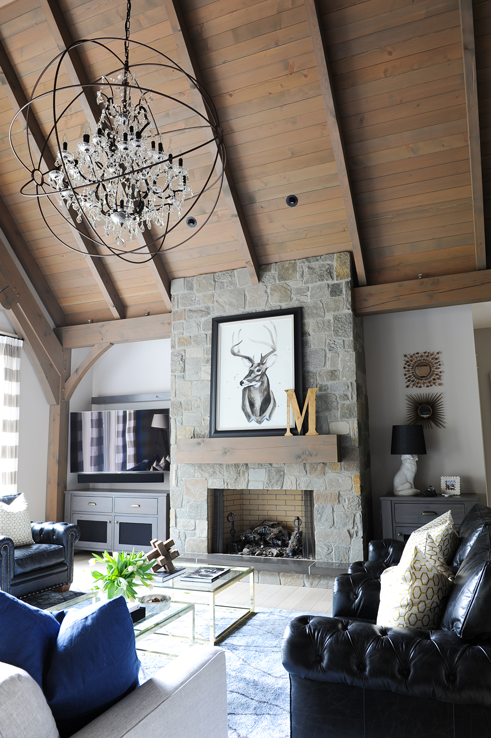
The living room fireplace is clad in castle-cut stone in a natural colour that’s warm without being overly rustic. Ben and Kelly balanced the TV screen, which flanks one side of the fireplace, with judiciously placed art and lamps.
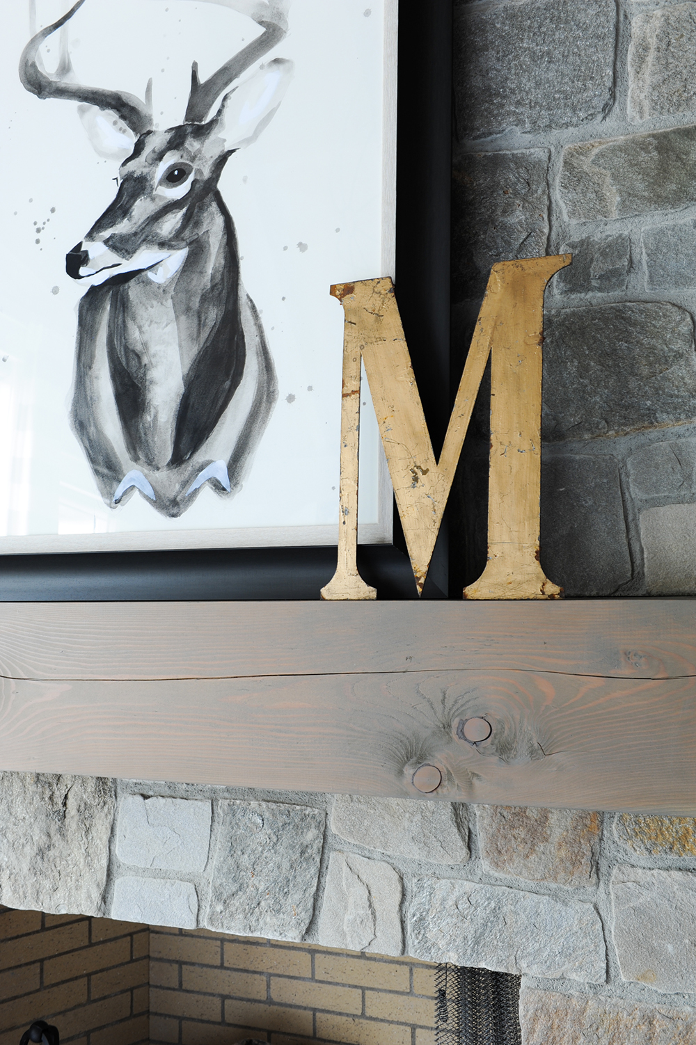
Custom Order
The “M,” for the family’s name, was found at a local antique store. It’s positioned in front of a deer watercolour painting, and the designers view it as a modern take on taxidermy. “We framed it in charcoal to add contrast to the neutral stones and depth to the monochromatic painting. We call it vegan taxidermy!”
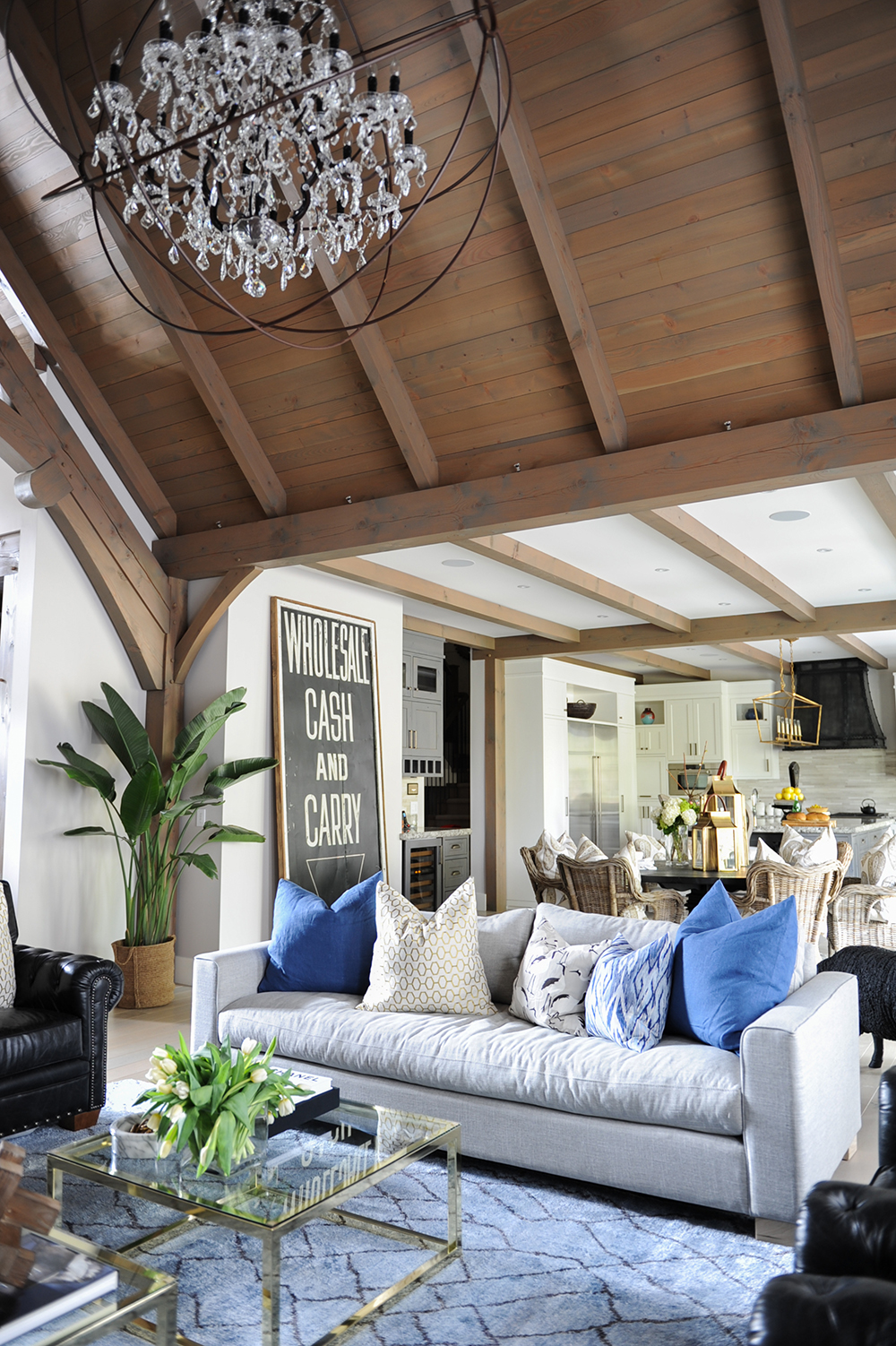
Material World
Tactile elements like the smooth leather chairs, a plush area rug and glossy tables conspire to create a cheery and welcoming living area. The toss cushions’ shades of blue feel energetic amongst the neutral tones.
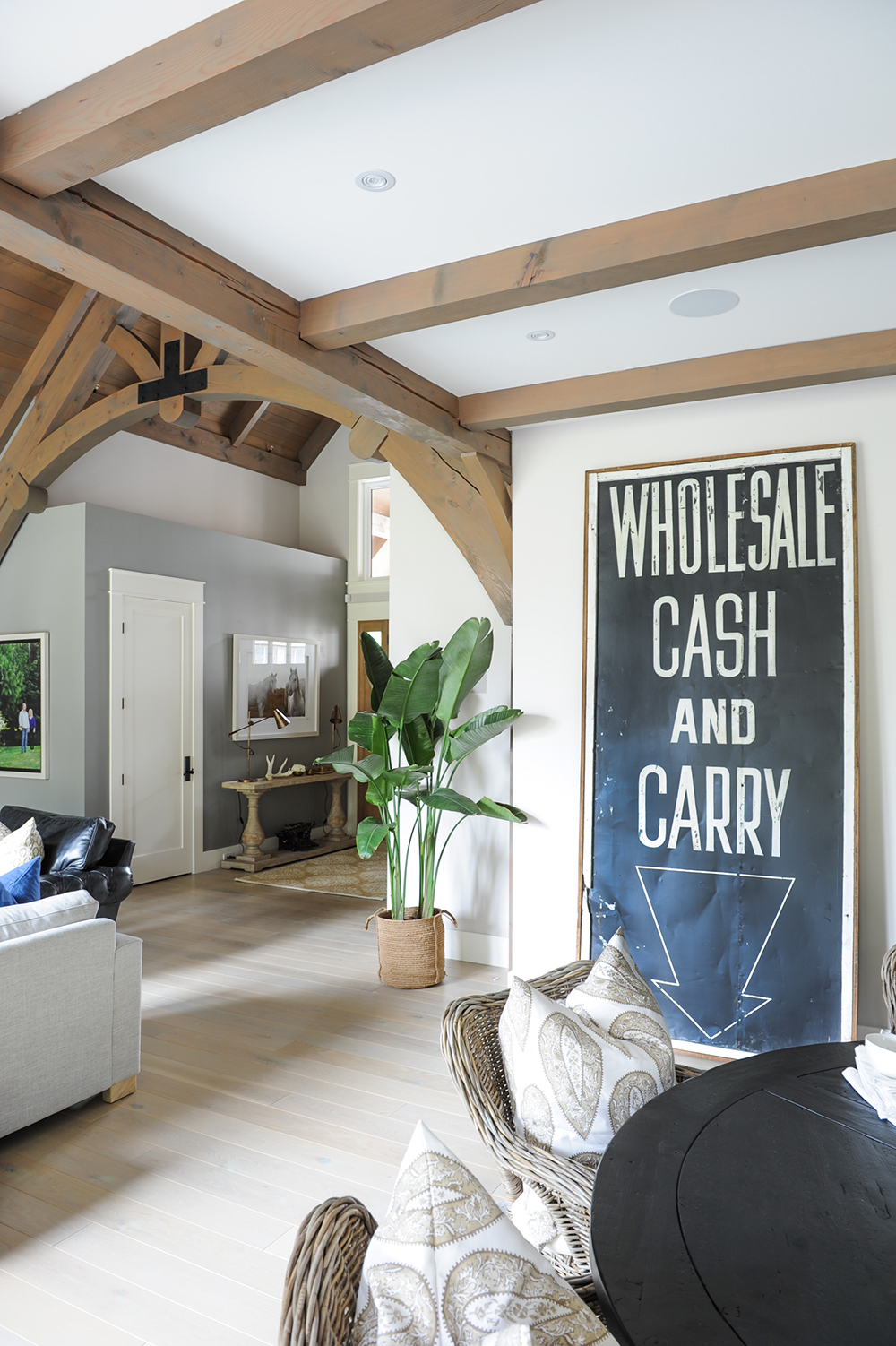
Sign Language
This fun and graphic sign in the kitchen’s eating area was chosen with great deliberation. “We knew that collected pieces suited the uniqueness of the space, so we hunted for pre-loved antique items instead of typical art,” says Ben. “We found this vintage cash and carry sign at an auction in Chicago.”
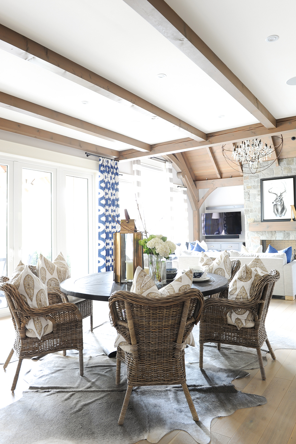
A Fine Weave
These wicker beauties in the kitchen’s eating area are further testament to the designers’ penchant for eclectic seating. Though they are the same style, their bold shapes and natural material feel both vibrant and relaxing. Welcoming oversized cushions channel the feeling.
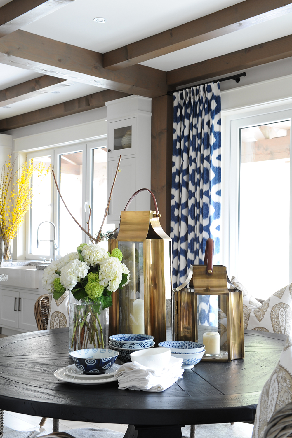
Brass Band
The burnished brass tones – here in handsome lanterns – enliven the neutral palette and are a warm foil to the crisp navy curtains and dishware.
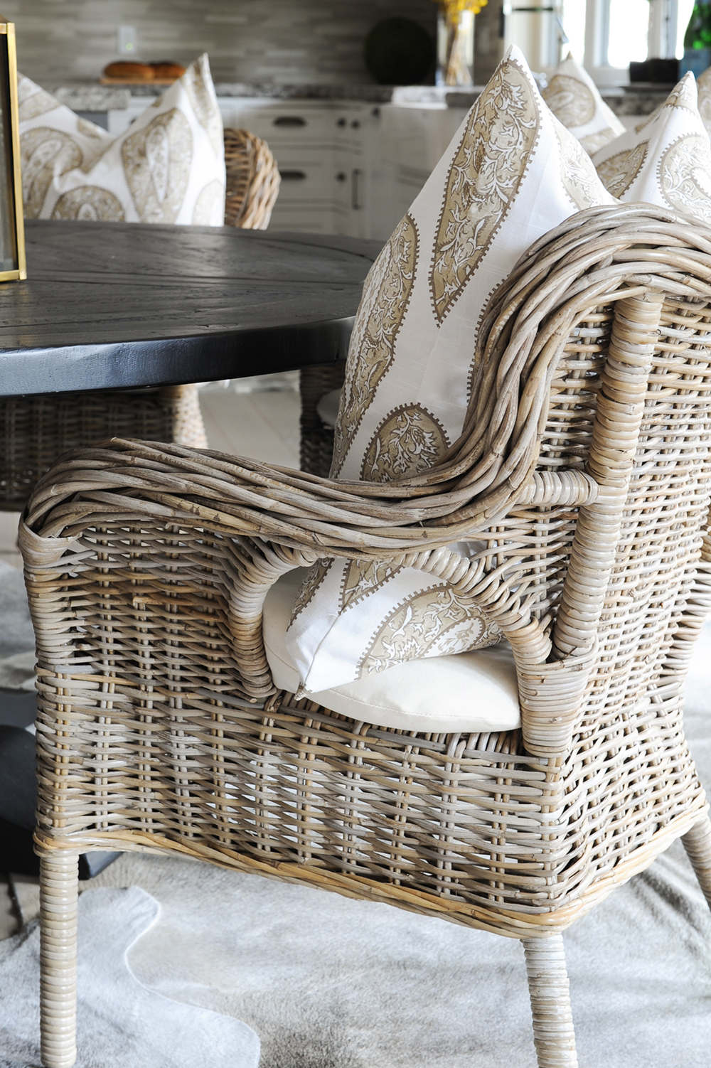
Tonally Awesome
The paisley toss cushions layer in the tones of the wicker for subtle richness and depth; a clever effect in such a rustic vignette.
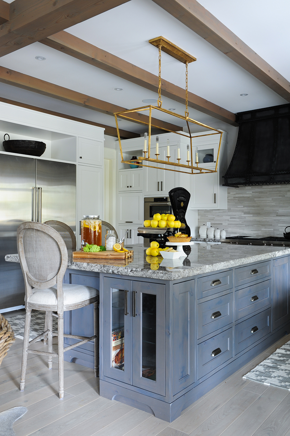
Island Time
The stained-grey island is topped with chiselled granite and finished with the designers’ chairs of choice. “These backed bar stools add a classic feel and help balance the more heavy items in the kitchen,” says Ben. “And round backs always make an island more interesting in my opinion.” The vibrant gold light fixture affords warmth in the neutral room.
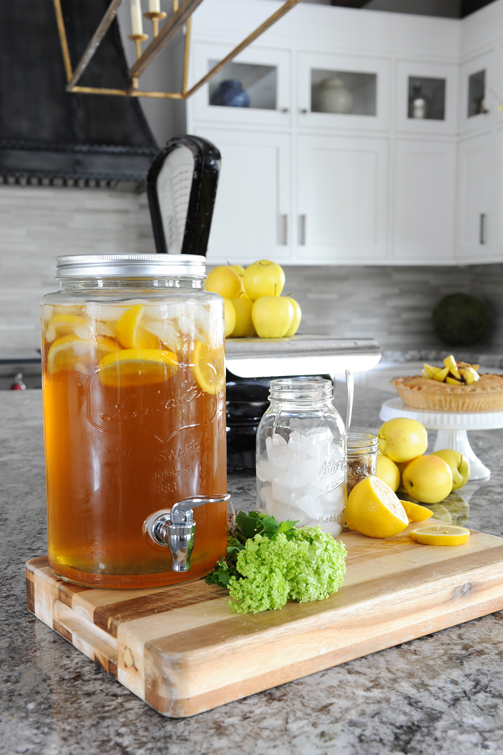
Home Sweet Home
The powerhouse design of the kitchen doesn’t preclude practicality. This is very much a family home, and the welcoming island hosts a range of activities and help-yourself treats, including homemade ice tea and pie.
Fan Club
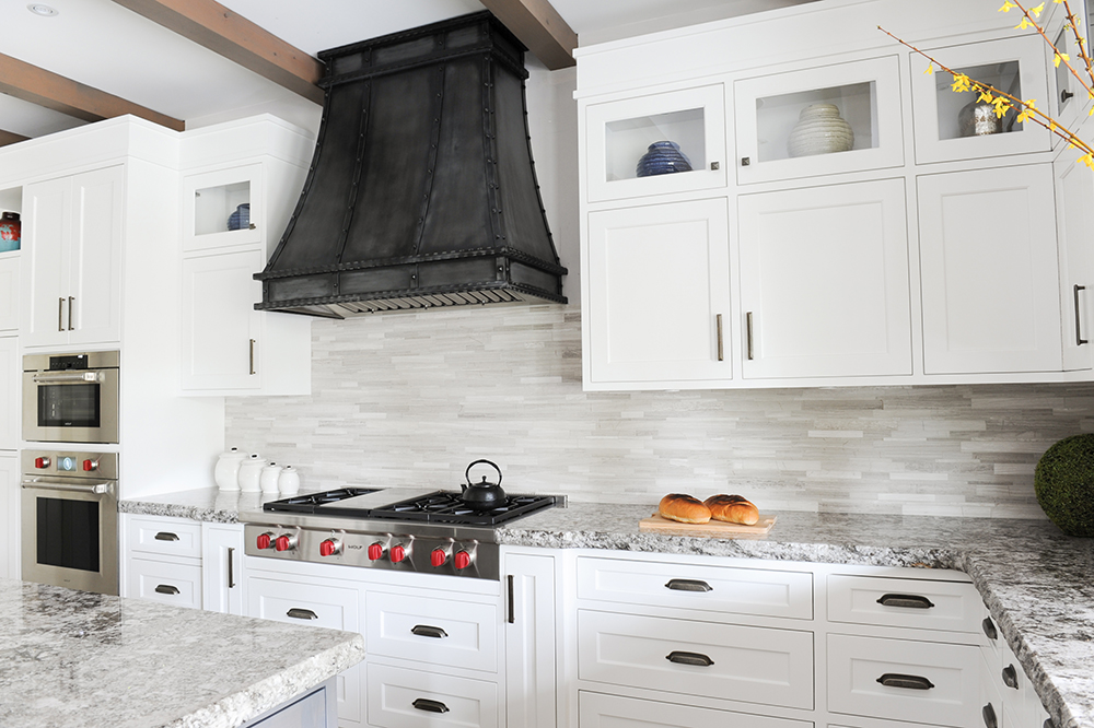
Not just functional, the handsome hood fan is a talking point in its own right. It’s clad with burnished iron-coloured steel and is dramatic in the white space.
Hooked on Classics
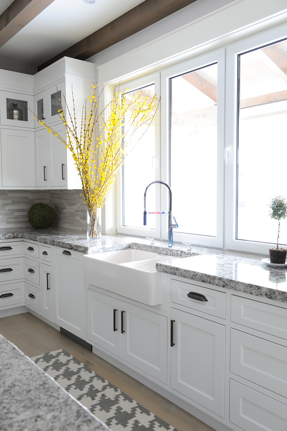
The kitchen’s extra-wide apron sink was a no-brainer. “It’s a classic and a needed addition to any country-themed home,” says Ben. An exploded grey and white herringbone-patterned runner layers in softness and is a smart complement to the granite countertops.
Into the Mix
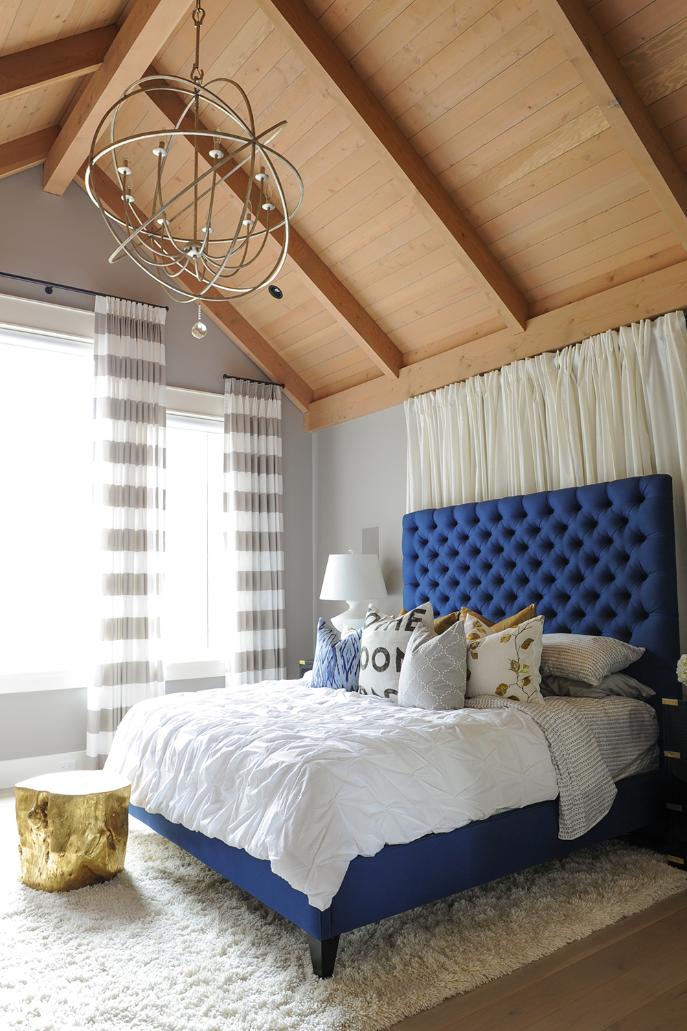
“The master bedroom is truly an amalgamation of different styles and ideas,” says Ben. “The tufted headboard and striped drapes are fun, while the timber- and wood-clad ceiling is more formal and grand.” Accessories, such as the gilded tree stump foot stool, keep the feeling whimsical and informal.
Roundabout
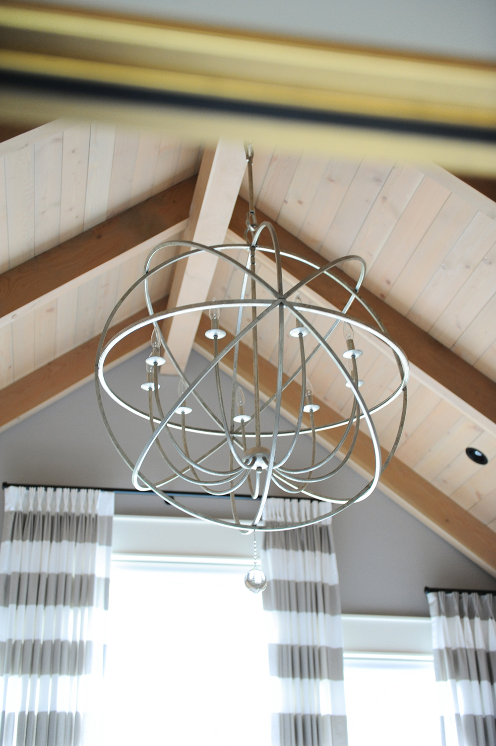
A round light fixture in the master bedroom softens the angles of the beamed A-frame ceiling. Its open weave doesn’t compete with any of the furnishings or natural finishes.
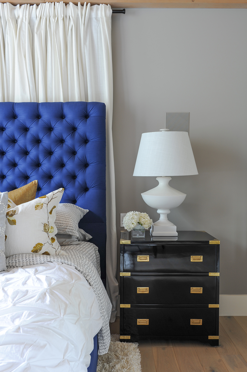
Side Kick
“These black lacquered and brass bedside tables are not a typical choice for this light and airy room,” says Ben. “However, they’re a great contrast to the soft bed and white lamp. When used correctly, lacquered furniture can be the final ‘wow’ touch to elevate a room.”
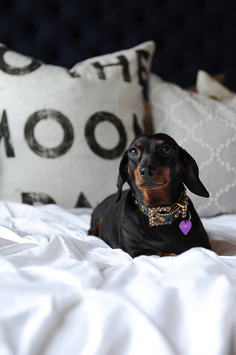
Fancy Free
Like all beloved four-legged family members, dachshund Fancy has full reign of the house – including the master bed.
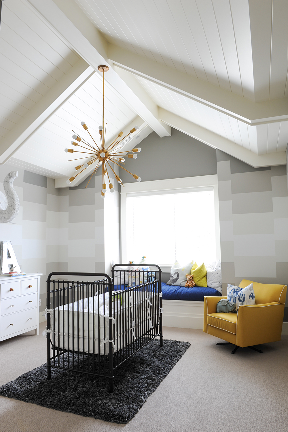
Nursery Cool
“Axl’s nursery was inspired by a modern geometric circus tent,” says Ben. “Centering the iron crib in the middle of the room made the space feel less cavernous. And filling a room while avoiding clutter is always the goal in any kid’s space.”
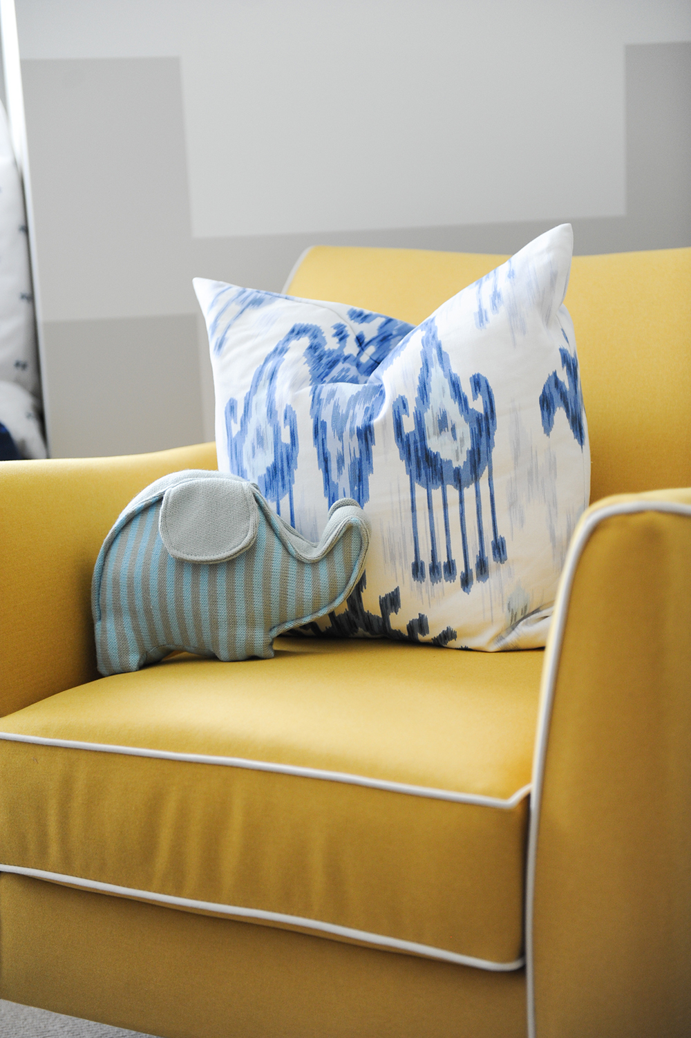
Room to Grow
Colourful accessories and furniture, like this zingy yellow chair, feel fun and childlike without being too baby-centric. The elephant-shaped pillow references the room’s whimsical wall hanging.
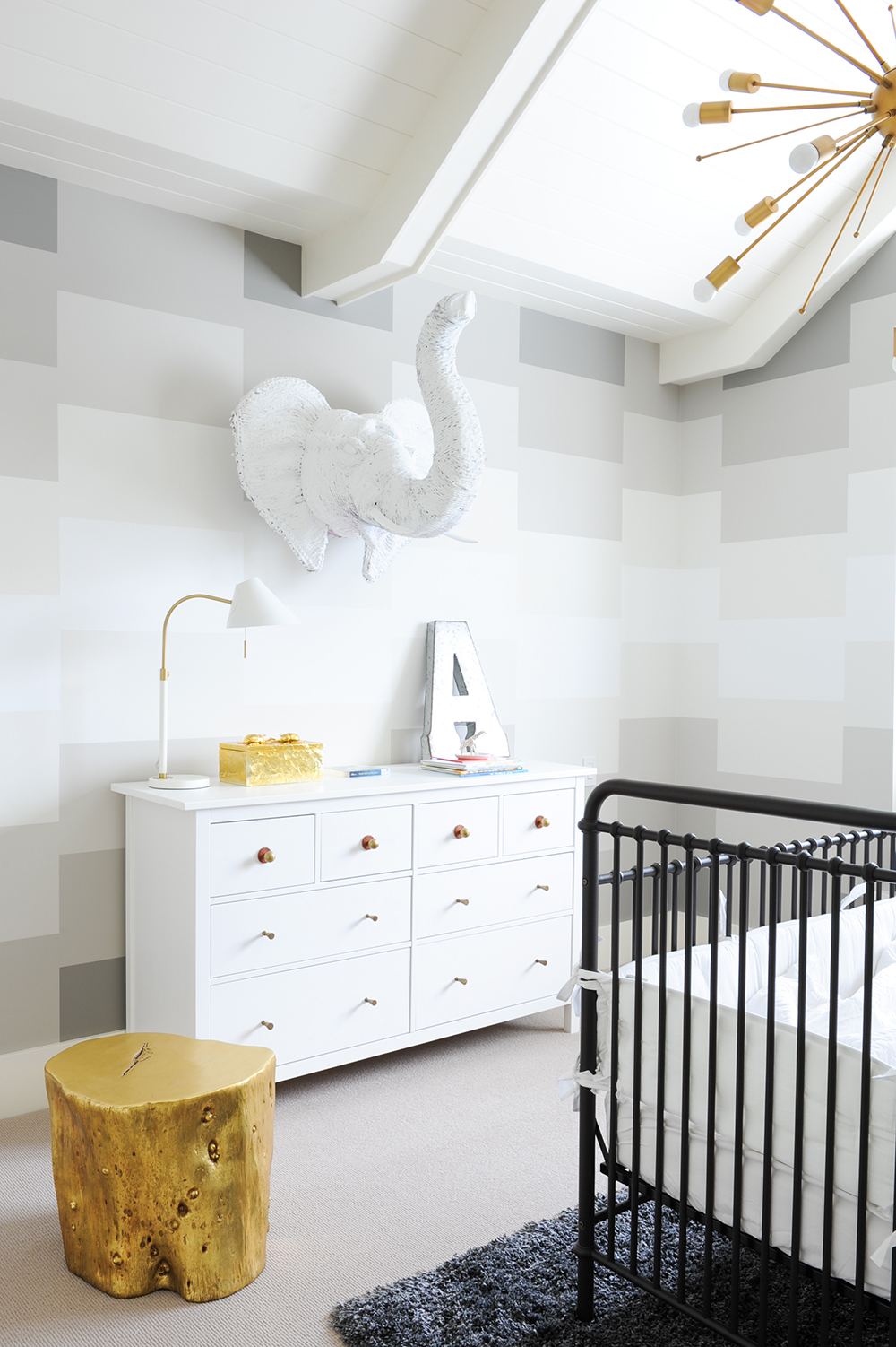
The Great Wall
“We painted, not wallpapered, the walls in gradient shades of soft Benjamin Moore greys,” says Ben. The rectangles are a nod to the room’s geometric tent inspiration. “I found the white elephant sculpture at a market in India. It and the gold accessories layer in whimsy without being typical nursery elements.” Which works well in a house that is anything but typical.
HGTV your inbox.
By clicking "SIGN UP” you agree to receive emails from HGTV and accept Corus' Terms of Use and Corus' Privacy Policy.


