When it comes to choosing a colour palette for your home, the best combinations aren’t always black and white. The colour combos that you pick can say a lot about you and make a major impact on the look and feel of your space, so if you’re ready for something a bit more complex, don’t be afraid to mix things up and experiment with interesting and unusual pairings. To help get you started, I found 14 cool colour palettes that you might not have thought of – but that are surprisingly stylish.
Brian McCourt is a contractor, design expert and co-host of HGTV Canada’s Backyard Builds.
Published September 6, 2020, Updated August 15, 2021
![Teal and Yellow [image] sunroom with white fireplace, blue walls and yellow accents](https://assets.hgtv.ca/wp-content/uploads/2021/12/surprise-colour-palettes-teal-yellow.jpg)
Teal and Yellow
It’s a misconception that bright colours are just for kids’ rooms. You don’t have to go all greige to style a grown-up room. Try using lighter shades on the walls with bolder hues as accents, like we did in this Backyard Builds indoor-outdoor sunroom. Soft blue and white walls were the foundation, while pops of yellow brought a sunny boost to deeper shades of teal and turquoise.
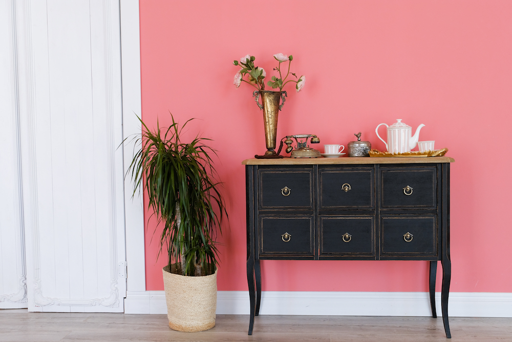
Bubblegum Pink and Navy
Alternatively, a statement-making wall colour gets sophisticated balance from dark-coloured details. In this space, bubblegum pink gets toned down with white trim and an elegant navy dresser. Here’s how to transform any sized space with a darker-coloured palette.
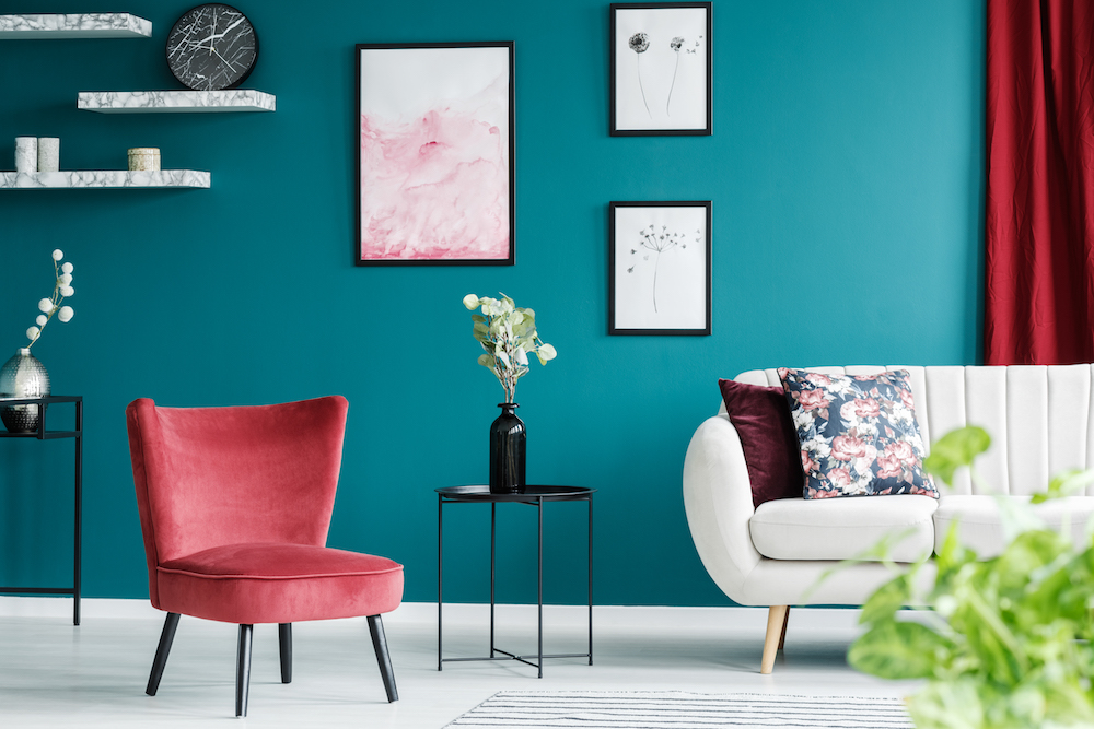
Cherry and Turquoise
Red and green is a perfectly festive combination, but that perfection makes it hard to integrate these complementary colours into off-season decor. The solution? Play with the tones. A cherry-red chair and curtain mixed with bold, blue-green walls is a chic combination all year round.
Related: 10 Colour-Blocking Ideas That Will Transform Your Home
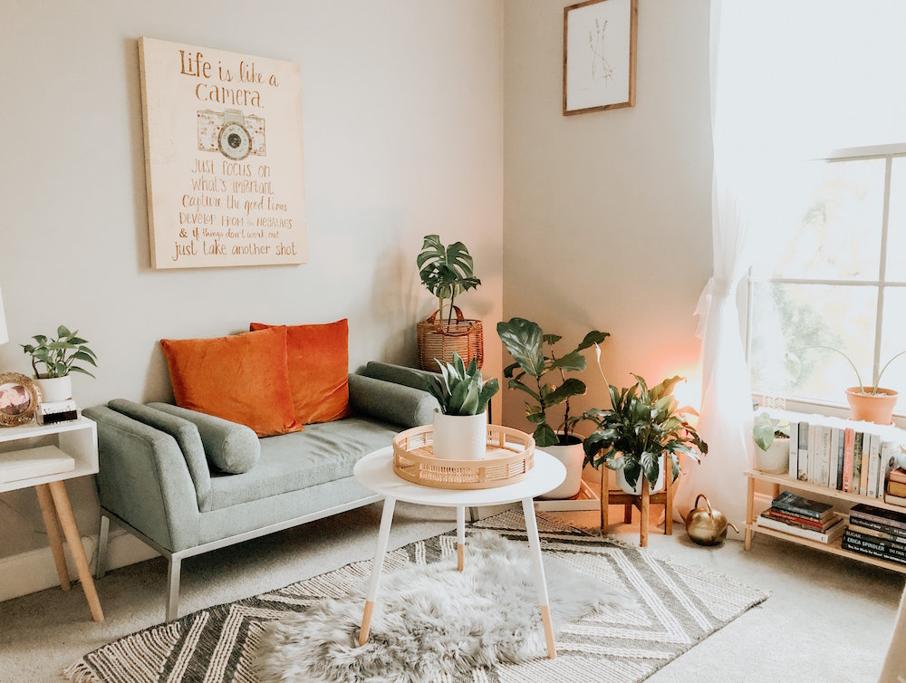
Sage Green and Burnt Orange
Touches of soft-but-rich colour are a great way bring cozy character to an otherwise-neutral room. In a white-and-grey mid-century inspired living room like this, burnt orange and sage green accents deliver warmth and a modern spin on retro styling.
Related: 15 Bedroom Decor Ideas to Make Your Space Cozy for Autumn and Winter
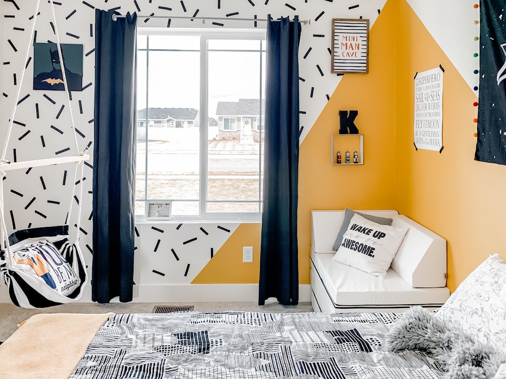
Navy and Marigold
Kids’ and teens’ rooms are the perfect places to play with pattern, texture and – of course – colour. While your first instinct might be to reach for a super-bright shade to achieve a fun feel, a cool mix of navy and rich yellow makes a dynamic duo that can grow with your child.
Related: Big and Bold Murals are the New Statement Wall for Your Kids’ Rooms
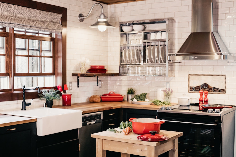
Black and Red
What’s black and white and… red all over? A distinctively stylish colour palette! Black and red might seem like a hard combination to pull off, but these strong hues can be really sophisticated, especially when they’re proportioned well with a neutral base, as this kitchen showcases.
Related: The Top Kitchen Paint Trends to Adopt in 2021 (We See You, Smoky White!)
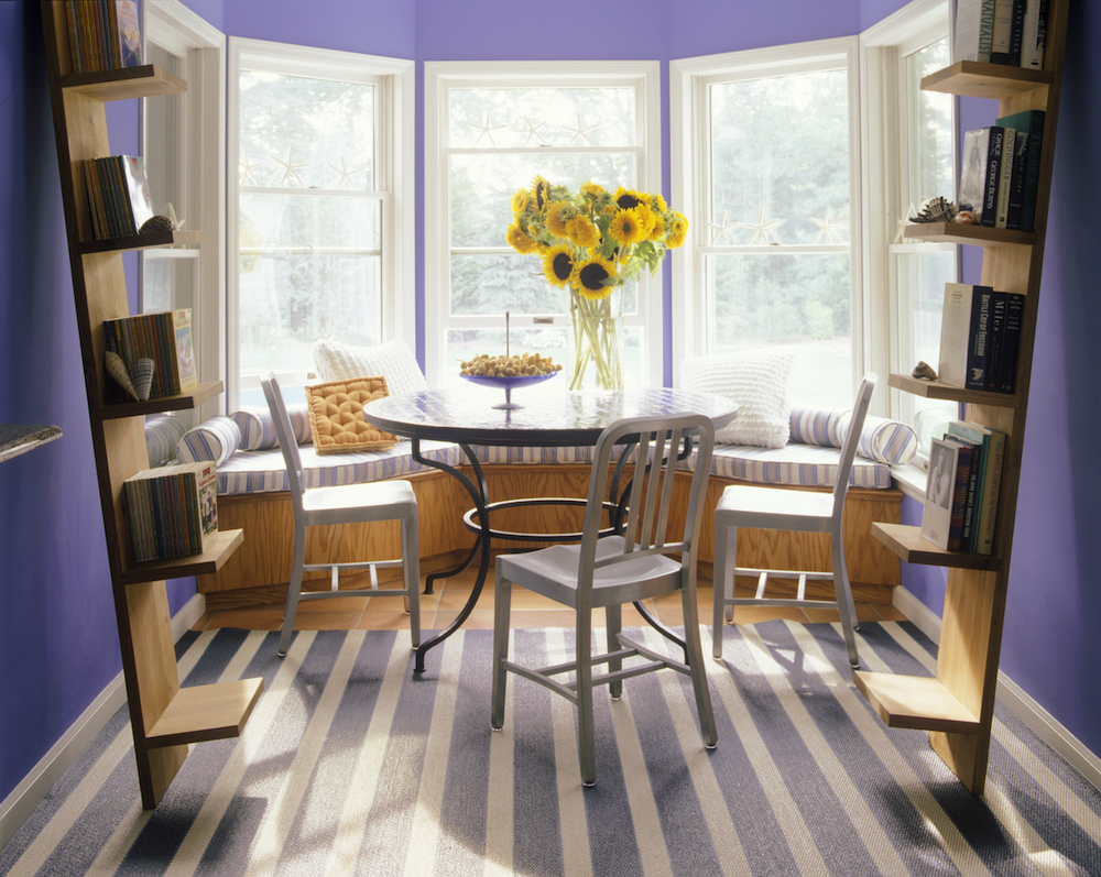
Violet and Periwinkle
Purple is a regal hue, but saturated shades like violet can be hard to match. Instead of looking for an opposite colour, try turning a single notch on the colour wheel towards a deep or medium blue – like this character-filled violet dining room with periwinkle-striped accents.
Related: 15 Dining Room Lighting Ideas That’ll Shine in 2020
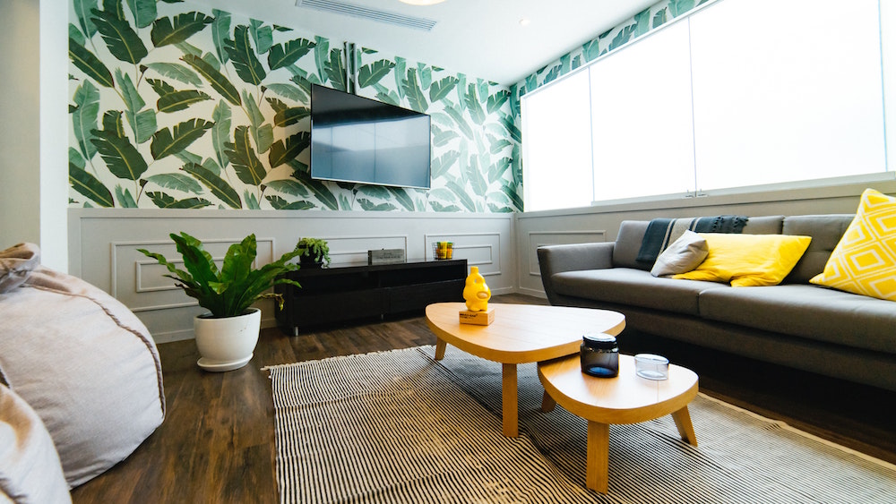
Forest Green and Yellow
There’s nothing more energizing than nature, which is why lush greens can be bold – but still grounding. With leafy greens as a base, citrus-coloured accents can evoke a botanical feel that’s full of personality. Can’t wait to go green? Try adding some easy-to-care-for indoor plants to your space for instant green-gratification.
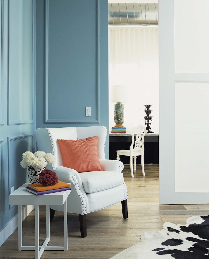
Sky Blue and Peach
Sky blues are a timelessly soothing choice, but calming colours can feel a bit bland if they’re left on their own. If pale blue is your hue, try embracing peachy-tone details for a pop of interest that’s still somewhat soft.
Related: 21 Simple Ways to Fall in Love With Your Home Again in 2021
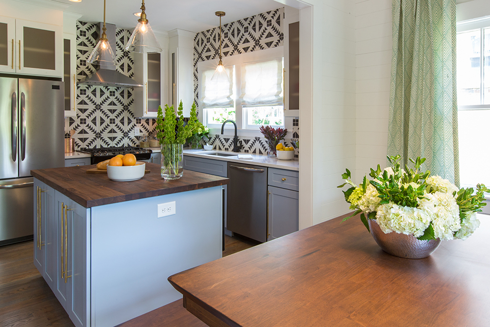
Lavender and Olive
This combination might not taste great together… but they look surprisingly chic when you’re going for an eclectic design – like this boho kitchen designed by the Property Brothers.
Related: These 10 Colourful Kitchens Will Inspire You to Make Bold Decorating Moves
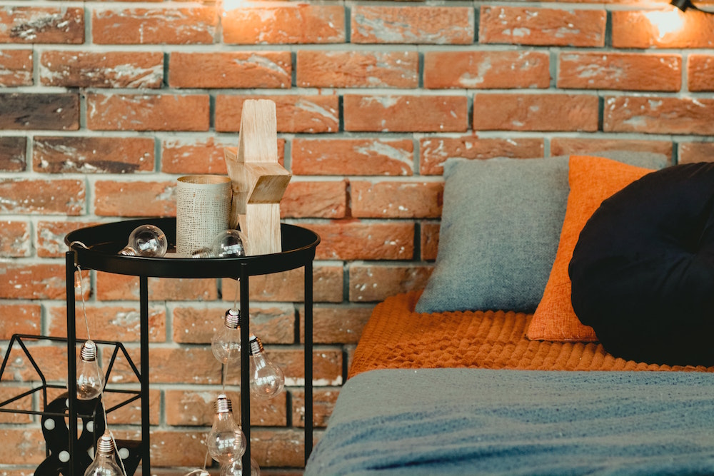
Orange and Denim Blue
Even though nothing rhymes with orange, there are actually plenty of colours that visually thrive beside it. Pumpkin orange, for example, is an unexpected way to punch up a more muted tone like denim-inspired blue.
Related: 10 Decorating Mistakes That Are Making Your Home Look Cluttered
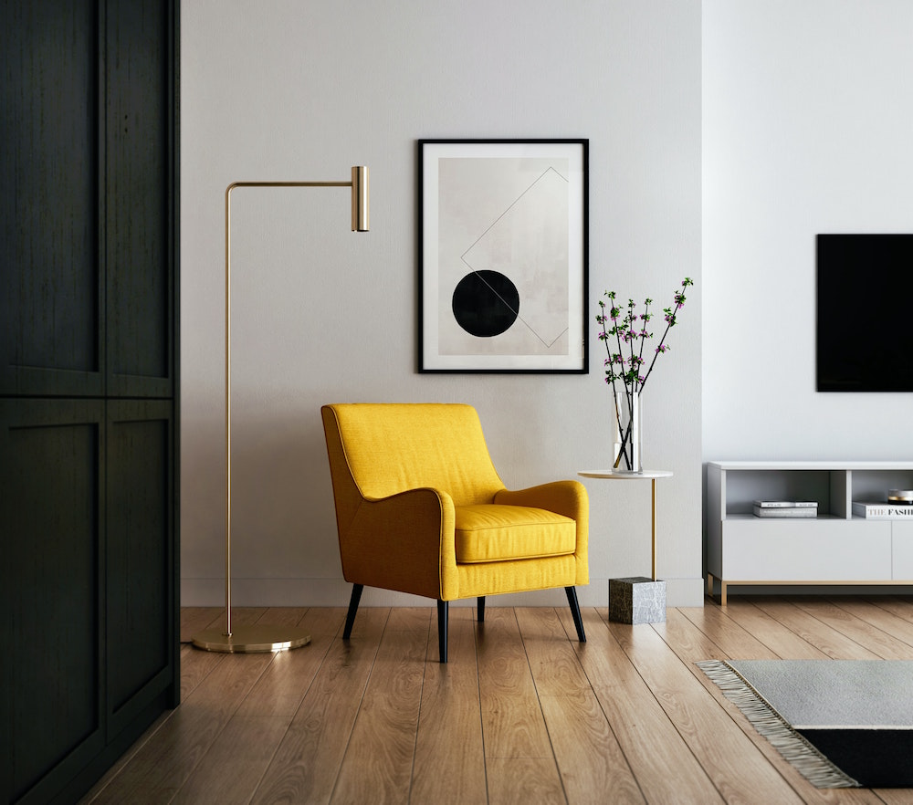
Black and Yellow
If you’ve been avoiding this colour combination because it makes you think of bumblebees, rest assured: when used strategically as high-contrast accents, black and yellow can be a bee-utiful combination.
Related: 11 Things Every Stylish Home Has (It’s Not What You Think!)
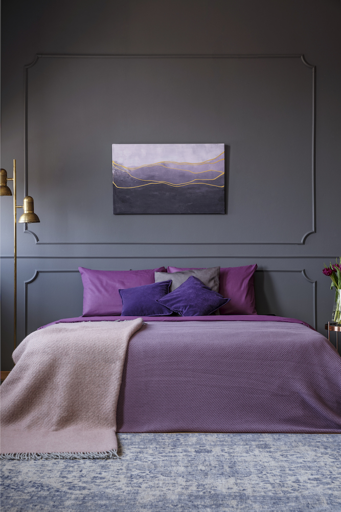
Magenta and Charcoal
Deep, rich colours are a fast-track to cozy-town. Jewel-toned purples lend surprising contrast to dark charcoal grey (particularly in an imperfection-disguising matte finish) for a luxurious look.
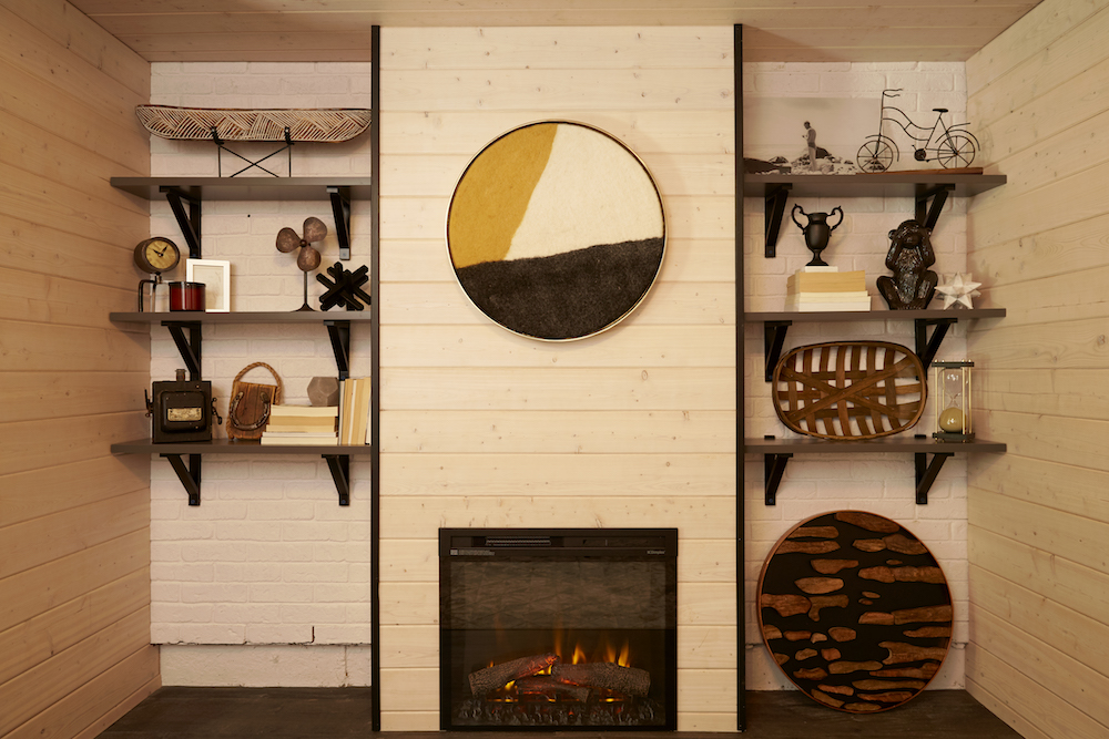
Mustard Yellow and Brown
Wood is a naturally rustic, stylish material to work with, but the right colour-pop accents can elevate its look for an ultra-cozy feel. In this cabin-inspired workshop for Backyard Builds, we used a mustard-yellow art piece to contrast with soft brown wood for a warm look.
Related: All the Backyard Inspiration You Need Right Now, From Landscaping Ideas to Backyard Studios
HGTV your inbox.
By clicking "SIGN UP” you agree to receive emails from HGTV and accept Corus' Terms of Use and Corus' Privacy Policy.


