Designer Angela Robinson mastered a balancing act in this 1,200-square-foot lower-level space in Vancouver’s Kitsilano neighbourhood. “It’s kind of like two homes in one: the entire front is above grade, but the back is buried and windowless.”
The residents, a young couple with a baby girl, moved into the semi-basement to be closer to their parents, who own the house and live upstairs. “I wanted to create a bright and minimal space for this family,” says Angela. “One that felt like the furthest thing from a basement!” And that’s exactly what she did. Here’s how.
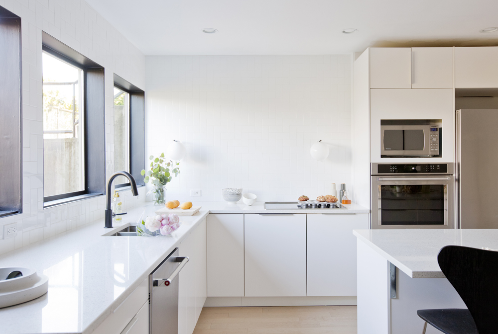
Location, Location, Location
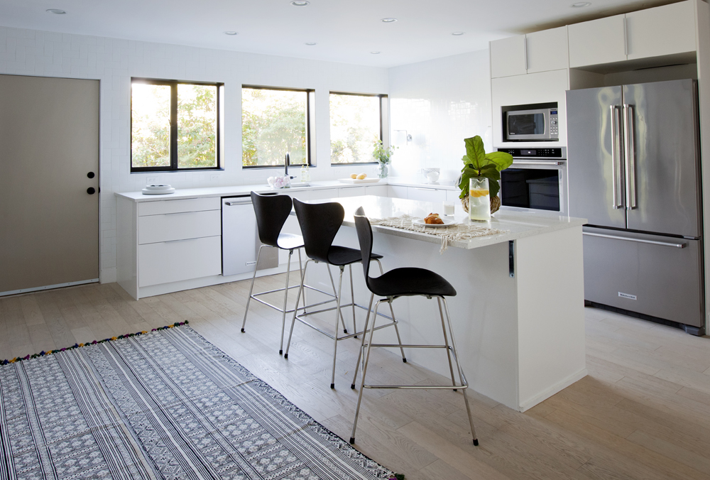
“We decided to locate the kitchen, rather than the living room, in the front of the suite where the windows are,” says Angela. “It’s the space with the most sunlight and the one the couple uses most during the day.” All-white cabinetry and pale oak flooring capitalize the natural lighting.
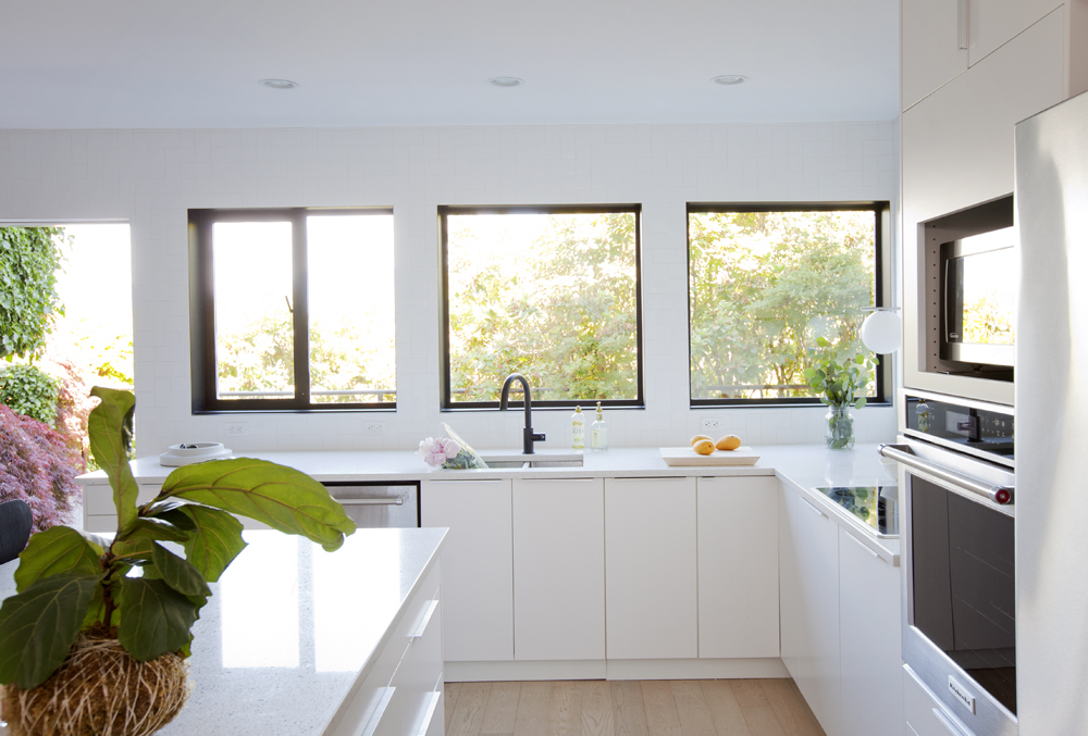
Window Display
“The site of the house is very private – there’s no traffic or neighbours, so there was really no need for window coverings in the kitchen,” says Angela. A great perk for the designer, who felt that installing blinds here would detract from the black window trim.
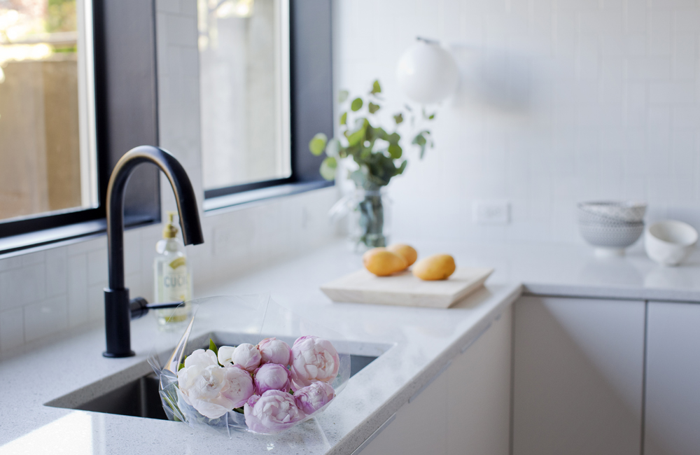
Black Magic
Angela punctuated the light and airy kitchen with chic matte black accents, like this streamlined faucet.
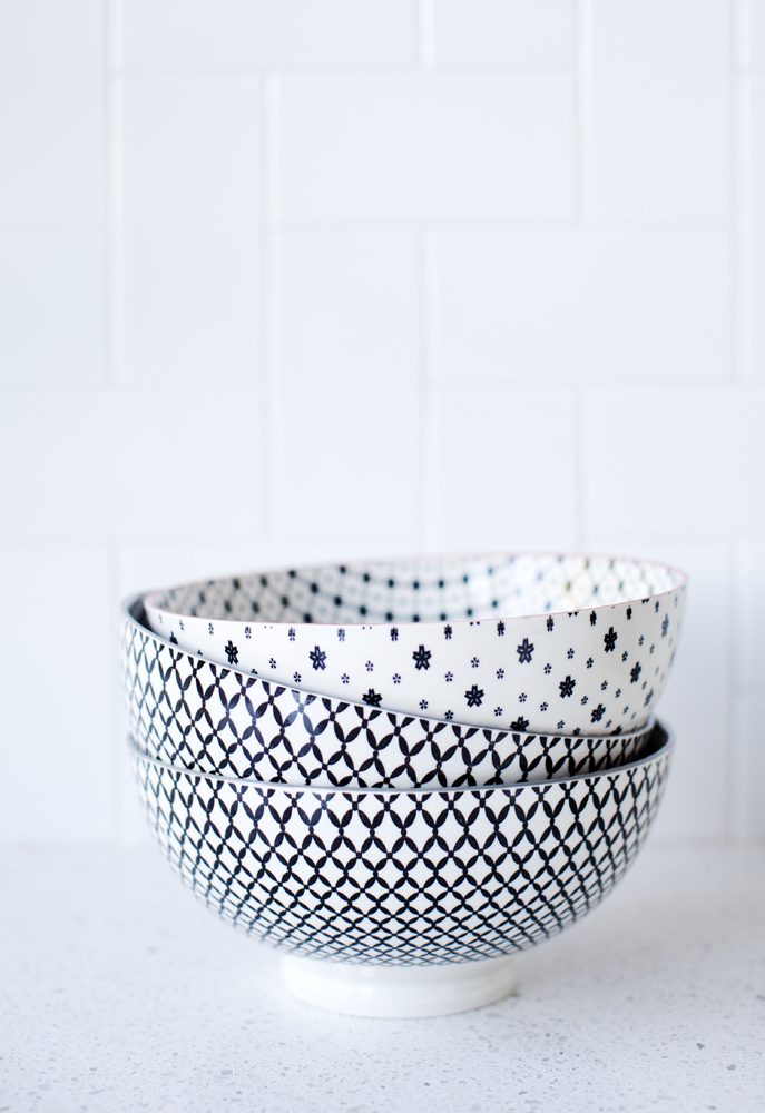
Super Bowls
You know you’re into design when your dishes match the kitchen! Simple items, like these patterned black and white bowls, are both practical and on point for reinforcing the room’s crisp colour scheme.
Take a Seat
“I found the island’s counter-height stools online at Pink & Brown“, says Angela. “Because this is the main eating area, it’s important for the seating to not only be aesthetically pleasing, but comfortable and functional too!” The area rug, a find from HomeSense, layers in soft texture and interesting pattern.
Storage Bank
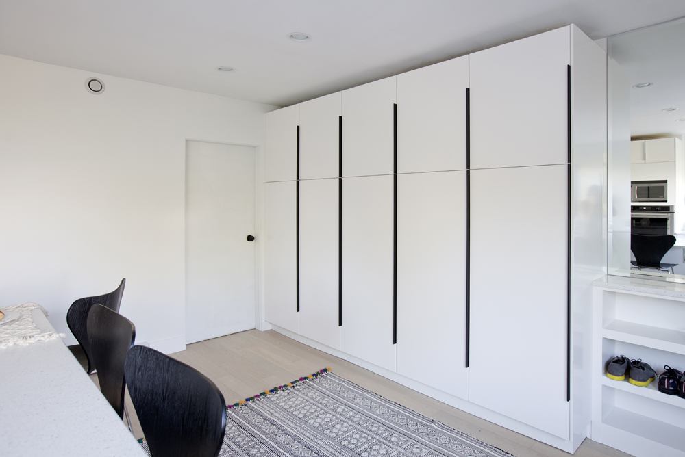
In the open-plan entryway adjacent to the kitchen, Angela designed a bank of smart cabinetry that provides ample storage space for coats and shoes as well as a separate pantry cupboard.
Nursery Cool
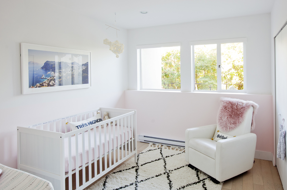
Unexpected furnishings, like graphic cushions and vibrant photography, fend off a baby-centric mood in the girl’s nursery. And the artwork isn’t just for visual interest. “It’s a photo of the island of Capri, which is the baby’s namesake.”
Master Plan
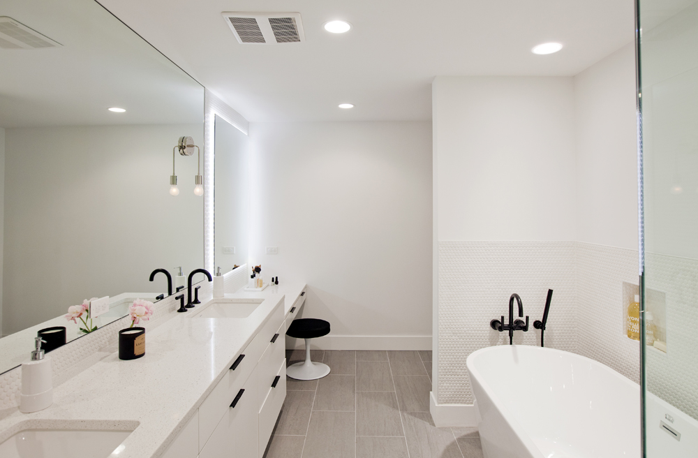
“Because there’s only one bathroom in the suite, we wanted it to be special,” says Angela. “I incorporated a built-in vanity for the homeowner to get ready, his-and-hers sinks and backlit mirrors.” The black faucets, hardware and vanity stool add a graphic element and reference the black accents in the principle rooms.
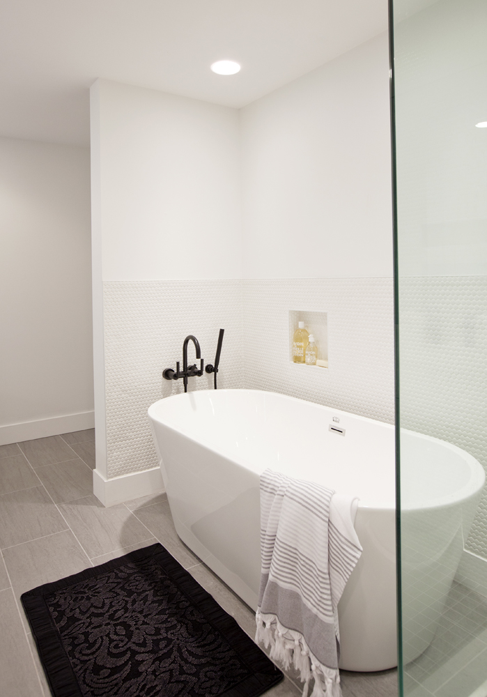
Spa Effect
The freestanding soaker tub is set against a tiled backdrop. “These penny-round wall tiles make the bathroom easy to maintain and add a textural element to the all-white space.” A clever built-in niche neatly corrals soaps and shampoos.
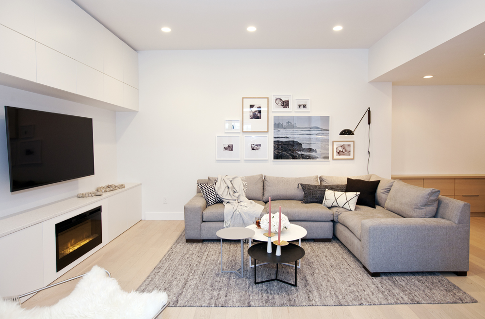
Just Lounging
To maximize seating options in the living room, Angela opted for a sectional over more traditional sofas or loveseats. The grey colour scheme is a soft counterpoint to the white walls and feels both sophisticated and welcoming.
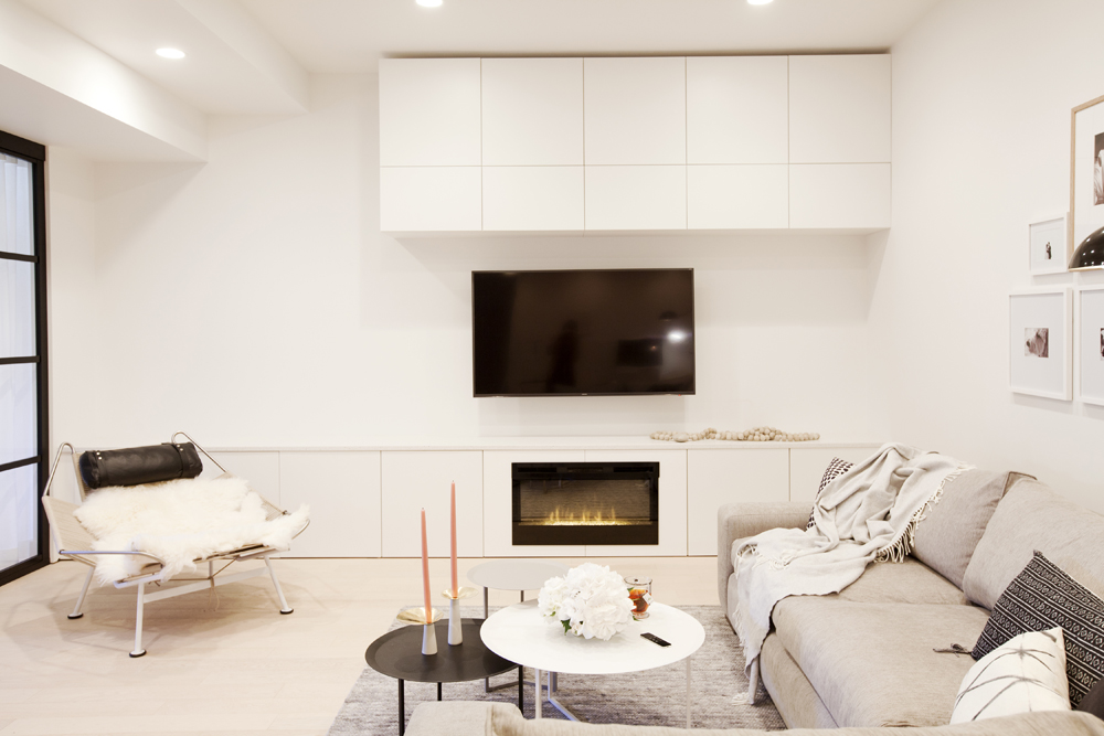
Fire Placement
The designer positioned the living room’s electric fireplace, one of two in the suite, at an unexpected level. “It serves its purpose of heating the room without taking up square footage or competing with the TV,” she says.
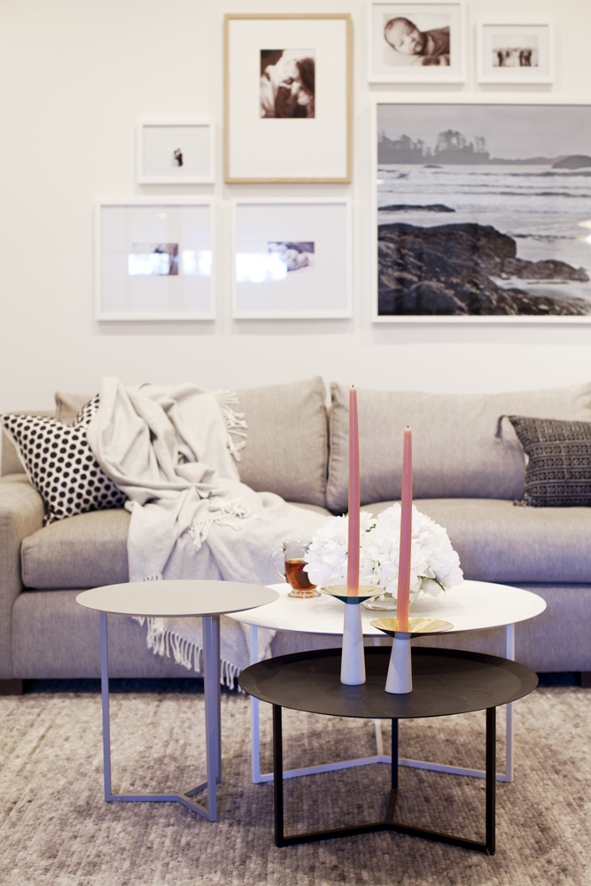
Personal Touch
Personal photos of the family, including baby Capri, and their vacation memories make this space very much their own. The white frames keep the pictures the focal point, while the sole wood-tone one lends a graphic jolt.
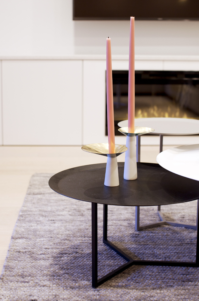
Geometry Lessons
Despite their angular bases, these round nesting tables serve as a dynamic counterpoint to the room’s straight lines. Their curves are complemented by the dramatic candlesticks.
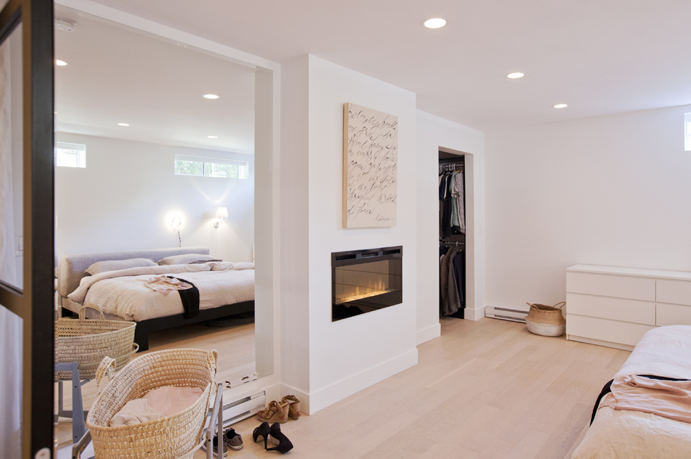
Master Plan
The suite’s second electric fireplace is in the family’s master bedroom. “I love having a fireplace in the bedroom,” says Angela. “It’s super practical yet adds a romantic element.” The mirrored wall that flanks one side of it reflects light and creates an expansive feel.
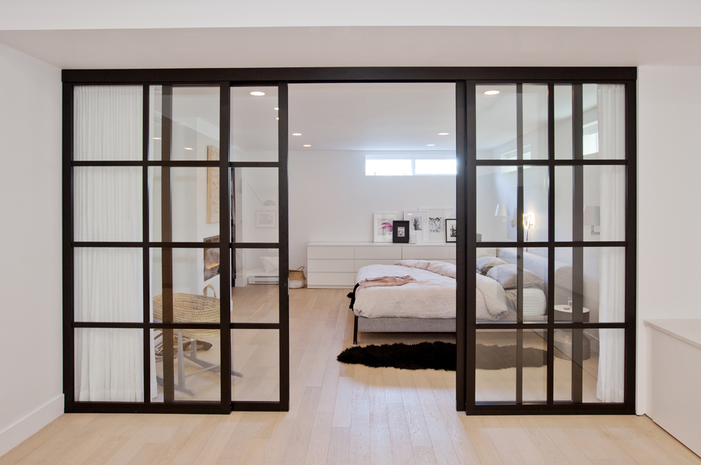
Light Time
“We chose to install a glass wall with sliding doors between the bedroom and living room,” says Angela. The ingenious idea allows some light from the bedroom into the windowless living area. “I also added floor-to-ceiling linen drapes on the bedroom side for more privacy.”
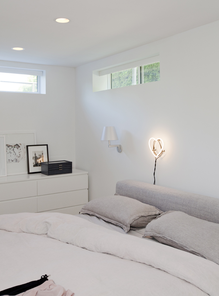
Light and Whimsical
The master bedroom’s sconce and pot lights are countered by a whimsical heart-shaped neon light placed above the bed. Keeping the backdrop and furniture white lifts the space and feels relaxing.
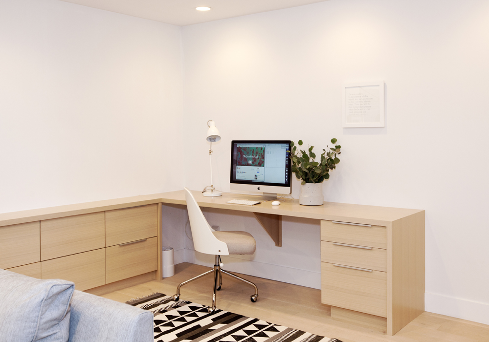
Custom Office
“Custom built-ins are a must when designing a smaller space,” says Angela, who designed this work station in a corner of the living room to exact specifications. “It acts as a home office, but there’s plenty of storage for work supplies and some of Capri’s toys.”
HGTV your inbox.
By clicking "SIGN UP” you agree to receive emails from HGTV and accept Corus' Terms of Use and Corus' Privacy Policy.


