After losing everything in a terrible house fire, Del, Jen and their teen daughter Carli were ready to rebuild their lives in the house of their dreams in Las Vegas. But their dream seemed to be far from reality thanks to closed-off rooms, an outdated kitchen, and an off-centre fireplace that had everyone scratching their heads. See how Property Brothers Drew and Jonathan Scott gathered up their renovation ideas and transformed this eyesore into a stylish home with a special space for all three of these tight-knit family members.
Watch new episodes of Property Brothers Mondays at 9PM on HGTV Canada, now also available through STACKTV with Amazon Prime Video Channels, or with the new Global TV app when you sign-in with your TV service provider details.

Bright New Beginnings
This newly transformed living room is more than just a little paint. Gone is the awkward feature wall the space, in its place are modern built-ins with open shelves and a central fireplace with a striking marble finish. There are multiple seating options for the family and guests, while pot lights give the space even more light. The white walls add to that brightness, and hardwood floors that run throughout the entire main area tie the open concept look together.
An Off-Centre Space
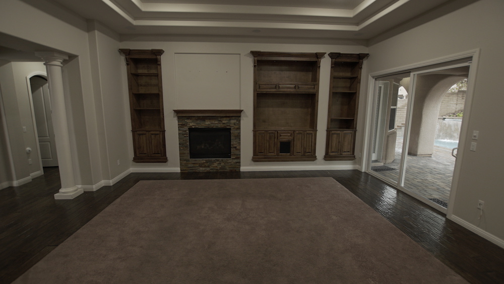
It’s hard to believe this is what the living room used to look like. The $850,000 house came with lots of potential (and an outdoor kitchen!) but clearly the inside needed a lot of work – especially the living room, with its former built-in cabinets and off-centre fireplace. Not only was it an awkward setup for anyone coveting open-concept living, but the dark finishes were sucking the light out of the room. Add in some awkward pillars and poor lighting, and you have a room desperate for attention.
Dining Room for Six
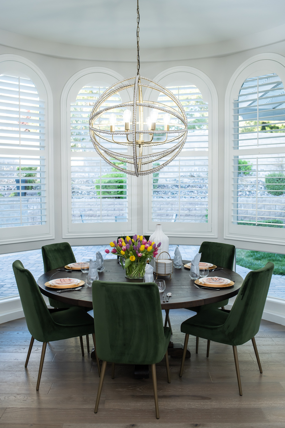
Dividing an open concept space into zones can sometimes be a challenge but Jonathan and Drew had an easy time defining this gorgeous dining room space thanks to the bay-style windows. The large circular table easily fits the area and offers a more traditional look, but the green dining chairs and decked out chandelier offer that extra bit of personality and glam.
Related: 14 Incredible Celebrity Dining Rooms You’ll Want to Have a Feast In
An Awkward Set Up
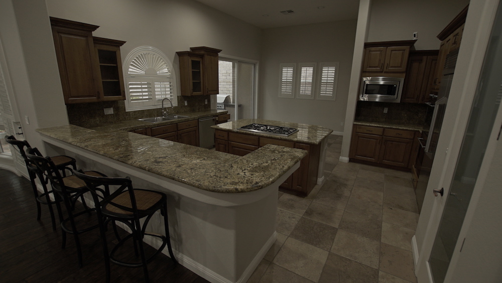
Before the renovation this kitchen was dark and uninviting. The dual counters were confusing, there was no flow to the actual workspace or appliances, and the bulky cabinets by the window were large and awkward. Add in dated shutters, weird walls, and a range in the middle of nowhere, and this is not the kitchen this particular family wanted to be congregating in.
A Fancy New Space
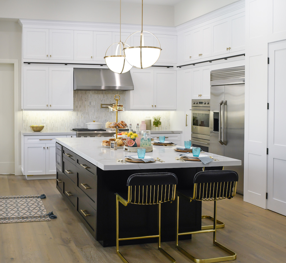
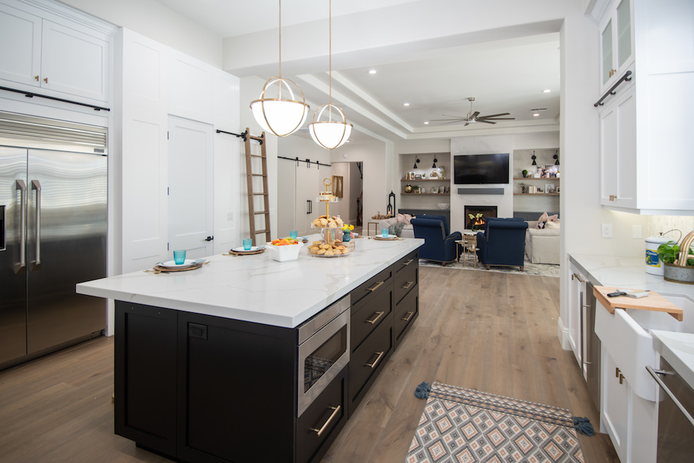
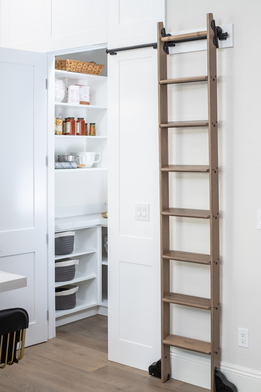
To make the most of the space, Drew pushed the kitchen back and gave it a total redesign. Meanwhile, when you have high ceilings, why not take advantage of them? The contractor ensured that there would be plenty of storage space with stacked cabinets and a ladder slide to access them while maintaining a a bright, open and airy feel. It’s total night and day compared to the dark, dull space it was before.
Related: Our 12 Most Popular Kitchen Design Ideas on Pinterest
Going With the Flow
Clean sightlines all the way through this redesigned space were totally worth sinking the majority of the $150,000 renovation budget into. The flooring adds instant flow while the pretty marble finish on the countertop and fireplace give continuity and personality. Add in some pendant lights and stainless steel appliances in the kitchen, and this is a modern, bright space that’s definitely more in line with the home of Del and Jen’s dreams.
A Pretty and Practical Pantry
Why leave all of your small appliances out in the open when you can tuck them away into your own customized pantry? Drew designed the doors on this tucked away space to integrate with the look of the cabinets, giving even more flow to the area. Meanwhile the ladder unhooks so that it can clip onto the bar on the other side of the kitchen, giving Jen and Del easy access to any storage spots in the the space.
Related: The Dreamiest Walk-In Pantries That Will Make You Want Your Own
A Magnificent Mudroom
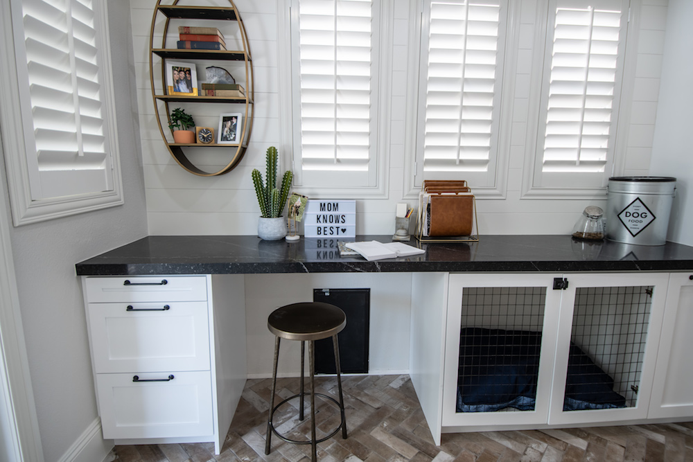
Having a small desk and a built-in kennel in the mudroom (right beside the stacked washer and dryer) may seem odd, but it was exactly what Jen wanted in her new space. This is her special room away from the family, that allows her a space to just drop off mail and other things as she comes in and out. Of course there are still touches of frou-frou glam, like those pops of gold, and the tiled floor below, which has an easy-to-clean surface with a stylish brick finish.
Teenage Media Room
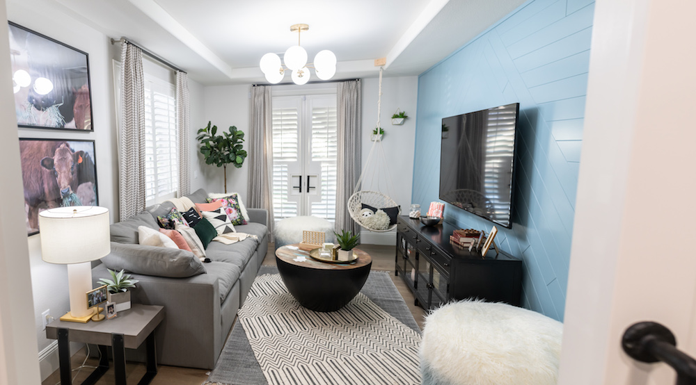
The real frou frou can be found in Carli’s designated space: an area where this teen girl can chill out and establish her own independence. Drew took all of her likes into consideration when crafting the space, from the cow photos and blue feature wall to the over-sized sofa and furry poofs. The best part is that the room can be transformed down the line while still keeping in sync with the rest of the main floor thanks to the matching walls and flooring.
Related: Minimalist Kids’ Room Design Ideas Fit for a Mini Marie Kondo
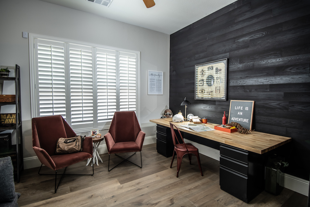
A Surprise Office
Carli got her girl-den and Jen got her pantry and mudroom, so the family wanted to do something nice for Ded too. Enter this new masculine office, which features darker furniture and worldly finishes, many of which were pulled out of storage from Del’s own collection. It’s a small space dedicated to the dad’s personality, with that same flooring and wall colour to keep the continuity throughout. With a space for everyone and modern finishes to covet for years, it’s safe to say this deserving family finally has the home of their dreams.
HGTV your inbox.
By clicking "SIGN UP” you agree to receive emails from HGTV and accept Corus' Terms of Use and Corus' Privacy Policy.


