When Binh and Ramon bought their Toronto home it was with many intentions of fixing it up into their forever home. But three kids and a lot of side projects later, they still felt that their house had an outdated and choppy layout that was no longer working for their crew. So they called up the Property Brothers for some renovation ideas. From a modern new kitchen and enlarged dining room to a beautiful new walkout and a functional basement, see how Drew and Jonathan designed the space of this couple’s dreams.
Watch new episodes of Property Brothers: Forever Home Mondays at 9PM on HGTV Canada, now also available through STACKTV with Amazon Prime Video Channels, or with the new Global TV app when you sign-in with your TV service provider details.
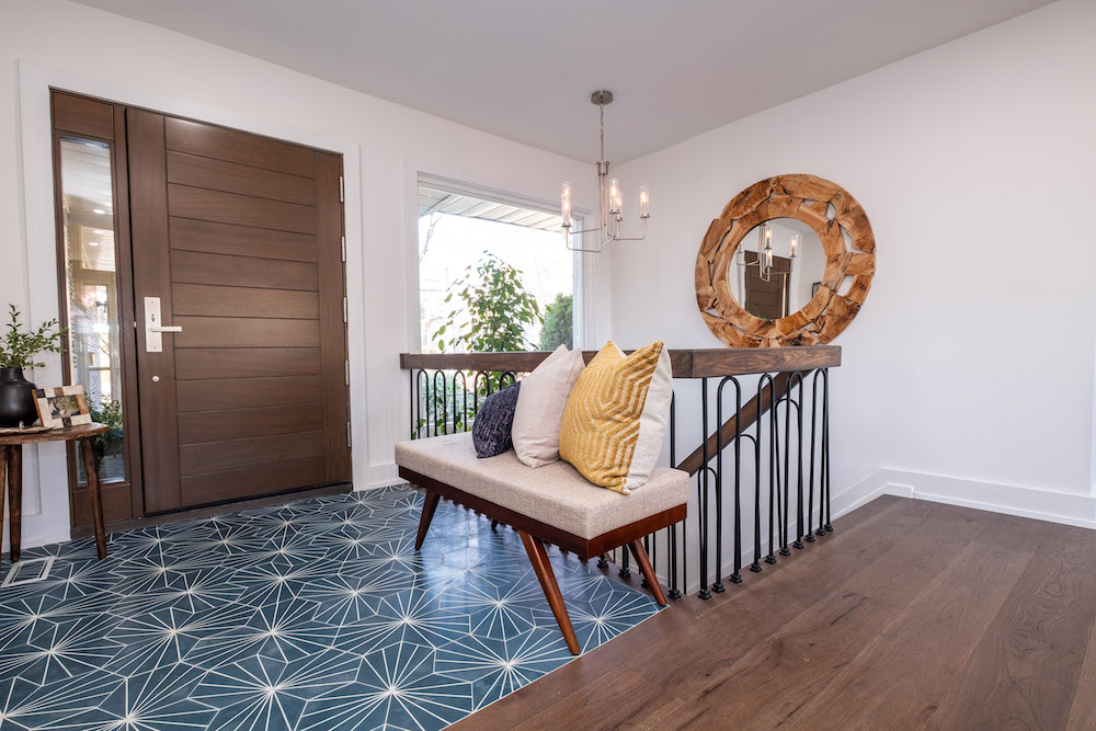
Modern Appeal
A foyer sets the tone for any home, and this space is no exception. The brothers made the most of this small space with some big design appeal. There’s the statement door with a dark wood finish, which contrasts perfectly with new personality-filled tiles. The refinished stairway leading to the basement is open and unified, making this a completely polished space.
Related: 9 Easy DIY Projects From HGTV Canada Stars That’ll Make Your Home Look Expensive on a Budget
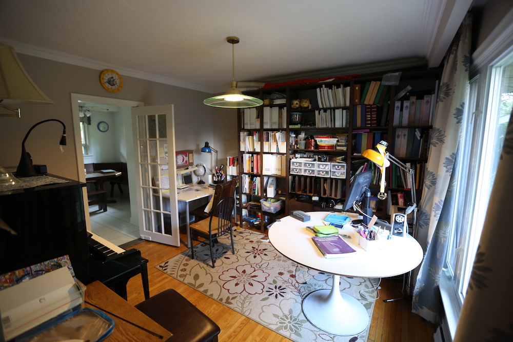
Dark and Clunky
Binh and Ramon’s home worked for them for many years, but as their friends and family circle grew they found they no longer had the space to entertain like they used to. Of course a lack of proper storage, small rooms, and awkwardly placed furniture didn’t help matters.
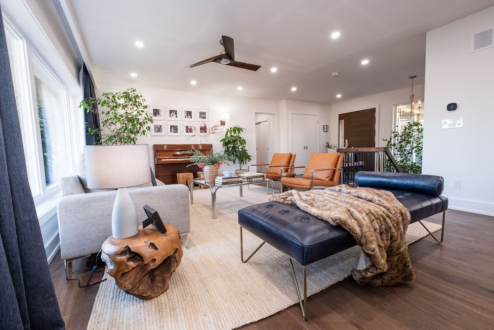
A New Family Space
Pot lights, new flooring, and fresh paint go a long way in updating an old space, but even more importantly Drew and Jonathan knocked out a few walls so the couple’s “new” home feels even more spacious and open-no more clunky layout here. The brothers incorporated older pieces of furniture (like the piano) with a few modern pieces to create a familiar but modern space.
Related: 20 Tips for Arranging Furniture in Your Living Room
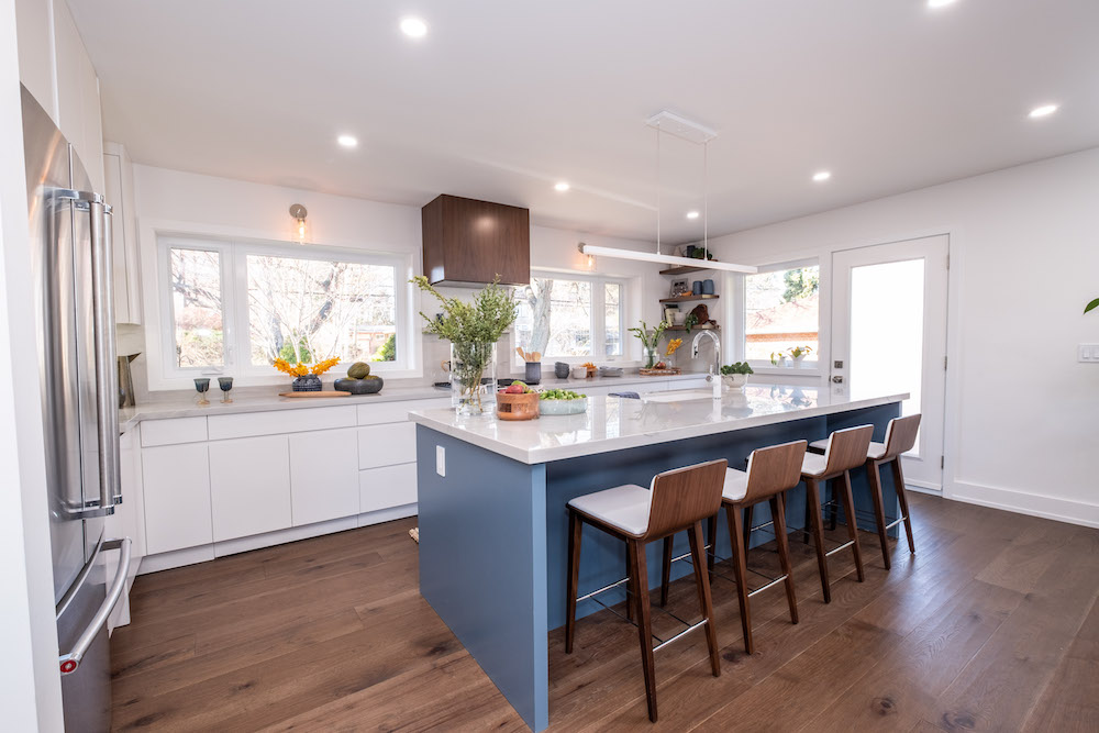
Hues of Blue
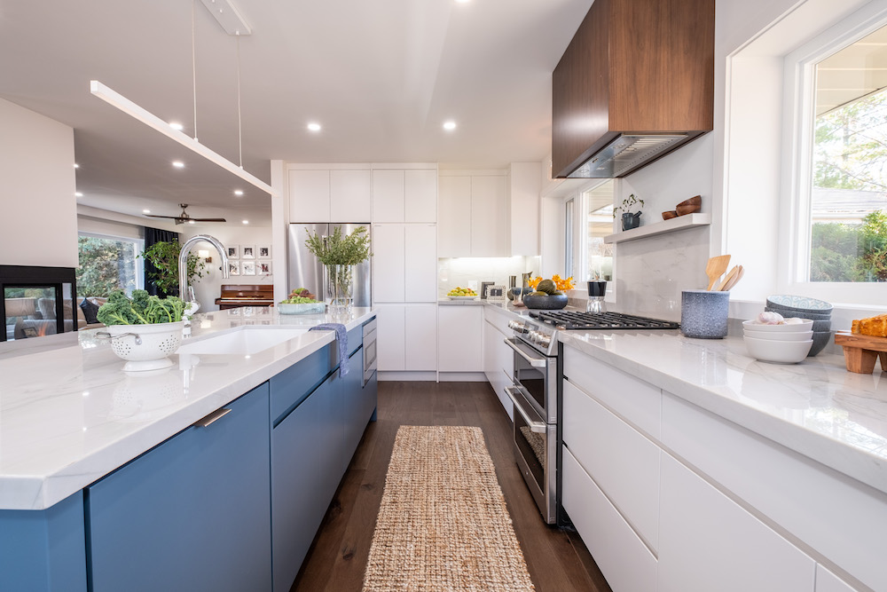
A white kitchen is always in style, but the brothers modernized this one with clean lines, a pretty blue island, and hints of mid-century appeal through finishes like the range hood and the island chairs. Meanwhile the large new windows allow lots of light to come through, and there is still lots of storage thanks to the cabinetry below.
Clean Lines Throughout
The new kitchen features an elongated space for the counter and cupboards along one wall while adding in an entire second wall of cabinetry along the back. The clean lines are further enhanced by the lack of hardware on the modern facings, which can eventually be switched up if and when Ramon and Binh feel like a new look. Add in those sleek new countertops and a hanging bar light above the island, and this kitchen is a bright and functional space that gives the family plenty of room.
Related: 7 Things the Property Brothers Can’t Do Without in a Kitchen
Reconfiguring the Space
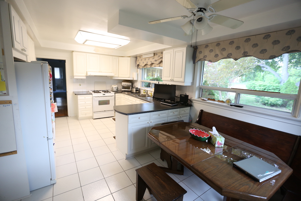
This is the kitchen before the redesign, with its closed off walls and cold tiling. While the windows were still letting in light, the outdated curtains and light fixtures weren’t doing anything to brighten things up. Add in an awkward layout and clunky seating, and it’s easy to see how a family of five would feel a bit cramped in this space.
A Pretty New Fireplace
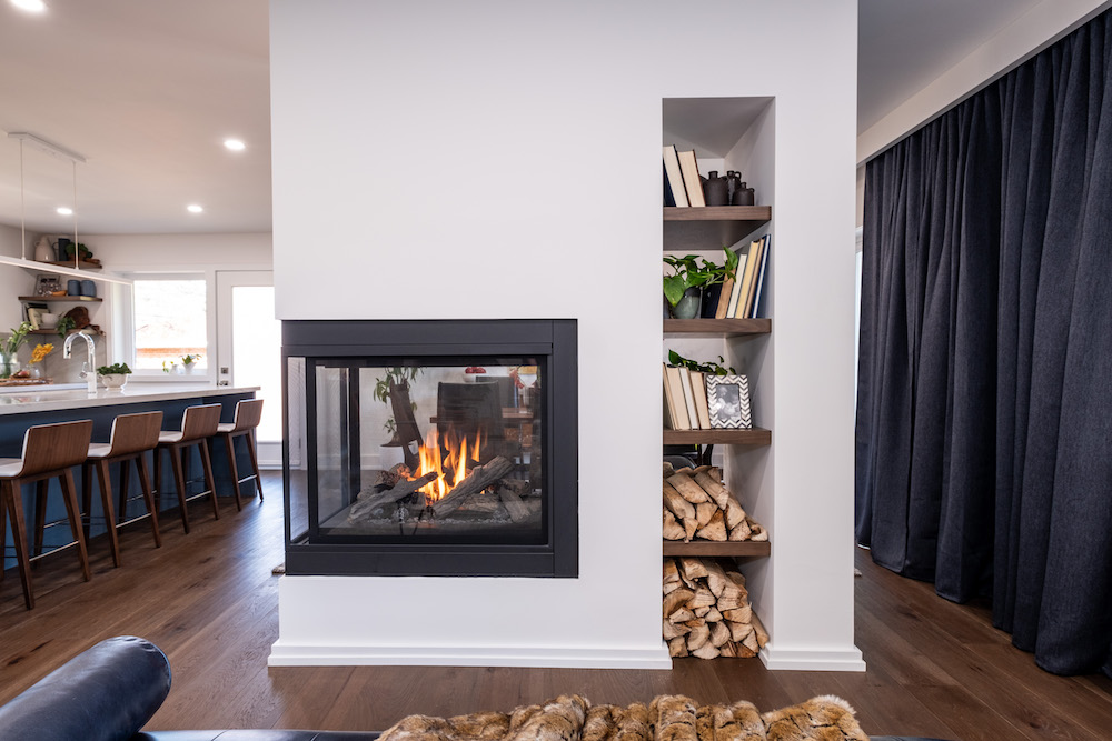
This gorgeous three-way fireplace is a major defining element. Drew and Jonathan designed this one so that it can be seen whether the family is in the living room, kitchen, or dining room. They further modernized the space with a clever built-in shelving unit.
Related: 8 Reasons Why You Should Install a Gas Fireplace This Season
Room to Dine
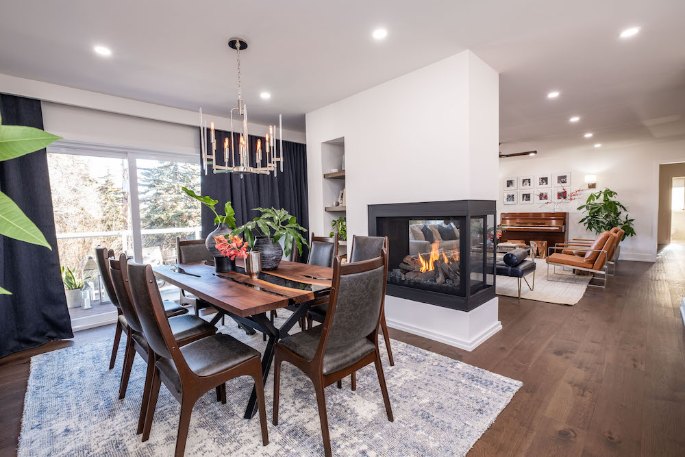
A big and open dining space was important to Binh and Ramon given their love of entertaining. So the Property Brothers conceptualized this bright and welcoming space that also offers a touch of formal appeal thanks to the wood finishes and the chandelier above. Meanwhile the fireplace wall helps delineate the space while still keeping the overall design connected. Time for a dinner party!
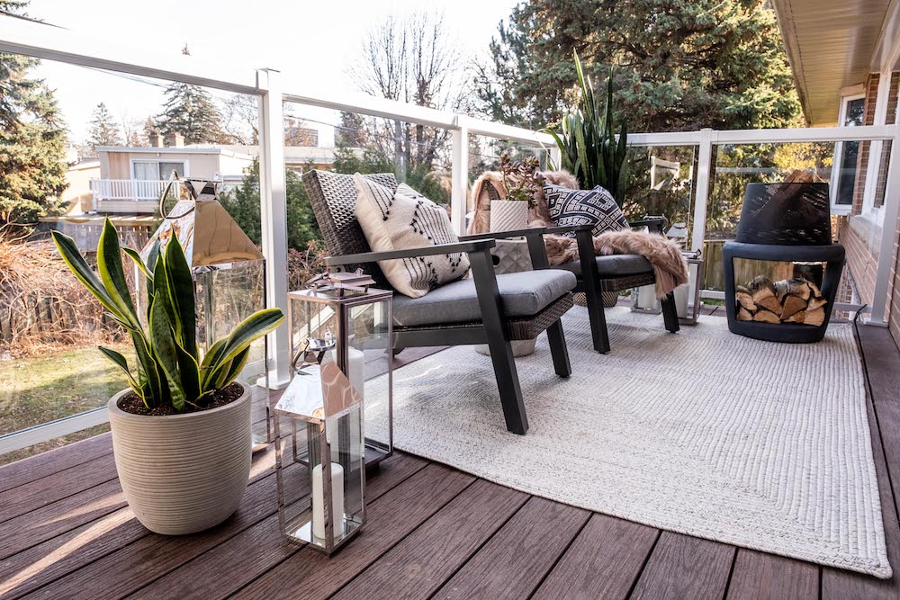
A New Walk-Out
One of the biggest frustrations Ramon and Binh faced with their old house was the inability to walk out to their large yard. The brothers fixed that by creating a walkout and this gorgeous little patio space, where the couple can enjoy a quiet morning cup of coffee or have some romantic solo time after the kids have gone to bed.
Related: How to Create a DIY Balcony Herb Garden (and Other Balcony Gardening Ideas)
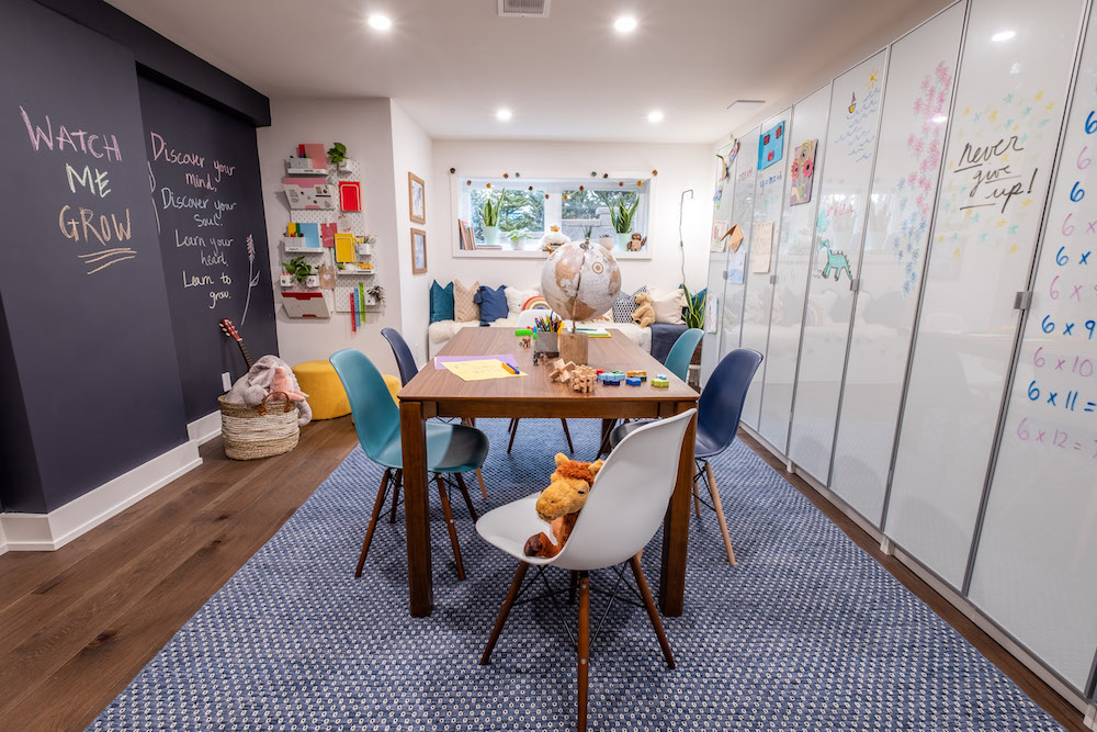
Space for the Kids
Before the renovation, the large basement was largely unused because it was so dark and unwelcoming. The brothers fixed that with this adorable new kid-friendly space that’s perfect for hanging out in and doing homework. There’s lots of seating for kids to gather and the interactive chalk and wipe board walls are brilliant additions for active minds.
HGTV your inbox.
By clicking "SIGN UP” you agree to receive emails from HGTV and accept Corus' Terms of Use and Corus' Privacy Policy.


