As The Simpsons heads into its 31st season, the sad truth is that Marge and Homer’s humble home looks exactly the same as it did three decades ago. Design firm NeoMam Studios set out to change that, by giving every room on 742 Evergreen Terrace a modern makeover – and, as a bonus, reimagined the Springfield family’s iconic living room in an array of different decor styles. As a result, here’s a chance to find out what the Simpson home would look like if Homer and Marge could afford to hire an interior designer.
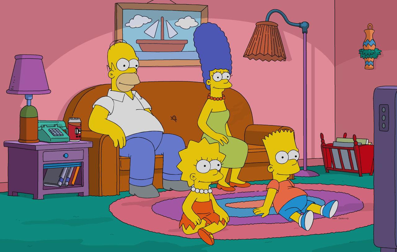
742 Evergreen Terrace
With The Simpsons launching into its 31st season as the longest-running scripted series in TV history, it’s understandable that their family living room is one of the most familiar spaces in pop culture – don’t even try to calculate how many hours of television over the years have taken place within these iconic pink walls. The Angieslist website, however, wondered what the room would look like with a bit of professional guidance and partnered with interior design consultant Pat McNulty to reimagine the entire house via digital wizardry – in the process, demonstrating how good interior design can transform the dumpiest home into something truly spectacular.
Related: Homes From Classic TV Shows and Movies Get a Modern Facelift With 3D Technology
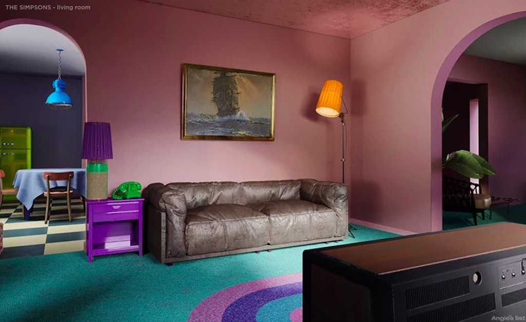
Before: The Living Room
As we recognize it, a digital rendering of Homer and Marge’s living room: pink walls, a floor lamp that looks like it belongs in a prison interrogation room and artwork that – and this is only a guess – Homer may have stolen from a Motel 6.
Related: IKEA Recreates Iconic Living Rooms From ‘The Simpsons,’ ‘Friends’ and ‘Stranger Things’
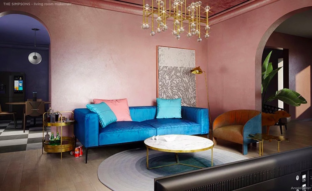
After: Living Room
Here’s the same living room redesigned in a luxe style, with some significant changes – such as the side table being replaced by a cocktail trolly (let’s assume Homer likes that particular design element). Other trends reflected in the redesign include bold brass, rounded furniture and statement chandeliers. And while the walls remain pink, the shade is more subtle and muted.
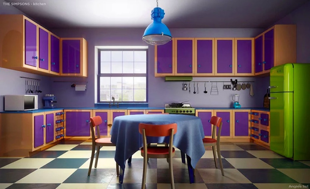
Before: The Kitchen
Let’s face it, this kitchen is sad. From the green fridge – is that a Norge? – to the bizarrely purple cabinets to the vintage linoleum, here’s a look that will have any HGTV designer reaching for the nearest sledgehammer.
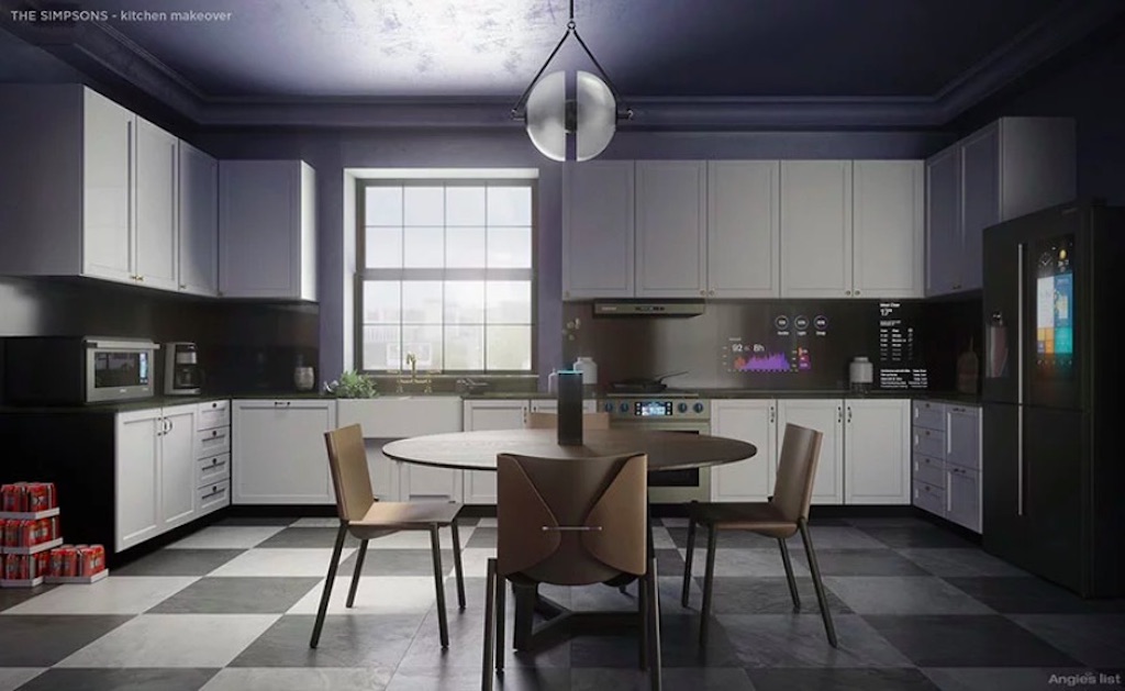
After: The Kitchen
The checkerboard floor – now classic black and white – is pretty much all that remains in this sleek redesign, which offers a mid-century modern table and chairs, a dark grey colour palette complemented by white cabinets and high-tech appliances with video screens and all sorts of bells and whistles.
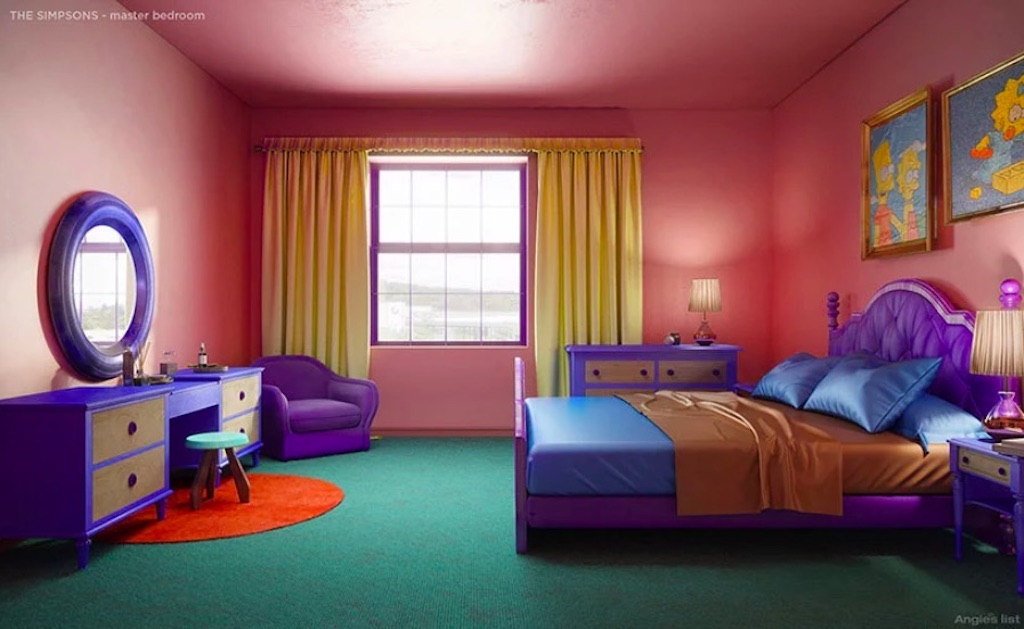
Before: Marge and Homer’s Bedroom
Best known as the room where Homer and Marge “snuggle,” the couple’s bedroom continues the pink walls of the living room, along with a purple and blue design scheme – capped off with a dark green carpet that looks like it belongs on a putting green. Feel free to give your eyes the time to adjust to all those competing and contrasting colours.
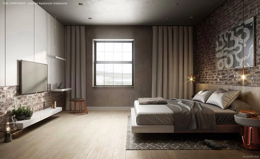
After: Marge and Homer’s Bedroom
Talk about a difference: cool, neutral tones and industrial chic create an elegant space. The concrete and brick add an organic accent, while weathered wide-plank hardwood flooring adds a lot of warmth. Although Marge may not be thrilled by Homer’s addition of a widescreen TV to the boudoir…
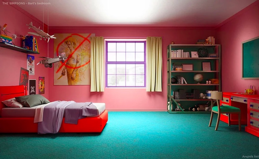
Before: Bart’s Bedroom
Boasting the same mini-golf carpeting and salmon-pink walls as his parents’ room, Bart Simpson’s bedroom has an ’80s retro look – which, to be fair, wasn’t considered retro back in the ’80s, which is when we first saw this room.
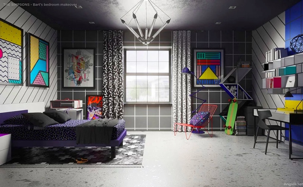
After: Bart’s Room
This redesign nods its hat to the Memphis design style that was big in the ’80s, replacing Bart’s lame-o movie posters with Pop Art prints and ditching the pastel shades for a more black-grey geometric look.
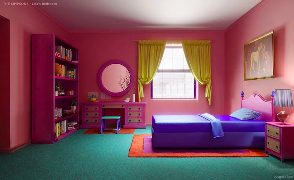
Before: Lisa’s Bedroom
Not dissimilar from Bart’s room, his sister’s space makes the most of the pink wall/green carpet look, but in a far more feminine way.
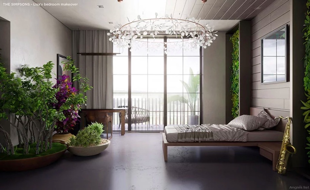
After: Lisa’s Bedroom
Given Lisa’s liberal leanings, the redesign of her room reflecting the biophilia design trend is no surprise. Her desk and chair are made from reclaimed wood and behind the bed there is a living wall with moss and plants. There’s also the addition of a Parisian-style floor-to-ceiling iron-framed window.
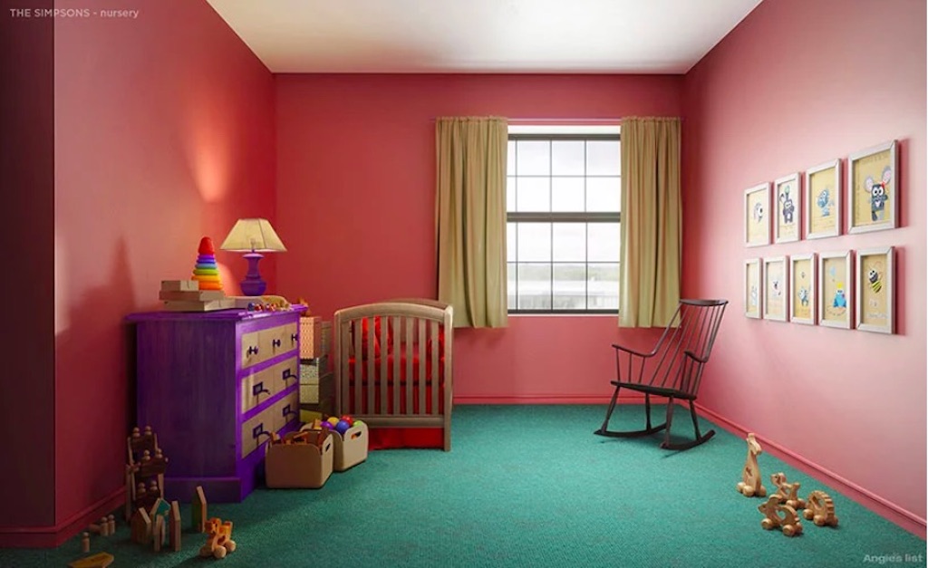
Before: Maggie’s Bedroom
Truth be told, the bedroom of the youngest member of the Simpson clan is vastly under-designed, with the sparsely designed space using leftover pieces and making the whole room look like an afterthought. Doesn’t Maggie deserve better?
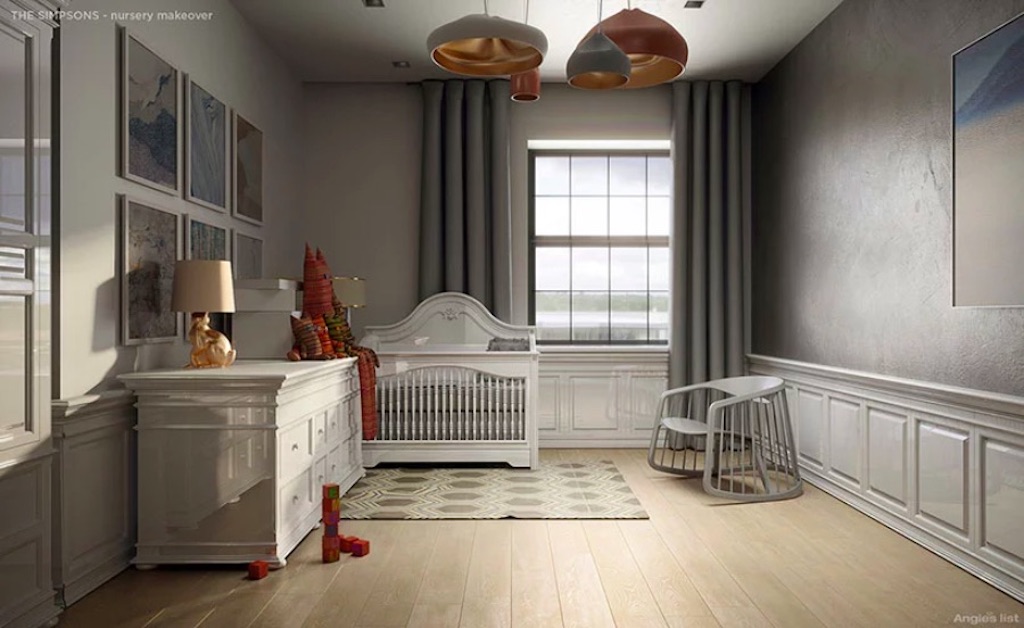
After: Maggie’s Bedroom
This regal redesign transforms Maggie’s nursery into a room of style and inspiration, with a theme of adventure to feed her dreams. Note the new toys – made from natural fabrics – which add a splash of colour to this cool new room, featuring a far more organic feel and neutral tones.
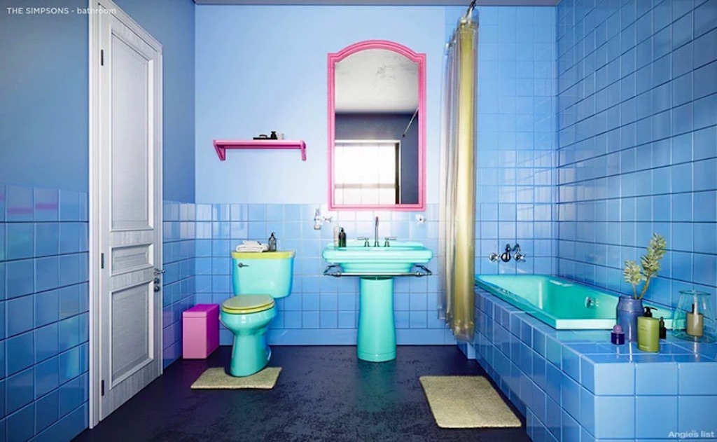
Before: The Bathroom
Don’t make us testify under oath that the Simpson home only has one bathroom, but that’s probably the case – and this monstrosity is it. We could describe what’s going on here, but really, just take a few moments and take it all in.
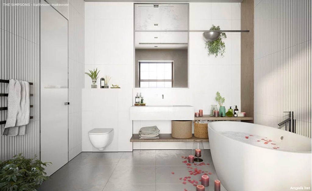
After: The Bathroom
Look what happens when the same bathroom is given a Scandinavian spa feel, featuring natural textures in relaxing whites and grey-hued stone, along with Scandi-style baskets, sculptural rattan and… rose petals sprinkled on the tiled floor and in the standalone oval-shaped tub! Homer’s got game! #snuggling
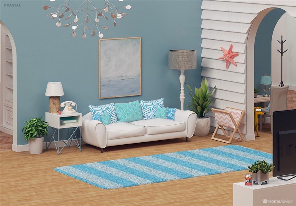
Living Room: Coastal
With the Simpson family home now completely redesigned, another challenge was accepted: redesign The Simpsons living room using different modern design trends to determine how different the space would look. First up: coastal decor, boasting a muted blue palette and shiplap accent wall, along with a crisp white sofa accessorized with light decorative pillows and a seriously funky chandelier.
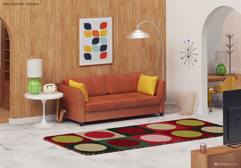
Living Room: Mid-Century Modern
Wait a minute, does Homer work for a nuclear power plant – or a Madison Avenue advertising agency in the 1960s? That’s the question to ponder while delving into this groovy mid-century modern redesign that shifts the Simpsons timeline from the mid-’80s to the mid-’60s.
Related: California Meets Sweden in This 1950s Hamilton Bungalow
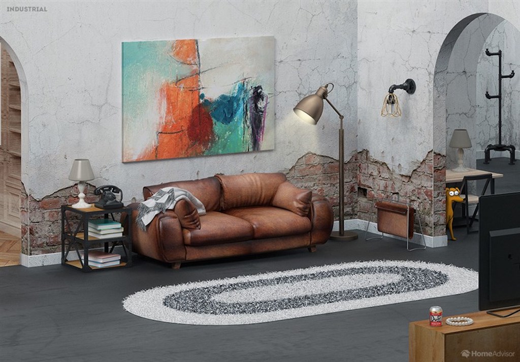
Living Room: Industrial
“As a power plant employee, Homer would feel right at home in an industrial living room,” quipped the HomeAdvisor blog, which commissioned these designs. “The updated room features exposed brickwork, furniture with wood and metal accents and a fluffy white-and-gray rug. A large abstract art piece replaces the famous boat painting above the sofa.”
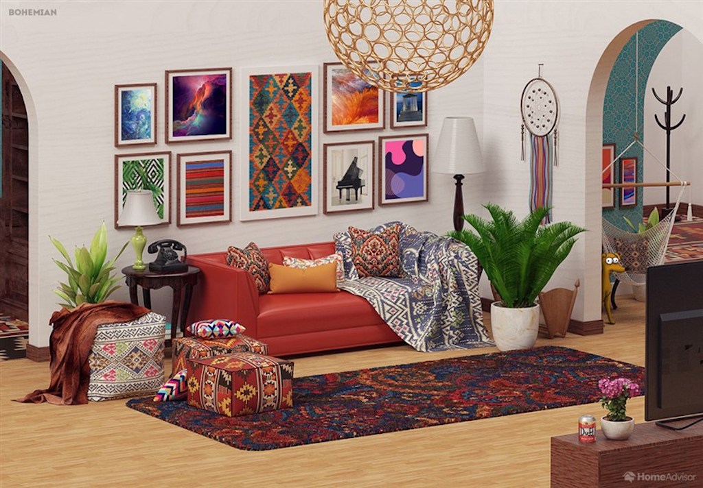
Living Room: Bohemian
“If anyone in the Simpsons household would embrace bohemian decor, it’s Lisa,” notes HomeAdvisor. “Vintage furniture, exotic rugs and decorations from around the world are the key features of this style. The ‘boho’ lifestyle is about being carefree and adventurous, perhaps summed up best by rich, vibrant colours and a purposefully messy layout.”
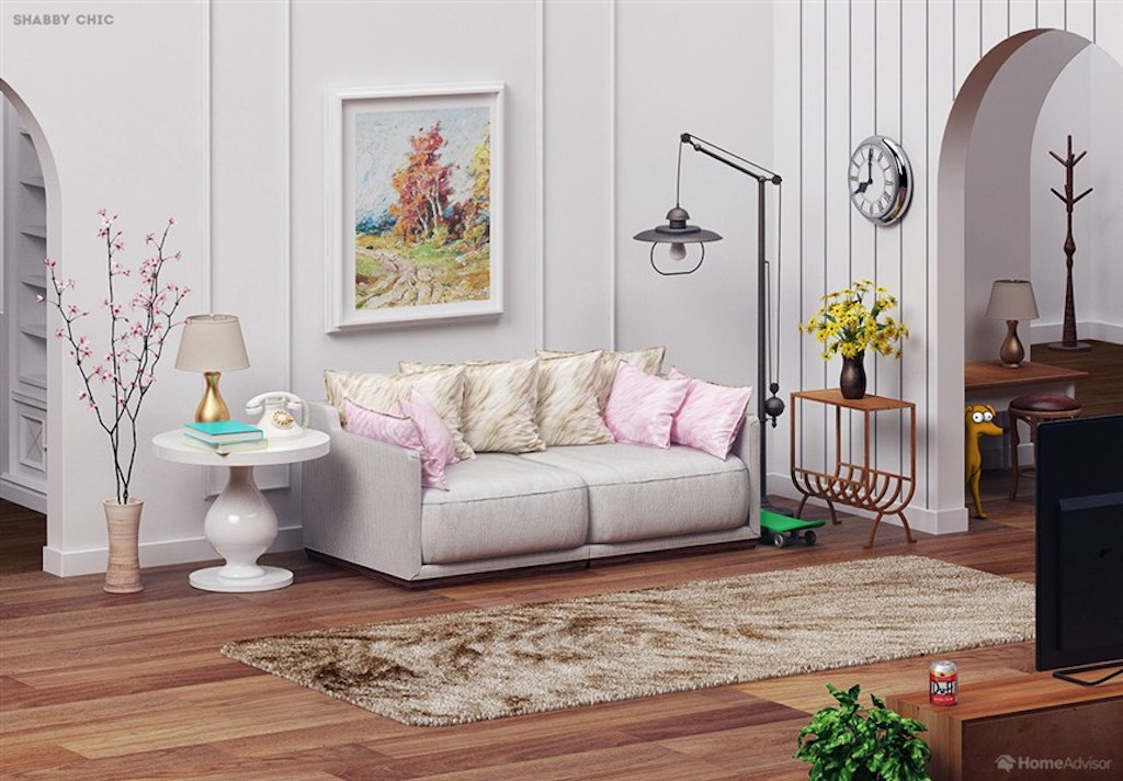
Living Room: Shabby Chic
“Marge probably wouldn’t like the chaos of a bohemian living room, but she and Lisa could compromise on the softer, more feminine flea market aesthetic of shabby chic,” notes HomeAdvisor. “This style is all about mixing and matching finishes, colours and styles. Vintage furniture, wall hangings and floral accessories would give the Simpsons’ living room a more stylish – though equally casual – feel.”
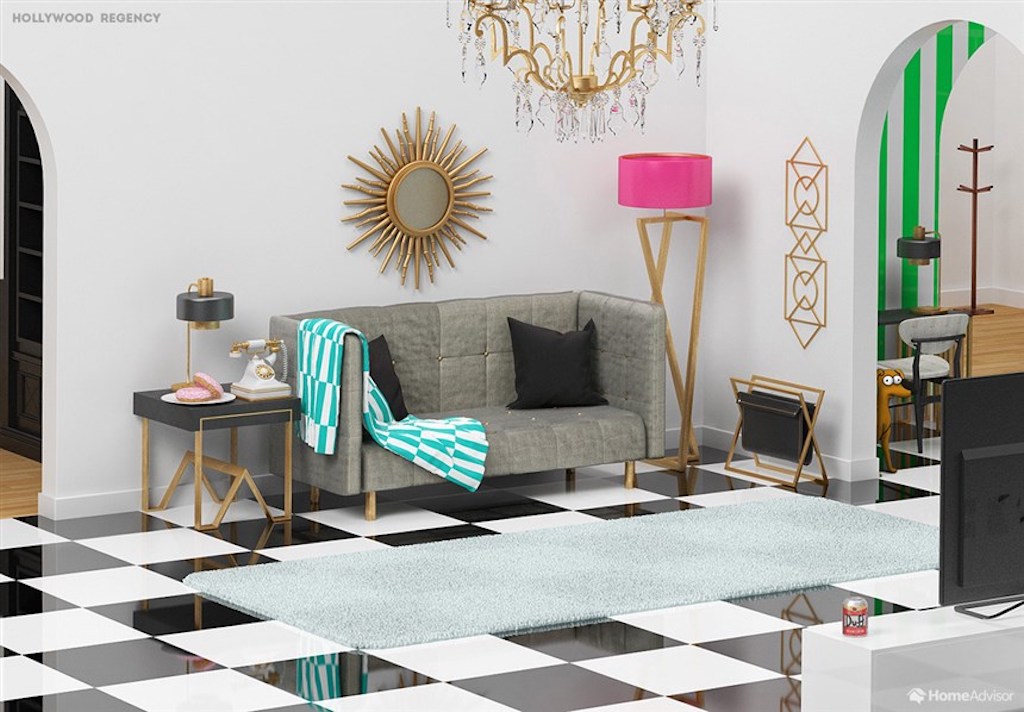
Living Room: Hollywood Regency
Wait, is this Springfield or Beverly Hills? “A Hollywood regency living room redesign would make the Simpsons the talk of the town,” declares HomeAdvisor. “This style is all about glamour and sophistication (not words normally applied to Homer and Bart), with contrasting colour combinations like pink and green or turquoise and lemon. Opt for bold statement pieces like black furniture with gold accents, complemented by luxurious fabrics.”
Related: RuPaul Lists Hollywood Hills Hideaway for $5M and It’s as Fabulous as You’d Expect
HGTV your inbox.
By clicking "SIGN UP” you agree to receive emails from HGTV and accept Corus' Terms of Use and Corus' Privacy Policy.


